It’s not always black and white
Posted on Fri, 4 Feb 2011 by midcenturyjo
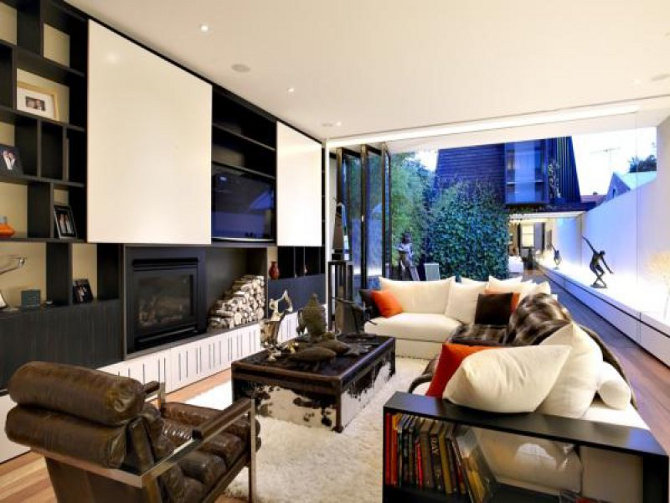
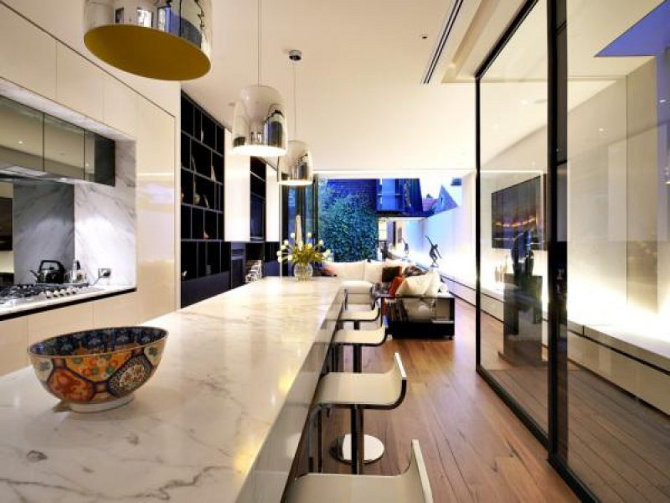
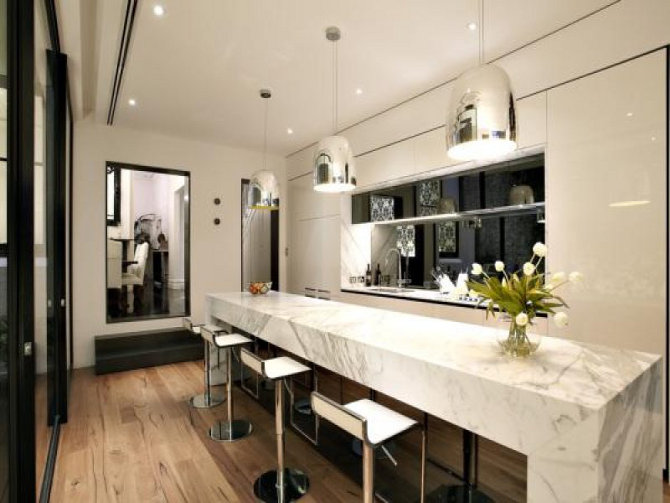
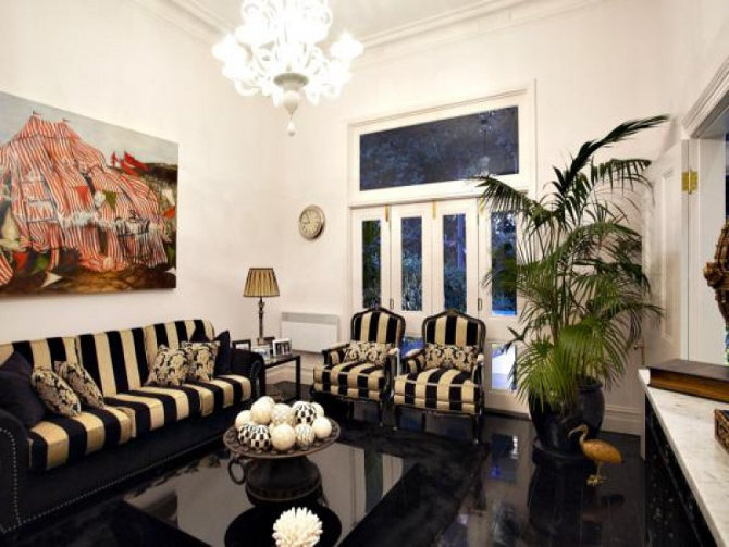
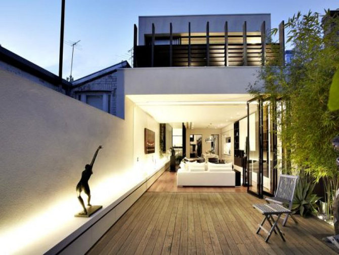
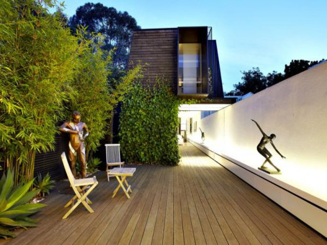
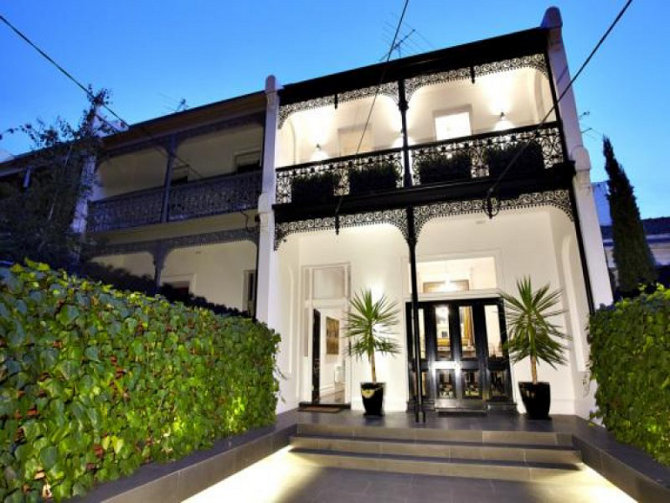
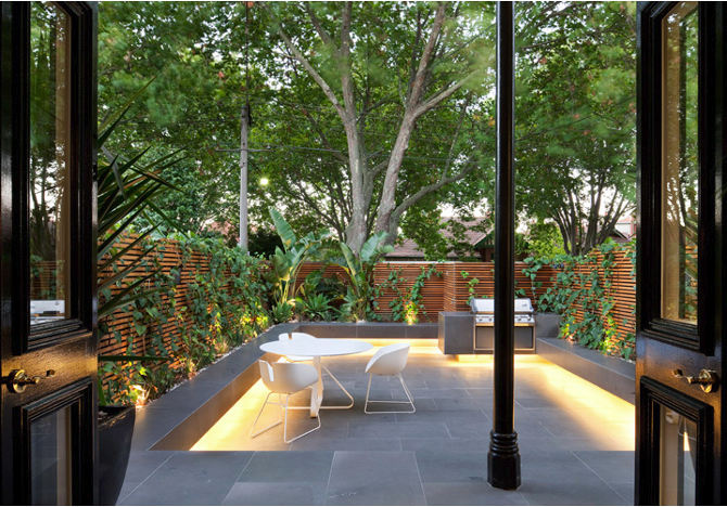
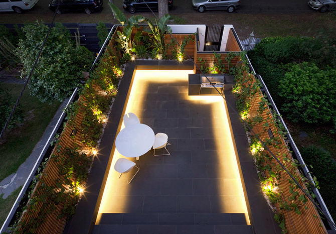
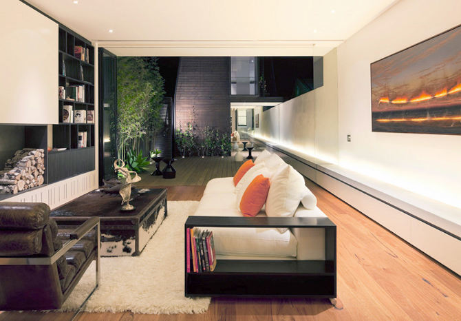
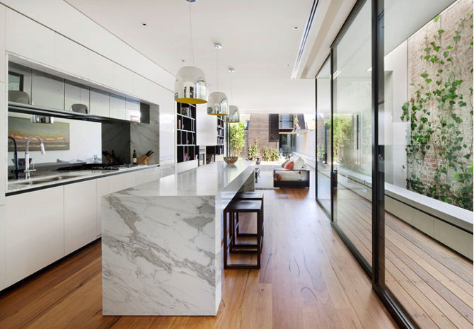
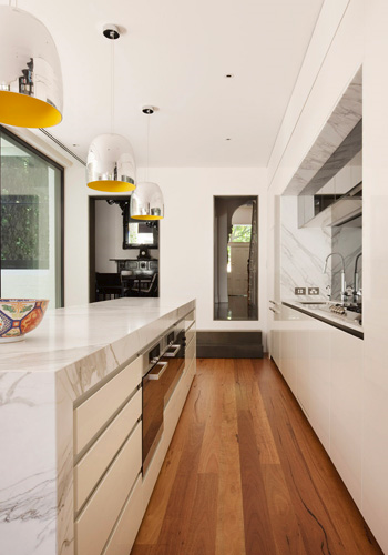
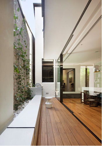
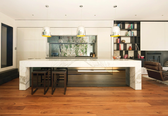
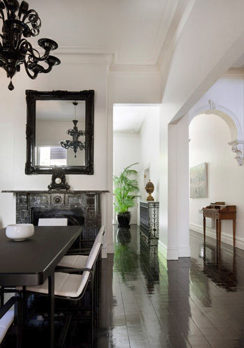
Found something interesting when stalking this week. Architect designed renovation in St Kilda, Melbourne. Spacious modern extension, lovely courtyard garden leading to a rear garage/studio. Architect Matt Gibson. A quick click over to Mr Gibson’s website and there is the house again but just a little different (after the jump). The rear is still the same (minus the modern stools, statues now complete the space). The family/TV room is still the same. Kitchen stools have changed but the bowl on the counter is still there. The biggest difference is the dining room. Chalk and cheese. Black and white. Definitely not the same. Not even the same taste. Then there is the striped living room which doesn’t appear at all on the architect’s site or fit the vibe of the house as depicted on Gibson’s site. We do though on the architect’s website get a chance to peek at the lovely front courtyard garden. So what has happened between the architect taking photos for his portfolio and the real estate agent snapping slightly blurry photos for the listing? Did the architect not like the client’s aesthetic and did a little editing of furniture and spaces? Has the owner “matured” in taste over the time? After all we all change our minds over time when it comes to our rooms. Is it a divorce and the wife can finally go all girly… still in black and white though? A girl who stalks the real estate listings and spends her time staring through the “virtual” curtains needs to know these things 🙂 What’s your theory?
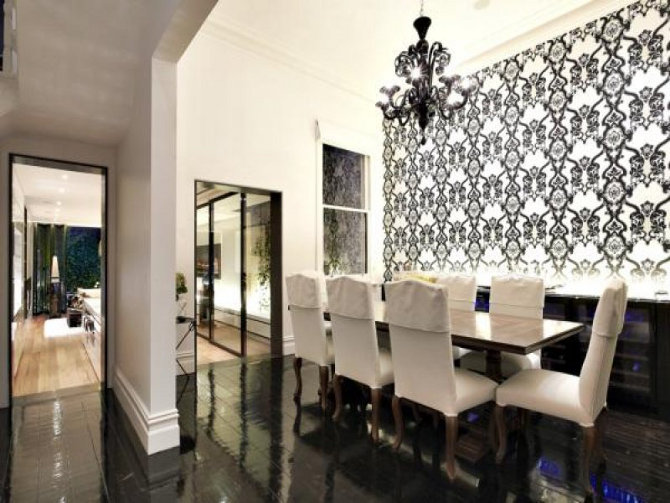
And now from the architect’s website….
Leave a Reply to Lin Cancel reply


Maria Black says:
I like the modern design that the architect offers the space, but I feel (personal taste of course) that the decor is a little stale. It doesn't feel homey, it feels sterile and like a museum. But very interesting, considering all the lines and nicely placed windows. I feel the modern sleek design of the architecture needs to be complimented by some contrast in the decor, some color. Thanks for sharing.
Claire says:
Oh la la… magnifique ! beautiful !!
Kris says:
I think on the architect's side, it's more of a staging effect ( so it looks nice and pretty ), however on the real estate agent's side, it's more of a live-in look ( there are real people living inside ), it has soul and character though pefect it may not be.
But i agree with Selina, the owners should have kept the dining room as it is, what a shame …..
HMC says:
Amazing…..one day when I have no children living at home and money I willl have a beautiful home, minus the golden man between my outdoor chairs.
Tanya says:
If they're looking for someone to move in right away, I'm your gal!
Tom says:
Very nice!
Beth @ the Modern Home says:
I much prefer the architect's aesthetic. That courtyard is devine!
Lin says:
Am I missing something here re: the changes to the dining room? The architect's photo shows only the opposite wall so we can't tell whether the b&w wallpaper is up or not. Same floor, same chandelier, same table: the only discernible difference is the chairs. Clue me in!
Mary Anne from Melbourne says:
I prefer the architect's look myself.
Does anyone know the name of the lights in the kitchen? Love the yellow peeking from underneath .
Thanks 🙂
ktrn says:
Wow, that's a huge difference! I can find myself more in the architects way, but the terrace is great in both ways!