Design Crew
Posted on Sat, 6 Aug 2011 by midcenturyjo

Got a problem? Need some help? Just standing there shaking your head? Don’t know what to do? You’re not alone. Send us a link to photos of your design quandary and let the Desire to Inspire design crew help you …. that’s you lot… the readers! Here’s a good one to sink your teeth into. Danica emailed about her beams.
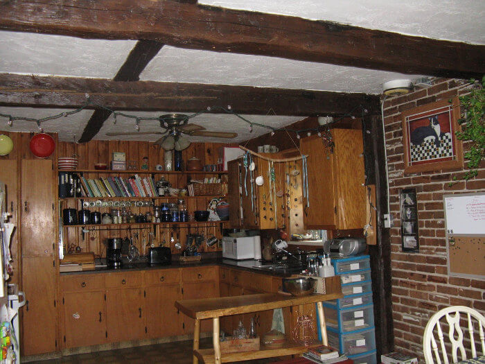
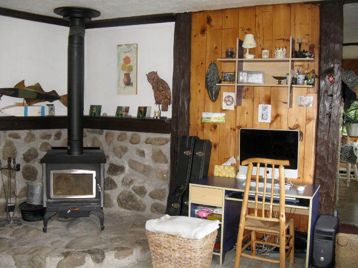
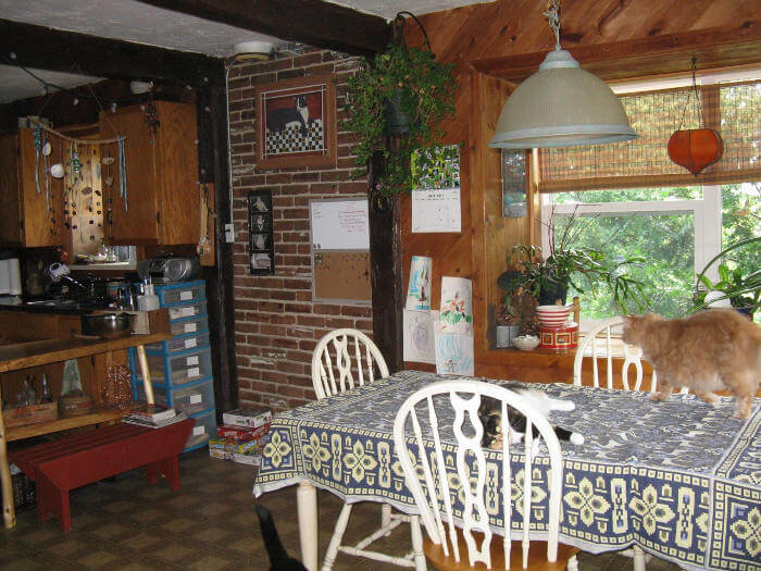
I am looking for help with my design problem involving exposed beams. I have a 35 yr old Cape Cod that has exposed beams through out the main floor. They are in ceiling in the kitchen, dining room and living room. They are also in the hall and continue down the walls in all these rooms too. Some are stained a 70’s chocolate brown and others are painted the same brown. At first I liked them as they lent a sort of chalet look to the place but now they are just too dark and dreary. They are large beams about a foot thick on all sides. I really don’t want to paint them white and I can’t even think about striping them. We have natural cedar walls everywhere too. I would like to brighten the kitchen by painting the cupboards(green) and the walls(white) in that area. I was also thinking of painting the ceiling a nice blue. But what to do with those beams? I also have a part wall of exposed brick.
I have been trying to come up with a practical solution to all of this for over five years now. So here are some pics of the kitchen/dining room and living room. Looking at them all I am thinking is “Yikes, that is a lot of wood!” We live out in the woods in East Coast Canada and have a eclectic style. I love the house but want it a little bit brighter.
Leave a Reply to Danica Cancel reply


Charmaine says:
Can I direct you to some other blogs for inspiration? Painting wood paneling & beams white: http://www.younghouselove.com/2009/08/how-to-paint-wood-paneling/
Painting wood beams grey (rather than white): http://www.younghouselove.com/2011/02/glad-thats-out-of-the-way-part-2/
And as for changing your cabin style into cottage style (I don’t know if other people agree with my delineation between cabin & cottage, but to me cabin/chalet style is dark wood & cottage style is light & bright). Anyway, another blogger’s home that has the light & bright eclectic look that you mentioned, that you might be able to pull some inspiration from is: http://rosylittlethings.typepad.com/posie_gets_cozy/
I think you kitchen is going to look great with a new coat of paint & some new hinges & knobs.
Georgia says:
I don't necessarily think it's the beams that are the problem. I think there is too mauch variation with the brick and the wood and the tiles and the walls. I would find a light neutral colour (I've lived with all white and it can be nice, but choosing a light neutral works just as well), maybe a colour from the lovely stone wall behind the fire and painting ALL the walls in both the lounge and kitchen the one colour. We had a pine lined room painted dark red with natural pine ceiling that was sooo dark. I chose a light skmoky wood colour for the walls and painted the celing whiite (leaving the dark exposed beams) and it is such a light and lovely room now. DTI did a fantastic post recently with a cabin that had had the pine walls all painted white and it looked brilliant and is what inspired me, but it doesn't have to be white. Athough if you don't want to paint the wood, you could give it a white wash look, by bleaching it, and then paint the walls and brick white. Either way, you need some cohesiveness, as there is too much going on visually. Then, once you have all the walls done, depending on what you have decided to do with the walls, you should be able to see what colour would work with the kitchen cabinets. If you've gone white on the walls for example, the lime green would look fantastic on the cabinets. If you've gone neutral in the rest of the room, you may find a blue or even white that looks good on the cabinets. Another trick I've found for brightening up low dark ceilings is to paint them with a white semi gloss as it reflects more light (and you could just paint between the beams). The same is true with painting cabinets. Hi gloss or semi gloss not only makes it easier to keep them clean, but reflects more light into the room. Good luck.
nina says:
I actually like those beams the way they are. I'd rather paint all the other wood white..? then look at the room and decide if anything needs to be done to the brick wall…. just an idea. good luck!
Suzanne Bonham says:
Hello and thanks for the opportunity to comment! I love your home and have lots to say.
First of all, if you and I were really interacting in a design situation, I wouldn't dream of responding to your questions without getting, from you, these 3 things:
1. At least 20 pictures of different interiors or pieces of furniture that you like, collected straight from your intuition without judgment as to whether it would work in your situation or be practical. Straight from the heart, pictures of anything you like.
2. An idea of your budget, money and time and what you are willing to do yourself versus what you must hire done.
3. I would want to know why you don't want to strip the beams or paint them. Simply, your reasons for not wanting to do this.
With these three I would be much more successful at making a response that would be to your tastes rather than to my own.
Lacking those three I will do the best I can.
There are two very strong and unchangeable features of your home that must be considered:
first — the incident light coming from your windows is heavily filtered through what looks like large trees or very heavy foliage. This will affect any color of paint you apply anywhere in the house. Paint is simply a reflector for the light that is hitting it. Your light is going to be very different from light in the paint store or anywhere else. You'll have to look at large samples of color in your own home. Try and bring home sample cans, and you may need to adjust them. I'd buy some at least some raw umber UTC and some burnt umber so you can drop a couple drops of color in to adjust your paint yourself if you need to. Raw umber will make colors more neutral and a shade greener, the burnt will shift towards the red.
second — your ceilings are low.
Those two things above make the whole seem very cozy and enclosed. I would play that up.
I would not use white – again due to the heavy influence of large trees and foliage, white — especially semi gloss or gloss whites will look cold and have a rather false teeth glow. Ick. Instead I would use your stone around the woodstove as a starting point and get various light neutrals derived from colors that look good with the stone. Much lighter than the stone, but derived from those hues. I would not use cream or ivory for your major colors. I'd go for very light soft greys, driftwood-browns, taupes (but avoid pink, you don't want beige) use light sages, very light warm grass greens. But mainly centered around various light soft greys. Some with a little more brown in them, some toward the blue side. It looks as if your house has a "great room" concept in which the openings between the rooms are larger, and rather than having discreet rooms, it is more like a large open space with different areas. You're going to want different colors for interest, but keep them very neutral and natural. Just like in nature. The human eye craves variety. So I would treat it as one room with different areas. I would go ahead with your desire to have the kitchen green — and yet just barely green will be enough. The green shouldn't contrast very much with the other soft greys. All your colors should be pretty close to each other in hue and value. You could do the cabinets in a light soft sage, with the backsplashes and other parts of the room in a soft grey picked up from somewhere else in the big room to unify it. And then put a green, maybe a more yellow dead-grass green, elsewhere in the big room to bring some green out there. Again, barely different from one another in hue and value. And flat. You want the sheens to be flat. You can use General Finishes milk paint for a durable cleanable high quality kitchen cabinet paint. It has a flat sheen. You'd have to get the colors and mix them yourself. Experiment with several of the small sample cans and keep it light.
Regarding the stone around the woodstove – I saw a response earlier about substituting beadboard there but that would violate code. It must be nonflammable within a certain distance of the stove. I would stay with the stone, give it a good cleaning maybe with TSP and then see about dye-ing the mortar around the stones a darker grey to reduce the contrast as much as possible between the stone and mortar – any dye will probably penetrate into the mortar since it's so porous. Use very dilute dye so that you can adjust the color as you go along. Then I'd see about painting your woodstove in a nice soft lighter grey slightly lighter than the stone. There are heat resistant paints in rattle cans that you can use; then first burn you would open up all the doors and windows to let the fumes escape. Wear a mask when using the rattle can; it's awfully fume-y.
I would avoid yellow or orange tones in your wood toned furniture and accessories. Someone recommended bleaching which is nice except you won't be able to get the bleach to soak in if there's a clear coat on your wood. You'd have to strip it first to get the bleach to penetrate. Also, bleach tends to make wood go light yellow and then you'd have to wash over it with a grey wash to correct that tone. For furniture I would go for driftwood tones, medium to light neutral natural browns… As such, the cedar on the walls I would go ahead and paint with one of those various light neutrals. Regarding the beams — I am noticing a line between the ceiling material and the beams that is wavy, as if either the ceiling is textured and meets the beam at an uneven line, or the ceiling was painted with a shaky hand. If indeed there is ceiling texture that will make a clean cut line between colors difficult or impossible, I would have the ceiling and beams in the same color. An alternative would be to paint the beams a contrasting color but then apply a diluted wash over the beams and the ceiling. Use a very high quality paint or the wash will peel the underlying paint. This will unify them and make that wavy cut line not be a problem.
Re. the brick — you must determine whether you like that brick or not. Is it a nice softly colored neutral older-looking red brick or is it a jarring dark 70's era brick with those vertical lines in it? It looks more like the latter to me than the former. I would tend to want to make them recede into the background by painting them one of those neutral light tones you're going to create. I am seeing overall a variety of things that you like to have in your home and up on the walls, and am guessing that a lot of those things have sentimental value to you and that you may have collected them over time. A light neutral background on walls and ceiling and floors (paint the floors a soft grey, darker than the walls) will allow your things to look great against them. Certainly decluttering of any things that you don't really need or don't like to look at would help.
Hope this is helpful —
Suzanne
Margaret says:
This is just a suggestion! Before you paint anything, take everything, and I mean everything, even things in the cabinets, out of the room. Take the blinds off the window, the shelves down anything that can be removed, remove it! Then start cleaning….start at the ceiling and work your way down to the floor. Scrub the cabinets, the fireplace (I like the idea of putting a Sealer on the stone surround). Step back admire your hard work and fall in love with the room the way you did when you first saw the house…… Then and only then make a decision about paint. If you paint great you are ready to get started, but if you don't, and i am not sure you really need to… You are ready to reload the room. Be ruthless, if you don't use it donate it, if the plants don't look a hundred percent, get rid of it, please lose the twinkle lights. If it's not in a frame don't tack it on the wall put things like that in a scrapbook you will enjoy them more and those special things won't fade as fast as they would on the wall. The computer desk just does not work in this rustic room, can you use the console table that is in the kitchen? It is fabulous. Keep the cats but lose the blue plastic drawers…. Just put things back in the room that you love… I honestly think you will fall in love with this room again! Best of luck and send us an after photo! I think you have a diamond in the rough.
lea says:
Sorry, total reno job is required here. Leave the beams and rip out all the old panelling and kitchen and yes, that stone around the fireplace has to go. De-clutter the area – keep only things that are useful or beautiful… of course beauty is in the eye of the beholder 🙂
Danica says:
Wow, I didn't realize there were trolls in the designing world too! I think some of you could probably find something a little more productive to do with your weekend than bash other people's homes. I only wanted to know about the paint and the beams, your negative comments about everything else really didn't do any good to anyone. I have two small children and we use the diningroom as a school room so the plastic drawers/pictures on the walls and twinkle lights are as I want them. I don't live in a museum.
I'd like to thank the people who actually took the time and answered my questions. I really appreciate all the appropriate comments and hope to tackle the beams soon.
Tony says:
I have come back to this post, and my initial reaction was to paint all the white stucco, ceiling and walls a burgundy color, vey similar to the low footstool and in the cat picture. I still think it would be a good fix for this room, would go well with your news green kitchen cupboards, and would be easier than painting the beams. If you prefer blue, choose a rich darker shade rather than a sky blue, but again, do the wall panels that are white the same colour. Cheers 🙂
hellrazor says:
Wow, I was thinking about this post and the whole "design crew" concept. I was wondering if people ever took the advice of the designers and if they might return with before/after pics. This post especially struck me because so many people took the time to give detailed advice, but the major piece of advice that most of the "crew" seems to be giving is pare down/de-clutter. Wouldn't even cost a single Loonie to do it.
And then Danica replied. "I only wanted to know about the paint and the beams, your negative comments about everything else really didn't do any good to anyone."
So Danica, why don't you just go to http://www.benjaminmoore.com/en-us/for-your-home/personal-color-viewer load in the pic of your room and "virtually" paint till your heart is content? That way you don't have to be bothered by the "trolls" that have so vexed you.
Danica says:
Thanks for the suggestions Tony! I had looked at a dark red too.
Hellrazor, you do make some valid points. I have tried all those paint sites for years and keep putting it off as I can't seem to settle on the perfect colour scheme. All the colours I have tried just looked off. I was hoping some people would have some experience with large beams like that. I can't be changing my mind every couple of years as this project will be huge.
I'll gladly send in an after photo once this is all completed!