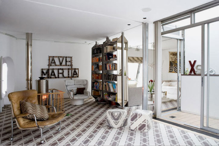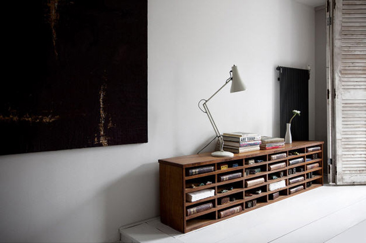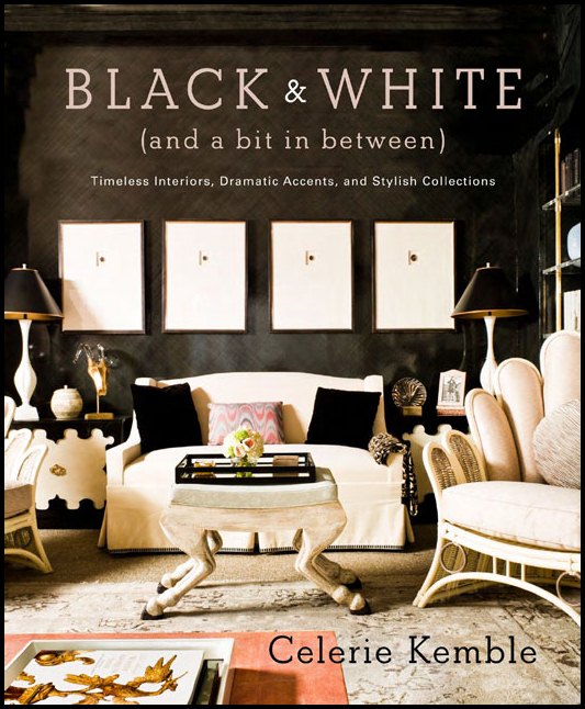
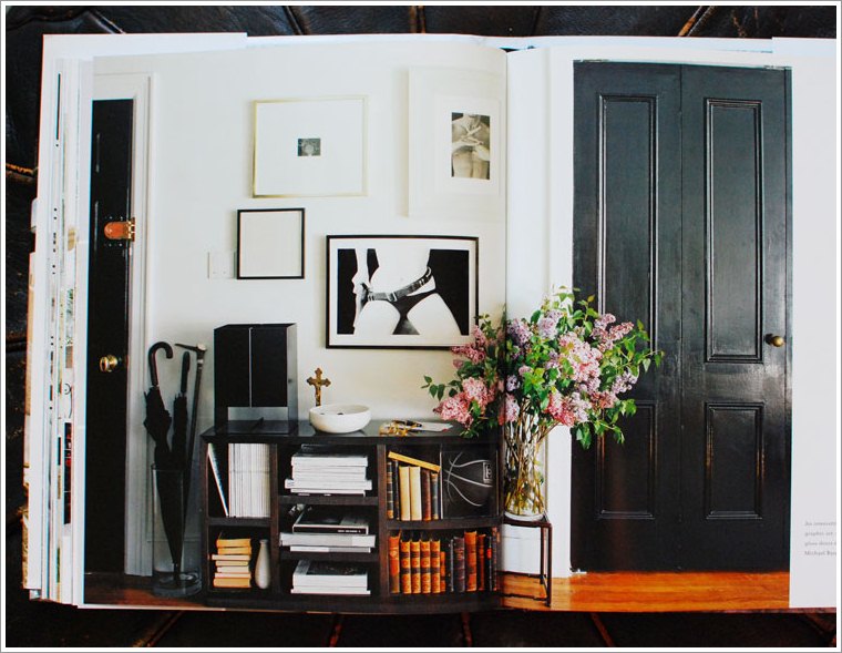
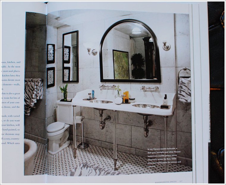
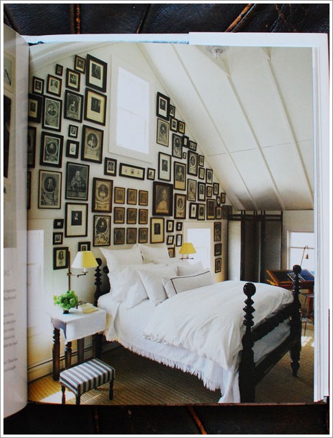
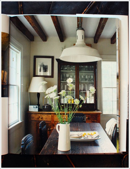
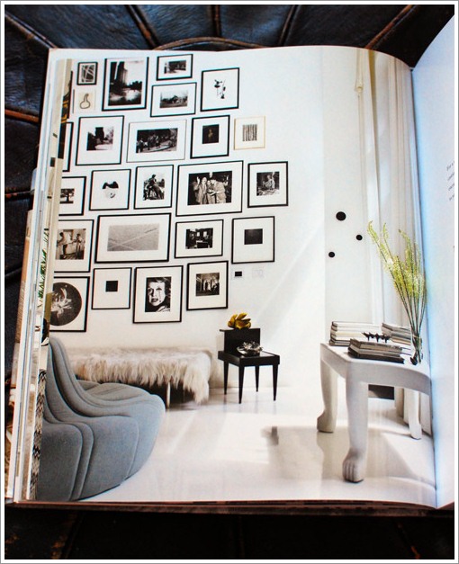
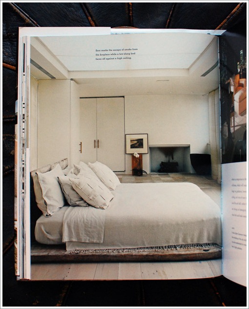
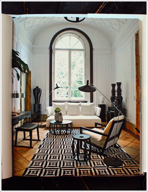
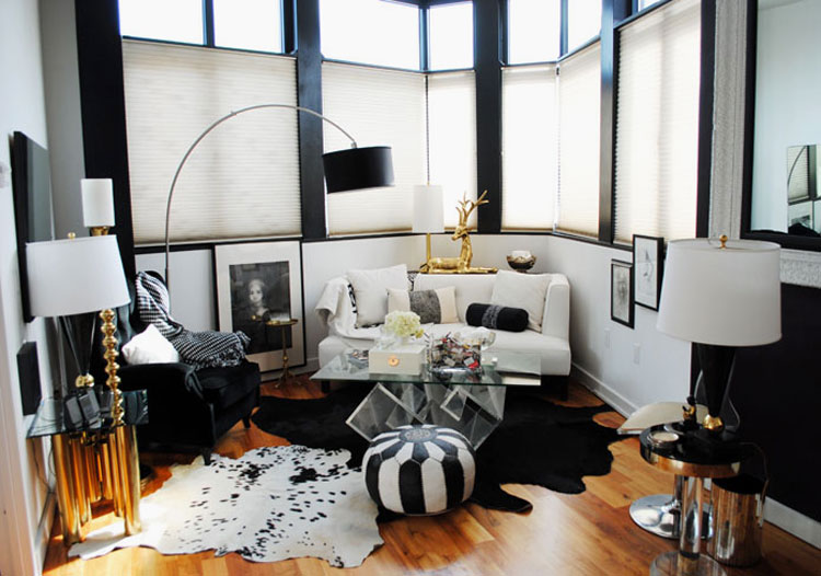
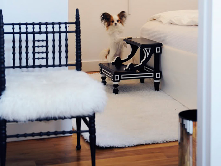
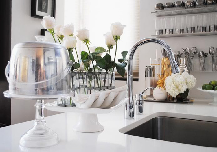
I was stoked to get my hands on a new book (out November 1st, from Clarkson Potter) by Celerie Kemble called Black and White (And a Bit in Between). Being a HUGE fan of black and white decor, this book was completely for me. It’s got a bit of everything, from classic to rustic to über modern. And I was pleasantly surprised to find some of my favourite black and white spaces – including photo #3 below (which Celerie also loves, as she has had it hung above her desk for years). There’s even a photo of Celerie’s to-die-for bathroom (photo #2 below). This book is a keeper, and I would highly recommend it to anyone with a love for this colour scheme. Get yourself a copy here or here (among others).
For Celerie Kemble and her acclaimed designer peers, the possibilities of black and white home decor are endless and suit any aesthetic. In BLACK AND WHITE (AND A BIT IN BETWEEN), Celerie welcomes readers into more than 75 homes, sharing advice on choosing the best paints and finishes; adding patterns, accessories, and collections; building an entire room scheme based on inspiration from nature; and even choosing the perfect accent colors.
P.S. More photos from the book and some Ottawa news after the jump
And for some quick local news – Mike from The Modern Shop emailed me that he is having a HUGE sale at the end of November. As I am a lighting whore and his shop sells all of my favourite brands, I’m booking it in my calendar. I think I’ll stock pile some fixtures (and maybe yet another chair) for the new house. 🙂


Two for tea
Posted on Fri, 4 Nov 2011 by KiM
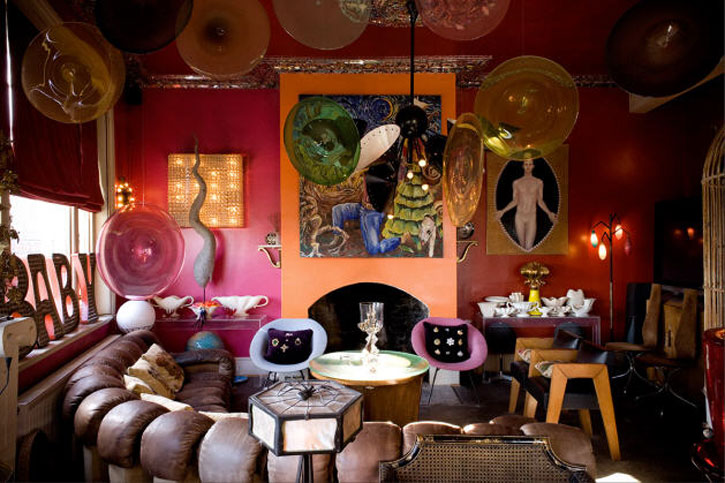
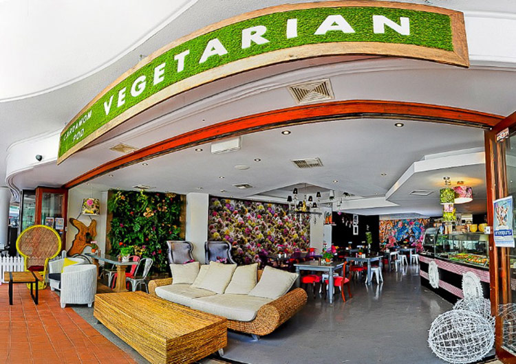
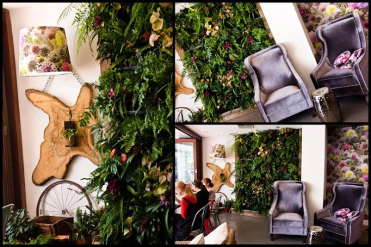
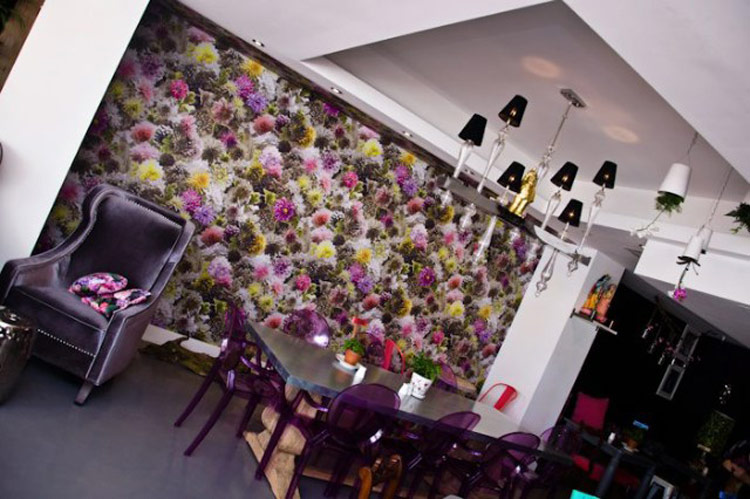
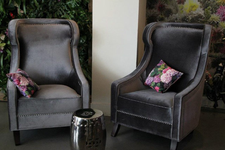
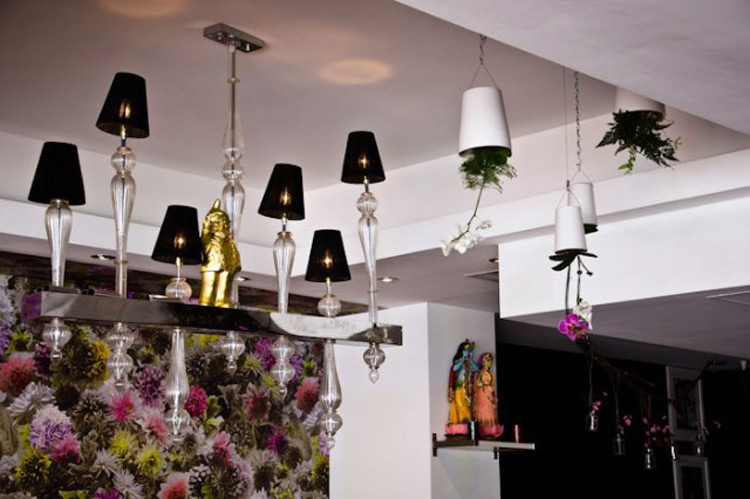
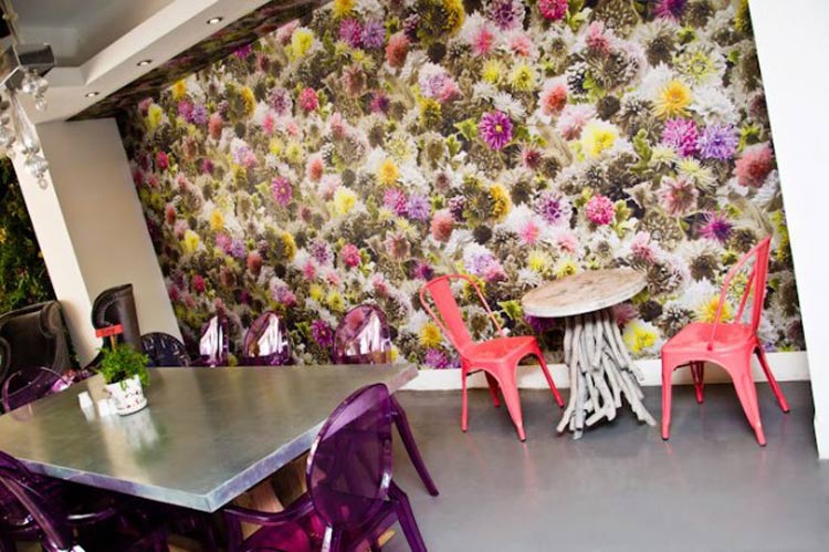
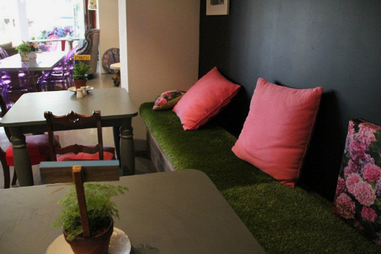
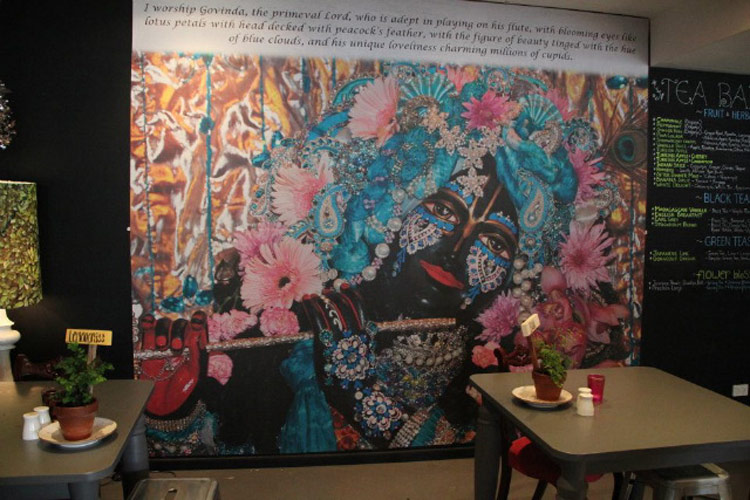
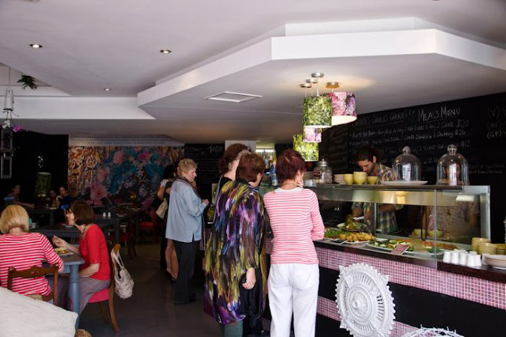
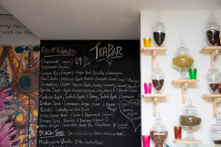
I thought I’d end off the work week with a funky café designed by Manju Pinnell. It’s the Cardamom Pod Vegetarian located in Broadbeach, Queensland. This café is beautiful – full of colour, life, gorgeous furniture and even a “grass” covered banquette! Great job Manju!

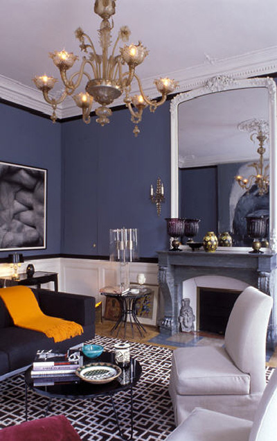
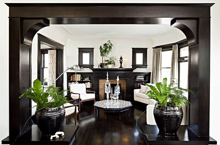
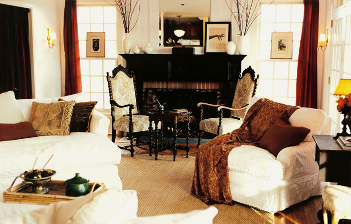
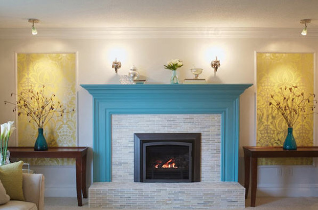
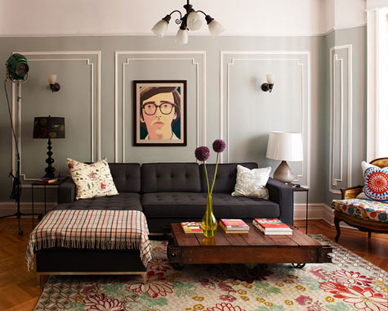
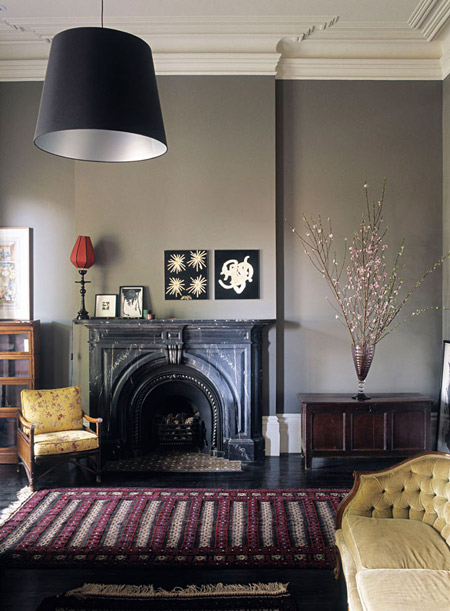
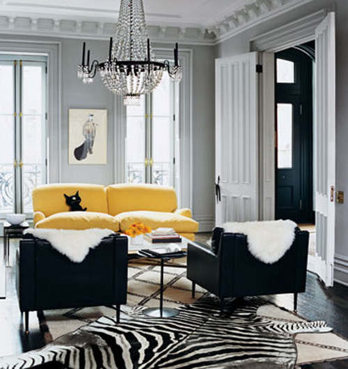
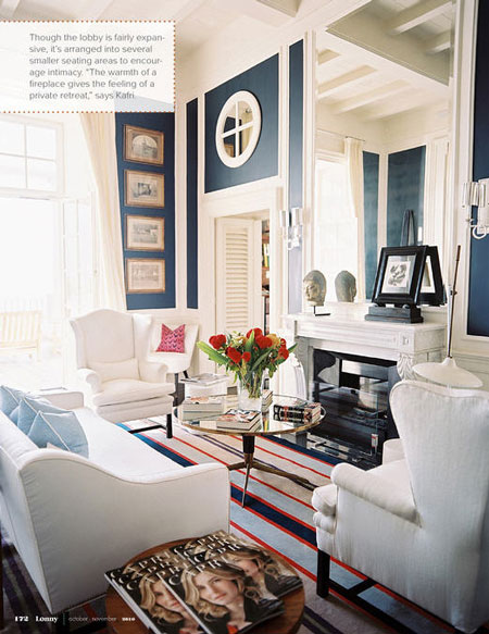
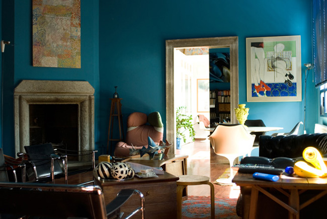
Reader request – going bold with trim
Posted on Fri, 4 Nov 2011 by KiM
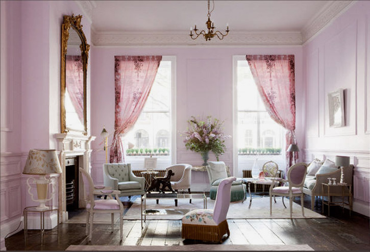
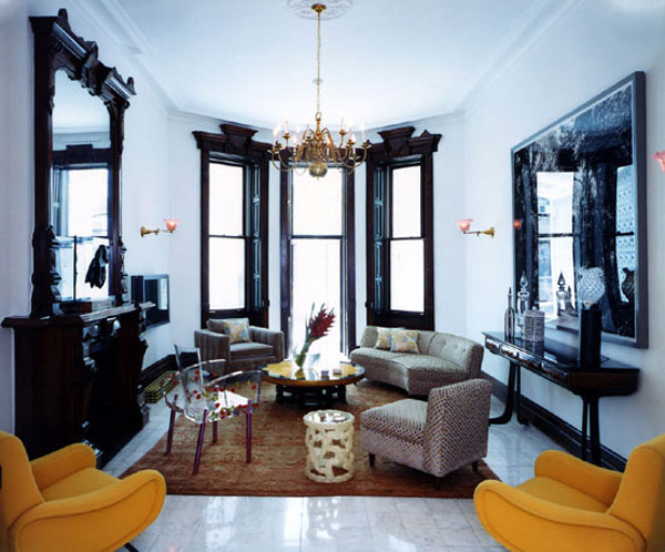
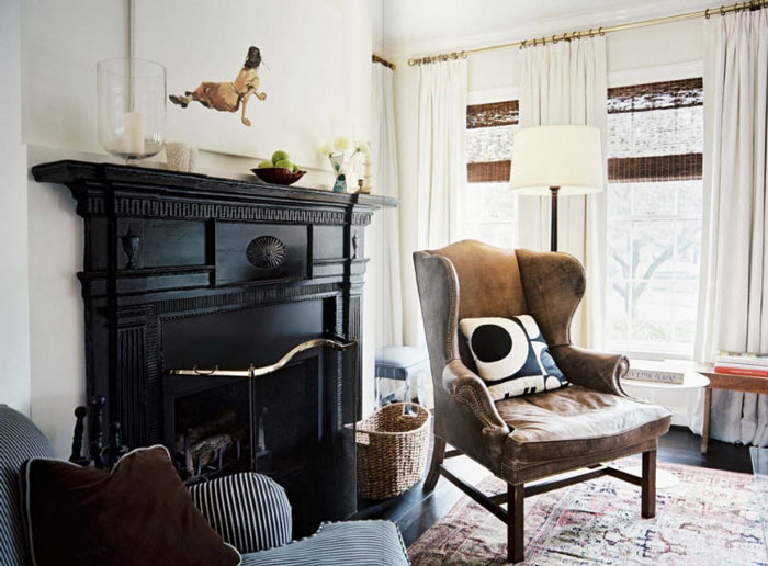
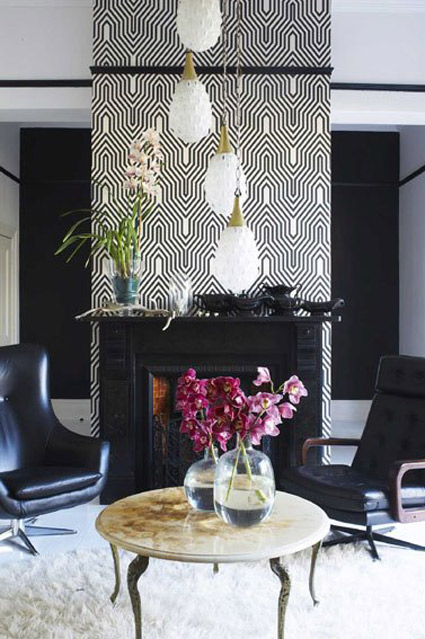
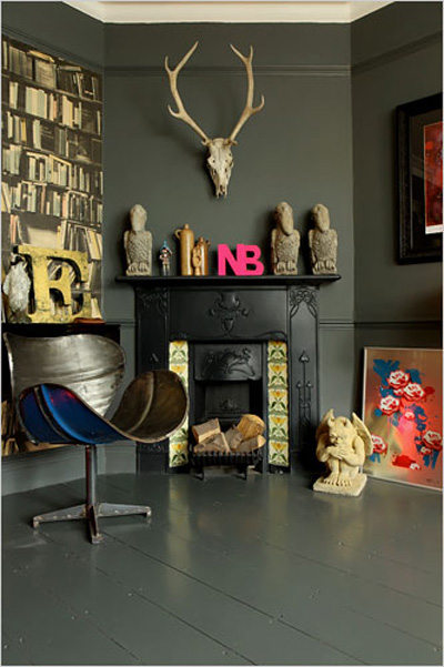
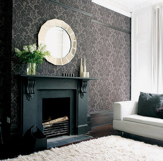
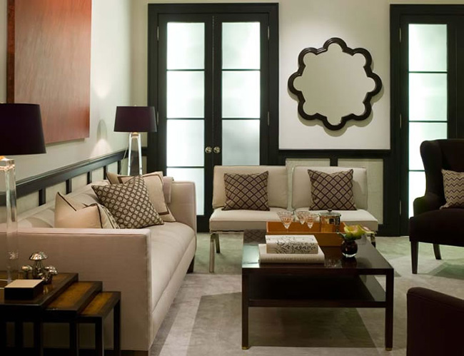
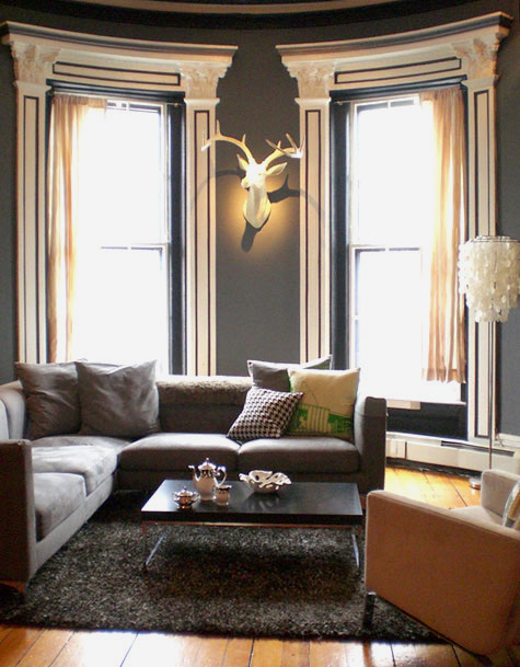
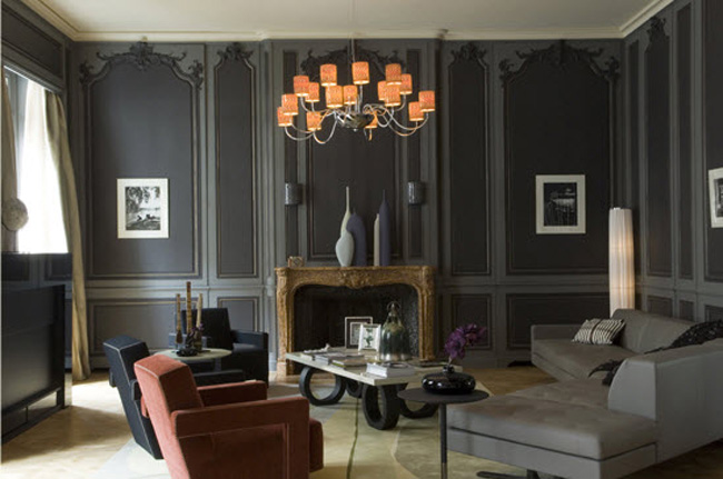
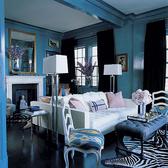
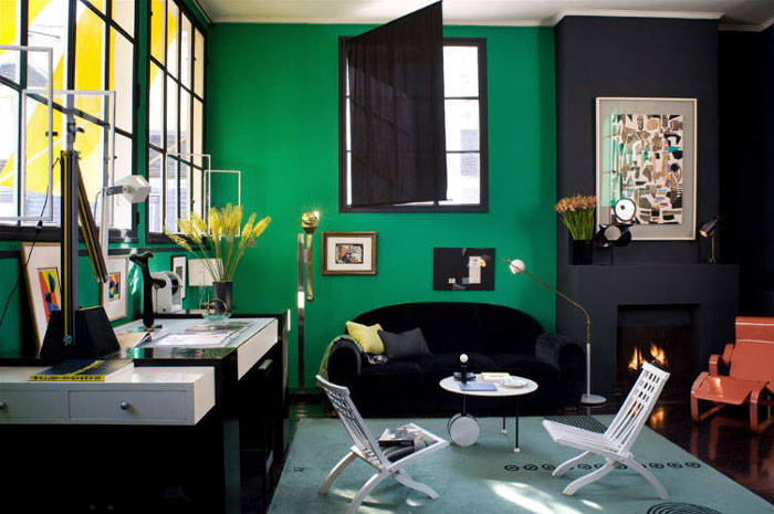
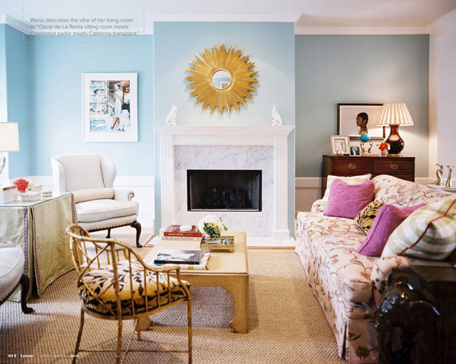
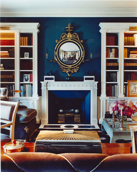
My apologies for not having done any reader request posts lately – stupid French test took over all my free time last month (and these posts usually take me a few hours to prepare). Anyway, this request came in a while ago from Ginger: I’ll admit, I’m somewhat Colour Intimidated. Typically, I go for BM Cloud White for trim and some degree of greige on the wall. It’s starting to look and feel somewhat uninspired. I recently finished up having alllll the floors in my house refinished and am now preparing to paint out my hall/living room/future nursery. I could blame being knocked-up or just Reno Exhaustion but I seriously cannot make up my mind over what to do. So I was wondering – can you show me some spaces that use dramatic colours (like black/charcoal/anything not BM Cloud White) on trim/fireplace mantles? I have an art deco space and I want to take it Over The Top. I am more than willing to help fellow DTI readers step away from the greige. But surprisingly this request turned out to be fairly difficult. Seems NO ONE really does much with trim except good ‘ol white. I did manage to find a few photos of trim and/or fireplaces NOT painted white (mostly black) and I added some photos of cool wall colours too that I found while looking for trim photos – and for some reason they are mostly blue. Odd. I am not a huge fan of any blues but these look fab with lots of trim detail. Hope this helps you step outside of your comfort zone Ginger!
Philip Galanes
Lonny
Elle Decoration SA
The New York Times
Pierre Yovanovitch
Jessica Helgerson
Jeff Andrews
Ami McKay
Inspace Locations
Phoebe Howard
Design*Sponge
Gerard Faivre Paris
Design*Sponge
Yatzer
Domino
Lonny
Elle Decor
Lux Productions
Lonny
Markham Roberts
AT Casa
Home of a glamourai
Posted on Thu, 3 Nov 2011 by KiM
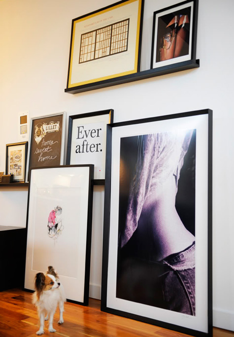
A couple of weeks ago I blogged a little peek into the home of fashion bloggers Jane and Judy Aldridge. Today I thought I’d share a little bit of Kelly Framel’s home. Her fashion blog the glamourai is one of my daily must-reads. Kelly’s NYC apartment is fabulous decked out in my favourite colours (black, white, brass and silver) with a glam Hollywood Regency vibe. And check out her adorable pooch!

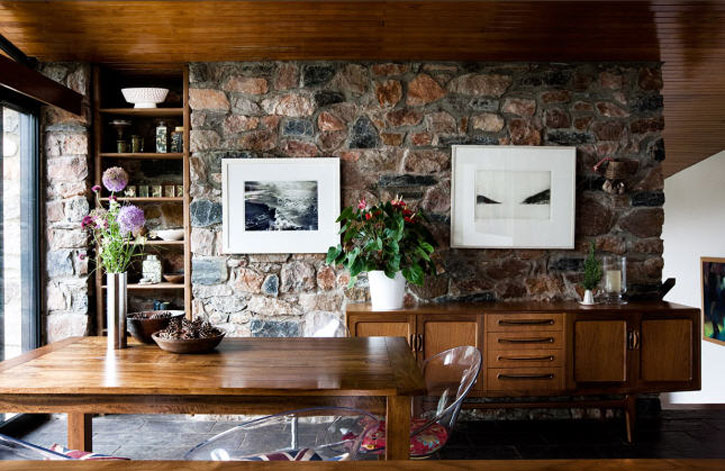
Paul Raeside update
Posted on Thu, 3 Nov 2011 by KiM
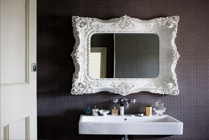
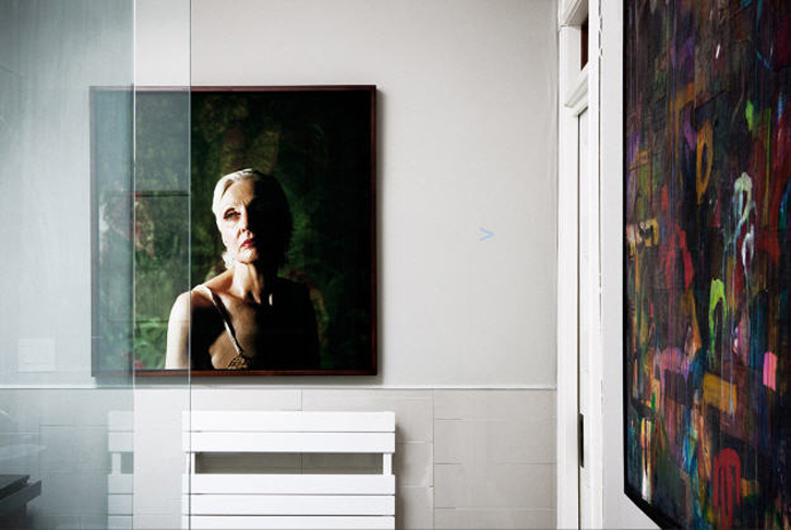
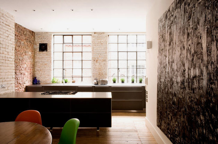
I have been a huge fan of Paul Raeside‘s photography for quite some time (Jo is as well) and always find his work so intriguing. Perfect compositions and OMG how he makes the natural light work in his favour so beautifully. On a side note, when I came across these photos I immediately sent the photo above to my husband, and told him we need to tile something in the new house with those beautiful black matte tiles.