Displaying posts labeled "Blue"
Chad Dorsey Design
Posted on Mon, 5 Apr 2021 by KiM
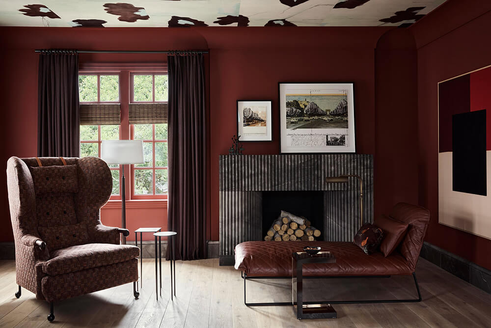
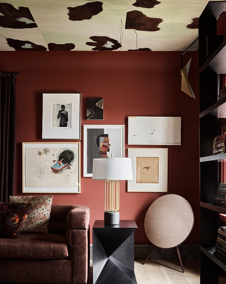
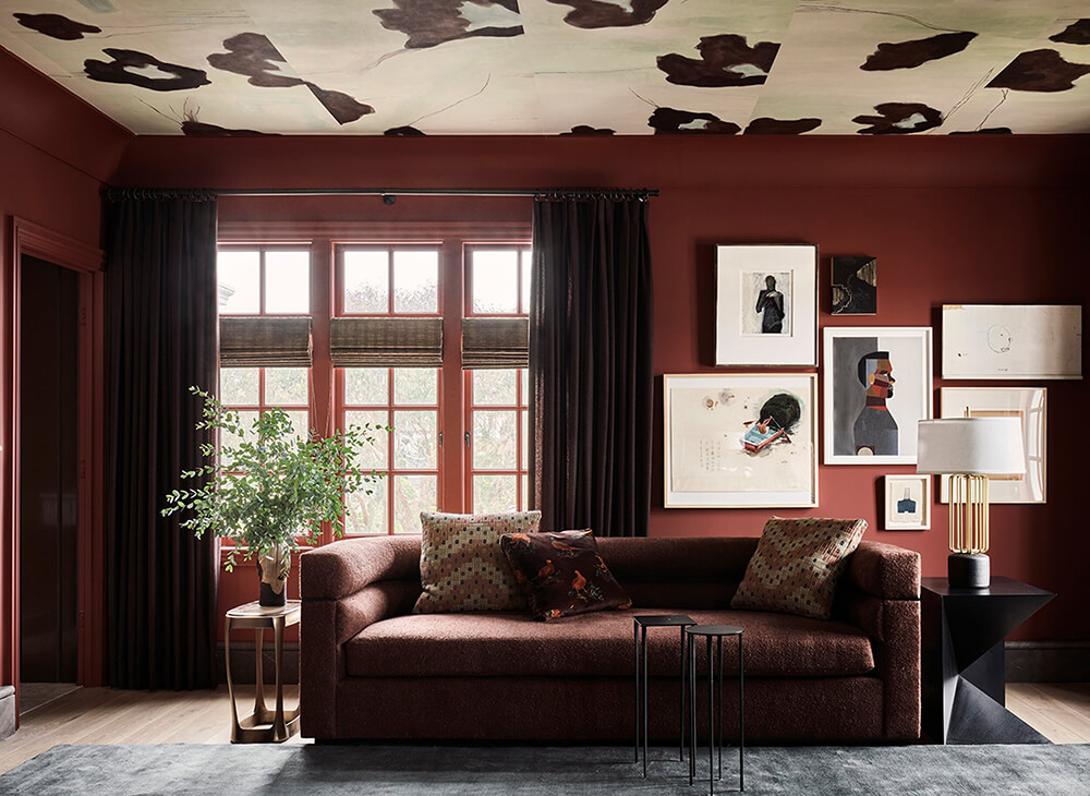
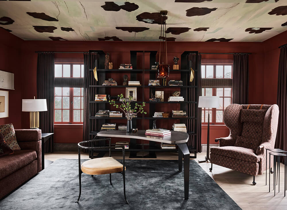
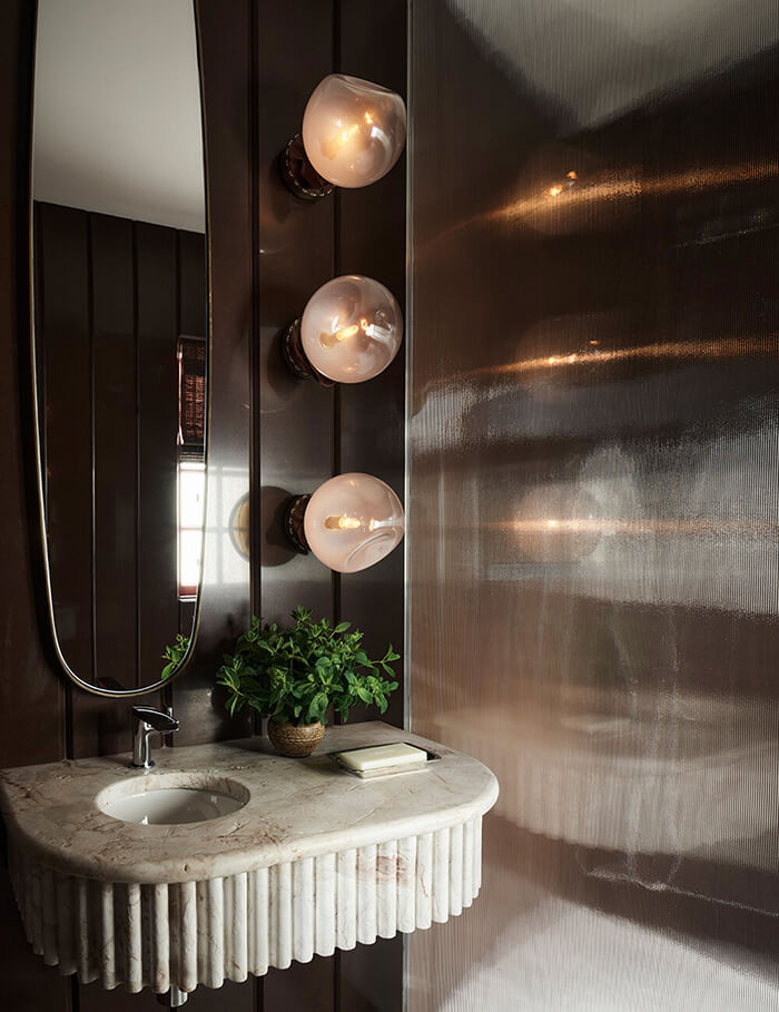
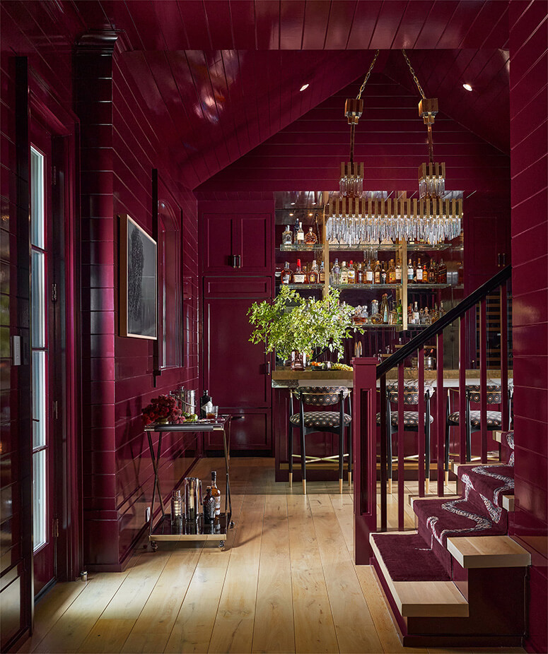
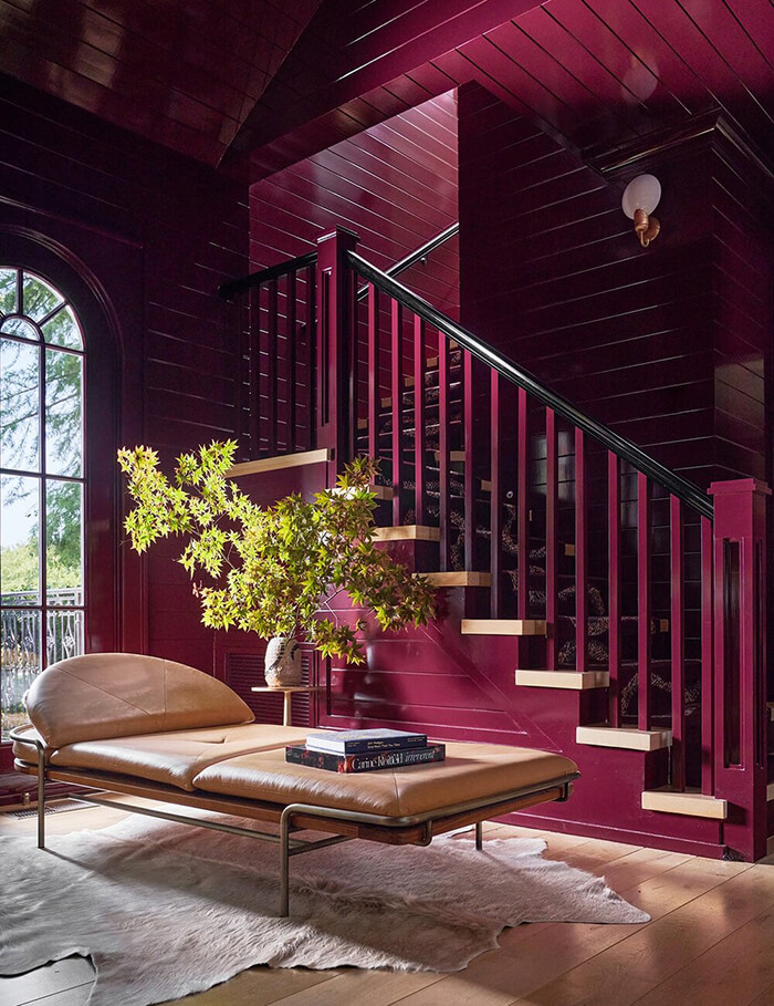
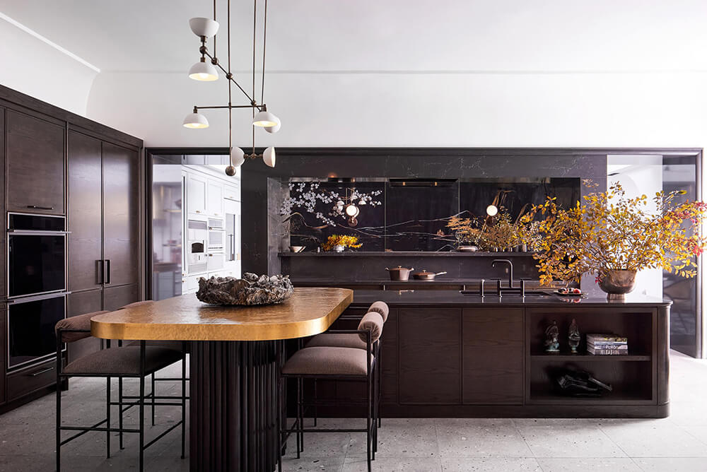
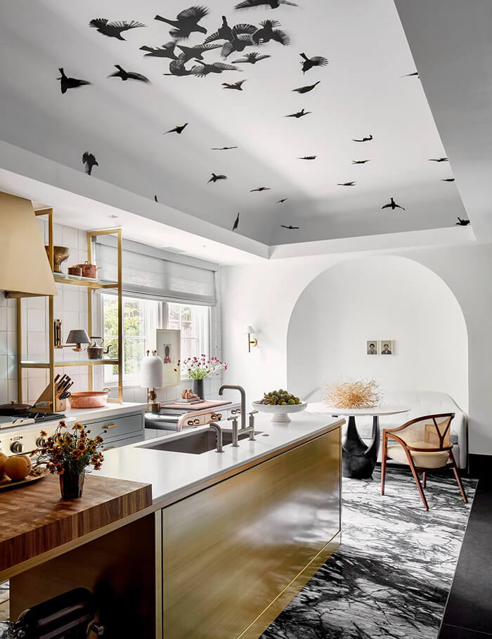
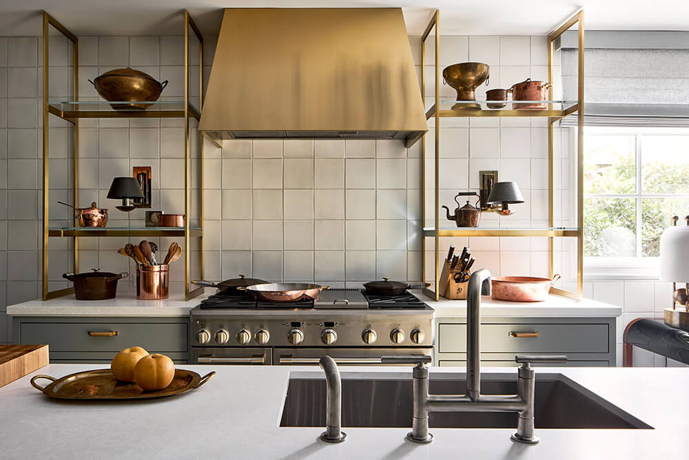
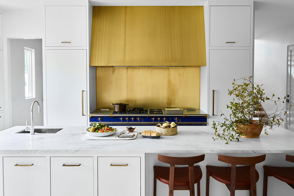
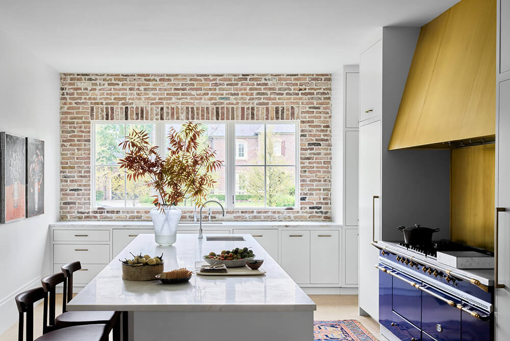
I really appreciate designers who set out to create wow moments in their designs. In the case of Chad Dorsey and “the listening room” it’s this sumptuous deep red/burgundy wall colour with matching furniture (Ginger Snap by C2 Paint). In his “covid nights” bar area it’s another punchy colour enveloping everything but the floor. Birds in a ceiling alcove, and a massive brass hood with royal blue stove in an all white kitchen are just a couple more from his portfolio. WOW indeed!!!
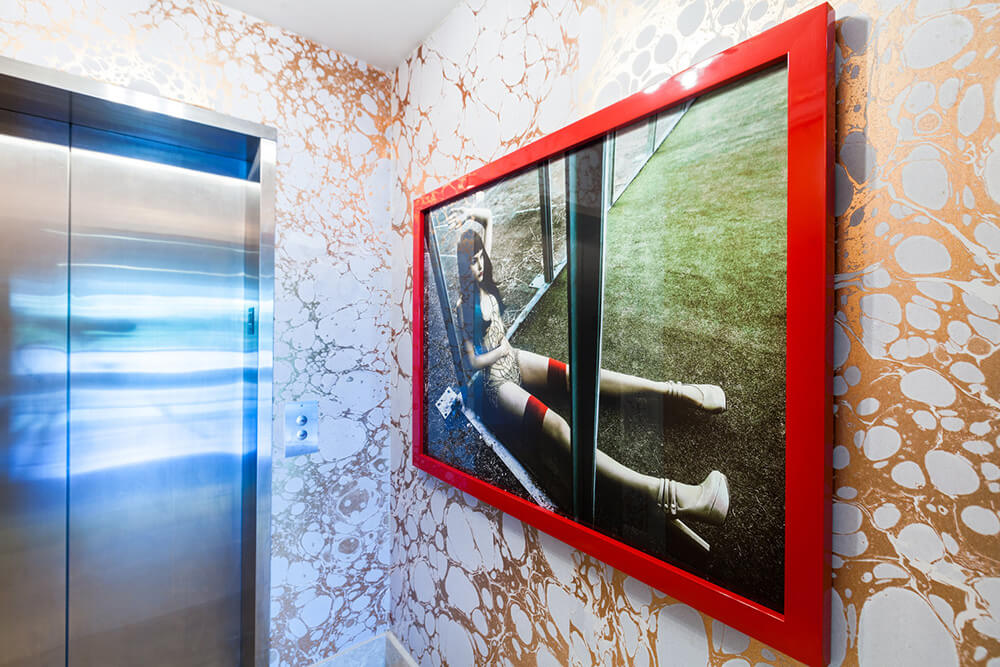
High intensity colour and pattern
Posted on Tue, 30 Mar 2021 by KiM
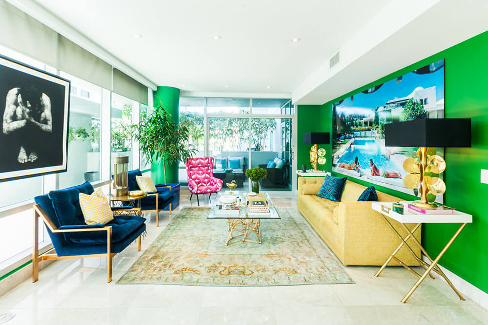
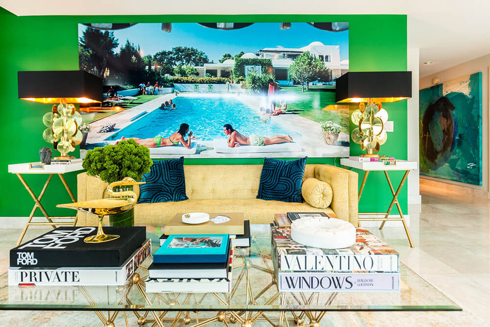
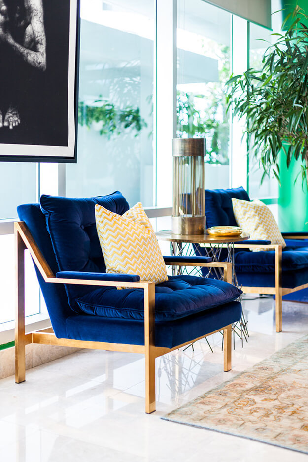
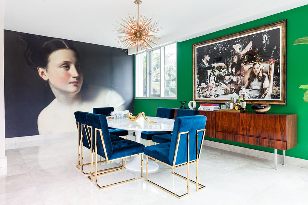
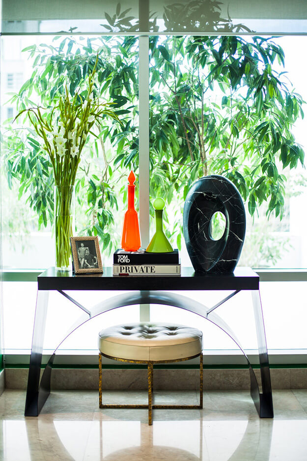
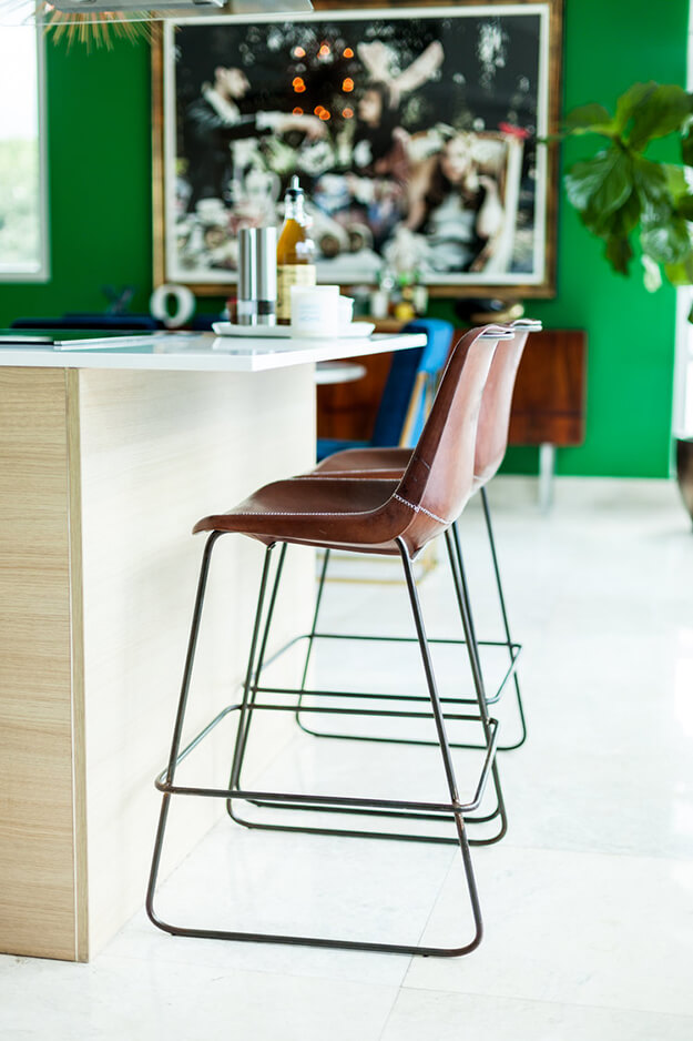
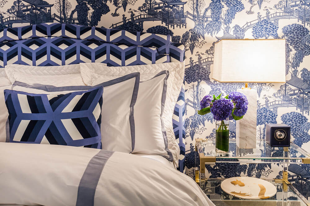
High intensity colours and patterns can be found throughout this San Juan, Puerto Rico condo designed by Stewart Rodriguez. From the moment you step out of the elevator you know you are in for a treat. The fashion editorial photograph of the glass encased model sets the tone of what’s behind the main door. Bold colors and art are the inspiration for this interior designer’s home. Fearless to kelly green walls that wrap the living room and dining room allow for the eclectic furniture pieces to come alive. The combination of a pink chair with the yellow sofa show how strong colors palettes can work perfectly in a space. The dining room is a stunning blend of modern with old romanticism. The “Study for ‘La Grande Jatte’, by Georges Seurat, 1884-5” in the National Gallery and the amazing fashion editorial piece of Alice in Wonderland by a Barcelona fashion photographer create a dining room to remember. The master bedroom chinoiserie wallpaper with the bold patterns on the upholstered bed make a bold move look peaceful and chic. This home is a great testament of living surrounded by the things you love…
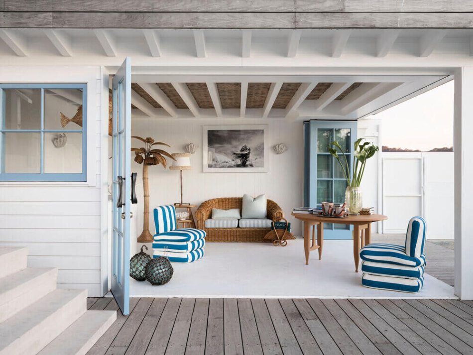
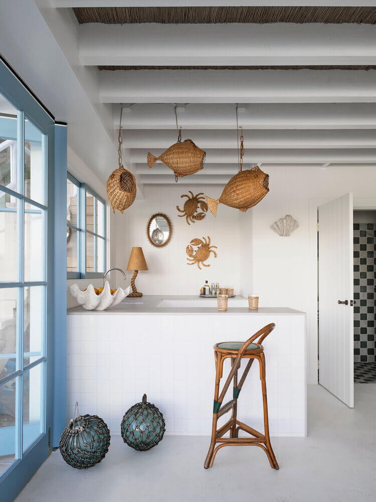
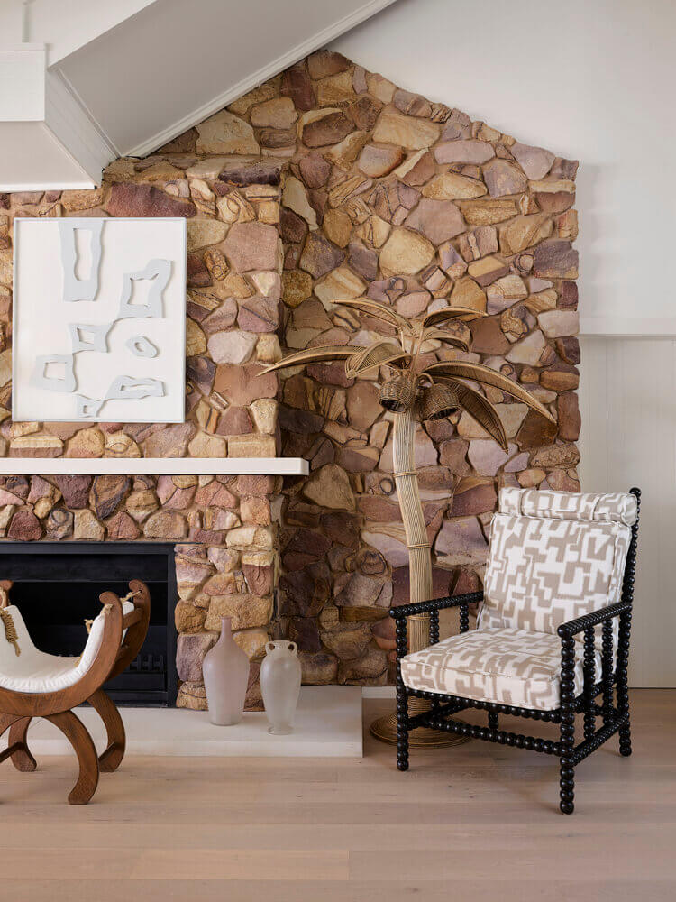
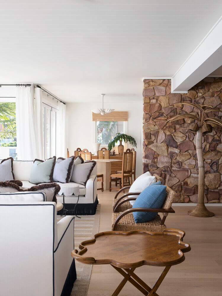
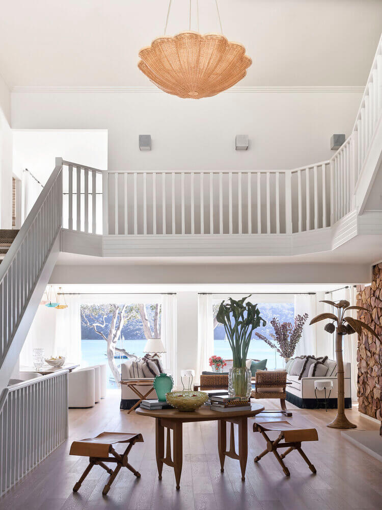
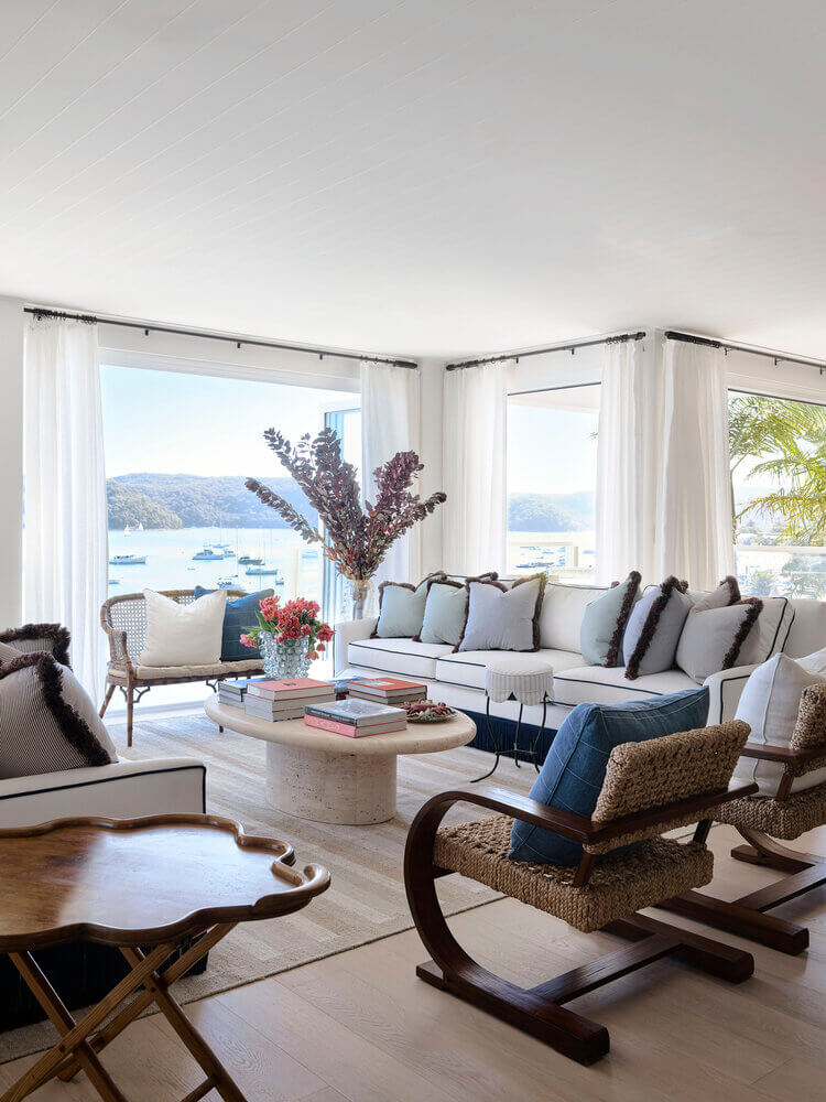
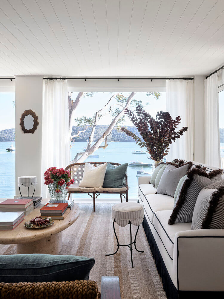
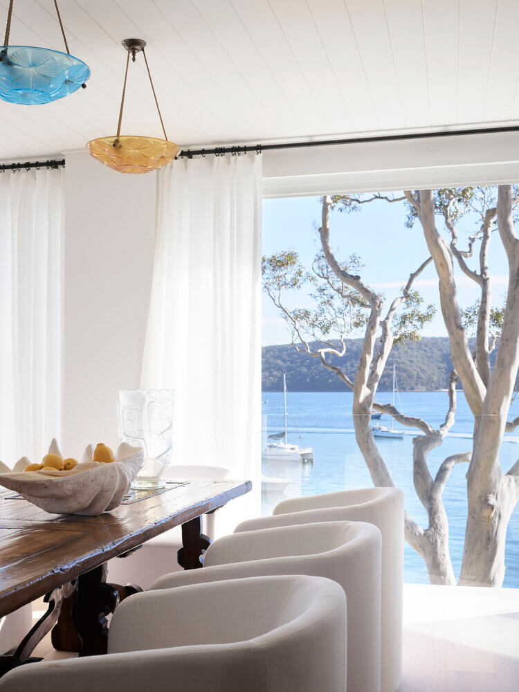
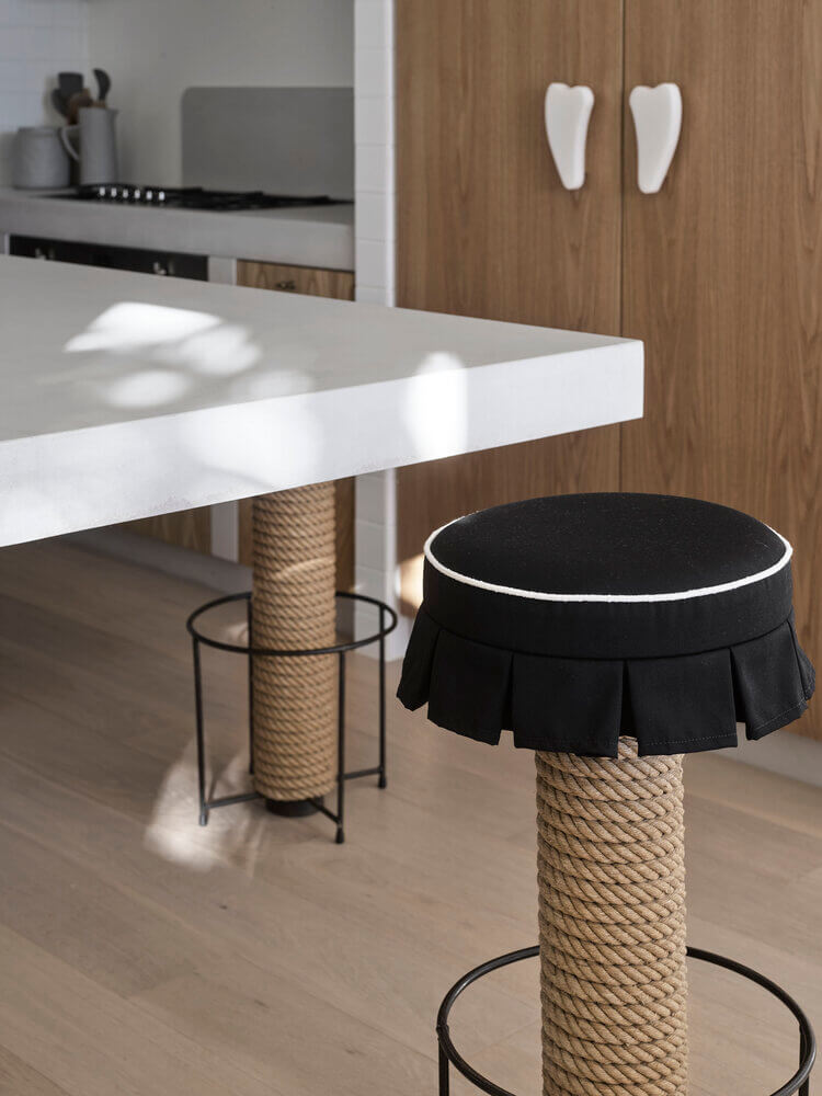
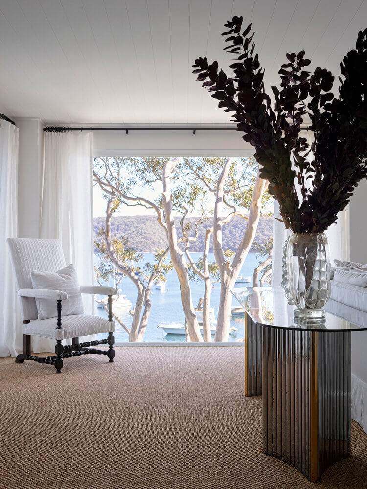
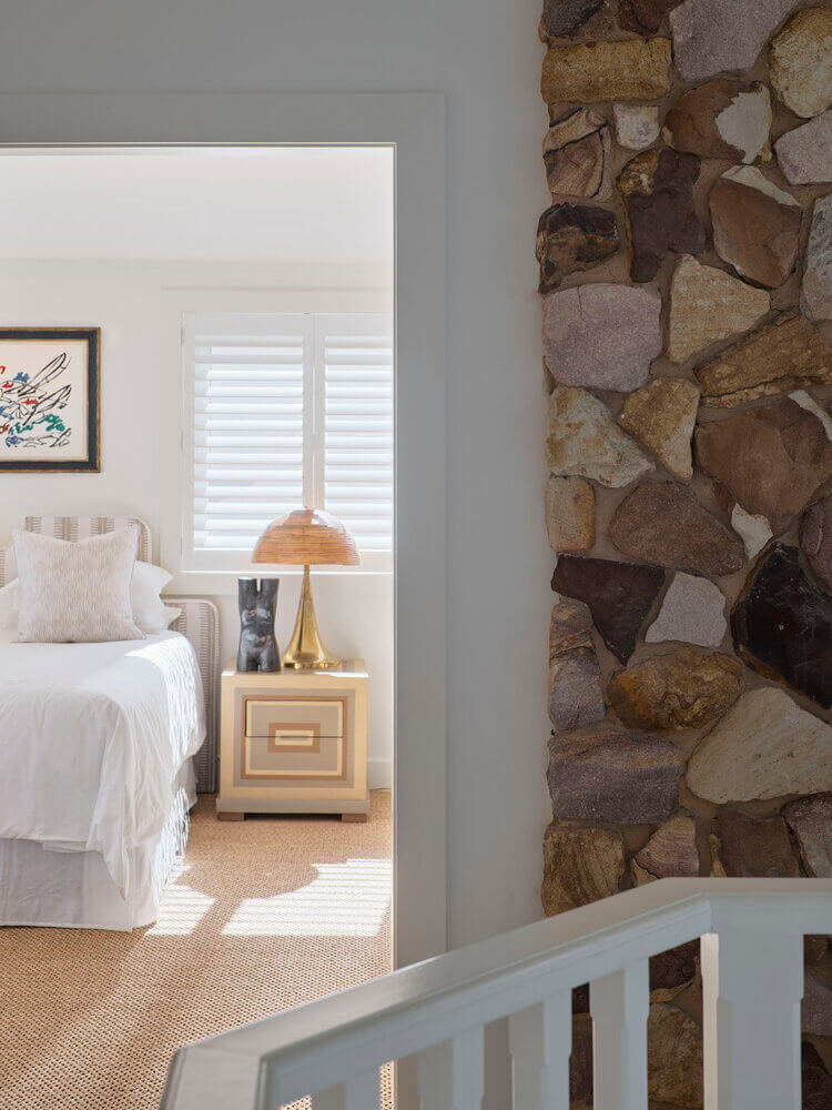
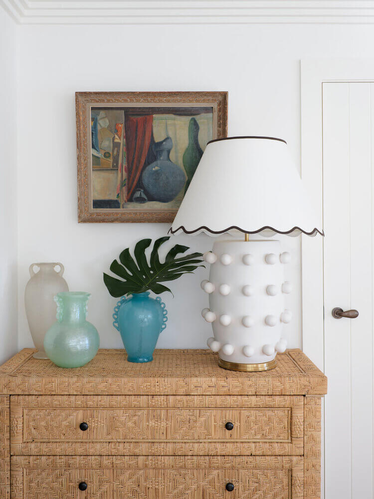
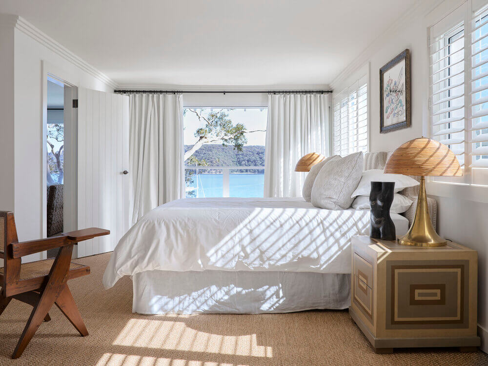
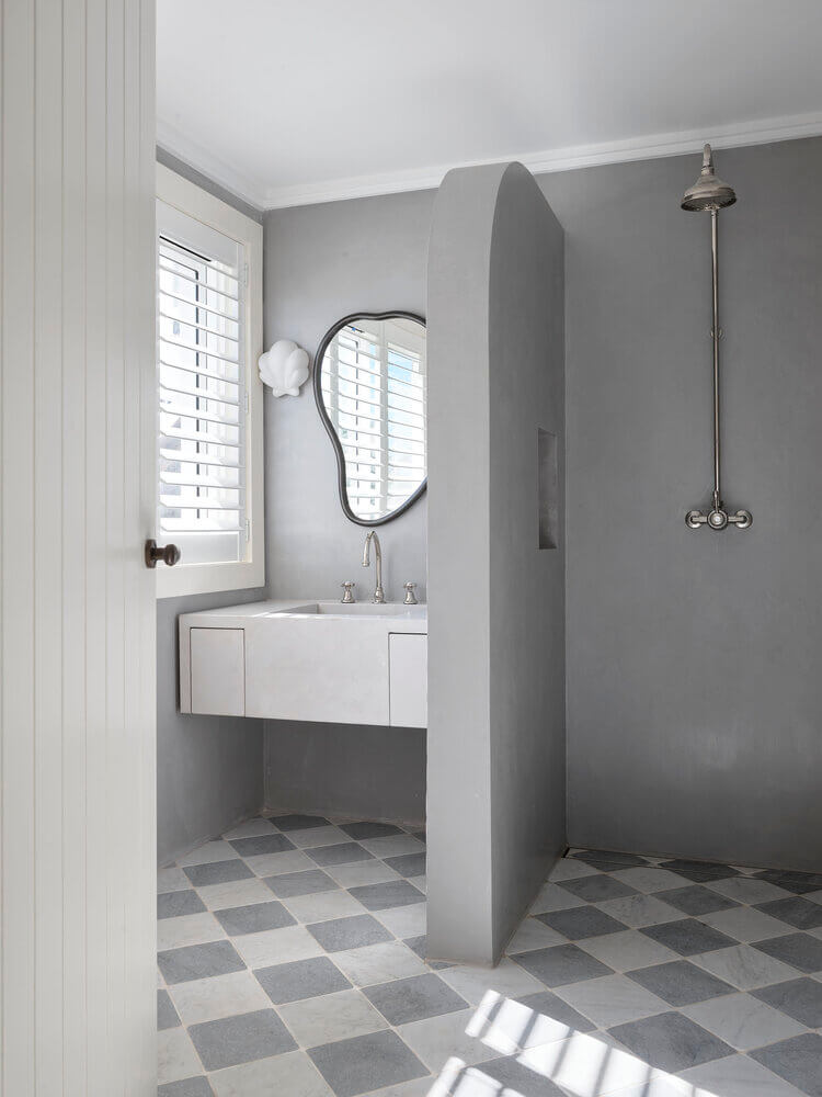
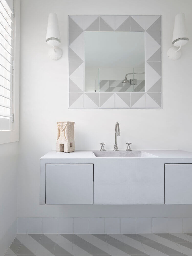
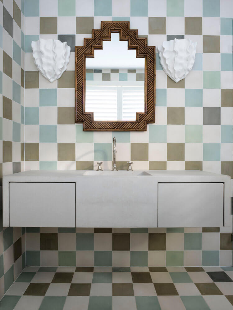
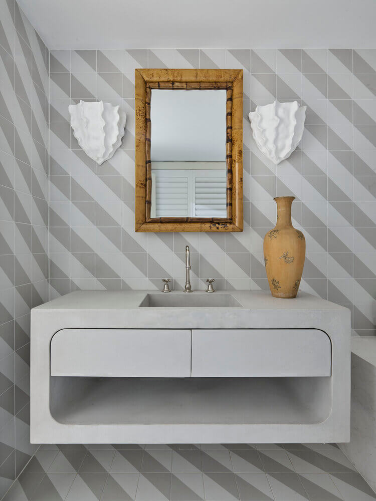
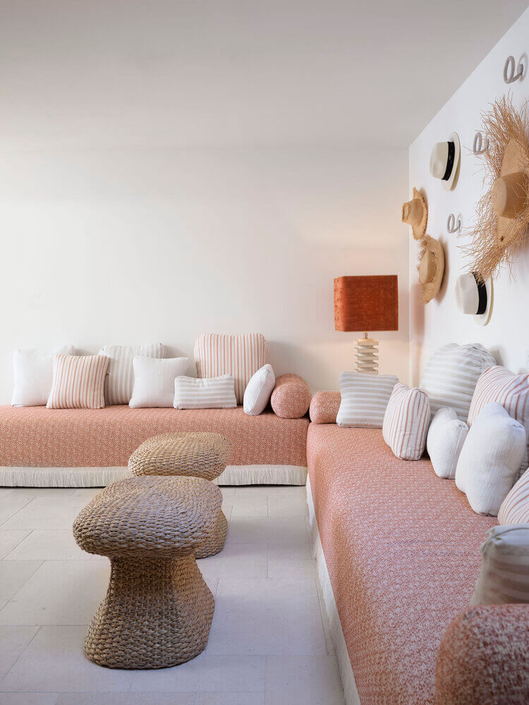
Palm Beach
Posted on Mon, 29 Mar 2021 by midcenturyjo
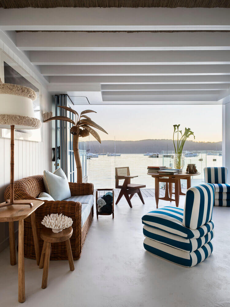
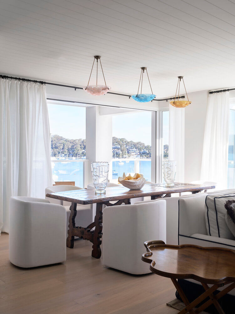
This Palm Beach holiday (the new term is “occasional”) home is no beach shack. Six bedrooms, seven bathrooms and three kitchens were just the start of what was redesigned in this sprawling 80s home. Sydney interior designer Tamsin Johnson has drawn on materials such as stone, timber and rattan with an eclectic mix of vintage and bespoke pieces in blues and neutral hues.
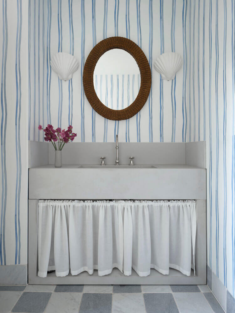
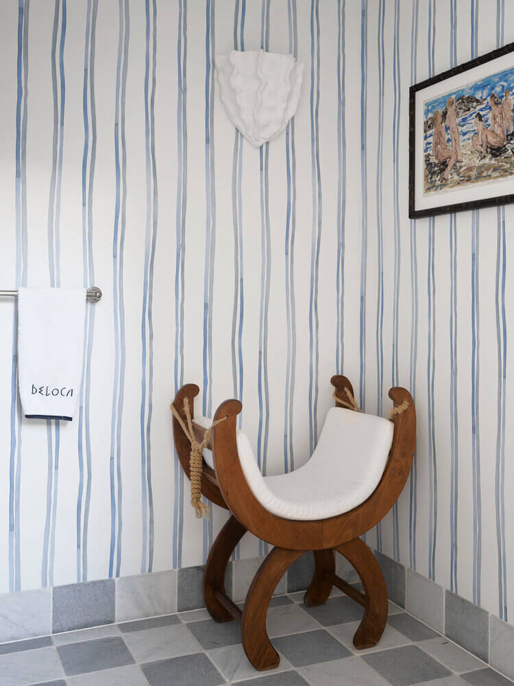
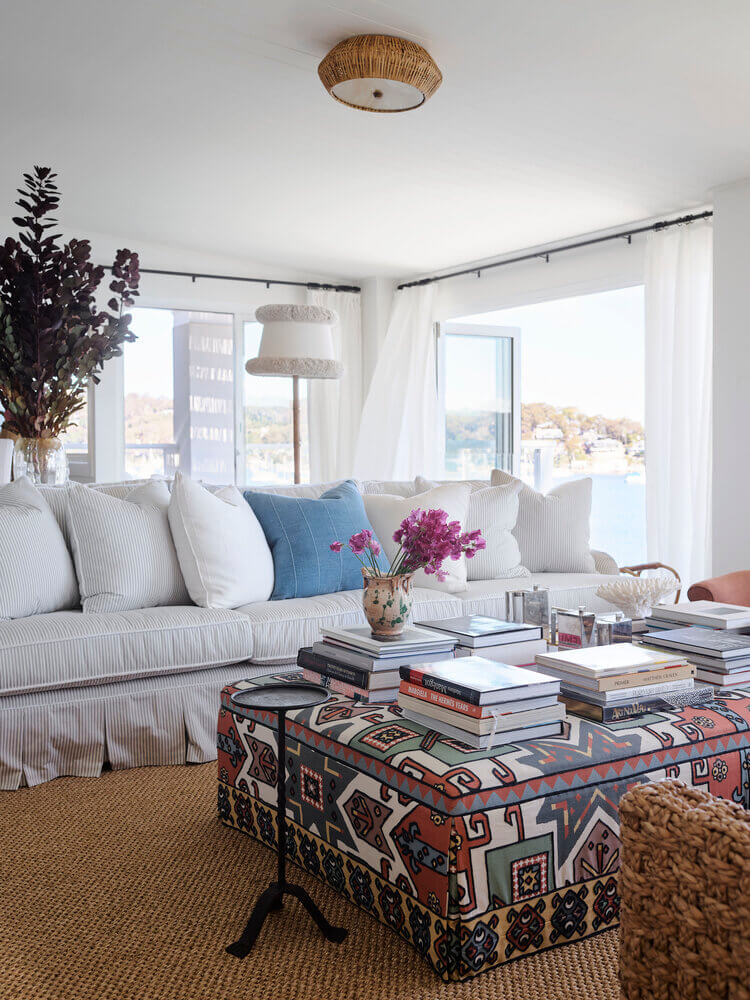
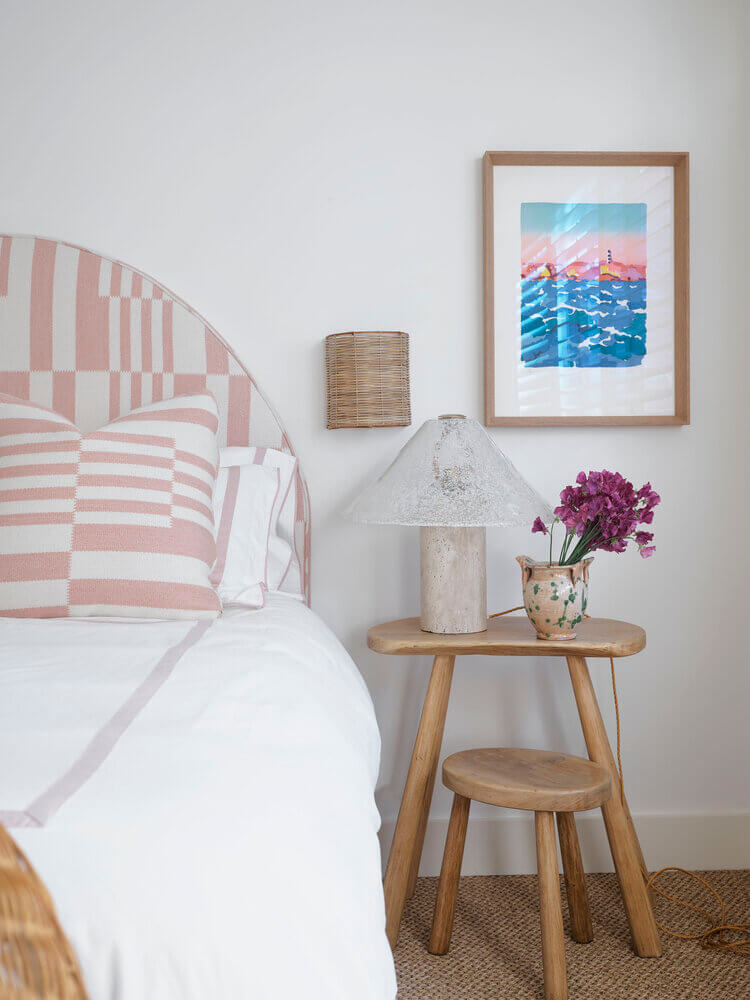

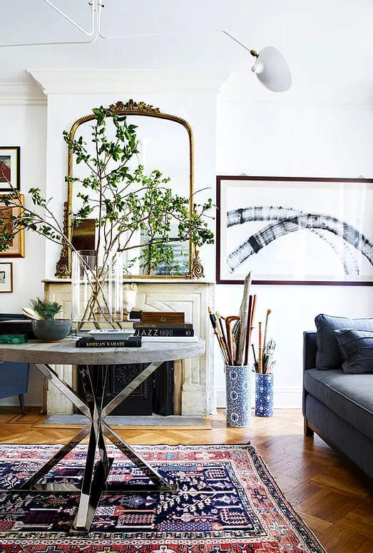
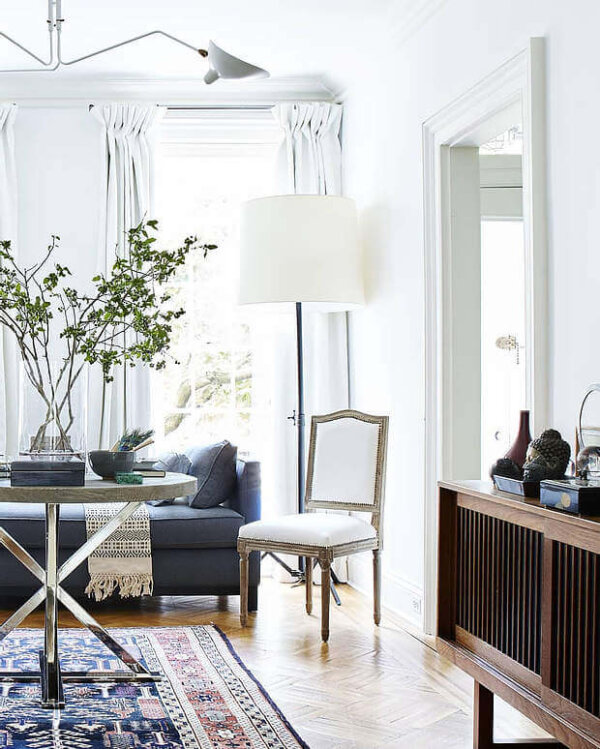
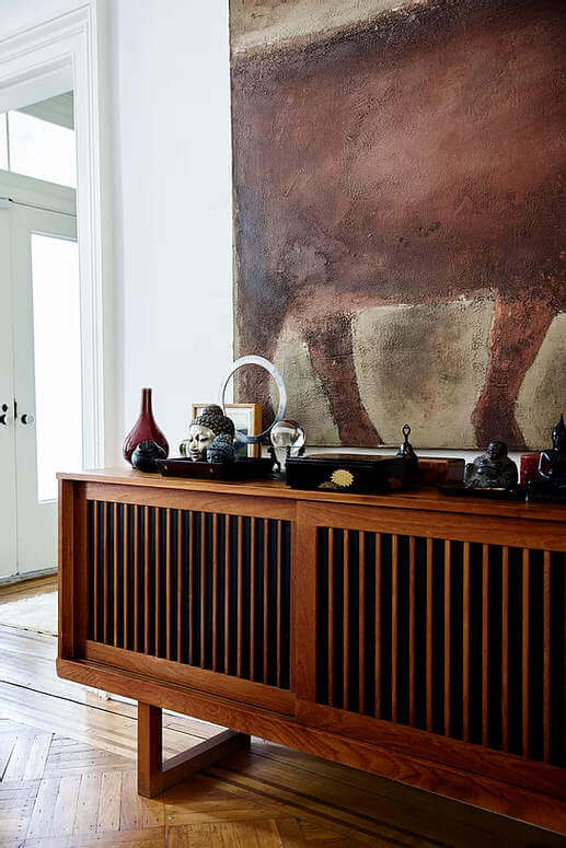
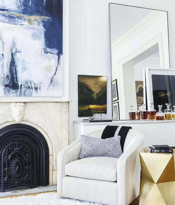
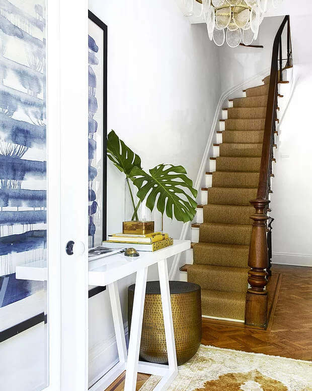
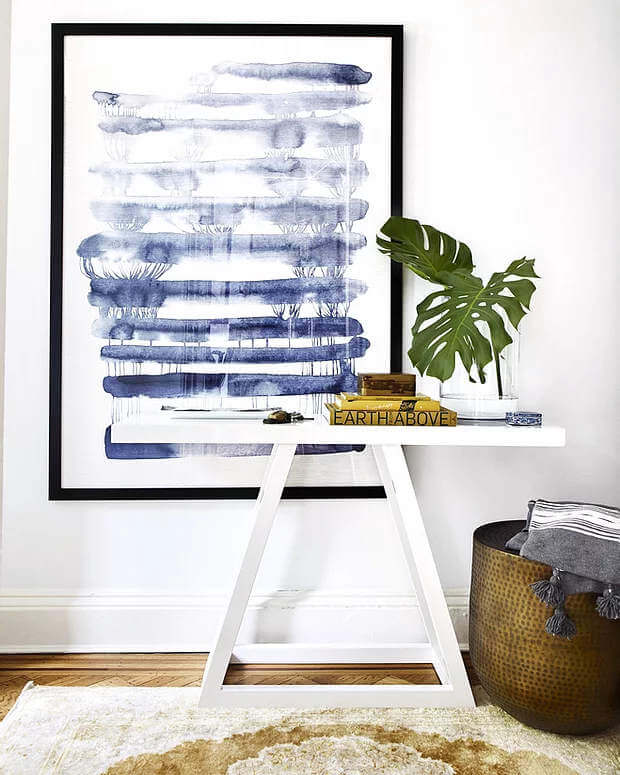
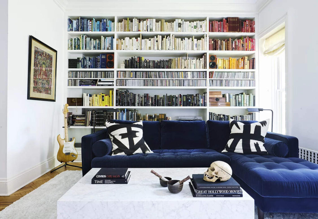
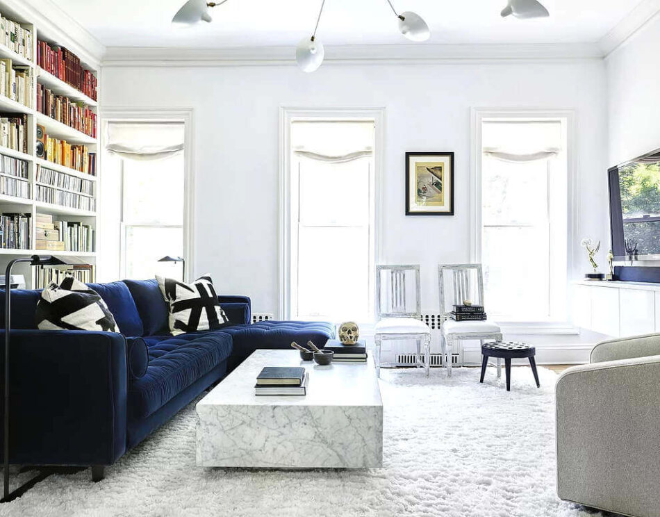
Feeling blue
Posted on Thu, 25 Mar 2021 by midcenturyjo
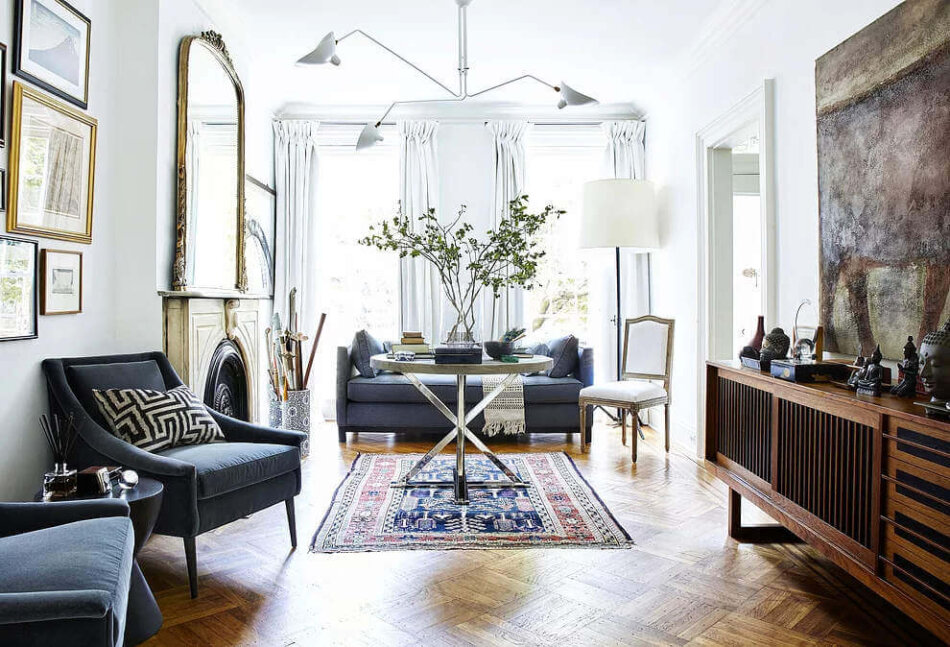
I’m not really feeling blue. I’m feeling the blues. Bright white rooms are the perfect foil for the rich accent blues. And what goes with blue? Why brown of course and that brown mid century console with the rich earthy tones of the large abstract artwork is the perfect balance. Another great house by New York-based interior designer Crystal Sinclair.
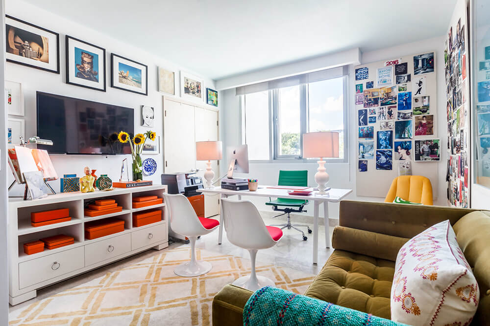
Maximalism with colour and pattern
Posted on Wed, 24 Mar 2021 by KiM
WOW there is alot going on in this home and I REALLY love it. Zoë Feldman Design took a very unique approach with the choices of colours and patterns throughout the home and the result is alot of fun and fabulously eclectic. Also, if you ever doubted the power of high gloss paint….
Color, pattern, & texture fill this eclectic Spring Valley home. Our client’s, fans of all things British, fashion, and believers in the “more is more” adage, quickly challenged us to find our inner maximalists. However, the real task was to create cohesion in such a layered and whimsical space. Our goal was to show enough restraint, without sacrificing any interest, to curate a natural relationship between the spaces. We utilized patterns and colors that one may not typically view as neutral to create a sense of layered complexity. In the entry, the leopard print stair runner serves as an organic neutral that enhances the effect of the floral patterned wallcovering. Throughout the home, small scale pattern serves as a complimentary juxtaposition to larger scale prints in a way that a solid would never be able to achieve. The kitchen serves as relief, a sort of palette cleanser, by using tonality over prints. The entire space is a study in balance leaving one to question everything they ever thought was true about neutral.
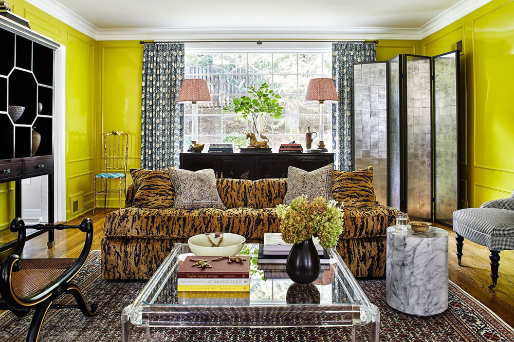
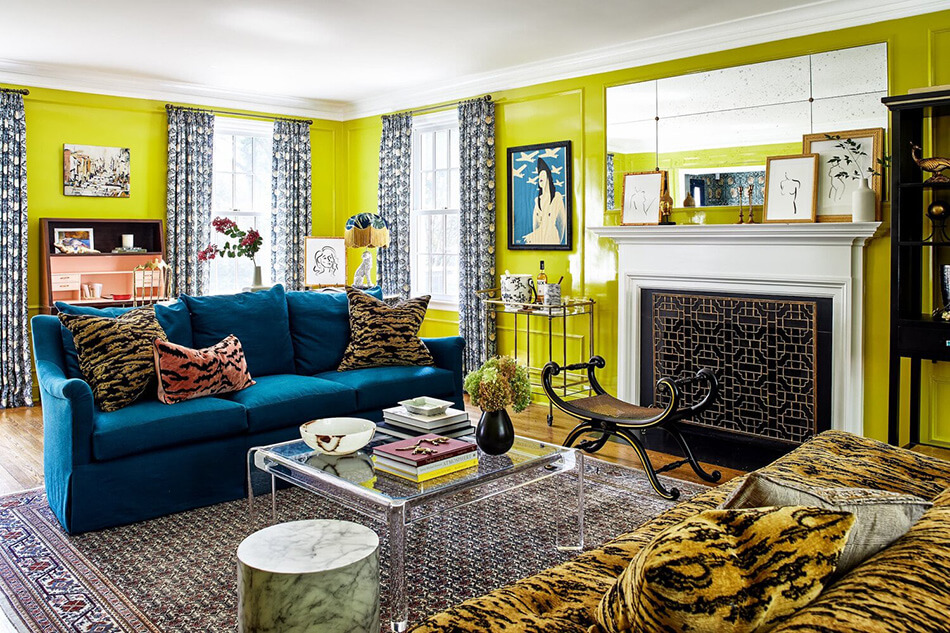
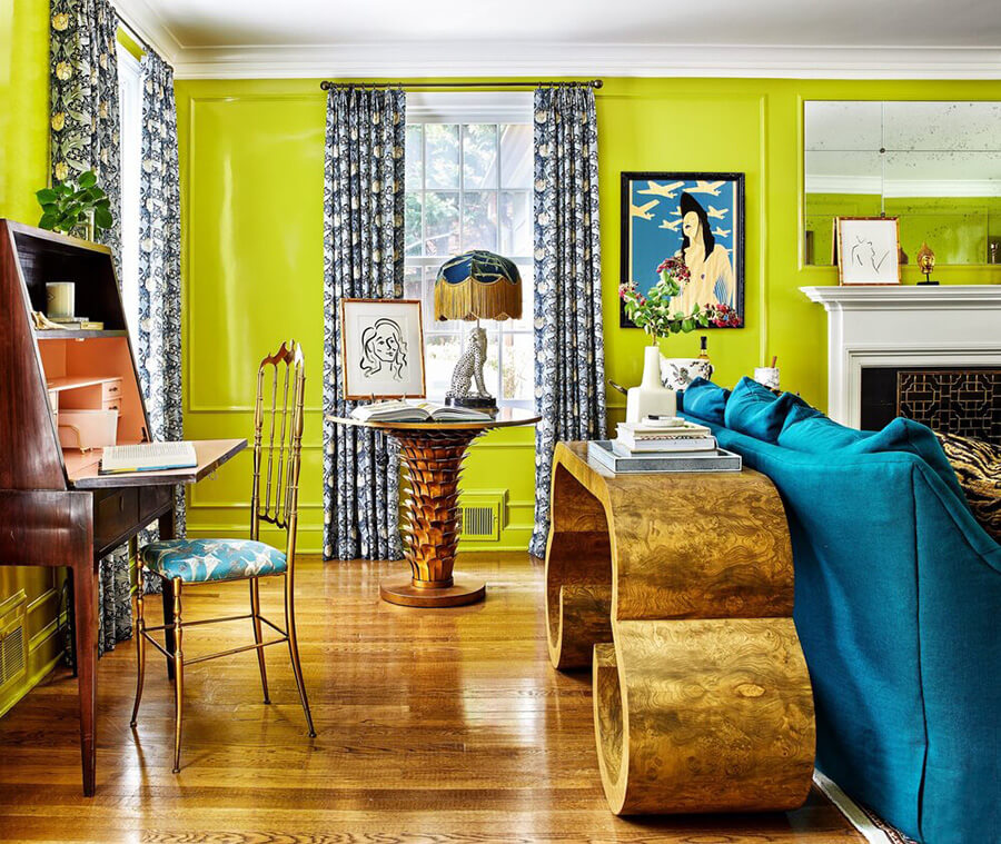
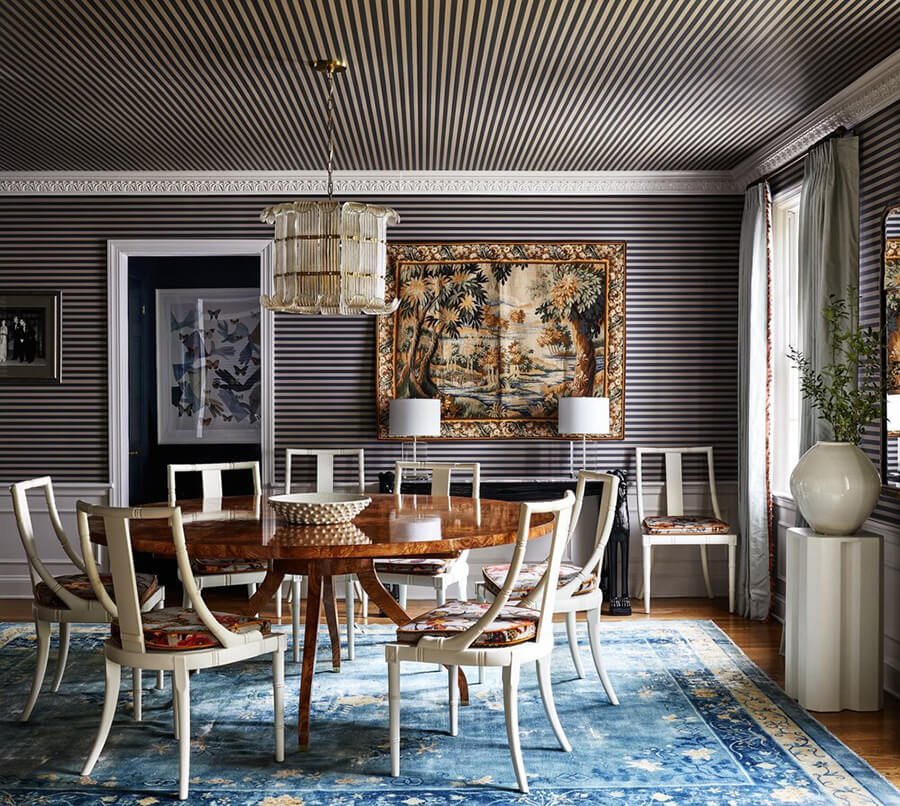
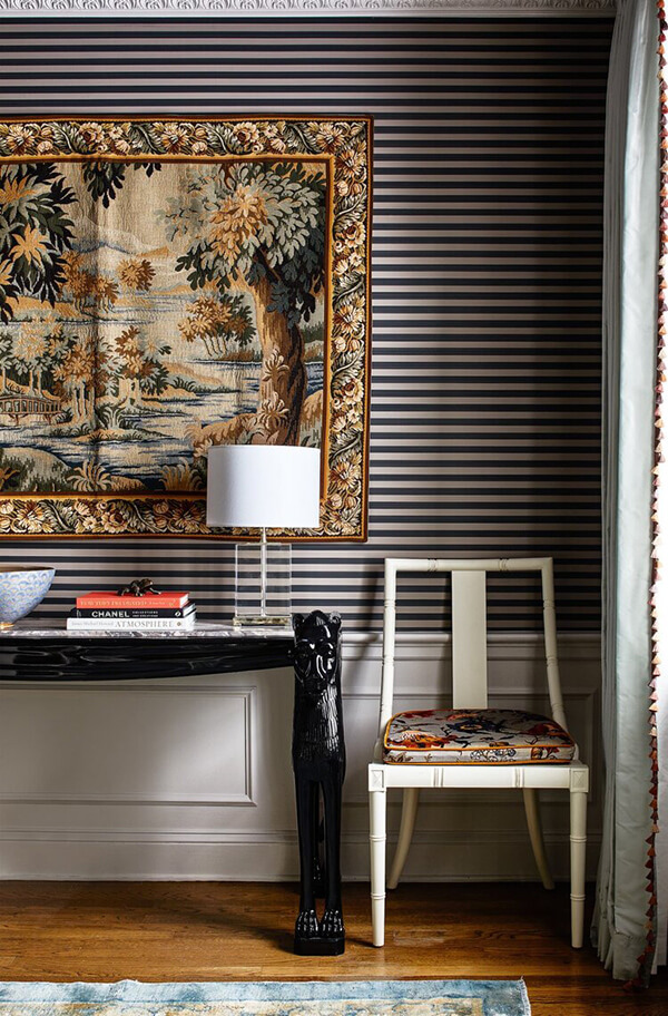
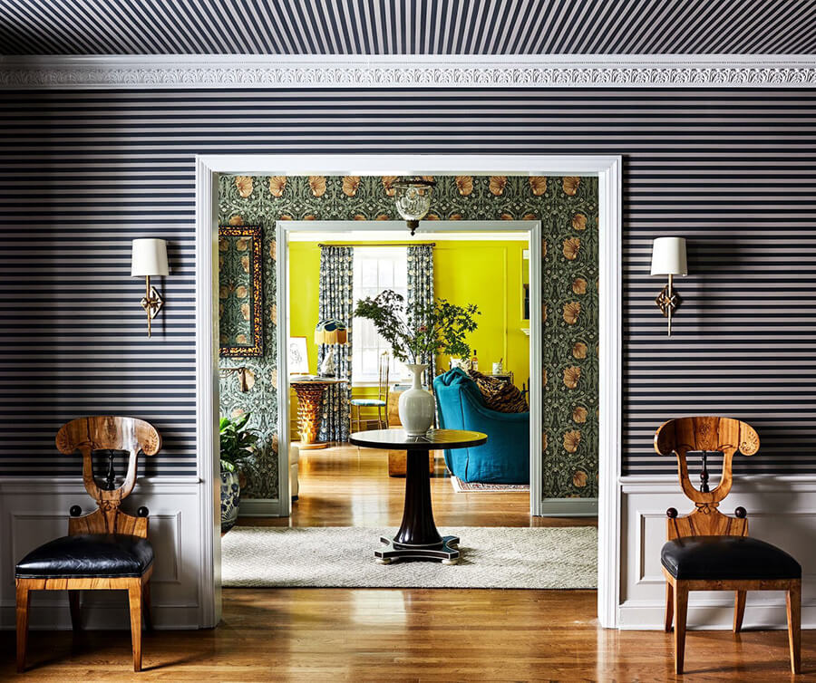
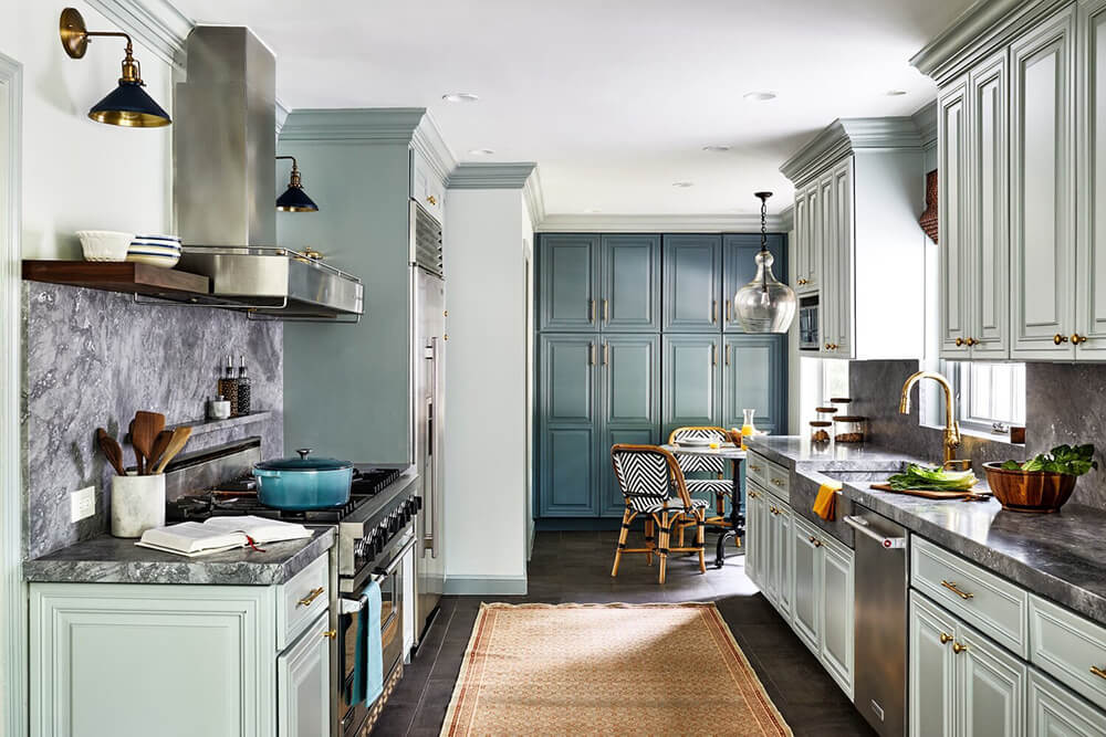
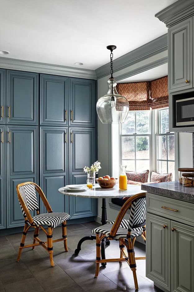
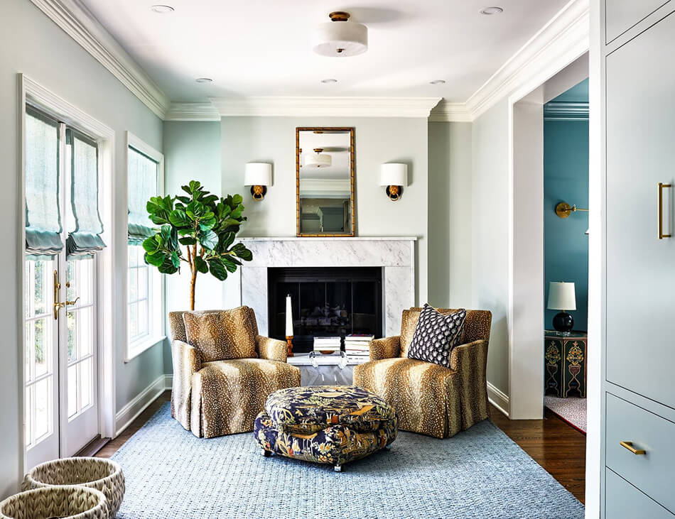
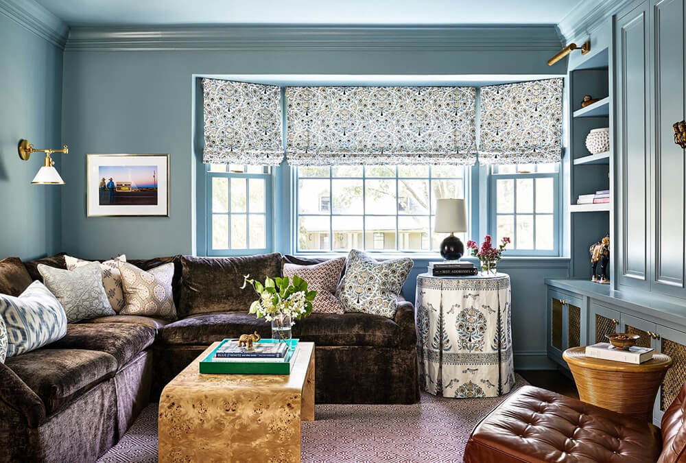
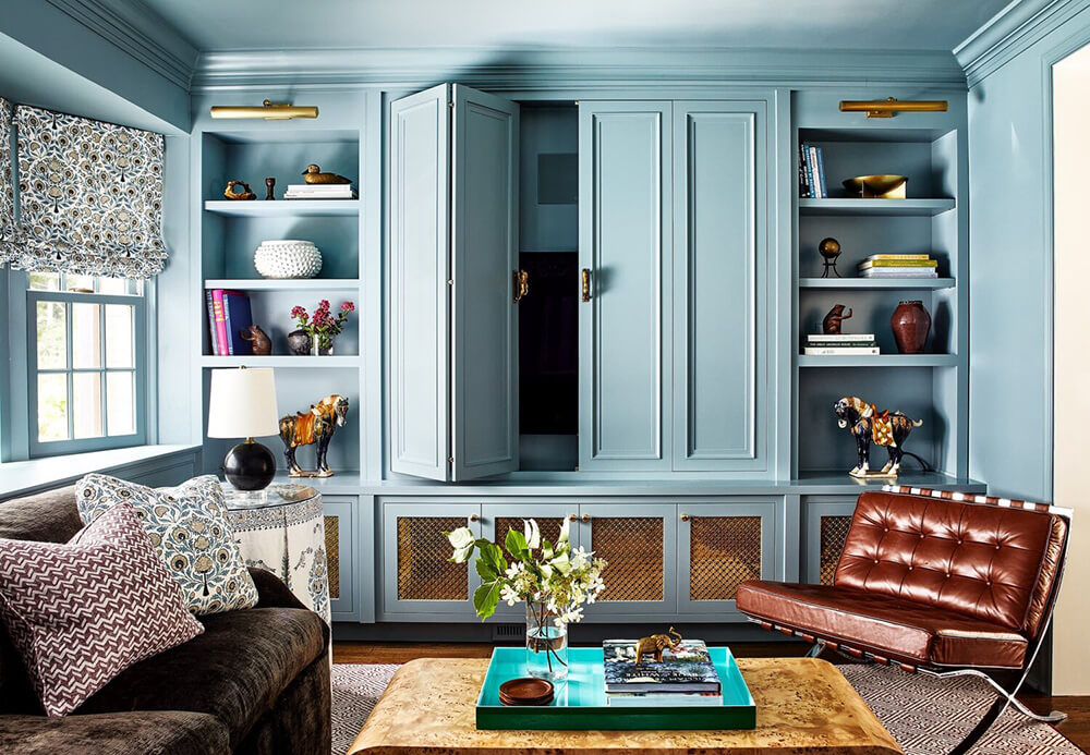
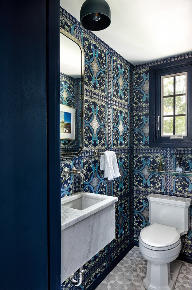
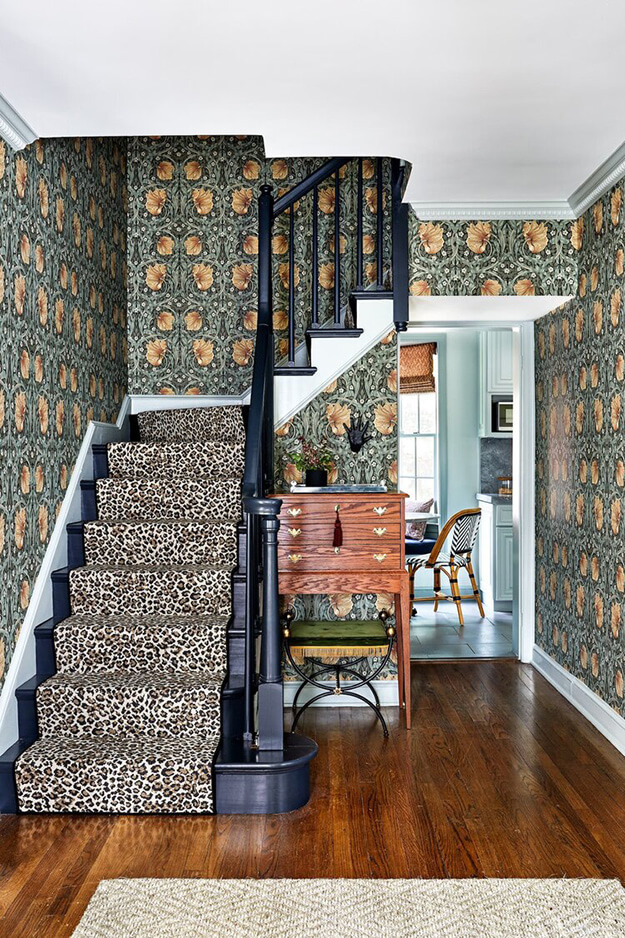
Photographer: Stacy Zarin Goldberg

