Displaying posts labeled "Living Room"
A lighter transformation of my living room
Posted on Thu, 19 Apr 2018 by KiM
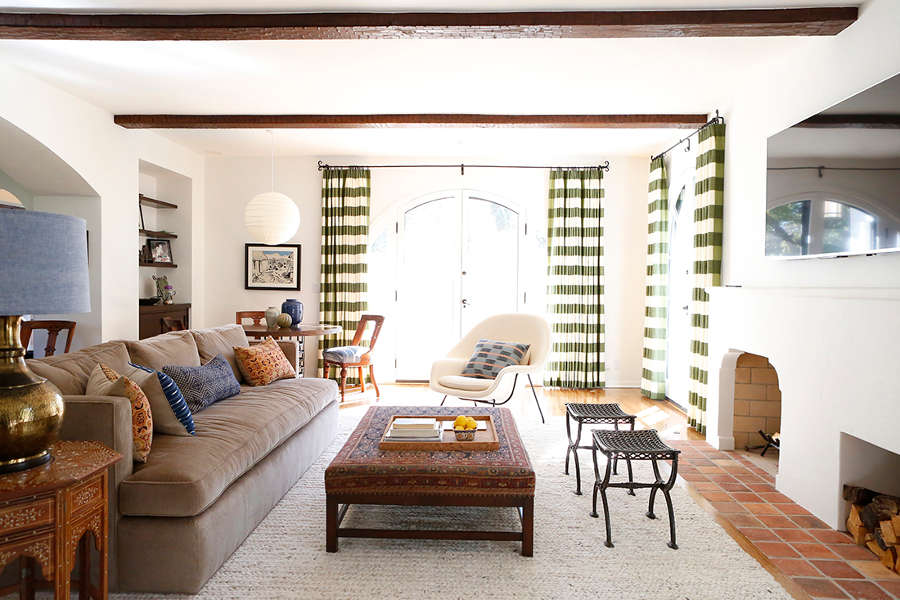
I was at it again a few weekends ago, going to town on my living room walls. As much as I love some dark paint, having a dark grey living room after about 3 years was getting to me. The cave-like effect had lost its initial appeal. Here is what it looked like before the transformation:
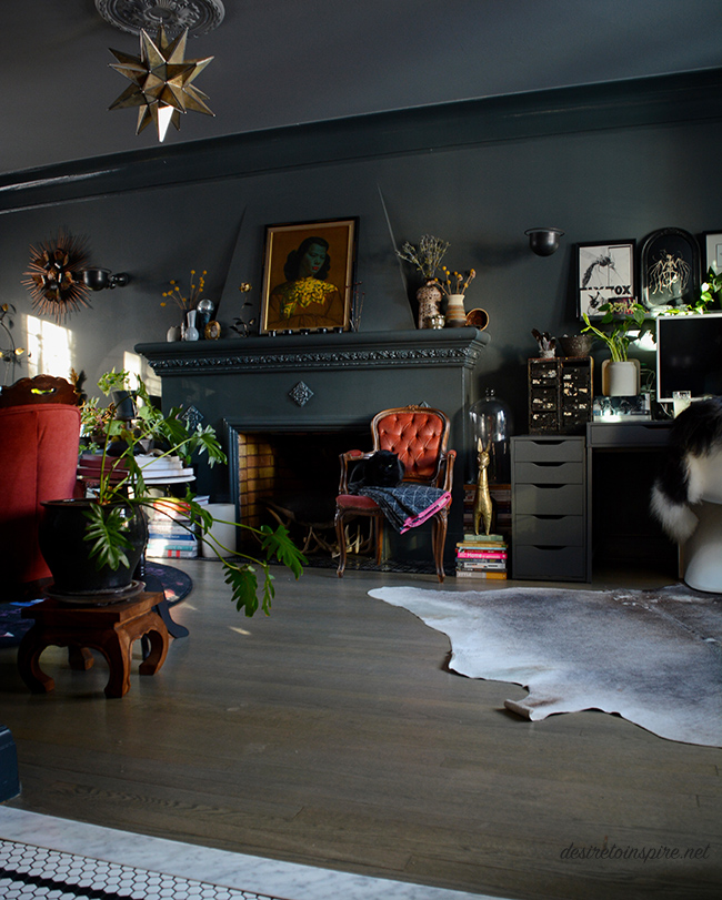
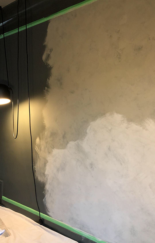
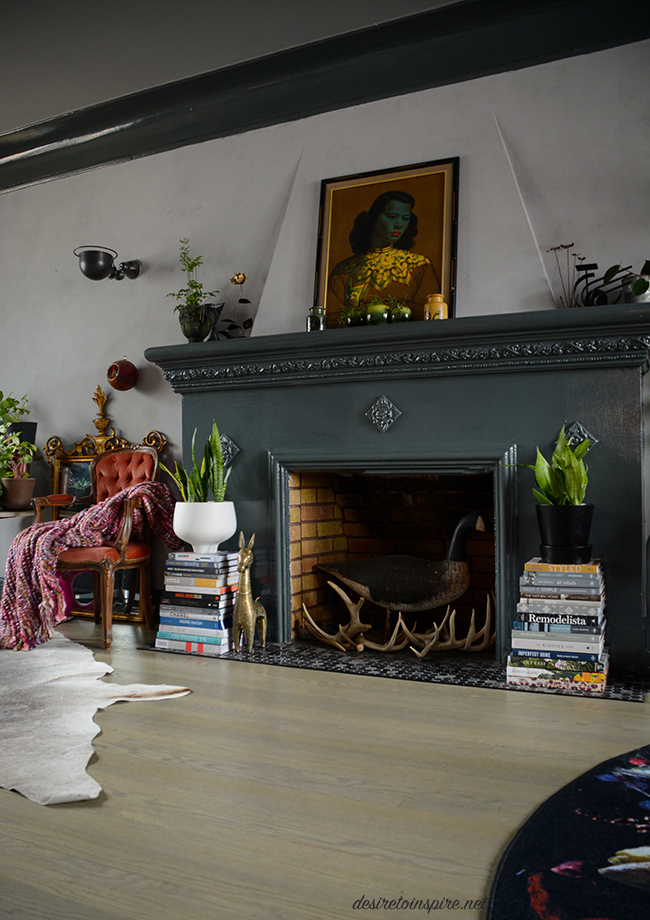
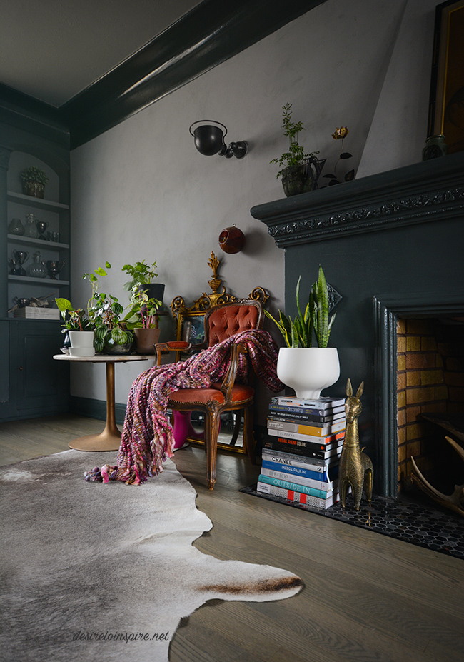
That was Downpipe by Farrow and Ball – high gloss on the trim and fireplace and estate emulsion on the walls (and Plummett on the ceiling) . Luckily I didn’t need to change anything but the walls (gawd I hate painting trim – and it’s high gloss so I may be stuck with it forever!). I am not a faux-finish gal but I have always loved the plaster walls the talented duo behind Jersey Ice Cream Co. always use in their projects. So I thought I would give it a go. Due to my busy schedule and general laziness when it comes to painting projects, I came up with a plan. I went to Home Depot and bought a couple of cans of Rustoleum’s Chalked paint – a medium grey (Country Grey) and a concrete coloured grey (Aged Grey). Then I bought many packs of cheesecloth, at Jo’s suggestion. I did a rough, thin coat of the medium grey over my dark grey walls, letting a bit of the dark grey show through. Oh – chalk paint dries almost instantly so I added a bit of water to it. Then I brushed on the lighter grey in small sections and immediately started dabbing with the cheesecloth. And voilà! It looks like concrete/plaster!
Here is a quick snap I took on my phone during the process:
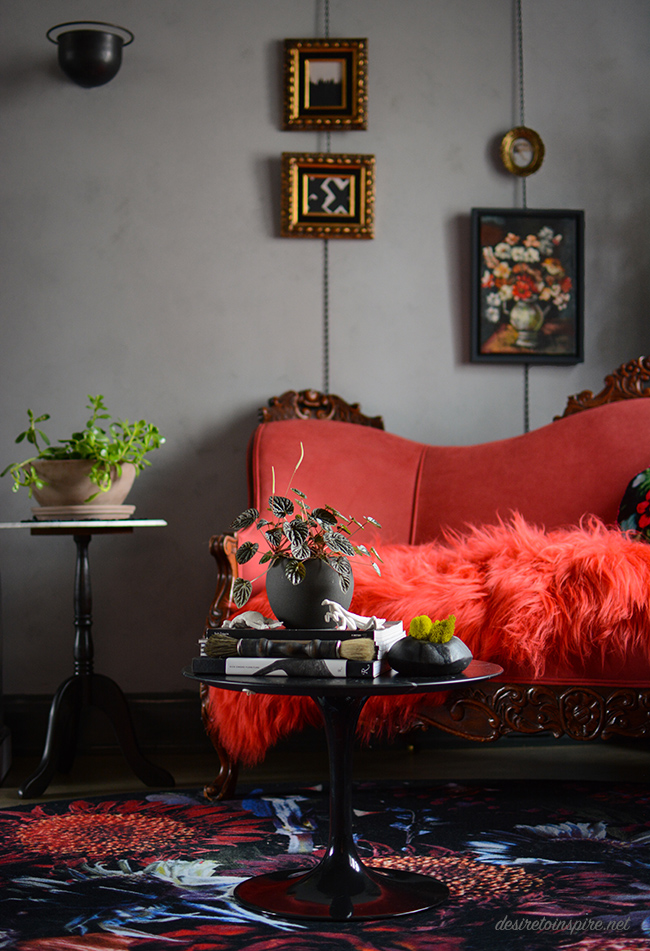
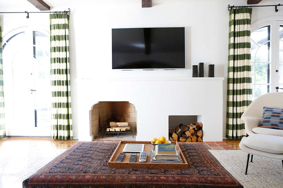
And here is how it looks now! (I know some people may think the dark was better but trust me, a room with larger windows that let in more light would have been much easier to live with)
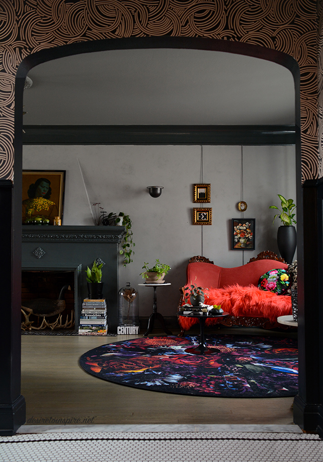
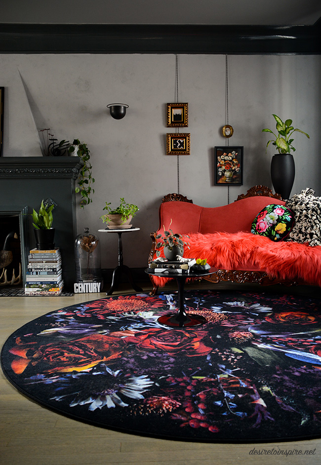
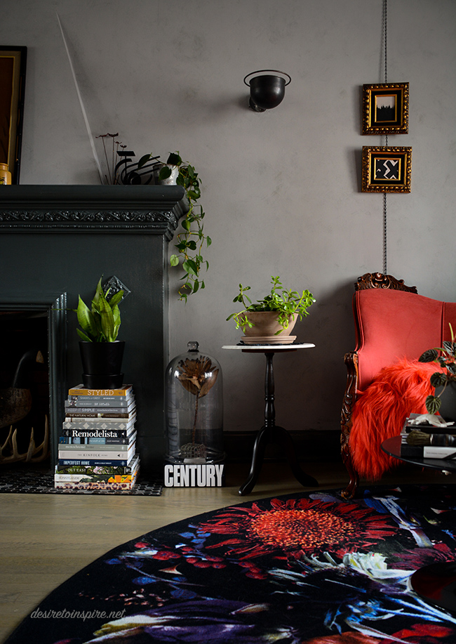
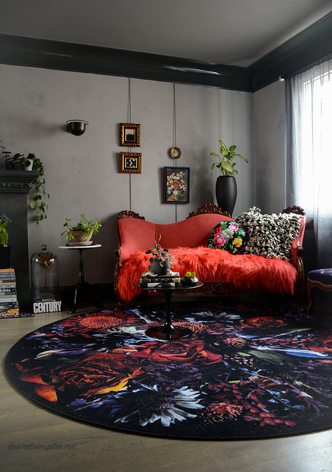
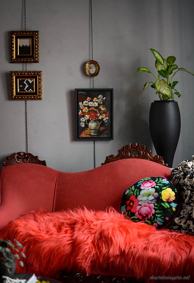
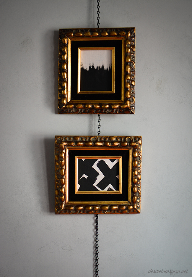
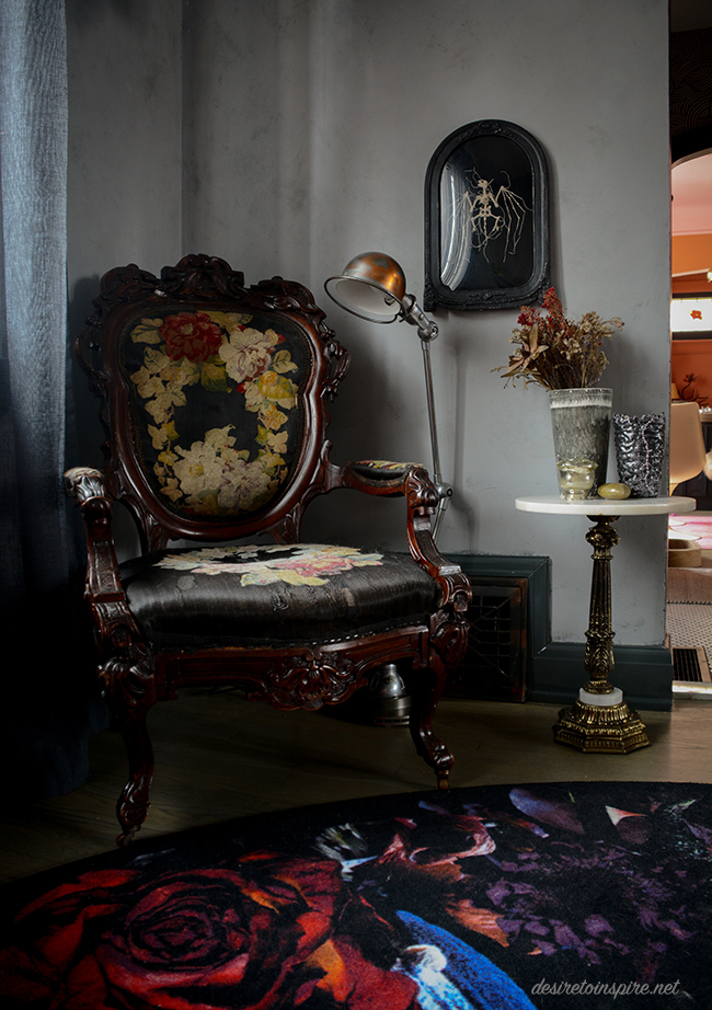
I was inspired by a photo I saw recently while doing blog research and found this simple solution for hanging art in a not-so-average way. I bought some small black chain at Canadian Tire which I attached by little eye hooks into the bottom of the molding left it hang down (I might hook it into the baseboards to straighten it out a bit). Those beautiful frames I found at Highjinx. They had awful still life paintings in them so I painted over them with some leftover paint I had stashed away.
(I really want to sell the awesome leather sofa under those tablecloths and get a new one more suitable for this space. Maybe this? Or this?)
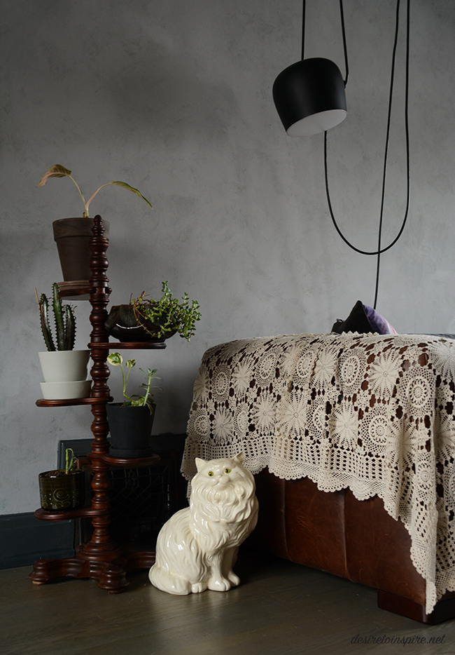
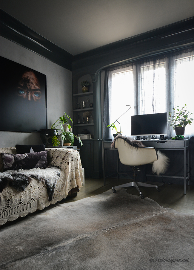
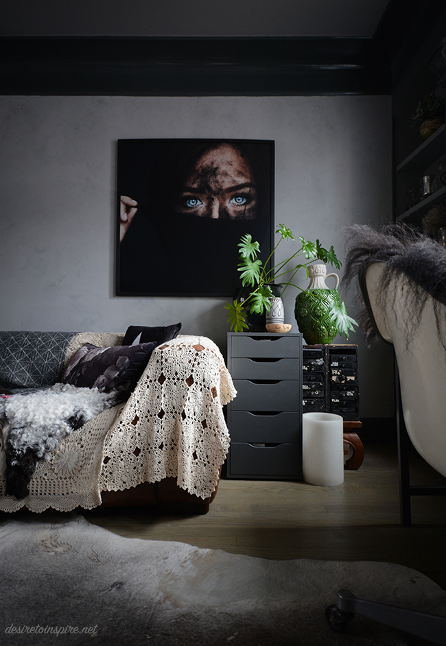
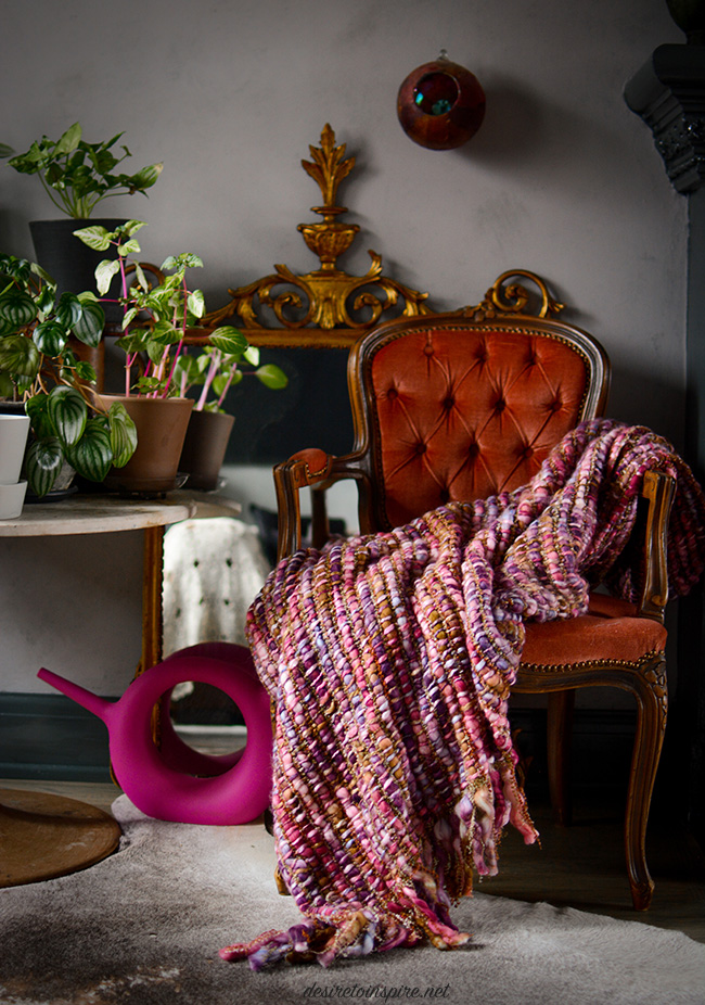
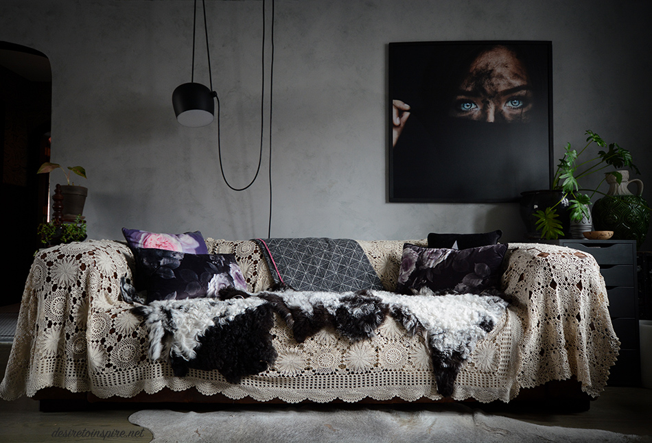
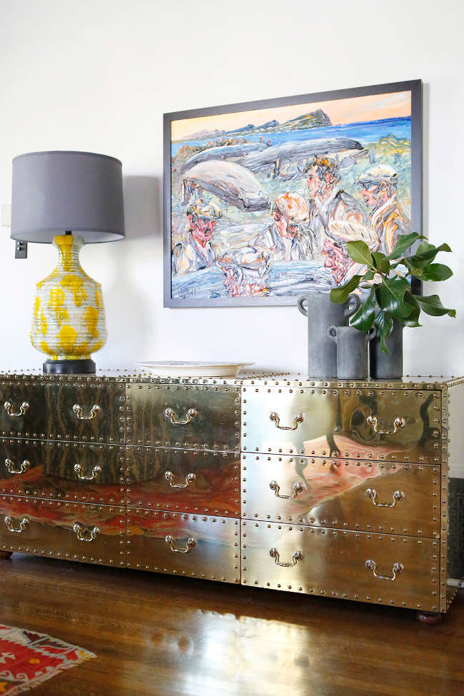
Sources: raspberry vintage sofa + brass base side table + pink tufted chair – The Pale Blue Dot; Moooi carpet by Marcel Wanders – The Modern Shop; sheepskins – Cowboy Kate Outpost; Knoll tulip table + black tall plant stand + blanket over back of sofa – Alteriors; floral pillow on raspberry sofa – Wild Rice Designs; knitted pillow – Hana Waxman; embroidered bat art – Caitlin T. McCormack; large portrait over sofa – photo by Amanda Margareth; ceramic cat + black base side table – Highjinx; pink blanket and remaining pillows – Homesense; FLOS aim pendant by Ronan and Erwan Bouroullec. Everything else random vintage finds.
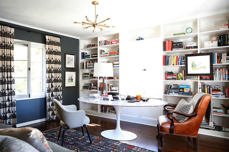
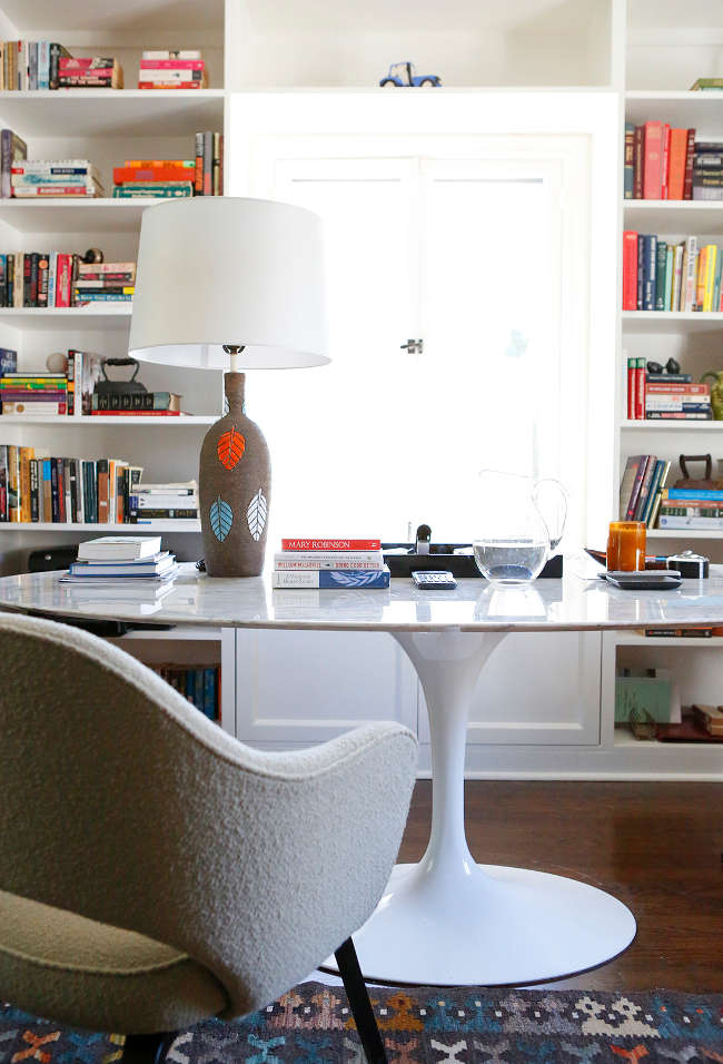
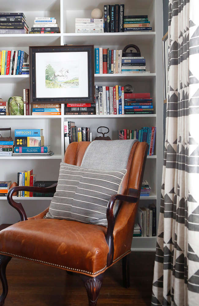
More from Betsy Burnham
Posted on Tue, 10 Apr 2018 by midcenturyjo
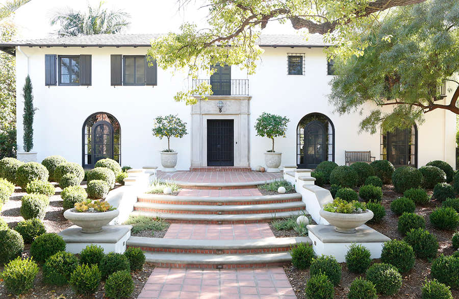
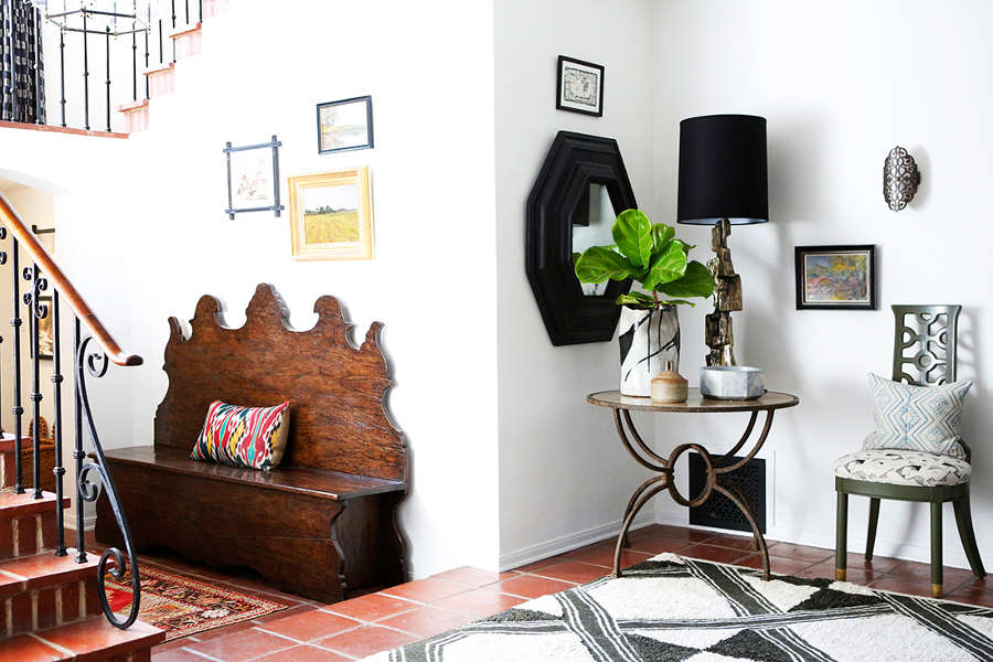
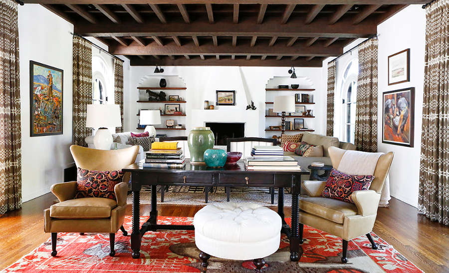
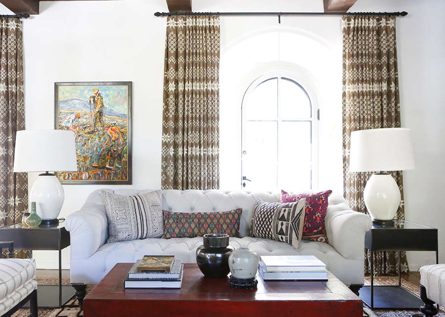
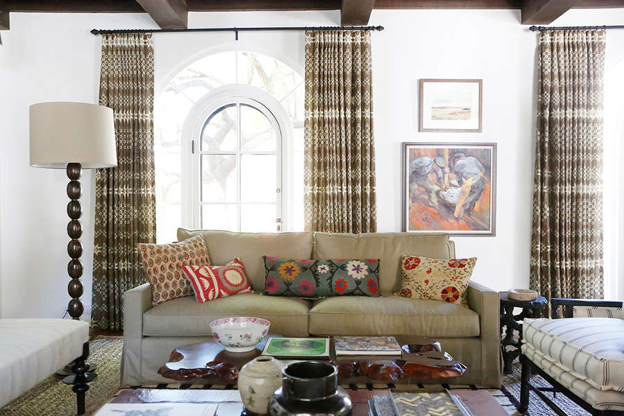
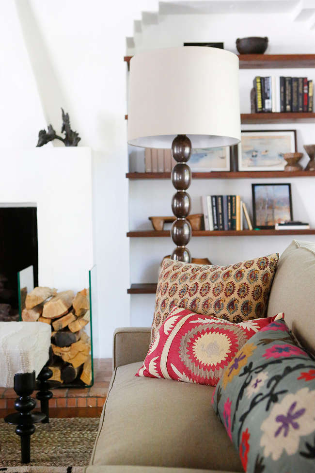
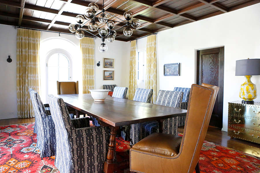
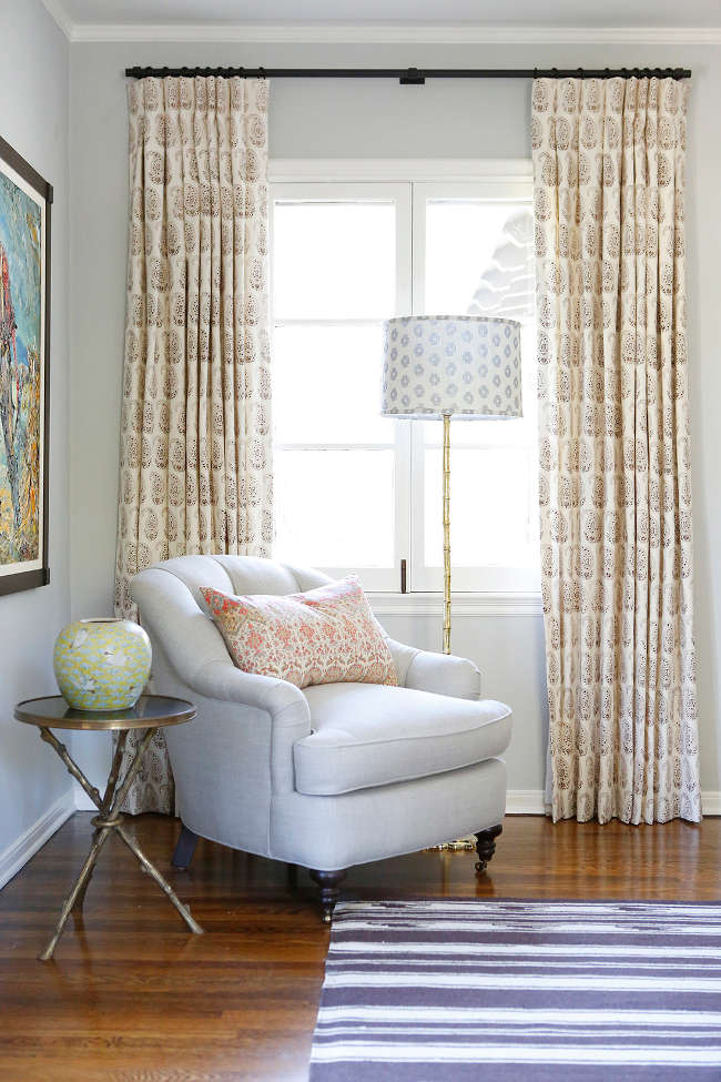
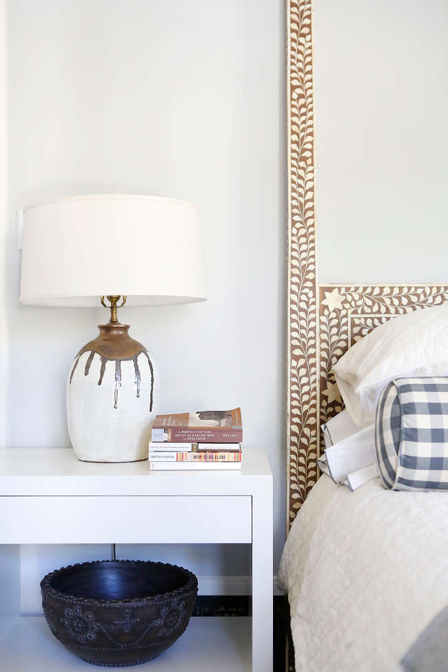
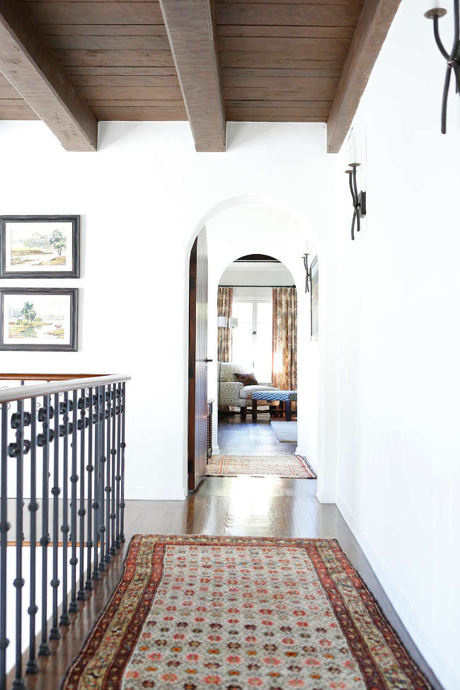
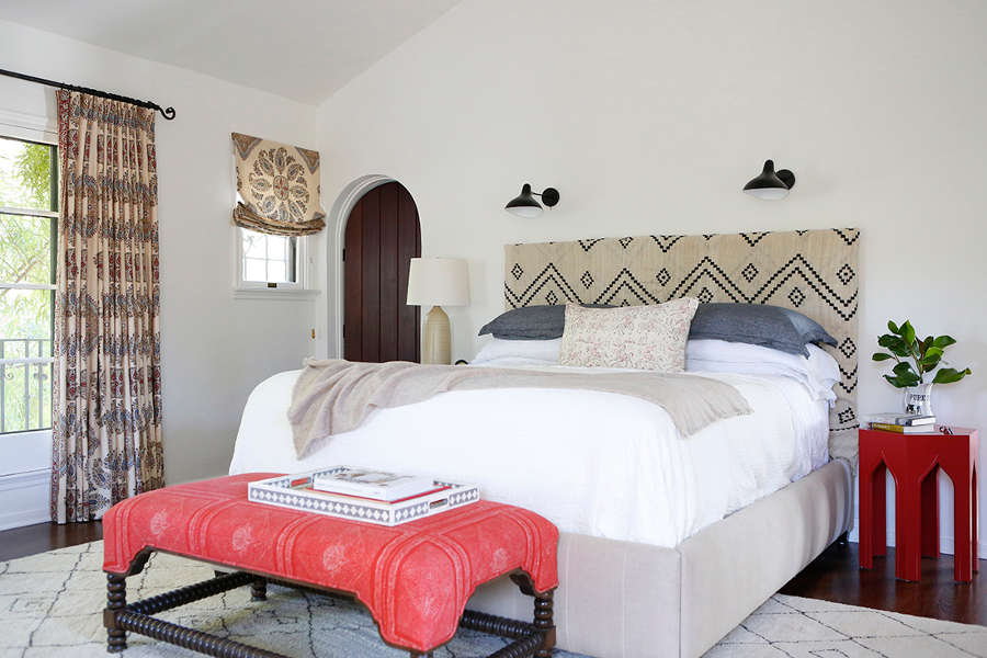
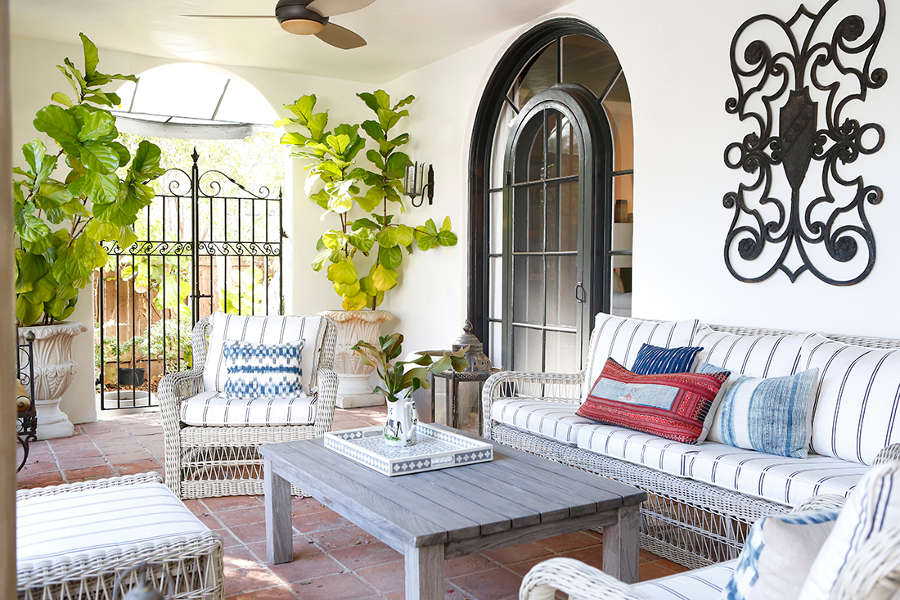
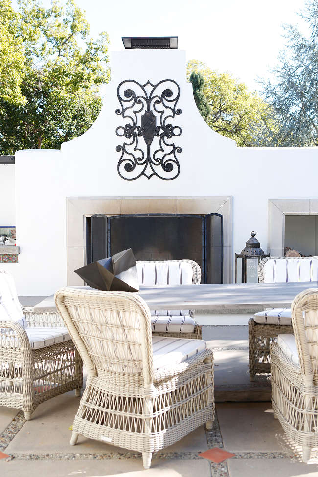
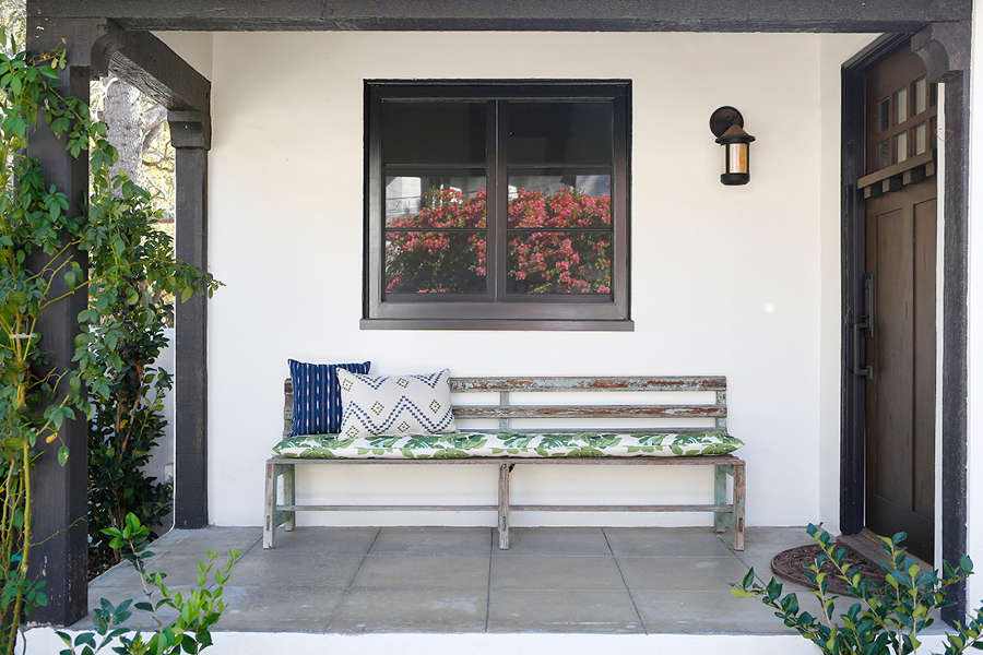
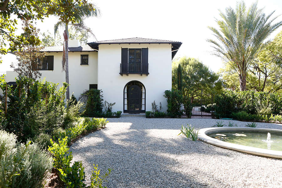
The exterior gives you just a hint at what treasures the interior holds. The white walls and black arched windows suggest a restrained elegance, a sophistication but the myriad of topiary balls cascading on the front garden suggests a sense of humour. Through the front door is a home full of personality and pizzazz but what else would you expect from Betsy Burnham of Los Angeles based Burnham Design? One of my favourite designers has done it again!
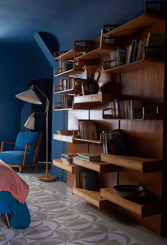
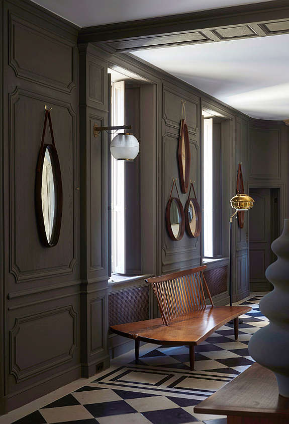
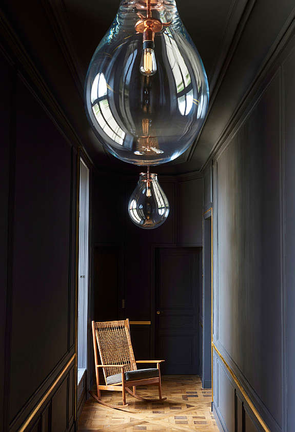
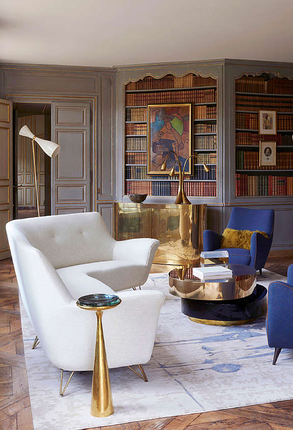
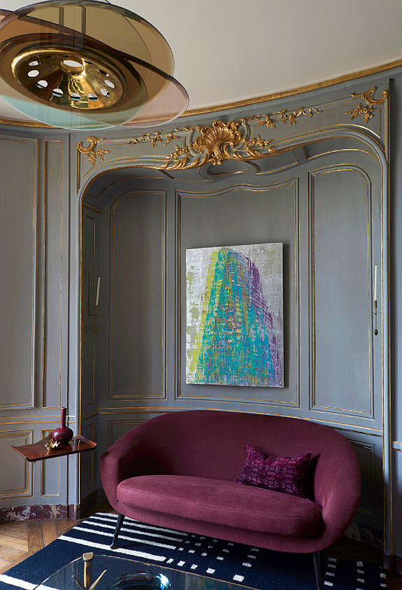
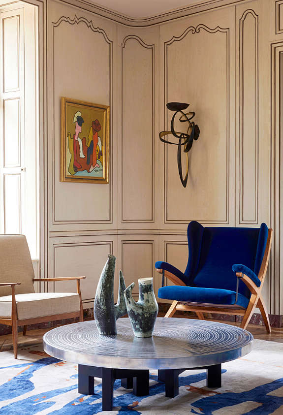
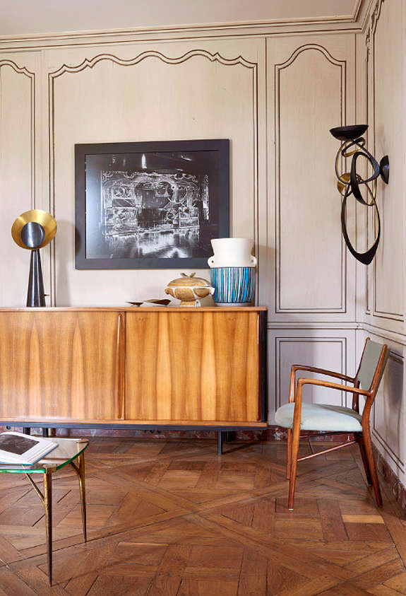
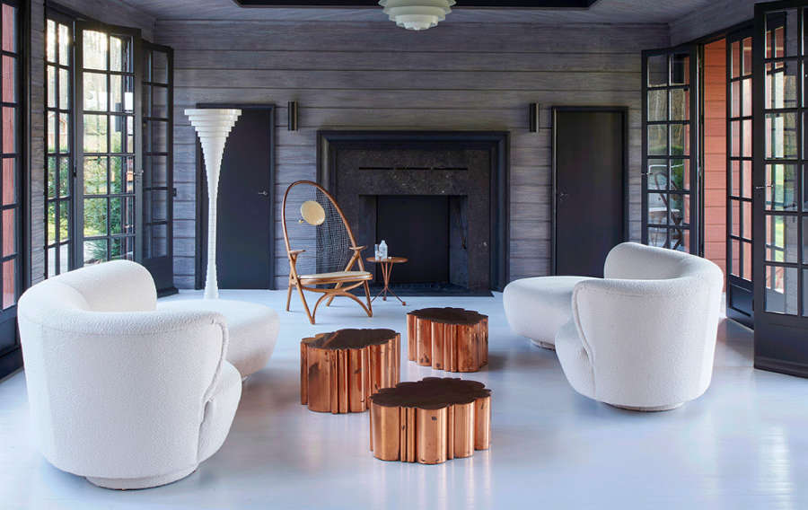
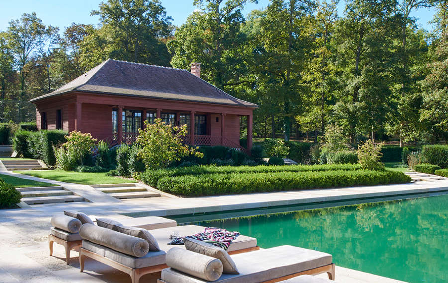
Didier Benderli
Posted on Sat, 7 Apr 2018 by midcenturyjo
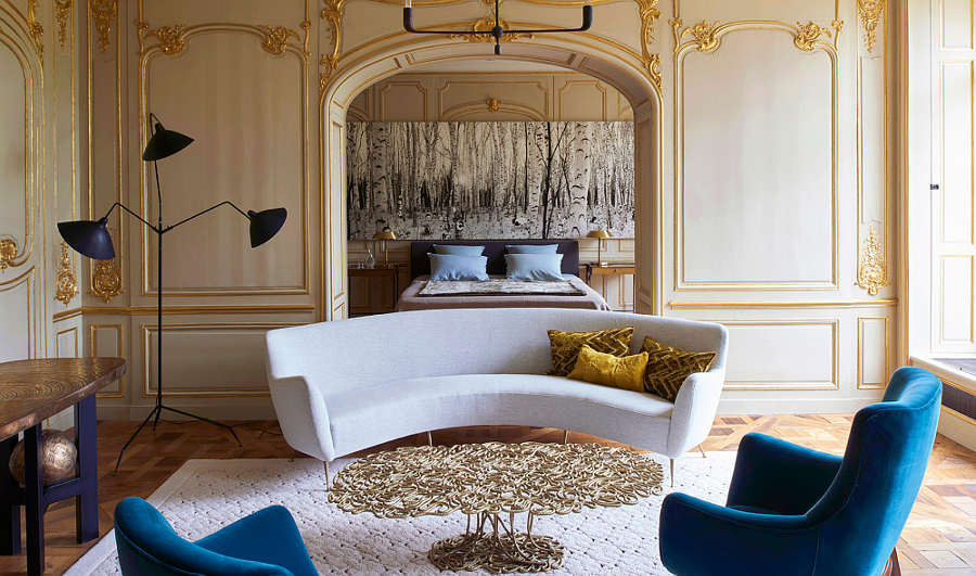
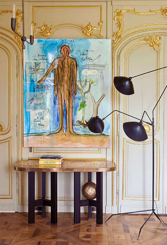
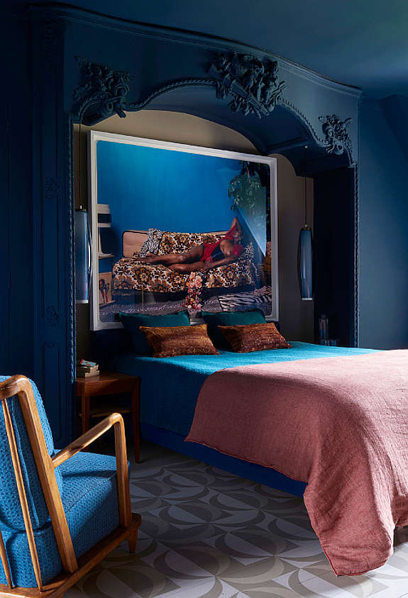
It’s a play of colours, of shapes, of periods and styles. It’s a play on the senses, an appeal to desires and memories. It’s classic and it’s edgy. It’s theatre set and it’s home. It’s eclectic but not haphazard. No if you look closely it is refined and just so. It’s Château en Île de France by Didier Benderli of Paris-based Kerylos Intérieurs.
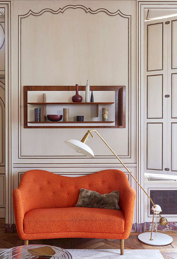
French Flair
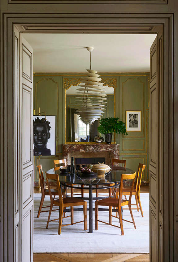
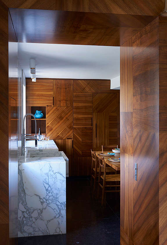
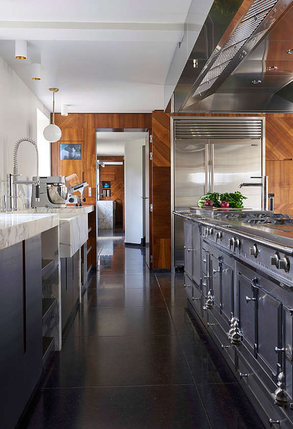
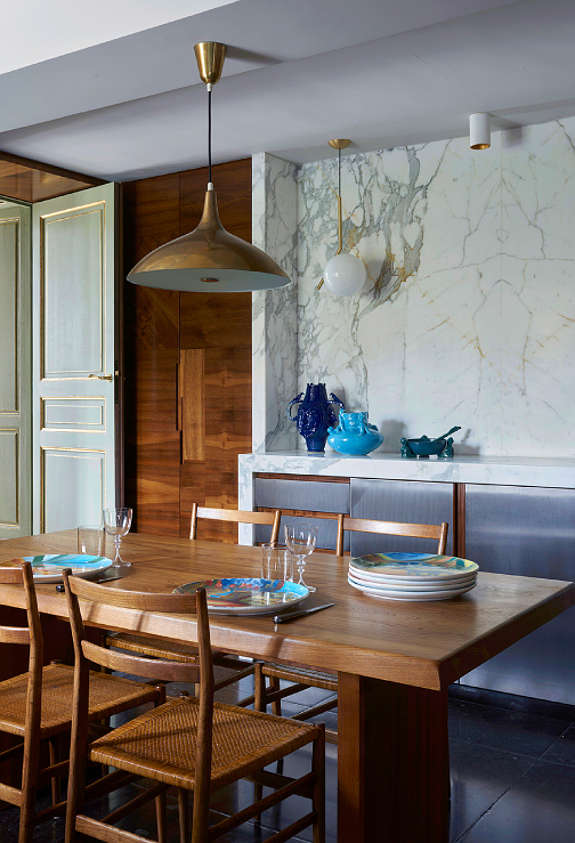
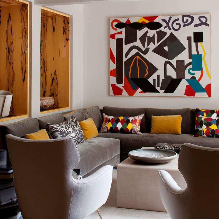
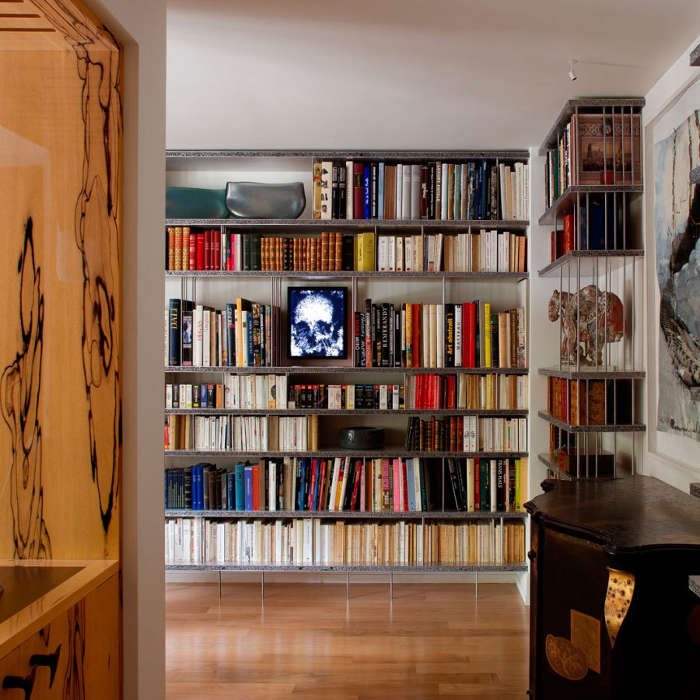
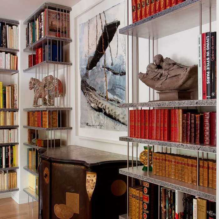
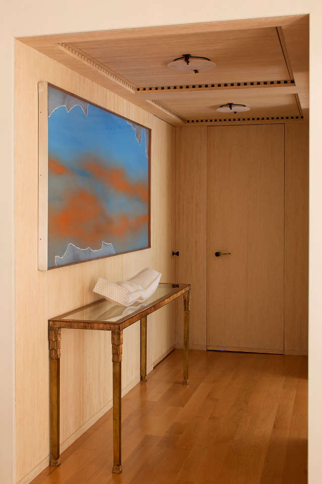
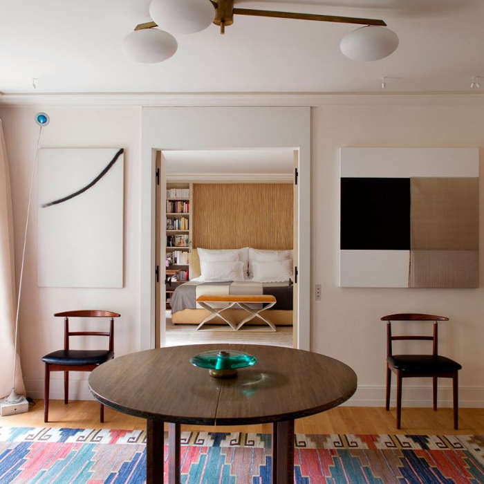
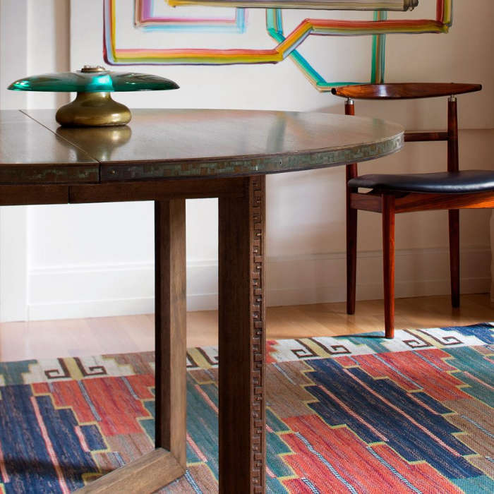
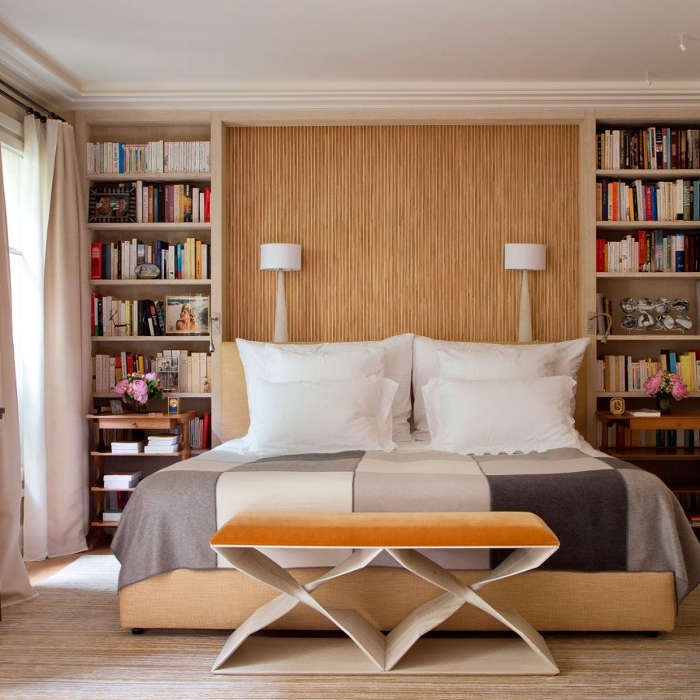
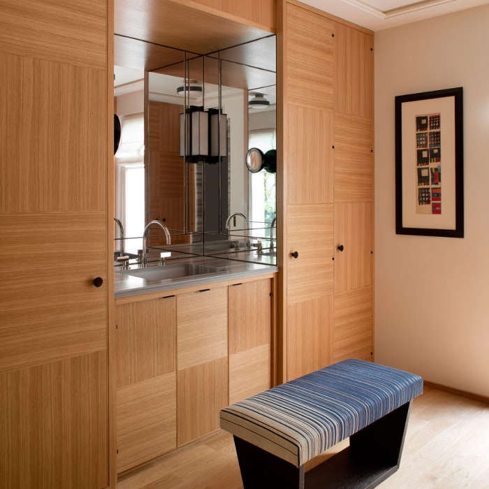
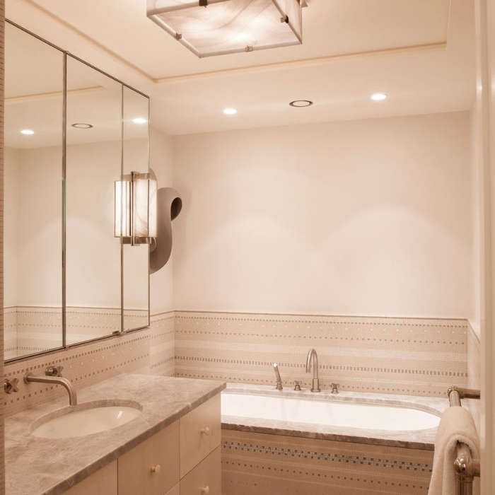
Posted on Thu, 29 Mar 2018 by midcenturyjo
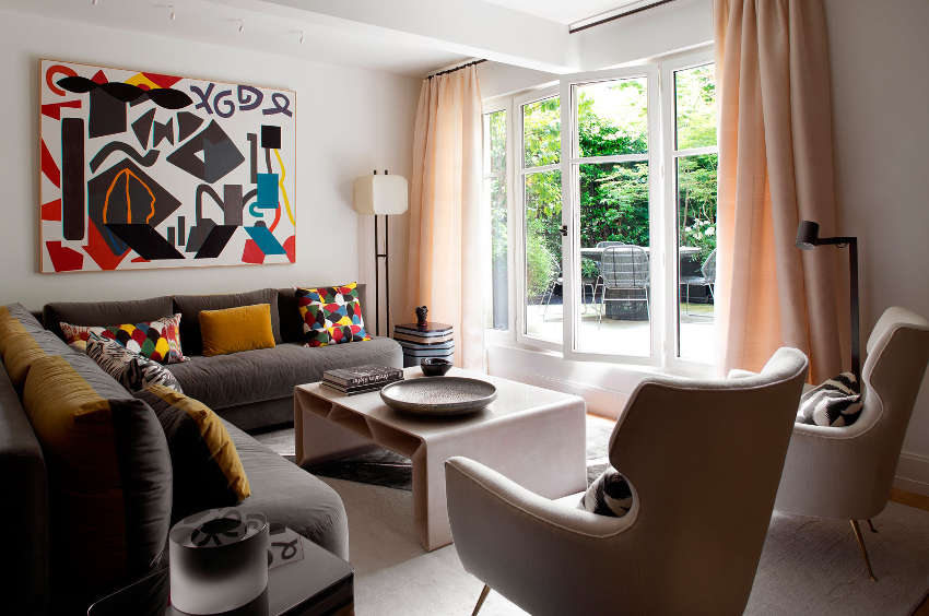
Shall we tick off the list? It’s French. It has colour and personality not to mention the amazing art. It’s part Art Deco, part mid century and perhaps a touch of 70s. It has incredible attention to detail (check out the ceiling in the entrance hall). It’s chic. It’s sophisticated but not at all stuffy. It has books, shelves and shelves of books. It’s fabulous. It’s by CSLB Studio.

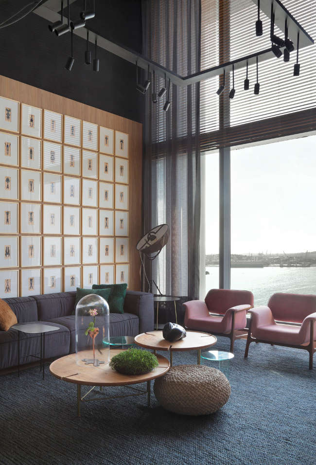
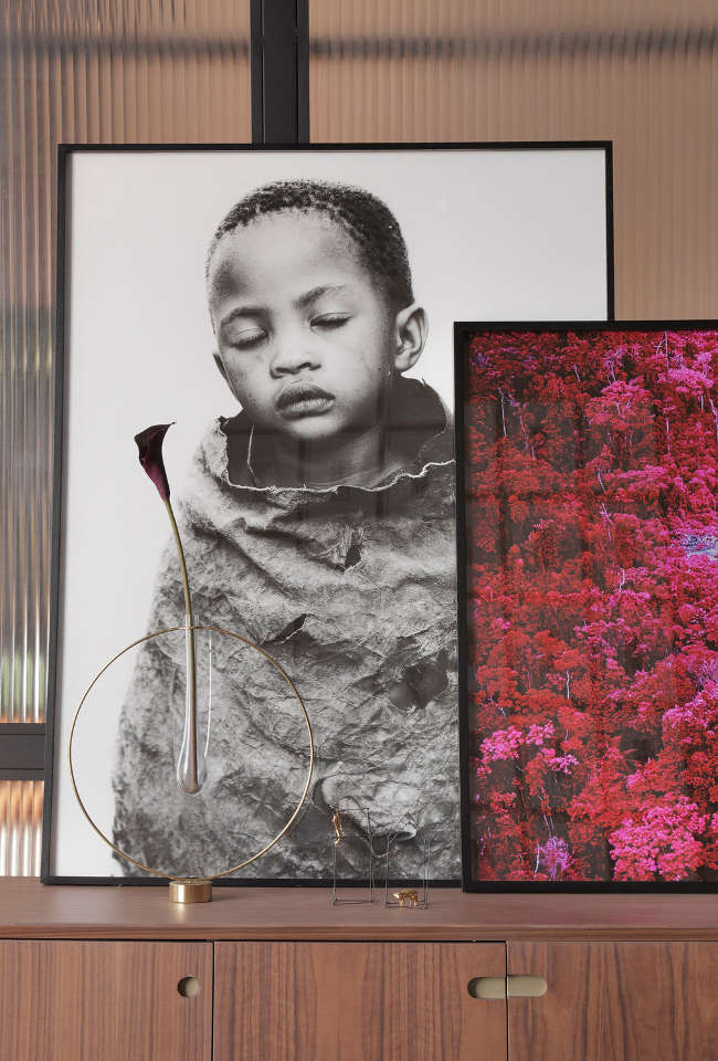
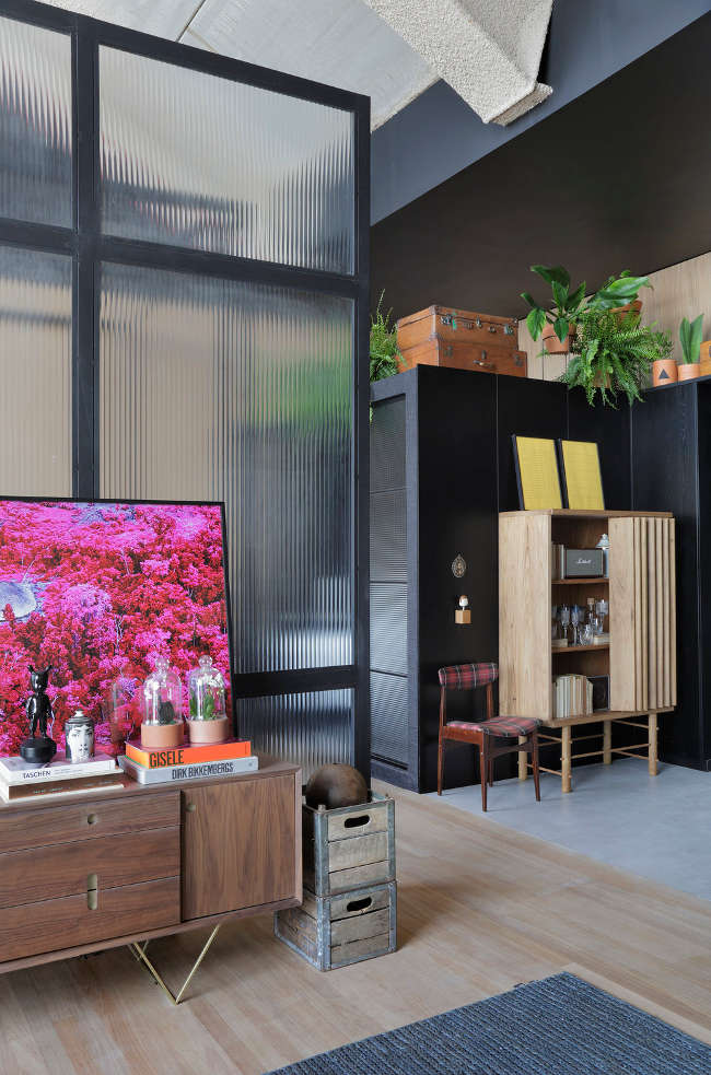
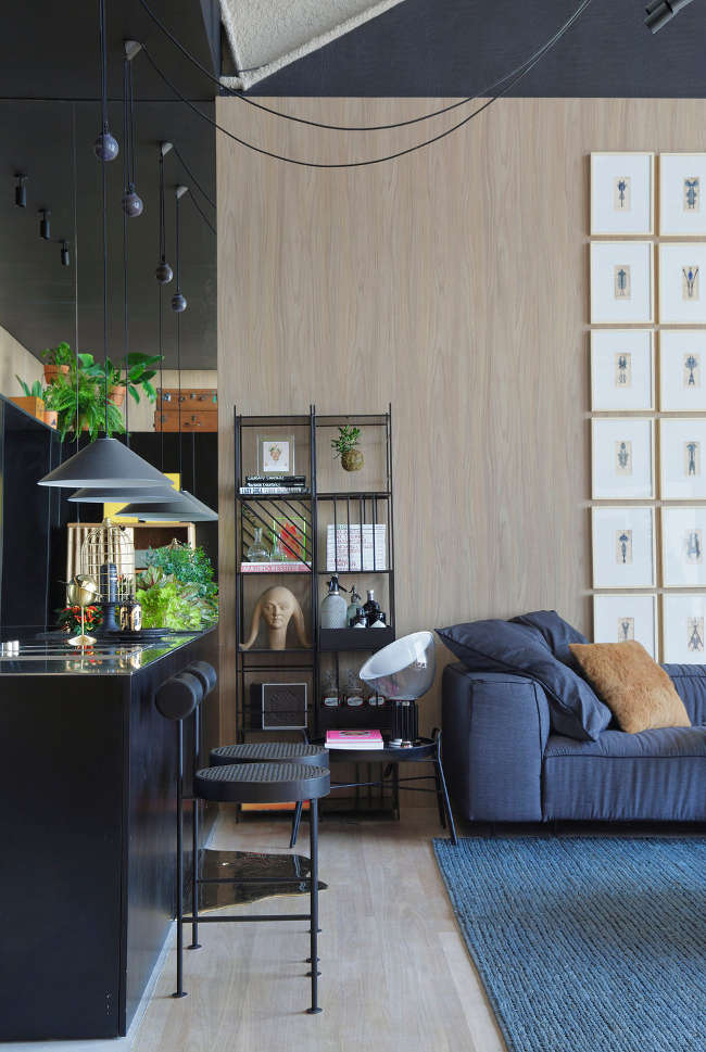
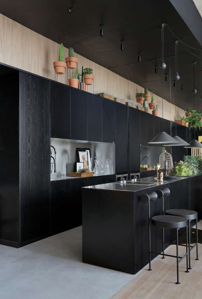
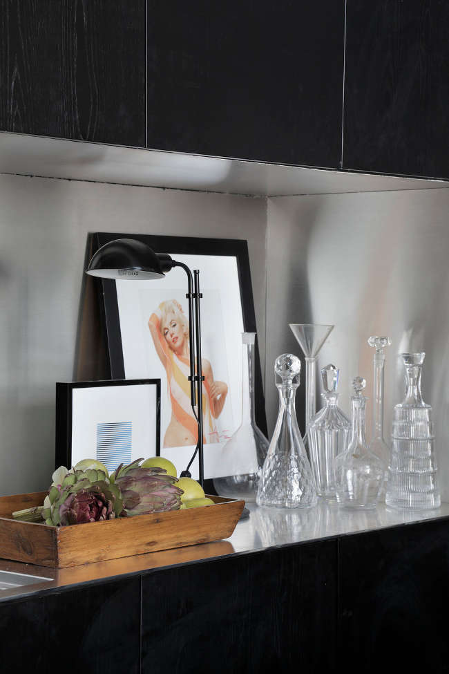
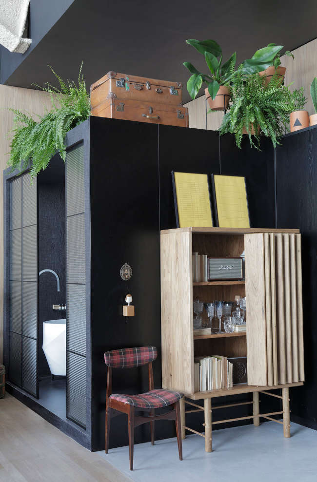
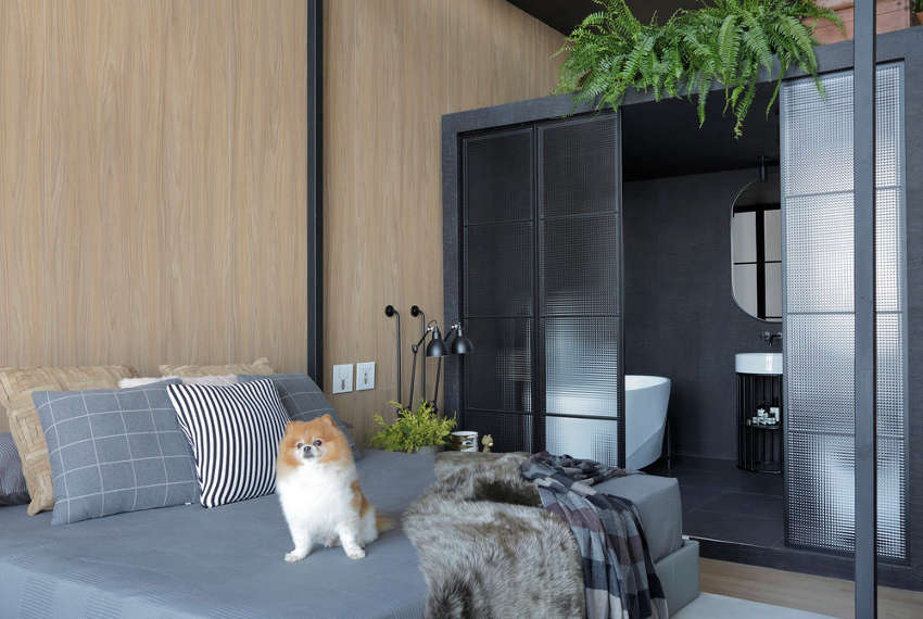
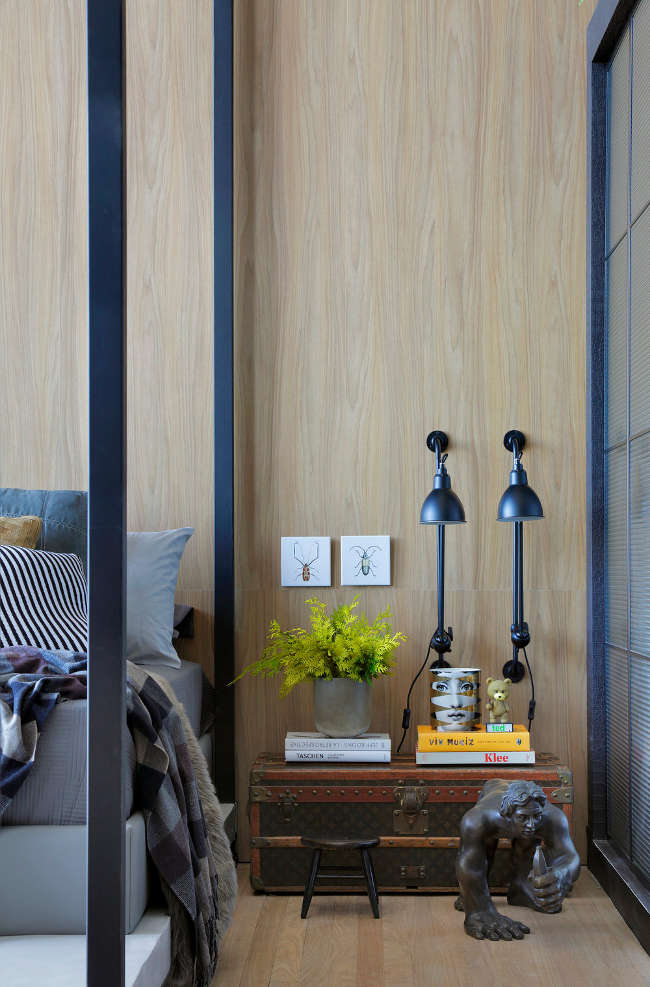
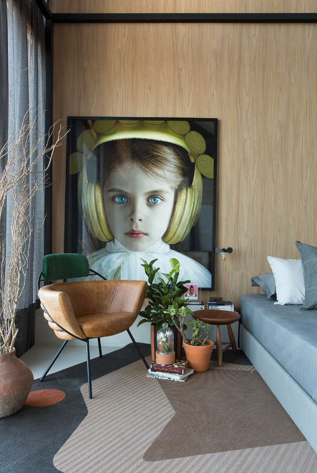
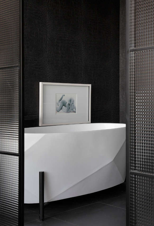
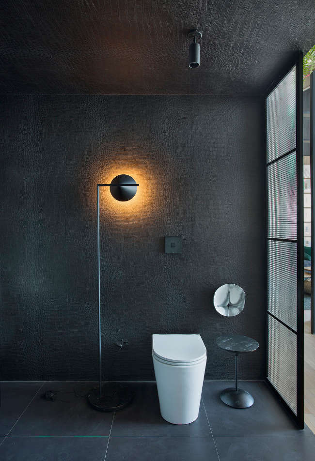
Brazilian drama
Posted on Wed, 21 Mar 2018 by midcenturyjo
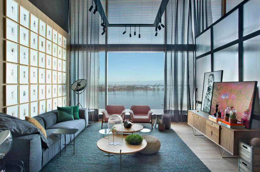
It’s dramatic. It’s stylish. It’s edgy and it’s the show home (or should I say apartment) by Studio ro+ca for CasaCor Rio 2017, the largest and most complete exhibition of architecture, interior design and landscaping in the Americas showcasing the best of the best. All I can say is ouch! Brazilian design is so hot.