Displaying posts labeled "Uncategorized"
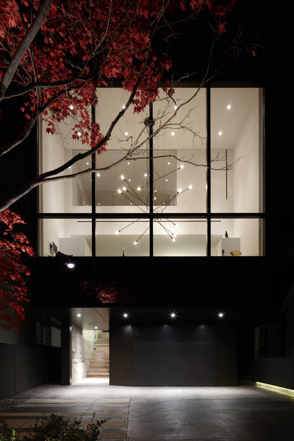
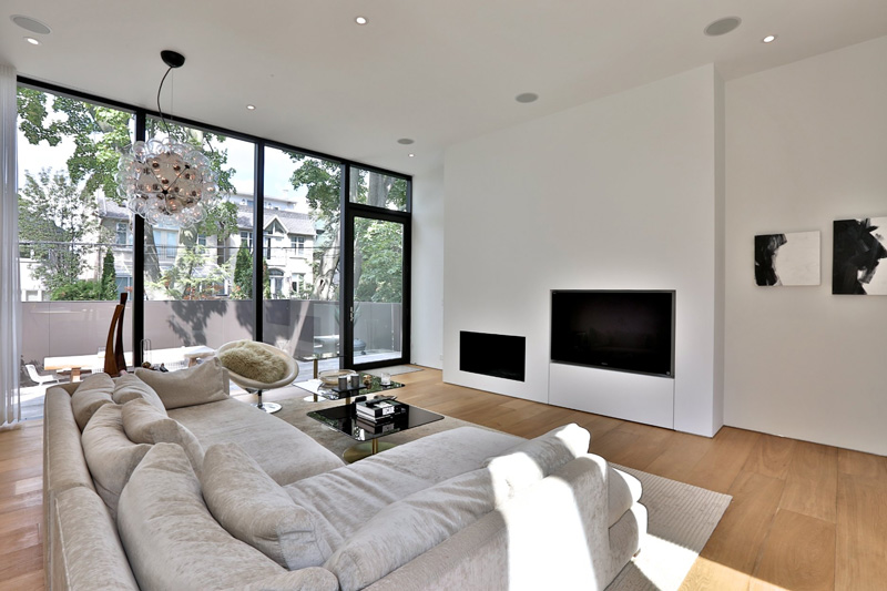
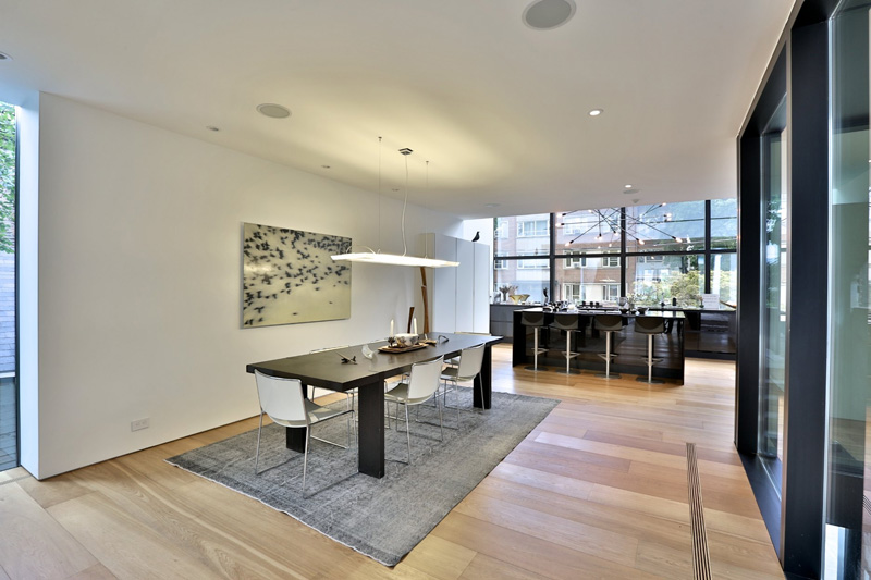
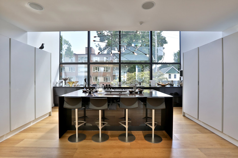
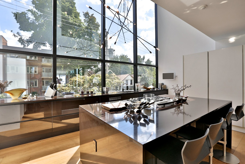
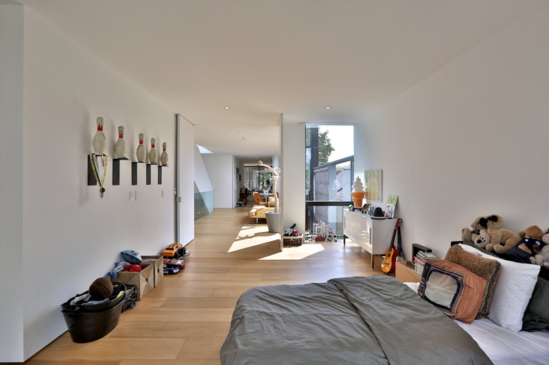
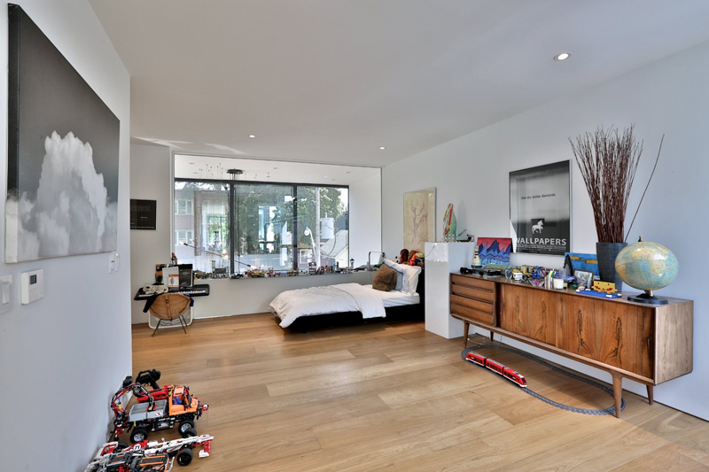
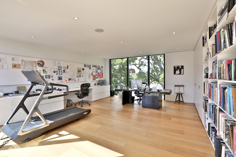
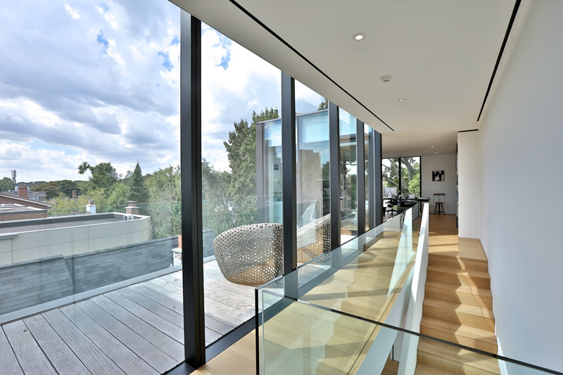
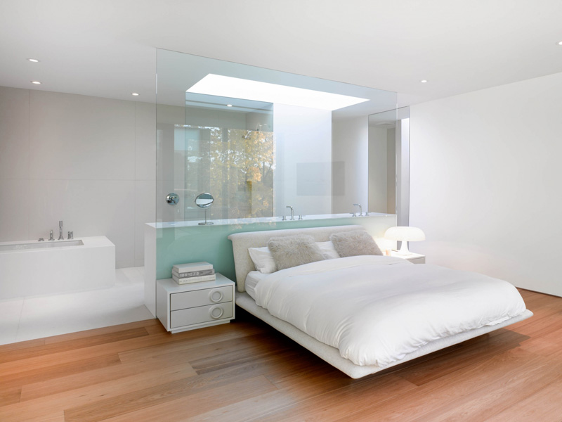
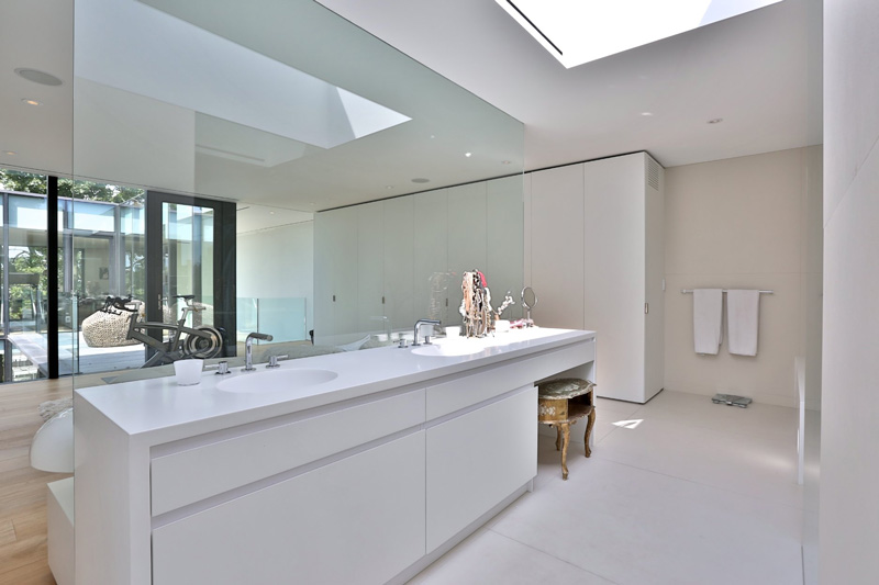
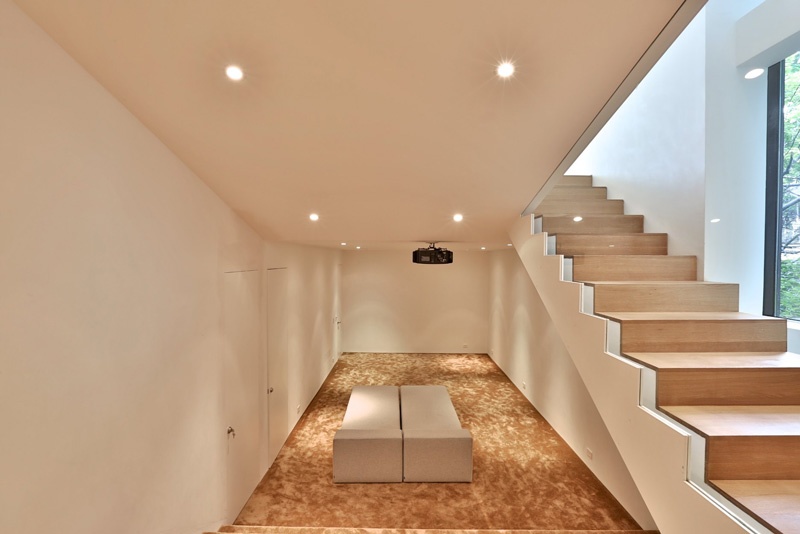
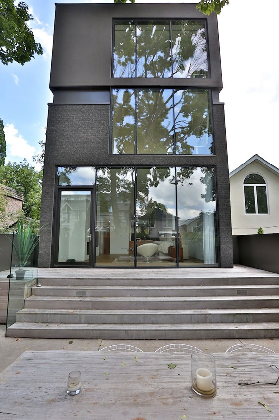
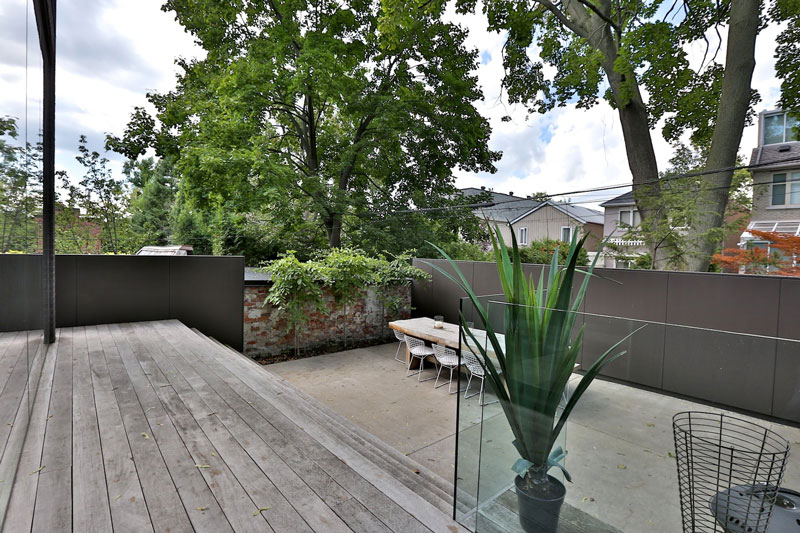
A modern home in Toronto
Posted on Tue, 14 Oct 2014 by KiM
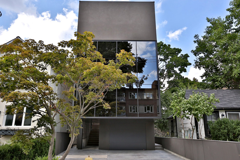
Check out this Toronto home that Lorena sent us the link to. It is a bit minimalist-harsh on the outside (someone called it an iPhone house…and check out the decrepit tiny bungalow next door) but I really like the interior layout. The decor could use a little personality and maybe a tiny bit of colour but these are real estate photos, and this home was listed for about $3.2 million. Yep, Toronto real estate is pretty outrageous. And this apparently sold pretty quickly. (Thanks Lorena!)
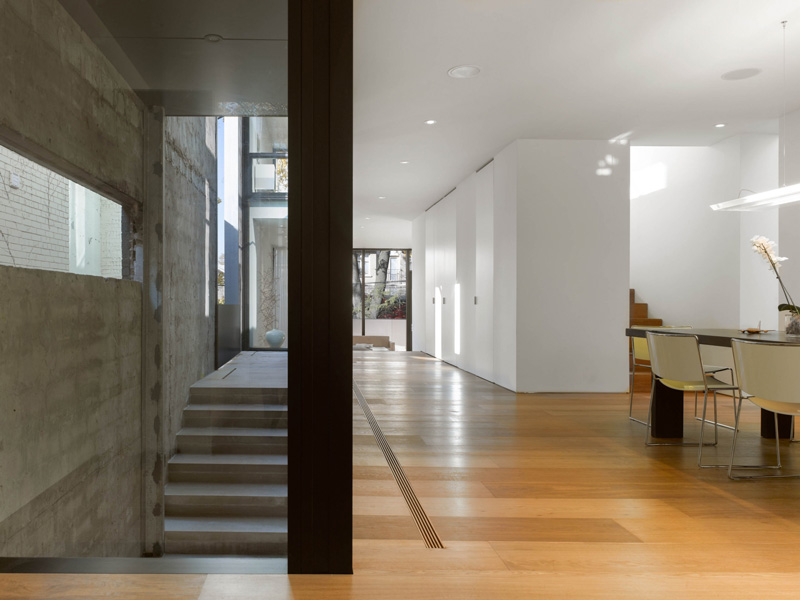
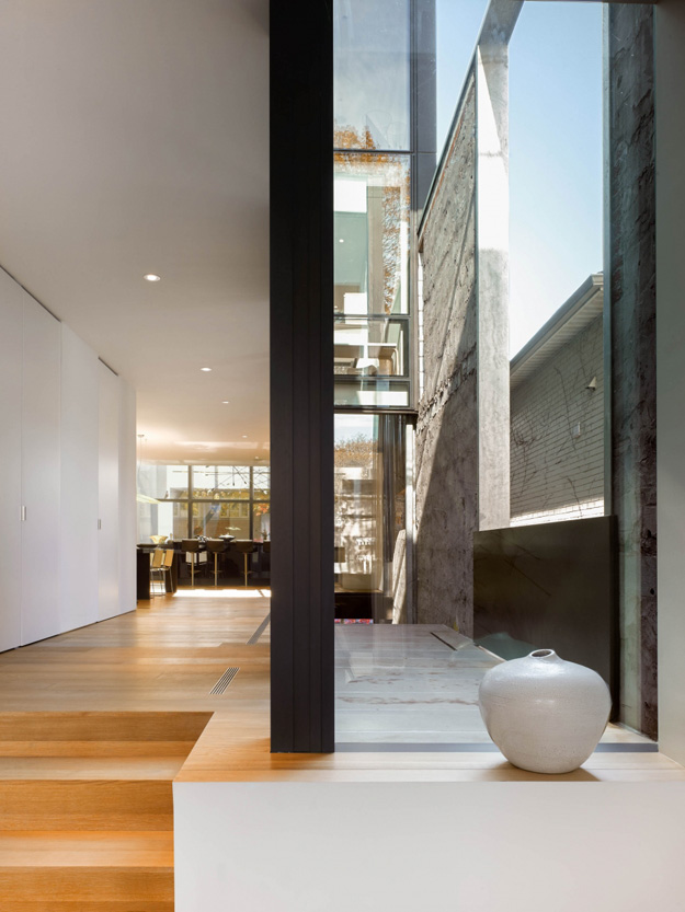
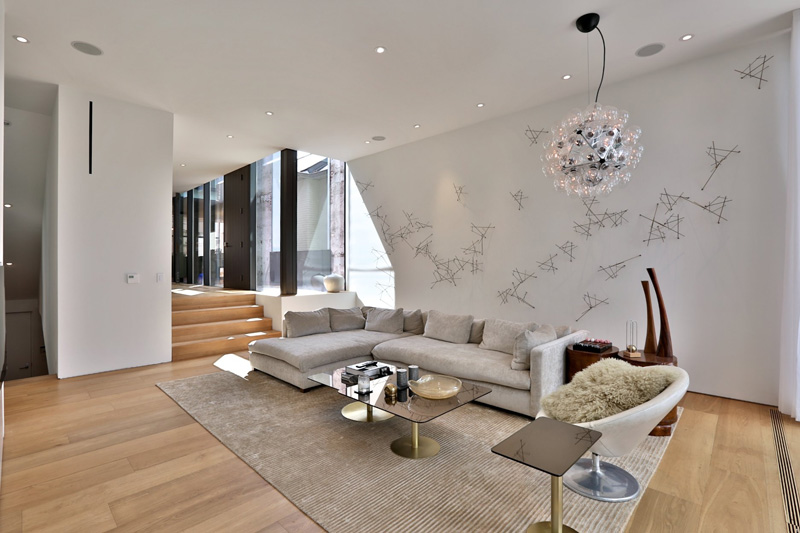
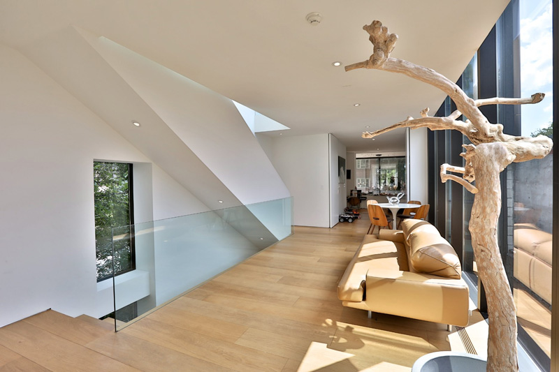
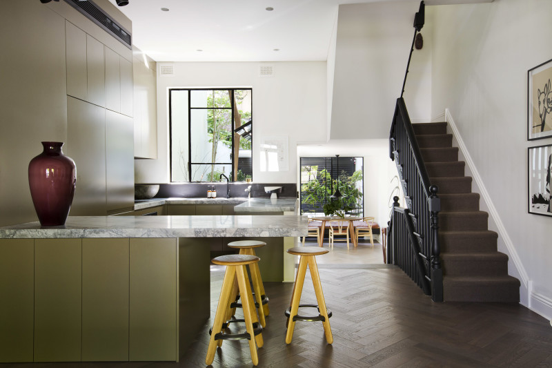
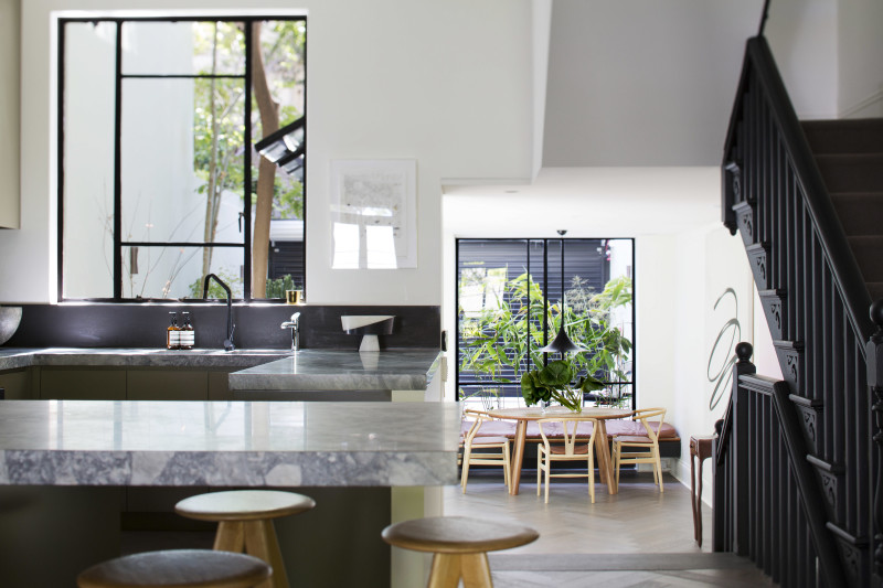
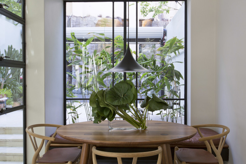
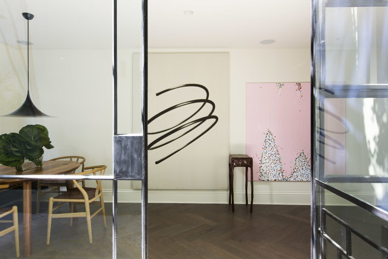
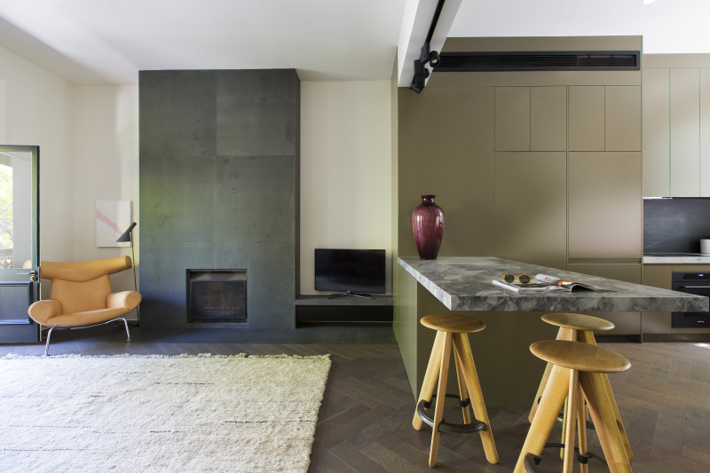
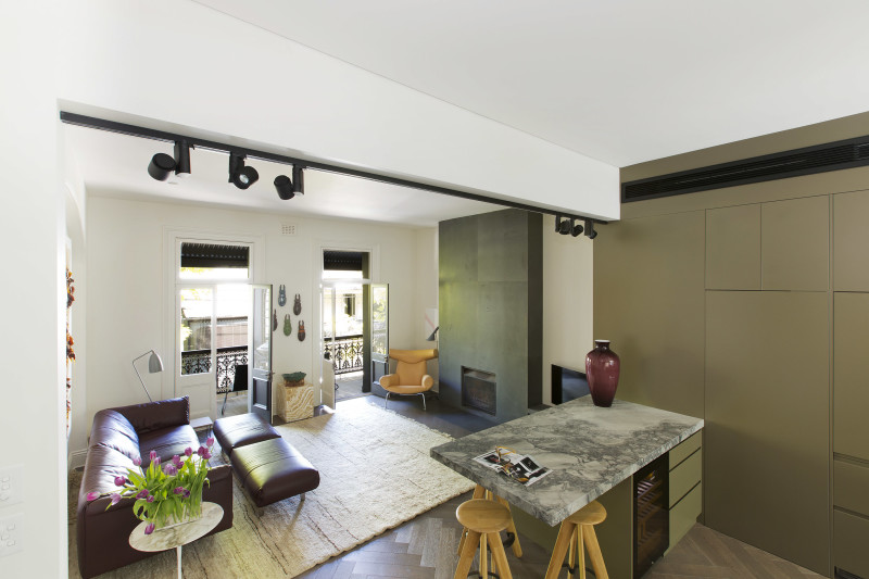
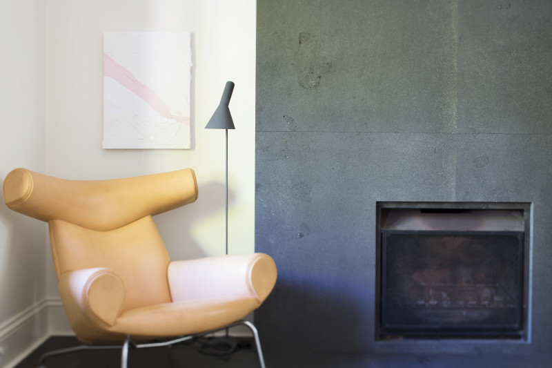
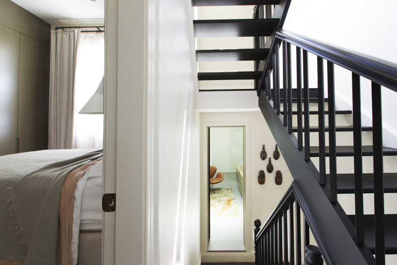
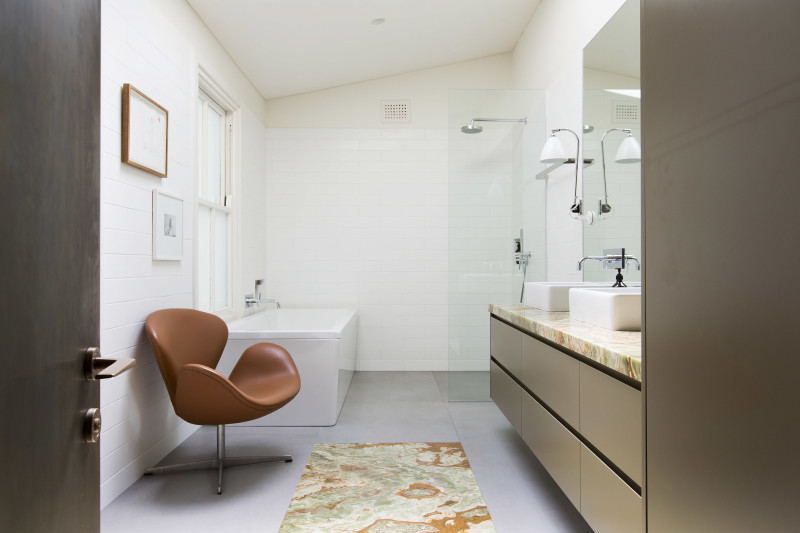
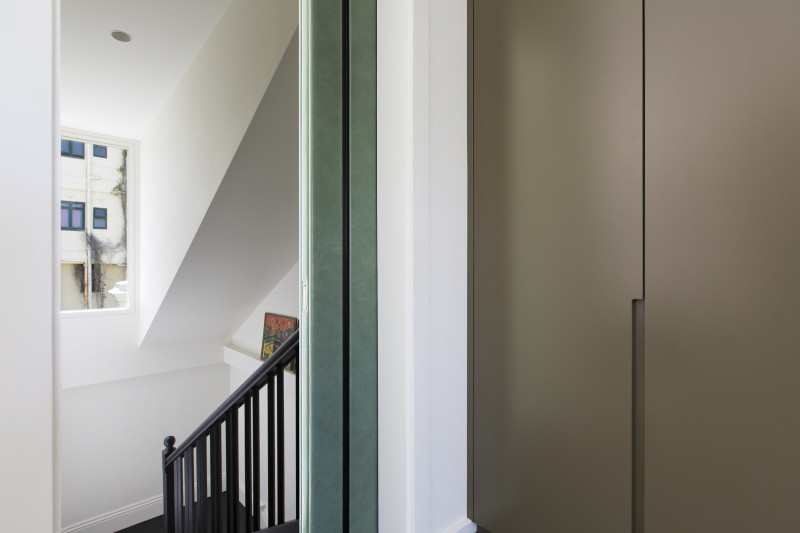
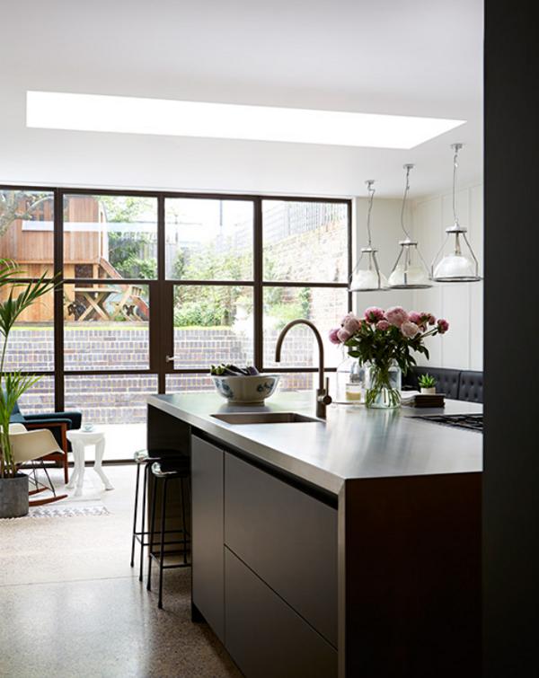
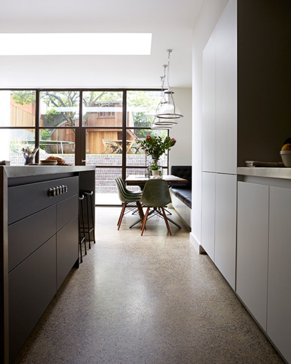
Stalking modern in a terrace house
Posted on Tue, 14 Oct 2014 by midcenturyjo

OK. I know. It’s another old terrace house with a modern extension and an open plan kitchen living area. It’s modern architecture not only added on but it has seemingly insinuated itself through the house’s old bones. I know the purists will hate it, those who cherish historical restoration and those who herald modernism. I know. I know. It’s an architectural chimera and I love it. I’m stalking the cheek to jowl terrace houses of Darlinghurst, Sydney and I couldn’t be happier. Link here while it lasts.


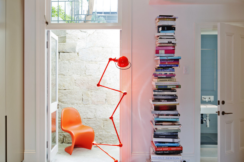
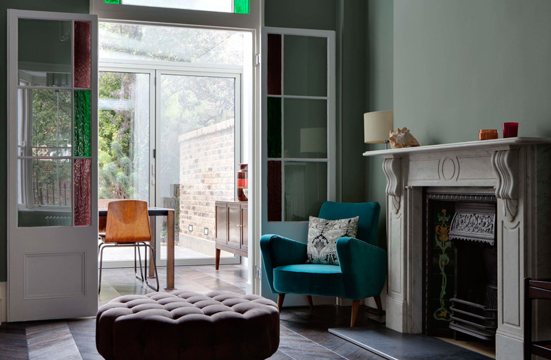
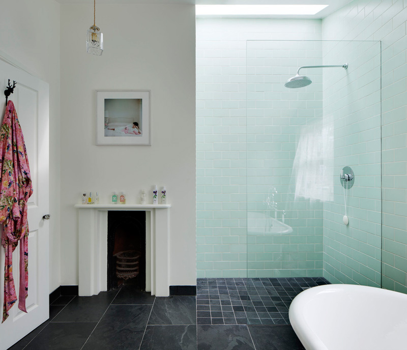
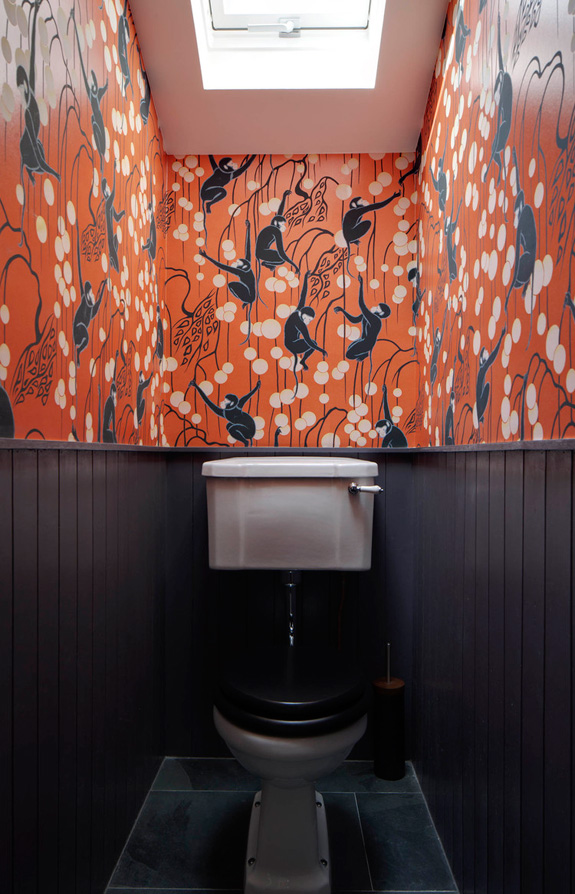
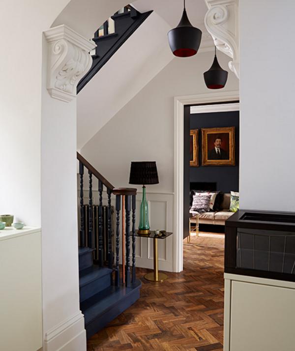
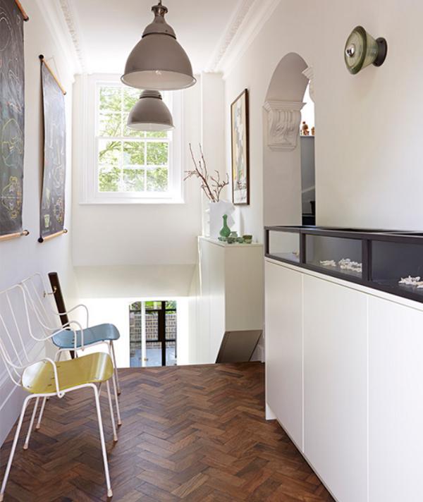
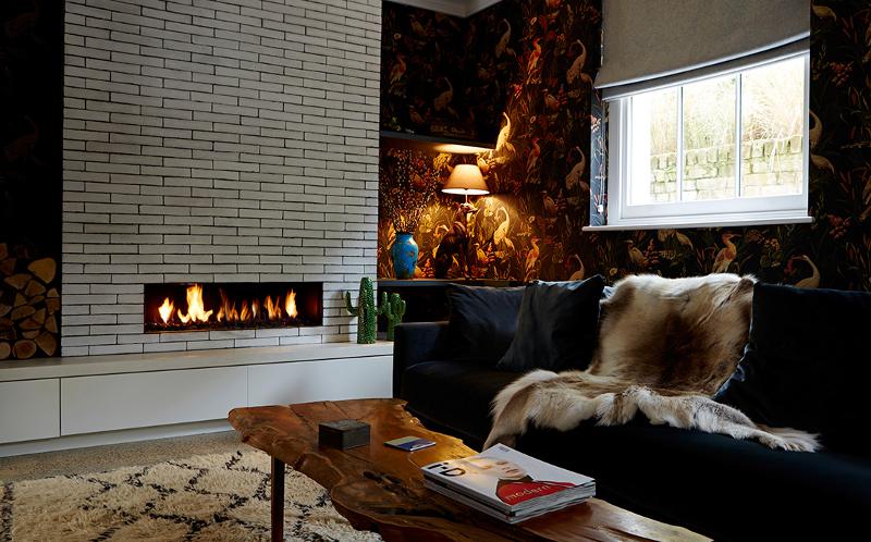
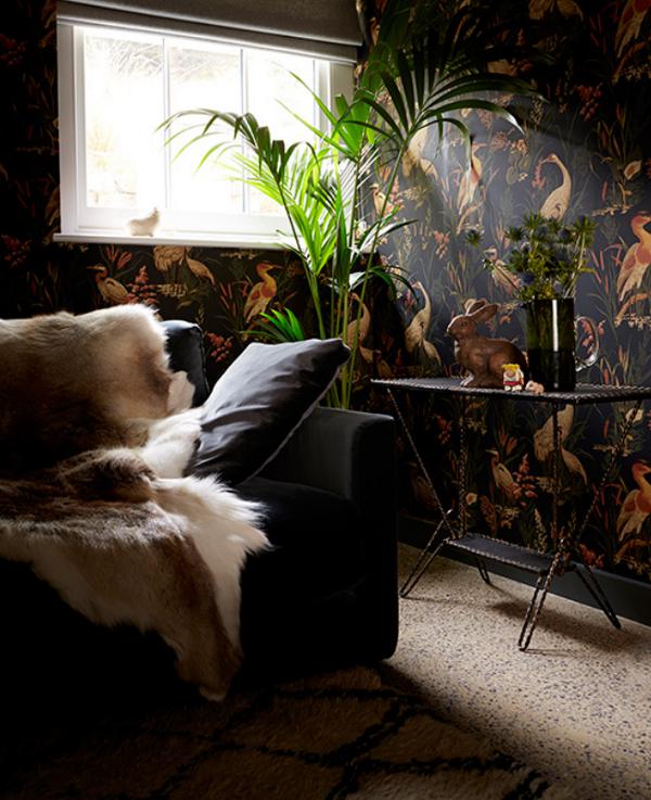
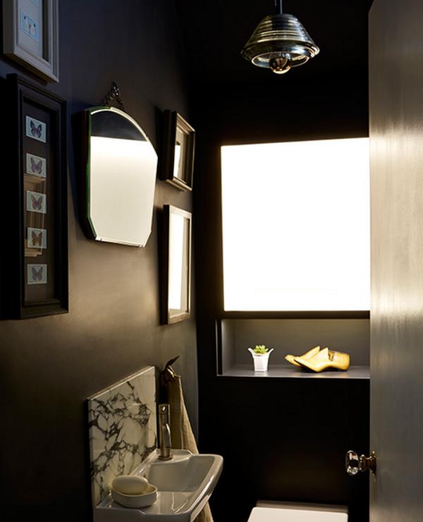
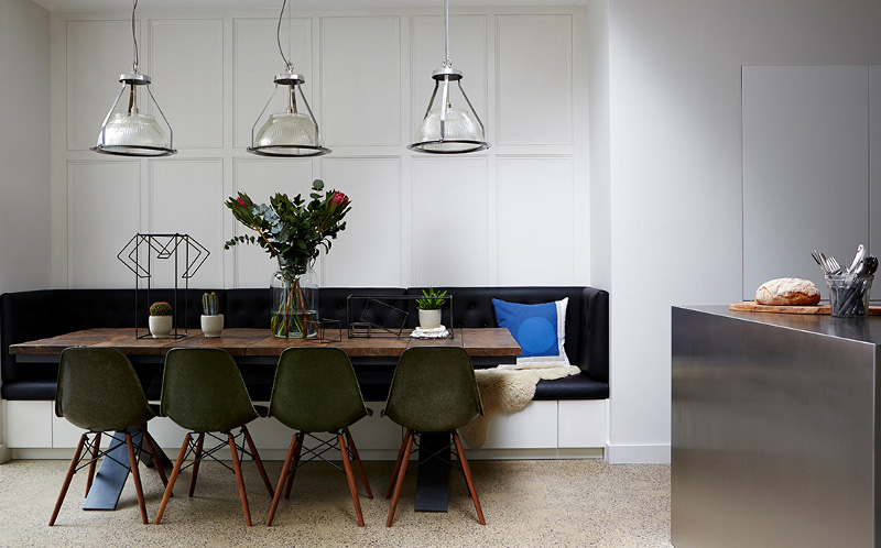
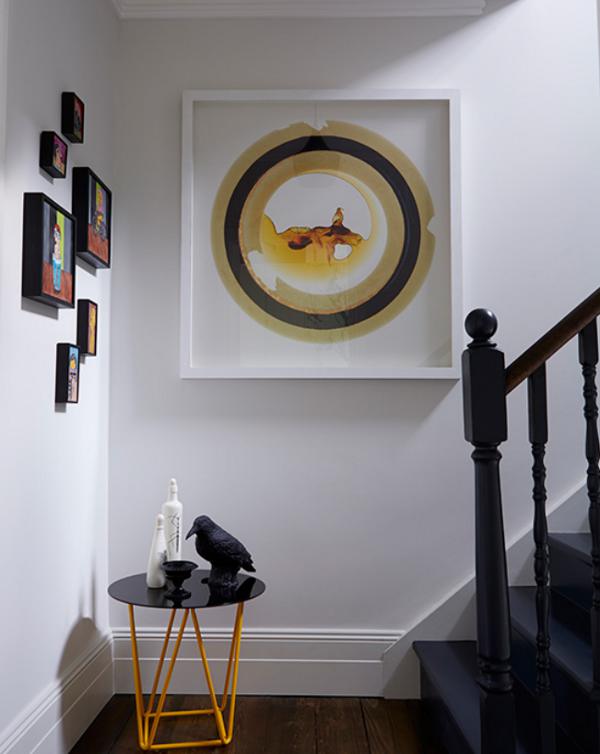
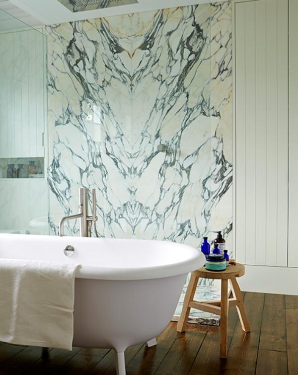
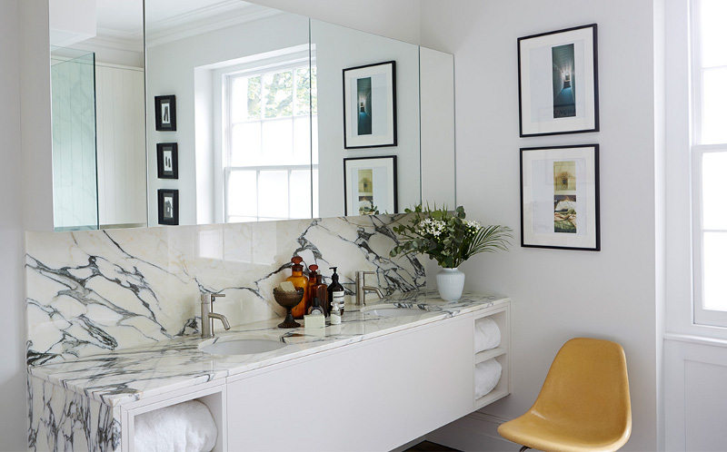
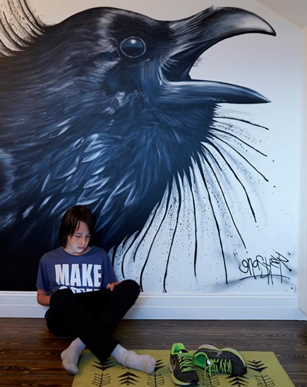
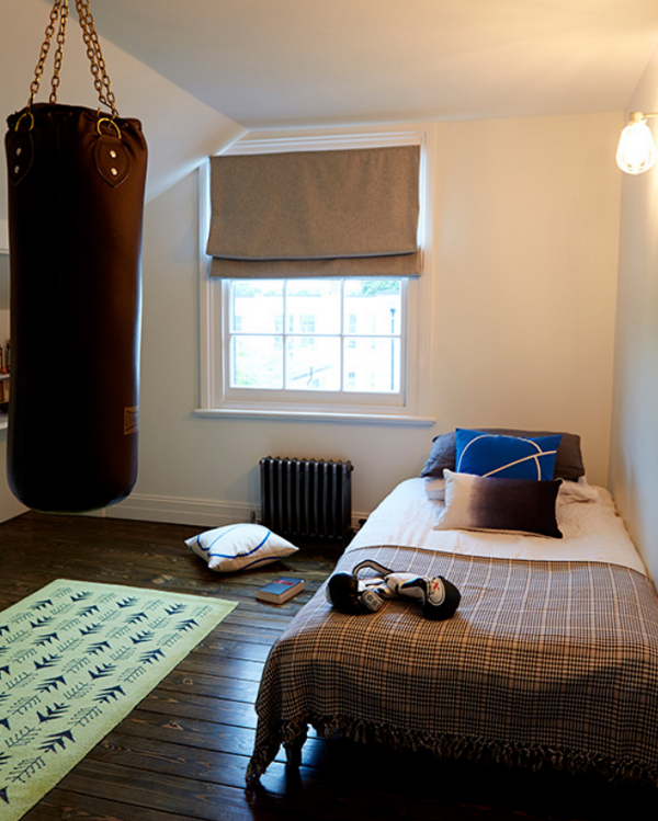
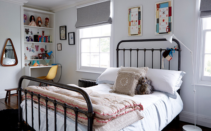
Latest from Graham Atkins-Hughes
Posted on Mon, 13 Oct 2014 by midcenturyjo
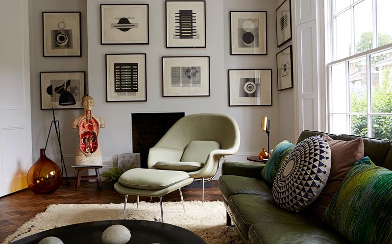
It’s not that he doesn’t take great photographs. It’s not that the houses he shoots aren’t amazing. No what makes me love London based photographer Graham Atkins-Hughes‘ body of work is his understanding of mood and atmosphere, space and light. How we inhabit spaces and, as the viewer of his photos, how we react to them. Oh and the photos are great too and the houses amazing. Here is his latest shoot, Art House of Hackney.
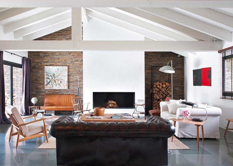
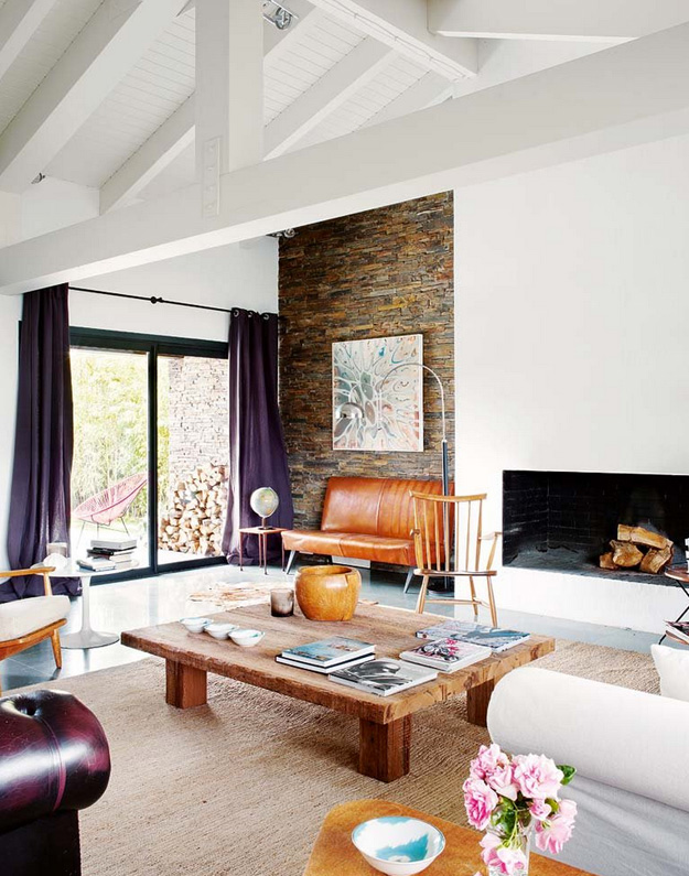
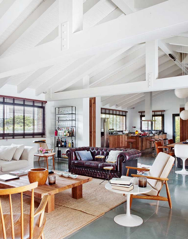
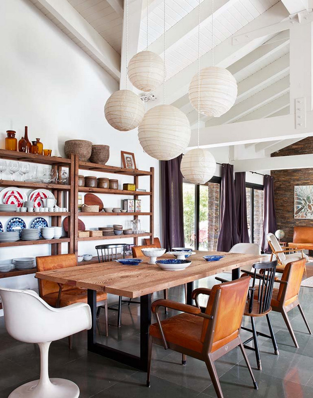
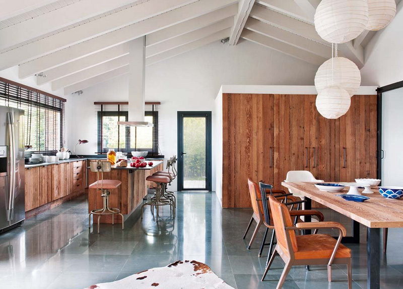
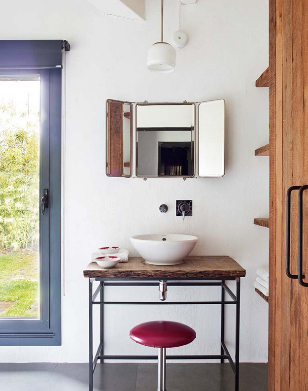
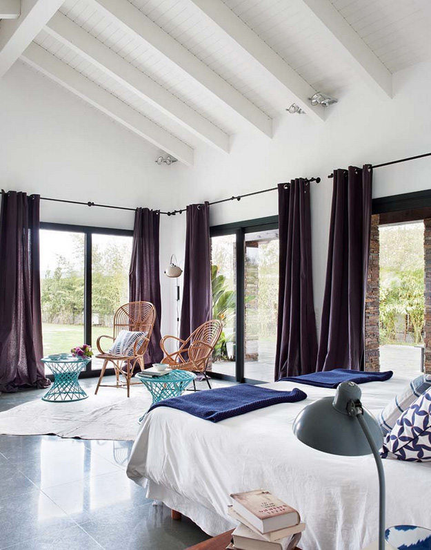
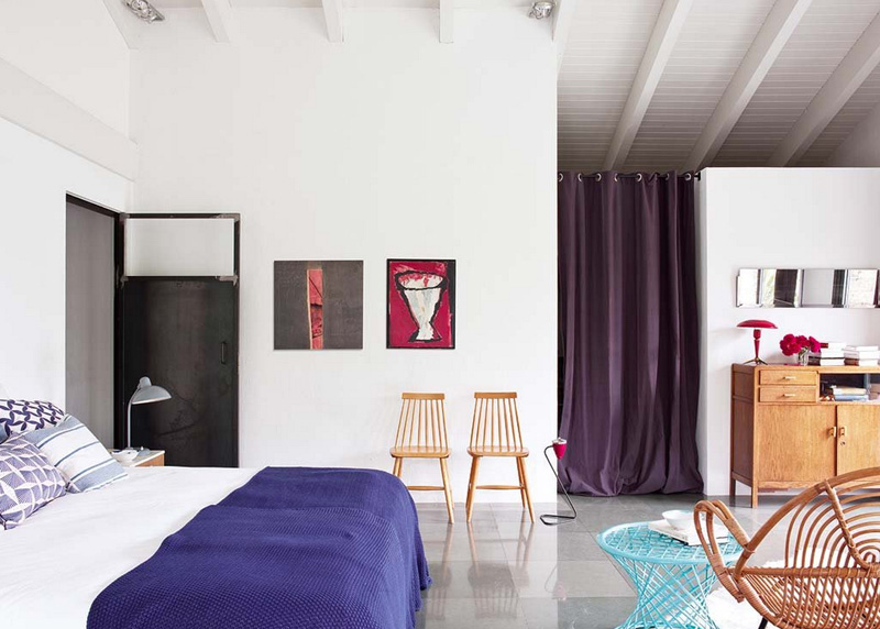
Leather, wood and stone
Posted on Sun, 12 Oct 2014 by KiM
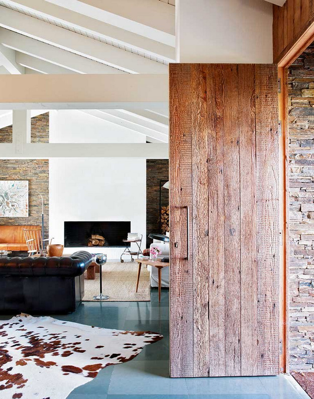
I fell in love/hate with this cottage/home in Spain featured in a recent issue of Nuevo Estilo. It’s huge open layout is perfect for cottage life and would be a fantastic gathering space of lots of friends and family. The combination of rustic (reclaimed wood, stone) mixed with a leather chesterfield and plaid chair also joined with some mid-century chairs and tables – bringing such disparate pieces together really works here. However, I am baffled by all of the window treatments – massively long purple curtains (why purple? WHY??) and blinds hung way too high. AGH!! The one red, one silver light fixtures in the bathroom…bad idea. (I won’t even discuss the bedding). And it is disappointing to see such a lazy approach to the ceiling and beams. Spraying it ALL white instead of leaving some of the raw wood showing, or at least the steal pieces. (Designed by Kotablue and Mercedes de las Heras)


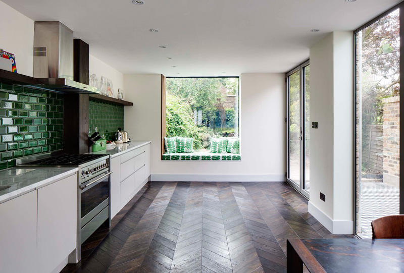
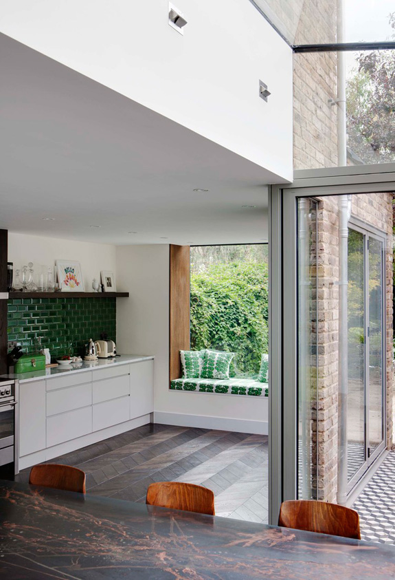
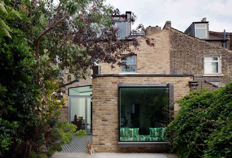
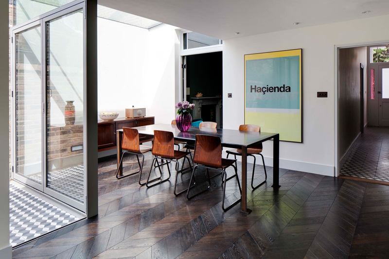
A favourite of Brian O’Tuama Architects
Posted on Fri, 10 Oct 2014 by KiM
LAWD HALF MURSEY WILL YOU LOOK AT THAT CHEVRON HARDWOOD FLOOR!!!!! (It’s so beautiful I might cry)