Some light
Posted on Tue, 27 Sep 2011 by KiM
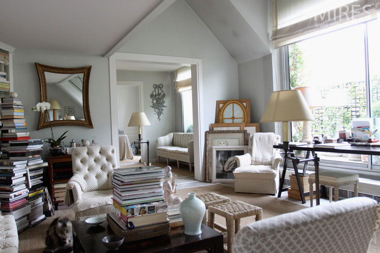
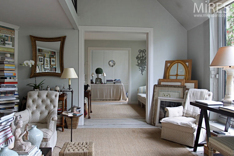
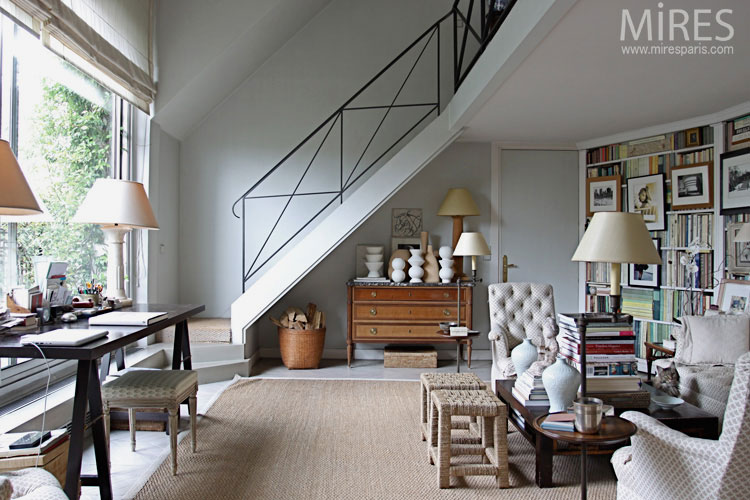
This is the first of 2 posts I have for you today. There is such a huge difference in the mood of a space depending on the colour scheme used…whether it be light or dark. This space is all about white and beige. Classic and French-inspired. The perfect space for a bookworm (although it could use some work – some of the furnishings are just plain icky).
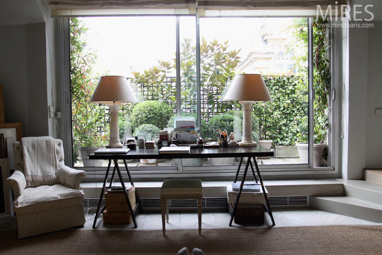
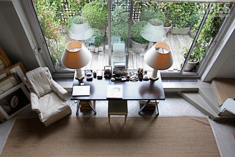
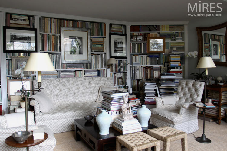
via Mires Paris
Leave a Reply to Graes Cancel reply


Stephanie Cristalli says:
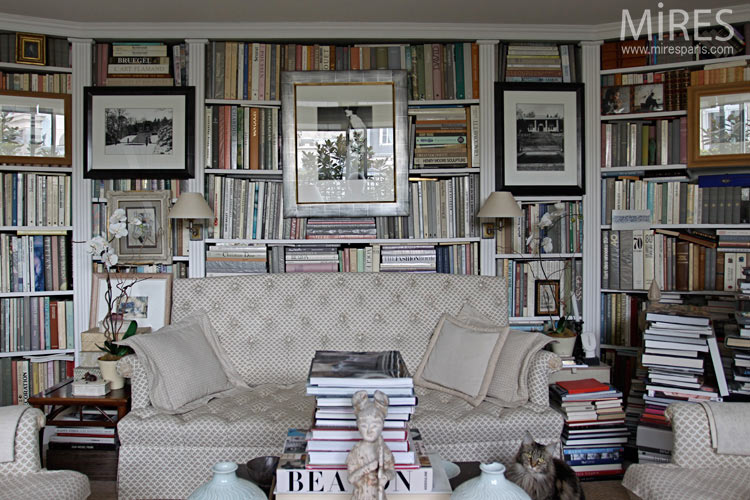
I can't decide what I think of the framed artwork hanging over the bookshelves. I have been seeing it a lot lately and it seems a little cluttery…but at the same time I kind of like the casual approach.
Sharon says:
I love the overall scheme and feel – but those bookshelves…….I couldn't take advantage of the calm space with all that higgeldy-piggeldy clutter
Cussot says:
I agree, Stephanie. I'd never do it at home because my husband the bookworm would always be nudging the pictures askew.
This is a man who pauses a DVD to read the title of a book on the killer's coffeetable. To balance out the universe, I email him every photo I come across of books with their spines turned to the wall …
Sy Higley says:
I like that it looks lived in. I don't mind the books-not at all. A space doesn't need to be 'brand new' to be beautiful.
Thera says:
I am very curious as to which furnishings the author considers icky?
KiM says:
I find the sofa and matching chairs pretty gross.
Tom says:
all of the furniture is "icky"
the space looks like someone is preparing for a huge estate sale.
Tom says:
I take that back there is one nice dresser and two cool ottomans, the rest can be put out at the estate sale.
Price it all to sell 😉
selina says:
Oh what a relief! I am getting a bit bored of the pristine staged (very photogenic) uber perfect sterile interiors we are seeing everywhere. That's not real life. In fact I have just got my "Paris Interiors" book out recently to have a rest from all the mid-century esthetics.
I like that some of the furniture is a bit icky. The space looks friendly cosy and inviting. For once one can feel it will be fine to just flop in the couch and sip a glass of wine with a good book. I wouldn't change a thing… ok perhaps try and house the piles of books on bookshelves or try and part with some.
Tom says:
Much too cluttered for my taste, and most of the design and furnishings are not my taste. Put me down for "no" on hanging art on the front of a bookcase. I've been known to put art on a bookcase shelf, typically leaning on the back of the bookcase it self
Cécile says:
I don't think anything is icky. The matching look may be a little too dull, especially with those faded colors, but in the whole it's a pretty cute room with a nice color scheme and interesting and original details. I particularly love the lamps and the bookshelves are just gorgeous with some great books and beautiful art.
Romina says:
Cussot, you make me smile, and I really need it, thanks!
I love the coffee table, the drawer? under the mirror (but i will remove those books) , the basket full of log (even I couldn't fing the fireplace) the artwork hanging on the bookshelves (although it will choosea a couple less and smaller) and the cat…
But I will remove some lamps, at least the one that came with a table, some boos, and I will be more bold with the upholstery. Just saying…
sue says:
Put me down for "icky".
That poor kitty in three of the photos is not even on the furniture. The sofa and chairs look icky and itchy. I would not want to sit on them either.
The walls would look better white (not that off-grey) and the place is way too cluttered and dingy looking.
Maybe it is staged for an estate sale?
christa says:
Hard to get past the matching sofa and chairs, put me down for "no" on those. And it's too cluttered for me — or if you want that much clutter, it needs to be more carefully curated. I'd like it a lot better if they added a color – like a palm green.
TMK says:
I'd add more books.
Graes says:
funny bout all the "icky" comments. I just would like to get me a high-back couch like that… but in a different fabric of course!
christa says:
TMK = LOL
Miranda says:
A pet peeve = framed art hung in front of books on bookcases. WHY do people do this? To me, it shows disrespect for the books and the art alike.
Renea says:
LIGHT and BOOKS and ART!!! OH MY!!!!!
Melanie says:
Hanging art in front of books is stupid. How is one to see the titles of the books let alone easily get them off the shelf to read. I love to read and I refer to many of my books everyday for my writing. I want my bookshelves to be full of books arranged by subject so I can find them and no art getting in the way. I like art but not displayed in front of my books.