Displaying posts from July, 2012
New work from Antonio Martins
Posted on Fri, 20 Jul 2012 by midcenturyjo
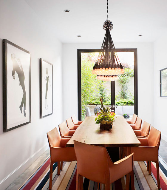
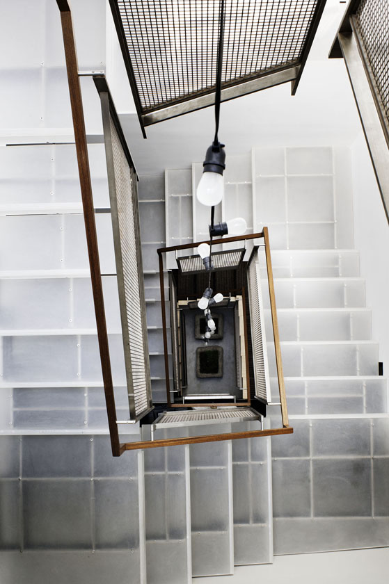
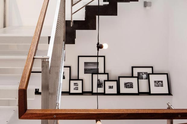
An eclectic mix of vintage, industrial and modern pieces defines the latest home by San Francisco interior designer Antonio Martins. Starting with an impressive concrete and steel base in a home designed by Zack de Vito Aarchitecture, Martins has layered not only furnishings and finishes but meaning into the modern decor. Favourites besides the Cassina Cab chairs in the dining room? The fab string of lights hanging through the stairwell and the personal touches like the b&w photos of family and friends casually propped on steel shelves. (More of Antonio Martins’ here and here.)
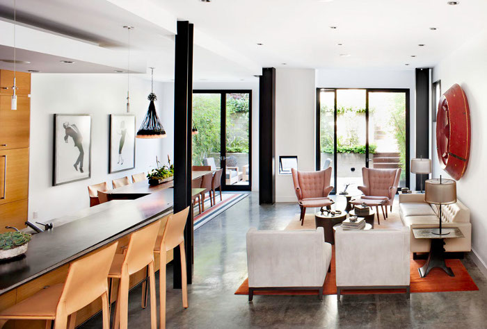

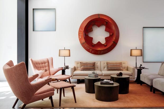
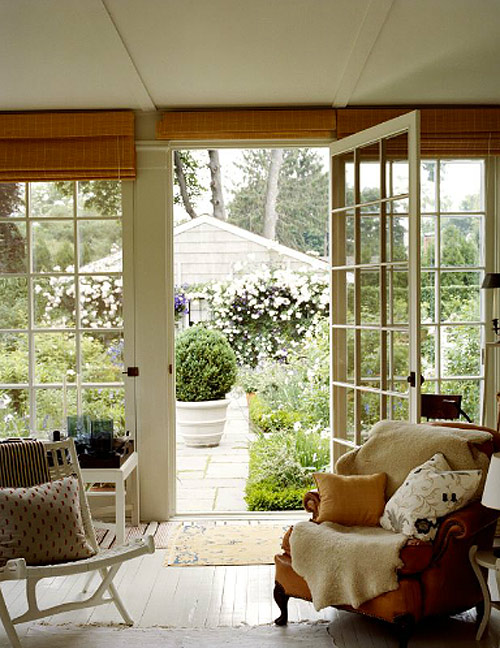
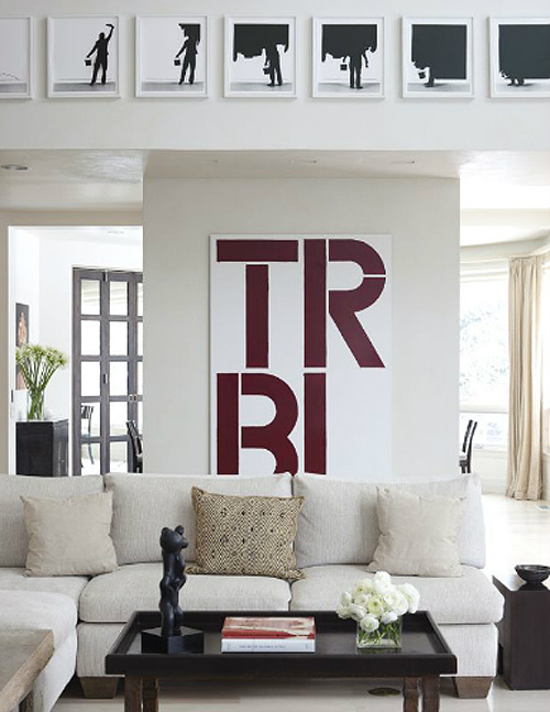
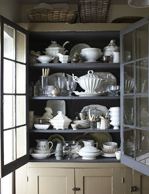
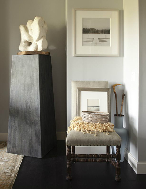
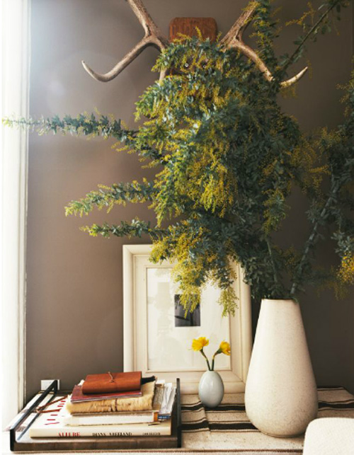
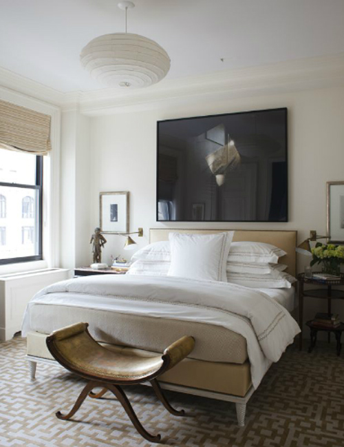
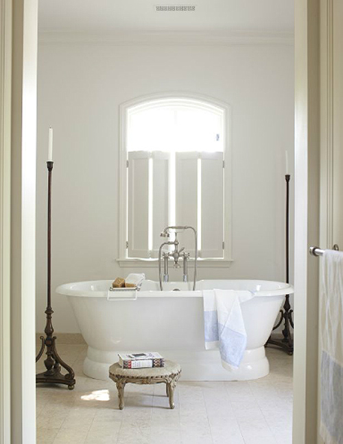
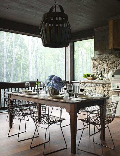
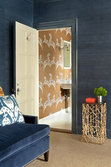
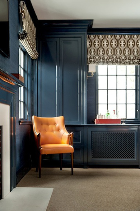
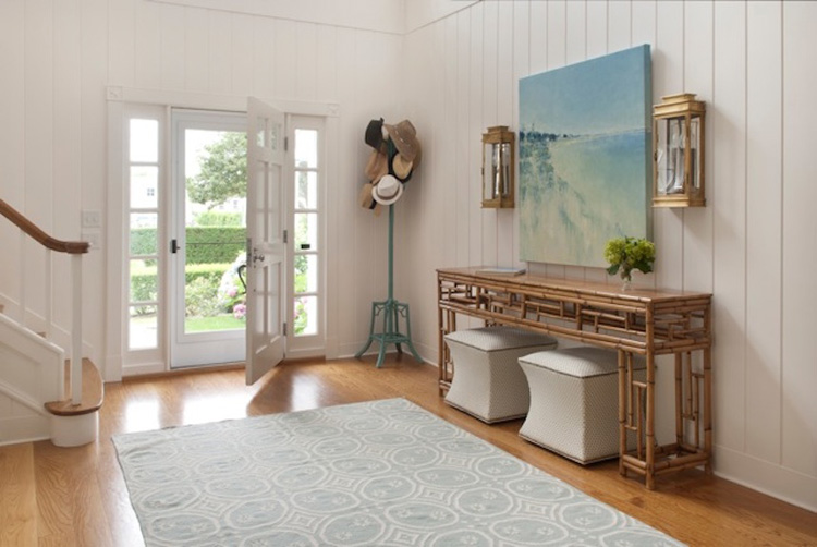
Max Kim-Bee encore
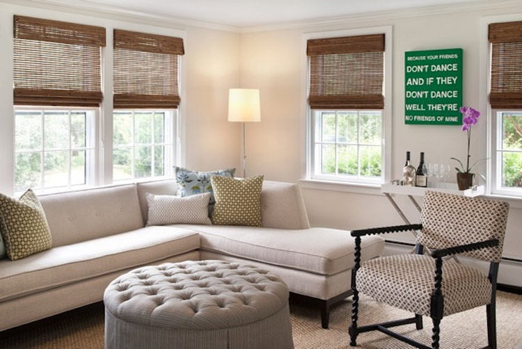
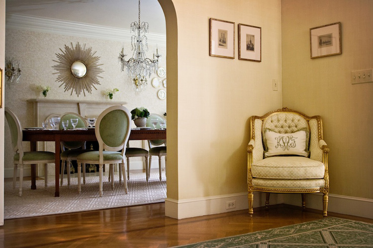
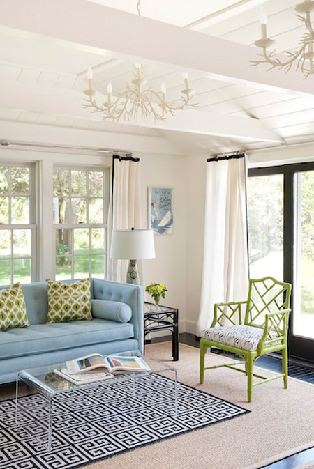
Posted on Thu, 19 Jul 2012 by KiM
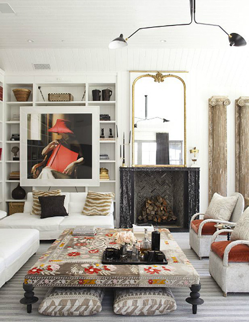
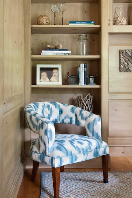
It’s been a little while since Jo featured some interior eye candy from the portfolio of photographer Max Kim-Bee, so I thought I’d re-introduce you all to some of his beautiful photos. I adore the space above – a wonderful eclectic and ethnic vibe.
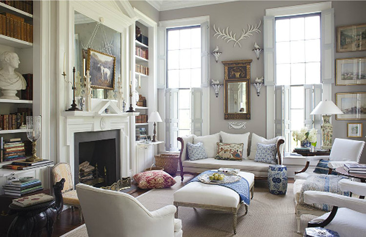
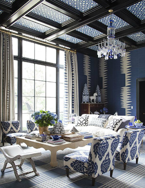
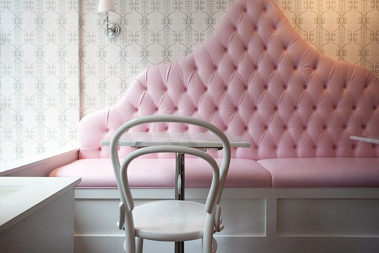
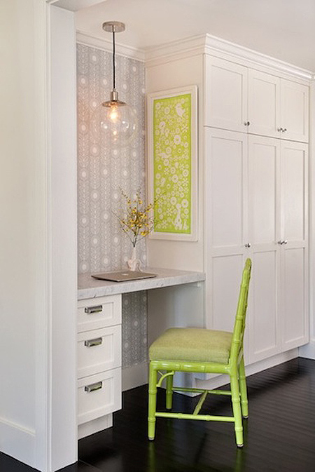
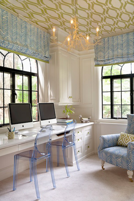
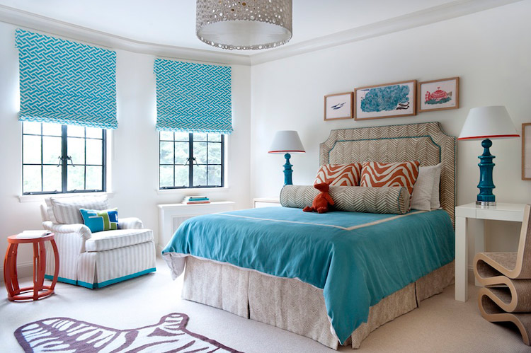
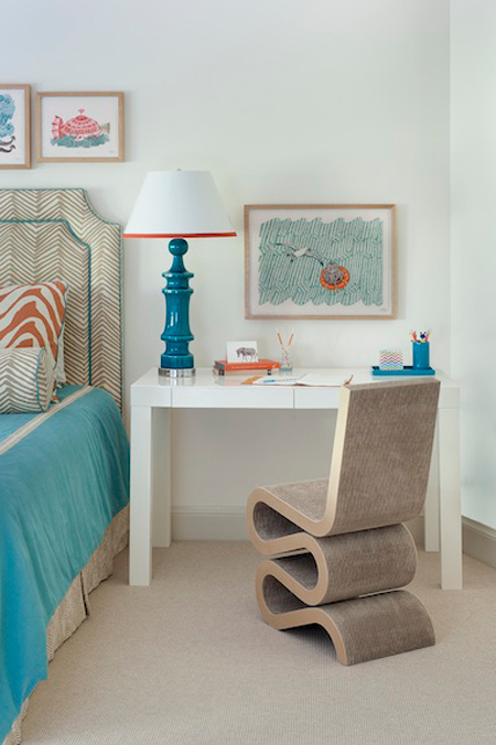
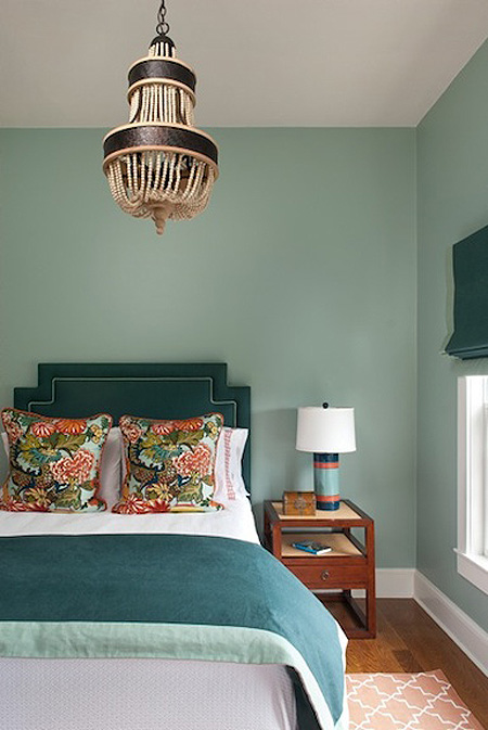
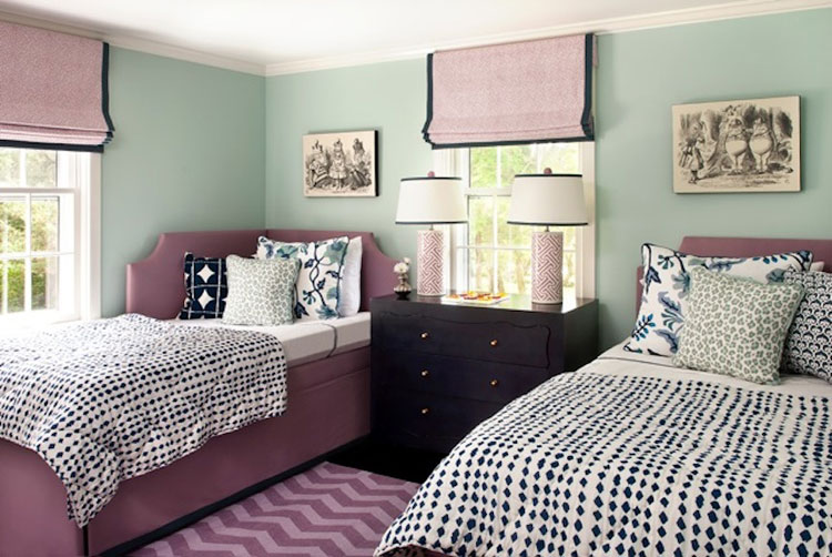
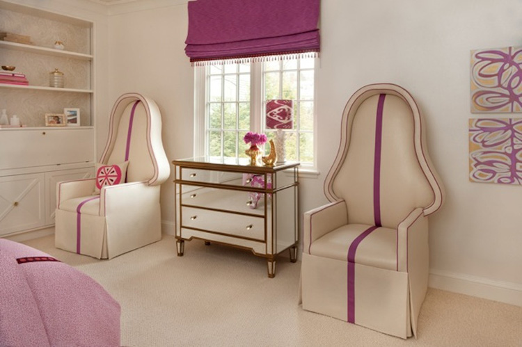
Annsley Interiors
Posted on Thu, 19 Jul 2012 by KiM
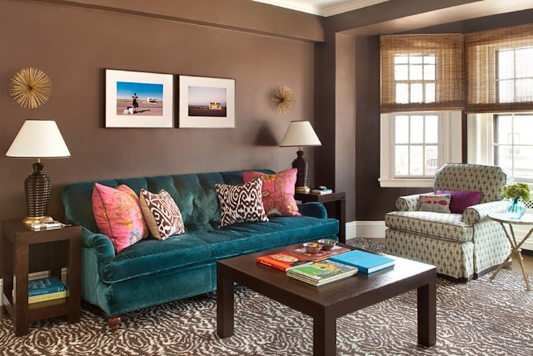
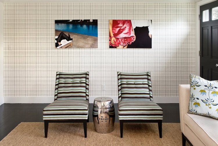
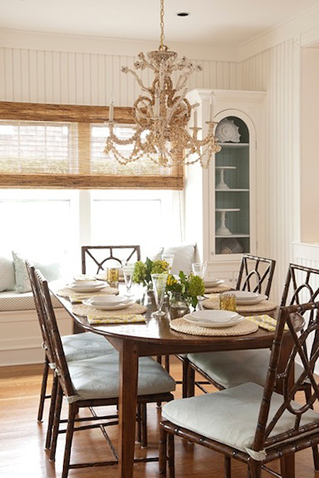
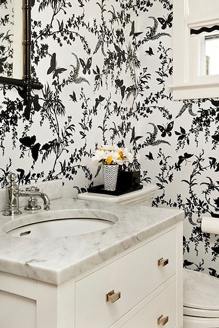
A fresh, hip take on traditional decor. Annsley Interiors, comprised of Annsley McAleer and Lindsay Nason, is just that. These ladies are not afraid of mixing up LOTS of colours and patterns to really liven up traditional furnishings. They create eye-catching and whimsical spaces with great attention to detail. I must add that I am in love with the banquette below. How fantastic would that be in a dressing room!
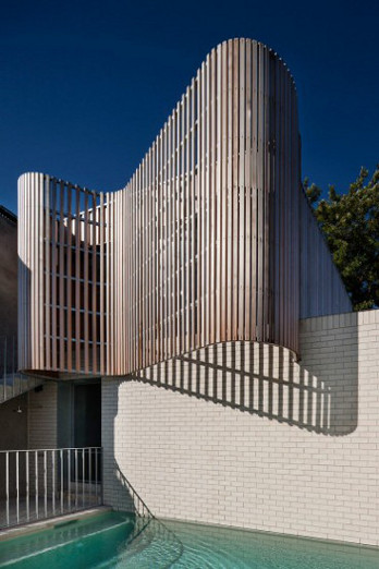
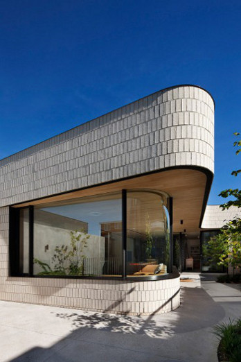
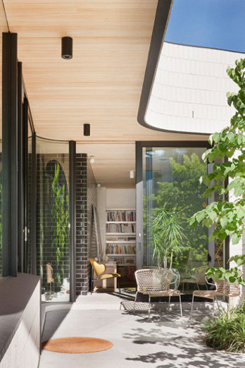
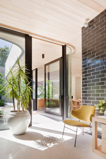
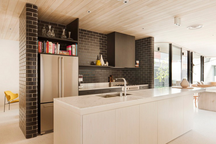
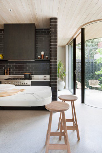
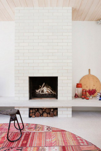
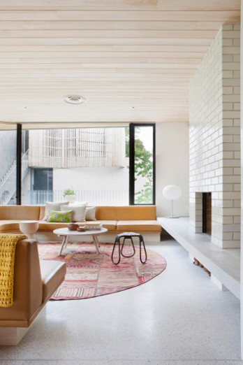
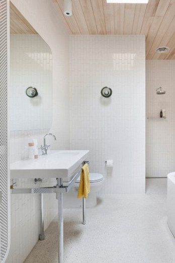
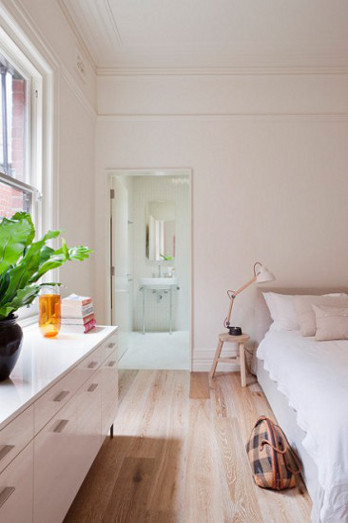
Brick house
Posted on Thu, 19 Jul 2012 by midcenturyjo
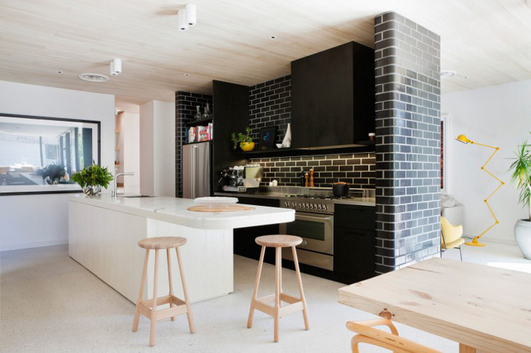
Modern and sculptural. Brick plays off concrete and timber, linear patterns meet sweeping curves. It’s a funky Melbourne house by Clare Cousins Architects that takes the raw to a new level. Bright, fresh and sun filled spaces with an indie vibe. New and now. (Photography by Shannon McGrath.)
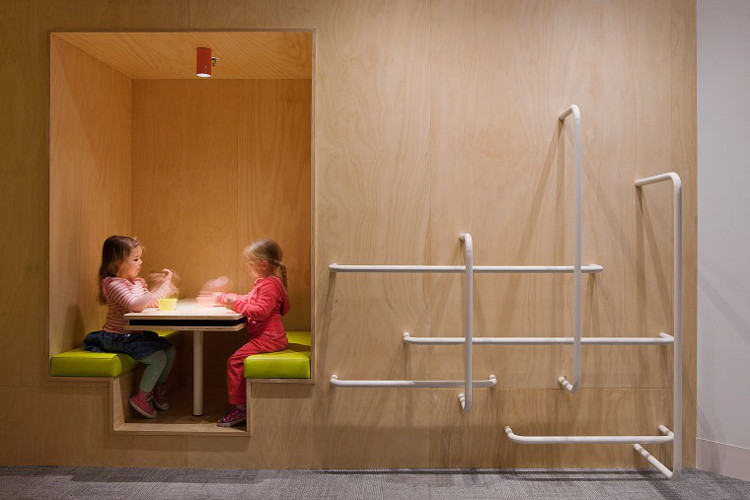
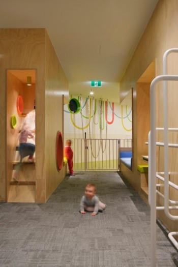
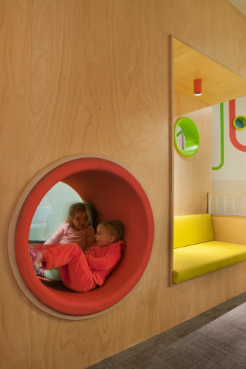
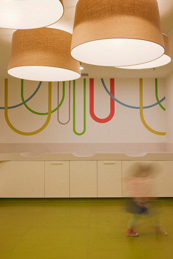
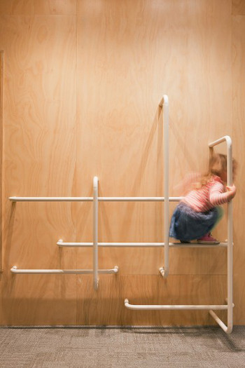
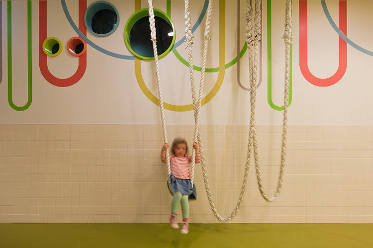
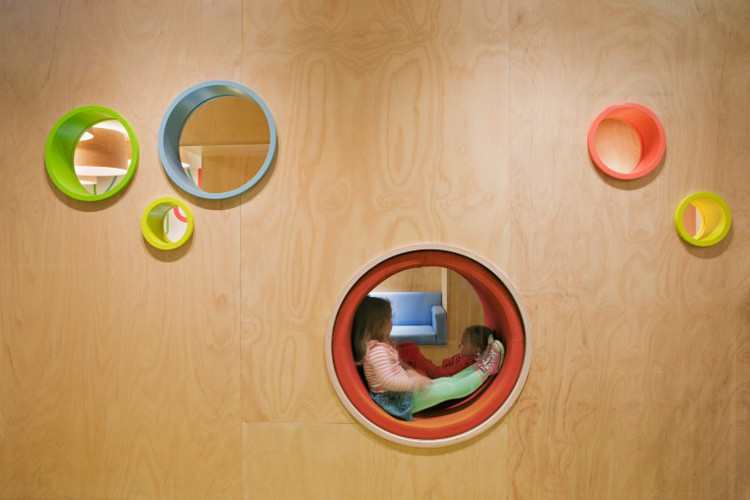
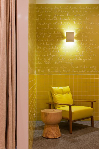
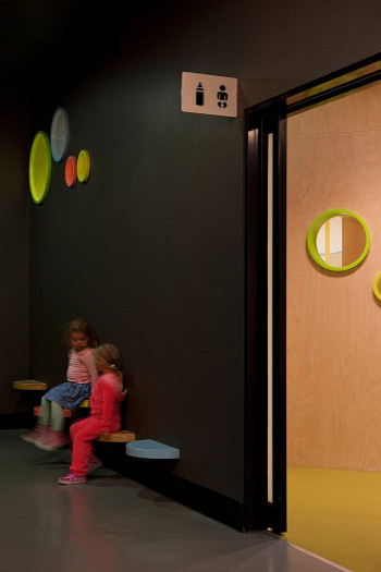
Parents’ retreat
Posted on Thu, 19 Jul 2012 by midcenturyjo
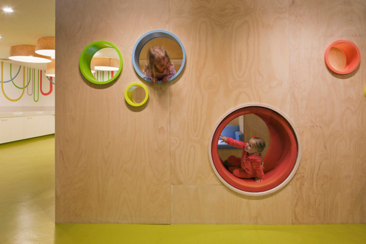
Something a little different for today’s post. The Melbourne Central Parents’ Retreat by Clare Cousins Architects.
“The brief called for three key zones: a wet area for toileting/baby change; a feeding/play area; and a retreat lounge as a waiting or alternative feeding area. While the project required a highly practical solution, ensuring children’s safety, adequate sight lines, and low-maintenance wet areas, for example, the emphasis is on peace and play. This is not a utility space, which is used and then left; rather, it encourages people to linger, children to play and parents to recharge. Key to the concept was the aim to preference local suppliers, and to use low-tech and sustainable materials, with bespoke play equipment unique to the project. A vibrant colour palette delineates and connects zones for easy navigation, while the custom-designed play equipment entices children to engage with the space physically.”
It’s fun and fab, a touch of practical luxury and leisure in an often utilitarian and frankly boring space. No “tuck them away way down the back and forget about them” but a celebration of young children and their parents, a welcome respite from the bustle of the crowds. (Photography by Shannon McGrath.)