Displaying posts from February, 2016
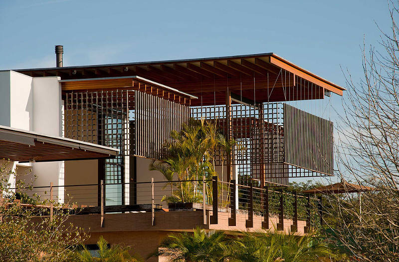
Brazilian beauty
Posted on Mon, 15 Feb 2016 by midcenturyjo
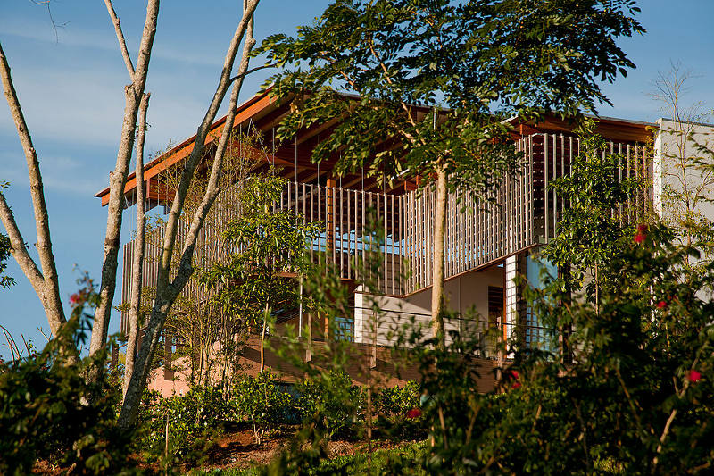
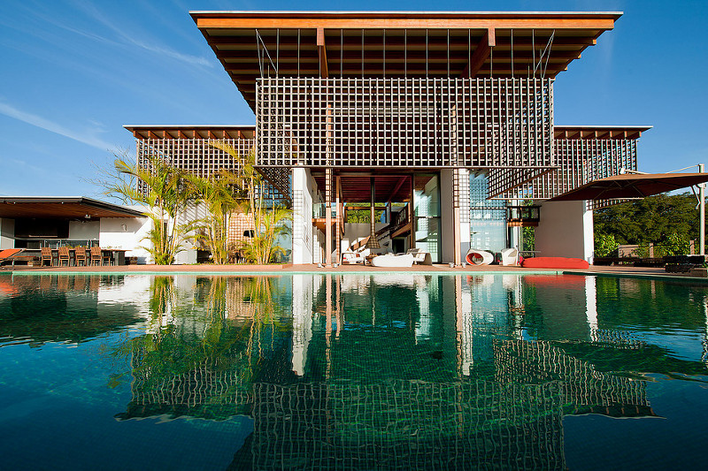
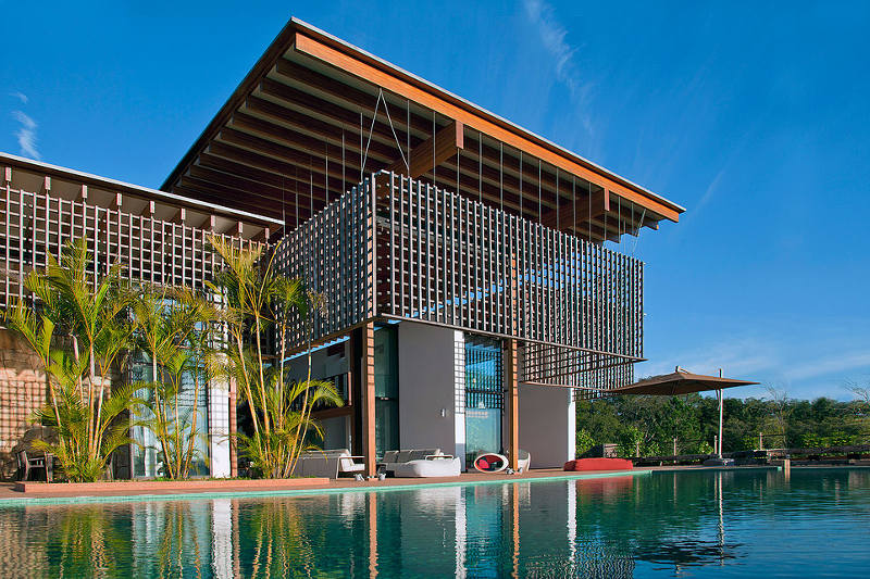
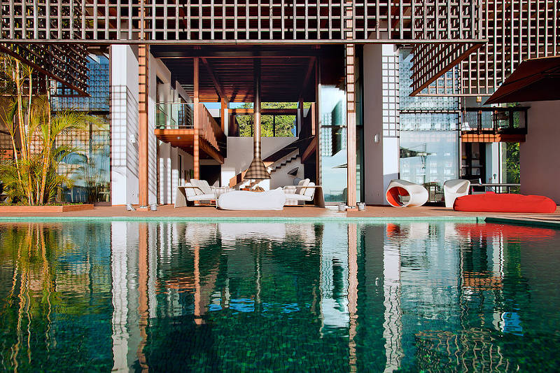
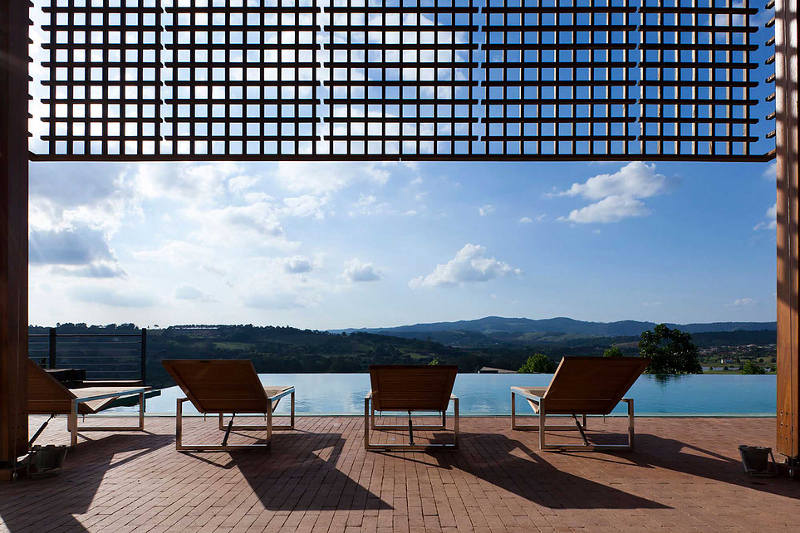
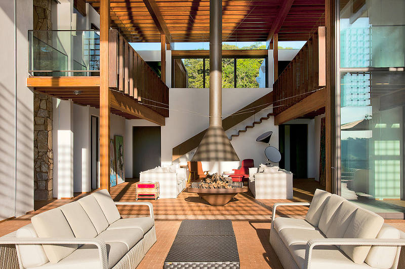
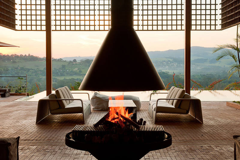
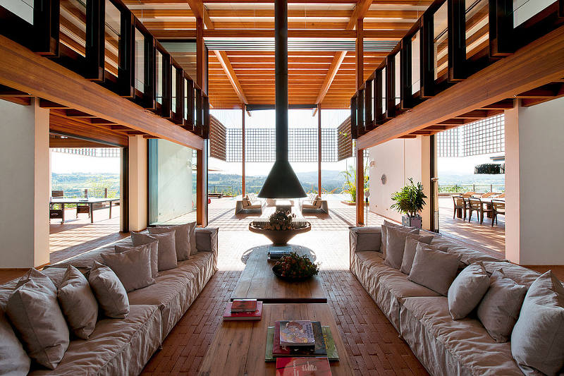
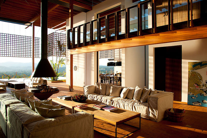
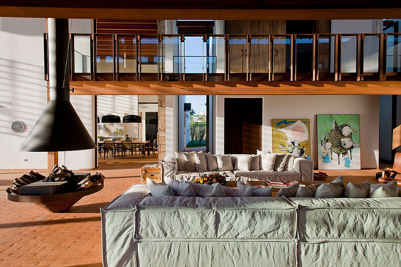
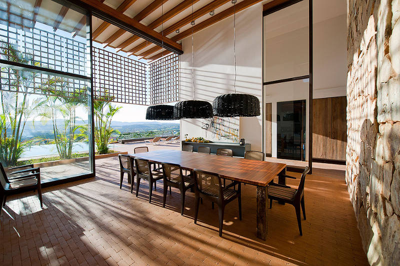
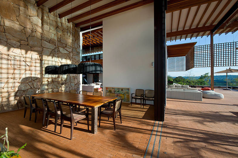
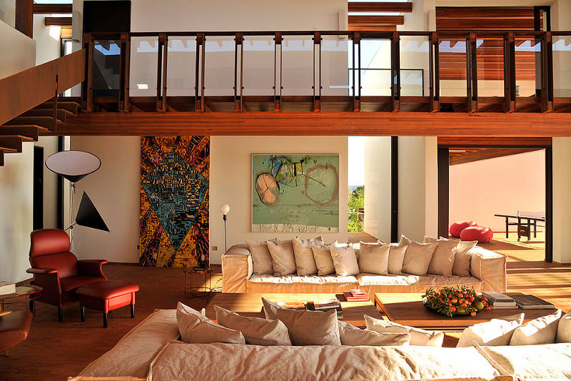
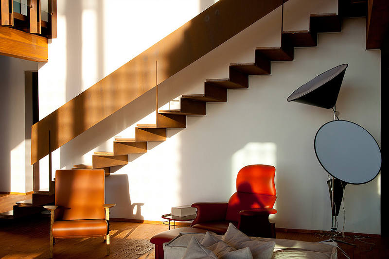
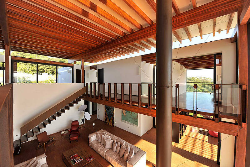
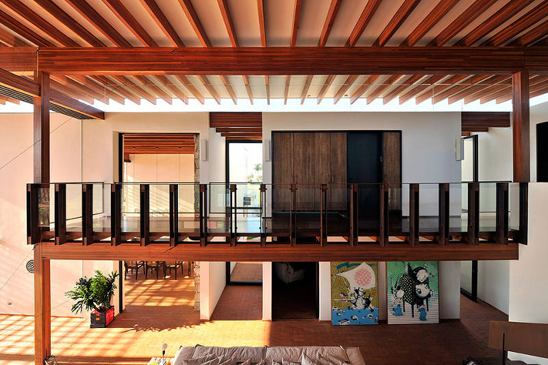
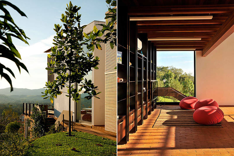
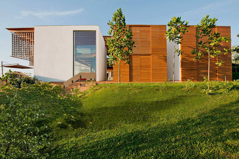
Sitting proudly on the rise with its face turned to the sun is the striking Quinta da Baroneza House by São Paulo-based Candida Tabet Arquitetura. Massive spans and a play of horizontal against vertical elements characterise the design. Sun kissed, open and generous. A true Brazilian beauty.
Dalla Polvere
Posted on Mon, 15 Feb 2016 by midcenturyjo
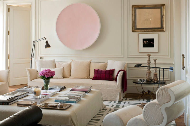
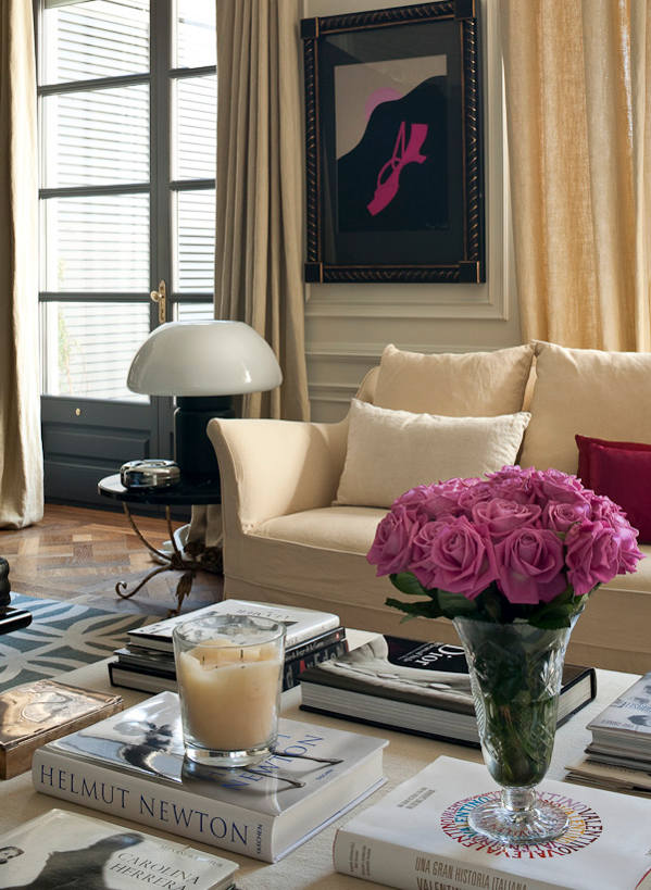
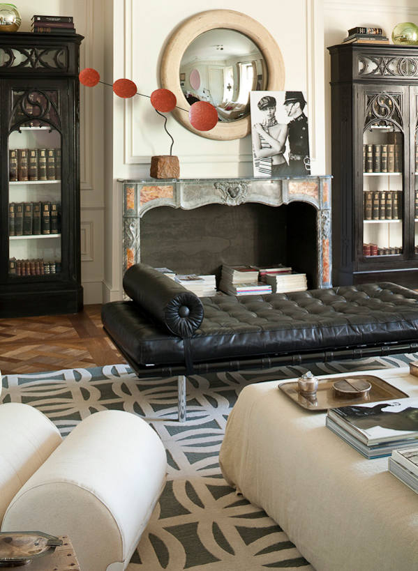
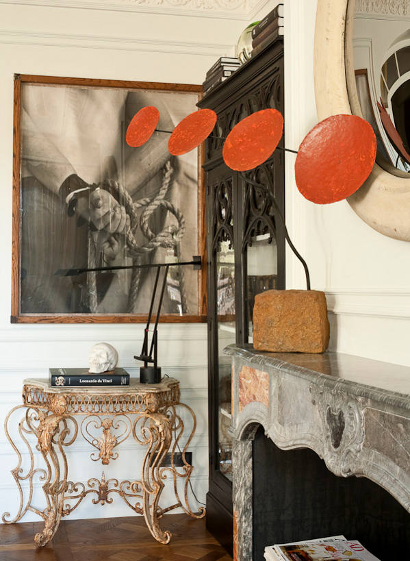
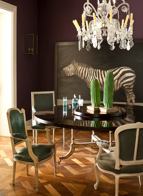
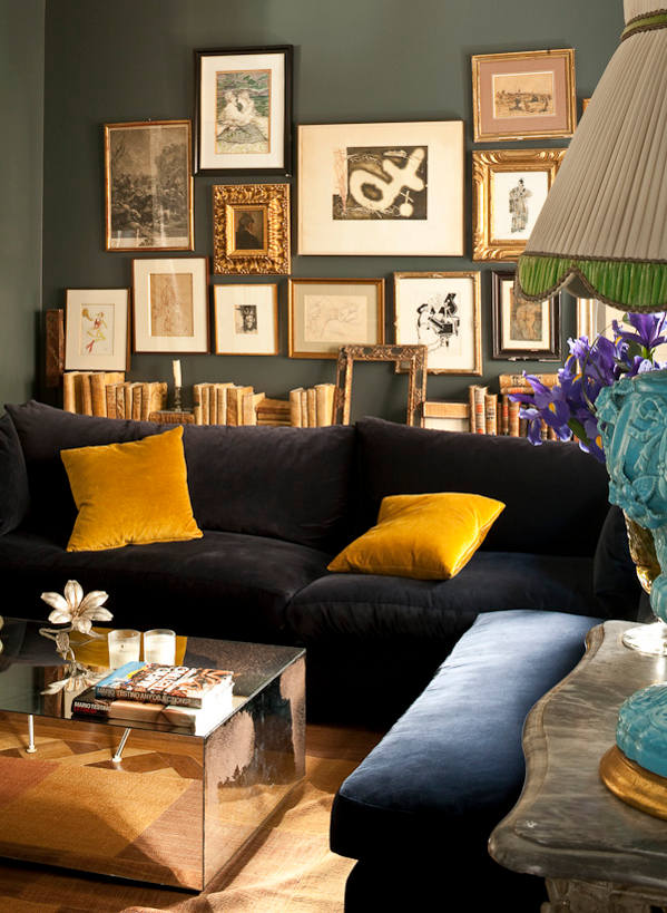
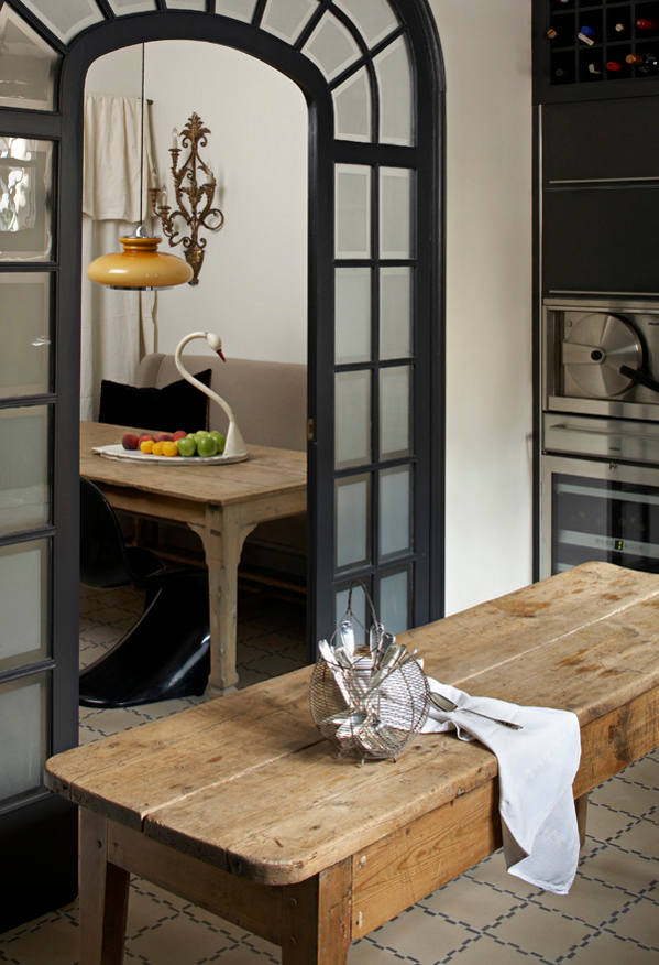
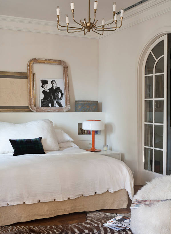
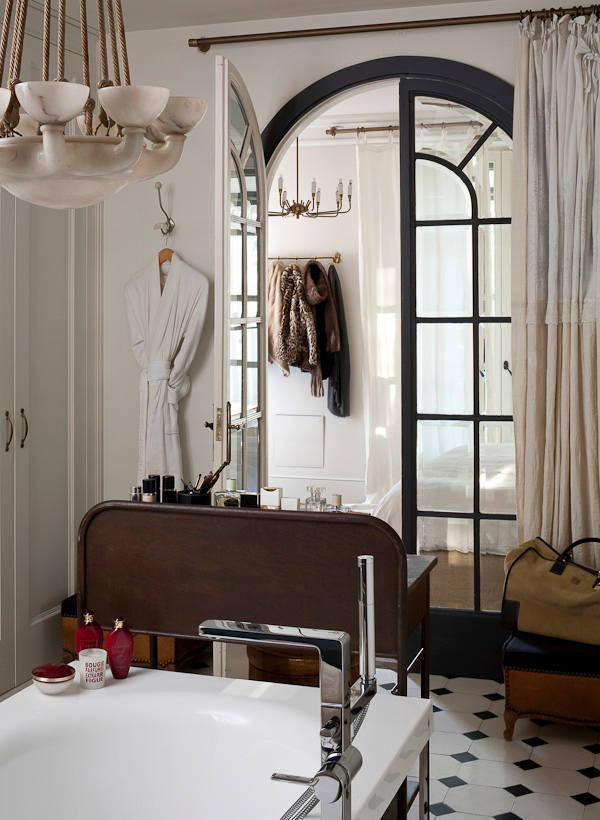
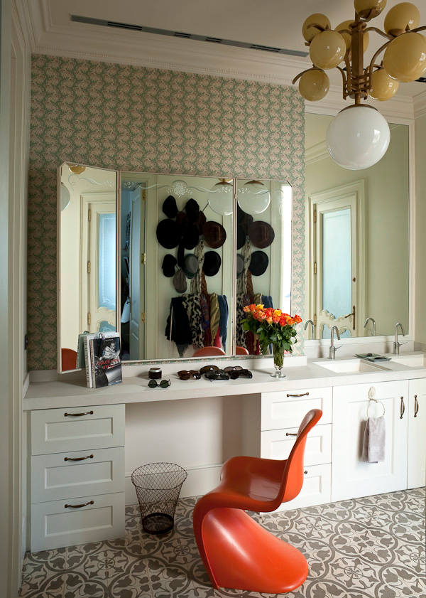
In the city of Gerona in the Catalonian region of Spain, a graphic designer and a fashion designer have joined forces to create stylish spaces redolent with that slightly eccentric, always decadent European eclecticism. 18th century antiques sit beside 20th century icons, French with Italian and Belgian, layered with silks and linens, leather and velvet… and always art. Piso Villa by Dalla Polvere.
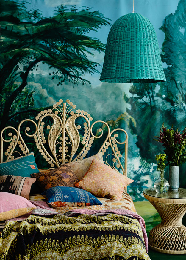
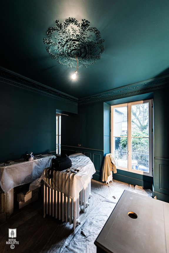
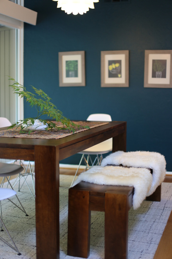
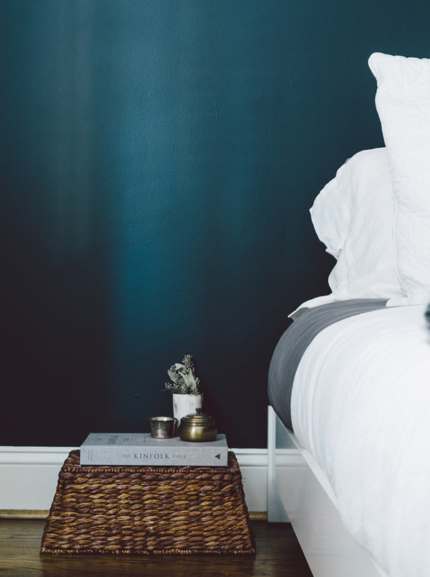
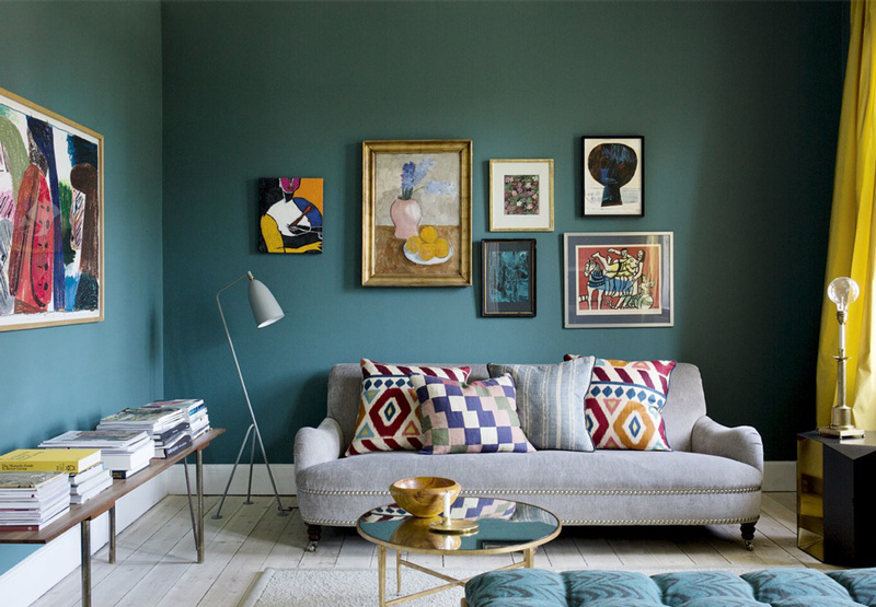
Vardo by Farrow & Ball
Posted on Fri, 12 Feb 2016 by KiM
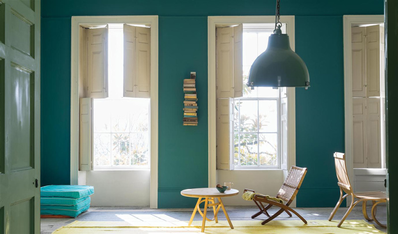
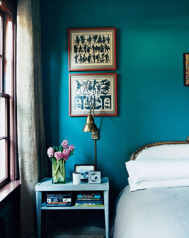
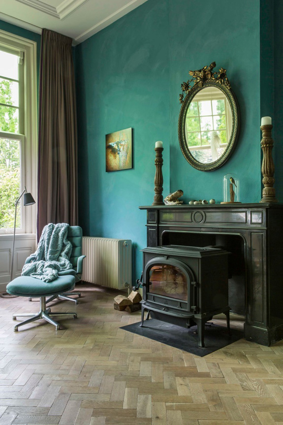
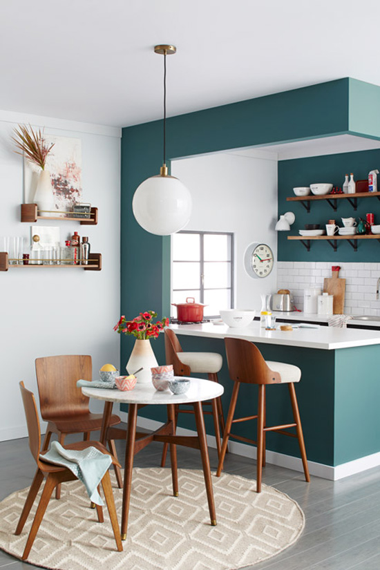
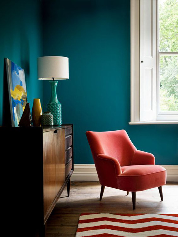
Vardo, the teal that Farrow & Ball never had…UNTIL NOW. If I wasn’t hung up on pink for my dining room, this would be the colour I would use. I find teal shades can be hard to get right. They are either too blue or too green or too bright. Vardo is the prefect mix of blue, green and grey. I may be obsessed with it. I would love to see it on a front door. So I went looking for some Vardo inspiration and here is what I found….
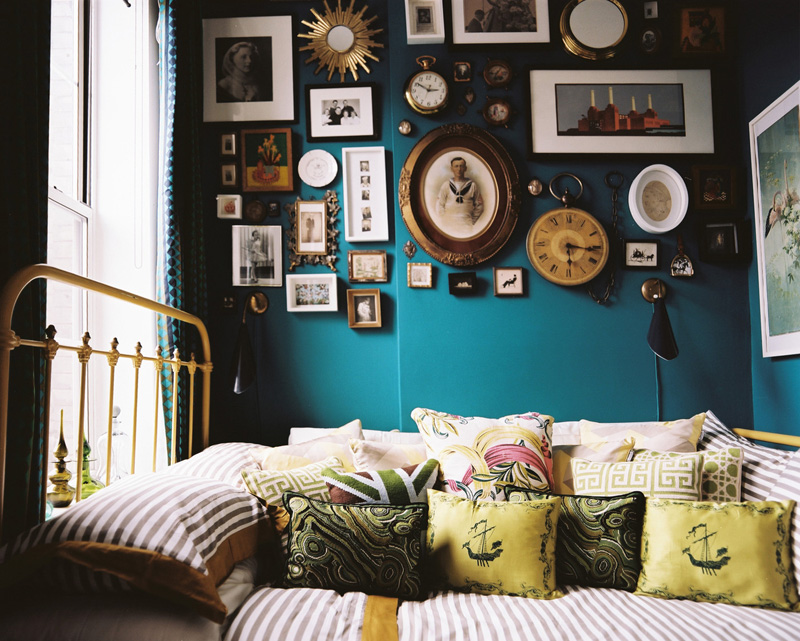
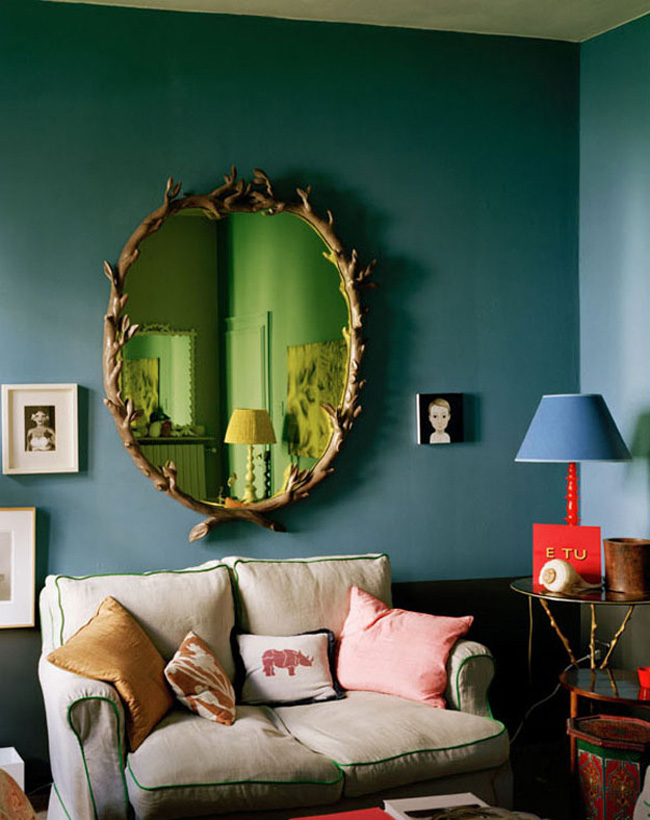
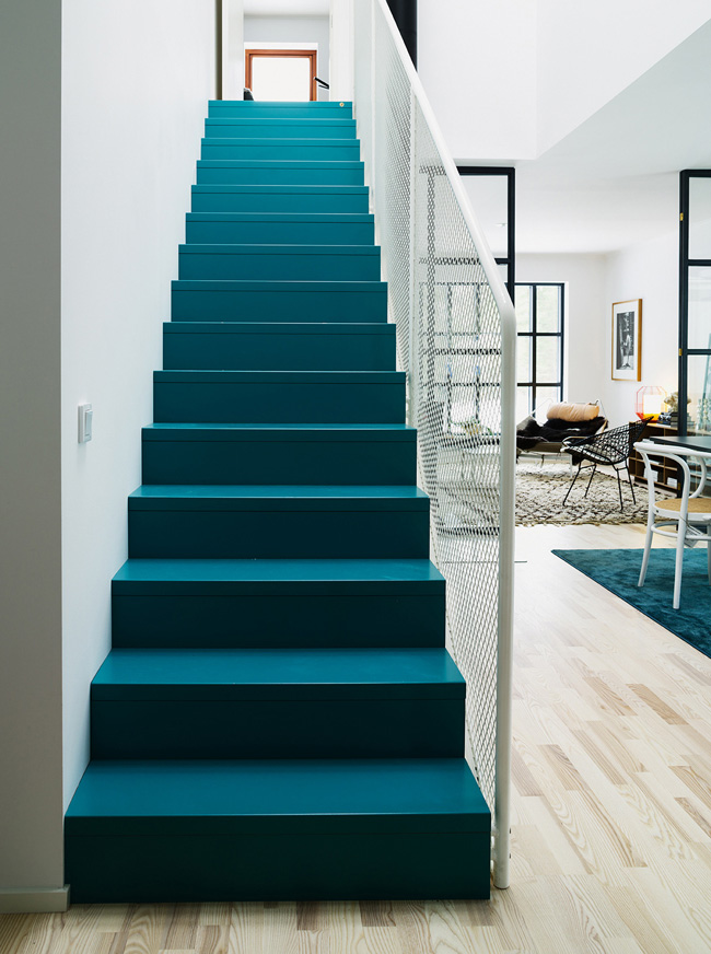
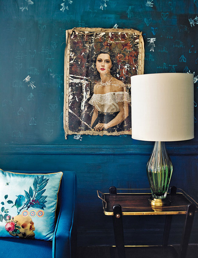
Dirk Jan Kinet via Architectectural Digest Spain

Revamping the 80s
Posted on Fri, 12 Feb 2016 by midcenturyjo
Talk about how to drag an 80s home kicking and screaming into the 21st century. Wow! Retaining original features like the curved walls the house is now fresh and fab, updated but still with a playful nod to the decade the taste forgot. (No, no, not true! I’m sure there was good taste. I was there. I looked amazing!) Hawthorne East House by Fiona Lynch. Love it!
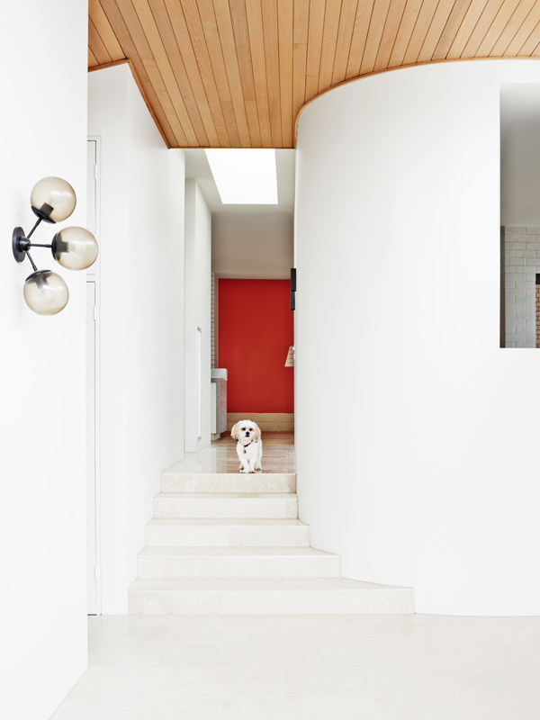

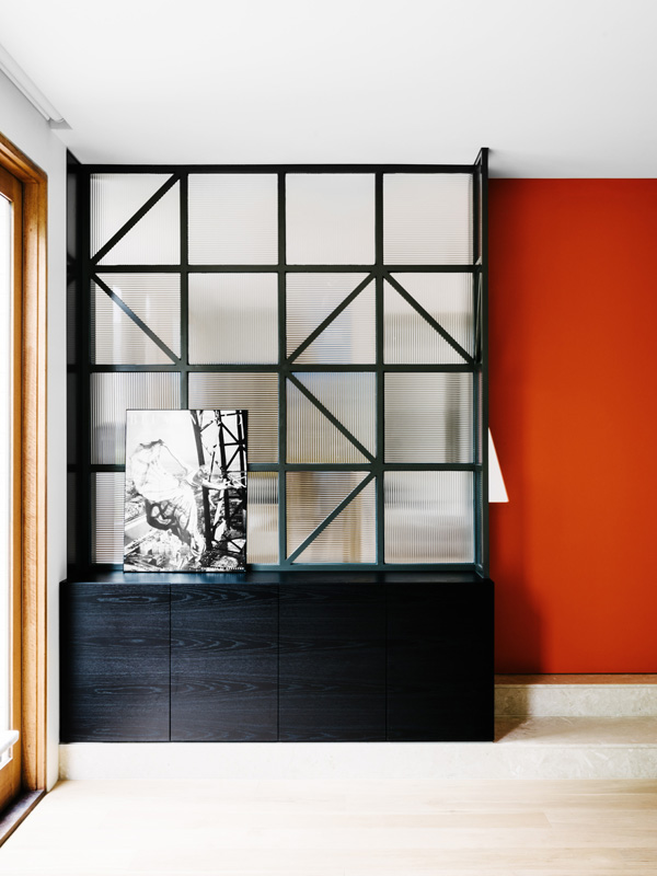
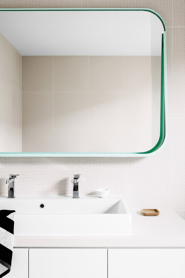
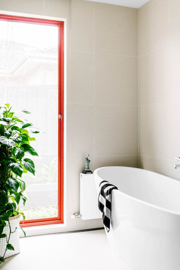
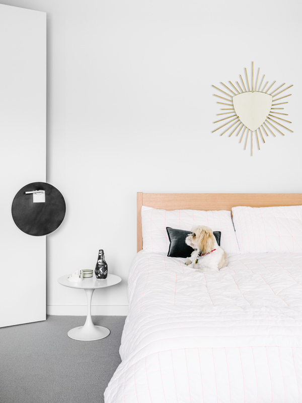
Photography by Brooke Holm. Styling by Marsha Golmec.
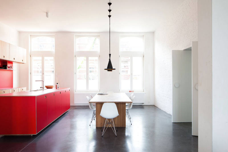
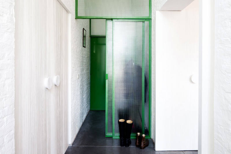
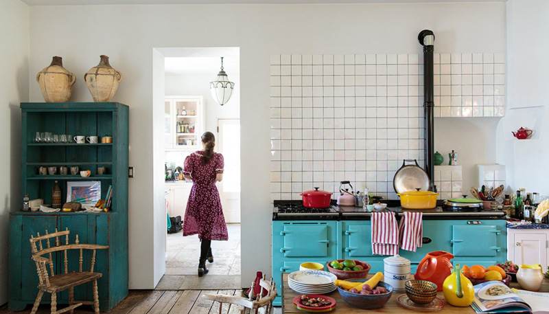
Take it as “red”
Posted on Fri, 12 Feb 2016 by midcenturyjo
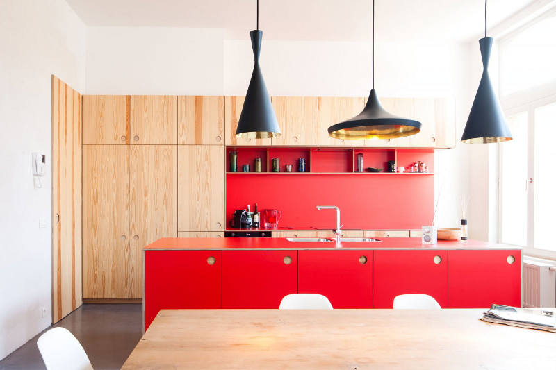
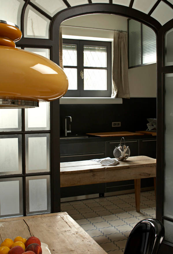
You can definitely take it as read that I love this modern kitchen by Belgian architects B-Bis. The use of primary colours and plywood to delineate the modern insertions within this historic shell is fun and fresh. Not sure that I could do my makeup in the yellow bathroom though. Perhaps it’s a bachelor pad?