Displaying posts from January, 2023
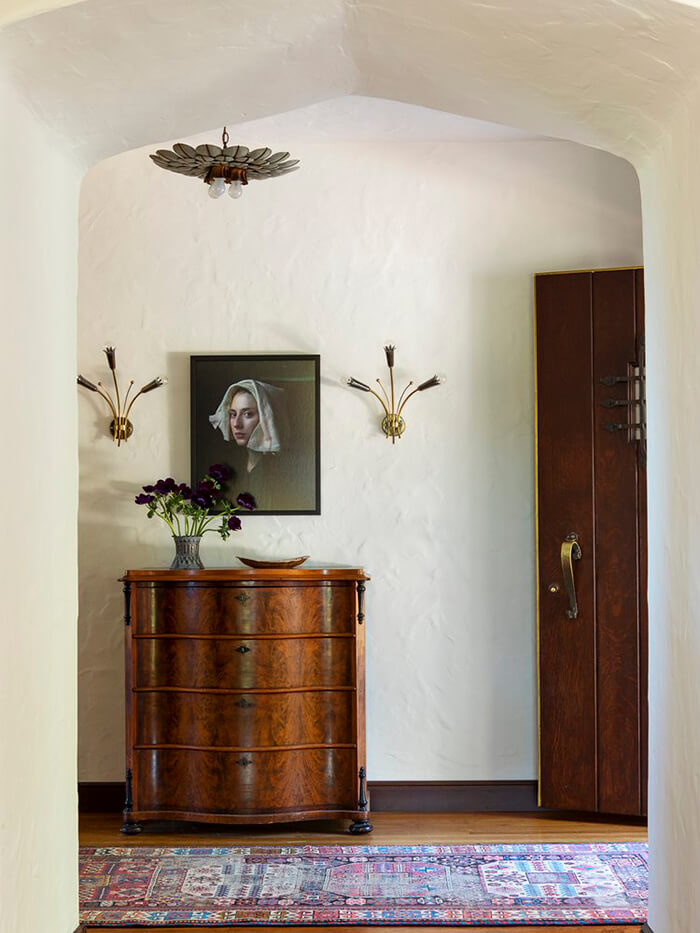
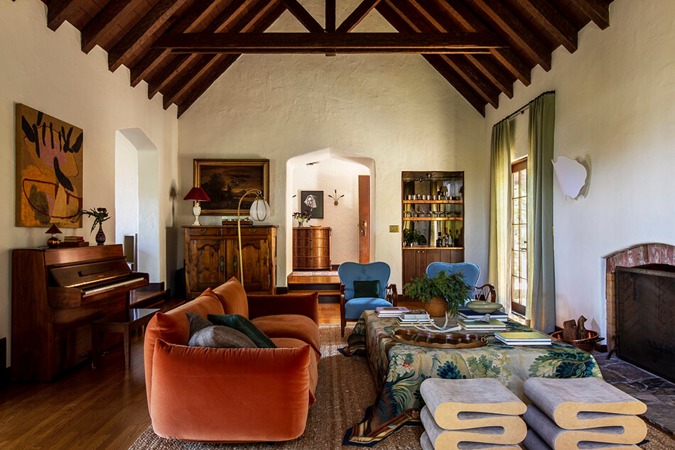
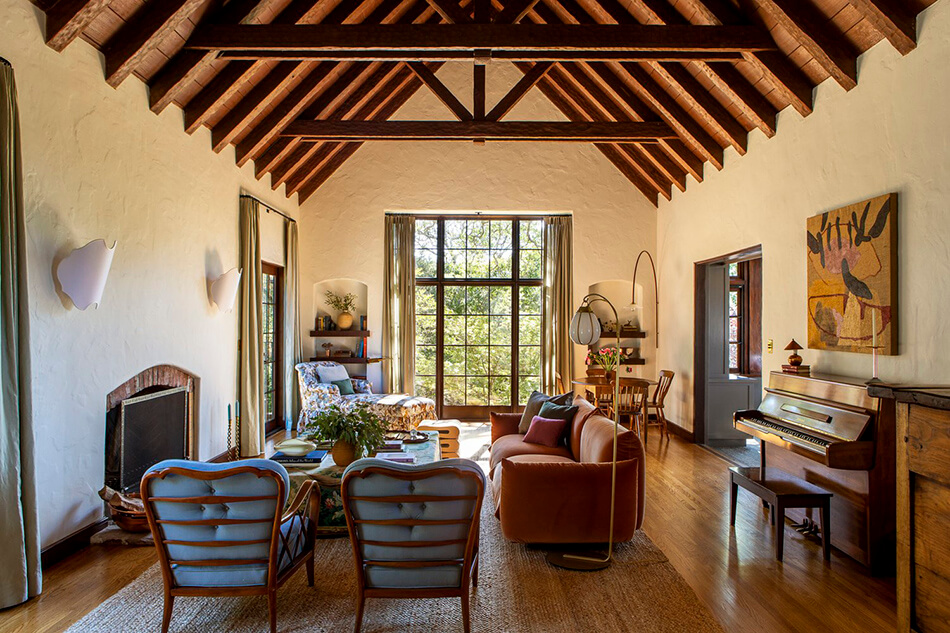
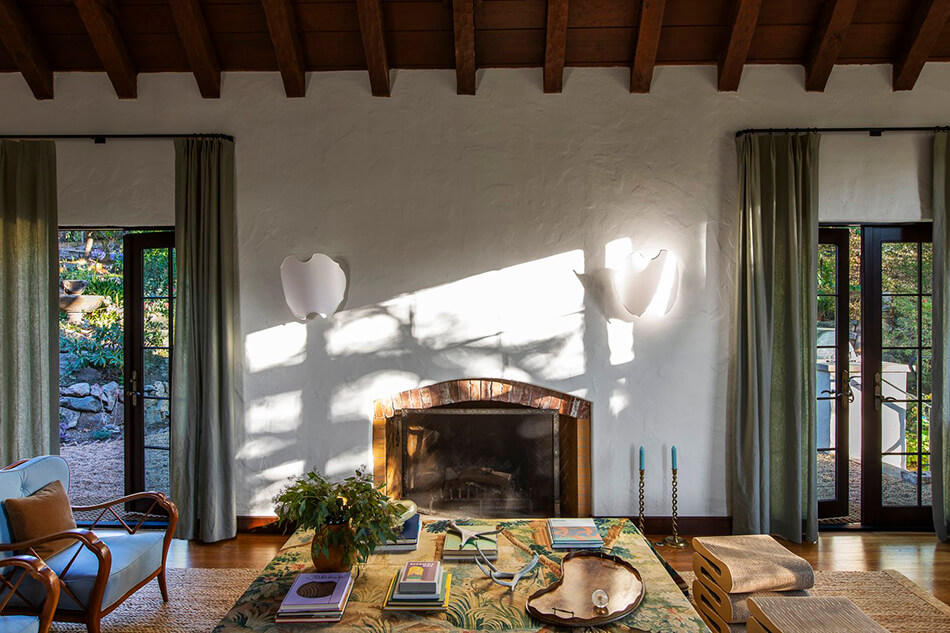
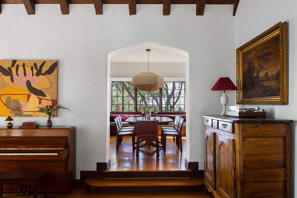
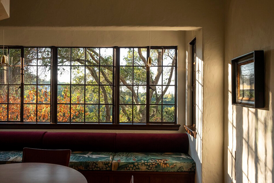
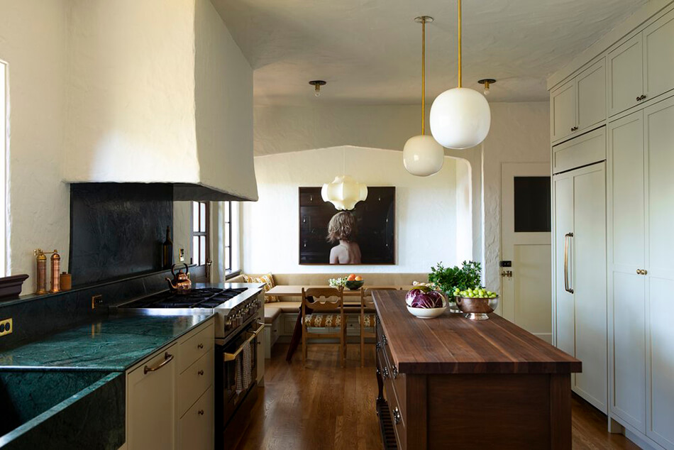
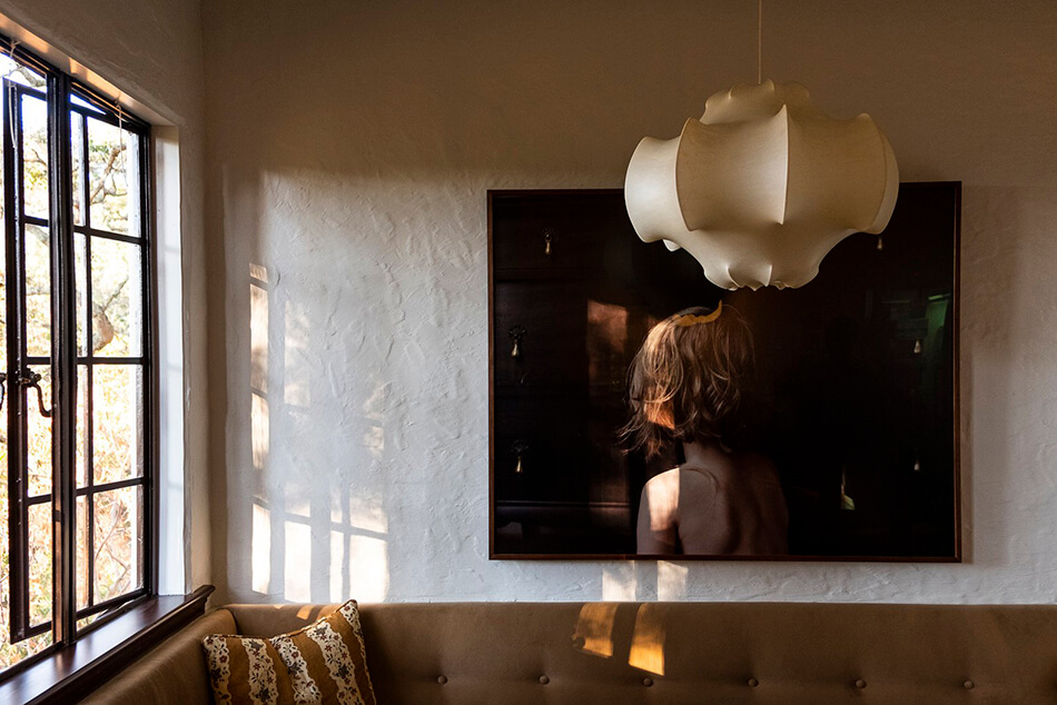
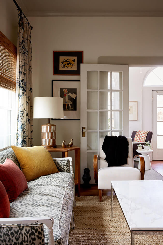
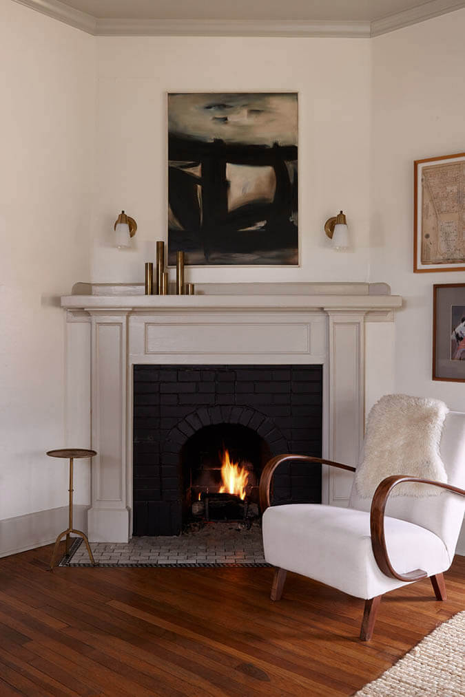
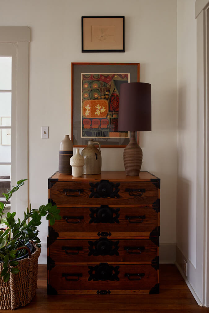
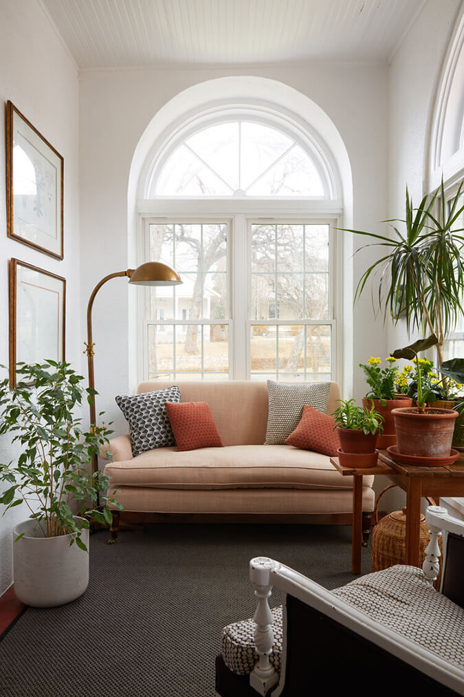
Woodside – bringing the past into the present
Posted on Thu, 19 Jan 2023 by KiM
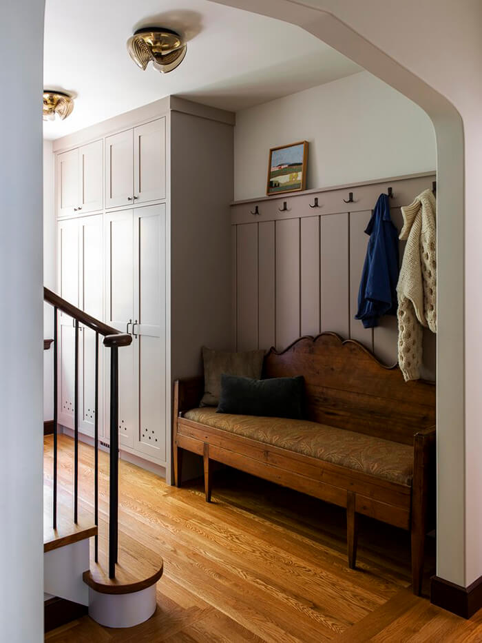
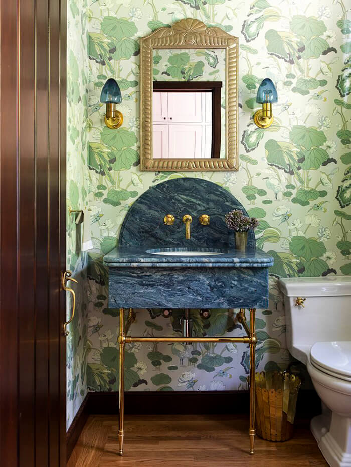
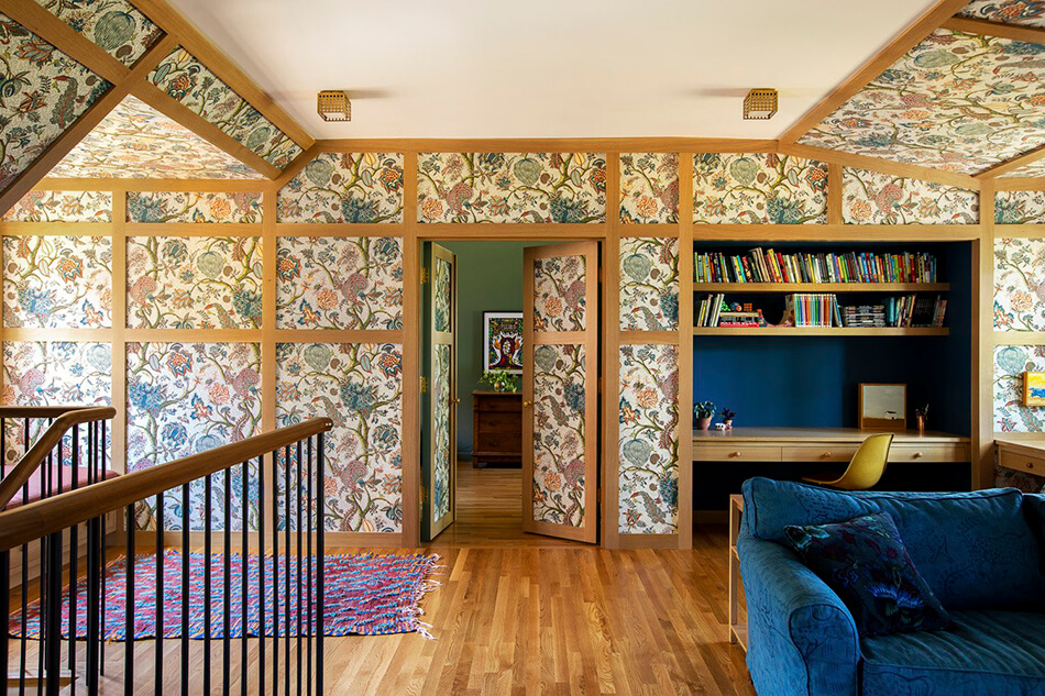
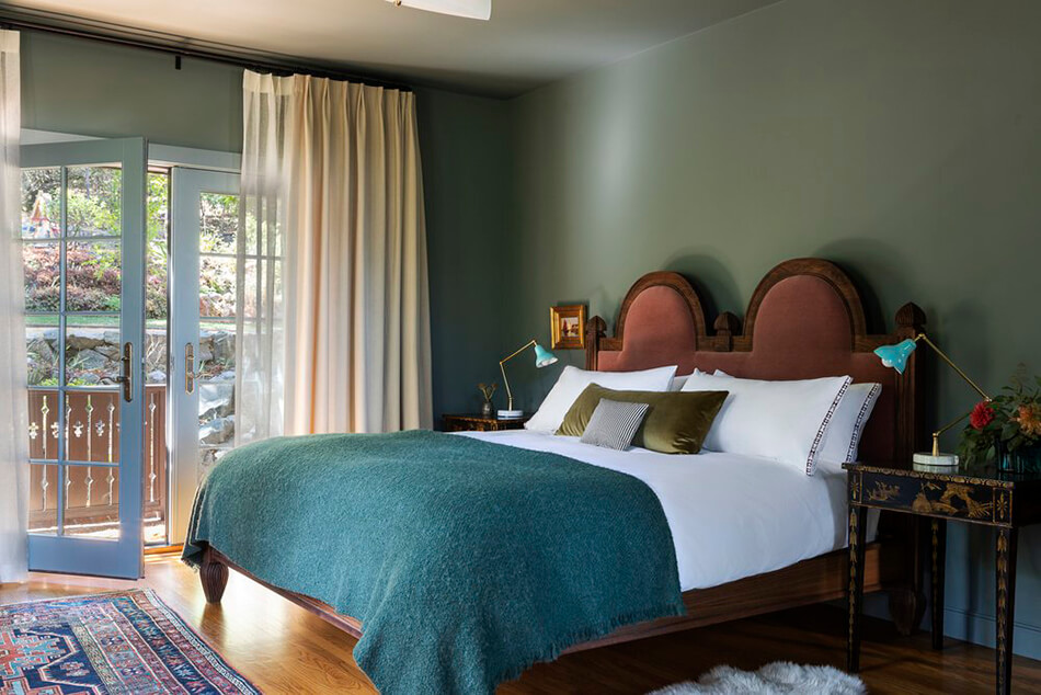
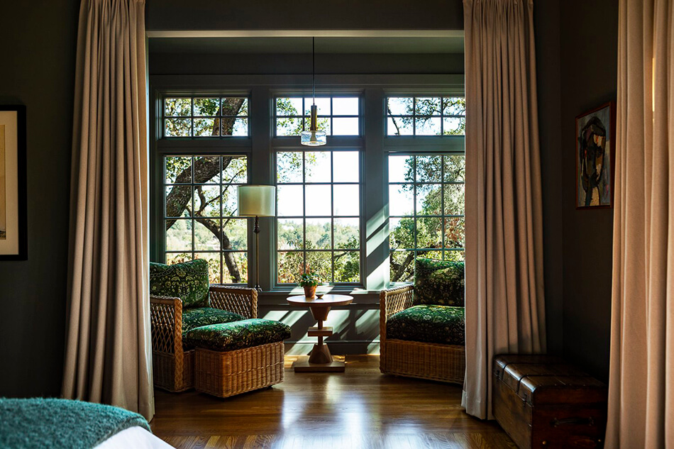
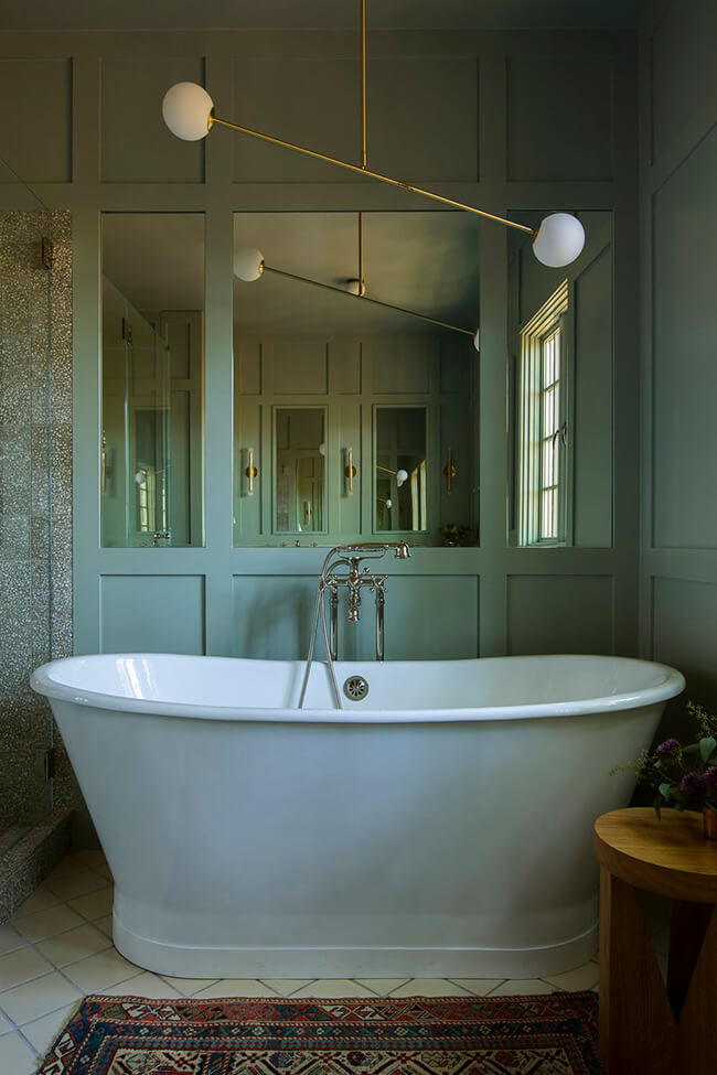
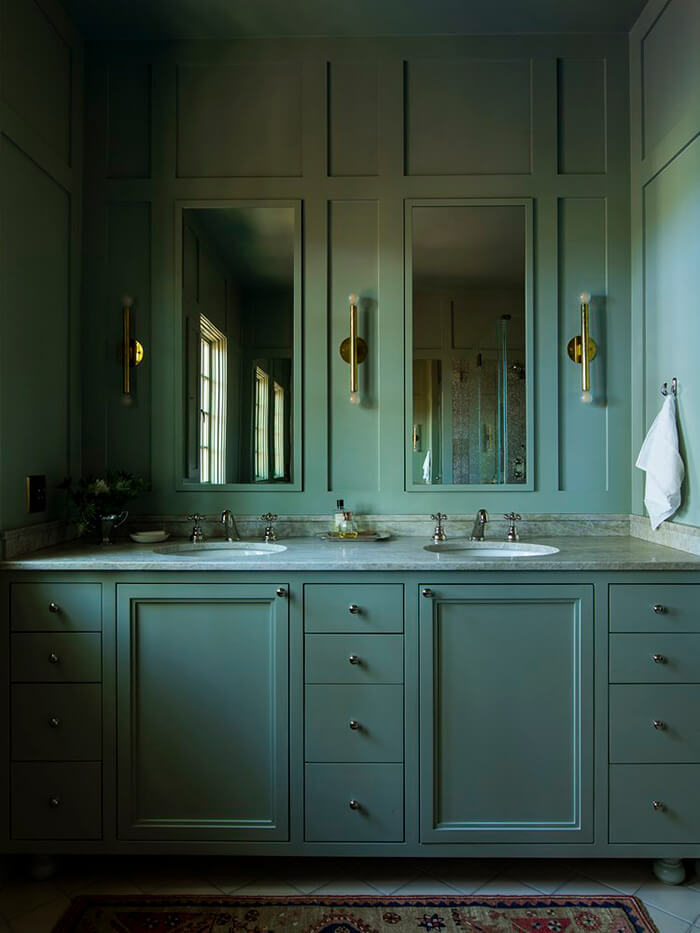
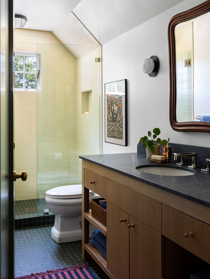
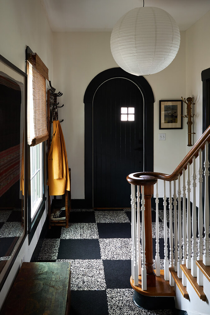
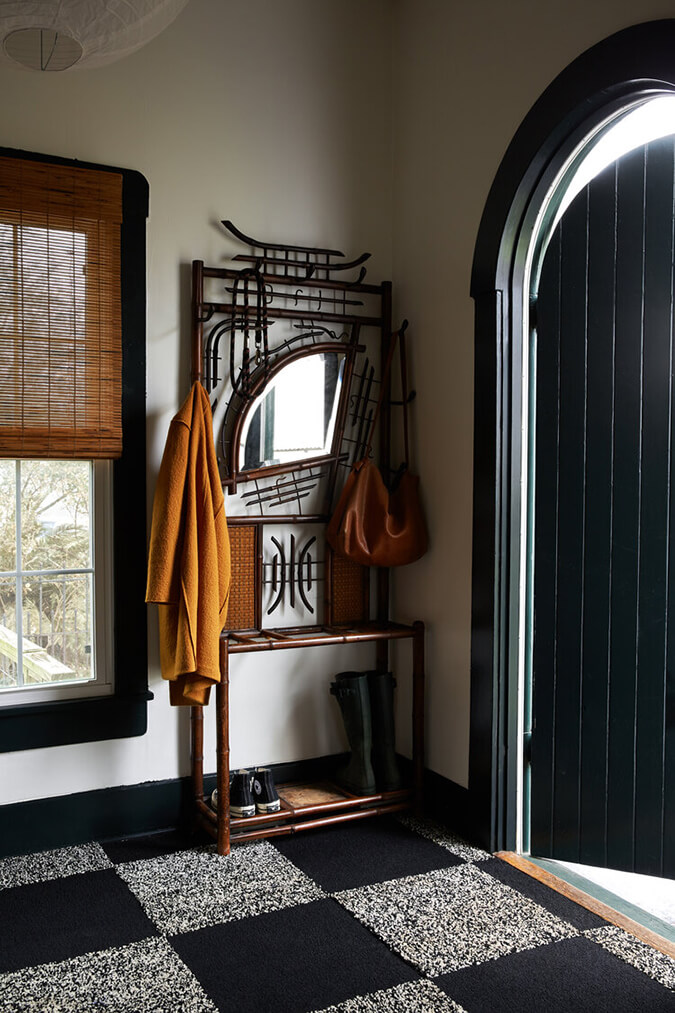
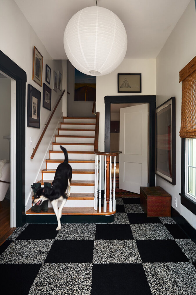
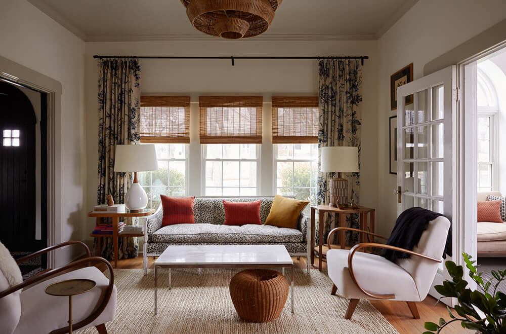
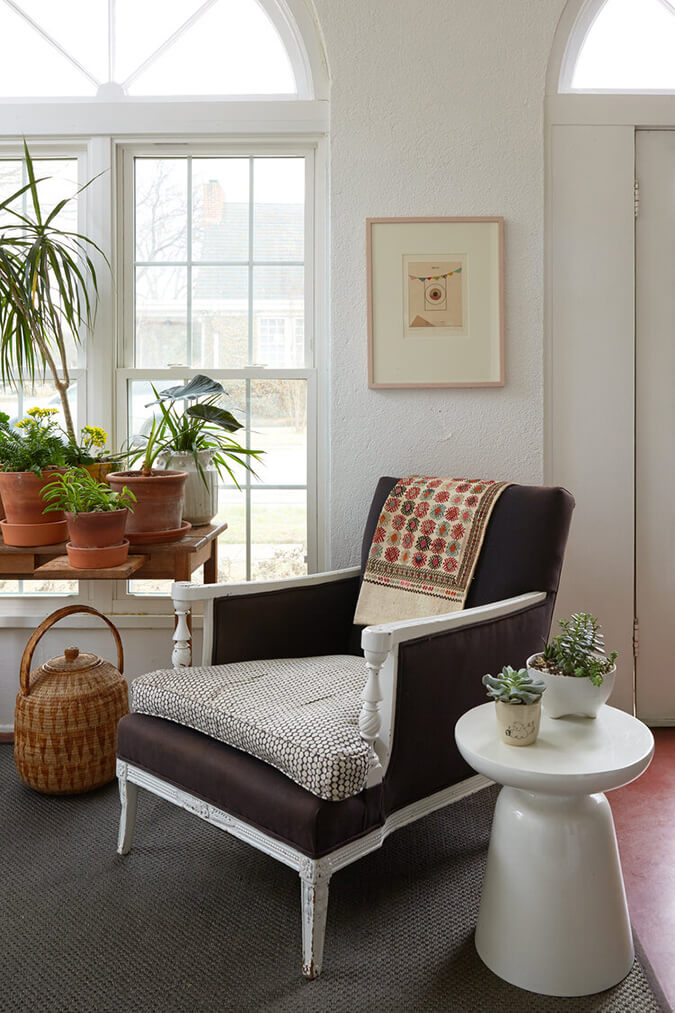
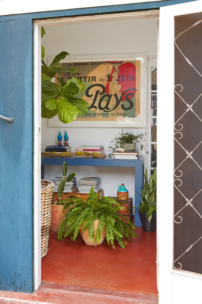
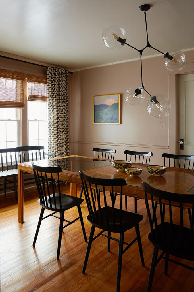
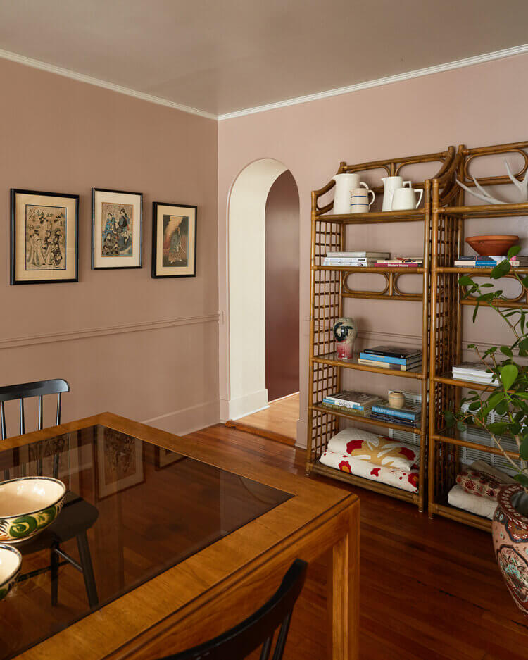
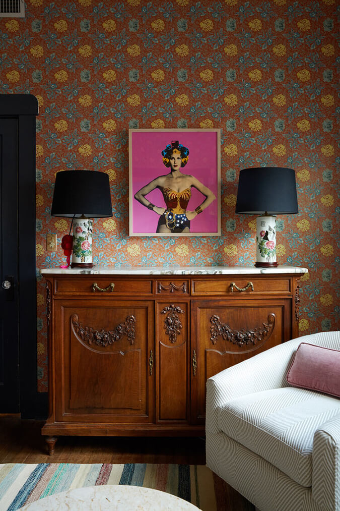
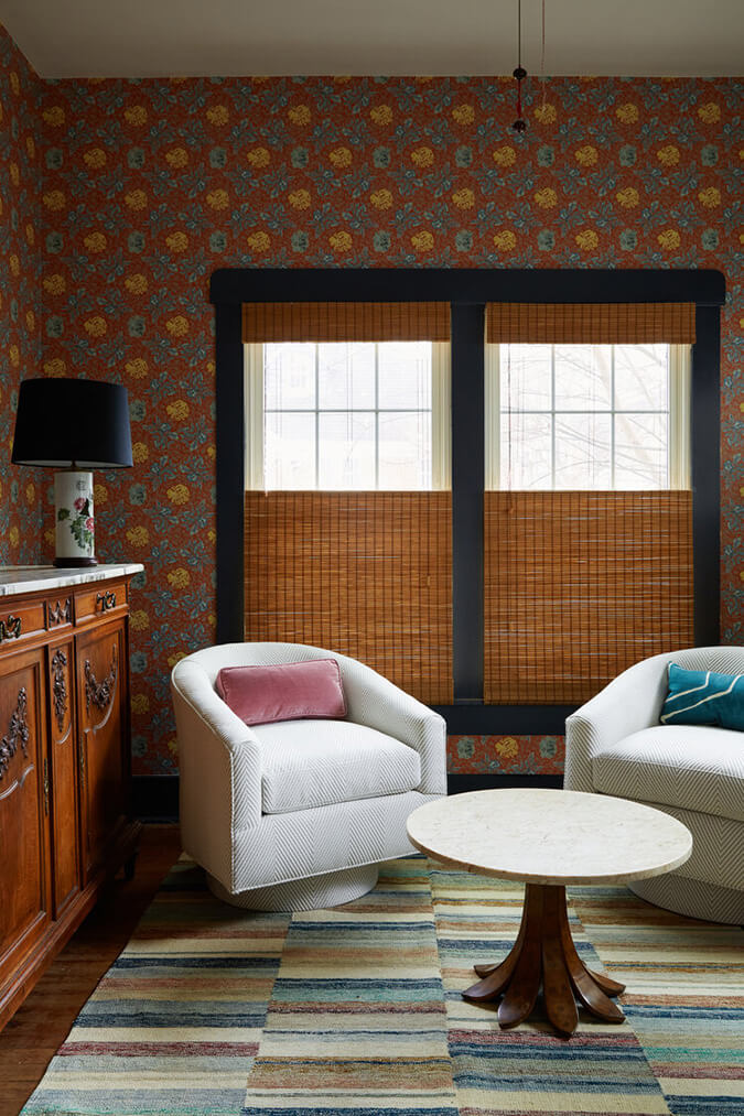
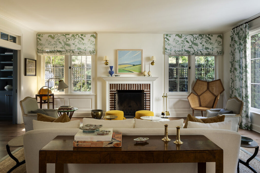
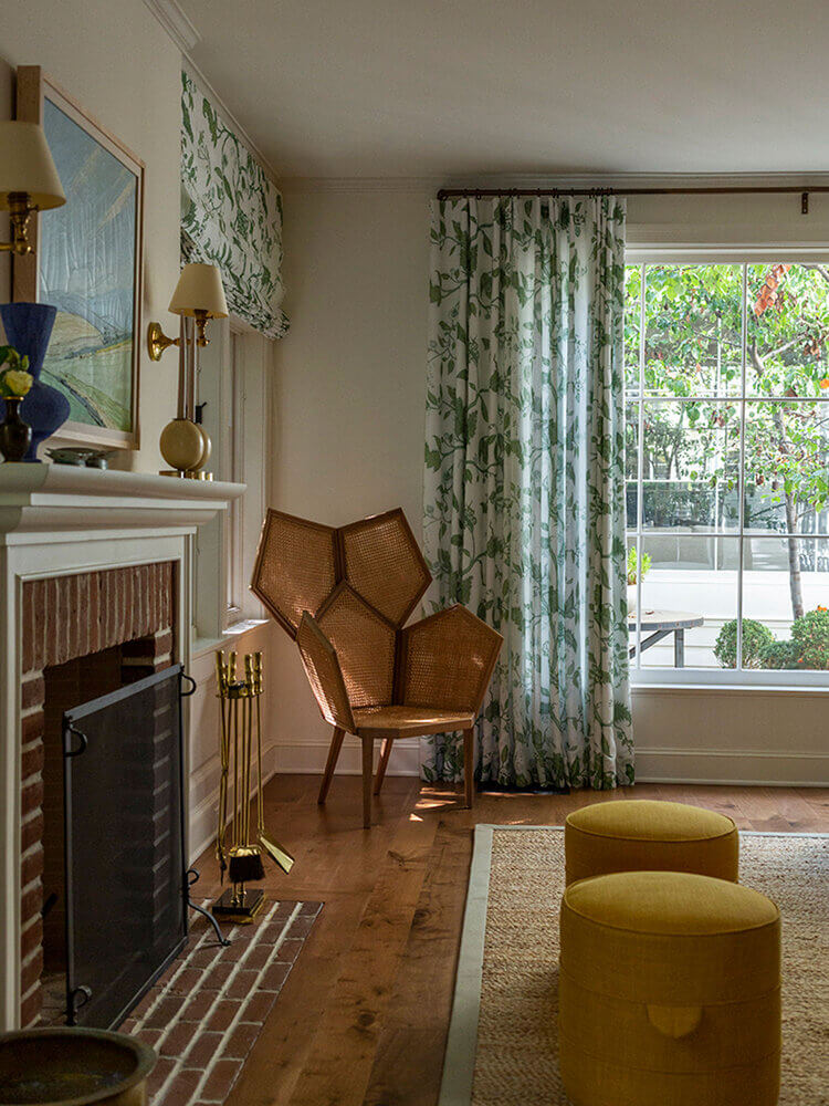
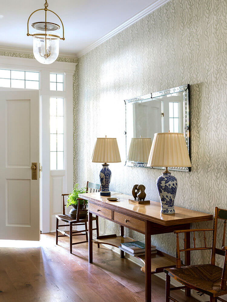
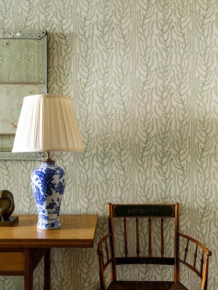
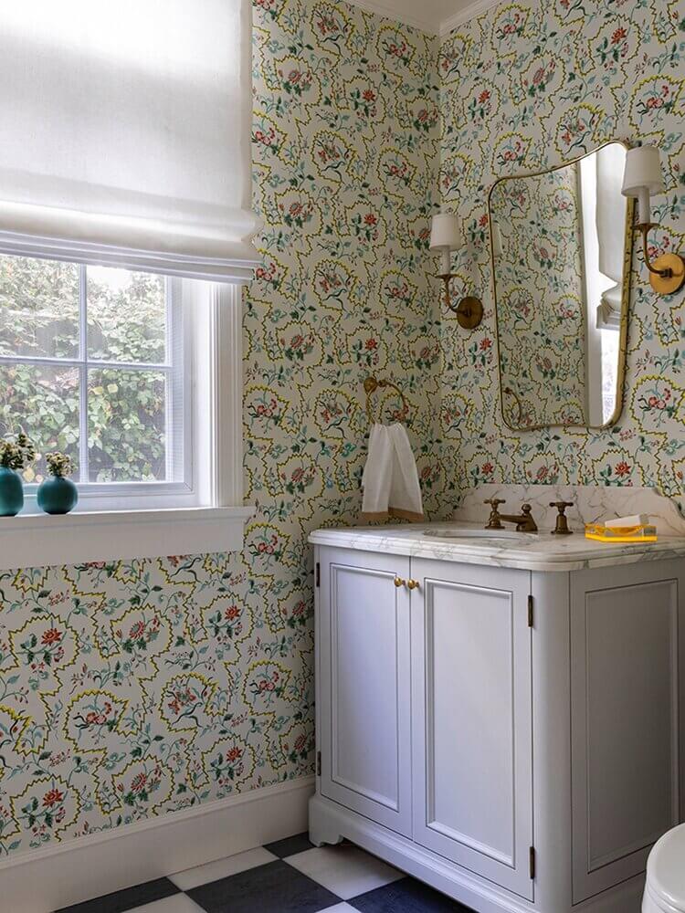
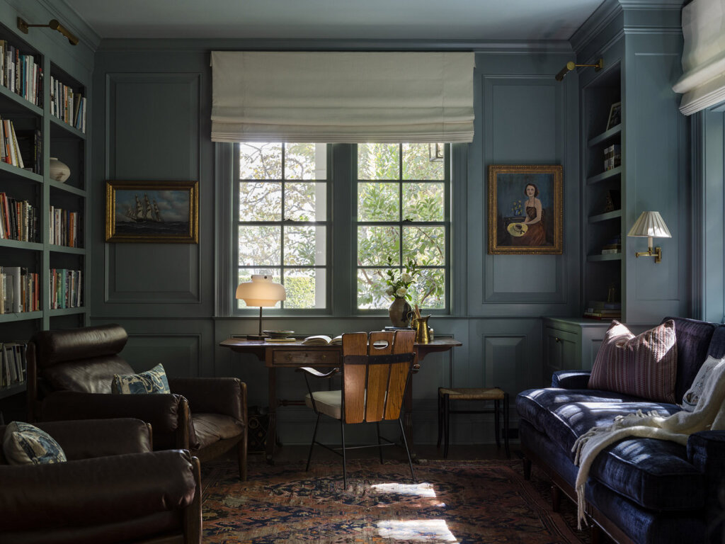
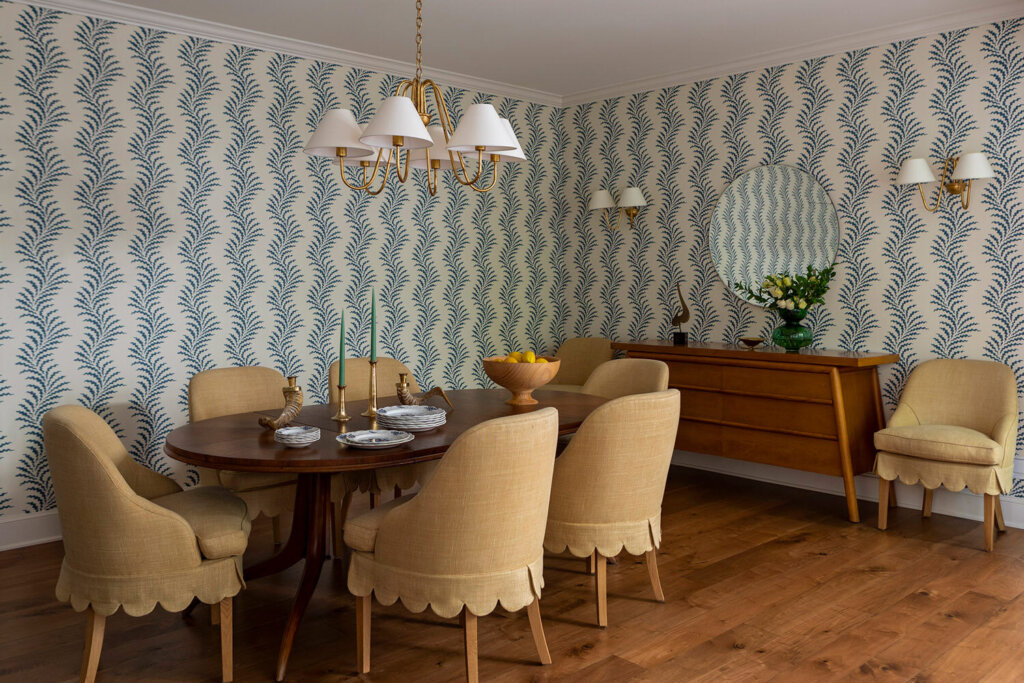
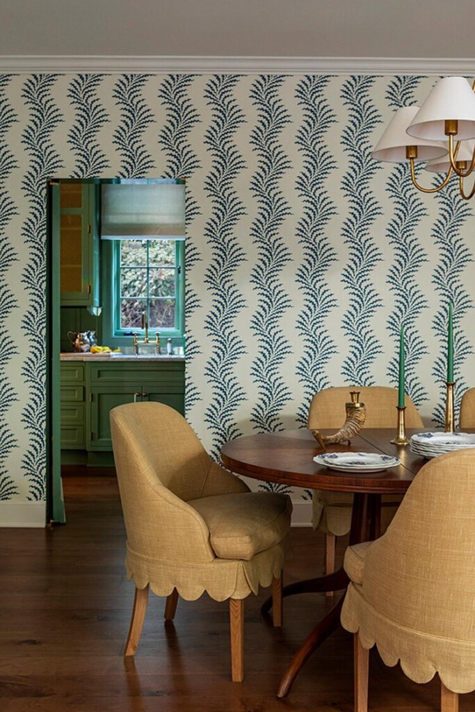
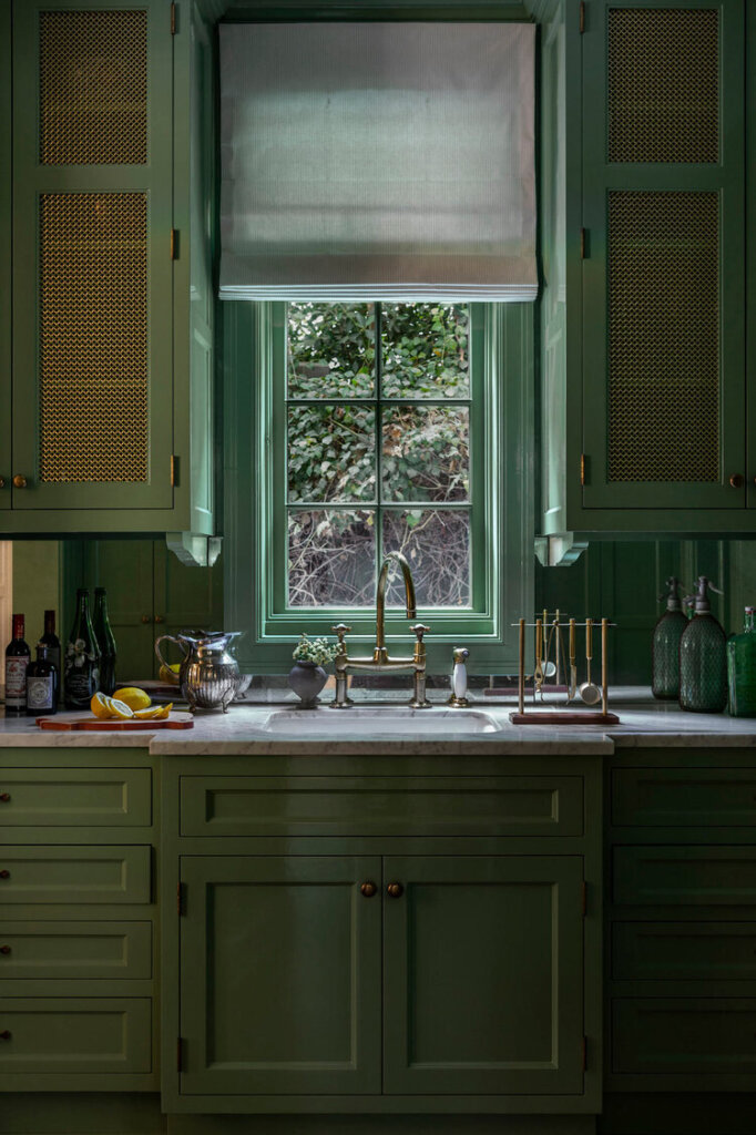
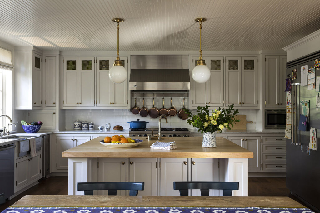
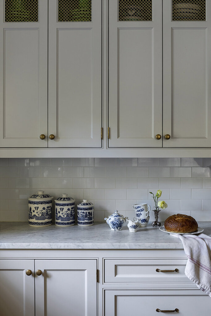
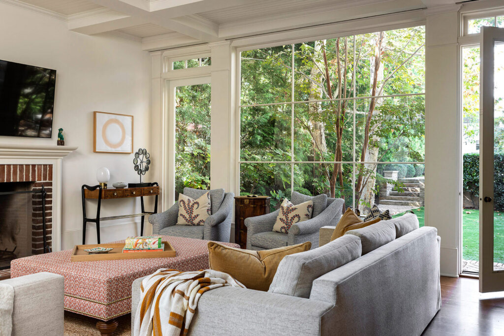
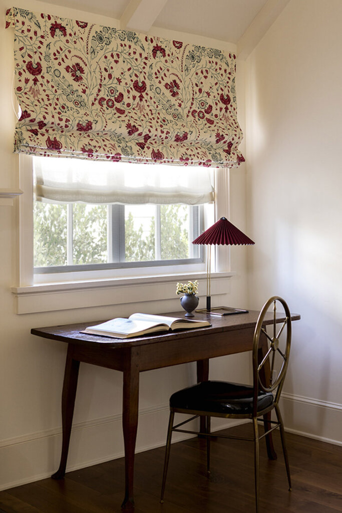
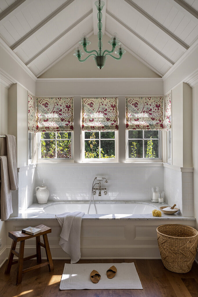
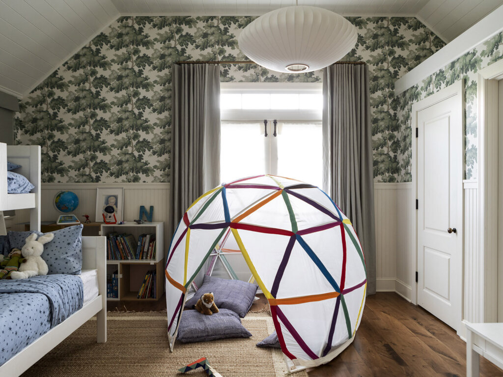
I never want it to feel as if everything was purchased at once. I’d rather it look more like an evolution. The blues, watery greens, and pale purples of the garden felt fresh, especially with all the browns of the wood in the house. It was nice to create a family-friendly piece of work that’s elegant but not too precious.
Always and forever a fan of Frances Merrill of Reath Design and her impeccable way of using colour and pattern and vintage together in ways no one else does. Photos: Laure Joliet.
A designer’s family home (where nothing is new)
Posted on Thu, 19 Jan 2023 by KiM
This is a peek inside Liz’s house, an ever-morphing, creative study, always in-progress. There is no finish line, or complete. It could be photographed again today and it would be different. Very little is new or store bought. Many pieces are from Liz’s late mother who was a collector and designer. Other items are hand-me-downs from friends, scores from second hand shops, antique shows, craigslist and the side of the road. There’s nostalgia and a story in most every piece. And yet, nothing is precious. Kids climb on all the furniture. The dog thinks the coffee table is a dog bed. The dining table hosts lego building sessions one night and dinner parties for 12 the next. Nicks and breaks, stains and tears are part of this house’s story. Everything is replaceable but the people and pets who call this place home … a mom, three boys, 1 dog, 1 rabbit, 1 mouse and a hermit crab.
Family living at its finest. Also love that this home is filled with nothing purchased ‘new’. Designed by Austin, TX based Liz MacPhail.
New England traditional with an English touch
Posted on Wed, 18 Jan 2023 by midcenturyjo
“Timeless, collected and chic, this tasteful family home was designed with love for a couple with a worldly sensibility. Drawing from both English countryside homes & quirky London flats, we brought in a playful palate of furnishings that would act as an effortless backdrop to the young art historians’ beautiful collection of antiques and notable works of art.”
It’s all about colour and pattern, wallpaper and a mix of antiques and modern. It’s what I would call quintessentially British decor but it’s definitely American. The best of both worlds. Carmelina by Meghan Eisenberg.
Kitchen love
Posted on Wed, 18 Jan 2023 by midcenturyjo
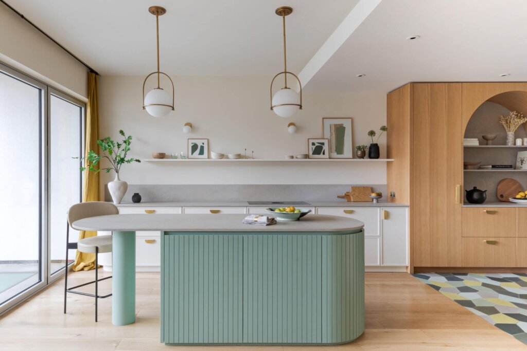
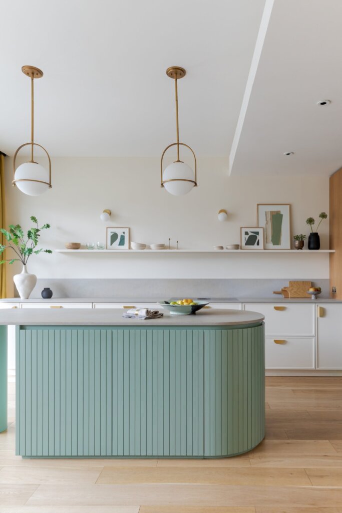
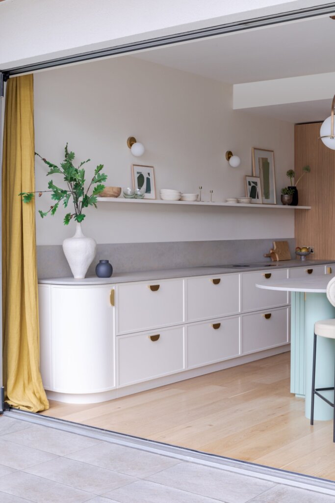
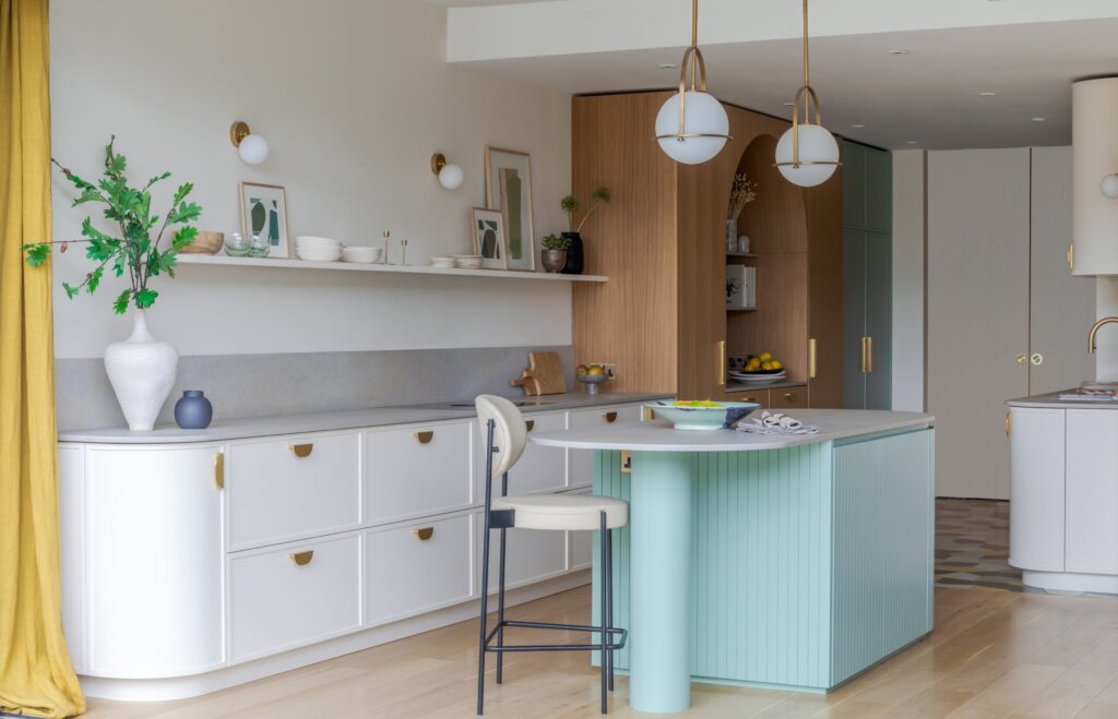
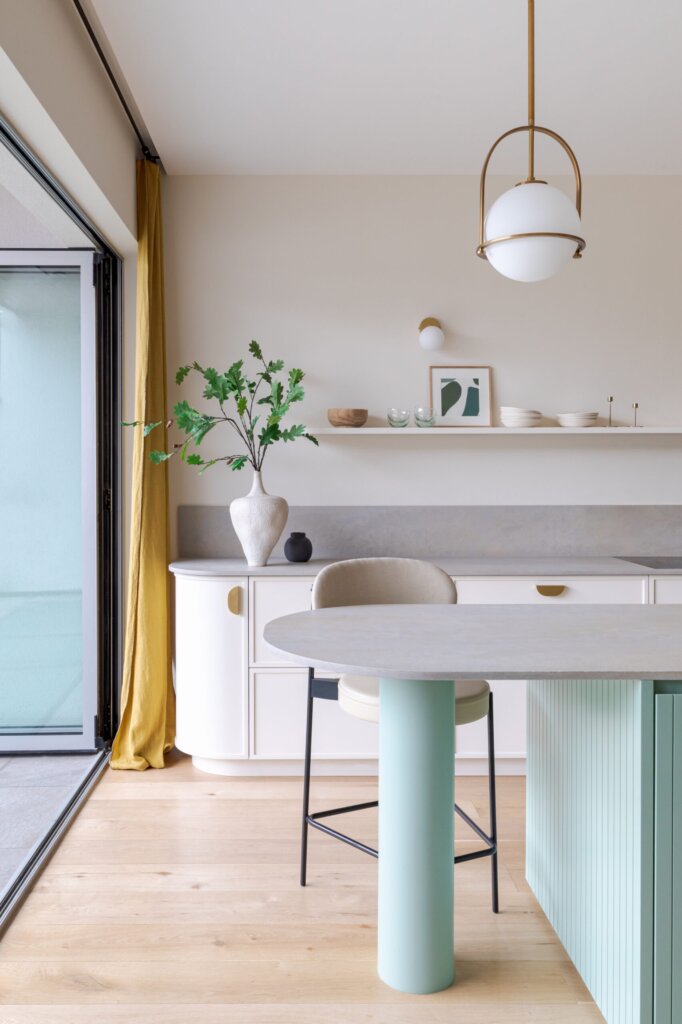
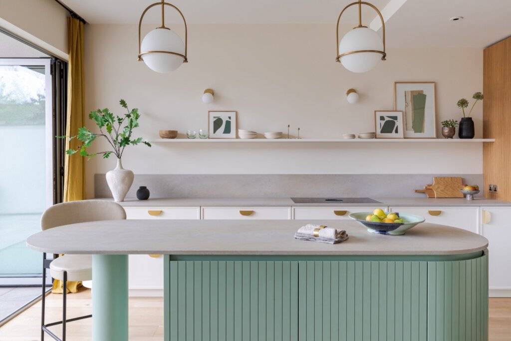
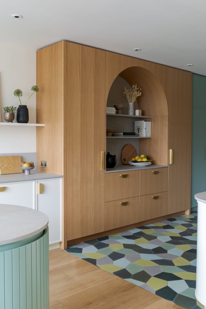
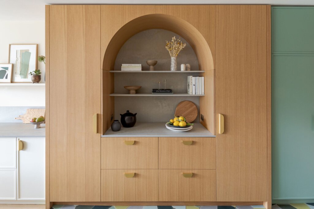
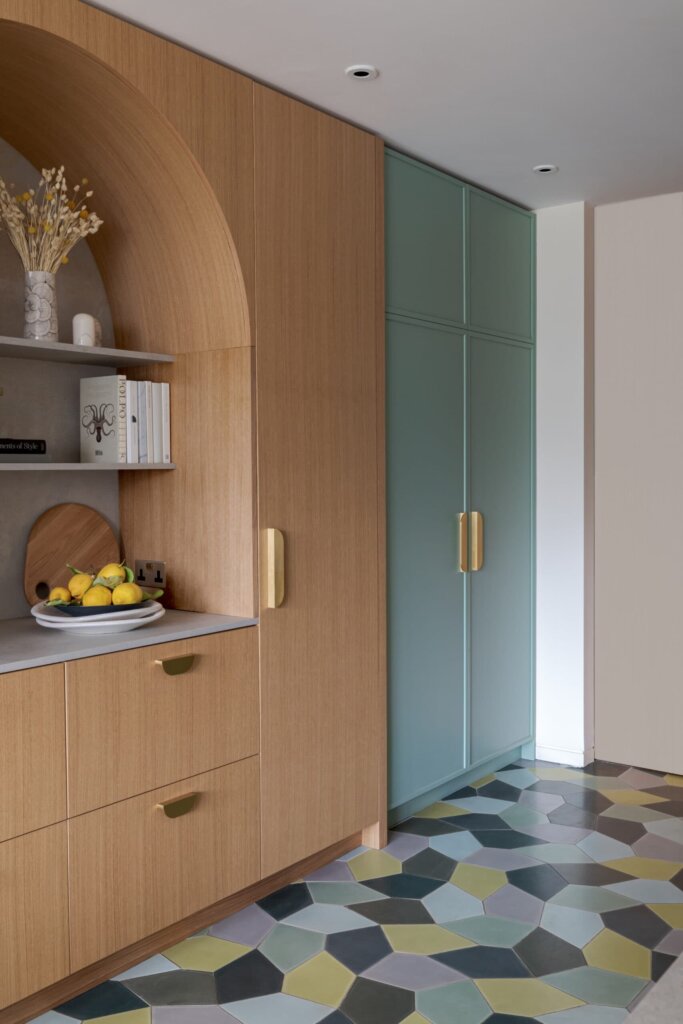
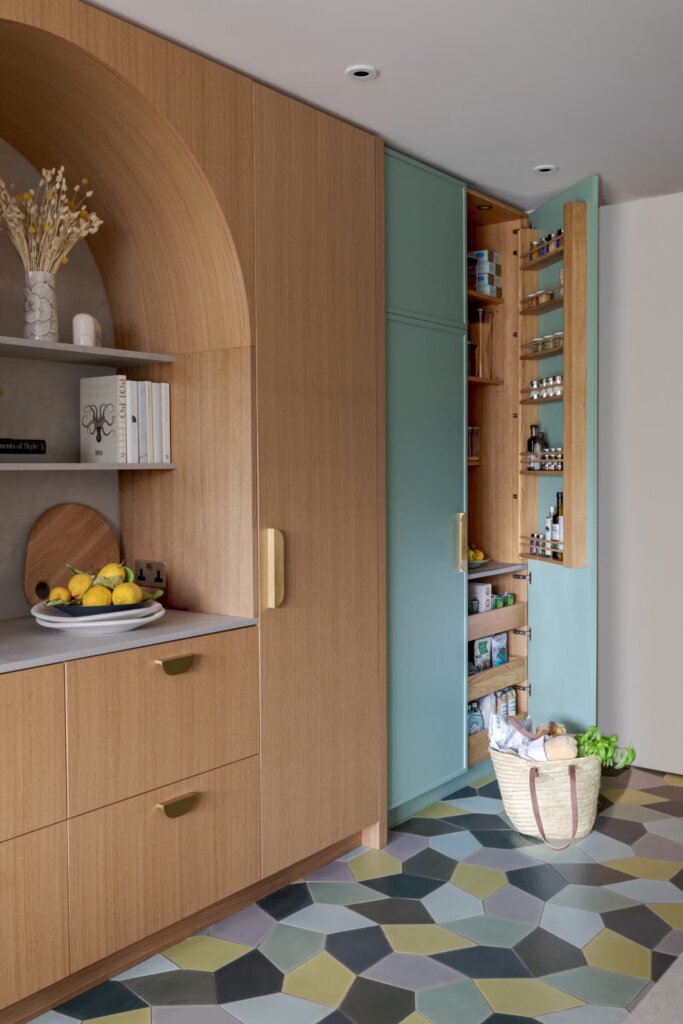
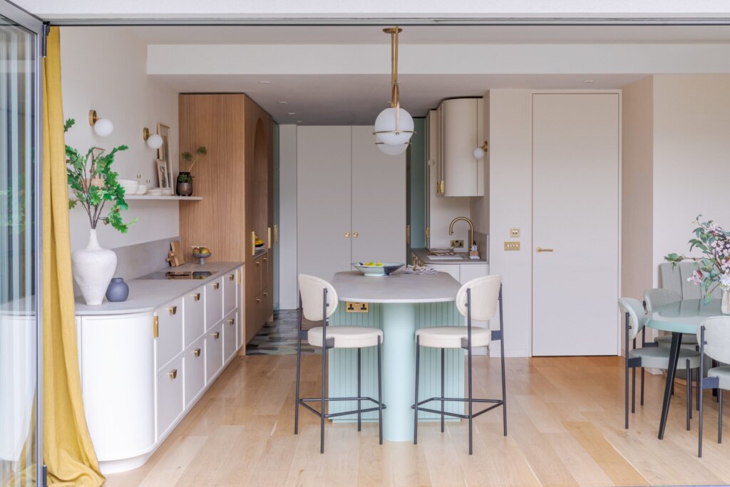
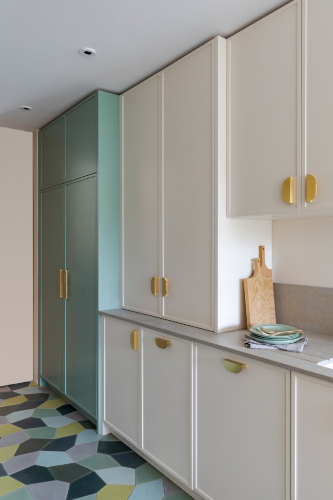
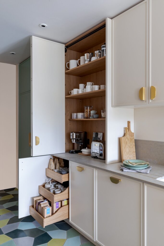
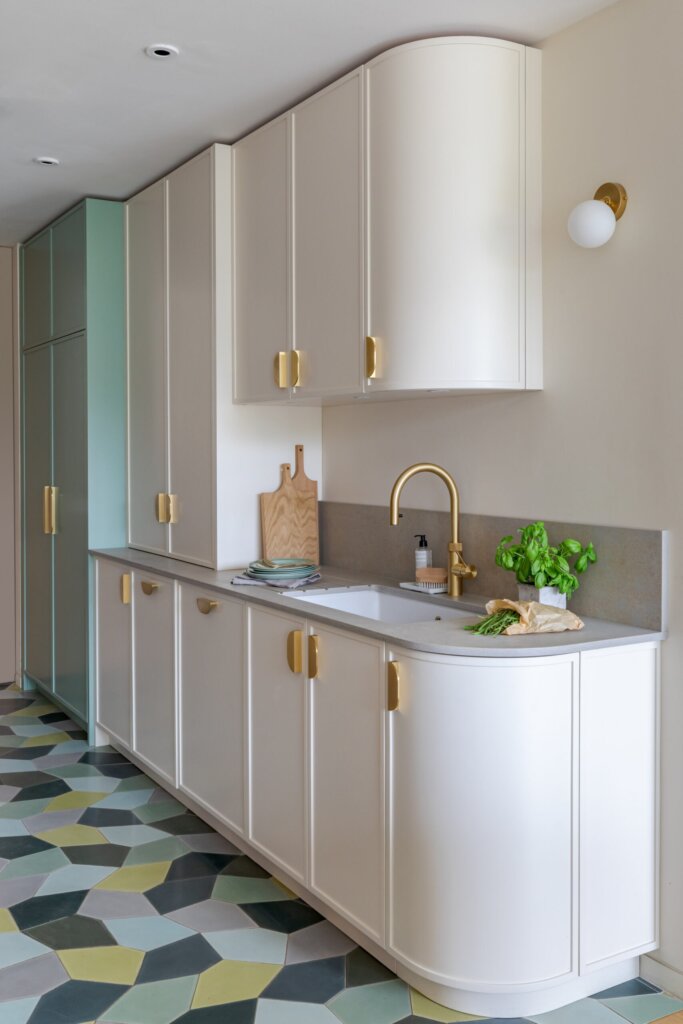
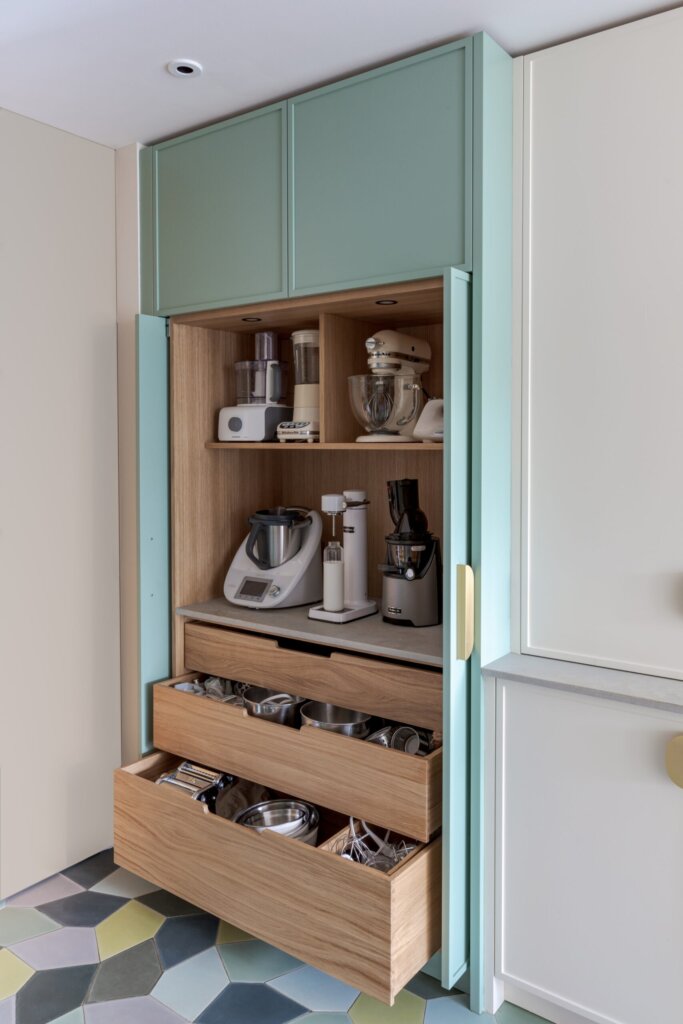
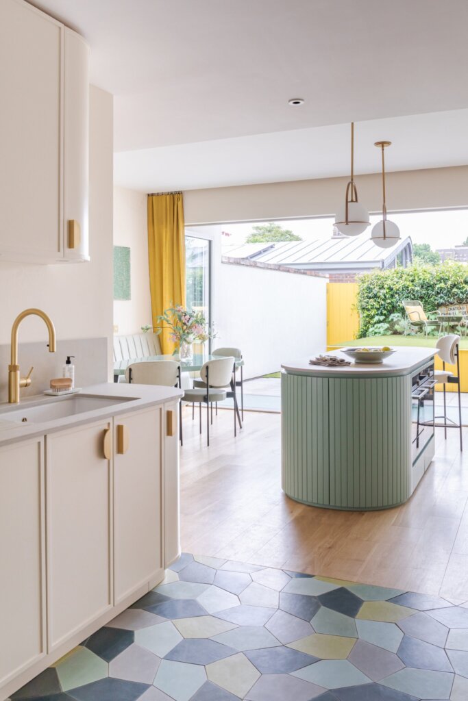
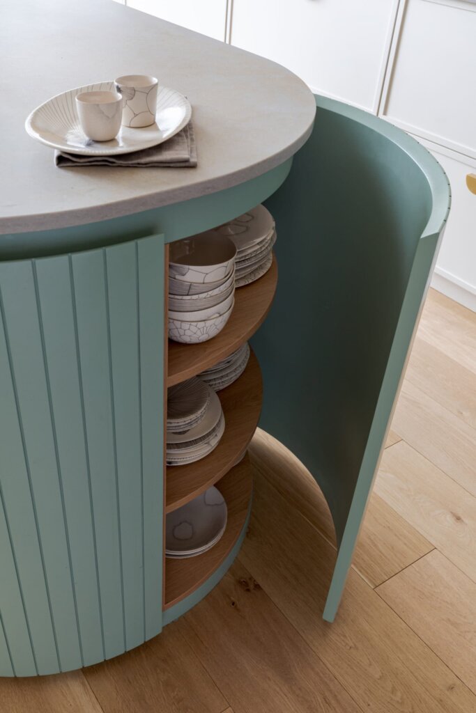
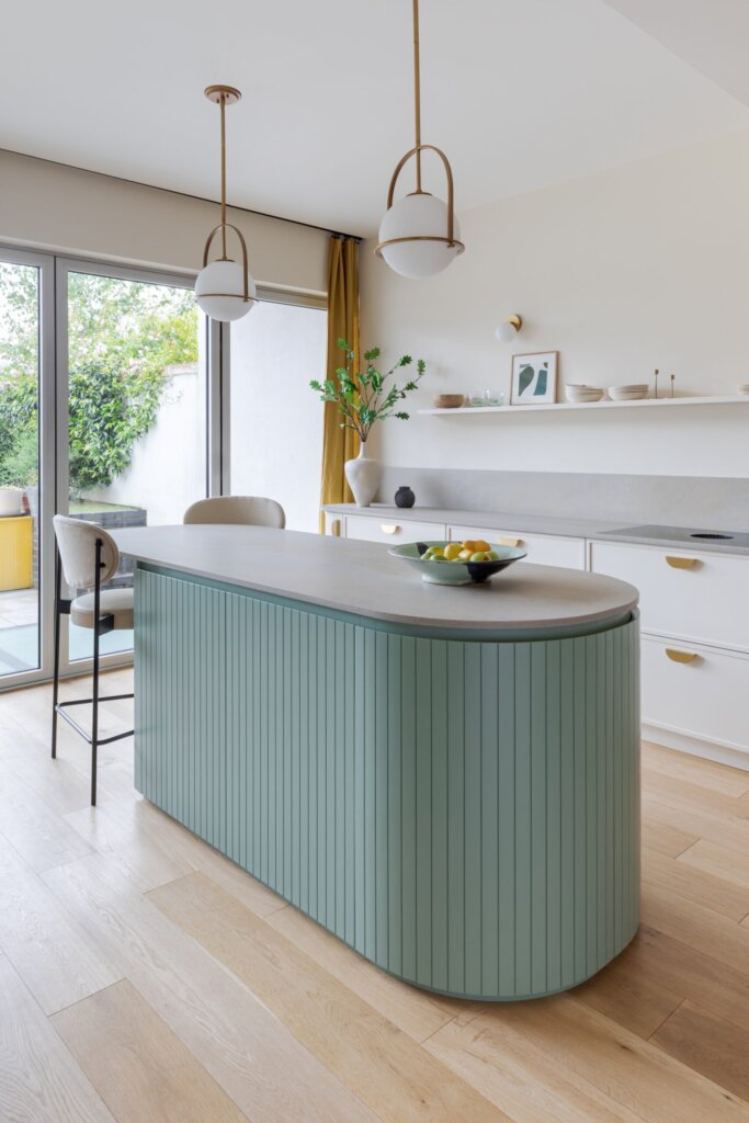
“This kitchen was designed to fit in a new build home that was lacking a practical approach to family space. Our clients wanted a kitchen with interesting curves and texture and one that they could ‘live in’. We reconfigured the layout – tucked away the sink, concealed all the appliances, and added a casual banquette dining area. The grand arched oak unit was designed to feel like a freestanding piece of furniture, whilst cleverly disguising the fridge and freezer. Together with the captivating island, it adds character and warmth to the space.”
How did I not know that I needed a minty green kitchen with curves and oodles of storage? Definitely a case of kitchen love. Pangbourne Ave by Kate Feather.
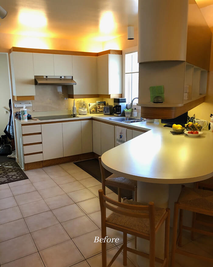
A dreamy kitchen renovation (with before photos!)
Posted on Tue, 17 Jan 2023 by KiM
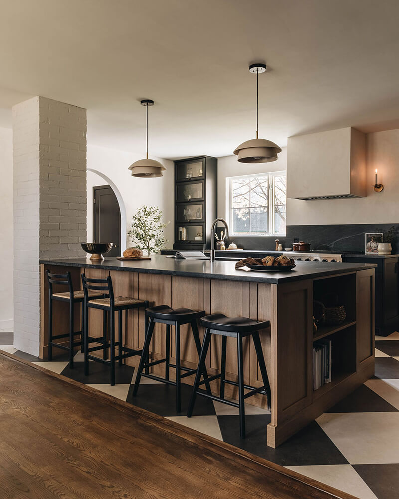
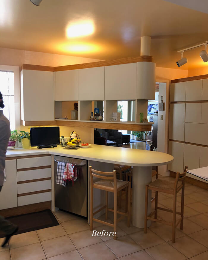
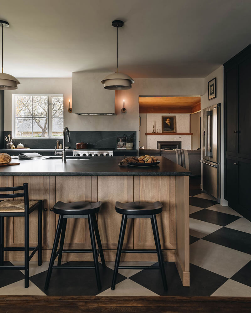
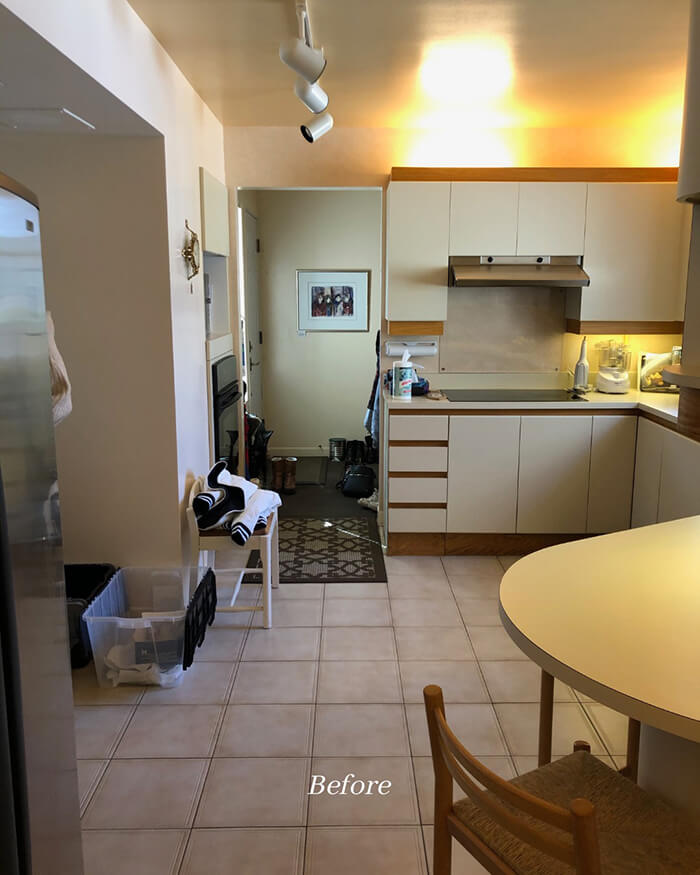
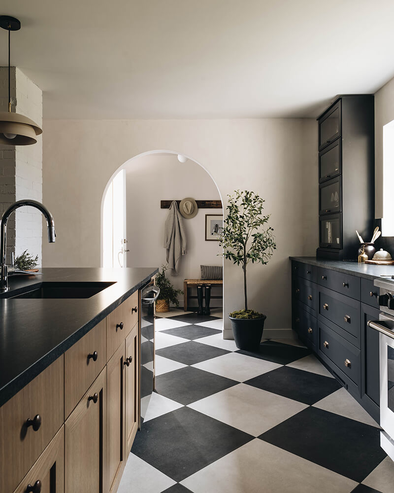
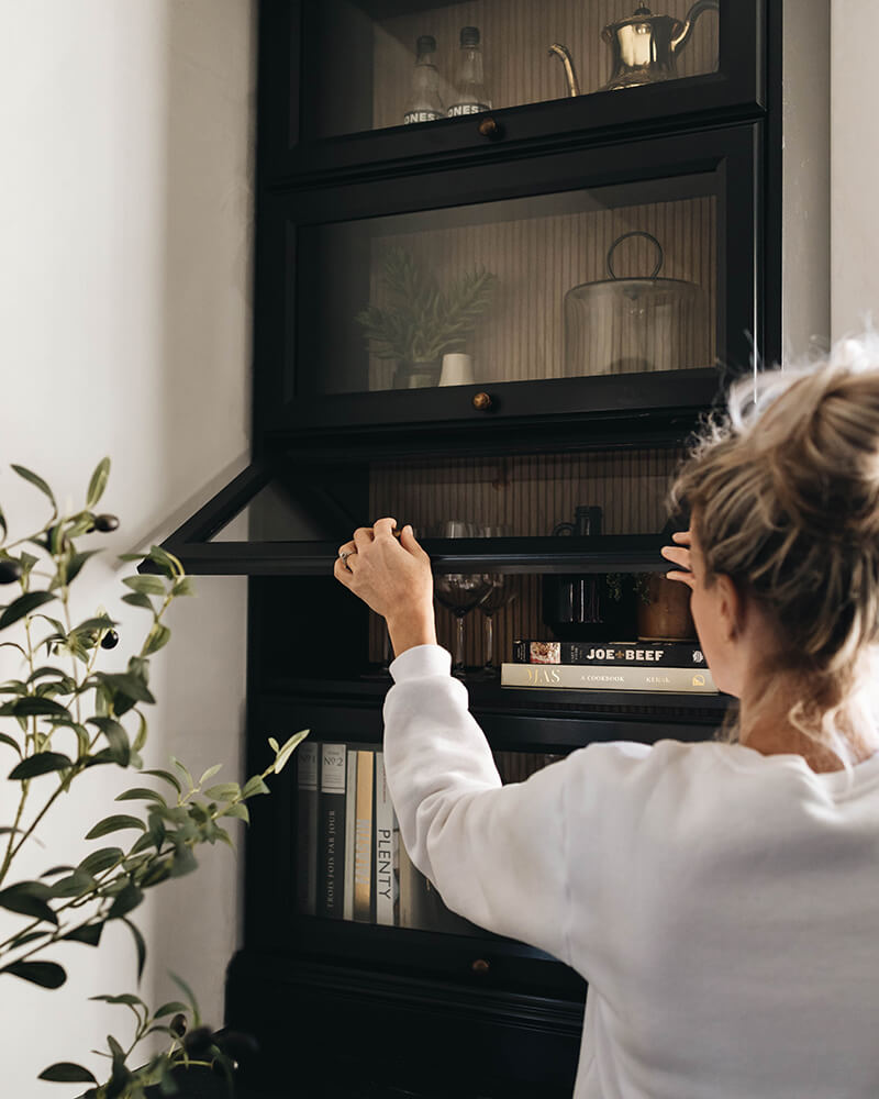
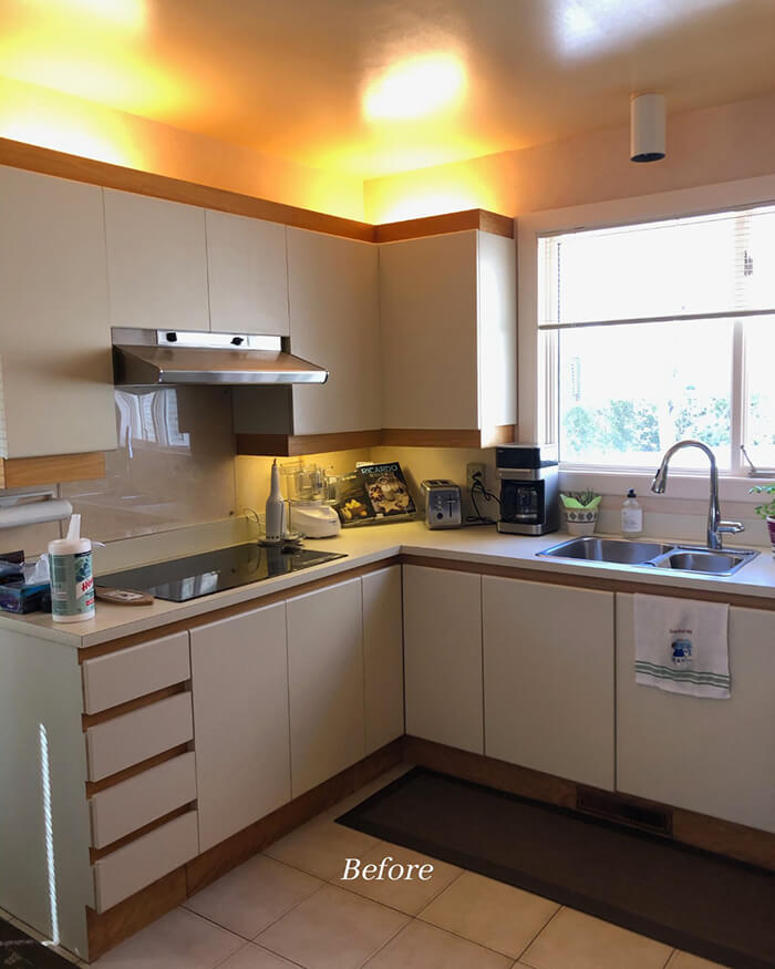
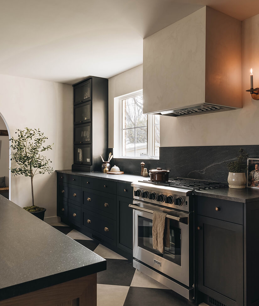
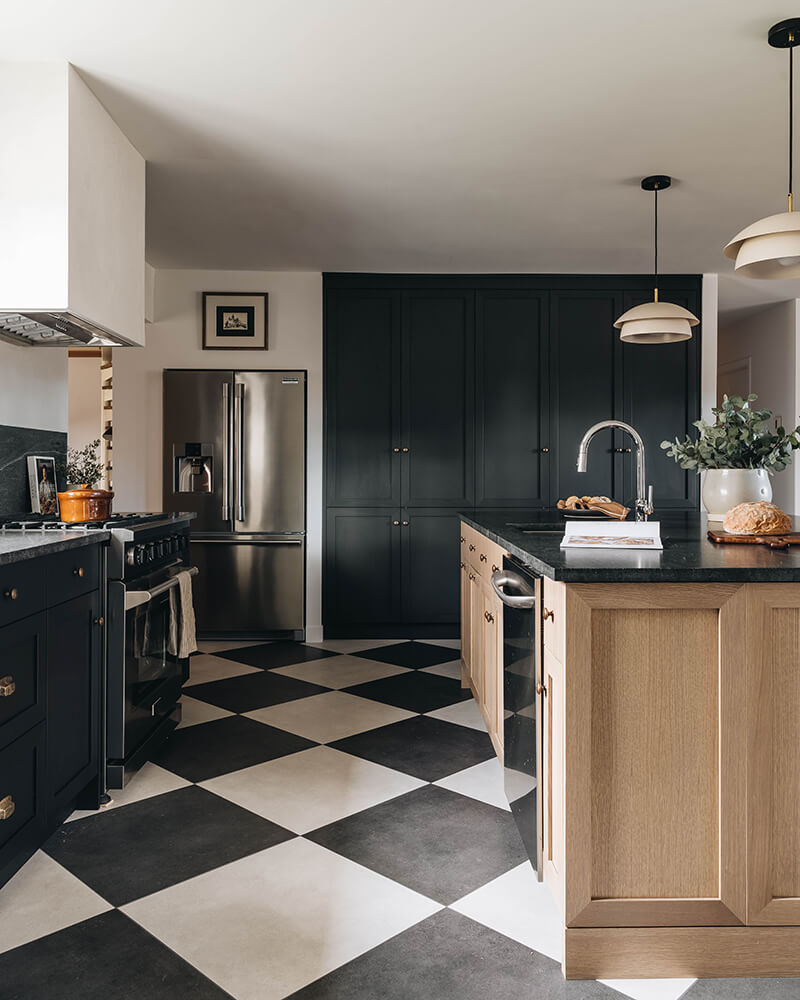
I do love some colour, but when someone does black/white and brown THIS GOOD I end up rethinking the meaning of life. This before and after of a kitchen renovation in Québec City is blowing me completely away. The granite countertop, lime-based plaster paint, to-die-for oversized checkerboard ceramic tile floor….it’s really quite a simple renovation when you look closely but Montréal-based Blanc Marine Intérieurs always nails the details and brings their projects together seemingly effortlessly. (Their IG account is one of my absolute favourites for inspiration). Photos: Photographie Interieure Co.
