A completely renovated first apartment
Posted on Fri, 13 Aug 2010 by KiM
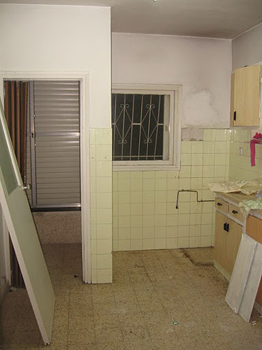
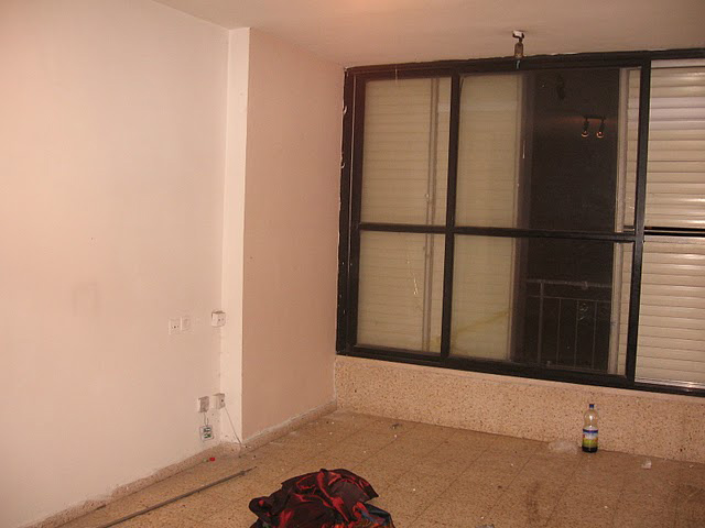
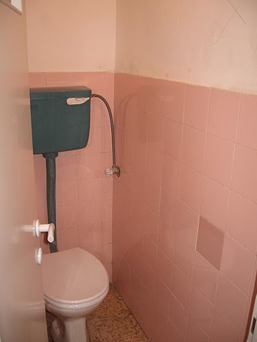
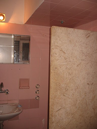
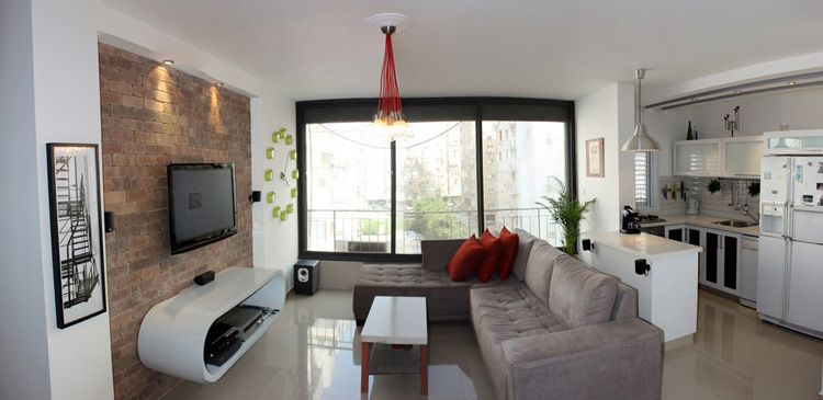
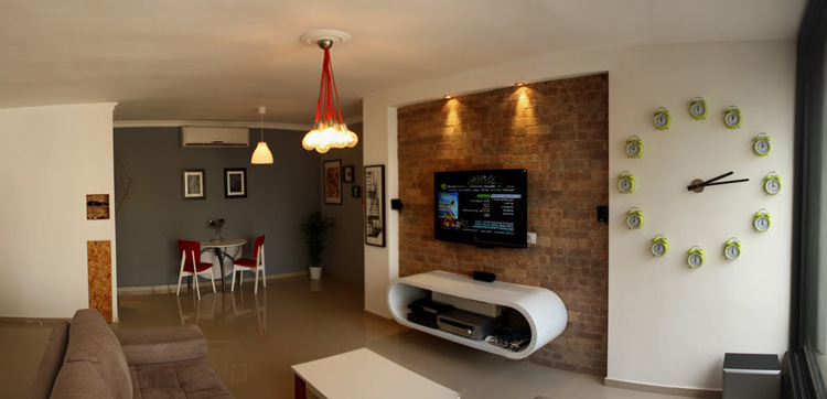
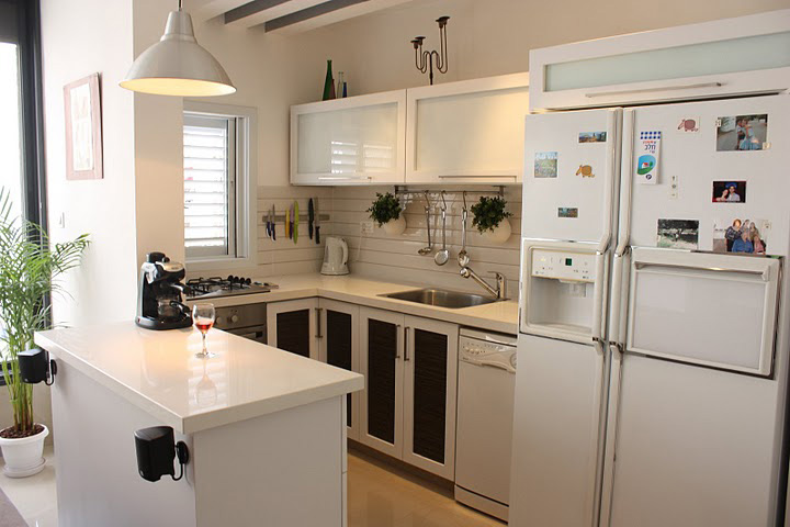
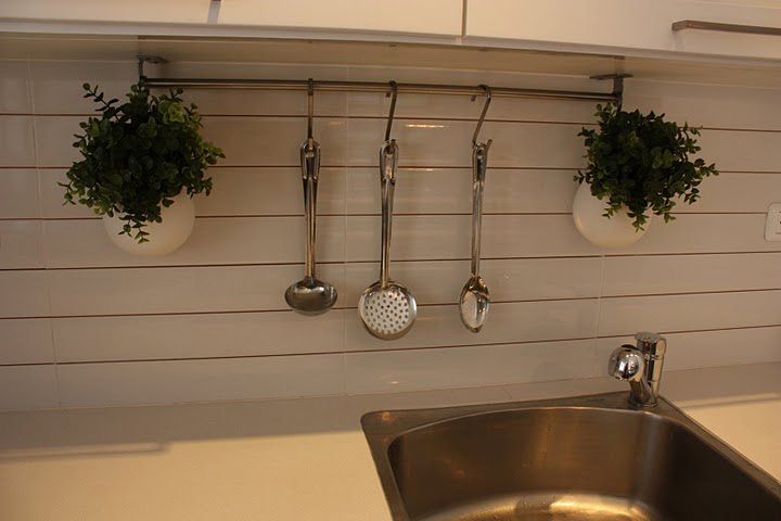
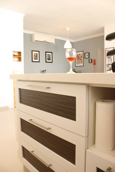
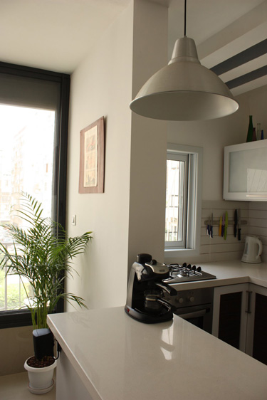
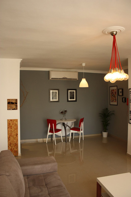
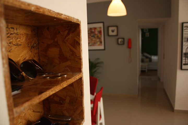
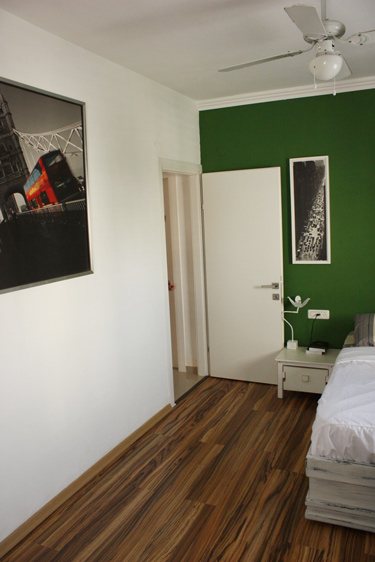
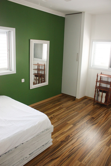
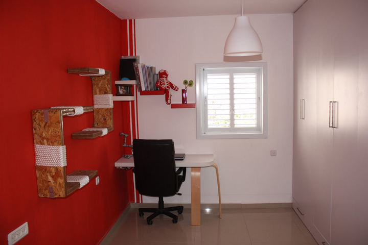
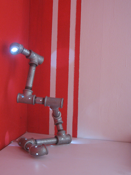
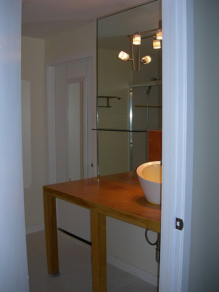
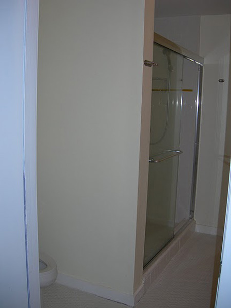
We received an email from Ron and it started off like this: “I’m 27 years old and live in Tel Aviv Israel, currently an industrial design student. Me and my girlfriend just bought our first apartment and decided to design it completely by ourselves.” Now before I continue I have got to show you a few of the before photos.
And some info on what went on after they had their way with their new apartment:
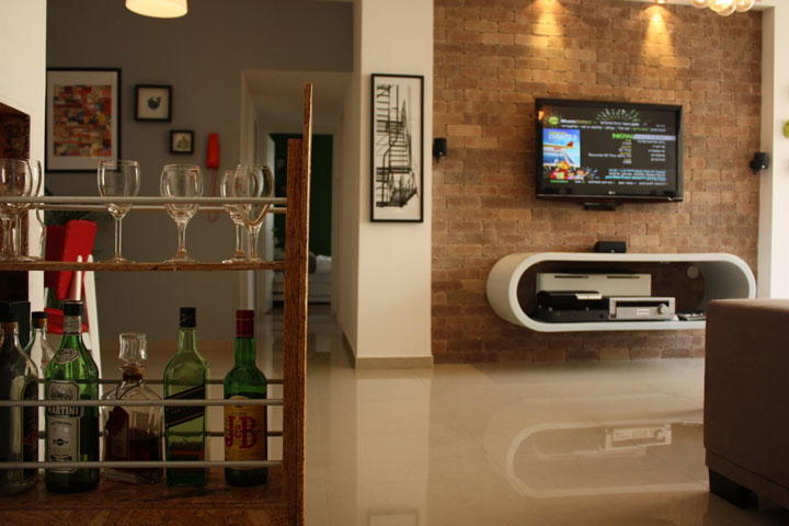
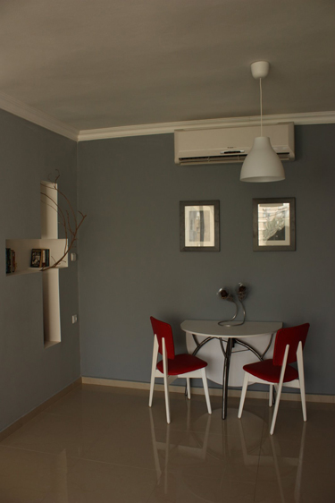
“In short we re-did the whole place:
Tore down the wall in the kitchen opening it up to the living room and dining area.
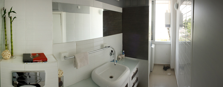
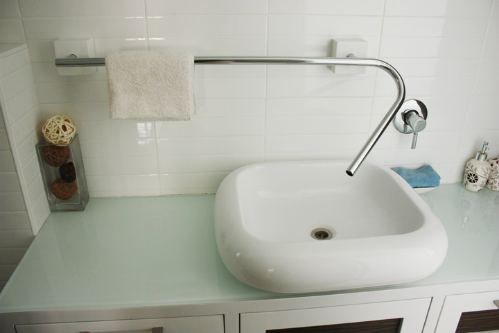
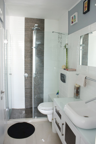
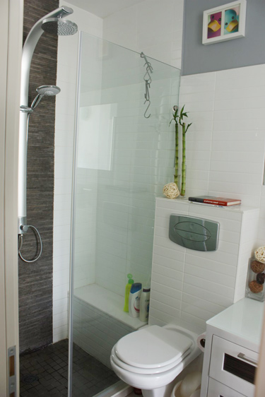
United the the bathroom making one long and spacious bathroom
Made the bedroom bigger by closing a indoor balcony.
A bar that comes out of the wall.
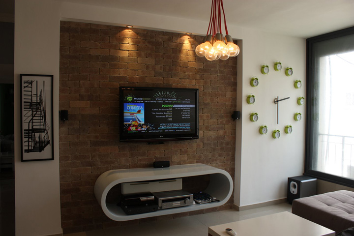
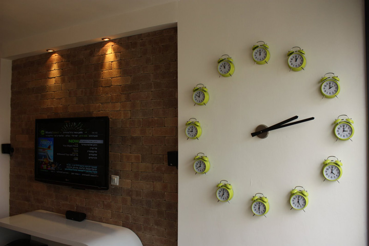
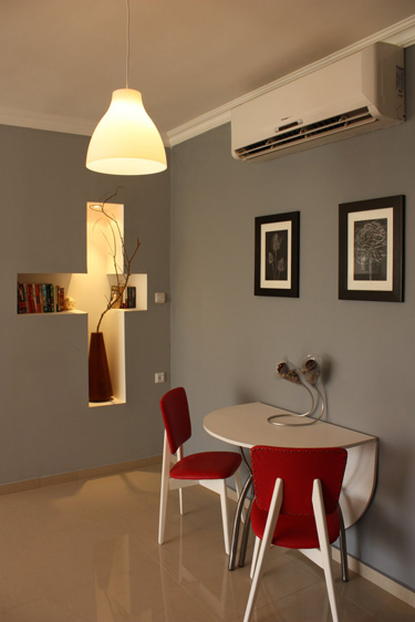
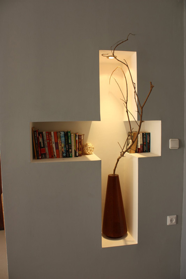
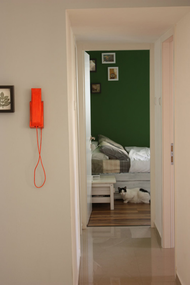
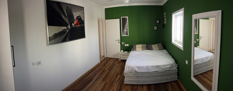
I personally designed and built most of the items seen in the pictures:
Large wall clock
Floating unit below the tv
round table and red chairs
table, pipe lamp and the cats playing area which is hung in the red room
faucet in the bathroom
wooden bar
lights in the living room (with red cords)
bed and side table in bedroom. “
I cannot even put into words how in awe I am of Ron’s talent. Seriously. This apartment is FULL of creative and such well-executed items. See for yourselves. (I told him I may steal the cat play area idea). Check out his website HERE.

************************************
To see the newest trends in Bathroom designs for new apartments you can visit iBuyNew which feature Melbourne new apartment designs and Sydney new apartment architecture.


Valerie and Alan’s bathroom remodel
Posted on Fri, 13 Aug 2010 by KiM
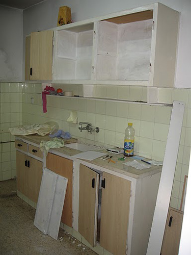
Valerie wrote us the other day to show off her remodeled bathroom and I had to share it on the blog because we LOVE a good remodel here on DTI. Here are the details:
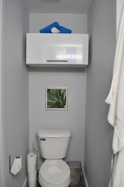
“Our current home is a loft in Midtown Atlanta and while it is a different type of home than most of your readers post about but it fits our style. Recently we completely renovated our bathroom. We only have one bathroom in our 2 bedroom loft, so making it as comfortable and functional as possible was extremely important, all while keeping in line with the way we have renovated every other part of the home. We did the entire project ourselves, except for installing the tub (living in a high rise building means plumbing mistakes can be huge!). We tore it down to the studs and the original concrete floor and brought it back in an industrial but modern and polished way that fits with the rest of our home. This included chipping away the tiny tiles that covered the floor and building a concrete step to accommodate plumbing that can’t go under your subflooring when your floor is concrete.”
Valerie also sent along a couple before photos that show the bland space as it was, but unfortunately she does not have any photos of details to show the terrible workmanship from a very unknowledgeable do-it-yourselfer.
I am in awe that Valerie and Alan did all this work themselves. The mosaic tiles are a gorgeous touch, and the colour scheme is perfectly bathroom-y and fresh. Check it out below. (More information on their remodel can be found on their blog. Great job guys! Thanks for sharing with us!)
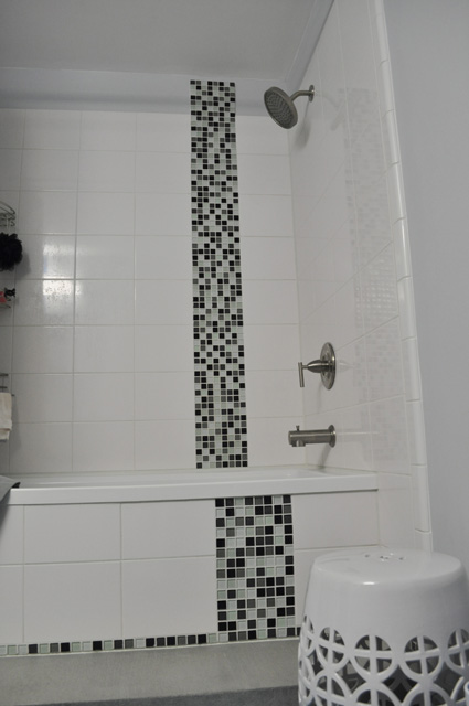
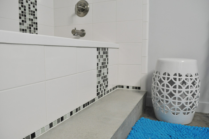
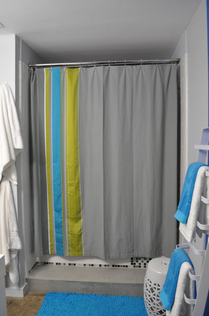
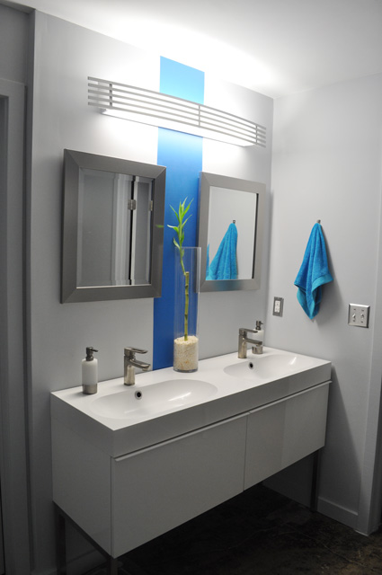
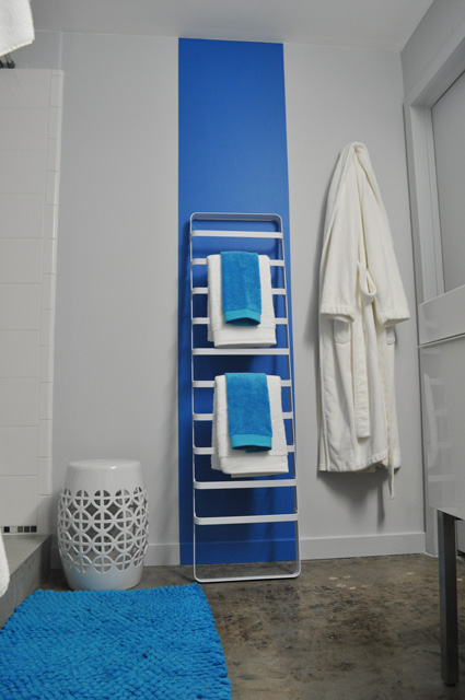
Sources: sink – Ikea; faucets, mirror – Home Depot; stool – HomeGoods; towels, bathmat, shower curtain – CB2; soap dispensers – Bed, Bath and Beyond; paint: grey – Valspar’s Bay Waves; blue – Behr’s Wishing Well
P.S. Stay tuned for another reader’s renovation later today…it’s INSANE!
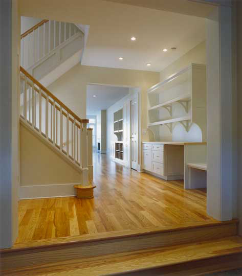
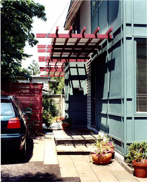
JDArchitect
Posted on Thu, 12 Aug 2010 by KiM
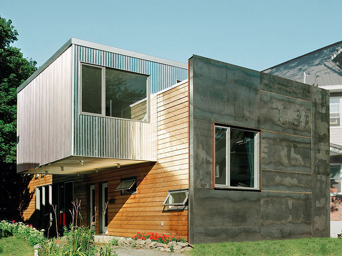
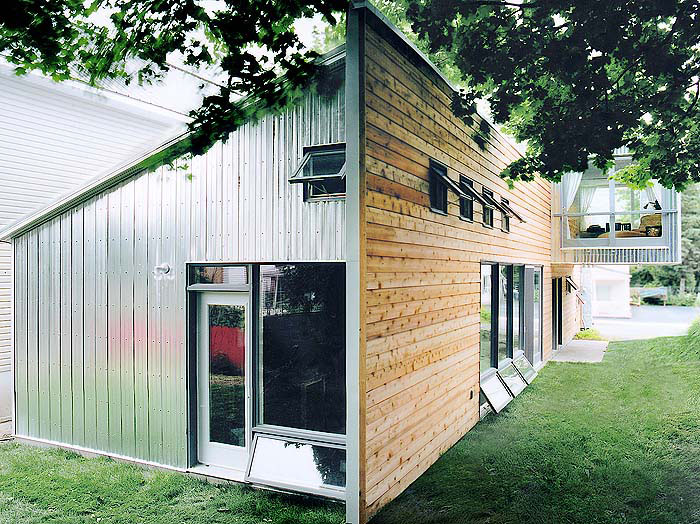
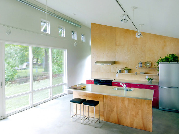
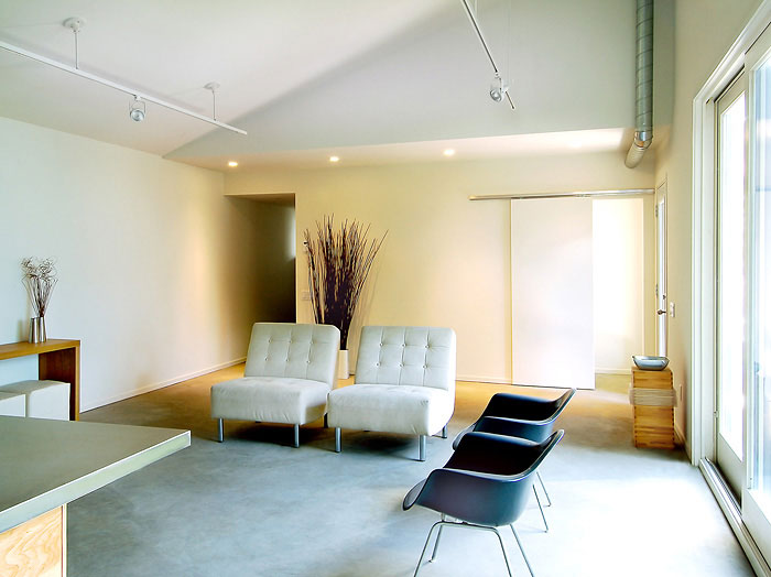
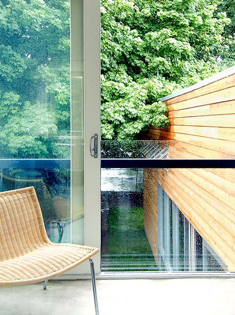
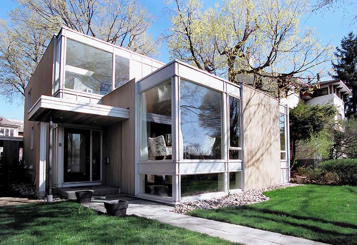
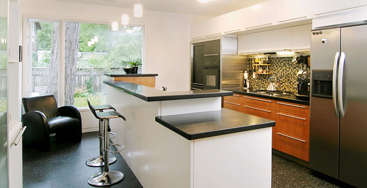
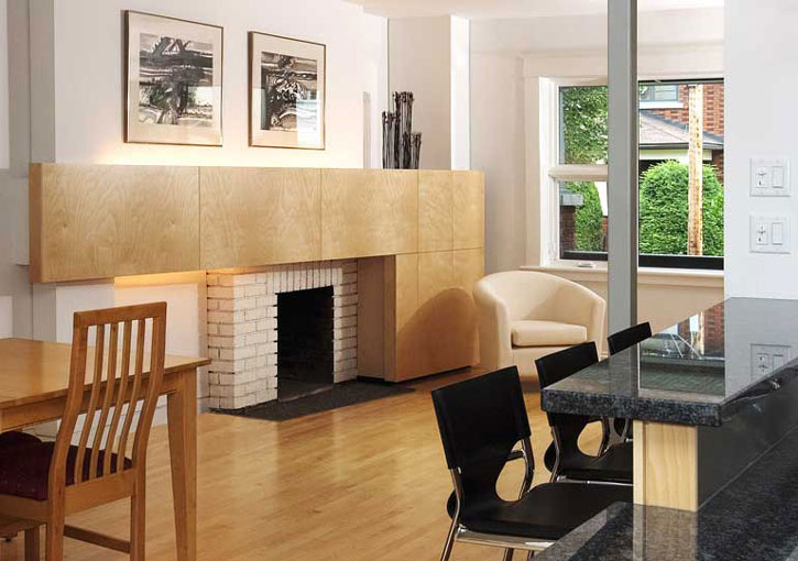
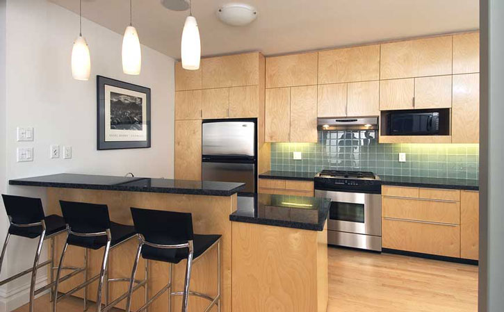
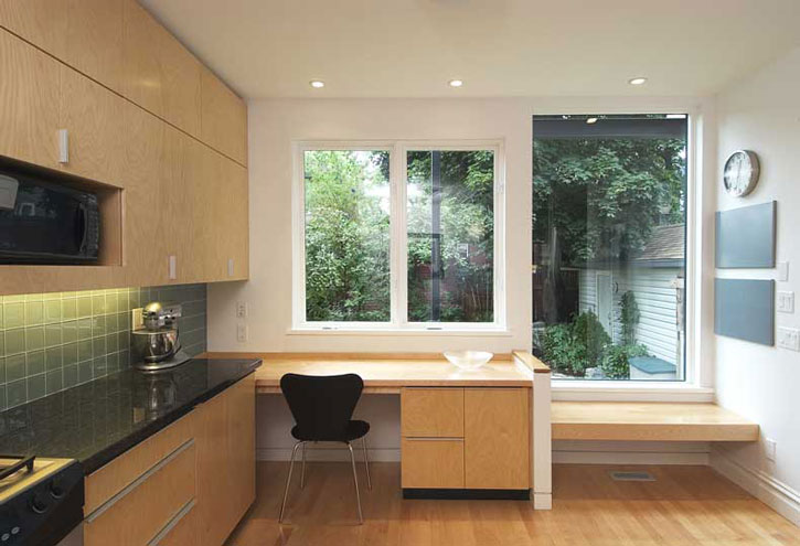
As I’ve mentionned a couple of times, my husband and I have been doing a bit of research looking for architects to help us plan the additions we want to make to our WAY too small and WAY too boring home. Our cat-sitter used to live on a street a few blocks from us where there was one of the coolest yet simplest homes I’ve ever seen around Ottawa. We recently saw the home in Ottawa Magazine and found out it was designed by local architect John Donkin. It’s 1700 square feet and his client had 3 requirements: a garden, a visitors’ apartment, and a strong street presence. The visitors’ apartment is cantilevered sideways over the lot which creates a shaded area in summer and a covered parking spot and sheltered entrance in winter. The mix of materials on the facade is exactly what I’m looking for and the kicker is the front of the home (iron?) has rusted over time and turned the most beautiful deep orange shade (second photo found on the blog Move That Bus!!!).


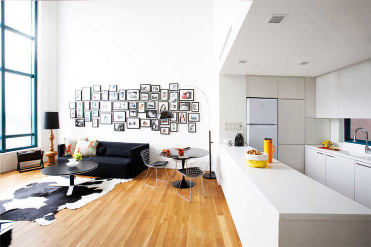
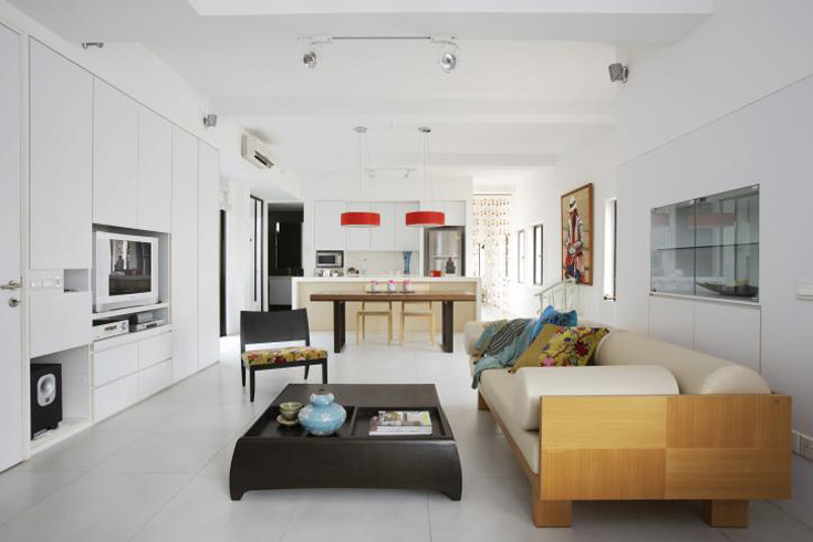
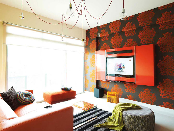
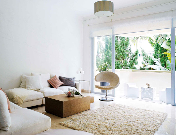
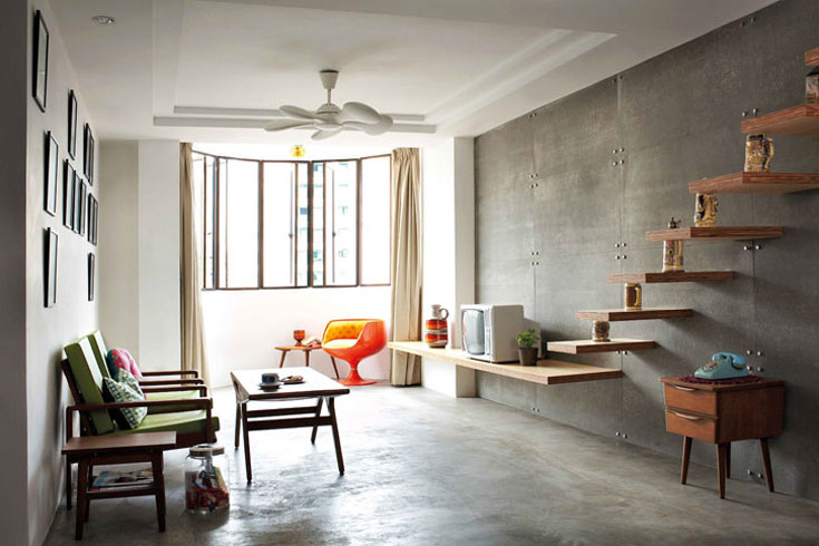
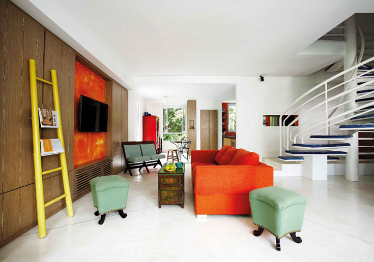
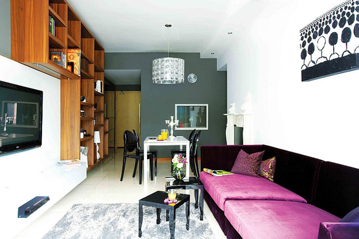
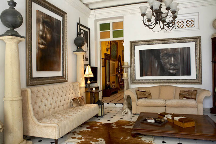
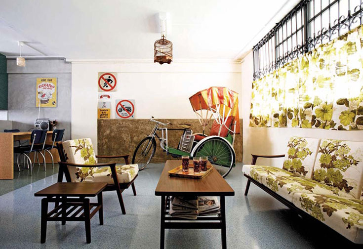
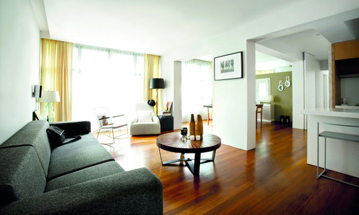
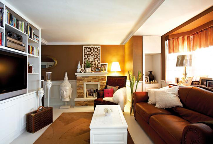
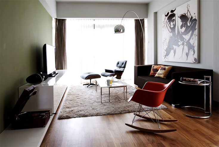
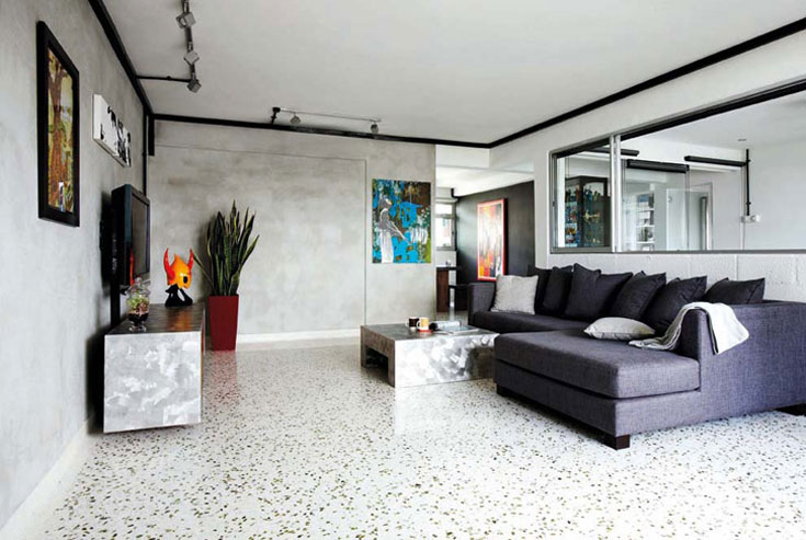
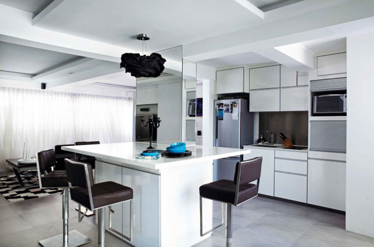
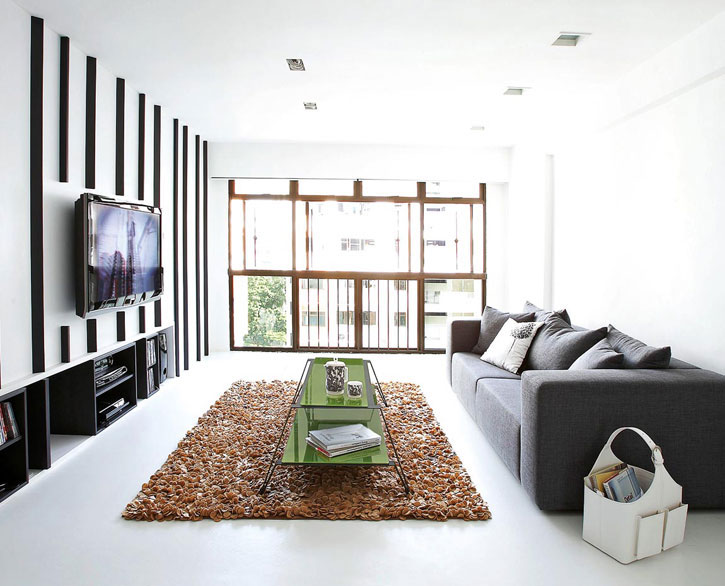
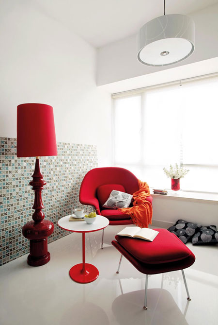
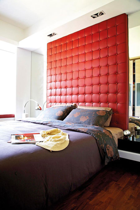
Home and decor in Singapore
Posted on Wed, 11 Aug 2010 by KiM
Back in April I blogged about a magazine from Singapore called Home & Decor that our wee blog was featured in. My list of favourite shelter magazines from around the world is slowly growing, and this one tops the list. Singaporeans are some super stylin’ folks! They seem to love colour, light airy spaces, and modern furnishings. Here are some photos from their website that really caught my eye.
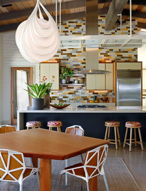
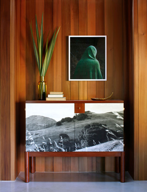
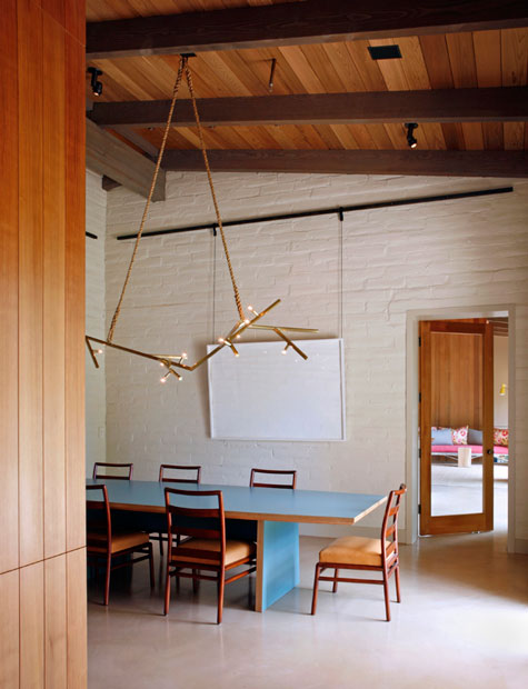
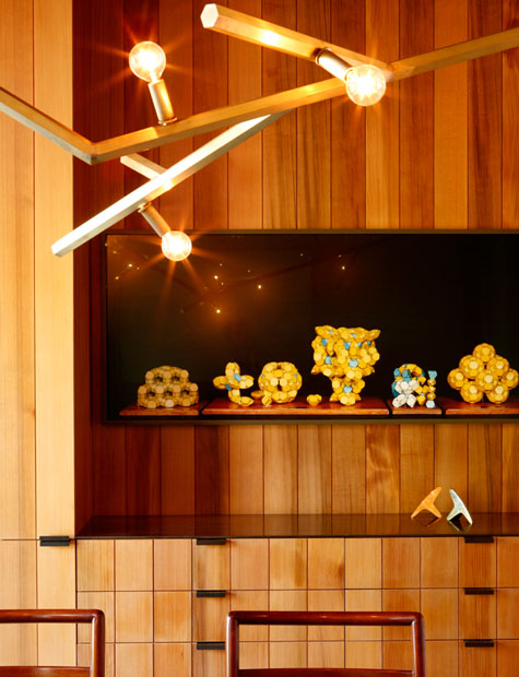
Charles de Lisle workshop
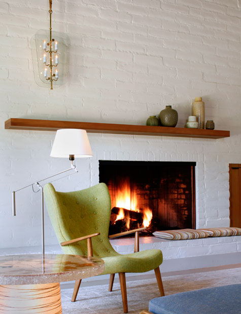
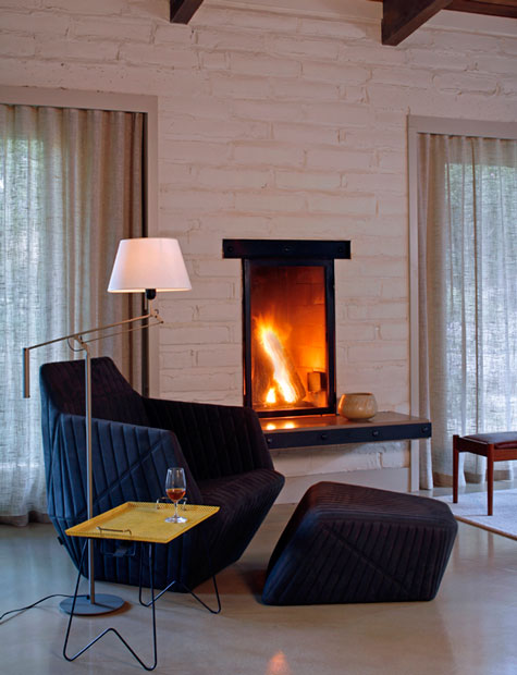
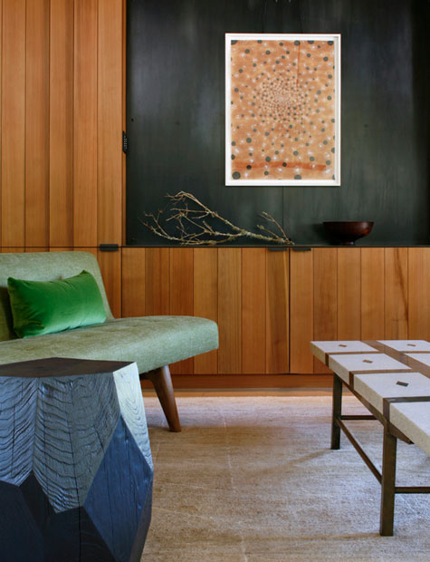
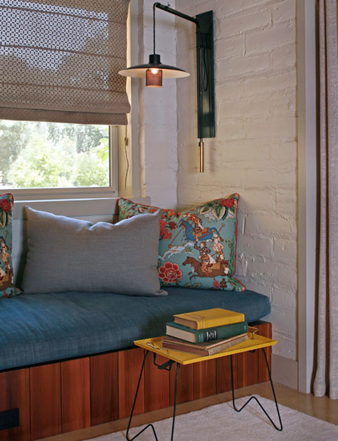
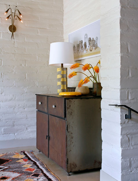
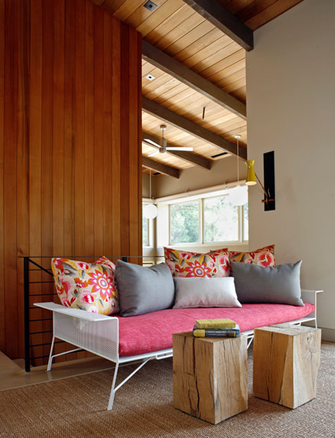
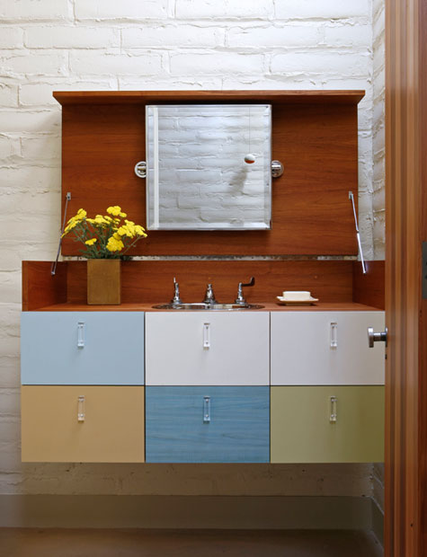
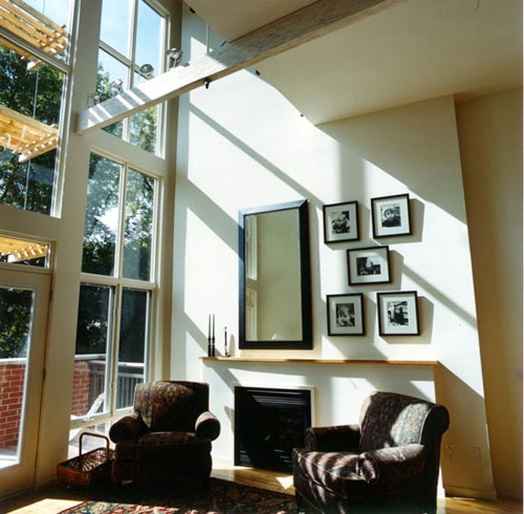
Posted on Tue, 10 Aug 2010 by KiM
Charles de Lisle Workshop is a San Francisco based design firm and it’s principal is a new favourite designer of mine. His experience spans the last 25 years working within the art of ceramics, metalwork, custom furniture, product design, decoration and interiors. His work has been featured in every major shelter magazine such as Interior Design, Dwell, Sunset and California Home + Design. While devouring his website, I came across the William Wurster Ranch in Portola Valley California and HAD to post this home here on DTI. It’s a mid-century modern and vintage masterpiece that is so full of character and intriguing furnishings and finishes.