Displaying posts labeled "Apartment"
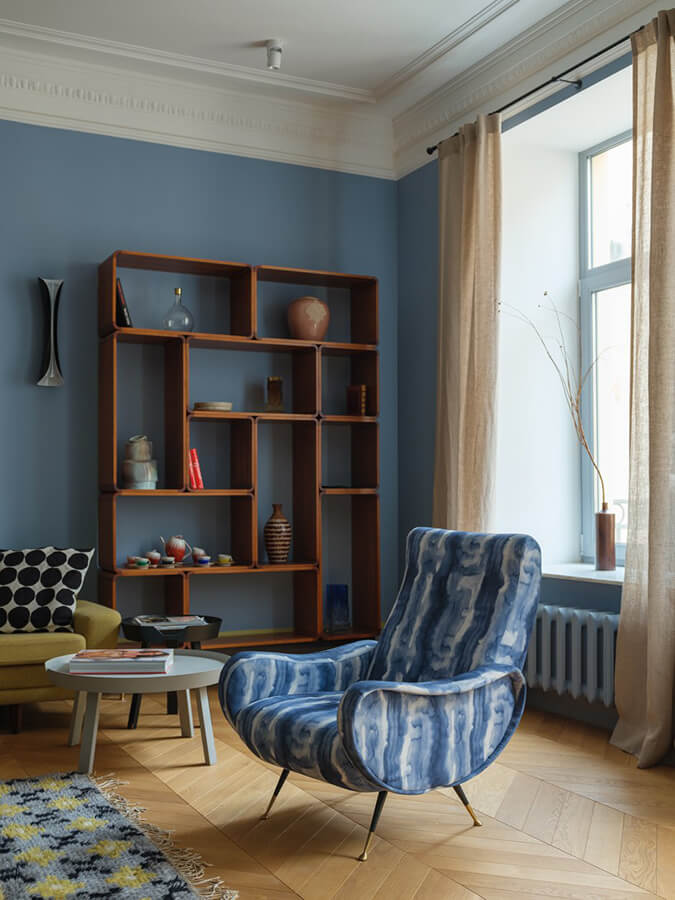
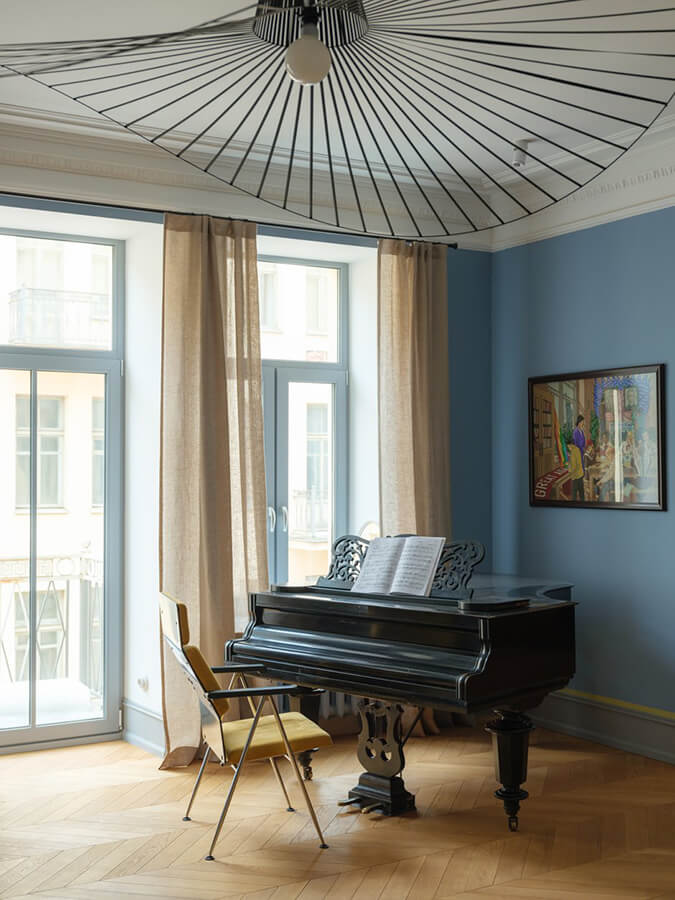
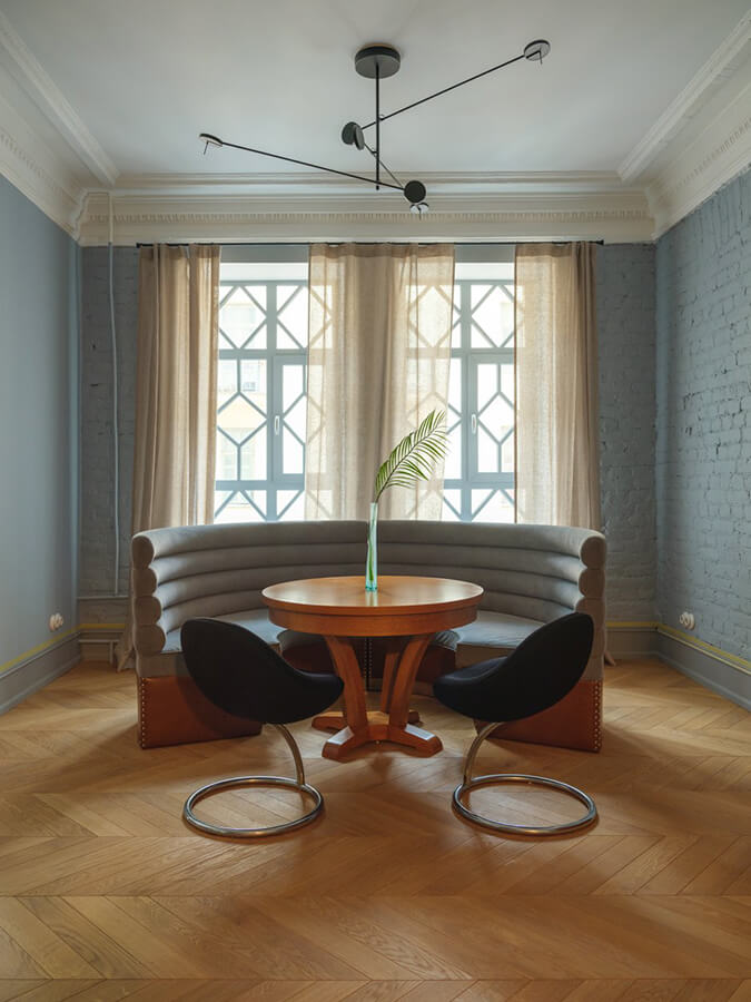
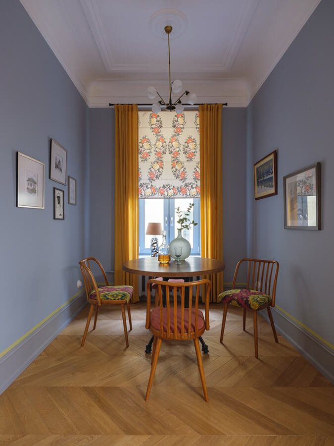
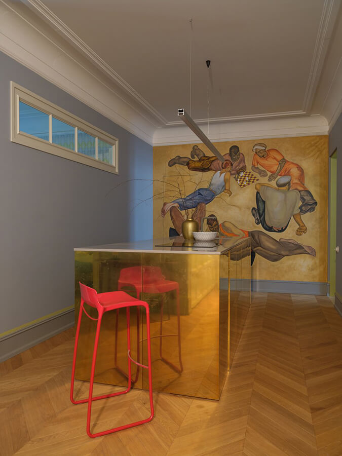
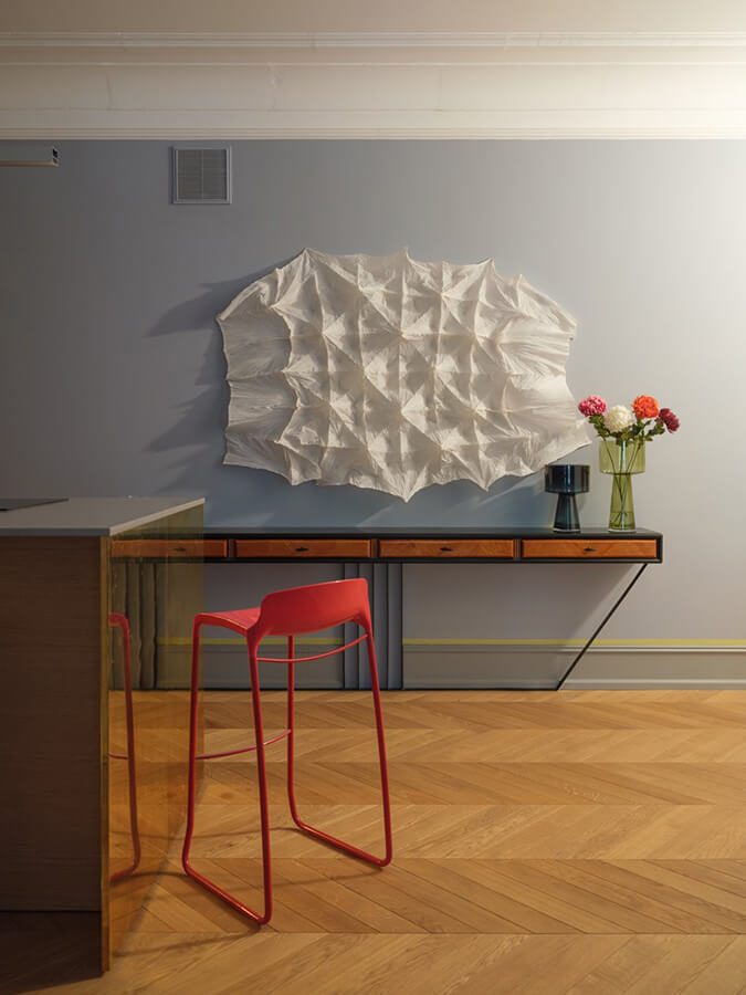
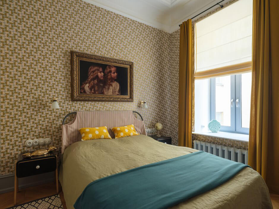
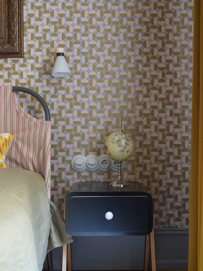
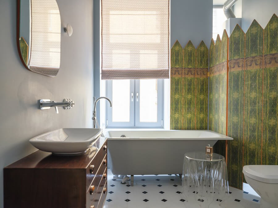
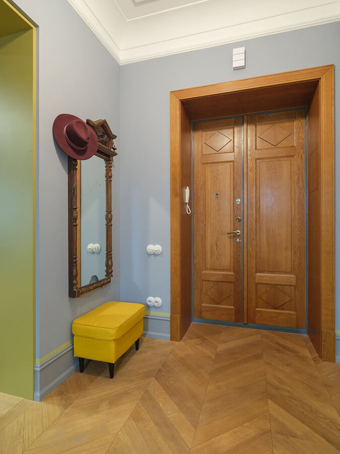
Lots of blue in a historic apartment in St. Petersburg
Posted on Sun, 19 May 2019 by KiM
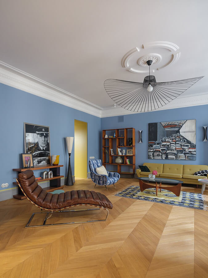
I spotted this apartment on The Village and wanted to share because it is unique and gorgeous, and has a European vibe I am always a fan of. Though admittedly, I hate blue (especially this shade) in interiors. Not sure why, I just can’t seem to get on board. Nevertheless this St. Petersburg gem located in a historic 1912 building has some really beautiful features, and was designed by Polina Gerasimova and Svetlana Kalimanova of Ruger Design. Happy long May 2-4 weekend my fellow Canadians!
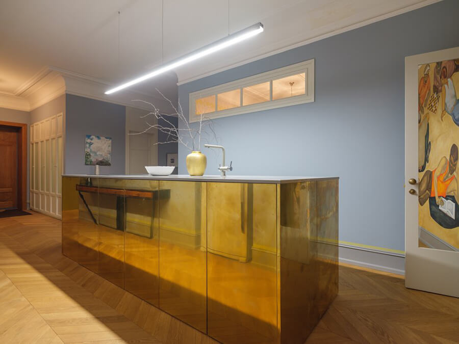
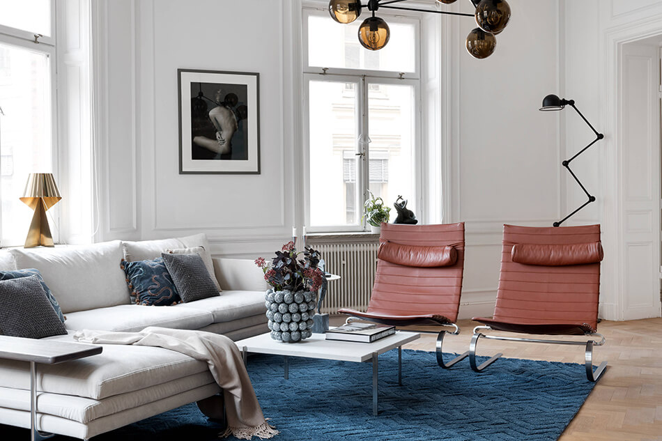
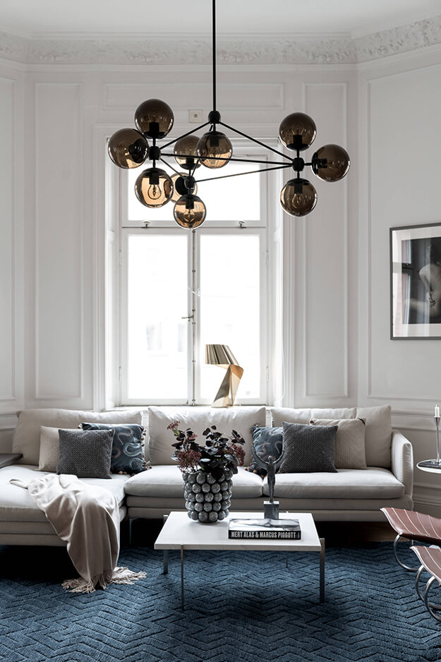
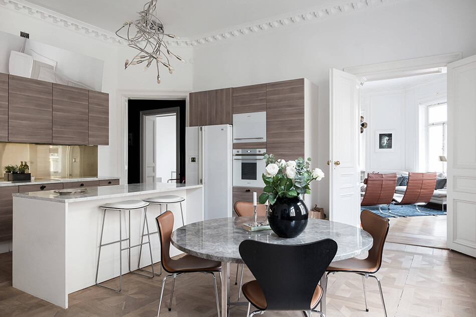
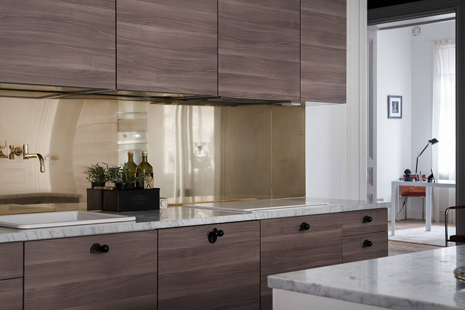
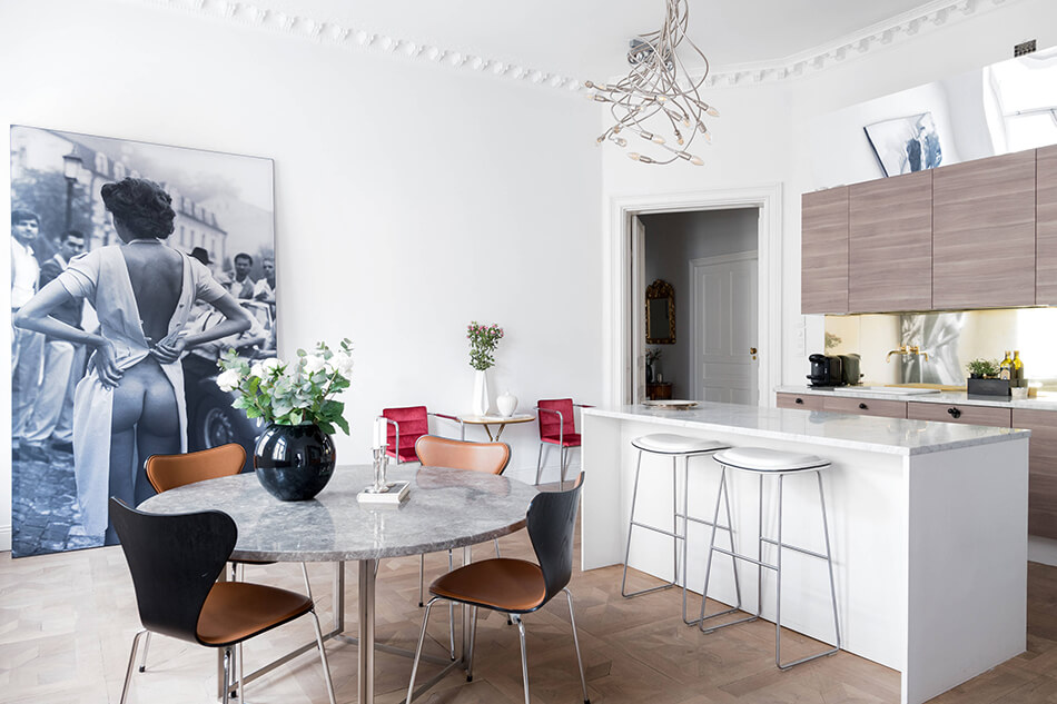
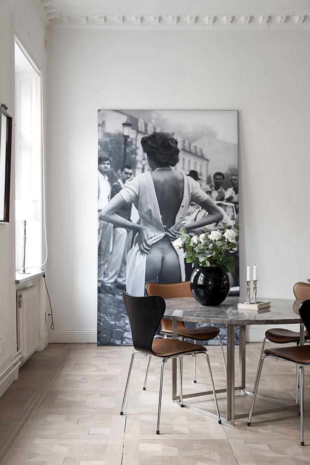
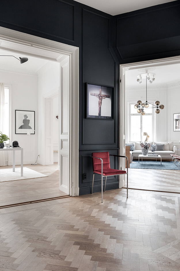
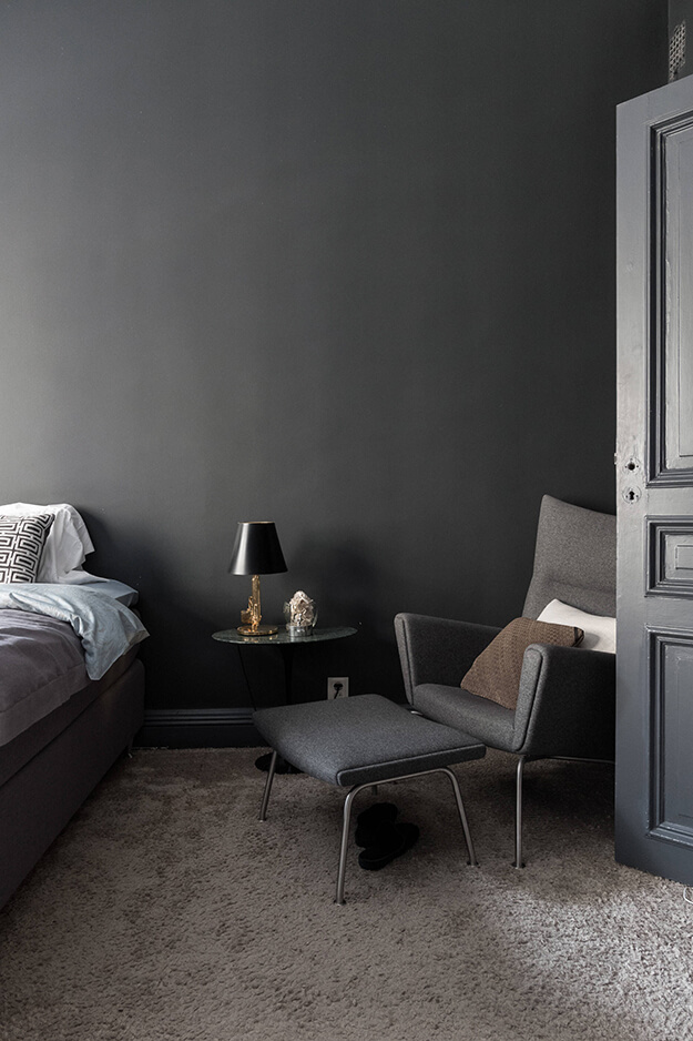
A turn of the century Swedish apartment
Posted on Wed, 15 May 2019 by KiM
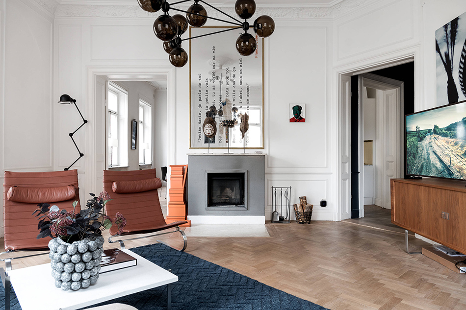
I spotted his beauty of an apartment on Lagerlings and had to share because it’s not your typical Swedish style of white and pastels. A bit of rust/orange, some black and brass, a bit of mid-century modern, and some bold artwork makes this space unique.
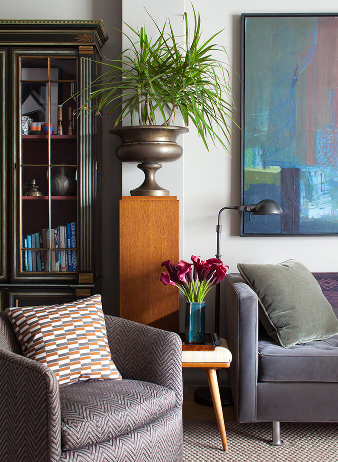
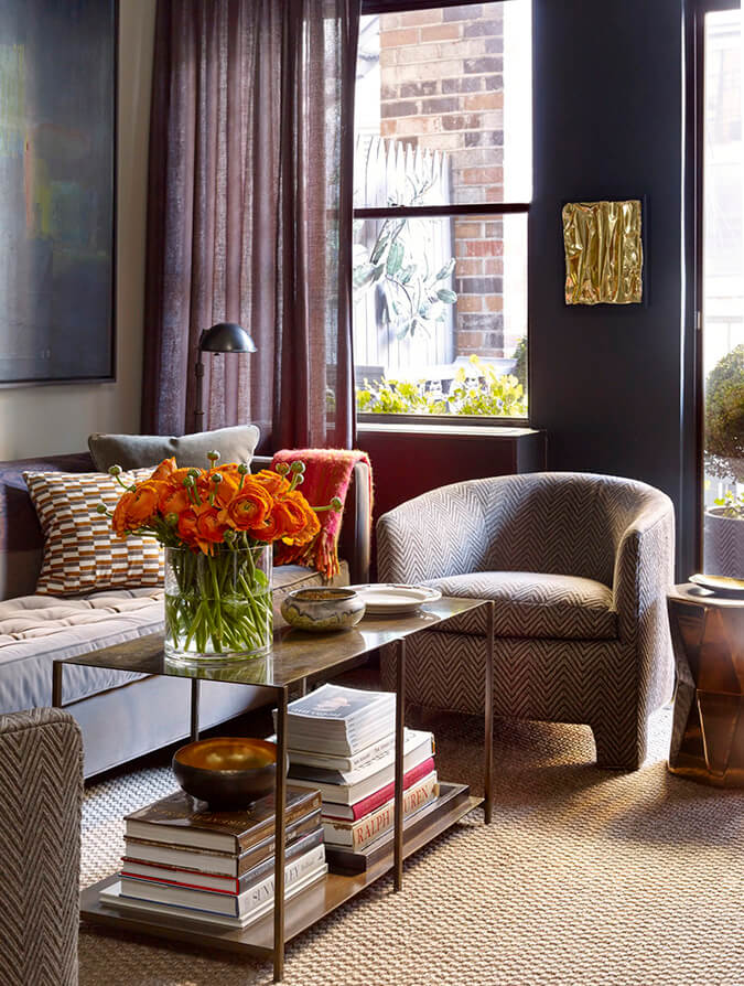
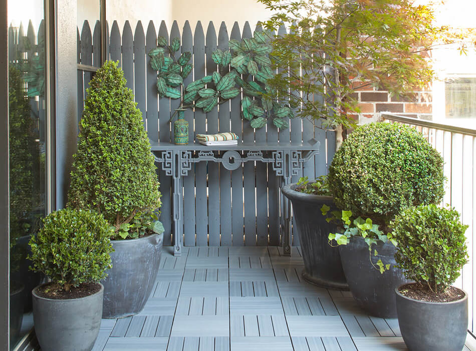
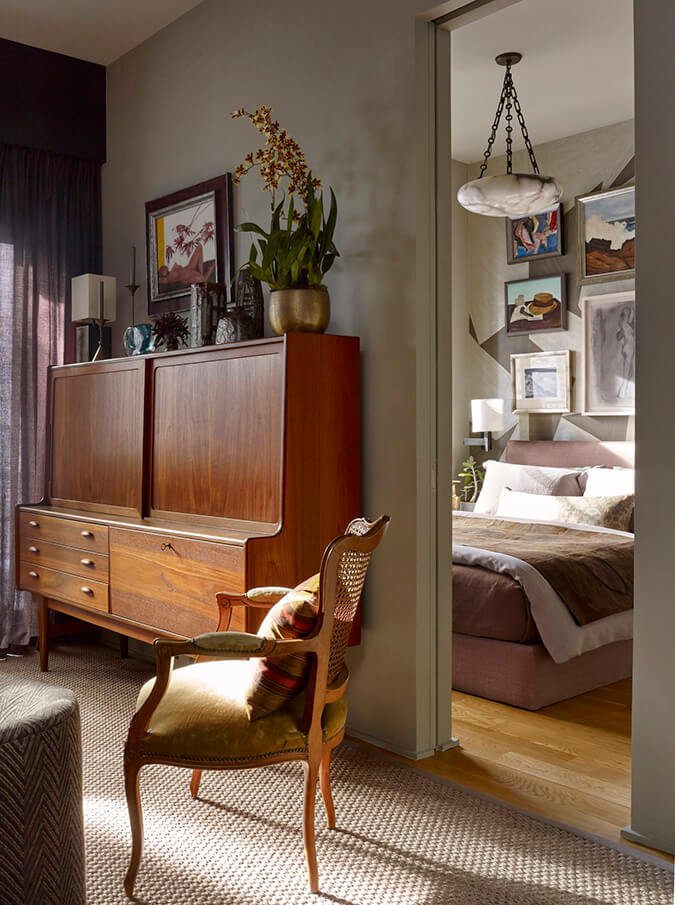
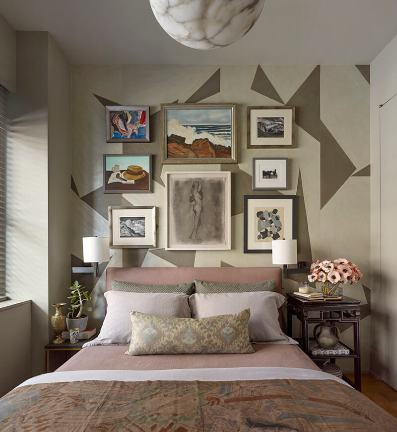
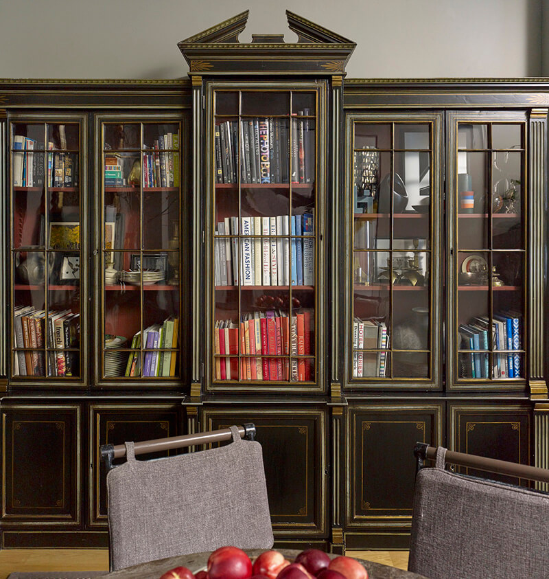
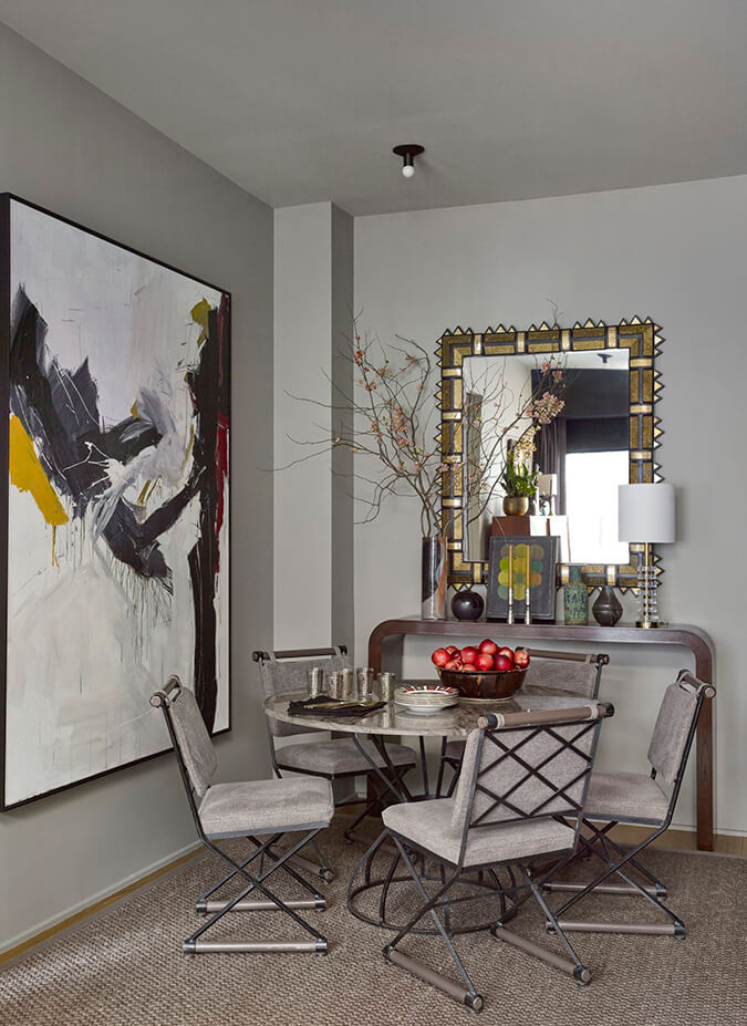
A designer’s Greenwich Village apartment
Posted on Tue, 7 May 2019 by KiM
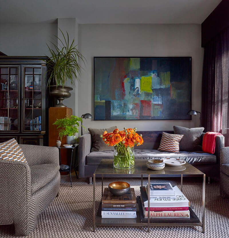
Moody colours, textures and artwork make this small apartment in Greenwich Village dramatic and luxe. This is the polished home of interior designer Josh Greene. (Photos: Peter Murdock)
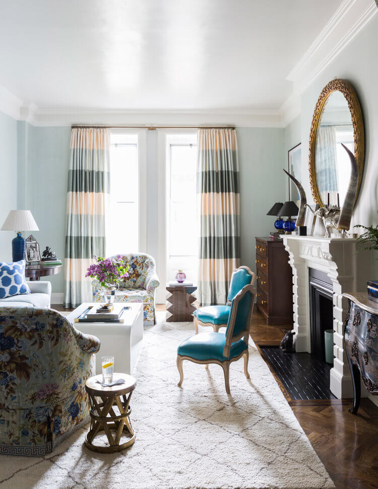
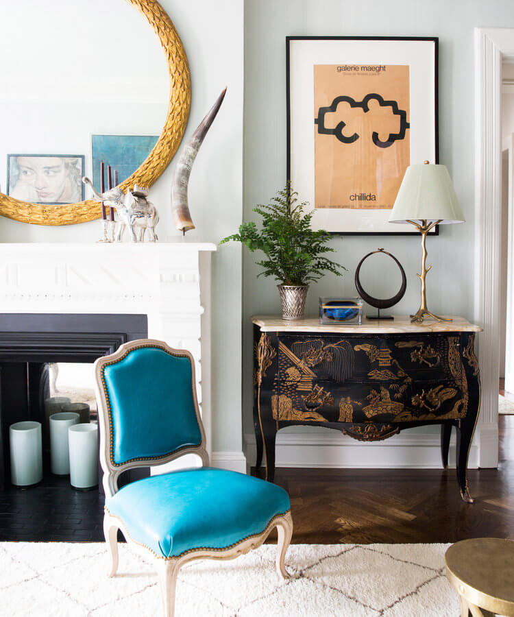
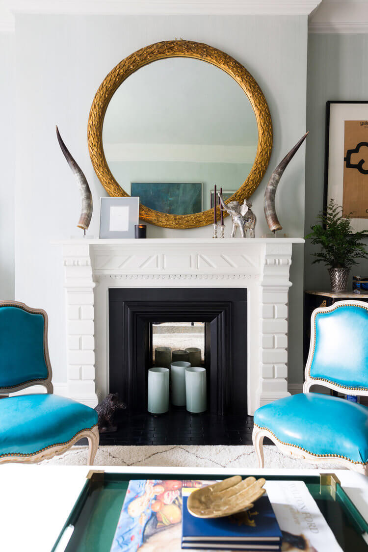
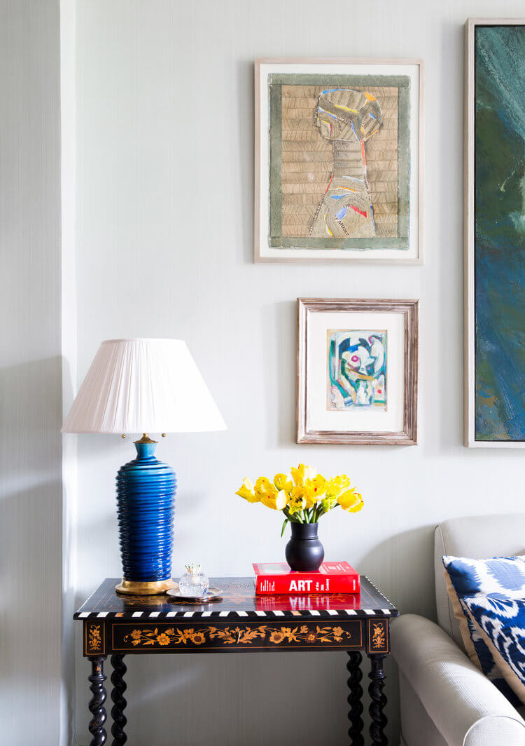
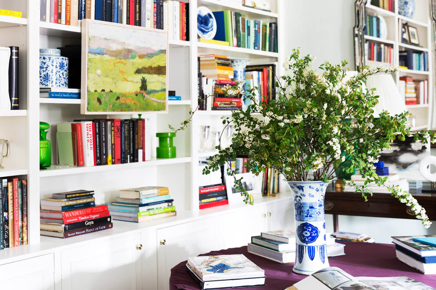
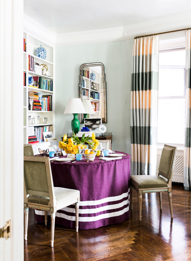
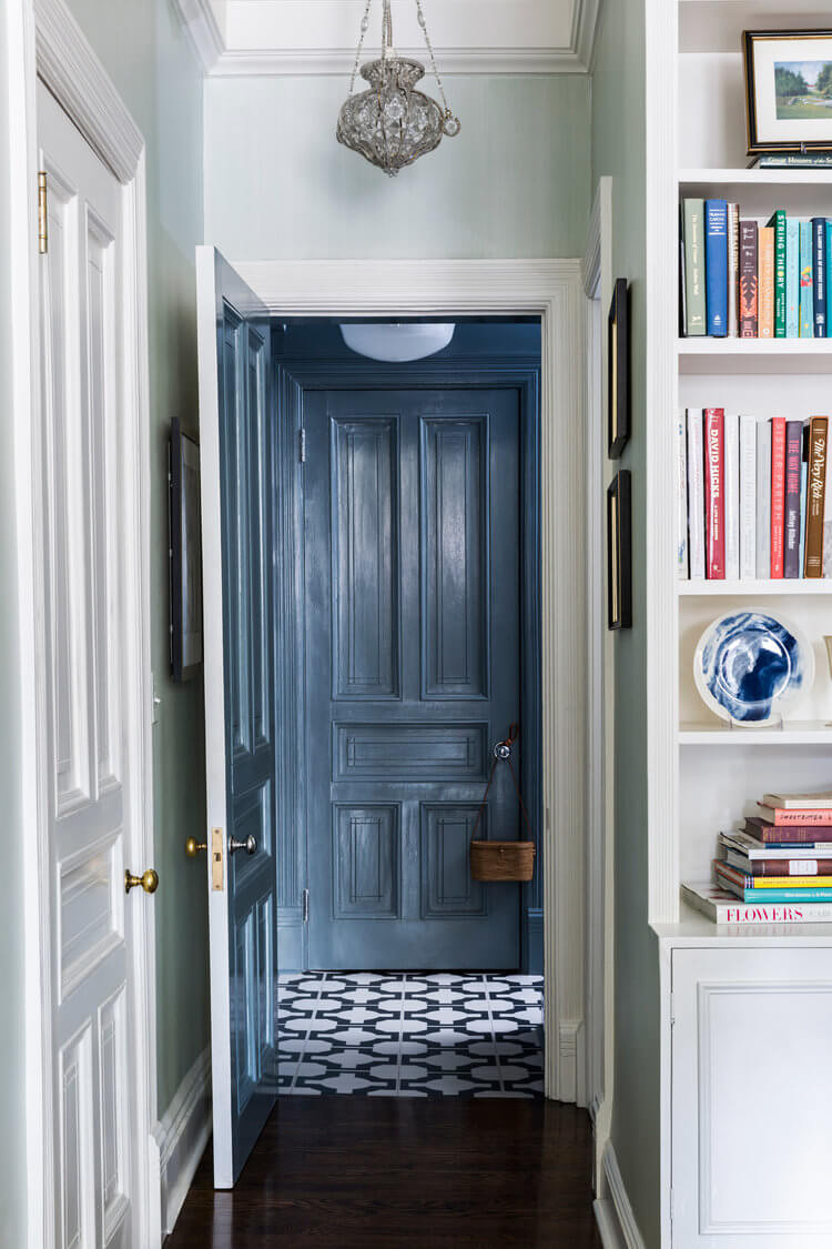
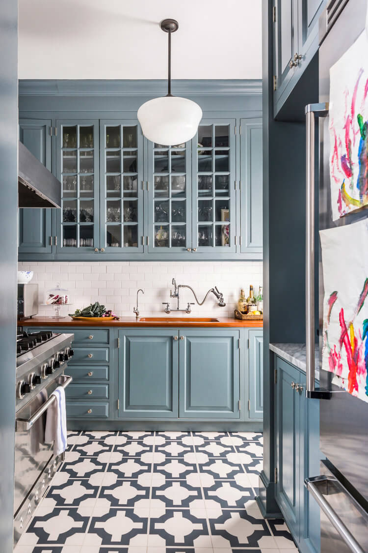
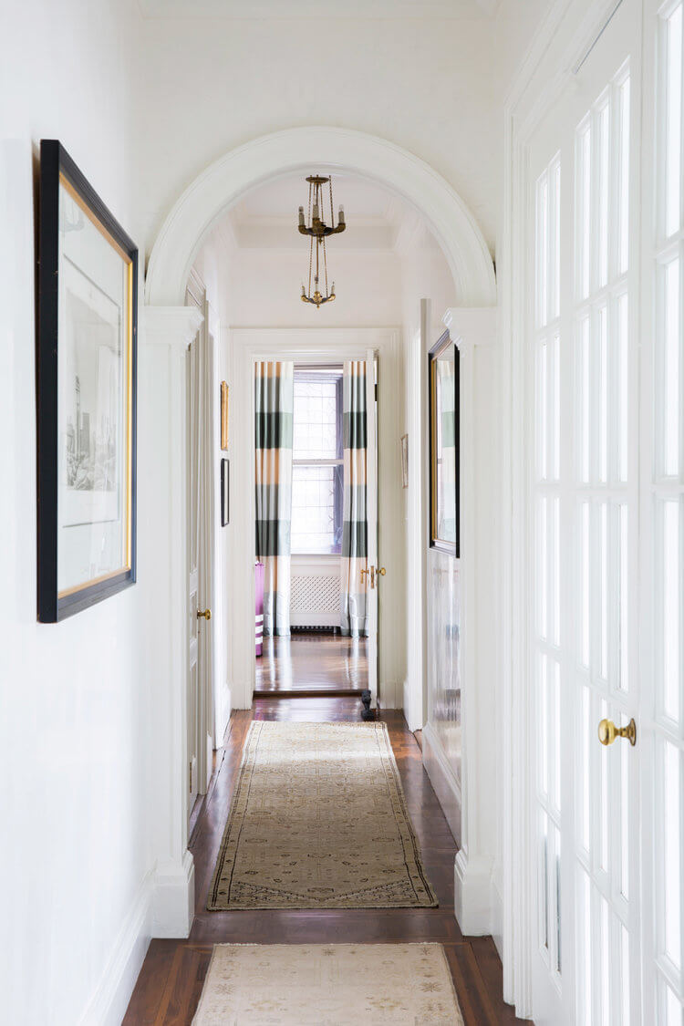
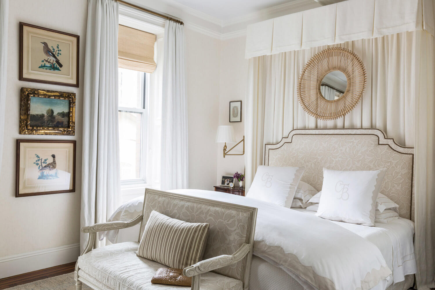
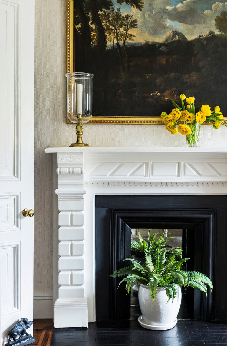
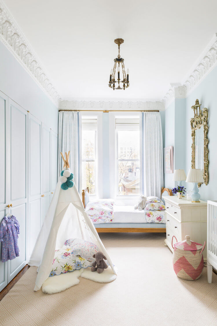
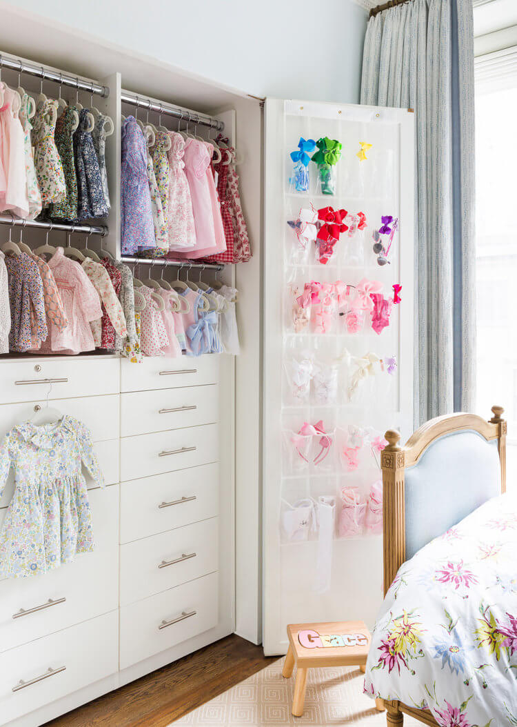
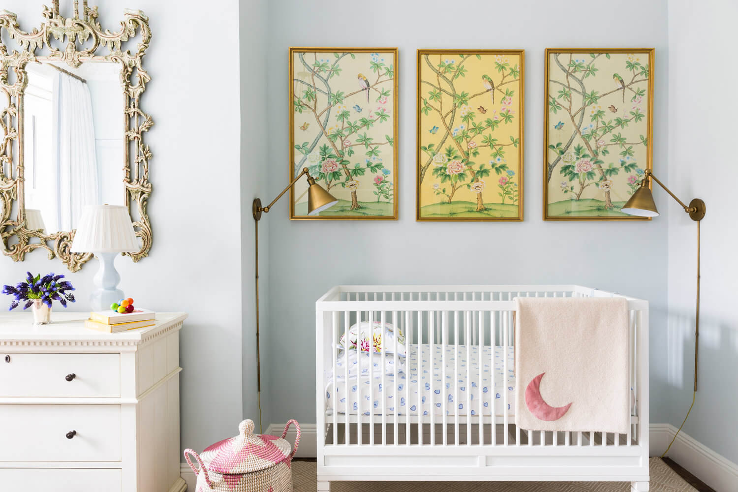
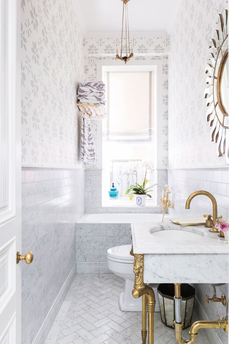
A stylish family apartment
Posted on Mon, 6 May 2019 by midcenturyjo
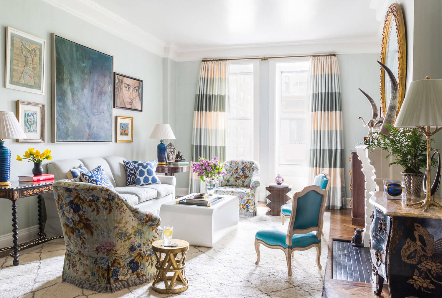
Whether you call it traditional with a twist, elegant eclectic or a just colourful family home this Gramercy Park apartment by interior designer CeCe Barfield is as joyful and exuberant as it is chic and stylish.
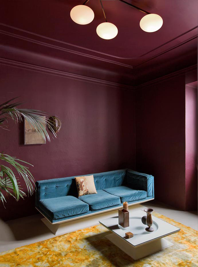
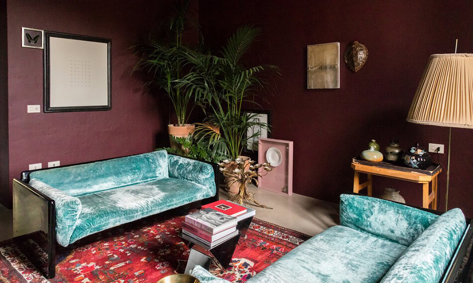
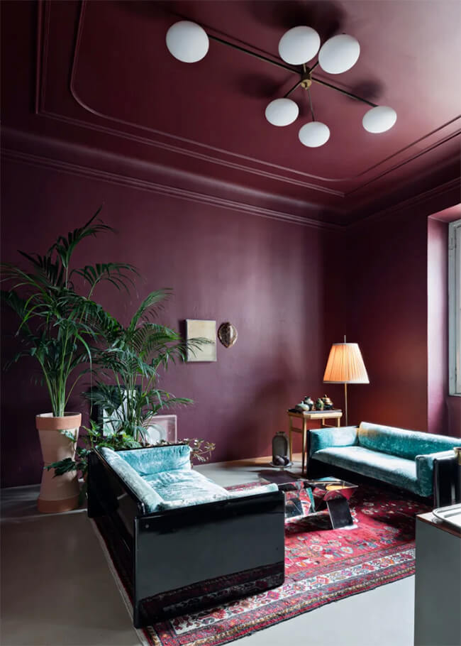
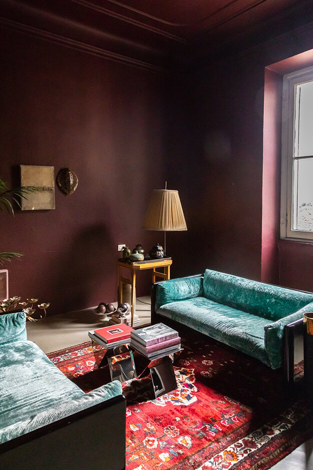
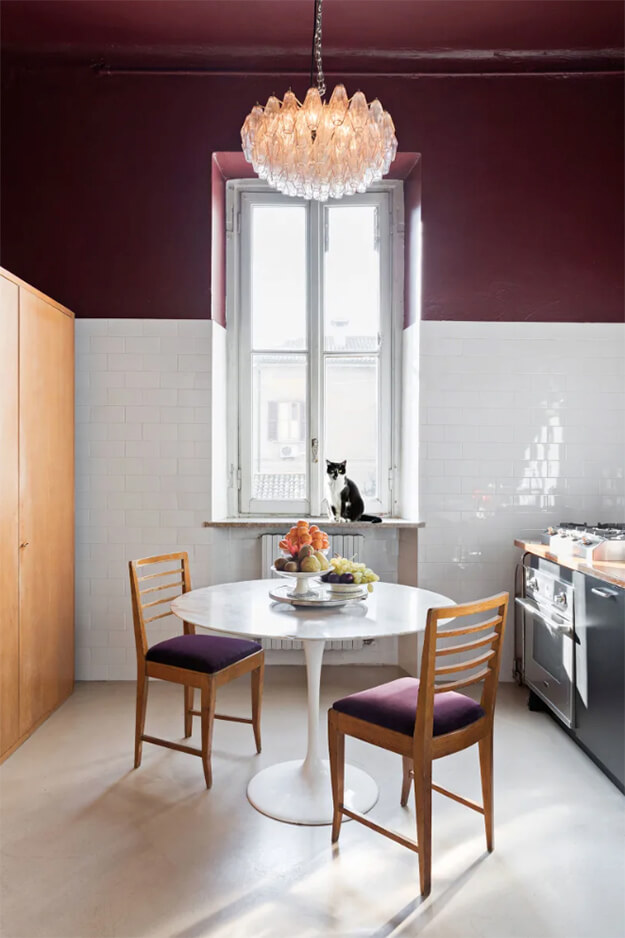
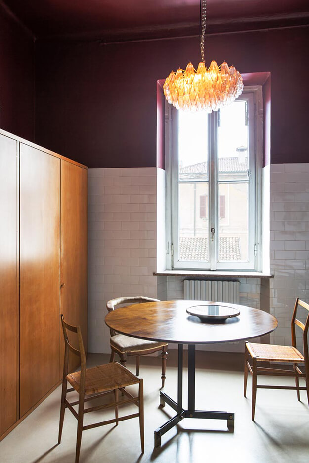
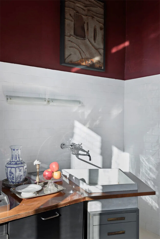
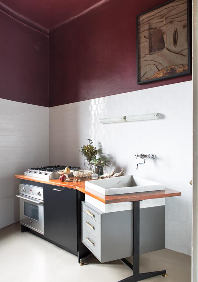
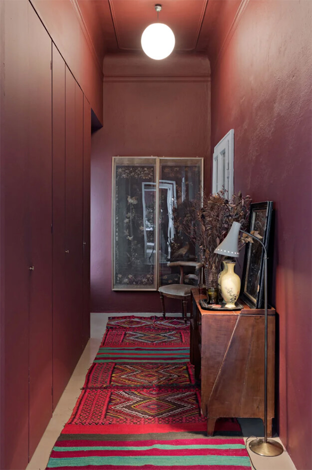
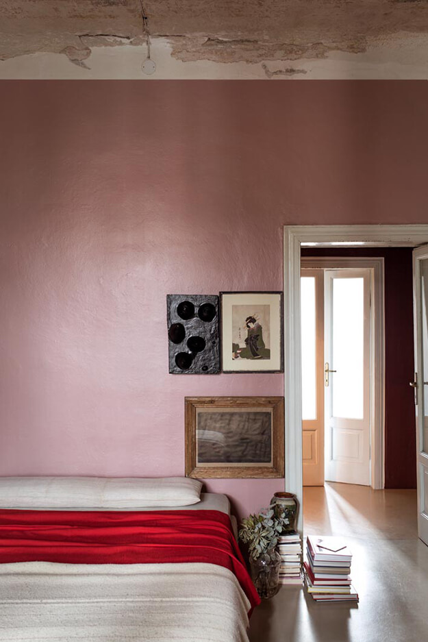
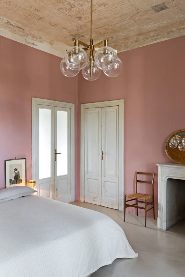
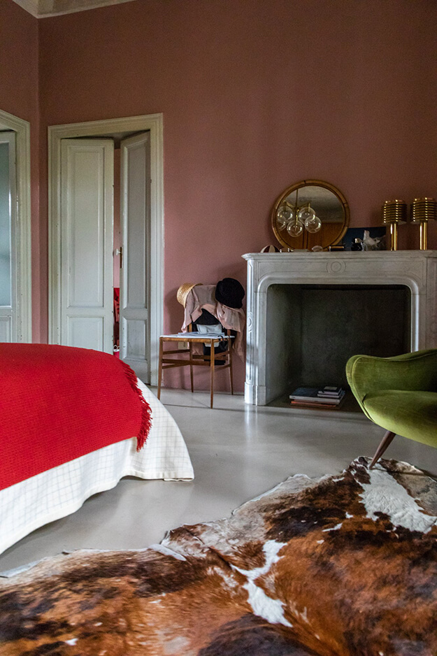
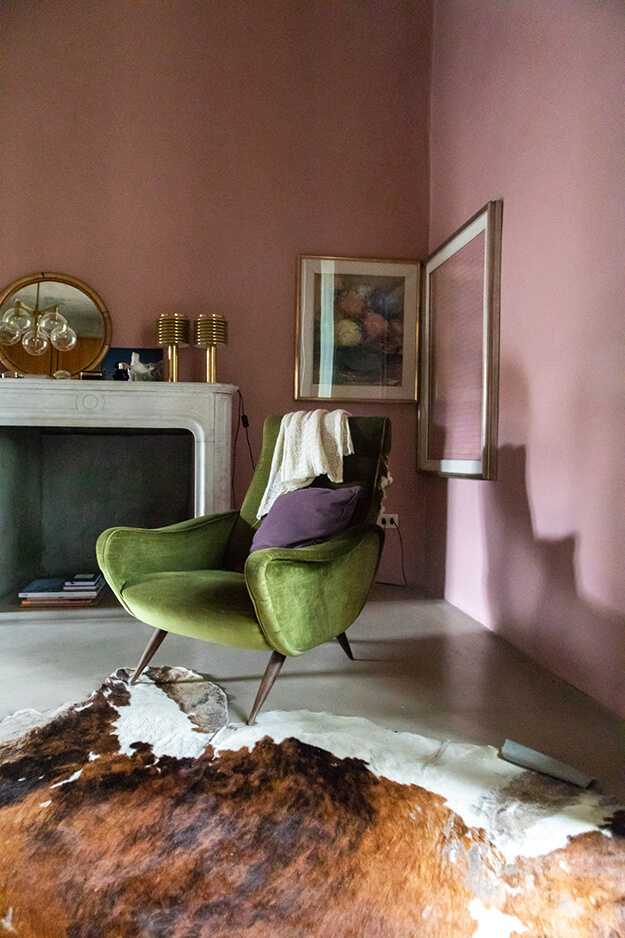
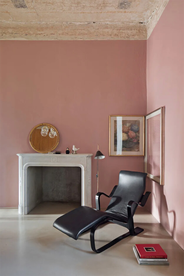
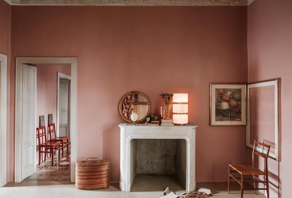
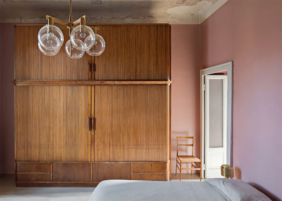
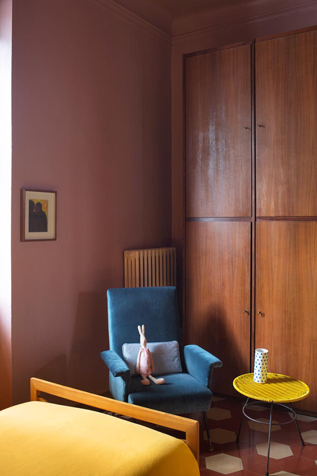
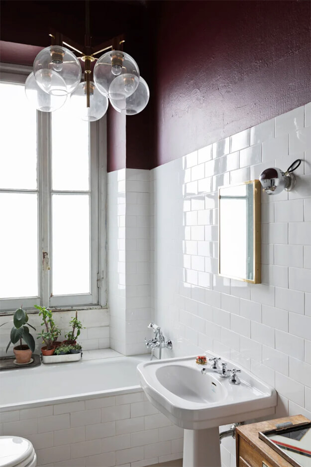
Pink and purple
Posted on Sun, 5 May 2019 by KiM
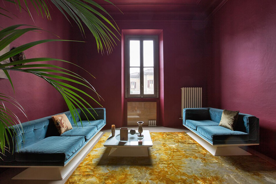
Shades of pink and purple – aubergine and dusty rose – can be found throughout the apartment of Daniele Daminelli of Studio2046 that he shares with his wife and 2 children. Located in an over 100 year old building in Treviglio, Northern Italy, each room is one of these moody shades and then mixed with other colours found in an eclectic assortment of rugs, chairs and sofas. I found a few features of this gorgeous apartment while googling and it is very interesting to see the different iterations that have taken place. (Architectural Digest Germany with photos by Laura Fantacuzzi & Maxime Galati Fourcade / Photofoyer; The Socialite Family with photos by Constance Gennari; Living with photos by Silvia Rivoltella, Styling by Alberto Zordan)