Displaying posts labeled "Black"
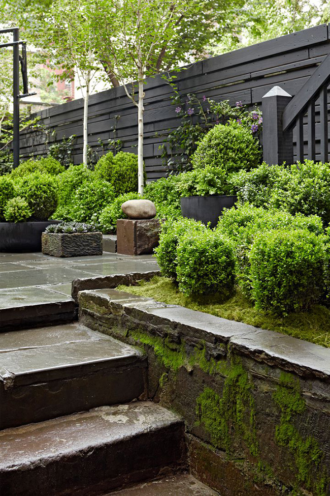
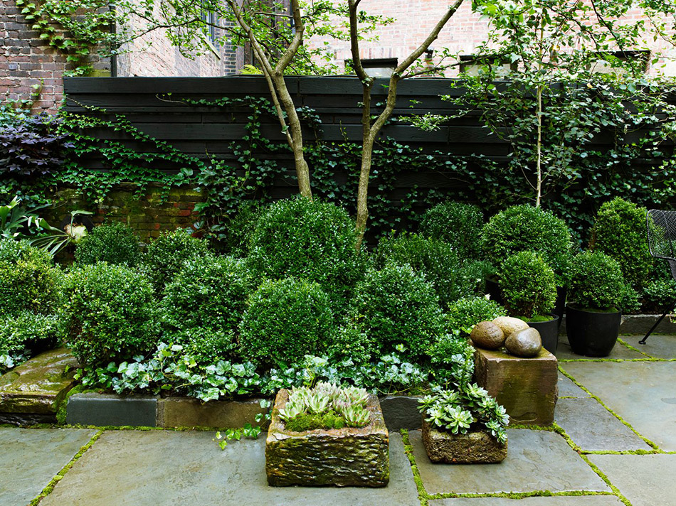
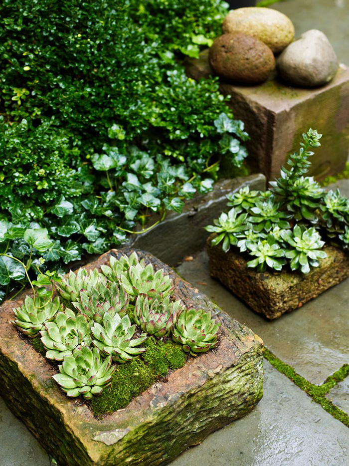
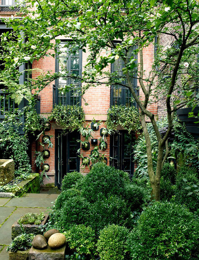
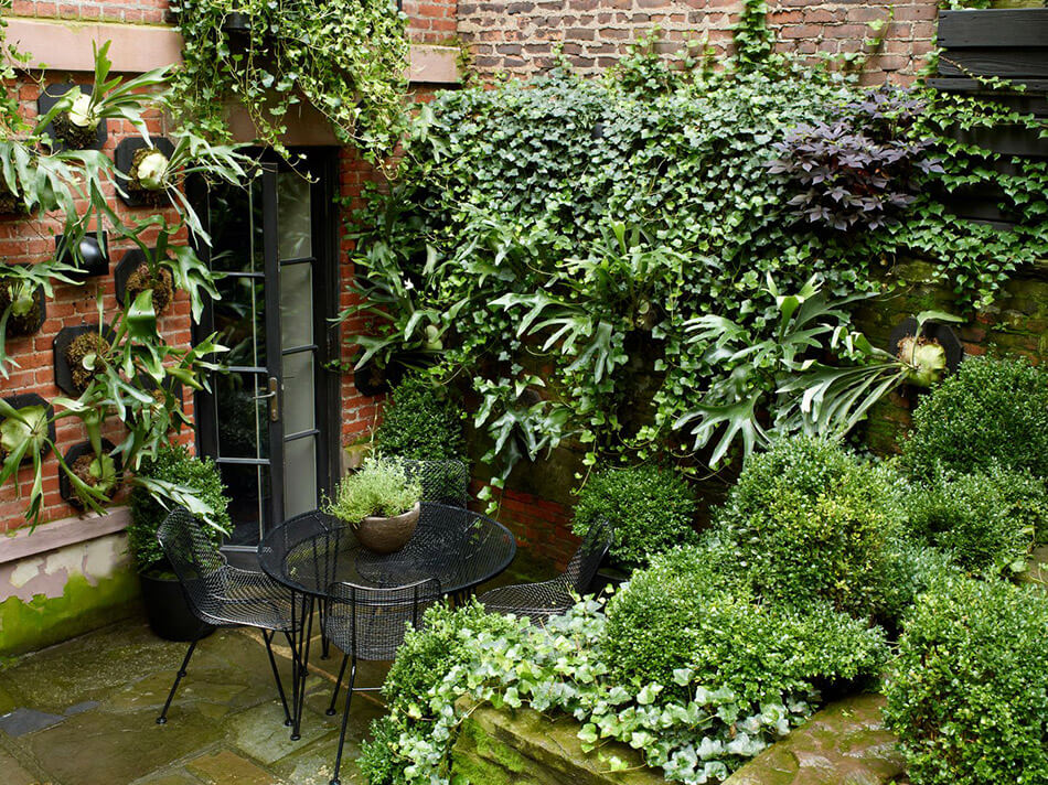
A townhouse garden on West 11th Street
Posted on Tue, 2 Jun 2020 by KiM
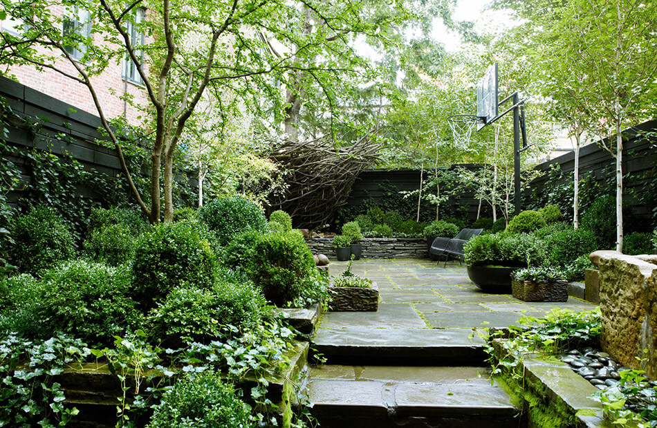
As of late I have been spending every bit of free time I have working on backyard projects with my husband. We finally received our shipment of plants (all evergreens – I realized I should embrace our crappy climate and plant things that look alive all year long) so the space is finally coming together. I am not big on flowers. I mean, I love a bouquet every now and then or picking some weeds out of the yard and sticking them in a vase but that’s about it. And that is why I love this townhouse garden project by Sawyer | Berson. It’s just deep greens and black. I love the simplicity yet how lush it is. Can’t really go wrong with classics like boxwoods and English ivy and staghorn ferns.
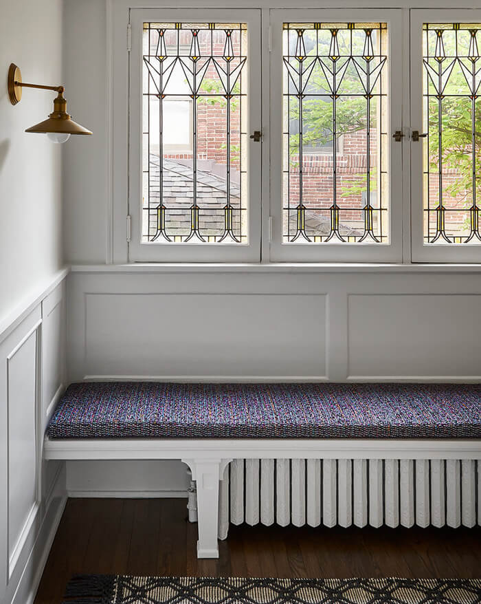
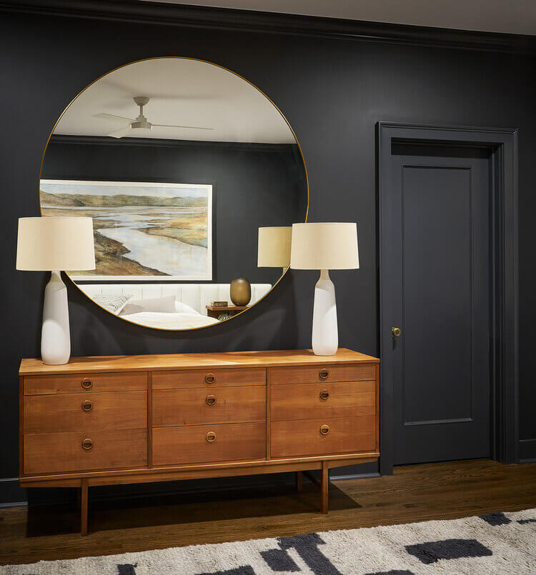
A renovated Park Avenue prewar apartment
Posted on Tue, 2 Jun 2020 by KiM
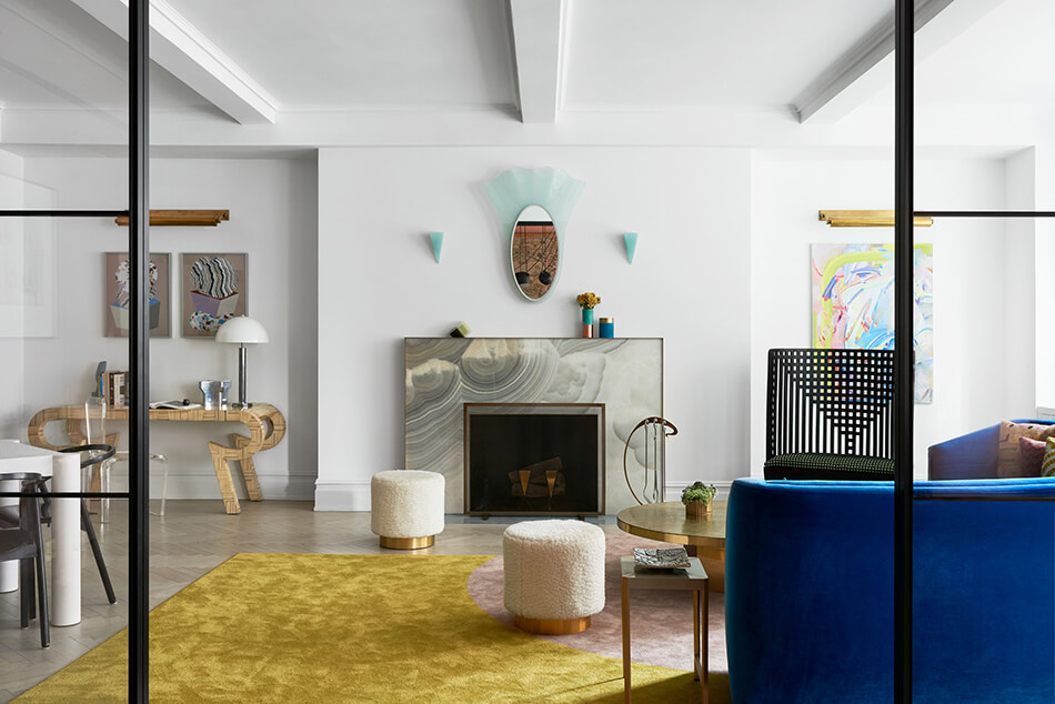
I absolutely love this Park Avenue prewar apartment architected and designed by MKCA. It has a contemporary art deco feel to it and has some exuberant touches that keep it young and fresh. Located in a distinguished Carnegie Hill co-op building, the 2,800 sf apartment has been reimagined for contemporary family life while retaining its original gracious formality. The renovation concentrated on maximizing the already well-proportioned formal spaces, including a generous entrance gallery, formal living room and dining room; while converting the dark and crowded storage and service areas into functional contemporary living elements.
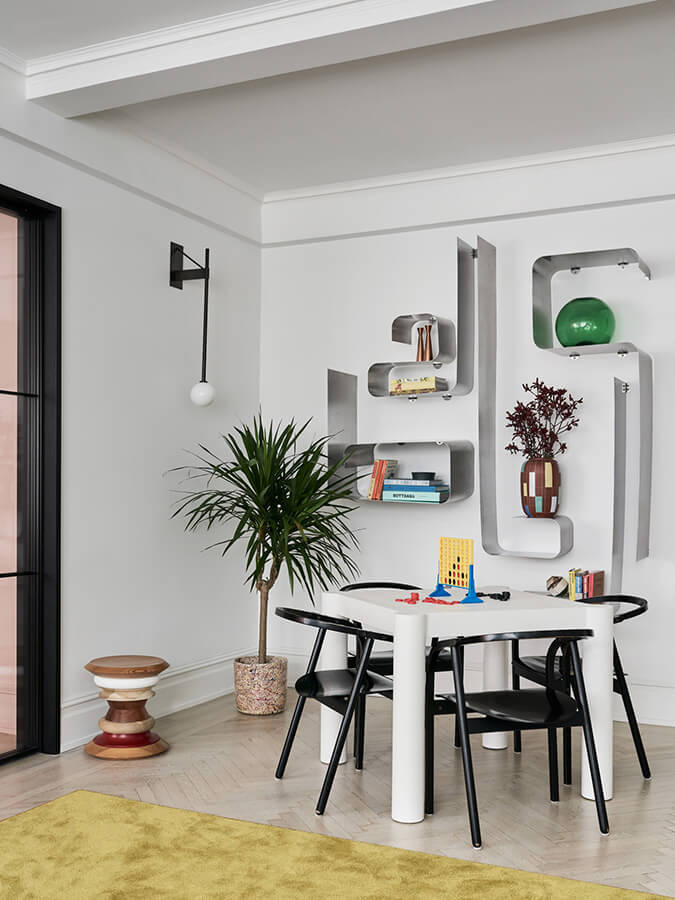

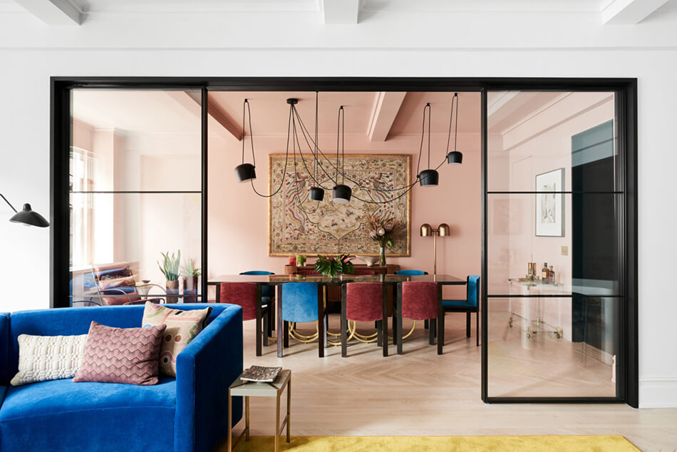
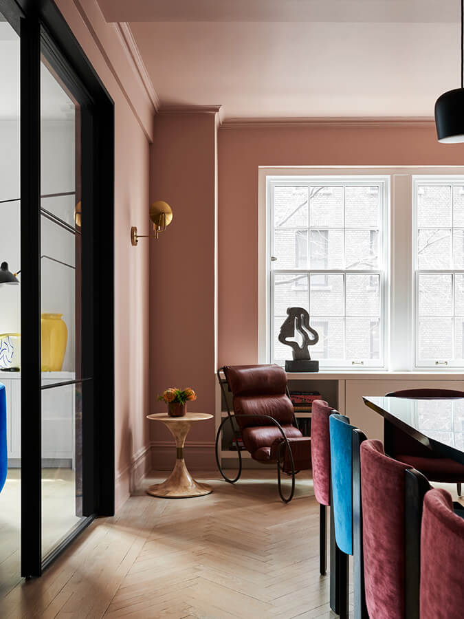
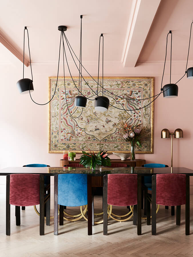
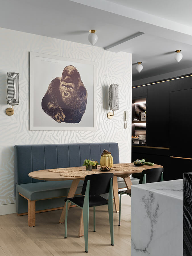
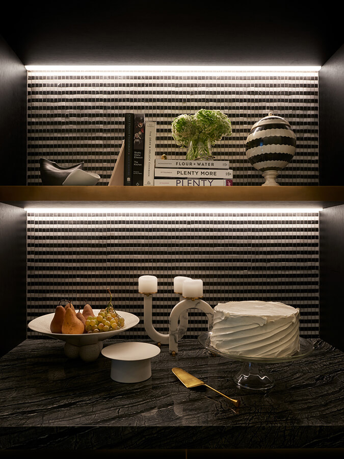
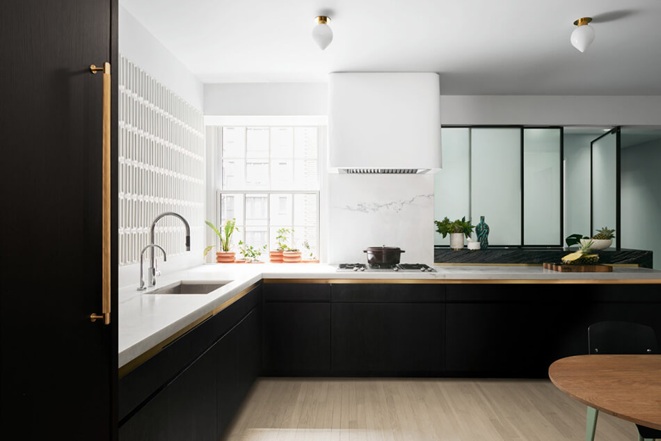
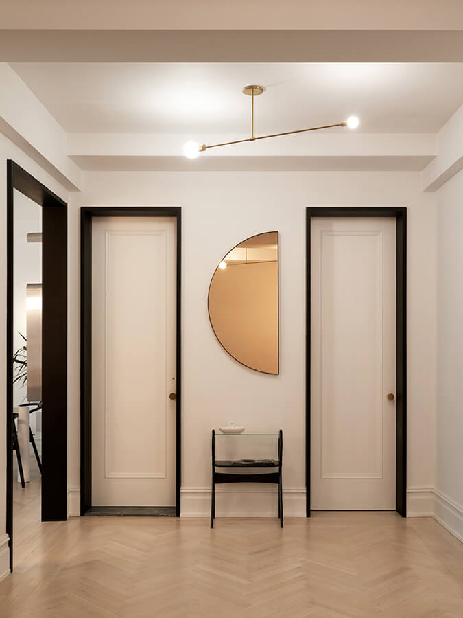

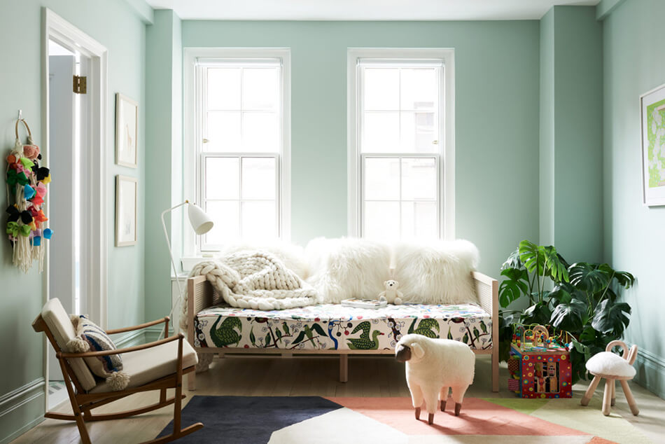
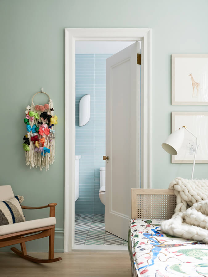
Photos: Brooke Holm
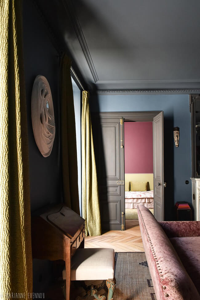
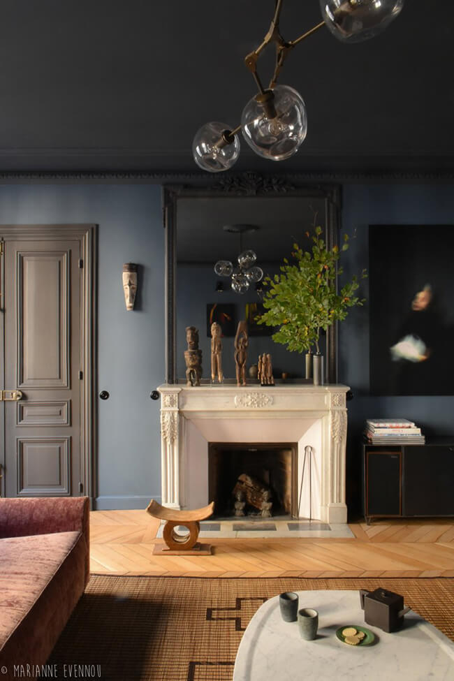
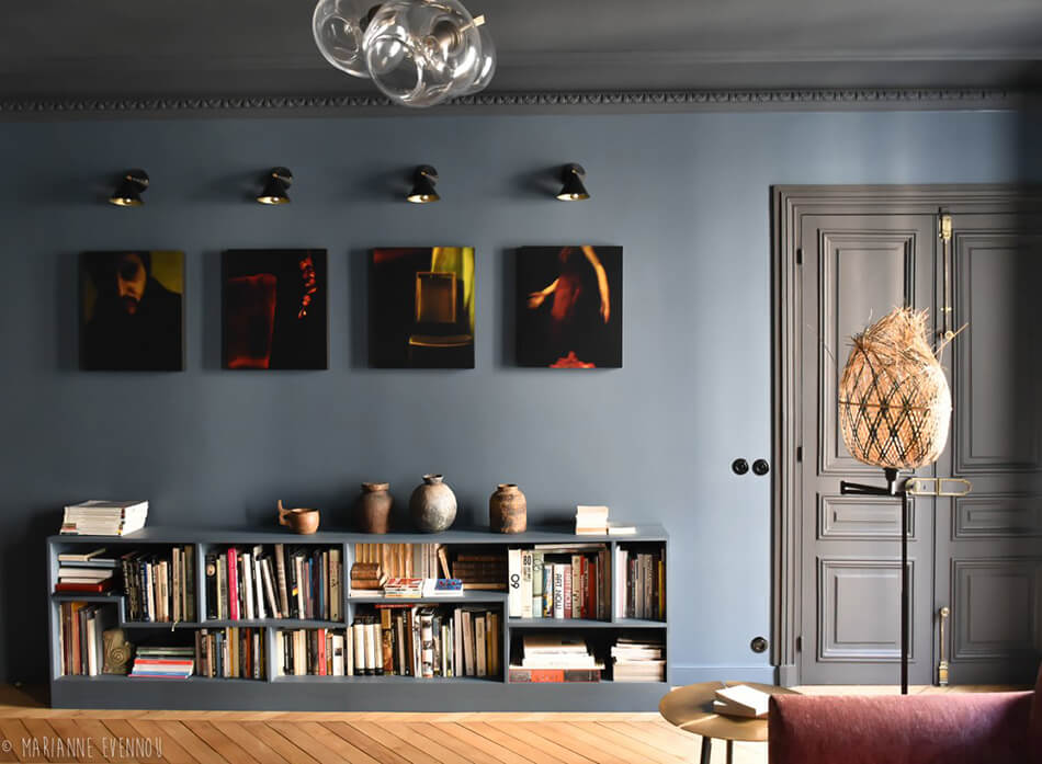
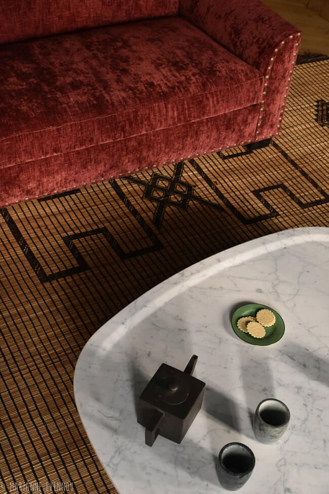
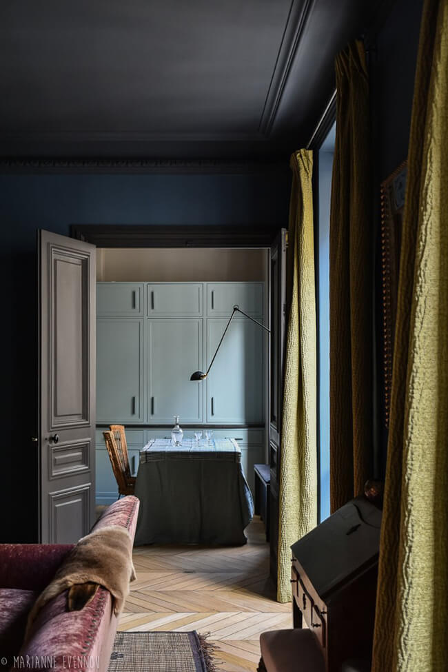
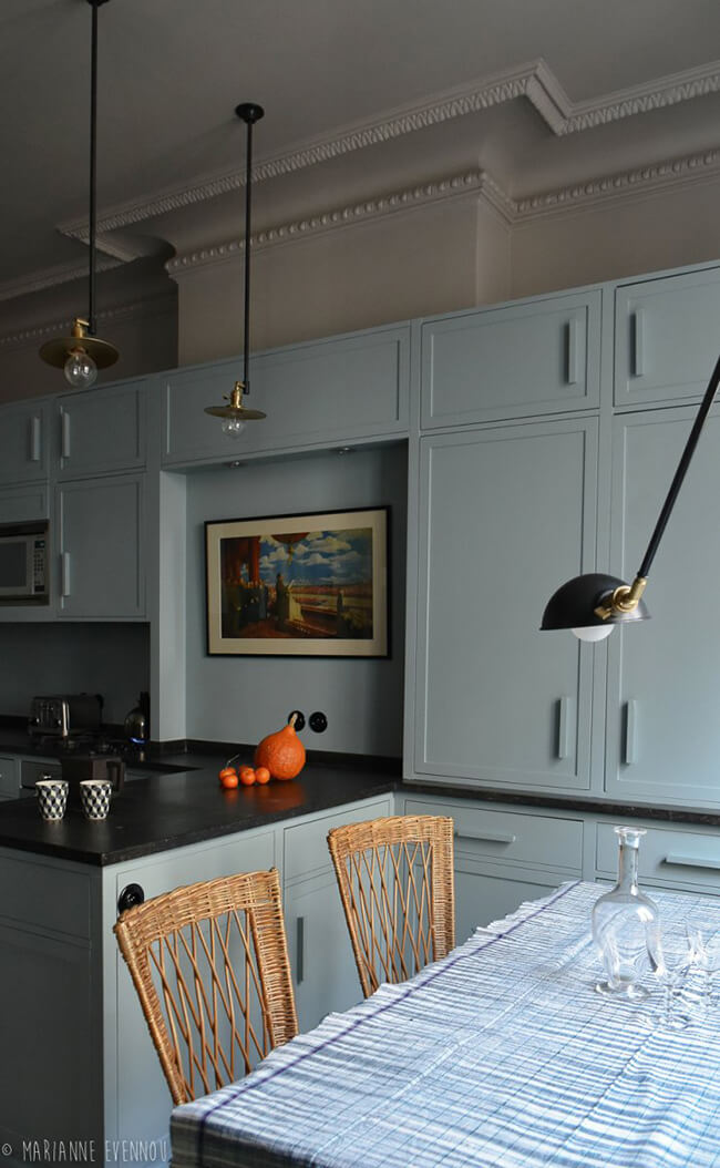
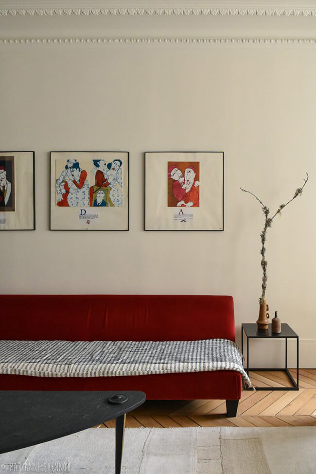
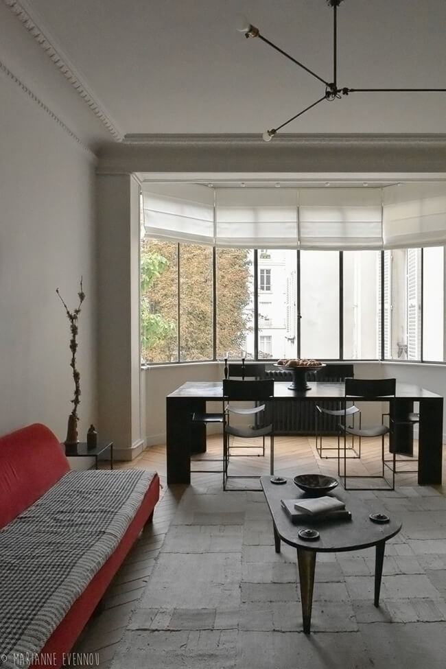
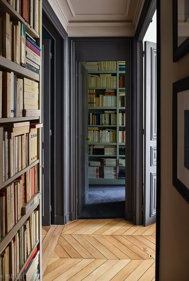
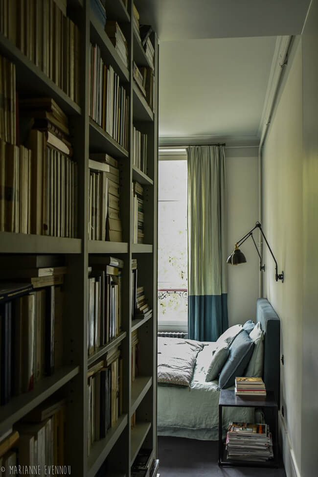
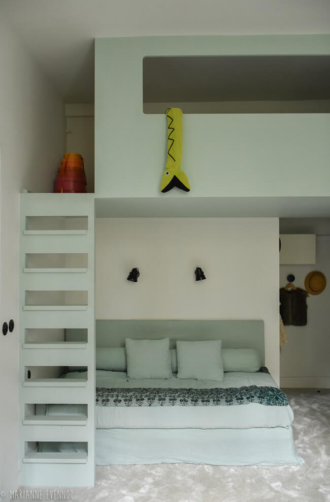
Chez Clémence et Bruno
Posted on Fri, 29 May 2020 by KiM
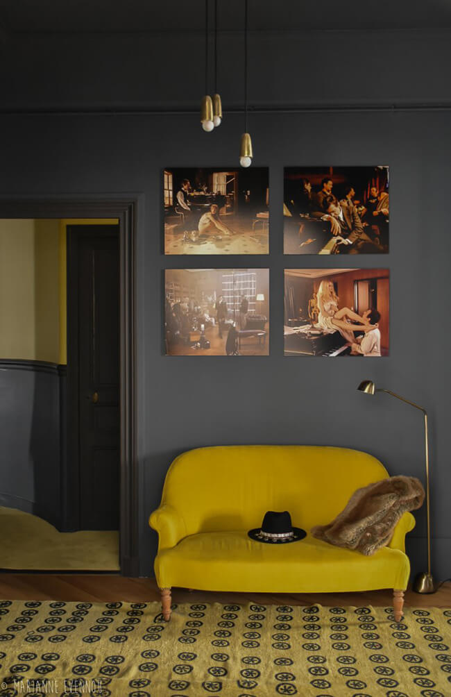
There is so much drama when using dark colours in a space. Add in some touches of bold shades of mustard and blue and it’s a feast for the eyes. It has been a while since we featured the work or Parisian interior designer Marianne Evennou and I’m delighted to share more of her unique take on interiors.
A fine balancing act
Posted on Tue, 26 May 2020 by midcenturyjo

It’s all about balance. A balance between crisp and modern and rustic and weathered. Rough versus smooth. A hint of scandi with a dose of Aussie. Light versus dark. Formally structured and sensuous and tactile. A fine balancing act indeed. Hunters Hill House by Handelsmann + Khaw.
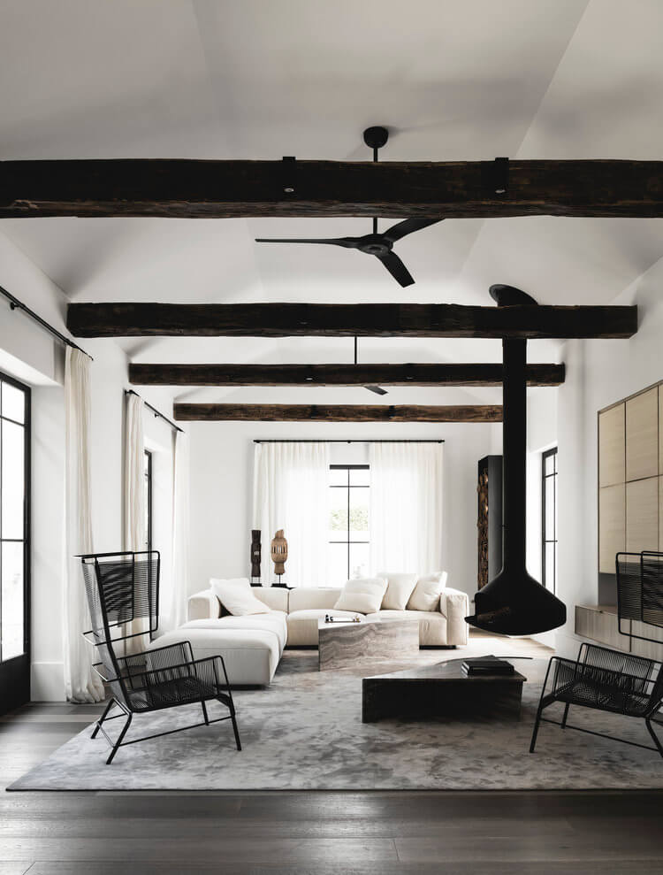
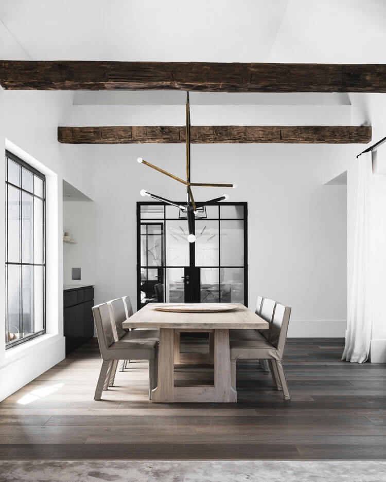
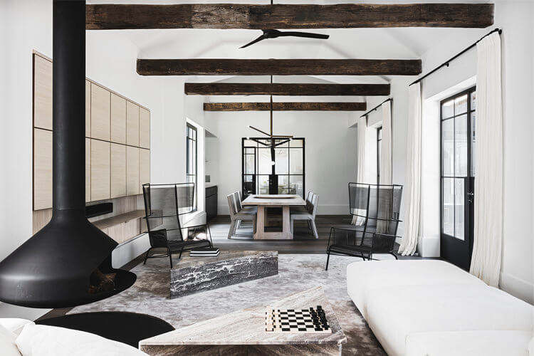
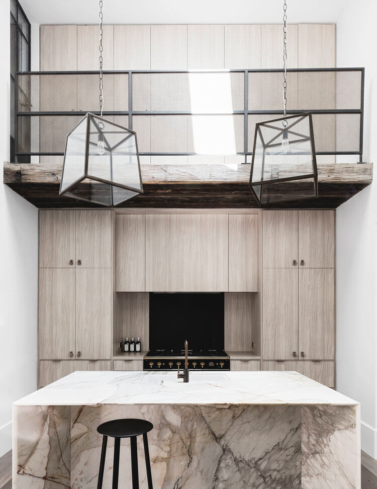

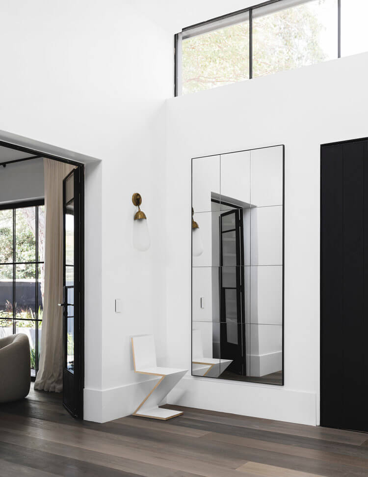

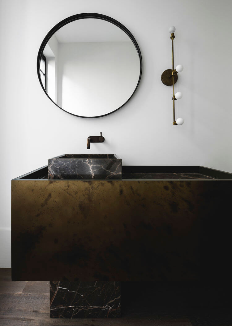
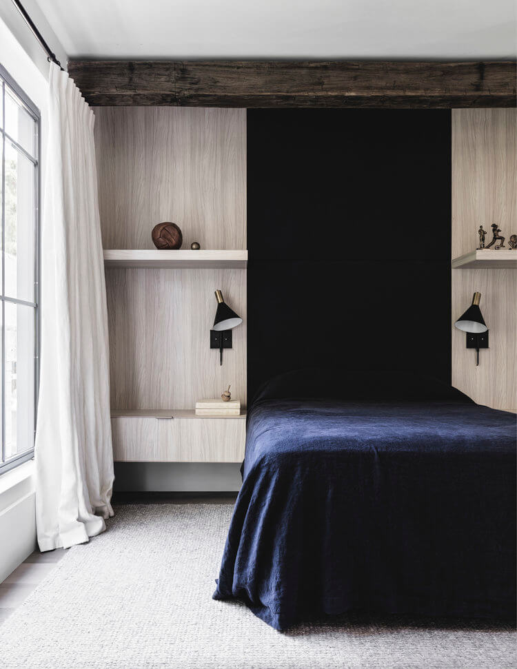
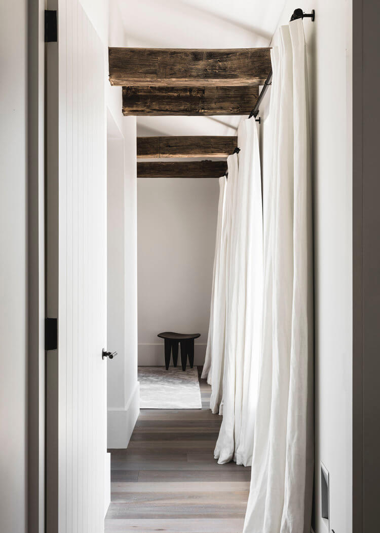
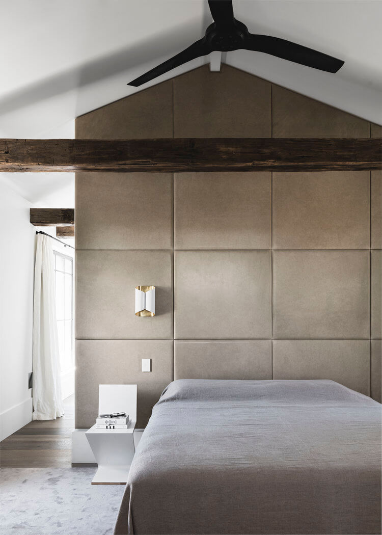
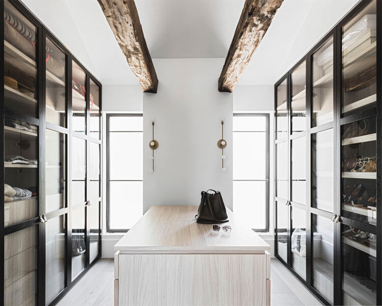
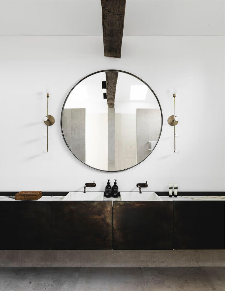

Photography by Felix Forest
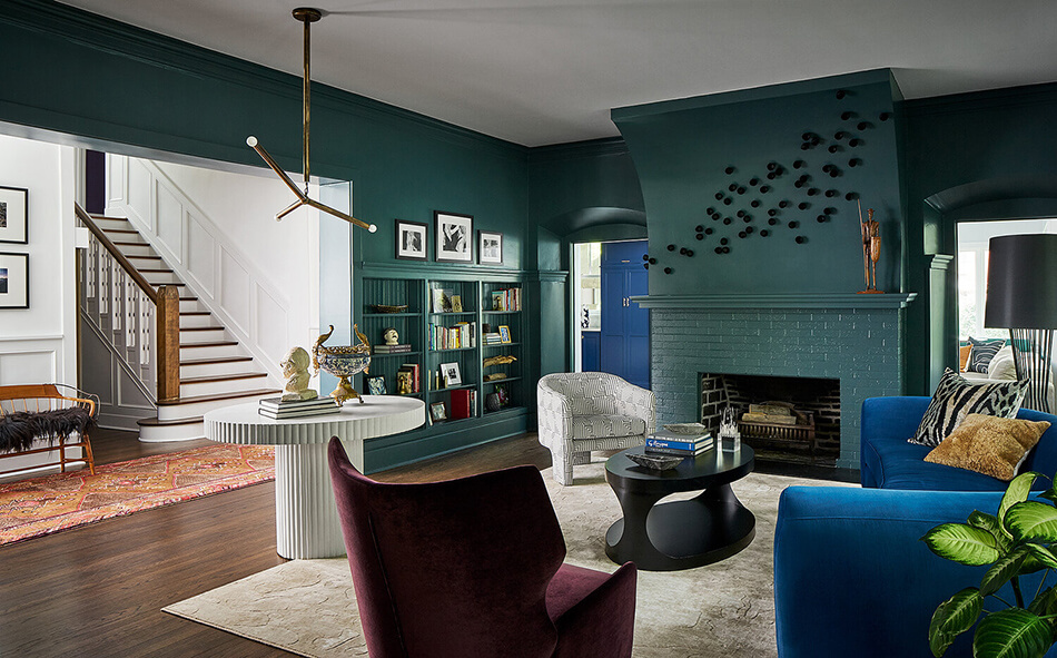
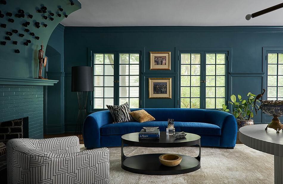
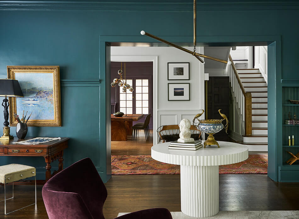
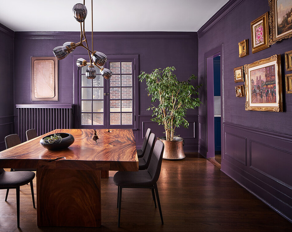
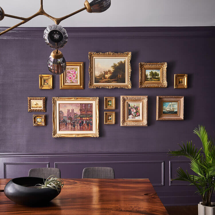
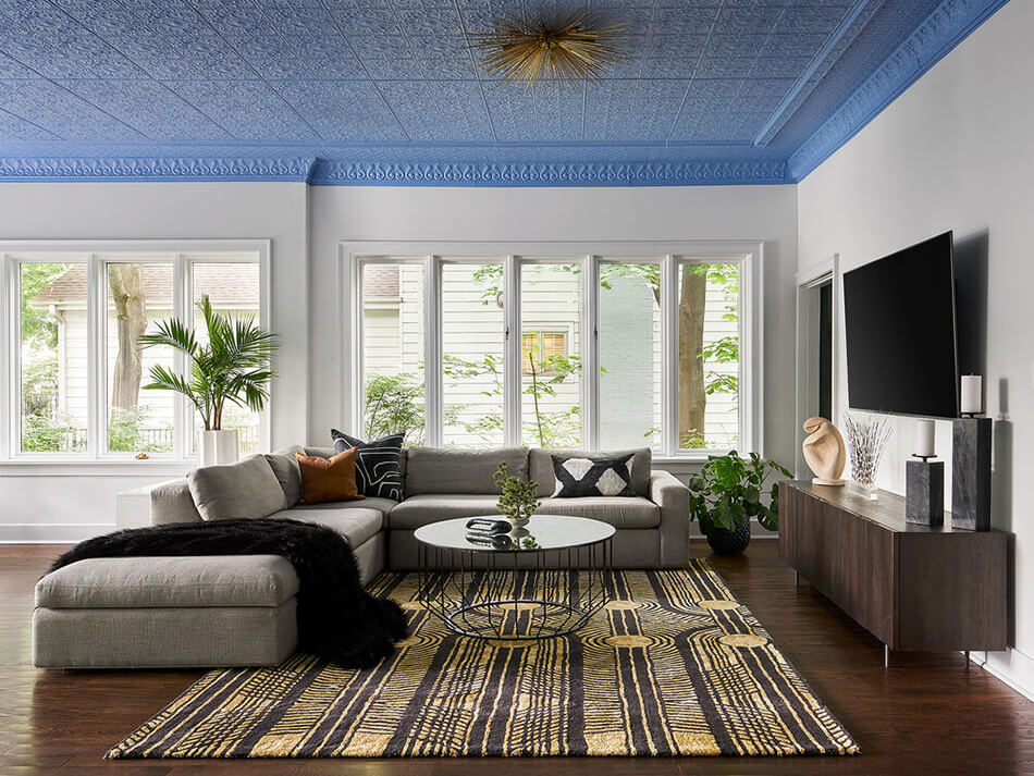
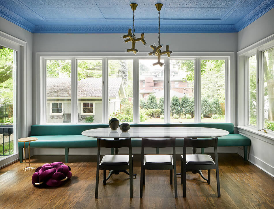
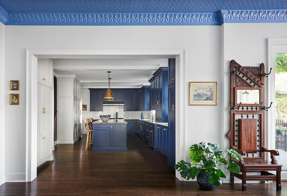
House of jewels by Studio Sven
Posted on Tue, 19 May 2020 by KiM
I wanted to share another very intriguing project by Studio Sven. In this case it’s quite a traditional style home that is given quite unexpected lashings of jewel-toned colours. At first I was a bit taken aback but the more I devoured these photos the more I like what I see (I’m still uncertain about that blue ceiling – not a fan of blue). It’s an inexpensive and very impactful way of modernizing a home.