Displaying posts labeled "Blue"
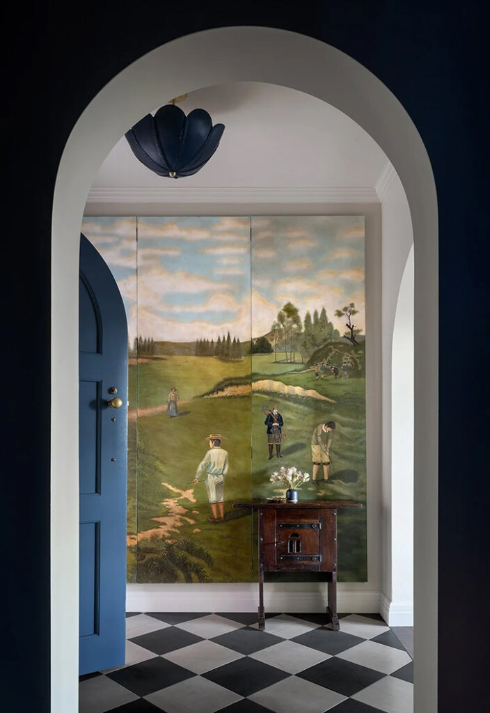
An early 1900s Arts and Crafts home with an impressive modern art collection
Posted on Wed, 6 Aug 2025 by KiM
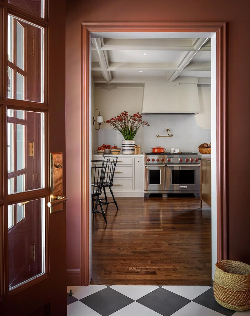
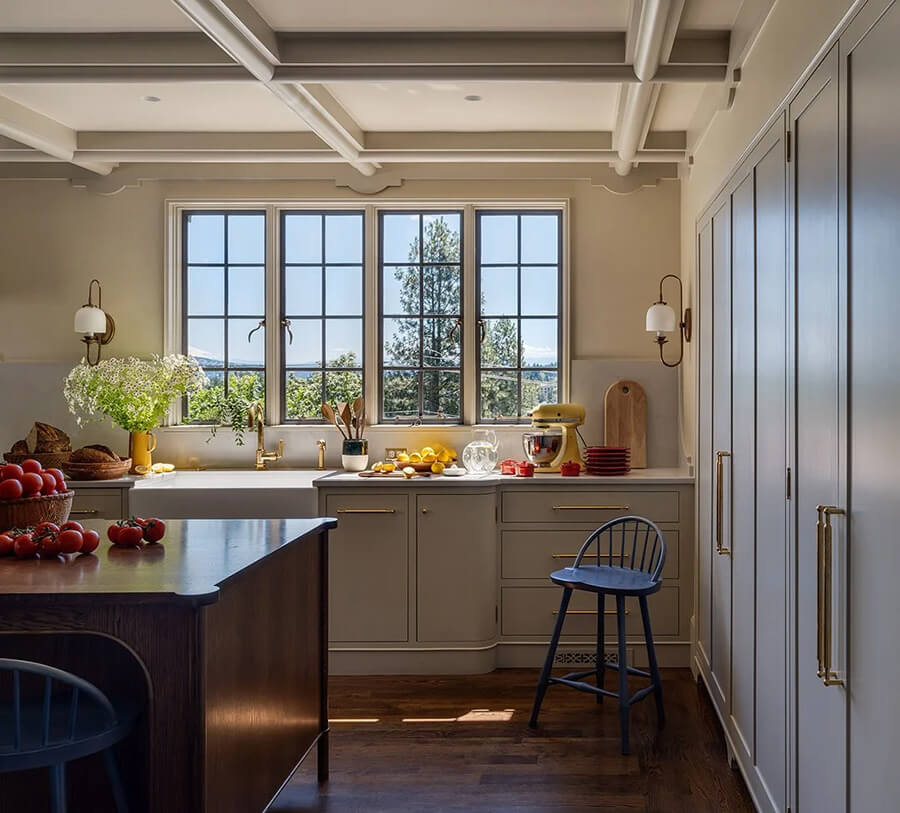
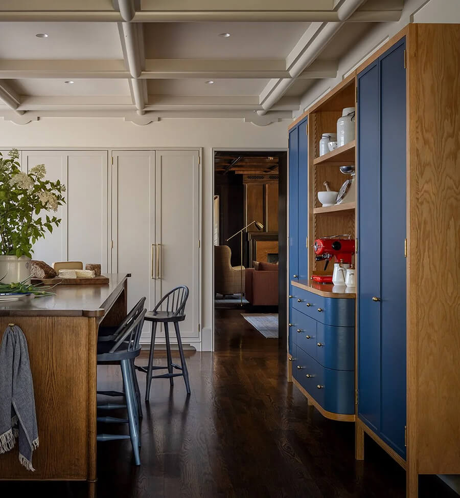
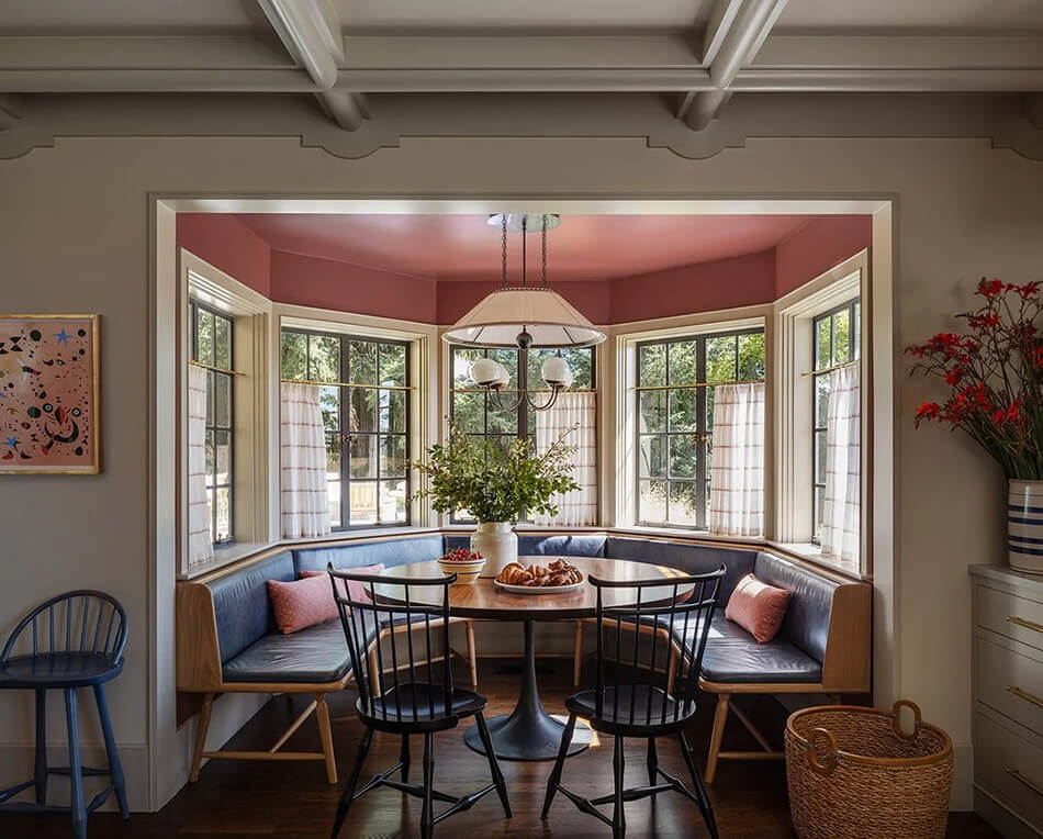
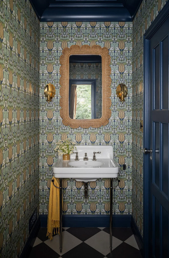
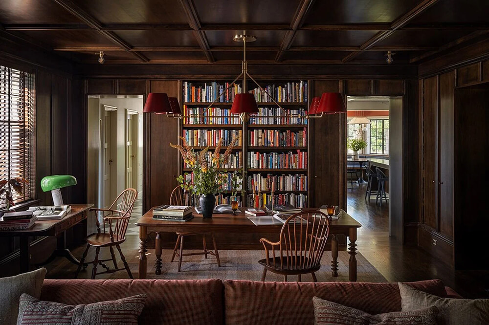
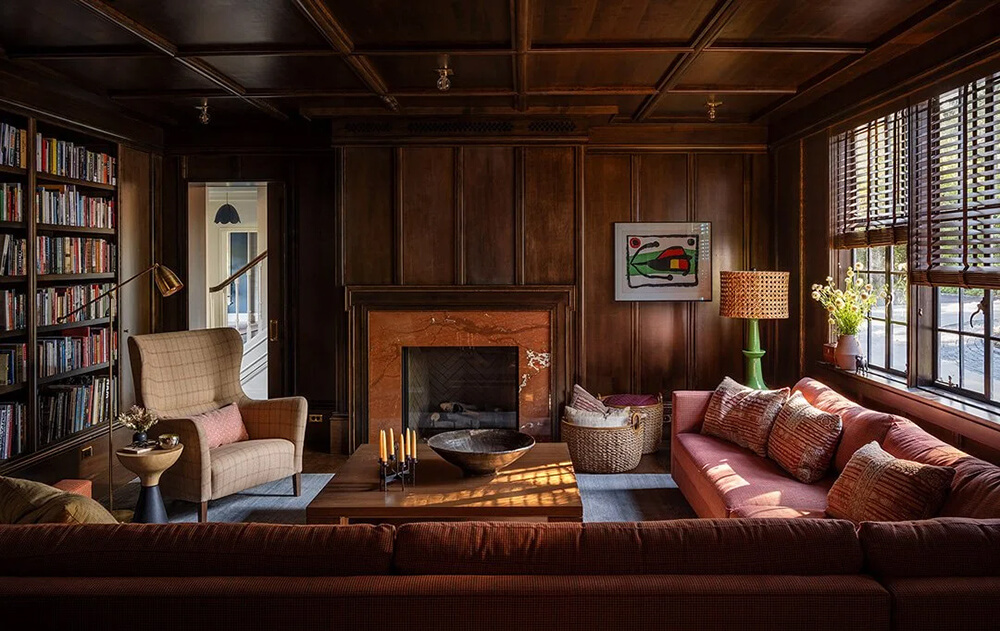
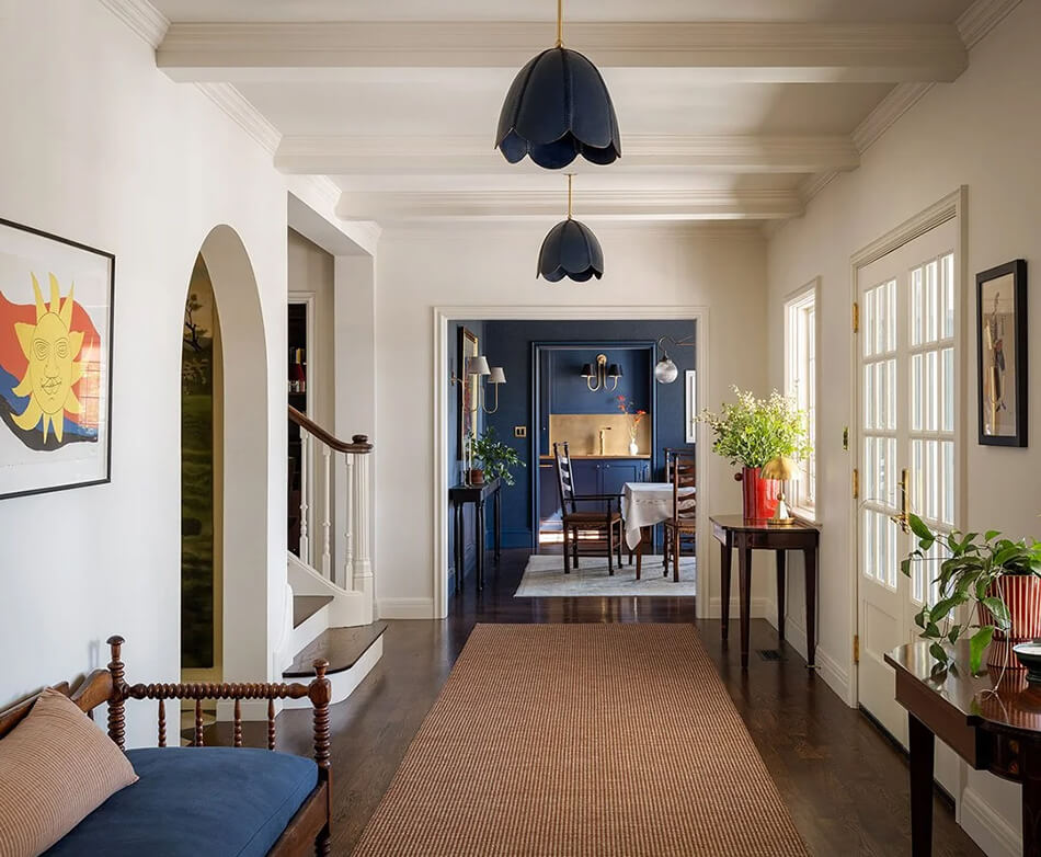
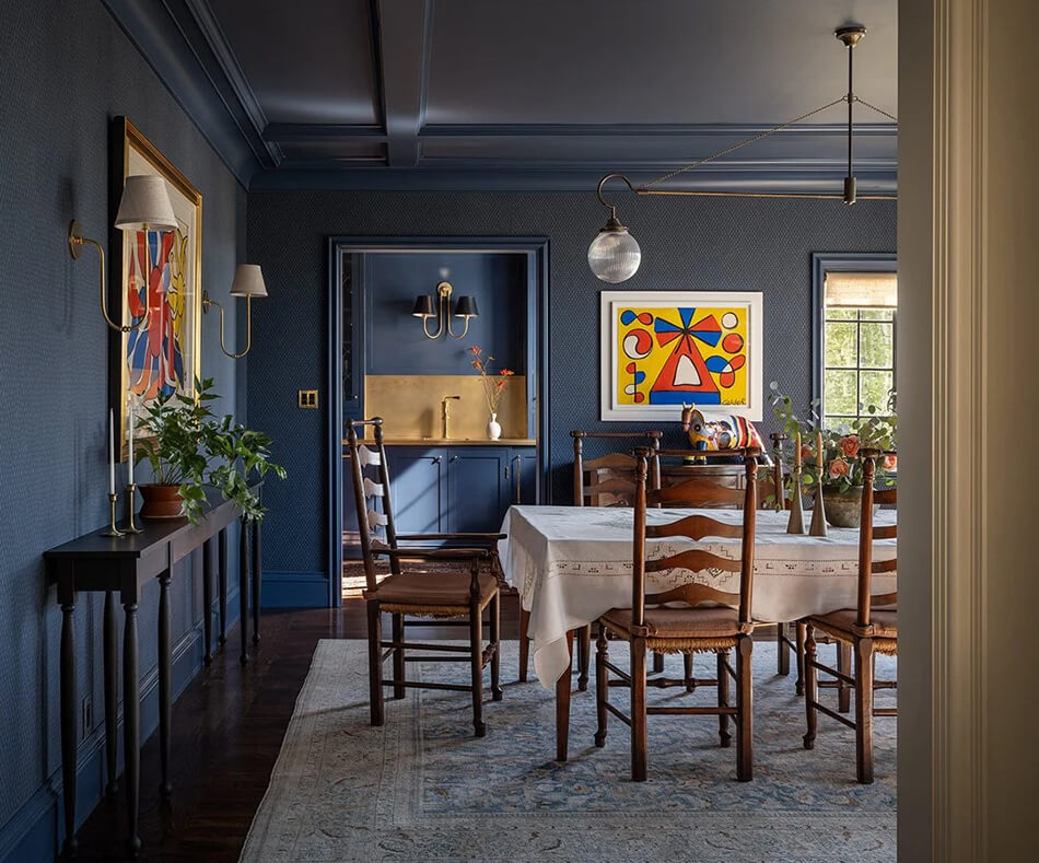
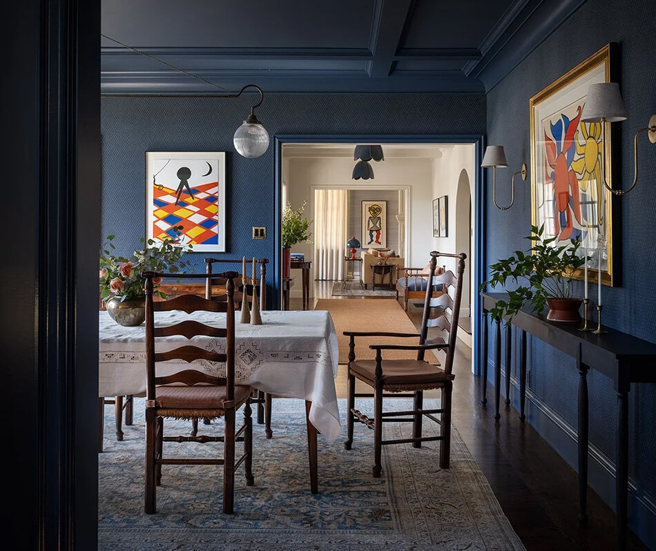
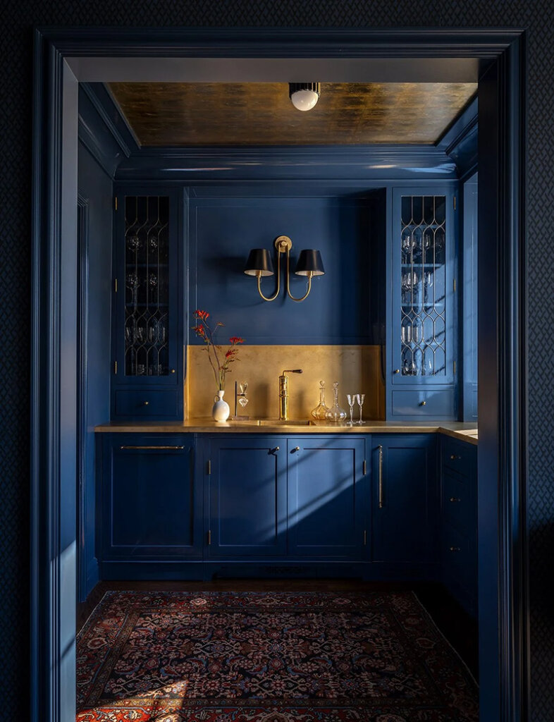
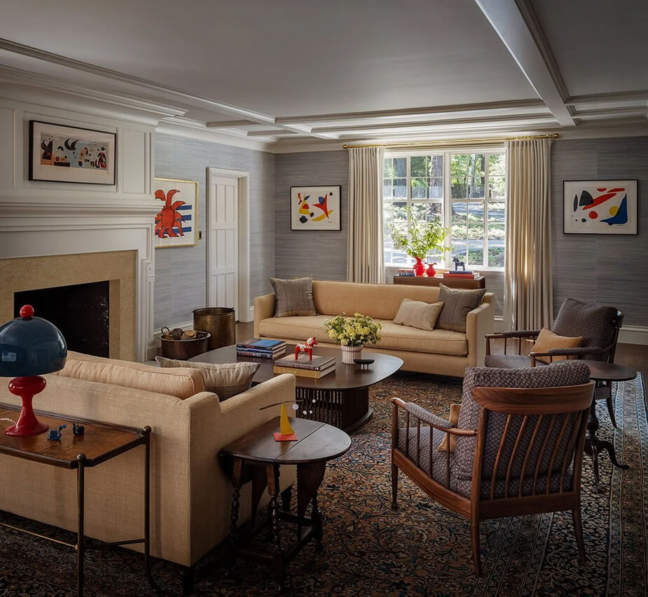
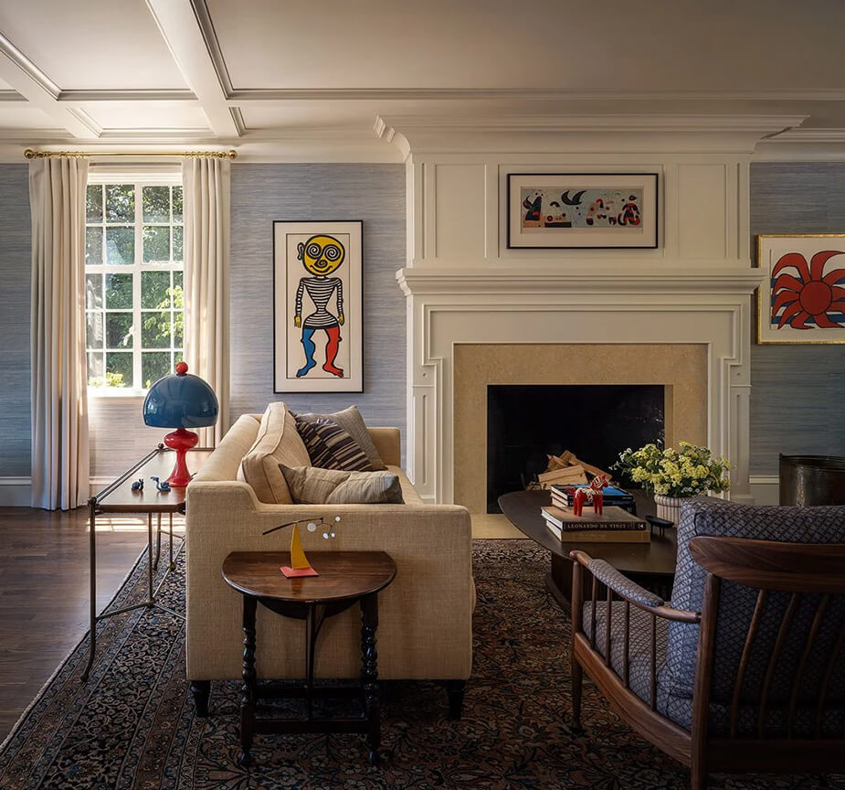
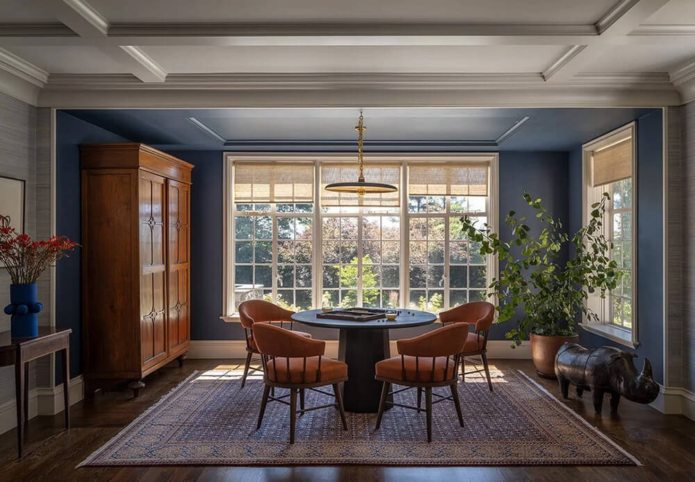
In addition to refurnishing the house, we also undertook an extensive renovation; adding a standalone three-car garage and converting the existing attached garage into a mudroom, a laundry room, a paneled-wood family room, and an expanded kitchen. Our clients, who had inherited an impressive art collection of primarily Calders, Miros, and Picassos, described their style as ‘East Coast preppy,’ and so we accepted the challenge of marrying that aesthetic with the bold, primary colors and forms of the iconic modern artworks. We developed an interior color and material palette in the reds, blues, yellows, blacks and whites of the art, but with each of those colors softened and muted. The result is a house that feels right for the art, right for the clients, and right for the house.
Jessica Helgerson does it again, creating some vintage magic in this beautiful home but somehow managing to work in this modern art collection and have everything make sense. I love how cohesive it all is by using those primary colours throughout (though in very manageable shades). Photos: Aaron Leitz.
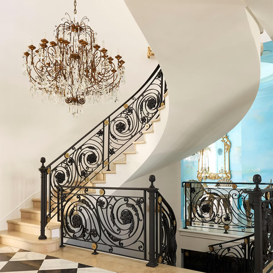
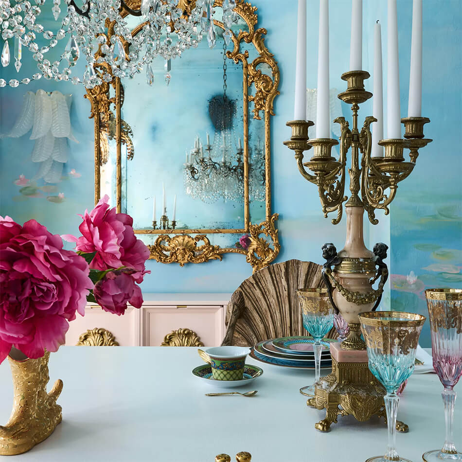
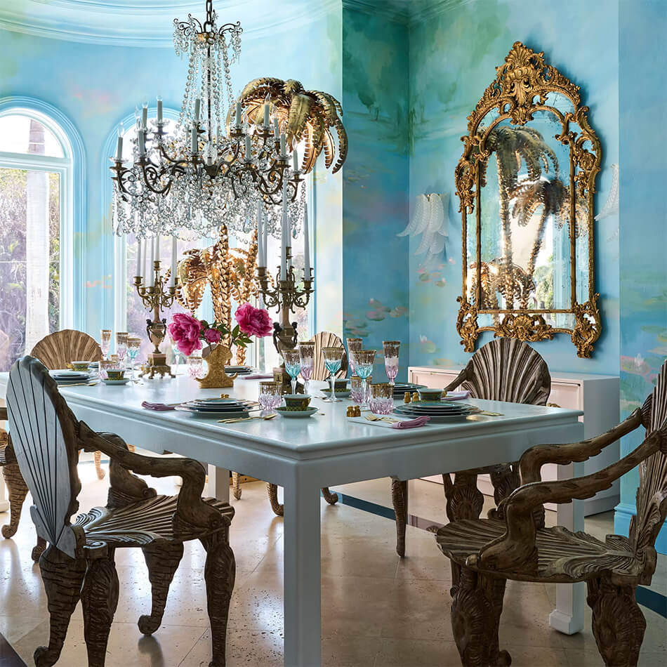
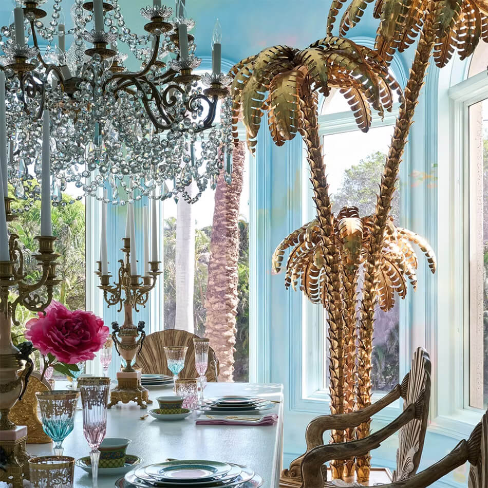
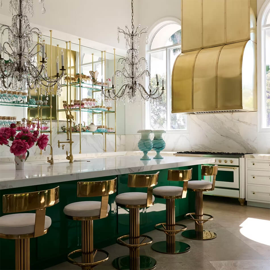
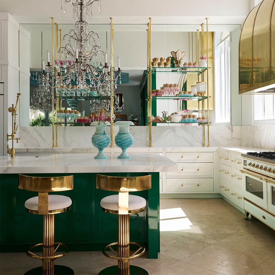
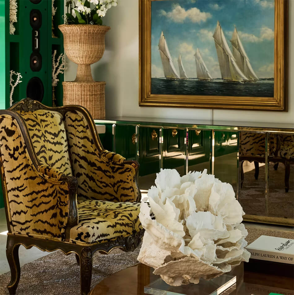
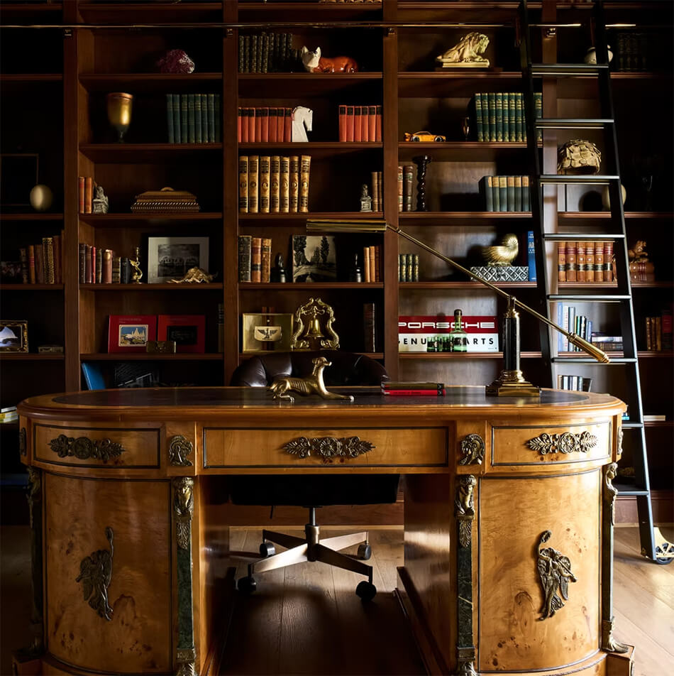
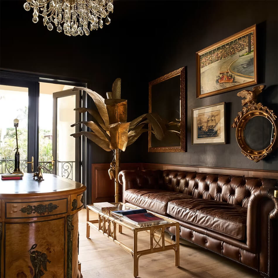
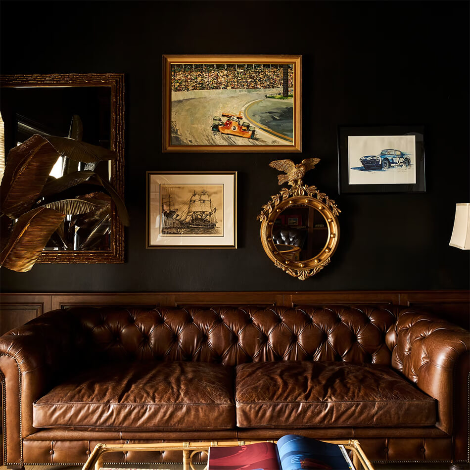
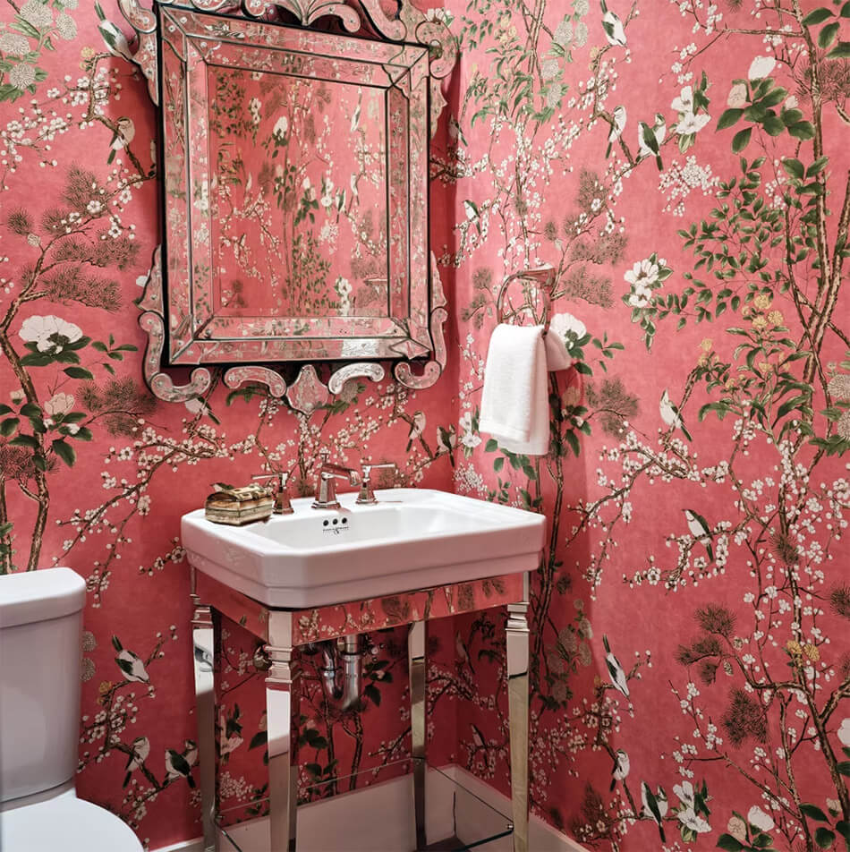
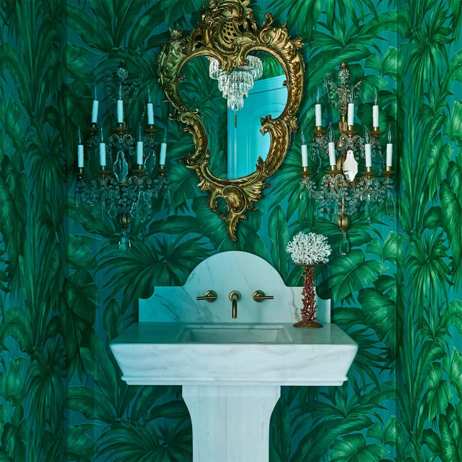
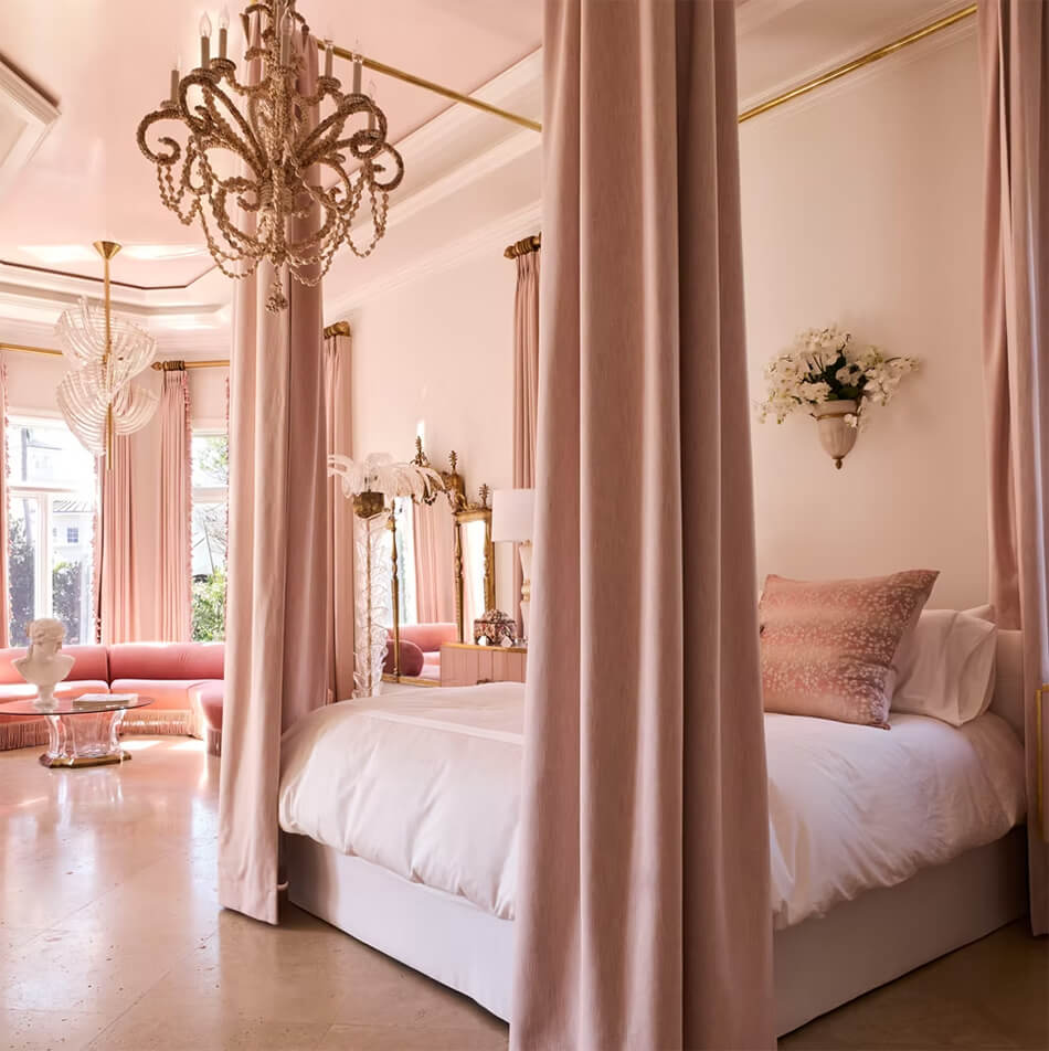
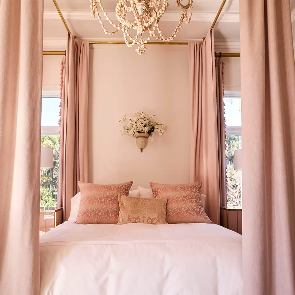
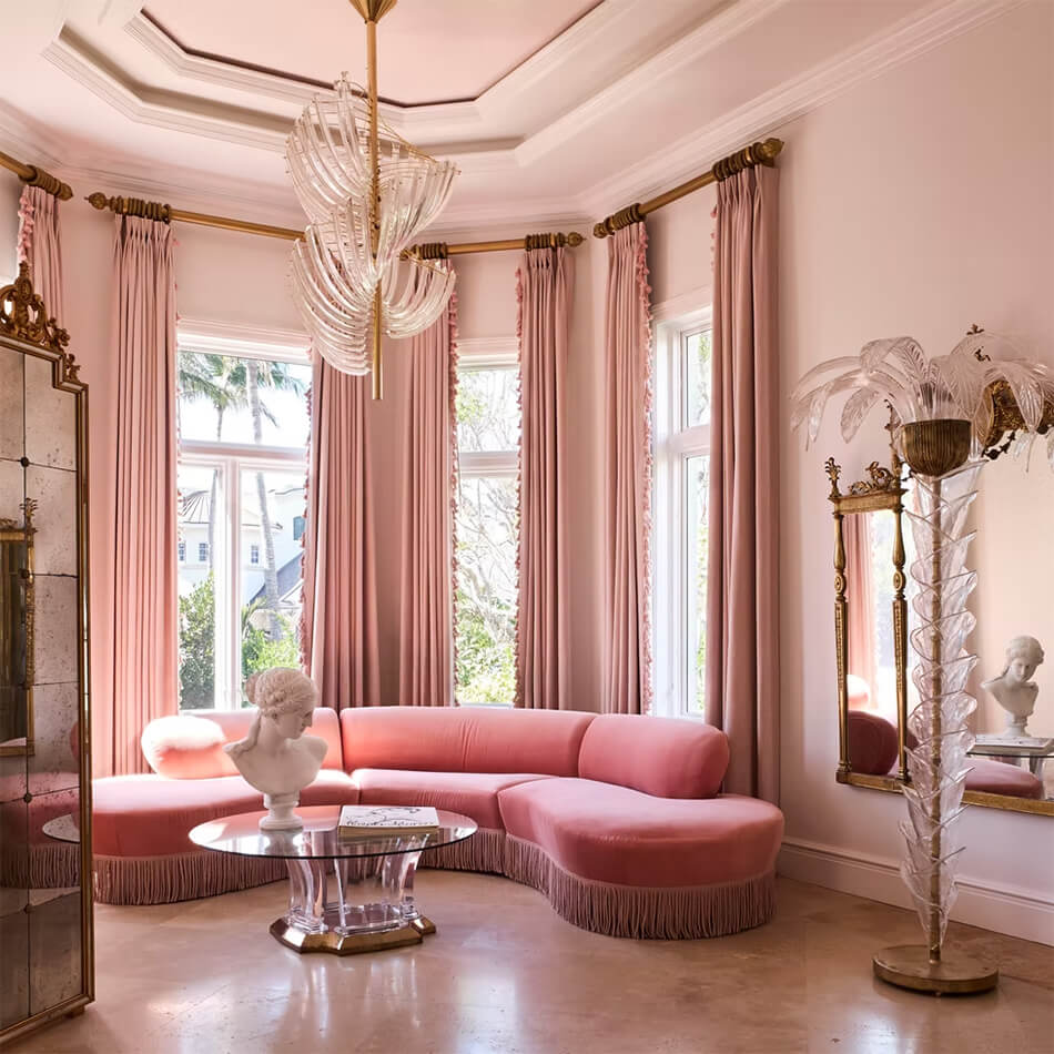
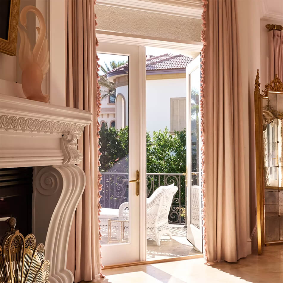
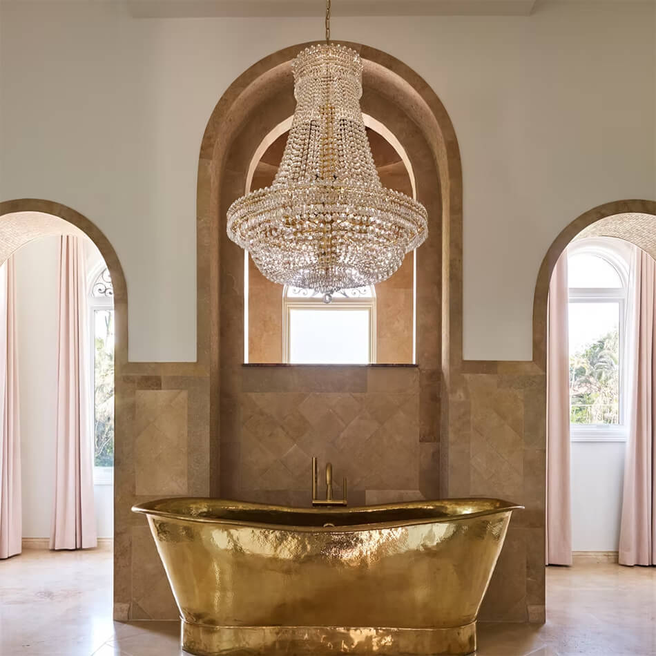
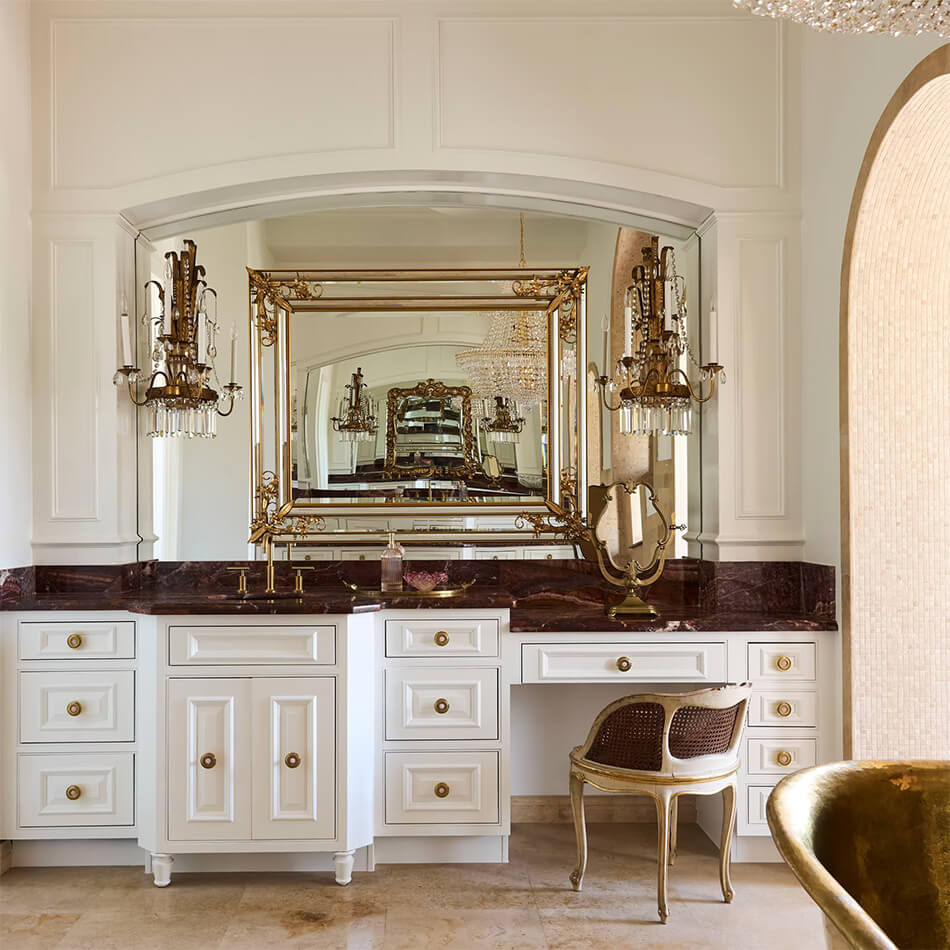
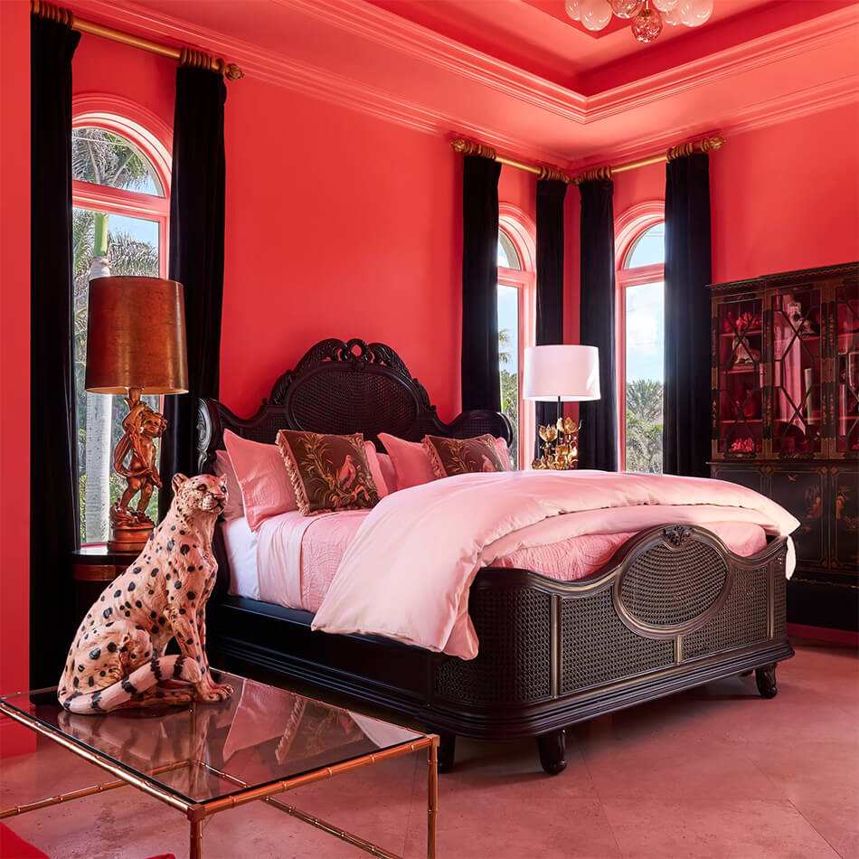
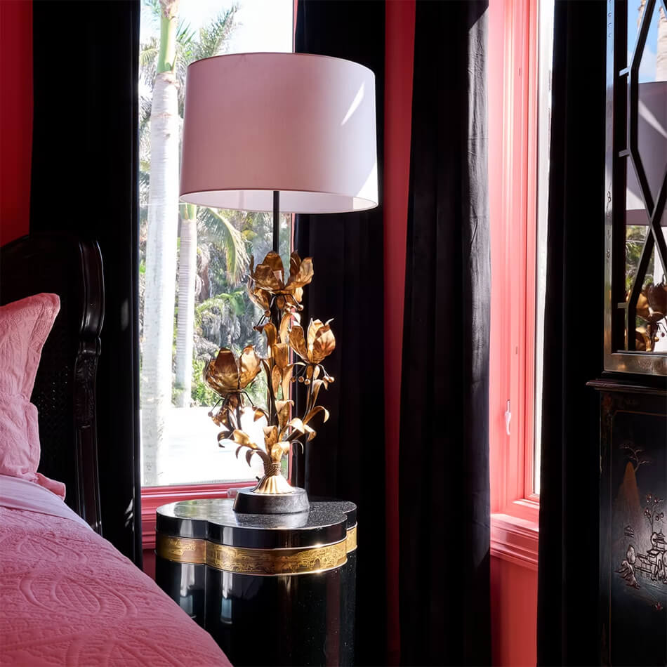
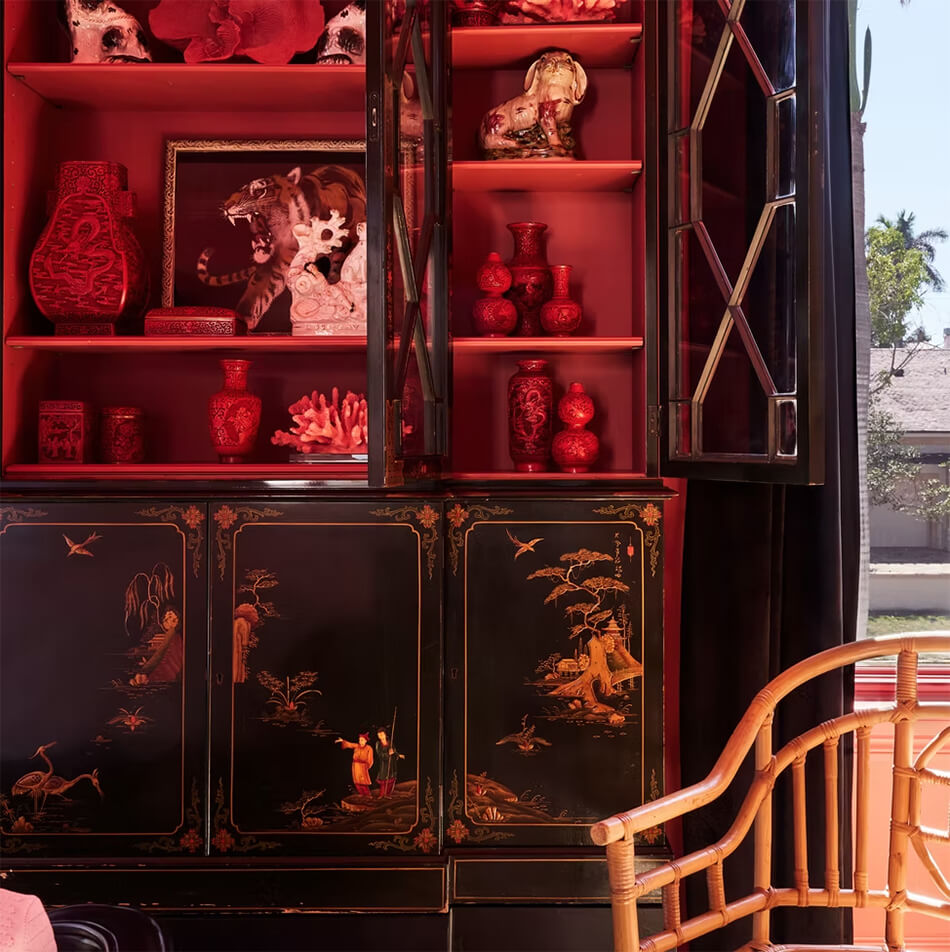
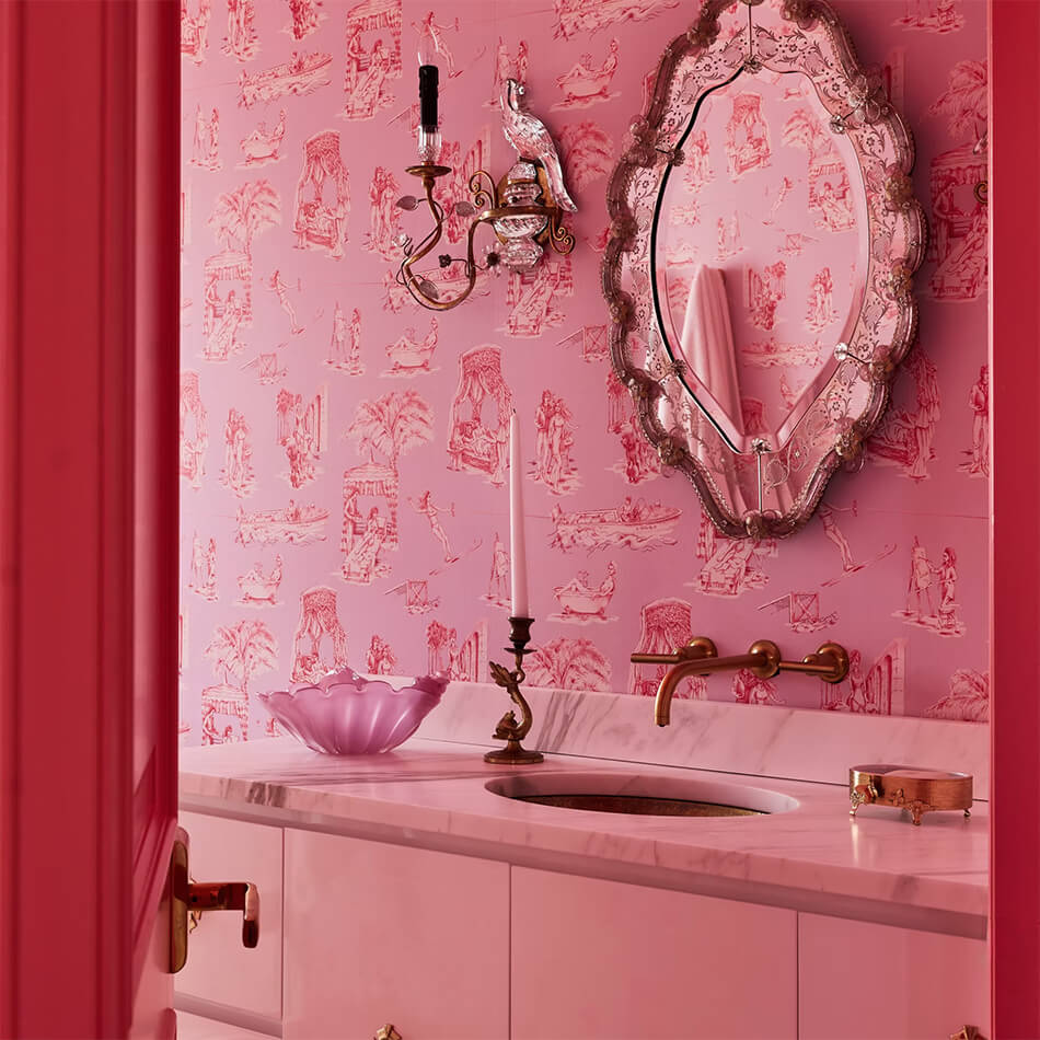
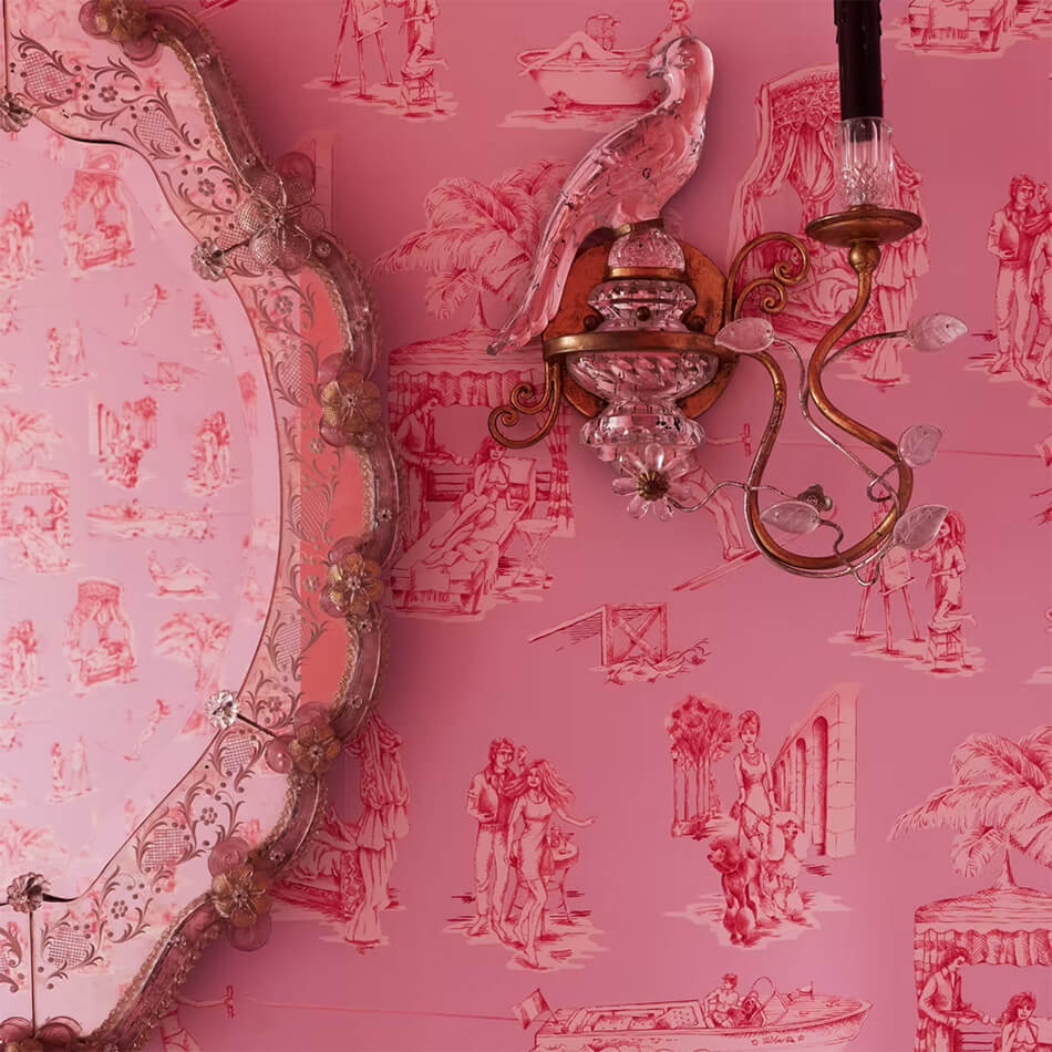
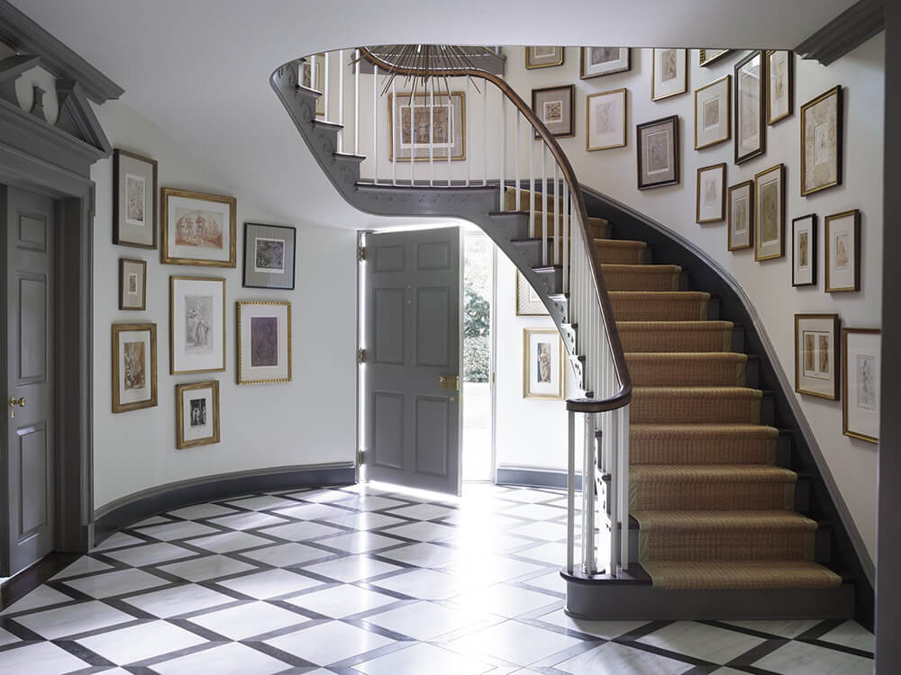
A Naples, Florida home fit for a drama queen & king
Posted on Mon, 4 Aug 2025 by KiM
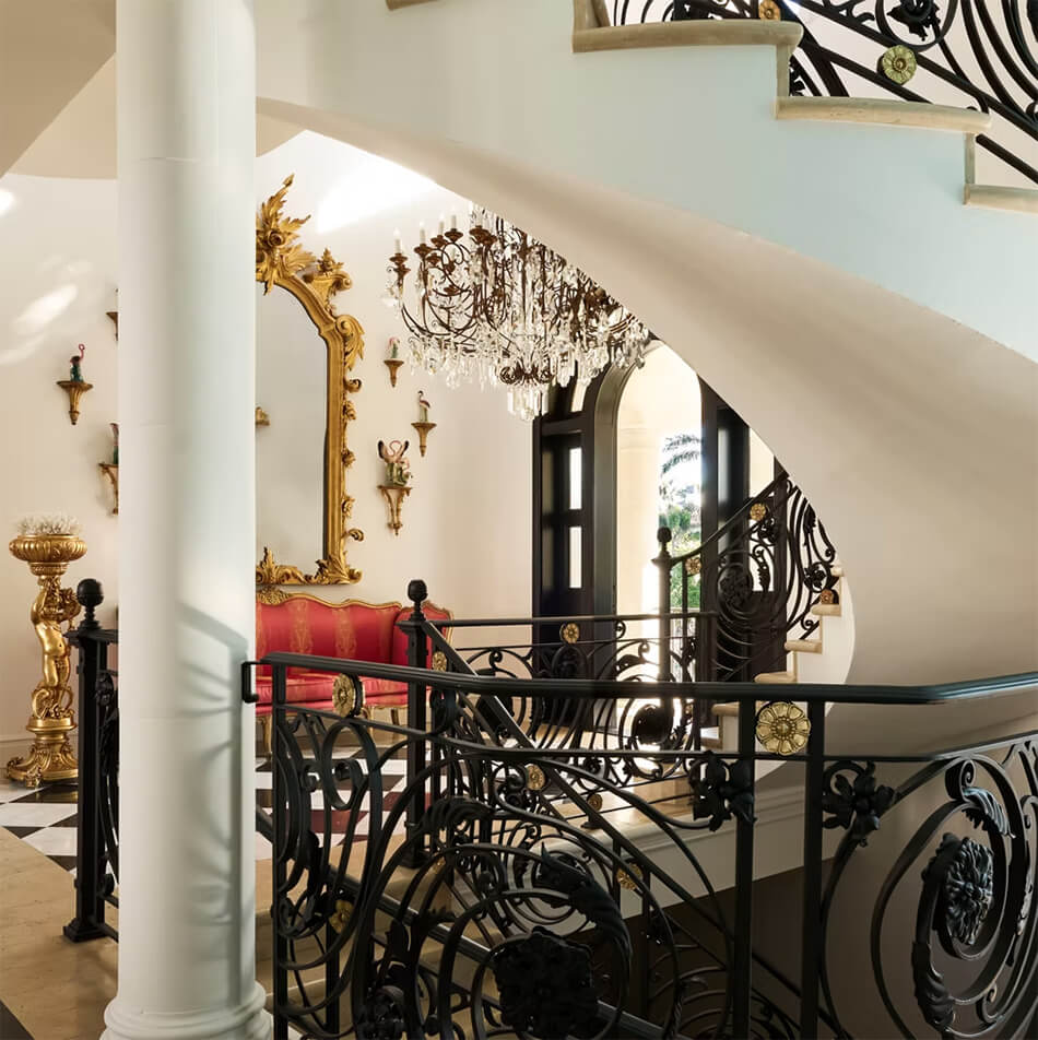
Annie Brahler of EuroTrash took an already glamorous home in Naples, Florida and worked her magic to bring glam throughout the interior. The staircase was giving Cheesecake Factory vibes, and is now curvy in the right places with a brass and matte black railing of iron florets and acanthus leaves – and that chandelier! The formal dining room was inspired by the drawing room walls in the Paris home of the late Yves Saint Laurent (hand painted by Olga Saldivar). The kitchen sparkles, drenched in green, white and brass. A fabulously and decidedly masculine work space for the mister looking very Ralph Lauren. The primary suite is a blast from old Florida past, swathed in the prettiest of pinks with a reupholstered Milo Baughman sofa. Then there’s the Chinoiserie bedroom….. Photos: Björn Wallander.
Space for positive living
Posted on Fri, 1 Aug 2025 by midcenturyjo

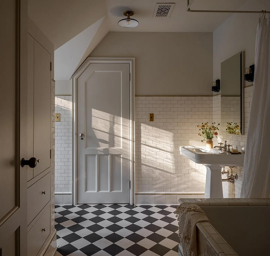
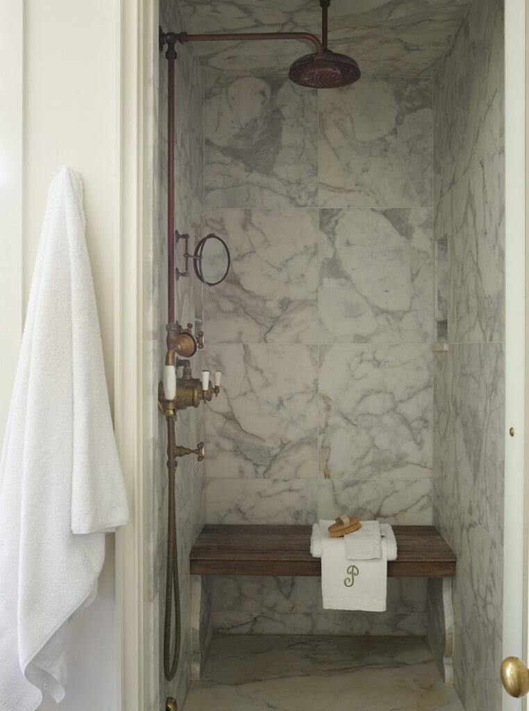
Owl Interior Design believes in the power of thoughtful interiors to elevate everyday life. In this family home in London’s Herne Hill, they transformed a guest room and bathroom with warmth and individuality. The bathroom became a peach-toned retreat of curves and bespoke details. In the guest room, inspiration from Ettore Sottsass and the Memphis movement was softened into a contemporary, inviting space with a subtle sense of play.


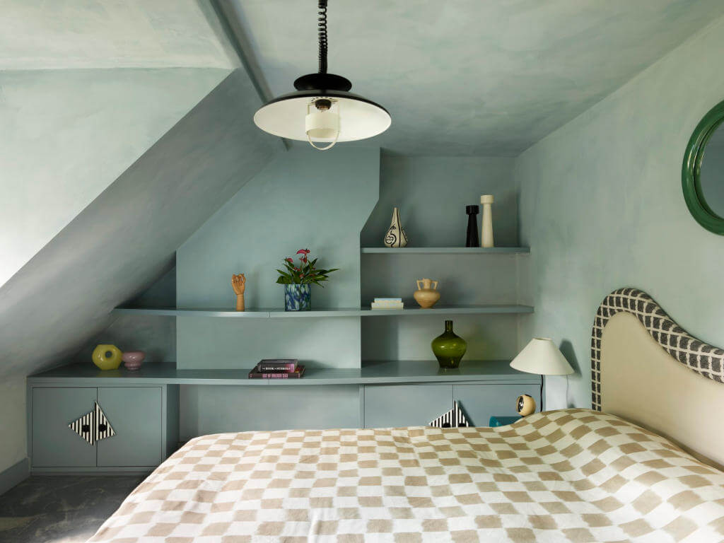


Photography by Rachael Smith.
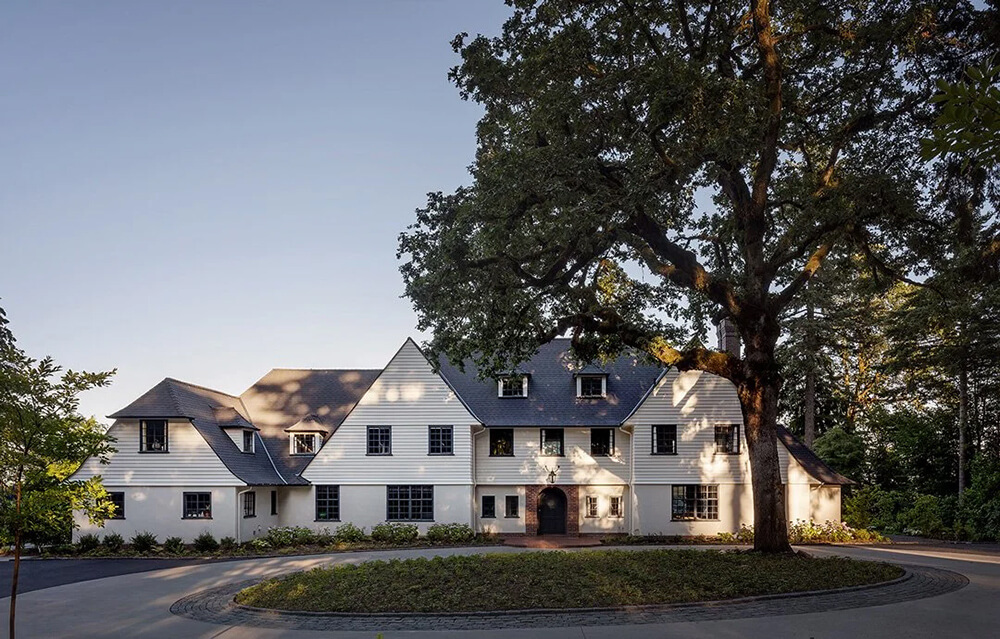
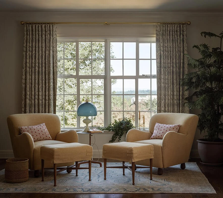
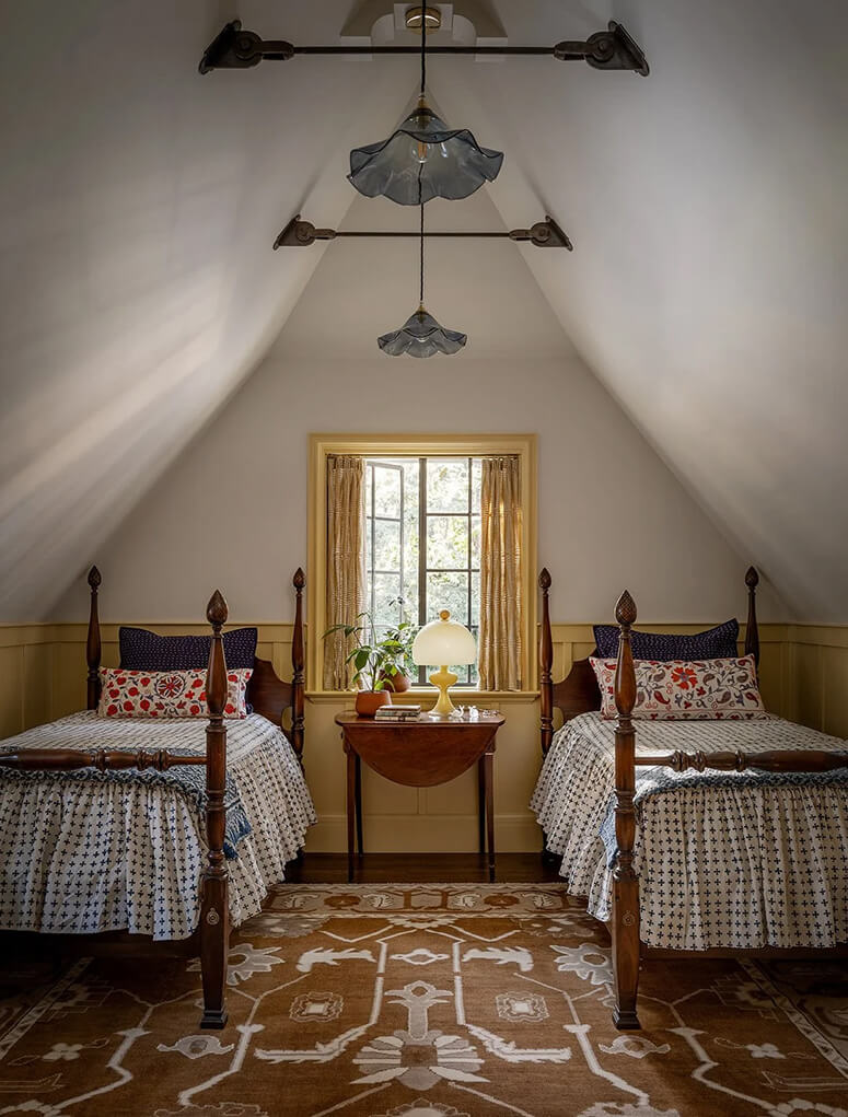
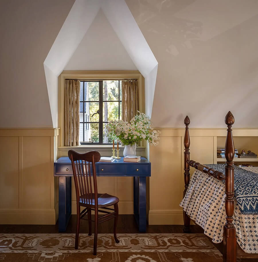
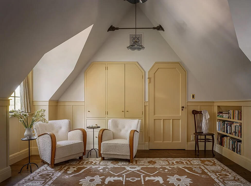
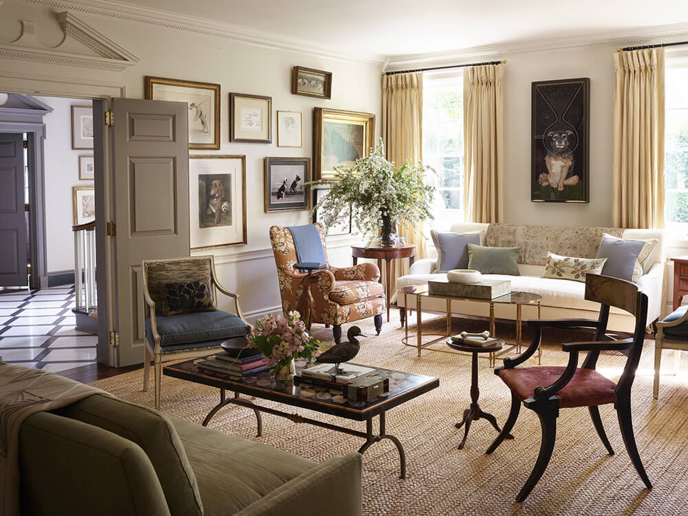
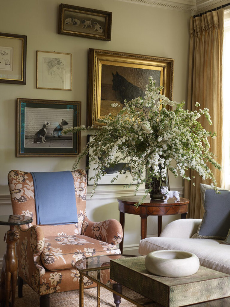
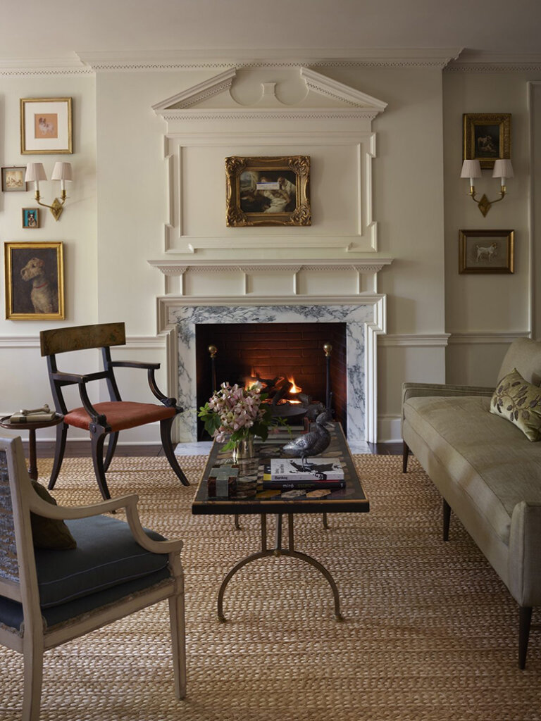
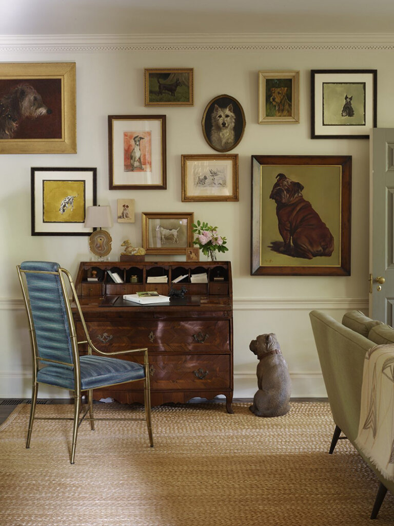
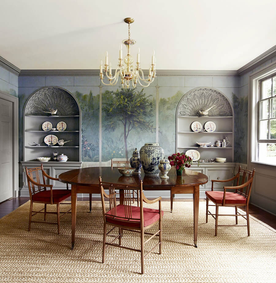
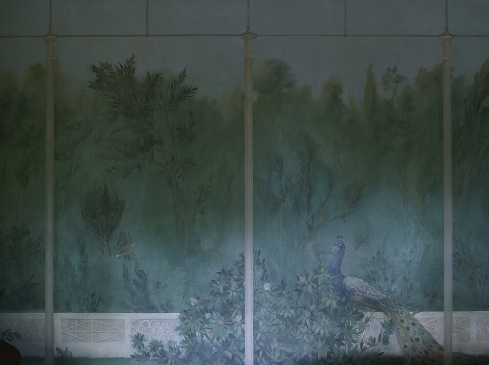
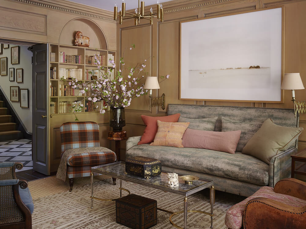
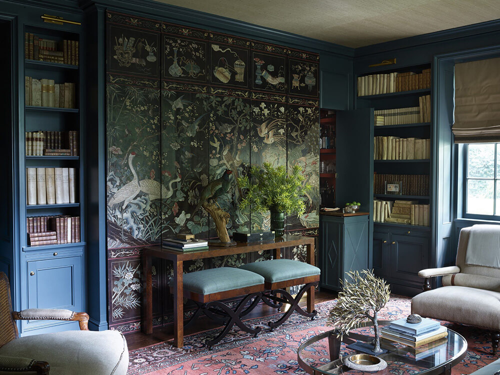
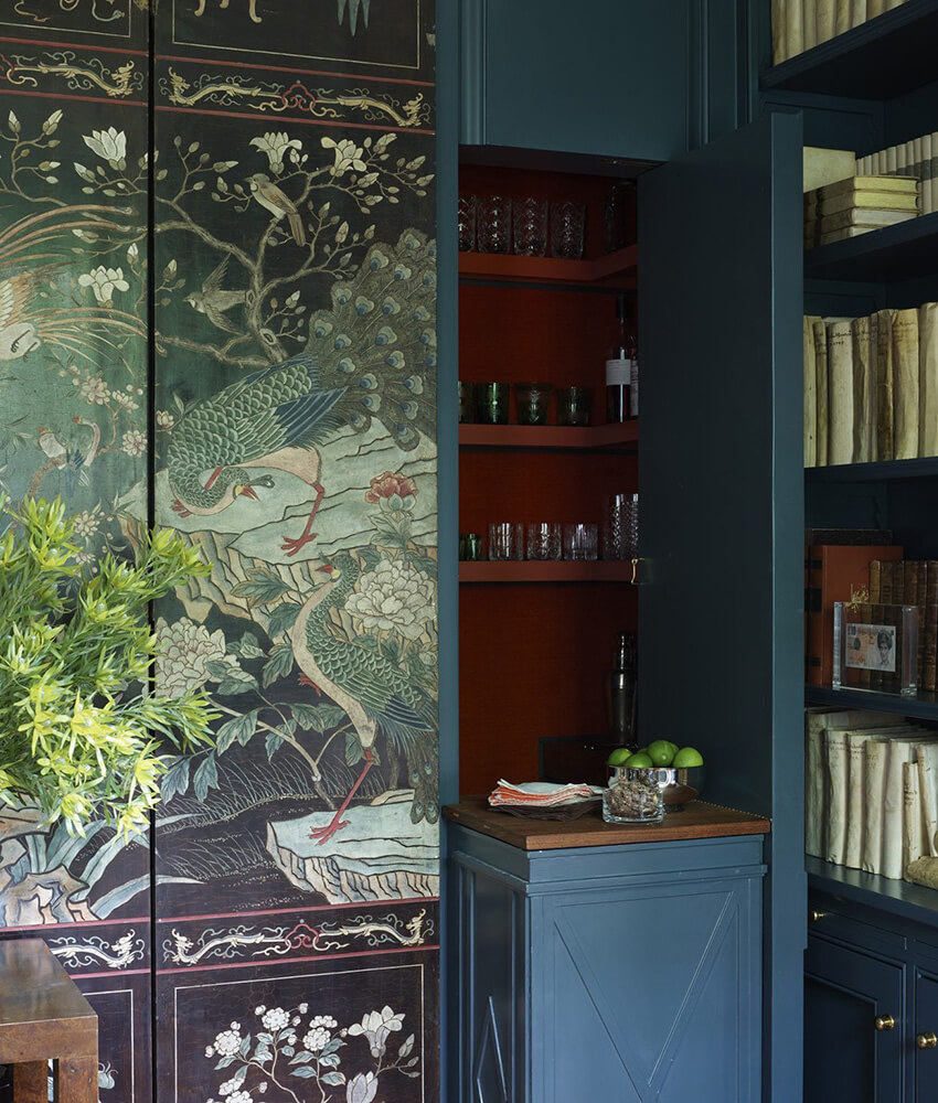
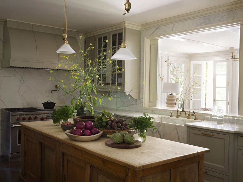
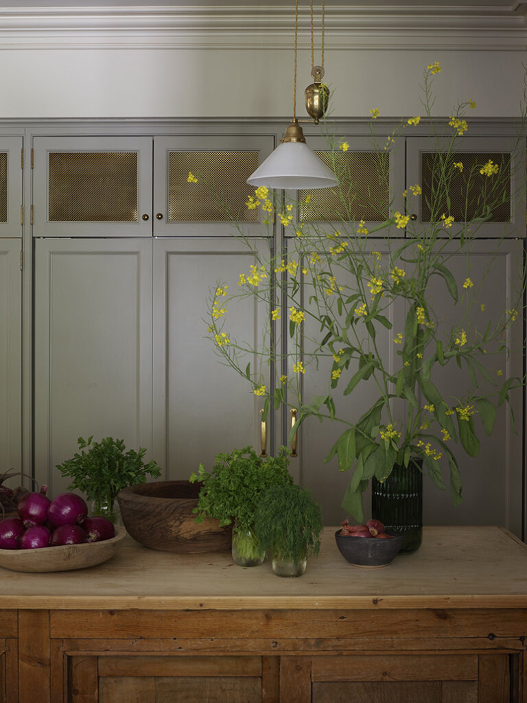
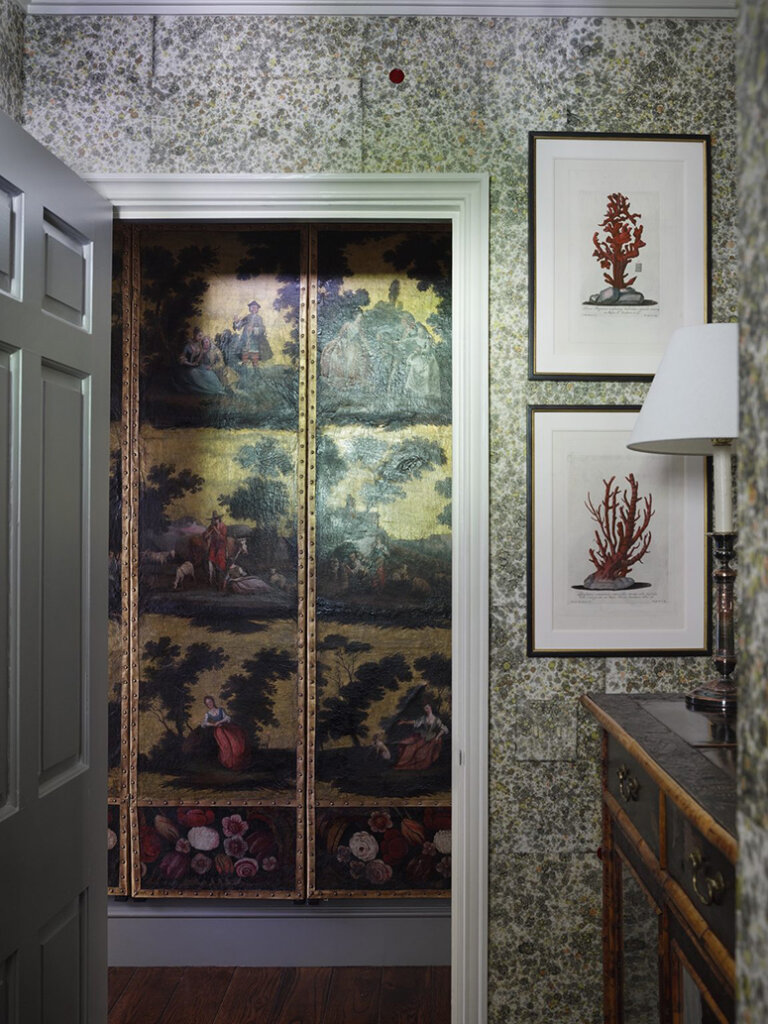
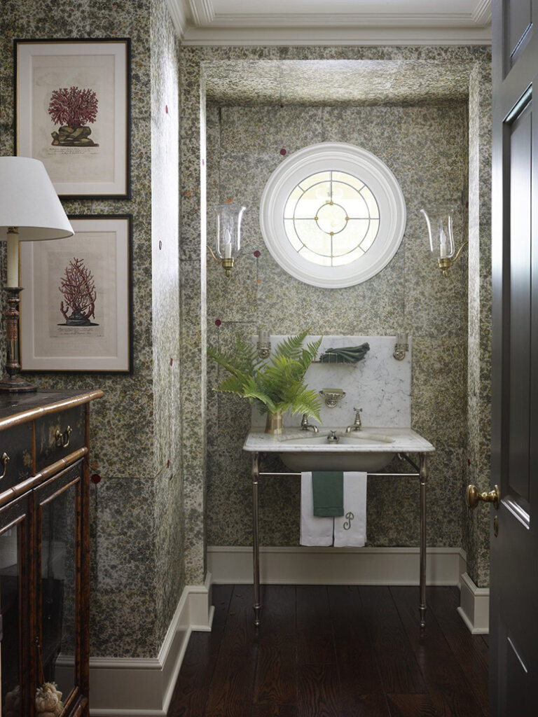
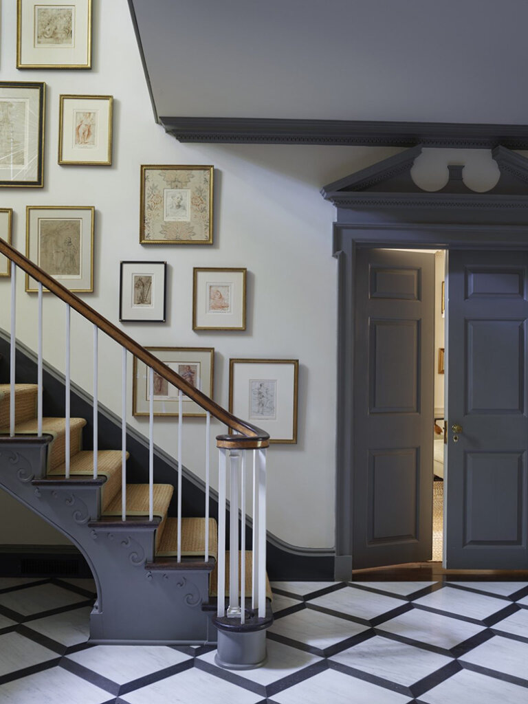
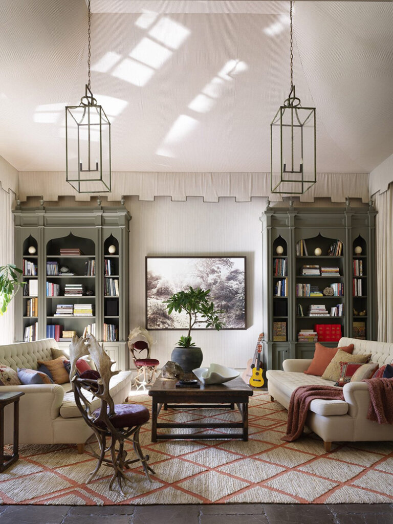
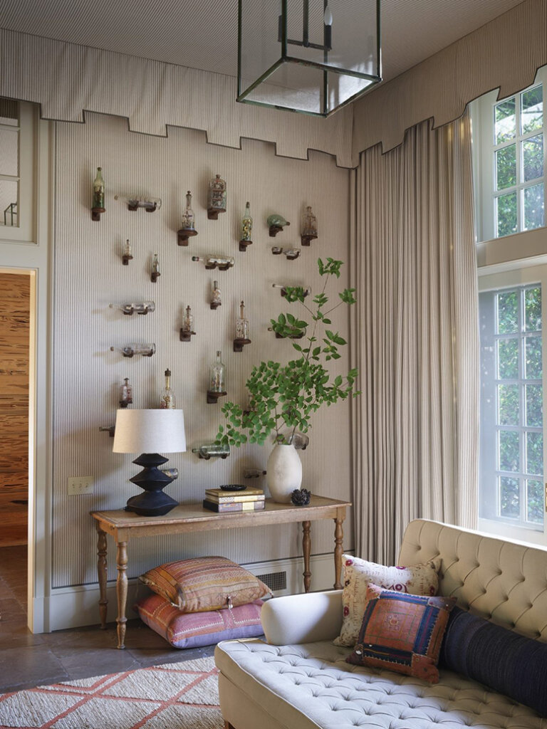
A restored 1930s Beaux Arts home in Atlanta
Posted on Thu, 17 Jul 2025 by KiM
This very large and very stunning historic Beaux Arts estate was originally designed and built by Philip Trammell Shutze in the 1930s, and was revitalized for a young family with deep Italian roots. The homeowners undertook a respectful renovation with designer Tammy Connor and architect Stan Dixon. The team preserved the spirit of Shutze’s design while reconfiguring rooms, restoring a previous addition, and converting the attic into a children’s living space. Drawing from the owner’s ancestral homes in Italy, Connor incorporated meaningful heirlooms such as master drawings and an 18th-century chinoiserie screen. The result is an elegant yet relaxed family home, rich in classical detail and personal heritage. Photos: Simon Upton.

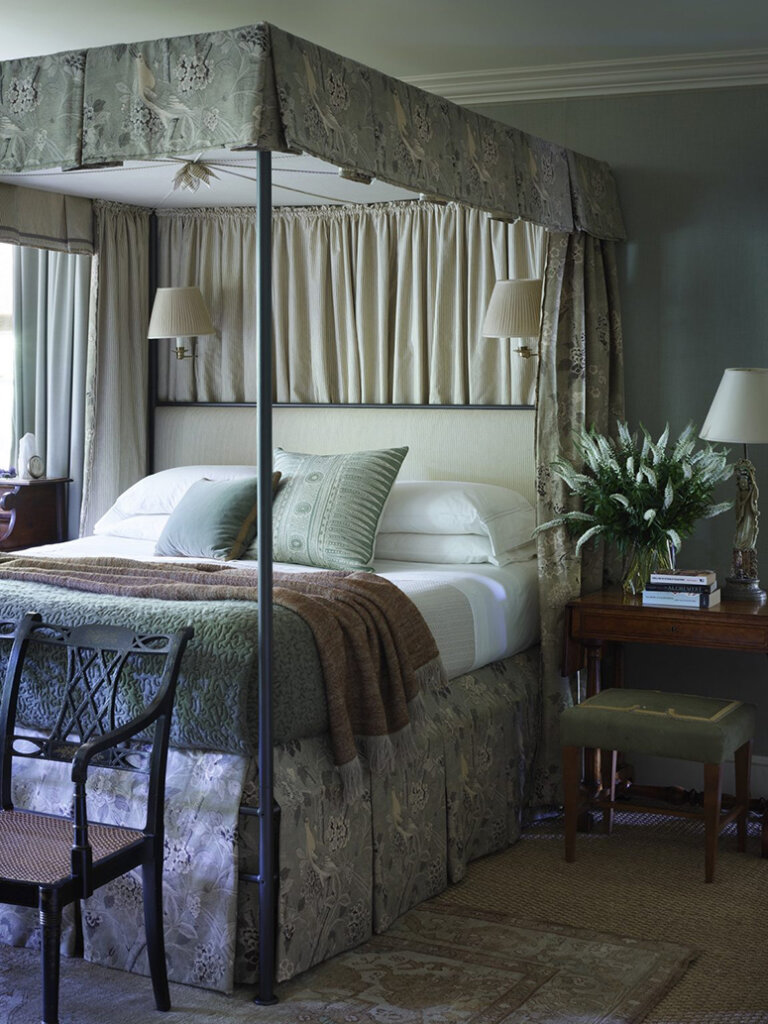
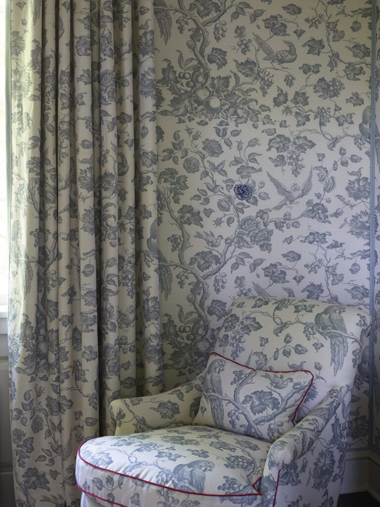
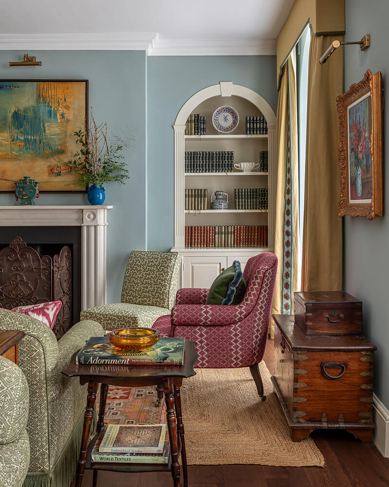
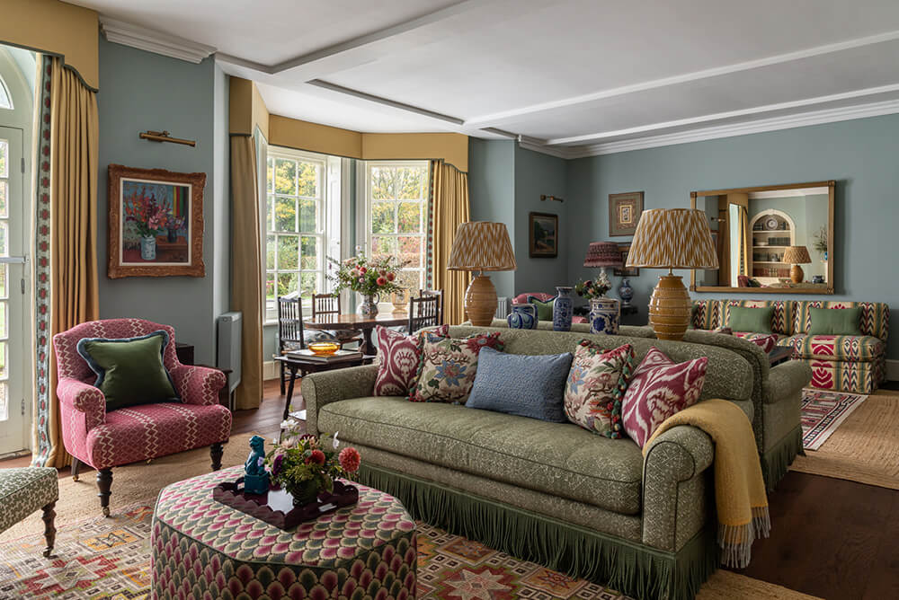
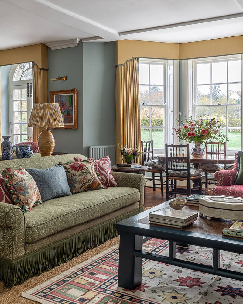
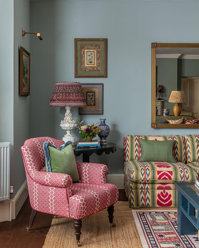
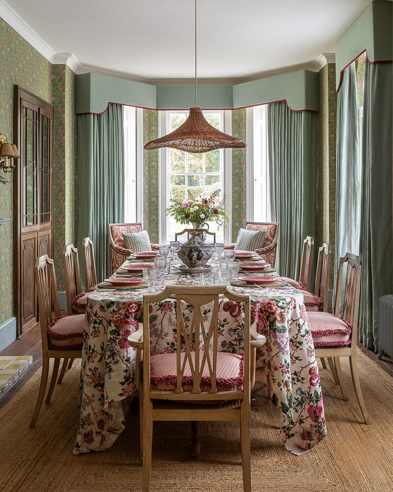
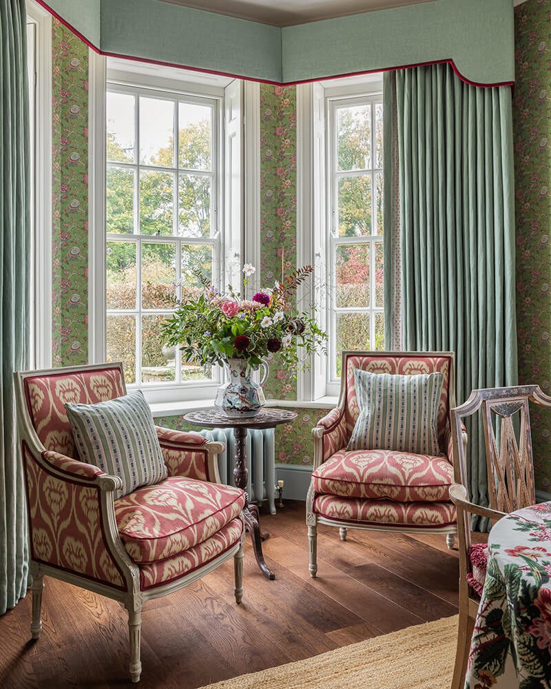
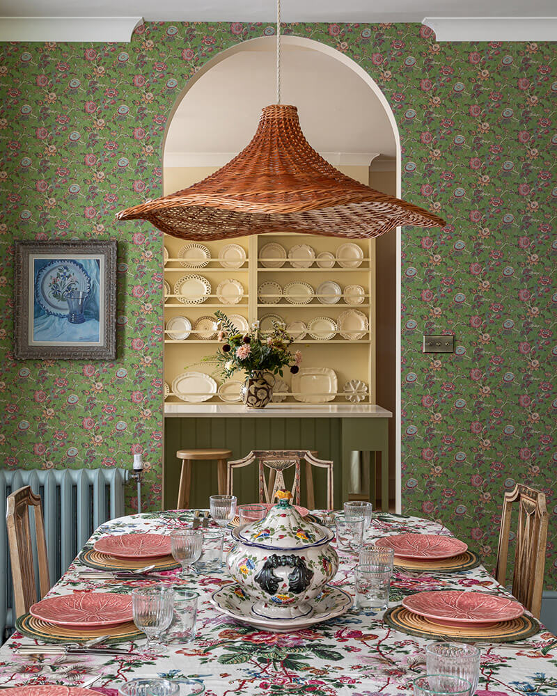
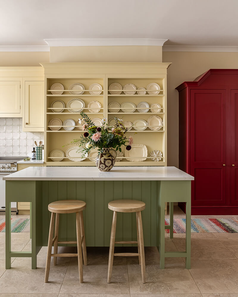
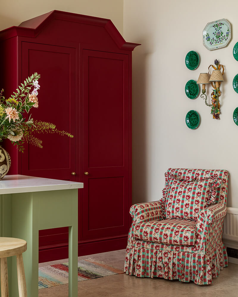
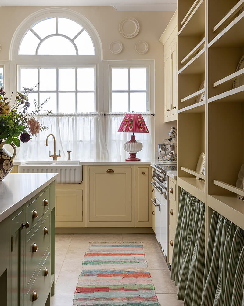
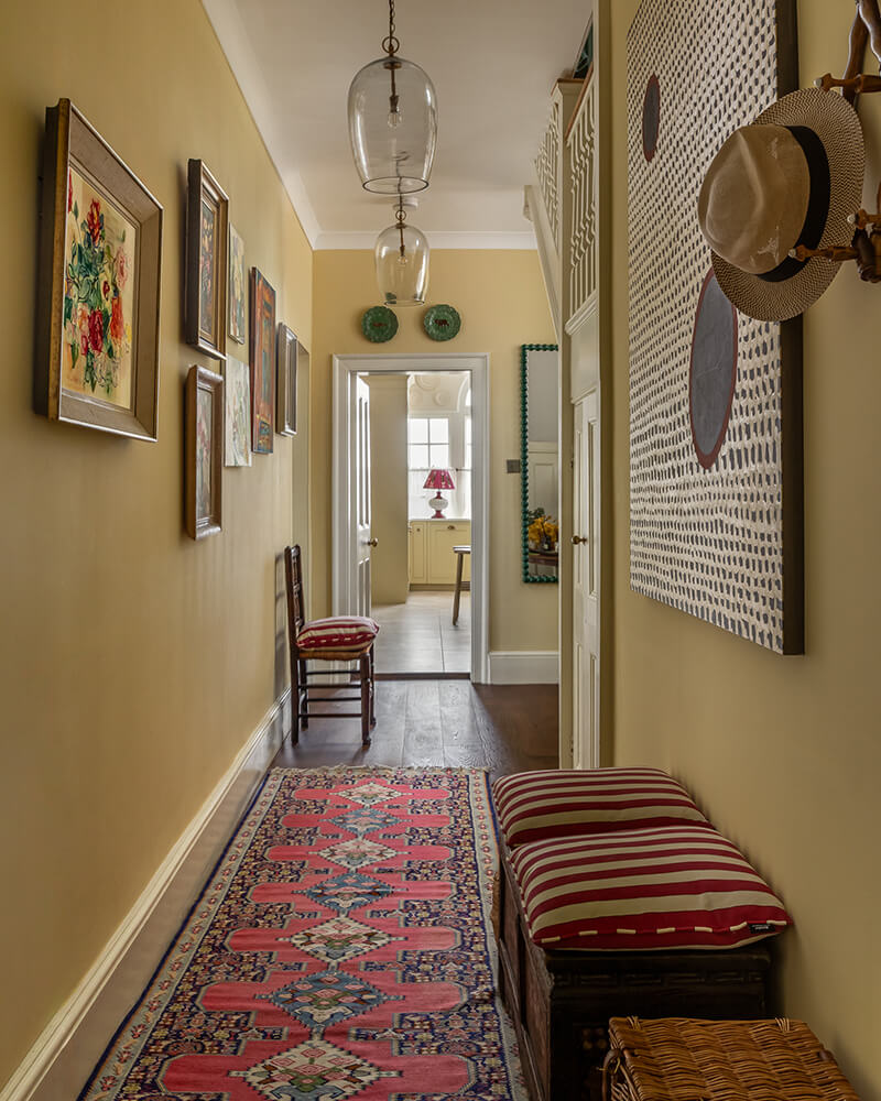
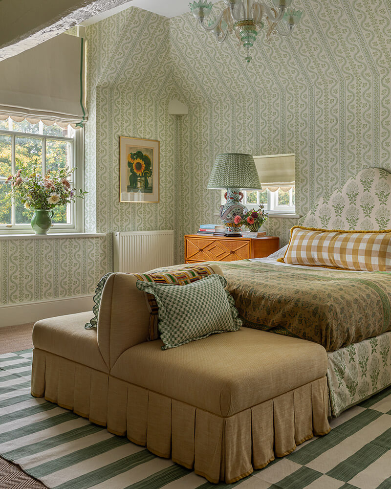
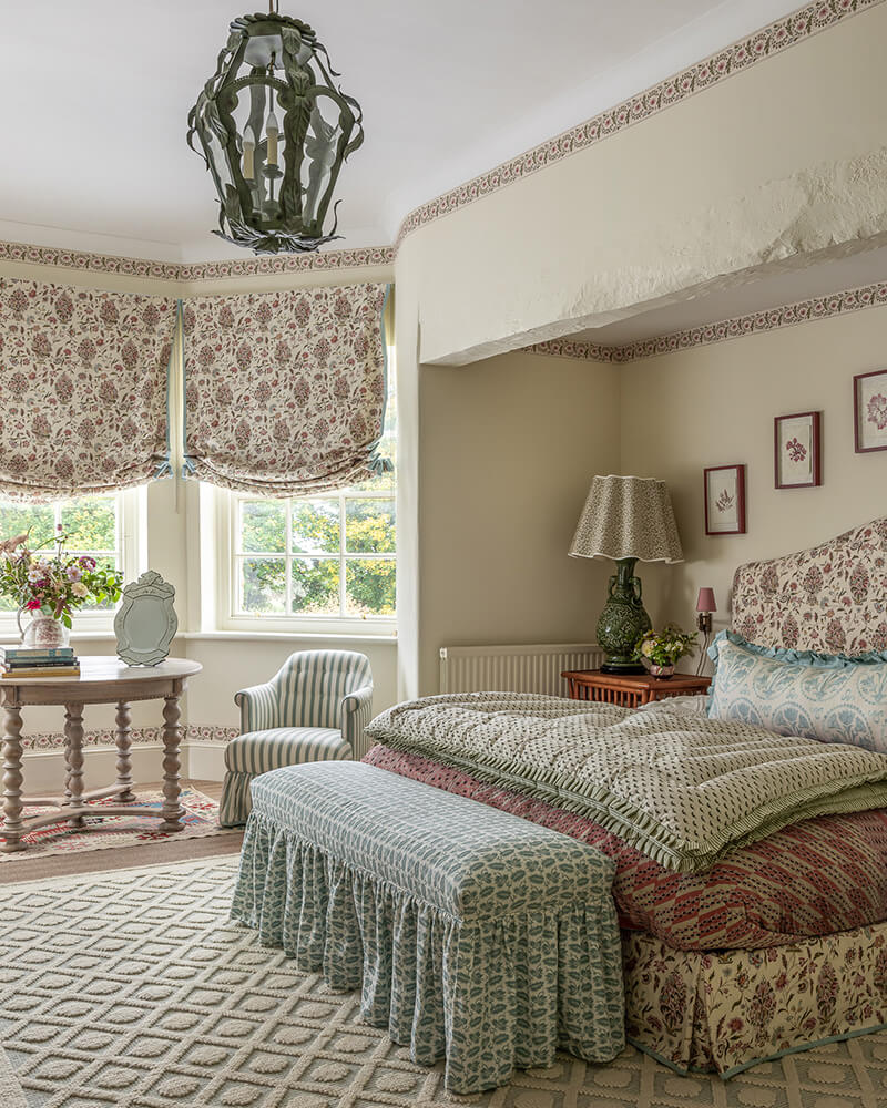
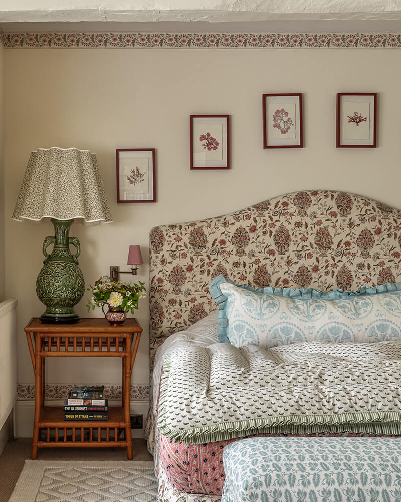
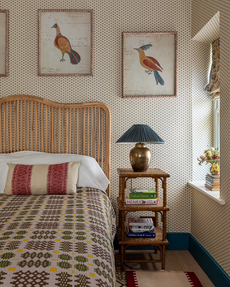
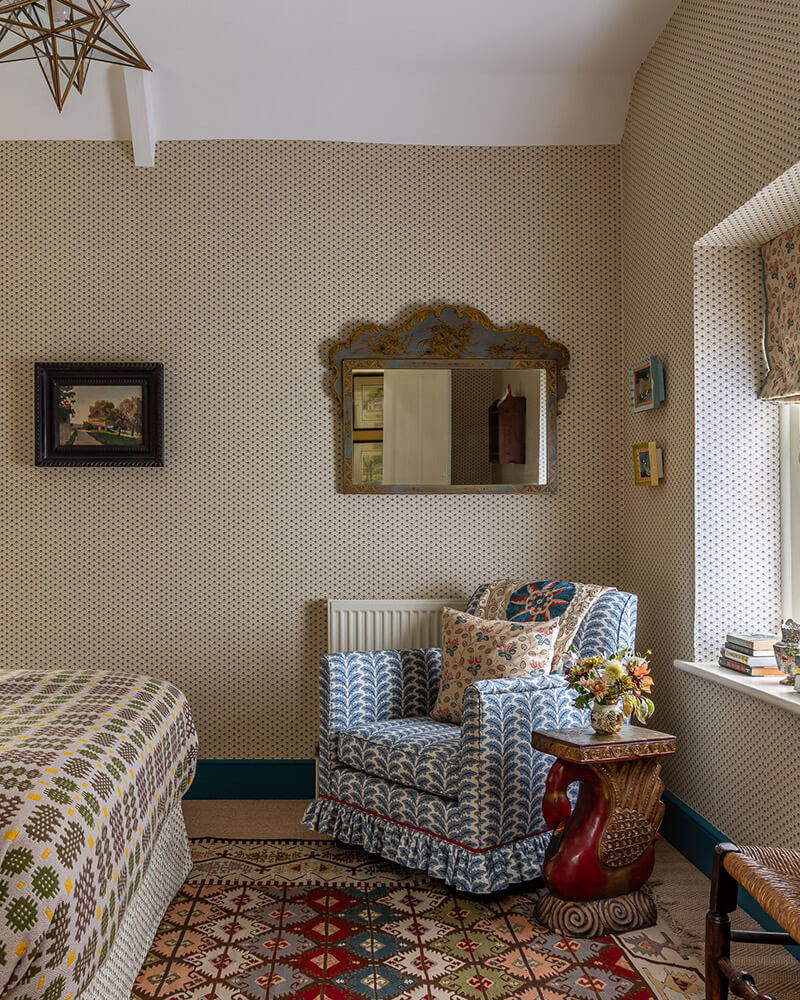
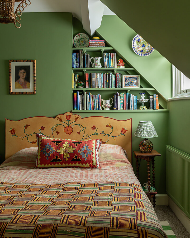
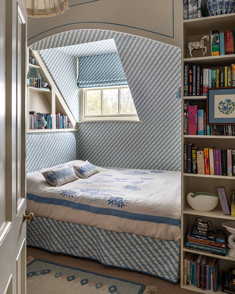
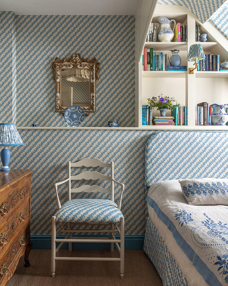
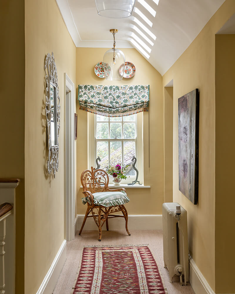
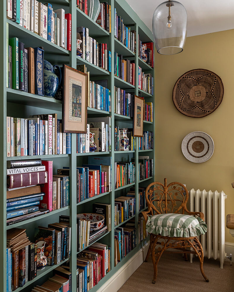
Traditional English country in a Georgian home in Buckinghamshire
Posted on Tue, 15 Jul 2025 by KiM
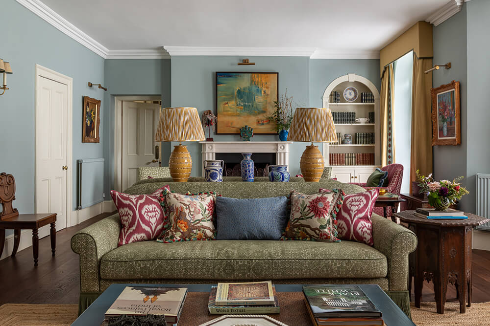
The clients had lived in Singapore for over 20 years and reached out to work with us because they were moving back to the UK and wanted help with their new home. Having lived in Asia for over two decades they wanted to work with a designer who would be able to incorporate their Asian art collection and lifestyle seamlessly into their new UK home. They wanted to create a joyful, colourful and cosy space filled with layers of pattern and colour. The house is a wing of a Georgian country house. We mostly focused upon the soft furnishings, as well as installing a new kitchen in soft buttery yellow, red and green. We wanted the house to feel like a traditional English country home but to have a well-travelled and eclectic atmosphere.
Designer Elizabeth Hay created such a warm, inviting home here with an abundance of gorgeous colours and patterns. I am in love with this living room with soft blues, greens, reds and yellows – a combination that can be garish if the tones are too bright. This is perfection. Photos: Jonathan Bond.