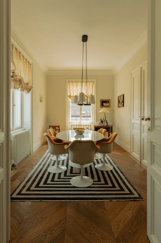
Displaying posts labeled "Red"
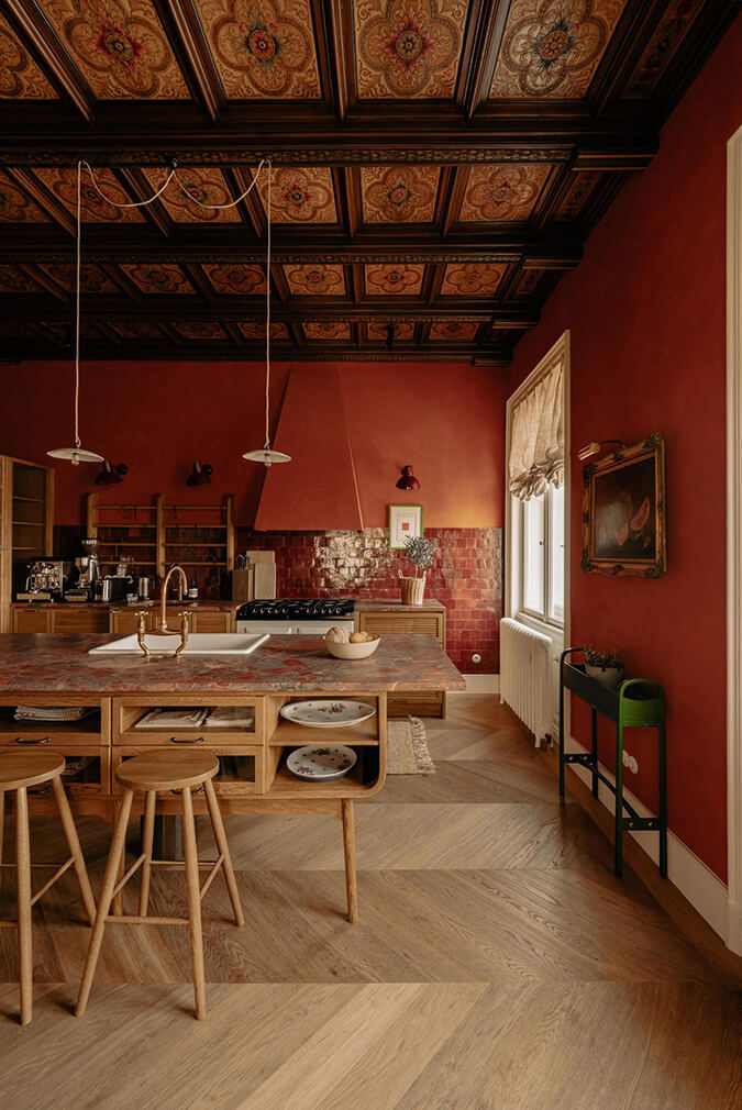
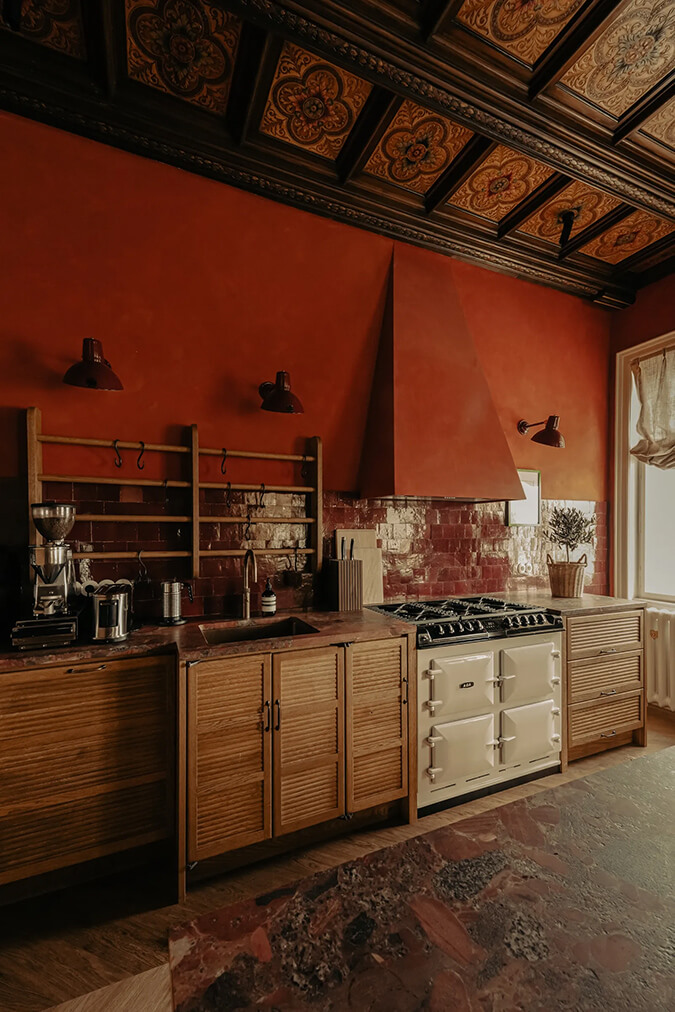
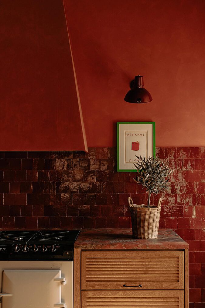
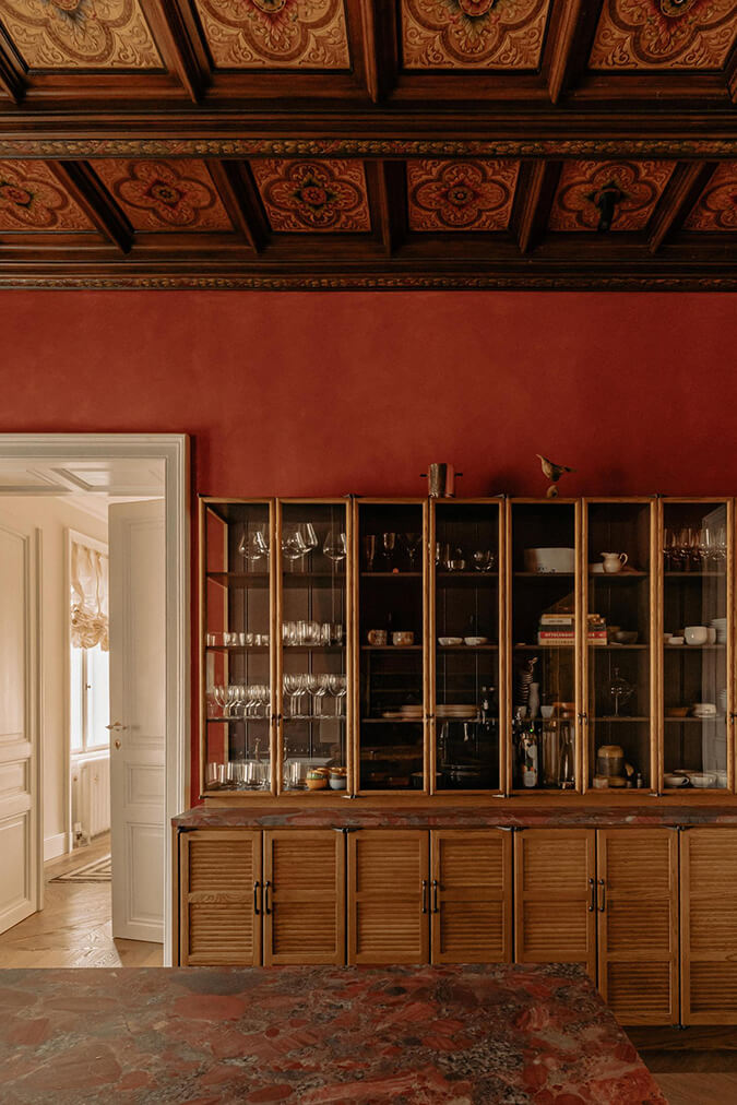
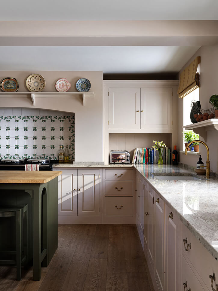
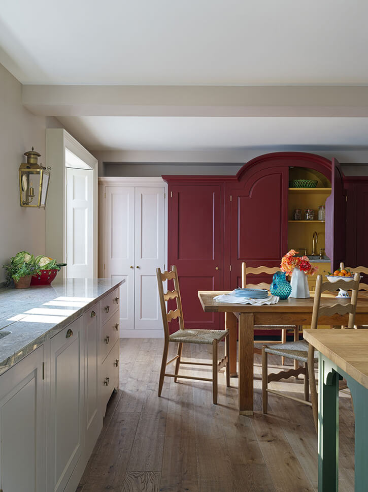
An apartment in Vienna with the dreamiest kitchen
Posted on Mon, 6 Mar 2023 by KiM
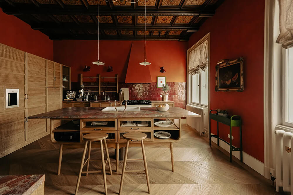
I am completely smitten with this apartment in Vienna designed by Atelier Karasinski. Particularly the kitchen outfitted with deVOL cabinets, with the most spectacular original ceiling and painted in the yummiest Negroni red”. Cooking in there would bring me so much joy! The rest of the apartment is eclectic and has such fabulous details – hellooooo marble and antiques and Gucci wallpaper and surprise cupboards. (Photos: Ana Barros for AD Germany)
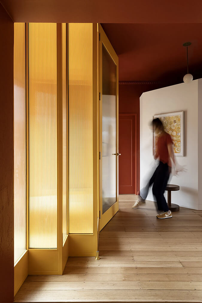
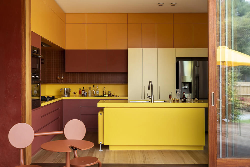
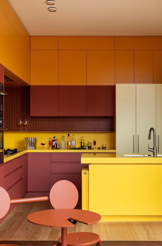
An Art Deco home gets a facelift with spicey colours
Posted on Fri, 24 Feb 2023 by KiM
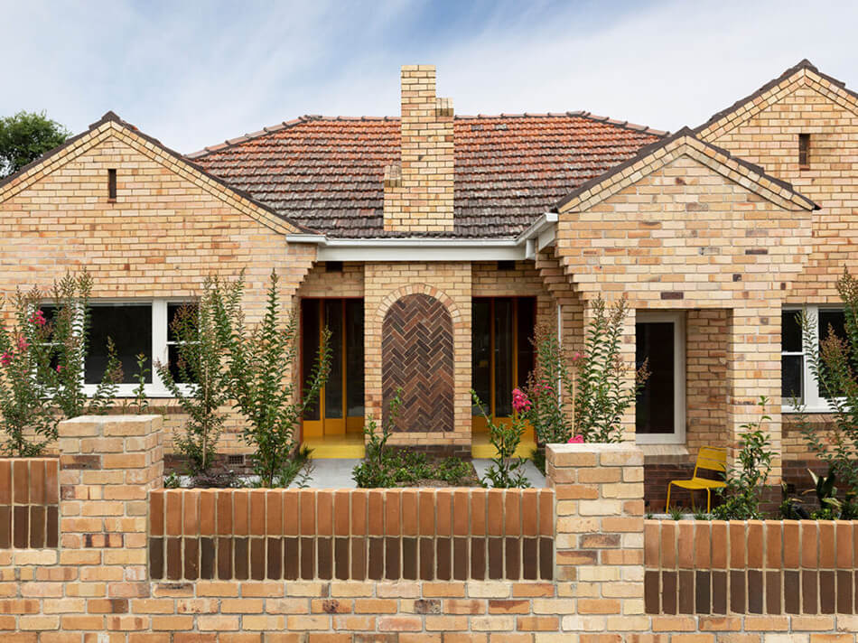
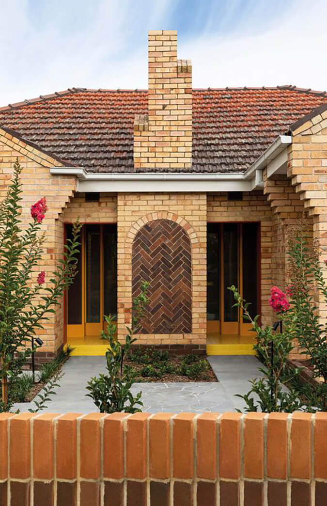
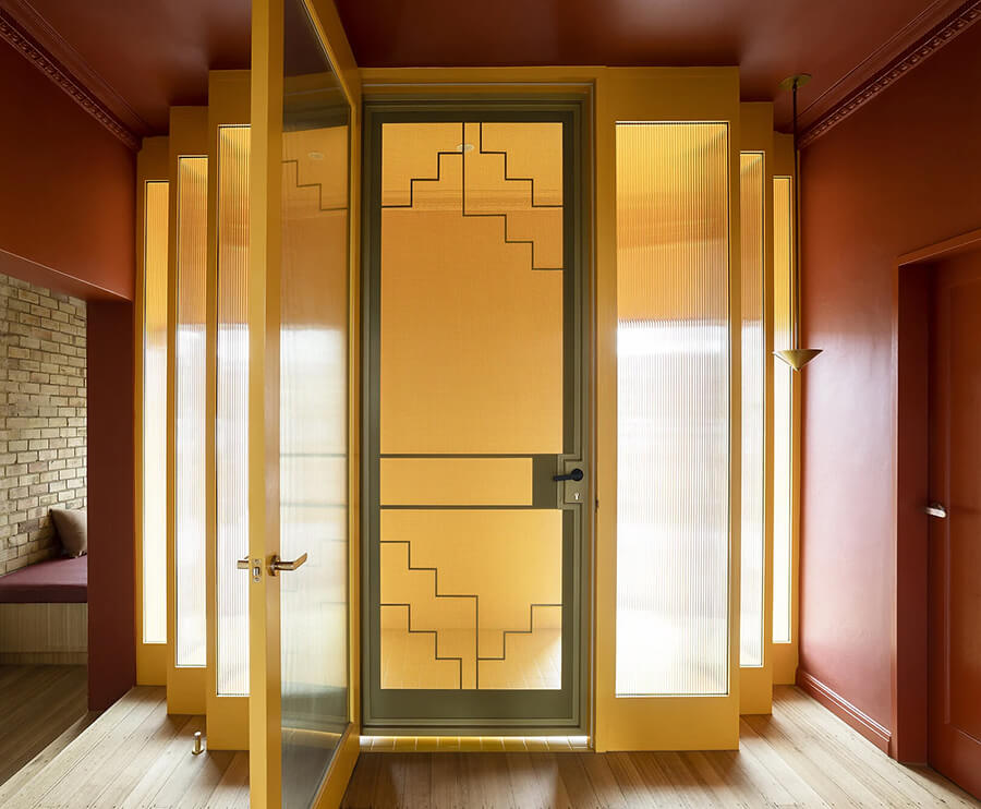
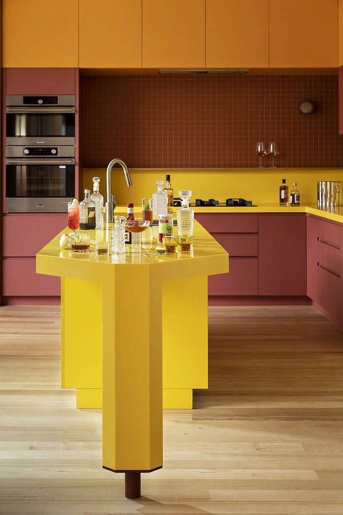
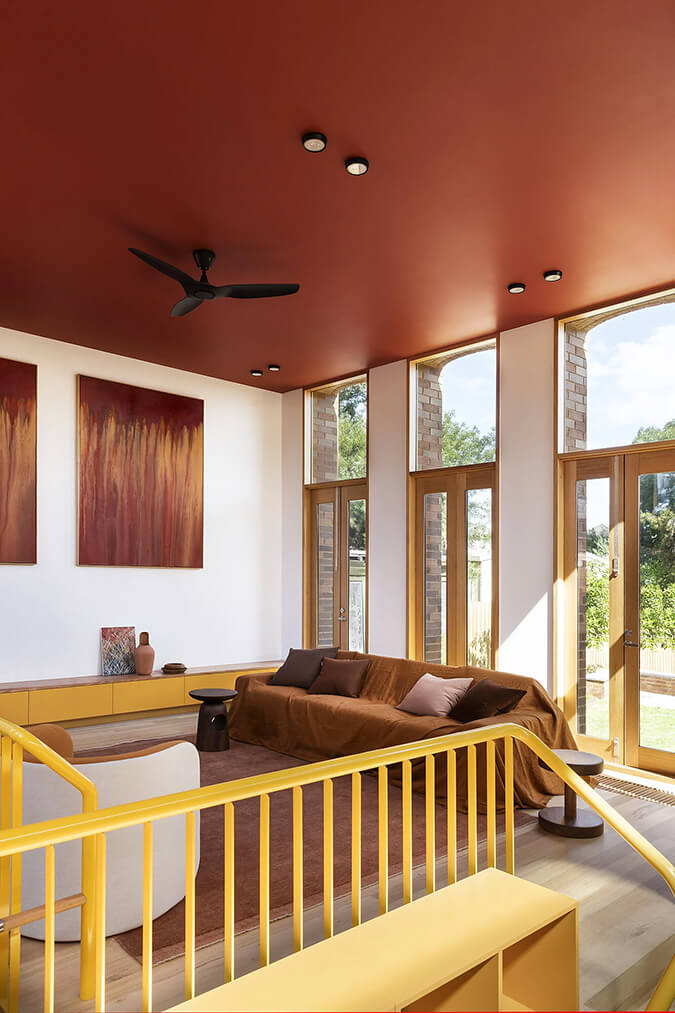
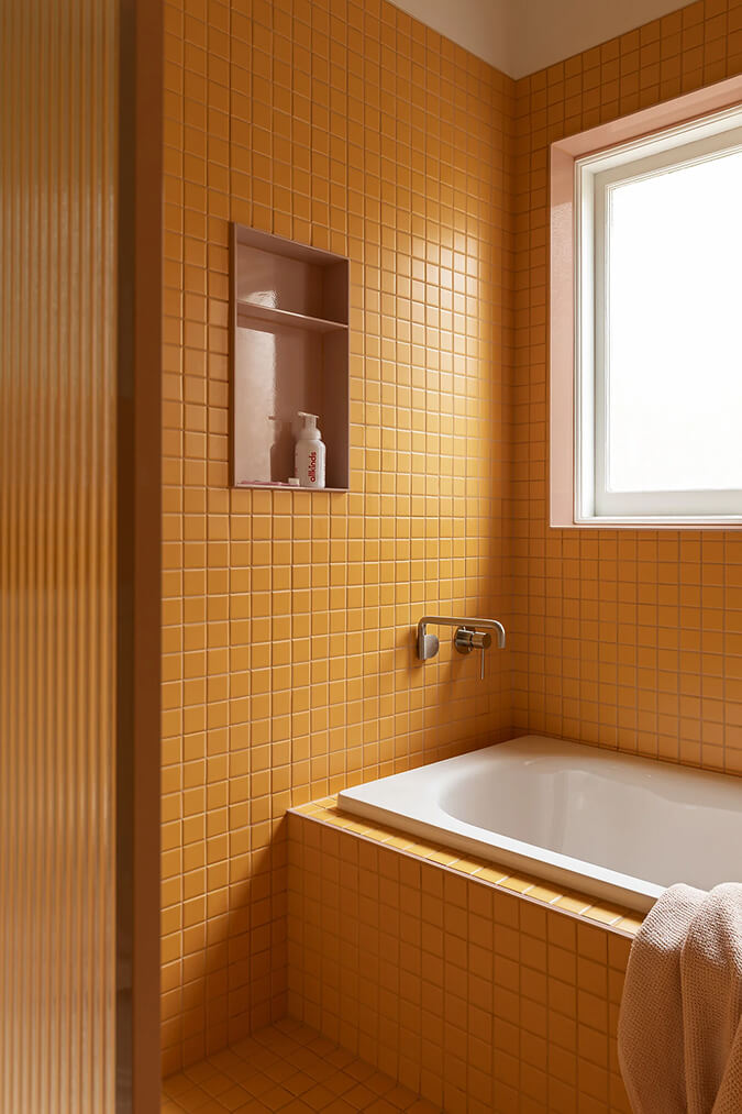
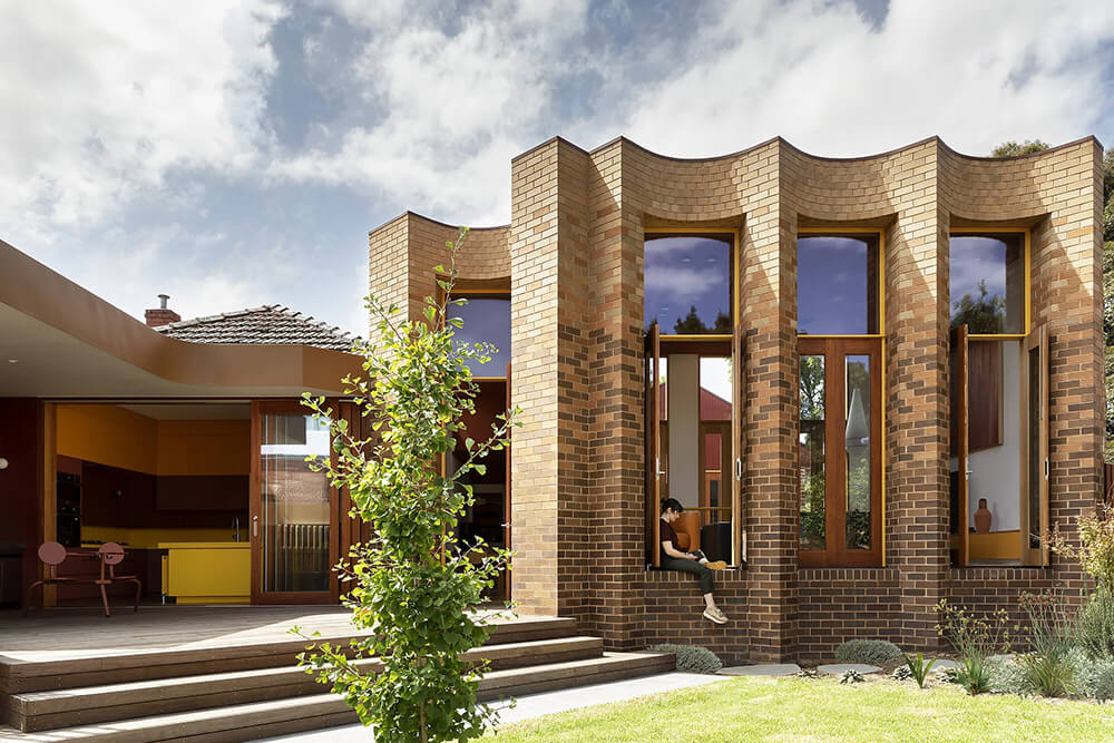
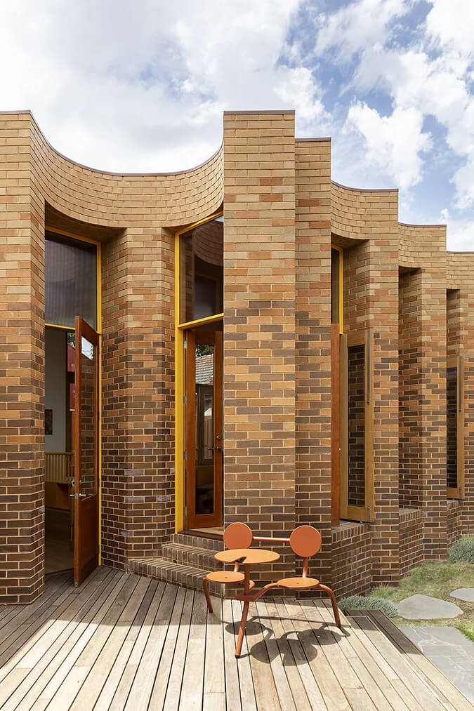
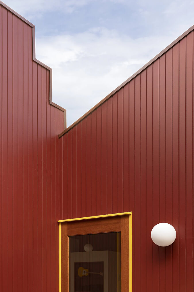
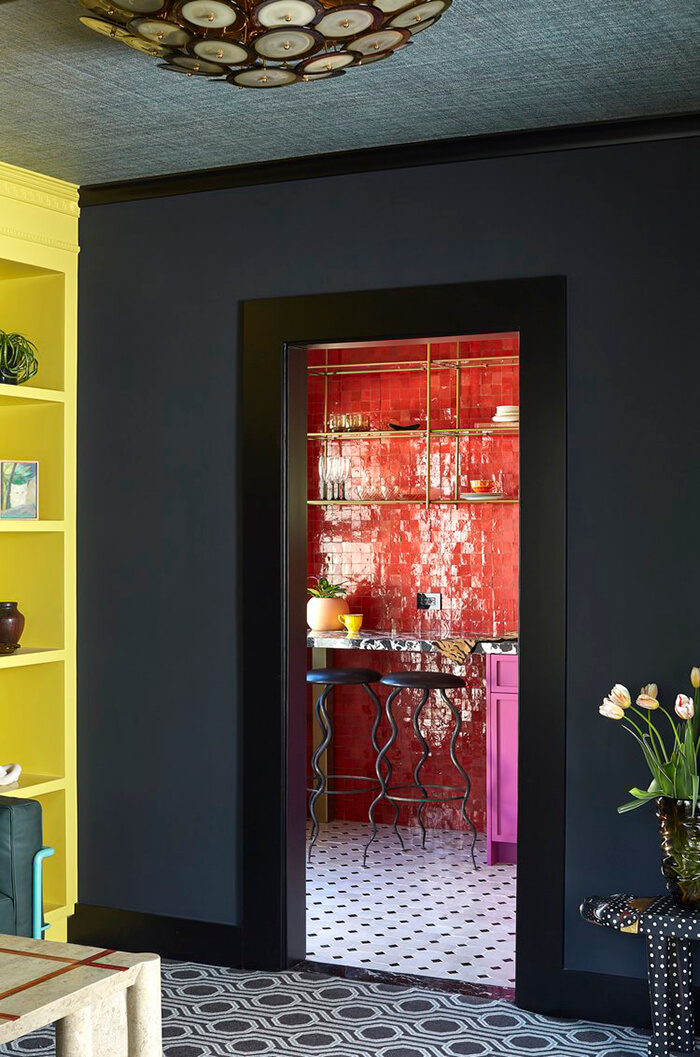
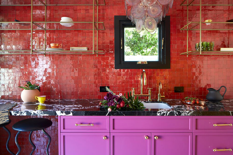
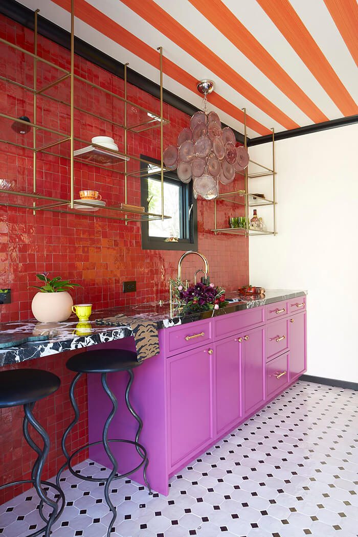
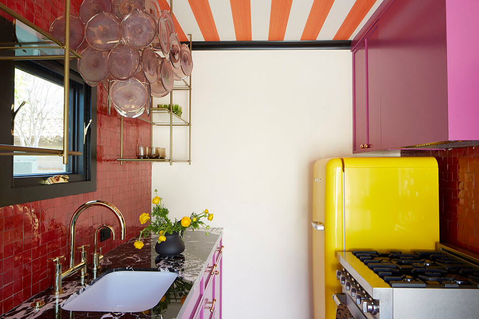
This prestigious double fronted Art Deco cream brick beacon of casual regality adorns a fancy suburban street in Moonee Ponds. WOWOWA’s role was akin to a surgeon – preforming open heart surgery, removing the scare tissue of the past renovation and creating a family home that celebrated the playful ornament of the original 1930’s era. The first decision was to mirror the cream & brown brick robustness of the front facade, around the back. A sense of inside outside was crucial to this project. Working around existing bones, the renovation addon reads like an L shaped nugget, but in reality, the living room sits on the base of an existing basement and is largely a reduction more than an alteration & addition.
I am DYING over this renovation. All of my favourite colours in one home (and all in one kitchen no less!). This home is so incredibly unique and vibrant, and that kitchen is one of my all-time favourites. (Photos: Martina Gemmola; Styling: Ruth Welsby)
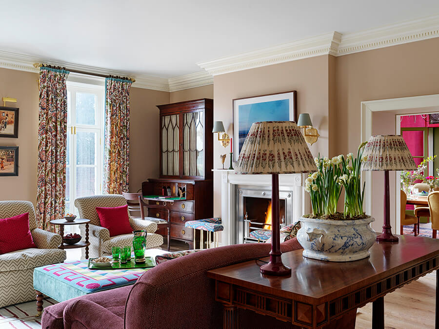
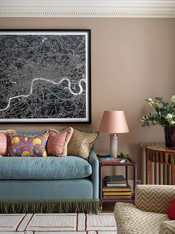
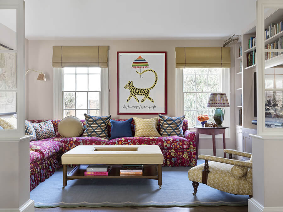
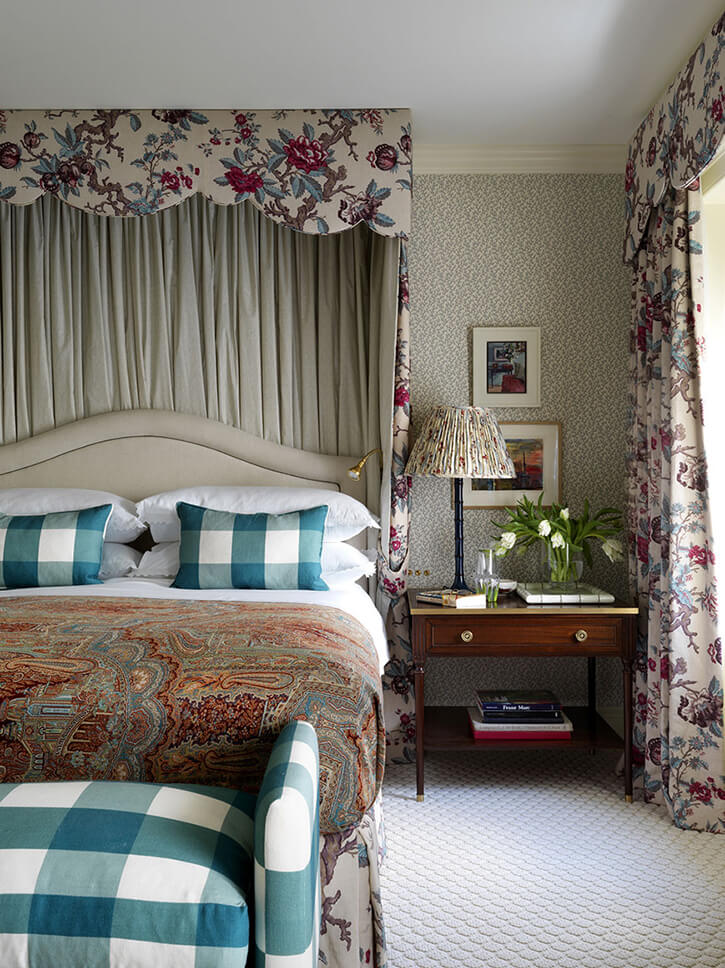
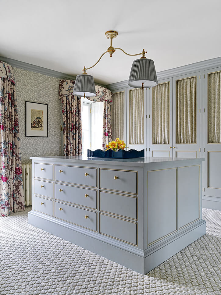
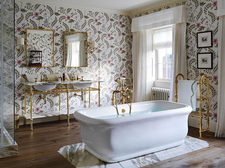
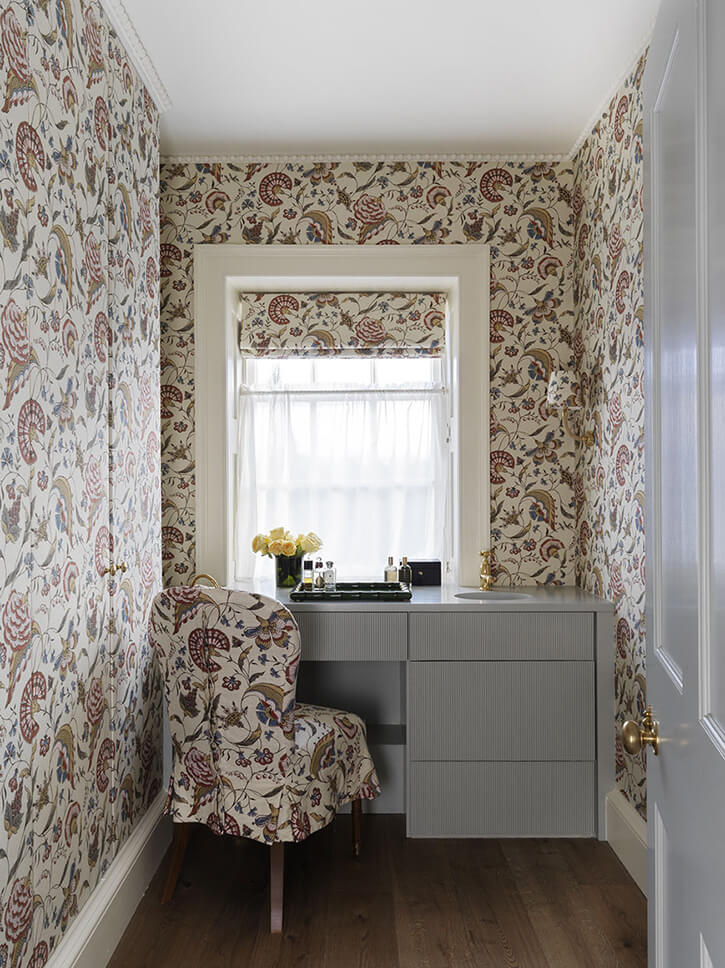
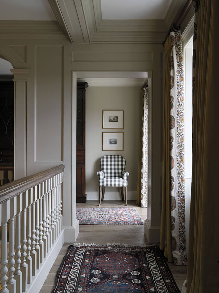
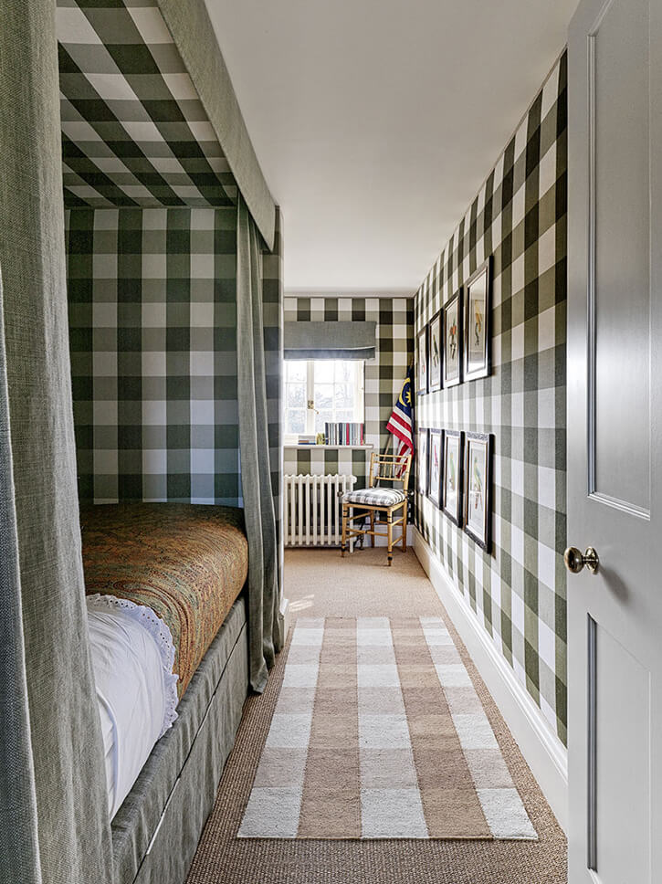
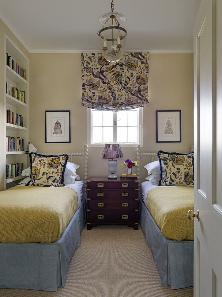
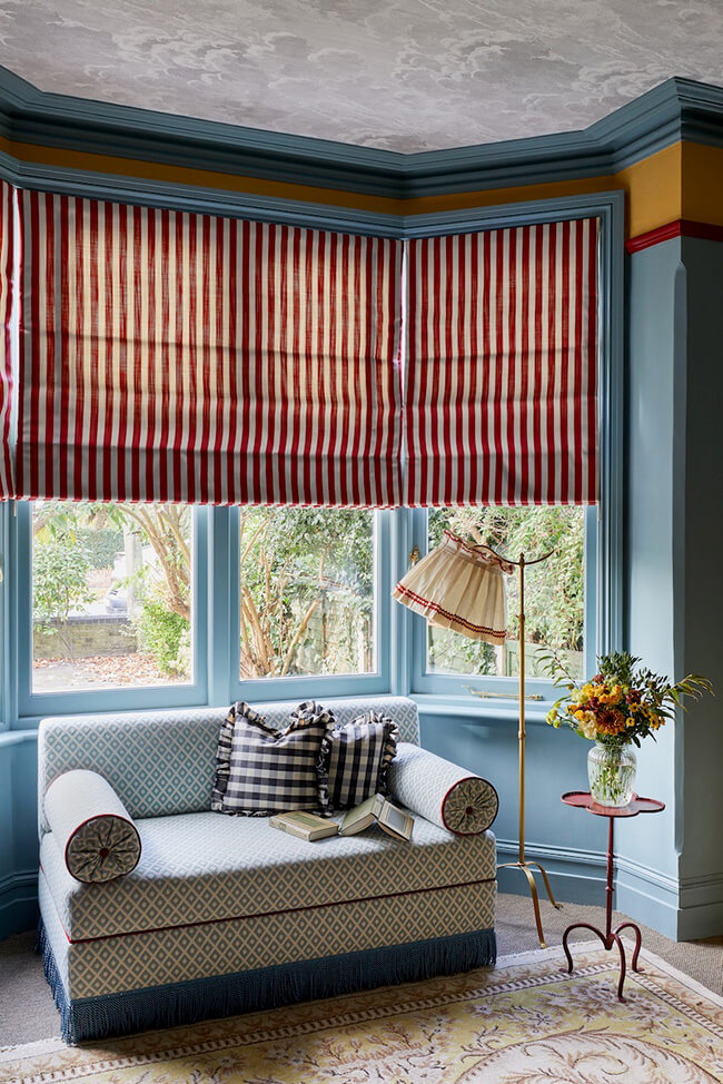
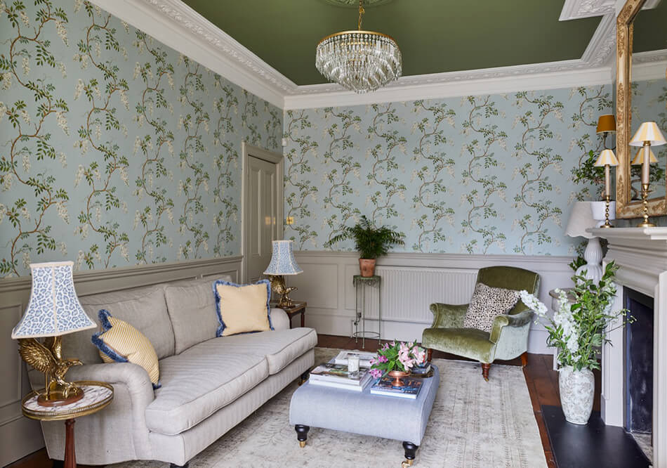
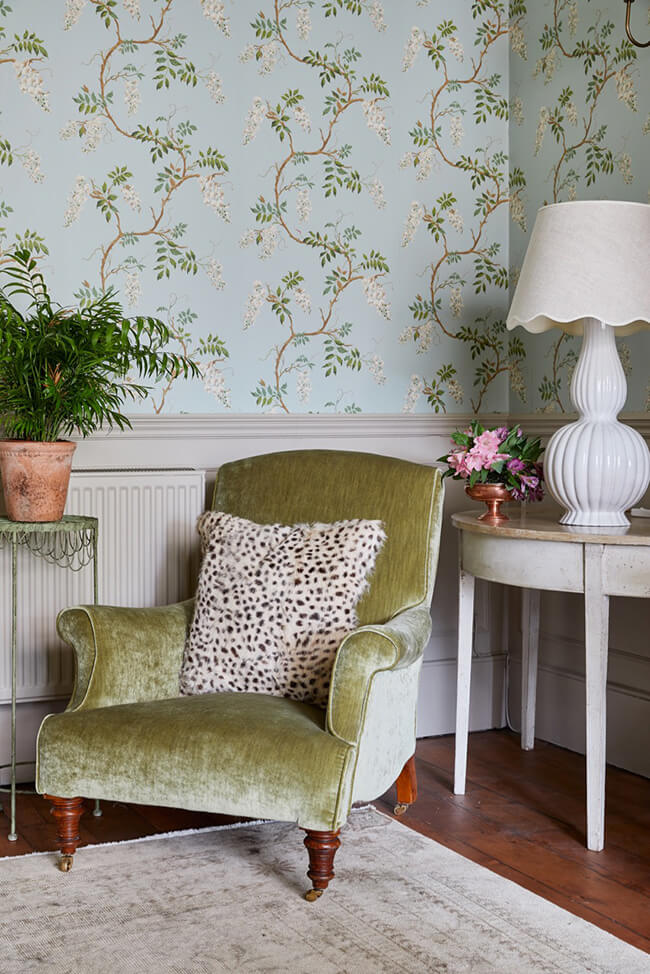
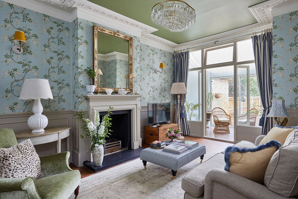
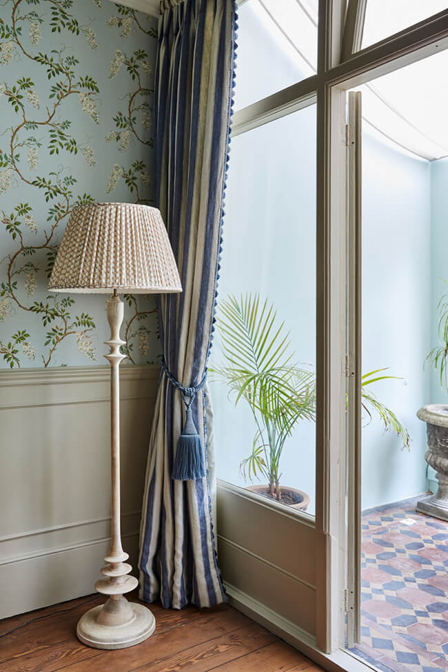
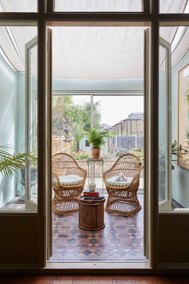
A Georgian country house with lots of colour and pattern
Posted on Thu, 16 Feb 2023 by KiM
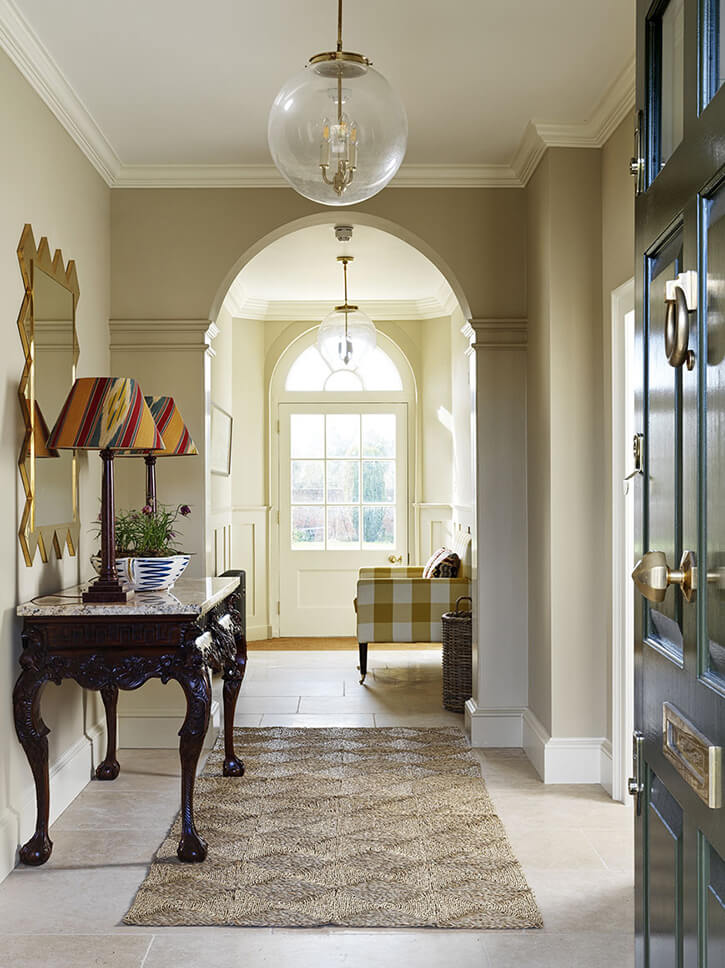
I had to share another project by the talented duo of Salvesen Graham because it is so wonderfully English, lots of colours – both bold and more subtle and plenty of patterns. Layering as these designers do so well and create such a welcoming home that I just eat right up. (Photos: Simon Brown)
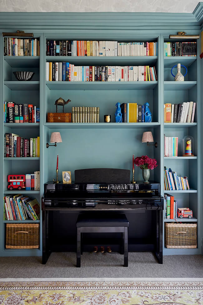
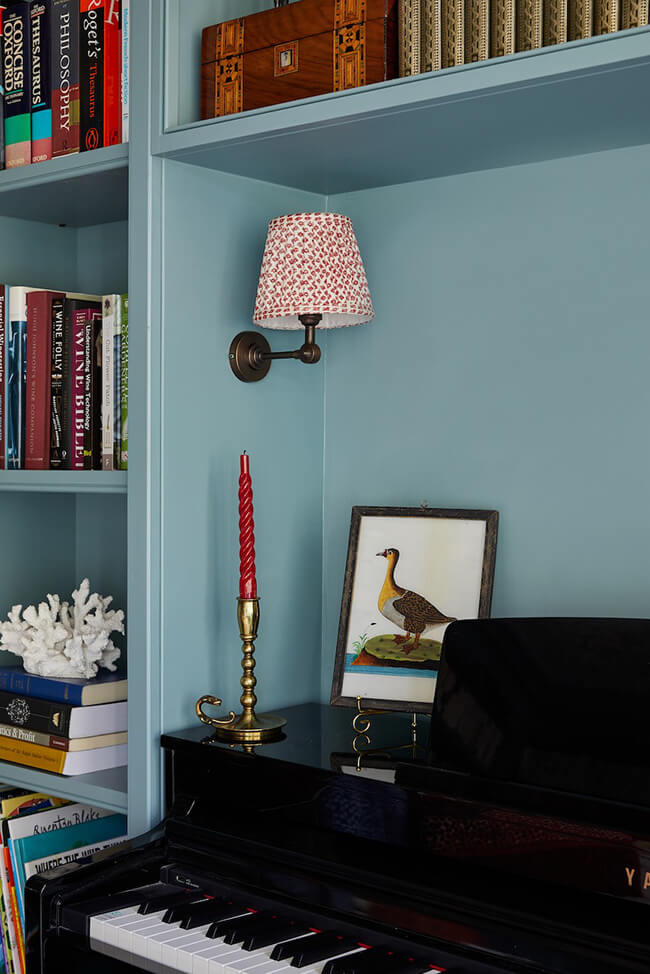
Out of the blue
Posted on Wed, 25 Jan 2023 by KiM
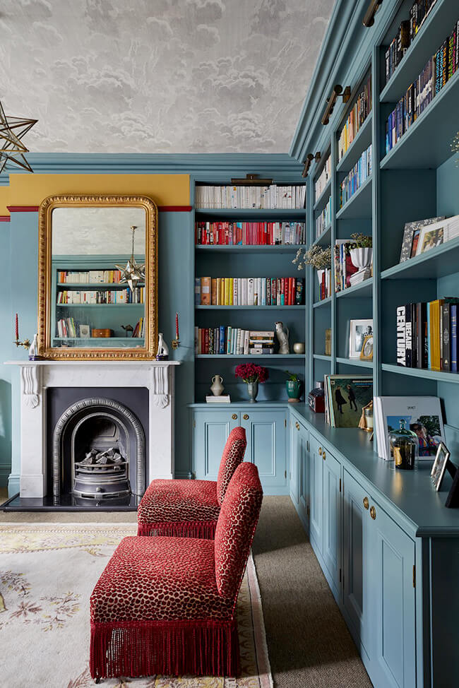
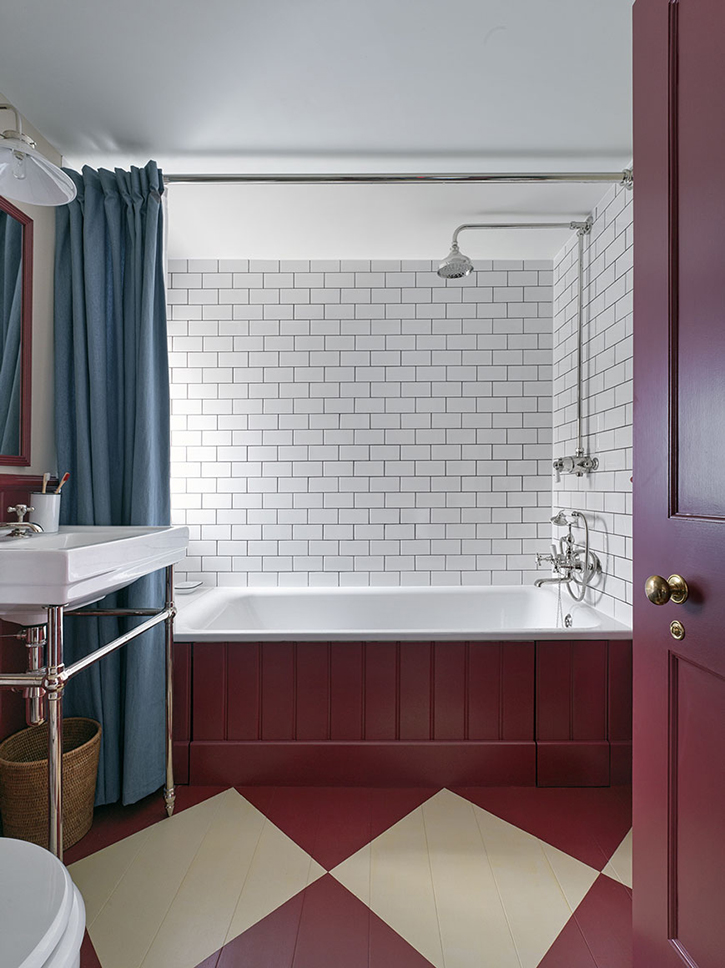
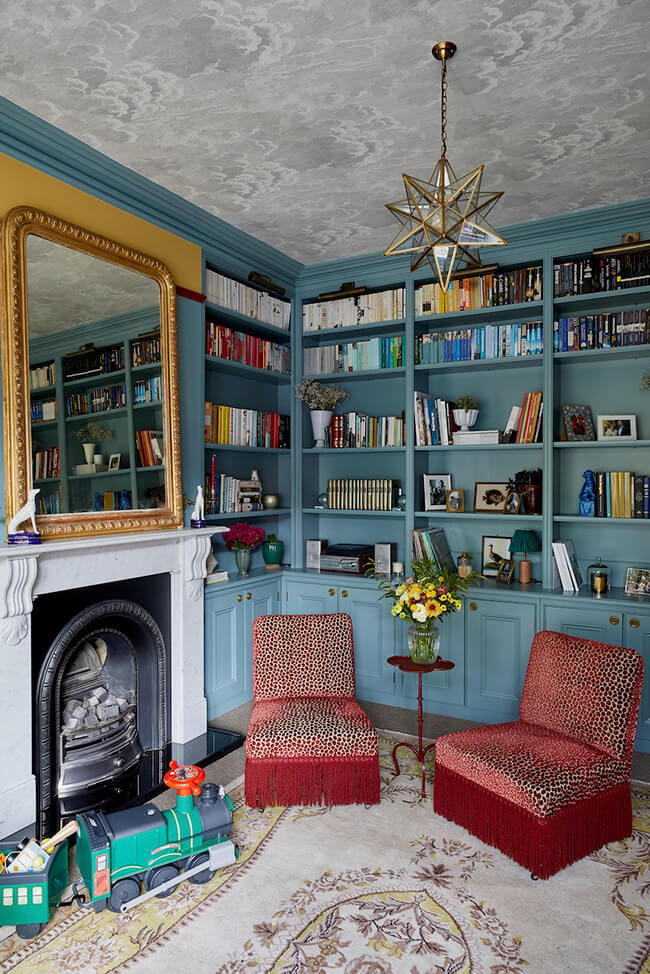
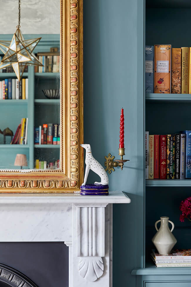
Blue might be one of my least favourite colours but this home designed by Laura Stephens has several pretty shades that I could get behind. Especially that Oval Room Blue library/living room, and with accents of red against it it’s even more special. Though could be because I’m so smitten with those beautiful built-in bookcases. (Photos: Chris Snook)
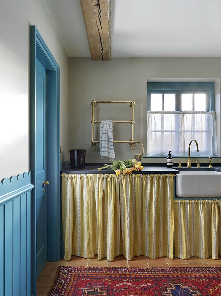
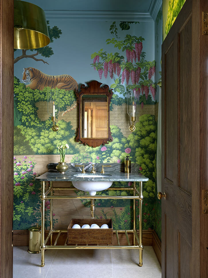
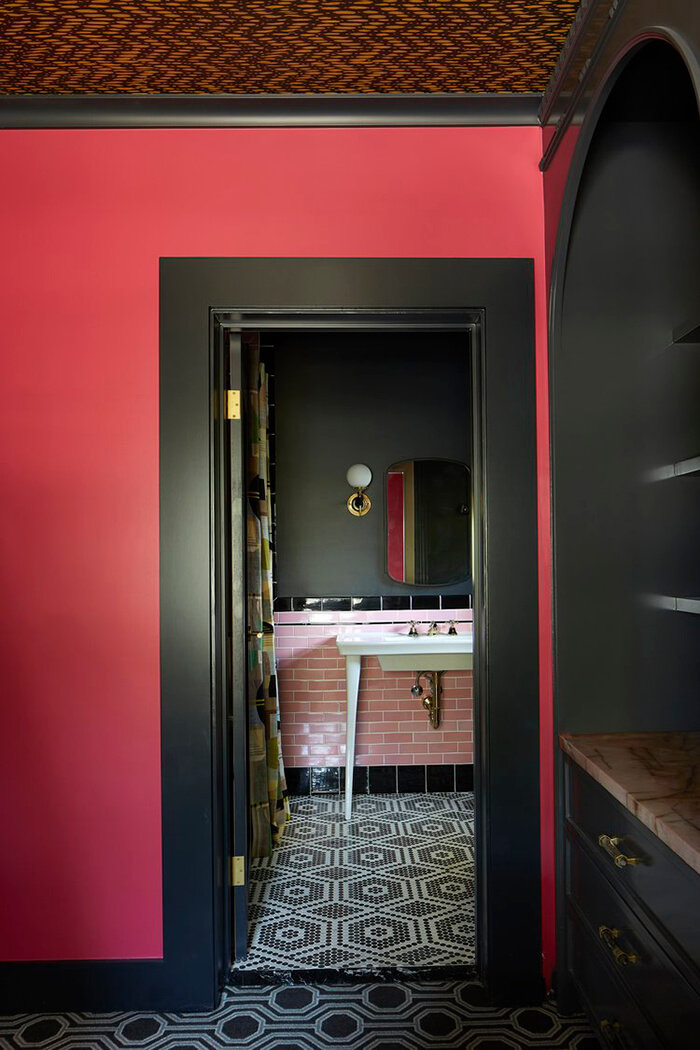
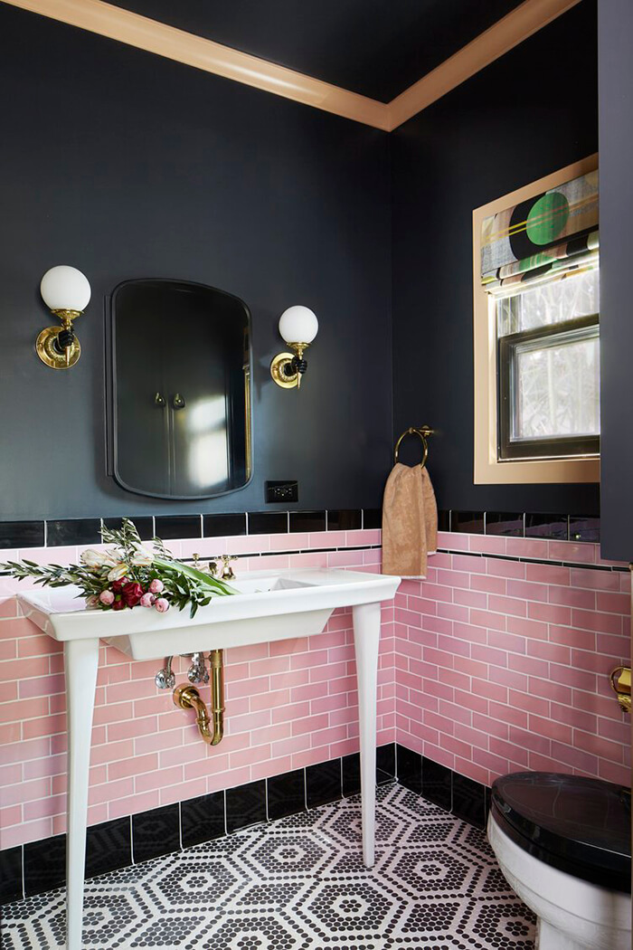
A guest cottage and main house bathroom renovation
Posted on Fri, 13 Jan 2023 by KiM
There’s nothing more gratifying than working with a homeowner ready to take creative leaps of faith with you. So, when a beloved (and fellow creative) client purchased a 1920’s Spanish home in Atwater Village and asked us to turn her guest house into a sassy writer’s shack, we hit the drawing board/completely blank canvas right away. Full trust in the process and a willingness to take all sorts of design risks with us, our client was down for coating every surface in super saturated hues, ample textures, and inspiring patterns. Such a no-holds-bar approach meant that the kitchen concept was born overnight (like, Caitlin had a dream and it was this exact kitchen that we re-created in real life) and the other spaces (reading room, office, and bathroom) followed quick on its tail. The small guest house is now a larger-than-life office-away-from-office that leaves visitors jaws on the floor and provides a daily pick-me-up to the lovely lady who writes there.
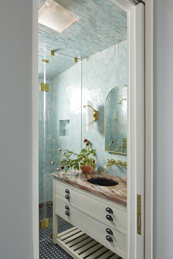
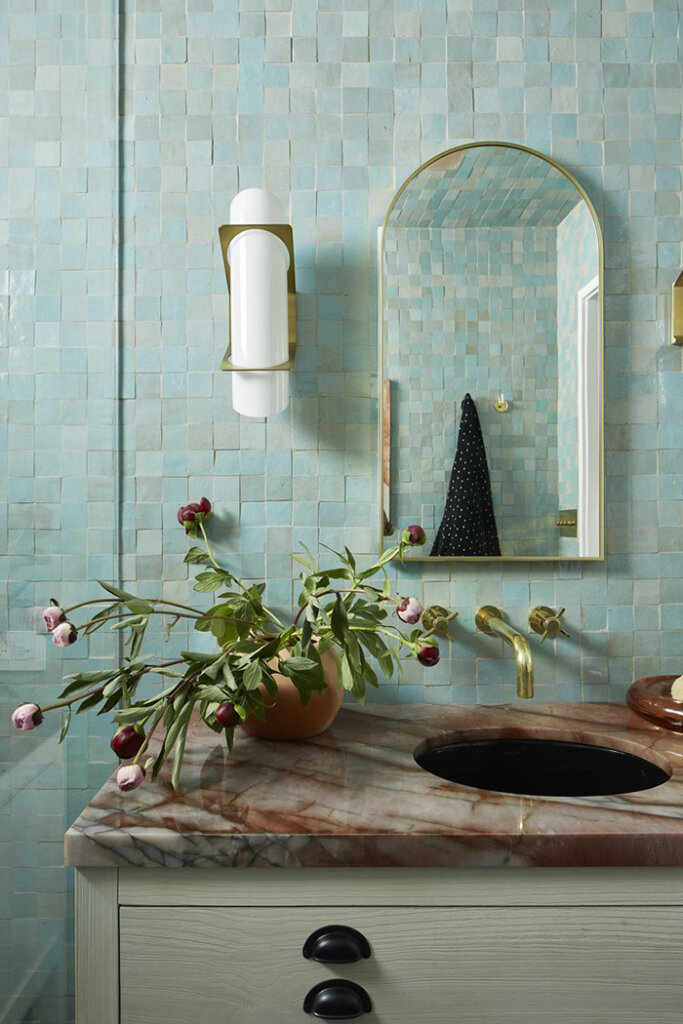
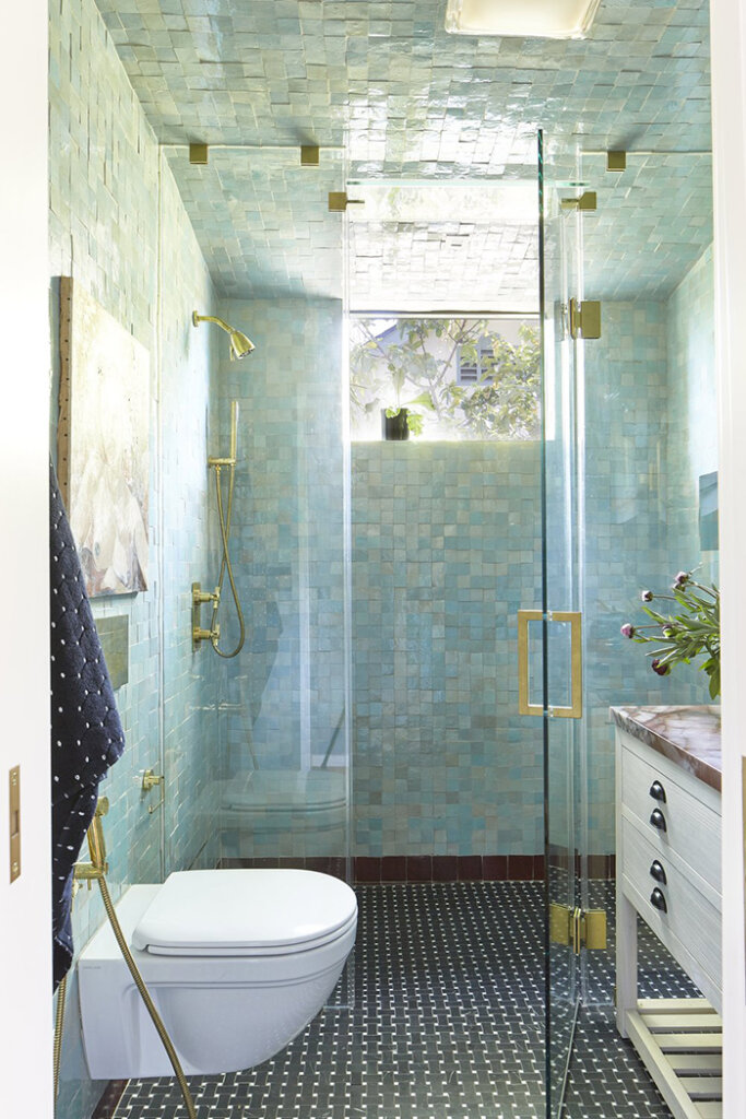
This may win a prize for prettiest tiles in one project. Talk about huge impact! Another fabulously courageous project by Black Lacquer Design. Photos: Jessica Alexander.
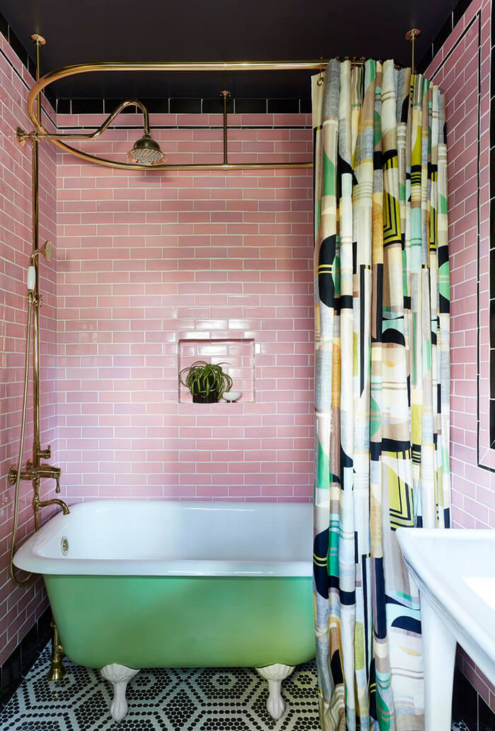
As is sadly often the case with homes of its era in Los Angeles, the kitchen and bathroom were completely gutted at some point and filled with builder-grade finishes unaligned with the inherent architecture of the home. On such jobs, our modus operandi is to reinfuse the spaces with details that harken back to the very best elements of the home’s original style while weaving in timeless touches of both modern life and the personality of the homeowner. In the bathroom, this method resulted in an eclectic, feminine heart-to-heart between the unruly imperfections of the handmade and the more orderly lines of the meticulously tailored. And what else could come from such a love story but a blue dream of a bathroom fit for a mermaid?