Displaying posts labeled "Vignette"
On the bright side
Posted on Wed, 24 Oct 2012 by midcenturyjo
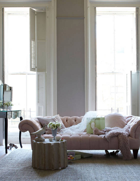
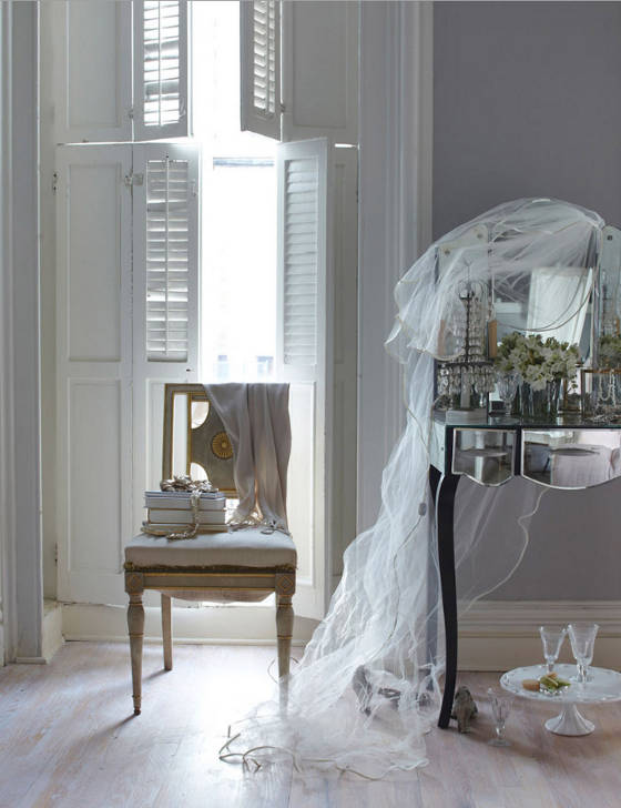
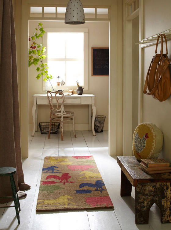
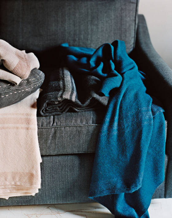
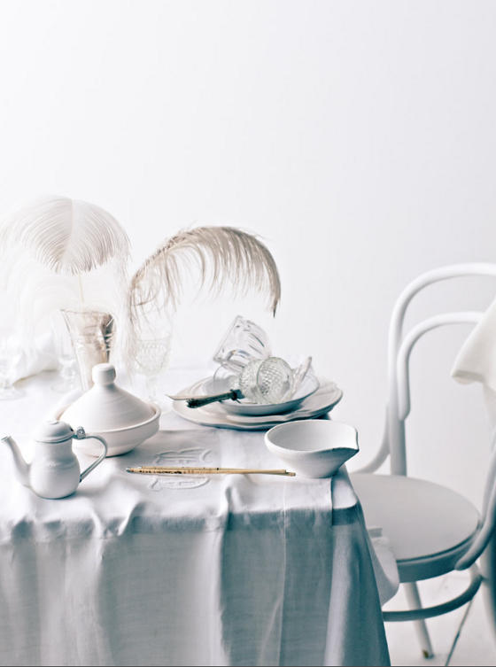
I hope, dear readers, that I didn’t leave you feeling down with the dark and moody styling of Hilary Robertson. No, no do not despair. Her work presents another face that is fresh and bright and young. My heart does little leaps with these lovely shots. Enjoy.
P.S. Mrs. Robertson has a shop for those lucky enough to make it to Brooklyn. A wonderland of the old and beaten up, patina and passion. 88 South Portland Avenue, Brooklyn.
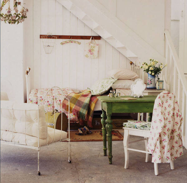
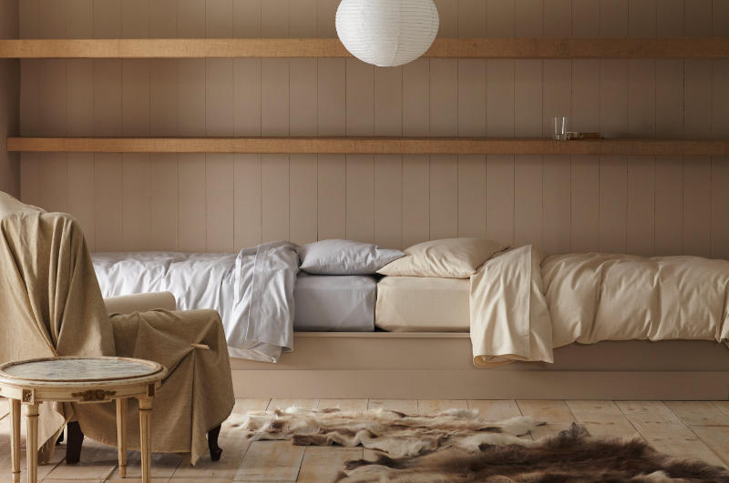
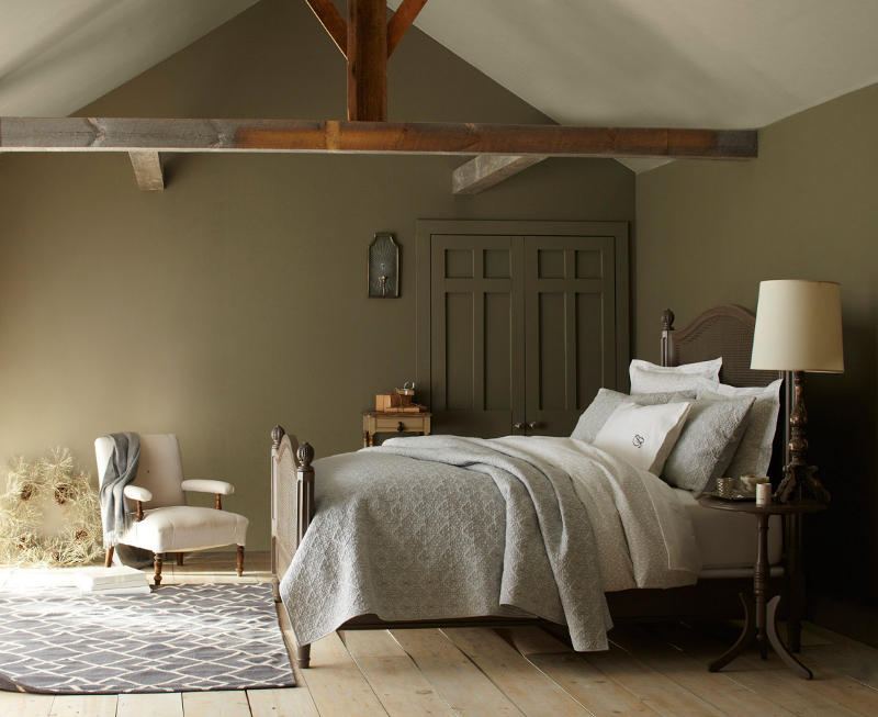

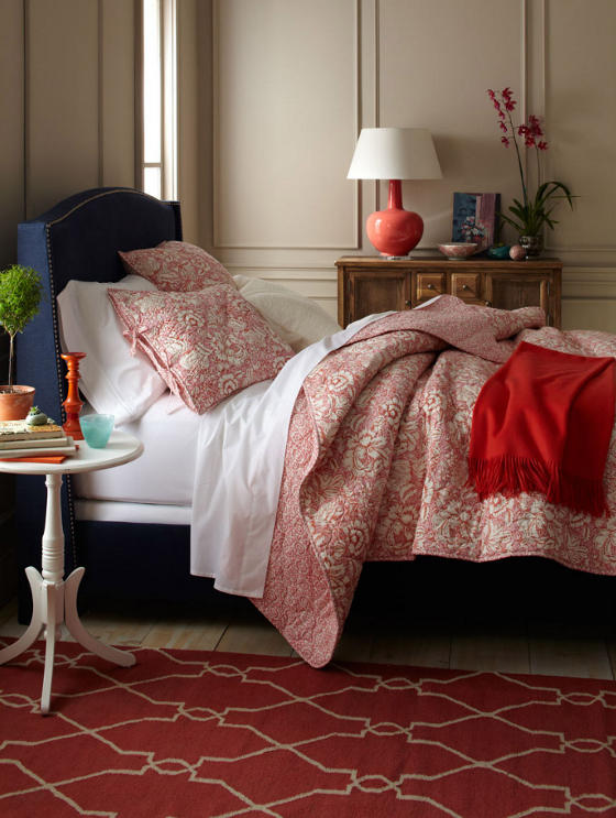
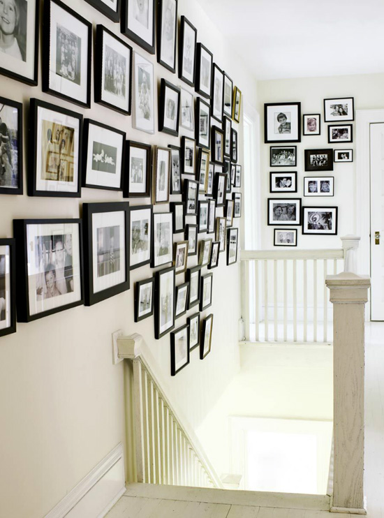
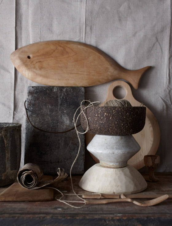
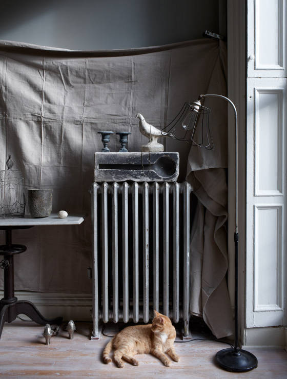
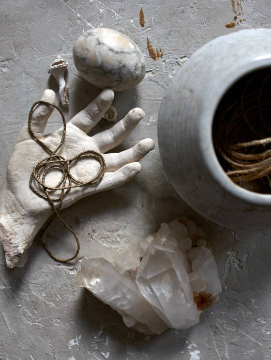
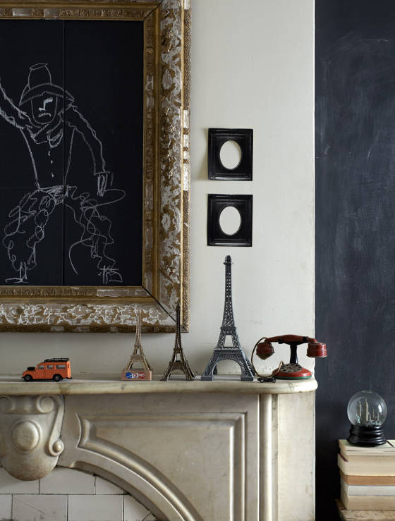
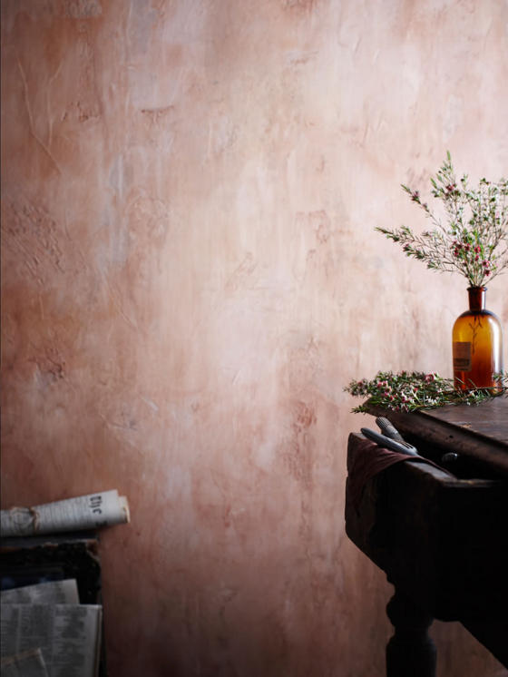
Here’s to you Mrs. Robertson
Posted on Wed, 24 Oct 2012 by midcenturyjo
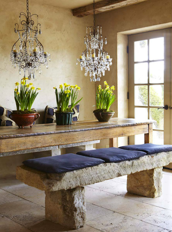
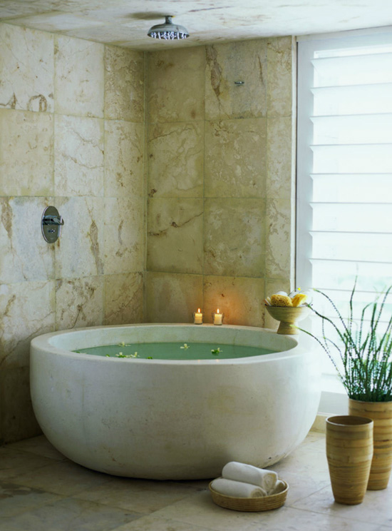
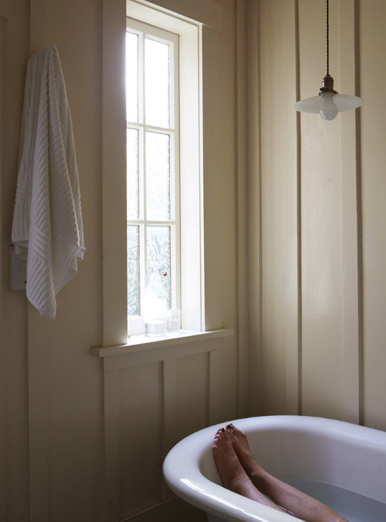
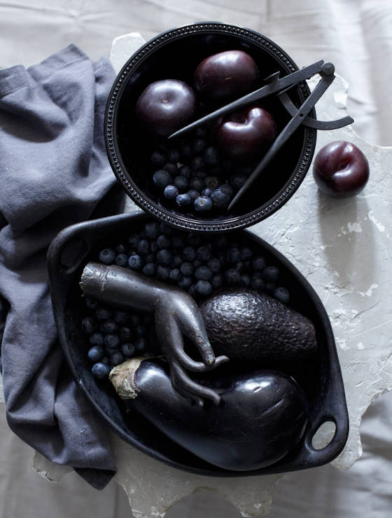
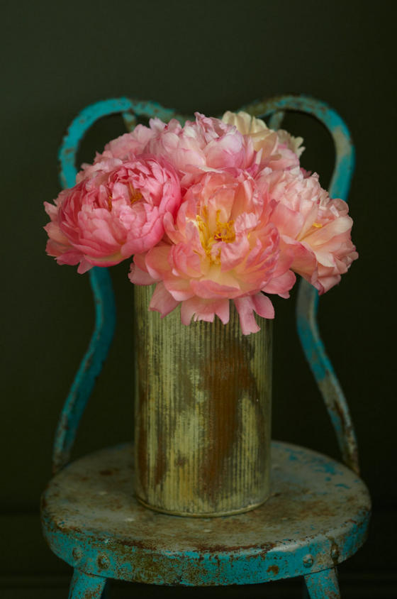
Almost a year ago a late afternoon storm had me racing to wax lyrical about interior stylist Hilary Robertson. Roiling clouds and a darkening light seemed a good match to the moody, limited palette of the work I featured back then. Today the sky is full of smoke, grey and once again menacing. The thick air sits heavy on my chest and the edges of my mind are picked at and bothered by news of fire not far from home. Once again I seek solace, no, inspiration in the moody tones of Robertson’s work. Dark and deliciously distracting. So here’s to you Mrs. Robertson for brightening my day.


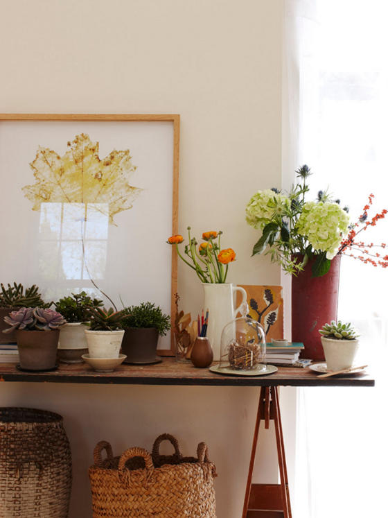
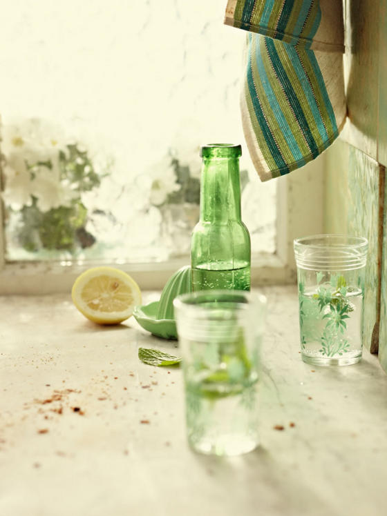
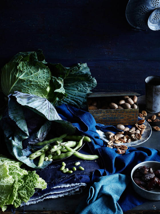
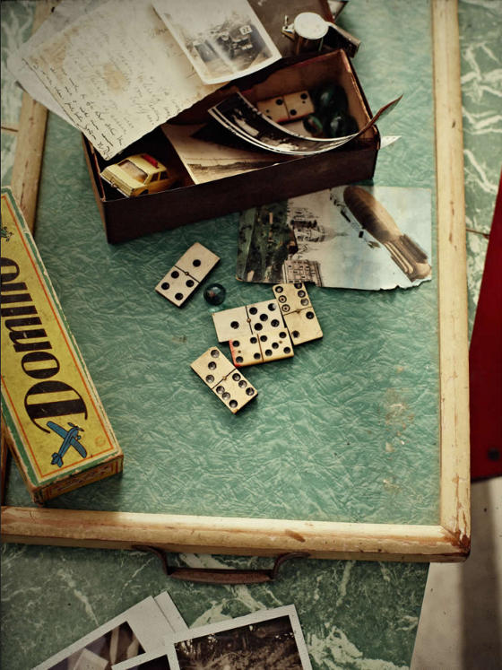
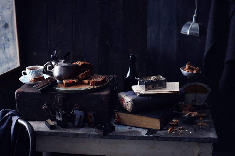
Just because …
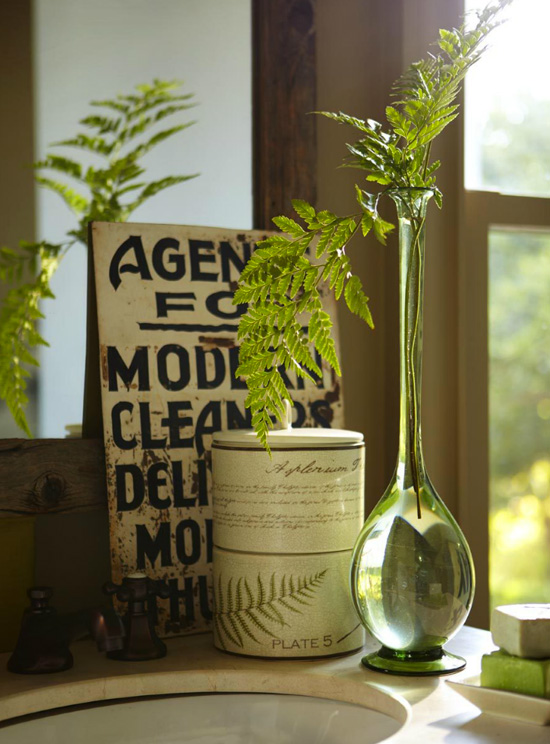
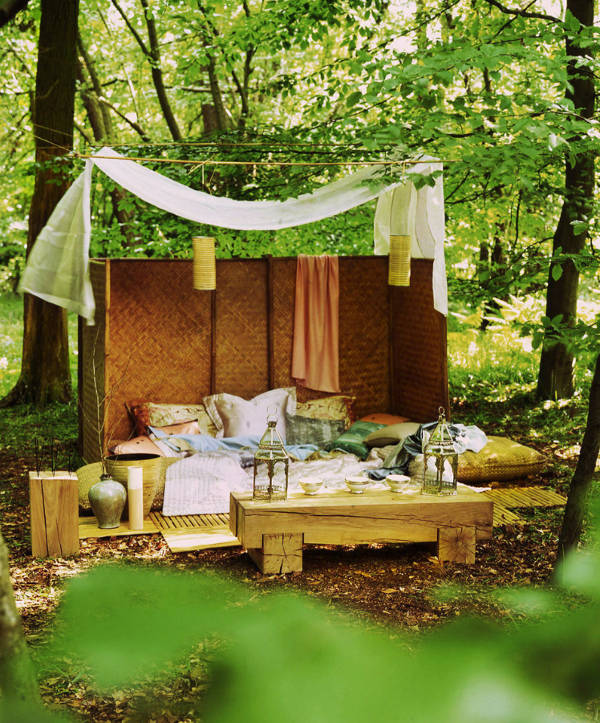
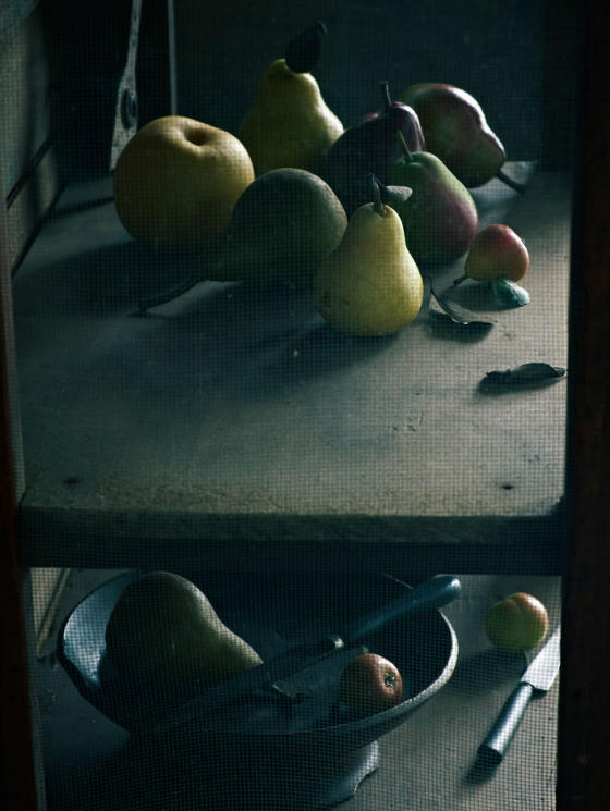
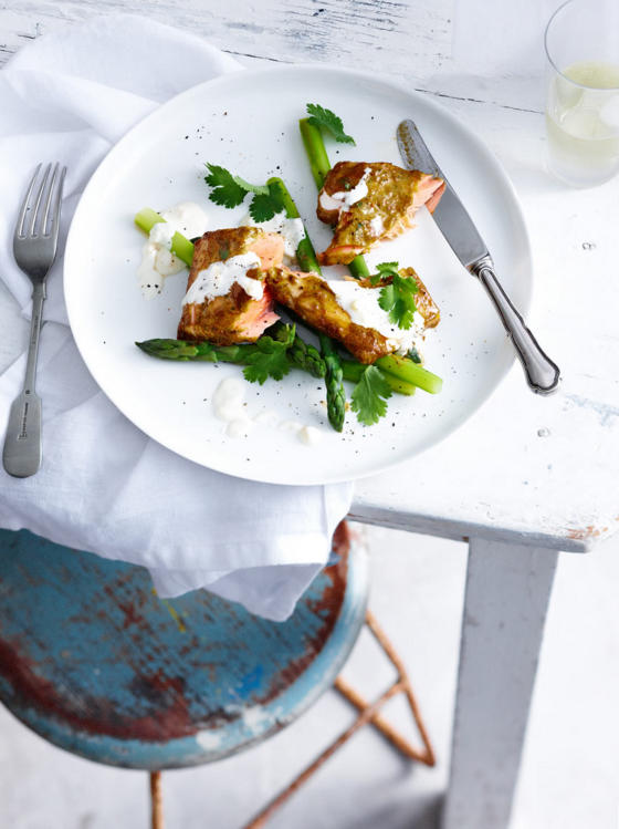
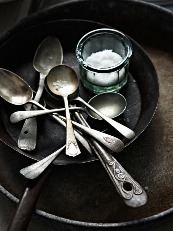
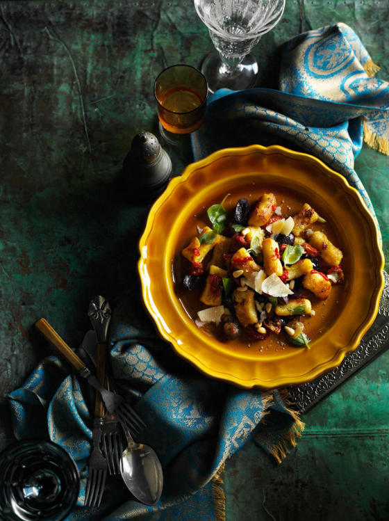
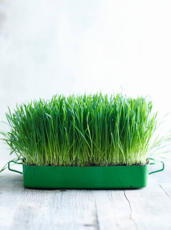
Posted on Tue, 23 Oct 2012 by midcenturyjo
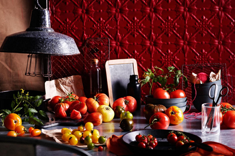
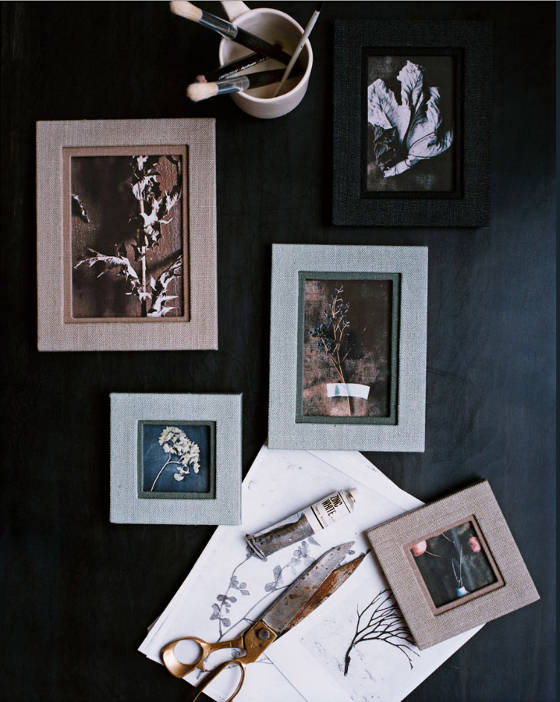
… they are so beautiful. Inspiration today comes from the stellar portfolio of food and lifestyle photographer Brett Stevens. OMG! The colour, the pure saturated colour and don’t get me started on the lighting, the composition, the angles. It’s official. I have a new photographer crush and these shots are of… food vignettes. Beating heart, short of breath, slightly feverish and not a wide angle room shot in sight. Can a table full of tomatoes be sexy? Can a bowl of cake mix make me weak at the knees? Can I smear that blue all over my body like a woad warrior? Dreaming of colours and textures, mixing and marrying for new room inspirations. Beauty is everywhere and today it is here captured through the lens of Brett Stevens.
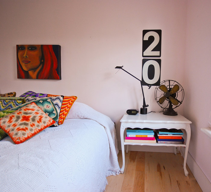
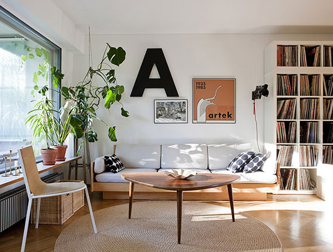
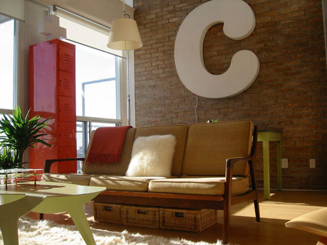
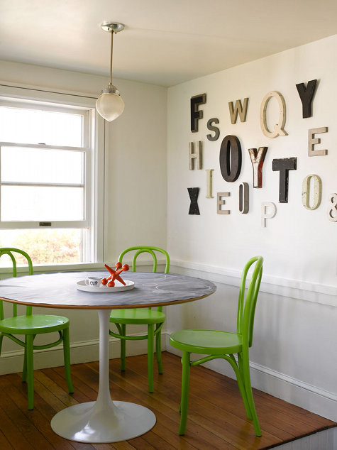
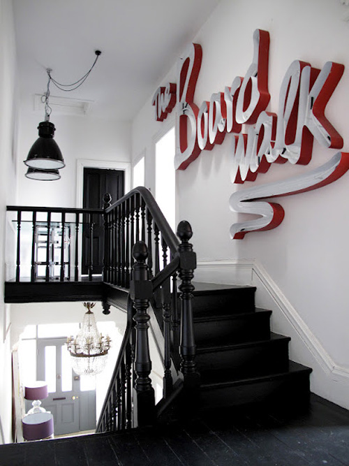
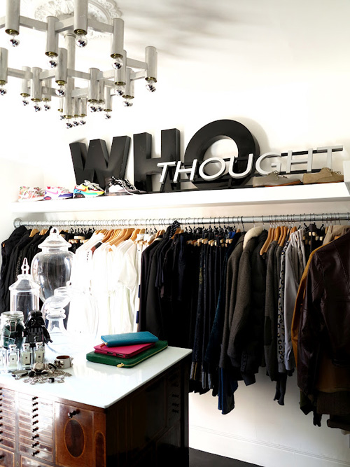
Big, bold lettering
Posted on Fri, 5 Oct 2012 by KiM
Every now and then I mention my love for graphic elements in a space. Large letters (or numbers) is one such method of adding something bold and graphic to a room. Whether they be vintage from a marquee or new cut from wood I think it’s a decor element that is fun and in your face. I’ve got some vintage gas station numbers I found on Etsy that I used in my bedroom (photo below) but I’d love something much bigger eventually. So here are some examples…
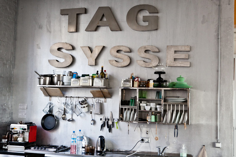
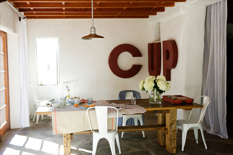
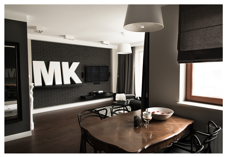
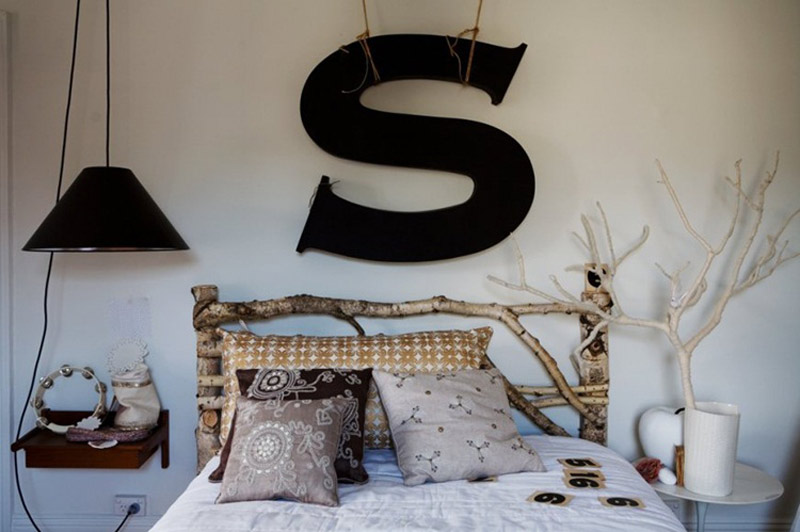
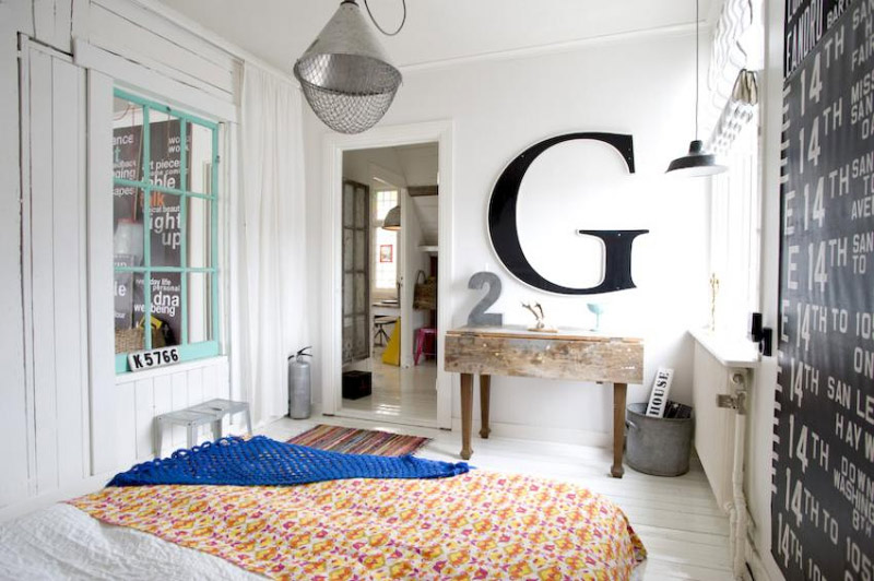
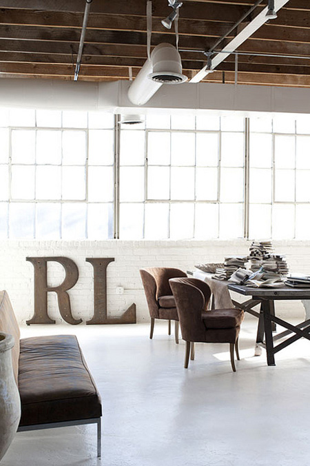
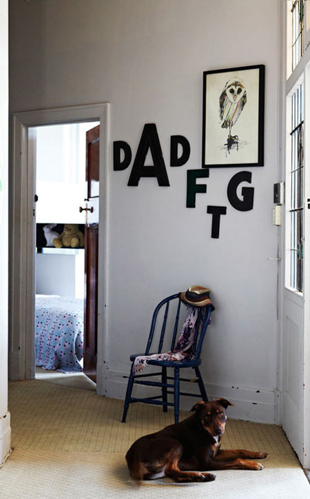
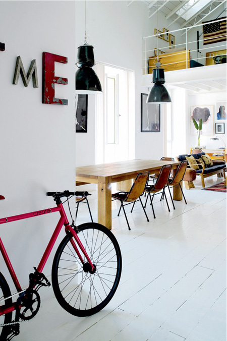
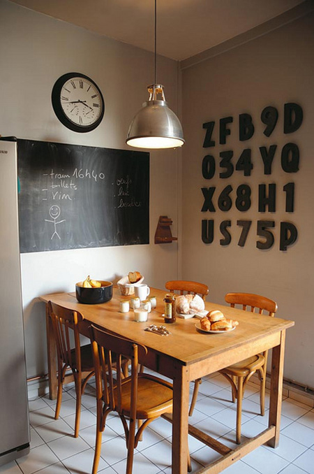
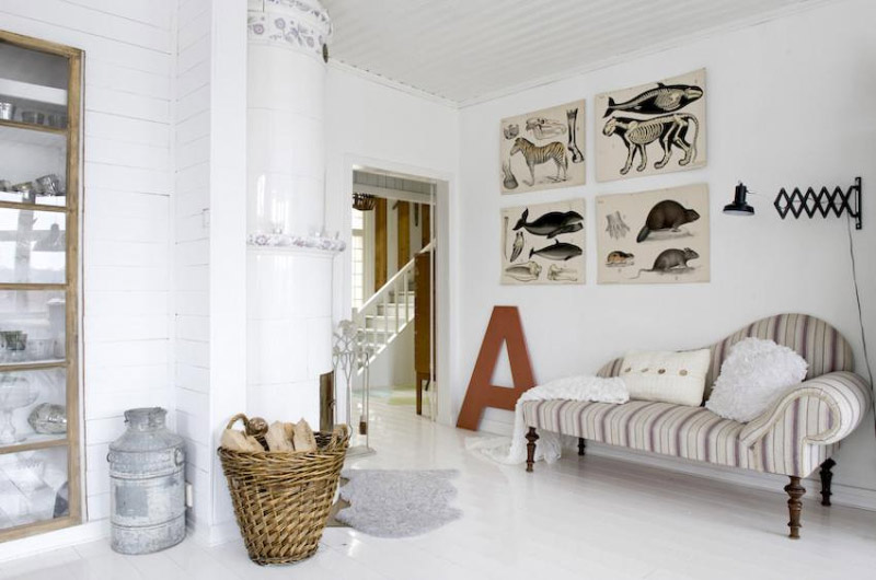
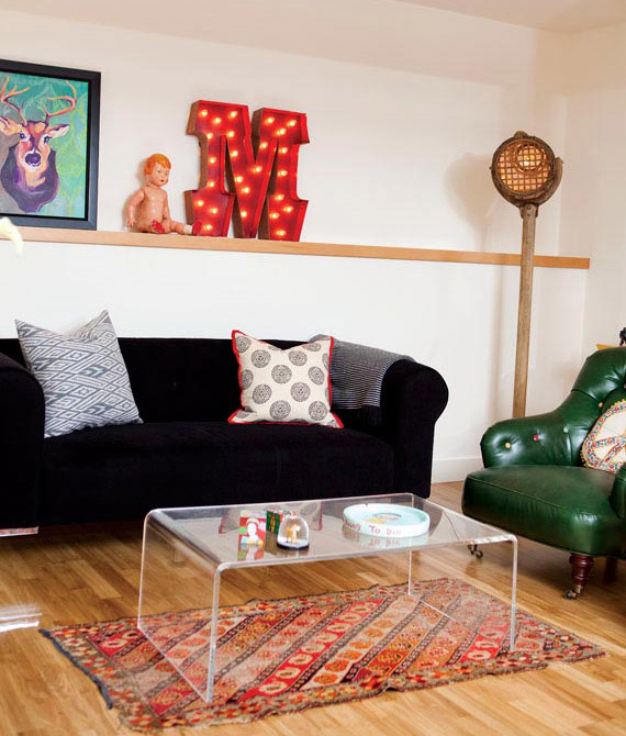
And always a favourite of mine, from 47 Park Avenue…
James Baigrie
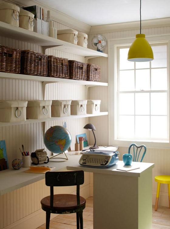
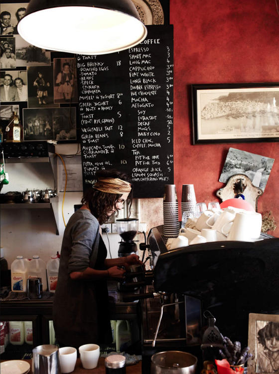
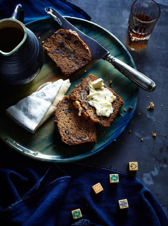
Posted on Wed, 3 Oct 2012 by KiM

Thought I’d stimulate the sense with some eye-catching interior photography once again, this time with a taste of the portfolio of California-based photographer James Baigrie.