Displaying posts from August, 2010
Reader request – long narrow hallway
Posted on Fri, 6 Aug 2010 by KiM
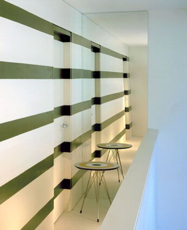
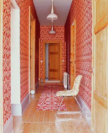
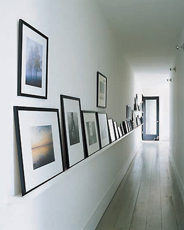
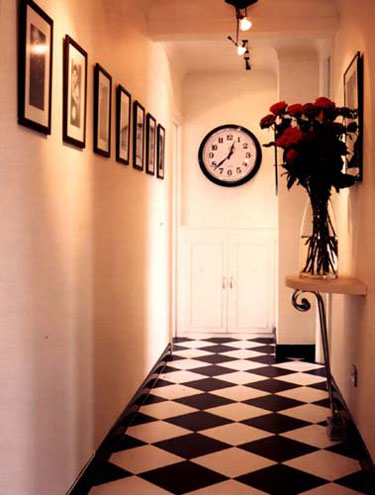
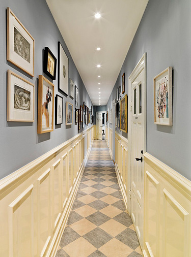
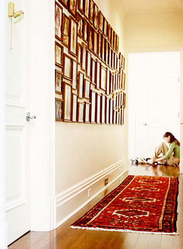
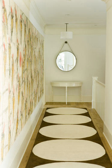
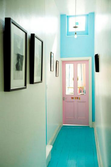
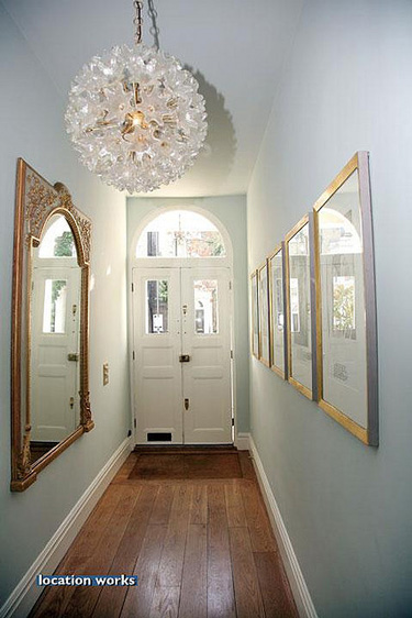
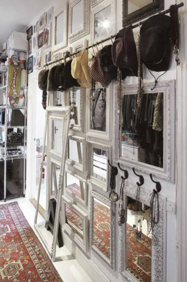
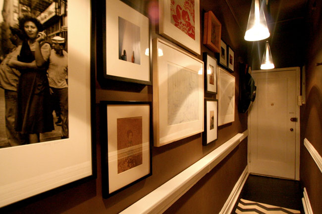
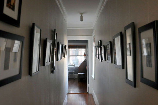
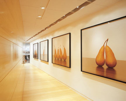
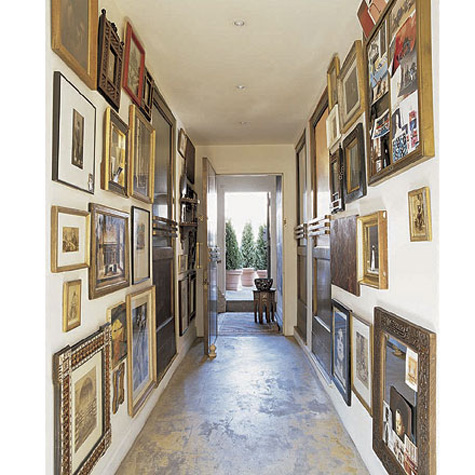
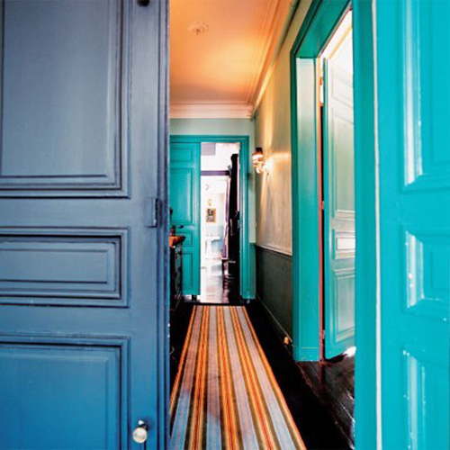
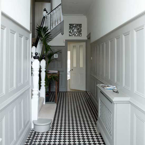
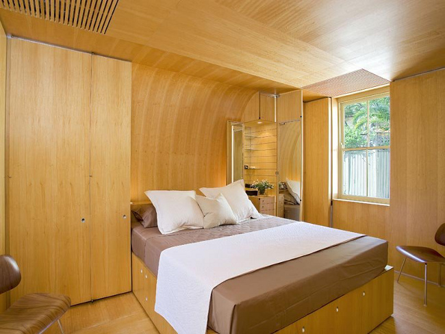
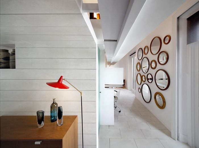
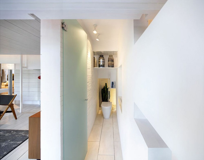
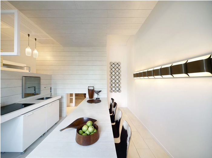
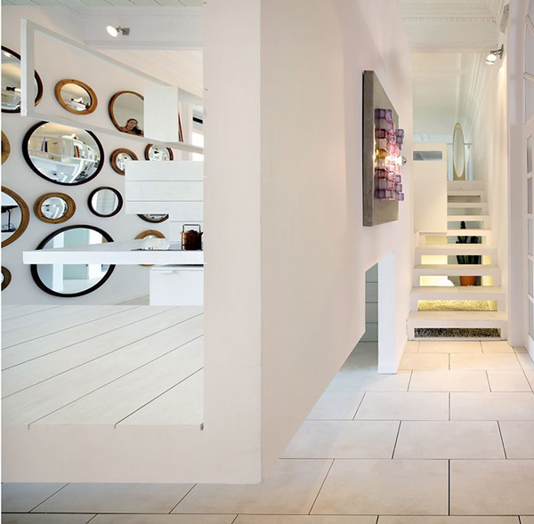
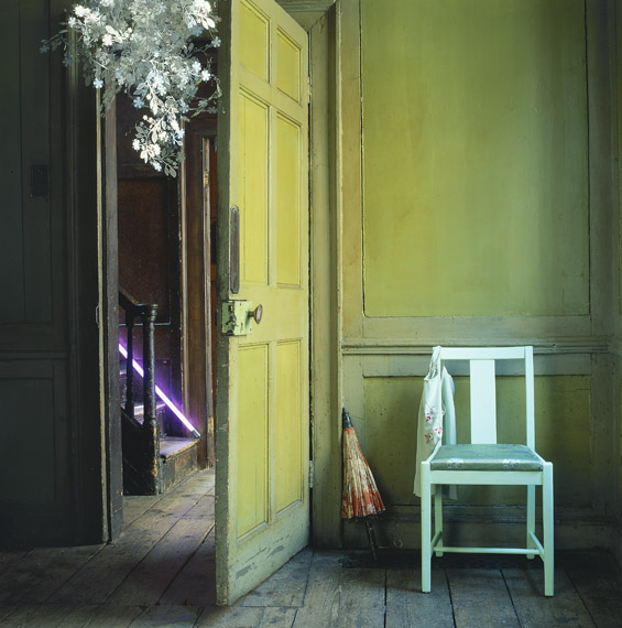
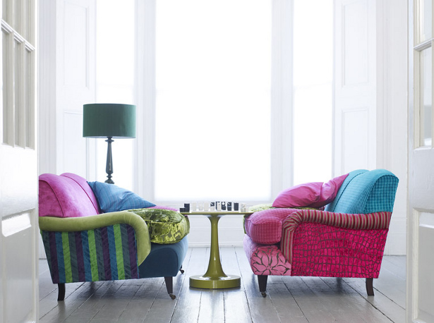
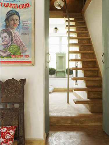
It’s reader request time, and this one comes from Sarah. “I love your site, and wanted to write in with a design problem I’m facing in an NYC apartment into which I’m about to move. The apartment’s front door opens into a very long, very narrow hallway with no room for furniture and no windows. Do you have any wall decoration recommendations to create a cool entrance effect?” Here are some inspirational photos for you Sarah. Now, some are not THAT narrow and have room for a bit of furniture but I found how the spaces were designed very intriguing (ie. the Domino mag photo after the jump).
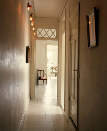
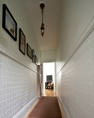
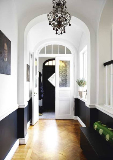
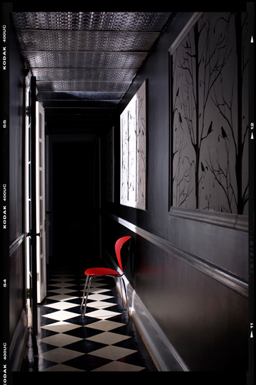
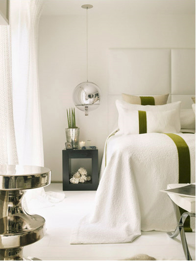
 Apartment Therapy
 Apartment Therapy
 Callas Architects
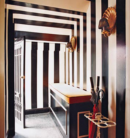 Domino
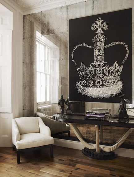
 Elle Decor
 Marie Claire Maison
 Living Etc.
Coffee cake and stalking
Posted on Fri, 6 Aug 2010 by midcenturyjo
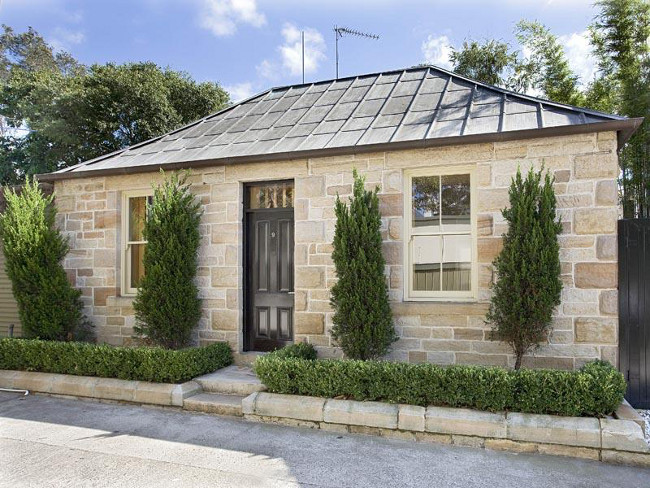
I had every intention of featuring a fabulous interior designer or a cool photographer today but I’ve been a bad girl and lingered too long over lattés and coffee cake with two blogger friends today. I’ve just rushed in the door and all I want to do is put my feet up and relax. It’s exhausting chatting for hours and hours. So a stalking post it is today! No need to write wonderful prose about this and that. Just wack up the pictures and say “wow”. Talk about not what you expected from the facade! The link to this Woollahra is here while it lasts.
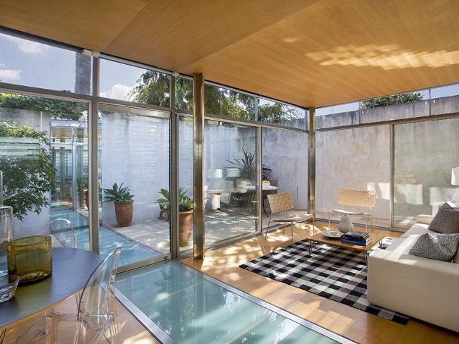
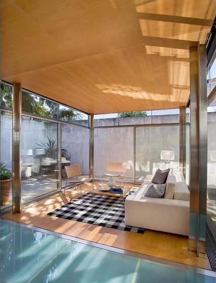
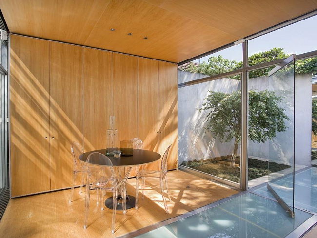
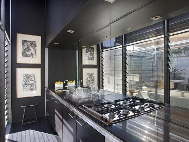
Can I live here PUHLEASE?!?!
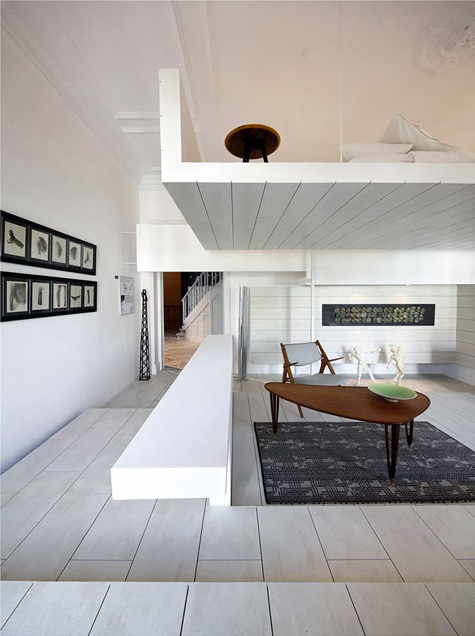
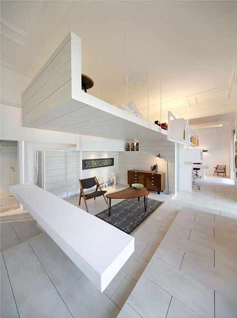
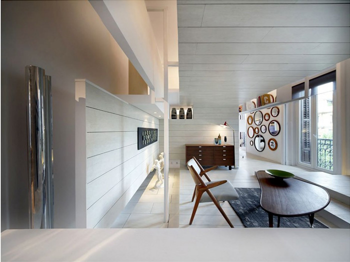
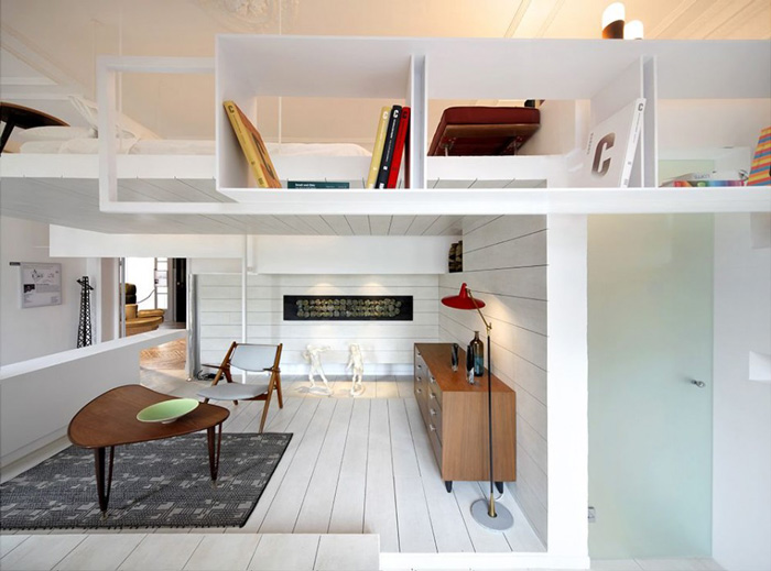
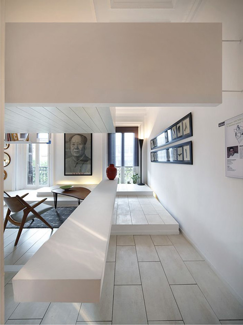
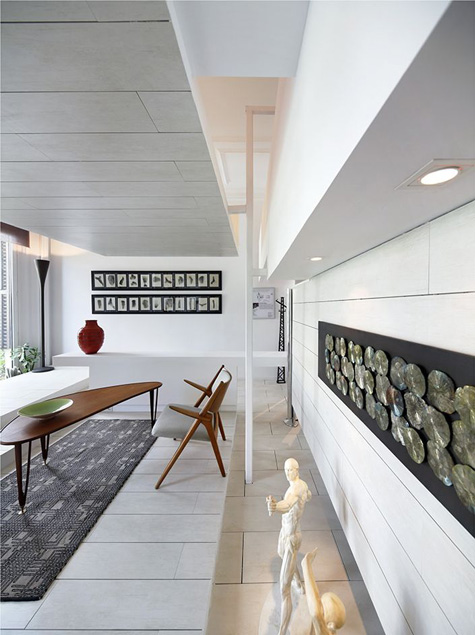
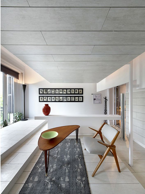
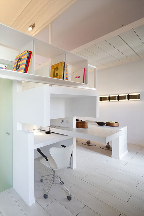
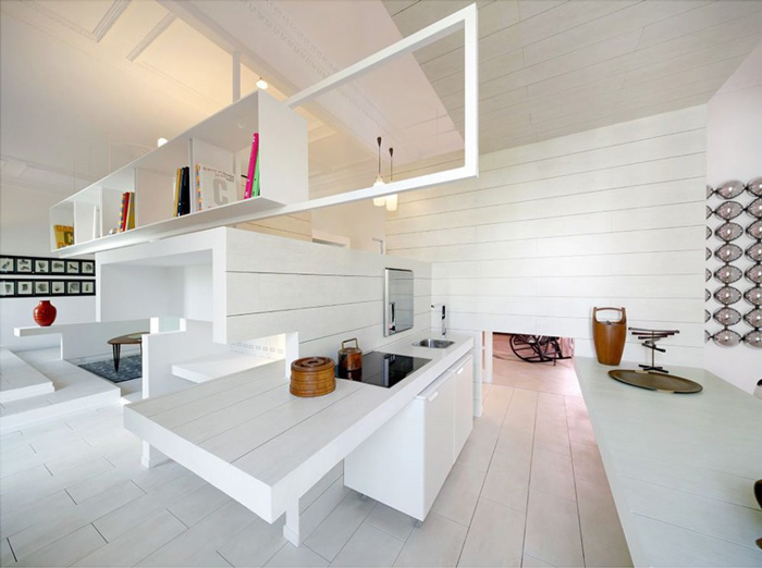
Posted on Thu, 5 Aug 2010 by KiM
I found this home on Contemporist and had to re-post it here because I am completely in awe of the architecture. It’s mind-blowingly AWESOME. And inspiring because Jeff and I are in the process of researching architects for the work we want to do to my ok OUR home and I would love to something even one iota as creative as this. The space was created by Spanish architect Héctor Ruiz-Velázquez and is the attic space of an early 20th century building in Madrid. It’s composed of several different levels and angles yet it’s continuous which makes the space appear much larger than it is (it being all white helps too)….and frankly, WAY more interesting. It’s just plain NEAT-O.

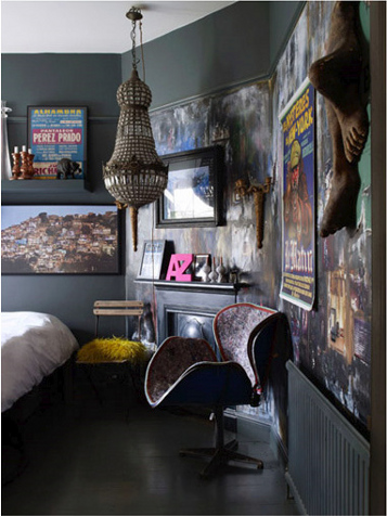
Mel Yates
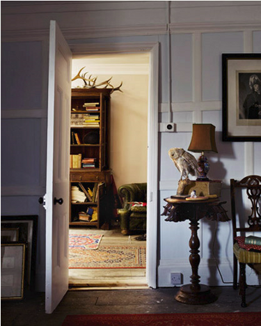
Posted on Thu, 5 Aug 2010 by midcenturyjo
How about a power house of photography today? How about a guy that consistently snaps fabulous hard core room porn pics that are guaranteed to feed our addiction? I can’t believe we haven’t featured Mel Yates before. You’ll know his work. Think Abigail Ahern, Kelly Hoppen and Graham & Brown, editorial work for House & Garden, Living Etc and Elle Decoration. It’s a passion and it shows!


Reader’s home
Posted on Wed, 4 Aug 2010 by KiM
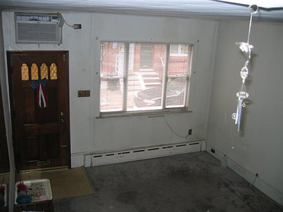
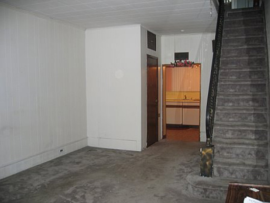
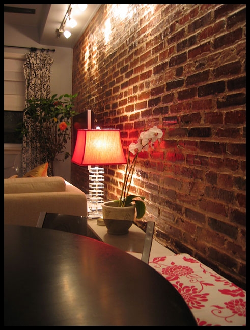
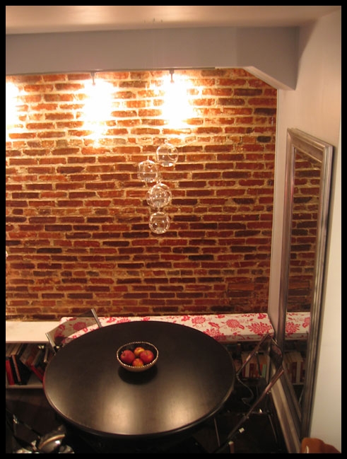
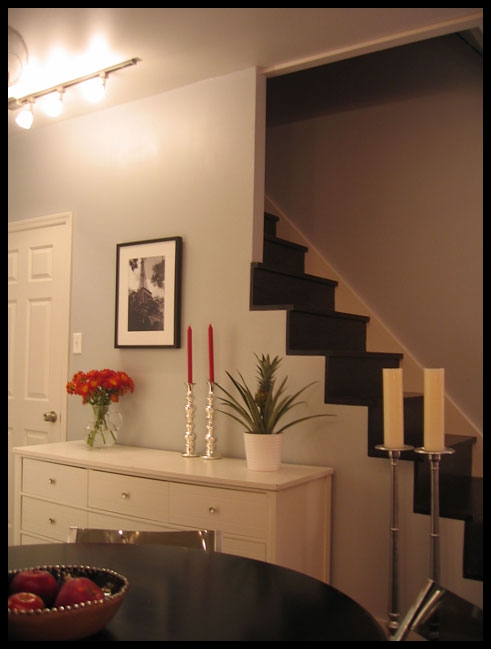
I am pleased to present a fabulous renovation of a reader’s home today. This one I can relate to. Interior designer Sary‘s home looks about as narrow as mine (12’) which is quite a design challenge. Here is a bit of history of her home: “It’s a typical brick Philadelphia rowhouse built in the early 1900’s. The previous owner was an elderly woman that had been living there for over 60 years and probably hadn’t renovated it in about 50. It was filled with paneling, peeling wallpaper, drop ceilings, dirty carpets…” The result was basically a gut job by Sary and her family turning this into a spectacular makeover that is SO inspiring. First let’s look at a couple of before photos of her living/dining space that was dark, dingy and just plain NASTY.
Sary essentially redid every surface – the walls, ceilings and floors. Track lighting was installed, a brick wall exposed, the railing removed on the stairs, the stairs redone with wood treads….
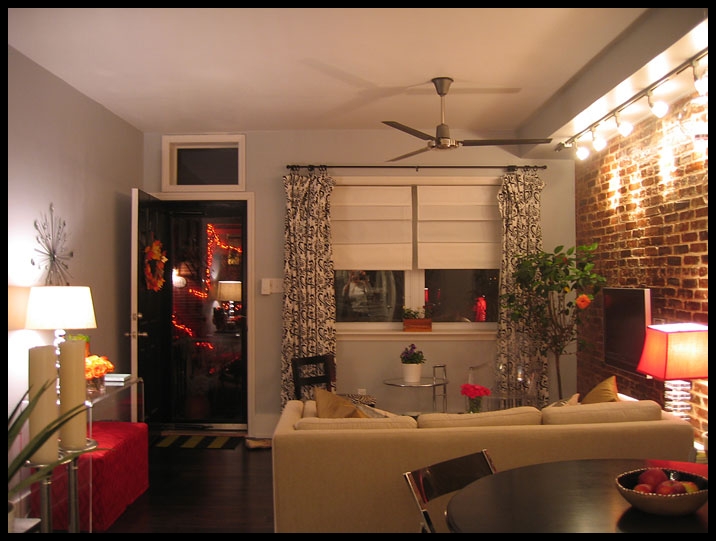
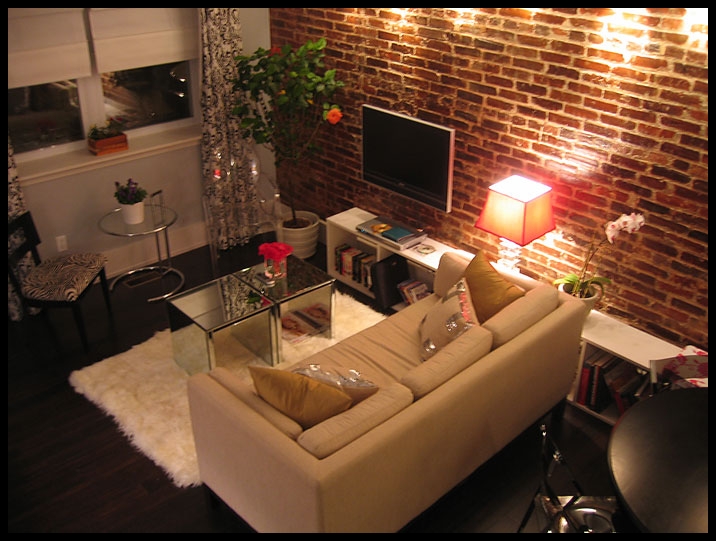
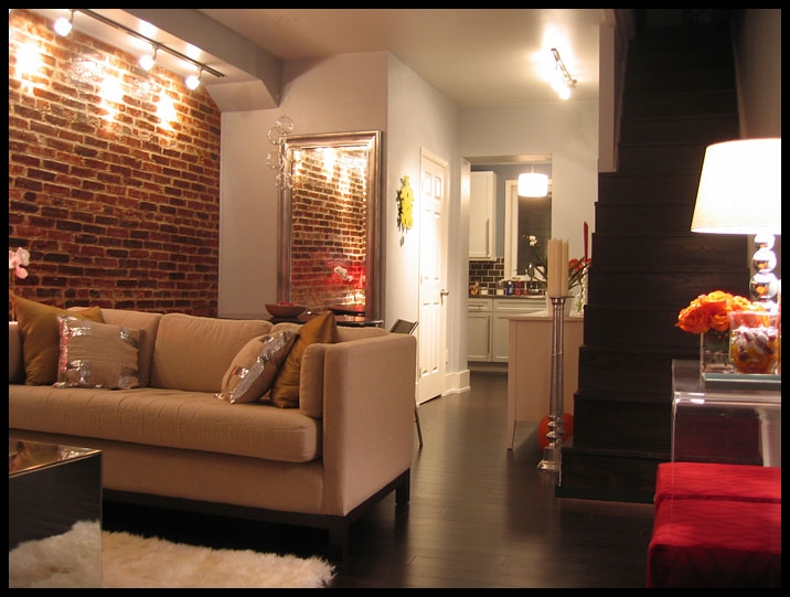
I loooove the bench/tv stand/book storage unit Sary and her father built (in an afternoon with just a nail gun, using wood she had pre-cut at Lowes) that extends from the living room into the dining space. Talk about multi-functional which is so necessary in a small space.
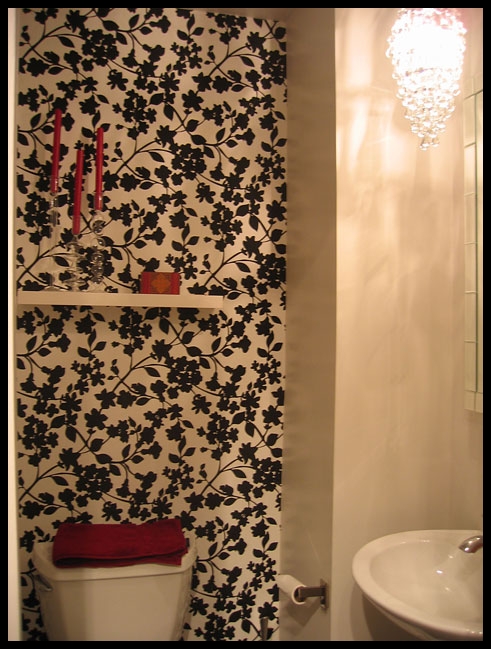
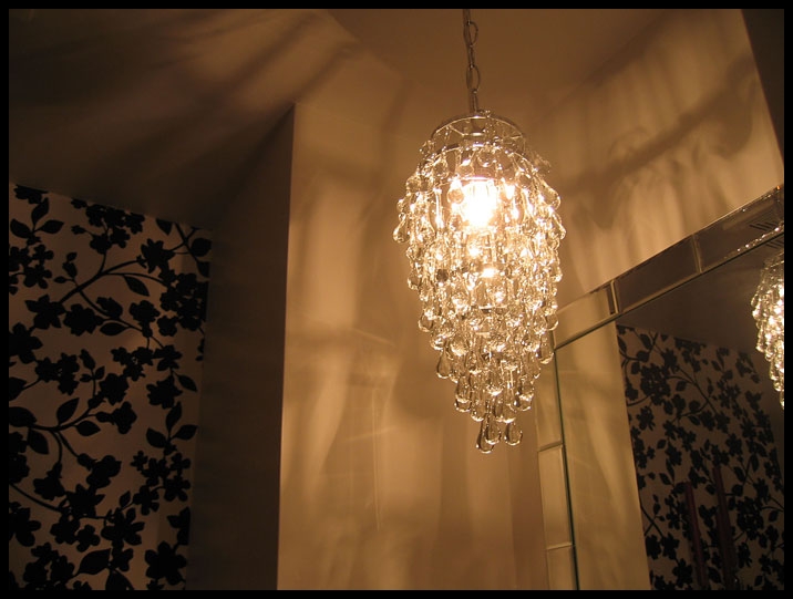
Next, a couple photos from the powder room located just behind the dining room.
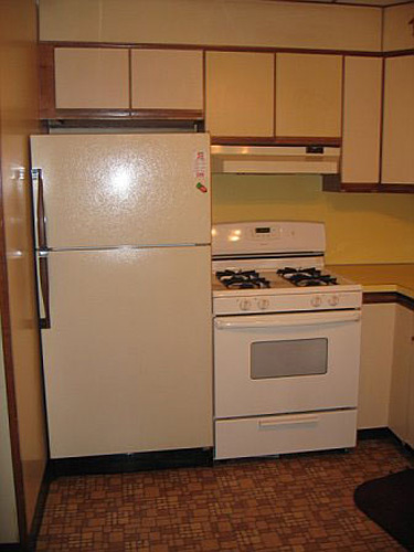
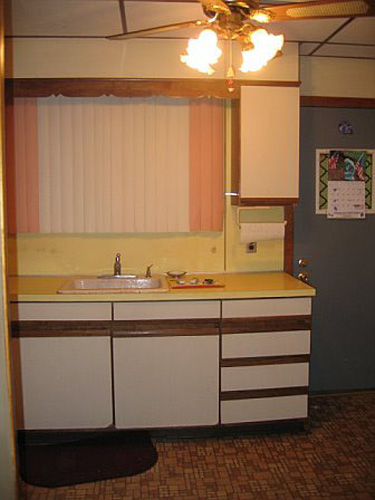
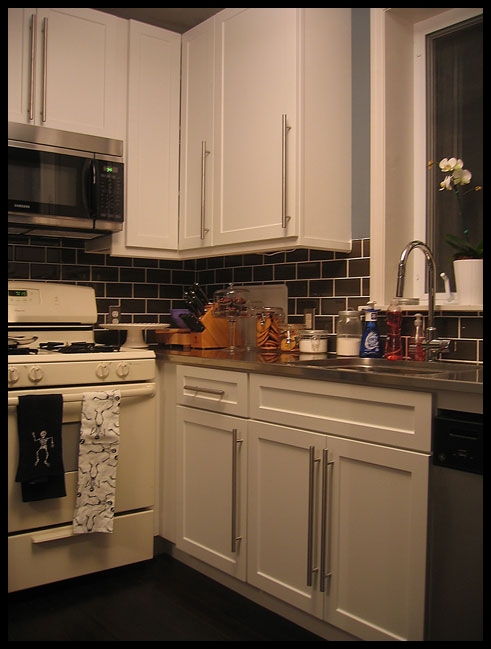
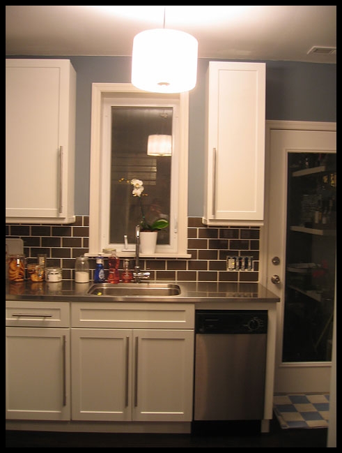
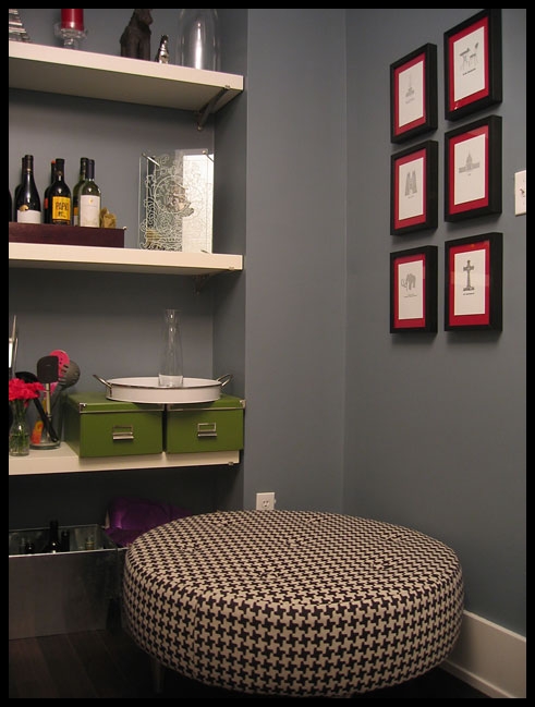
And lastly the kitchen, which had a drop ceiling (that was removed), awful cabinets, countertop and flooring (all replaced). The window was replaced with a larger one and the door with one that is mostly glass. I’m loving the little nook she created with an ottoman opposite the back door. Great for friends to chill out on while she’s cooking. 🙂
CONGRATS Sary! You should be very proud of the incredible job you’ve done. It shows everyone that you can make any house a home with a little creativity and ALOT of hard work.

