Displaying posts from August, 2012
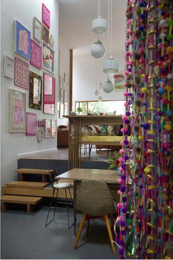
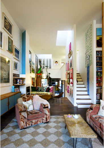
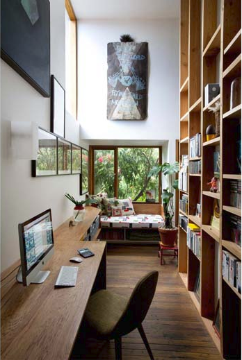
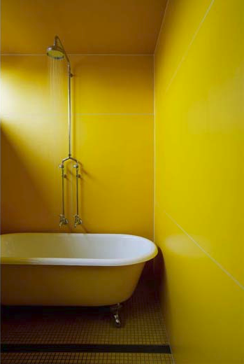
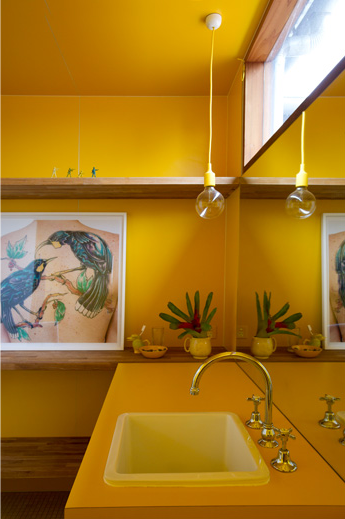
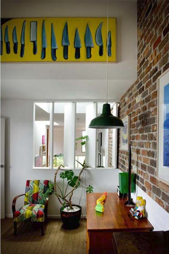
Two houses are one
Posted on Mon, 6 Aug 2012 by midcenturyjo
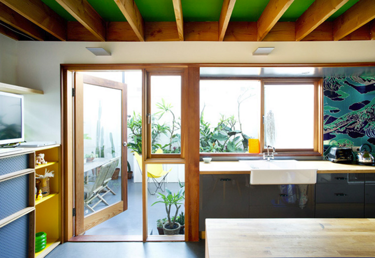
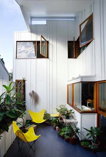
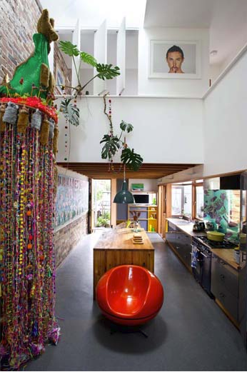
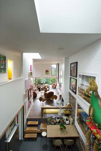
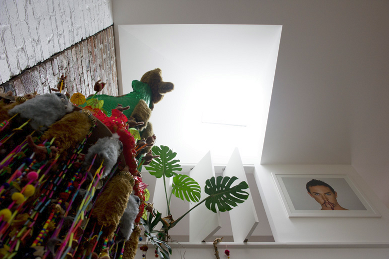
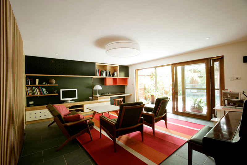
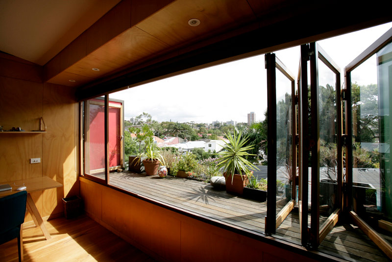
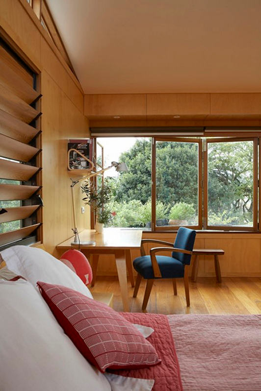
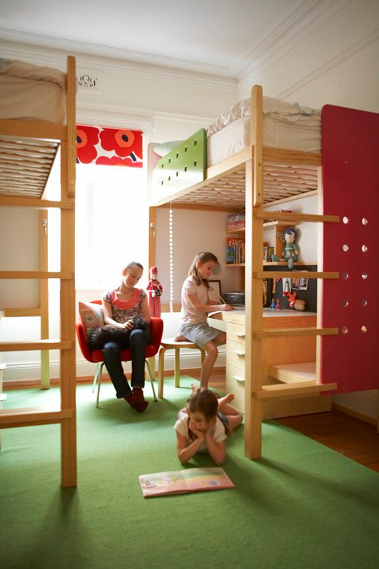
Designed by David Boyle Architect two semi detached houses designed to different plans and sitting on an inner city block provide the perfect home for the owners and a second property to rent or sell to finance the project. Sounds simple and clever. Equally simple and clever is the design solution reached by the DBA practice. A great example of small scale urban consolidation but more importantly a wonderful starting point for the expression of the owner’s own aesthetic. Interlocking positive and negative spaces, layering of building materials to provide texture and interest, passive environmental design and salvaged and recycled materials. It’s practical, clever and quirky.
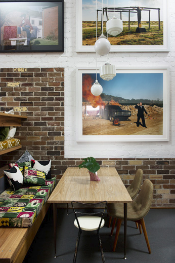
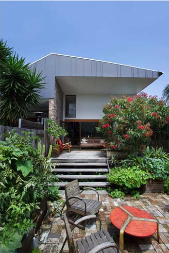
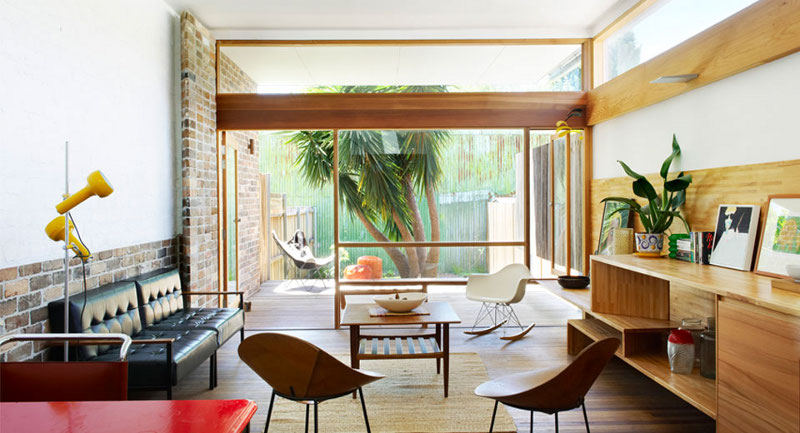
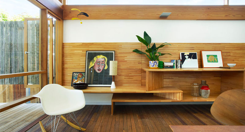

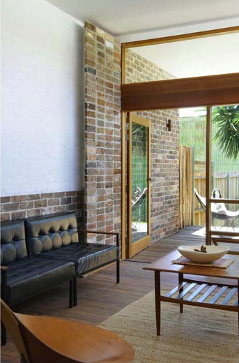
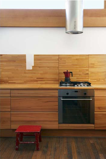
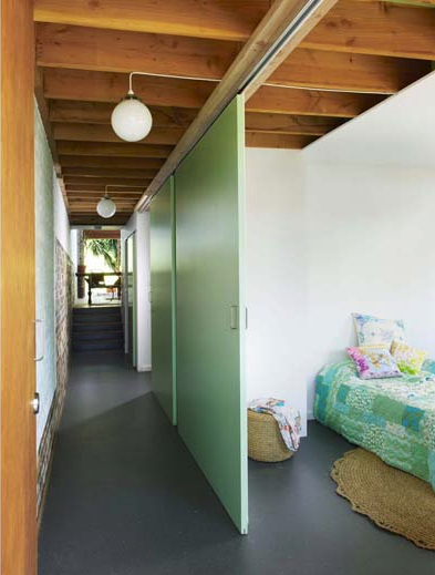
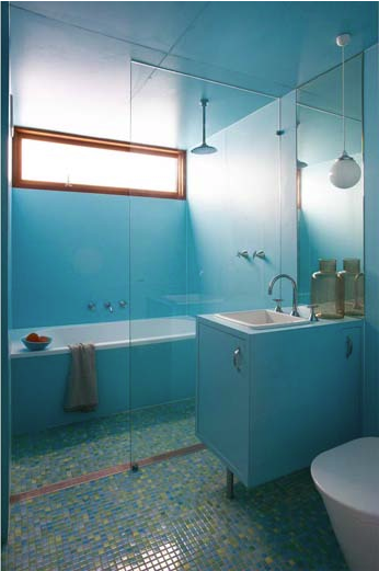
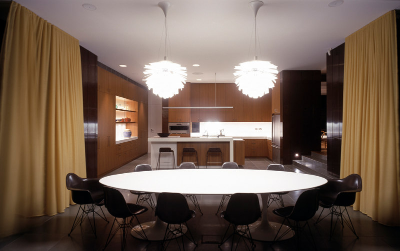
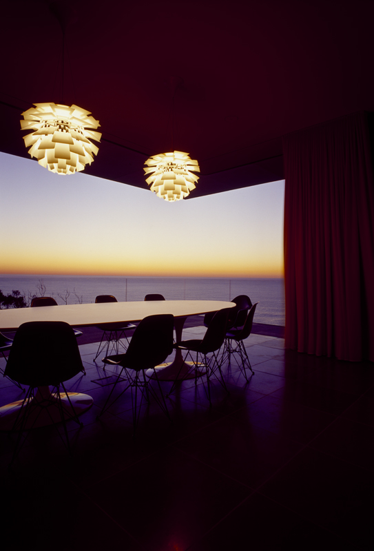
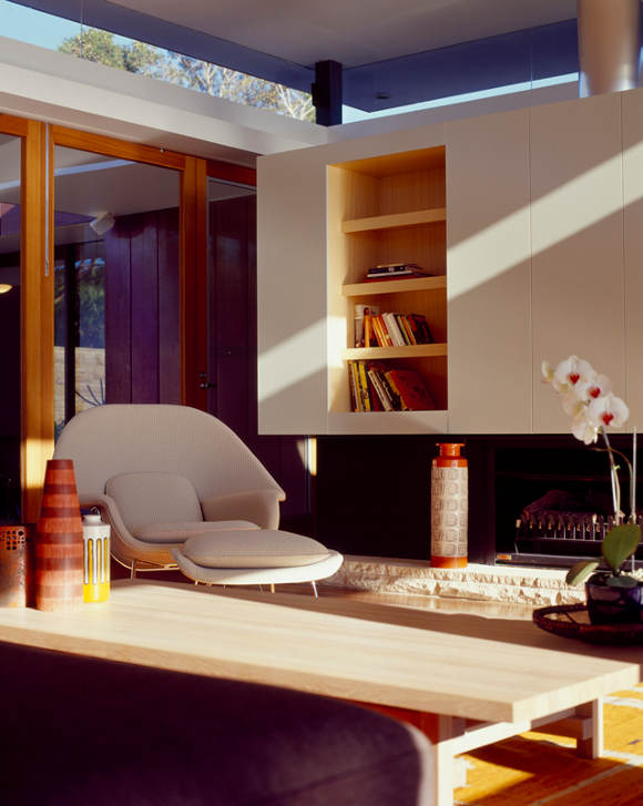
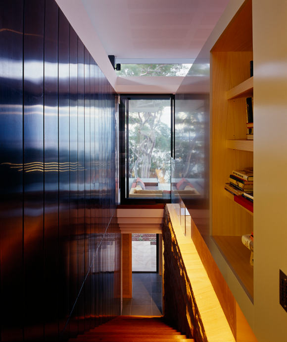
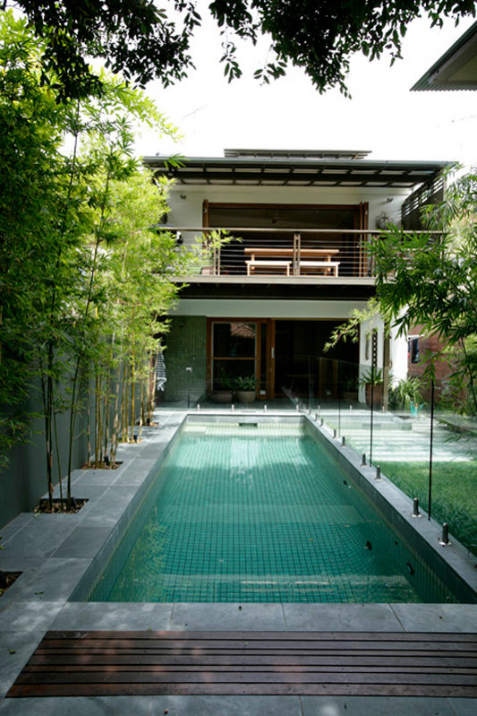
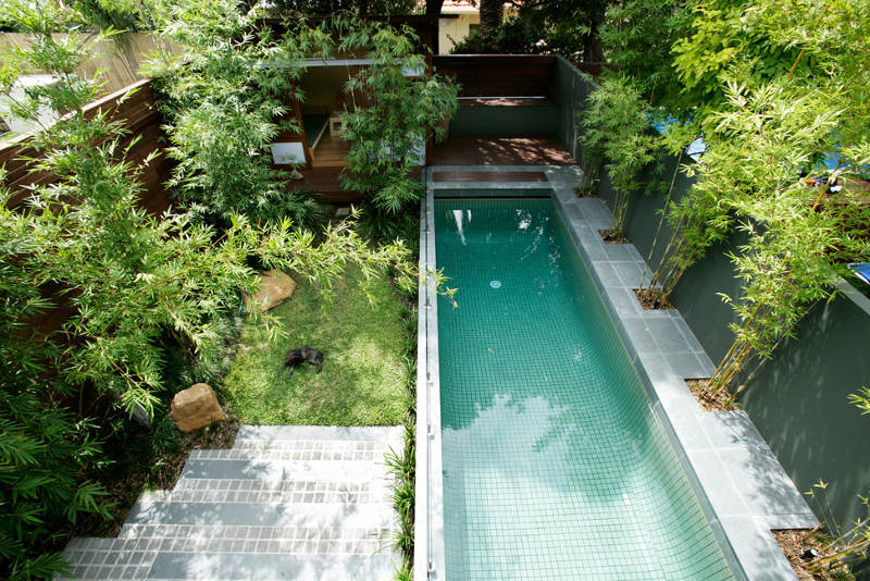
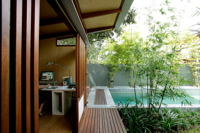
Design King
Posted on Mon, 6 Aug 2012 by midcenturyjo
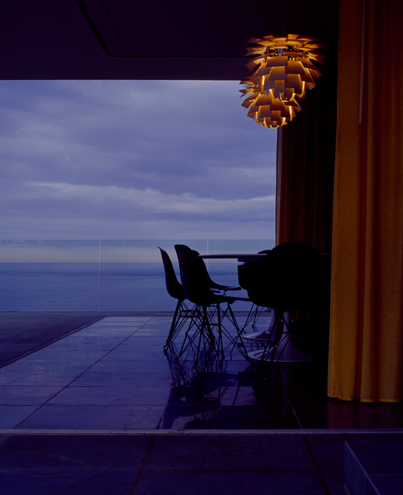
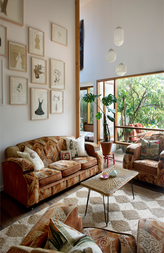
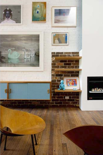
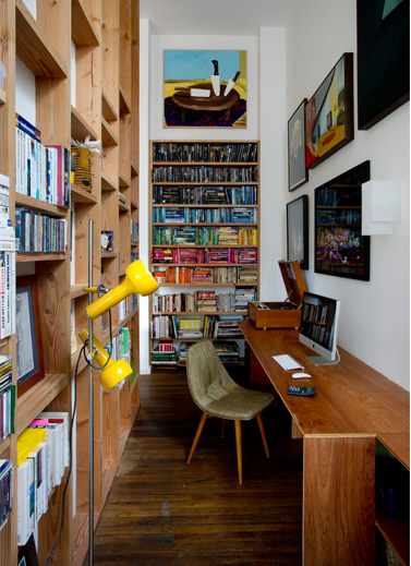
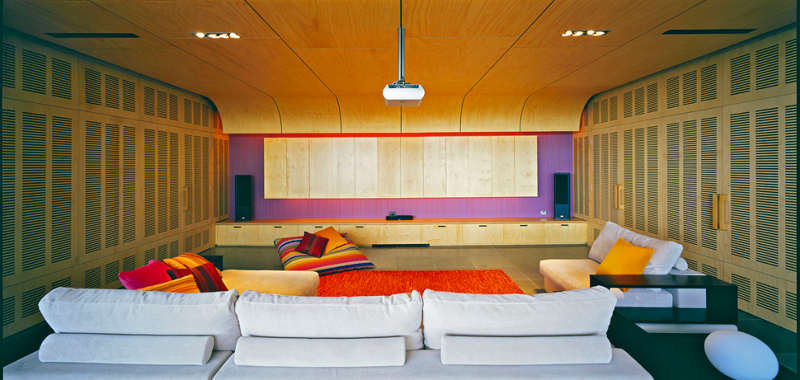
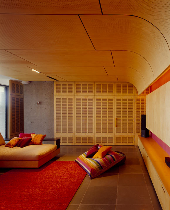
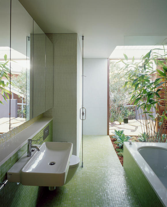
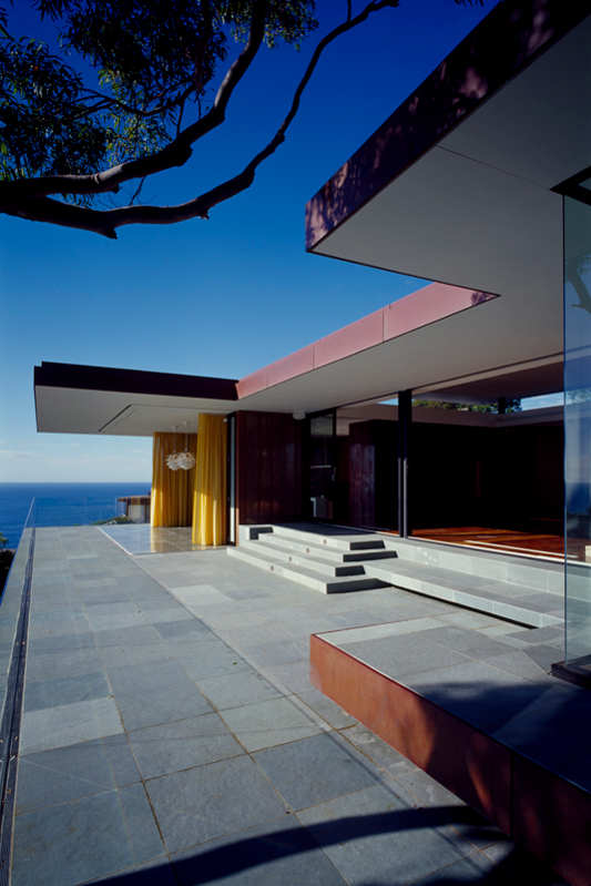
Beautifully designed and crafted houses. It seems obvious what an architect strives to achieve. Homes that seamlessly fit their site and their owner’s needs. Two homes today from Jon King of Design King Company. Timeless and clever, practical and specific with a wonderful sense of place. A celebration of the external and a revelling in the internal and private. The first home at Palm Beach has a sense of drama, almost a stage presence. The second, a family home at Coogee turns inwards and provides a sanctuary, a private wonderland for those who live within.
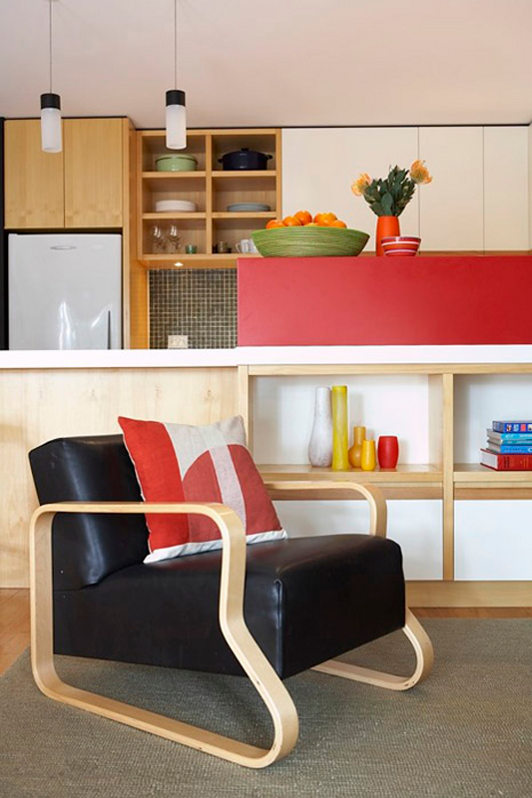
Pam’s retro office remodel
Posted on Sun, 5 Aug 2012 by KiM
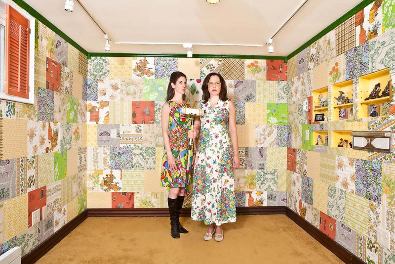
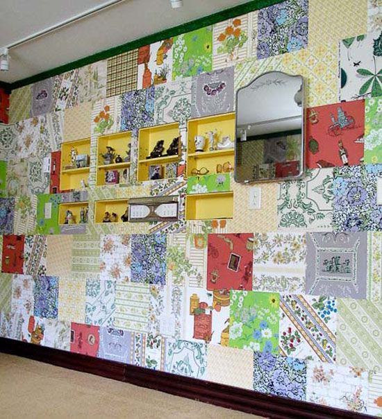
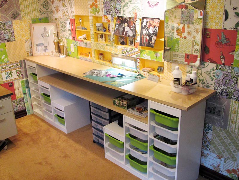
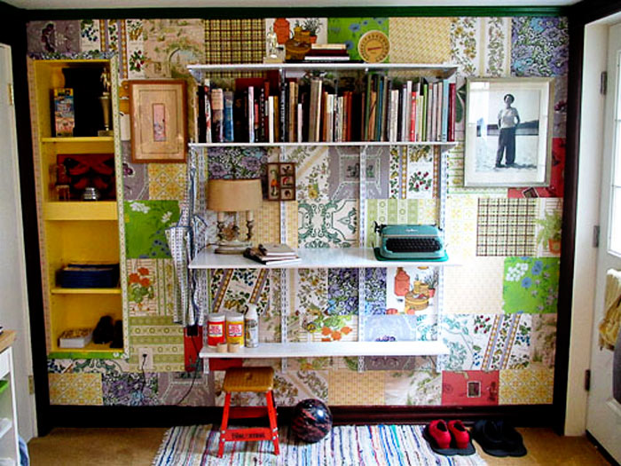
Remember this post from last week of an office with wallpaper samples on the wall? Well, Pam of RetroRenovation.com thought our readers might like to see what she did with her office as it has the same “patchwork” going on on the walls. Her new office is SO FUN, and she has in fact inspired me to do something with all of the vintage wrapping paper I have stashed away that I bought on Etsy a couple years ago. I’m thinking of cutting it into pieces and gluing it to the island in my dressing room. 🙂 ANYHOO, she sent along some photos and info on her office remodel. Check it out:
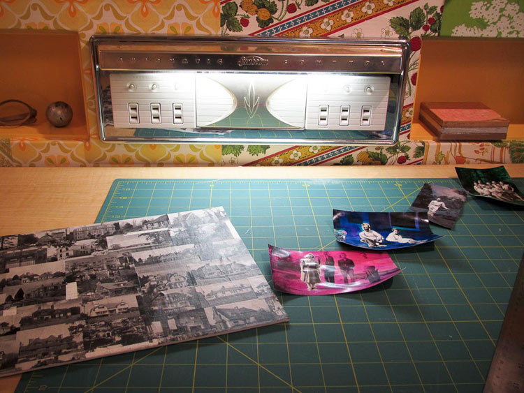
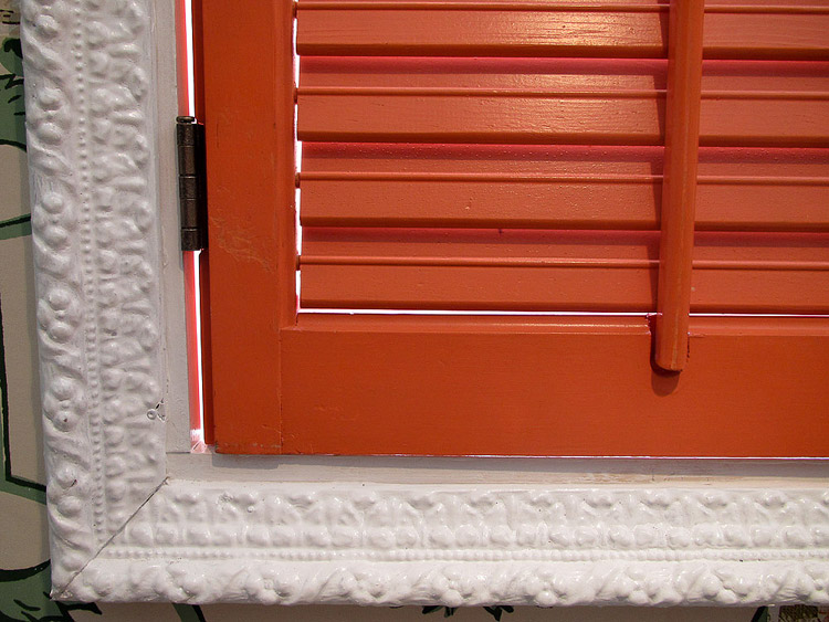
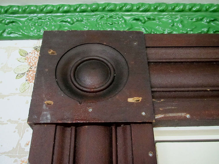
I needed to renovate my office principally to add more insulation — it’s in the basement. I am a fulltime blogger now — and the time had come to make this space truly comfy cozy and my own. I also wanted to add crafting space — I love to collage. And, I had a hoard of vintage wallpaper — from the 1920s through the 1970s — I’d collected over the years — often, in onesy-twosey rolls that were not enough to paper a room. Also, I am just more color crazy than EVER and wanted to create a space that appealed to me just me I don’t care what anyone else thinks! Put these all together and you get my crazy patchwork quilt office. I used nearly 300 12″ x 12″ squares — I cut each and every one. My friend Denise (pictured me in the American Gothic photo) helped me put it up. She is a decorative painter and has a great eye. While it might look “insane” at first glance, there really is a rhyme and reason to the papers chosen. (cough cough I have more). The principal field is sort of acid yellow and acid green patterned with off white or soft white… and there are also softer yellows, greens and oranges, also in patterns with soft white. From there, we added complements… “pops”… of purple, rusty red, and that very strong, more solid lime green. The crafting space is Ikea Trofast children’s storage with Herman Miller! Countertops found at the Re-Store. I had recessed storage built into the wall above my crafting area. The trim also comes from the Re-Store. I kept the wood as-is: Not Perfect is the New Perfect. The foofy white trim around the shuttered window (orange shutters were my mother-in-law’s) I painted glossy white. Ceiling trim (also from Re-Store) is a grass green. I added a pretty mirrored medicine cabinet. Because I could. Track lights around edge. Vintage wagon wheel light in center. Oh, and I sent you a shot of my vintage Sunbeam Appliance Center, which I installed for fun but also for a little bit of light on the countertop.
Sneak peek – Freedom’s summer collection
Posted on Sun, 5 Aug 2012 by midcenturyjo
From my insider at Freedom a little preview of what’s in store from Tuesday 7th August. Summer brights, a range with a coastal vibe and the new Woodlands story. Can’t wait to see more.
Vegas Market – part 2
Posted on Fri, 3 Aug 2012 by KiM
I showed you the Four Hands showroom earlier, but there were so many other showrooms that caught my eye as well. While partaking in the Traditional Home treasure hunt, I managed to snap some photos of pieces that pretty much distracted me from the tasks at hand.
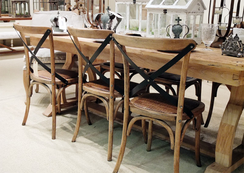
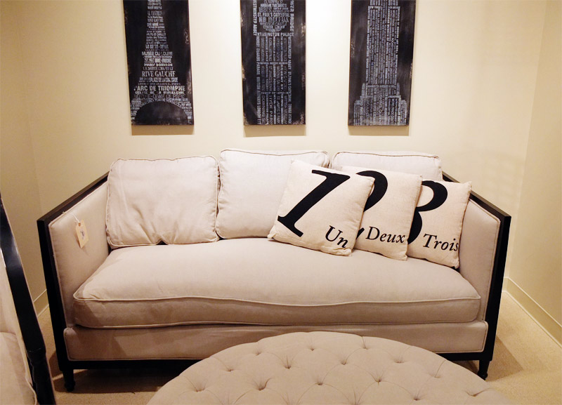
Another of my favourite showrooms was Lulu & Co. I love French furnishings – the rustic vibe, classic and understated. These guys do it VERY well.
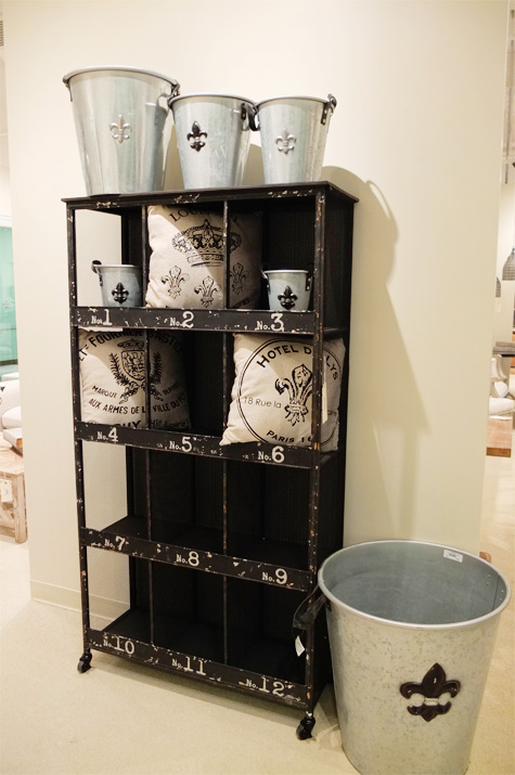
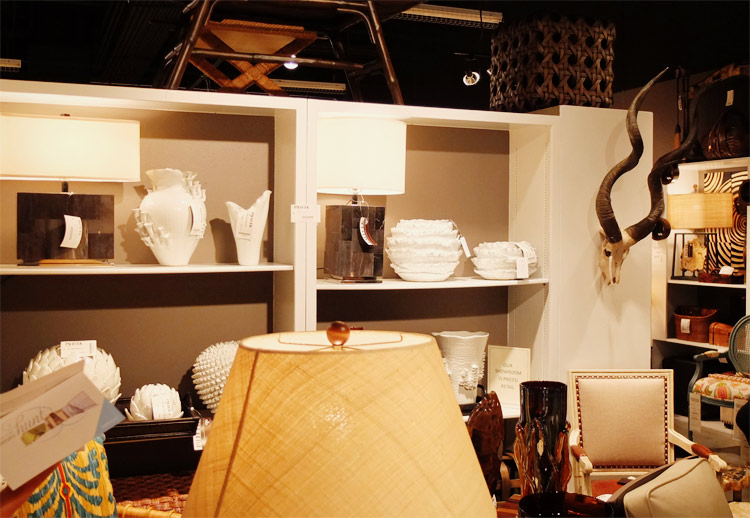
Palecek was also in my top 3 showrooms. Every single piece was absolutely gorgeous and made of the most incredible materials. Unfortunately I didn’t end up snapping many photos there.
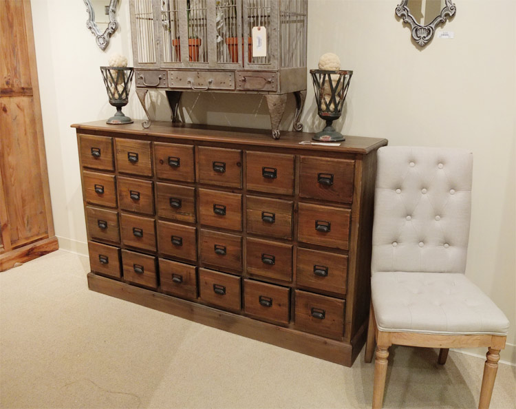
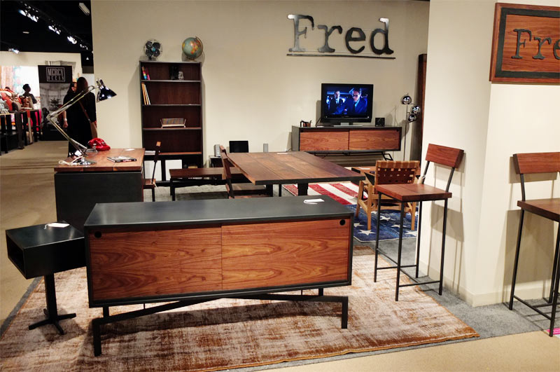
Loved the pieces by Fred. Wood and steel case goods with a mid-century modern vibe.
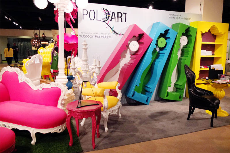
POLaRT – the craziest outdoor furniture I’ve ever seen. Go big or go home with this collection.
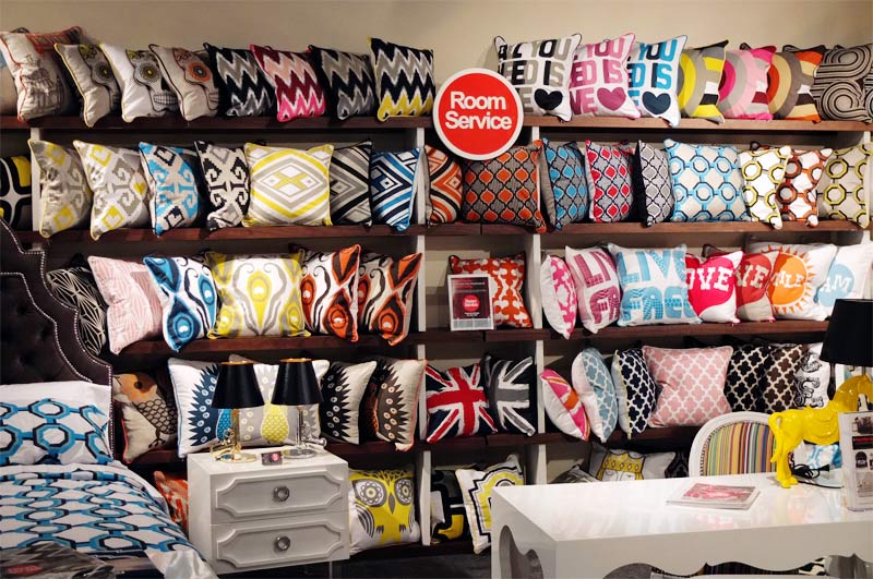
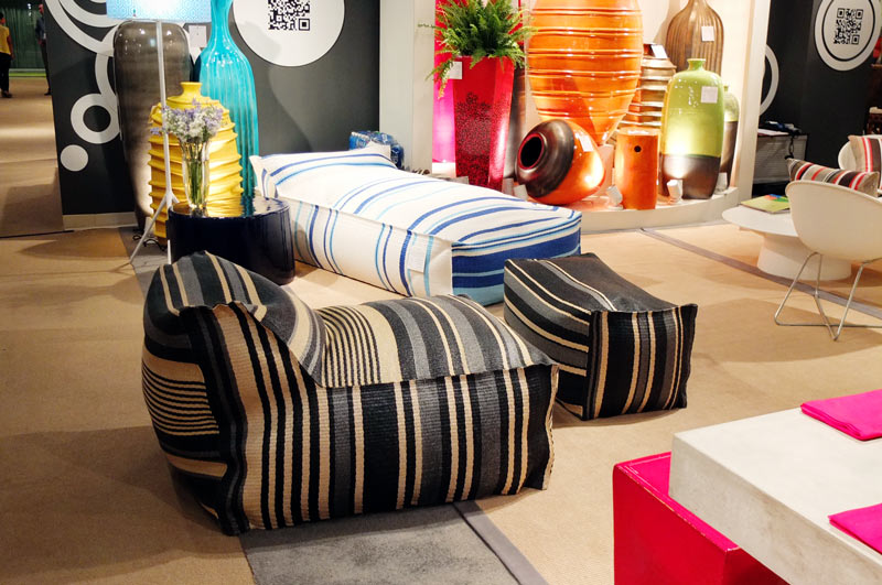
Room Service had such funthrow pillows in bold patterns and colours.
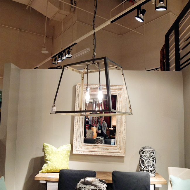
Classic Home had some beautiful light fixtures (not sure if they were part of their collection or not) and bedroom display.
Classy outdoor furniture by Robert Allen.
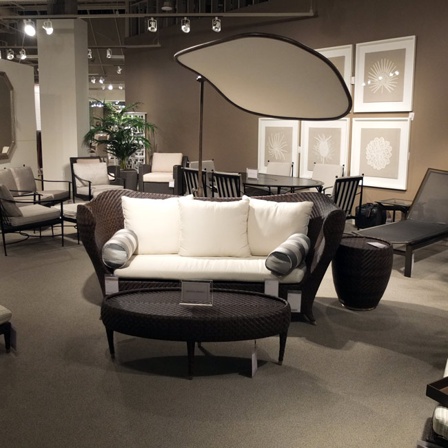
Now this is my type of outdoor furniture – loungey and casual. The Nest Collection by Seasonal Living.
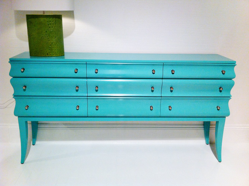
Lexington had some HOT pieces that were high gloss fabulous like this credenza and ornate Rococo-esque bed.

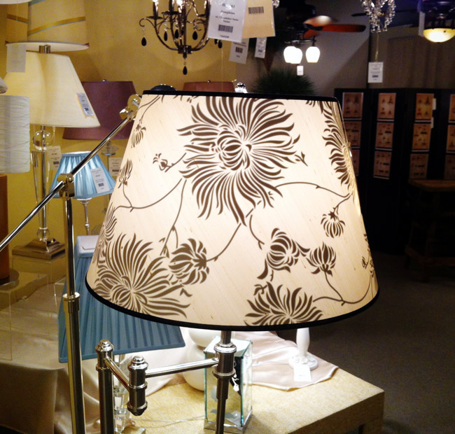
Loved this Laura Ashley lamp with a design on the inside of the lampshade. So pretty when turned on with a bright bulb.
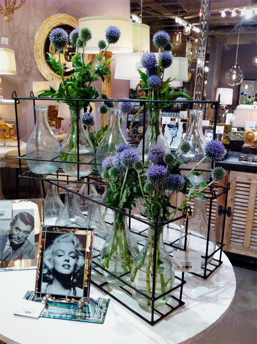
The Arteriors showroom was very inspiring but unforuntately I didn’t take many photos. However, this little vignette caught my eye. Such a pretty display of wild flowers.