Displaying posts from April, 2015
Happy Friday!
Posted on Fri, 10 Apr 2015 by KiM
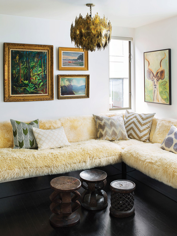
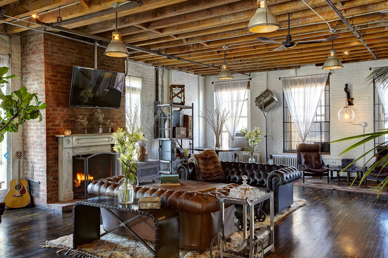
Happy Friday dear readers! I leave you with this photo, a fine piece of decor ass if I may say. Sexy black floors, sheepskin extravaganza (my cats would lose their minds) and a SWEET brutalist light fixture. Via C Home (photo by Douglas Friedman).
Contrast House
Posted on Fri, 10 Apr 2015 by KiM
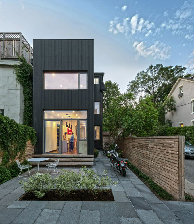
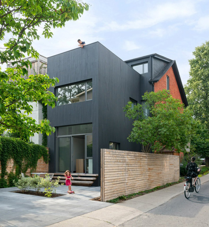
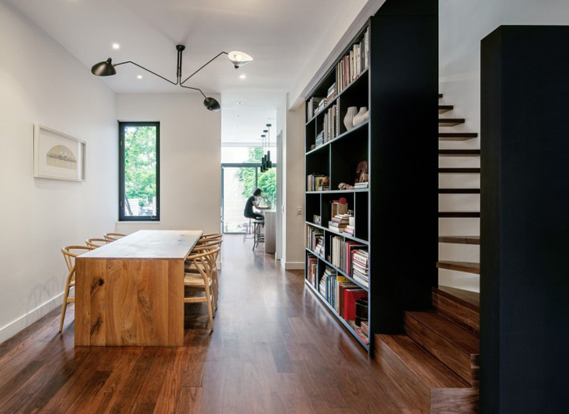
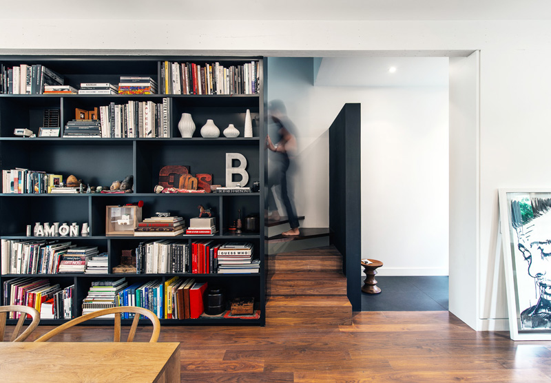
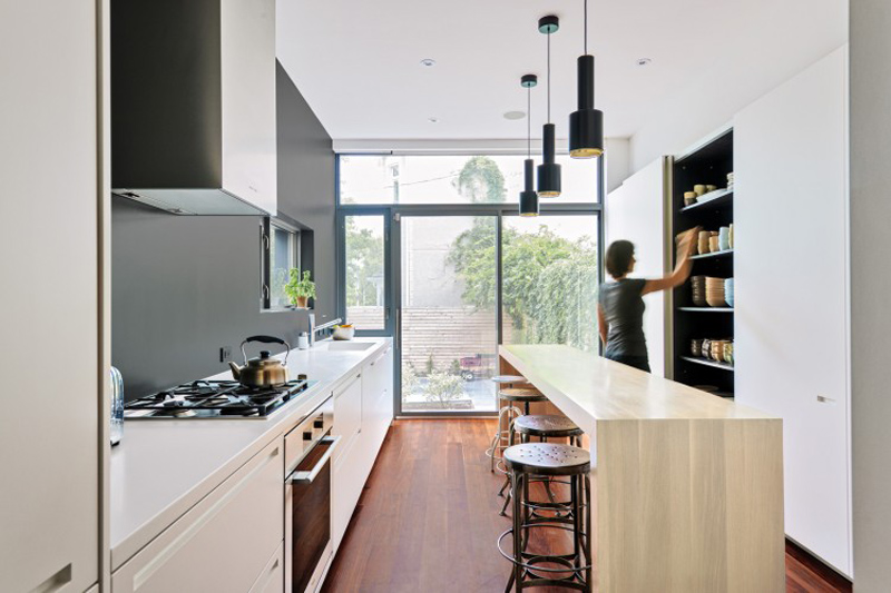
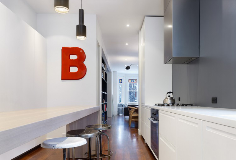
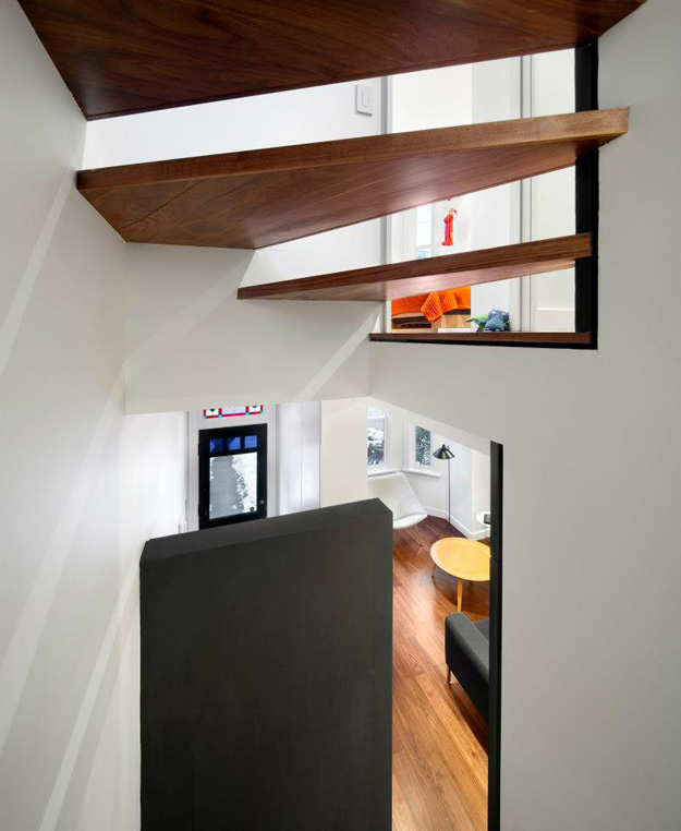
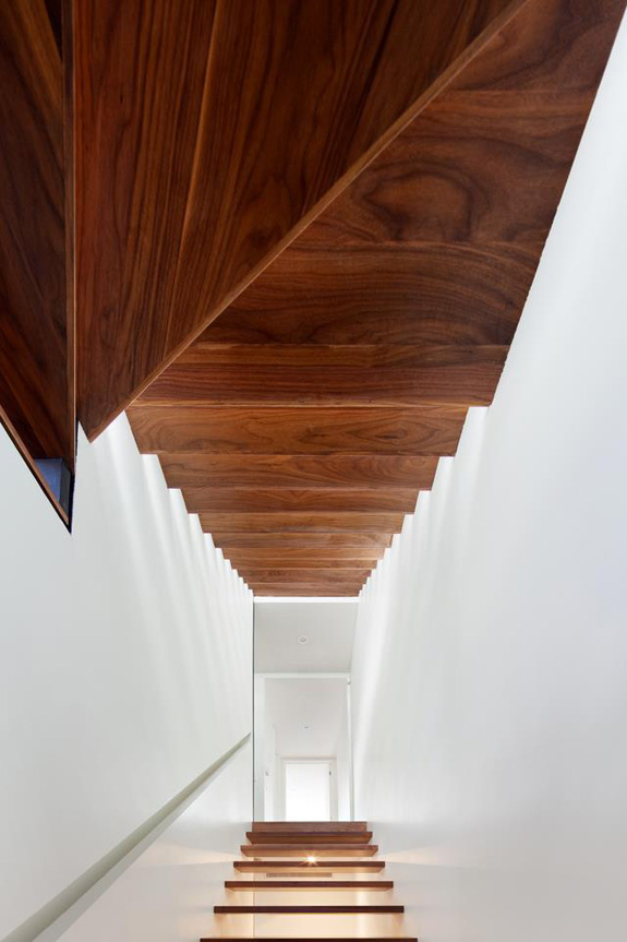
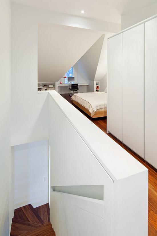
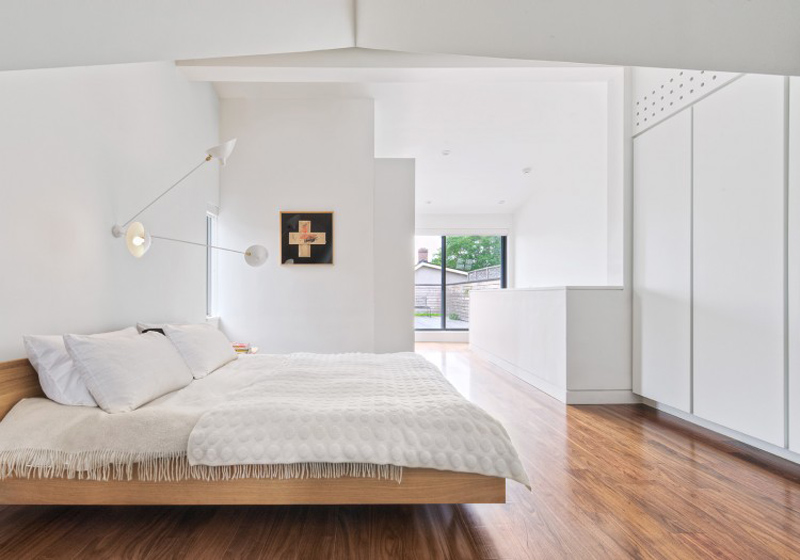
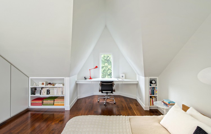
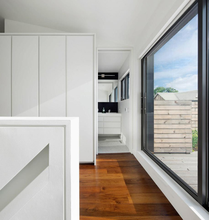
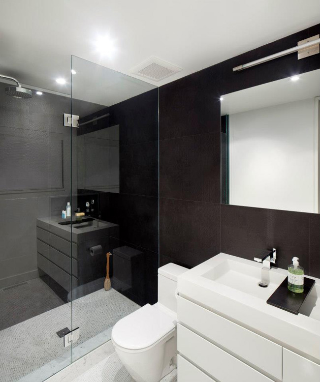
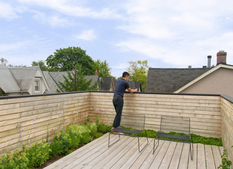
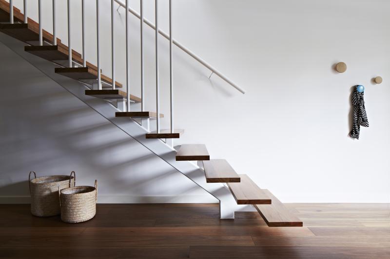
How to modernize an old home on a tiny lot and make it the best house on the street! The intent of the remaking of this narrow 125-year-old residence was two-fold: to increase natural light in the interior using contrast, and to reduce the house’s ecological impact.An increase of natural light is accomplished through both physical and perceptual means. Physically, the long, narrow house – only 11 feet wide on the rear façade – was reconfigured to allow direct sight lines to new window openings. Perceptually, contrast was used as a means to “brighten” internal spaces without direct access to natural light. Contrasting elements are placed in proximity to produce an intensified effect. At each level, the stair is punctuated by a black element to define space — be it floating bookcases housing the owner’s collectibles, or a chalk board wall for play — and to create contrast to visually intensify the natural light spilling down from above. Via Toronto’s Dubbeldam Architecture + Design
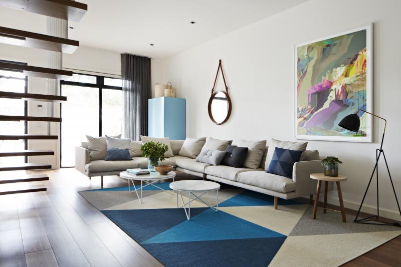
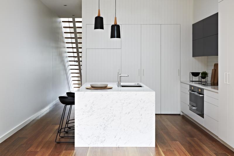
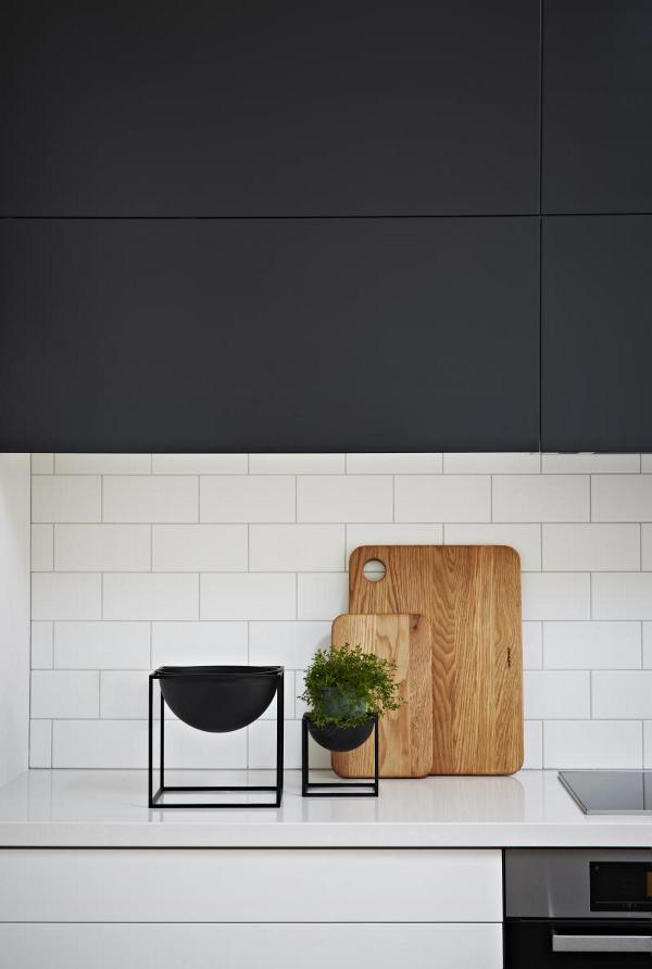
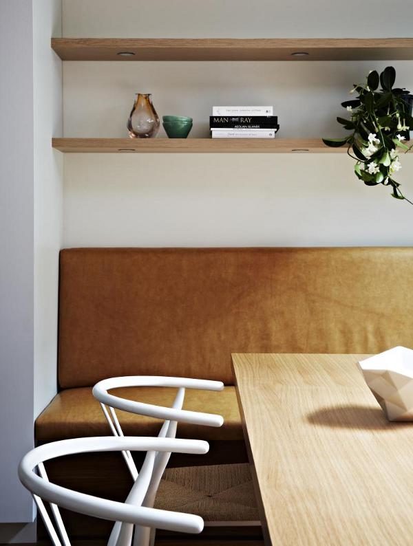
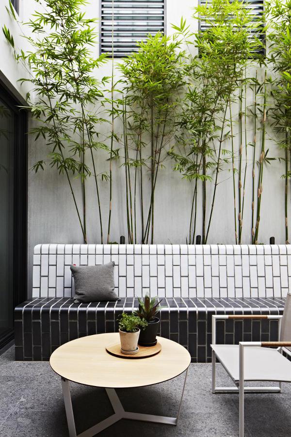
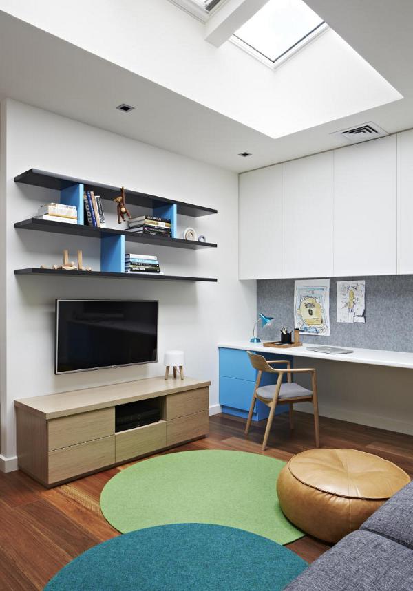
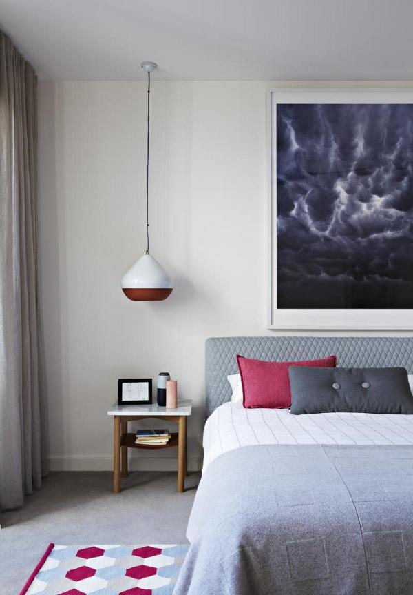
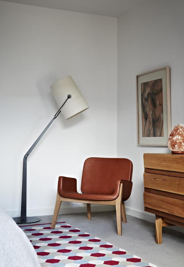
Doherty Design Studio encore
Posted on Fri, 10 Apr 2015 by midcenturyjo
The renovation of this small 2 storey single fronted townhouse by Doherty Design Studio has resulted in a sophisticated, minimalist design with an emphasis on the quality of finishes and the livability of the space. The small courtyard, by landscape designer Nathan Burkett (you may have caught a glimpse of it here), connects seamlessly with indoor spaces. Strong modern lines, practicality and beauty.

Art in (a) flat
Posted on Fri, 10 Apr 2015 by midcenturyjo
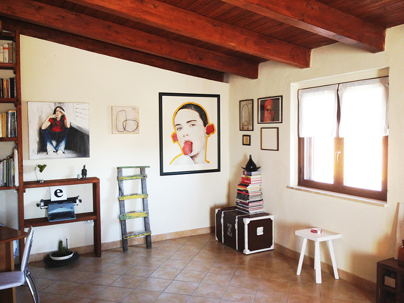
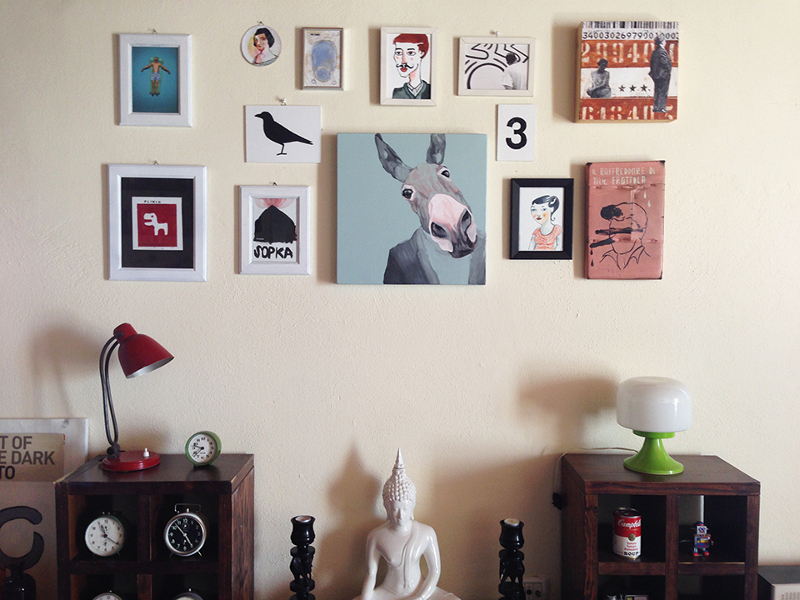
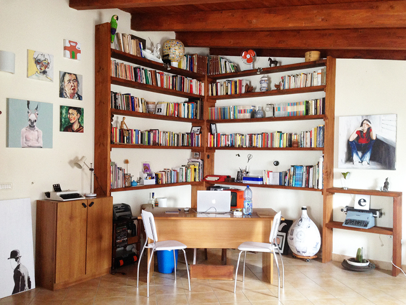
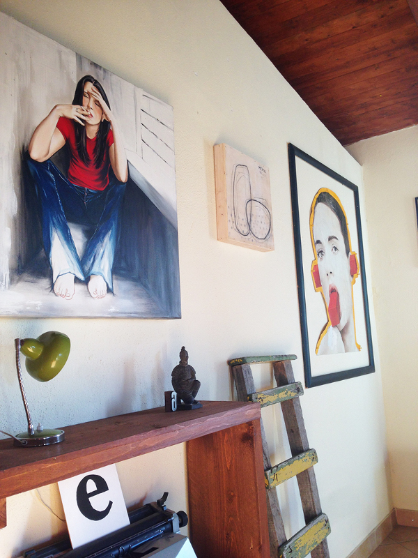
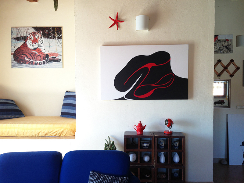
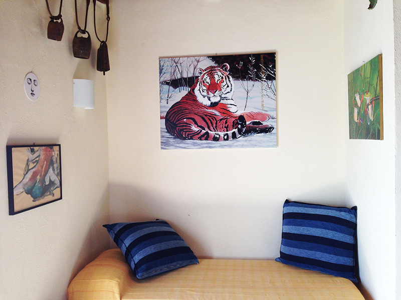
Milan-based web designer Franco Scarpino has a bolt hole in San Leonardo di Cutro, Calabria on the Ionian Sea. Here in his 40 sq m attic apartment he can throw open the windows and gaze out to see. But Franco seems to spend most of his time looking inside his flat.On the wall there are works of 15 different Italian artists. You see Franco is part of a home based gallery movement Art in Flat which brings artists and home owners together to exhibit art in one of its most natural habitats, the walls of a house. You could say this post is half reader’s home half home exhibition. I think I need to get involved in something like this here in Australia. A very cool idea.
The element of surprise
Posted on Thu, 9 Apr 2015 by KiM
I love the element of surprise in a space. A modern chair pulled up to a early 1900s wooden desk. A graphic piece of art hanging above granny’s old rocker. A sleek glass dining table with an antique brass chandelier hanging above. I laughed when I stumbled upon these photos.
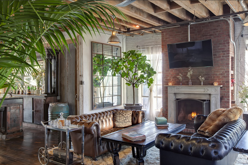
The loft space is heavenly but anyone with no sense of imagination would then fill it top to bottom with industrial decor (ok, this is probably an ad for Restoration Hardware or something similar so they can get away with it). I’ll forgive those responsible as I freaking LOVE those chesterfields and all that exposed brick.. (Photos by Scott Gabriel Morris)

