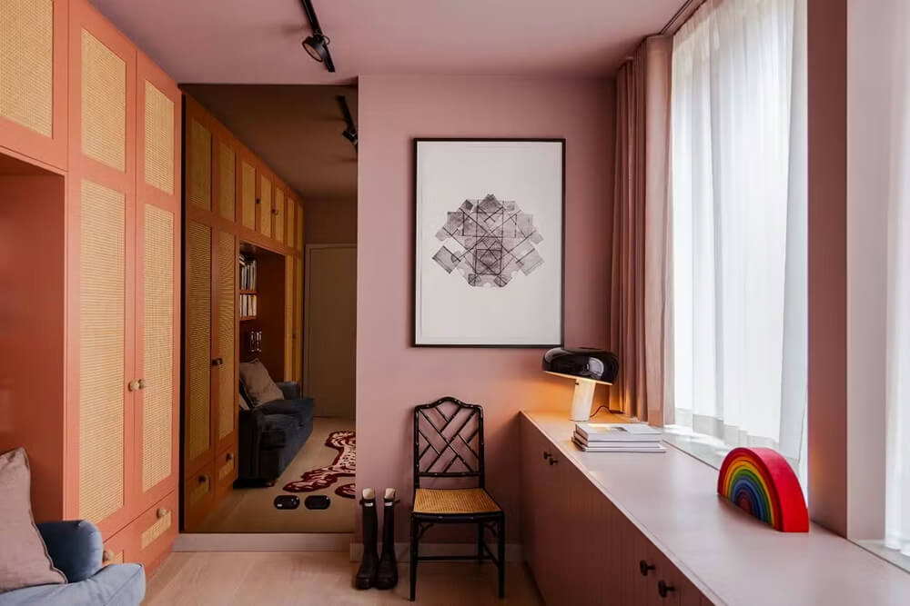
Bringing Italy and Miami into a Berlin penthouse
Posted on Fri, 9 Jan 2026 by KiM
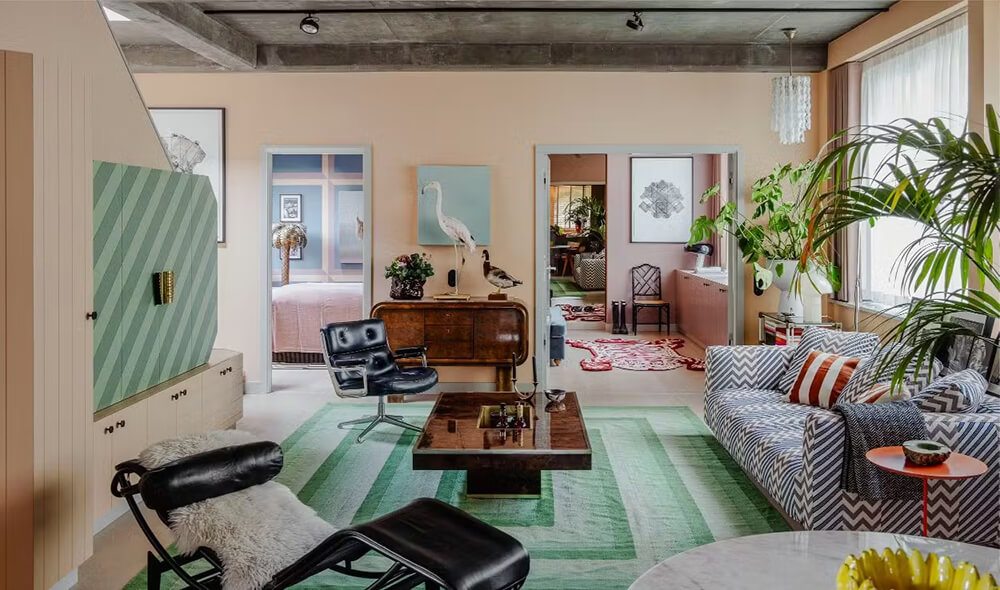
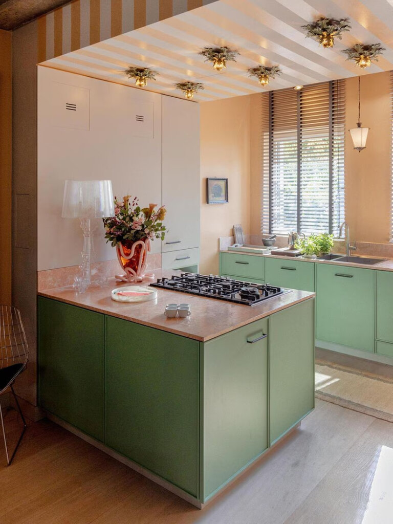
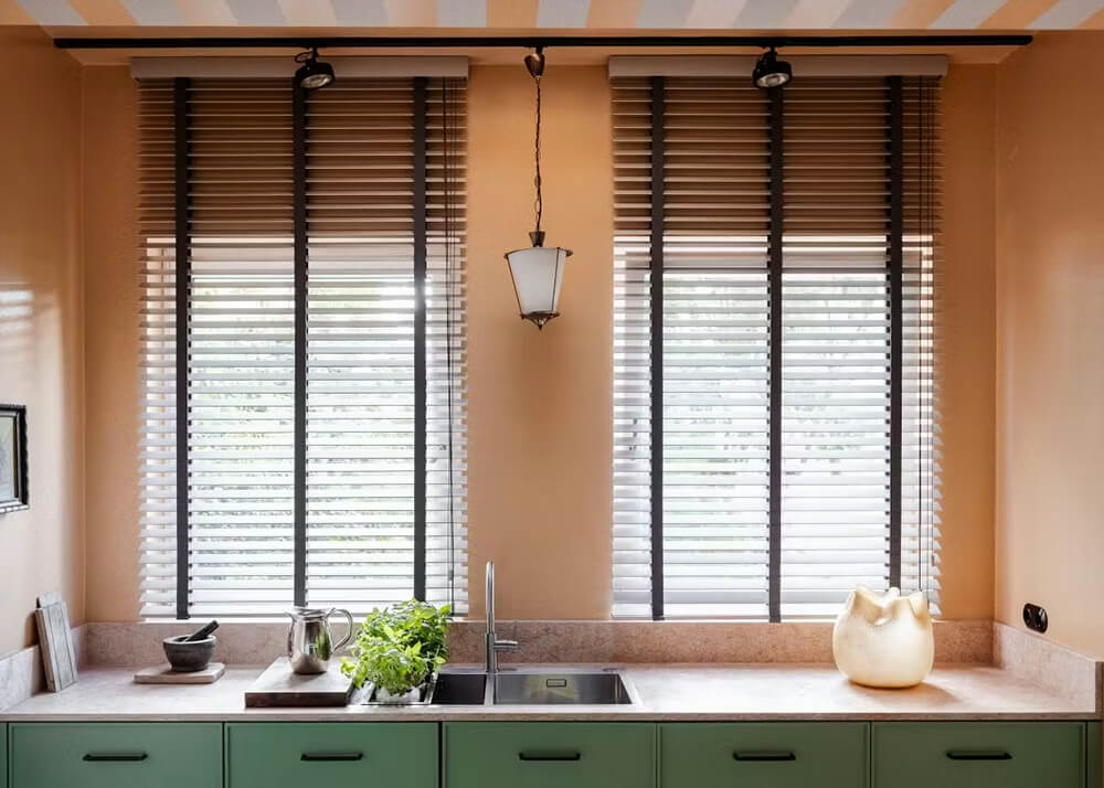
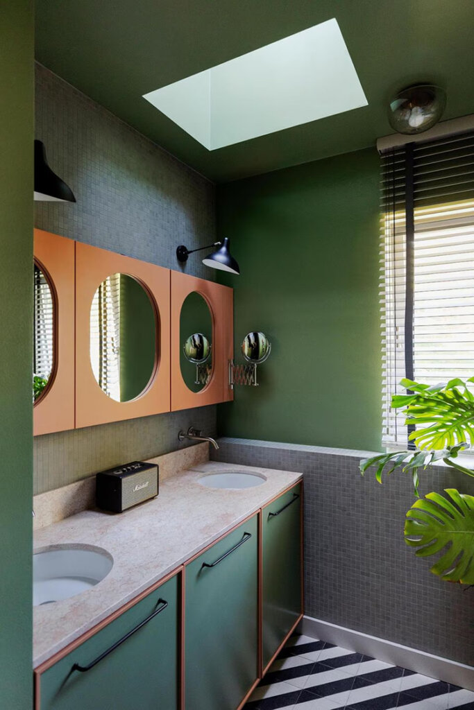
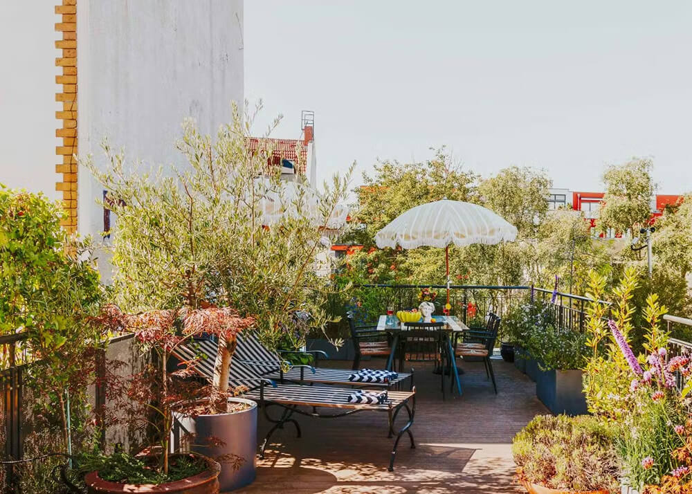
Collected, designed, and imagined elements form the foundation of a living space inspired by a walk from Portofino to San Fruttuoso. I’d add that this is giving Miami vibes with all the fabulous pastel colour combinations. This 90 sq m concrete box has been completely transformed by Fabian Freytag and it is now soft around the edges, very easy on the eyes and has lots of quirky and creative details that make this apartment stand out. Photos: Kozy Studio.


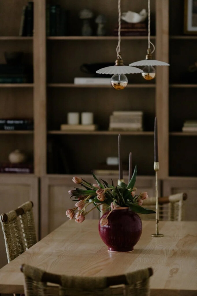
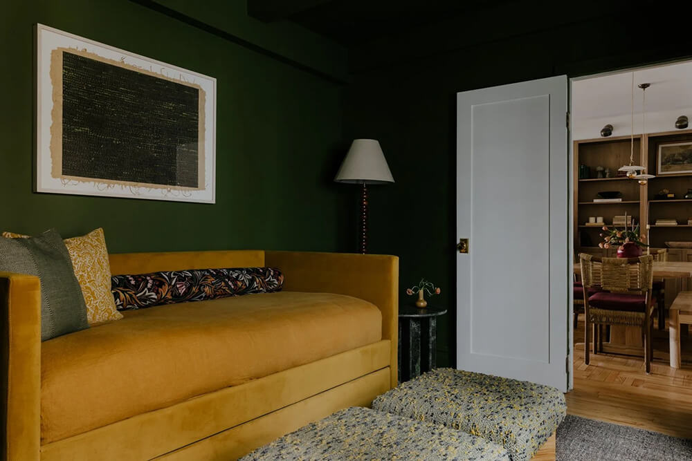
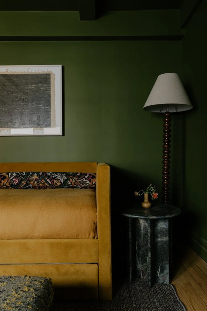
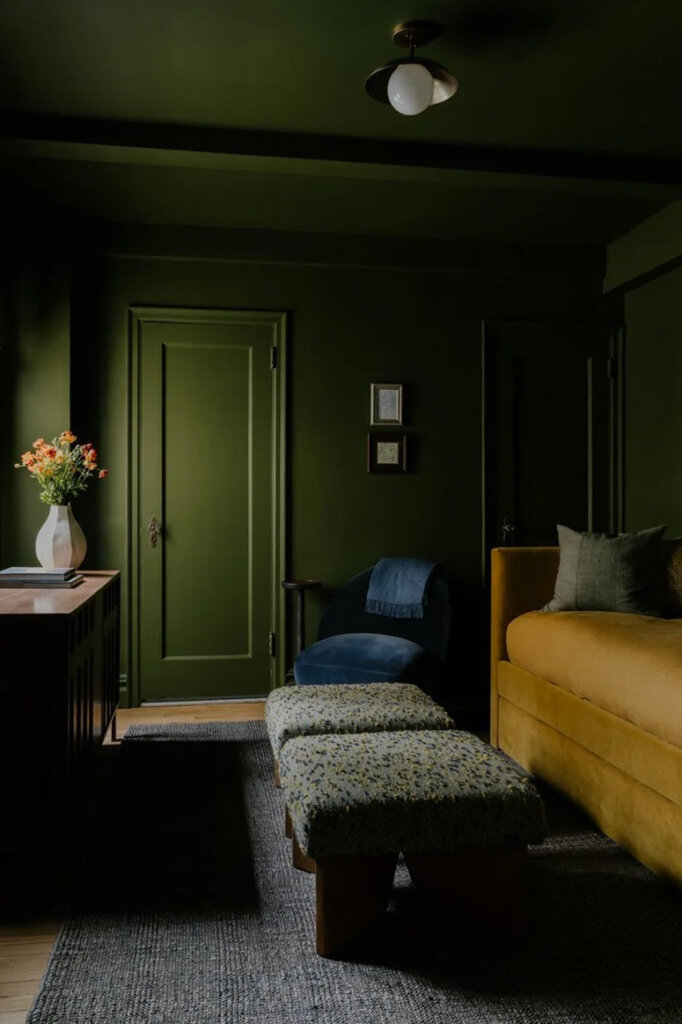
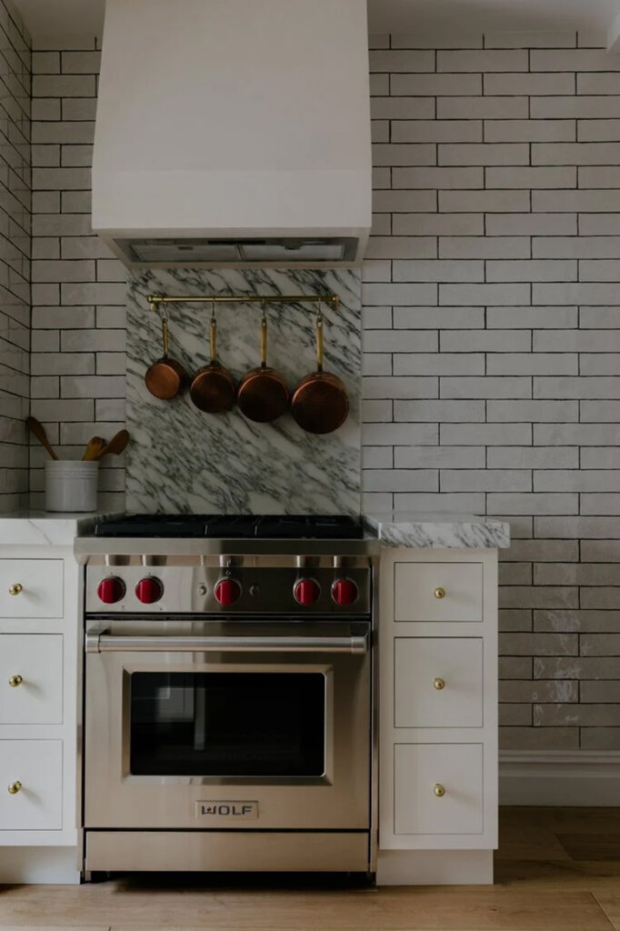
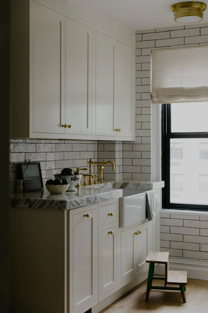
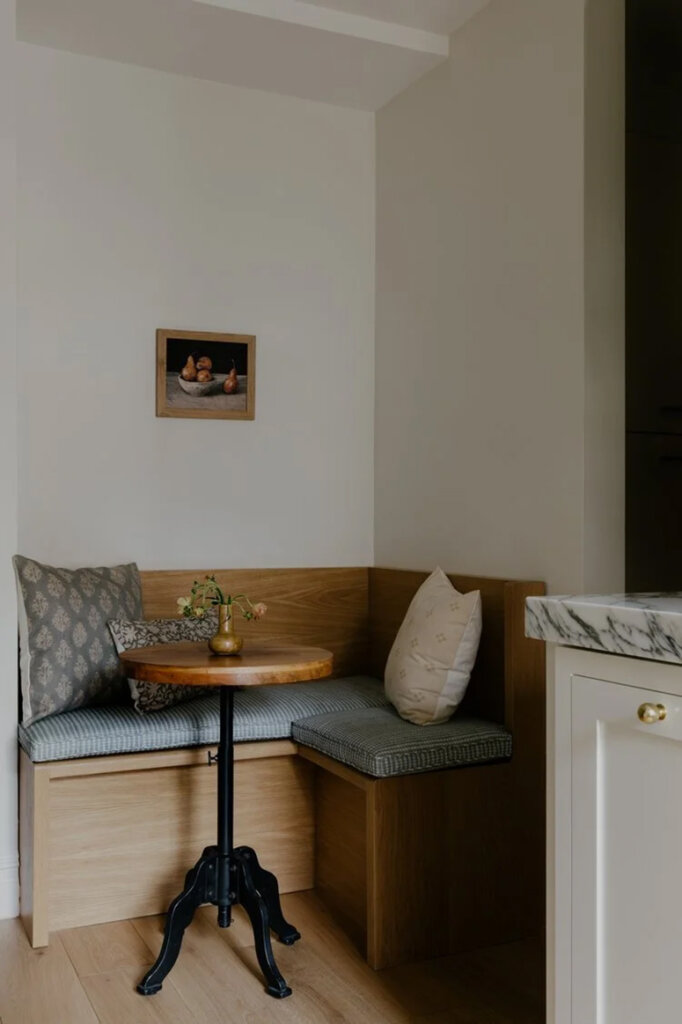
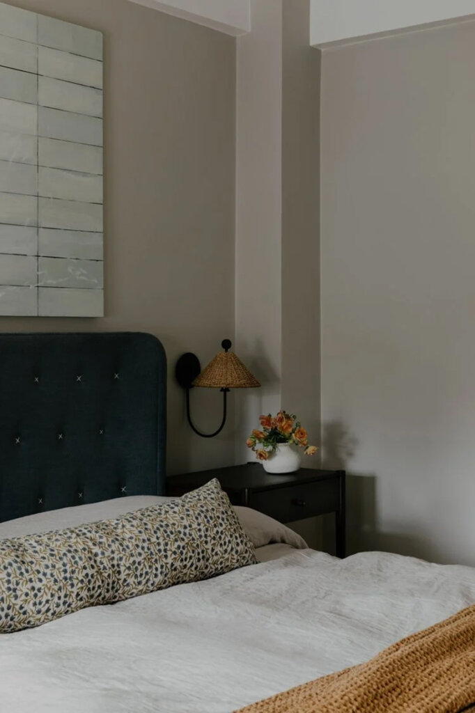
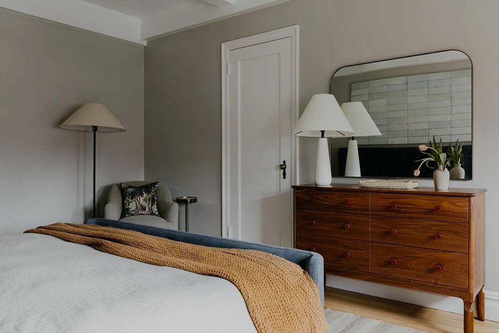
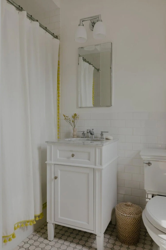
A renovated Upper East Side family apartment for weekend visits
Posted on Fri, 9 Jan 2026 by KiM
This apartment in the Upper East Side was bland and had a senseless layout. In came Emma Beryl who created a cool hangout for a family with a couple of kids to use on weekends (dictated the pandemic). It now has some really great built in storage, a dark and dramatic room for the kids that houses a daybed with trundle so it does double duty when the kids aren’t there, and a much better layout in the kitchen. Stylish and timeless and really functional.
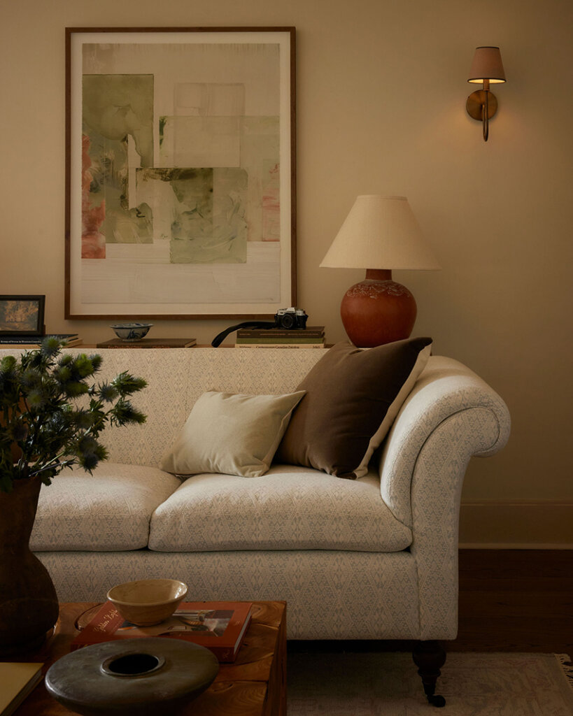
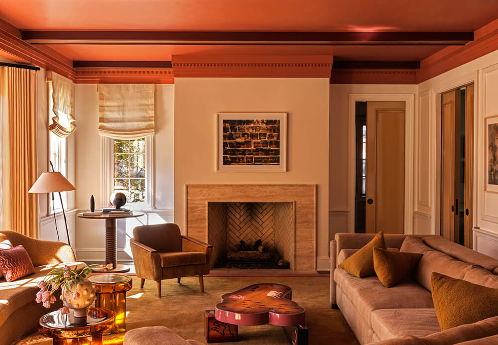
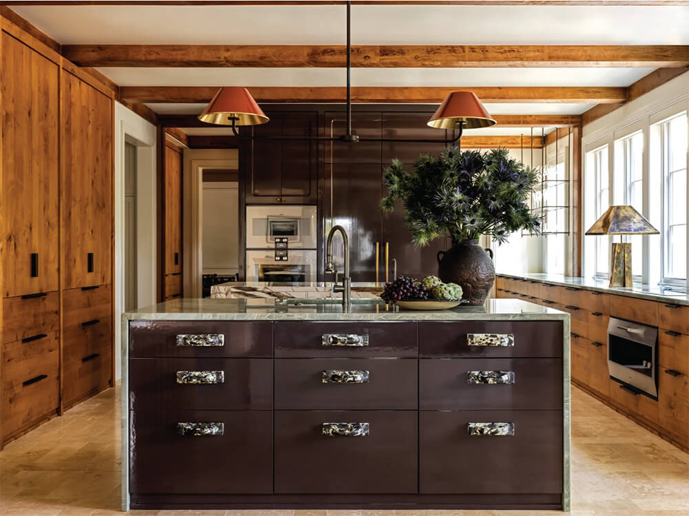
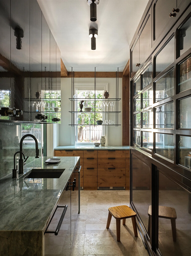
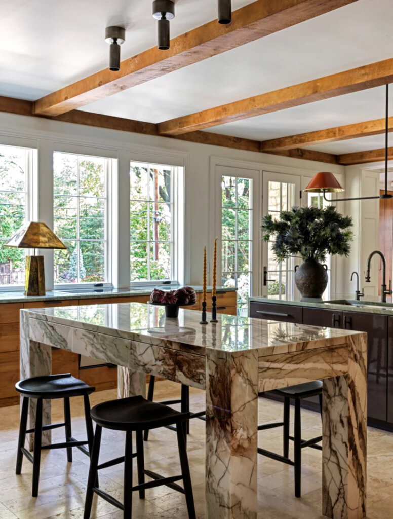
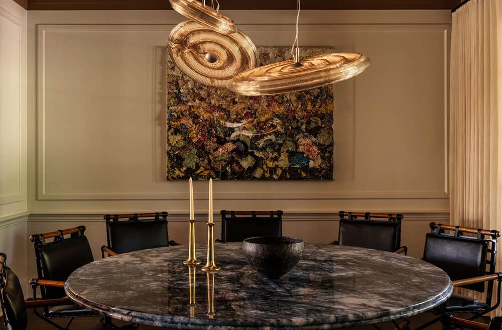
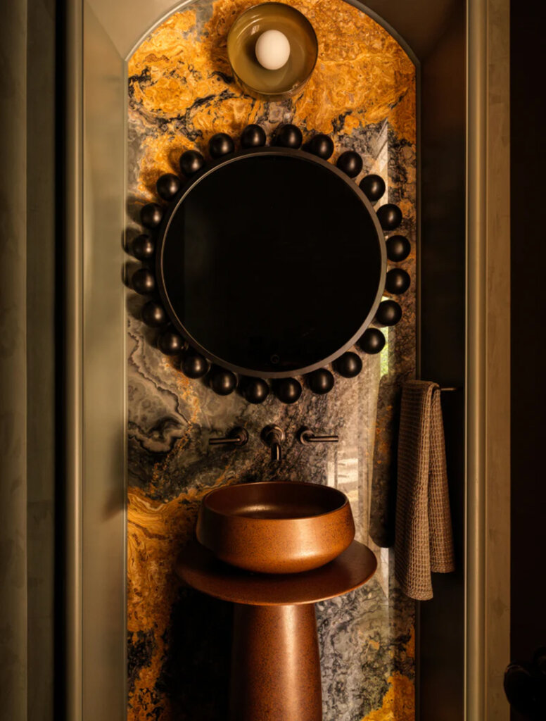
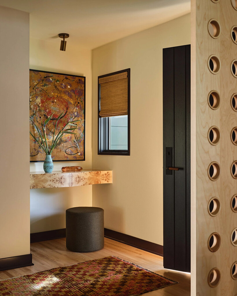
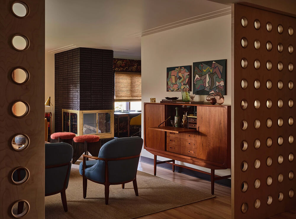
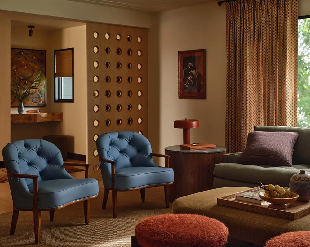
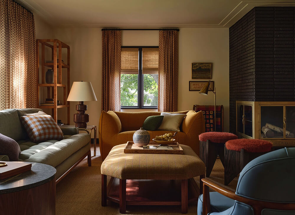
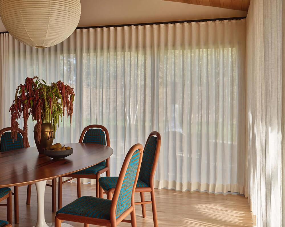
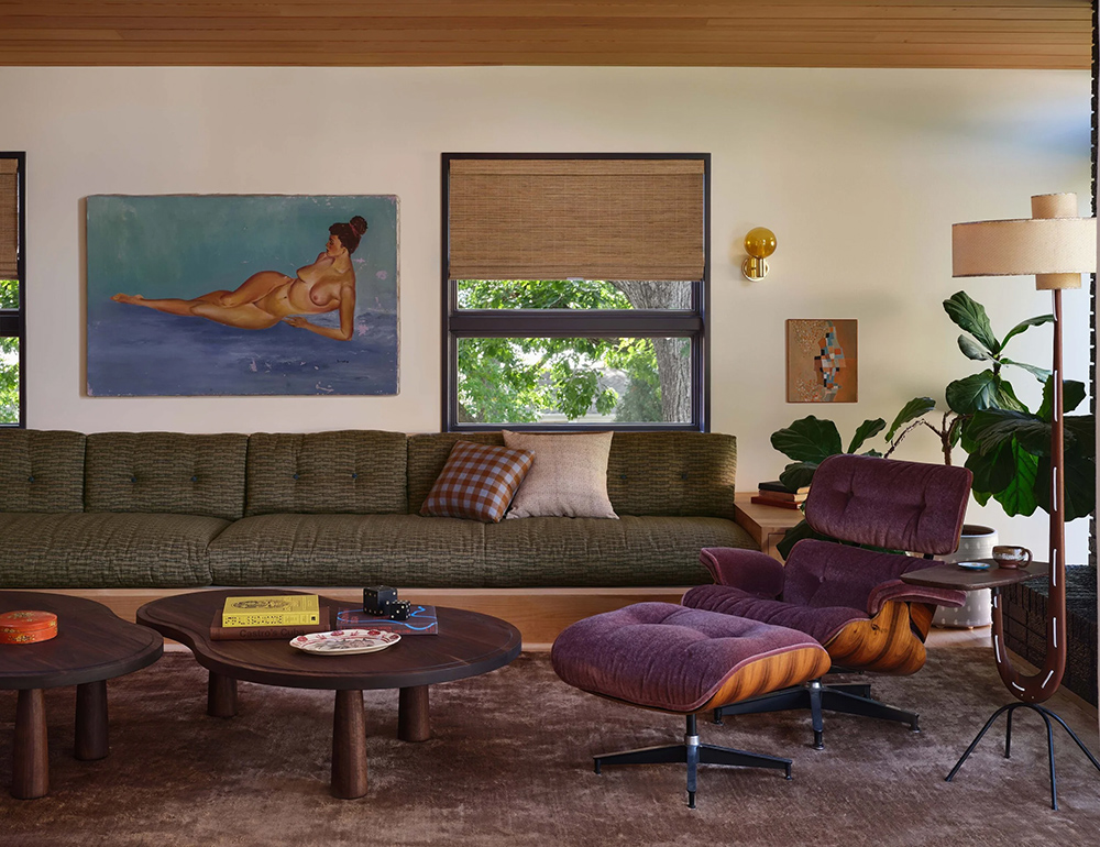
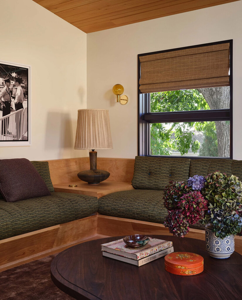
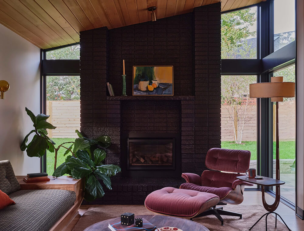
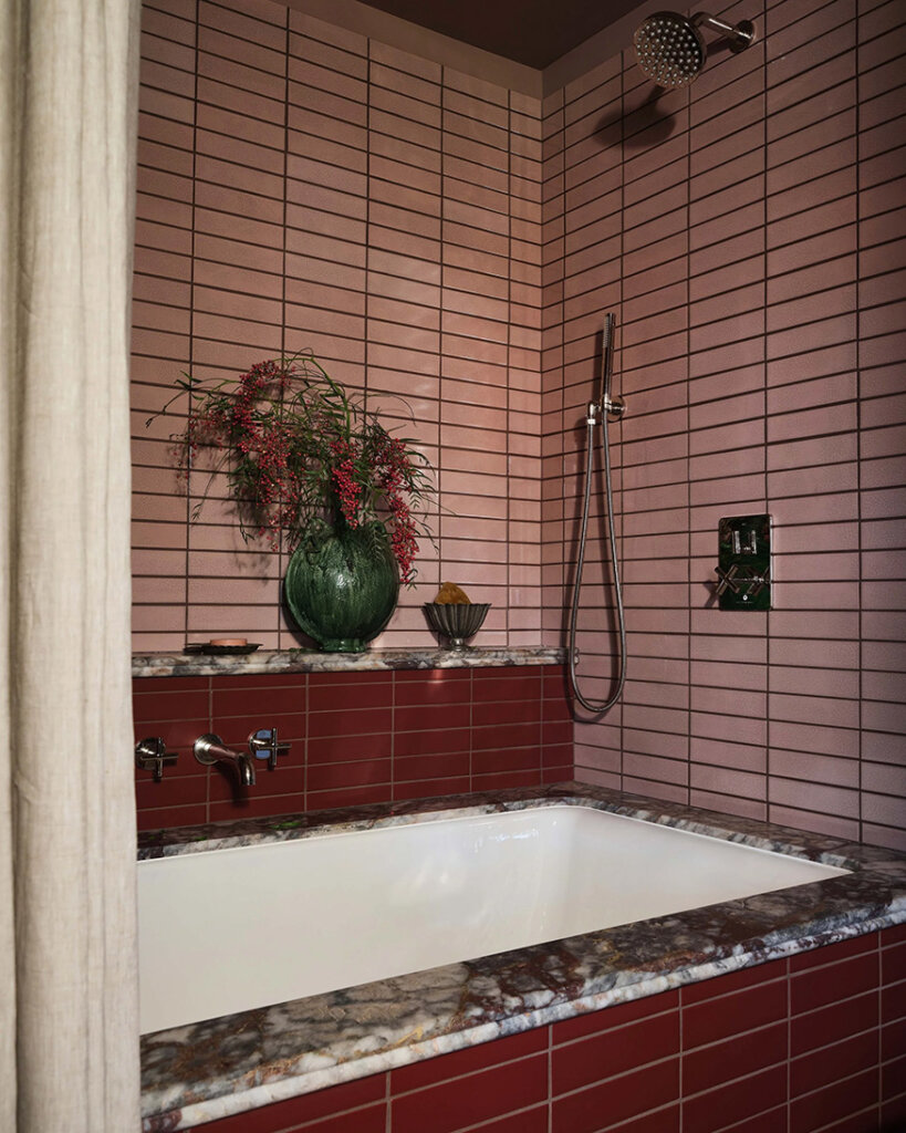
A ‘feel good for all seasons’ home in Minnesota
Posted on Wed, 7 Jan 2026 by KiM
The owners of this expansive home in Minneapolis wanted it to “feel good” in all seasons. Bright and warm in the spring and the summer; cozy, intimate, welcoming, and inviting in the fall and winter. They also were simply looking for an updated kitchen floor after buying the house. It turned into an update of 90% of the house, and in a short timeframe. Prospect Refuge once again delivered and it is magical. Photos: Chris Mottalini; Styling: Katja Greeff.


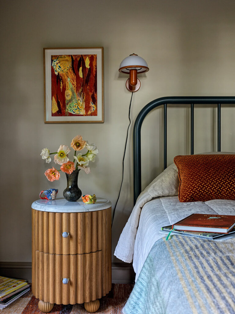
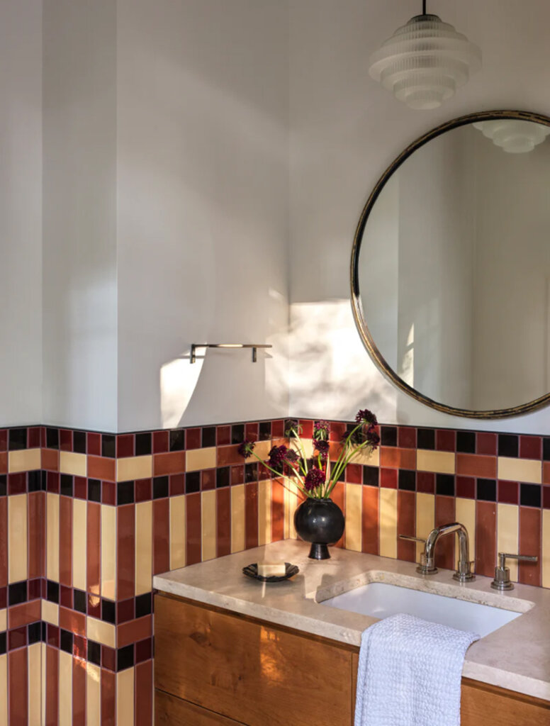
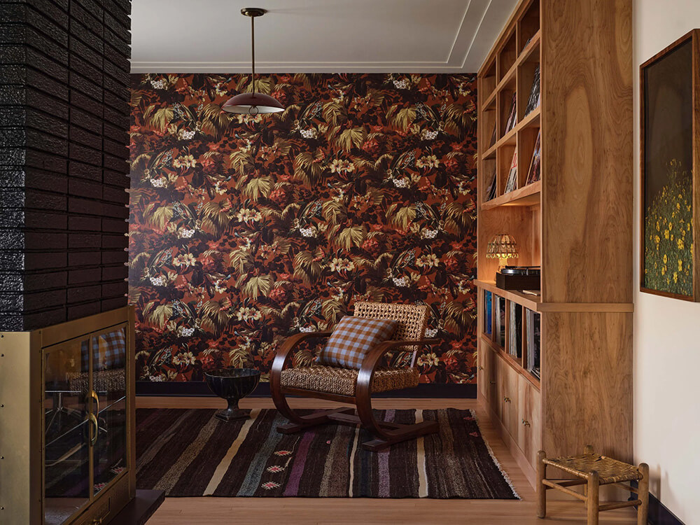
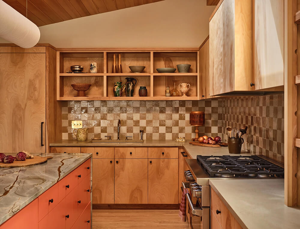
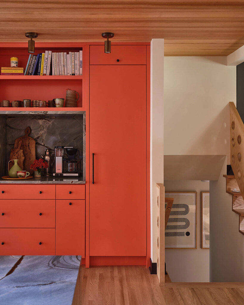
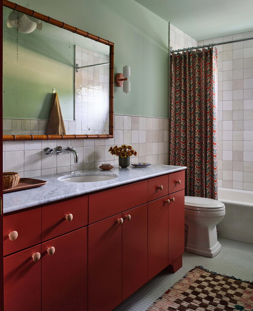
A renovated midcentury rambler home in Minneapolis
Posted on Wed, 7 Jan 2026 by KiM
Snuggled within a windy Edina, Minnesota street, our Vibrant Mid Century Split Level breathed life back into this 1955 home. A gut renovation, just-enough vintage, and a nod toward the home’s bones, recaptured the space. A mashup of bold colors, unexpected materials, and a dash of curiosity gives this young family a unique and personal oasis.
I love that designer Anne McDonald embraced and enhanced the groovy mid century elements of this home and added some beautiful deep jewel tones as well as some funky patterns (that kitchen backsplash is the bees knees). It’s now more current and totally liveable and practical. Photos: Michael Clifford; Styling: Yedda Morrison.
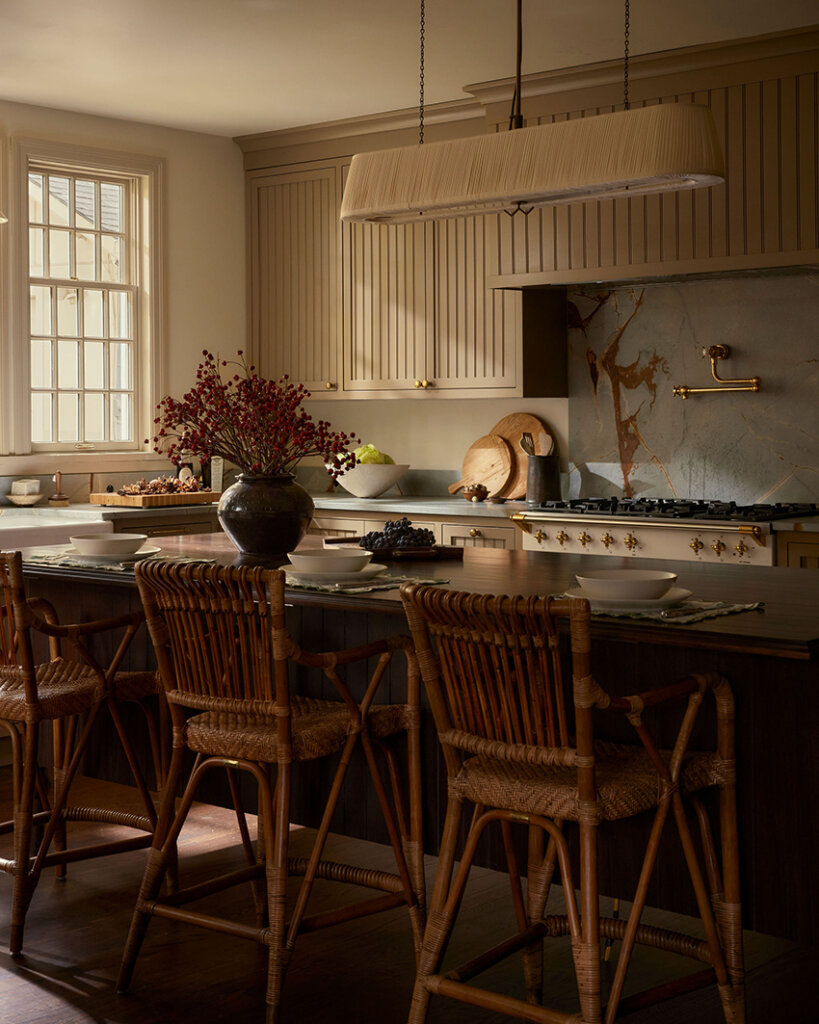
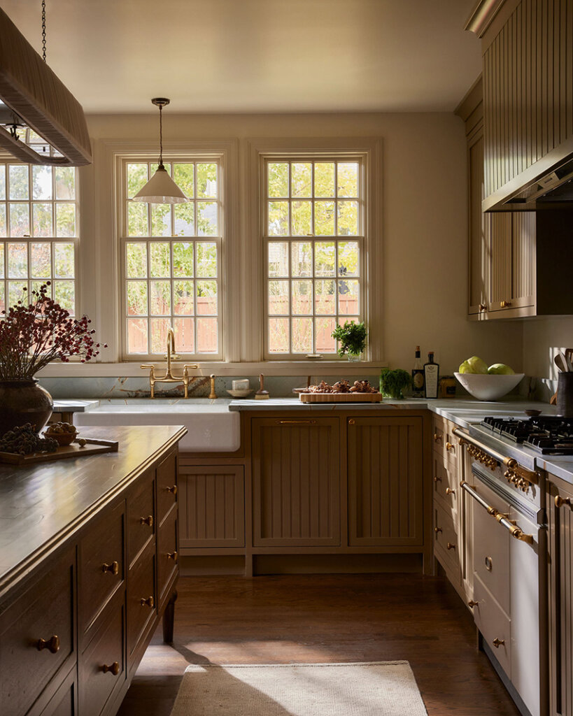
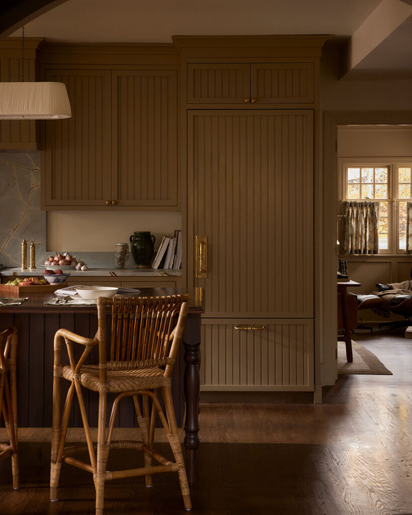
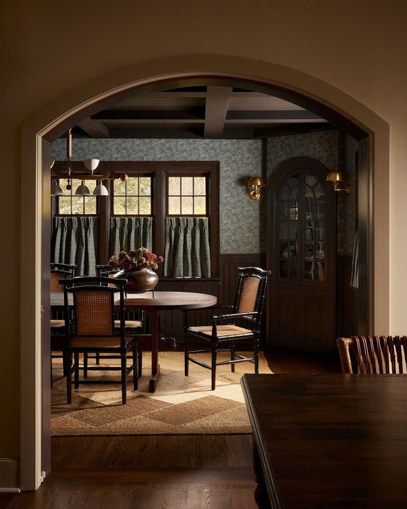
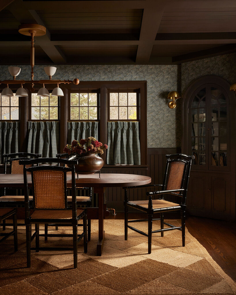
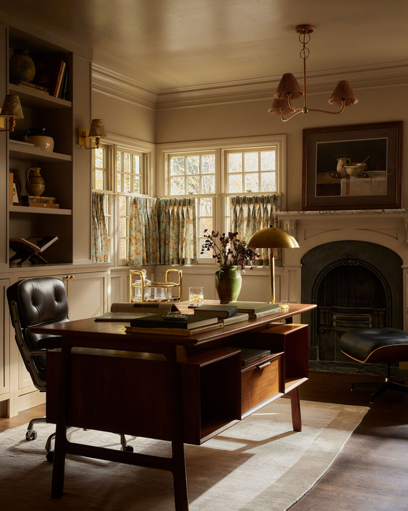
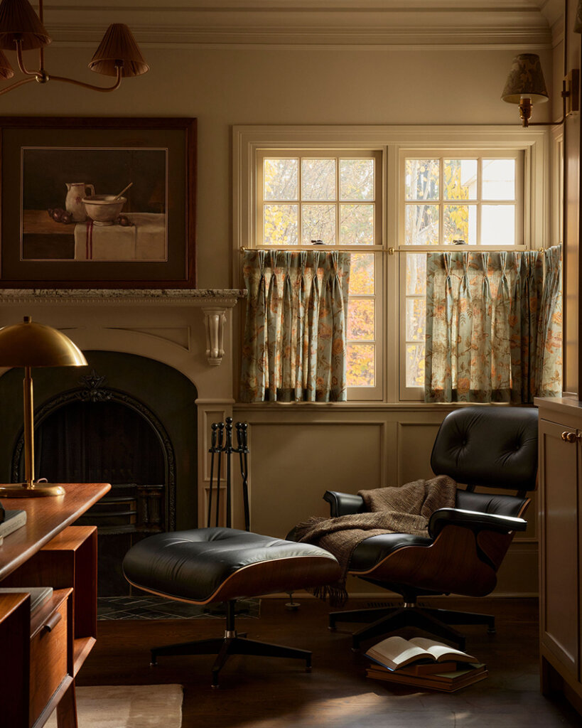
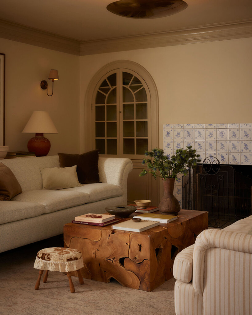
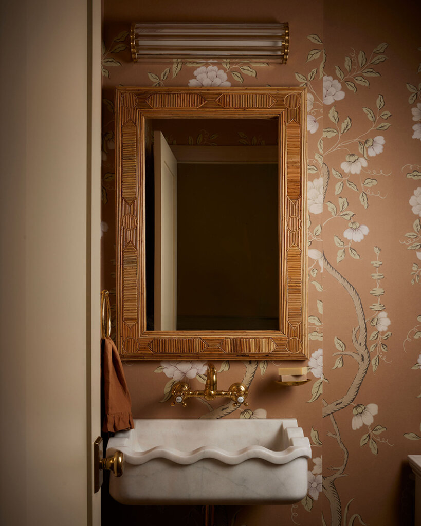
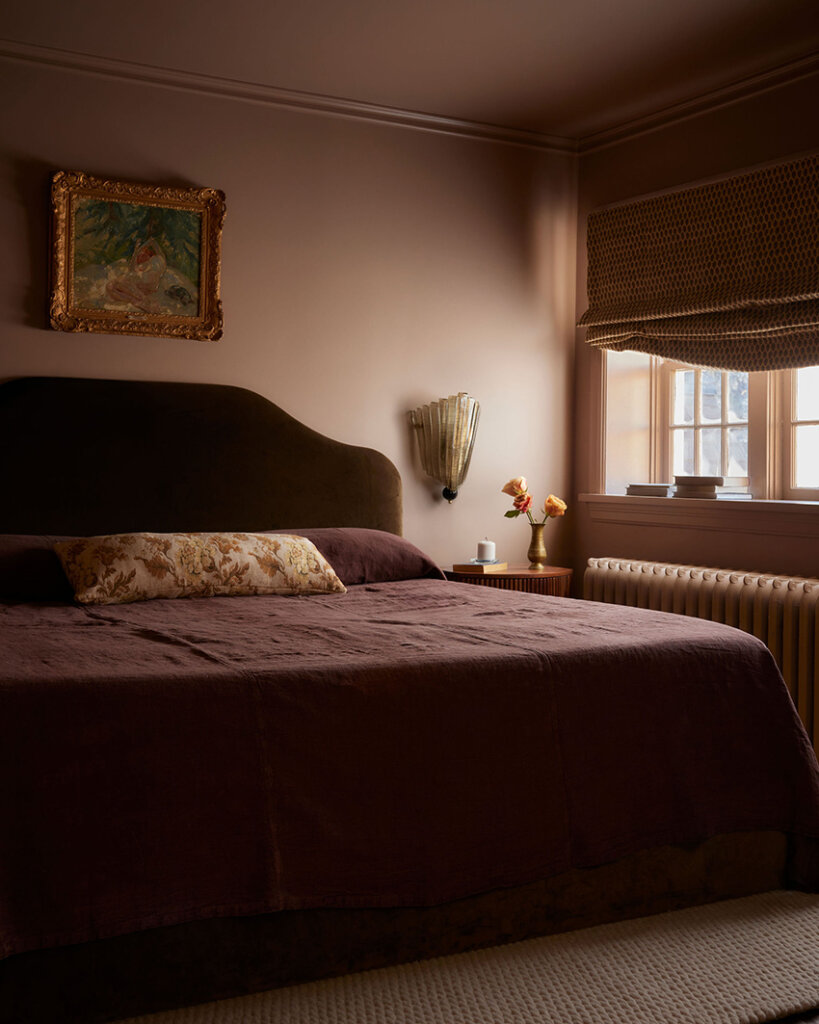
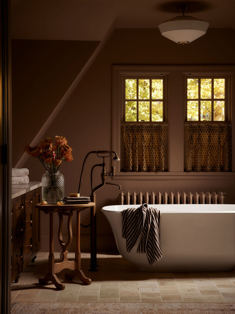
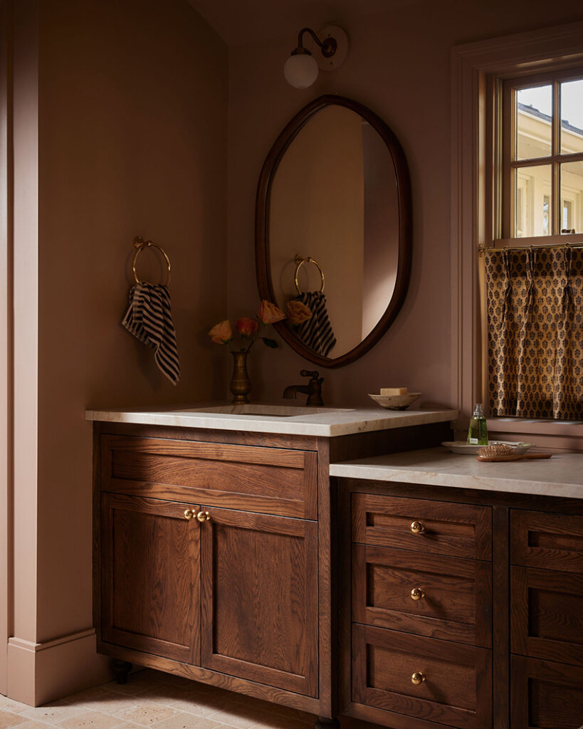
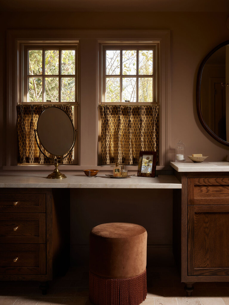
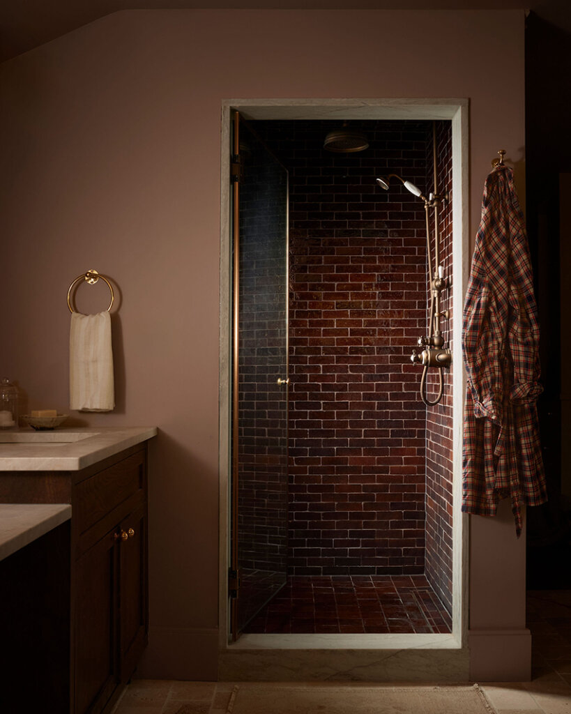
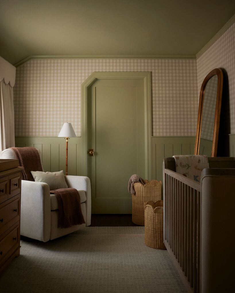
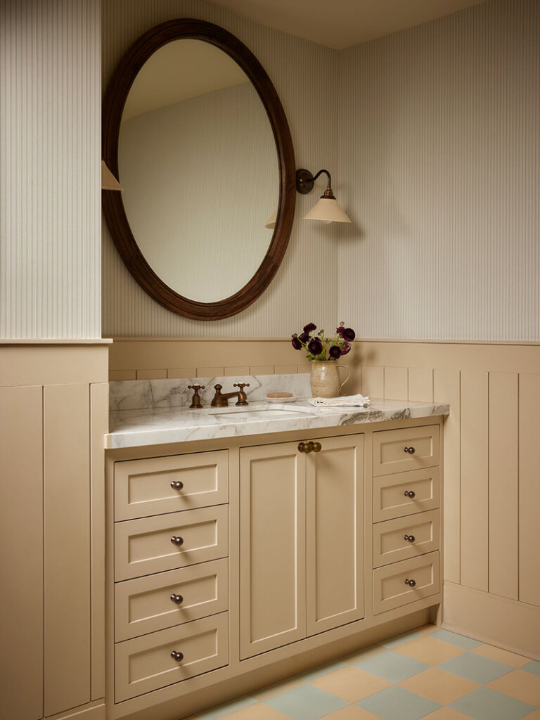
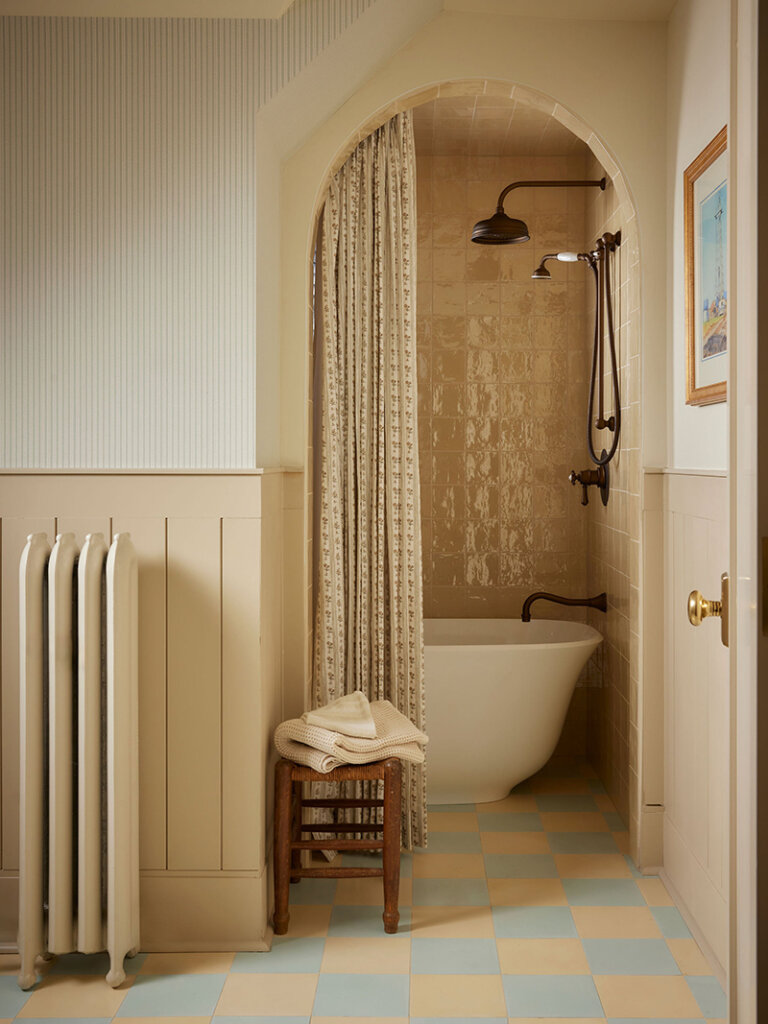
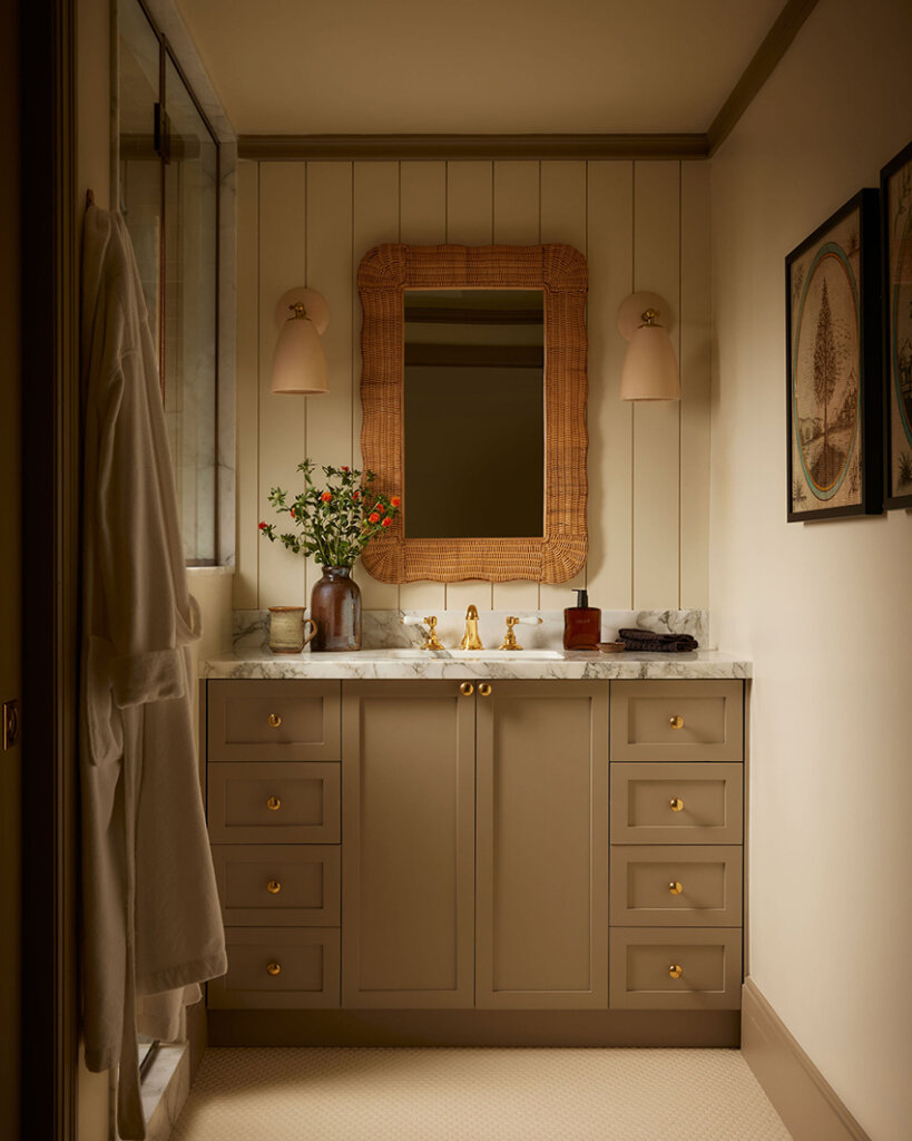
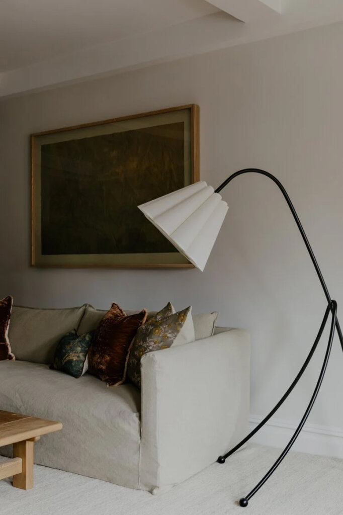
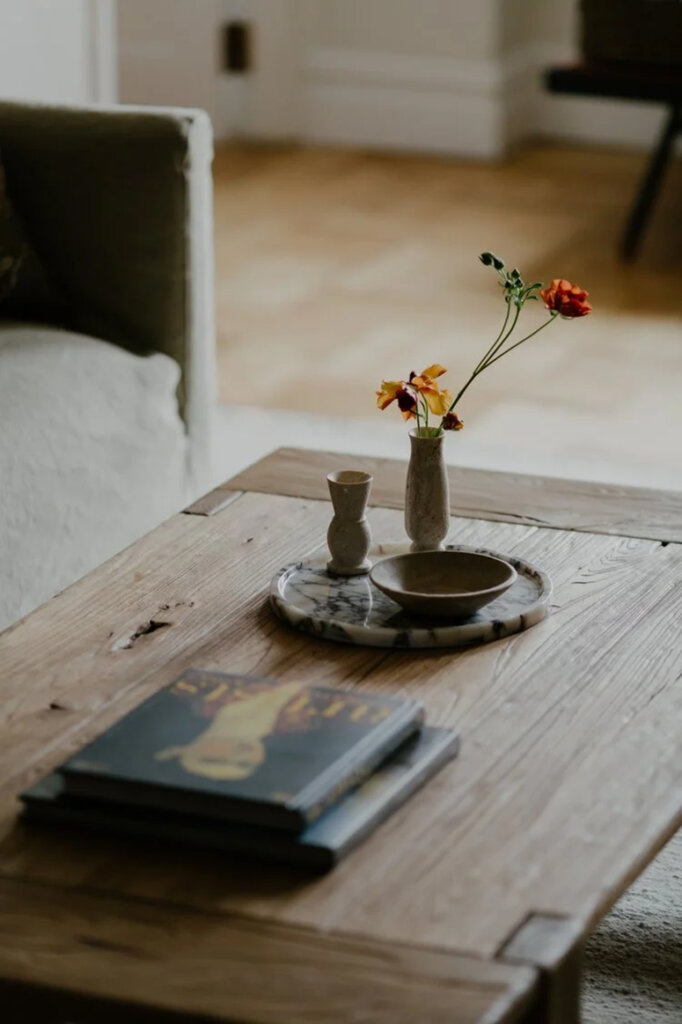
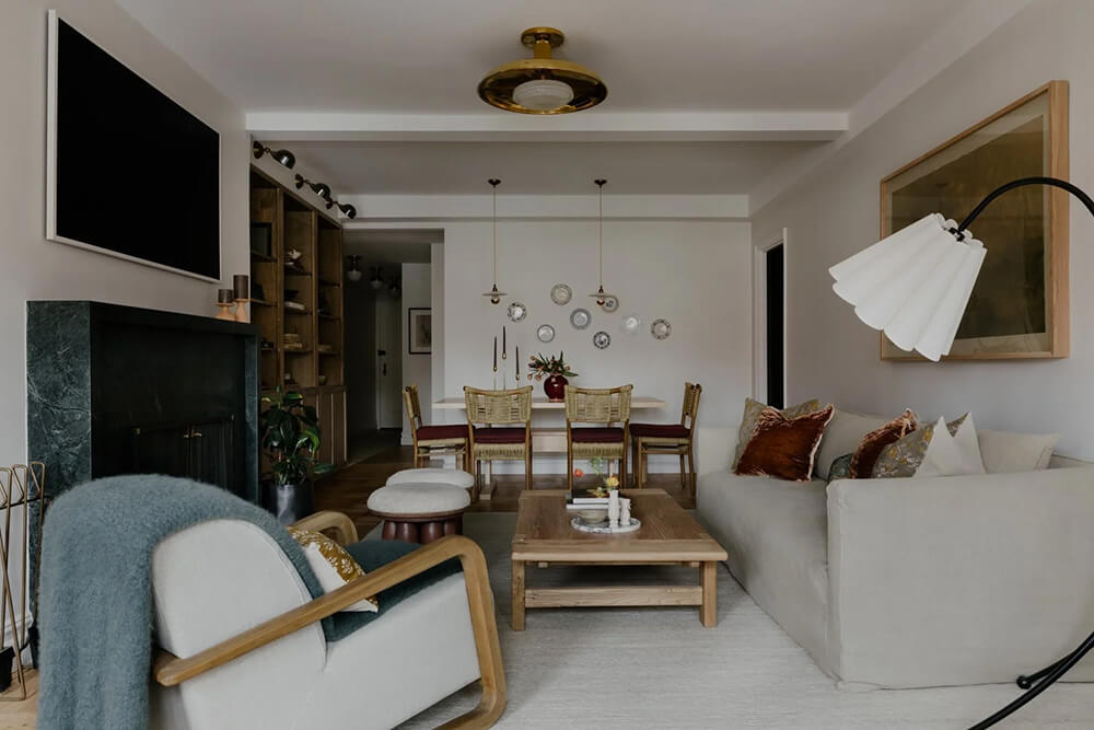
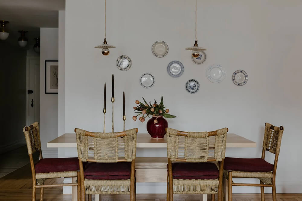
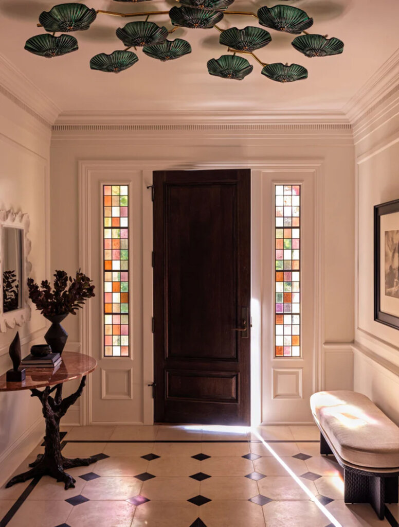
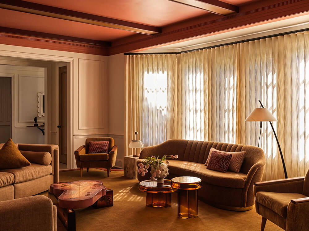
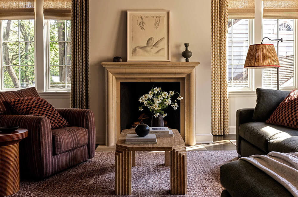
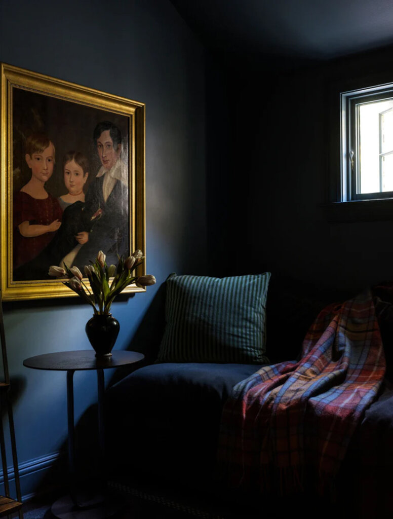
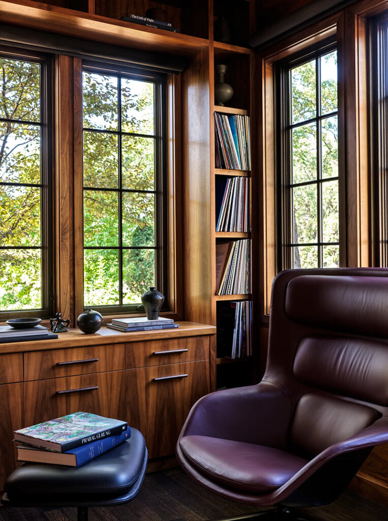
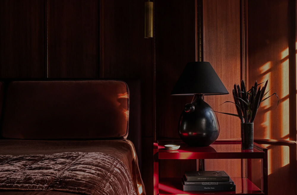
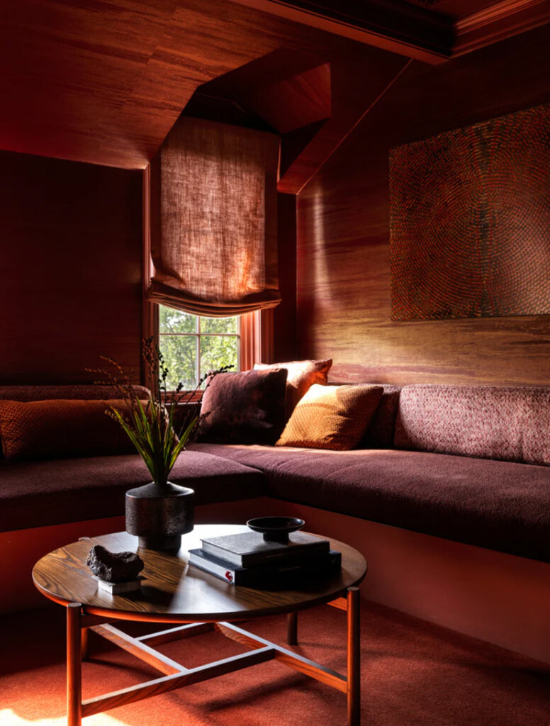
Tudor on the hill
Posted on Mon, 5 Jan 2026 by KiM
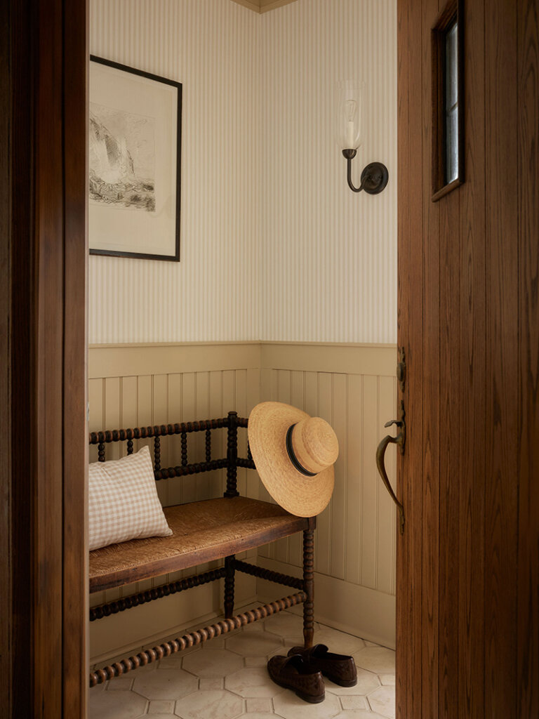
This Tudor home was already rich with character and an undeniable sense of history, so our role was to listen carefully and build upon what was already there. We leaned into English-inspired detailing, layered pattern play, tailored millwork, and a softened, heritage-driven palette to create rooms that feel collected, cozy, and elevated all at once. Traditional silhouettes meet thoughtful finishes, with warmth always leading the way.
As always with Ashley Montgomery‘s projects, I am completely smitten, and this is definitively a top favourite because of the traditional touches. The prettiest of colour palettes too. Photos: Lauren Miller.