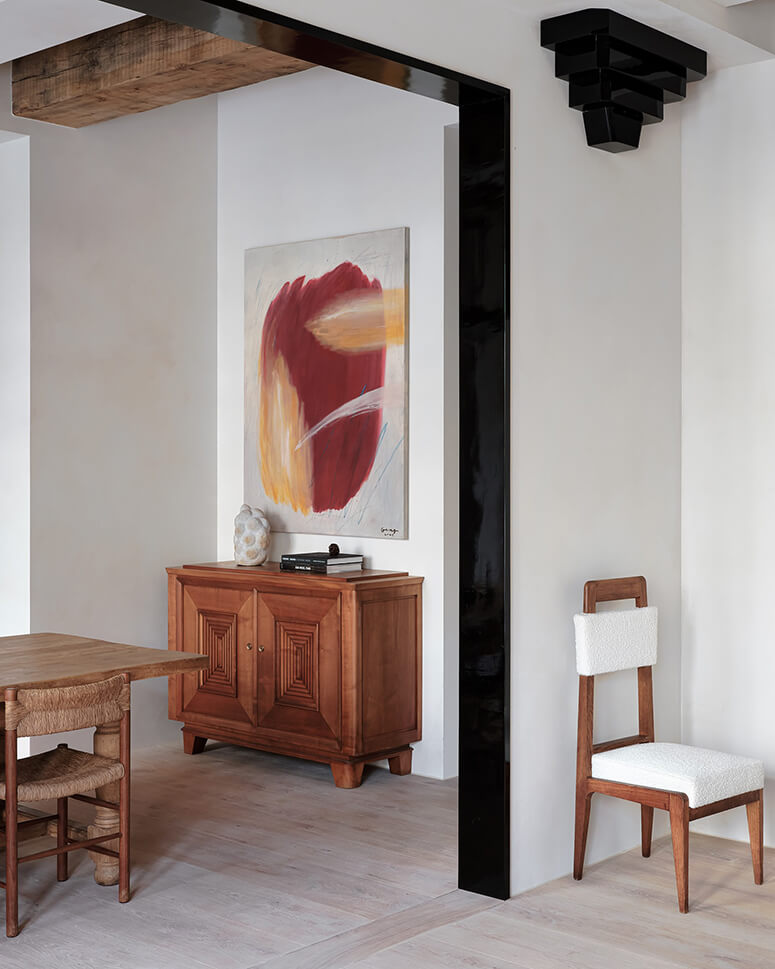
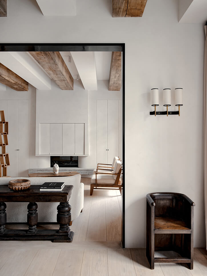
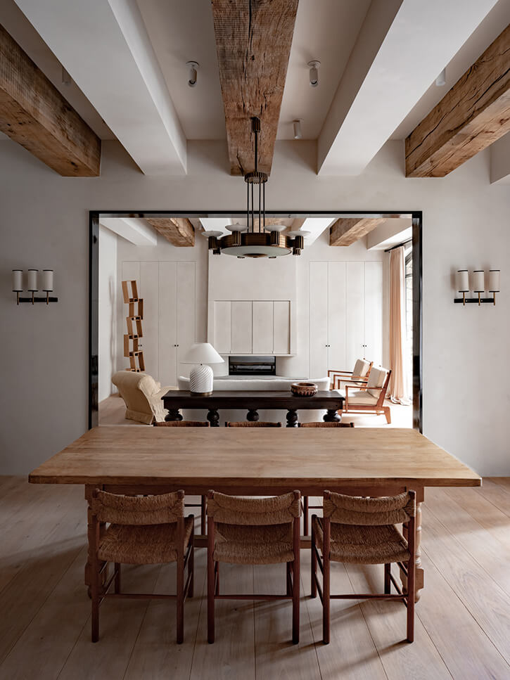
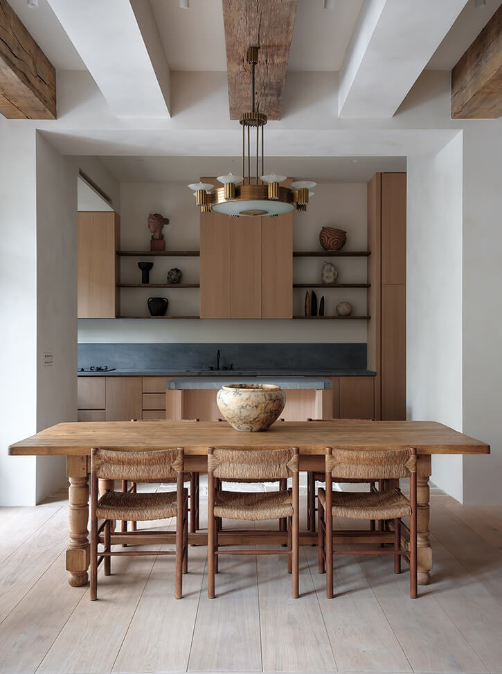
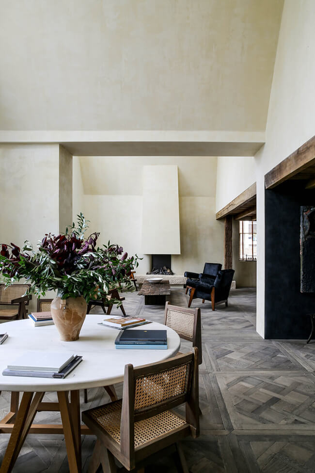
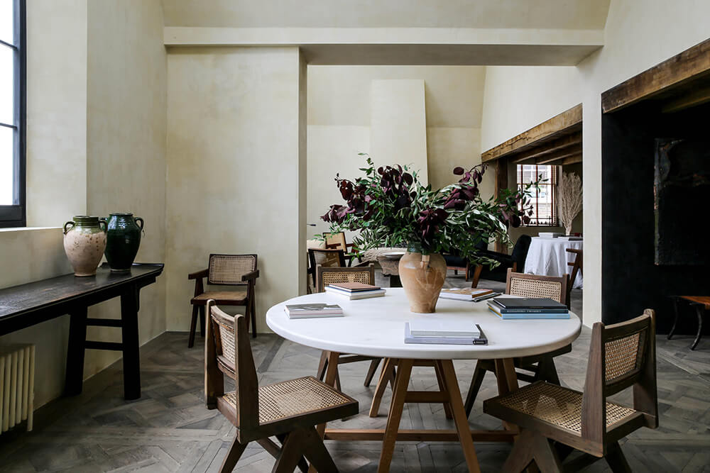
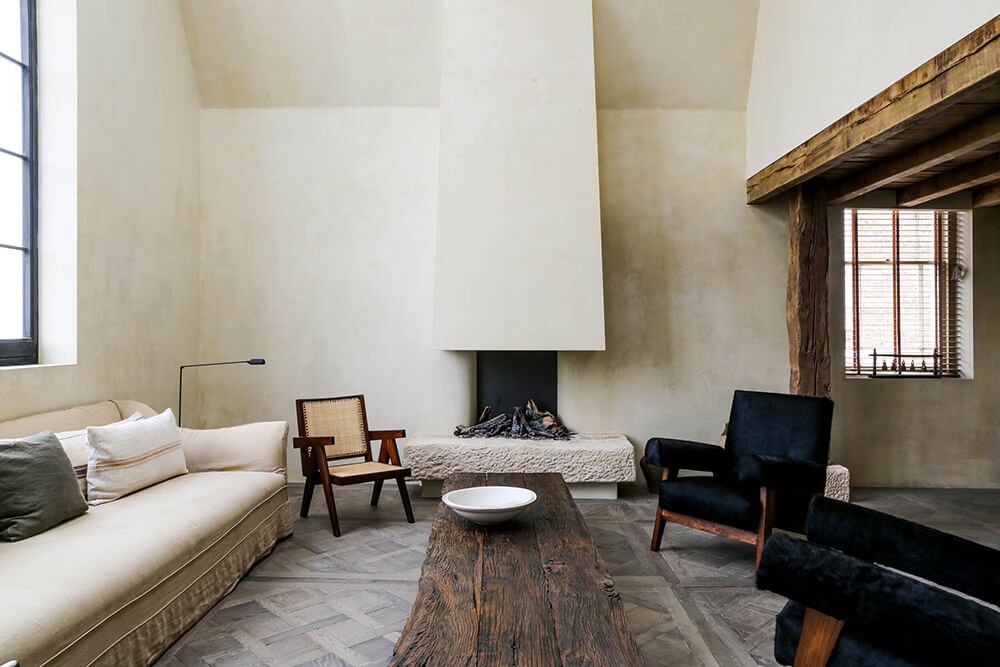
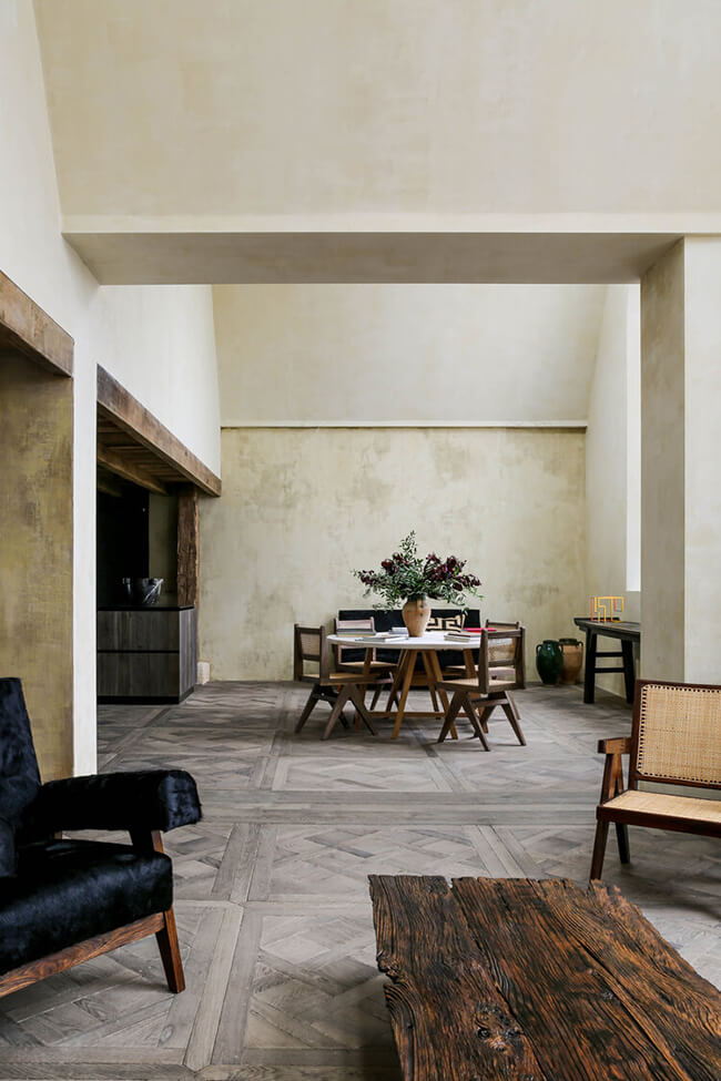
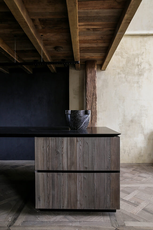
Displaying posts labeled "Apartment"
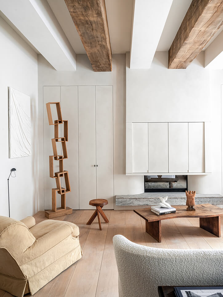
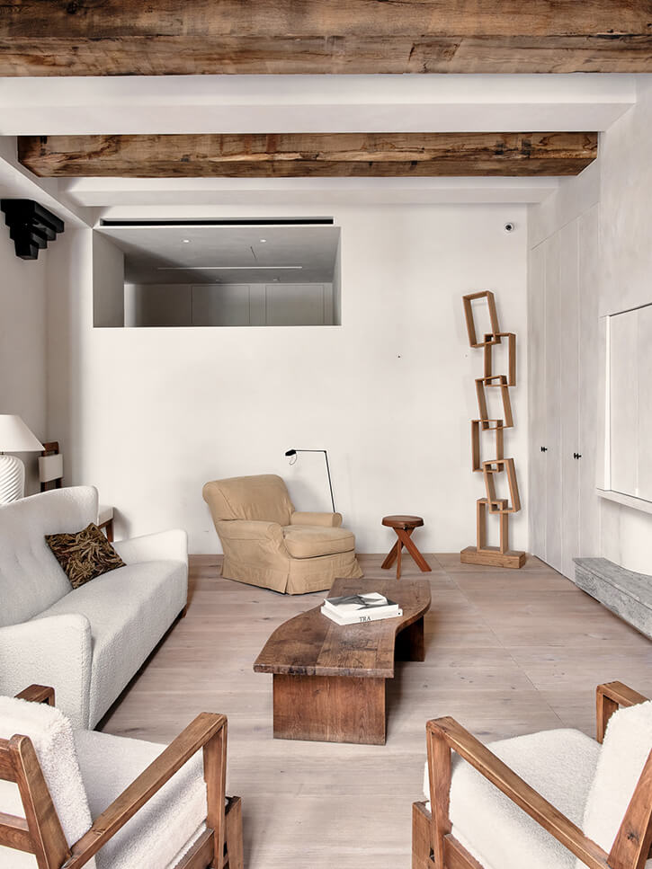
Warm minimalism
Posted on Thu, 9 Dec 2021 by KiM
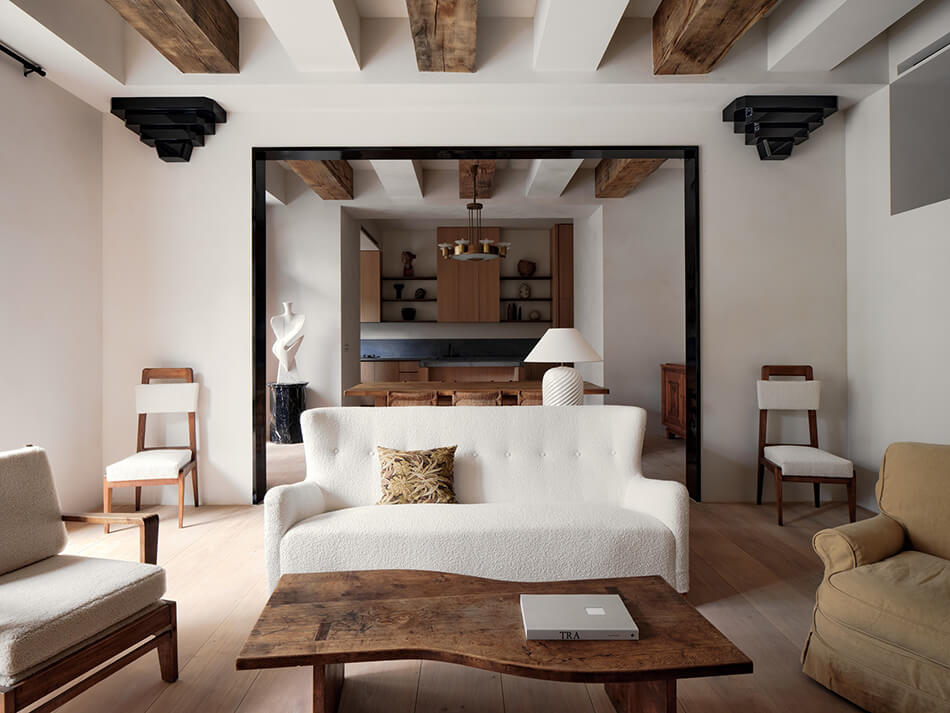
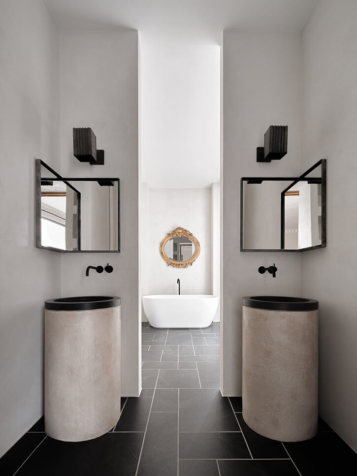
This home in Taipei exudes a warmth and softness, an earthy and rustic yet modern and minimalist vibe. Bringing the country to the city. This is breathtaking. Designed by ECRU Studio. (Photos: Suiyu Studio)
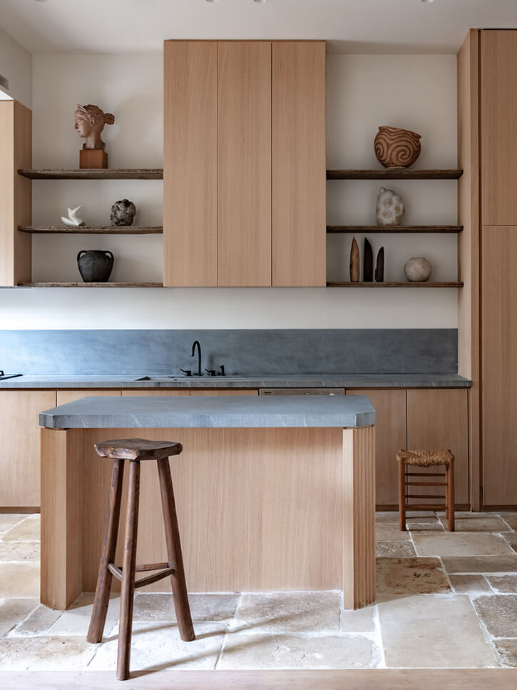
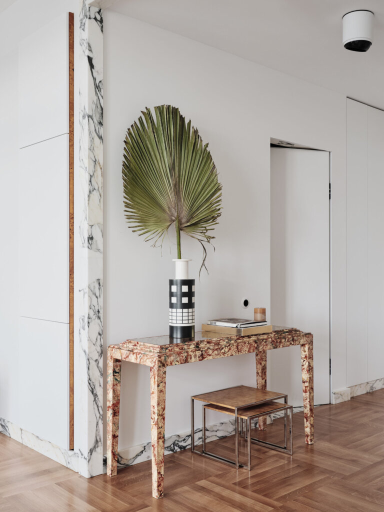
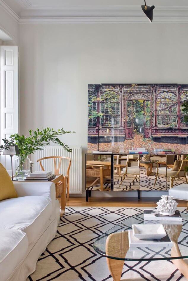
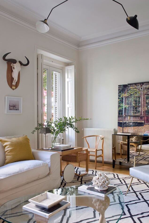
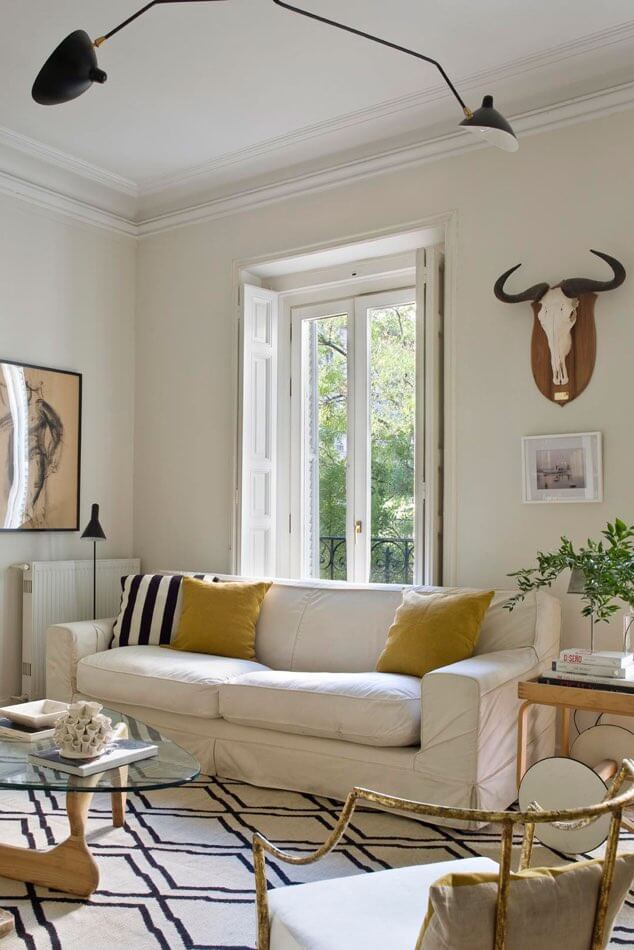
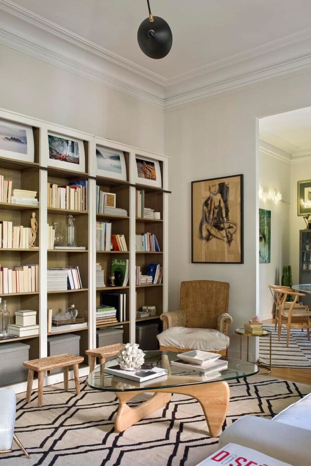
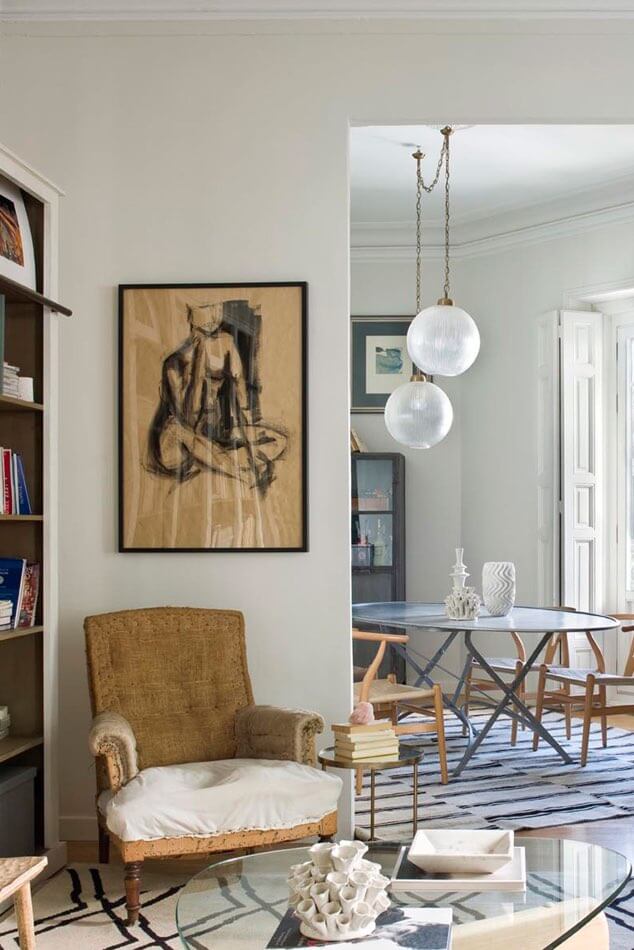
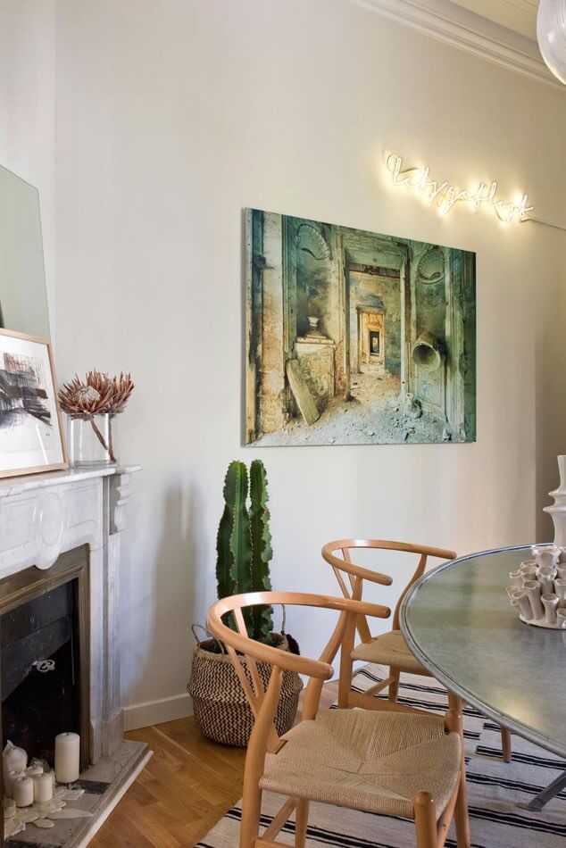
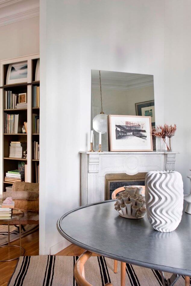
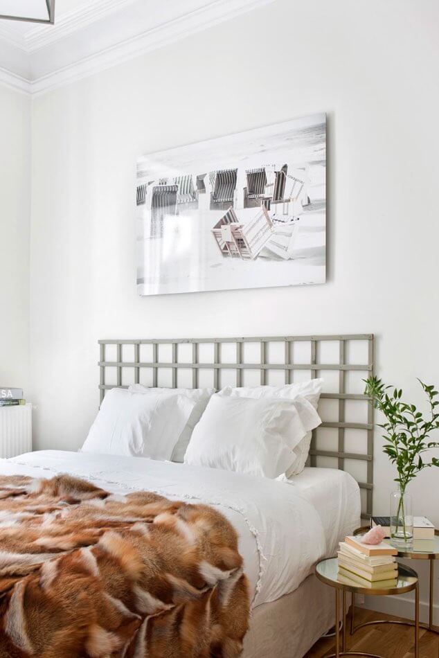
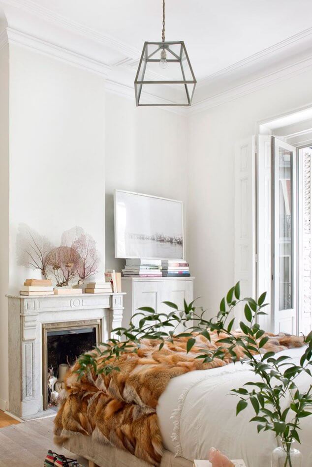
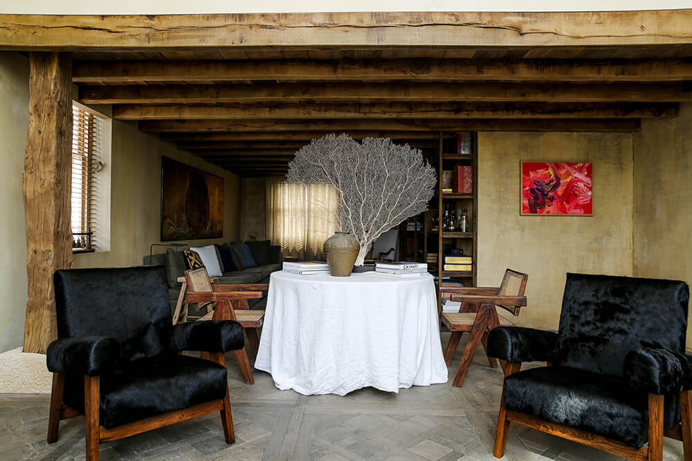
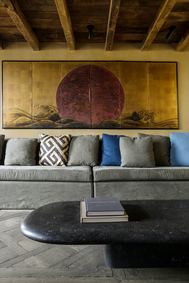
Neutral in Madrid
Posted on Thu, 2 Dec 2021 by midcenturyjo
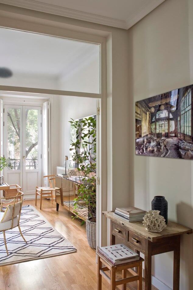
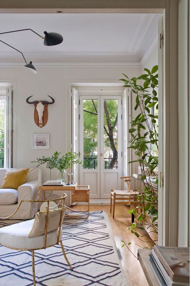
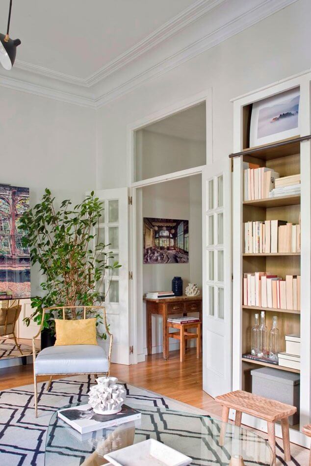
With its restrained, neutral colour palette, eclectic mix of furniture, cool art and layer upon layer of texture this apartment by Madrid-based Estudio María Santos is sophisticated but not stuffy, stylish and welcoming. Think light flowing in through tall windows and a preference for natural materials like wood, stone metal and linen.
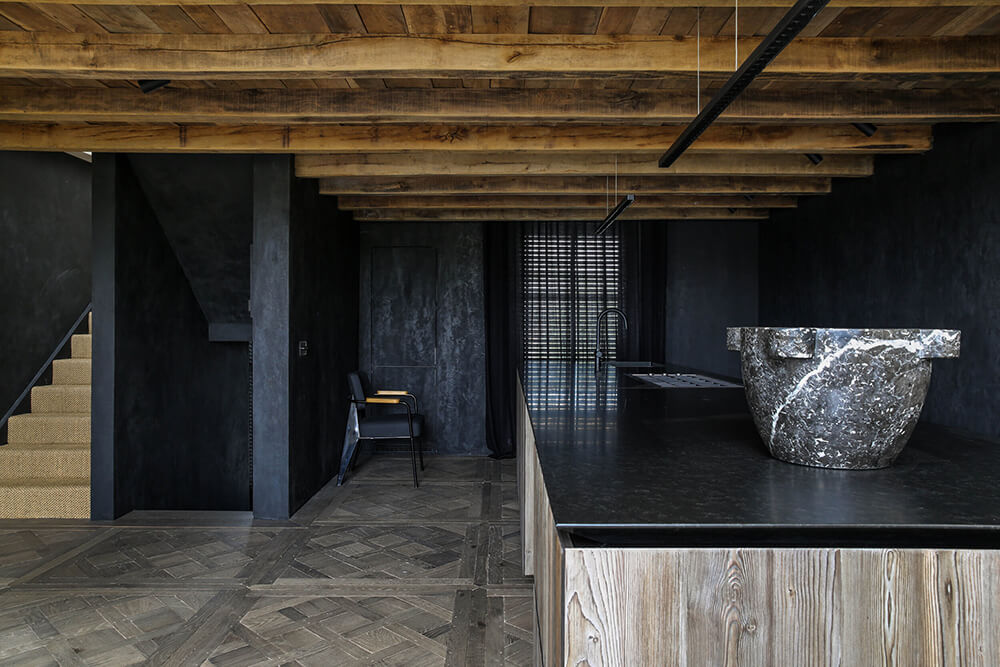
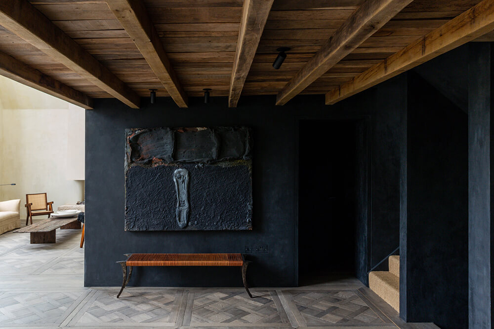
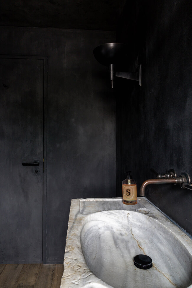
Notting Hill artist studio
Posted on Mon, 29 Nov 2021 by KiM
Two things about this Notting Hill artist studio that I must point out. 1 – Black walls win over white any day. 2 – If you are going to go minimal, do it like this. Earthy, edgy and textured. Saskia Blyth of Blyth-Collinson Interiors is responsible for nailing this space.
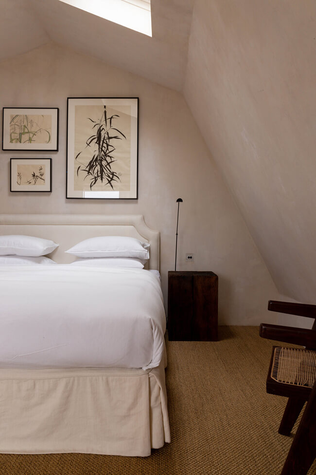
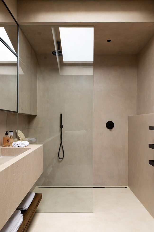
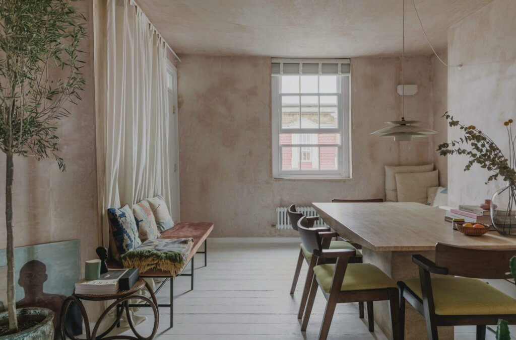
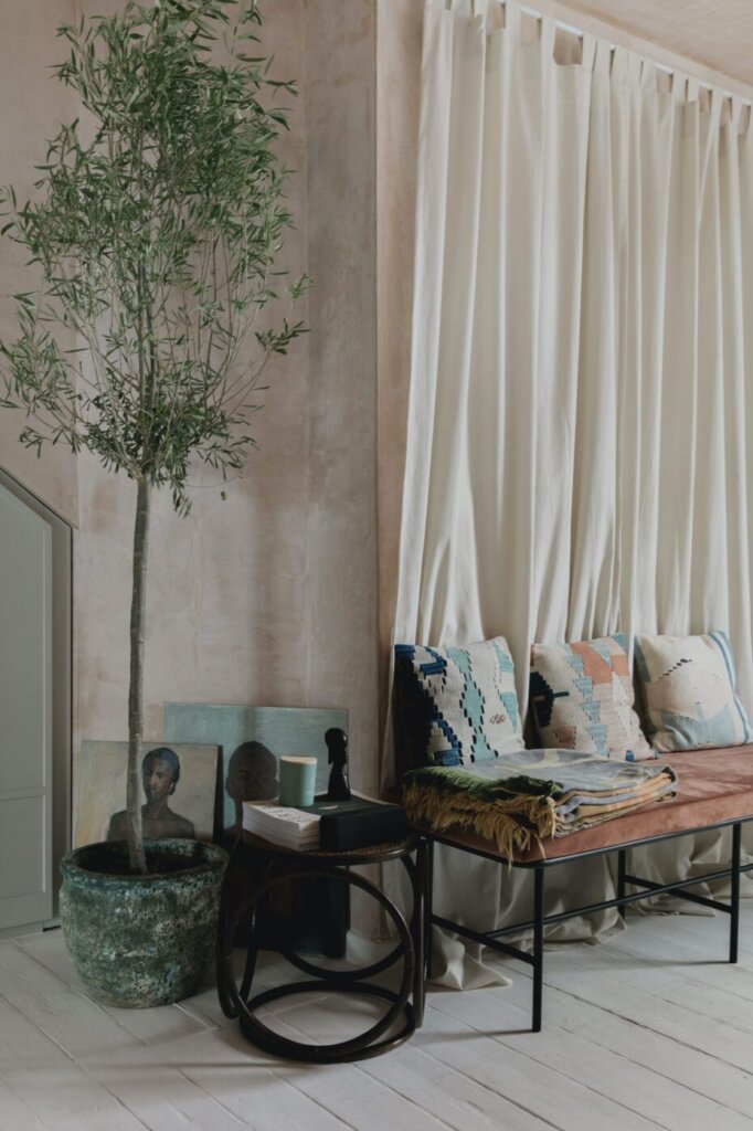
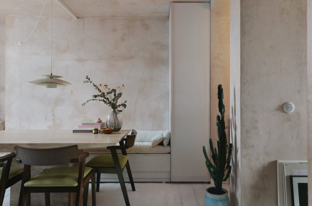
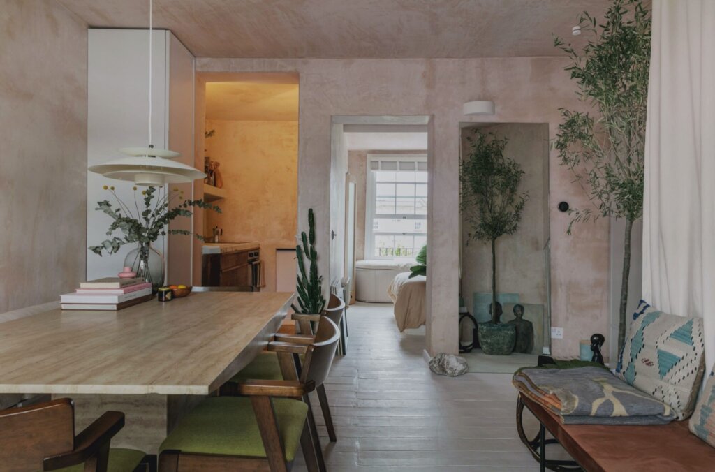
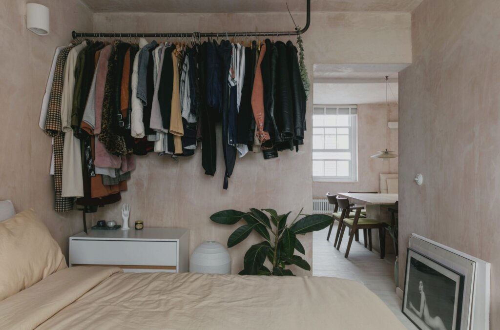
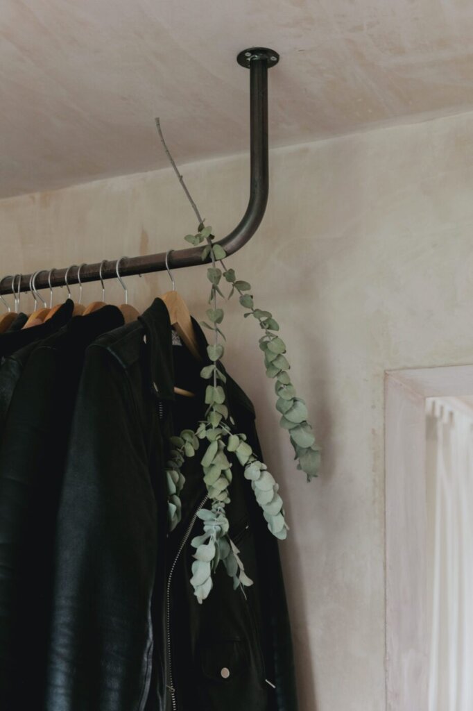
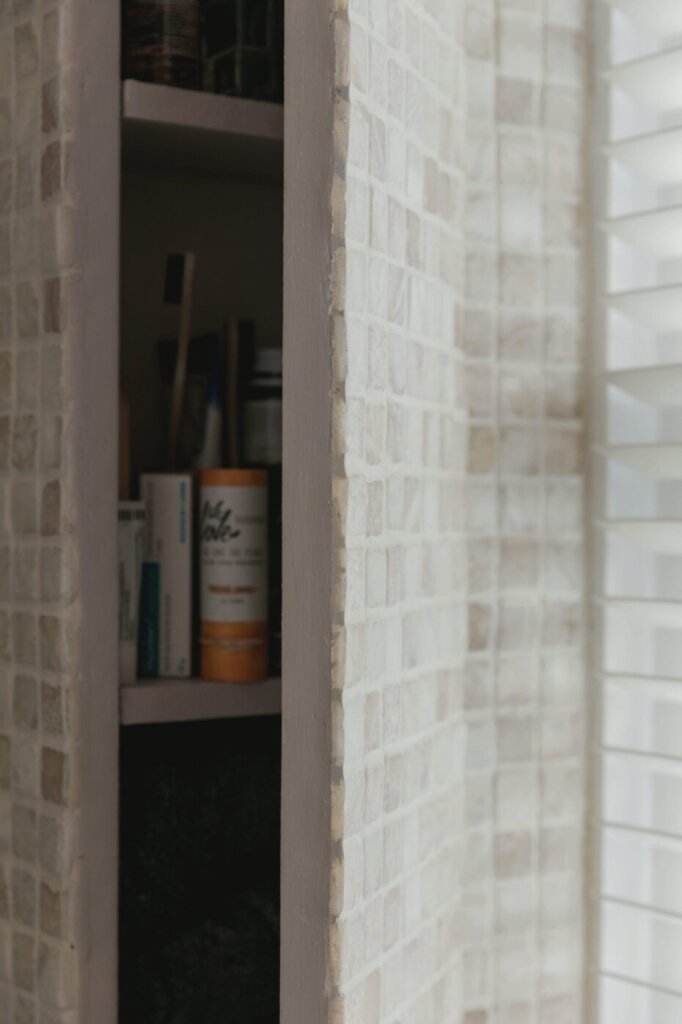
House of clay
Posted on Thu, 18 Nov 2021 by midcenturyjo
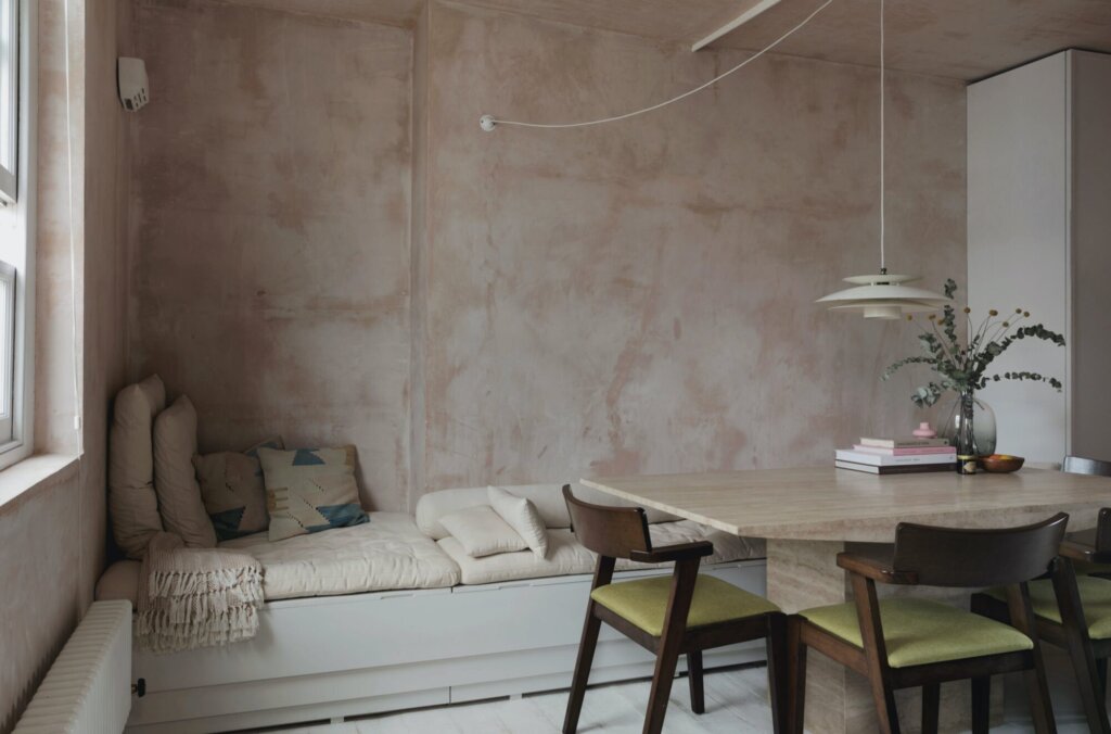
“The Clay House, situated in Bethnal Green overlooks two parks, one to the East on the bedroom side with the living quarters facing Weavers Fields to the West. We were struck with how the light cast long shadows deep in to the plan from the afternoon in to evening reminding us of the carved rock formations found in the Western USA – a narrow gap punctured with light. The clients, with roots in California via the Philippines and Ireland sought a retreat from the pressures of city life and for it to be a simple space to work, eat and live. Raw clay plaster walls and ceilings run through the apartment with beaten old white floorboards refurbished but still storied. Cacti and olive trees coexist against a backdrop of an aged birch kitchen with handcut tile countertops and an onyx mosaic bathroom. A travertine table forms the heart of the working, dining and living area bouncing light deeper through the space.”
An oasis in the bustling city. Tactile and soothing with a wabi sabi vibe. Clay House, pared back living by London-based architecture and interiors practice Red Deer.


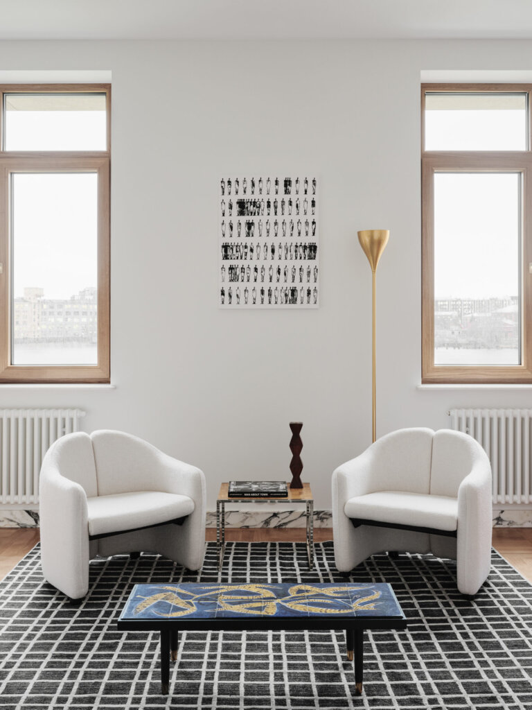
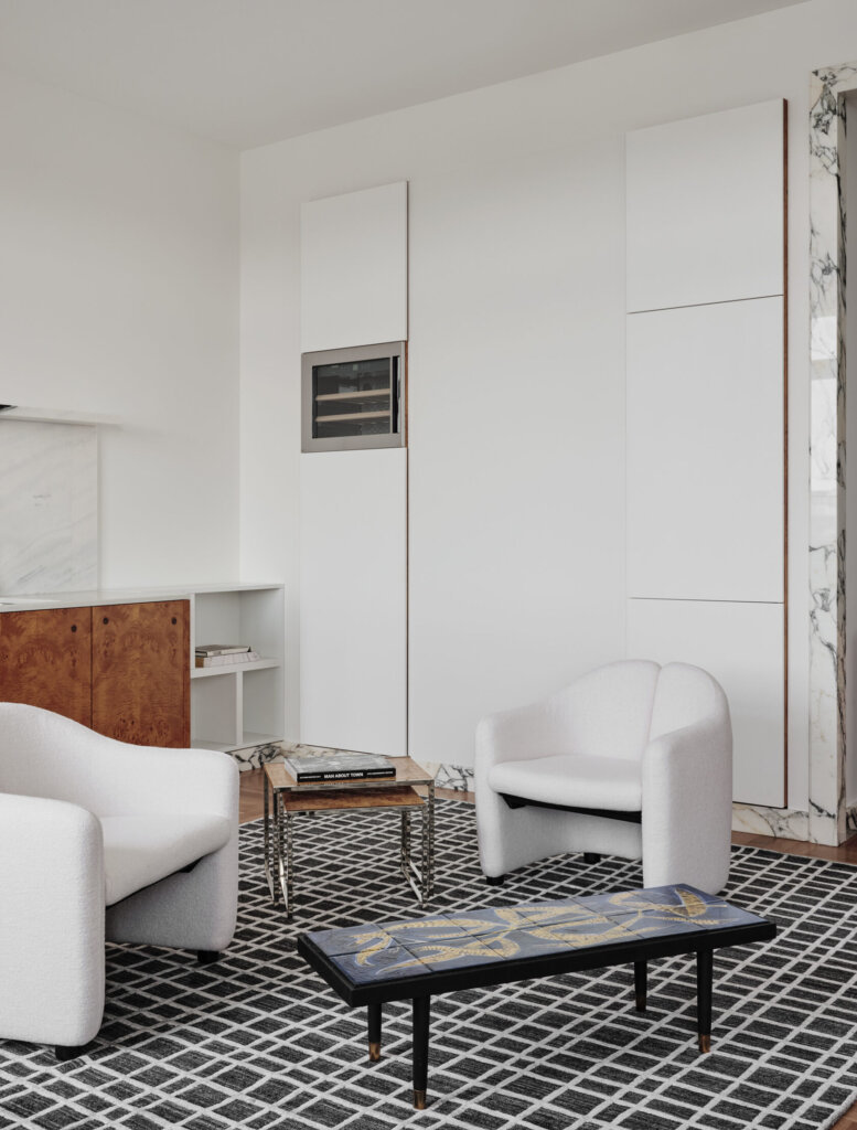
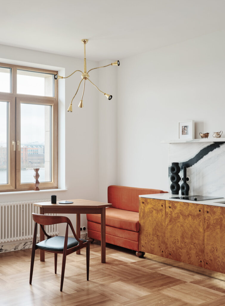
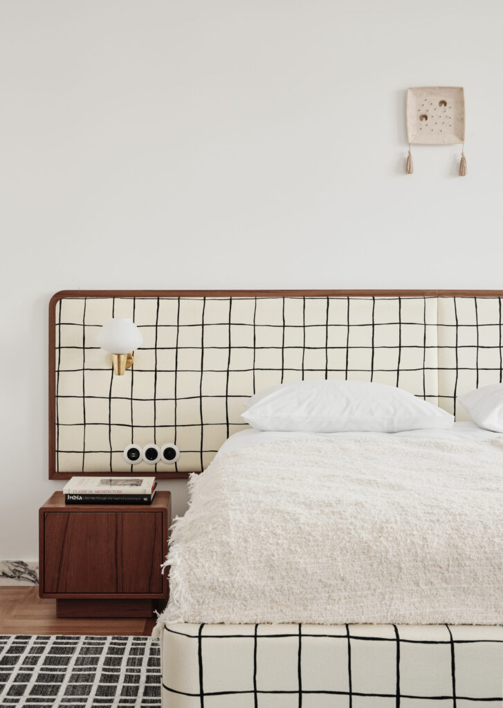
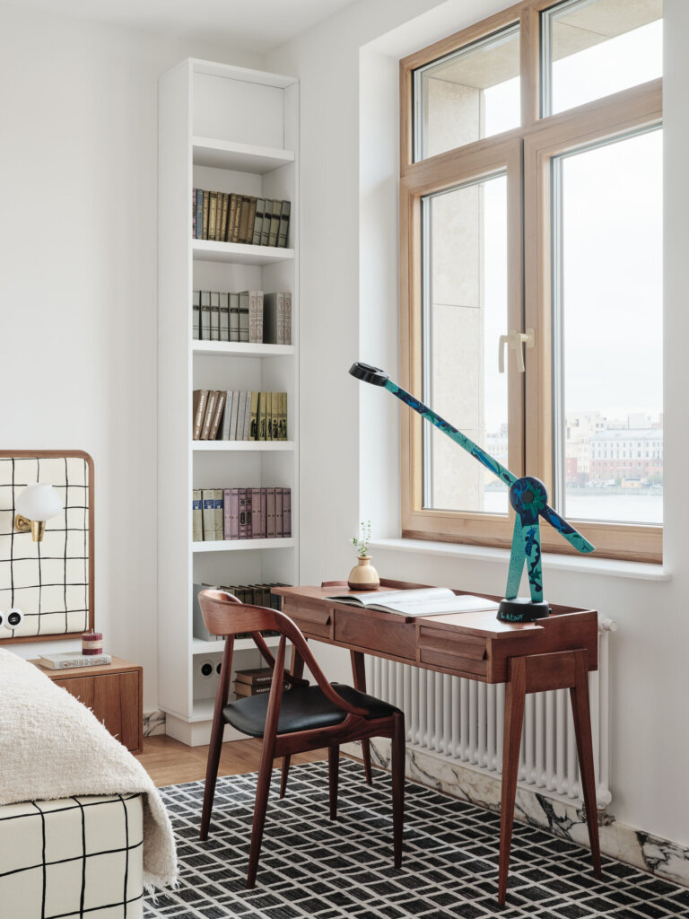
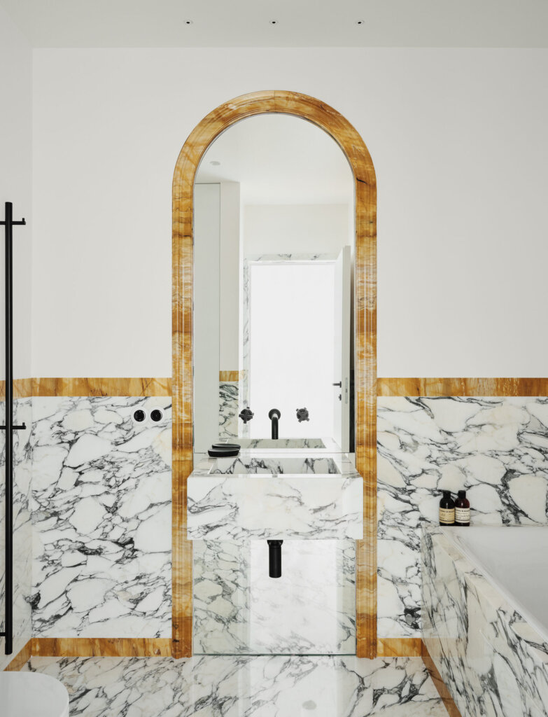
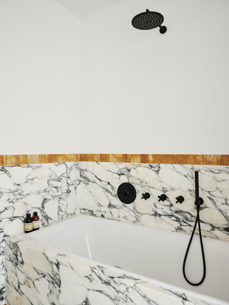
Living large in a 49m² St Petersberg apartment
Posted on Tue, 16 Nov 2021 by midcenturyjo
Sophisticated, stylish and masculine this small apartment by St Petersberg-based interior designer Tim Veresnovsky uses a black and white colour palette and clever use of pattern to trick the eye into believing there is so much more space. Honey toned stone and timbers warm the scheme.