Displaying posts labeled "Black"
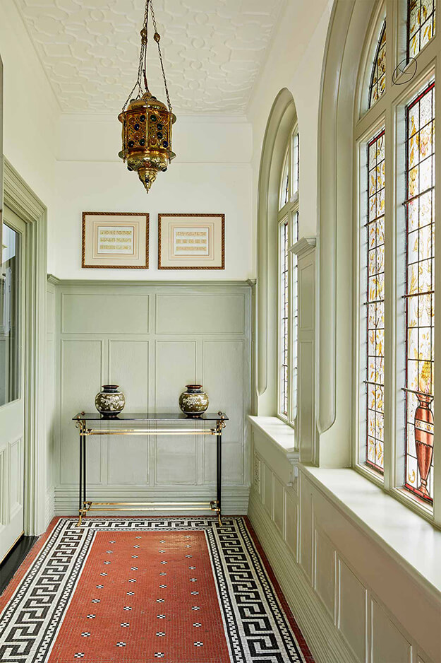
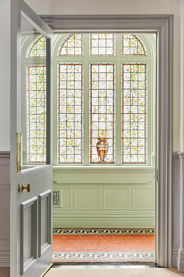
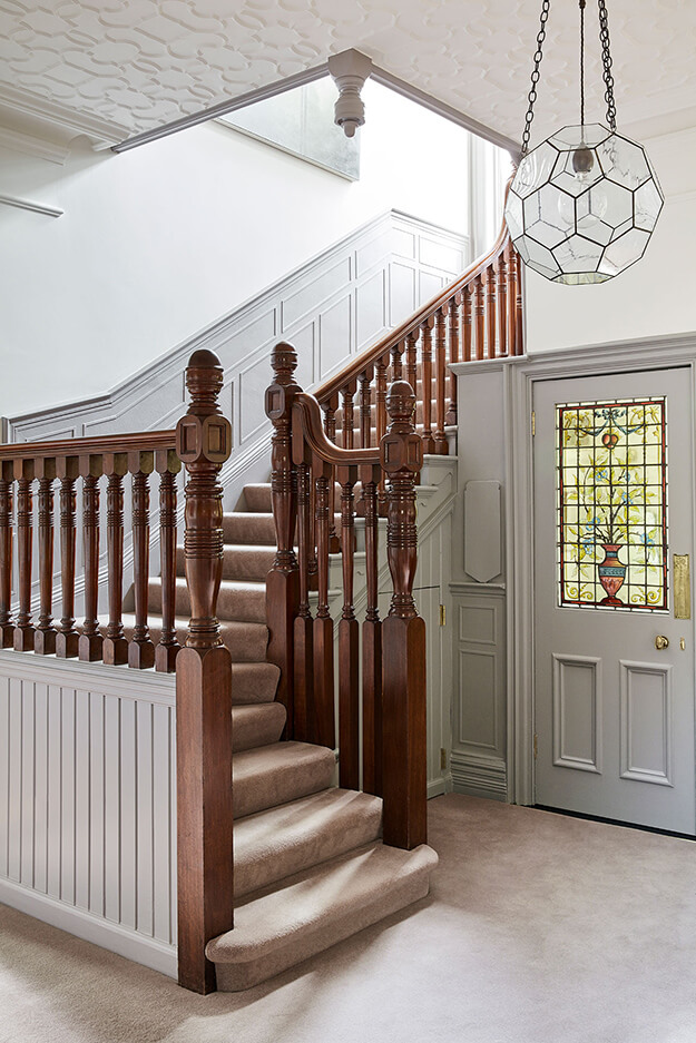
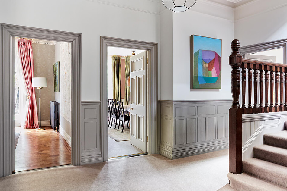
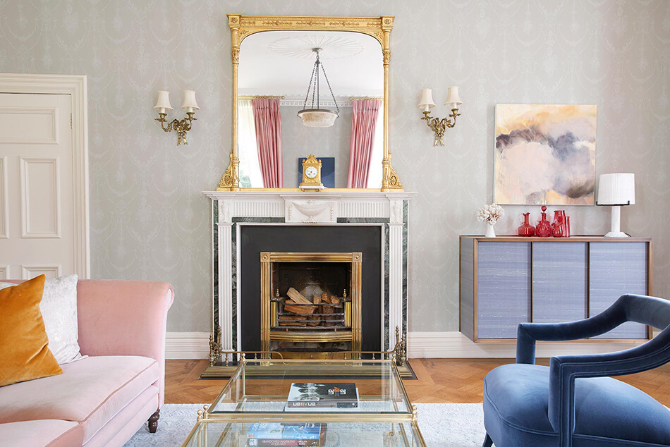
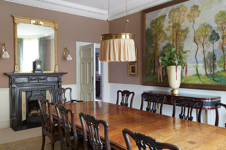
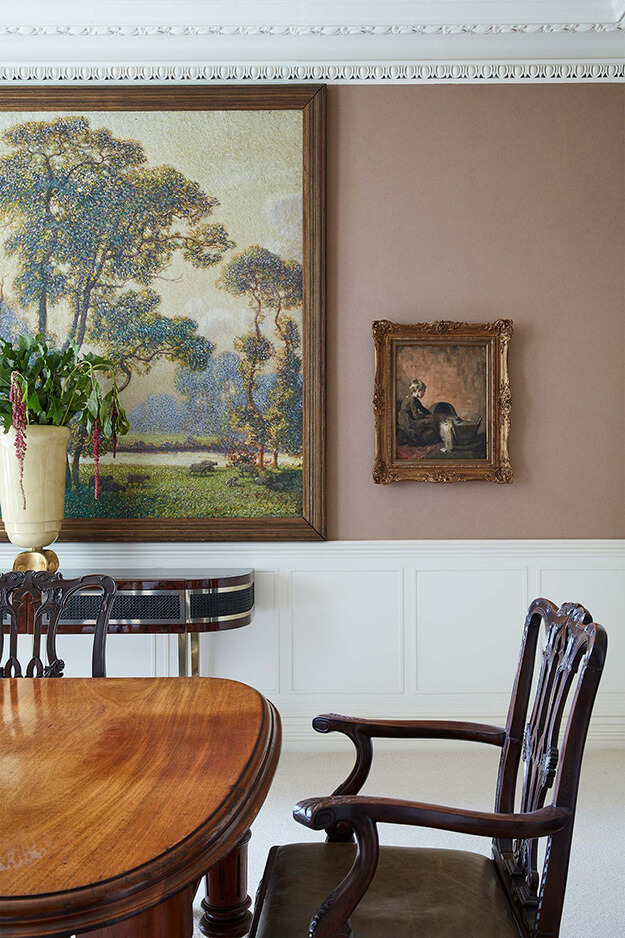
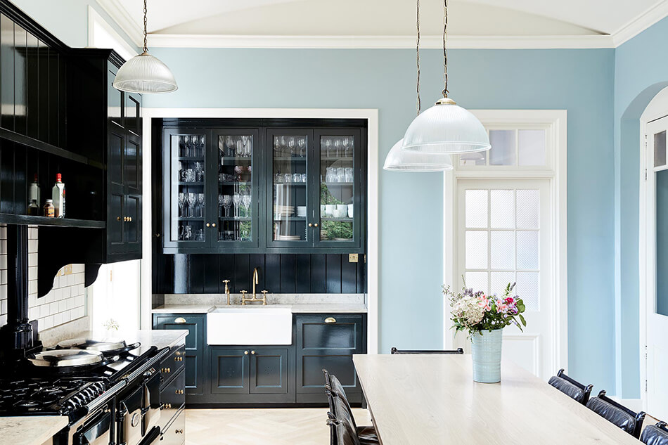
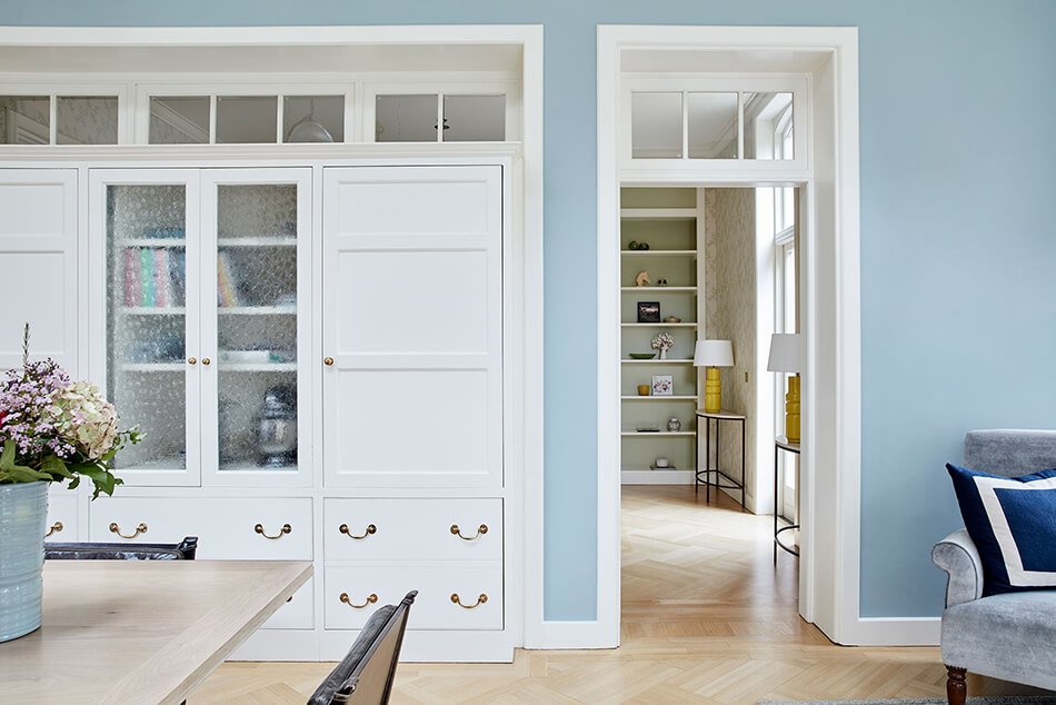
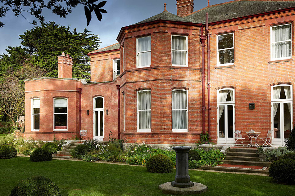
Adelaide by LyonsKelly
Posted on Mon, 6 Sep 2021 by KiM
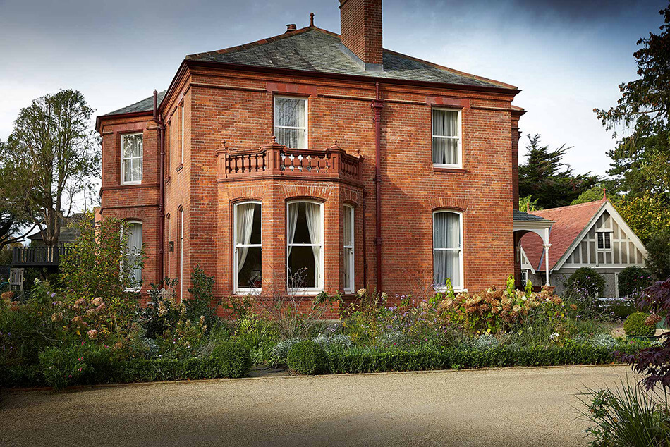
What an absolutely beautiful home full of incredible architecture. Architected and designed by Irish based firm LyonsKelly.
The detached house was built in the 1890s but had been largely untouched since the 1940s. It retained its original layout including servants’ room, scullery and butler’s pantry. The layout and services required modernising but we did not want to take away from the special character of the house. We relocated the kitchen from the Northside to the South-West corner so that it overlooks the gardens and benefits from direct sunlight. This involved altering the service rooms of the house to make a new kitchen, family room and terrace with an outdoor fireplace. The original mosaic tiles on the terraces inspired new finishes such as the floors in the bathrooms. The clients did not want an interior that was slavishly period-perfect so the decoration is a combination of antiques mixed with contemporary and vintage items.
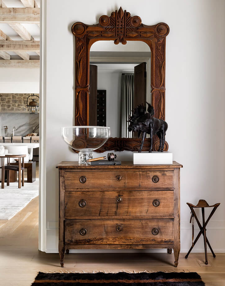
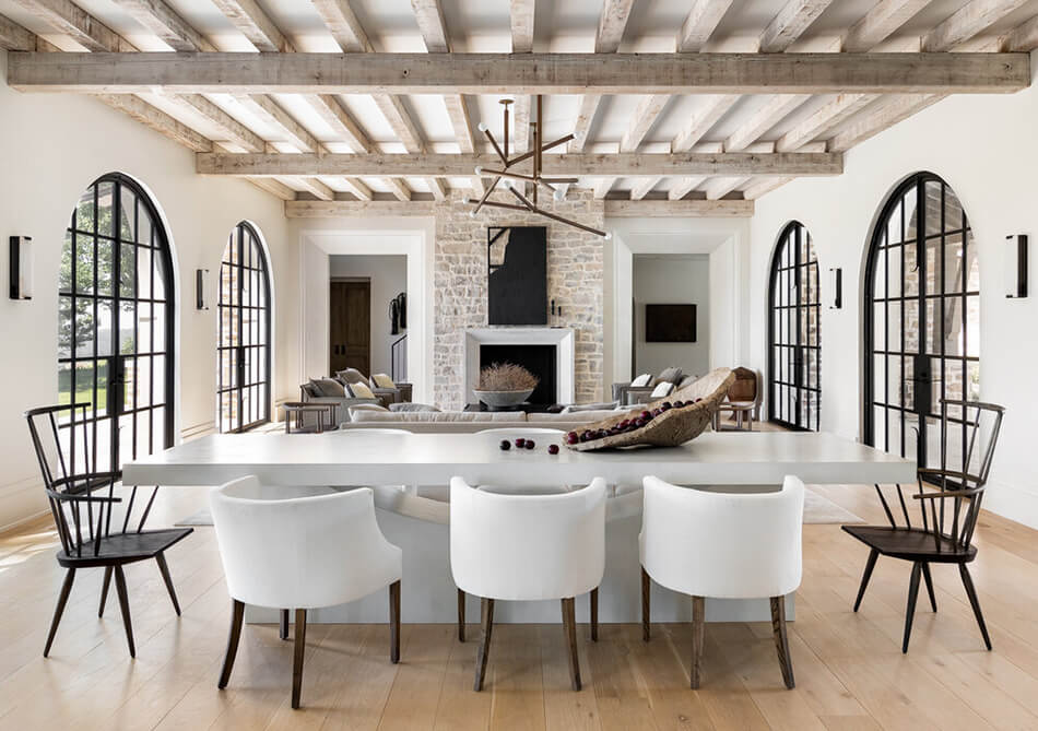
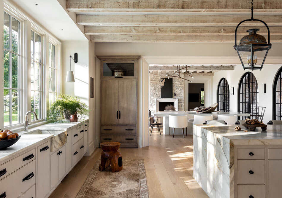
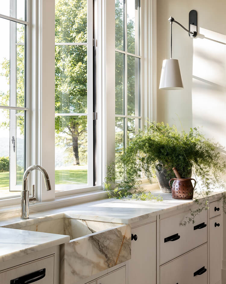
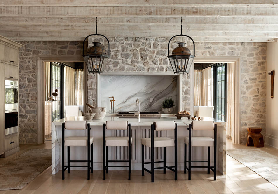
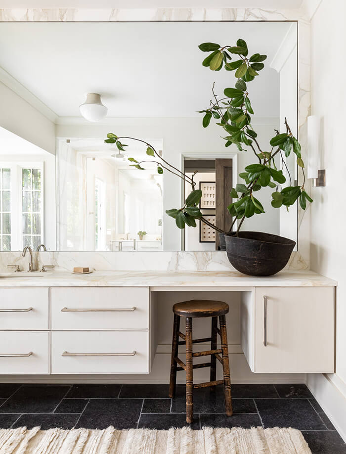
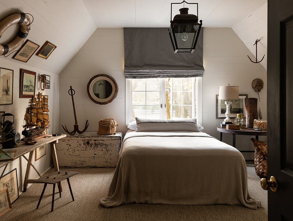
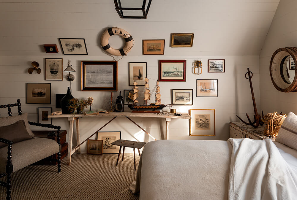
A bit brighter and more contemporary
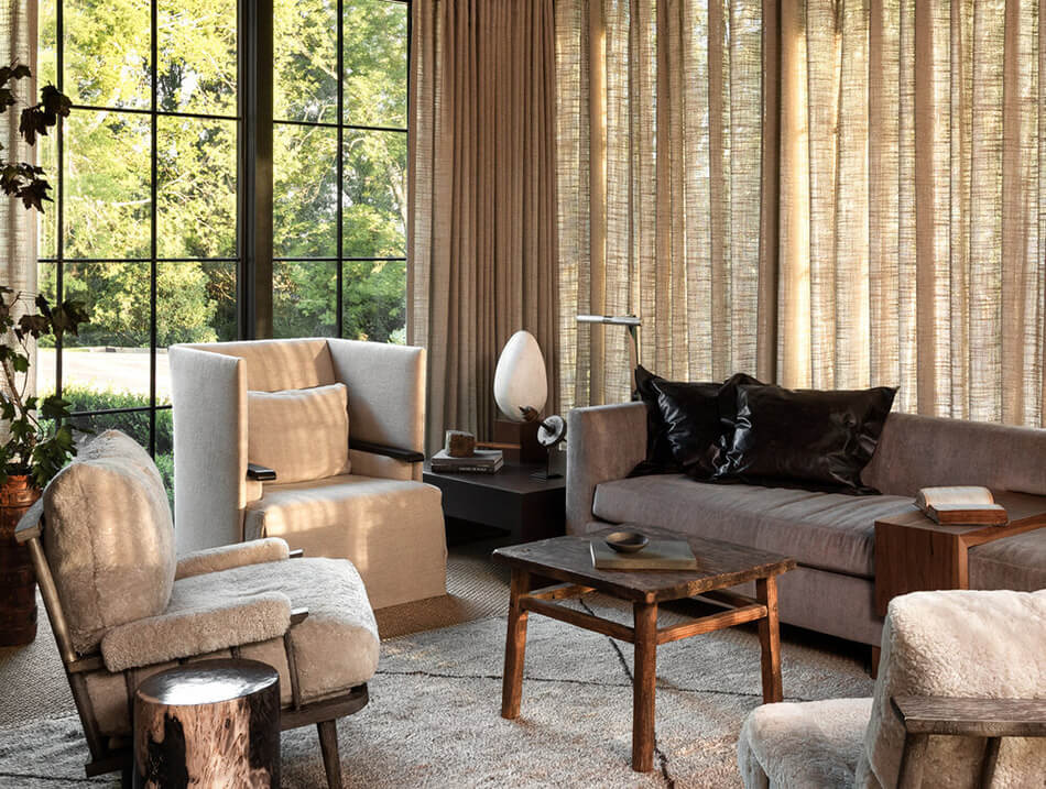
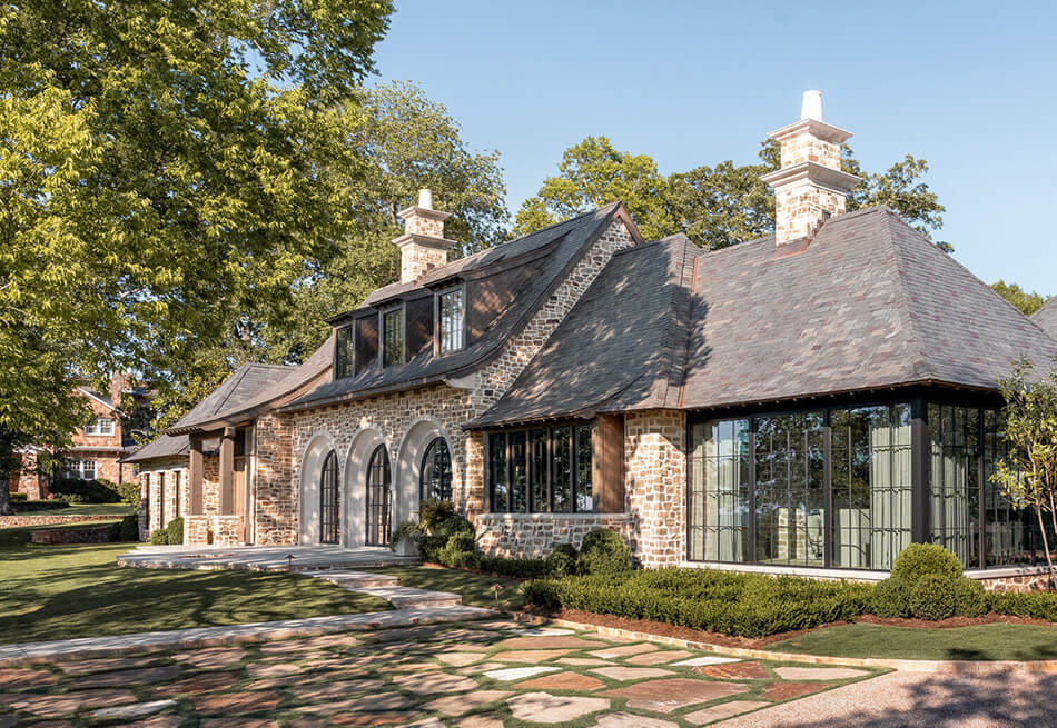
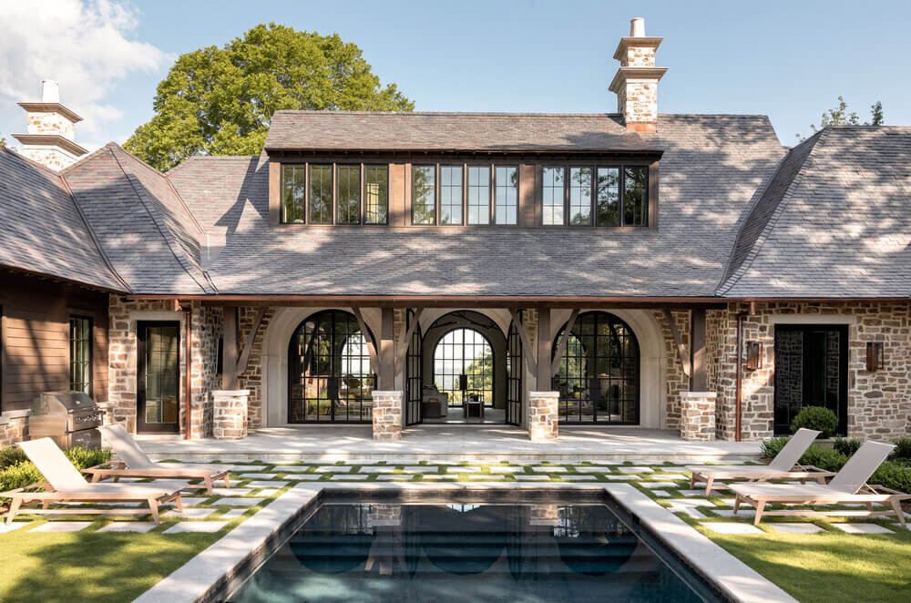
Posted on Thu, 2 Sep 2021 by KiM

Sean Anderson‘s neutral, textured, vintage vibe is always present in his spaces, even when it’s on the brighter and more contemporary side. Every piece I want to go up for a closer look, and touch it to feel the softness or the patina. This home in Alabama is very neutral but there’s so much texture and warmth that colour is not at all missed. (Photos: Haris Kenjar; Architect: Tom Adams; Builder: Francis Bryant Construction)
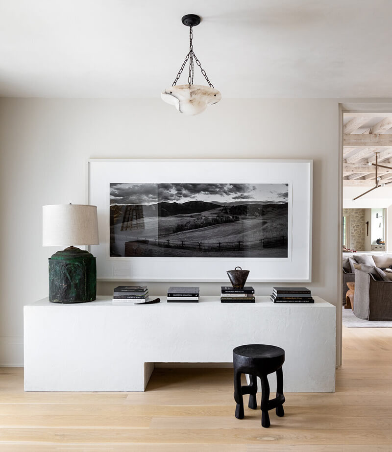
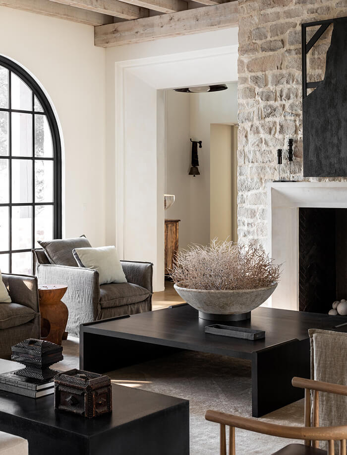


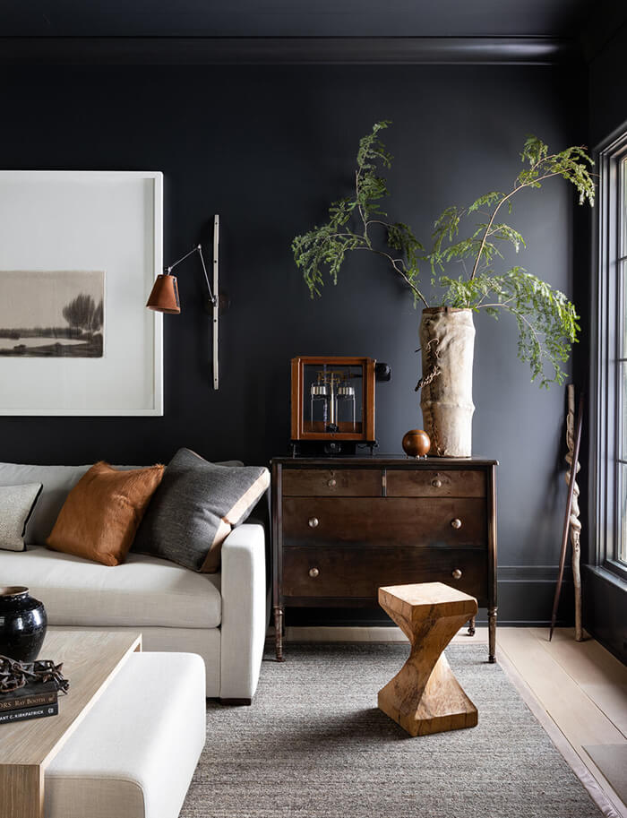
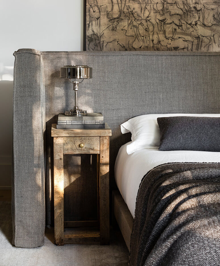
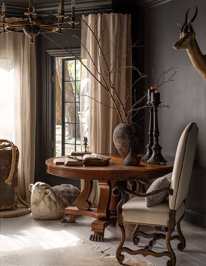
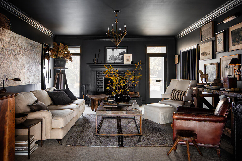
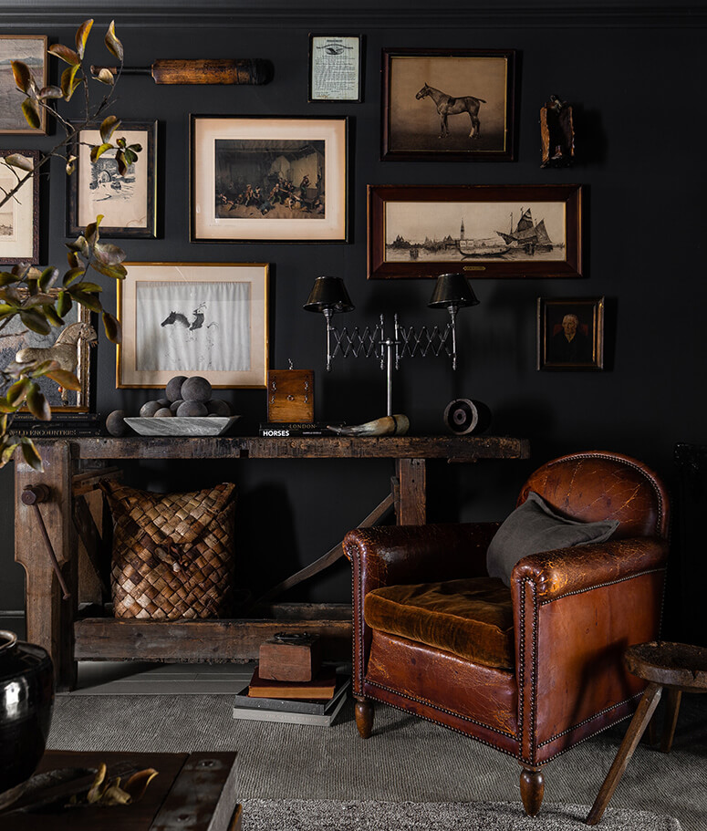
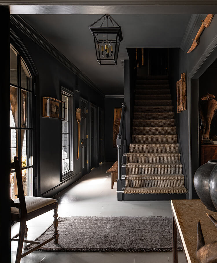
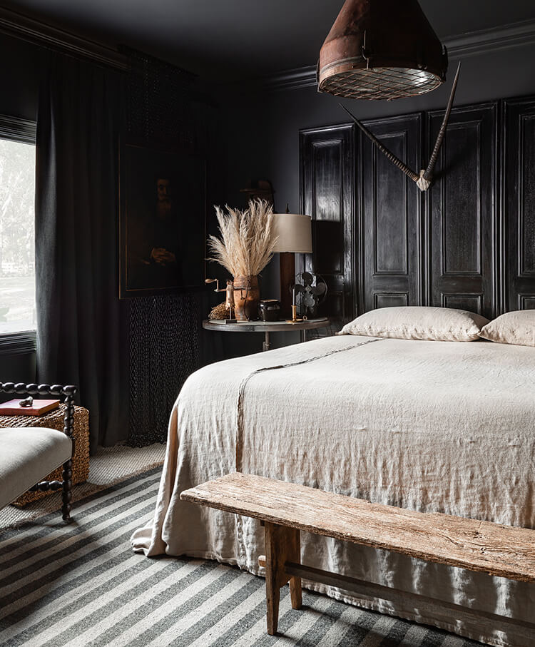
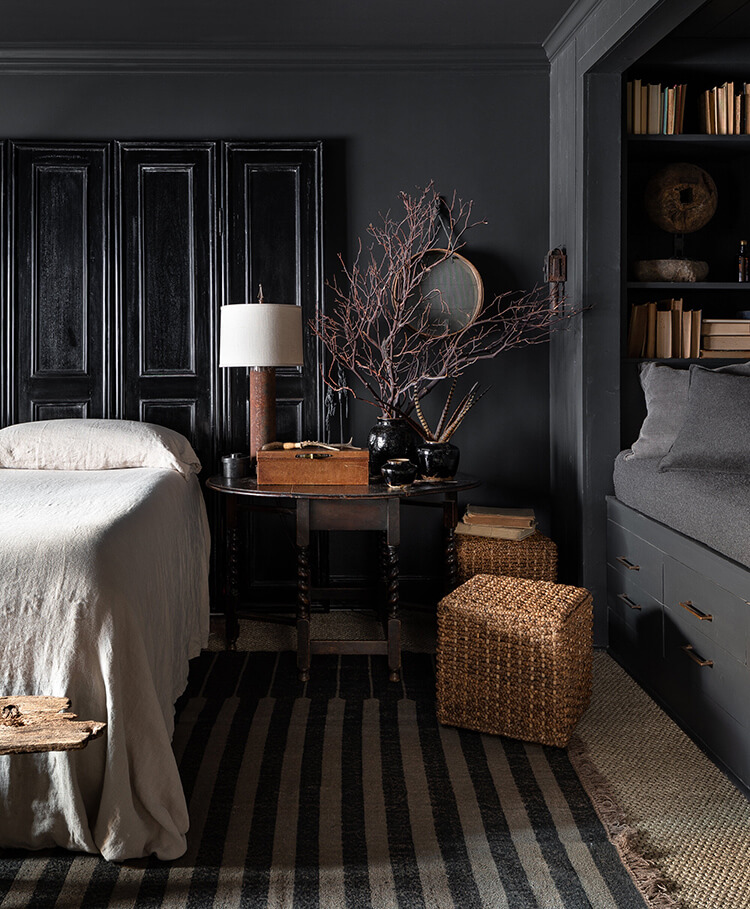
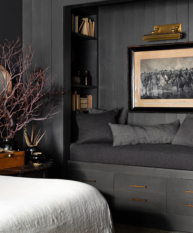
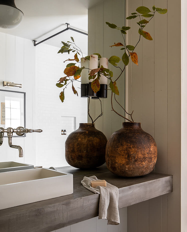
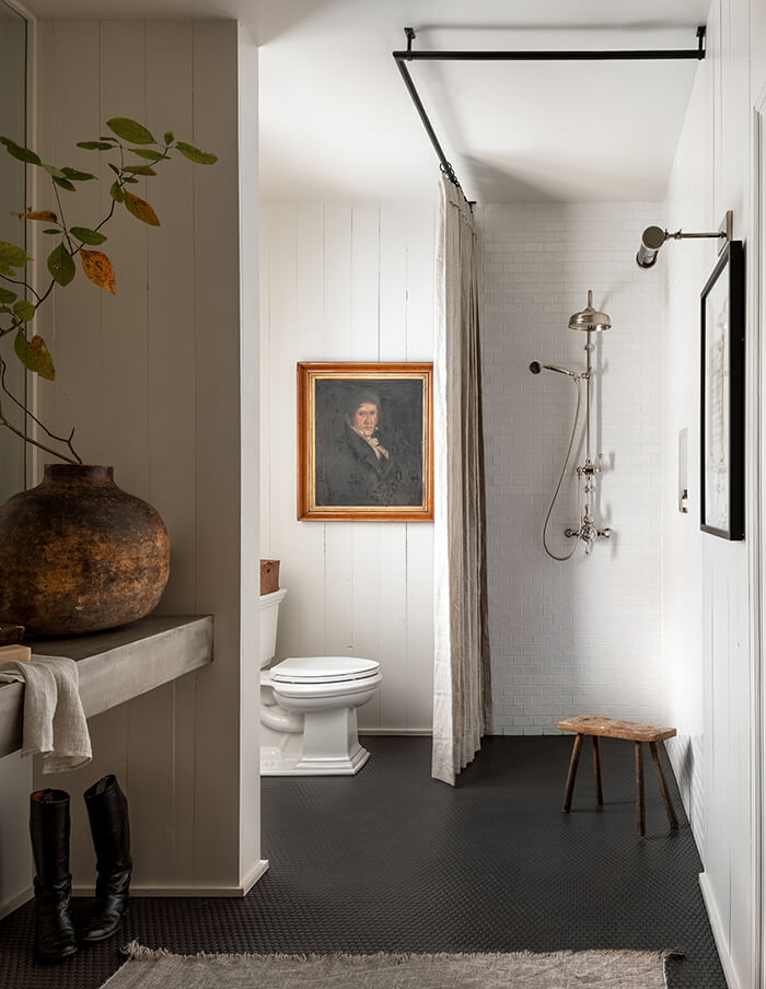
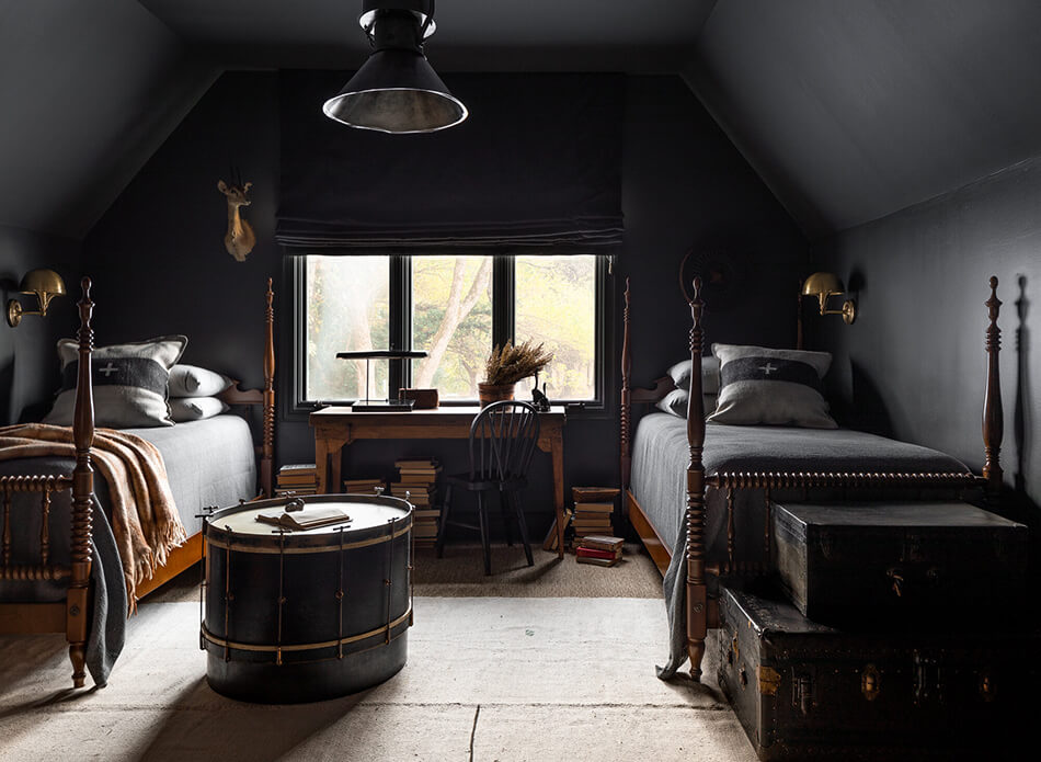
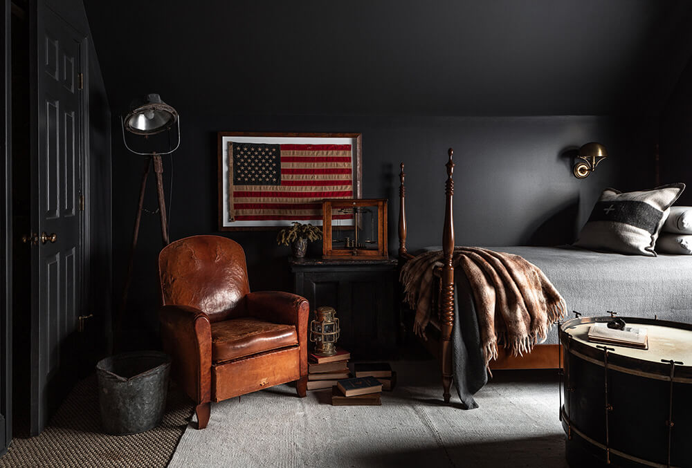
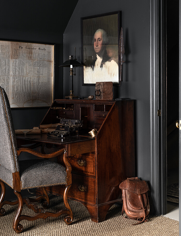
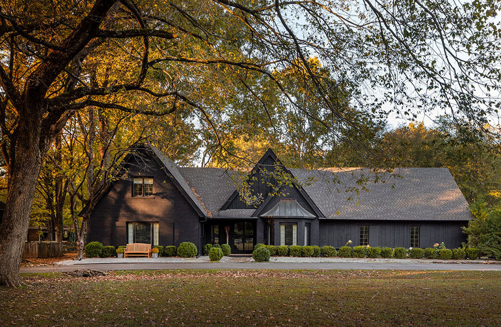
Dark and moody vintage heaven
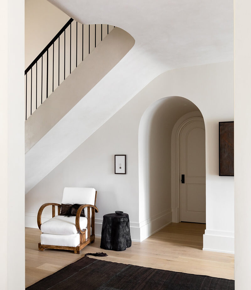
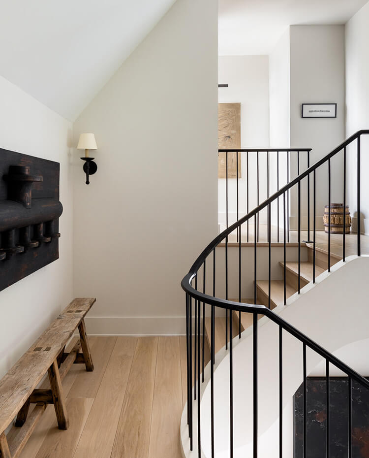
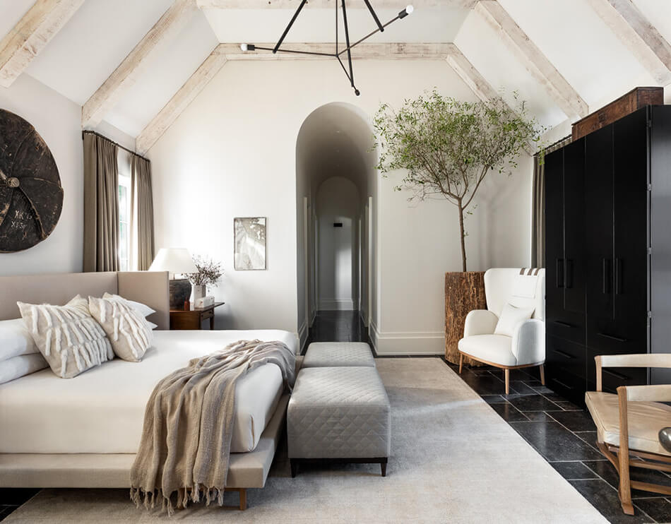
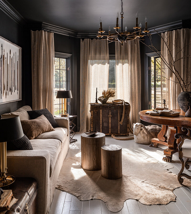
Posted on Tue, 31 Aug 2021 by KiM
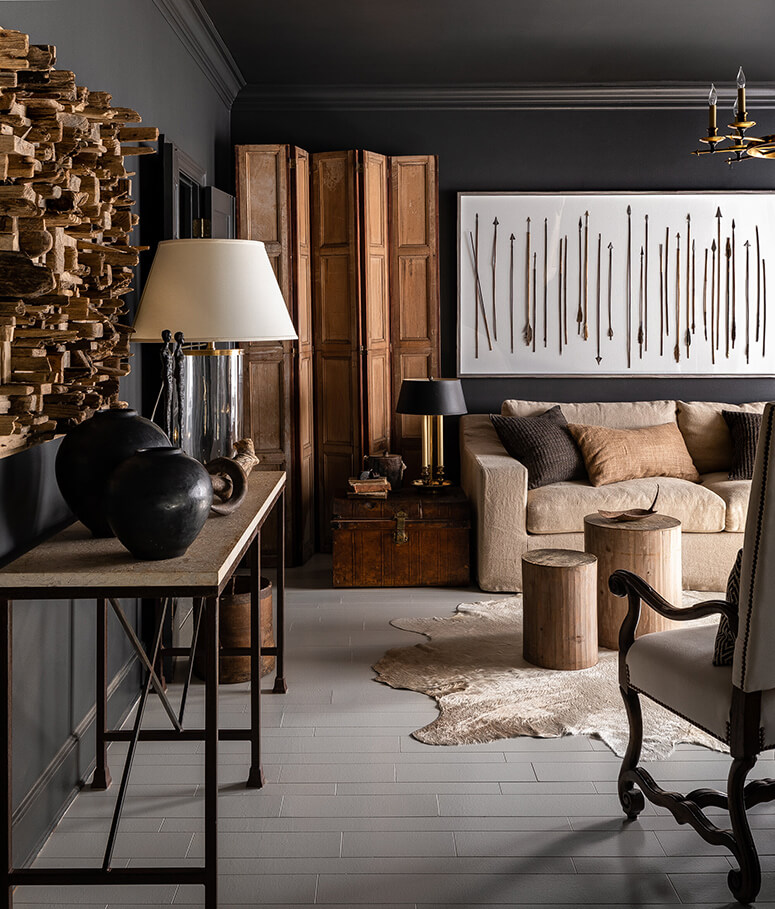
My love of all things dark. moody and full of texture and patina with lots of vintage will never ever waiver. And why my love of the style of designer Sean Anderson will also never waiver. When he goes dark he does it so incredibly well, and unlike any other designer I know. This home in Tennessee is packed with character and drama and I could stare at these beautiful spaces for hours. (Photos: Haris Kenjar)


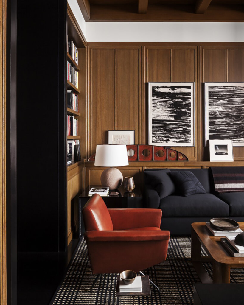
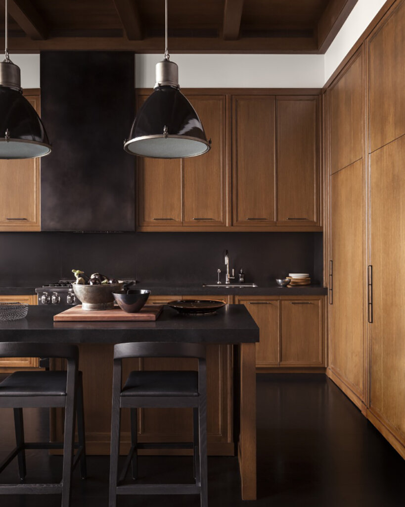
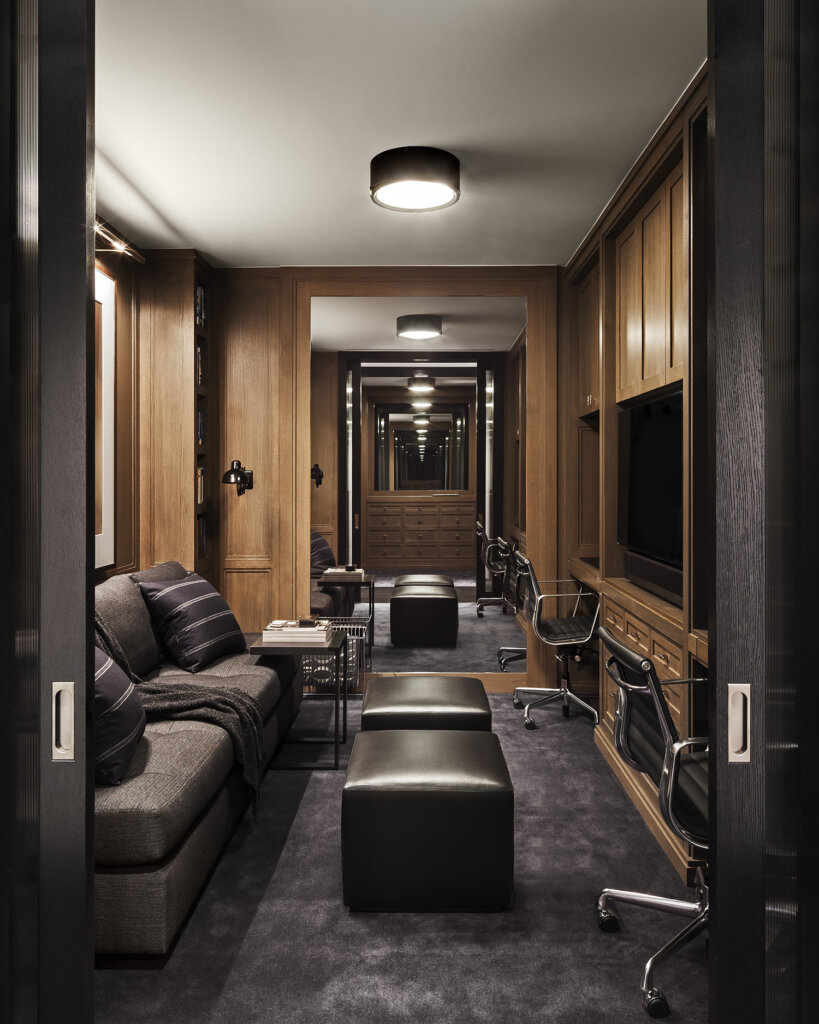
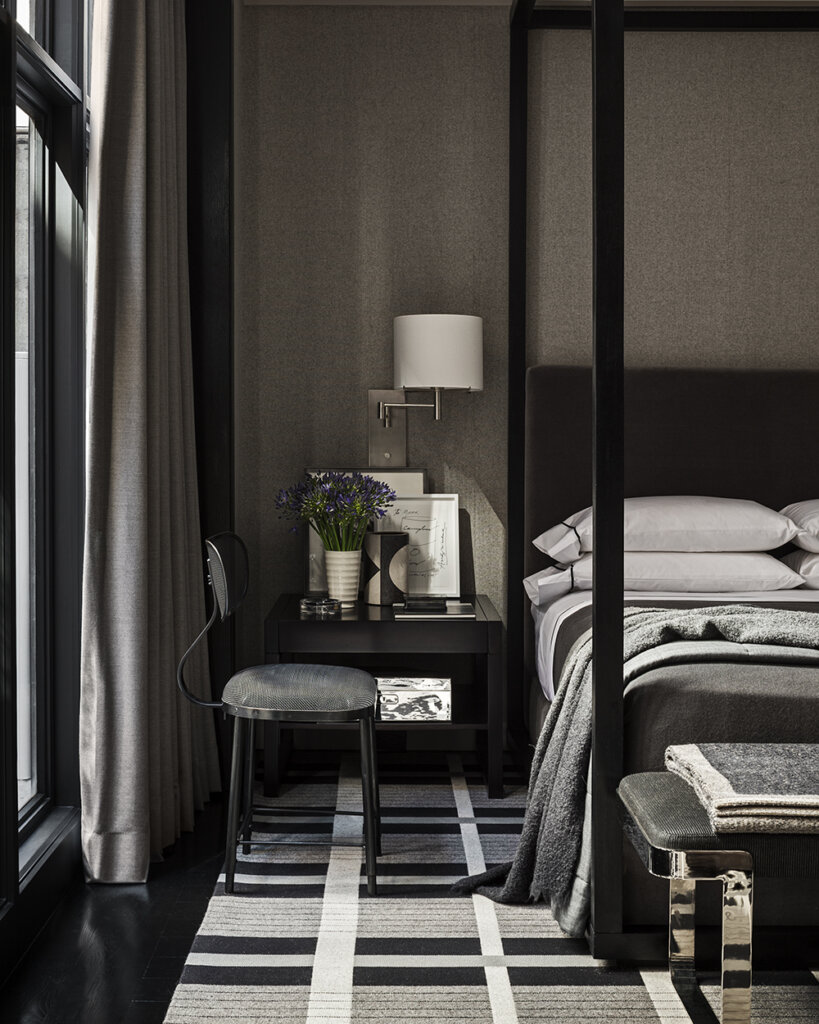
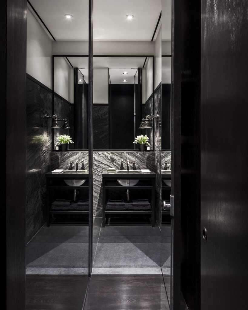
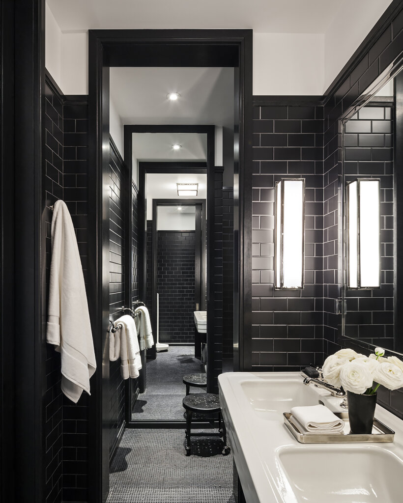
Dark and moody in the city
Posted on Tue, 24 Aug 2021 by midcenturyjo
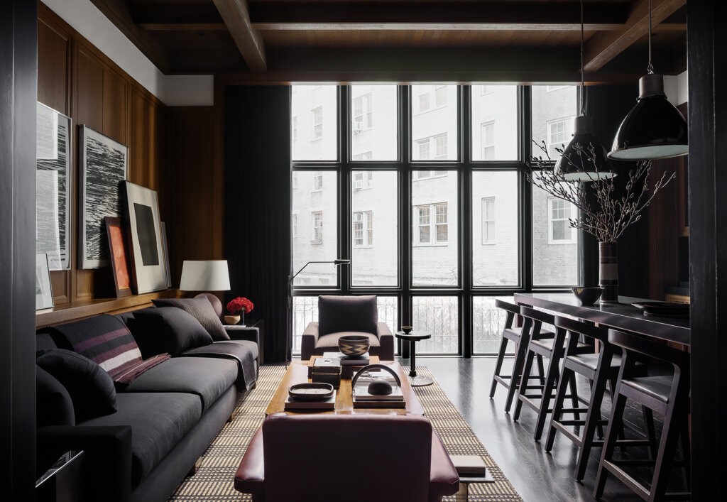
Moody and masculine in New York’s West Village. Deliciously dark and carefully curated with open plan living and private corners. Sophisticated city living. It couldn’t be more of a contrast to the Southampton home I just featured but it’s by the same über talented designer Mark Cunningham.
Contrasting elements
Posted on Fri, 20 Aug 2021 by midcenturyjo
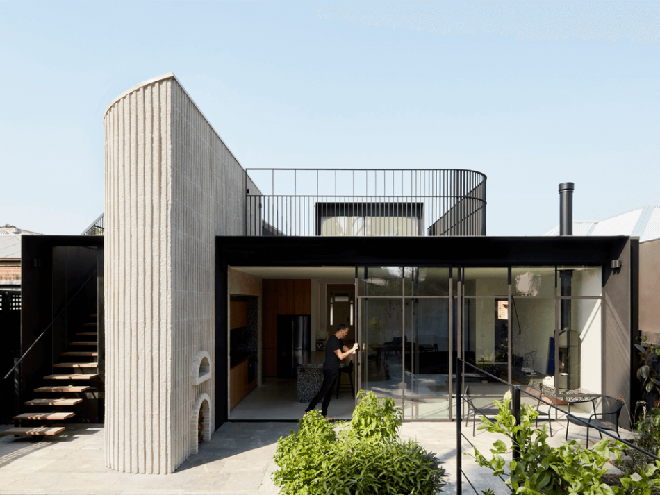
Constrast between the Edwardian home in front and the modern at times brutalist rear extension with its strong solid forms. Contrast between block and marble and timber cabinetry. Constrast between dark and light, in and out. All this contrast in a South Yarra, Melbourne home, the result of a successful collaboration between Pop Architecture and Beatrix Rowe Interior Design.
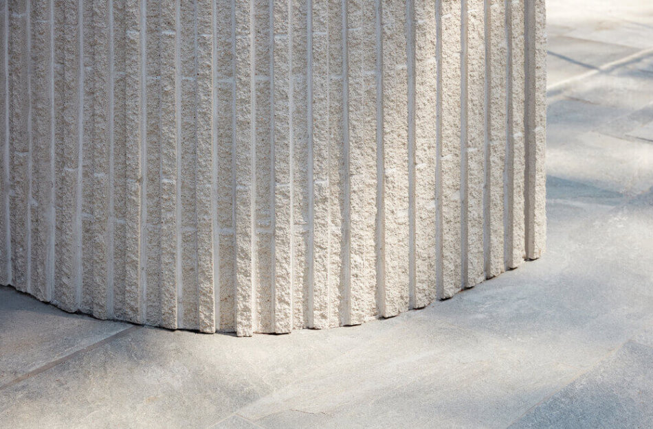
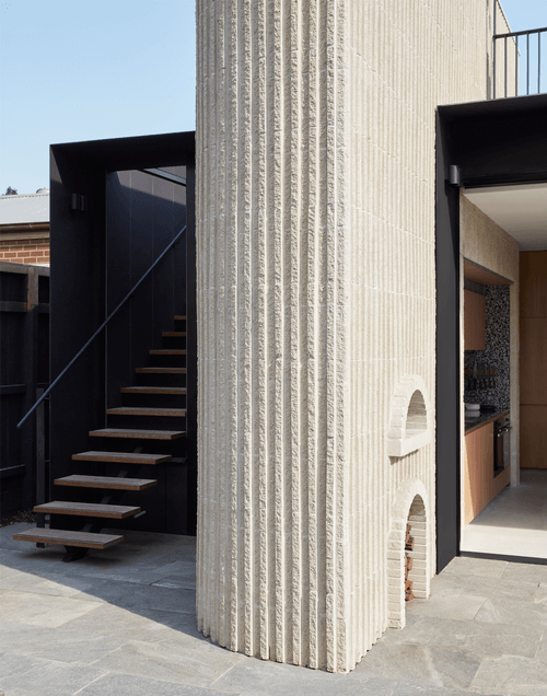
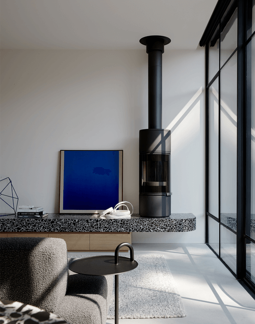
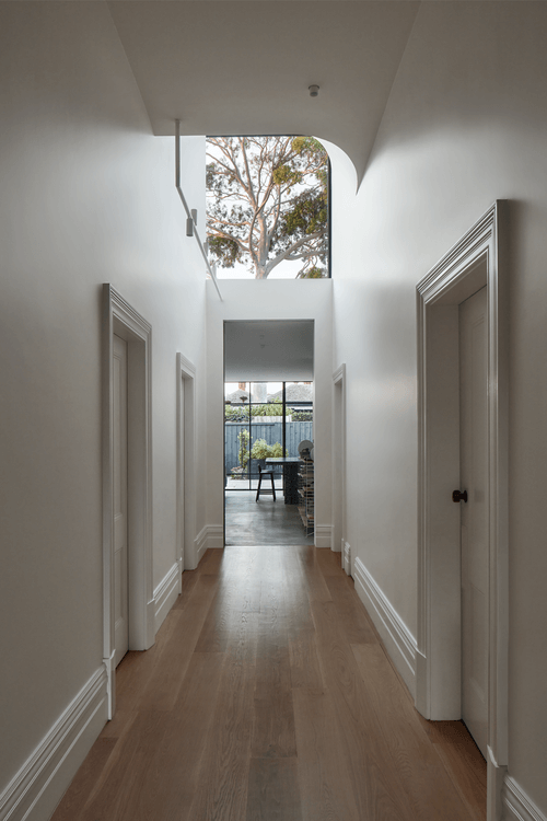
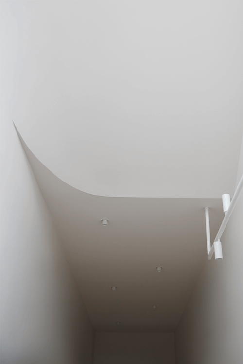
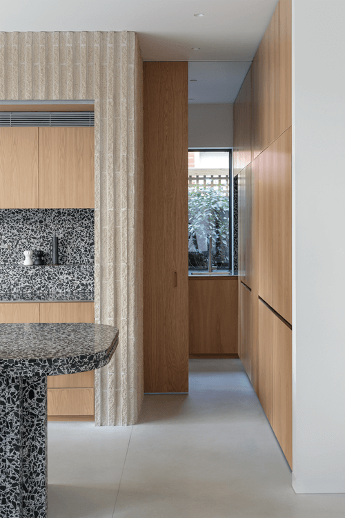
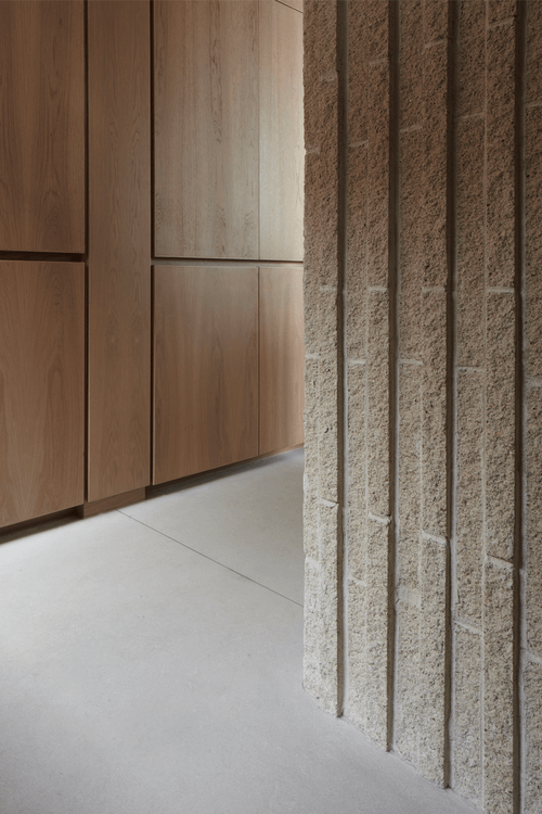
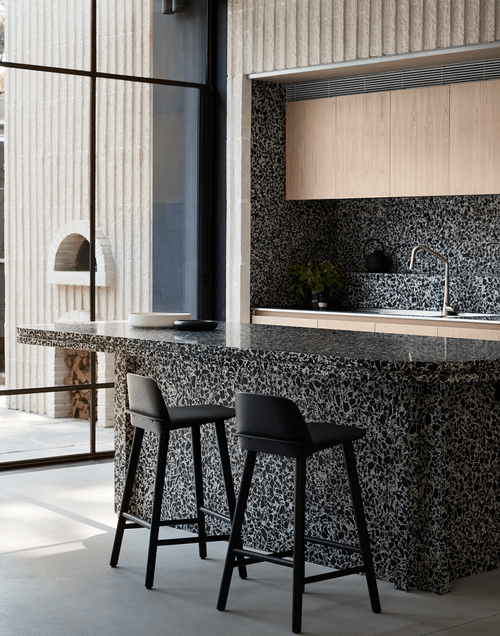
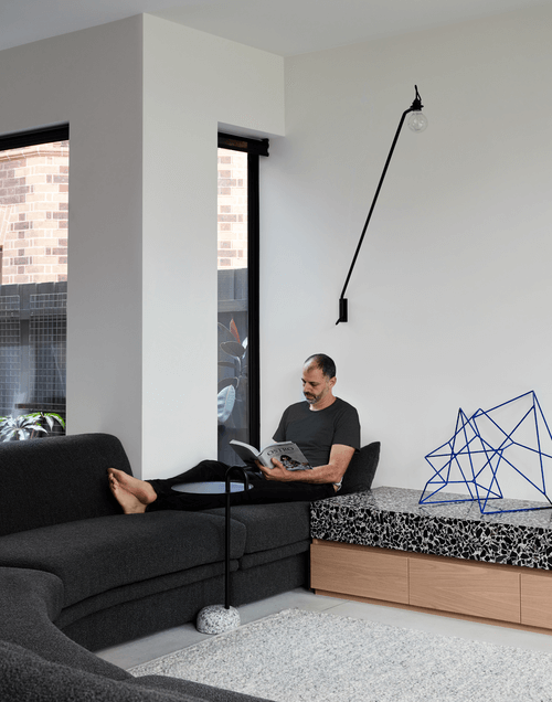
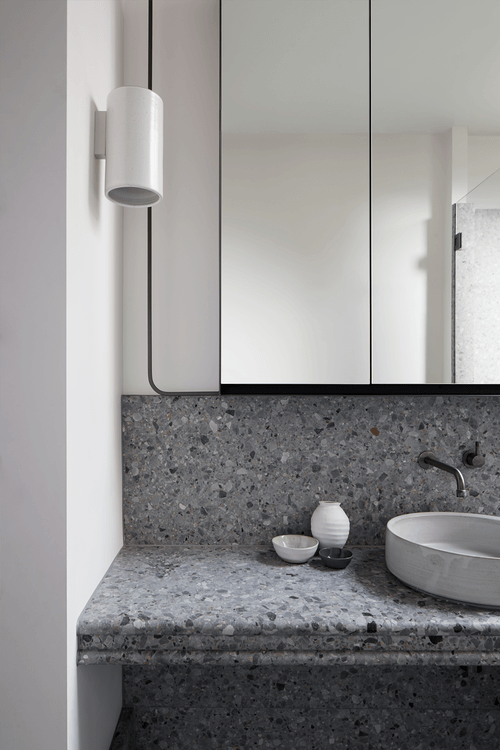
Photography by Willem-Dirk du Toit

