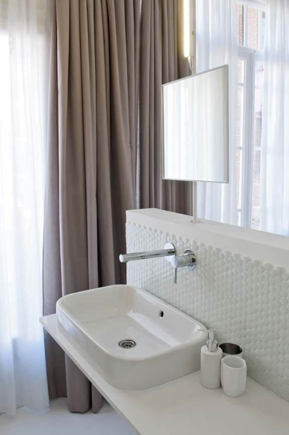
Displaying posts labeled "Blue"
J+G Design
Posted on Tue, 15 Sep 2015 by KiM
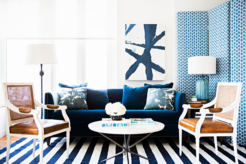
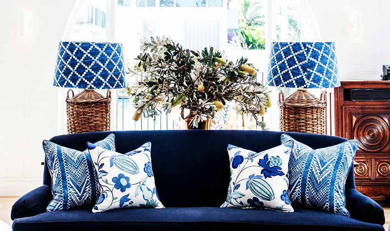
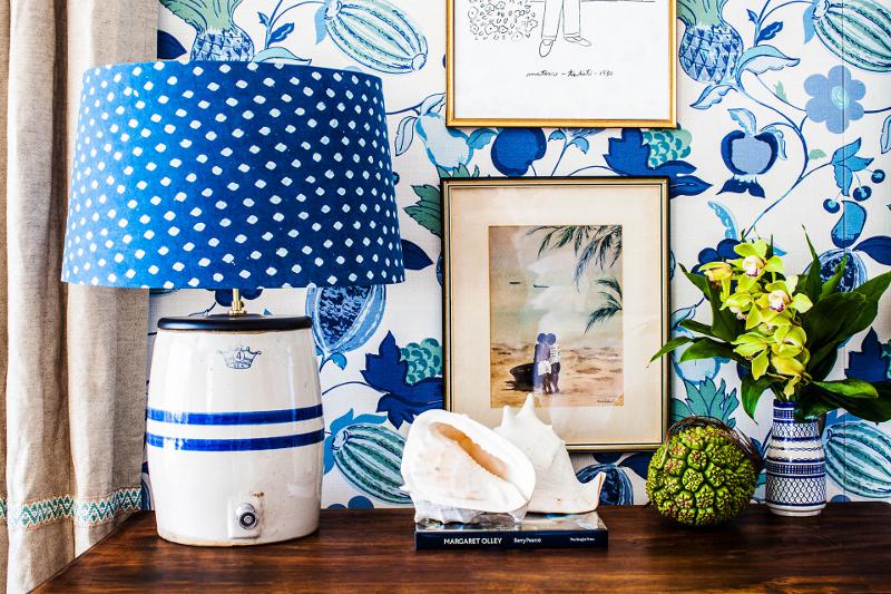
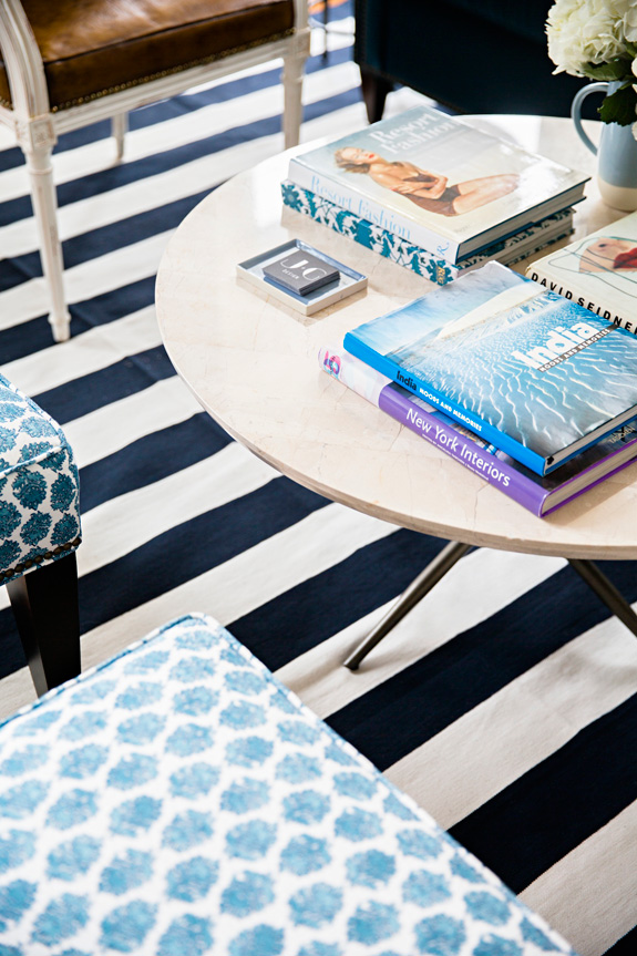
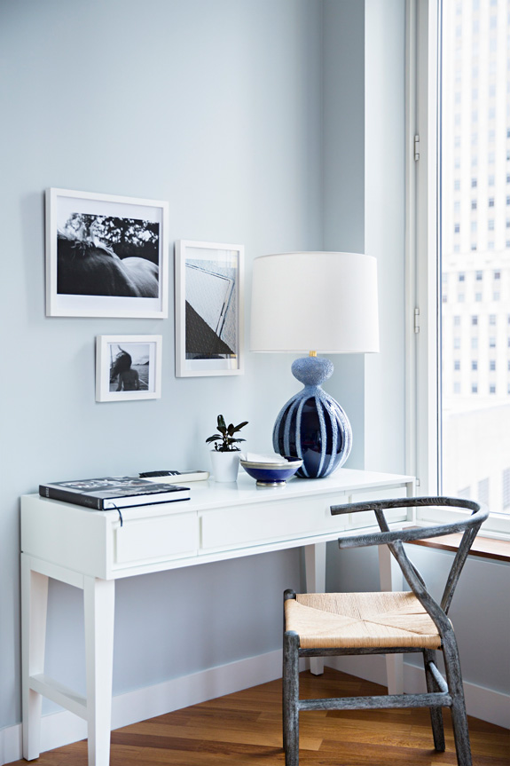
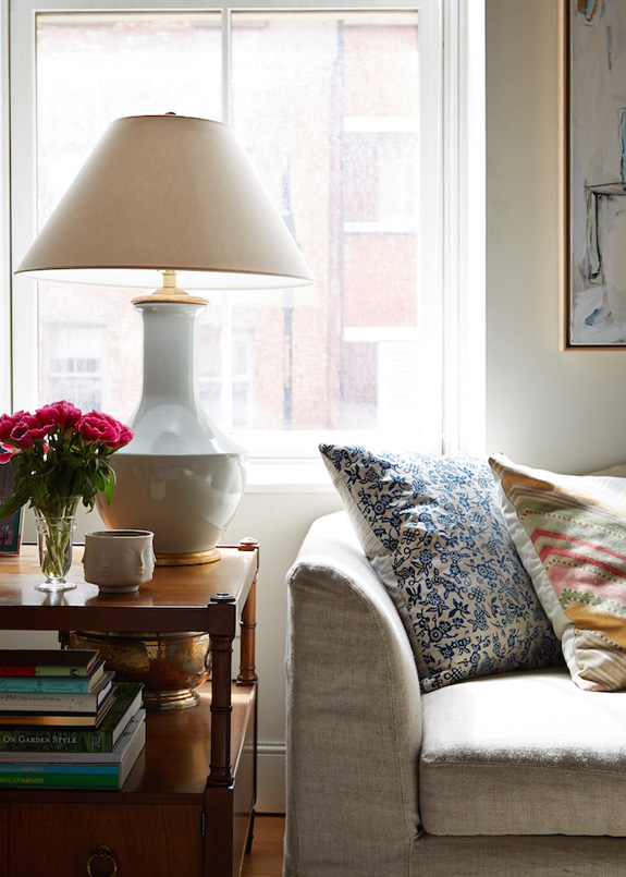
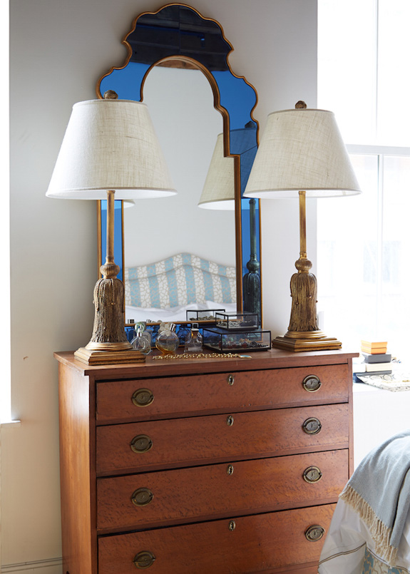
NYC based J+G Design is made up of interior designers Jennifer and Georgie whose style is uptown sensibility with downtown flair. We like to describe our aesthetic as traditional design as we see it through our lens – equal parts tailored and eclectic, glamorous and relaxed, bold and subtle. It is this unique balance that we strive for in every project. This first space is making me really love blue – stunning!
More tumbling block inspiration
Posted on Sun, 23 Aug 2015 by KiM
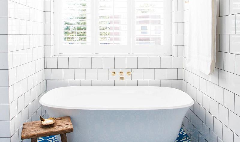
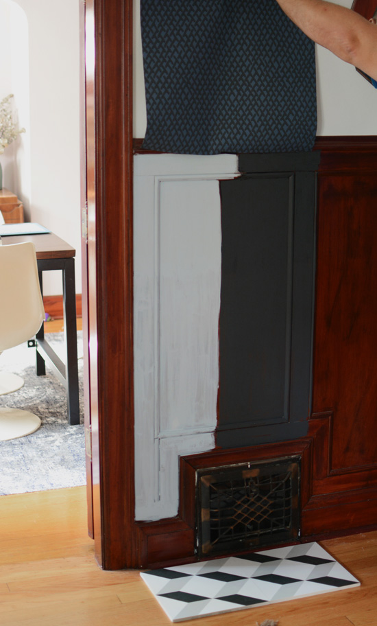
I had the day off Friday so high on my priority list (aside from taking an elderly lady’s cat to the vet, because I apparently don’t have enough of my own cat problems) was going to get a sample of the tumbling block tile. When I saw it in the store again I immediately started having heart palpitations. And the second I lay the sample tiles on my floor, I knew they were the ones. I am so smitten with these damn tiles. I repainted the wainscoting with some samples of Parma Grey and Off black that Farrow & Ball provided me and I am sold on black (gloss though), and had husband hold up the roll of Amime I had and I know based on my last post alot of people aren’t really feeling this combo, but I think I have to go with my gut on this one. I really dig the European vibe this pairing gives, and think it is a bit more sophisticated and unexpected than my original choice. And I think this will make me happier in the long run.
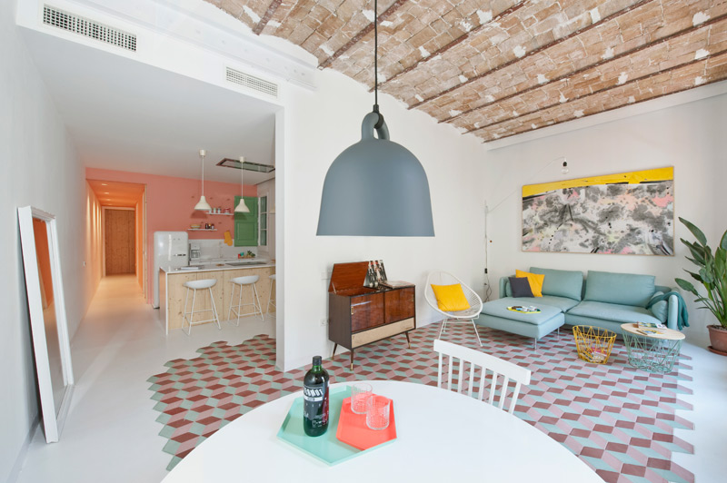
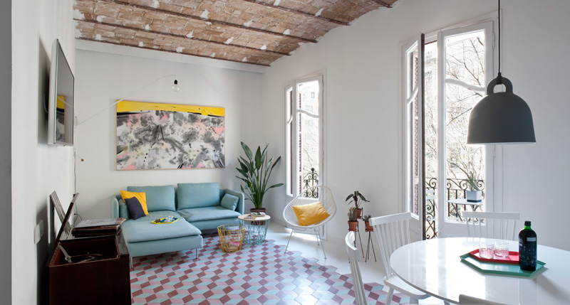
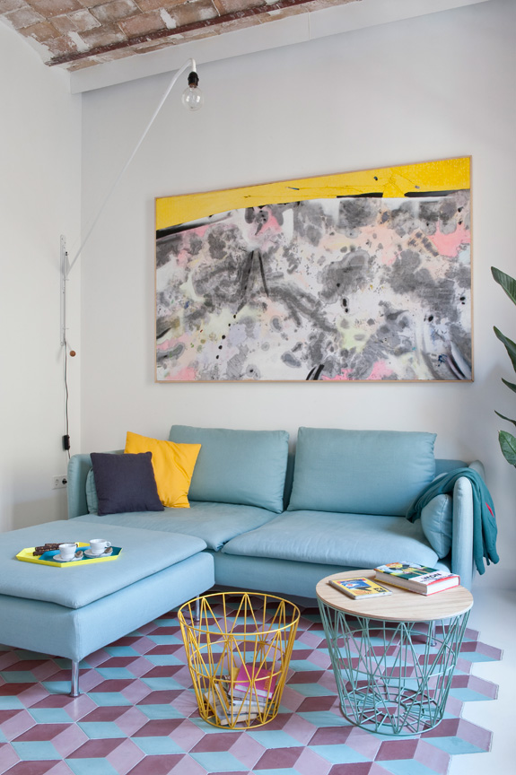
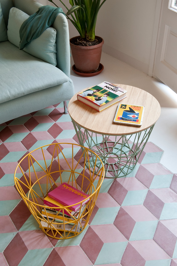
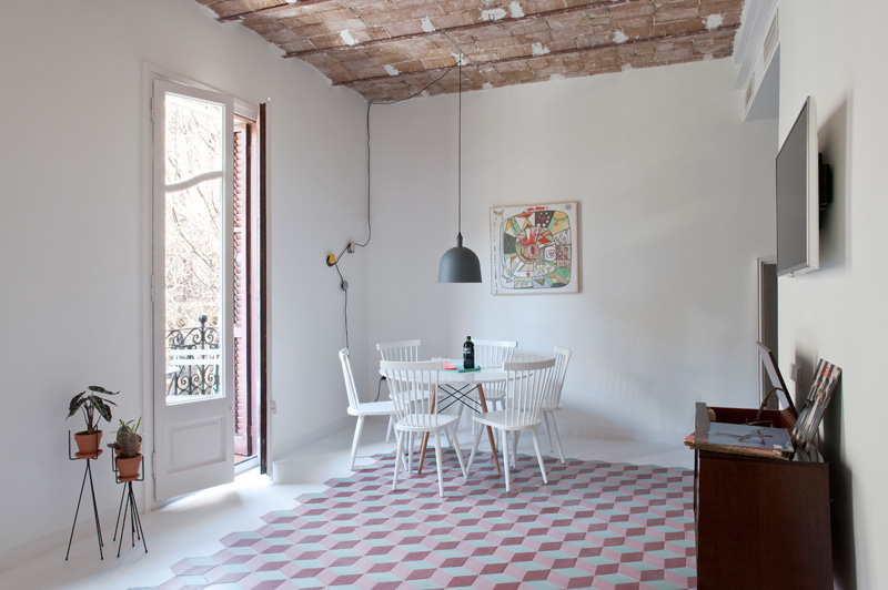
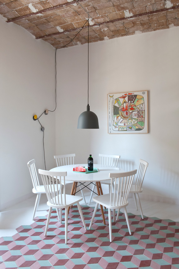
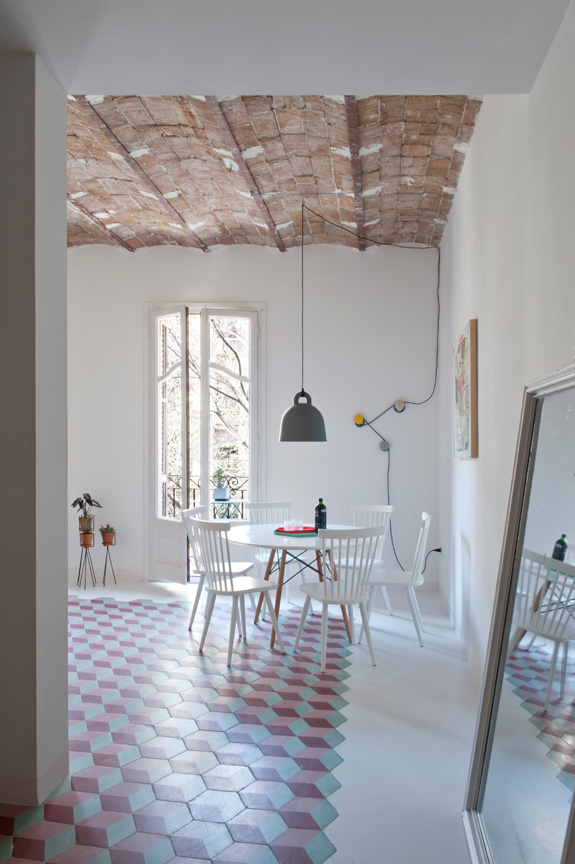
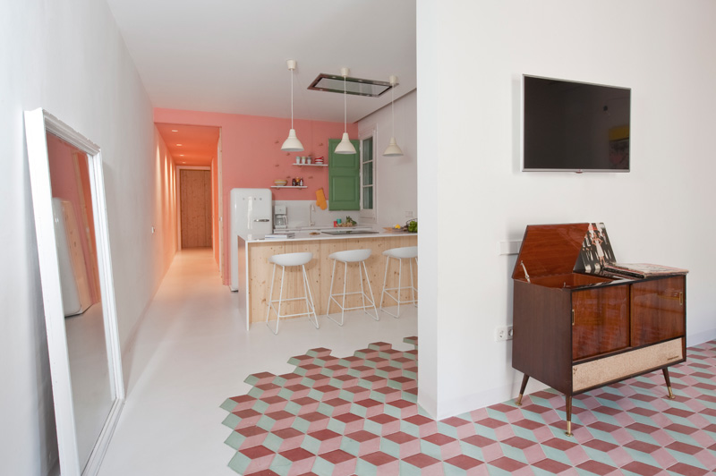
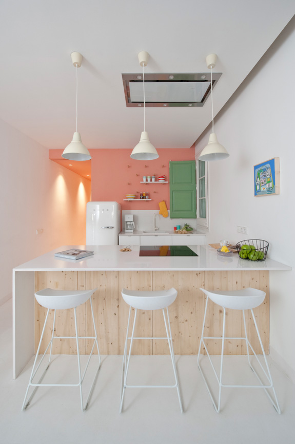
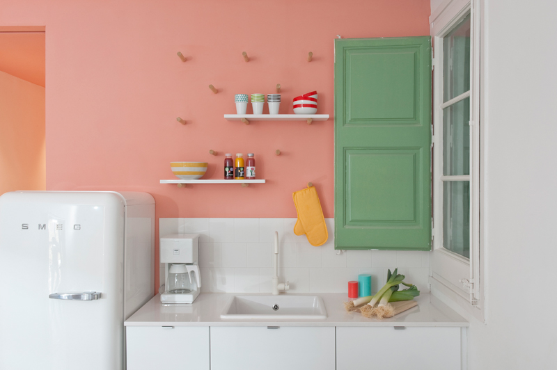
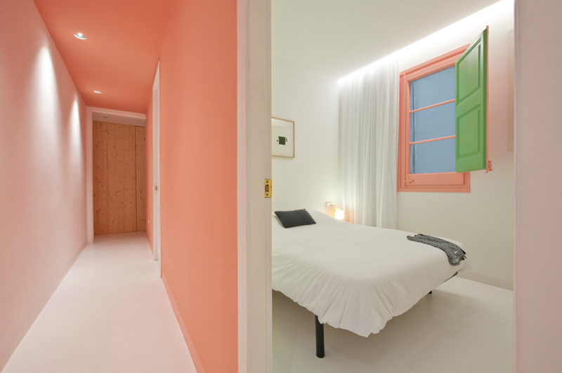
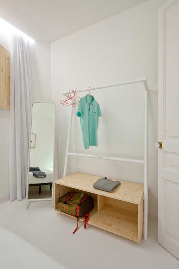
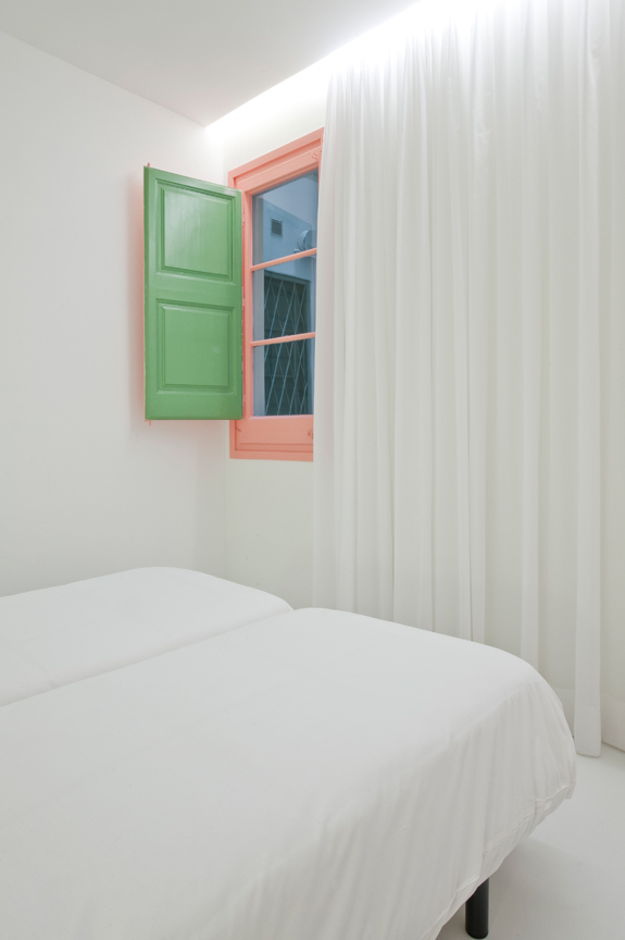
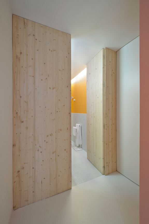
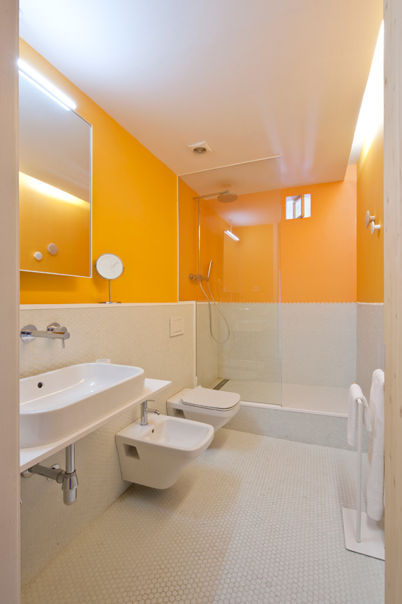
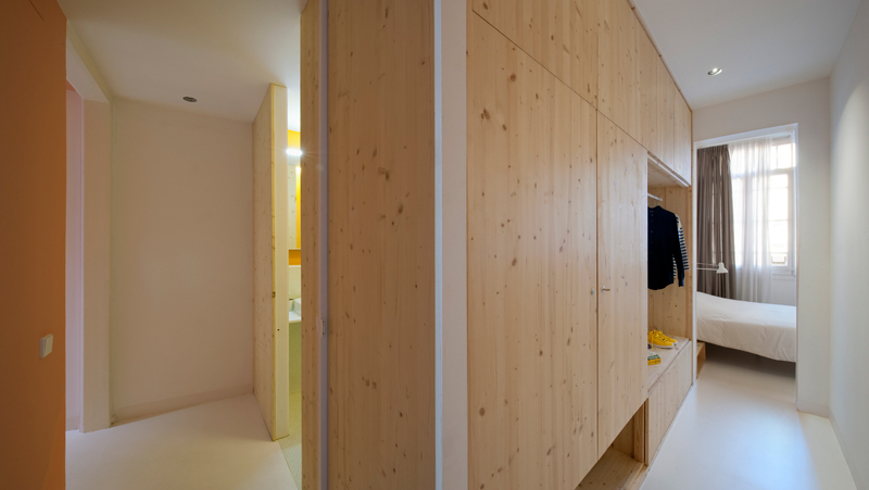
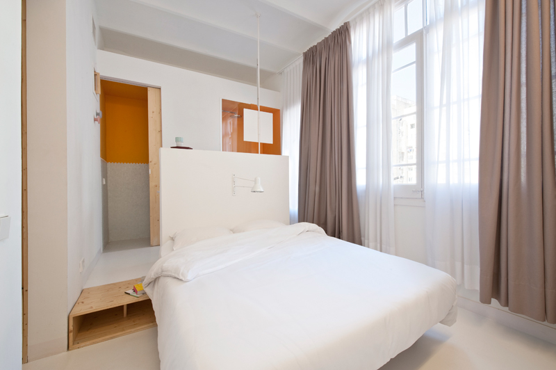
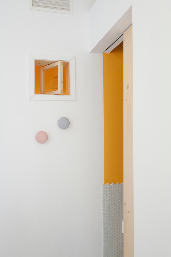
I spotted this apartment yesterday on Living and thought it would be an appropriate post today. It is the summer home of an Italian family, a joint project of Studio CaSA and Margherita Serboli Arquitectura. This 97 sq m apartment located in Eixample, Barcelona is now bright and modern, with some original details maintained such as window frames and vaulted Catalan terra cotta ceiling (soooooo gorg!!). The cement tumbling block patterned tiles in the living and dining room are a really fun way to add pattern to the apartment and break up up the expanse of white in the open space. The pastel colours aren’t really my thing, but are really cute for a summer vacation pad. I would totally Airbnb this place. (Photos: Roberto Ruiz)
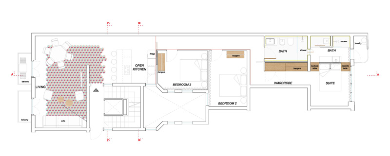
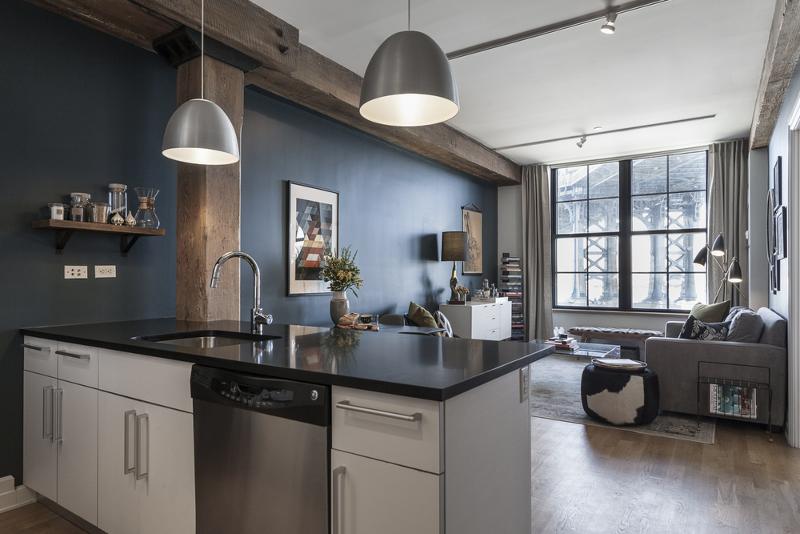
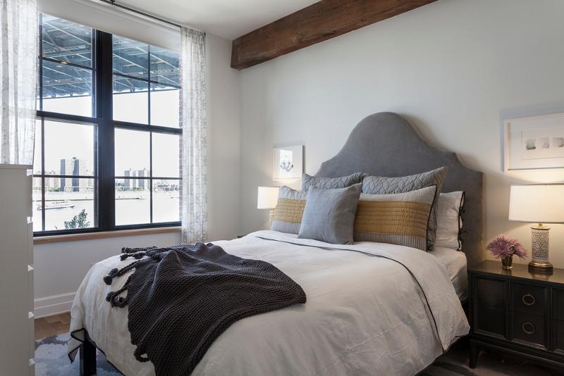
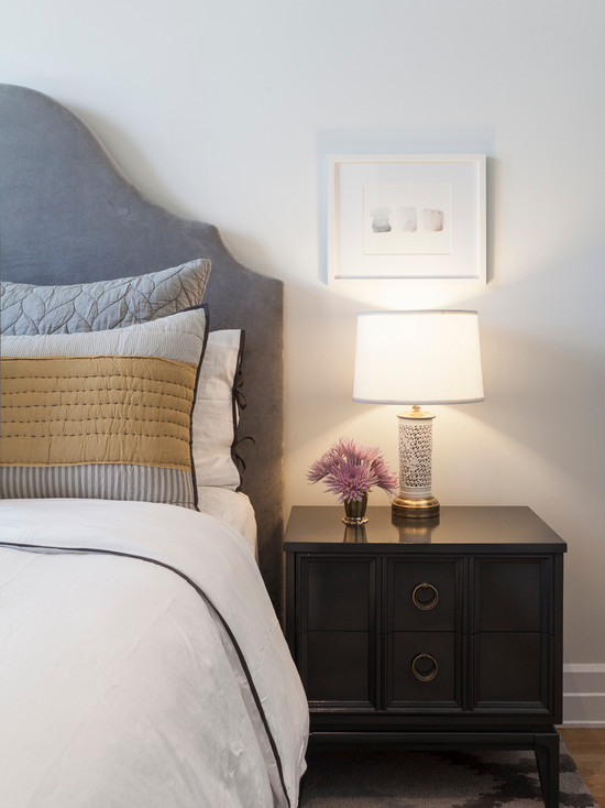
Down under the Manhattan Bridge Overpass
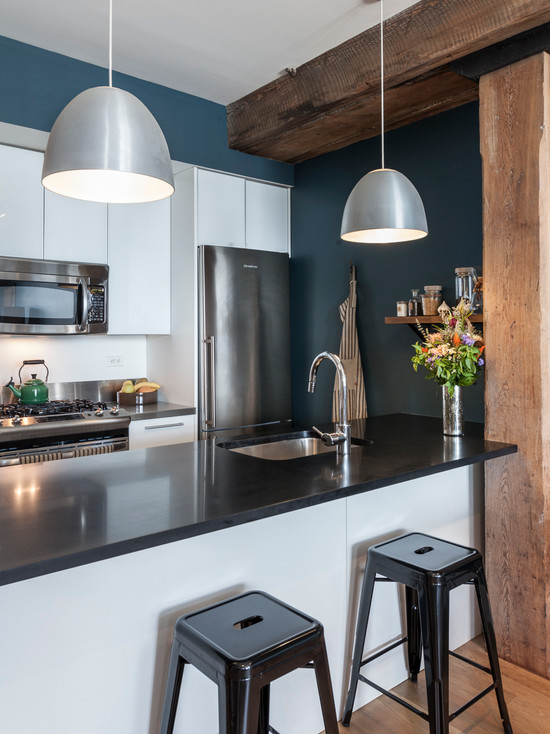
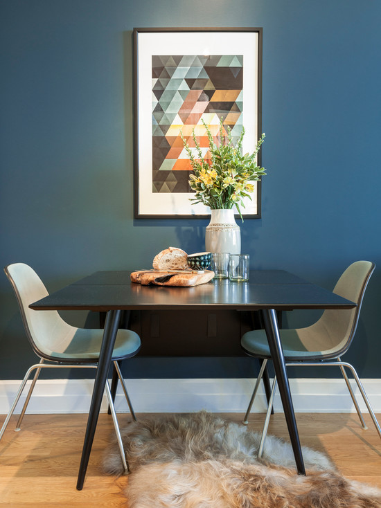
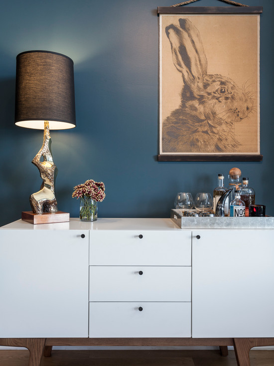
Posted on Thu, 20 Aug 2015 by midcenturyjo
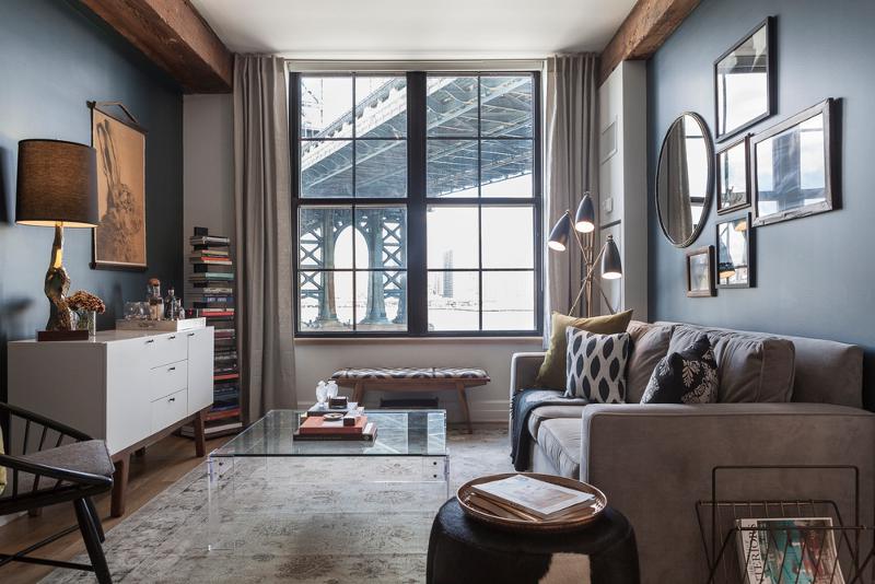
I don’t think you can get anymore “down under the Manhattan Bridge overpass” than this Dumbo warehouse apartment by Brooklyn-based Interior Design firm Sheep + Stone. Character, warmth, quirk and a view to the bridge from the large industrial style windows.
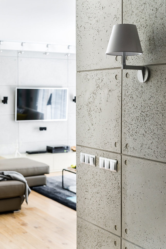
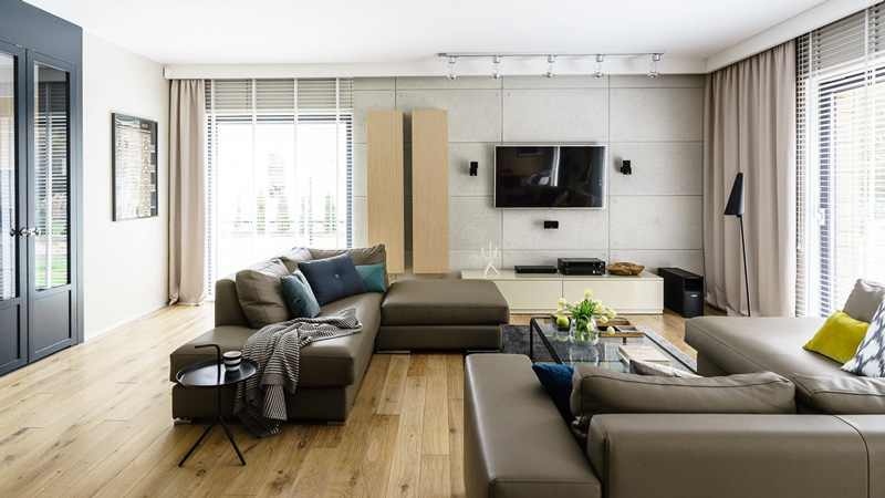
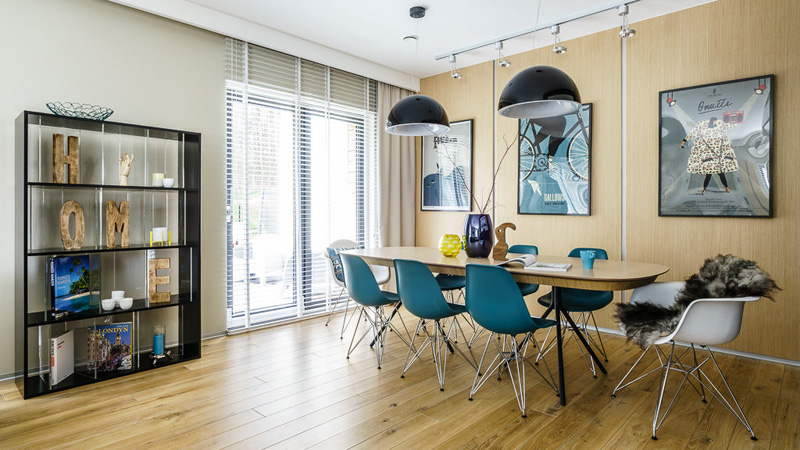
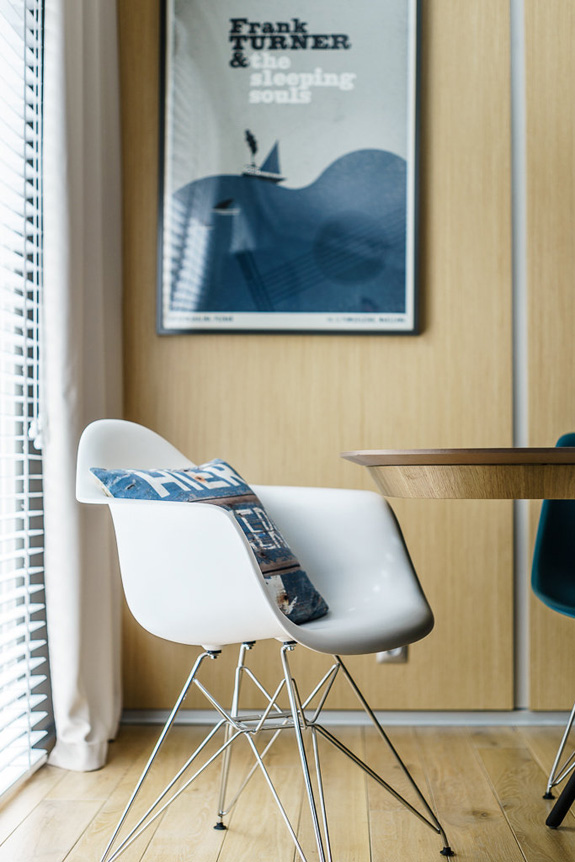
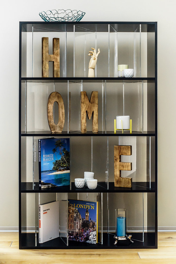
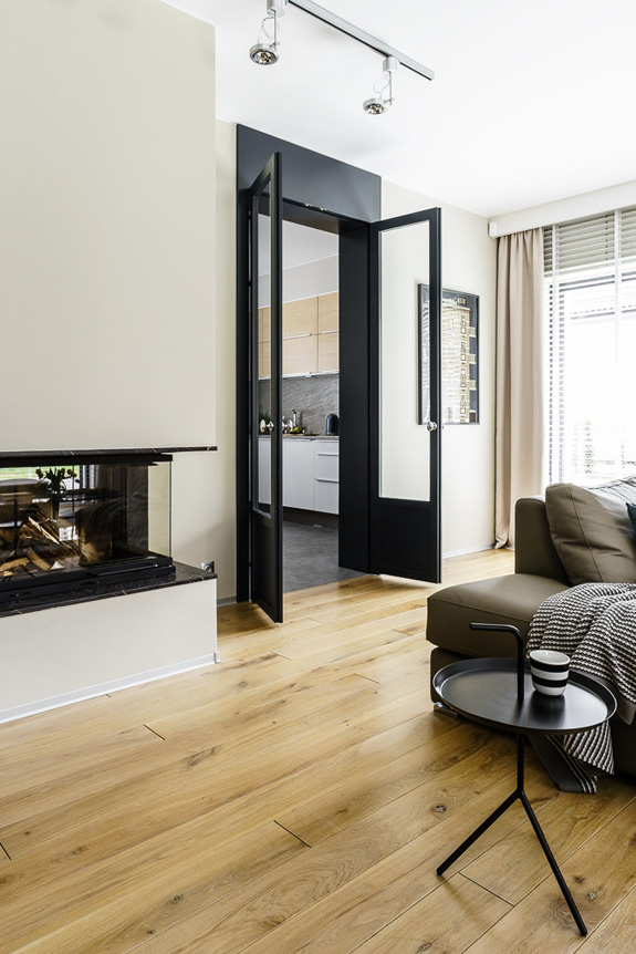
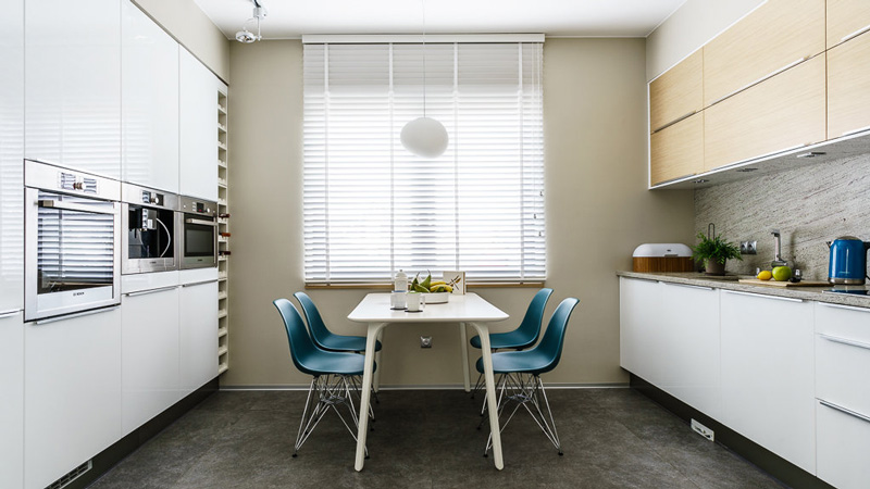
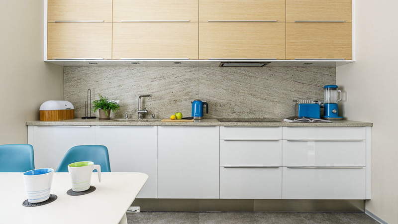
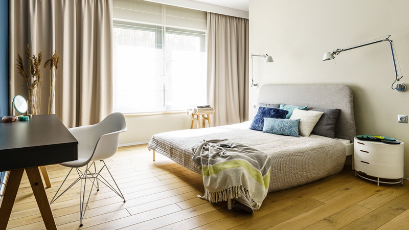
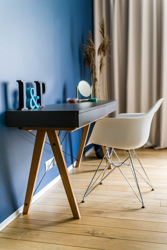
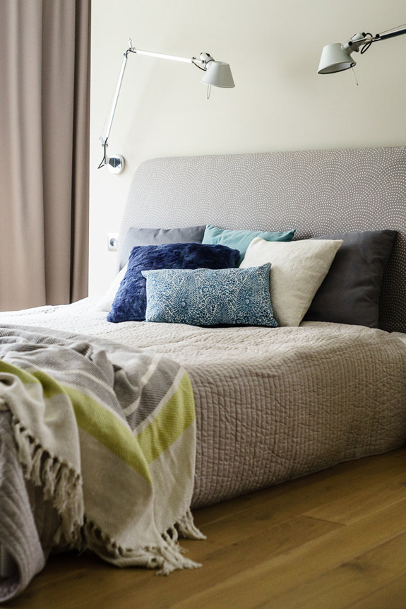
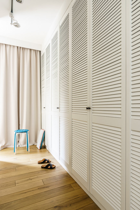
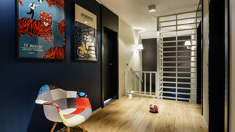
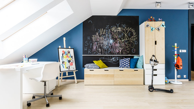
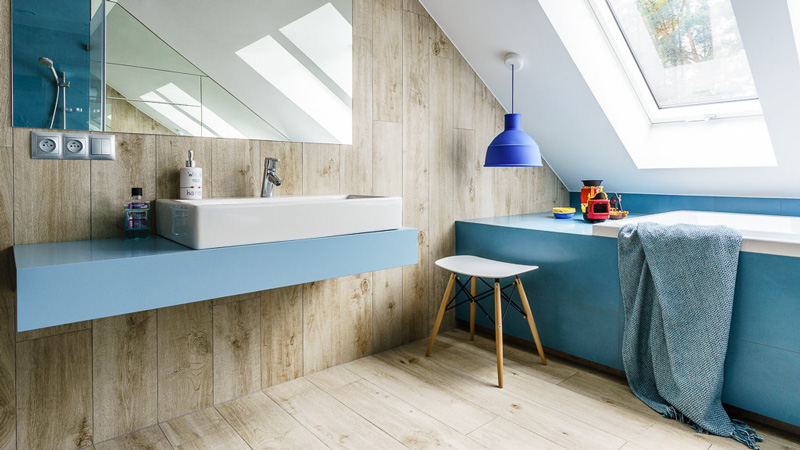
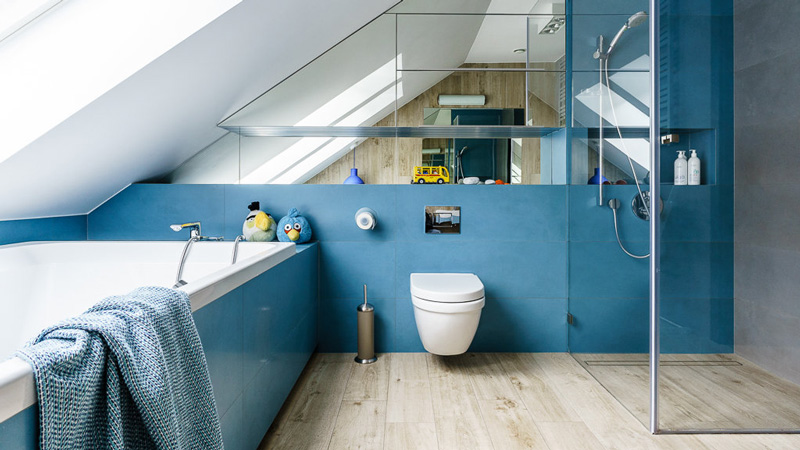
A family home by Lucyna Kołodziejska
Posted on Wed, 12 Aug 2015 by KiM
Lucyna Kołodziejska is a decorating machine! I featured one of her latest projects a couple of weeks ago, and here is another! It is a home for a young family (a couple with 2 boys) about 25 kms from Gdansk, who wanted a space to entertain, and to showcase their poster collection. I really love this one – neutrals with accents in black and blue throughout the home make it very cohesive. This is one of my favourite projects of Lucyna’s.
Halcyon days
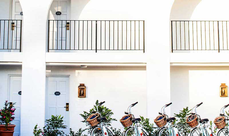
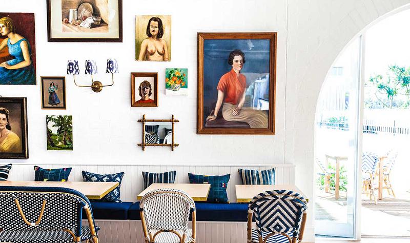
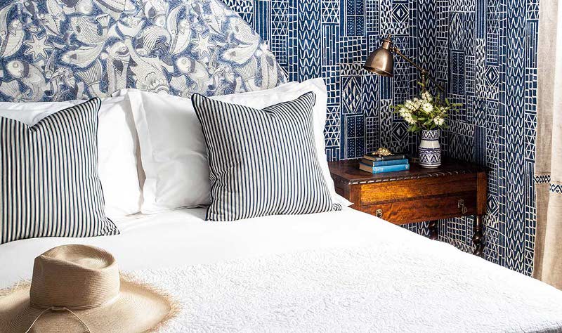
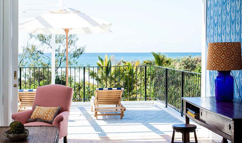
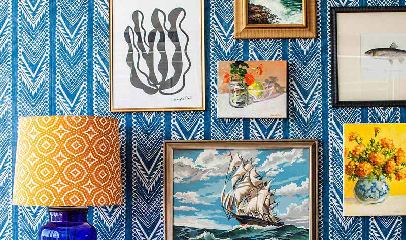
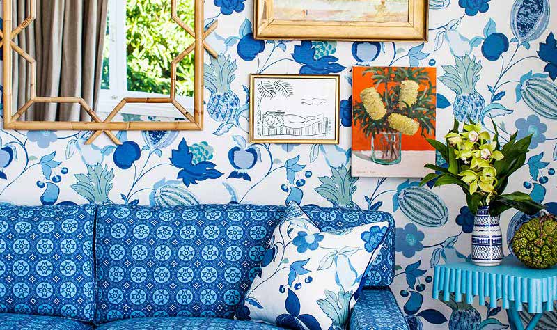
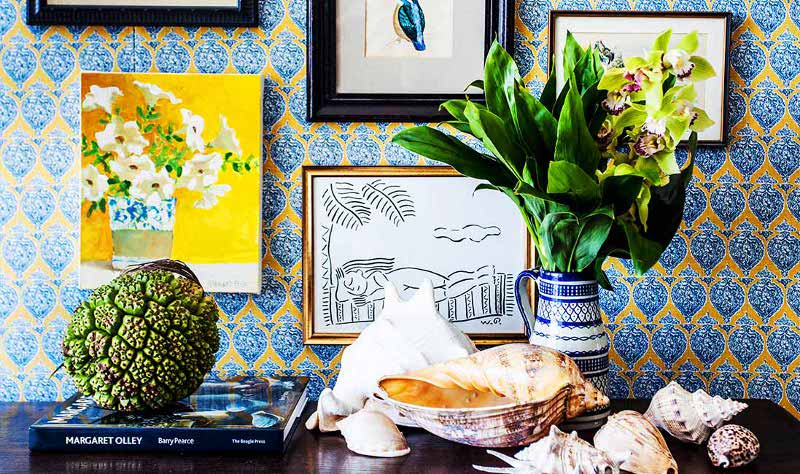
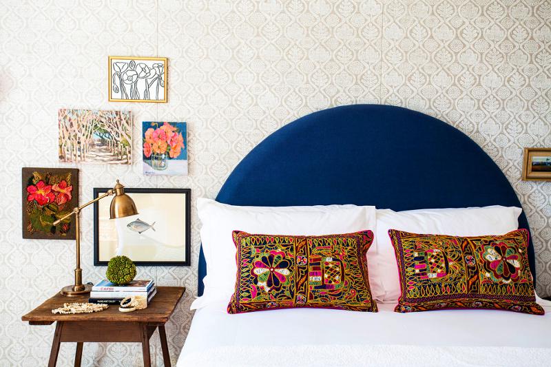
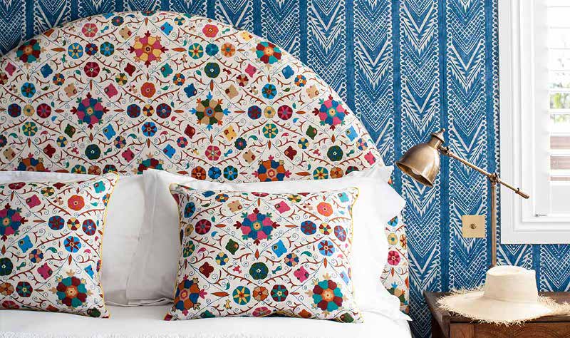
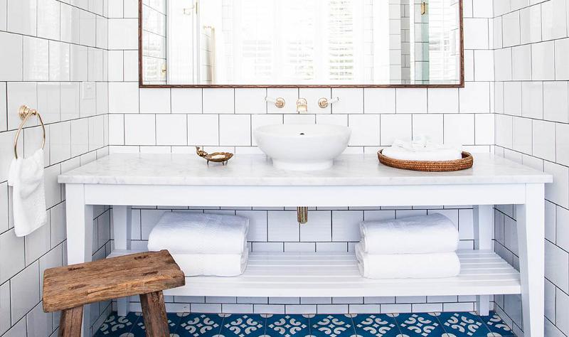
Posted on Fri, 17 Jul 2015 by midcenturyjo
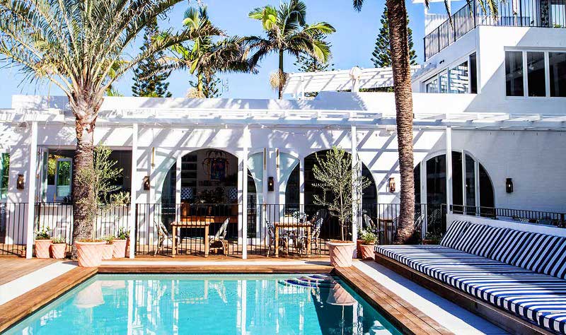
halcyon – adjective – denoting a period of time in the past that was idyllically happy and peaceful…
You may have seen it in the latest Vogue Living. You may have followed its progress on Anna Spiro’s Instagram account. You may have only seen it in your dreams. Halcyon House, the new boutique hotel at Cabarita Beach in Northern New South Wales. Pattern on pattern with bold colour and crisp white, gallery walls and vintage pieces. A once down at heels beach motel has risen phoenix like to become a glam but welcoming, casually elegant holiday destination. Architecture by Virginia Kerridge and interiors by Anna Spiro of Black & Spiro.