Displaying posts labeled "Green"
The house recast
Posted on Tue, 21 Jun 2022 by KiM
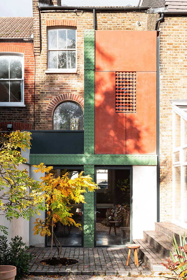
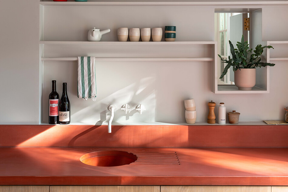
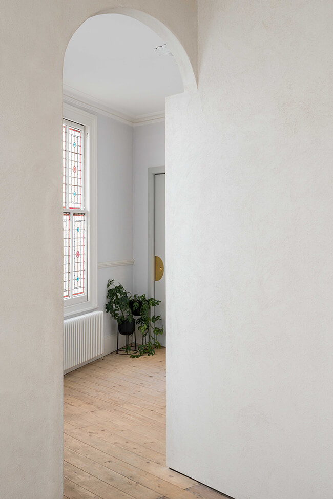
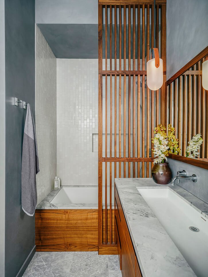
The owners, a retired couple, approached Studio Ben Allen to reconsider the piecemeal rear façade of their end of terrace Victorian house in north London and to provide a new kitchen and two new bathrooms – one to be on the ground floor and accessible. The architects were keen to consider how the extension could demonstrate exemplarily use of pigmented patterned concrete as both structure and architectural finish. Green patterned columns and beams create a framework for the salmon colour structural wall panels of the first-floor bathroom. Internally the use of pigmented concrete continues – with stairs, counters, sink, floors, benches, bath and washbasin all cast in pigmented concrete. A second theme is the use of louvered vaulted ceilings with bring diffuse light down into both the kitchen and bathroom. A double height space connects the new ground floor spaces with a new mezzanine on the first floor which in turn is connected to the main stair. This void allows light to penetrate deep into the house while also creating visual and aural connections through the house.
The creativity! The curves! The colours!
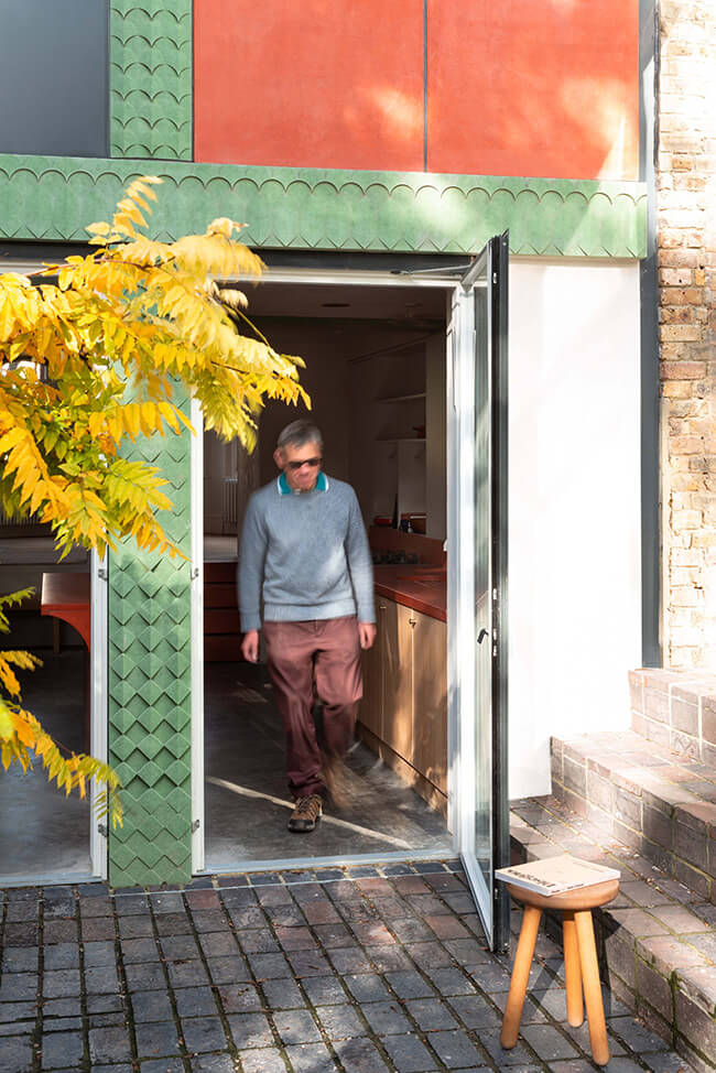
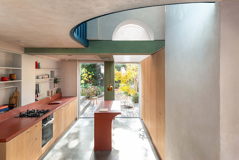
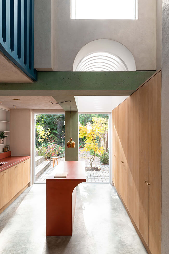
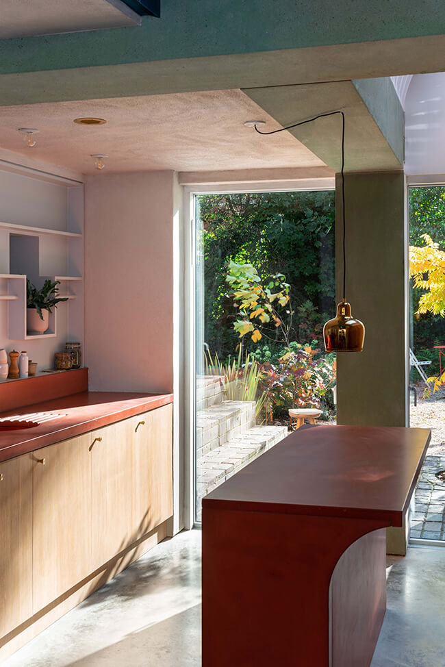
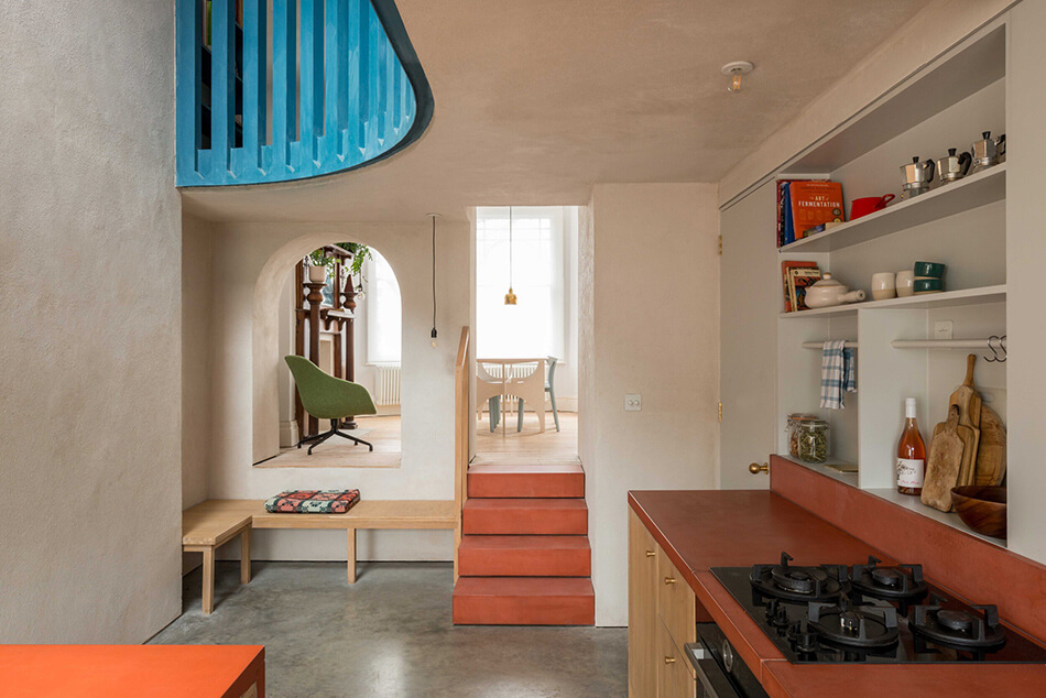
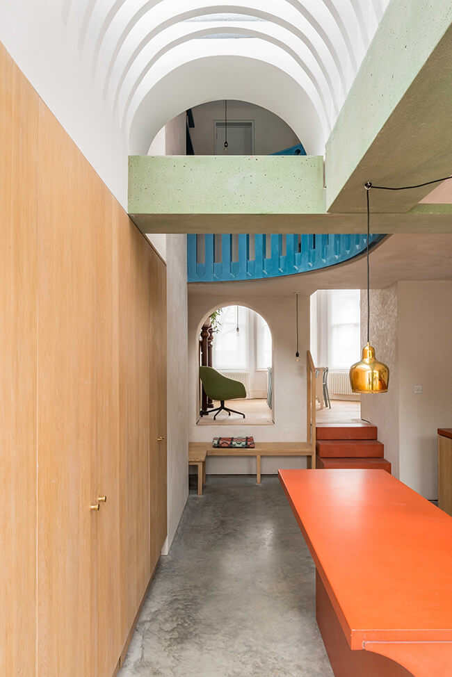
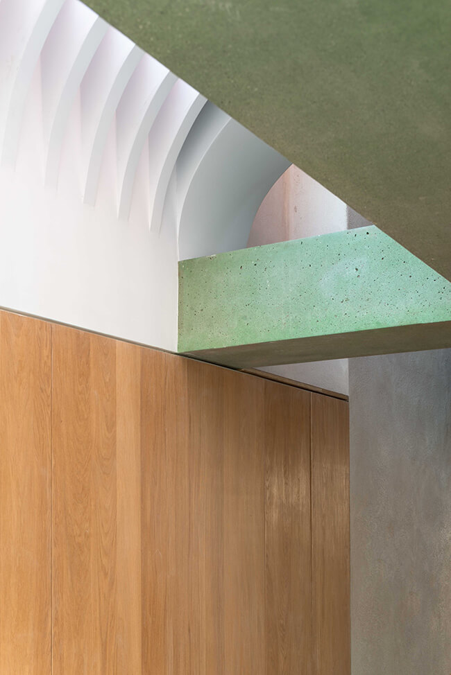
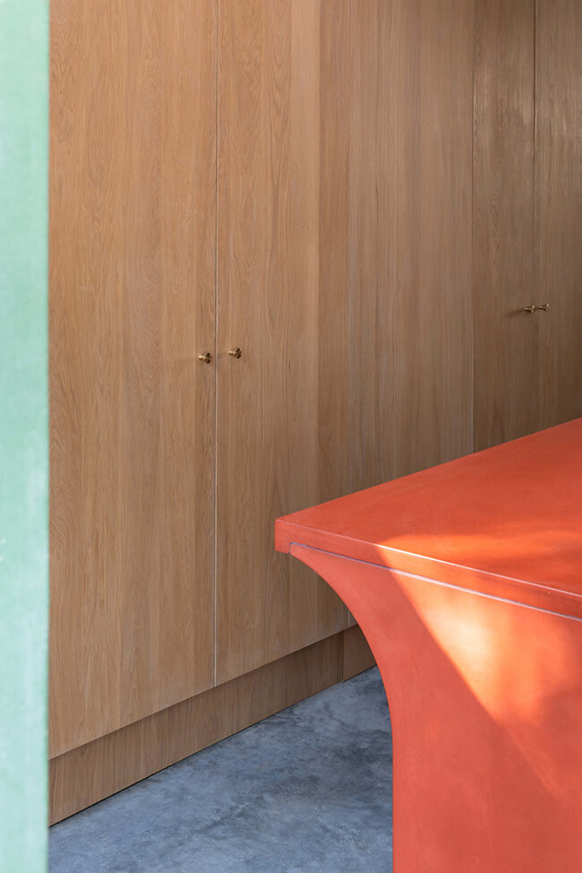
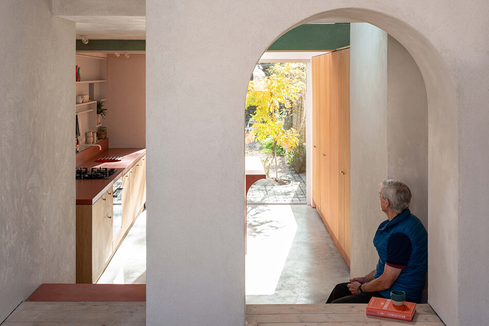
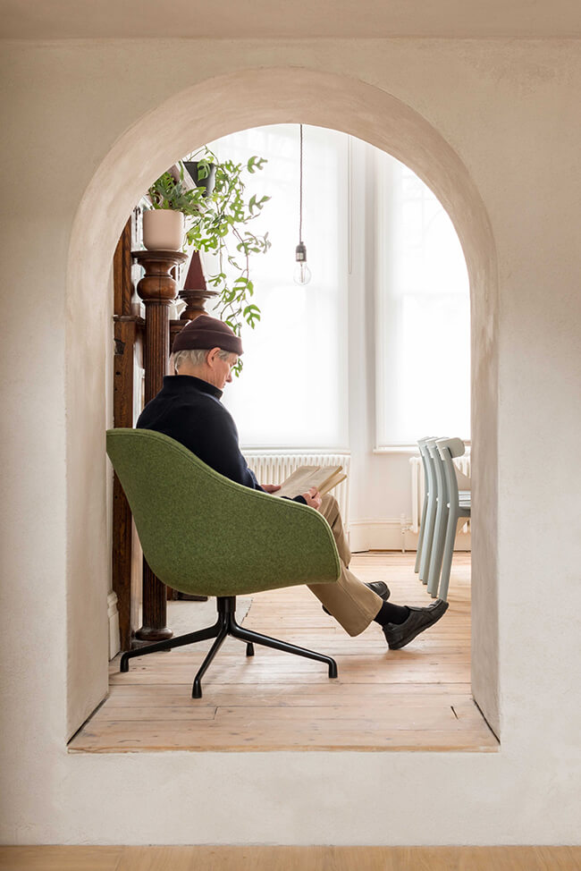
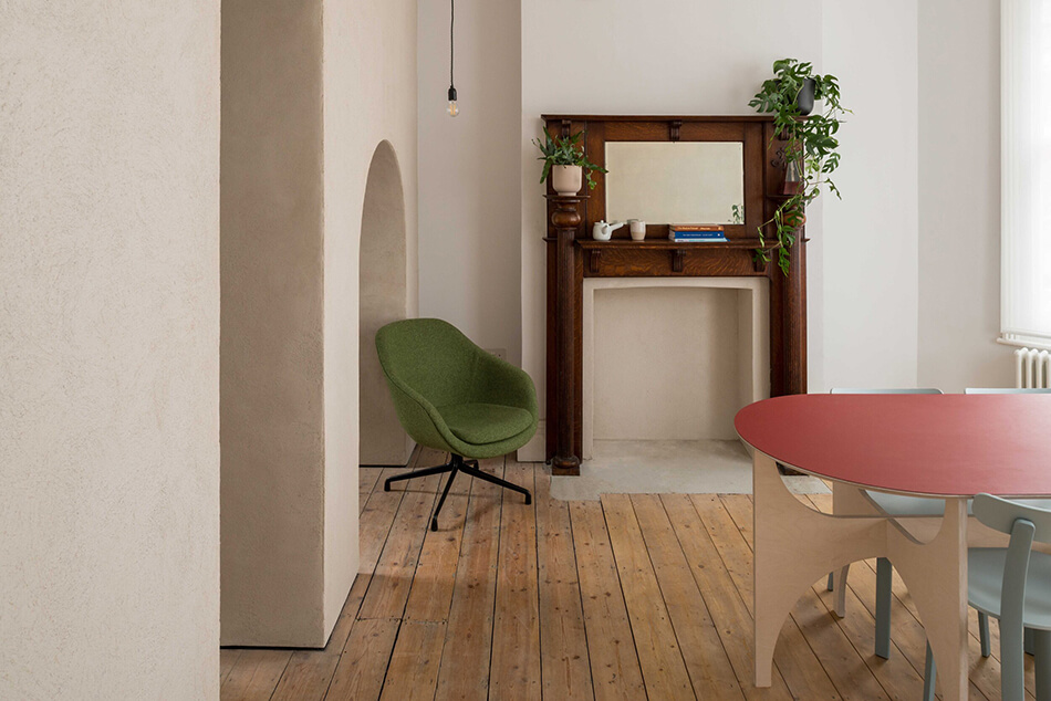
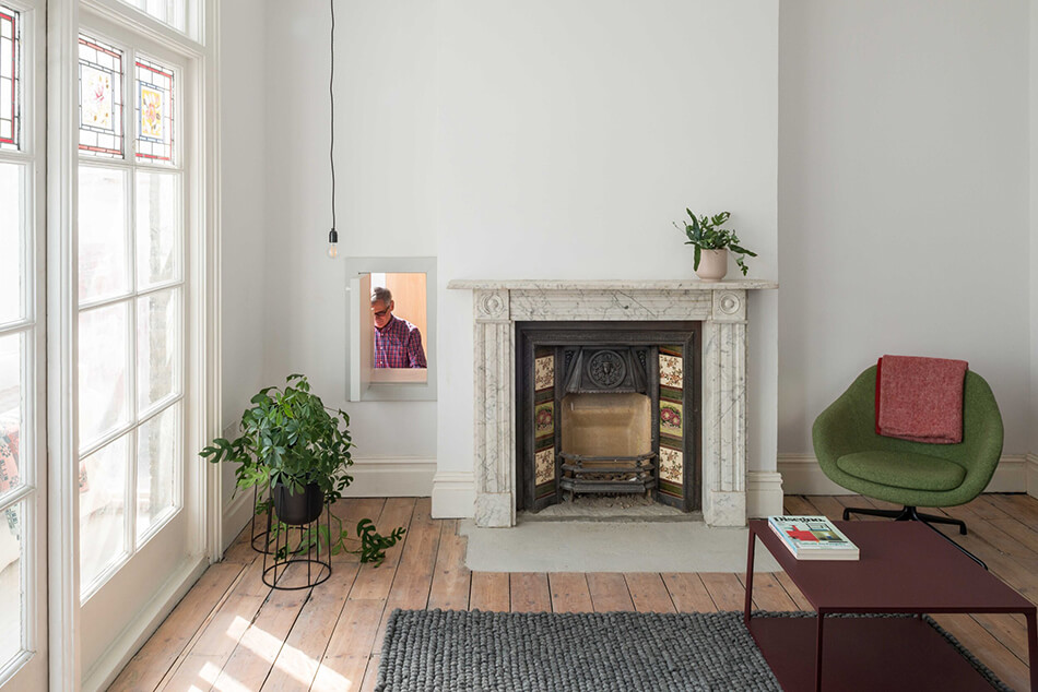
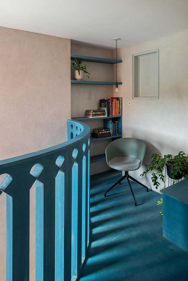
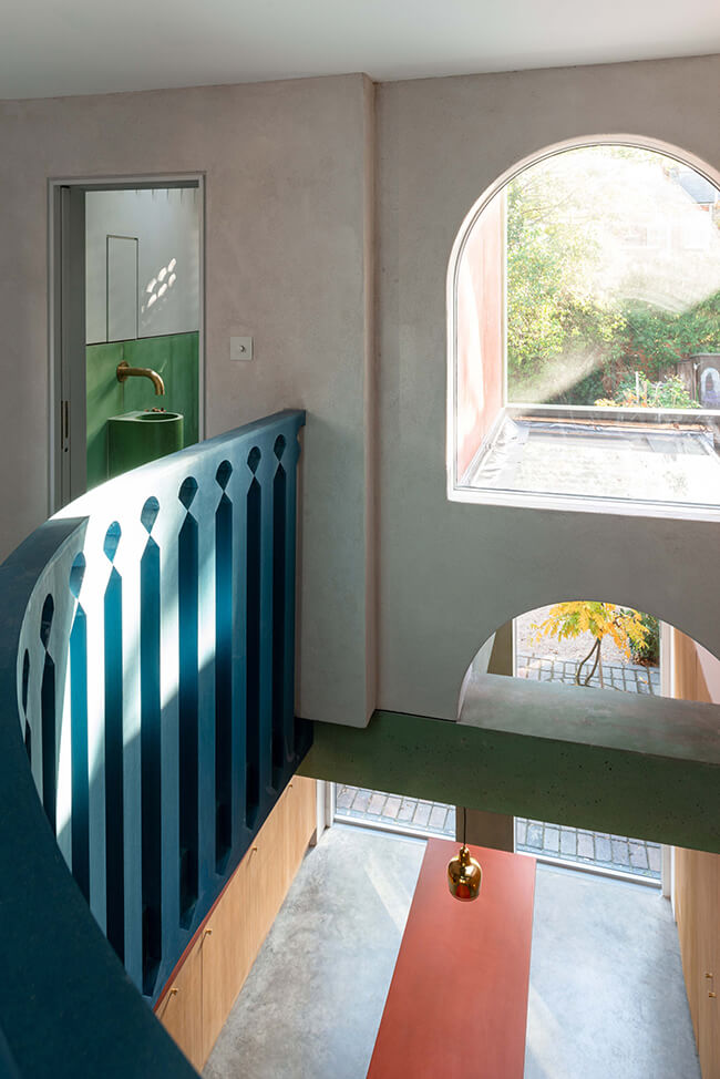
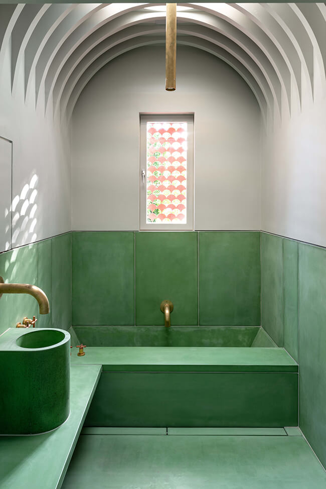
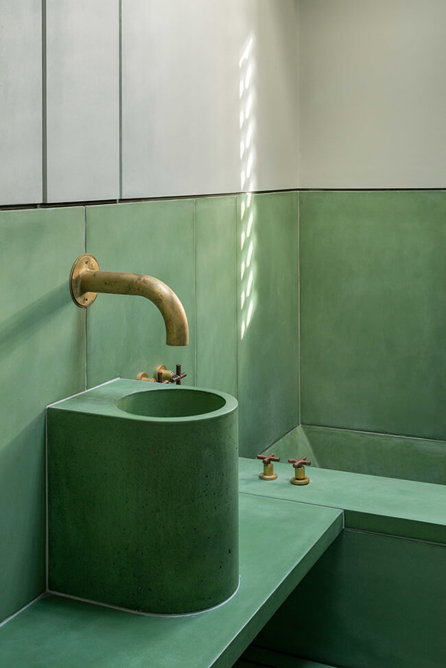
Project Team: Ben Allen, Omar Ghazal (project leader) / Structural Engineer: Entuitive / Landscaping: Daniel Bell Landskap / Structural and exterior concrete: Cornish Concrete / Interior Concrete: Concreations / Metalwork: Fish Fabrications / Photography: French+Tye
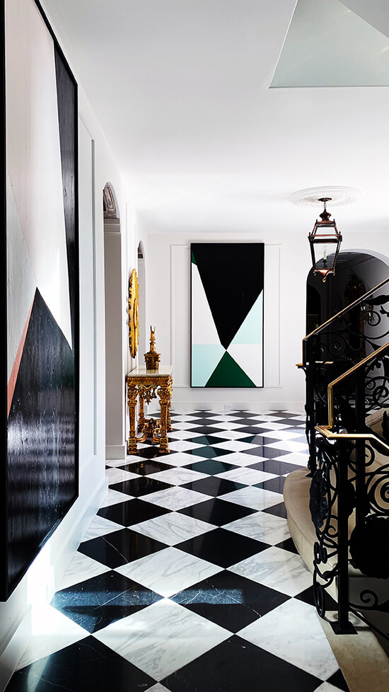
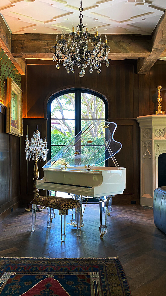
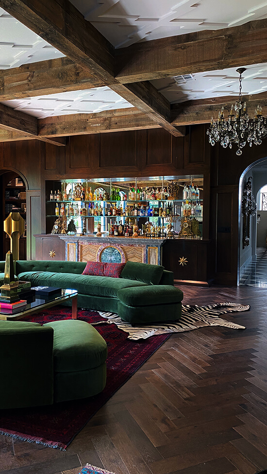
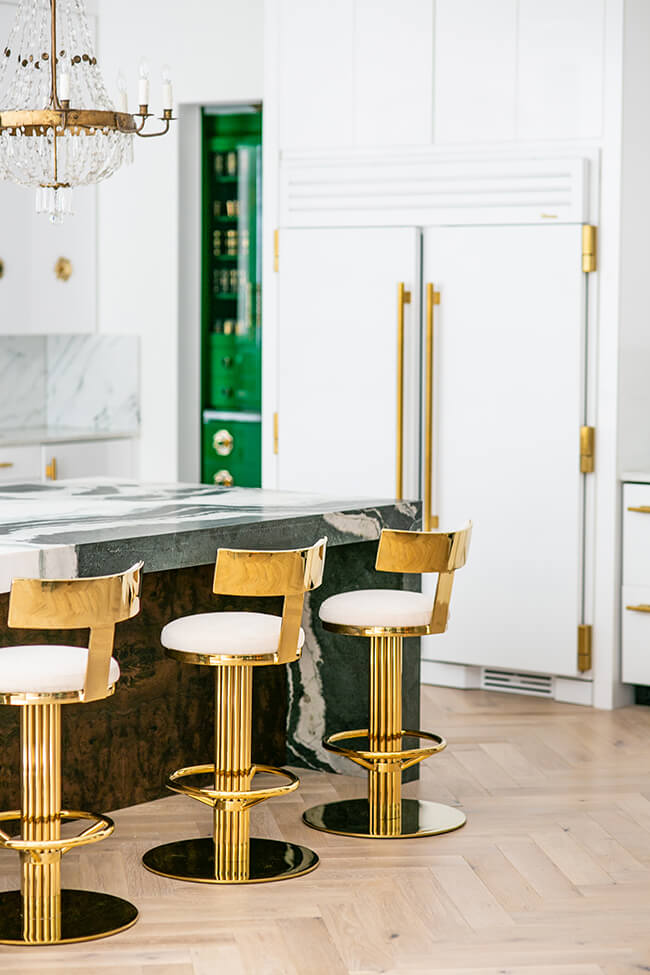
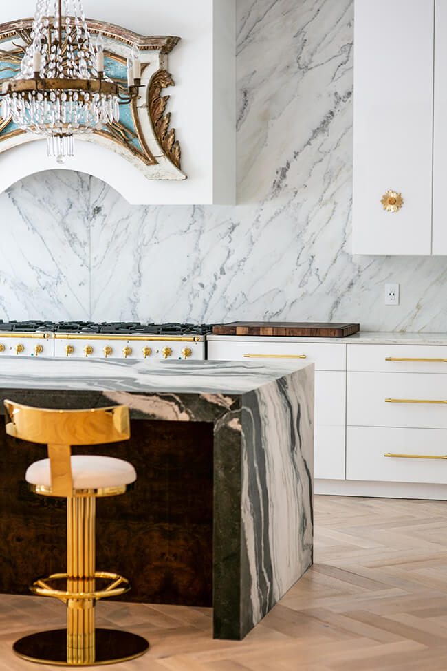
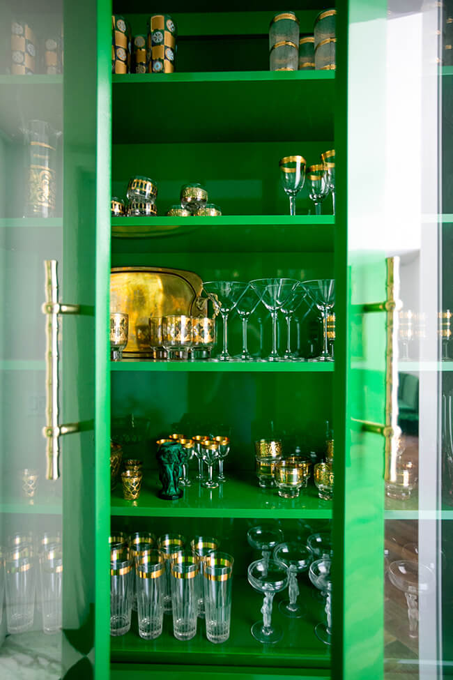
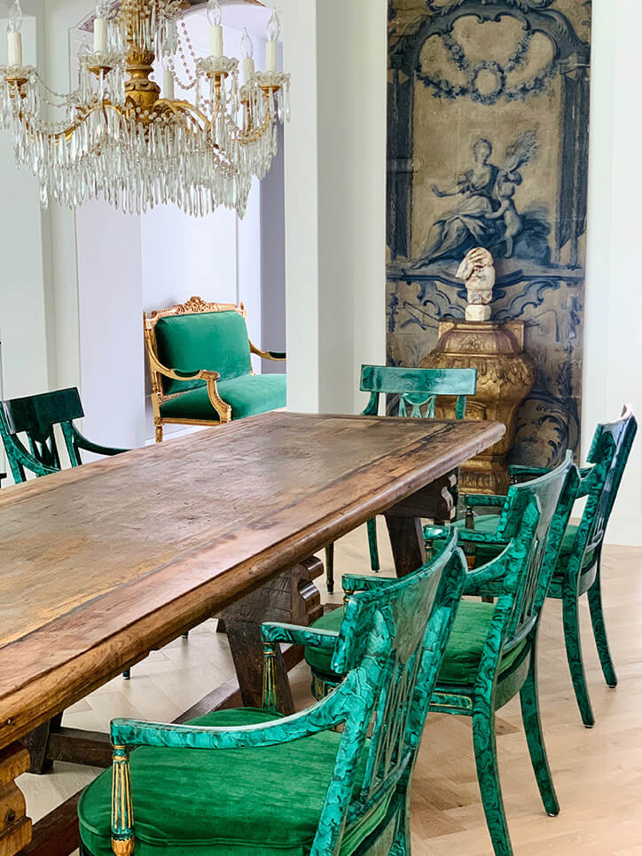
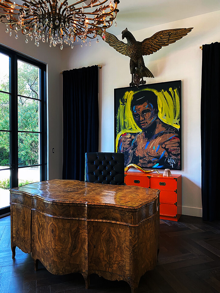
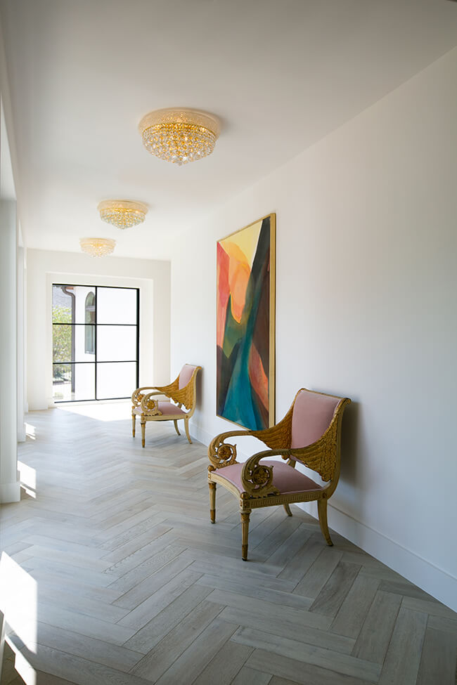
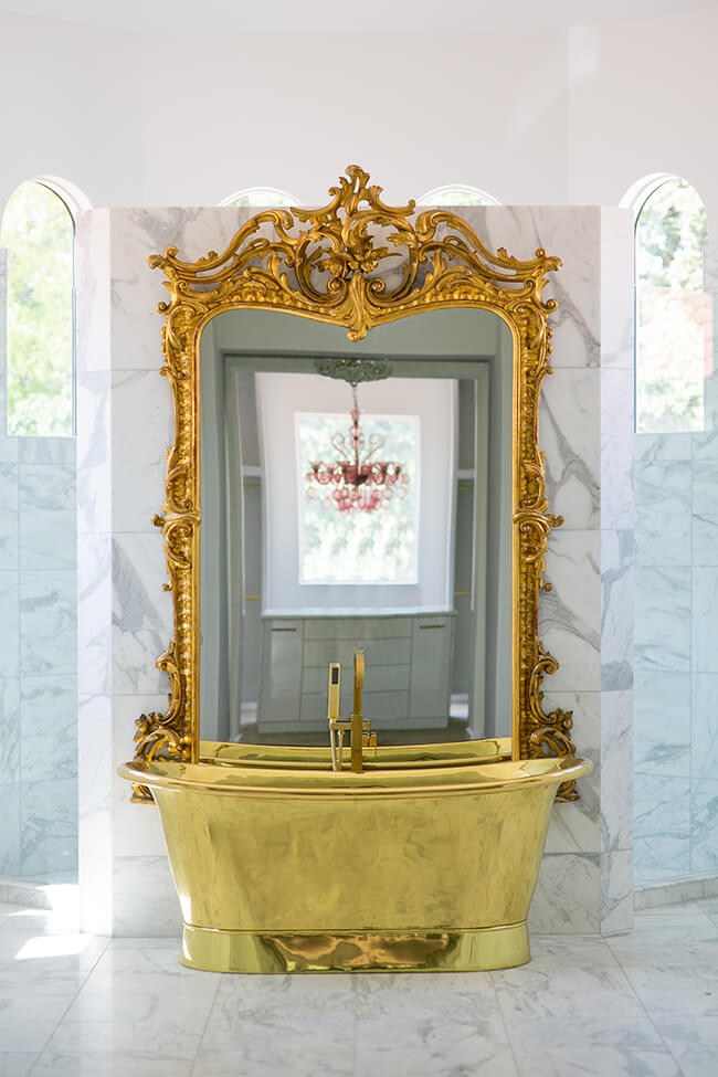
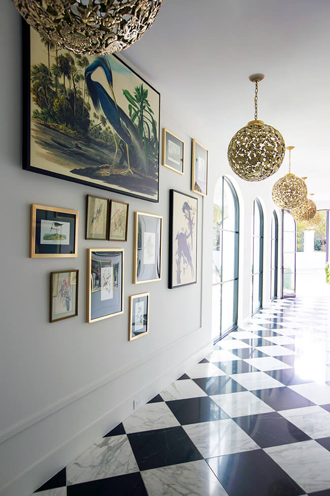
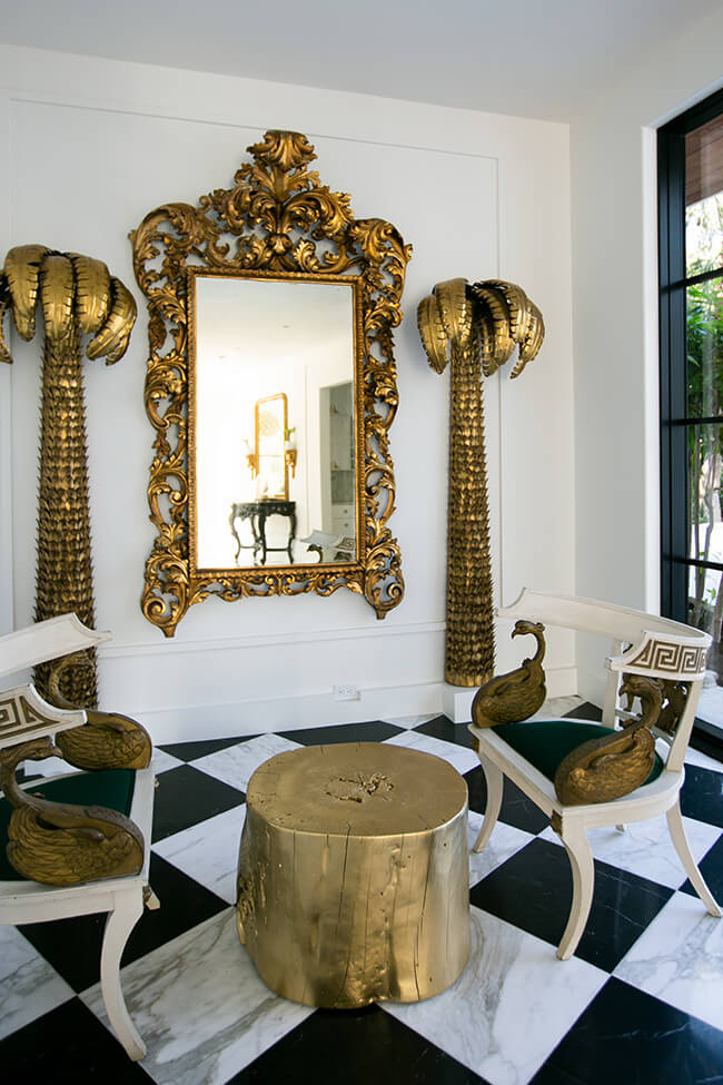
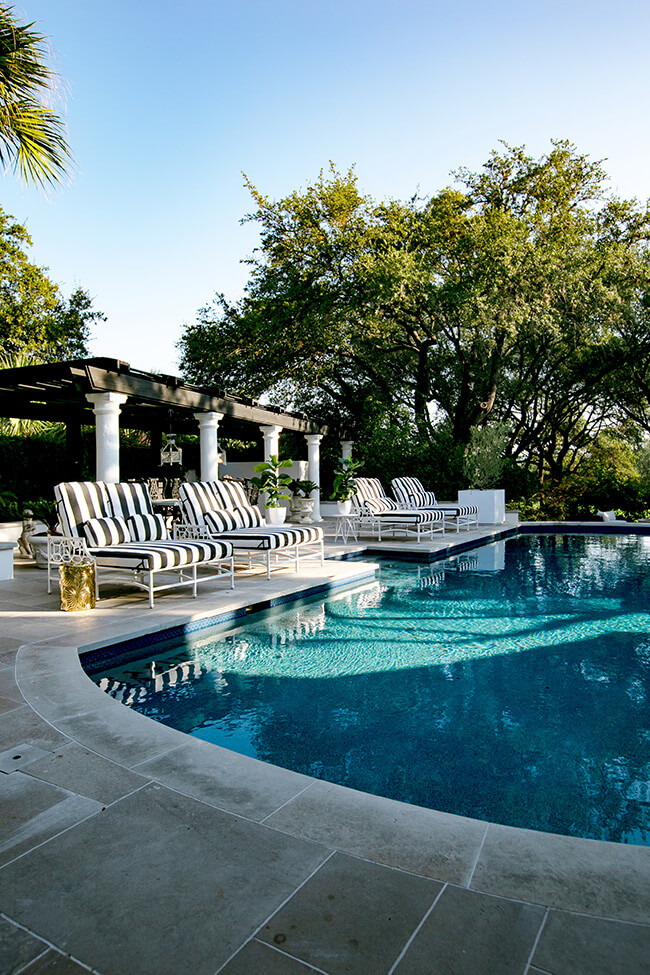
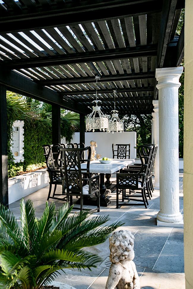
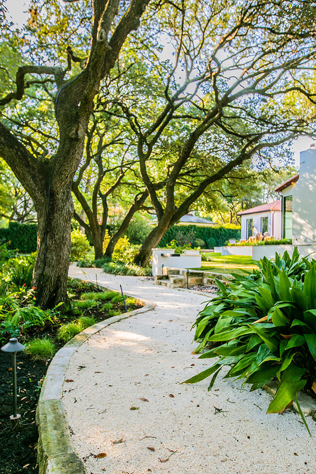
Hollywood glam in a Texas home
Posted on Wed, 15 Jun 2022 by KiM
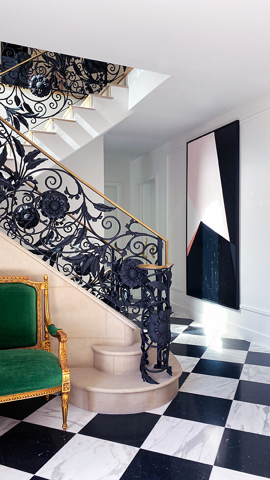
Not everyone loved the last feature I shared of Annie Brahler of EuroTrash‘s work. And not everyone will love this one that is very Hollywood glam with gorgeous marble harlequin floors, lots of gold/brass and blingy chandeliers. But I had to share it because she’s got balls and I admire that. Go big or go home, amiright?

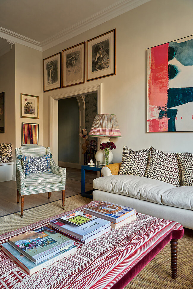
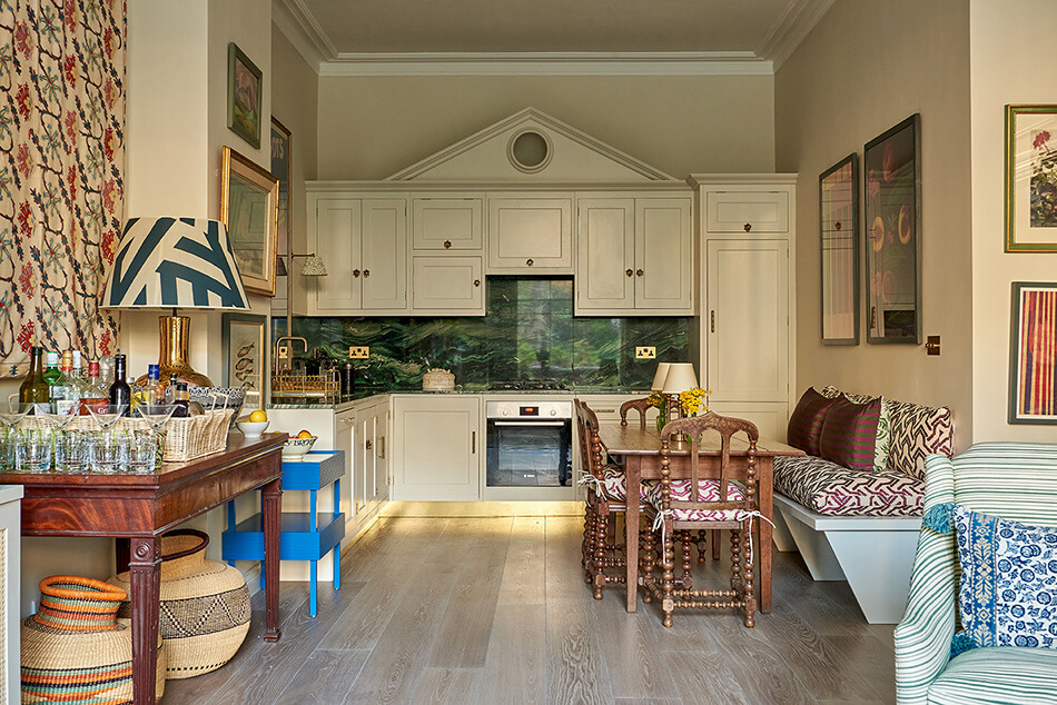
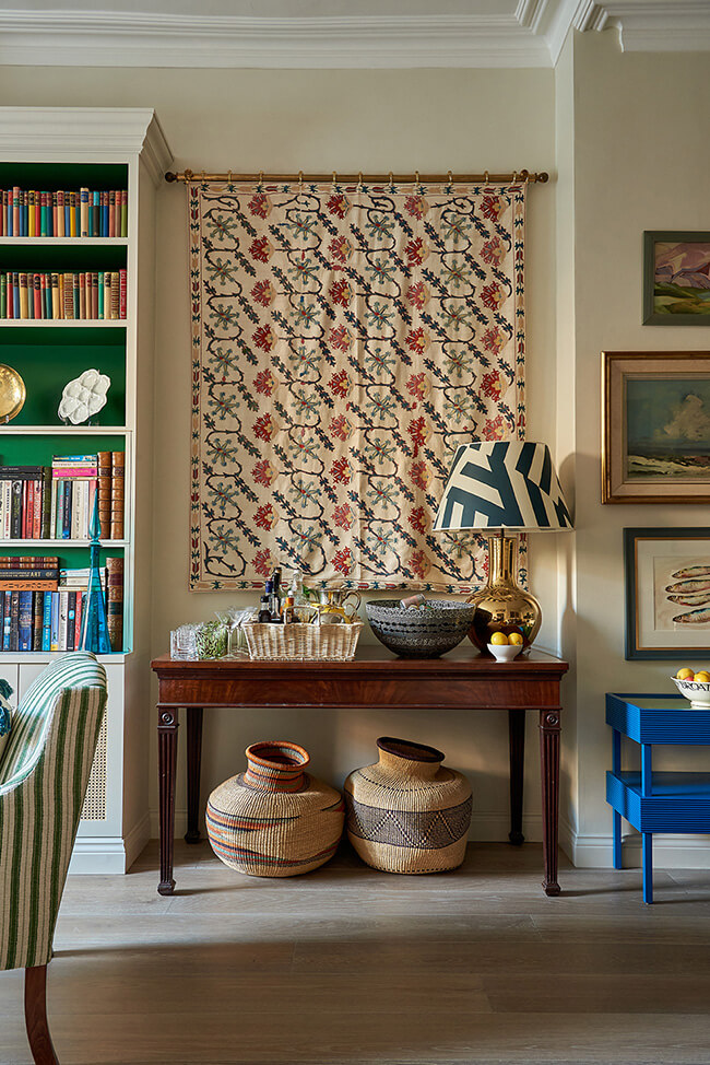
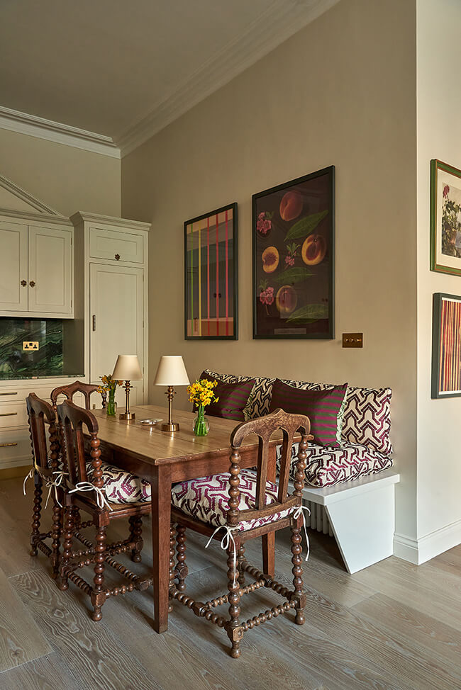
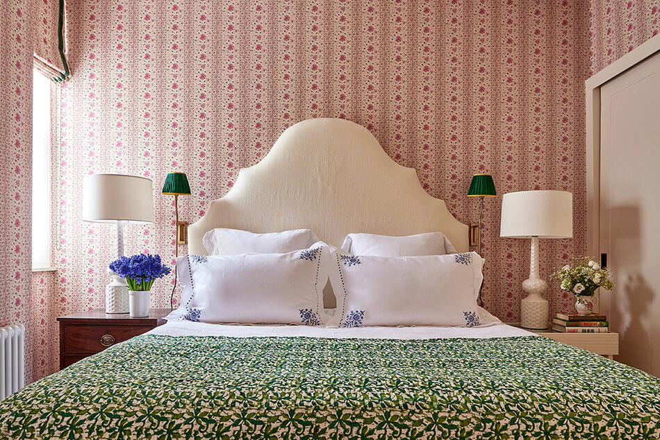
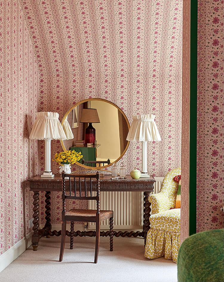
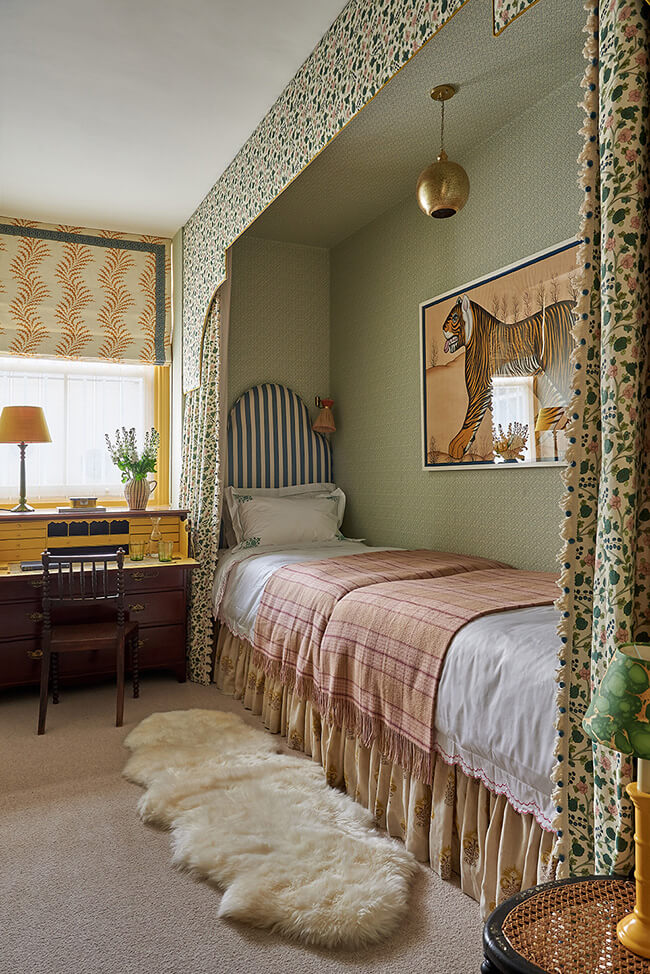
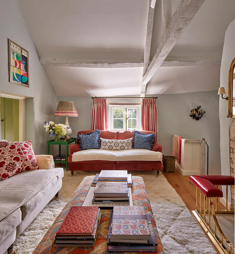
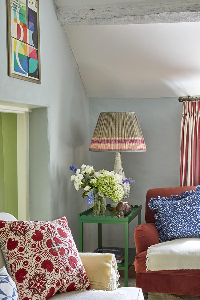
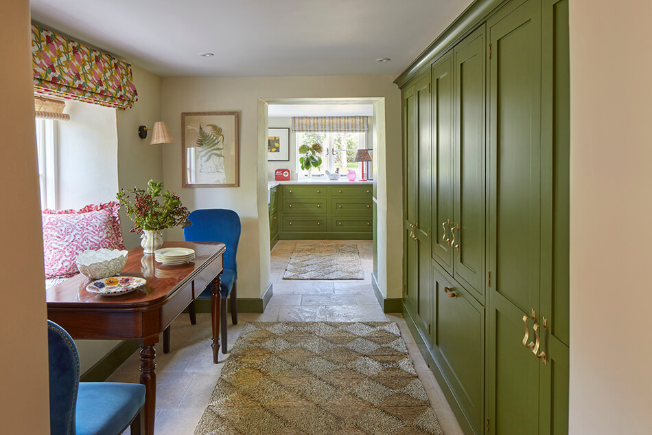
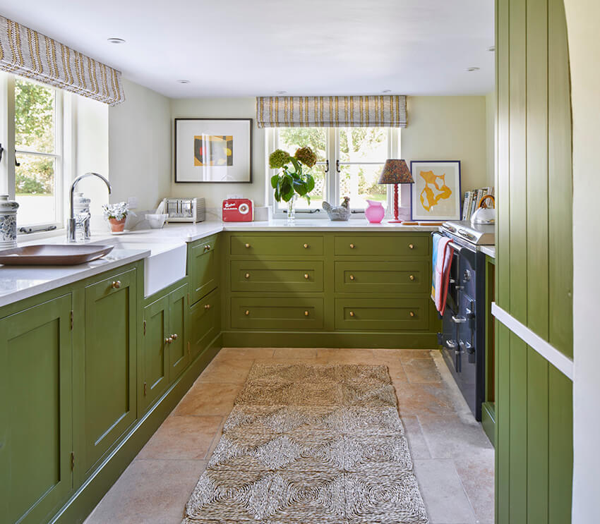
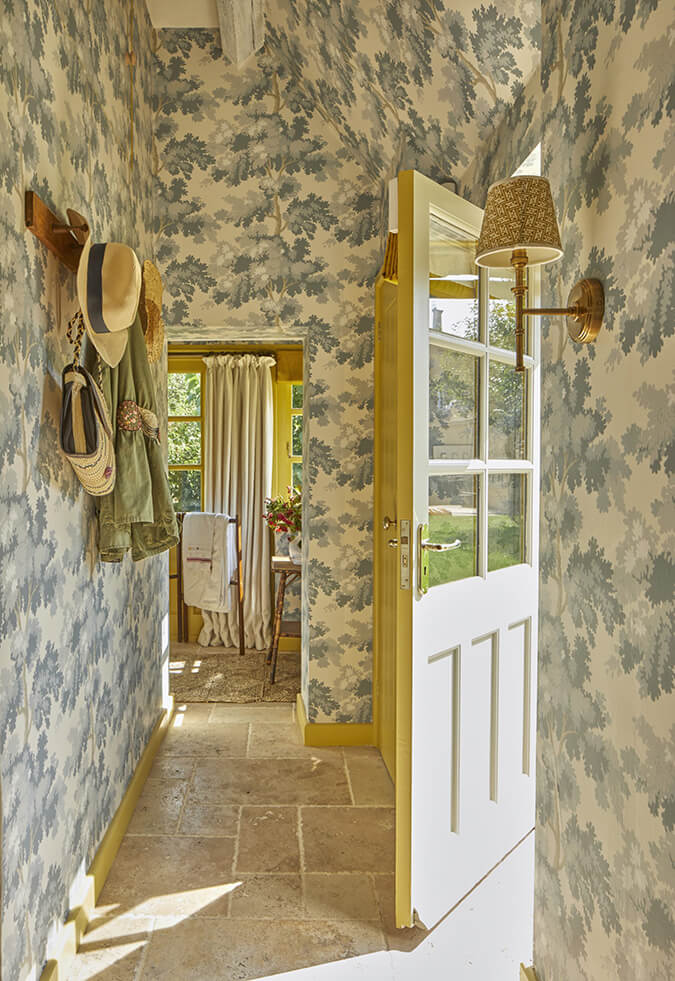
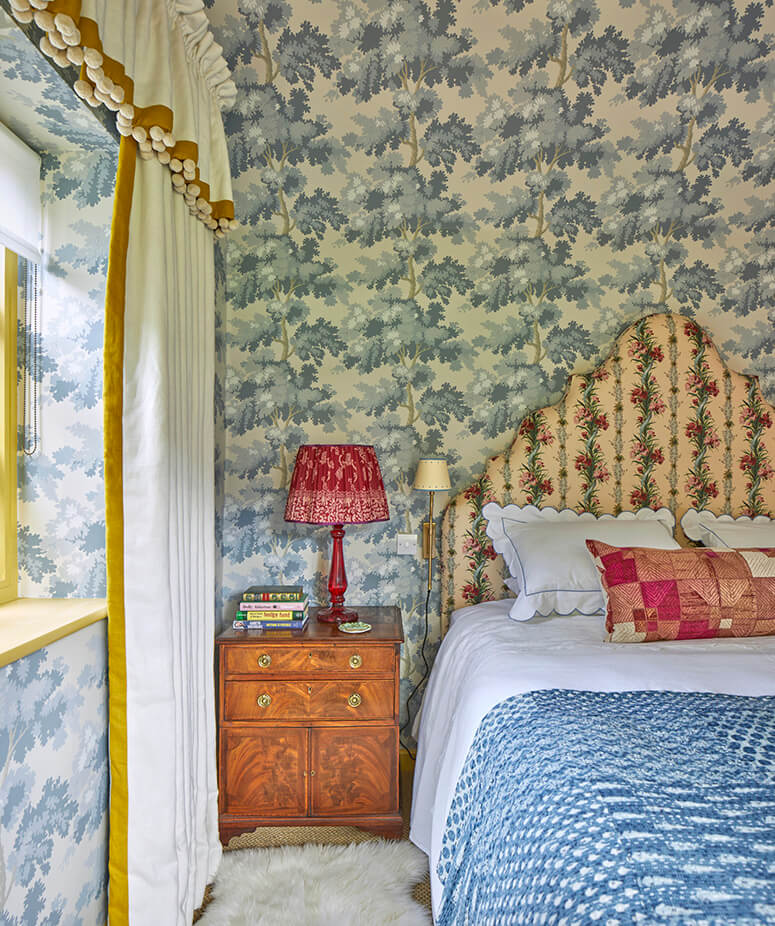
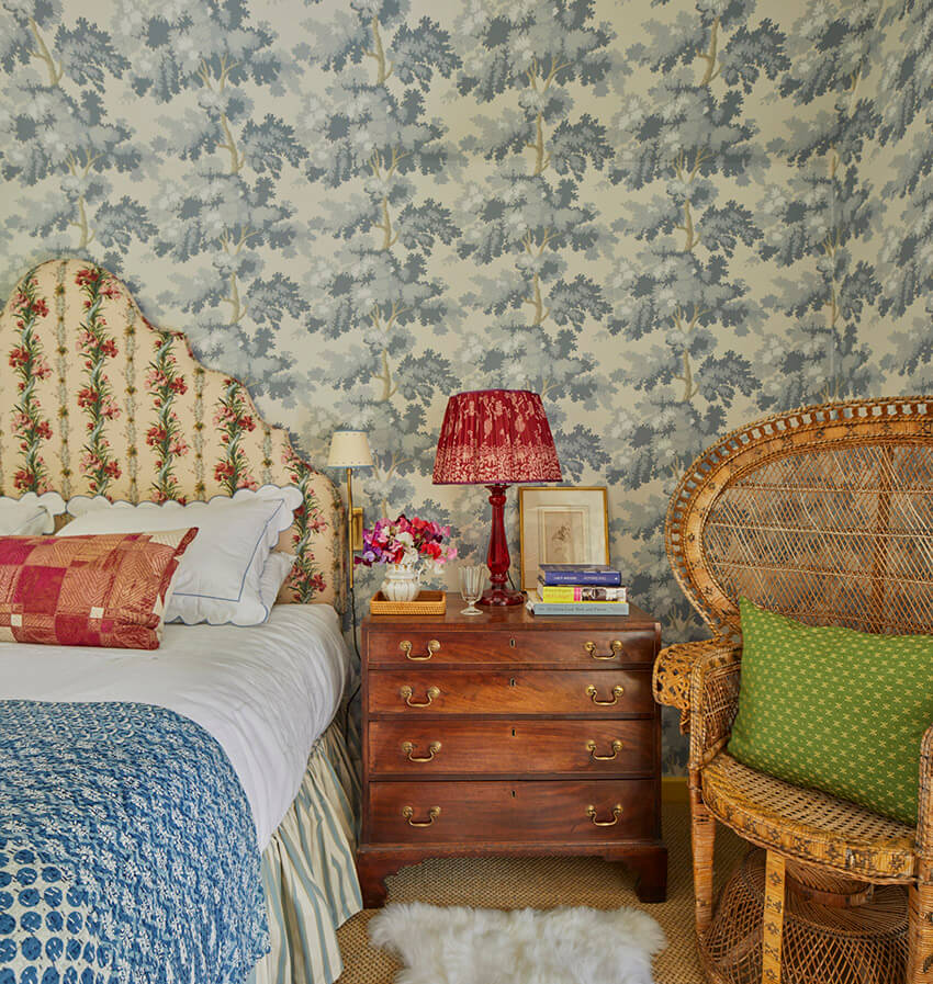
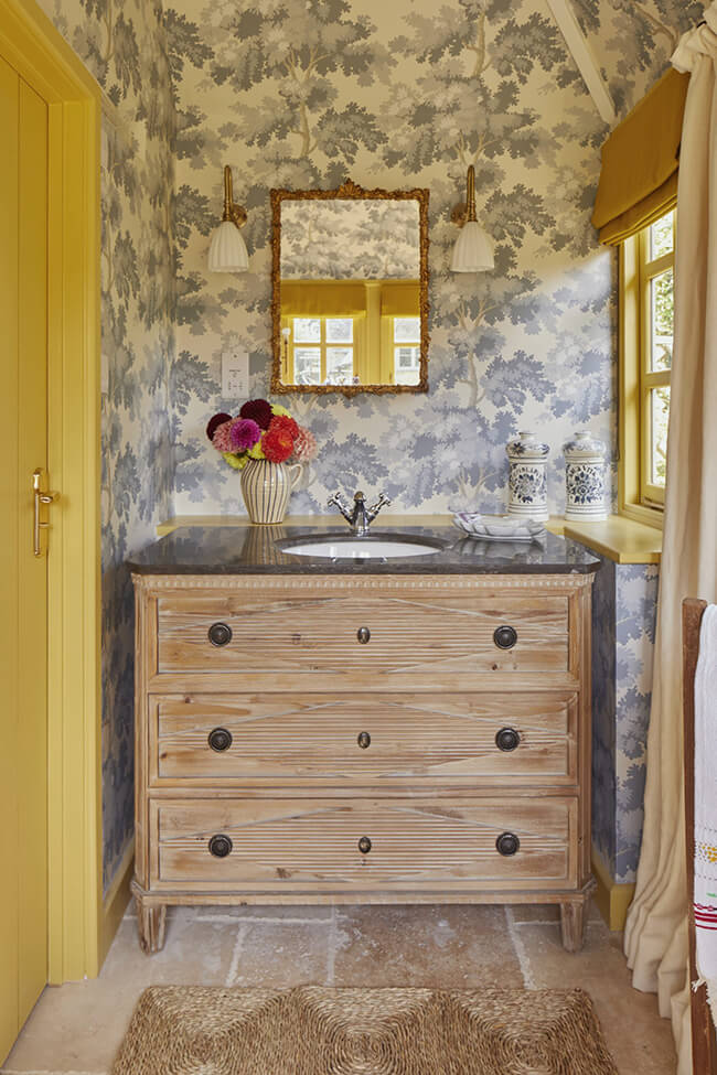
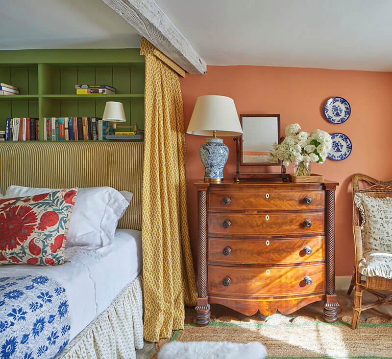
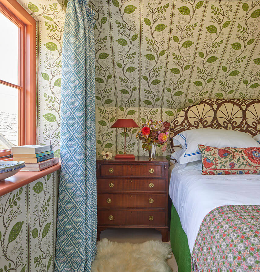
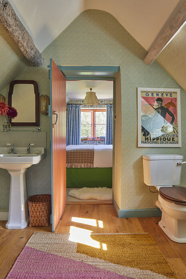
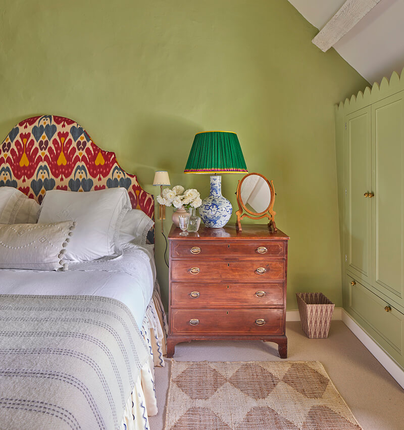
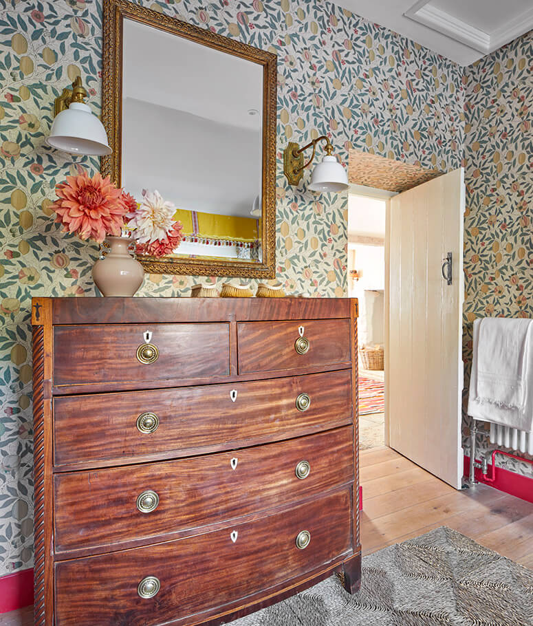
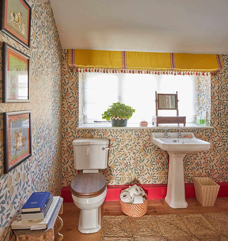
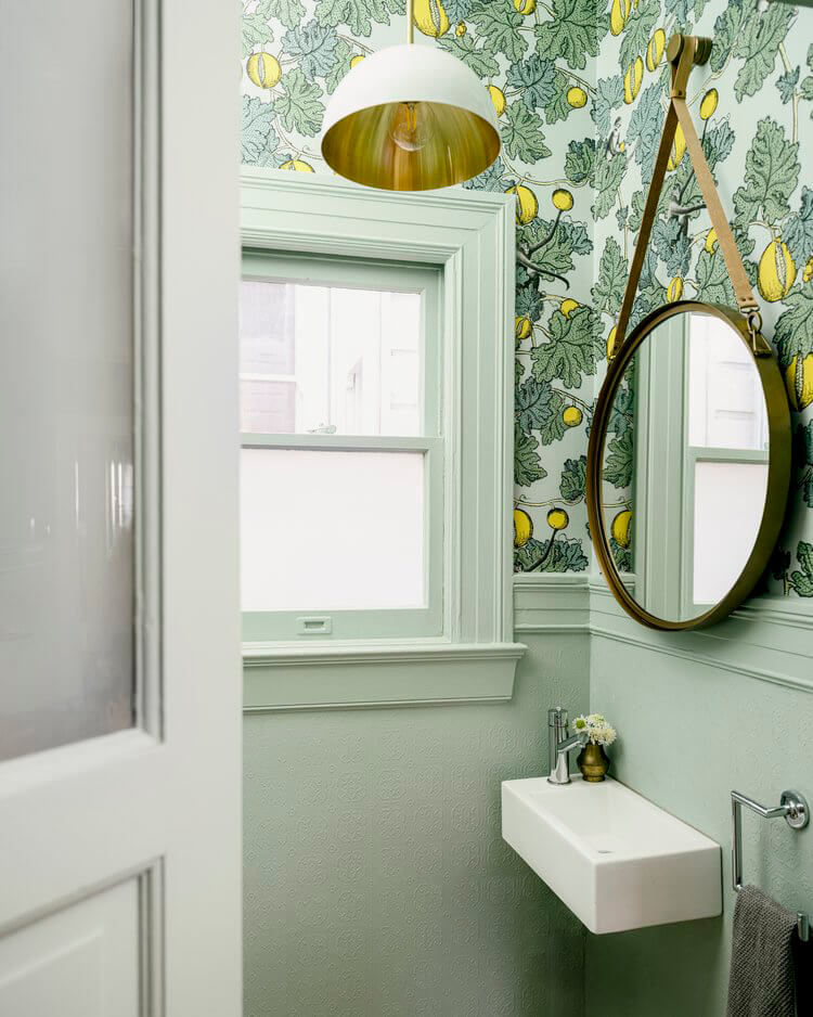
Soft colours and patterns in a Cotswold house
Posted on Mon, 13 Jun 2022 by KiM
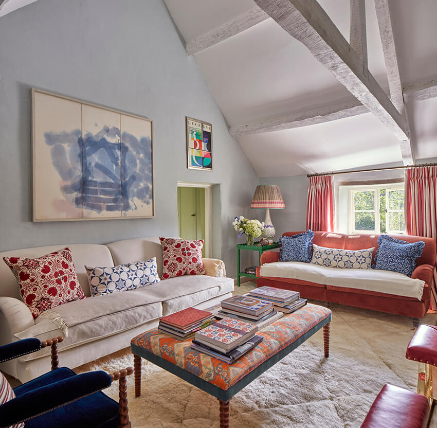
I had to share another pretty as a peach home designed by Sarah Vanrenen. Soft greens and blues and yellows, and abundance of patterns – all so welcoming.
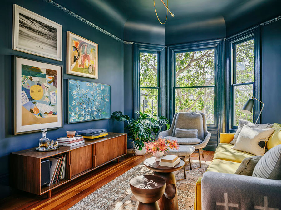
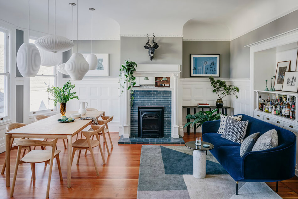
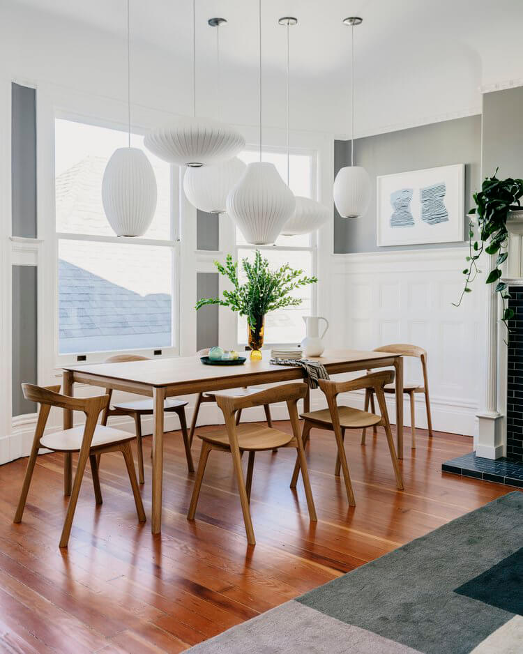
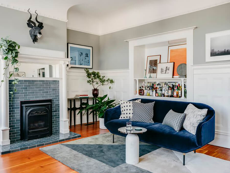
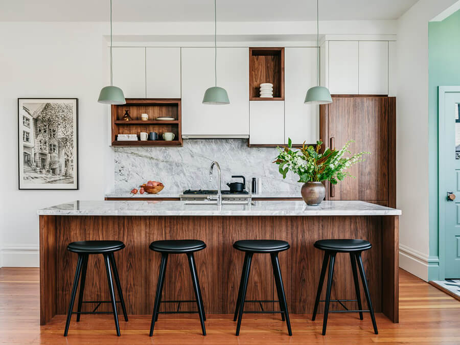
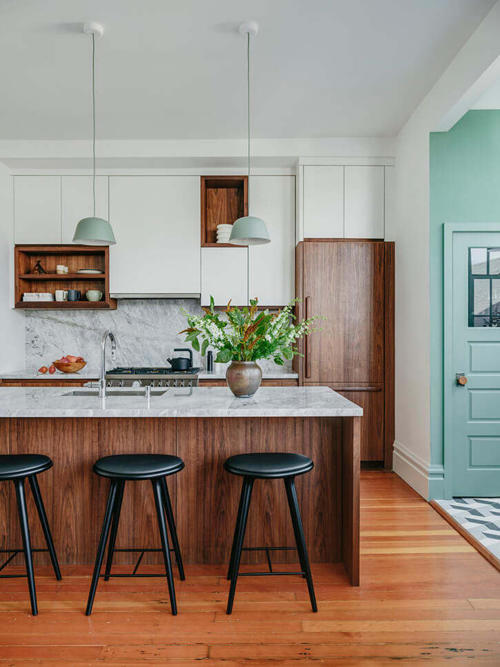
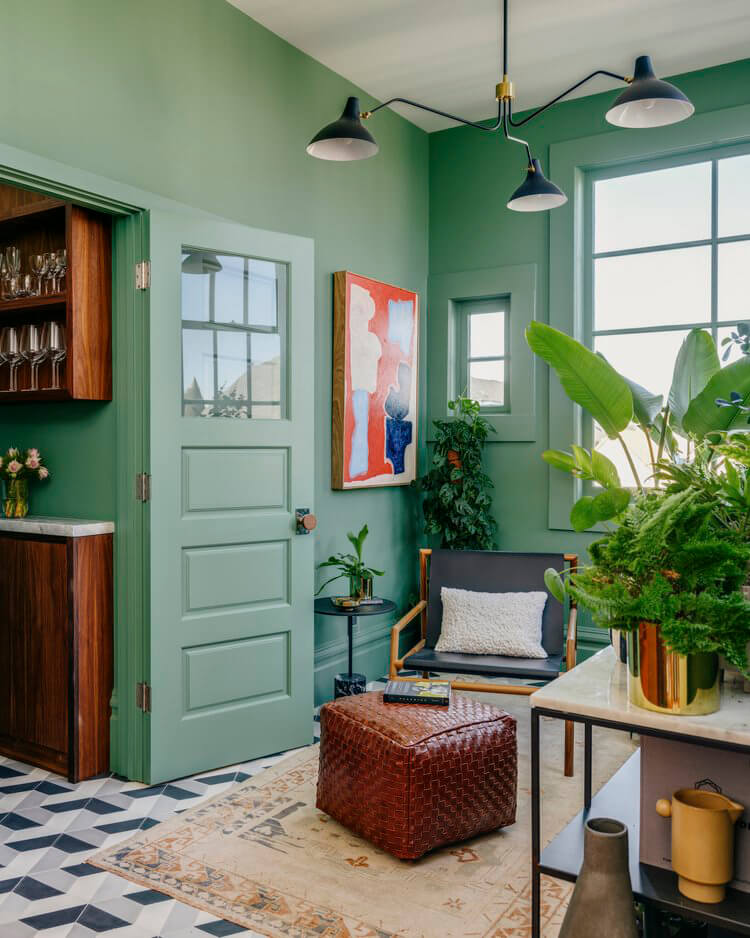
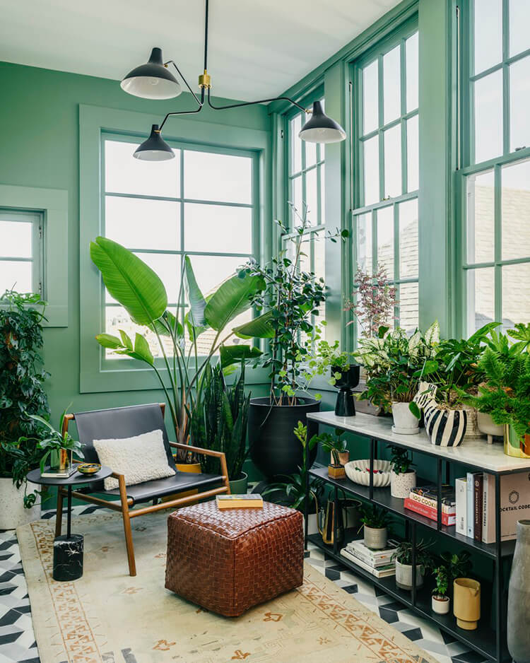
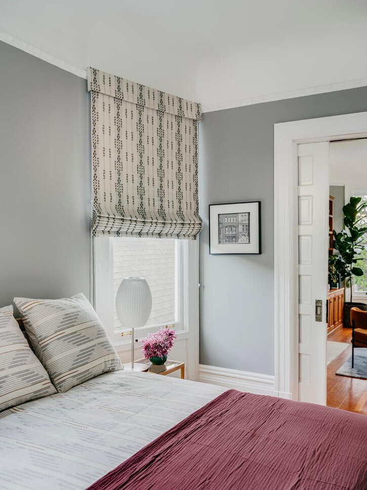
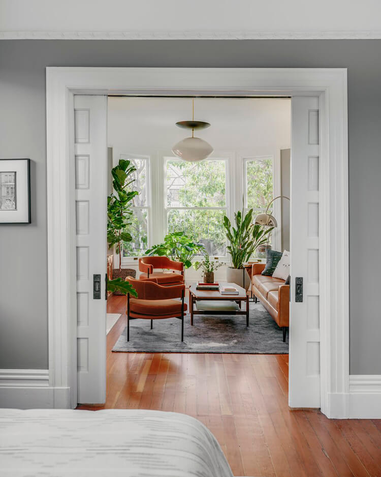
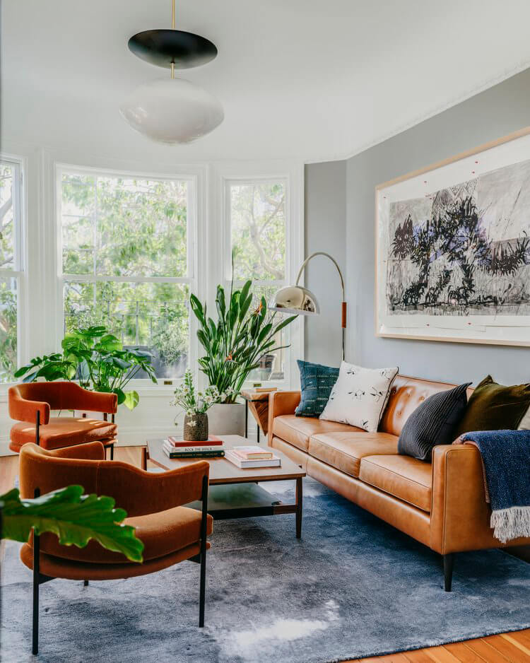
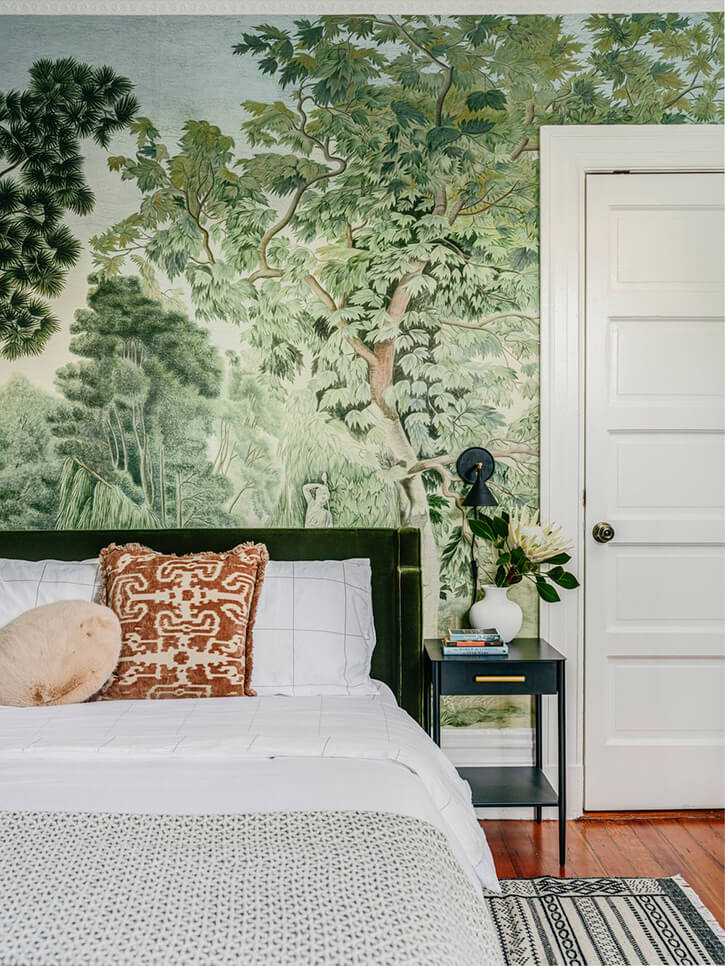
Blues and greens in a San Francisco Victorian
Posted on Tue, 7 Jun 2022 by KiM
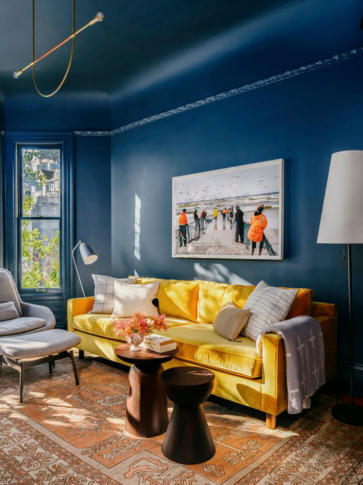
This San Francisco Victorian had a prior life as a somewhat neglected rental unit. Our clients felt compelled to rescue it and make it their Bay Area home base. We were fortunate enough to be asked to collaborate on this project, giving the space new life. Upgrades in the spaces were a must. However, all changes were done with thoughtfulness and with an eye towards not only practical changes, but ensuring a dusting of design magic throughout this new home. Forgoing neutral colors, we went bold and bright throughout. I really love the shades of blue and green and fun wallpapers and tile used in this home designed by Banner Day Interiors.
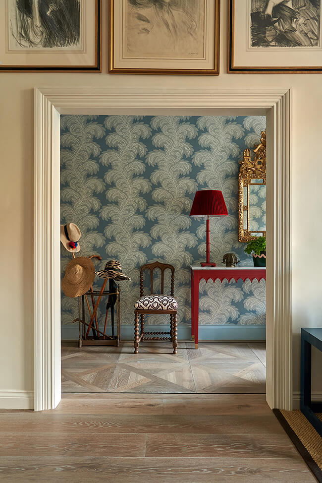
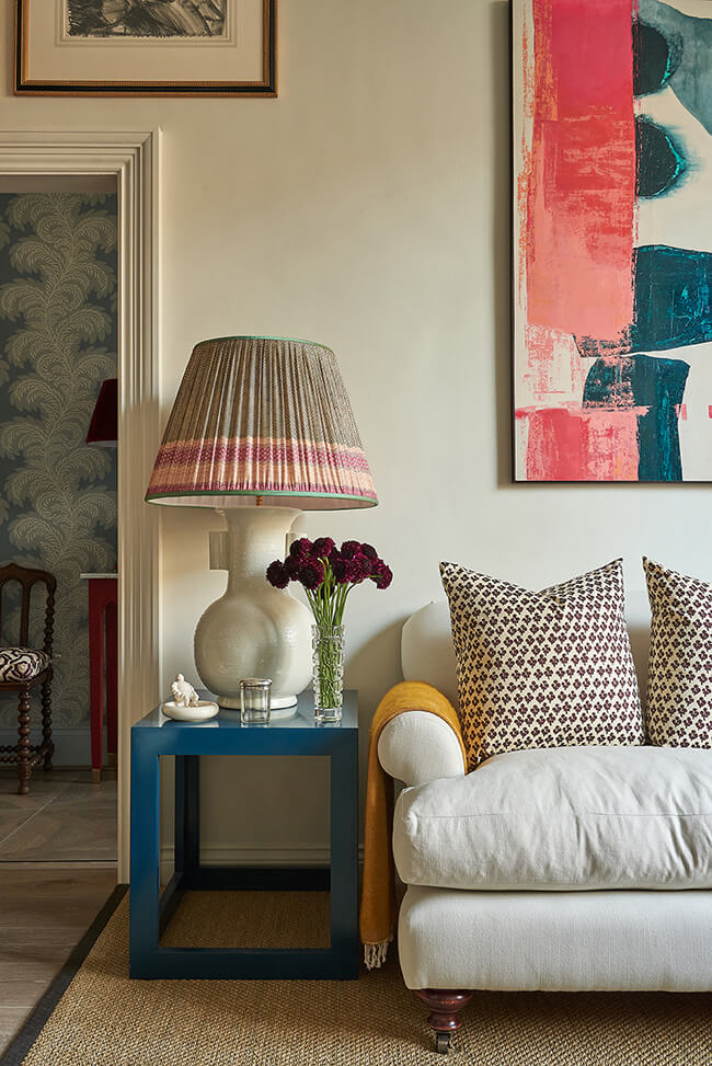
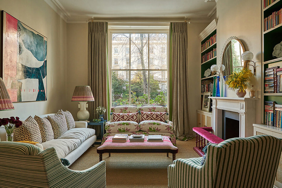
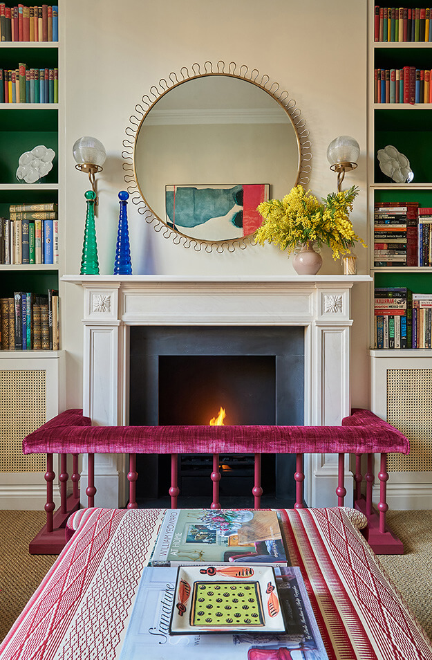
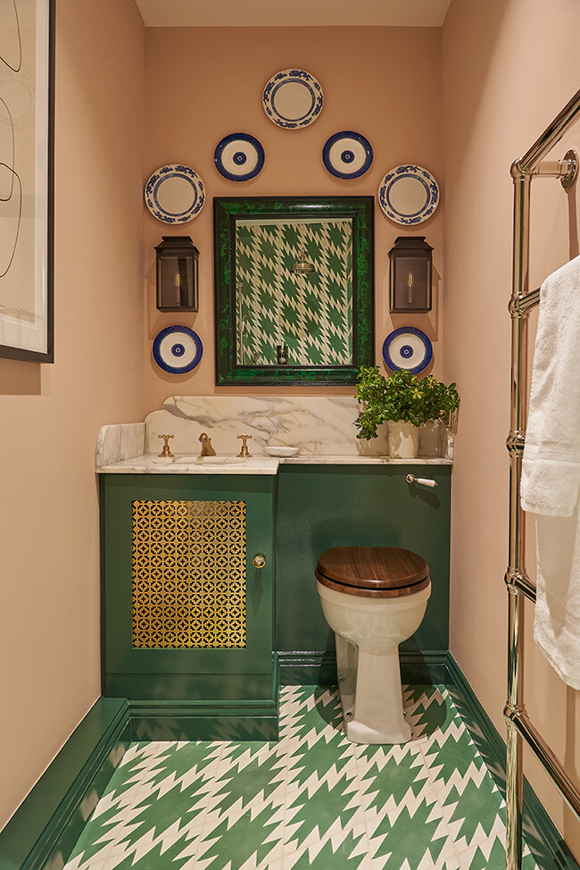
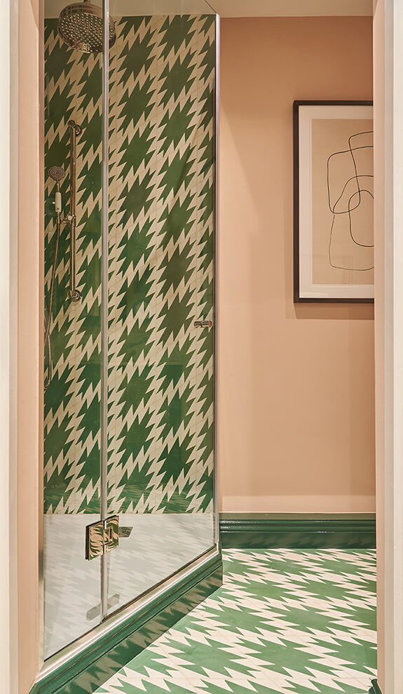
The prettiest Notting Hill apartment
Posted on Tue, 7 Jun 2022 by KiM
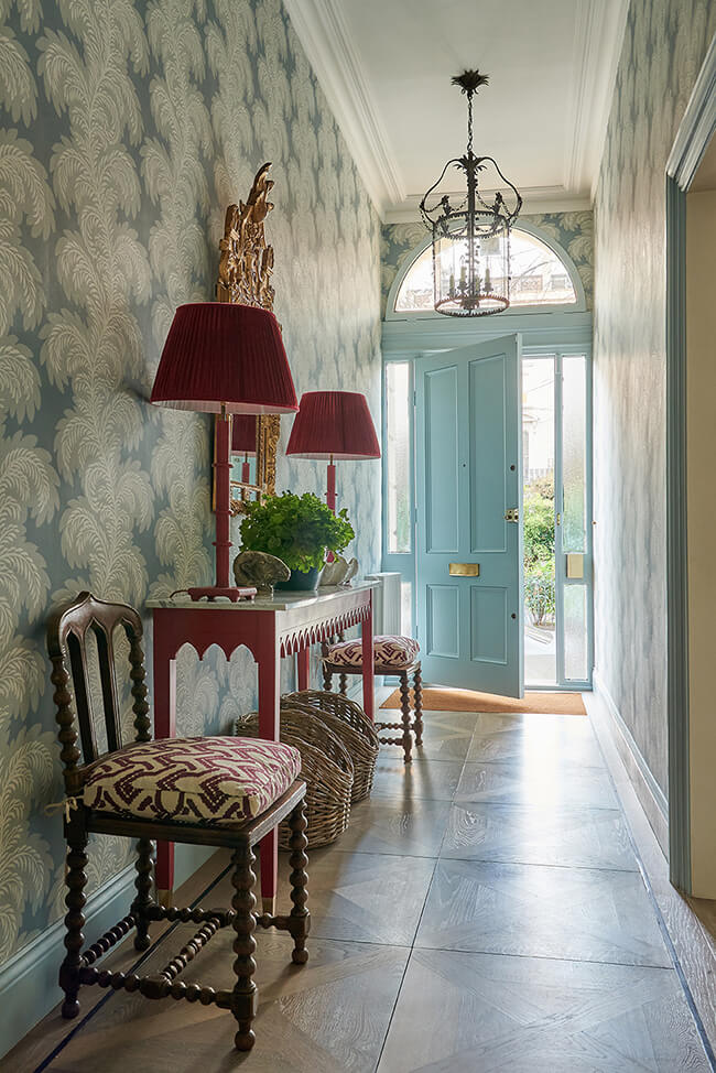
This Notting Hill apartment designed by Vanrenen GW Designs is a bit of a modern approach to classic English style with the prettiest shades of pink, blue, green and yellow. So many beautiful patterns too. I’ve taken to spending what little free time I have scouring Etsy for any patterned textiles. I’m obsessed 🙂