Displaying posts labeled "Purple"
The Schoolhouse
Posted on Fri, 28 Jul 2023 by KiM
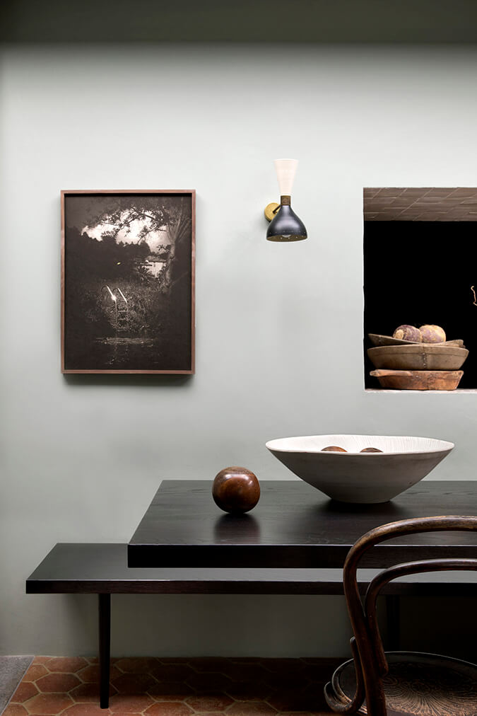
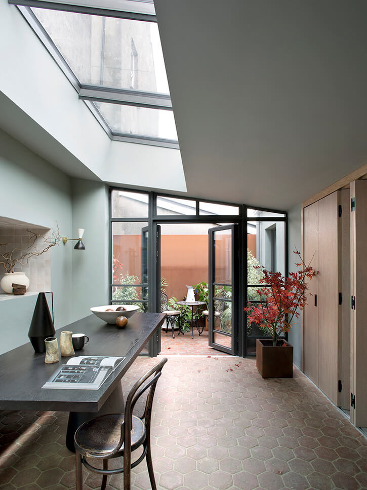
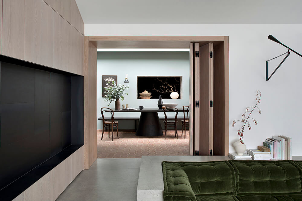
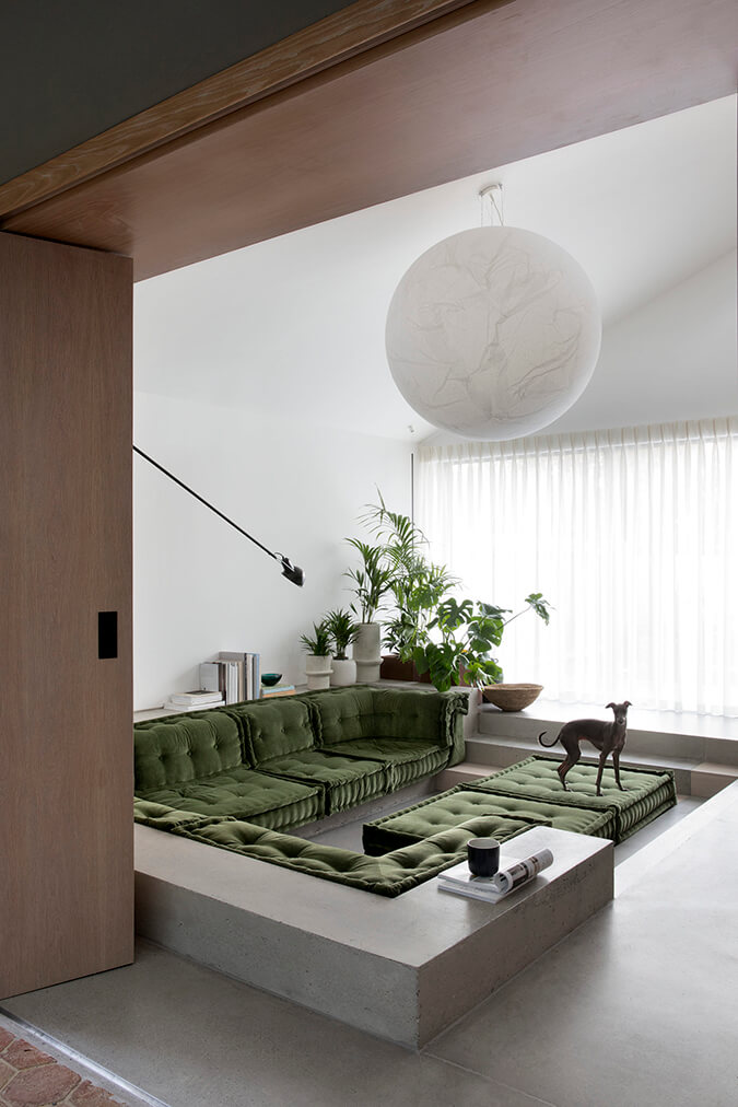
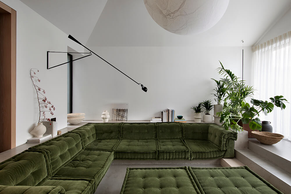
The Schoolhouse, merges old and new, combining contemporary details within conservation architecture. This family home blends dynamic and vibrant elements with understated and timeless spaces, designed to feel as though it has been permanently embedded in the historic building. Our challenge was to create an inviting, emotive atmosphere that captivates those who live there and takes them on a experiential journey.
In typical Kingston Lafferty Design fashion, this home is high drama, drenched in bold colour, full of graphic, shapely elements and I was completely sold when I got to the sunken living room. Photos: Barbara Corsico, and for more details check out est living.

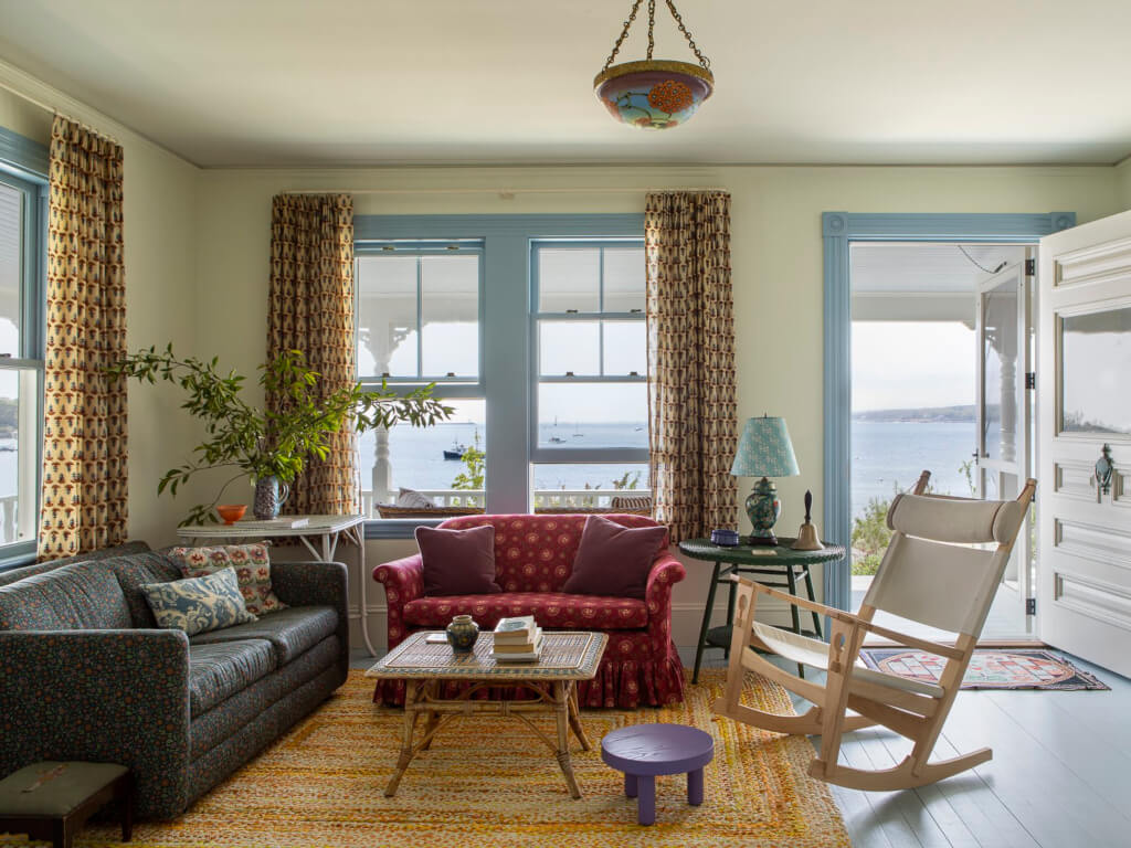
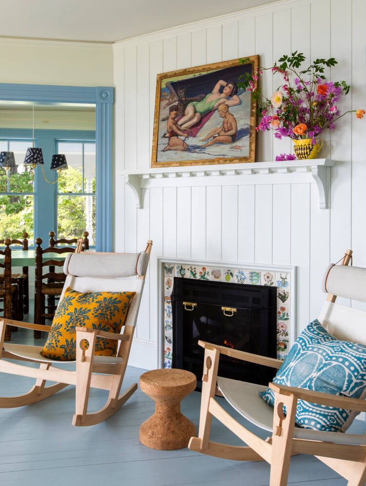
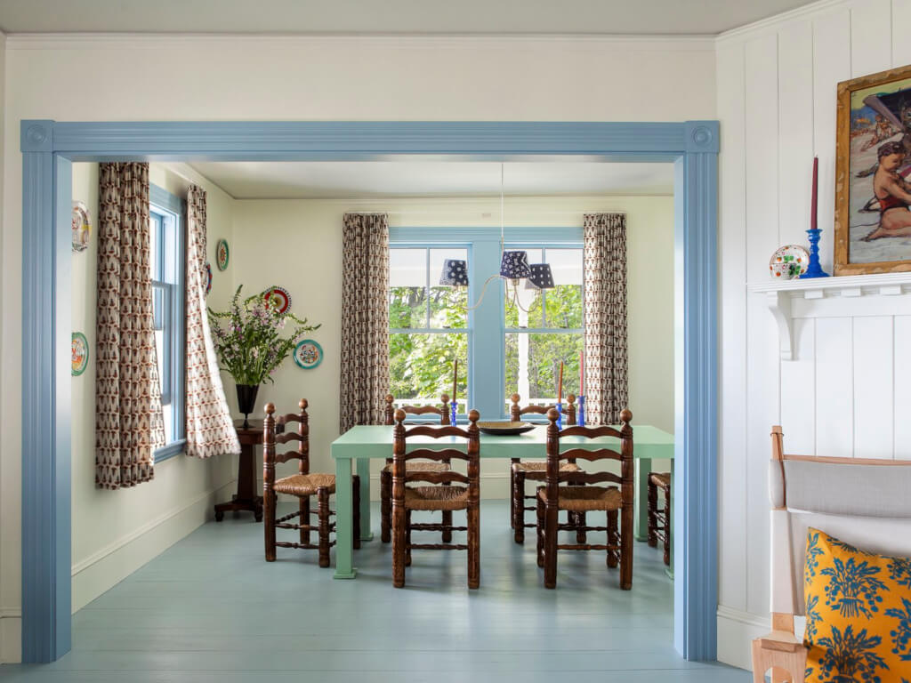
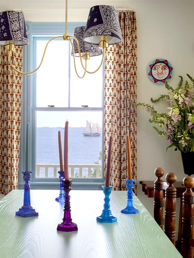
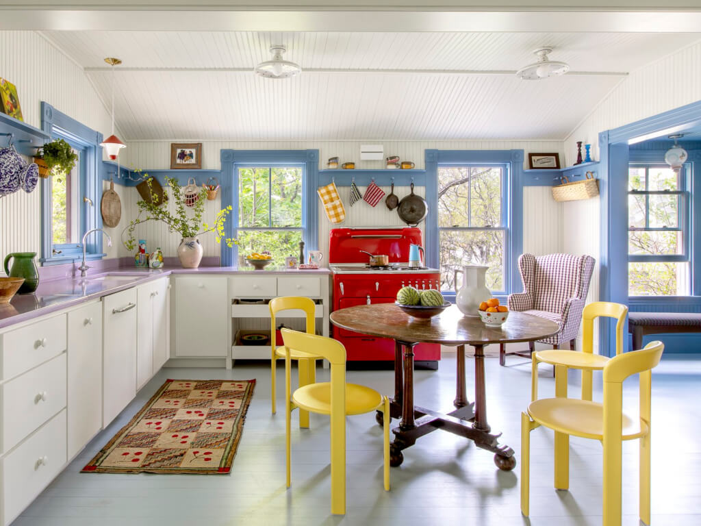
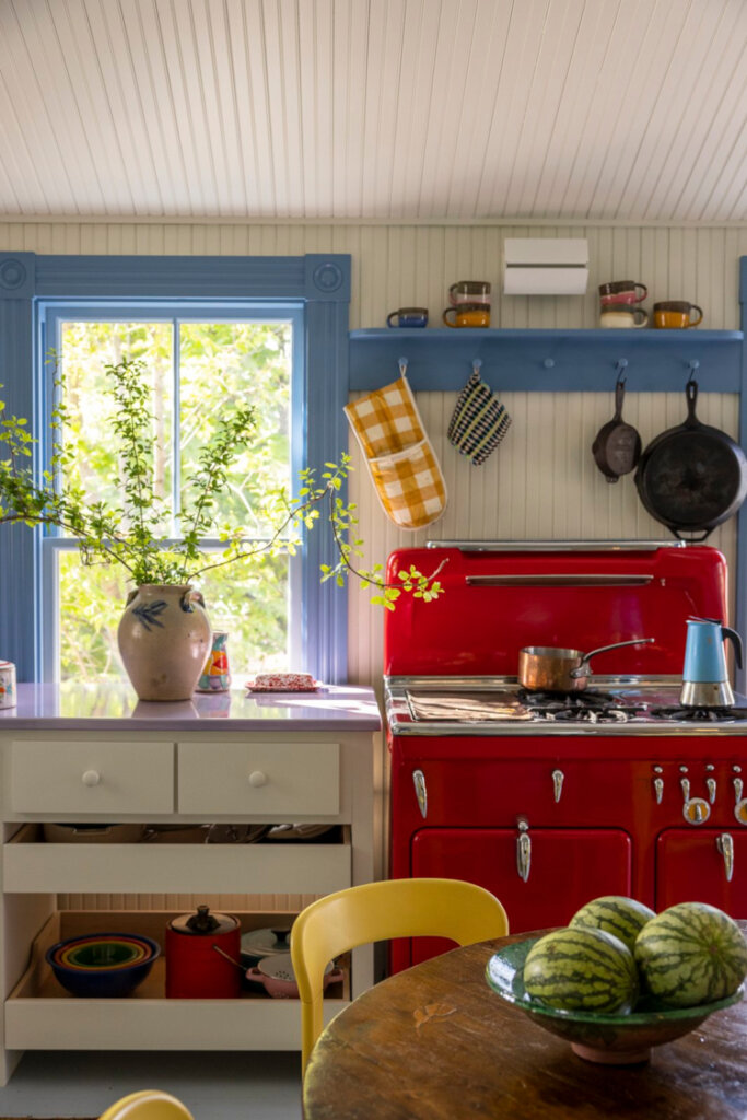
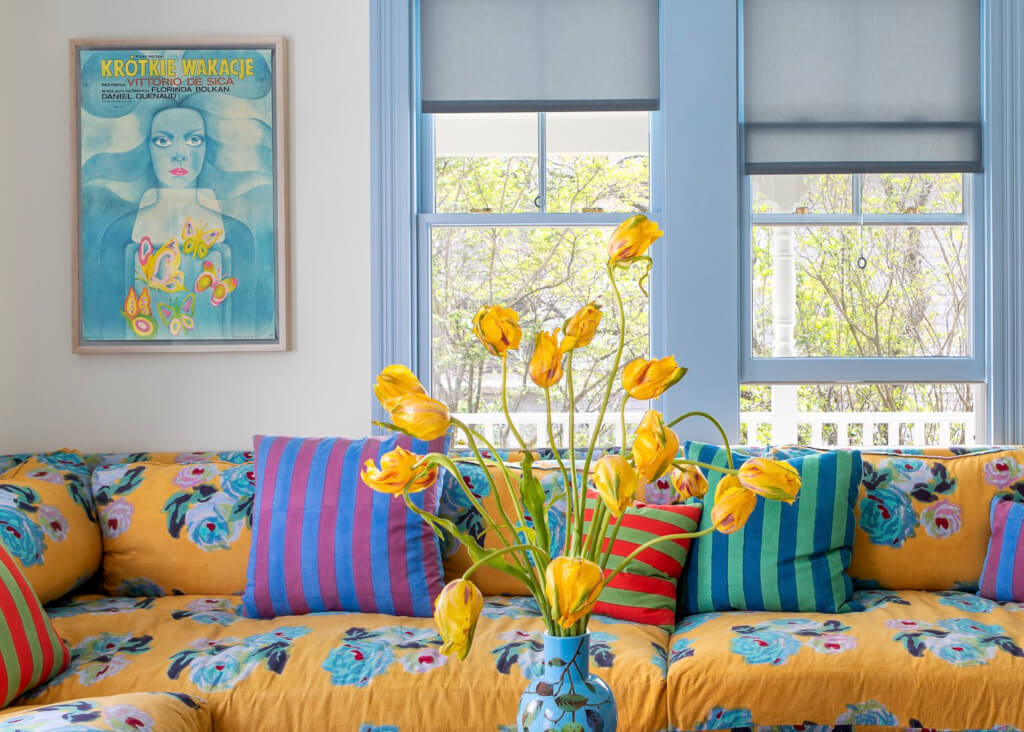
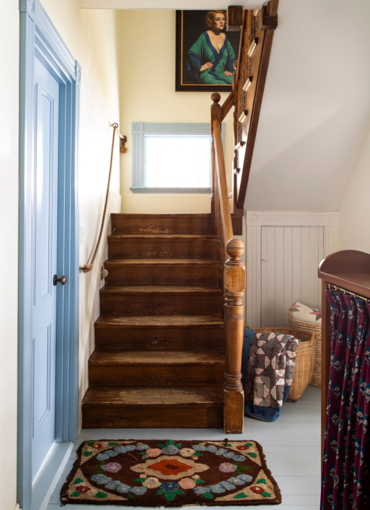
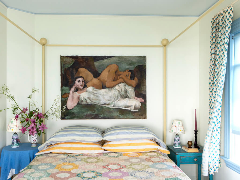
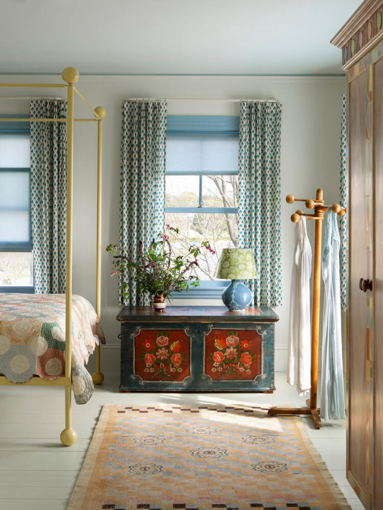
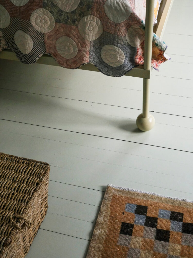
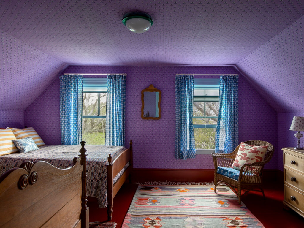
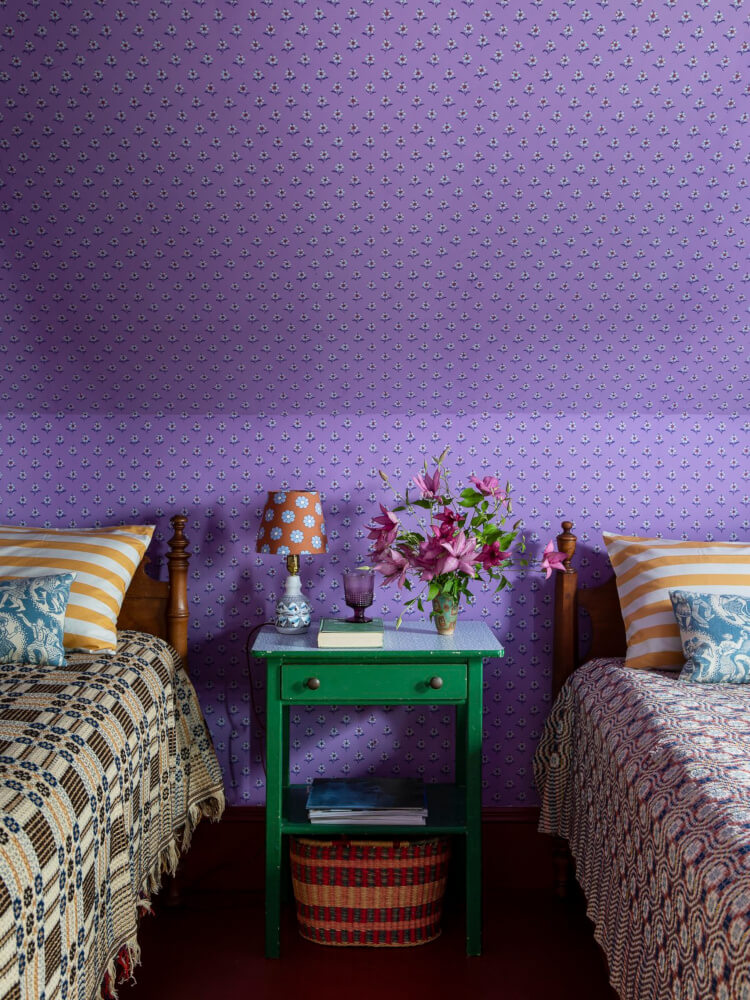
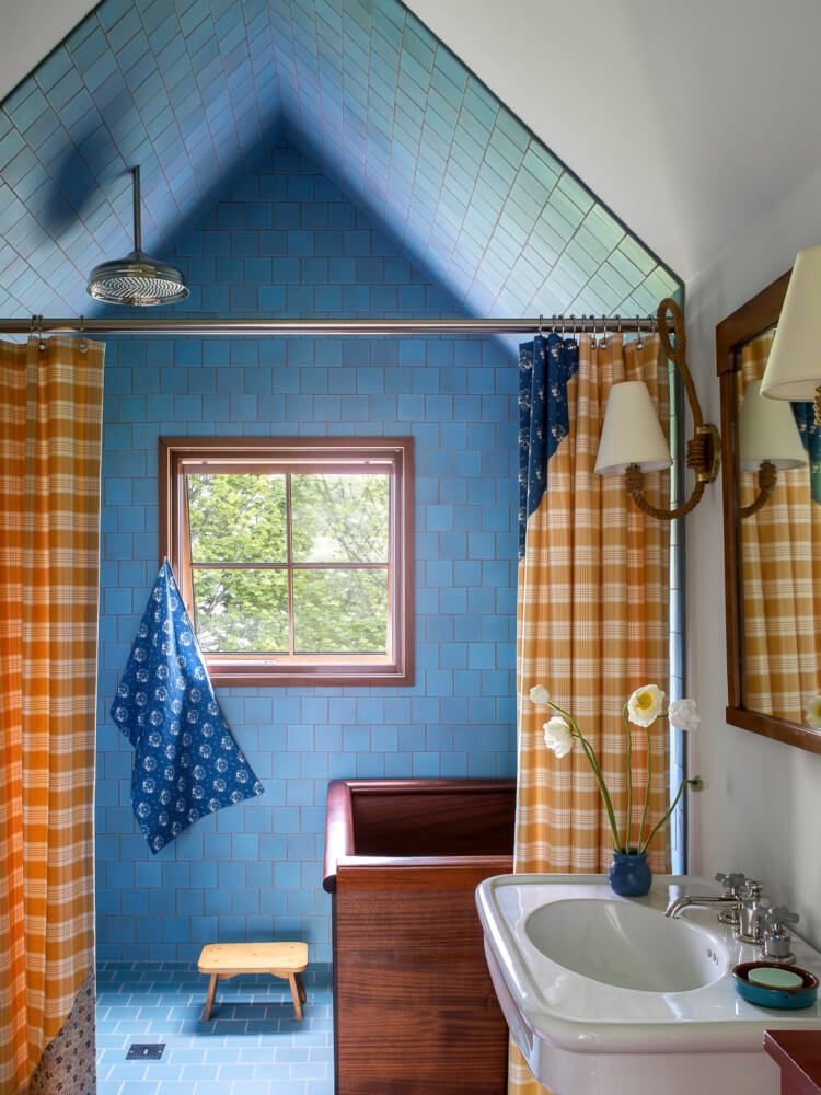
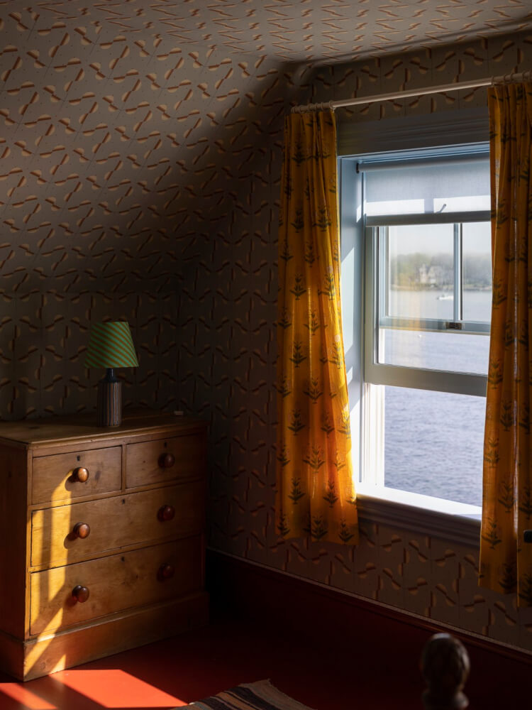
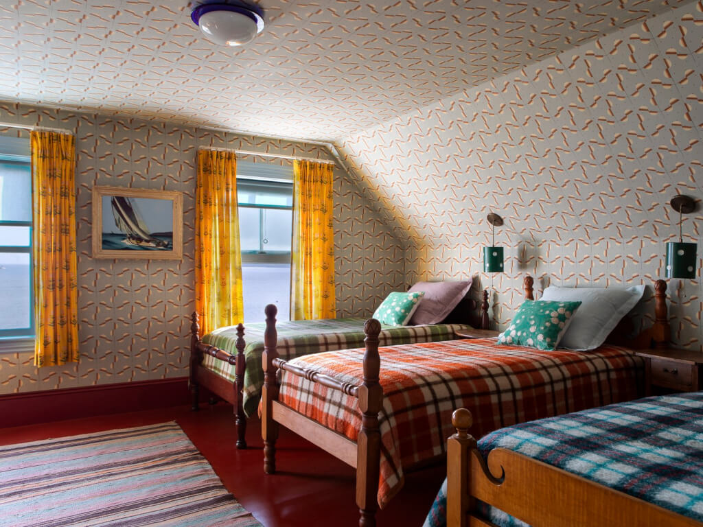
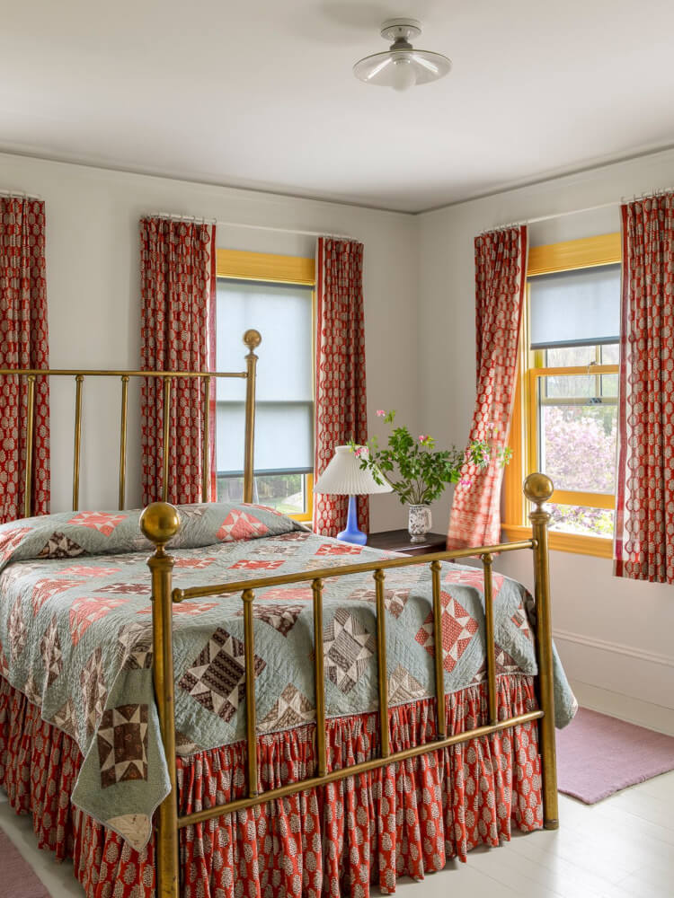
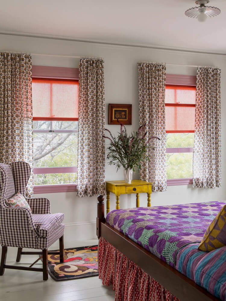
Hardcore cottagecore
Posted on Fri, 26 May 2023 by midcenturyjo
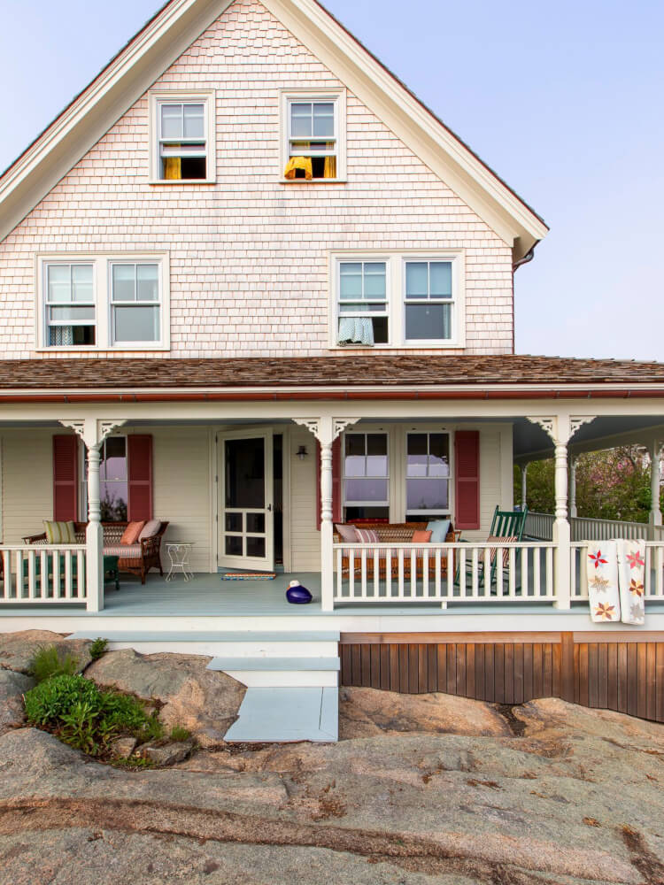
Colour, pattern, textiles, flea market finds and carefully curated antiques. Everything considered but nothing “precious” … except the experience. The place, the memories, the lifestyle. Family and friends, the smell of the sea and a home that holds relevance to the owners. Cape Ann Summer House by Reath Design.

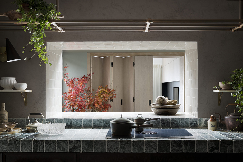
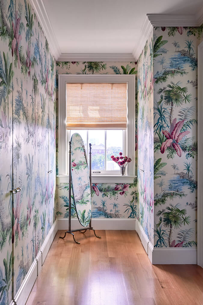
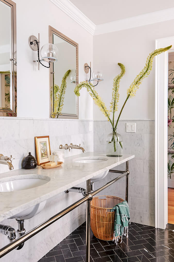
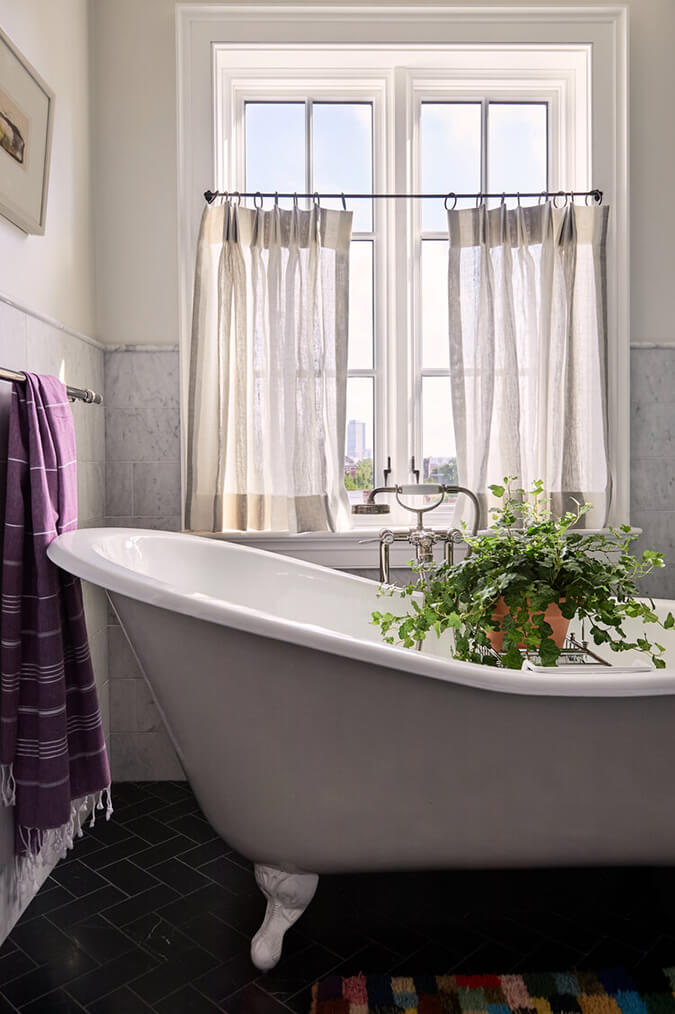
Fresh take on a pied-à-terre
Posted on Fri, 26 May 2023 by midcenturyjo
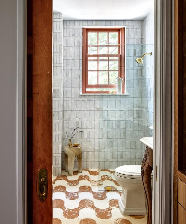
“Our young client was ready to make a home that felt like her own. In order to optimize the condo’s limited space, we reconfigured the layout and changed the function of certain spaces, like converting a hall closet outside of the bathroom into a built-in unit with a vanity, mirror, and storage drawers and cabinets. An open washstand with legs and light stone selections make the bathroom appear bigger, and a recessed floor length medicine cabinet prevents counter clutter. The much-loved galley kitchen, featuring antiqued stone tile and a plaster curve and vent hood, opens onto the moody dining room, the perfect setup for the owner’s many dinner parties.”
City chic with a fresh young vibe. Kalorama pied-à-terre by Zoe Feldman.
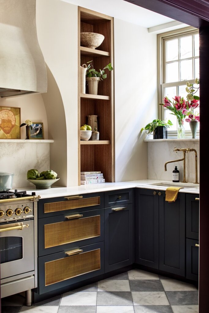
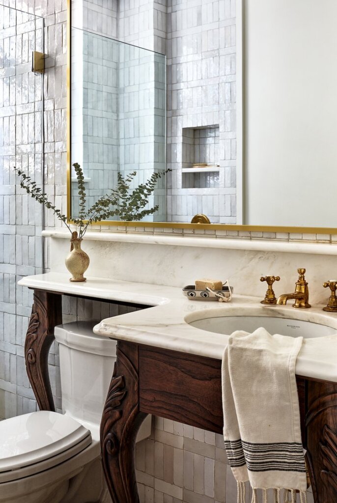
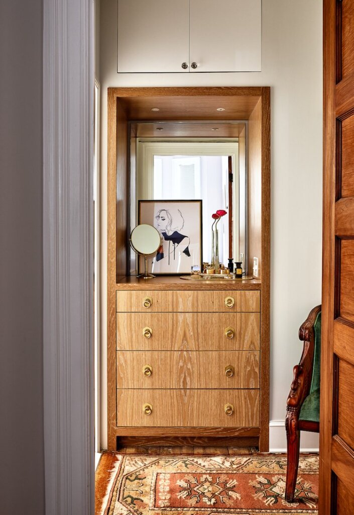
Photography by Stacy Zarin Goldberg
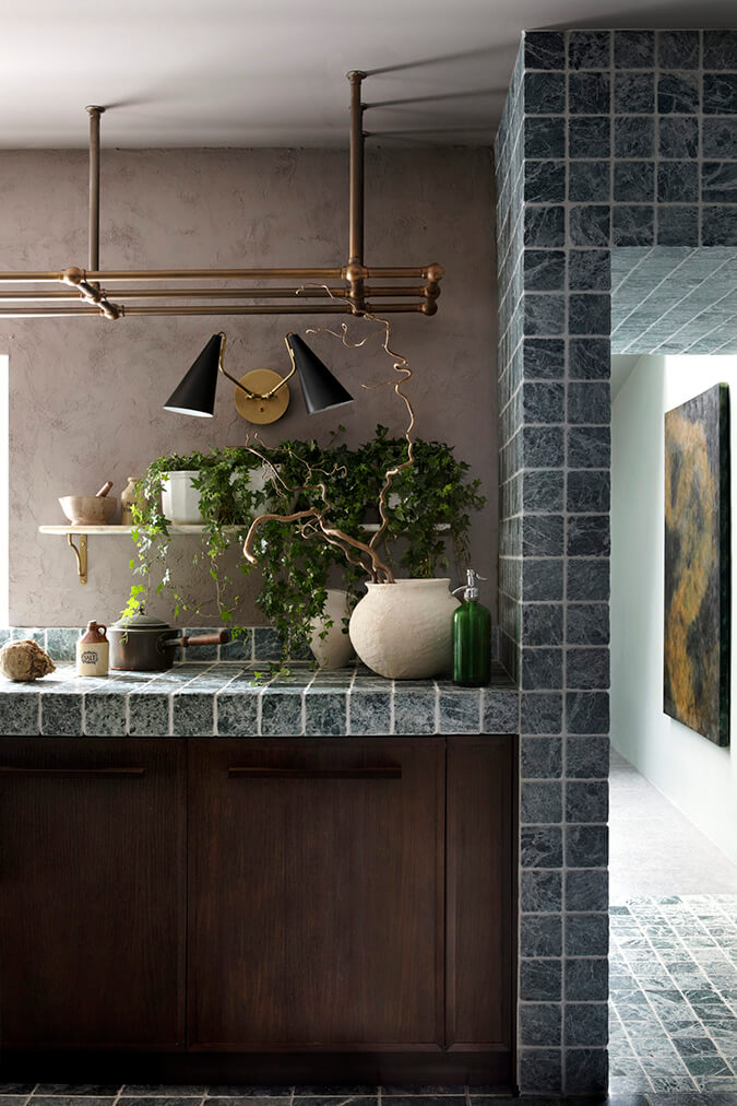
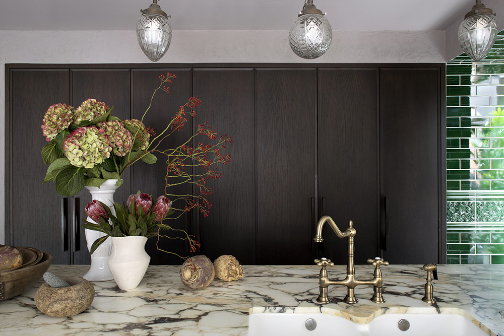
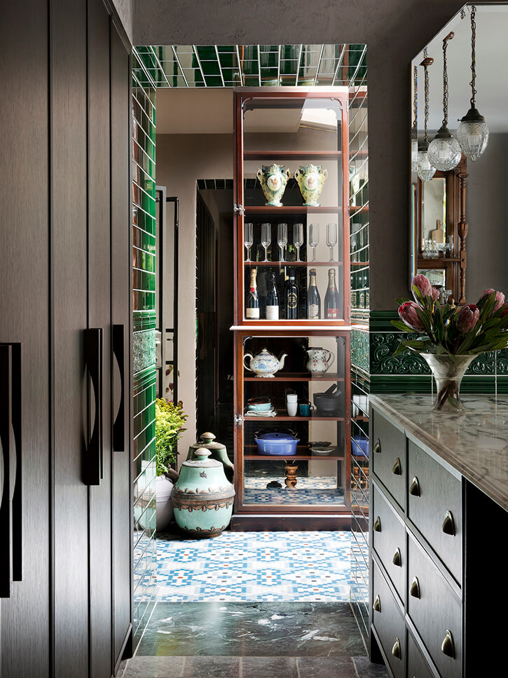
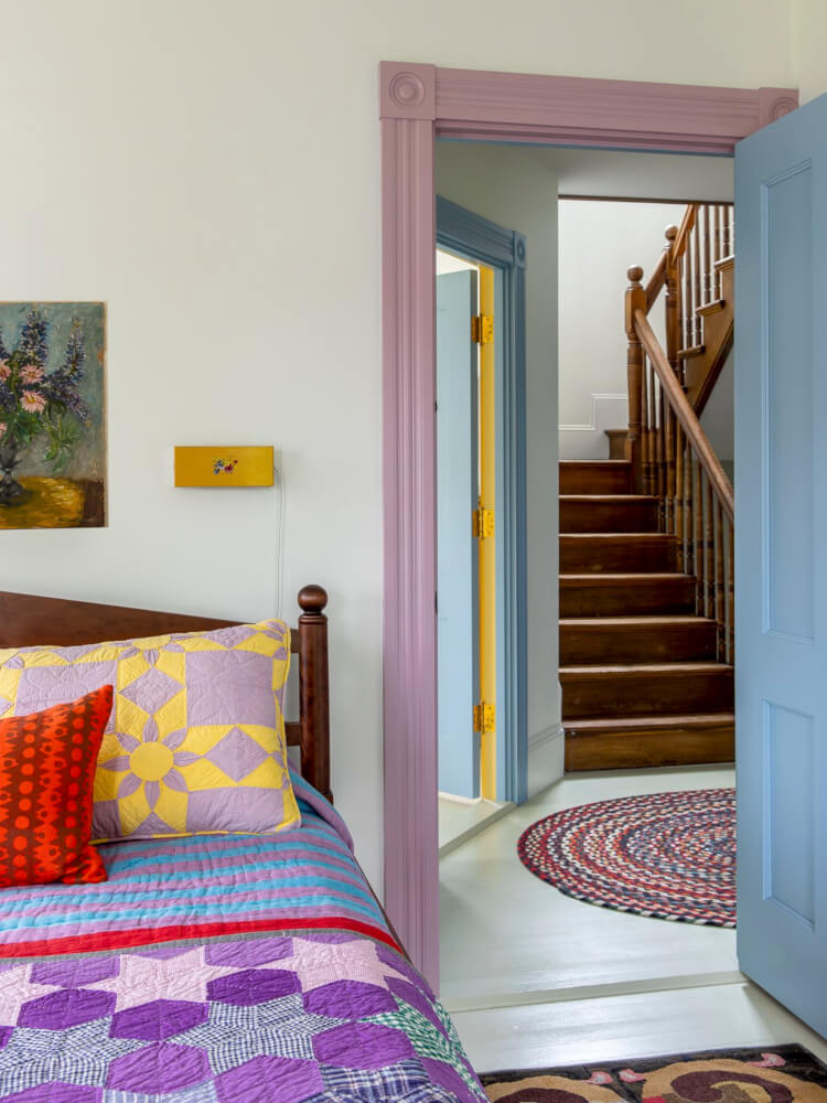
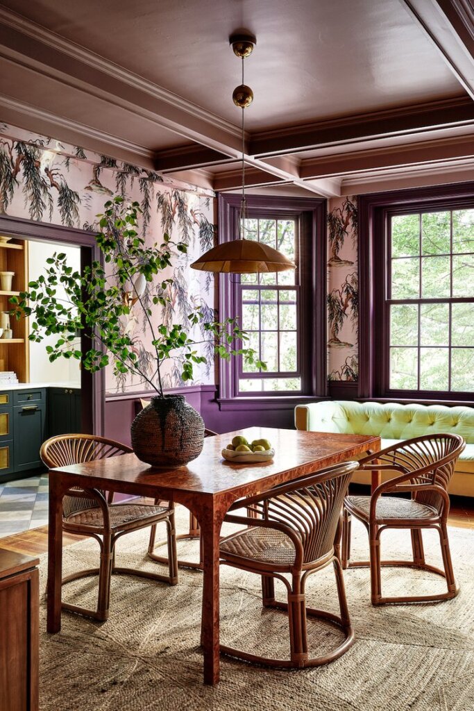
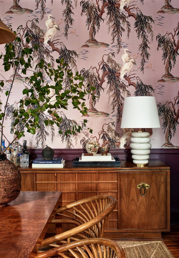
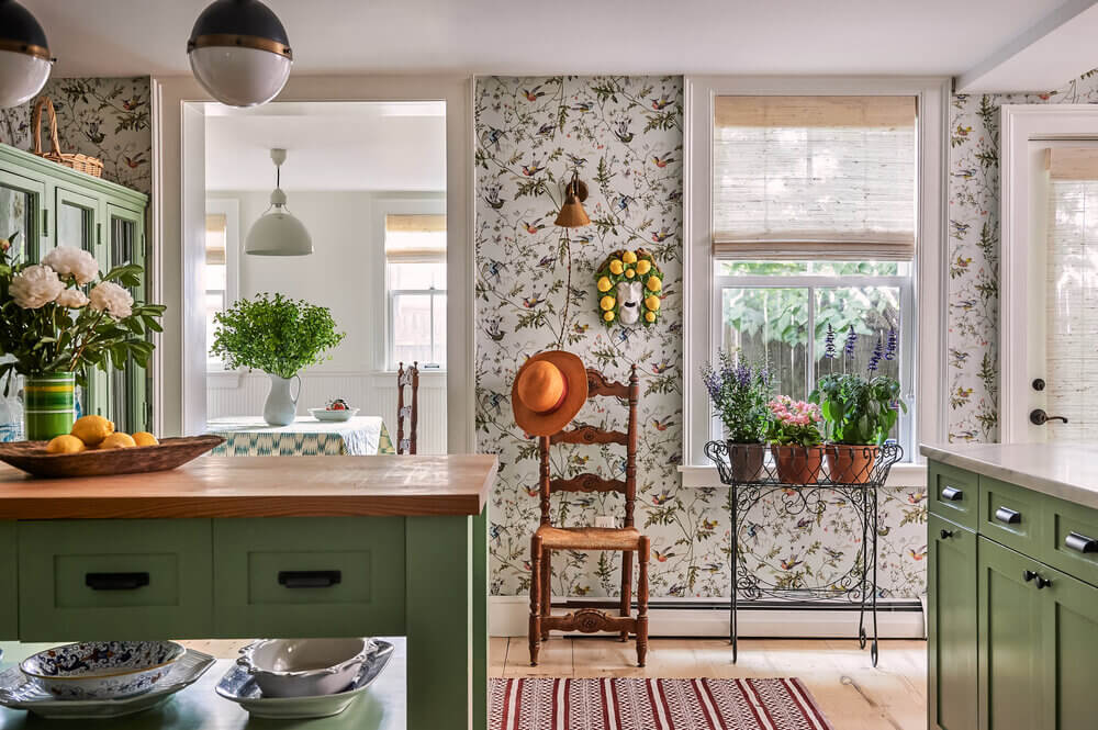
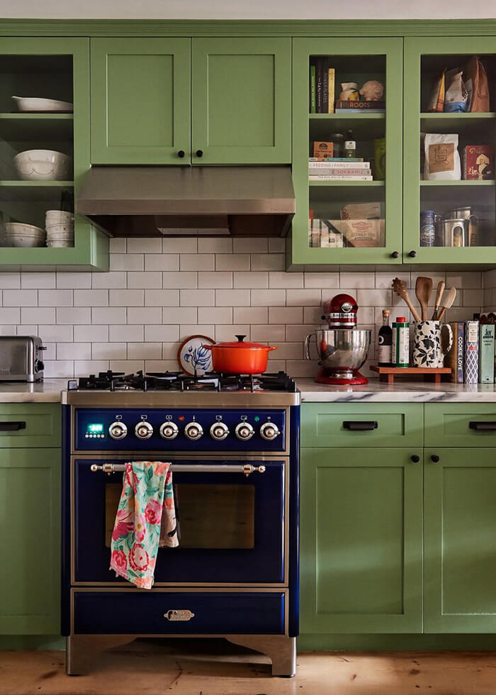
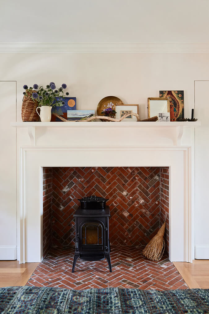
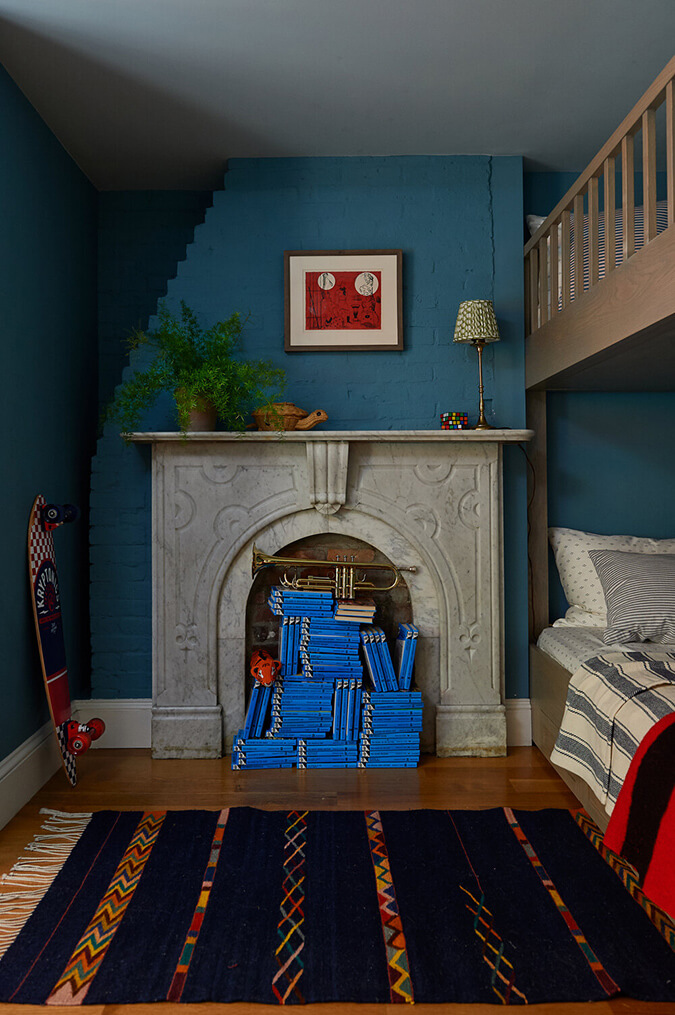
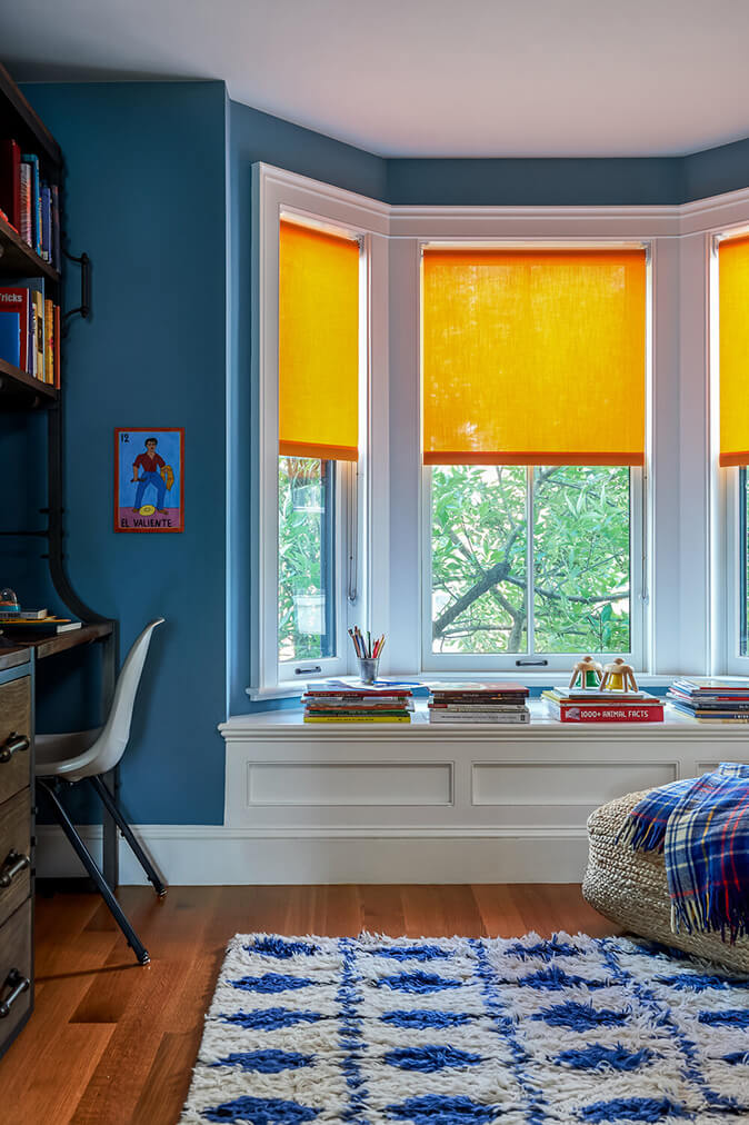
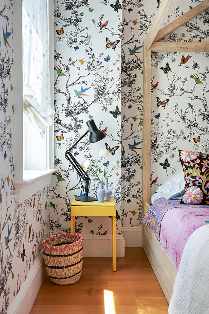
Captivating colours in an 1870s Boston townhouse
Posted on Wed, 17 May 2023 by KiM
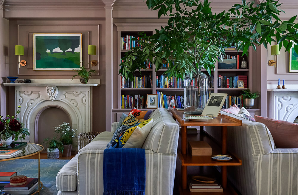
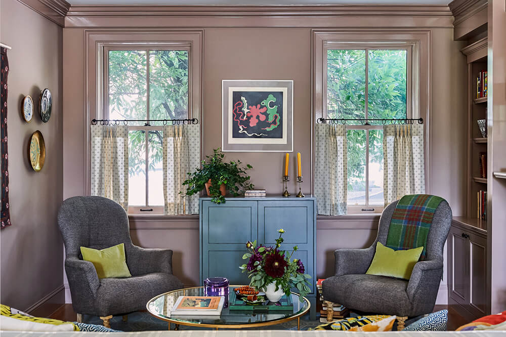
Located in the historic Charlestown neighborhood, our Boston townhouse project included full-scale renovation management, comprehensive finish selection, furnishings and art selection. Built in 1875, the color palette throughout the residence references the Victorian-era (particularly the dusty mauve living room) modernized with unexpected accent colors that captured both the client’s artful taste, and timeless New England roots.
Not sure which I prefer more – the dusty mauve or the green in the kitchen (Farrow & Ball’s Breakfast Room Green). Such pretty colours! Designed by Jessica Stambaugh of JS Interiors. Photos: Sian Richards.


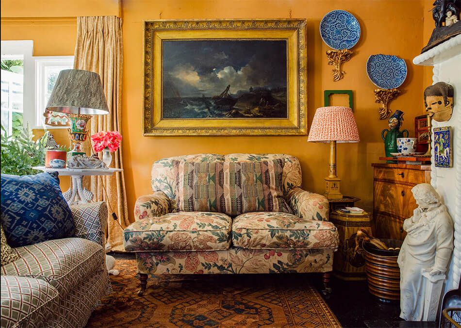
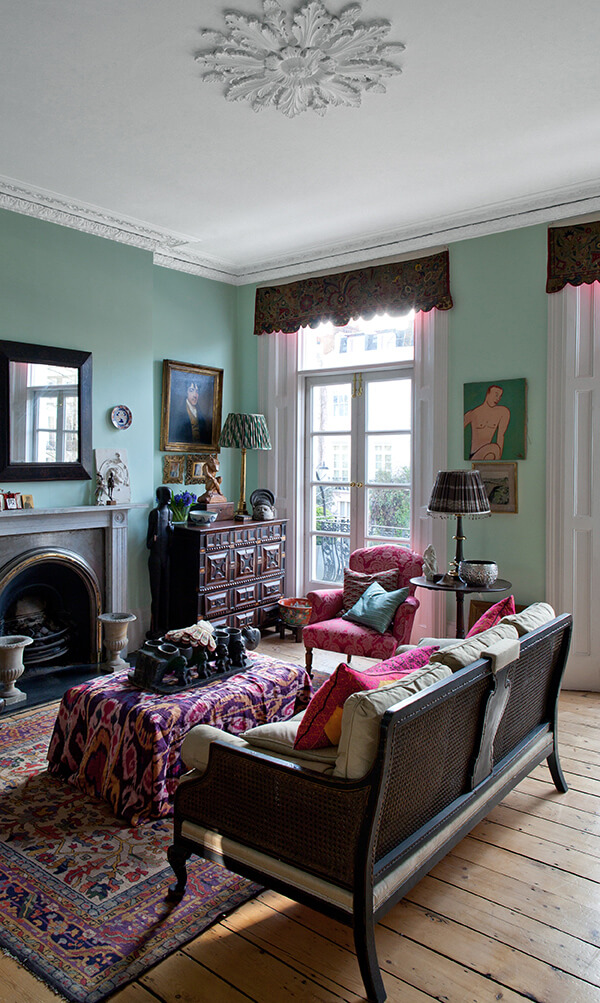
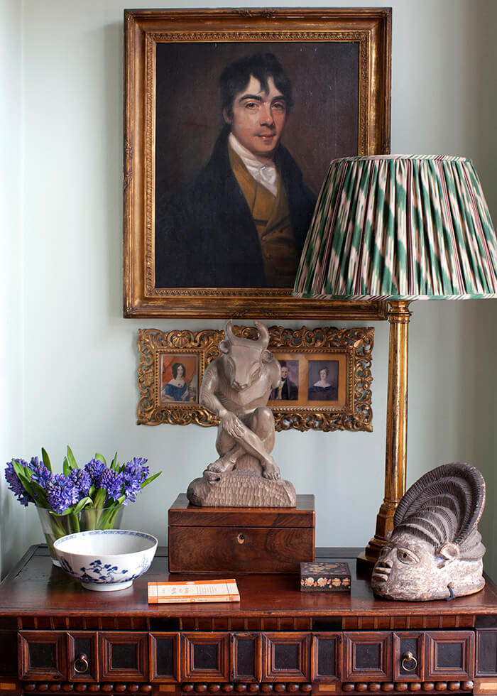
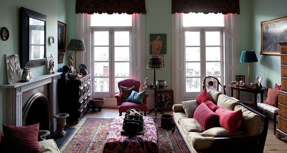
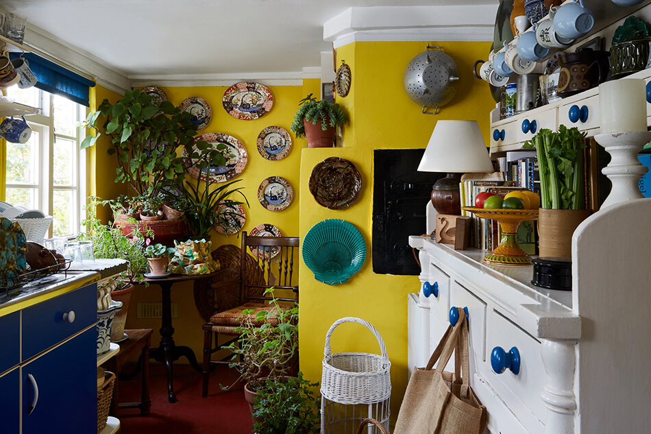
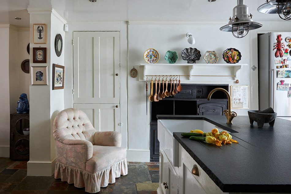
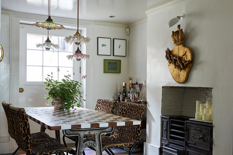
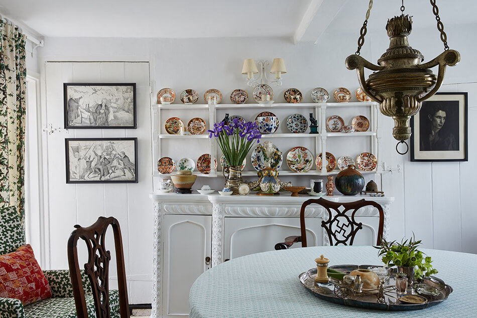
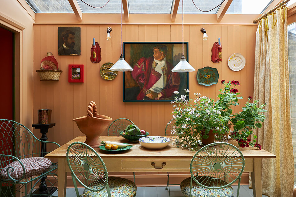
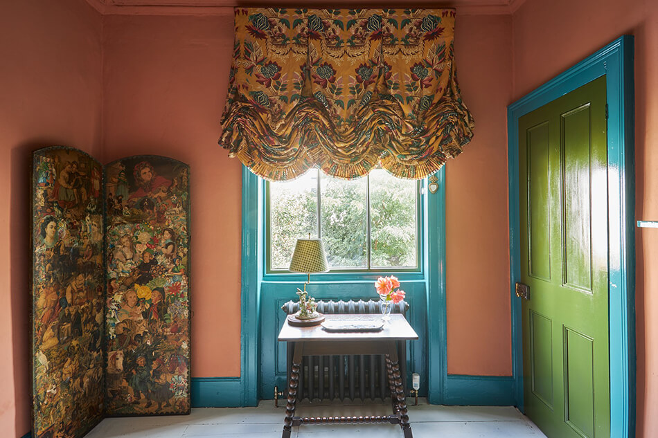
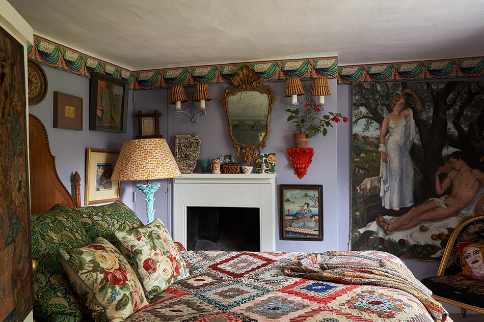
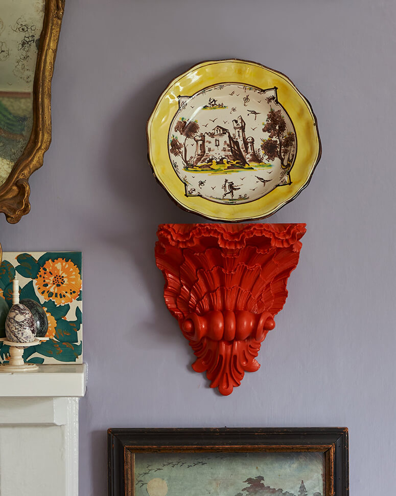
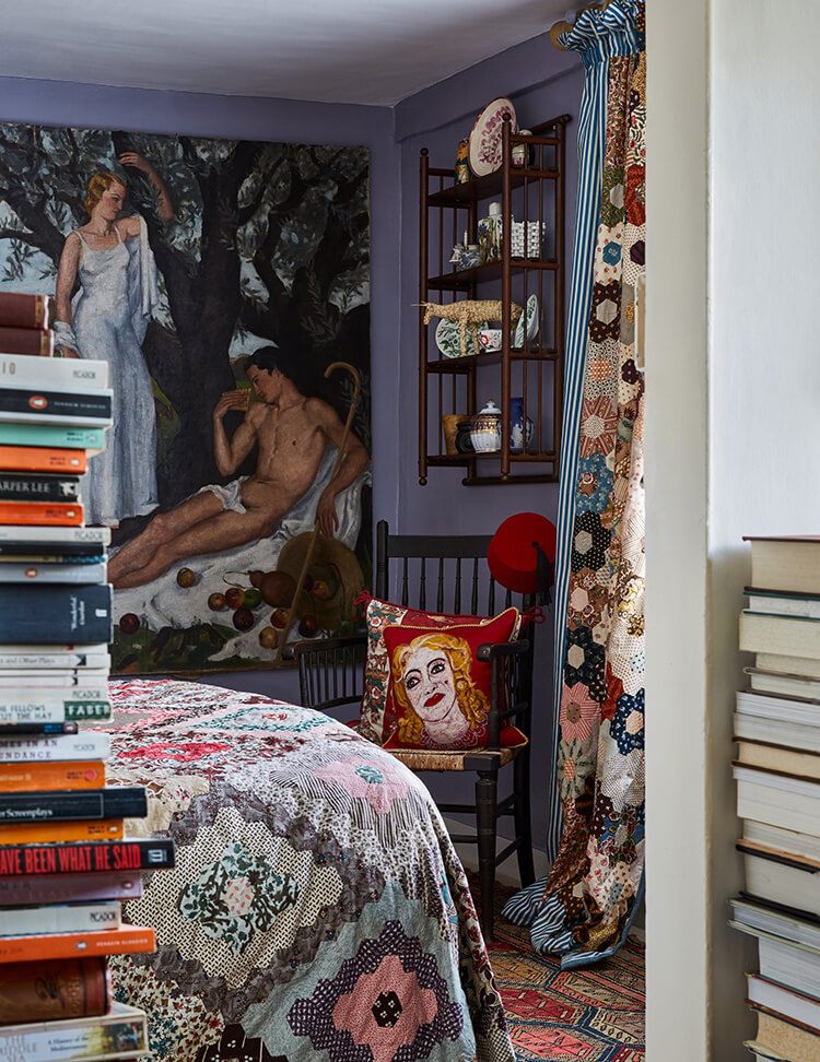
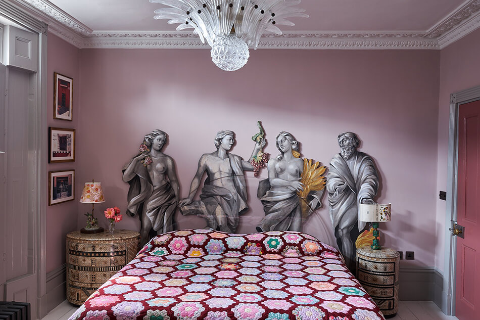
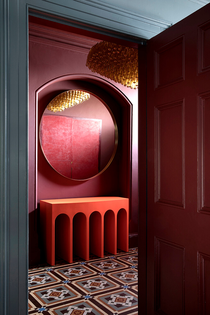
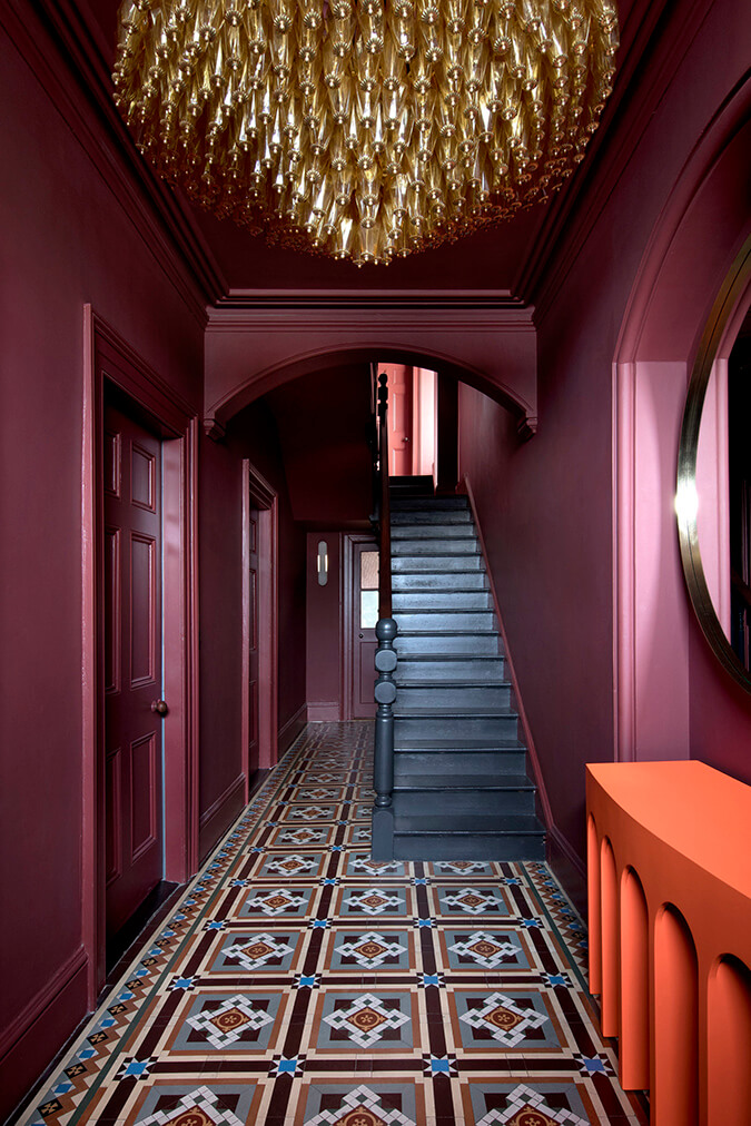
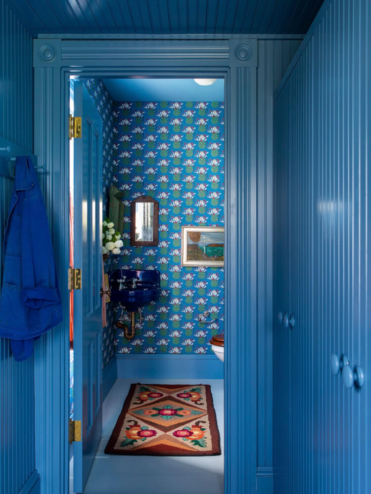
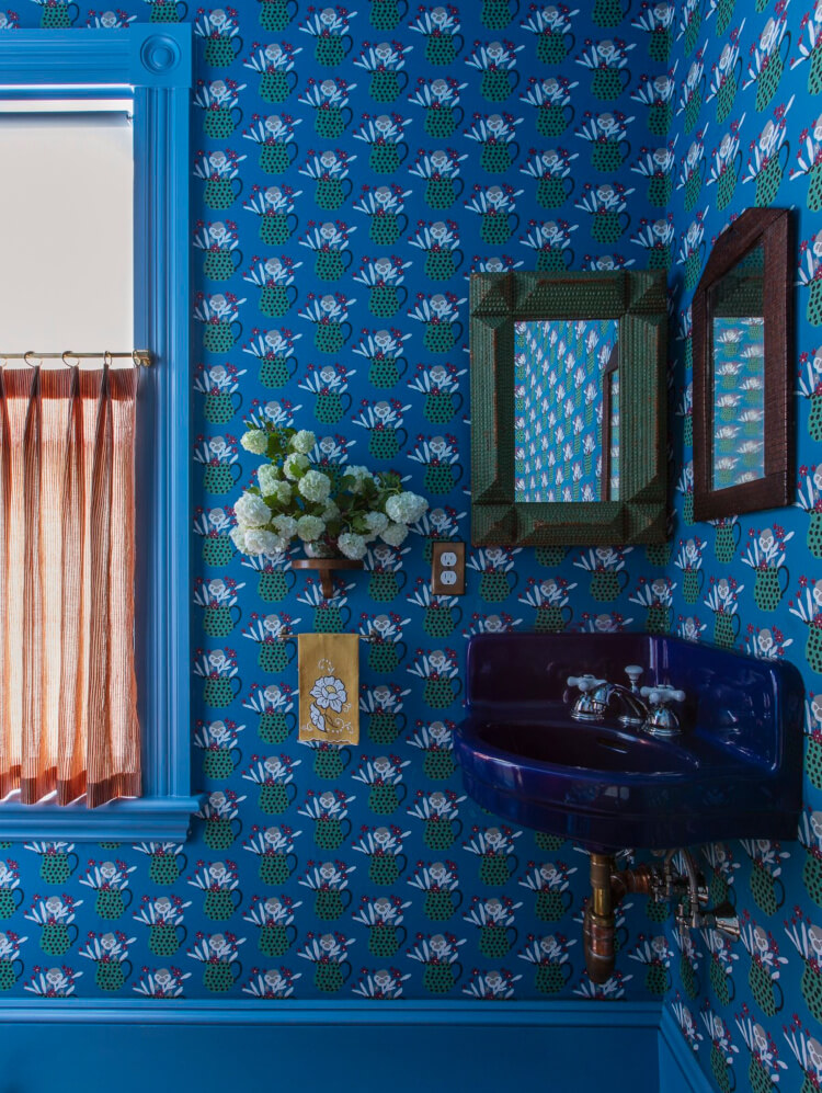
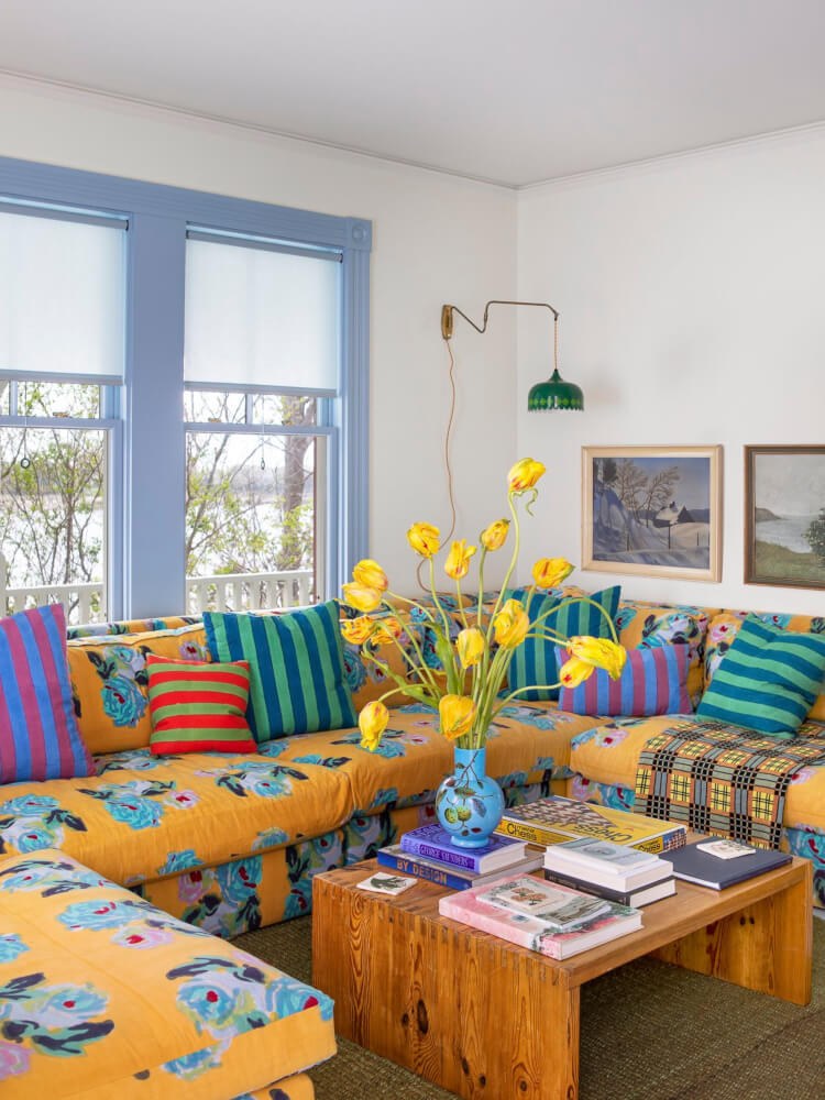
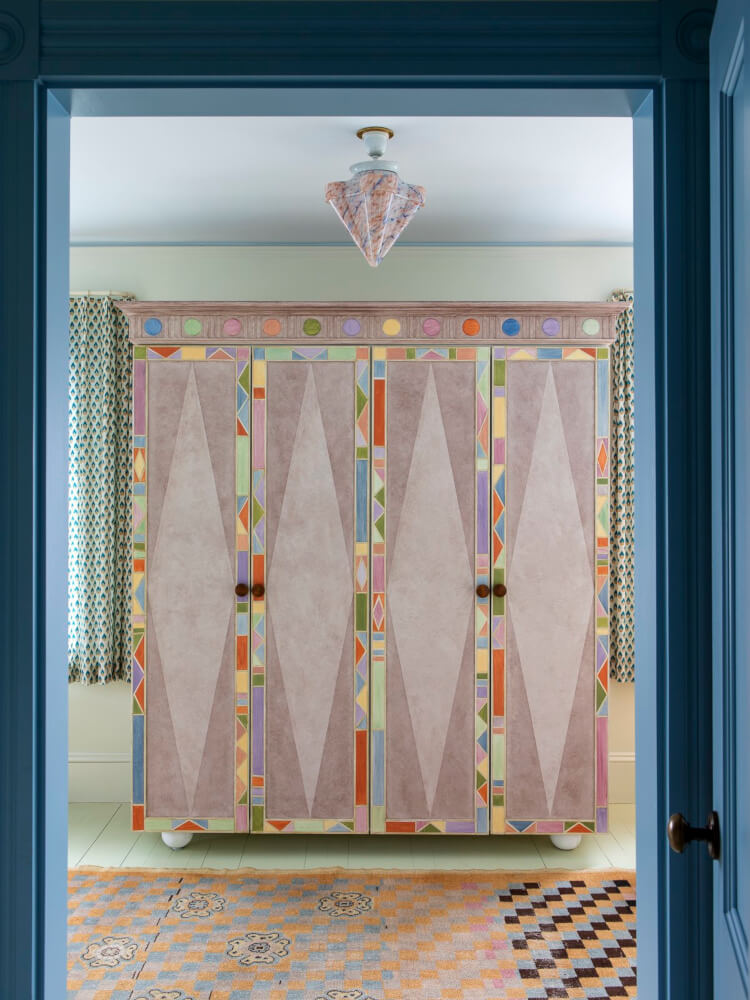
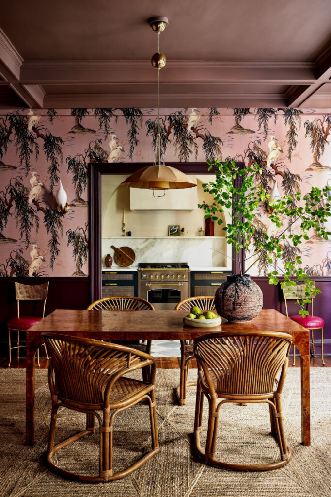
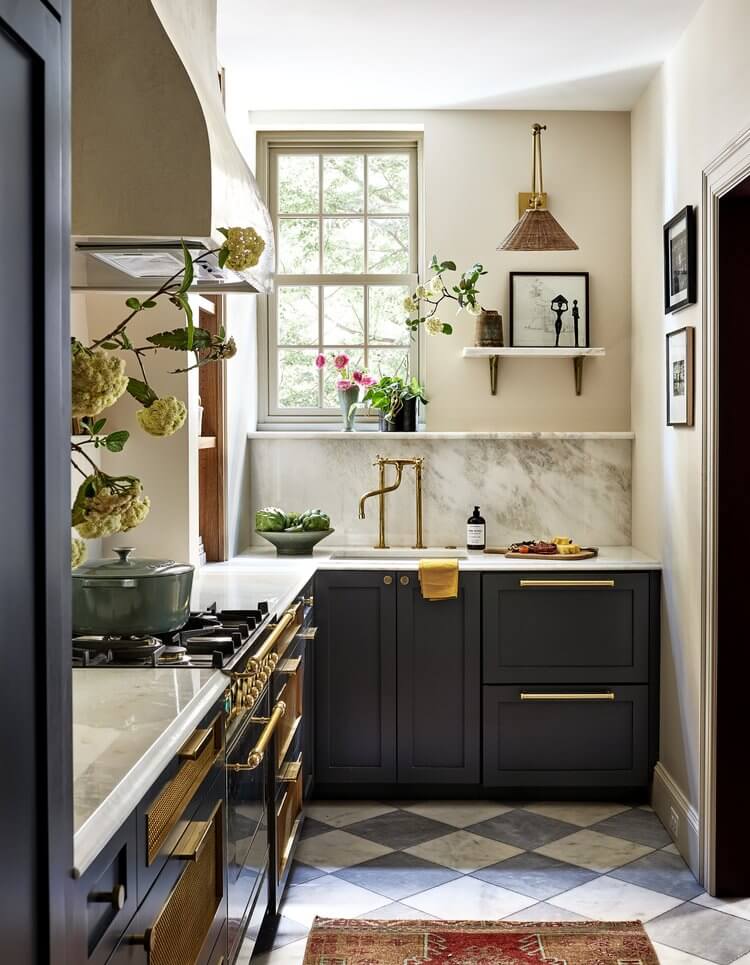
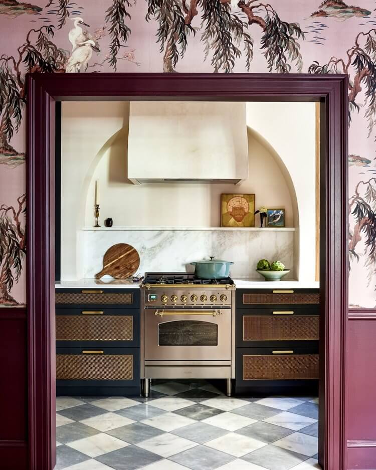
More colourful, maximalist spaces by Benedict Foley
Posted on Tue, 9 May 2023 by KiM
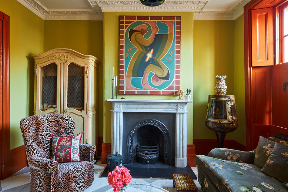
Keeping the theme going of maximalist, colourful, vibrant, whimsical spaces, here are some more spaces designed by the inimitable Benedict Foley. Benedict really does have a way with colours that you don’t see in most interiors.