Displaying posts labeled "Reader’s Home"
Design Crew
Posted on Sat, 17 Nov 2012 by midcenturyjo

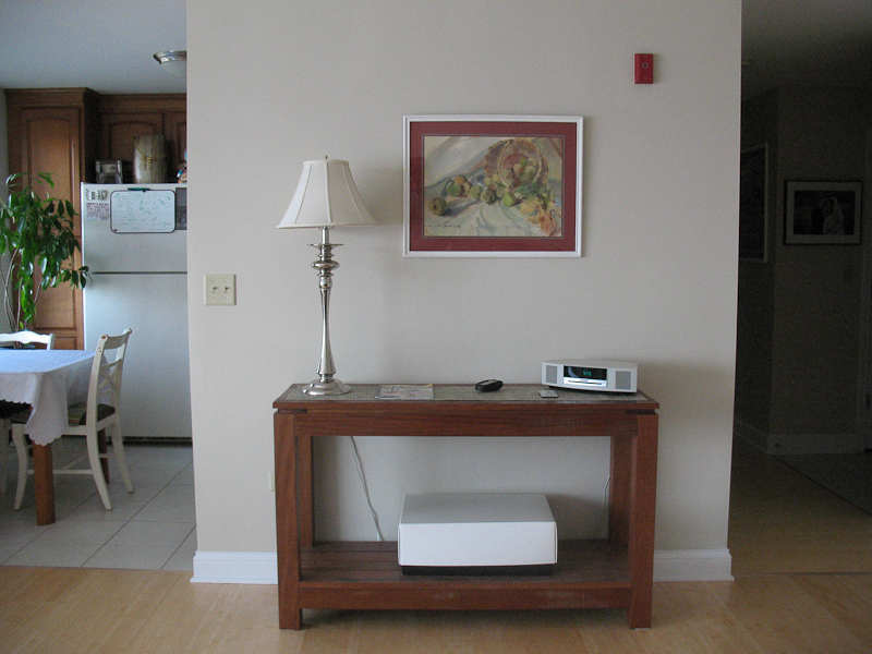
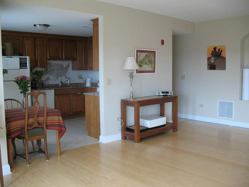
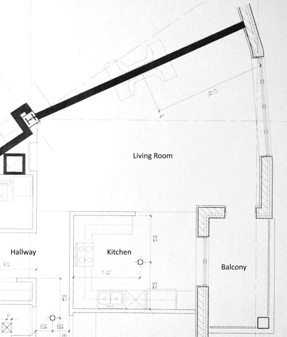
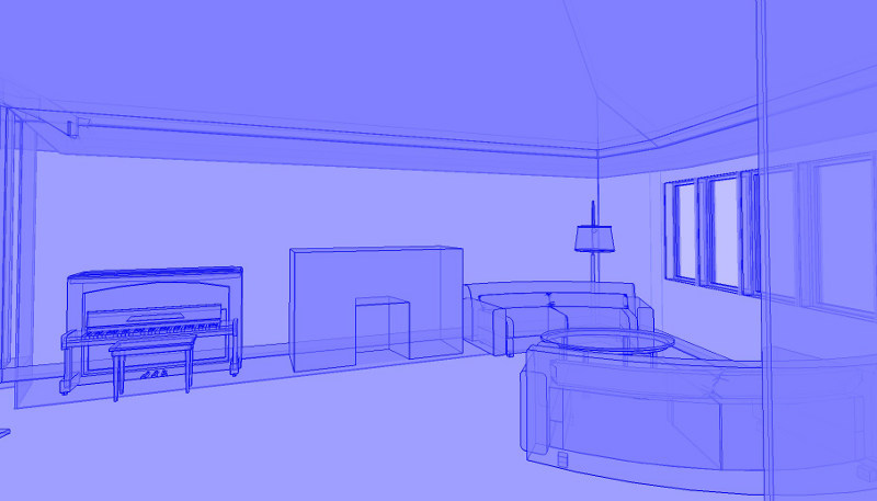
Got a problem? Need some help? Just standing there shaking your head? Don’t know what to do? You’re not alone. Send us a link to photos of your design quandary and let the Desire to Inspire design crew help you …. that’s you lot… the readers! This week’s email is from Dmitriy who is really keen to help – 2 incarnations of the space, a plan and some 3D sketch ups.
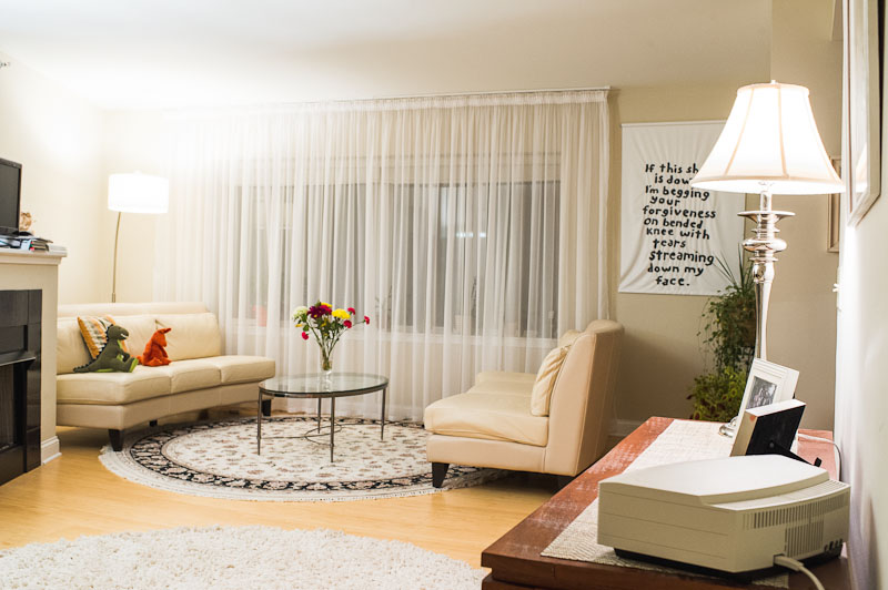
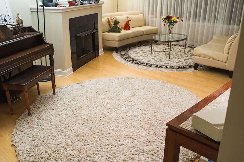
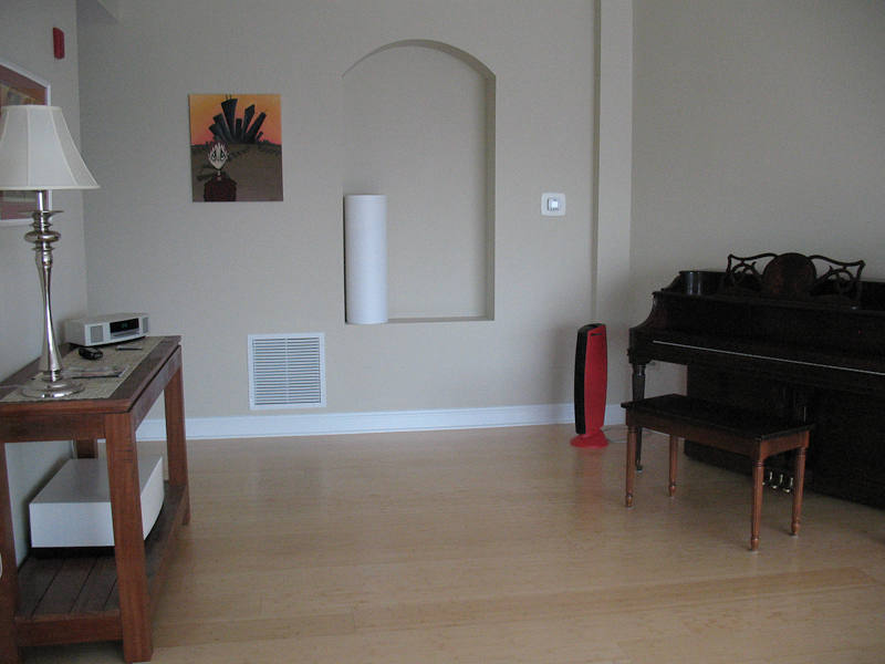
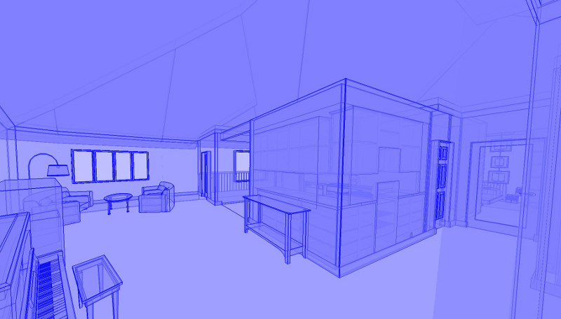
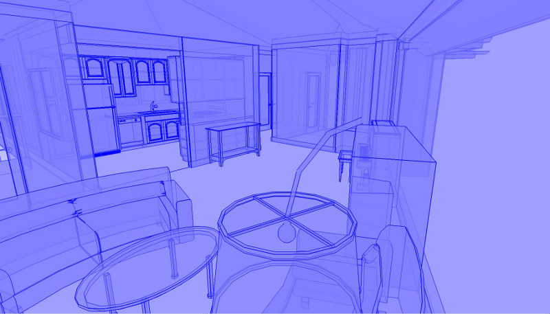
Hi, I am hoping that the Design Crew can help us with our living room. The main wall is at an angle, so the left side of the room is shorter than the right side. Ideally, we would like to create two distinct areas, a sitting area and a dining area, but we are unsure how to do this without breaking the flow of the room. We are not sure what to do with the fireplace, because the way it is positioned, in the middle, seems to really restrict our options. Right now we have two couches and a coffee table on the right side of the room, and we have a console table and a piano on the left side of the room. We have a TV above the fireplace, but this placement does not work very well, because having to look up to watch it is uncomfortable. We have a small dining table in the kitchen, but would really like to have a dining area in the living room. We are hoping the Design Crew can give some suggestions.
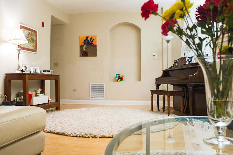
Although we like the couches we have, we are open to replacing them if their size and shape are not optimal for our room. Same goes for the console and coffee tables and the area rugs. The only piece we would really like to keep in the room is the piano.
Plan and 3D sketch ups after the jump.
Design Crew
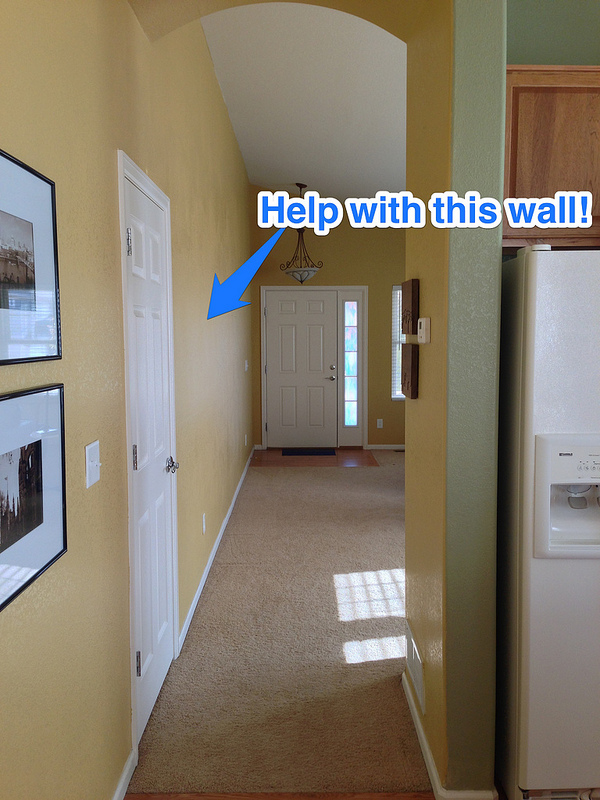
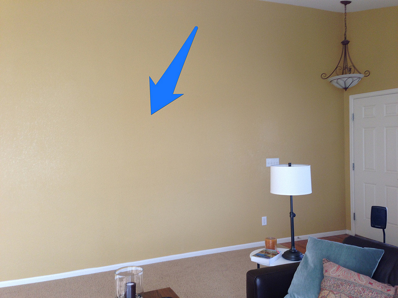
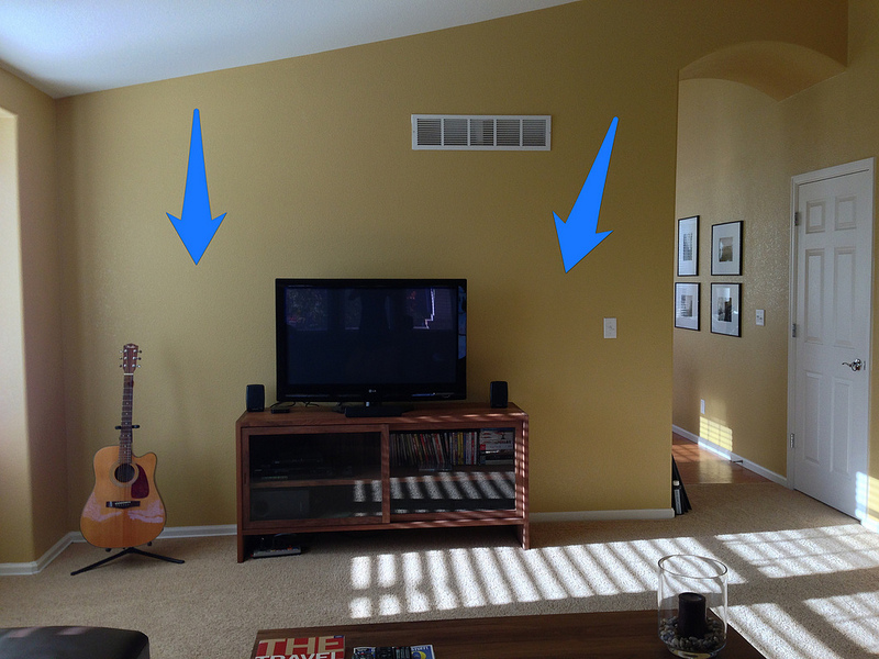
Posted on Sat, 20 Oct 2012 by midcenturyjo

Got a problem? Need some help? Just standing there shaking your head? Don’t know what to do? You’re not alone. Send us a link to photos of your design quandary and let the Desire to Inspire design crew help you …. that’s you lot… the readers! This week’s email is from Lauren.
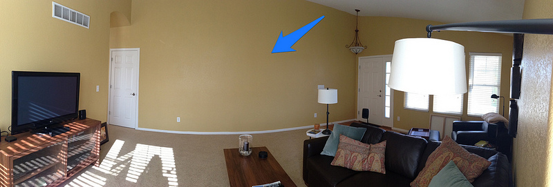
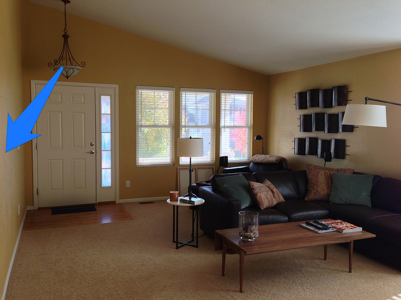
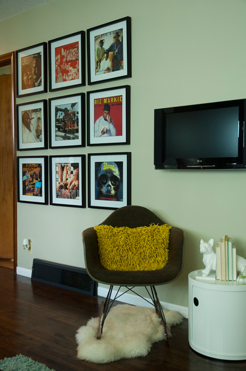
Hi, I am hoping that the Design Crew can help us with our living room. We are currently renting and cannot change the paint, the light fixtures, or flooring. We have two large walls that are intimidating and we are at a loss for how to fill them. The large wall with the coat closet is particularly problematic in that we can’t put furniture here to break up the space because it is in the line of traffic from the front door to the back of the house. The wall with the TV seems like it needs something, but we aren’t sure what. We tend to lean towards a look that is clean and simple, yet comfortable. Any ideas would be greatly appreciated. I promise to send pics when it is complete!
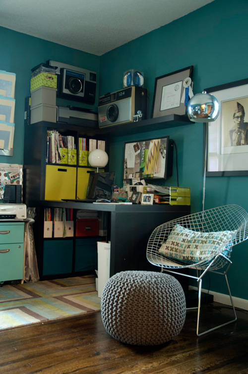
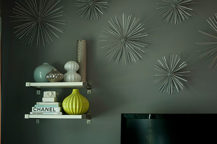
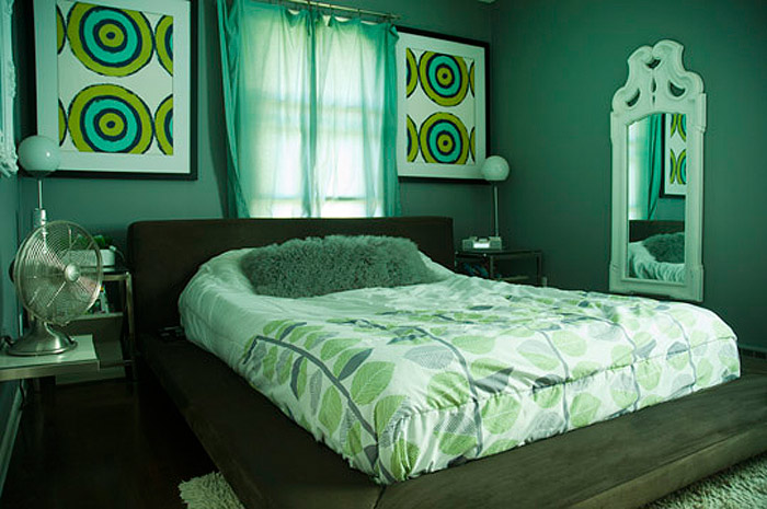
Reader’s home – Janelle’s tropical oasis
Posted on Thu, 18 Oct 2012 by KiM
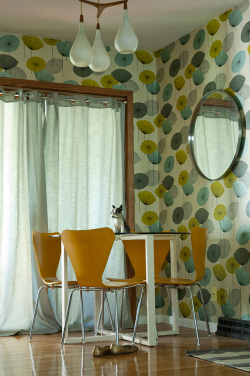
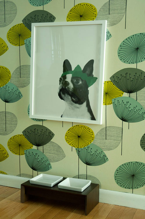
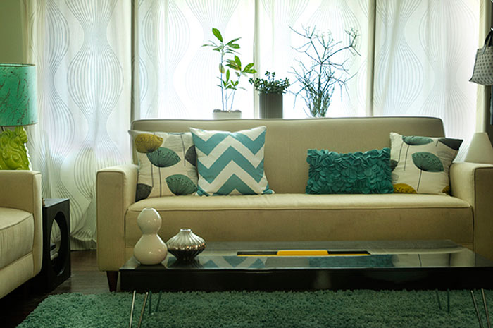
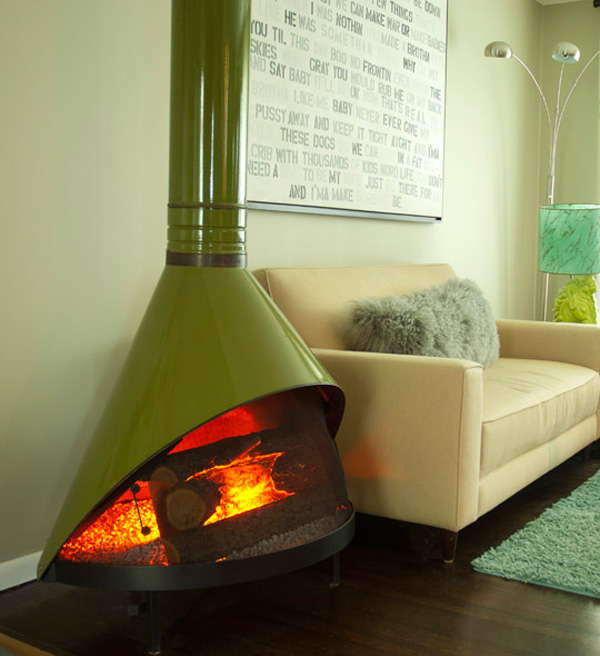
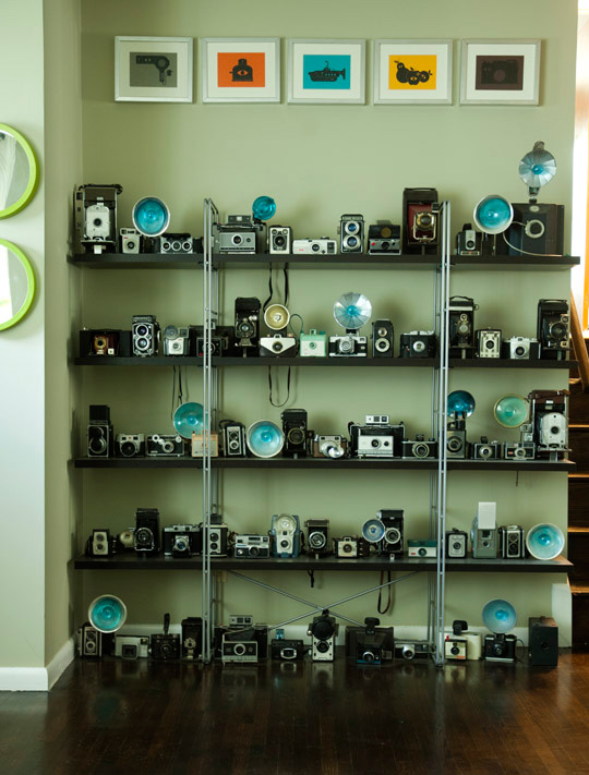
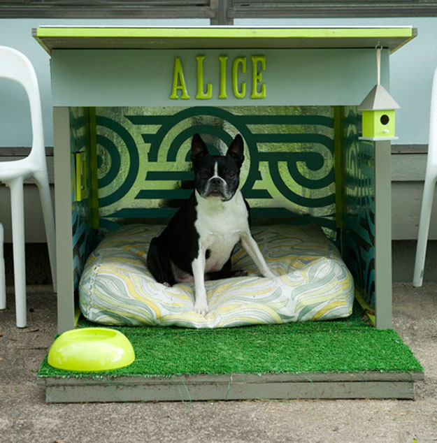
It seems Apartment Therapy is having a Room For Color 2012 contest, and photographer Janelle has entered her home. The tropical colour palette she went with in her new home began with her obsession with the colour aqua (and moved into mustard, grey and lime), and the purchase of the Dandelion Clocks wallpaper by Sanderson for the dining room. Beautiful bold but soothing colours. LOVE! Also loving her MASSIVE vintage camera collection…and she clearly loves her pooch. 🙂 You can vote for Janelle here (if you don’t want to create an account with AT you can sign in with Facebook).

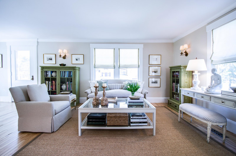
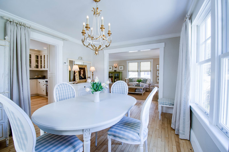
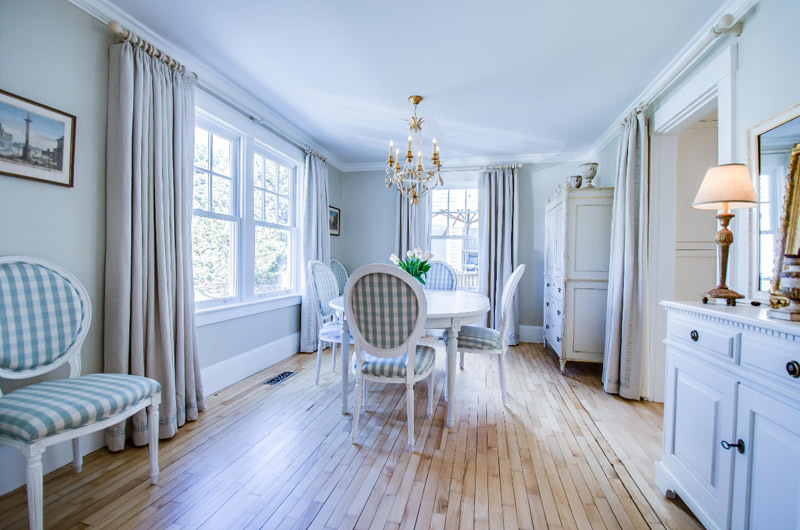
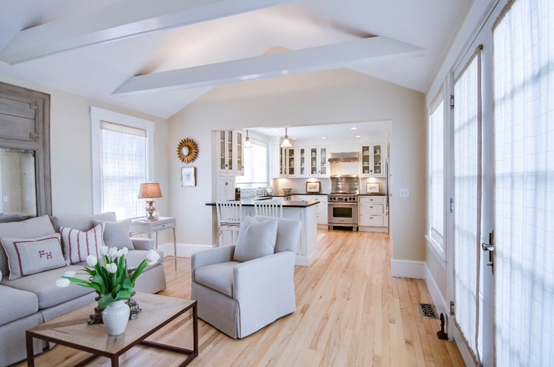
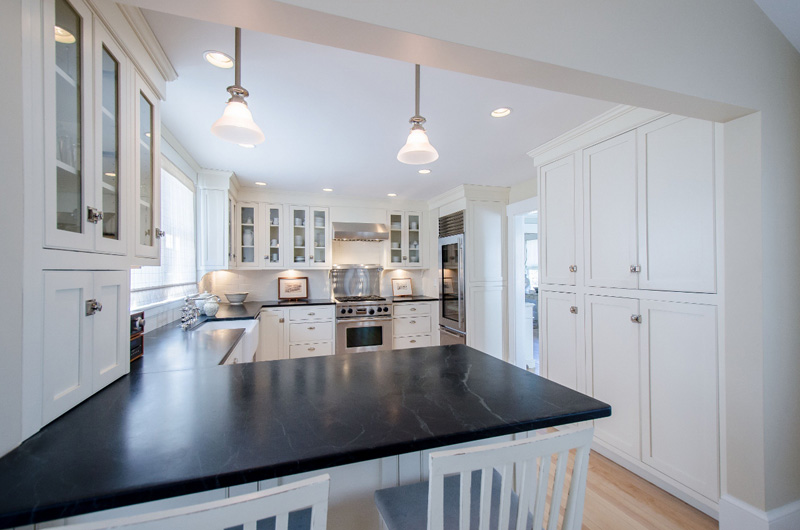
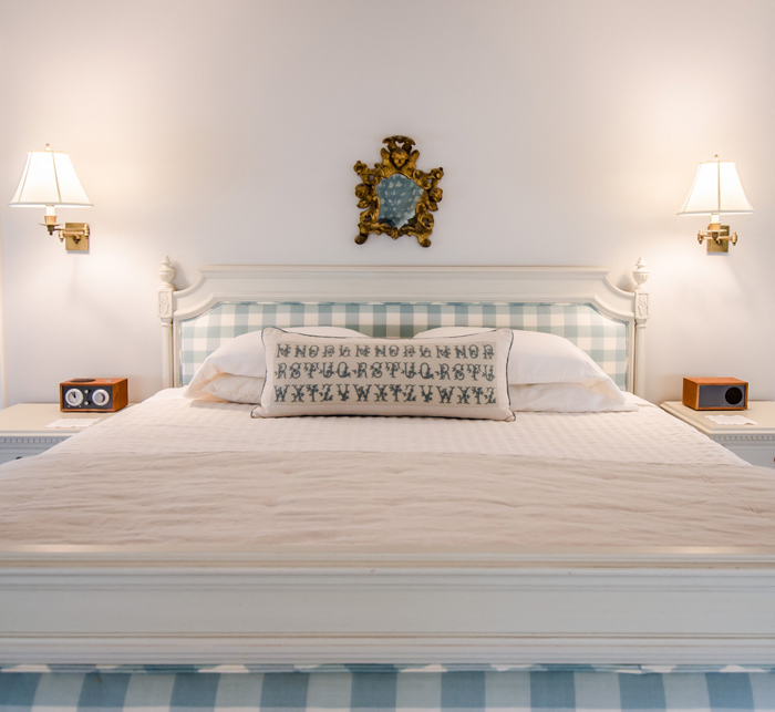
Reader’s home – Phyllis’ to-the-studs renovation
Posted on Tue, 16 Oct 2012 by KiM
Today’s reader’s home comes from Phyllis of Henhurst Interiors, and boy is it a DOOZIE!
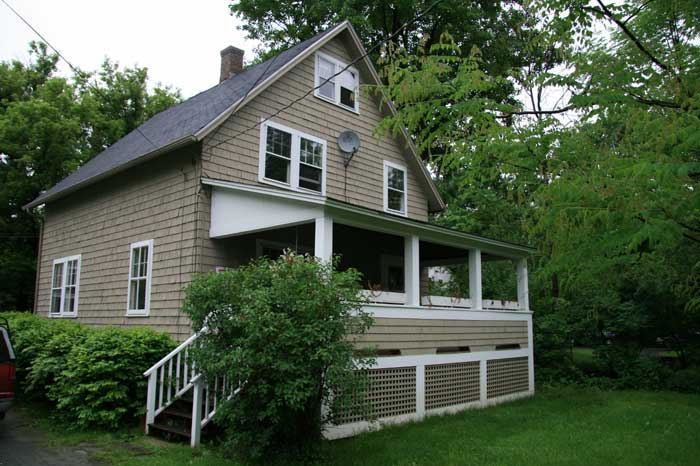
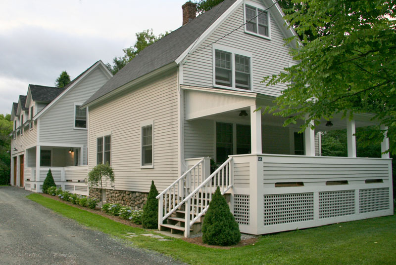
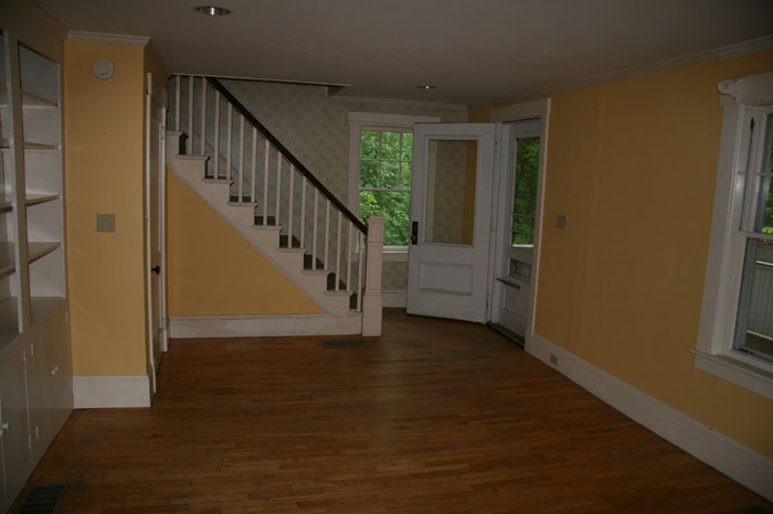
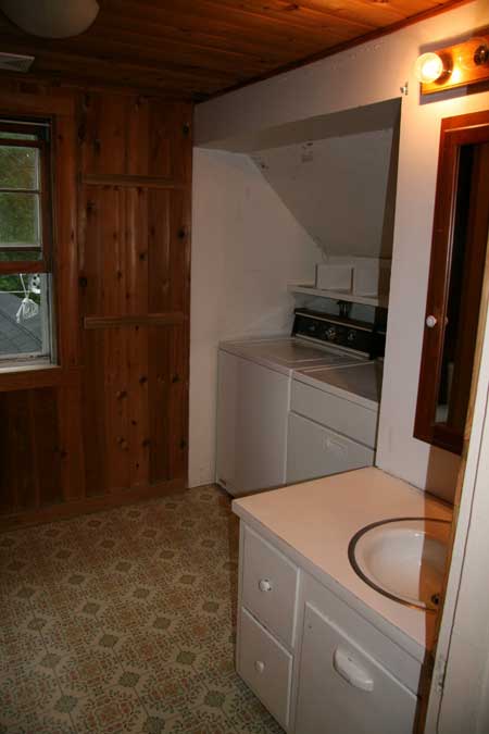
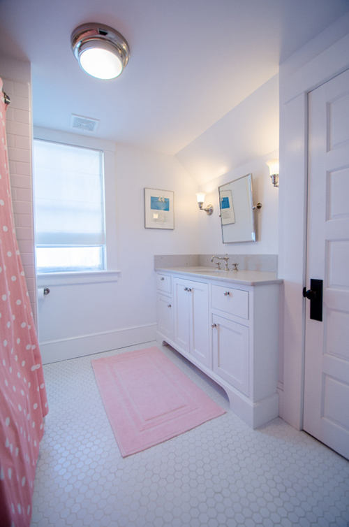
The house was built in 1913, a traditional and modest Vermont village house, with an unfortunate 1980’s addition of a downstairs bedroom (that was the room off the kitchen we turned into a seating area.) The house had not had many improvements (there was no heat being directed to the second level, just a single open grate in the floor of one of the bedrooms) and anything that was added we ripped out (rough built-ins and an ill-positioned wood stove.) We took some walls down to the studs, moved doors to make spaces more functional, and gutted the single existing bathroom which also housed the washer and dryer. We built an addition containing a mudroom, powder room and garage on the first level and an office, laundry room and master bedroom suite above. The addition was designed in the vernacular of the original house and of this region, and in the new section we replicated the interior doors and oil-rubbed bronze hardware that were found in the old section. We also replaced all the windows with energy efficient ones in the same ‘ six over one’ configuration of the originals and replaced the exterior cedar shakes that were the siding with wood clapboards. When we bought the house it looked like a sea shanty. It was a sad and neglected ugly duckling, and to someone else it might have been a tear-down, but I knew right away we could make it beautiful. I have added before and after photos of the bath as well as exterior photos so you can see how tragic is really was. This is a perfect example of a renovation that maintains the original vibe of the home – inside and out. It’s absolutely beautiful and was obviously a labour of love for Phyllis. I am thoroughly impressed.
Here is a before photo of the exterior:
It’s cute, but OMG check out the new exterior with addition:
And here are some before photos of the neglected interior:
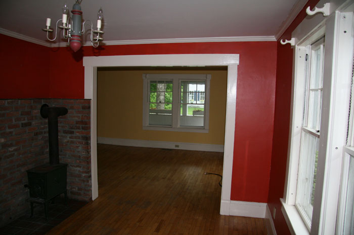
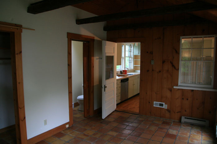
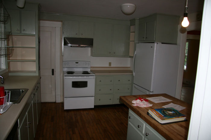
You won’t believe the transformation….
![]()
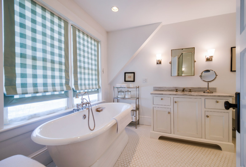
A before photo of the only washroom:
Here it is with a complete overhaul:
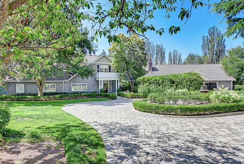
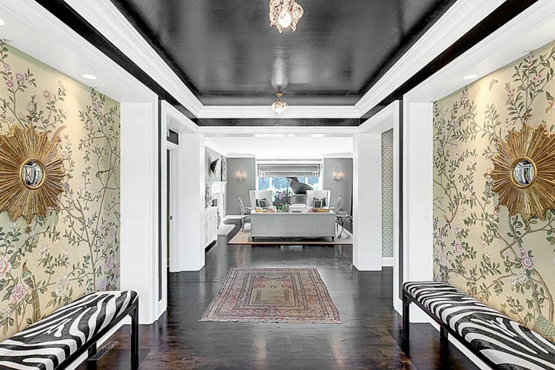
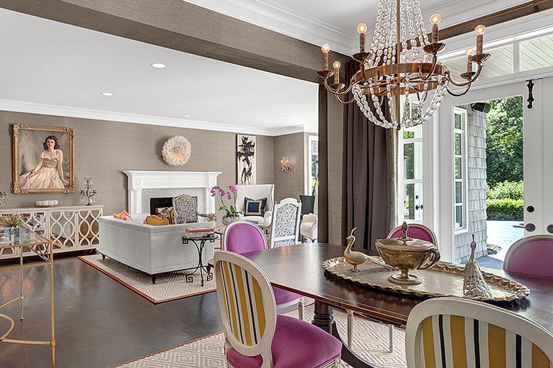
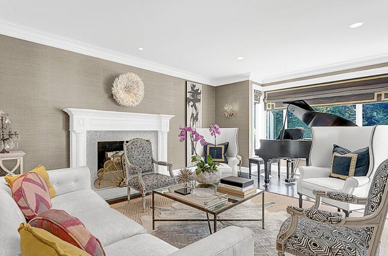
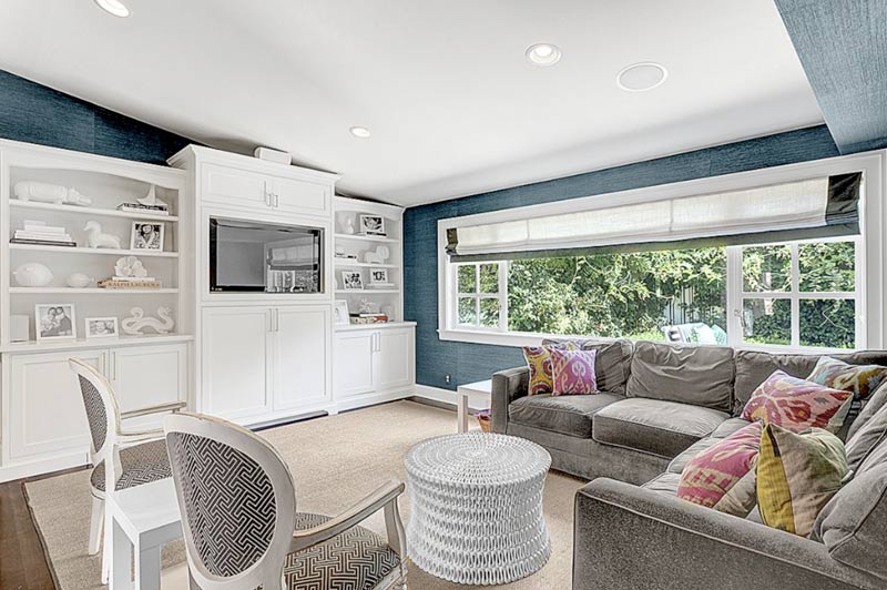
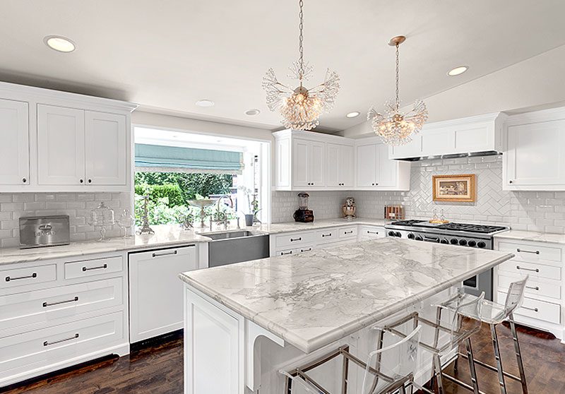
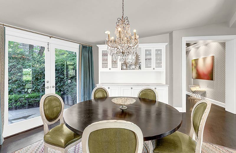
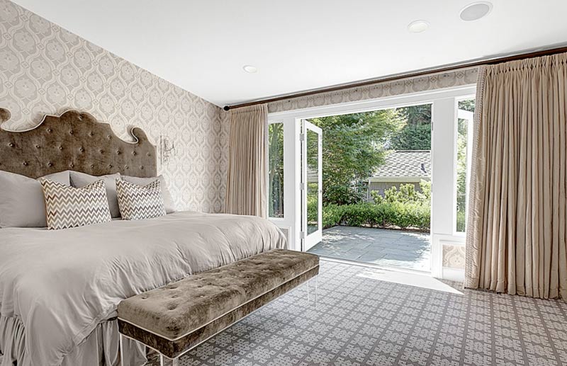
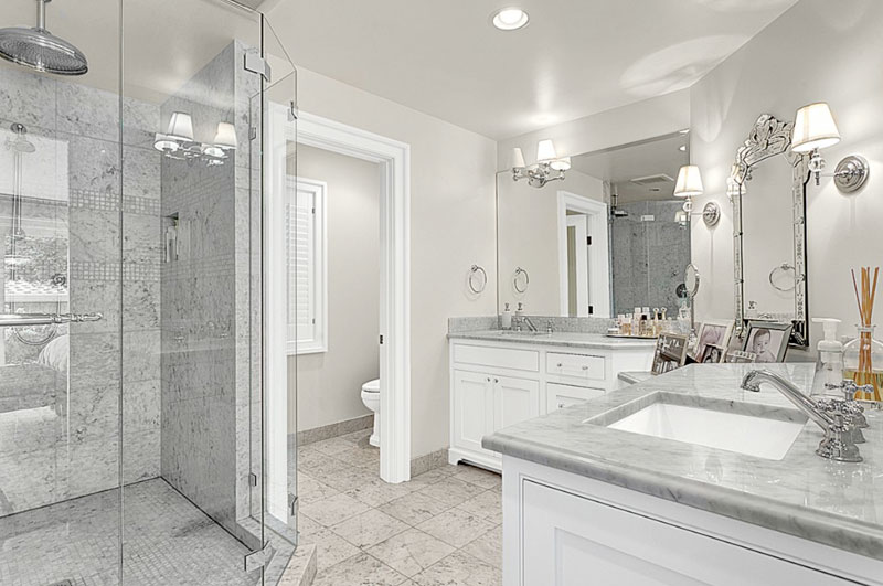
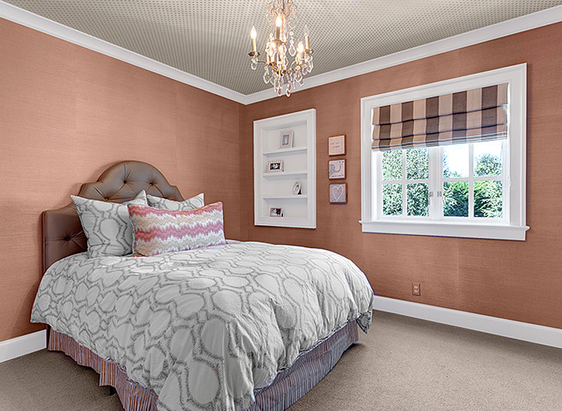
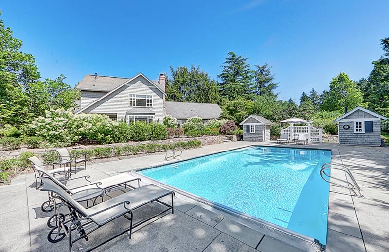
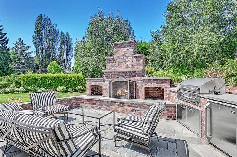
Reader’s home – Jennie’s labour of love
Posted on Fri, 12 Oct 2012 by KiM
This next home is Jennie’s, located in Mercer Island, WA (just outside of Seattle). It was a 5 year project that basically took the interior down to the studs. It’s on an acre of beautiful property with alot of work done on the outside as well. This home is stunning, and the classy decorating should help sell it it no time. I adore the foyer – the black ceiling and detail is dramatic and wows from the start. The kitchen isn’t too shabby either. I would certainly enjoy cooking a big meal in there. View the listing here.