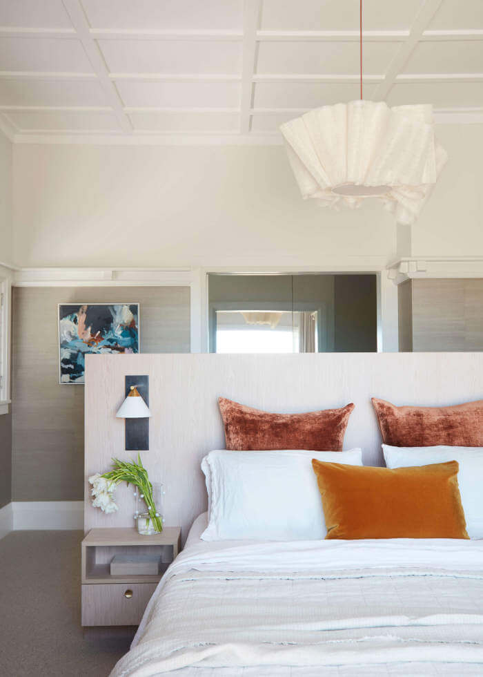
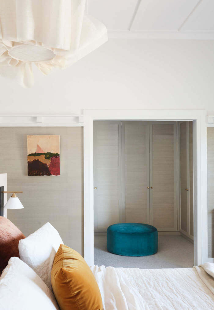
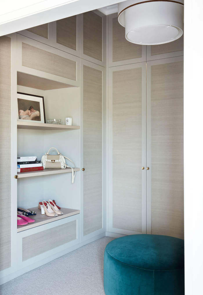
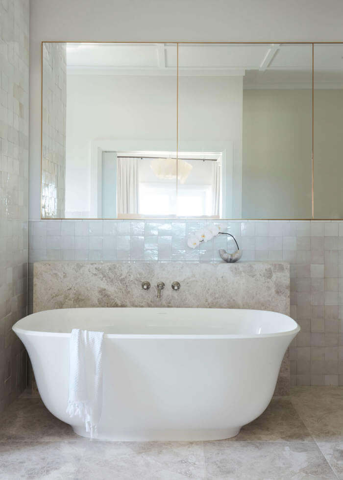
Displaying posts labeled "Tile"
A renovated 1936 home with vintage charm
Posted on Mon, 14 Sep 2020 by KiM
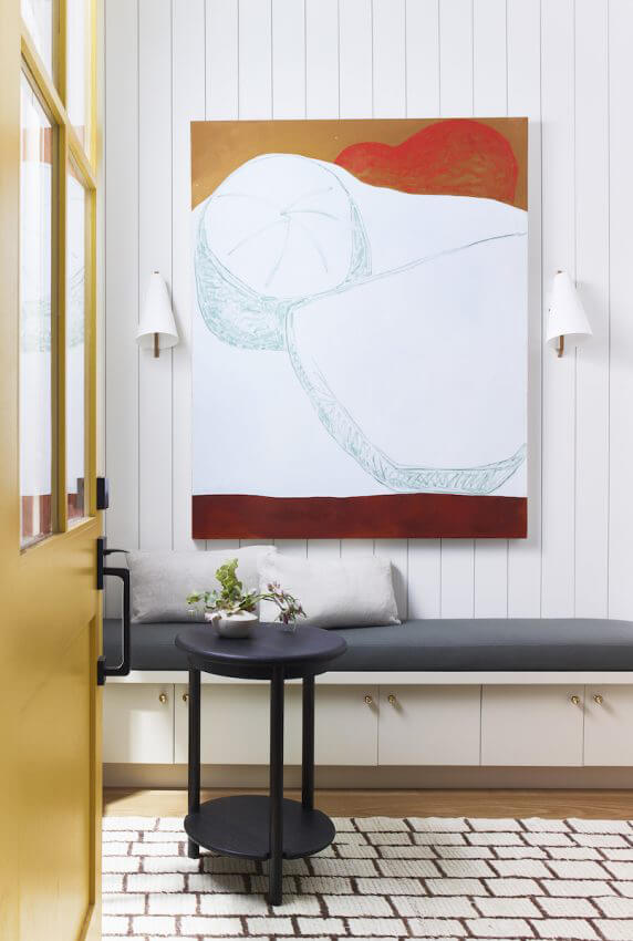
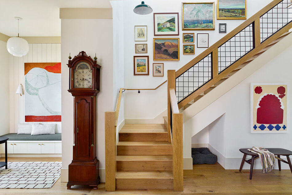
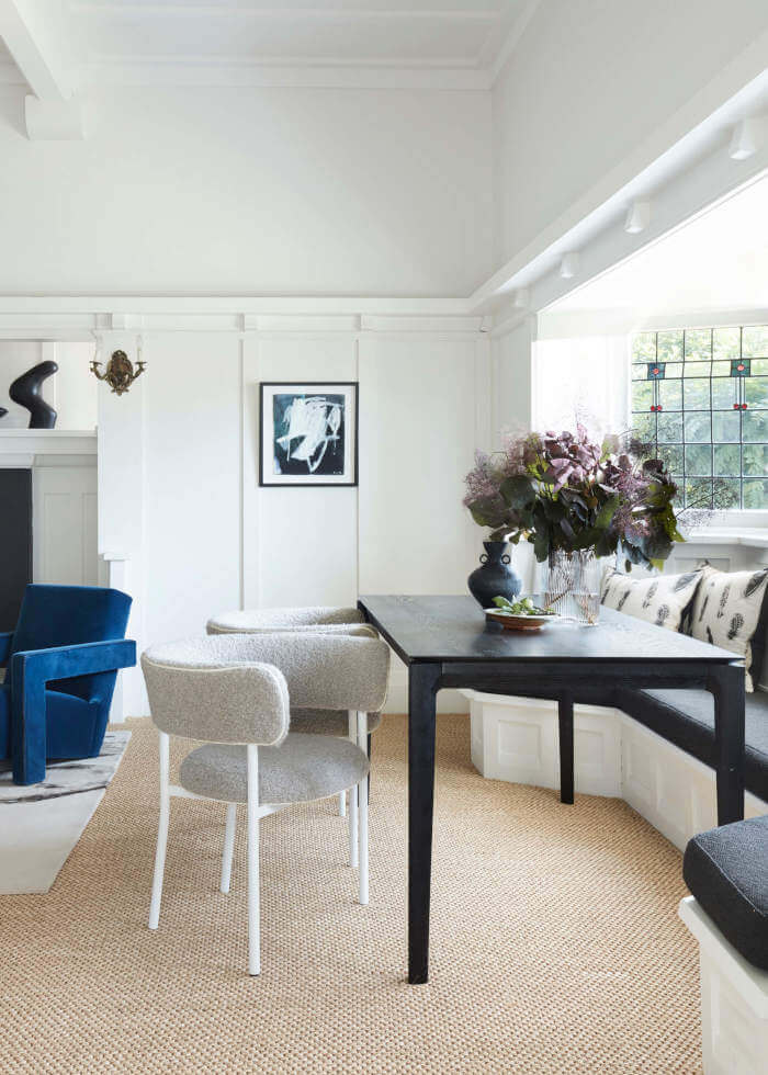
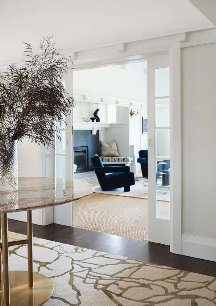
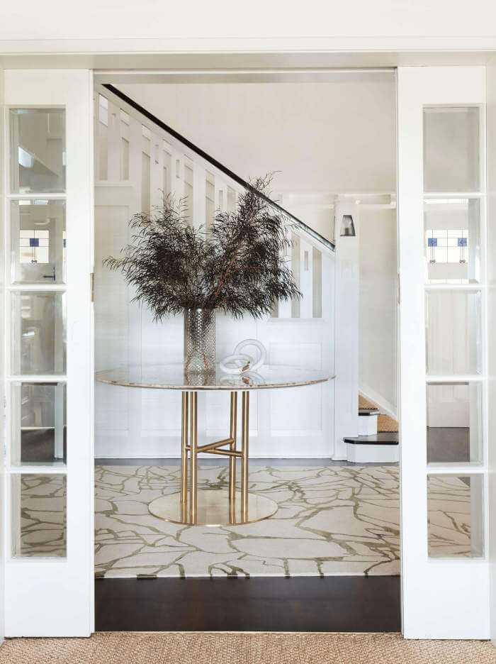
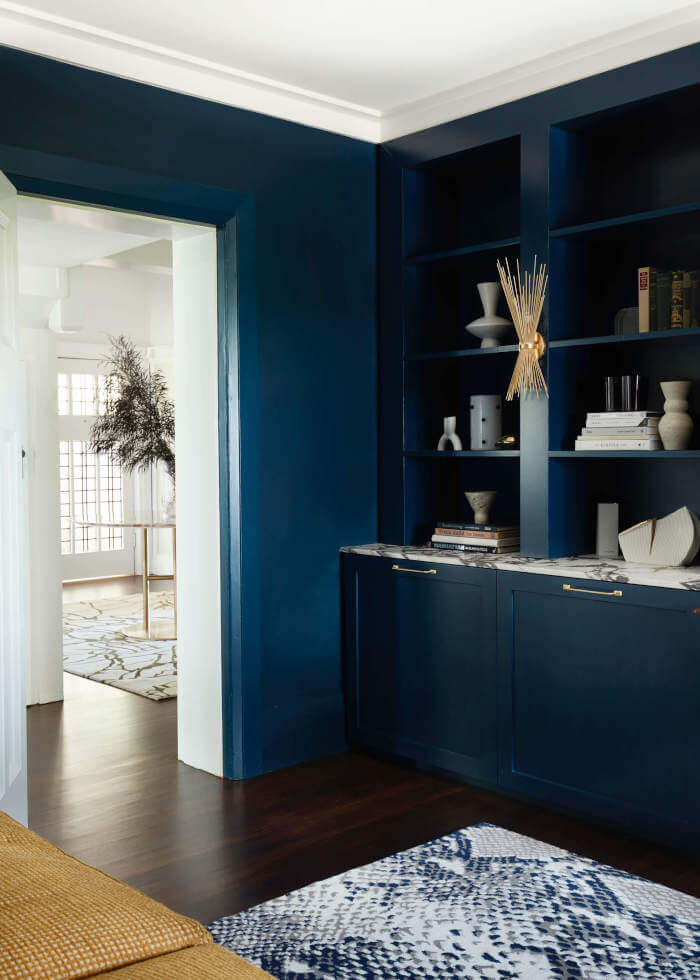
Respect to all those designers out there who appreciate original architectural details and attempt to maintain the history of a home. Such as San Francisco firm Landed Interiors & Homes. The renovation of this classic 1936 home included a reimagining of a cluster of small rooms that were no longer functional. We opened up the kitchen to the dining room and backyard, utilizing a view from the front of the house extending to the back yard and reconfigured the connection to the ground level, addressing the floor plan of bedrooms and bathrooms on both levels. The transformation has an incredible feeling of openness that wasn’t there before. We were careful of the original architectural details, installing new windows and doors that matched the old style, repeating arches in the openings, and keeping original trim where possible. The original vaulted living room was enhanced with updated furnishings from different eras to reflect the client’s eclectic taste, from contemporary to mid-century to antique pieces. Our choices for both furniture and interior finishes were motivated by the vintage Storybook architecture, which is British-influenced and calls for classic materials that are of solid quality.
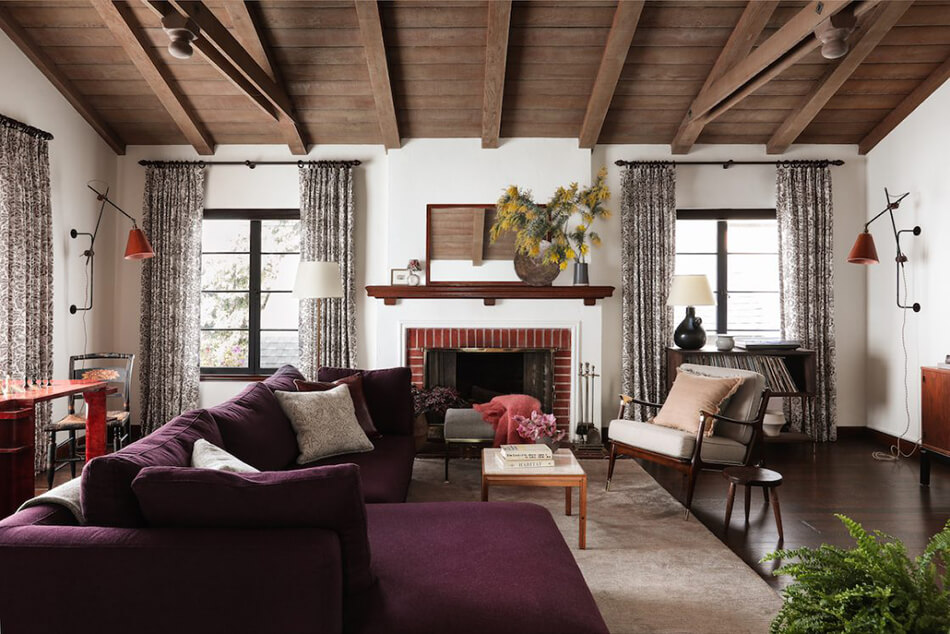
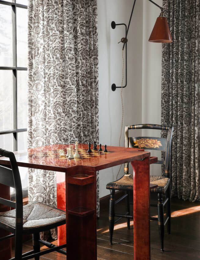
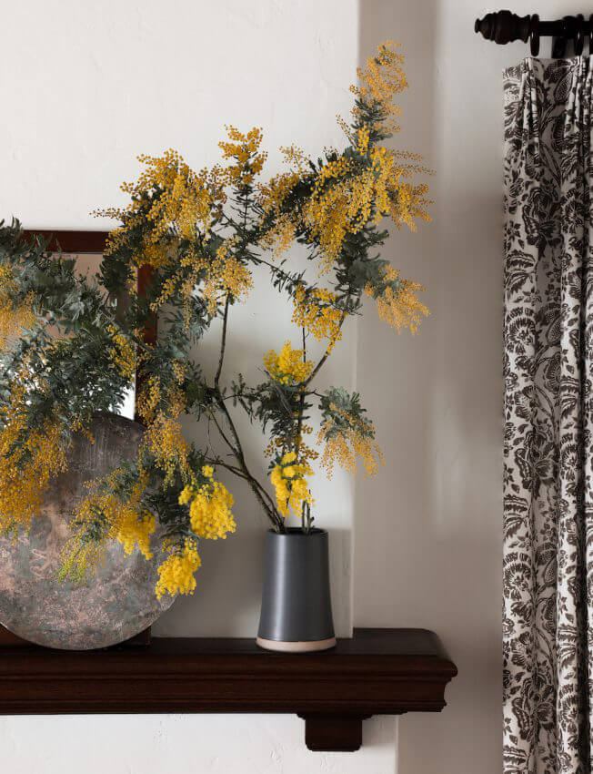
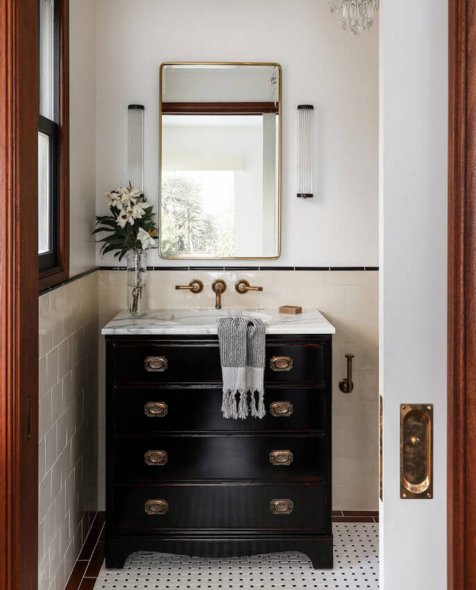
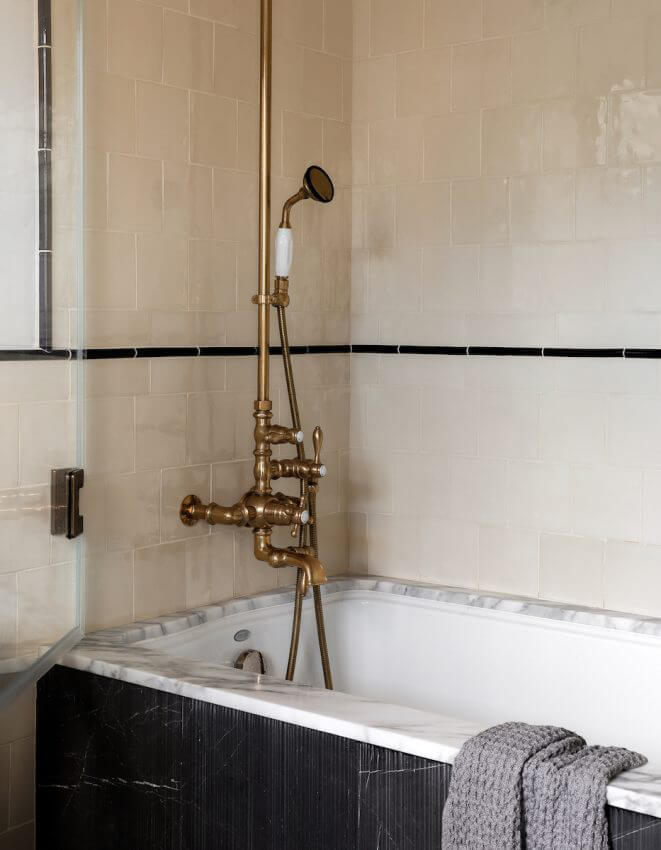
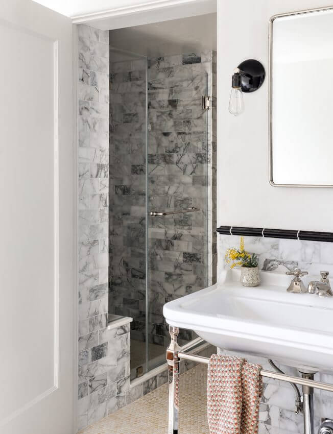
Photography: Haris Kenjar
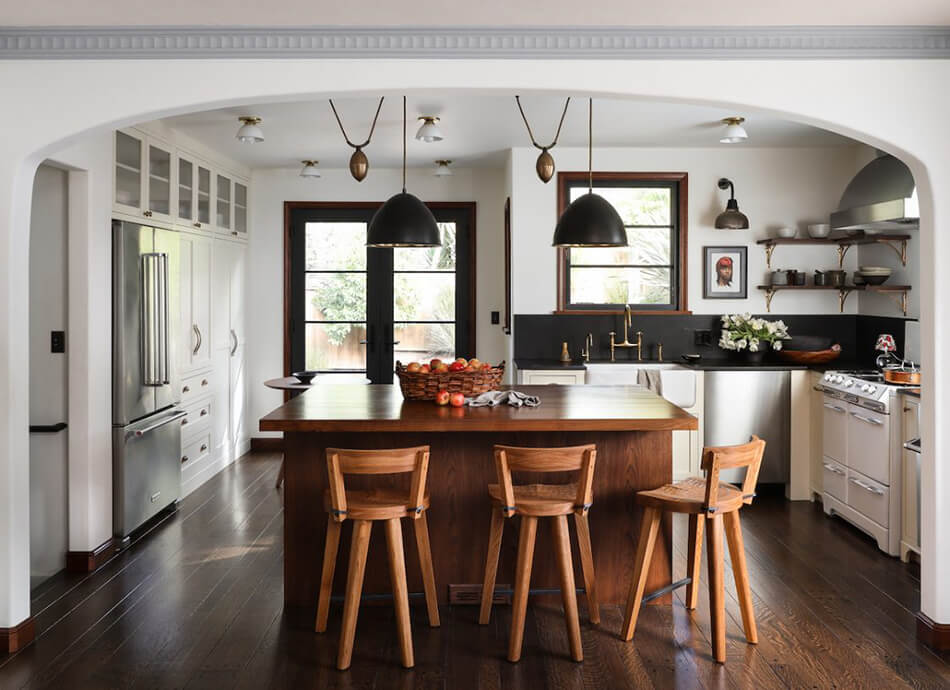
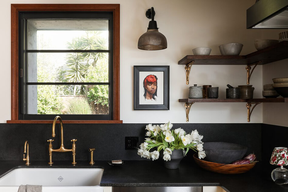
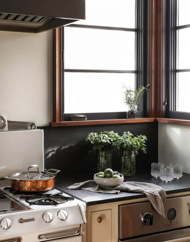
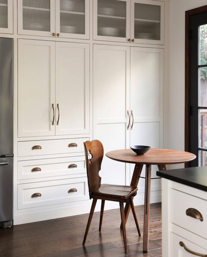
Modern classic farmhouse
Posted on Mon, 14 Sep 2020 by KiM
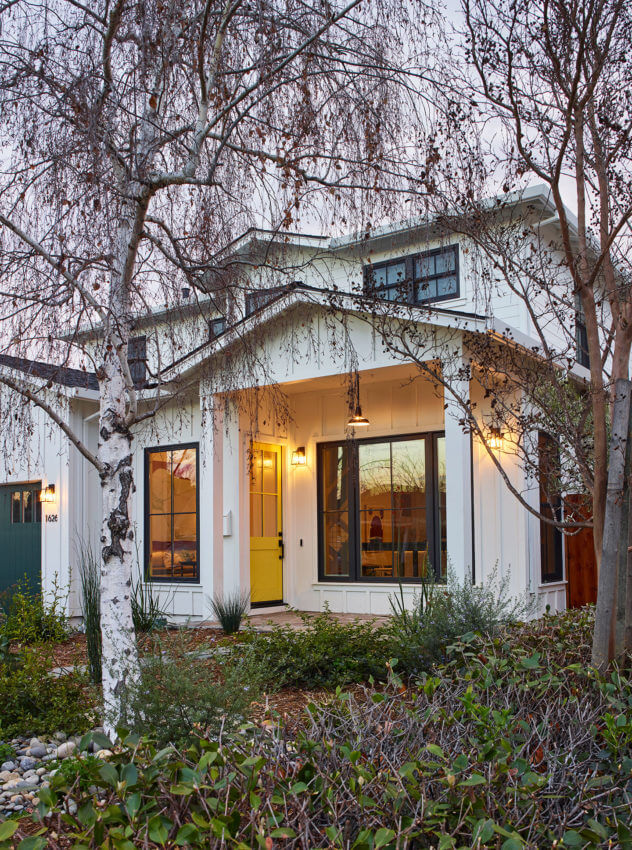
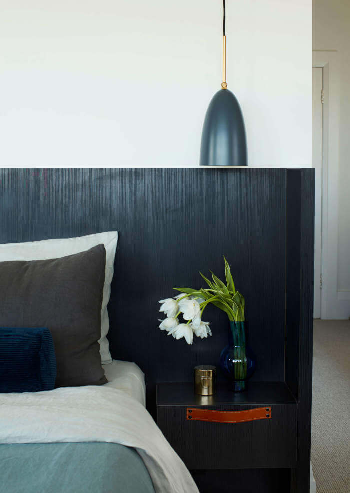
We can’t seem to get enough of modern farmhouse homes, and this one is no exception. especially the kitchen – that yellow zellige tile is unexpected touch and absolutely gorgeous! Another impressive project by Landed Interiors & Homes. In this Silicon Valley town near Menlo Park, we designed a home from the ground up for a young family. The clients were inspired by modern homes with Shaker simplicity and classically casual interiors. Working from the outside in, we consulted on exterior materials and window specifications, then worked with an open plan to specify the interior architecture and all finishes, creating the backdrop for traveled artwork and furnishings. The verdant palette, with its honey yellow and deep green, was hand picked for its natural cheerfulness. Modern farmhouse design finishes including contrast millwork, shiplap cabinets and trim, simple tile layouts, and a stair railing made from hog wire, traditionally an exterior material, were interpreted in a contemporary style.
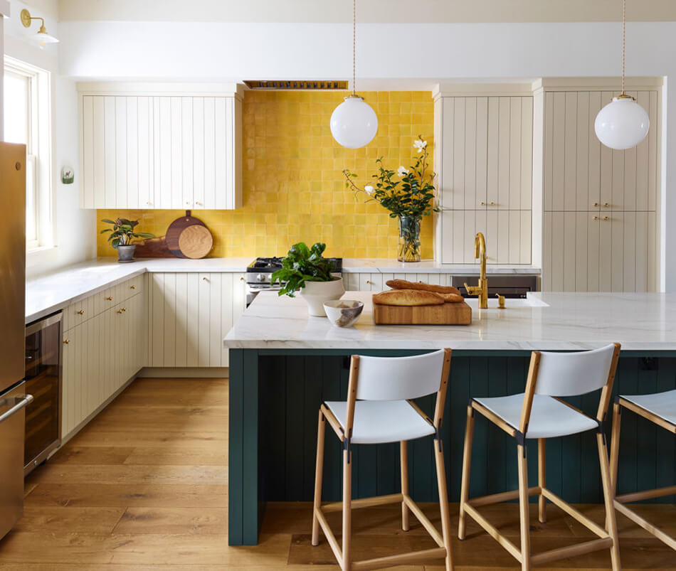
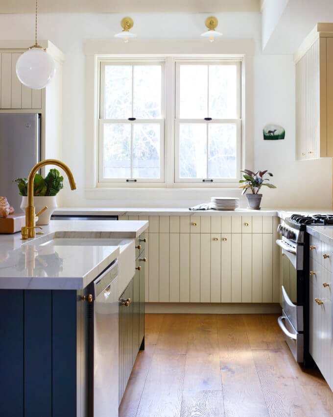
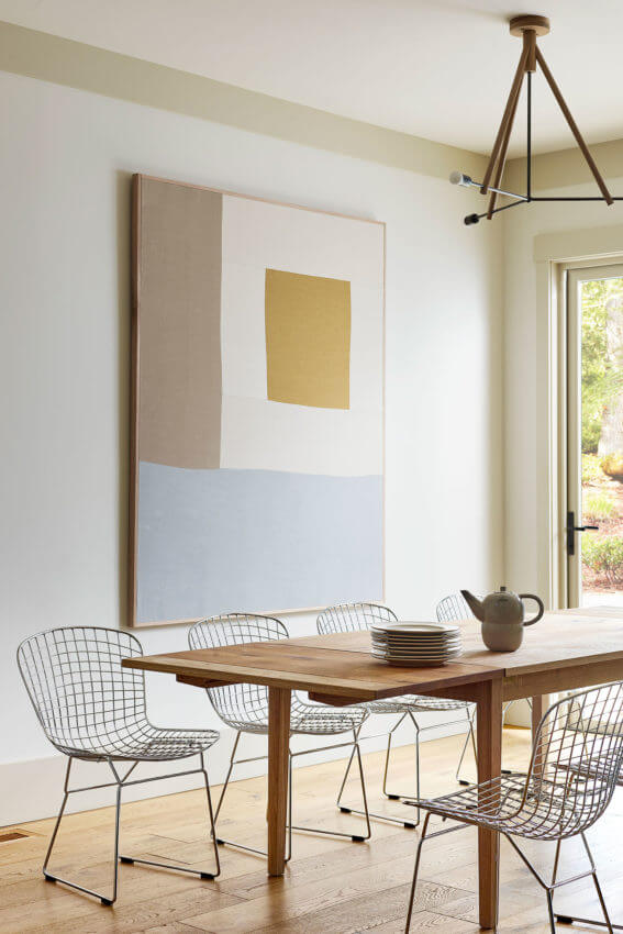
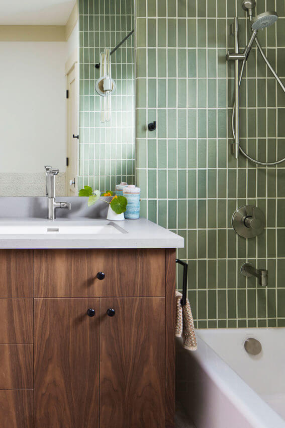
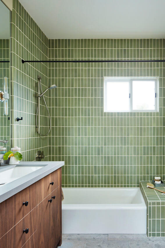
Photography: Brad Knipstein
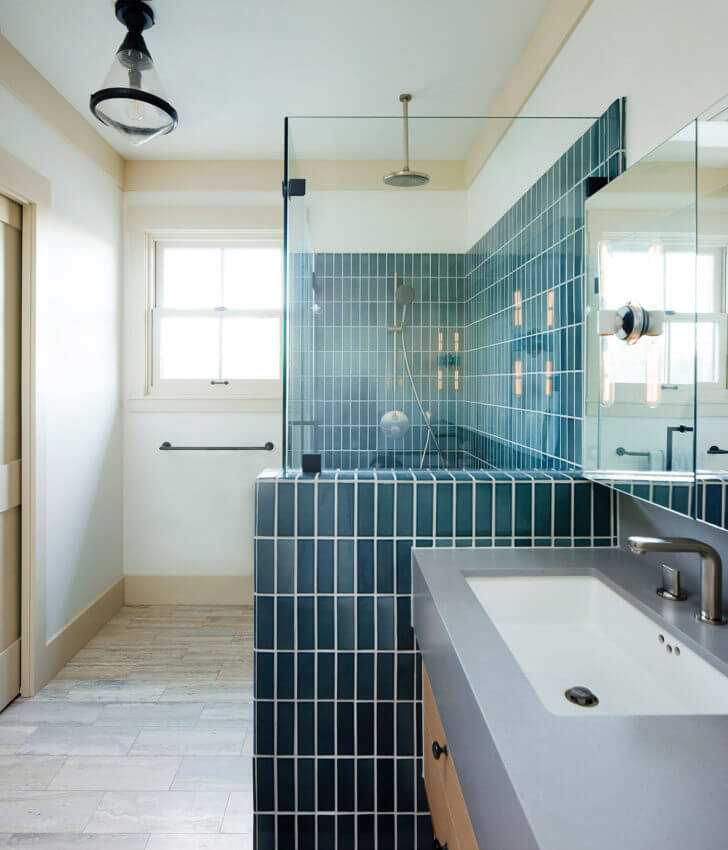
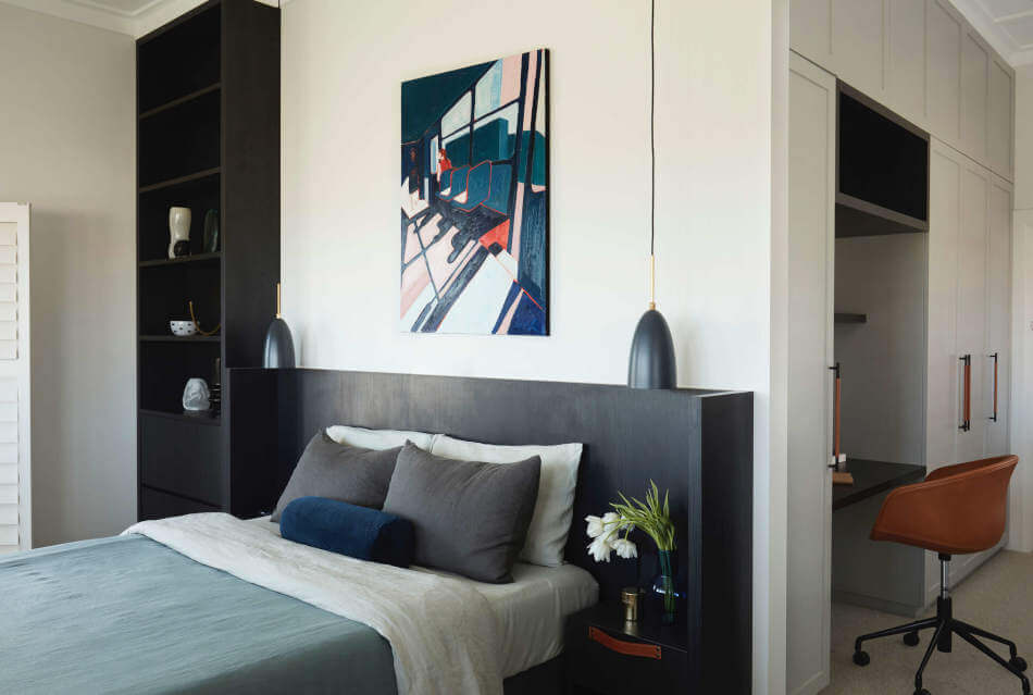
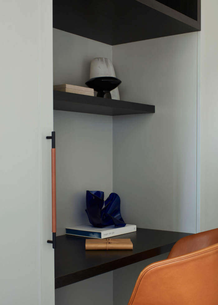
A completely renovated former student flat
Posted on Fri, 11 Sep 2020 by KiM
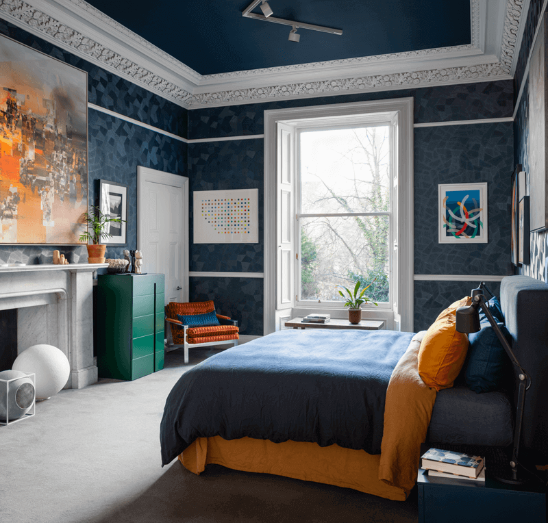
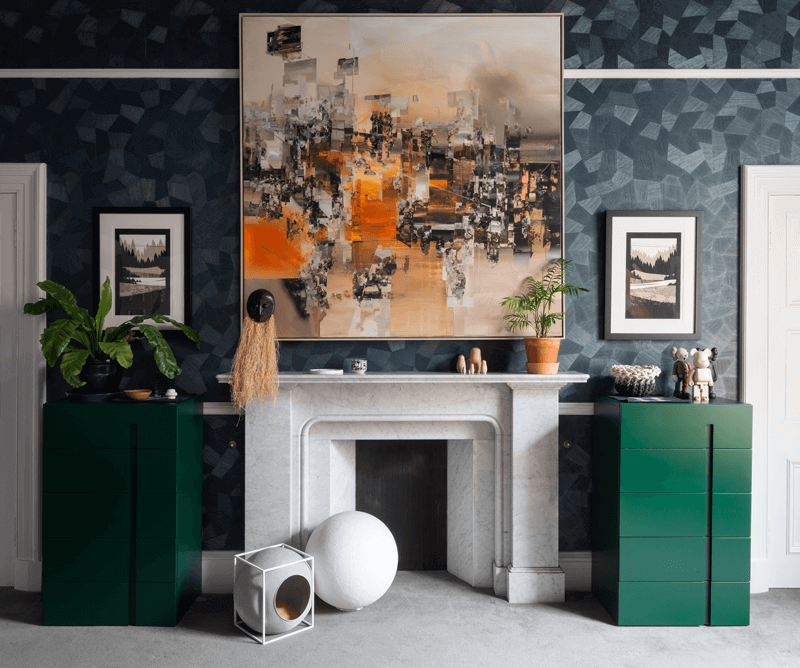
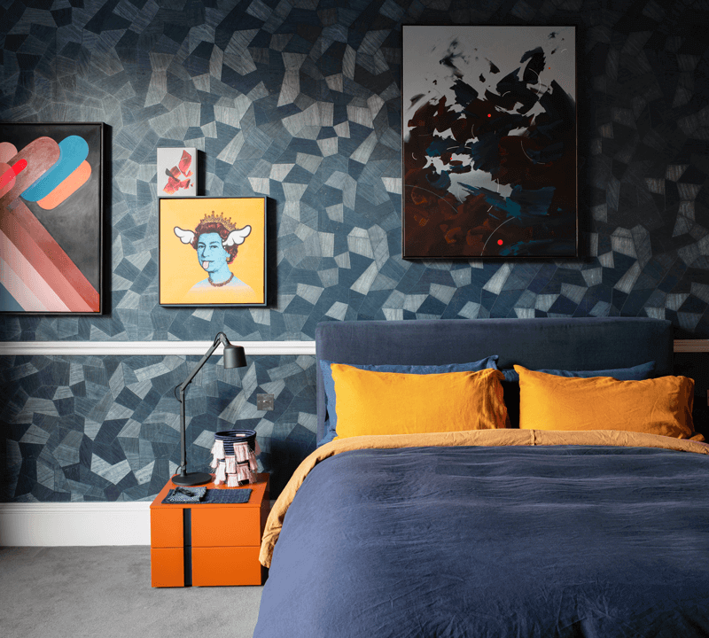
Sometimes all it takes is some modern artwork, some bold accent furniture and accessories, statement lighting, maybe a bit of graphic wallpaper and tile…. Coates Place was a 4 bed student flat that had seen better days, and after a complete home renovation, including new central heating system, a few new doorways and a kitchen relocation, the apartment is now a contemporary city pad fit for today’s living. Designed by Mr Buckley Interiors.
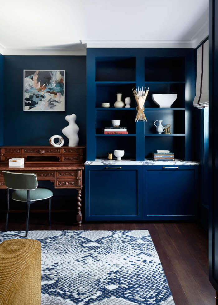
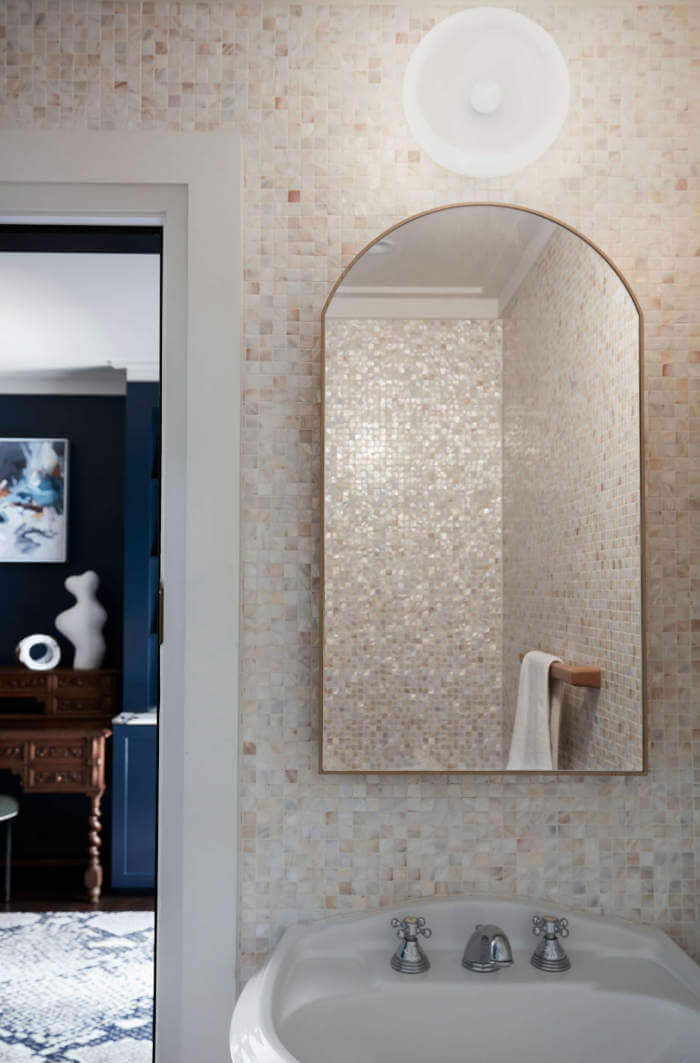
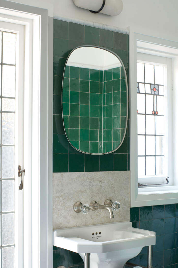
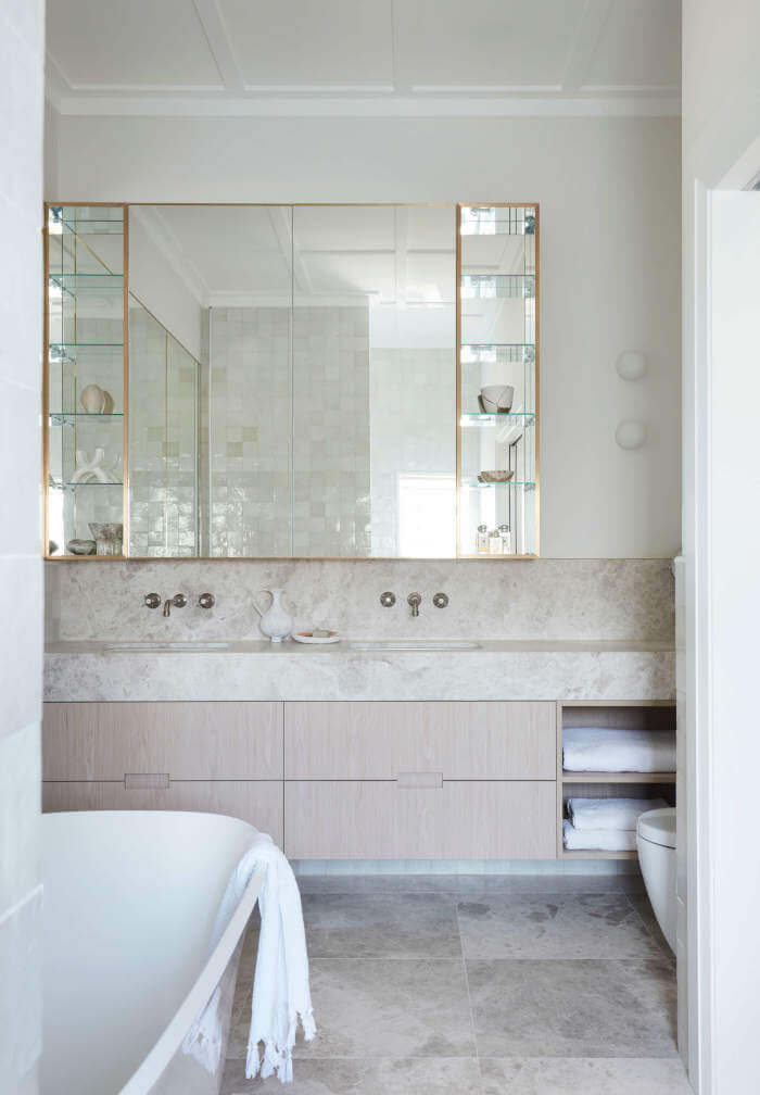
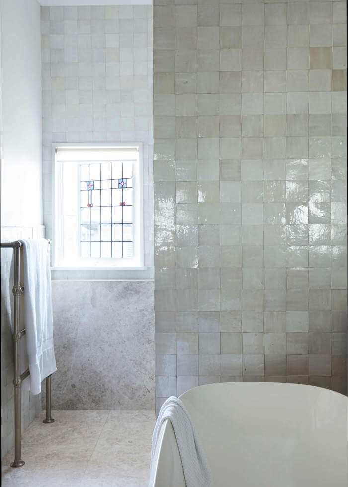
A respectful reimagining of an Edwardian villa
Posted on Fri, 28 Aug 2020 by midcenturyjo
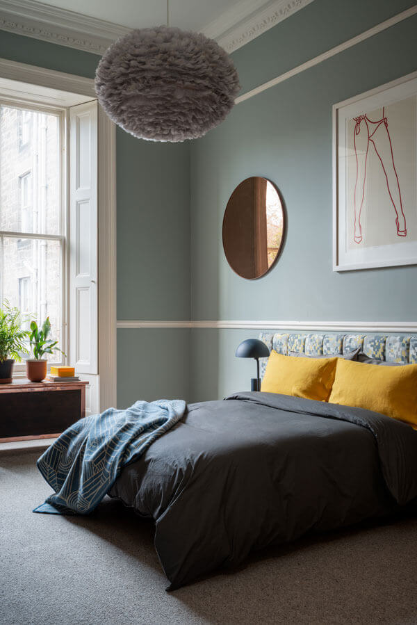
It’s all about sophisticated contemporary living but remembering the building’s Edwardian past. Think textures and layers, white walls meeting sissal floors, zellige tiles, stone and accents of royal blue. Clifton Gardens by Studio Gorman.
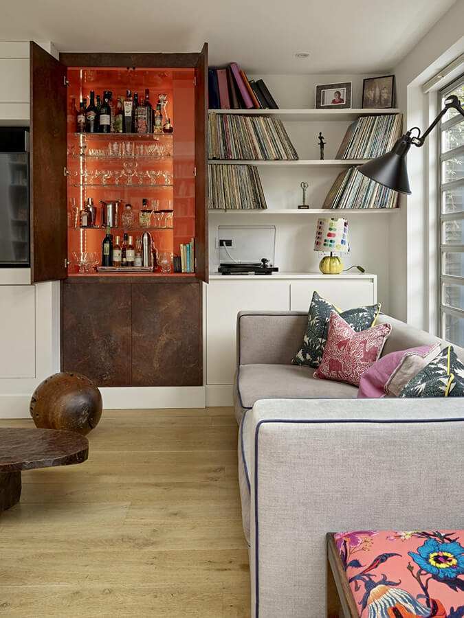
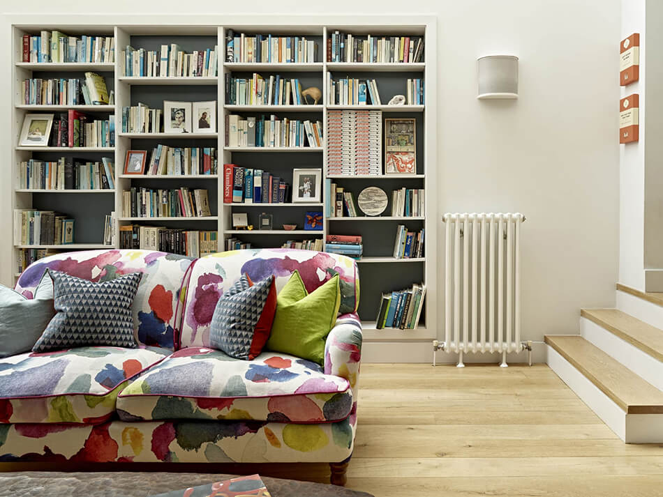
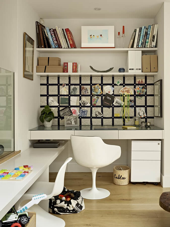
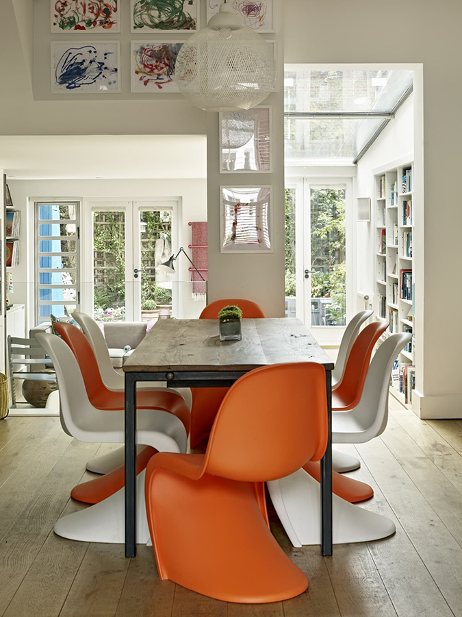
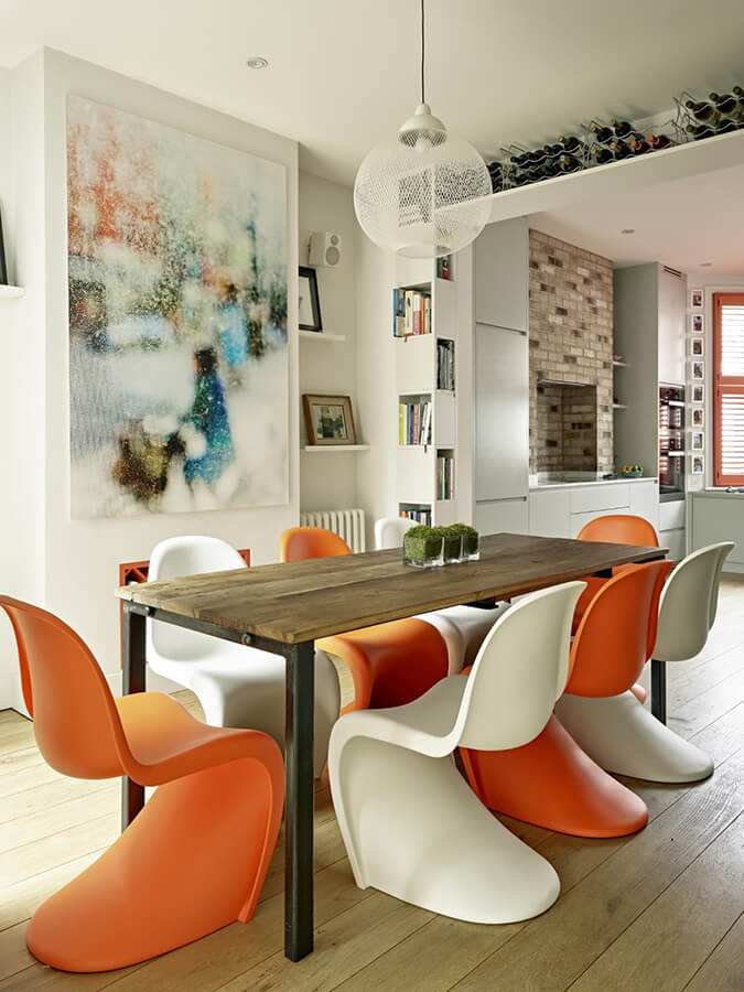
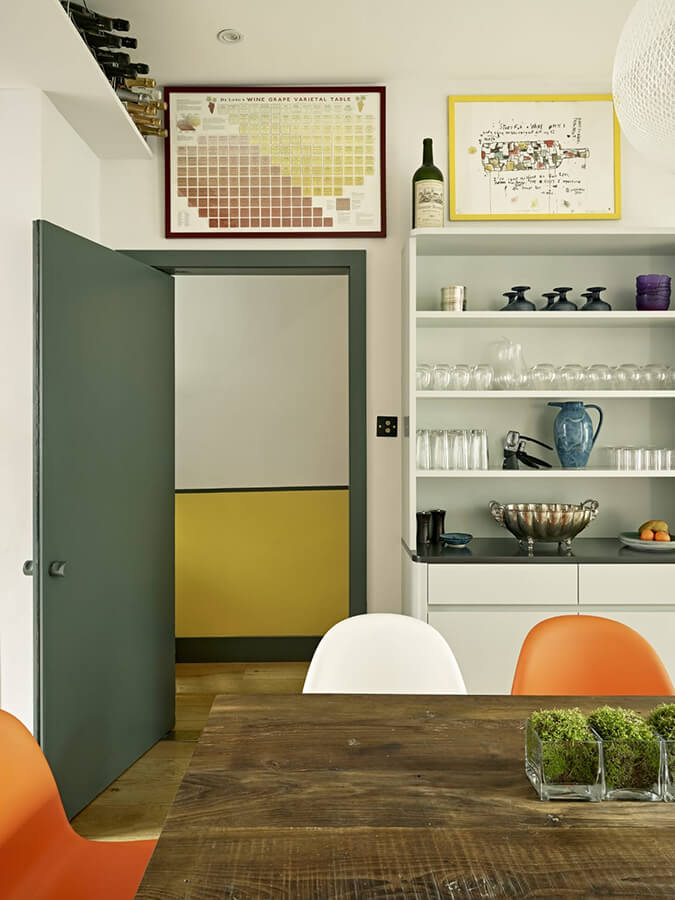
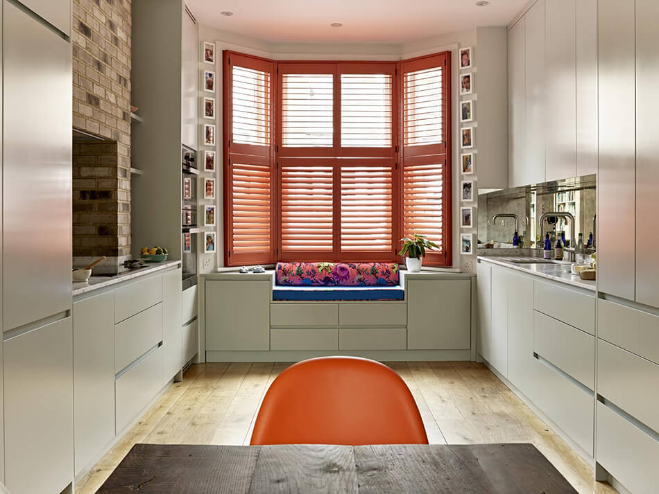
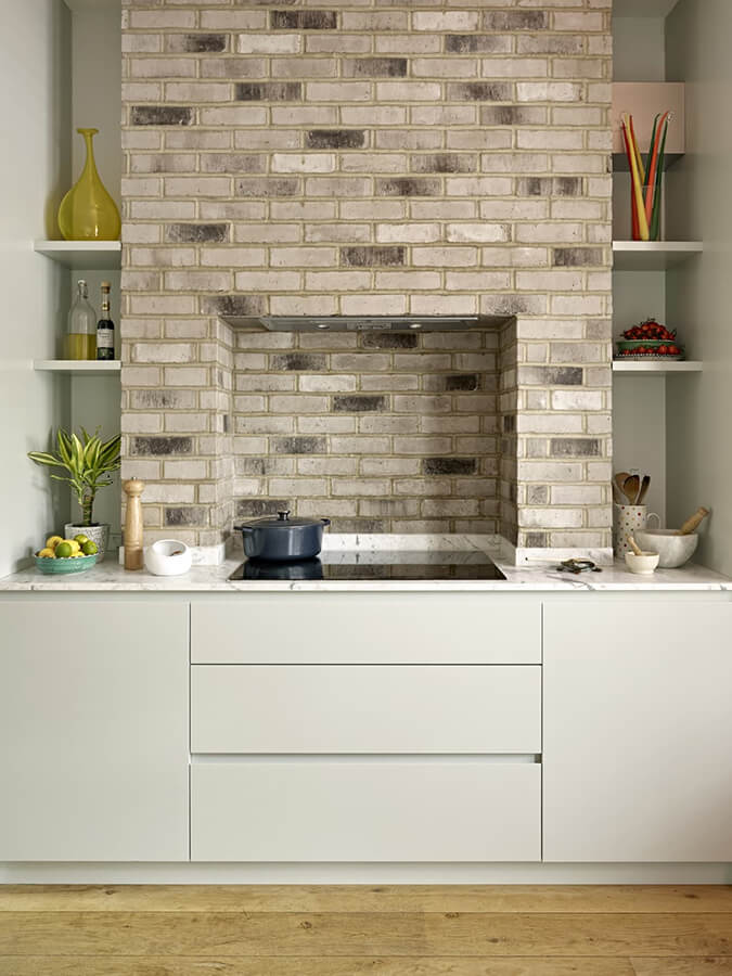
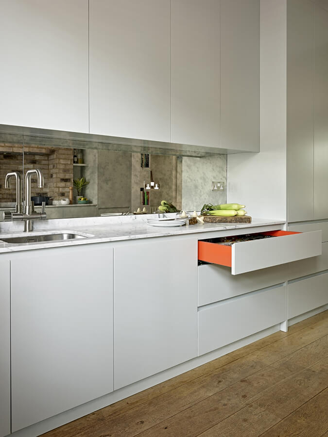
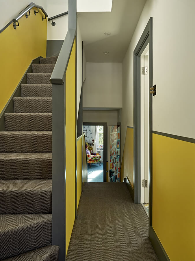
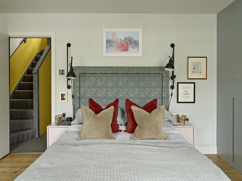
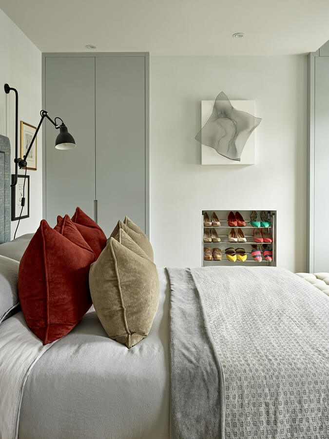
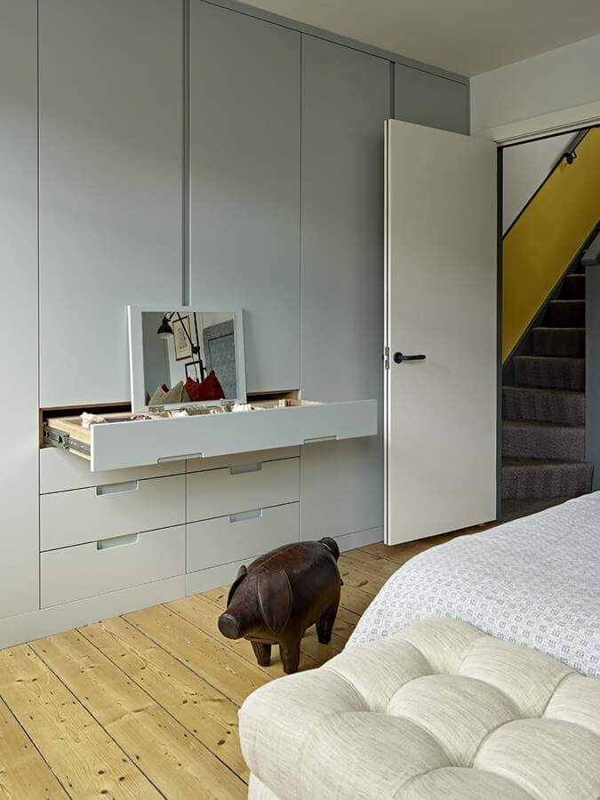
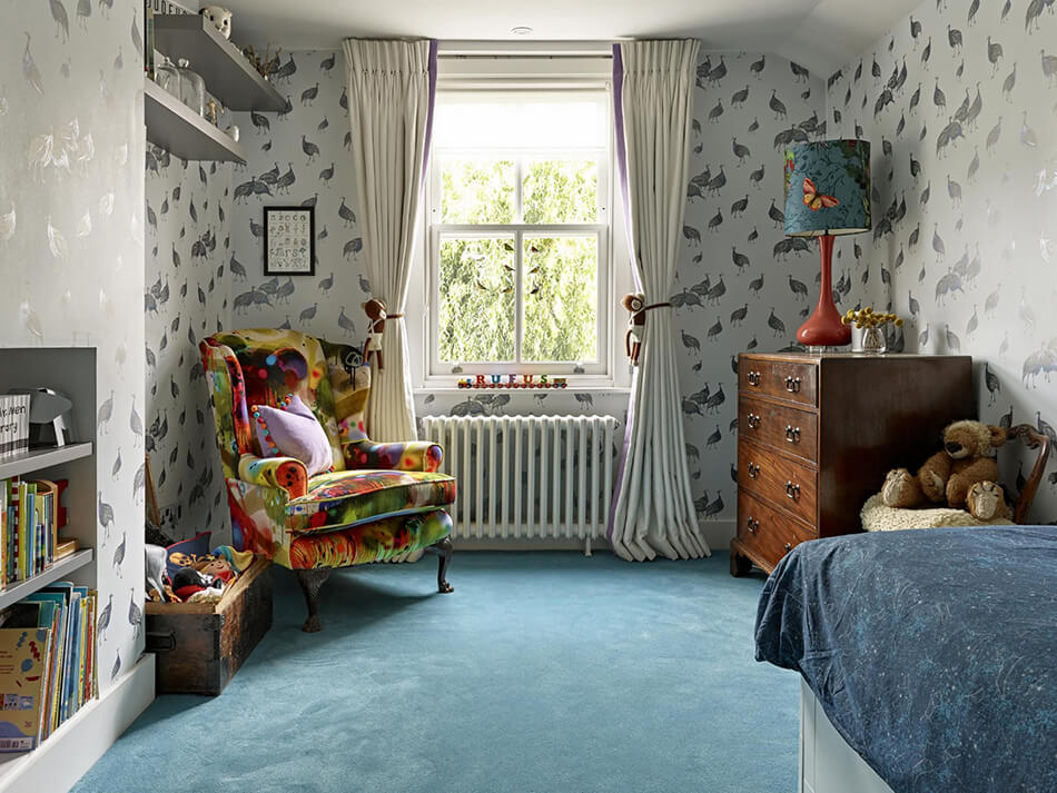
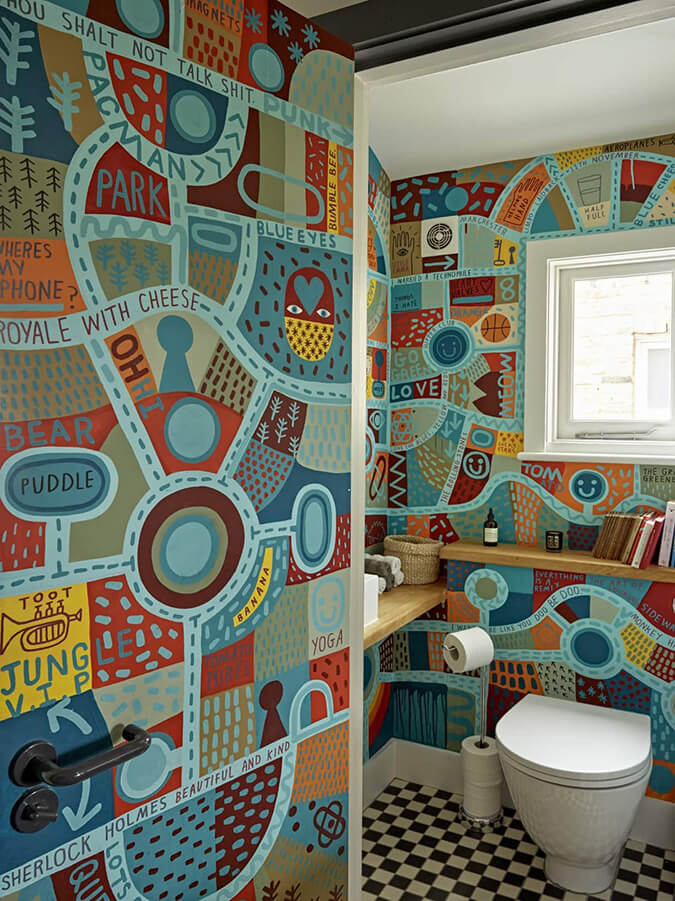
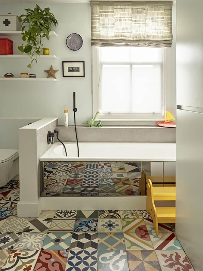
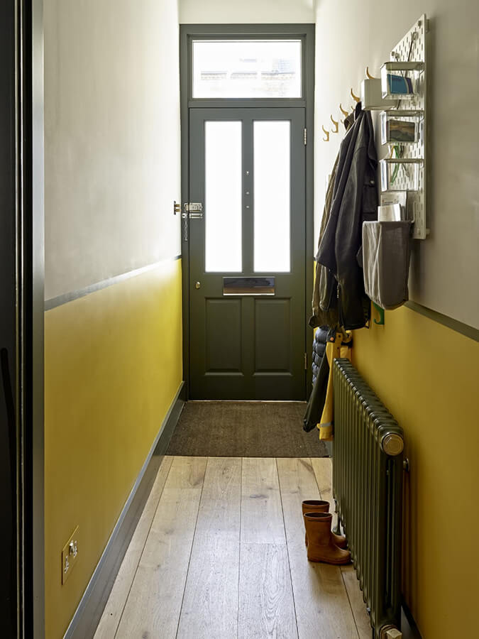
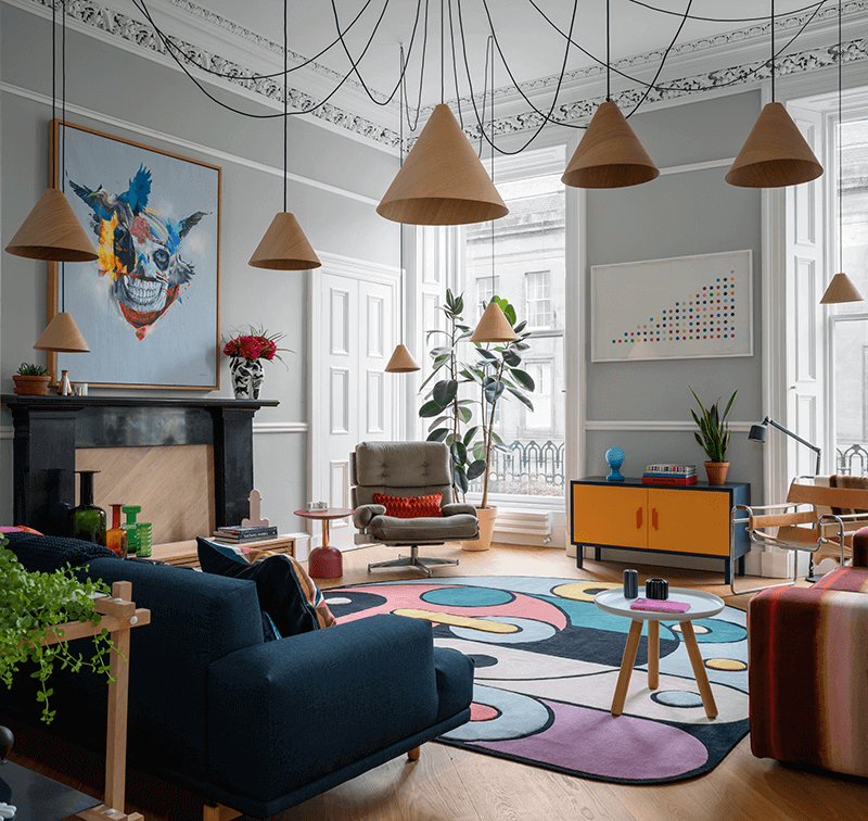
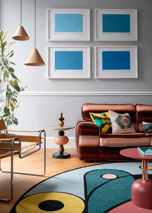
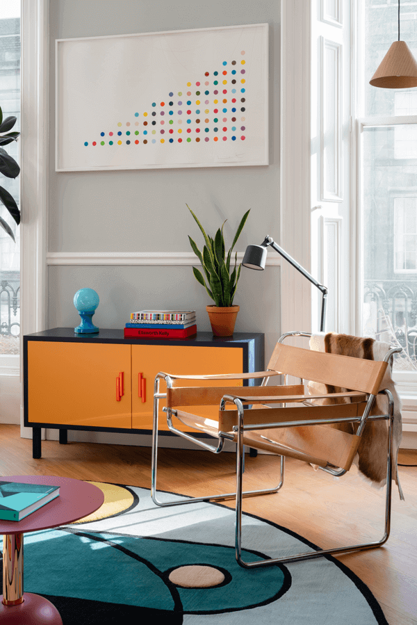
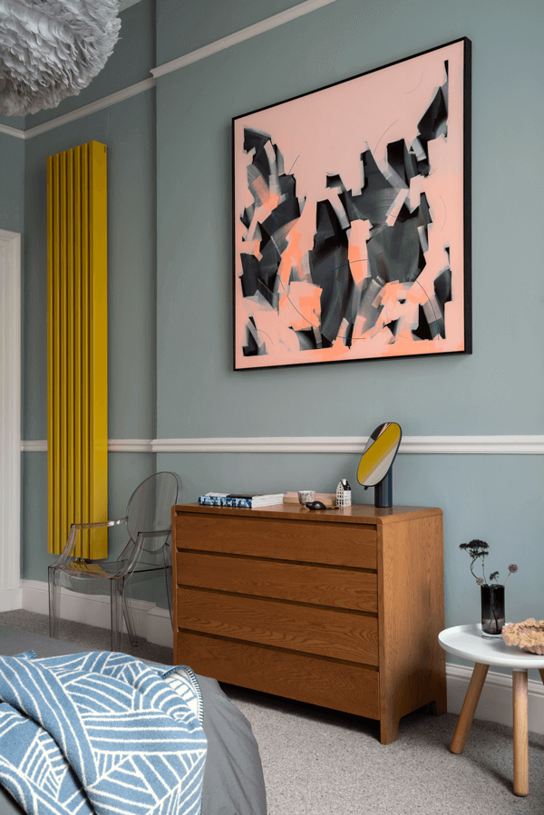
A contemporary take on a London Victorian
Posted on Tue, 25 Aug 2020 by KiM
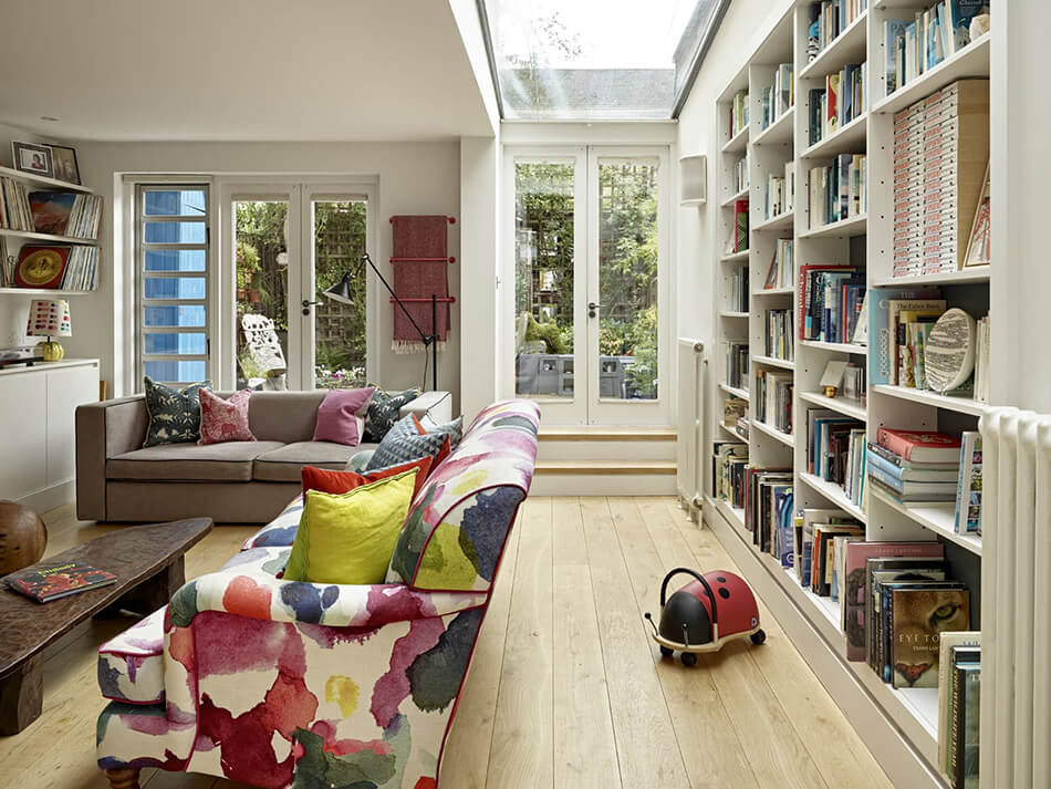
London designer Clare Gaskin used unexpected colours and really maximized space with great storage solutions in this terrace home. We designed this Victorian terrace in two phases. Firstly we tackled the dated floorplan and dingy look with renovation work which stripped the property back to its shell. More recently, we made the property work as a family home, finding ways to reflect the personalities of this young family whilst providing much needed storage, so often requested for projects of this type. The client wanted a contemporary, light, modern and airy space. During the first phase we opened the ground floor up. Positioning the kitchen at the louder (street) end of the property and with the dining area in the middle. At the rear of the property, benefitting from a side extension, the lounge is situated. We made the lounge feel more spacious by digging down to increase the ceiling height and feel lighter with a large skylight and glazed french doors opening onto the garden. The brief was for a lot of colour, as well as a flow and continuity through the property to ground it and make sense of the pockets of colour and pattern. This project was filled with fun specifications of finishes as well as a lot of time spent on how to create storage wherever we could.