Displaying posts labeled "Wallpaper"
Inside Out and colour, colour and more colour
Posted on Wed, 21 Jan 2015 by midcenturyjo
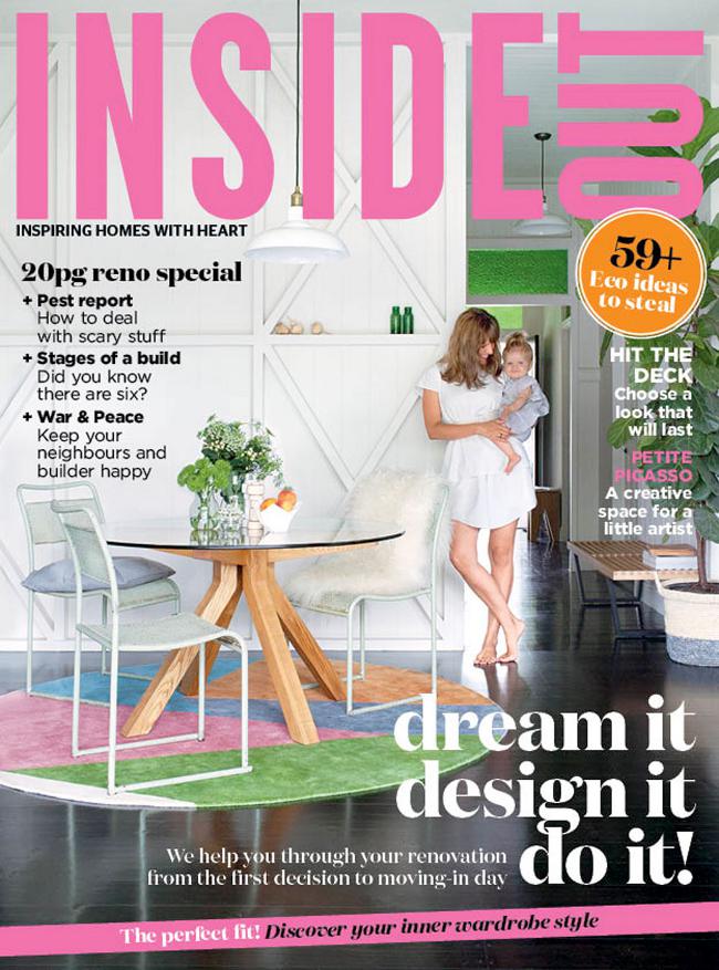
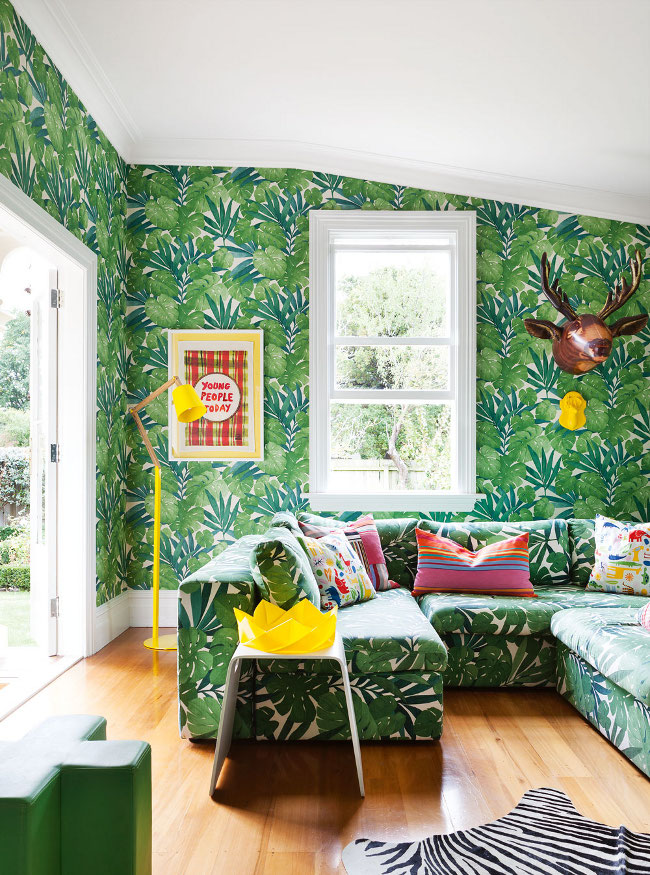
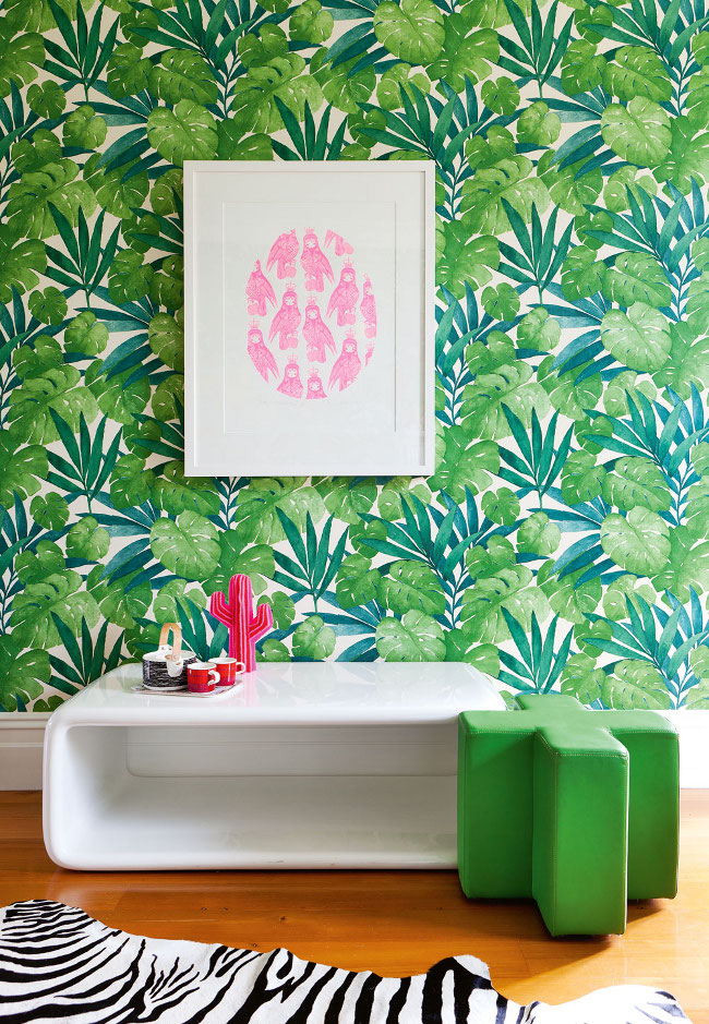
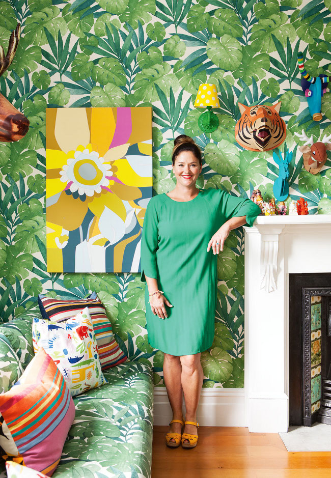
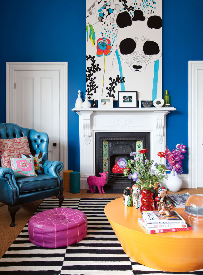
Inside Out hits the newstands tomorrow and yes Managaing Editor Lee Tran Lam has sent us a sneak peek but what a house! Colour overload. Makes me want to do my happy dance. I’ll let Lee Tran tell you a little more about this New Zealand gem.
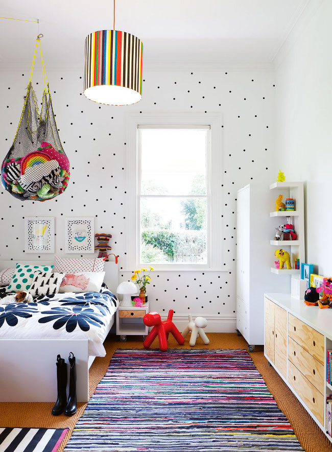
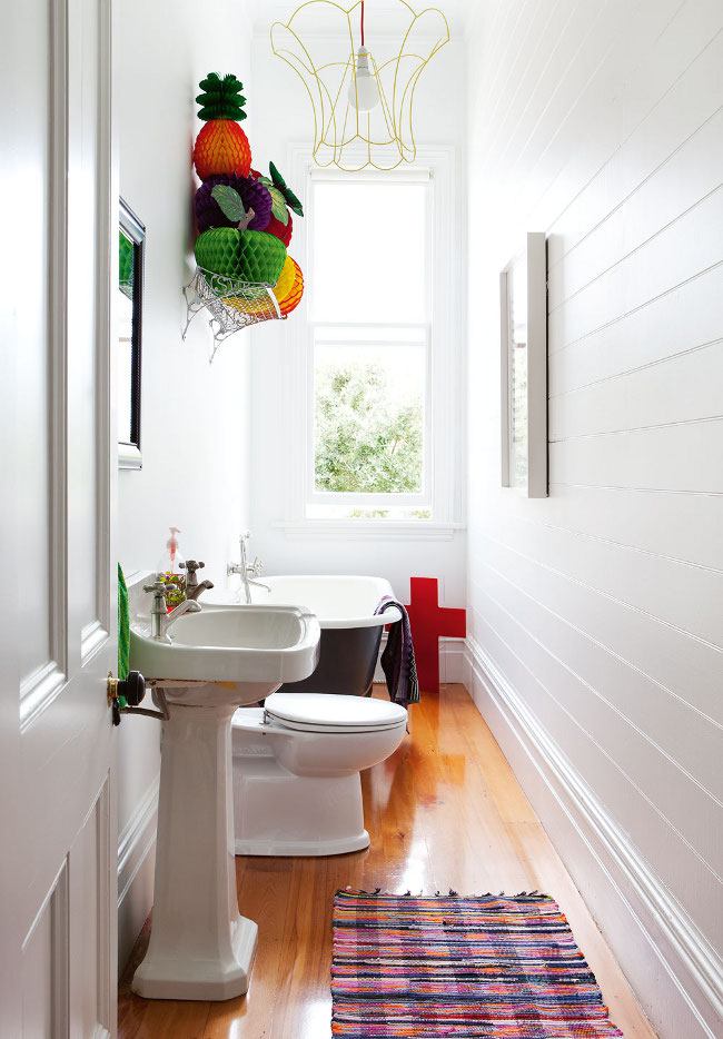
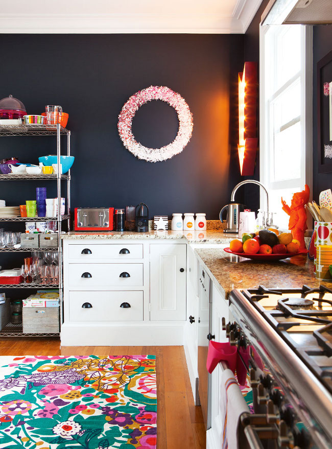
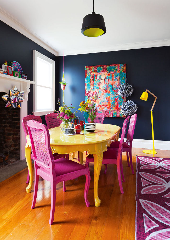
“I’ve got some eye-catching pixels from the new issue of the magazine, out Thursday, and they’re from a home that definitely hunts out your attention!he house belongs to designer Alex Fulton and was styled by LeeAnn Yare and photographed by Larnie Nicolson. I love how Alex’s style is completely unbound and each room has a one-of-a-kind feel – such as the green wallpaper that flourishes all across the surface of her living room, and the sofa that matches its well-cultivated and growing patterns! There’s also her daughter Isla’s room, which Alex has given a confetti-like scatter of graphics, by applying stationery spots on the walls. And in the bathroom, she ‘serves’ a fruit salad above the sink and decorates a lamp with an upside-down pendant. This is a home that’s shot through with original idea after original idea.”
Aussie readers can pick up their copy of the February Inside Out on Thursday. Don’t fret if you aren’t in Australia because you can read along on Zinio, Google Play, the Apple Newsstand and Nook.
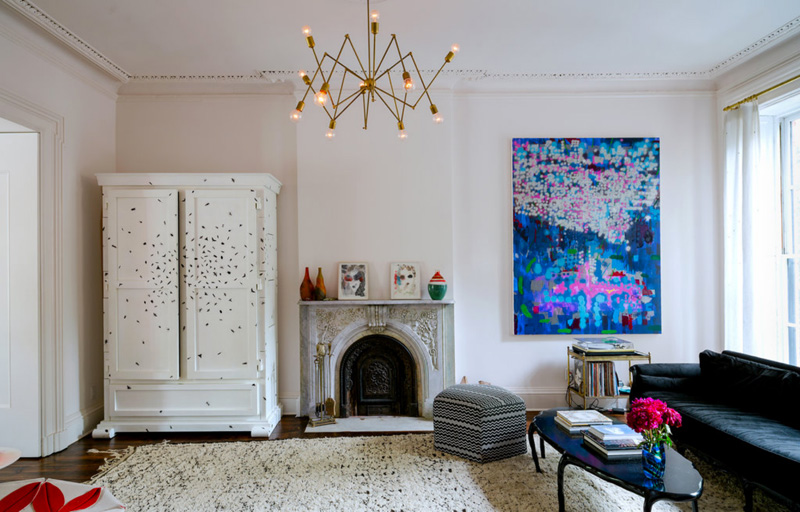
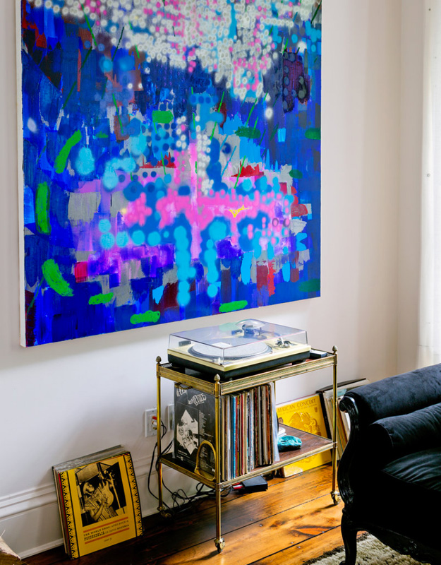
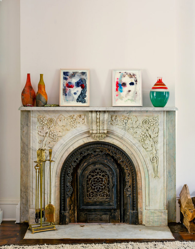
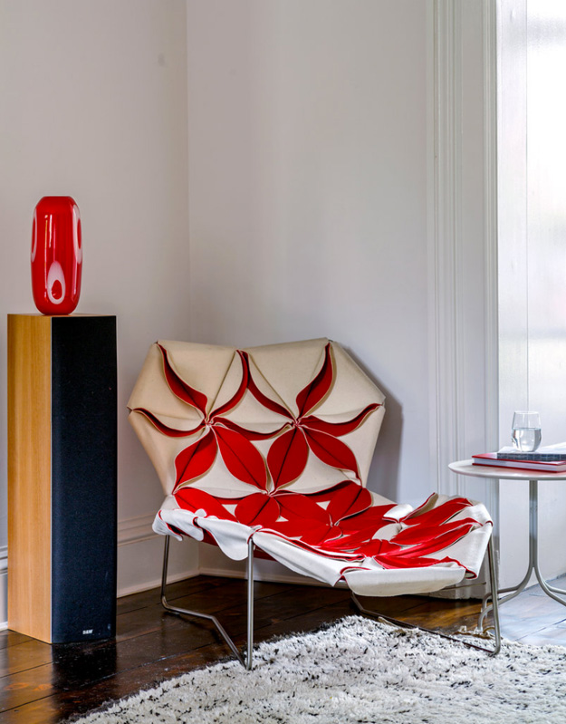
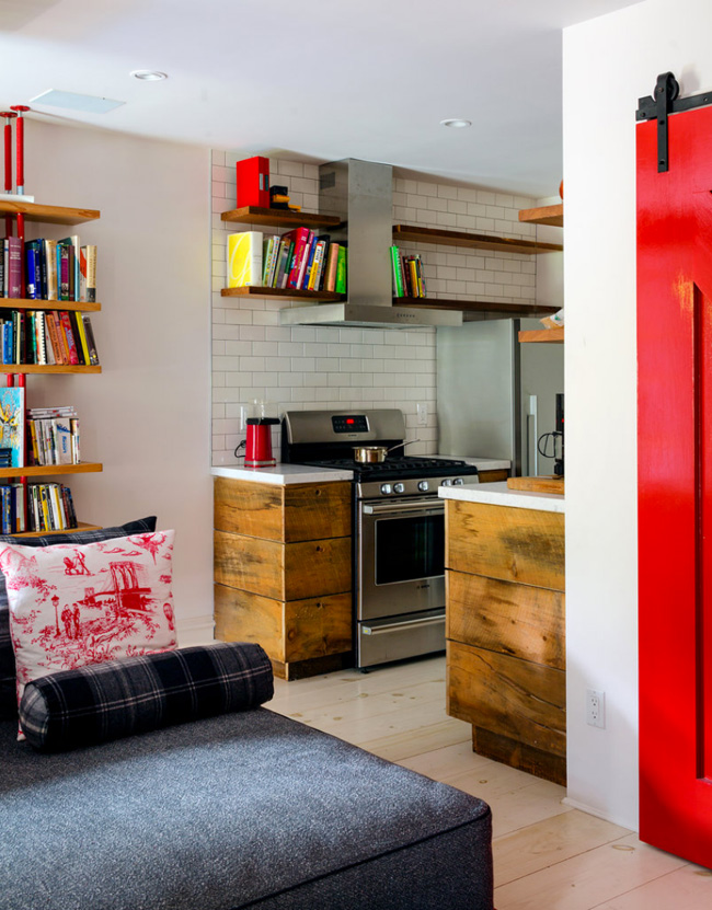
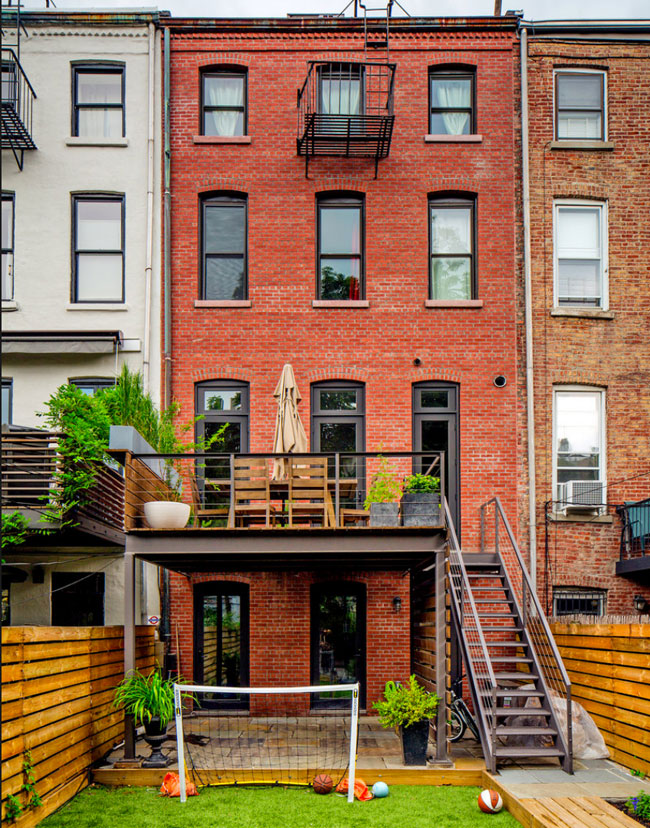
A really cool Brooklyn townhouse
Posted on Thu, 20 Nov 2014 by KiM
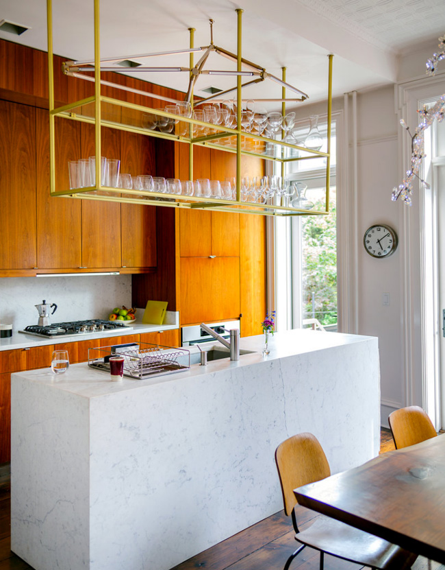
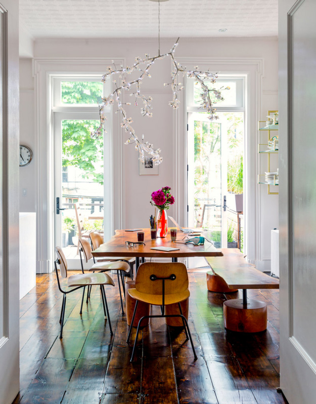
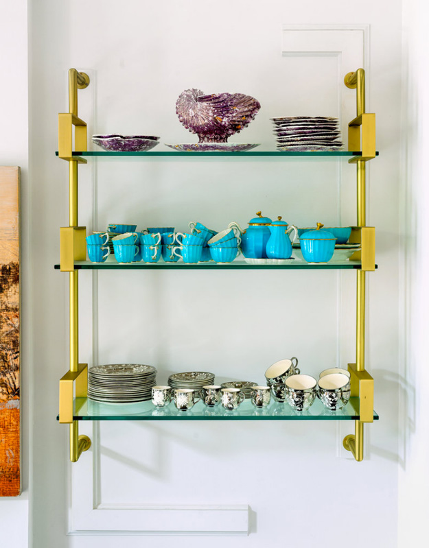
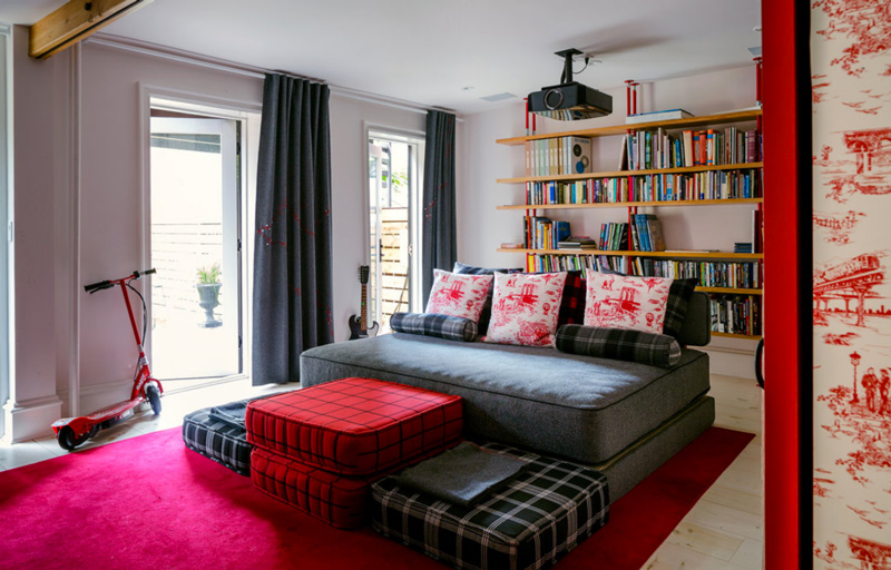
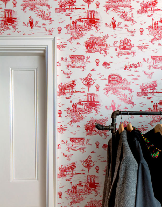
I don’t know how I missed the reveal of this incredibly awesome townhouse last year in the New York Times. Owned by Beastie Boys’ Mike D, he lives in this 3200 sq ft Brooklyn home built in 1853 with his wife and 2 boys, and they spent 6 months and about $500K on renovations. The result is phenomenal – eclectic and funky decor that works so well with the traditional architecture. I love all of the touches of brass throughout (especially the kitchen *GASP*), and the fun Brooklyn Toile wallpaper (from Flavor Paper) was designed by Mike. I could just pack up my clothes and the cats and hubby and move right in without changing a single thing.

POW!
Posted on Thu, 21 Aug 2014 by midcenturyjo
Talk about packing a design punch. I can’t wait to see more of this Fitzroy apartment by interior designer extraordinaire Greg Natale but I guess I’ll just have to wait until November 2014 when his book The Tailored Interior is released. Swoon. Love his wallpaper range for Porter’s Paints. Stripes never looked so sexy.
Cortney Bishop
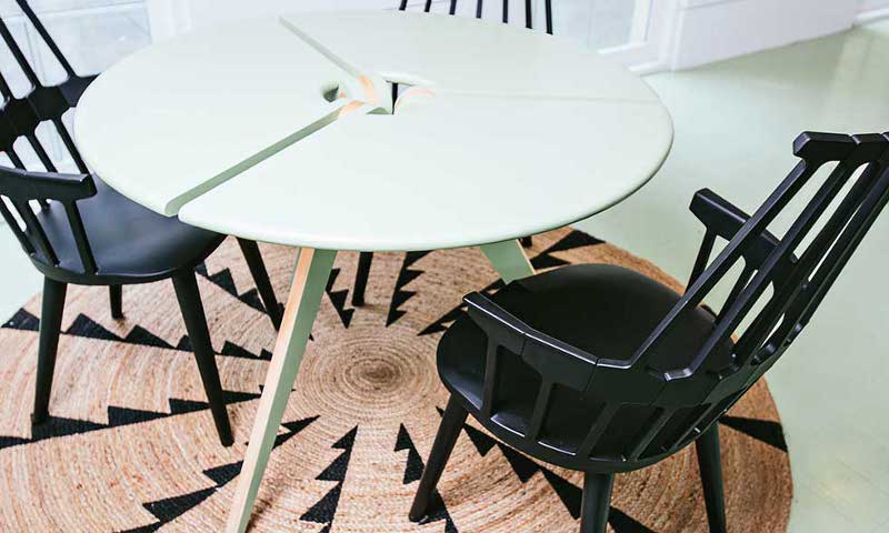
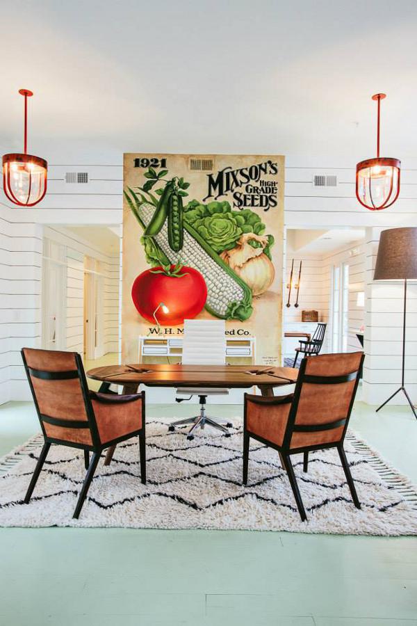
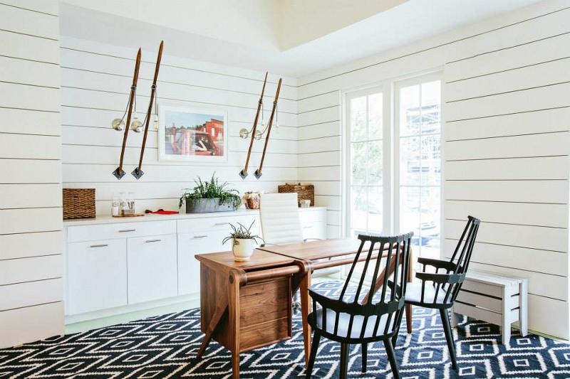
Posted on Thu, 13 Mar 2014 by midcenturyjo
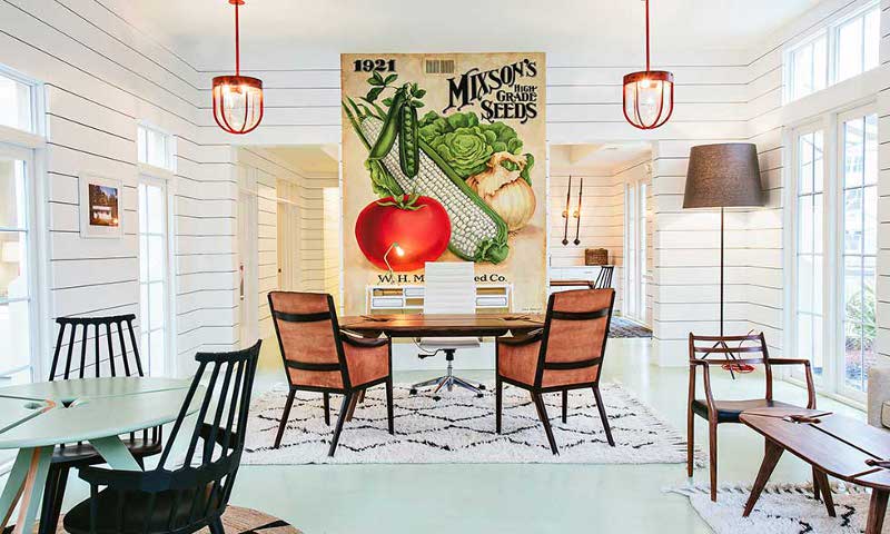
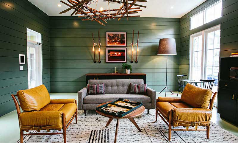
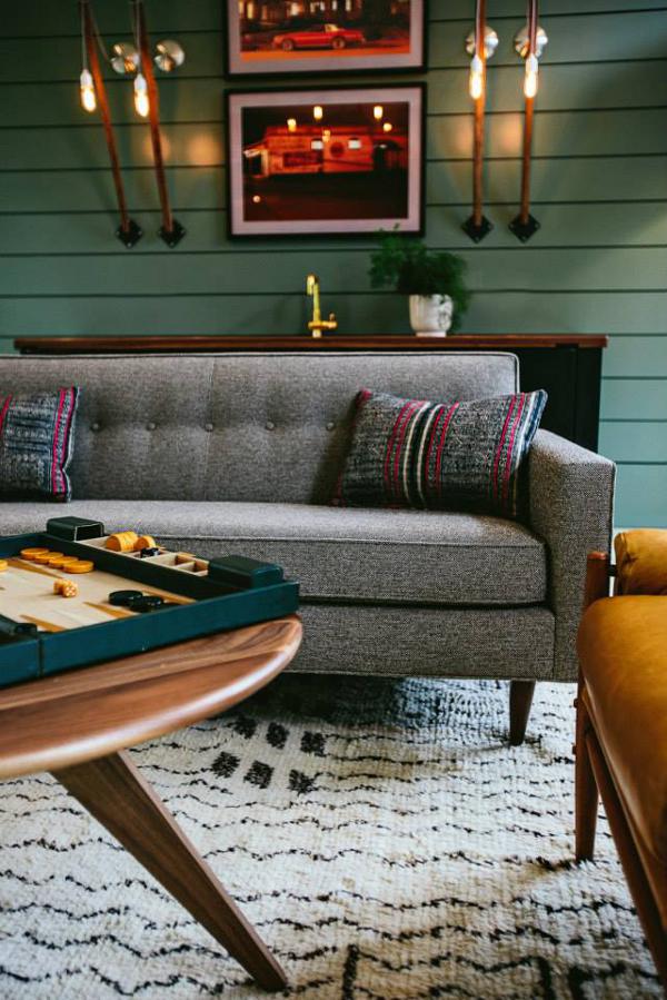
Casual yet stylish. Fresh and fun. Whose home is it? Try display apartments, the Flats at Mixon by Charleston, by South Carolina interior designer Cortney Bishop. Wonderfully bright and light and at other times moody and masculine. The perfect showcase for potential buyers. What I love most? The use of green whether minty fresh floors or murky with a retro vibe.
Pam’s retro office remodel
Posted on Sun, 5 Aug 2012 by KiM
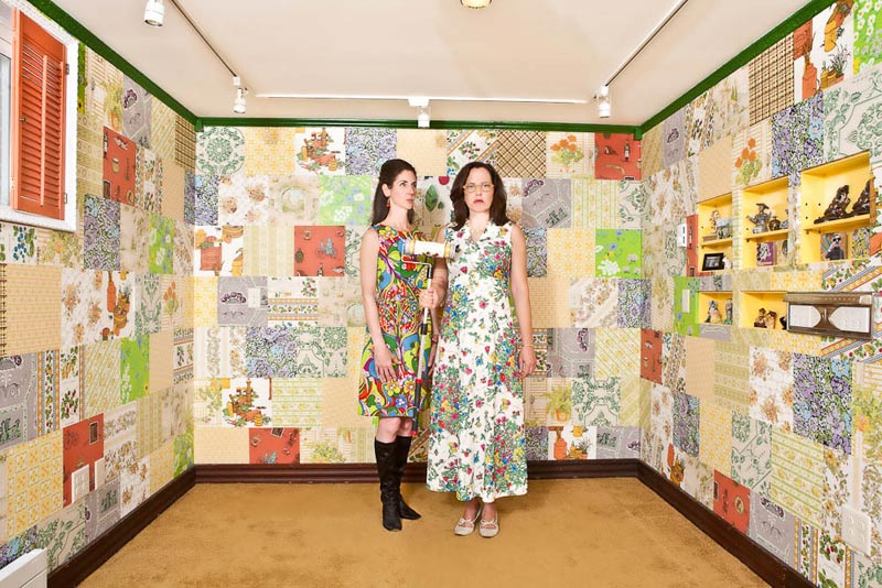
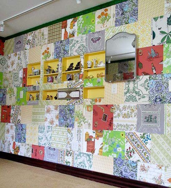
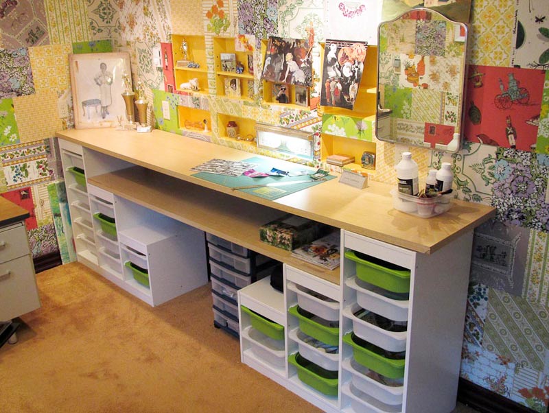
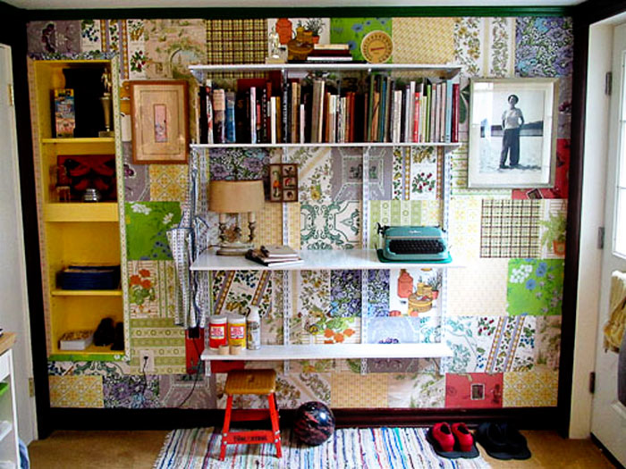
Remember this post from last week of an office with wallpaper samples on the wall? Well, Pam of RetroRenovation.com thought our readers might like to see what she did with her office as it has the same “patchwork” going on on the walls. Her new office is SO FUN, and she has in fact inspired me to do something with all of the vintage wrapping paper I have stashed away that I bought on Etsy a couple years ago. I’m thinking of cutting it into pieces and gluing it to the island in my dressing room. 🙂 ANYHOO, she sent along some photos and info on her office remodel. Check it out:
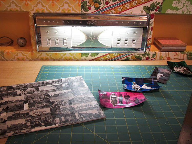
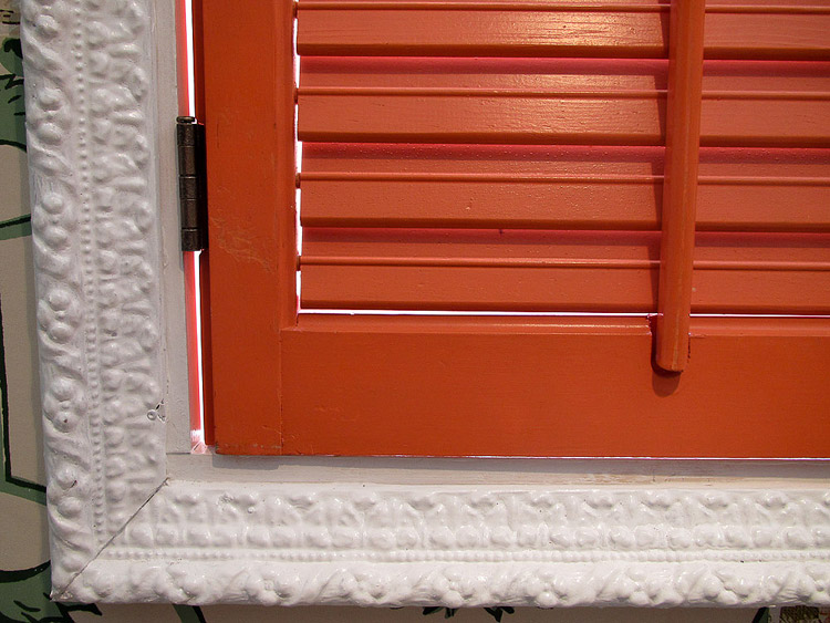
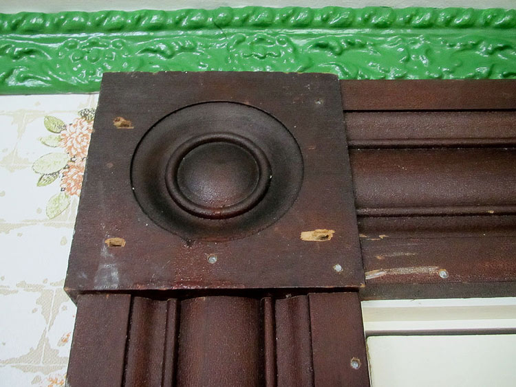
I needed to renovate my office principally to add more insulation — it’s in the basement. I am a fulltime blogger now — and the time had come to make this space truly comfy cozy and my own. I also wanted to add crafting space — I love to collage. And, I had a hoard of vintage wallpaper — from the 1920s through the 1970s — I’d collected over the years — often, in onesy-twosey rolls that were not enough to paper a room. Also, I am just more color crazy than EVER and wanted to create a space that appealed to me just me I don’t care what anyone else thinks! Put these all together and you get my crazy patchwork quilt office. I used nearly 300 12″ x 12″ squares — I cut each and every one. My friend Denise (pictured me in the American Gothic photo) helped me put it up. She is a decorative painter and has a great eye. While it might look “insane” at first glance, there really is a rhyme and reason to the papers chosen. (cough cough I have more). The principal field is sort of acid yellow and acid green patterned with off white or soft white… and there are also softer yellows, greens and oranges, also in patterns with soft white. From there, we added complements… “pops”… of purple, rusty red, and that very strong, more solid lime green. The crafting space is Ikea Trofast children’s storage with Herman Miller! Countertops found at the Re-Store. I had recessed storage built into the wall above my crafting area. The trim also comes from the Re-Store. I kept the wood as-is: Not Perfect is the New Perfect. The foofy white trim around the shuttered window (orange shutters were my mother-in-law’s) I painted glossy white. Ceiling trim (also from Re-Store) is a grass green. I added a pretty mirrored medicine cabinet. Because I could. Track lights around edge. Vintage wagon wheel light in center. Oh, and I sent you a shot of my vintage Sunbeam Appliance Center, which I installed for fun but also for a little bit of light on the countertop.