Displaying posts labeled "Windows"
A designer’s artful home in Guatemala
Posted on Wed, 22 Jul 2020 by KiM

I’m having heart palpitations over the Guatemalan home of designer Rodman Primack. Colours and patterns and textures (and the tile!!!!!) within spacious rooms and incredible soaring ceilings make this home spectacular.
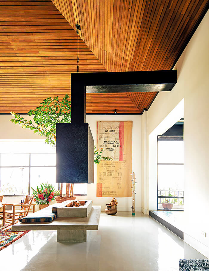
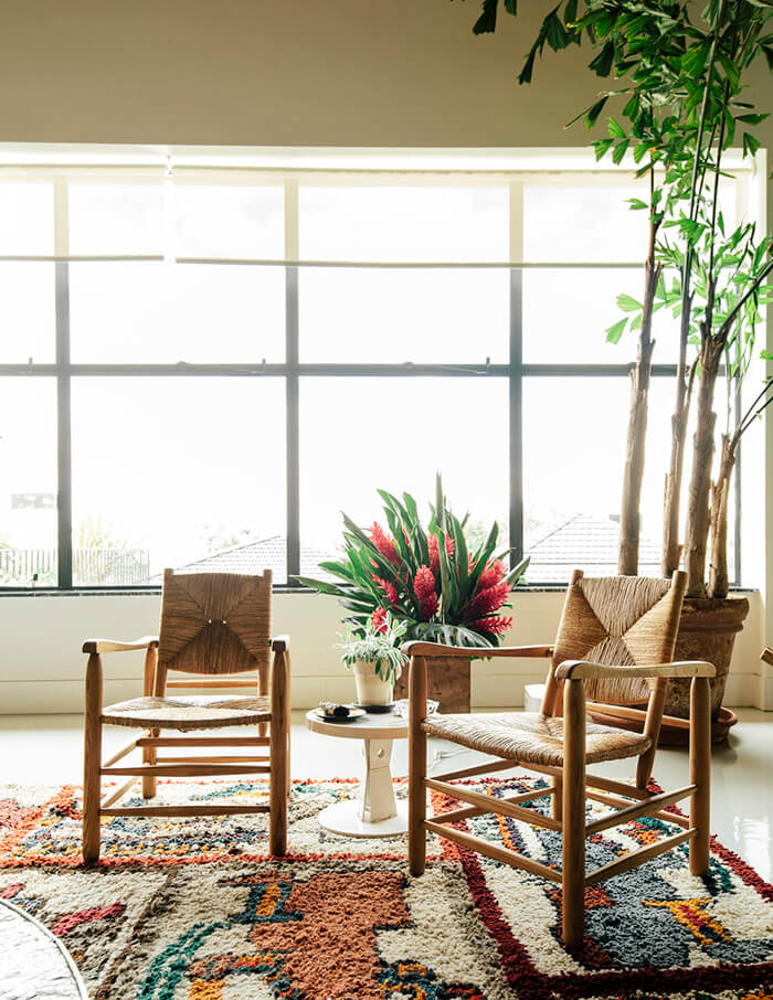
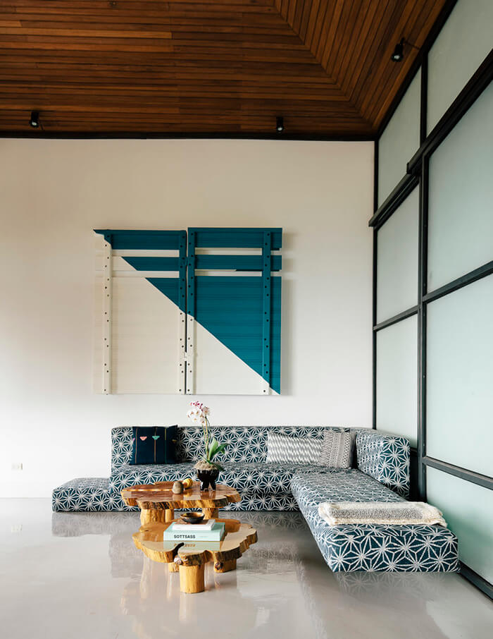
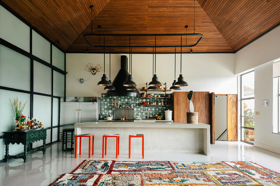
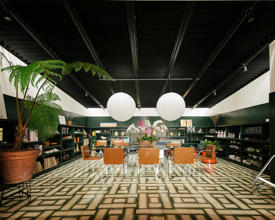
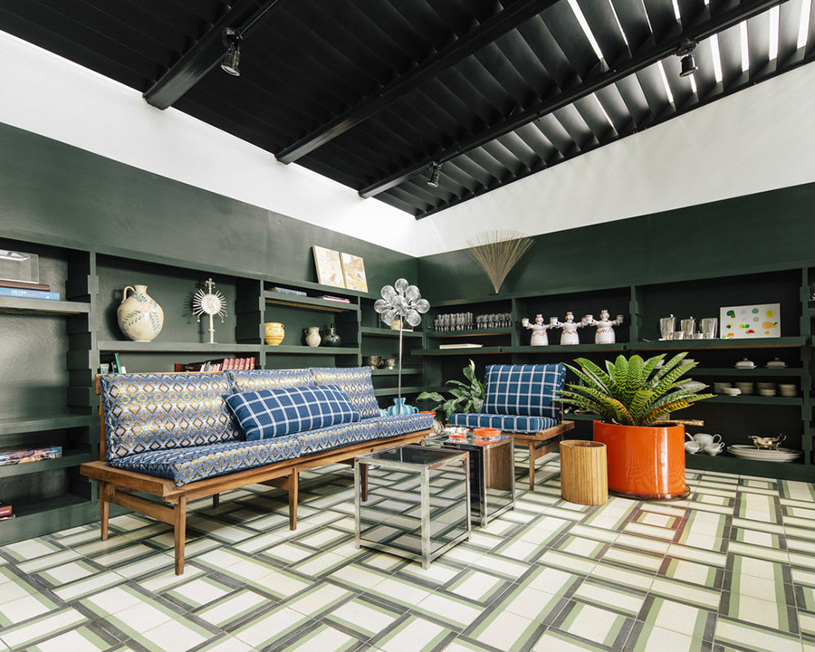
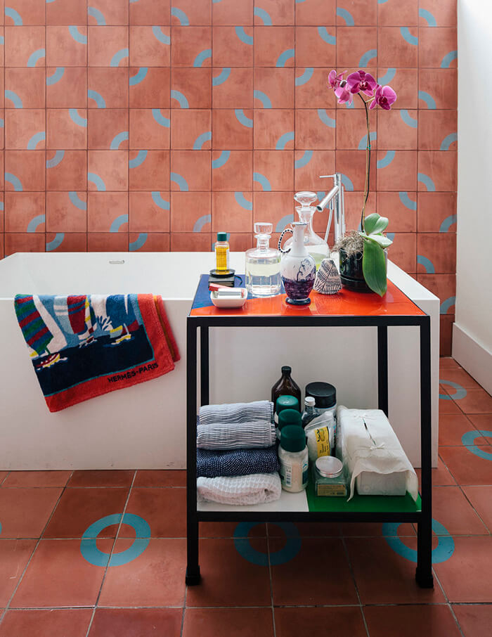
Photos: Ben Hoffmann
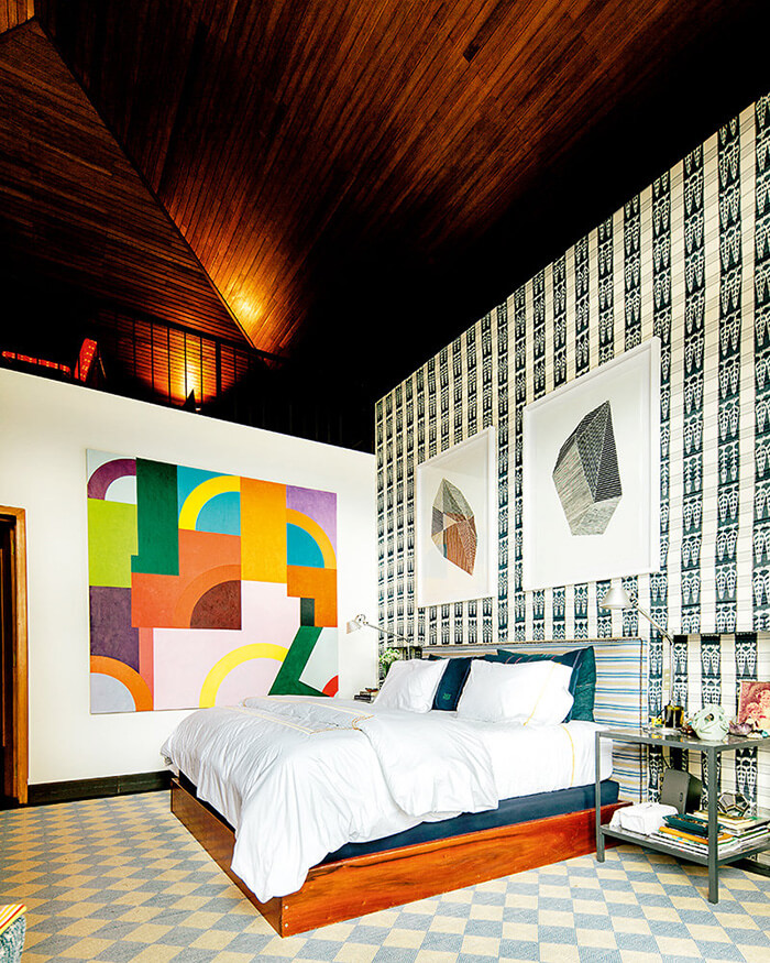
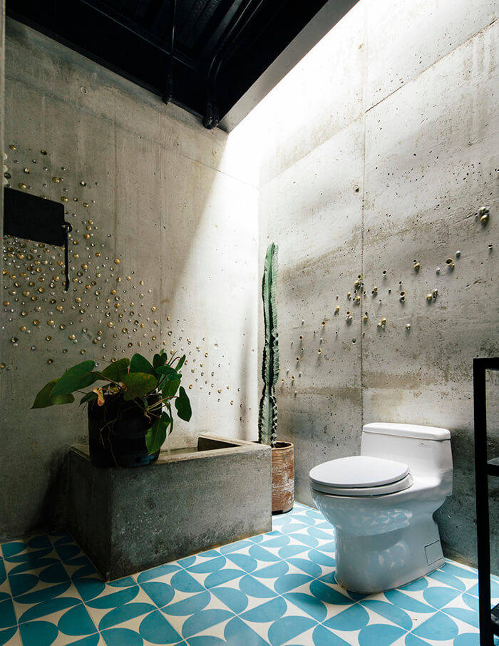
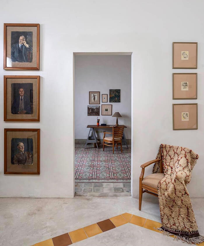
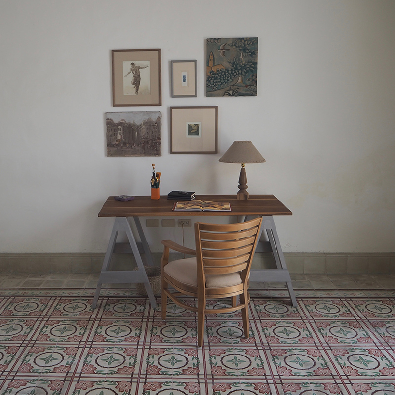
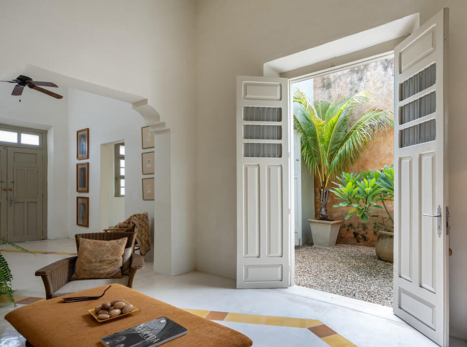
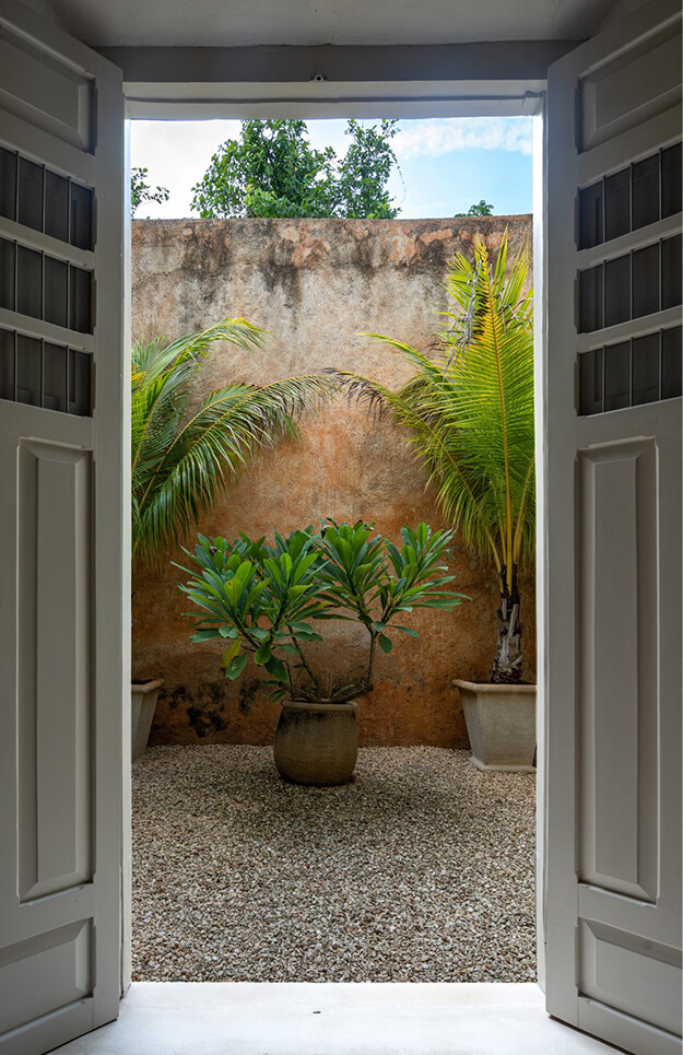
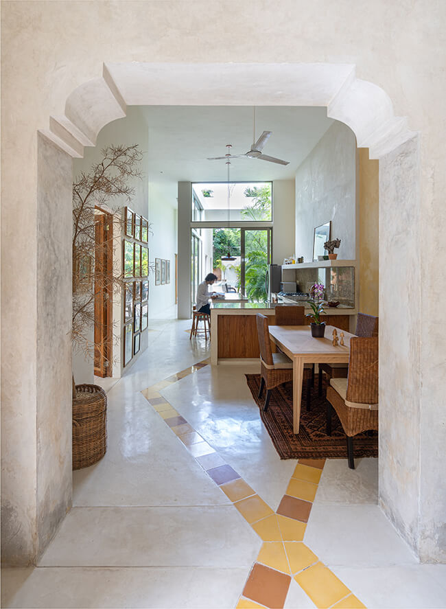
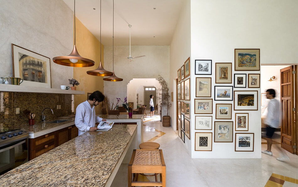
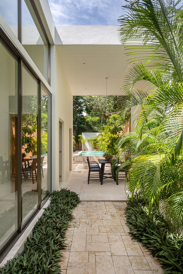
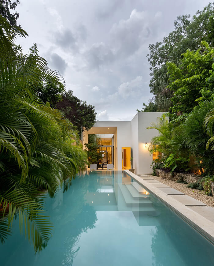
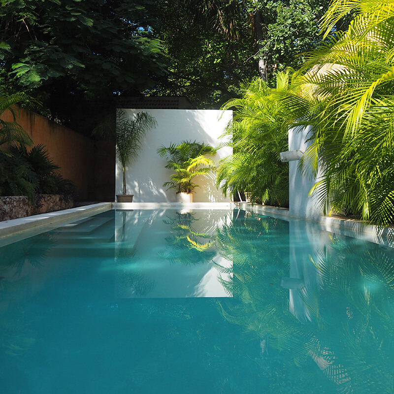
E&A 64 House – a hidden sanctuary in Mexico
Posted on Fri, 10 Jul 2020 by KiM
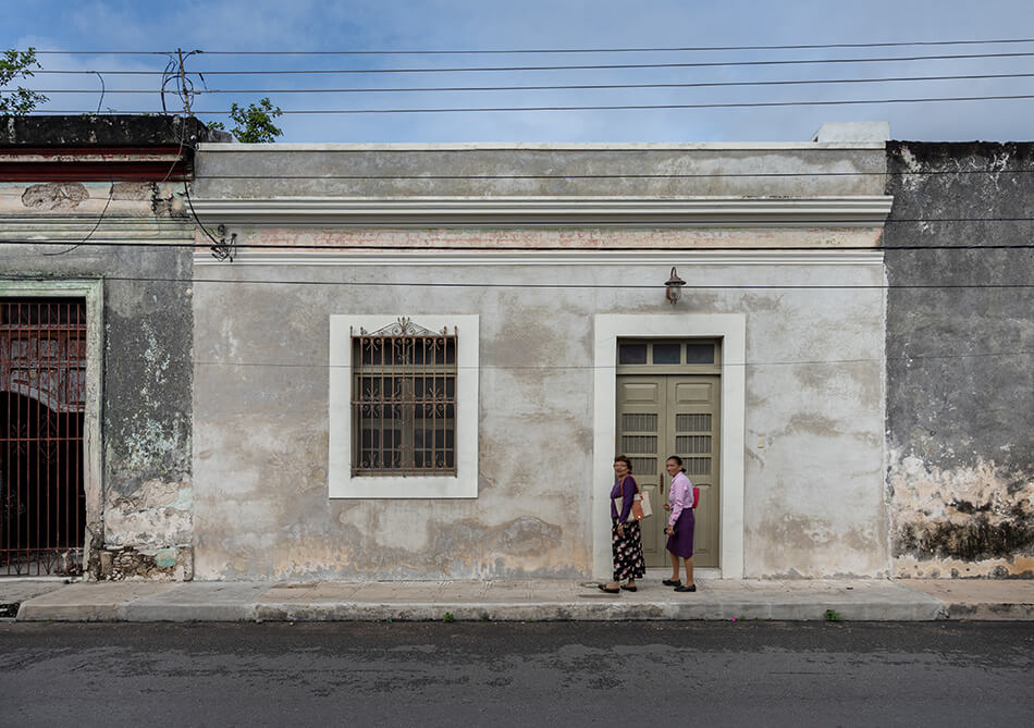
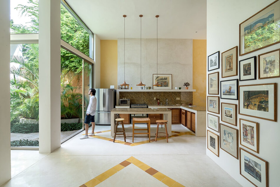
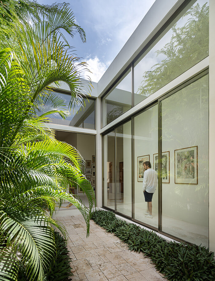
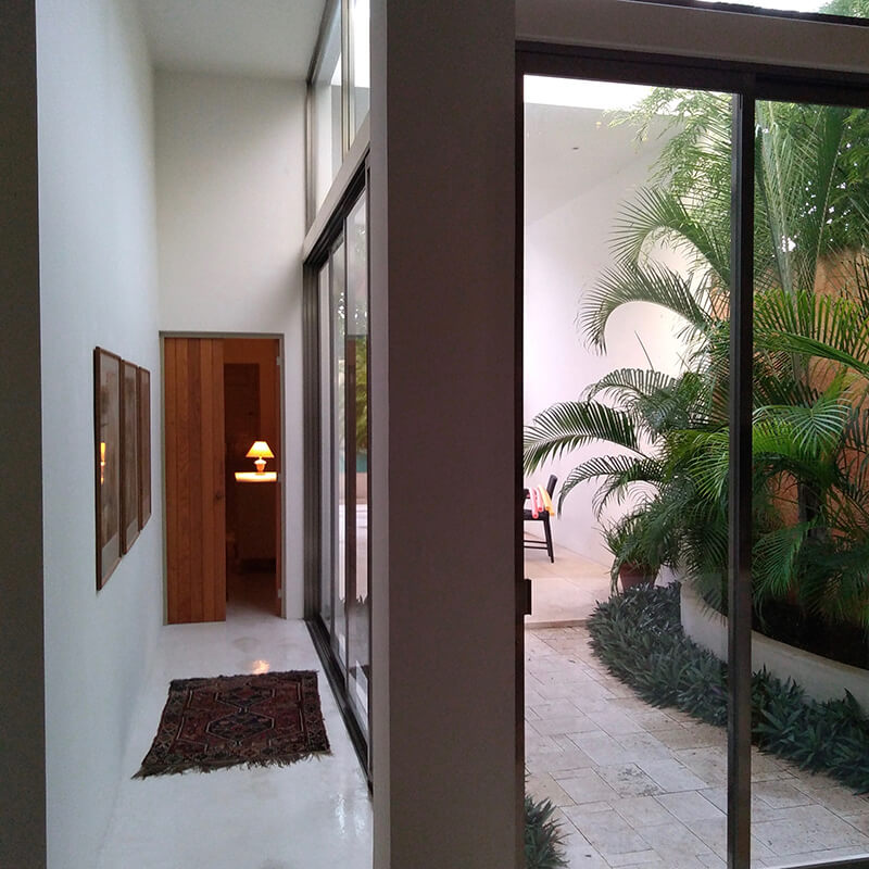
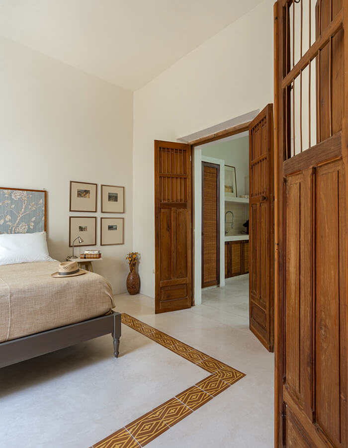
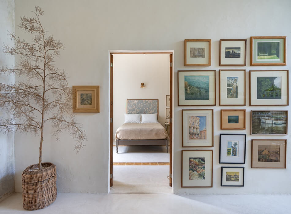
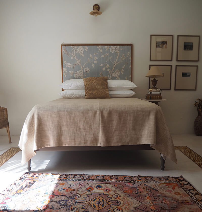
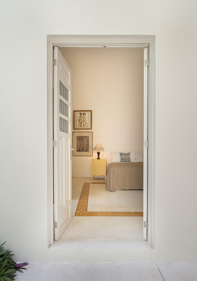
As many of you know by now, I absolutely adore Mexico, and have dreams of moving there one day. When Edward sent us photos of his incredible home in Mexico, I was so excited to share it with you all. It’s stunning, and I love how you have no idea what you’ll find on the other side of the very unassuming front door. My wife and I are from England, and live in the beautiful city of Merida, state capital of the Yucatan in Mexico. Many of the old colonial buildings in the city centre have been renovated, some very grand, some quite modest. Casa Cool (CasaEA64) is an old colonial but with contemporary addition. We used a local architect with their construction people. The house is in the city centre (Barrio of Santa Ana), but as you can see from the garden, quite secluded for a city property. The architects drew up the plans taking into account our requirements.
My wife and I did the decoration using our possessions and stuff acquired from our travels. The plan was not to make a Mexican ¨theme¨ house, but to keep it all rather eclectic. We tried to keep it simple and free of clutter, thinking that empty space is as important as ¨things¨. The idea was to continue with the high ceilings because of the heat in the Yucatan. But we also wanted every space to have its own source of natural light. We wanted to blur the distinction between interior and exterior. Thus the large sliding windows by the kitchen which is the heart of the home. Internal courtyard means plenty of open doors to assist airflow. Bedrooms are air-conditioned, but we rely on natural cross breezes for ventilation in the living spaces. Ceiling fans and air-gaps provide this. Floors are white polished cement with local pasta tiles in diamond pattern to mimic the Moroccan Beni Ouarain. The patterned floor tiles in the studio are original. There are 3 Scottish portraits hung vertically in the entrance. The frames of these were made from the cedar wood of the old original front doors which were beyond saving. Little things like that provide a bit of a link with the history of the house and added a touch of character to the place. This home could not be more perfect and if I get the opportunity to move there one day, I hope to be able to find a home this enchanting. Architect: Taller Estilo Arquitectura Photography: Apertura Arquitectónica


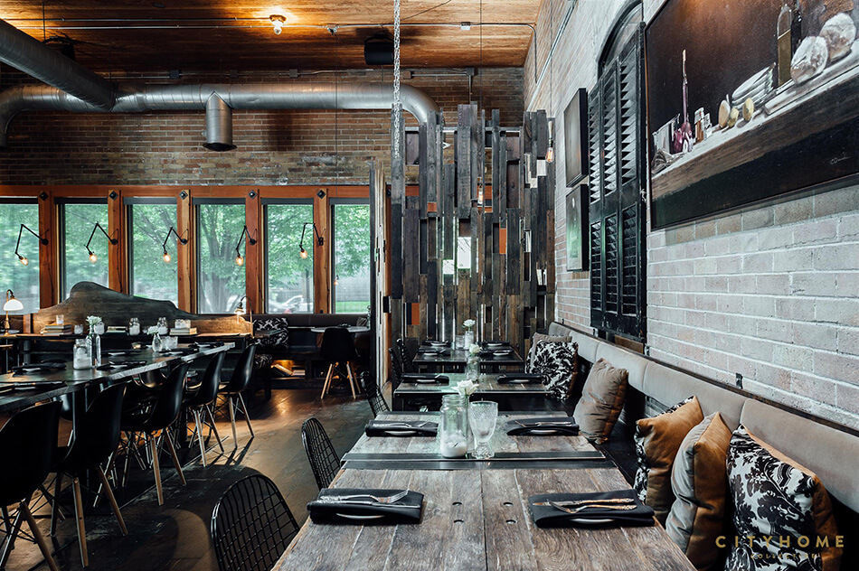
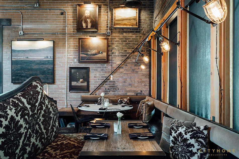
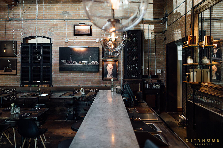
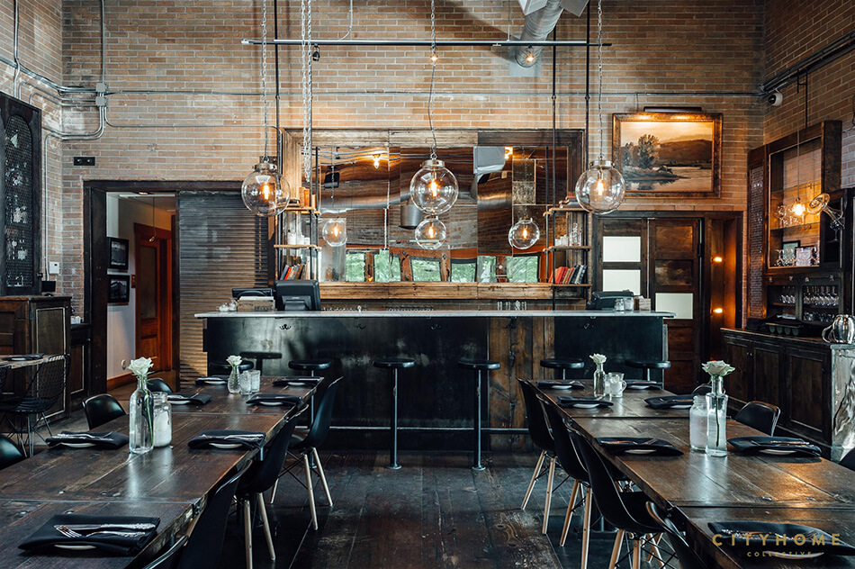
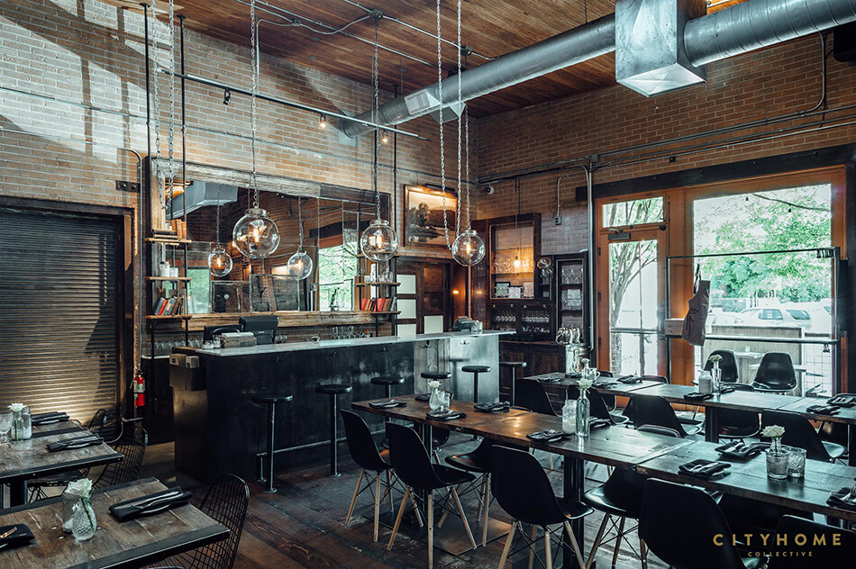
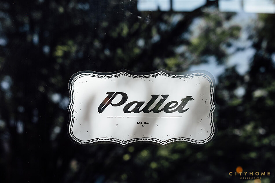
Sunday at a restaurant – Pallet
Posted on Sun, 5 Jul 2020 by KiM
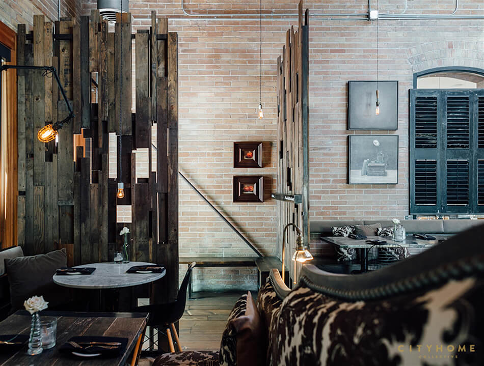
I sometimes feel the industrial interior trend has been completely overdone. But every once in a while a project catches my eye and I realize I still appreciate the moodiness and reusability of this style. Such as Pallet restaurant in Salt Lake City designed a few years ago by the consistently awesome cityhomeCOLLECTIVE. I’d LOVE to enjoy an evening here (post-pandemic of course).


A timeless black and white kitchen
Posted on Tue, 30 Jun 2020 by KiM
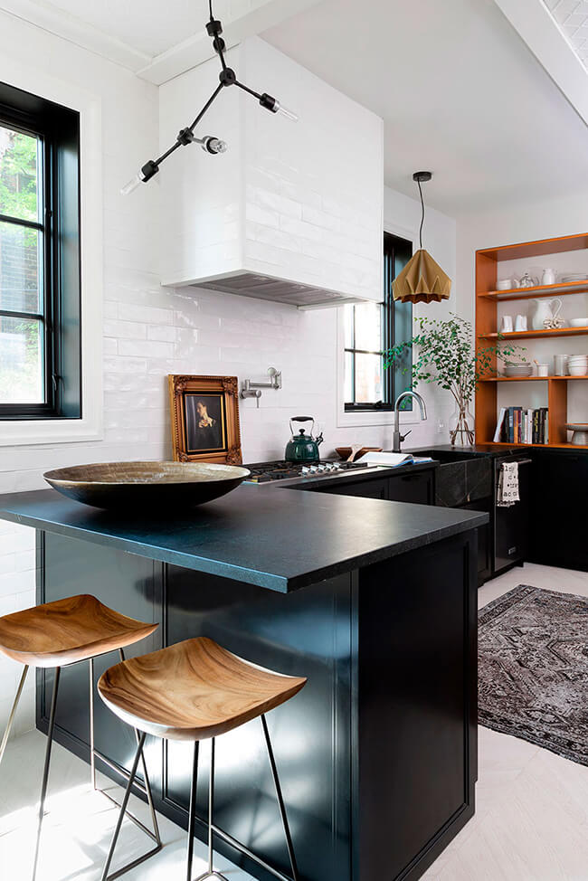
I am head over heels over this kitchen. Every inch if it. The drama of the contrast between black and white, with gold tones added in wood, art and the pendant, the soapstone countertops and integrated sink, the Indonesian rosewood armoire pantry (a Kijiji steal)….and perhaps my favourite touch is the fact that designer Inez Mazzotta (Kelly Hopter Interiors) left the window casings white and painted the rest of the window black. Graphic with a touch of subtlety.
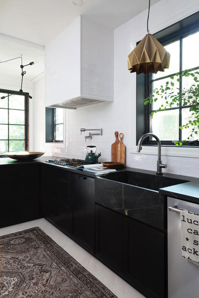
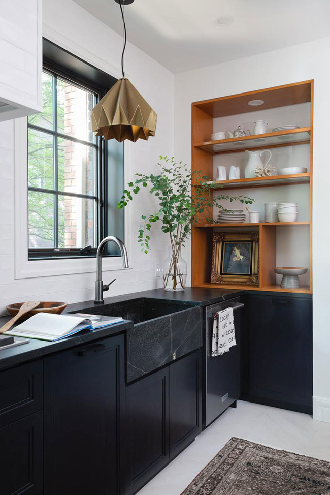
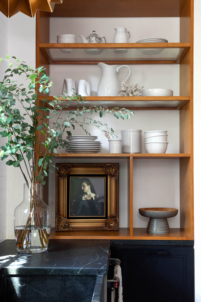
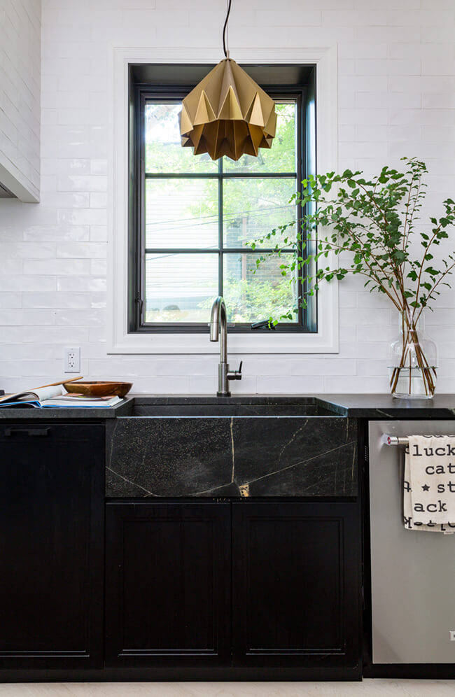
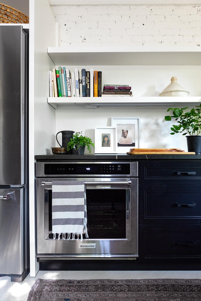
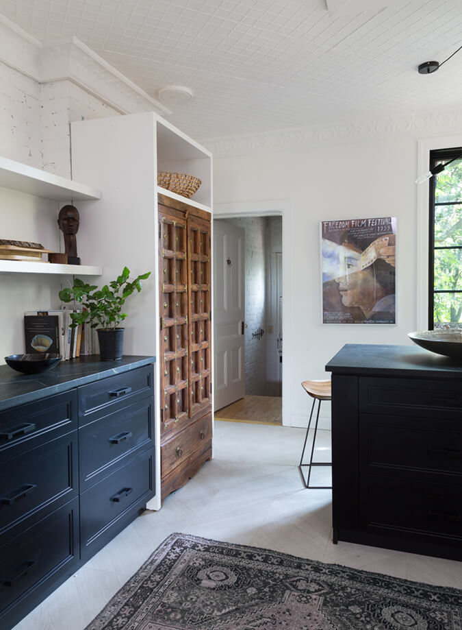
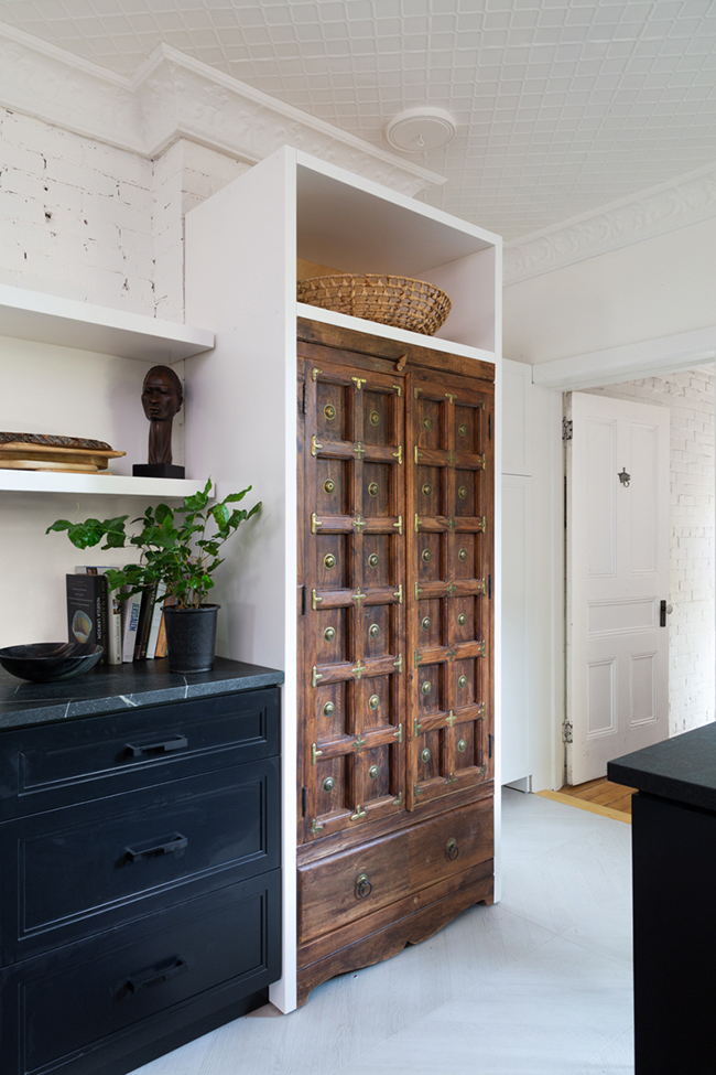
Photography: Robin Stubbert
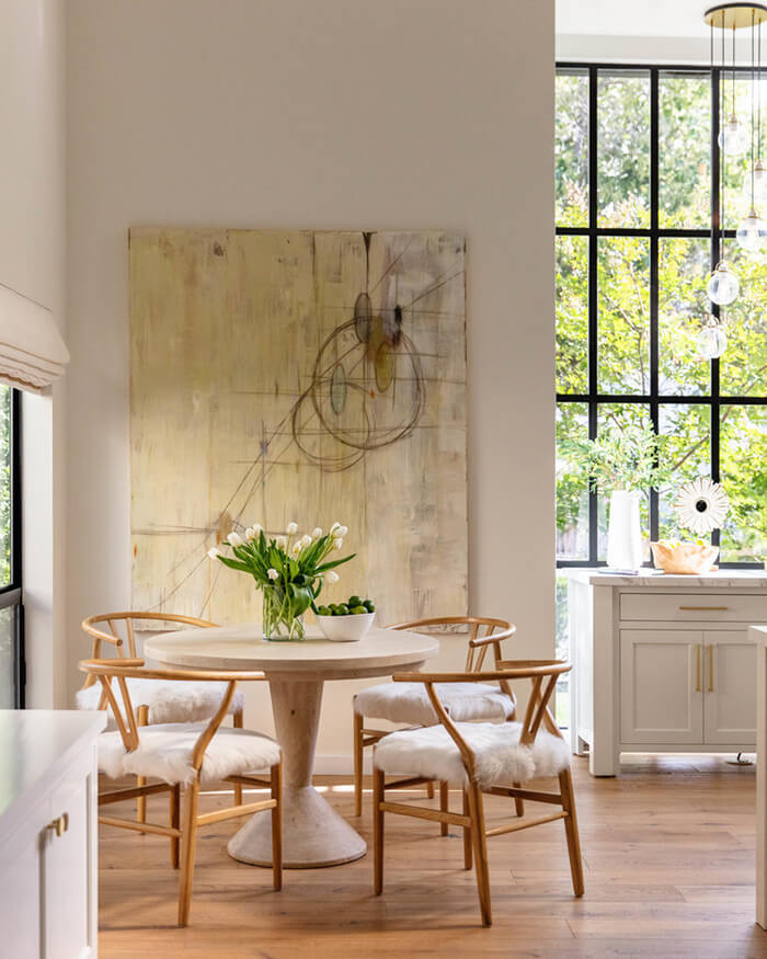
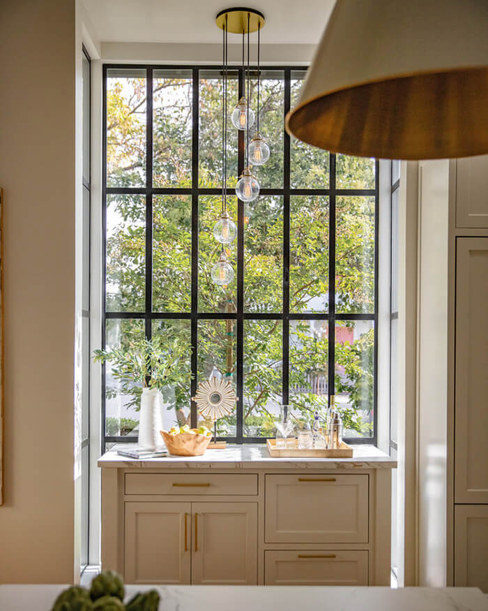
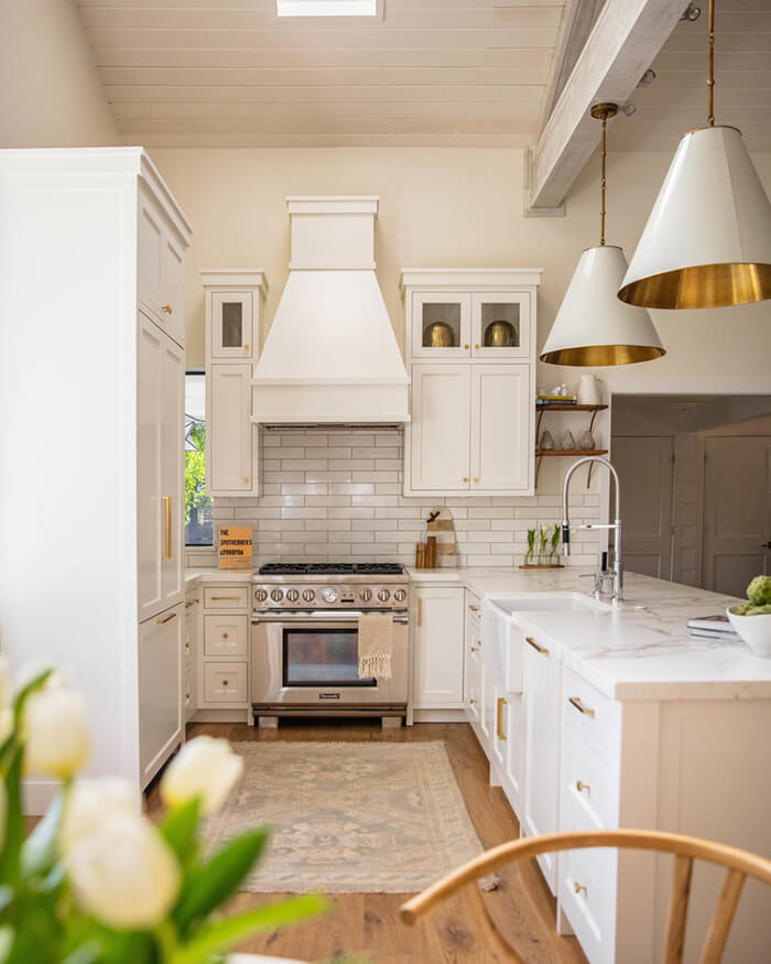
Bright and neutral
Posted on Thu, 4 Jun 2020 by KiM
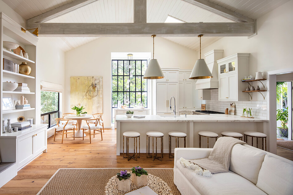
Beamed ceilings, large windows and nothing but neutrals. This home is so bright and airy and soothing. Designed by Heaton+Williams.
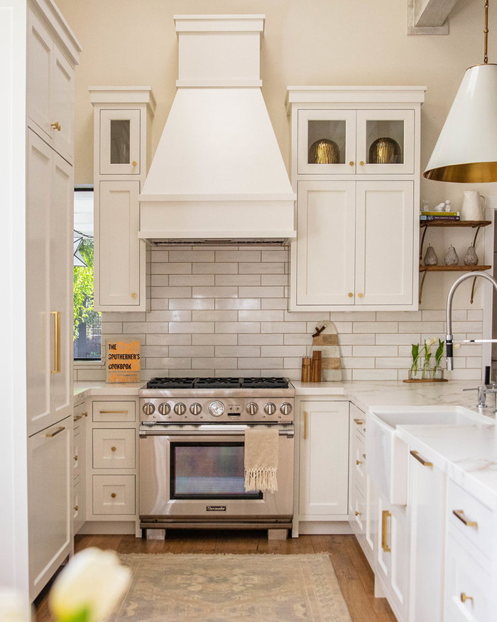
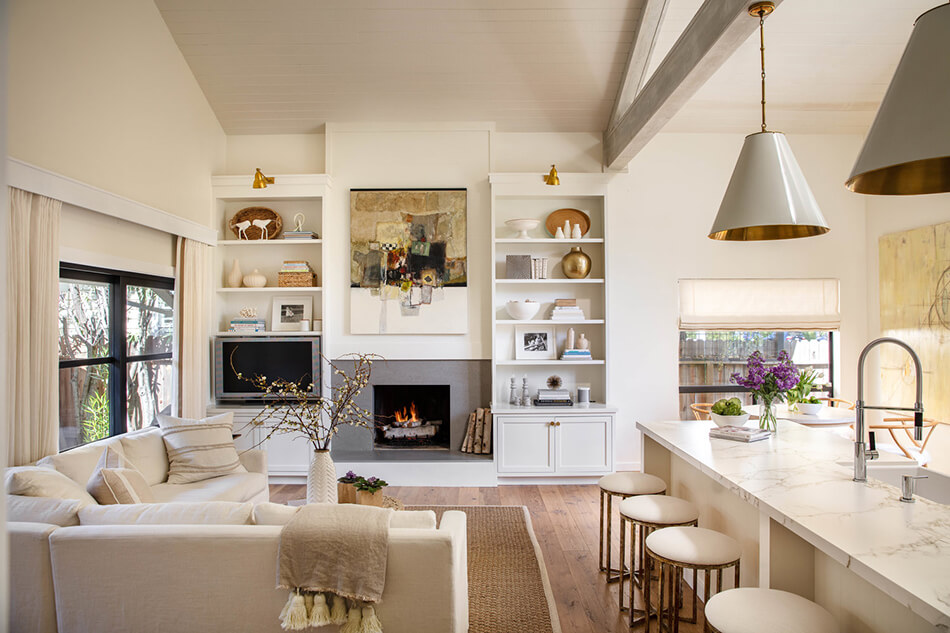
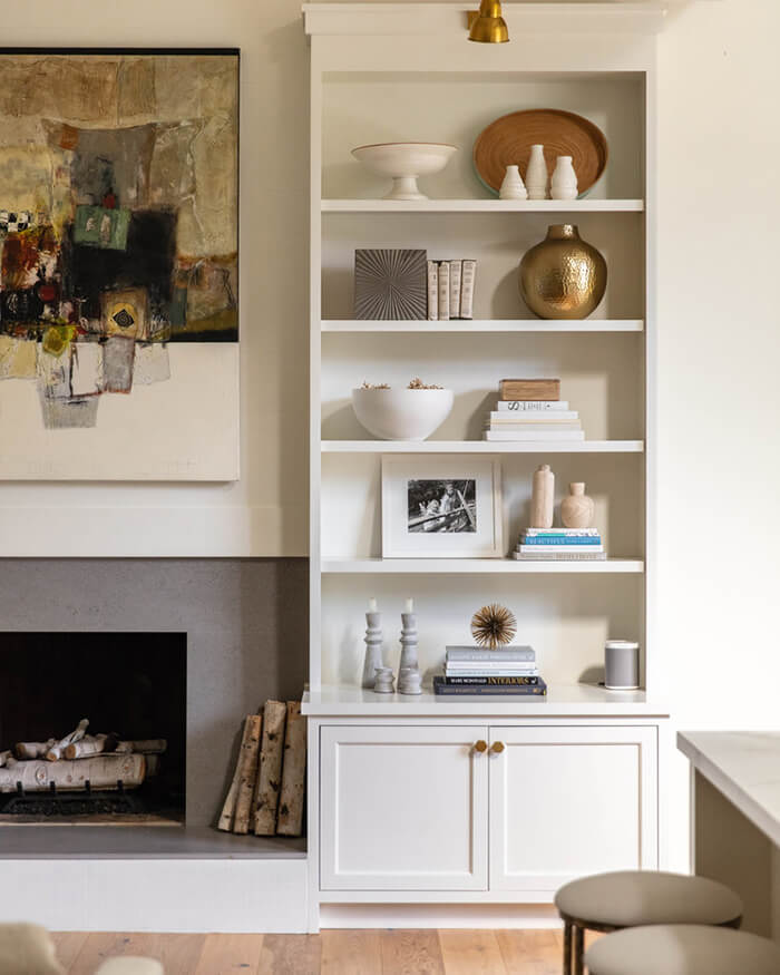
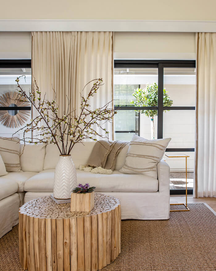
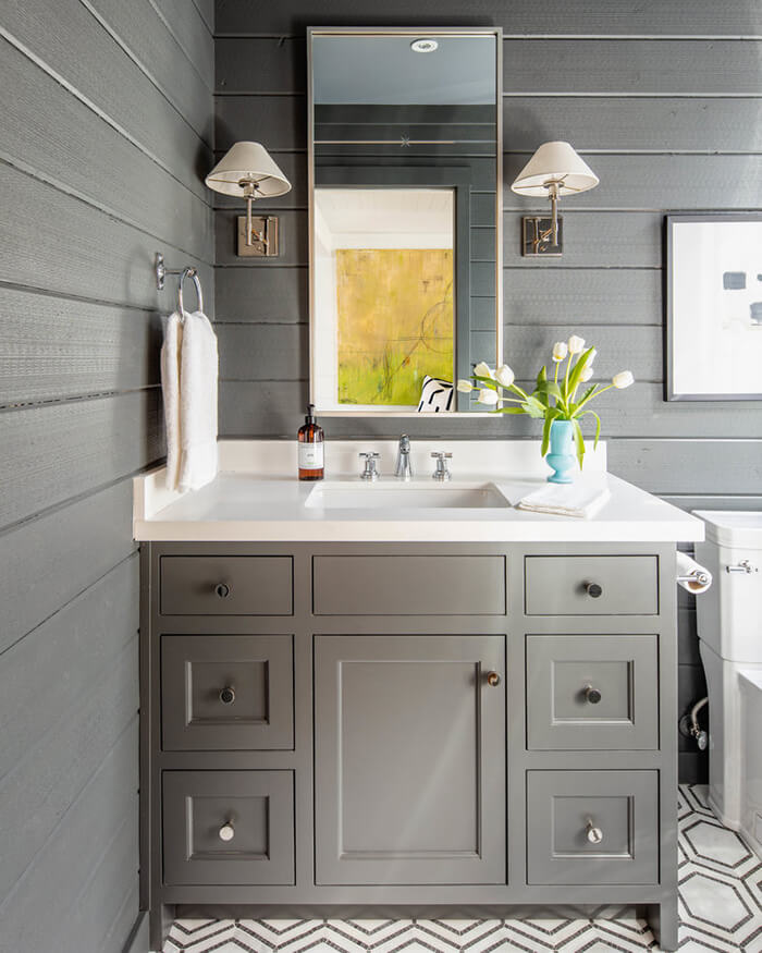
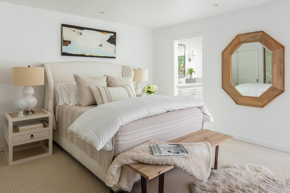
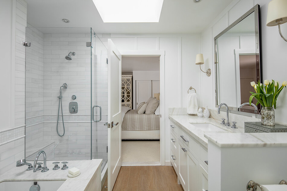
Photos: Thomas Kuoh

