Displaying posts labeled "Mid-century"
The Rooftop bar at the Quarryman’s Hotel in NSW, Australia
Posted on Sun, 28 Jun 2020 by KiM
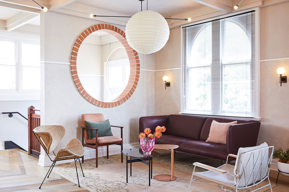
Killing Matt Woods was inspired by the mid century modernism and the gardens and architecture of Palm Springs when designing The Rooftop bar at the Quarryman’s Hotel in Pyrmont, NSW, Australia. “The Rooftop” aims to attract the diverse crowds which populate the many creative offices & aims to attract the diverse crowds which populate the many creative offices & studio spaces within the Pyrmont peninsula, & hopes to give this City fringe suburbs occupants a genuine alternative environment from which to dance the night away. The circles that repeat throughout the space and the reclaimed multi-coloured timber floor make this eye-catching and really special.
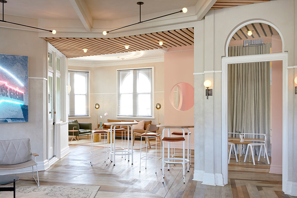
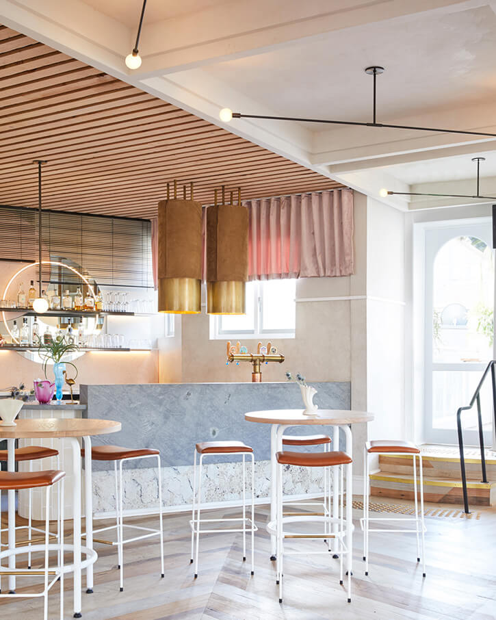
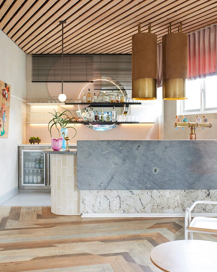
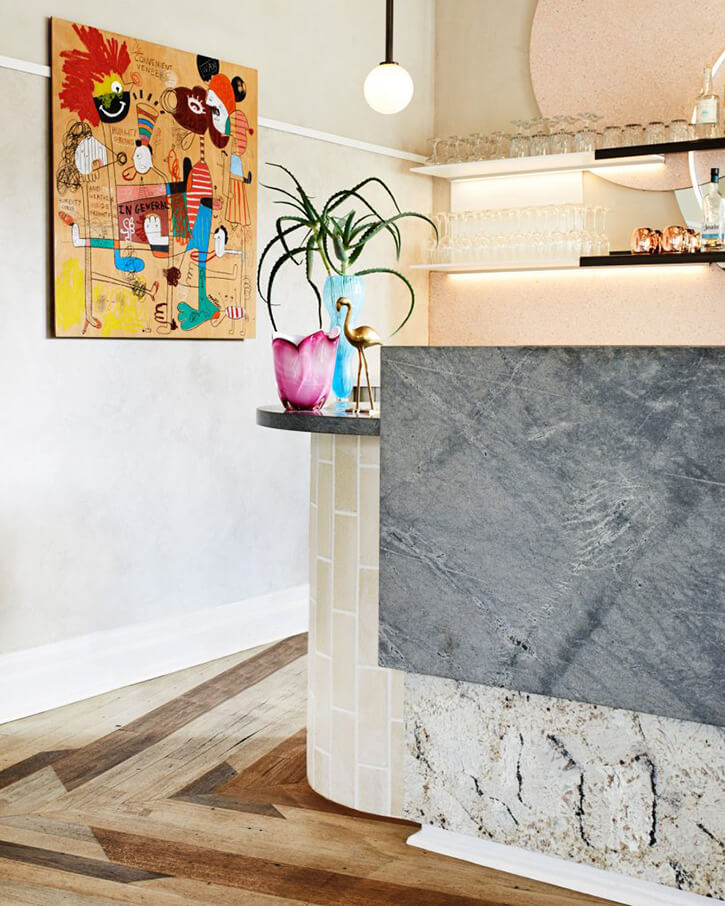
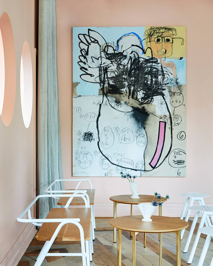
Photography: Dave Wheeler
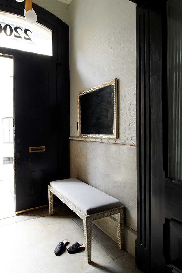
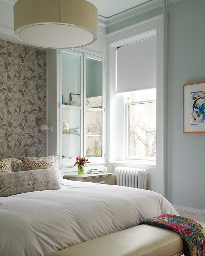
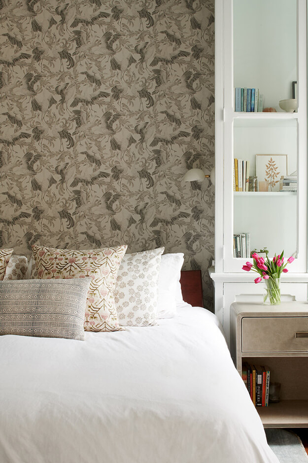
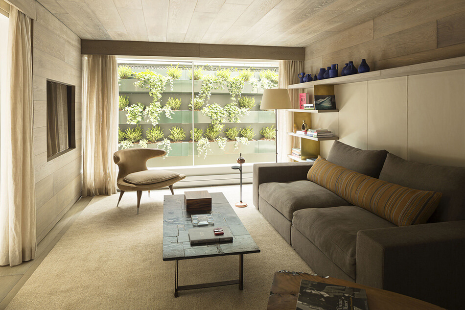
The sea captain’s house
Posted on Tue, 23 Jun 2020 by midcenturyjo

The renovation of a 19th Century Bellport Long Island sea captain’s house by C.S. Valentin saw the marriage of the house’s beautifully uncomplicated bones and a mid century aesthetic. It’s been called “Mid Century Shaker” even “Flintstone Chic”. I call it simply sublime.
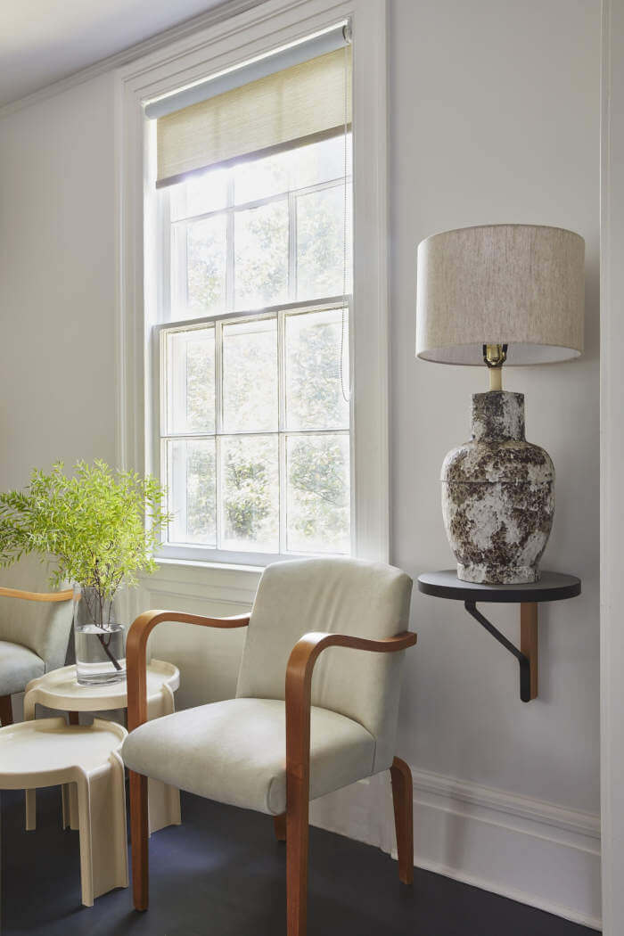
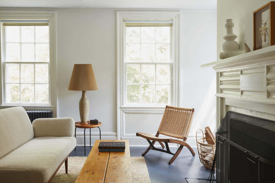
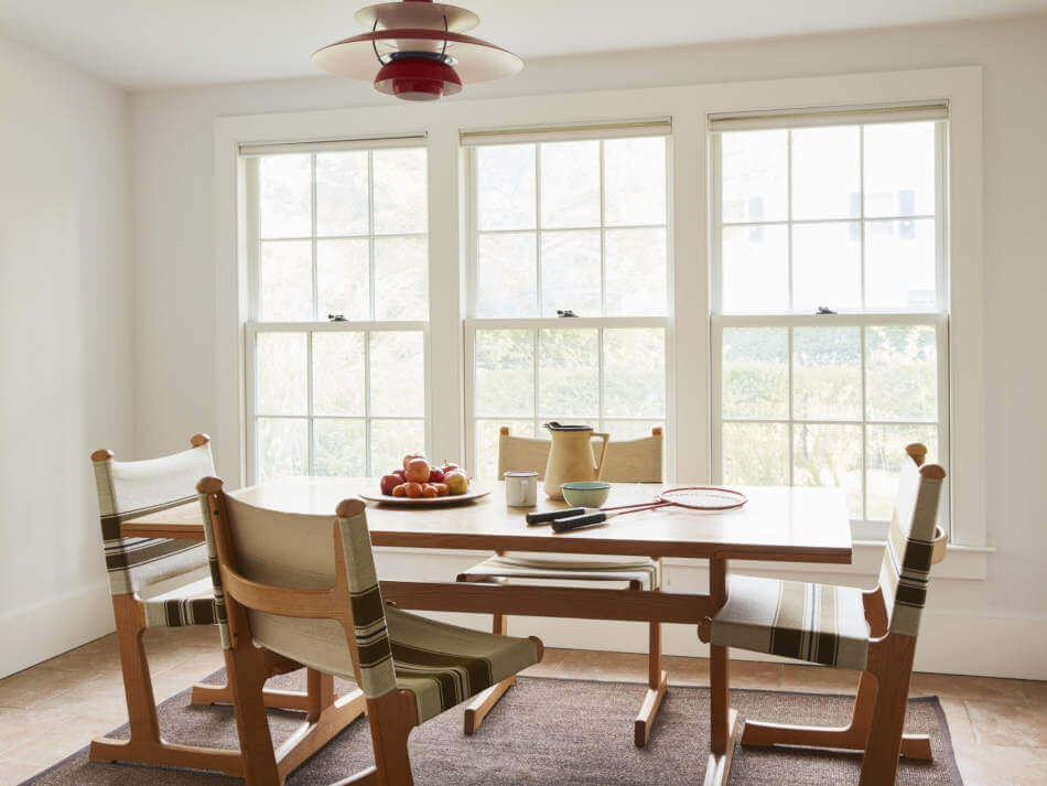
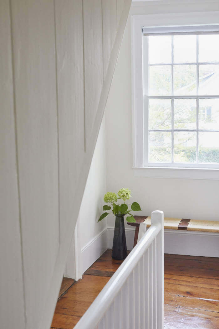
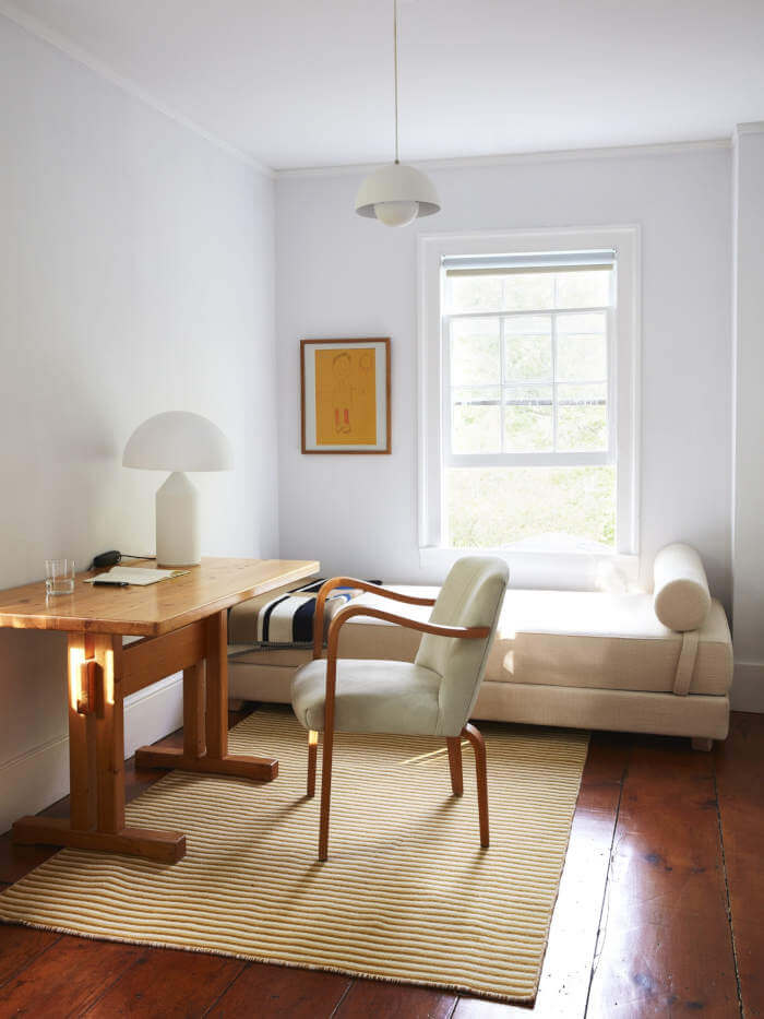


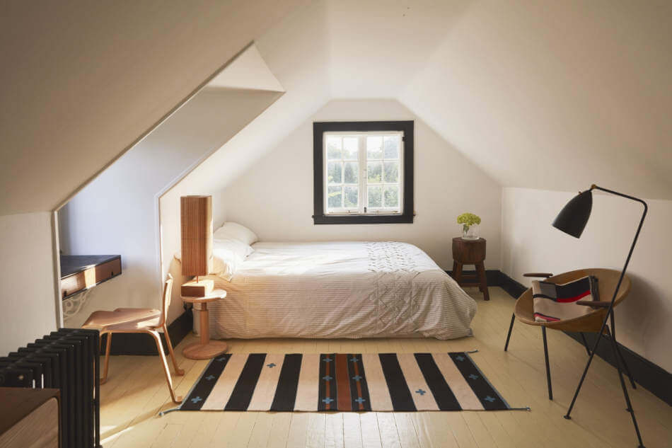
Photography by Jonathan Hökklo
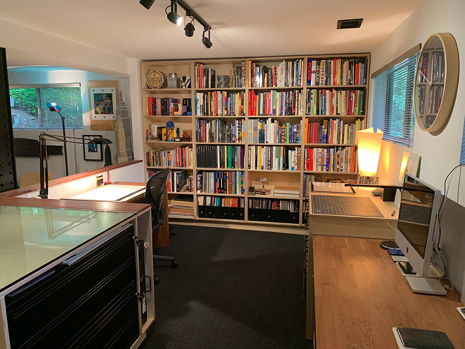
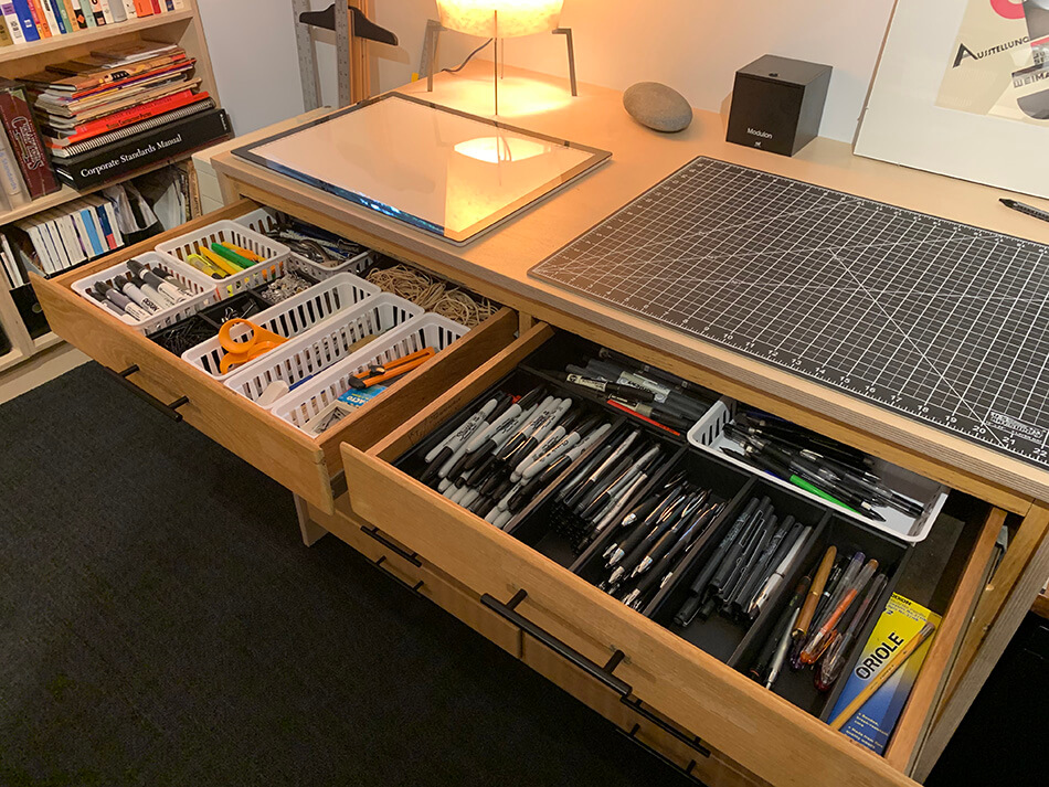
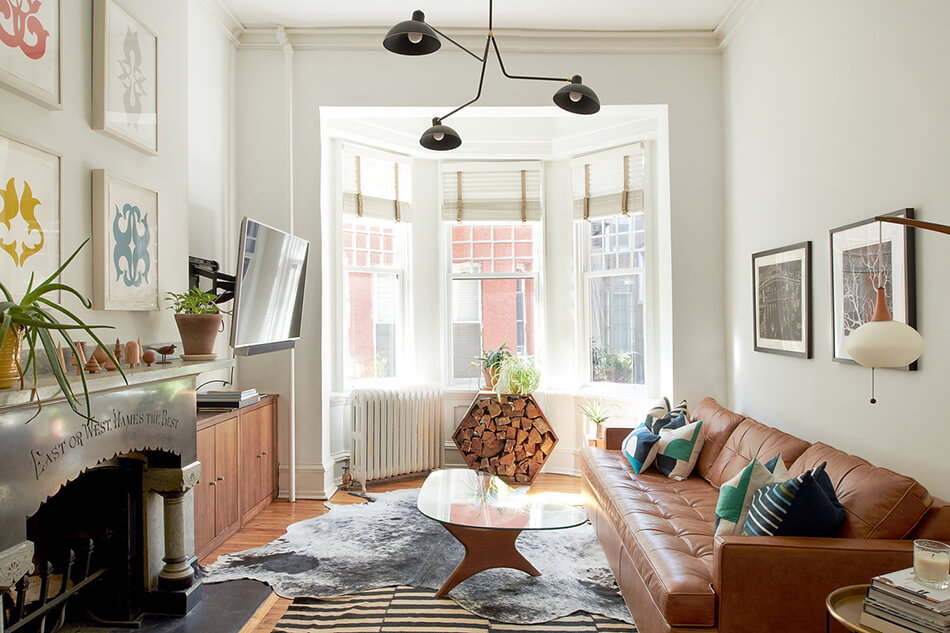
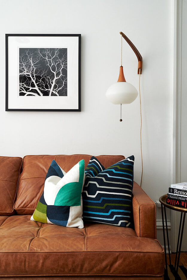
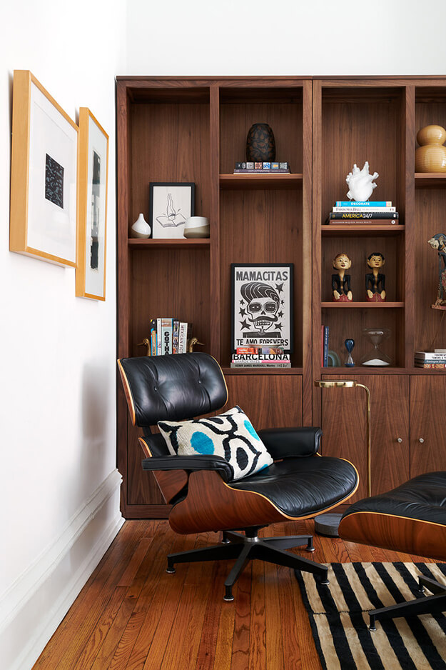
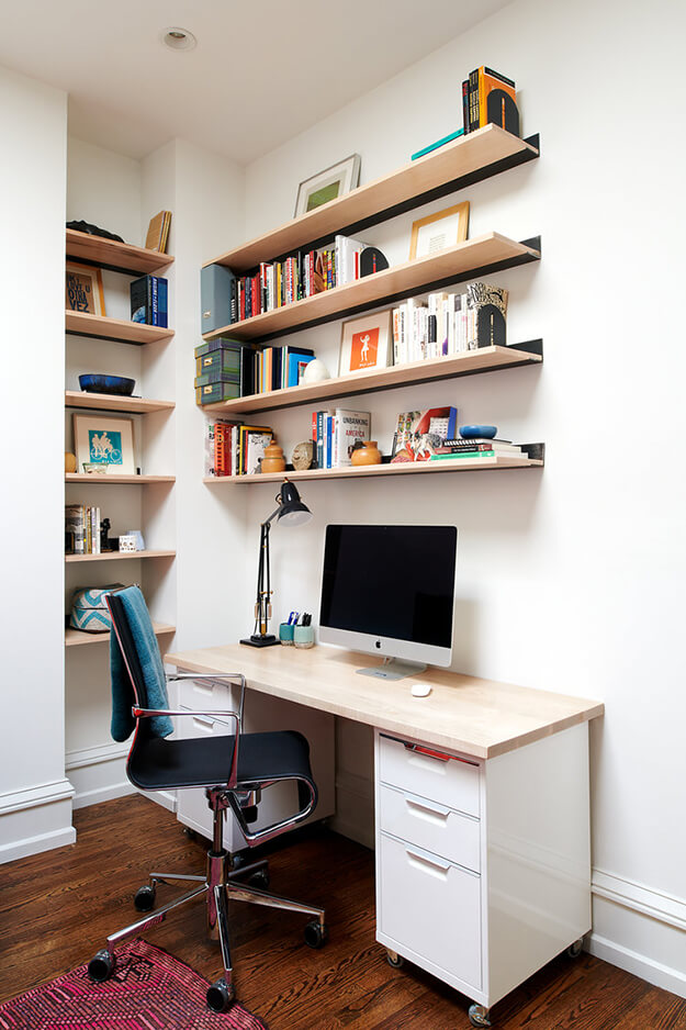
Reader’s home – Greg’s pandemic-driven home office remodel
Posted on Tue, 16 Jun 2020 by KiM
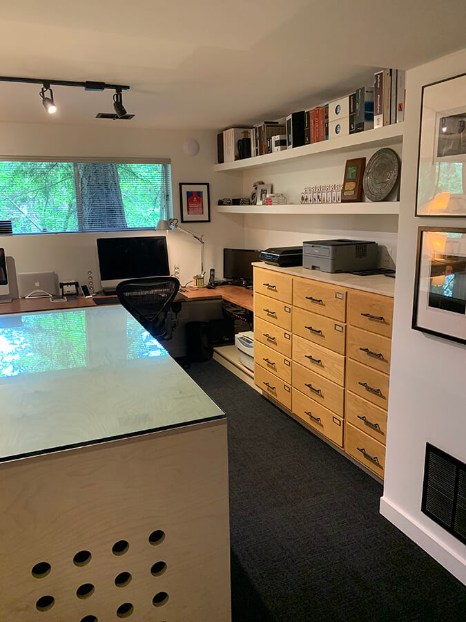
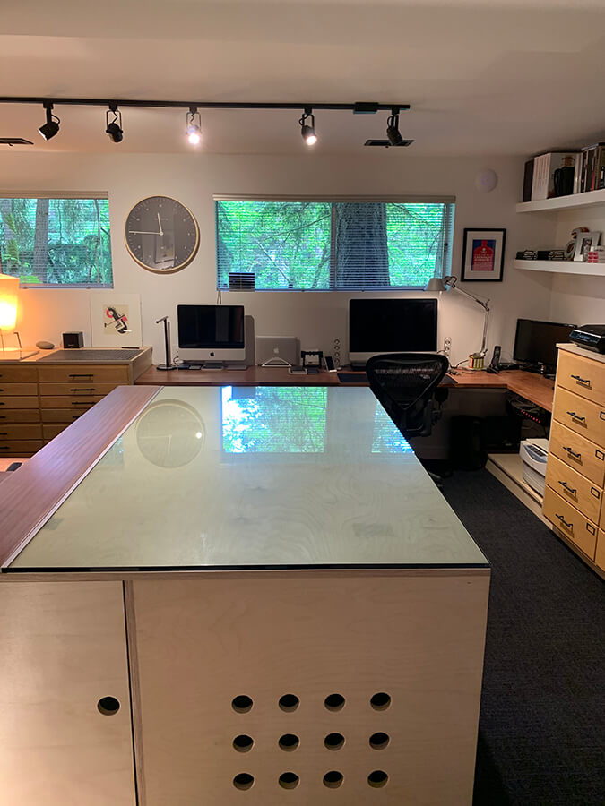
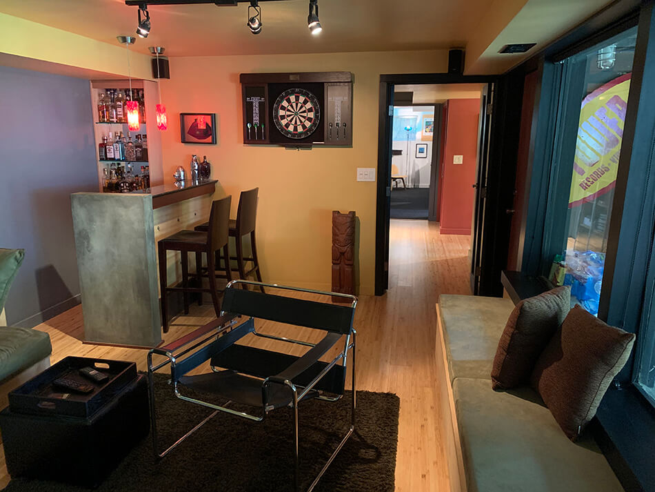
I have been working from home for my day job since day 1 of the pandemic lockdown (mid March). One day last week my boss asked all us leads on the team to send photos around of us in our workspaces. I was horrified at the tiny makeshift workspaces my colleagues had created for themselves. Meanwhile here I sit at my 8′ long former dining table on a Herman Miller office chair surrounded my about 20 plants, stacks of design books and several cats. So it really made my day when Greg Walters, who runs a graphic design company in Seattle, emailed with some photos of his pandemic-driven home office remodel. I am in awe of his organization, insanely good storage units and other cool stuff he came up with. All of this in the basement of his 1962 mid century post and beam home. I’d never go back to the office with this setup!!!
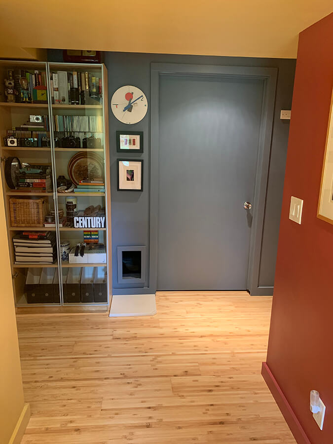
The hallway image between both rooms has the door to our utility room that houses the furnace and water heater along with our washer and dryer and a slop sink. The rectangular opening near the floor is the entrance to our cat’s litterbox now located in the utility room so we have finally gotten that out of sight.
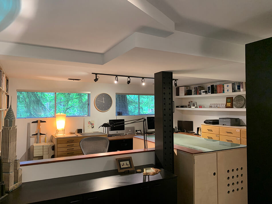
The cabinet island I created out of Baltic birch plywood is topped with my former glass conference table. The wood cabinets were surplus from a lab remodel at the University of Washington and were purchased for $25 each.
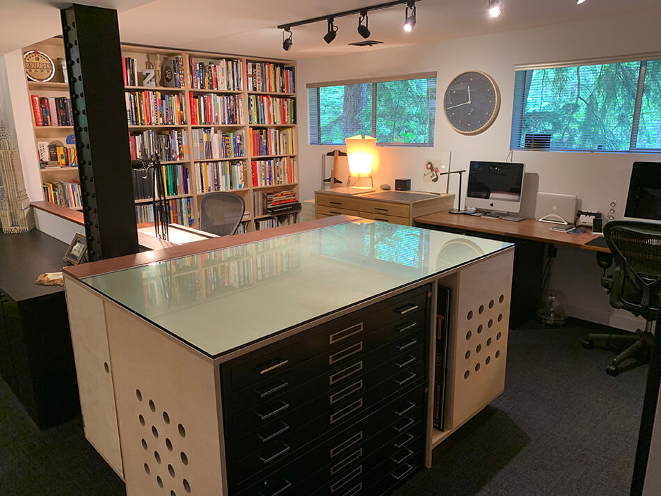
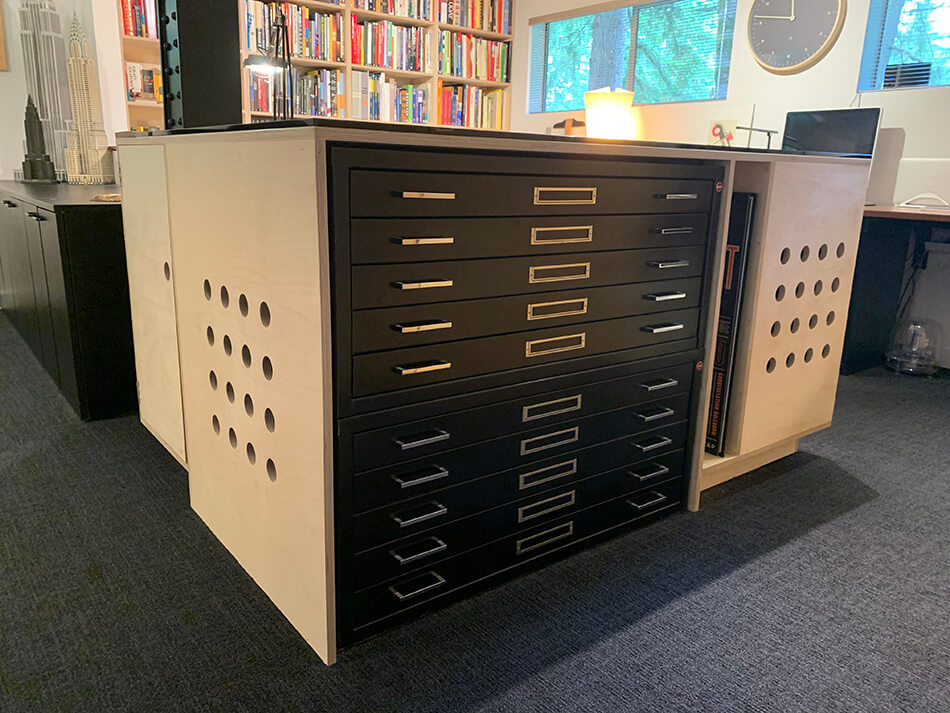
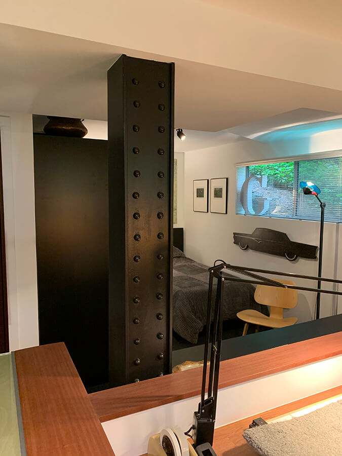
The fake steel girder/post was faced in mdf and I ordered a bunch of wood half rounds to create the fake rivets.
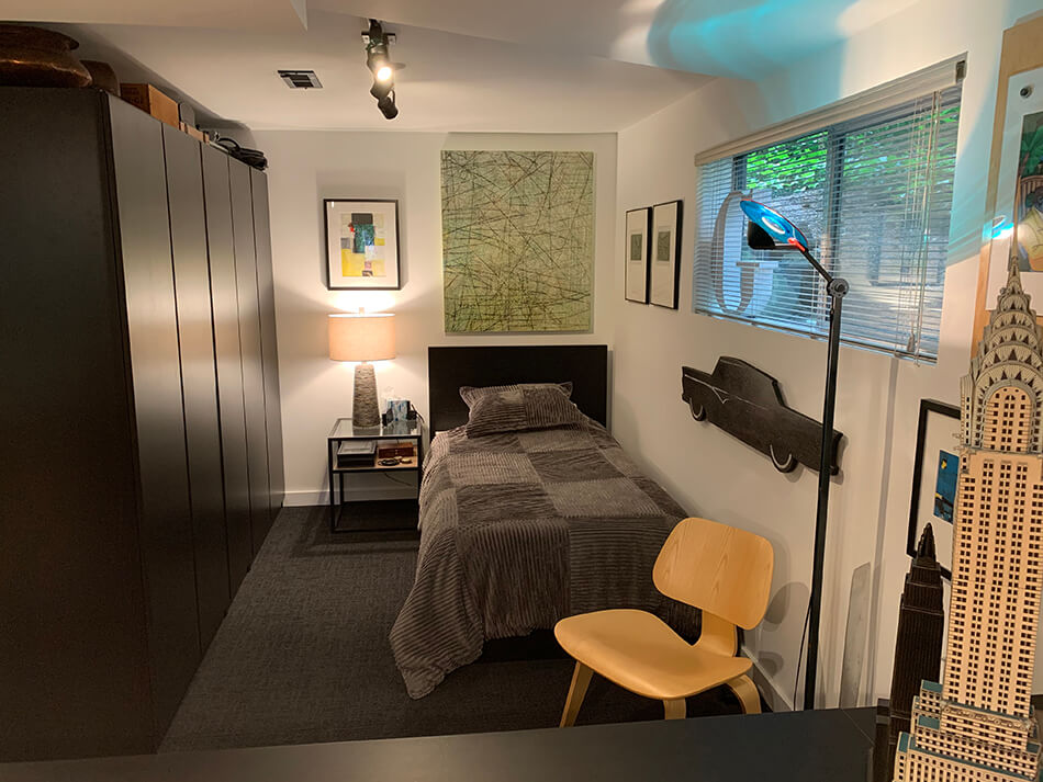
I eliminated a small conference room area and replaced it with a guest bedroom area where it used to be. (Perfect for afternoon power naps!!!)
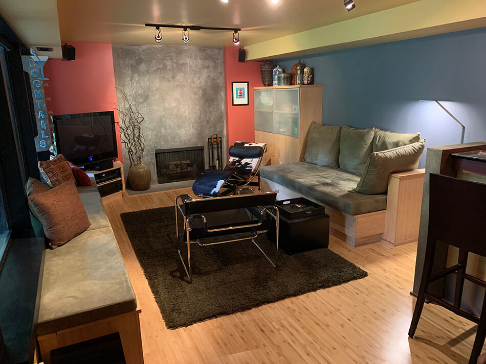
The other room is on the other side of the basement and used to have walls of really cheap sheet paneling and green shag carpeting that was replaced with bamboo flooring. The cabinets in that room are all bamboo ¾” plywood. I call the other room my man cave since my wife has her own workspace upstairs and we seem to have created our own fiefdom on each floor since we are empty nesters and now have the space we both wanted. No kids in the house really has allowed us to customize what both of us have always wanted but never had the time or space to really get done.
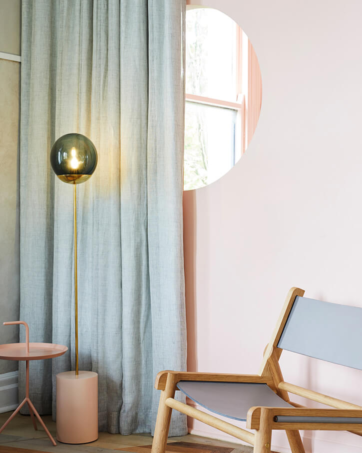
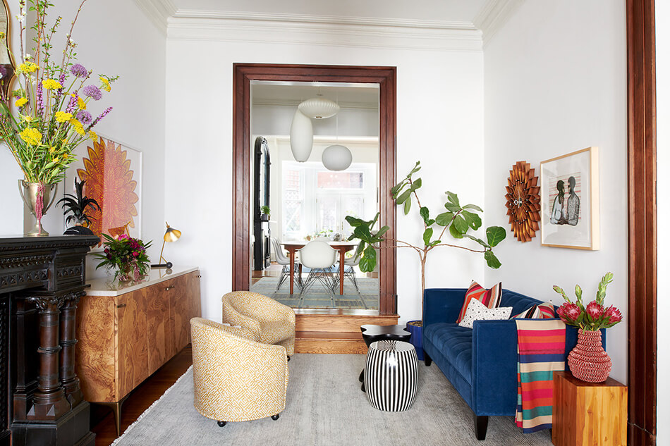
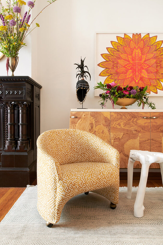
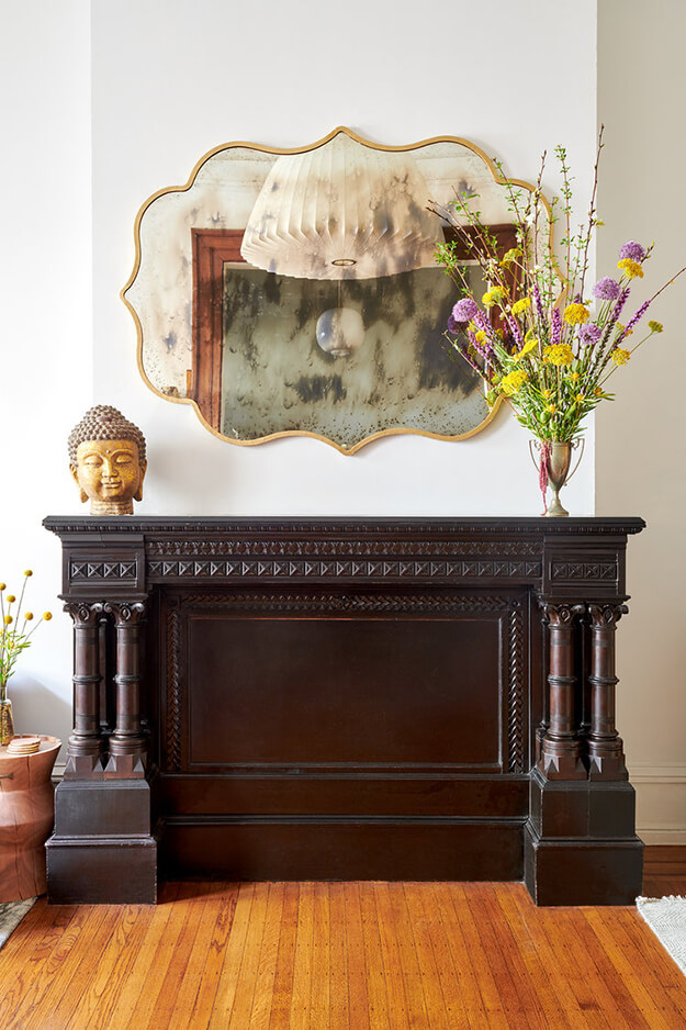
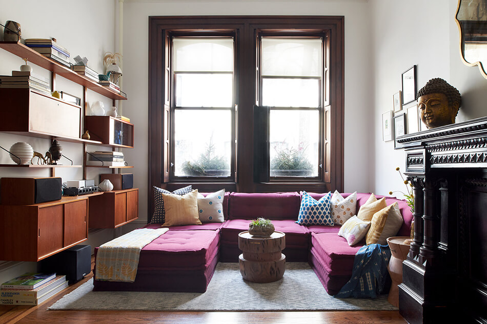
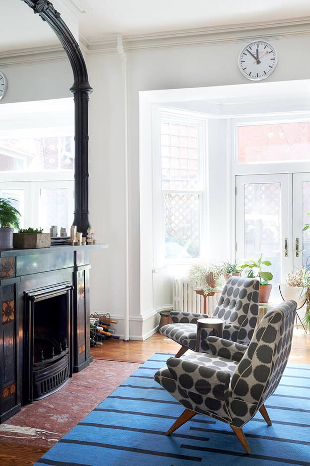
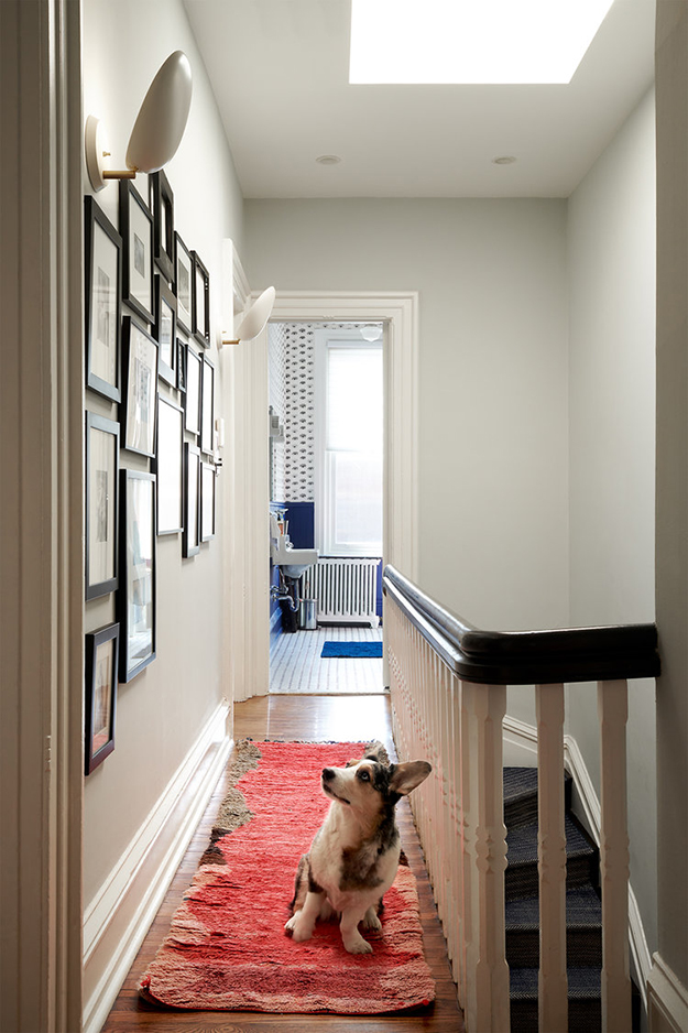
A Victorian with a modern flair
Posted on Wed, 29 Apr 2020 by KiM
When a Victorian home in Pennsylvania gets a modernized update, but maintains its original features that makes it special, you know it’s going to be a winner. Michelle Gage livened the heck out of this home with some bold colour and artwork, mid-century classic furniture and lighting and the bonus of an adorable dog. (Photos: Rebecca McAlpin)

OM Townhouse
Posted on Wed, 18 Mar 2020 by KiM
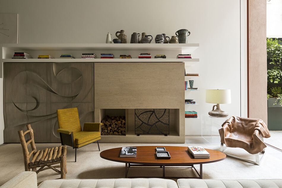
More neutral and modern from Arthur Casas in this 375 m2 New York townhouse. In an elegant prewar building standing five stories tall, just a few steps from central park, this ground floor apartment called for extensive renovations. The aim of the design was to illuminate the interiors and re-create environments, eliminating dividers and lending a visual unity to the apartment. We imagined the living room, with its 6 m ceilings, as the central space in the house. It connects the apartment’s three levels via a staircase that goes from the basement—transformed into a guest suite and laundry area—to the walkway on the upper level, which leads to the children’s bedroom. The garden is separated from the living room by large glass doors that slide into the walls, integrating interior and exterior spaces. Sober, neutral tones; simple gestures; integrated spaces; and furnishings that cover much of the best in 20th-century american design—with works by icons such as george nakashima, peter lane, and edward wormley, among others—are all key points in the design.
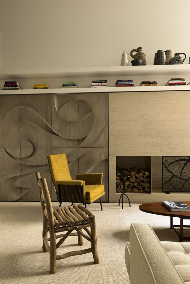
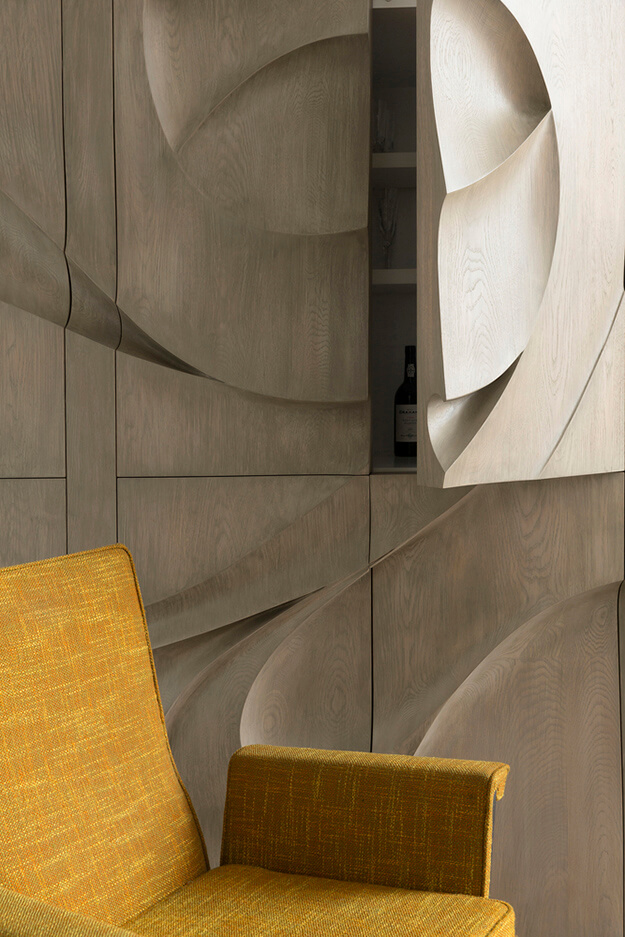
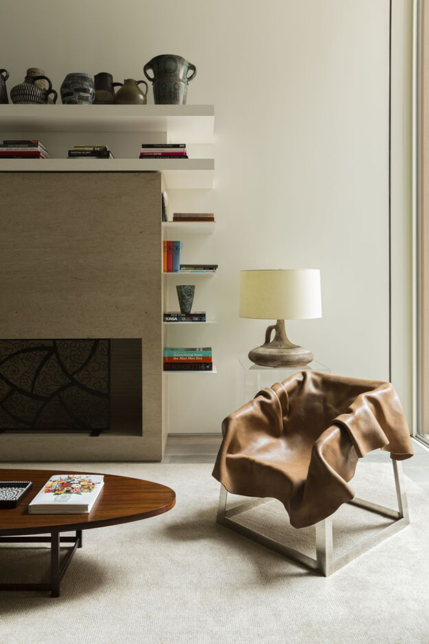
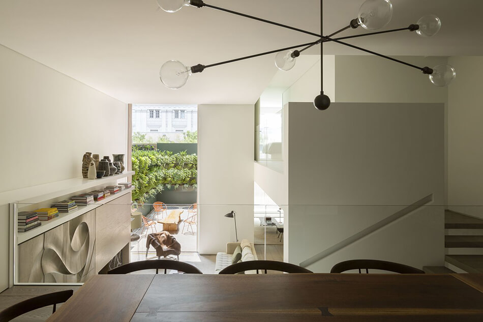
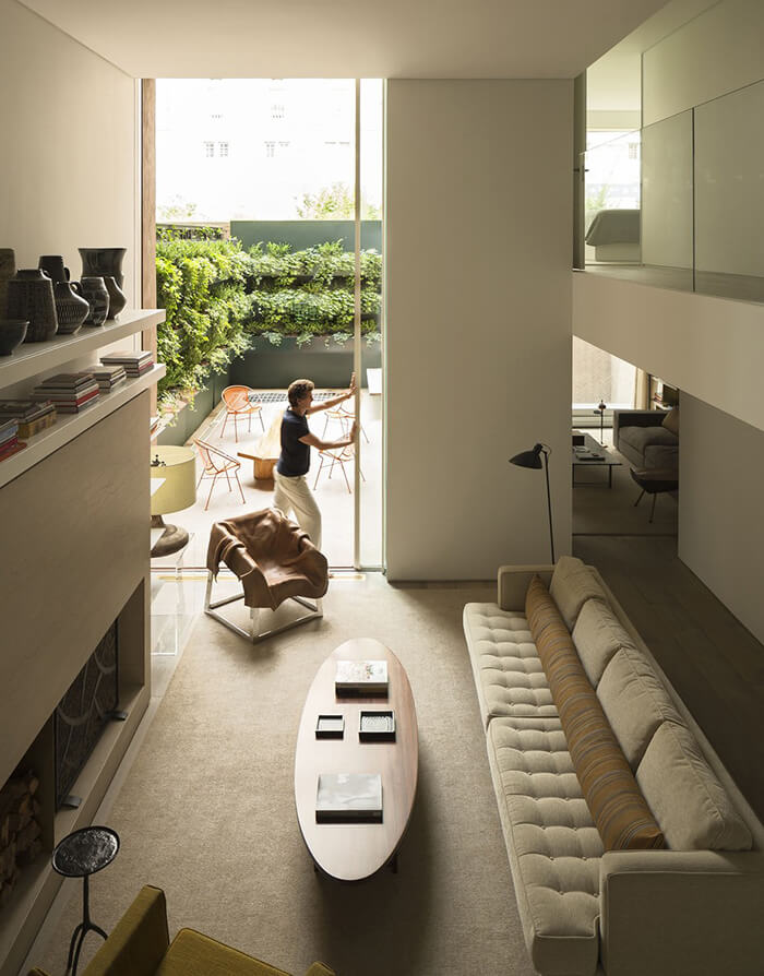
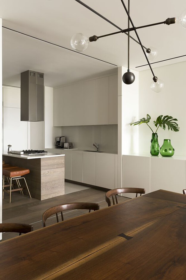
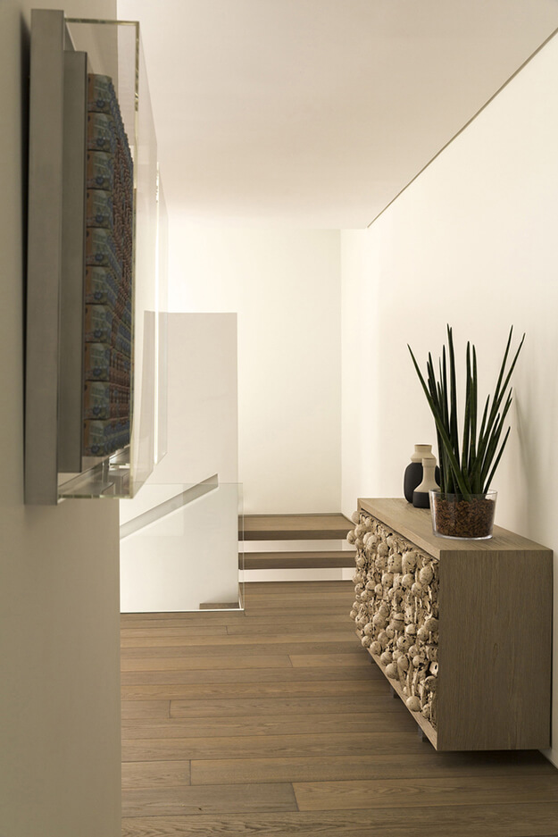
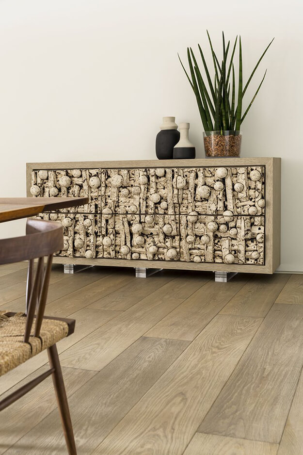
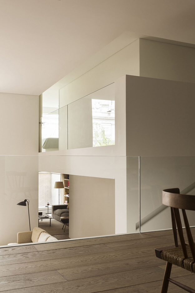
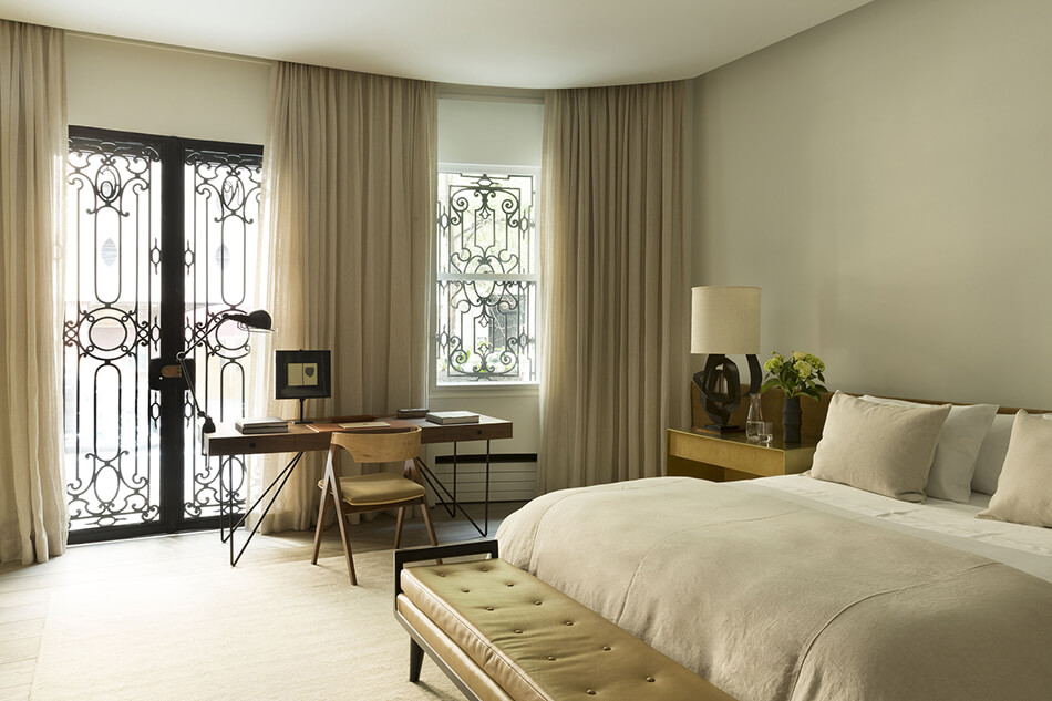
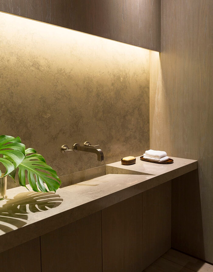
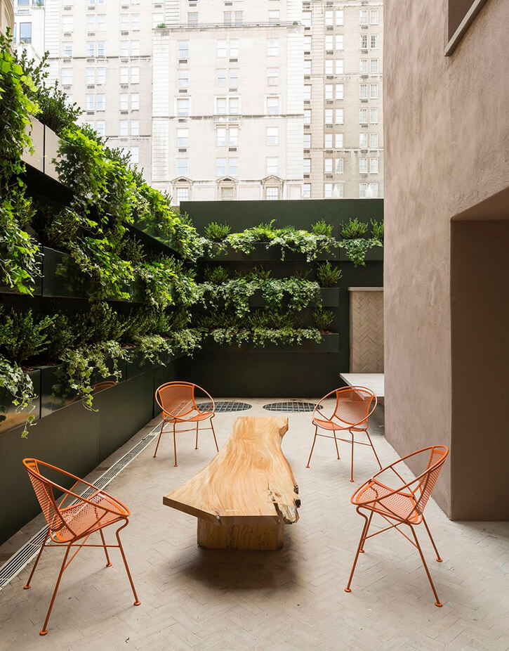
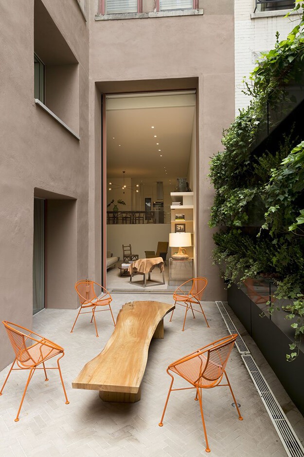
Photos: Ricardo Labougle

