Displaying posts labeled "Modern"
80s apartment redo
Posted on Thu, 12 Dec 2013 by midcenturyjo
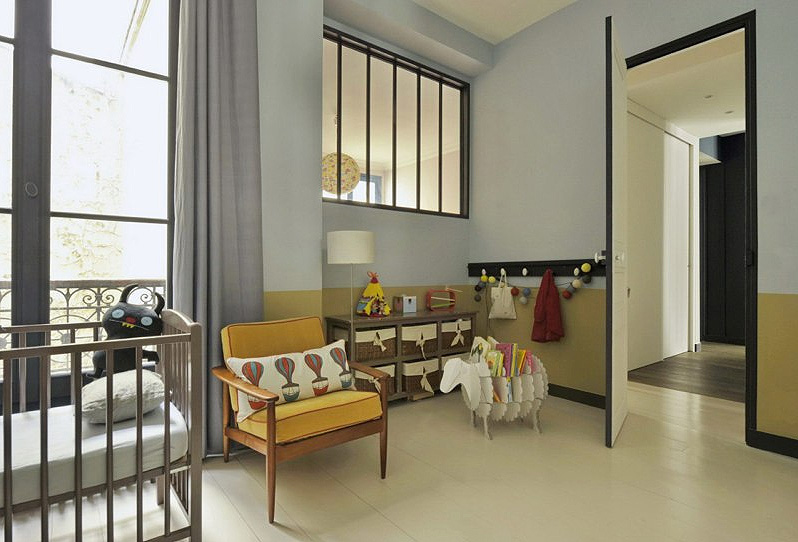
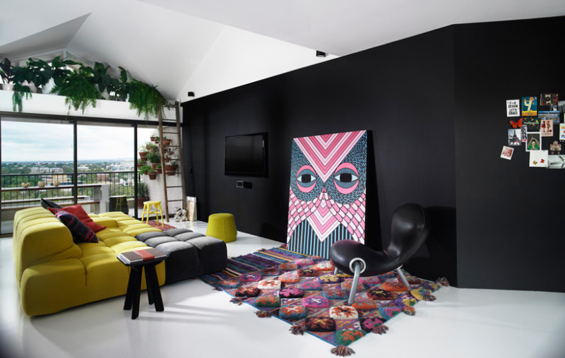
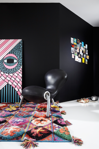
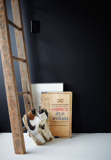
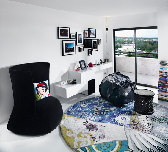
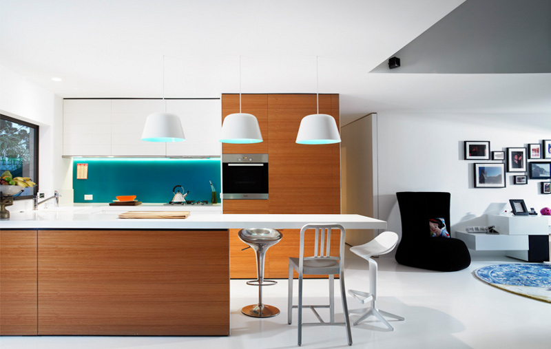
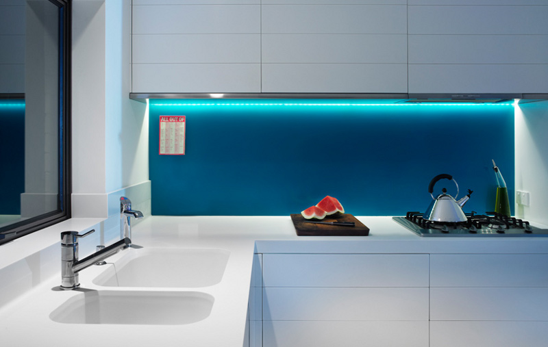
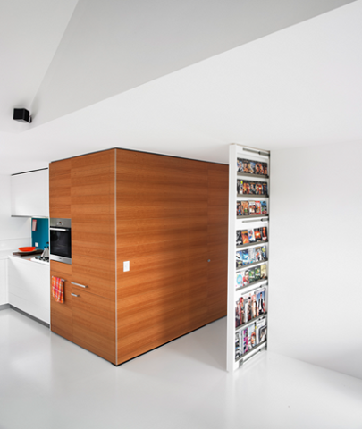
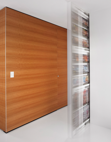
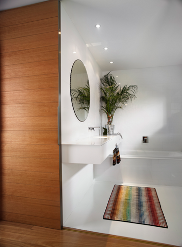
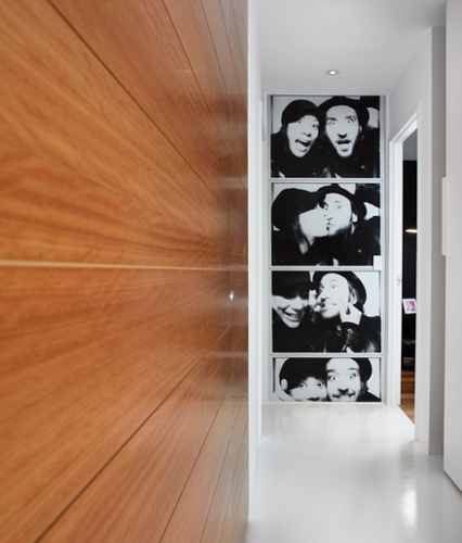
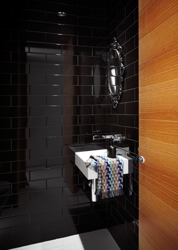
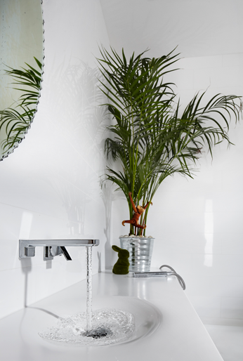
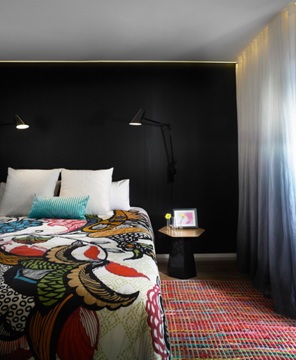
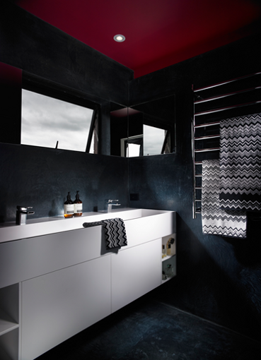
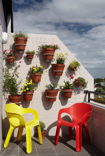
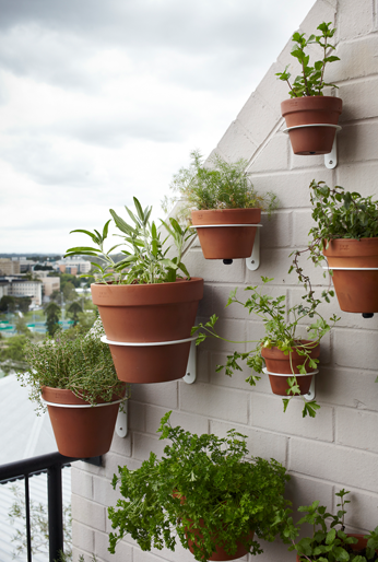
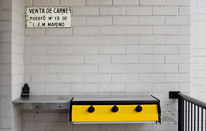
If you live in Australia you know these apartments. Tired old brick exteriors with tired old plasterboard interiors. Wall to wall carpet with a collection of interesting stains, swirling, dripping plaster slapped onto the ceiling and aluminium sliding doors with safety stickers. If you were lucky and lived on the top floor (always no more than four floors or the developer would have to spring for a lift) the “architect” may have thrown in a “cathedral ceiling and clerestory window”. No redeeming features except the size of the rooms. Say what you like about those old apartments they at least had a little more room than today’s incarnations. Now take an 80s apartment in a wonderful inner city location (Brisbane readers should be able to tell by the bridge and the tennis courts across the river) and drag it kicking and screaming into the 21st century and you have a hipster’s pad with room for baby and barbie. Very cool. By Alexander Lotersztain and derlot.
<
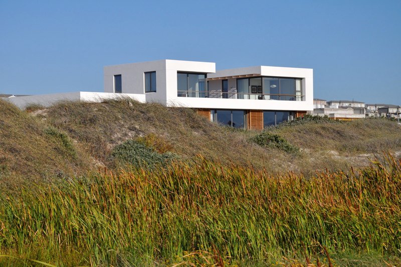
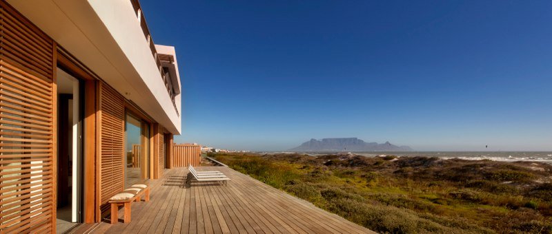
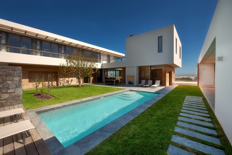
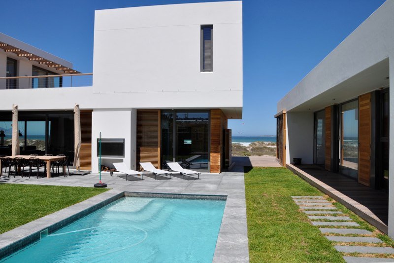
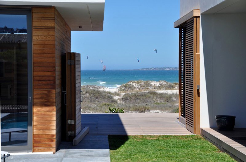
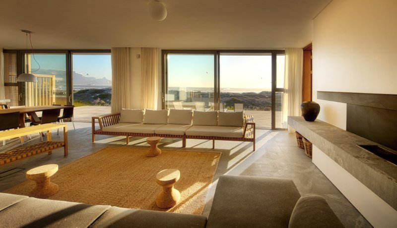
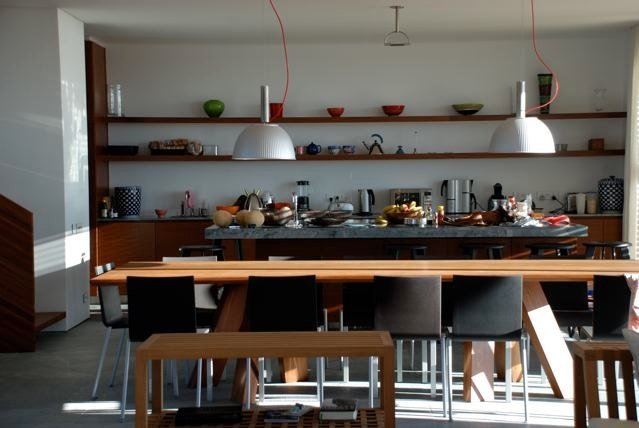
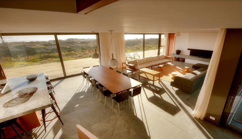
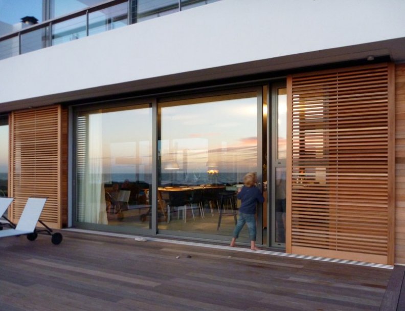
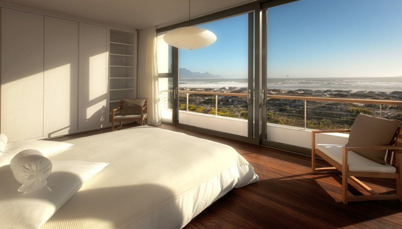
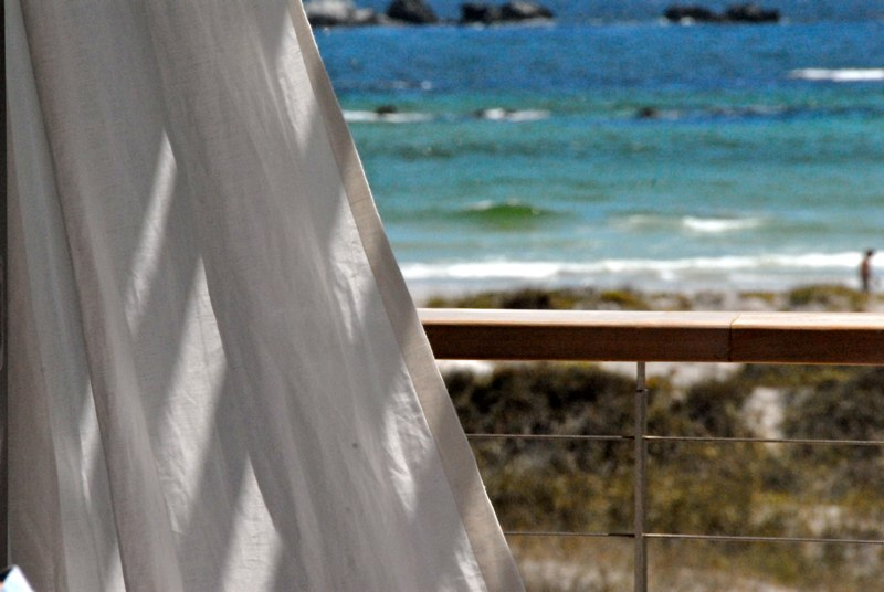
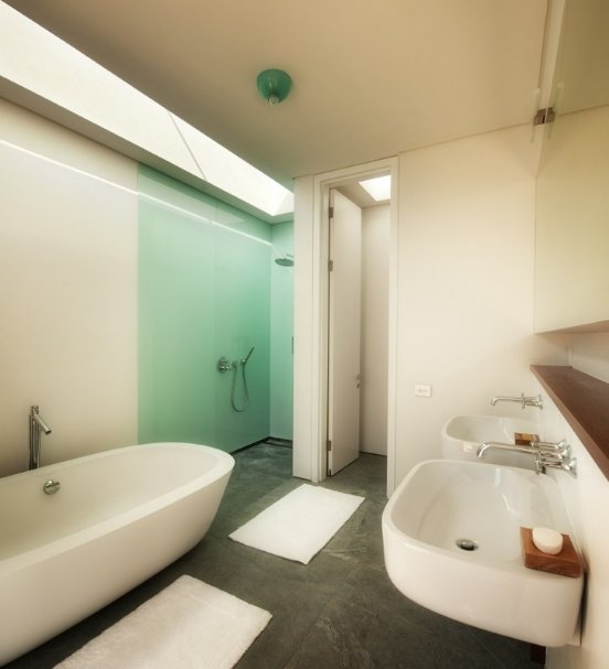
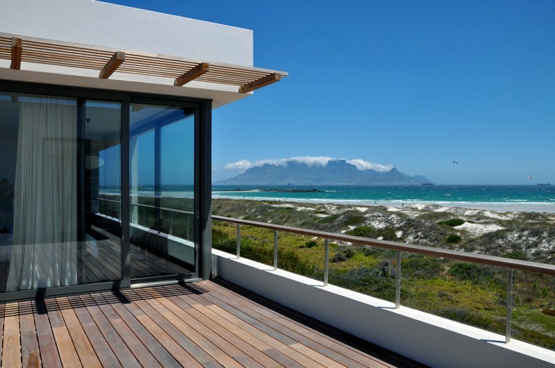
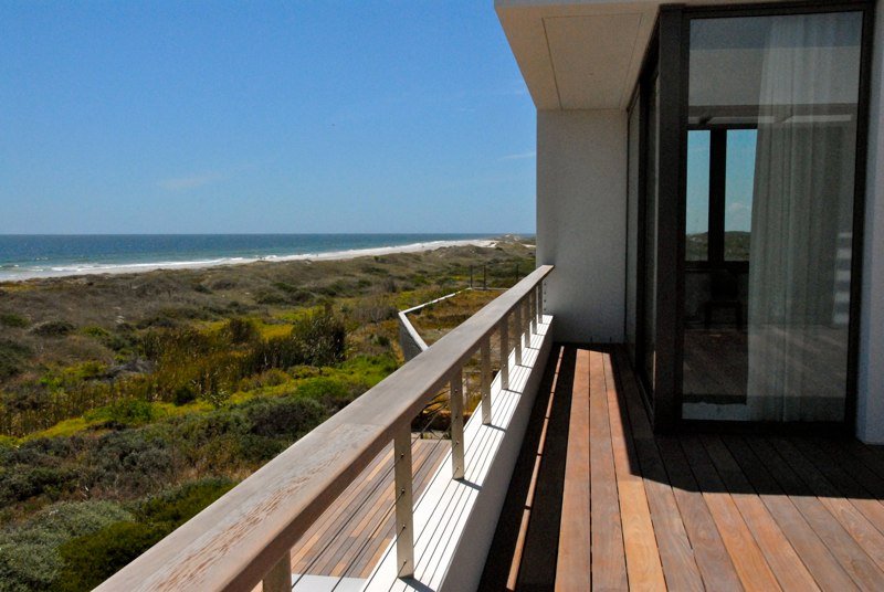
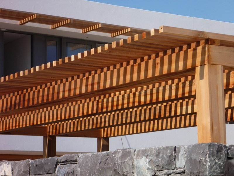
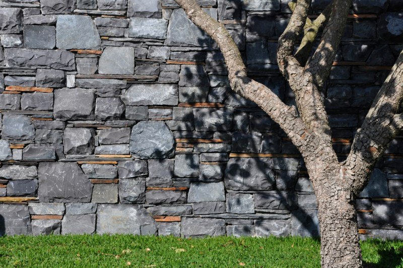
Big Bay Beach House
Posted on Thu, 12 Dec 2013 by midcenturyjo
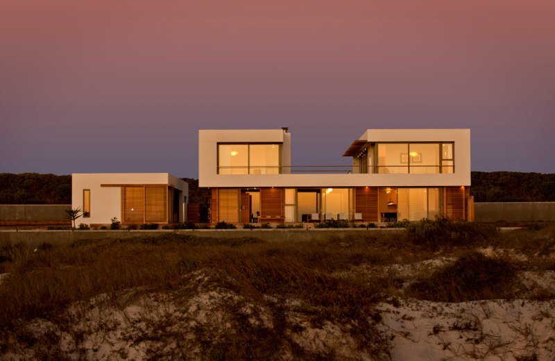
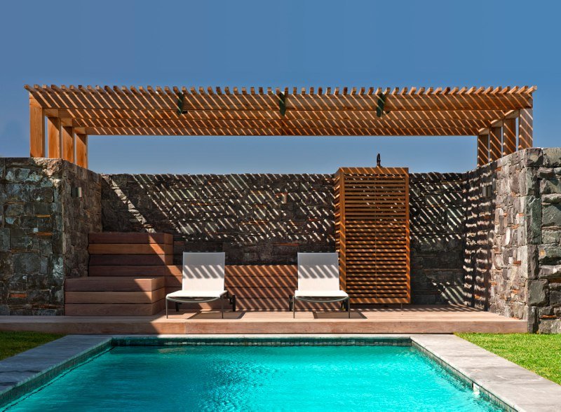
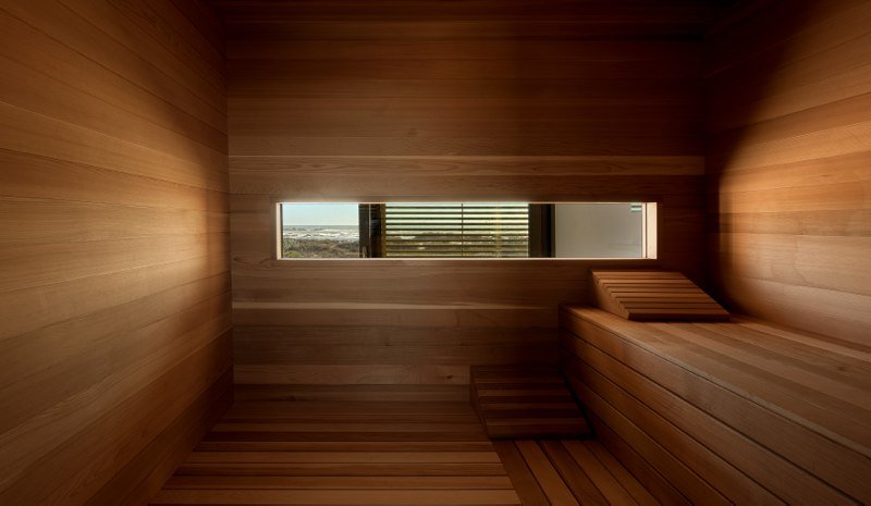
I can smell the salt in the air and hear the crash of relentless waves. Sand whipped up by the stiff onshore breeze stings my shins. I squint into the bright light and wonder if I’ll trek down to the beach and plunge headfirst into the sea or whether I should be sensible, walk back inside and slather cream into my sunburn. A beautiful location, a beautiful house, a beautiful daydream. Big Bay Beach House, 25 minutes drive from Cape Town, South Africa and available for holiday let. Maybe not a dream after all.

Stacked House
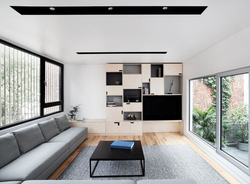
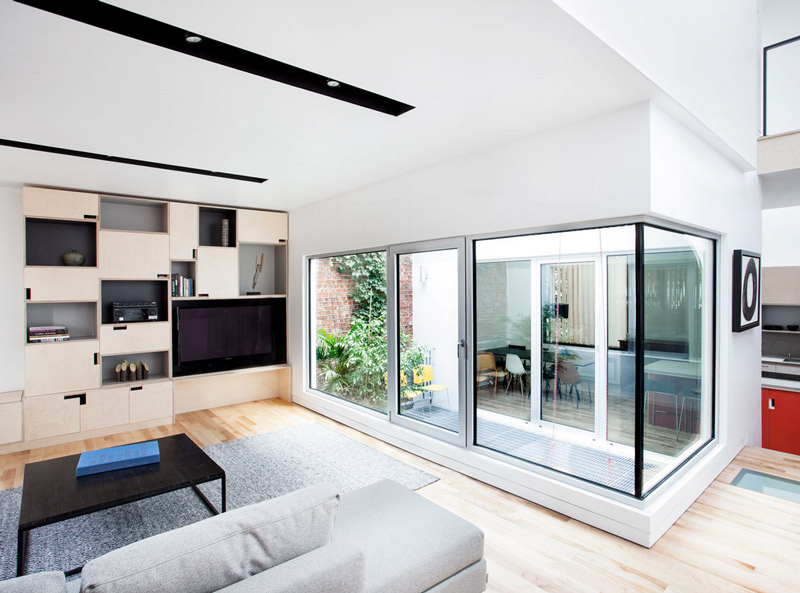
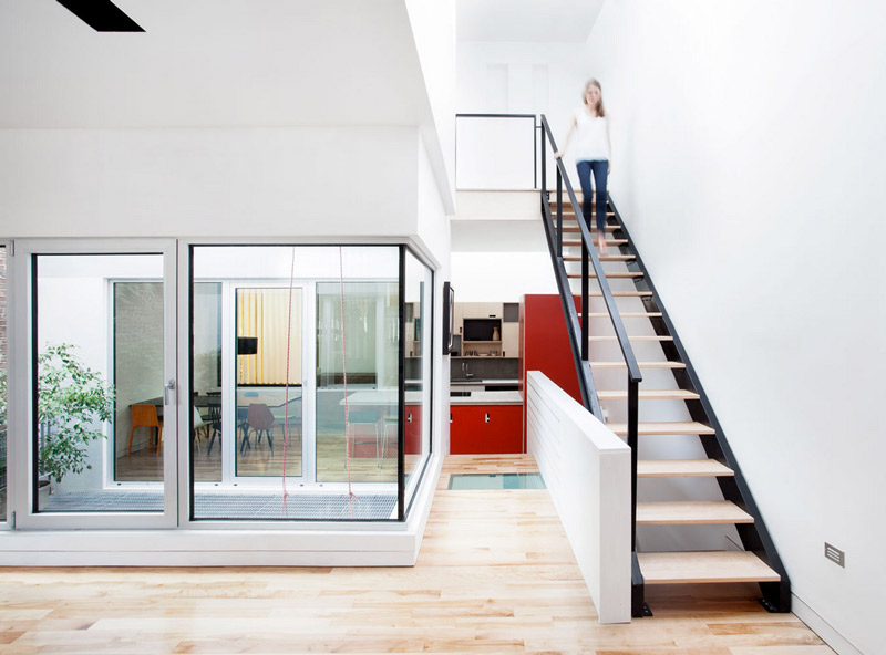
Posted on Tue, 10 Dec 2013 by KiM
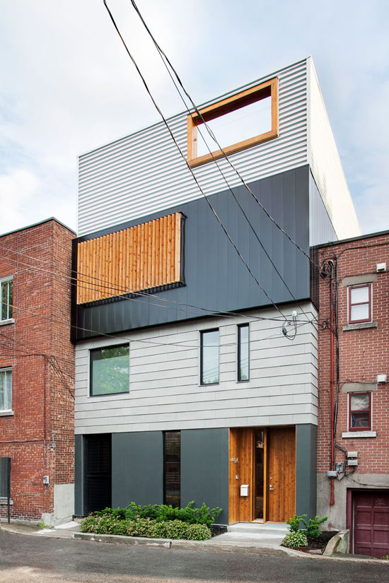
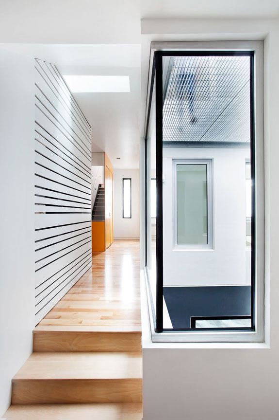
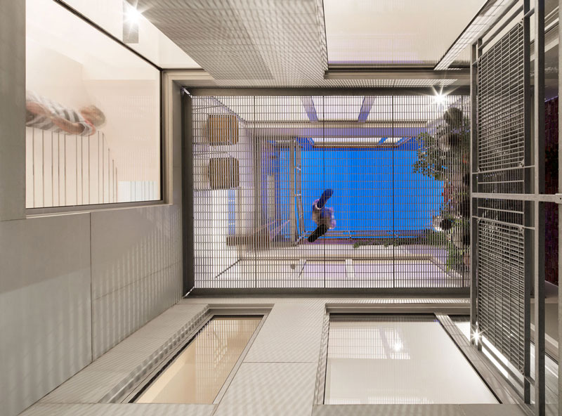
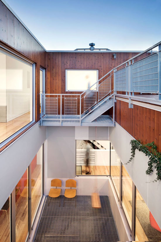
I LOVE this home designed by Montréal architects _naturehumaine. I read the description to my husband while chuckling – it’s exactly what we wanted to do when we tear down our house and rebuild. This project was done in collaboration with the client who wished to build his own home. The site is located in a back alley of Montréal’s Plateau neighbourhood and the design reflects the patchwork of extensions and renovations typically found in Plateau alleyways. The constraints of the site called for a house that was built upwards versus outwards. Four boxes clad in different materials are stacked one on top of the other. A void carved out of the center of the house, provides daylight, ventilation, and private outdoor space. (Check out another of their projects here).

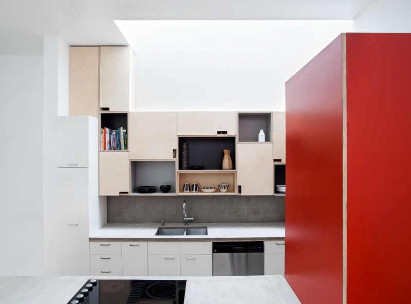

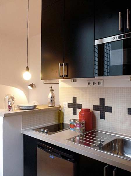
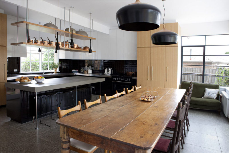
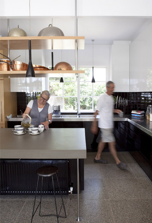
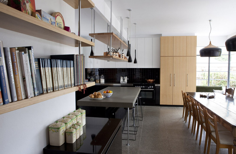
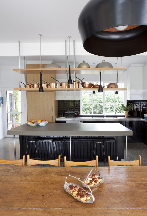
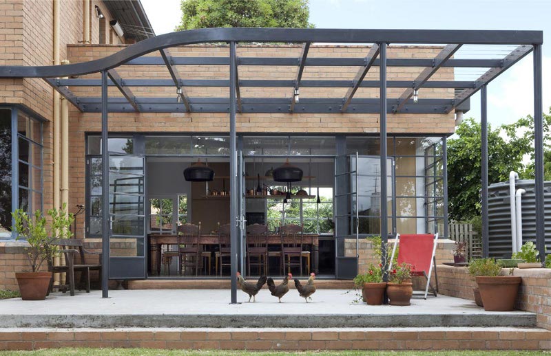
The cook’s kitchen
Posted on Tue, 10 Dec 2013 by midcenturyjo
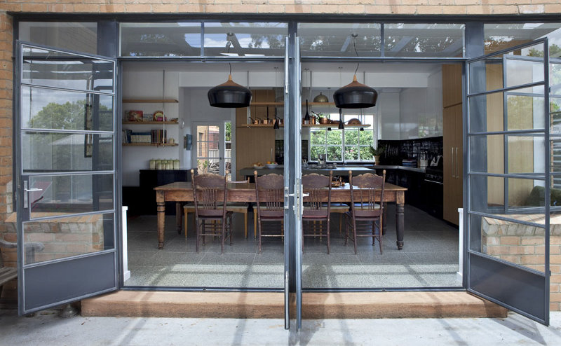
I had to revisit the MAKE architecture portfolio. There was a kitchen renovation I had to share. The kitchen/dining area of this art deco home was upgraded so that the owners could run a cooking school. Large enough to allow for classes, intimate enough for day to day living. I love the interplay of the black with the timber and the gleam of metallic highlights, the art deco style glass and steel doors and the rustic dining table. I would love to cook here. More importantly I would love to share my food with family and friends here.
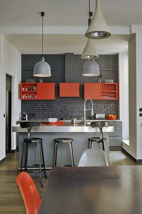
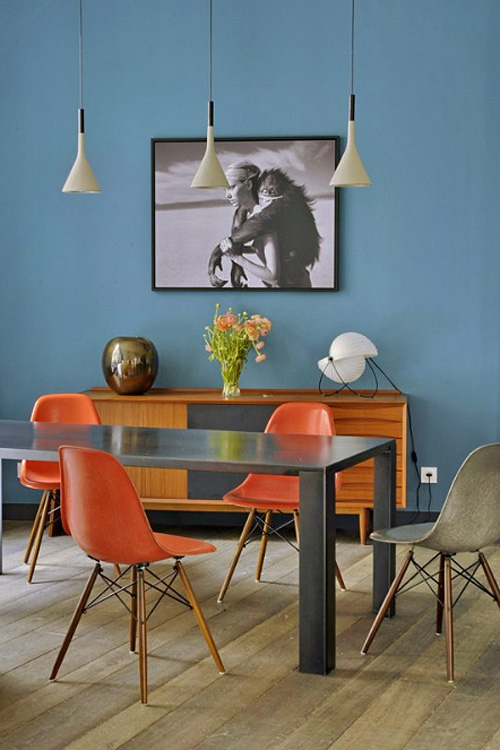
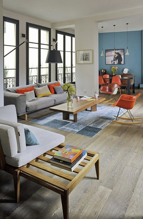
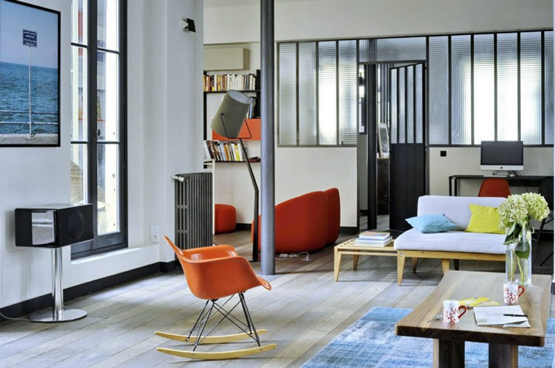
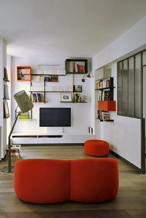
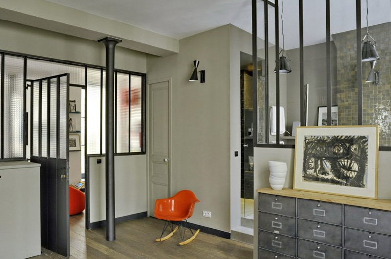
I’m loving these spaces by Karine Simonot and Stéphanie Maigret of MOC (Maison, Objets et Chantiers). Some bold colour accents, some always fabulous Eames chairs and some amazing architecture for an eye-catching backdrop.