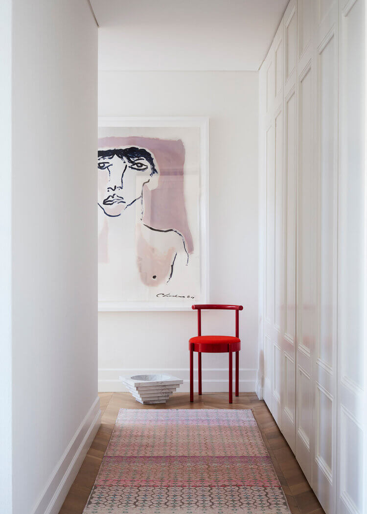
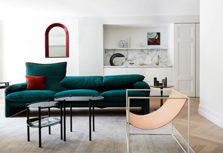
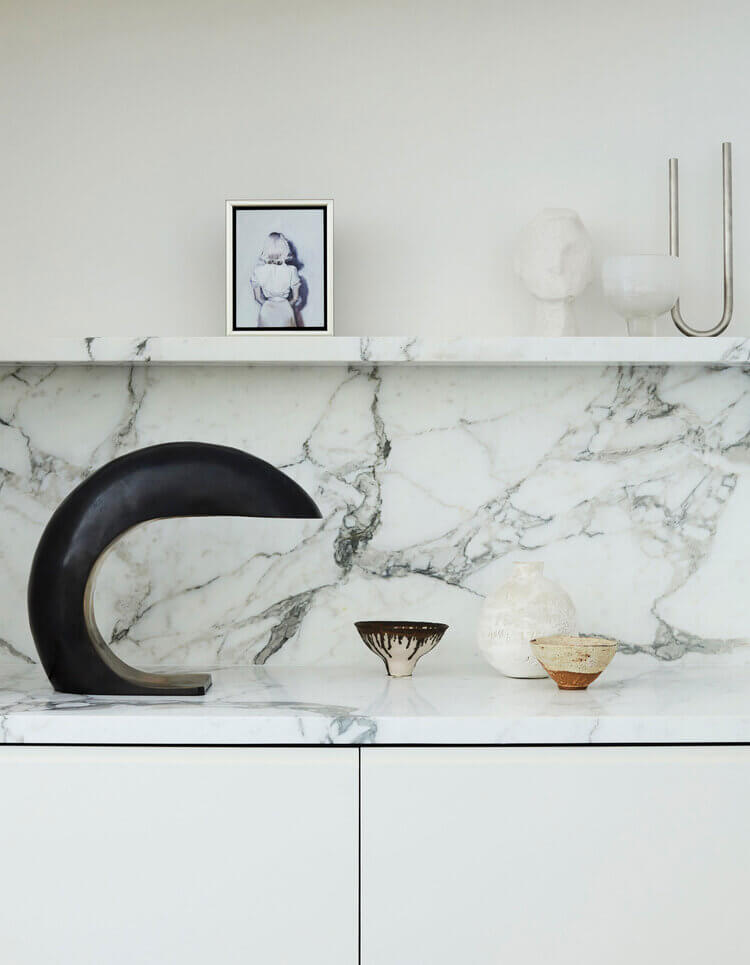
Displaying posts labeled "Modern"
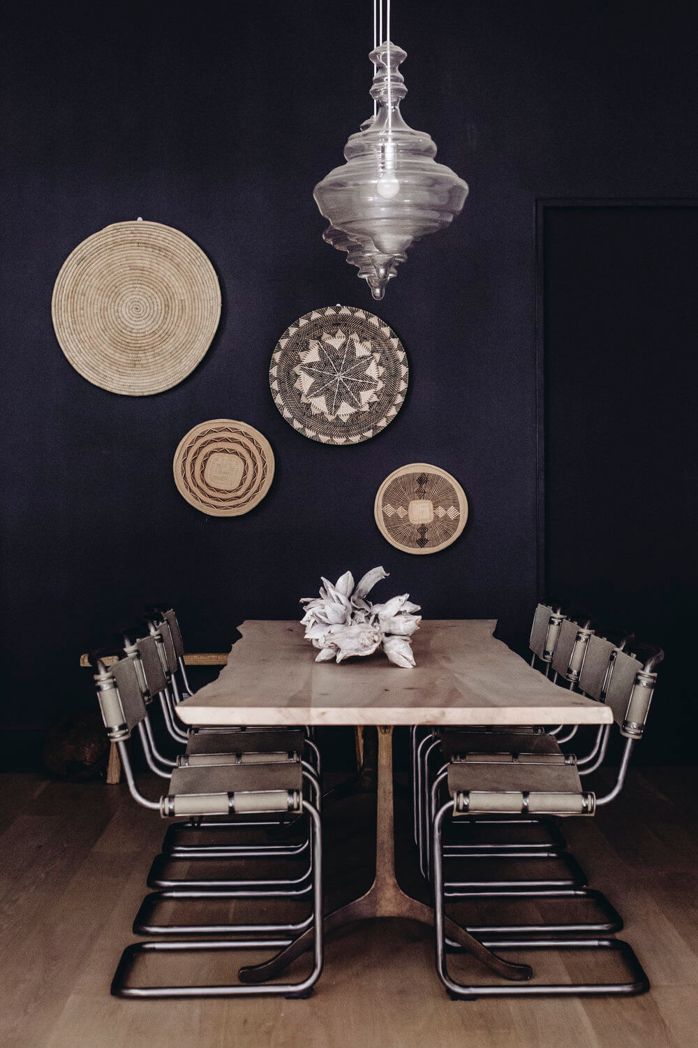
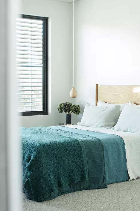
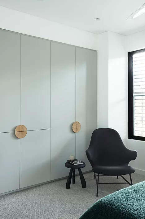
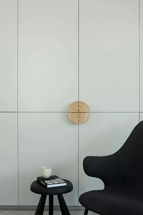
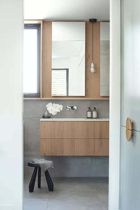
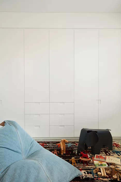
Bold drama with Harbour views
Posted on Mon, 7 Sep 2020 by midcenturyjo
“With iconic Sydney Harbour as it’s backdrop and flooded with natural light the brief for Wolseley was to inject high Parisian style and design into a suburban setting. This involved the complete transformation and refurbishment of an existing three story semi-detached townhouse through considered custom detailing and materiality. The home retains a strong connection to the external environment and is accentuated by bold strokes of drama and ethereal forms.”
A contemporary home with an old soul and an eye to the future. By Sydney-based interior designer Mrs Smith.

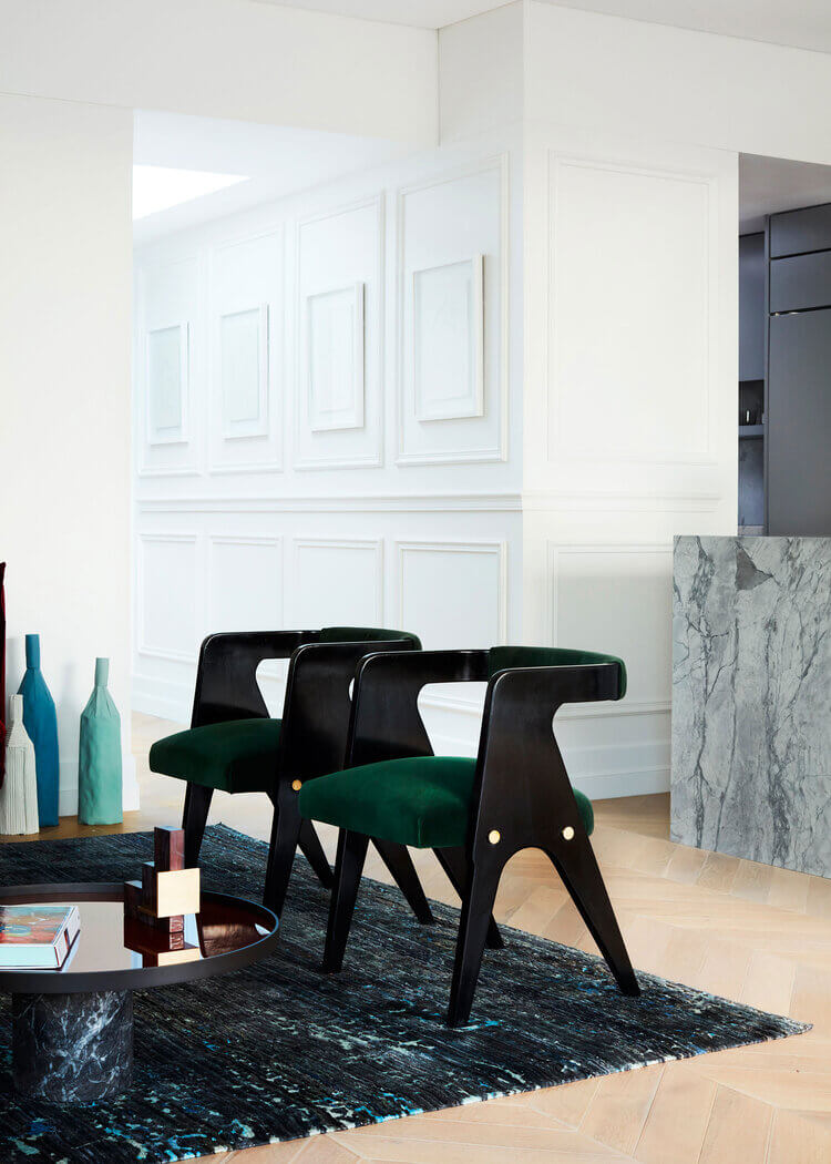

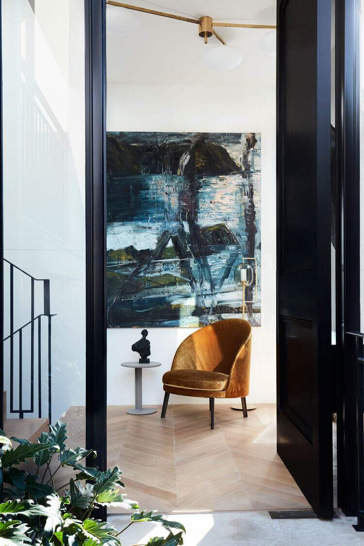
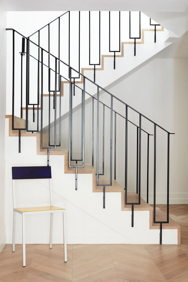


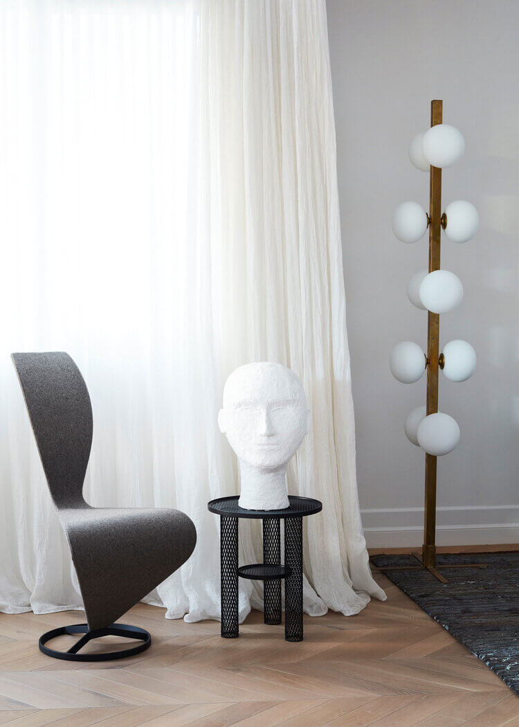
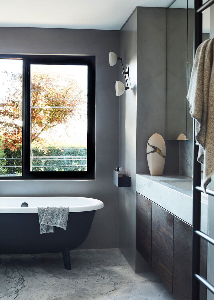
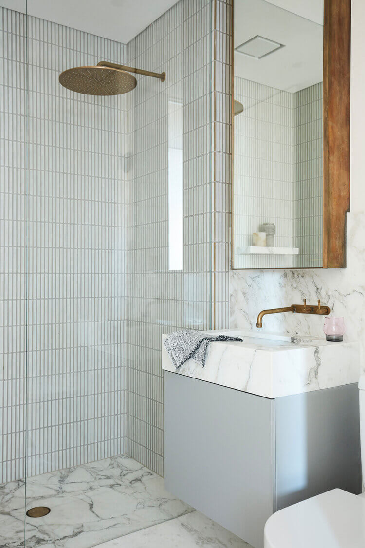
Photography by Prue Ruscoe
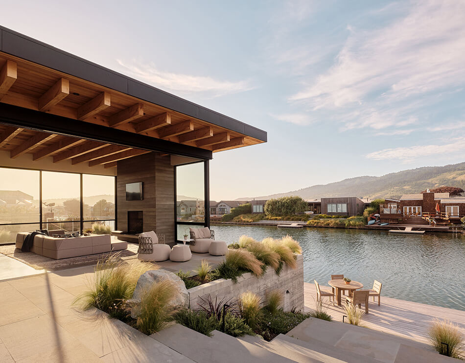
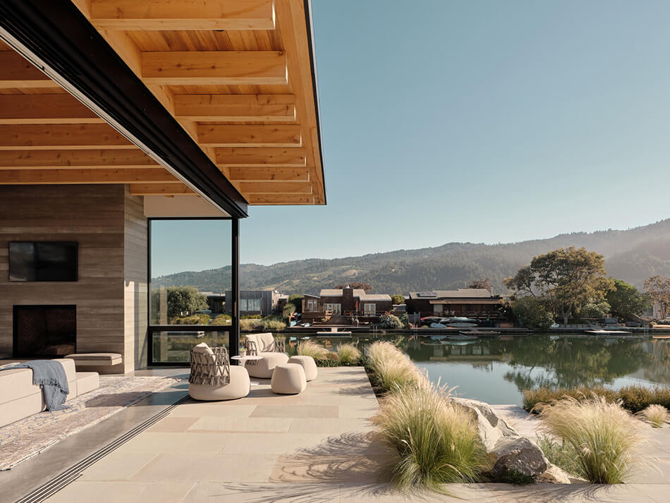
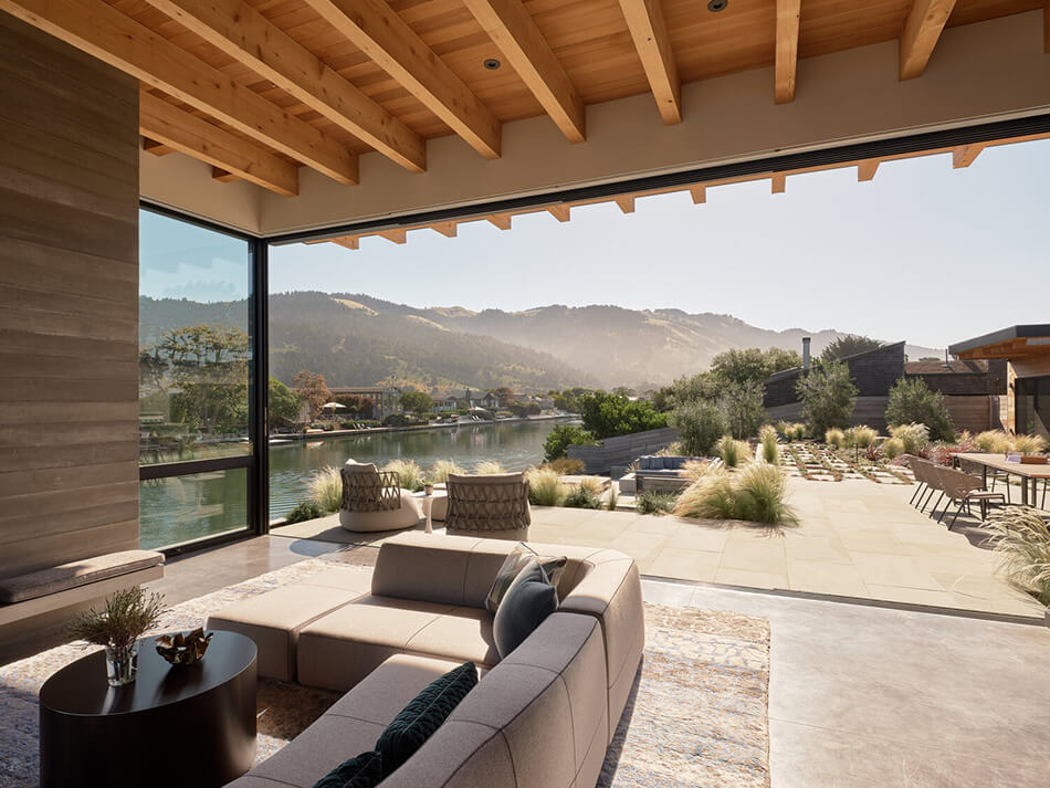
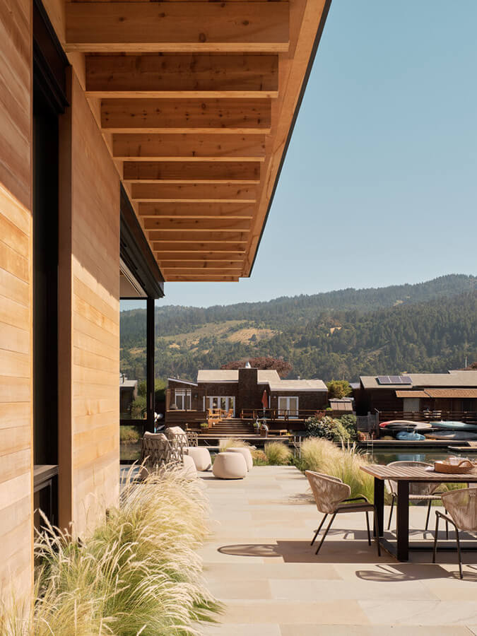
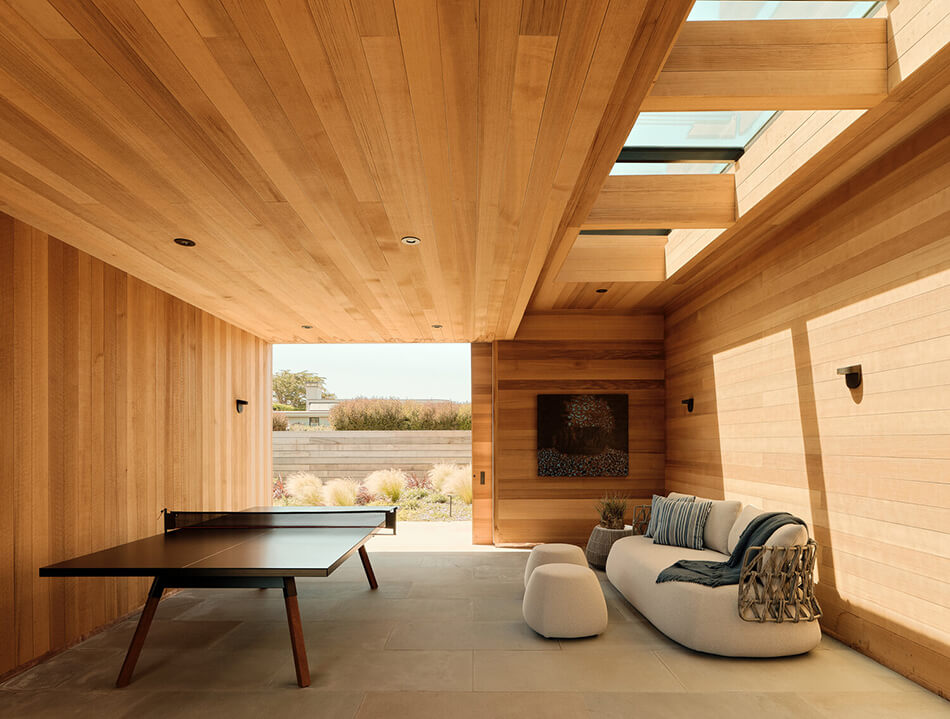
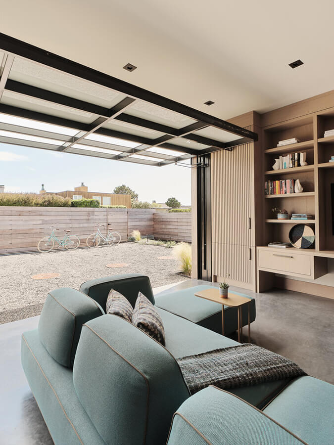
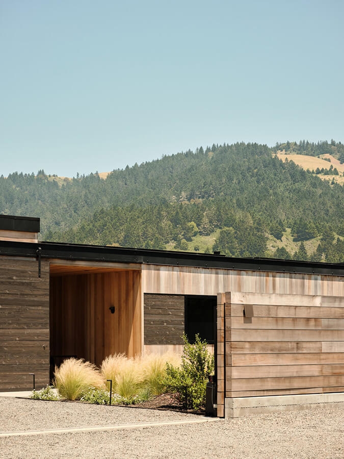
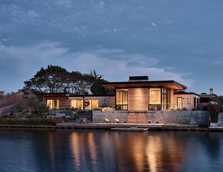
Private lagoon views in California
Posted on Fri, 4 Sep 2020 by KiM
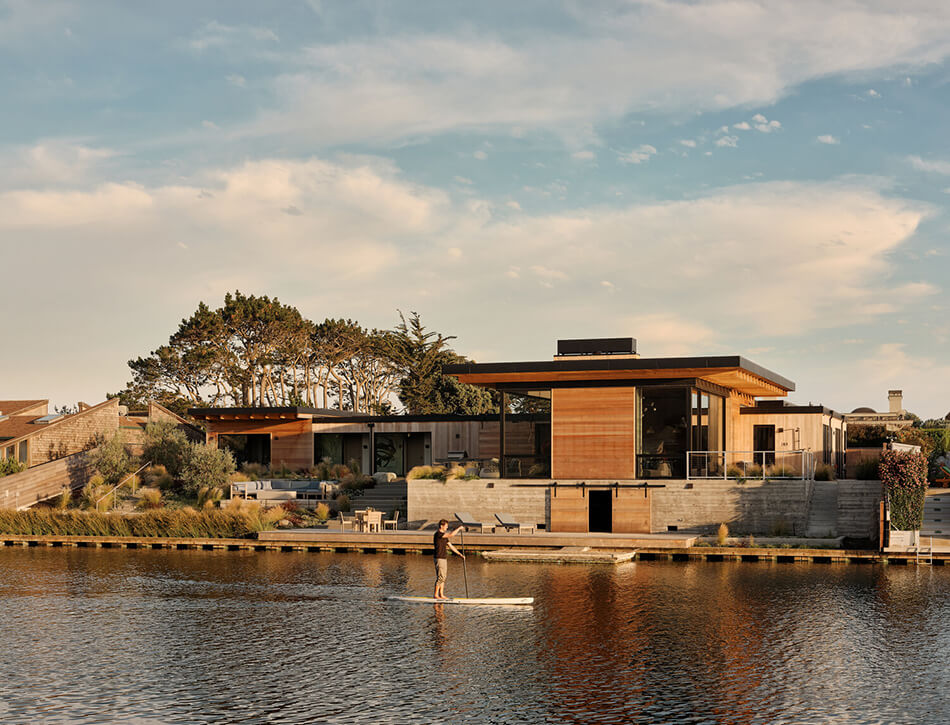
This house!!!! Those views!!!! Set on a private lagoon adjacent to a pristine stretch of northern California coastline, the Seadrift House lets nature in from all angles. The site was designed to make the most of lush mountain views and foster connectivity to the active and social lagoon-life. This is indoor-outdoor living at its finest. The landscape features deer resistant, drought tolerant and fire resistant plantings. Landscape design: Boxleaf Design, Architect: Butler Armsden Architects, Contractor: Gubbins Building Company, Landscape Contractor: New Leaf Gardens.
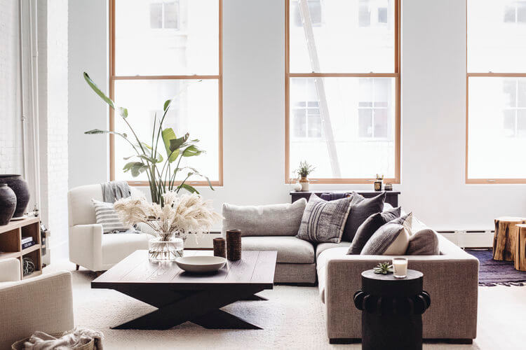
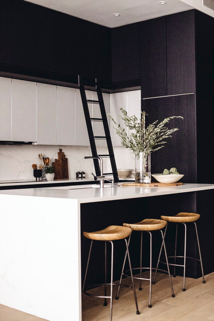
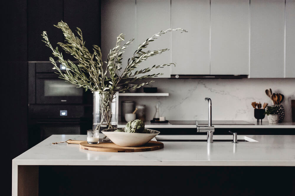
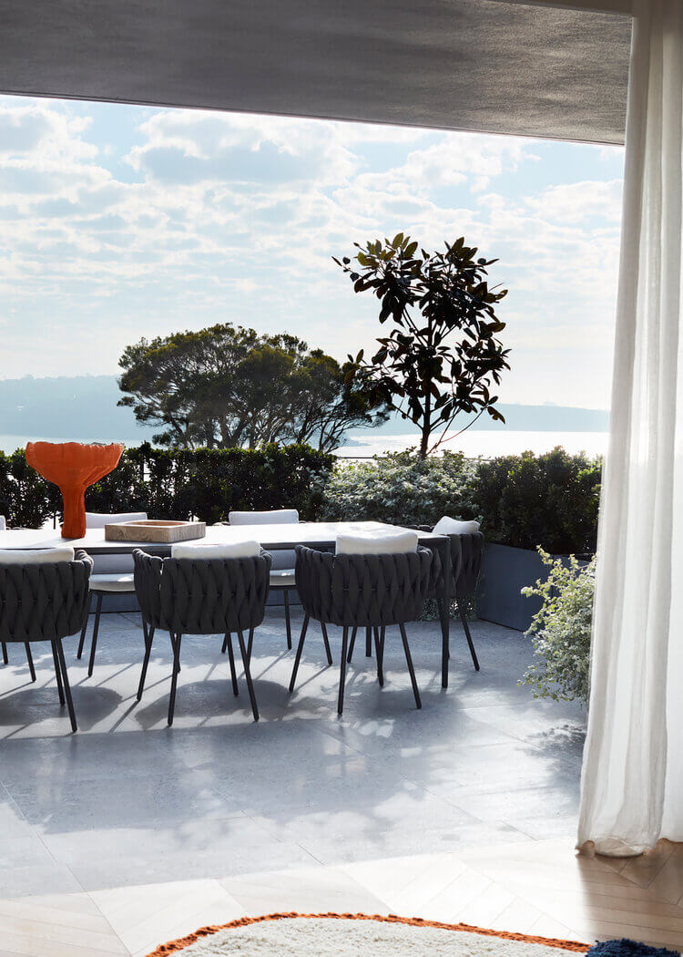
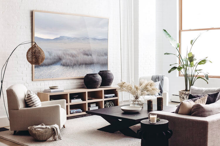
Neutral modern goodness
Posted on Wed, 2 Sep 2020 by KiM
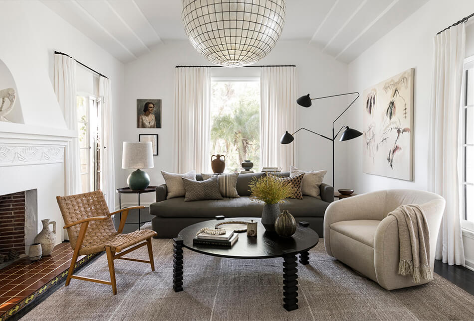
The other day I was talking to my twin about how much I love neutral, earthy spaces but with lots of dark pieces mixed in because drama is always necessary, and fabrics with lots of texture and warmth to them. I feel like L.A. designer Katie Hodges has really nailed what I had in mind with this home she designed. There is a uniqueness to each room which I can also appreciate.

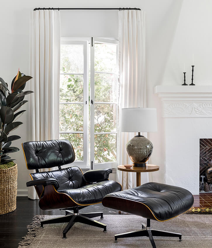
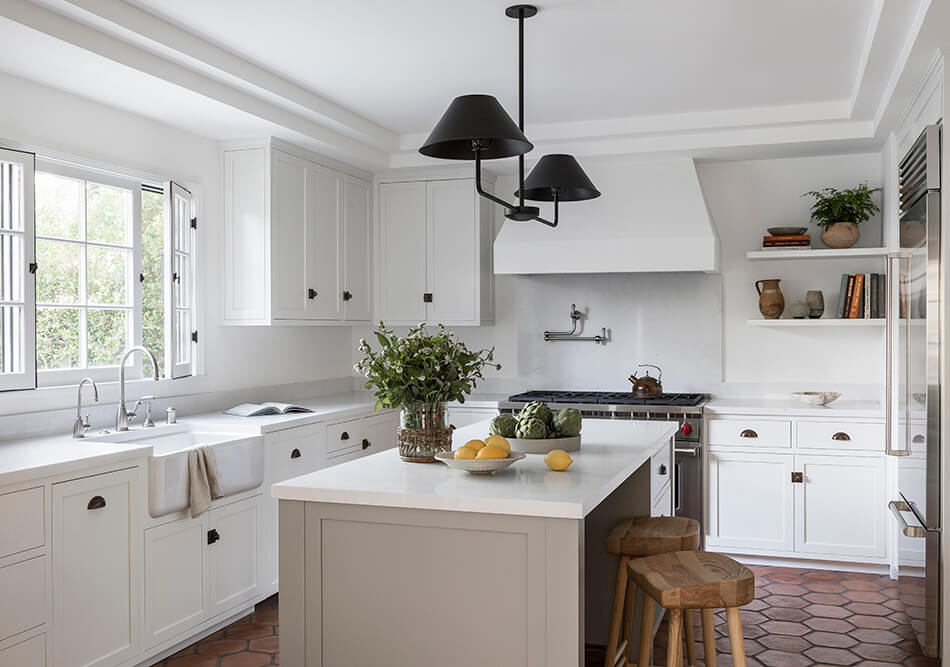
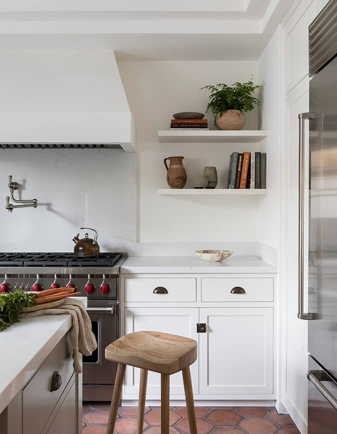
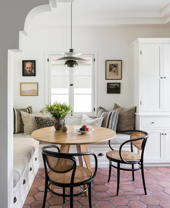
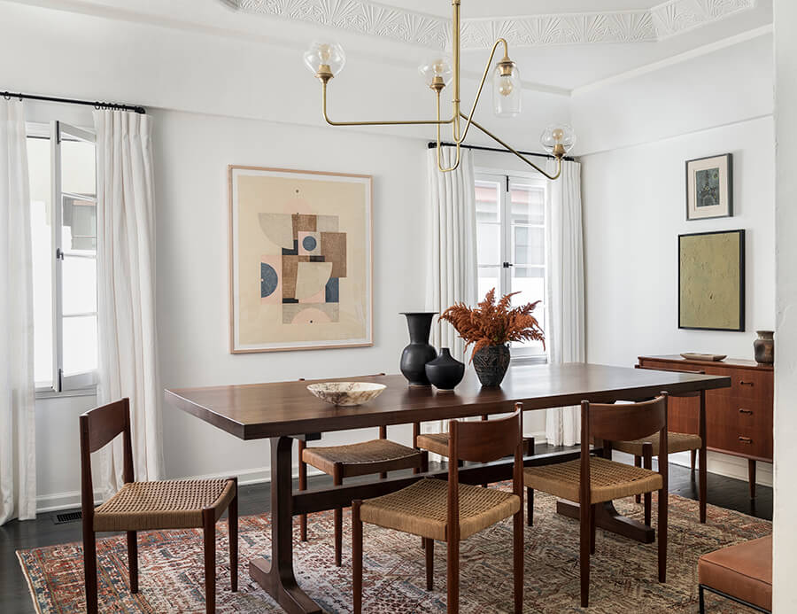
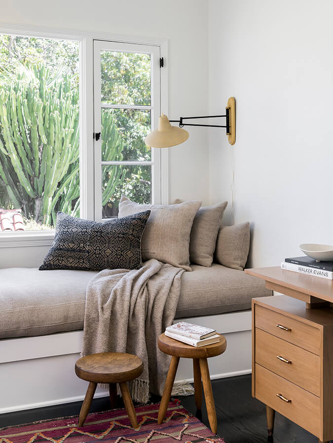
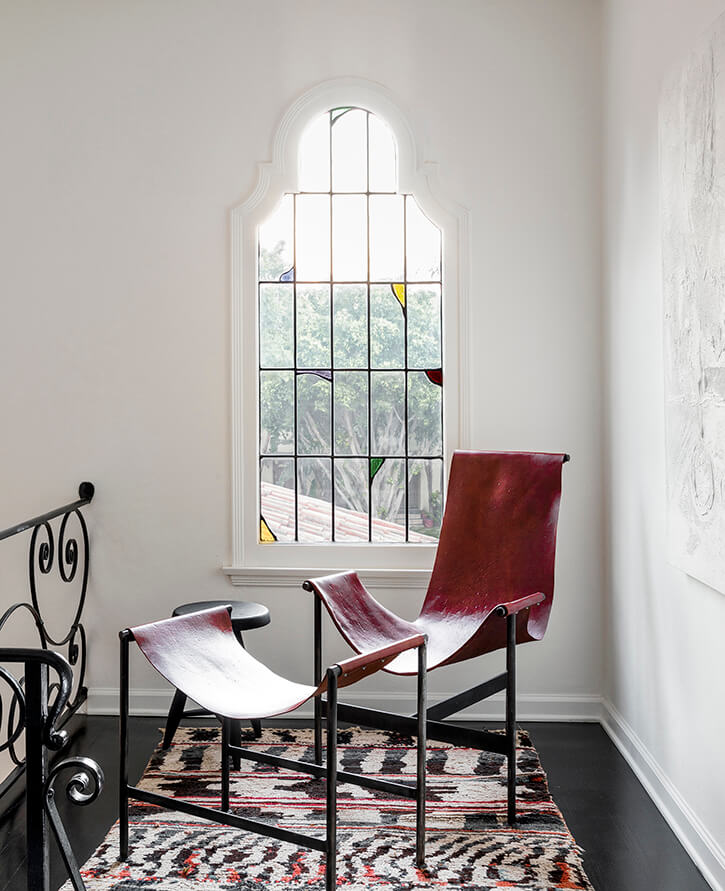
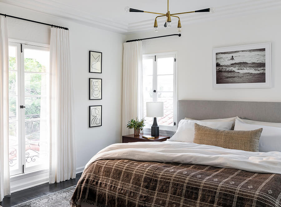
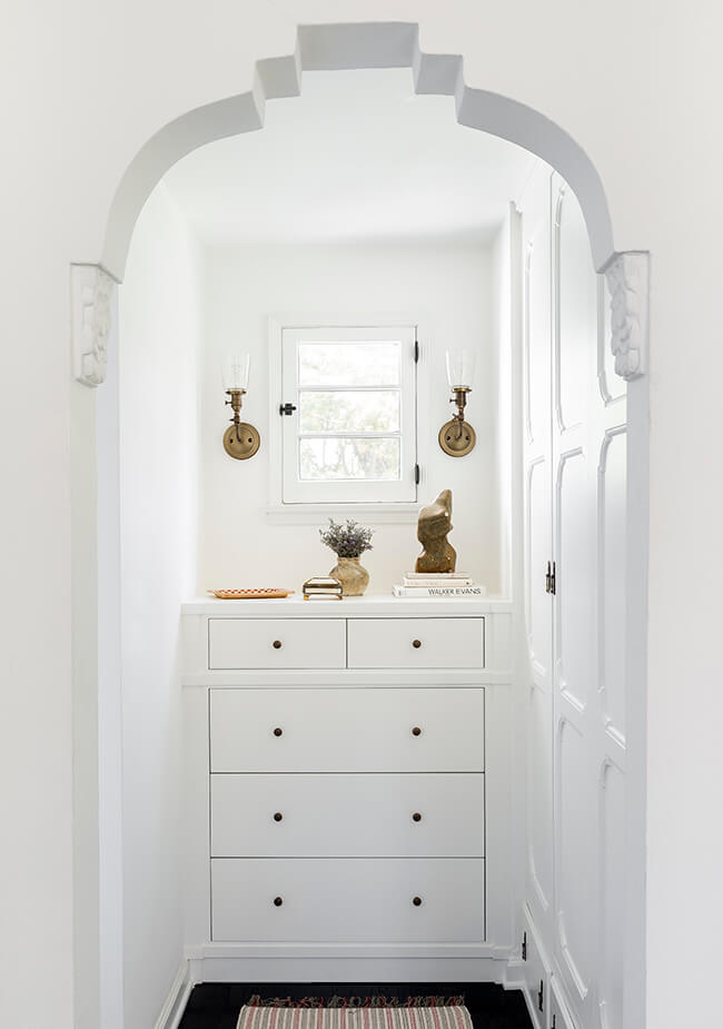
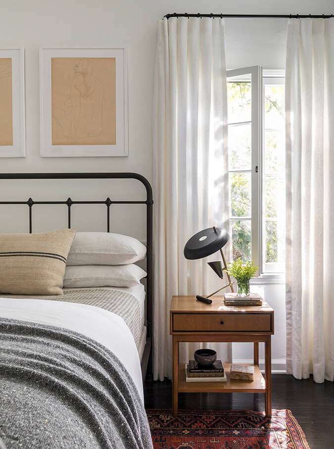
Photos: Haris Kenjar
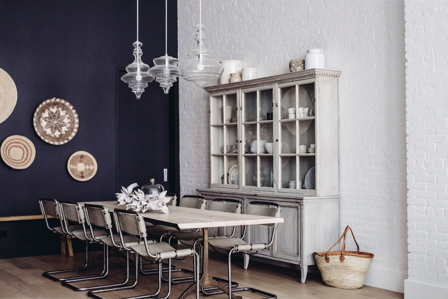
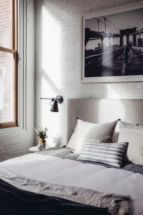
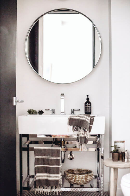
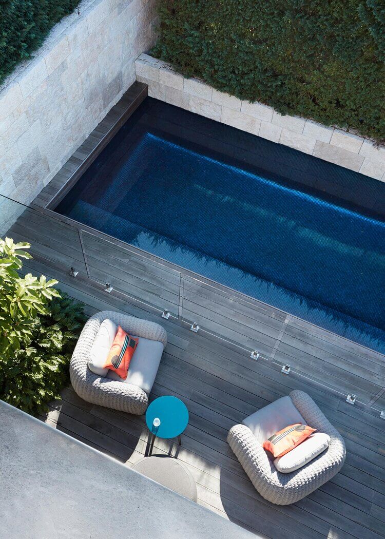
A sleek contemporary home with exposed brick
Posted on Tue, 1 Sep 2020 by midcenturyjo
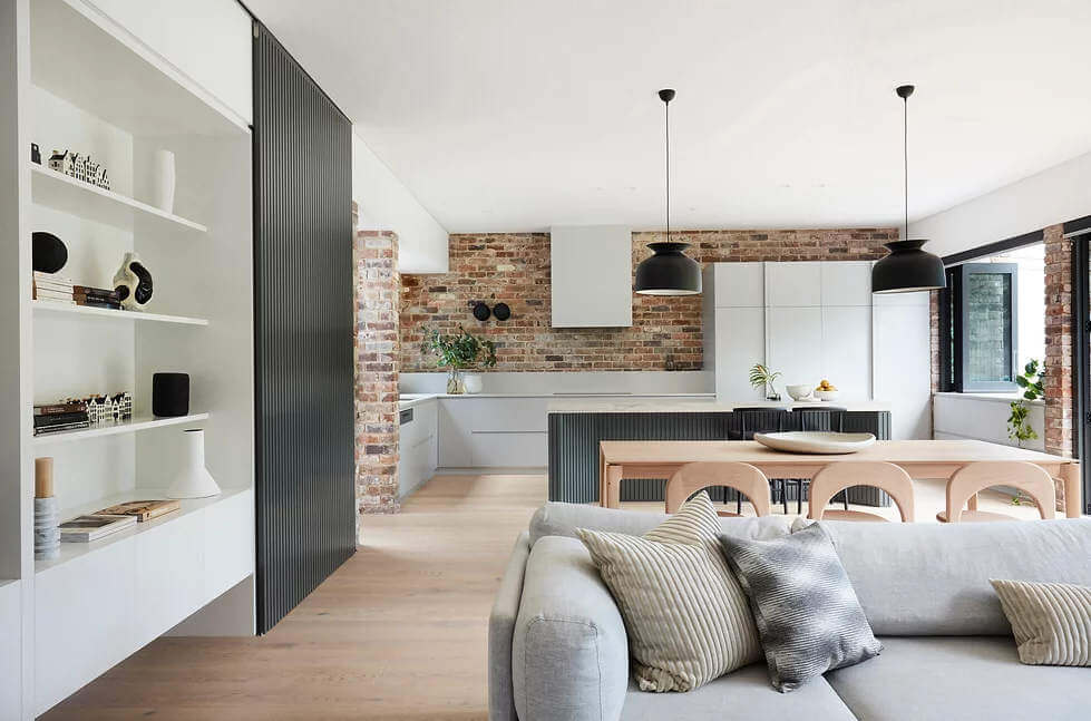
Clean modern lines play against almost rustic exposed brick walls while an industrial vibe is balanced by natural materials in this contemporary family home. Indoors and out meet seamlessly while private spaces are soft and restful. Functional, cohesive and considered. Lot B Bridge House by Sydney-based interior design studio Lot 1.
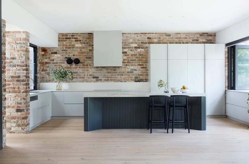
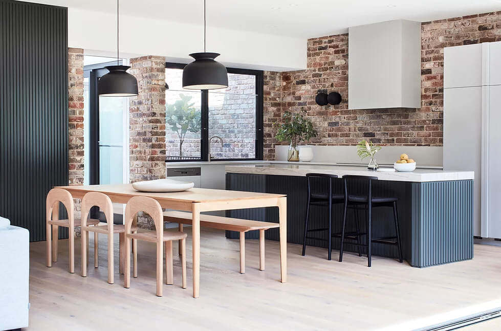
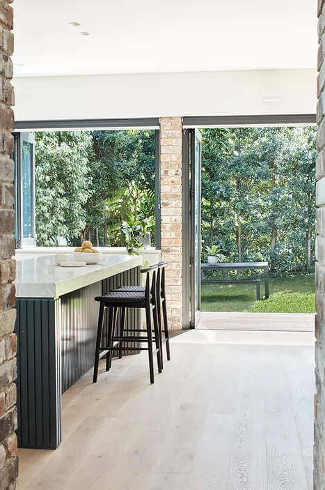
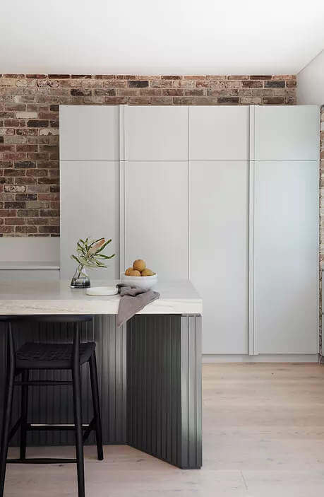
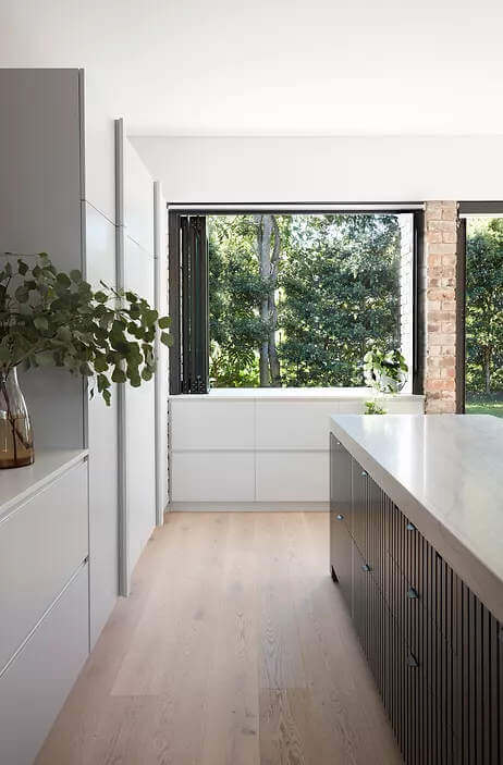
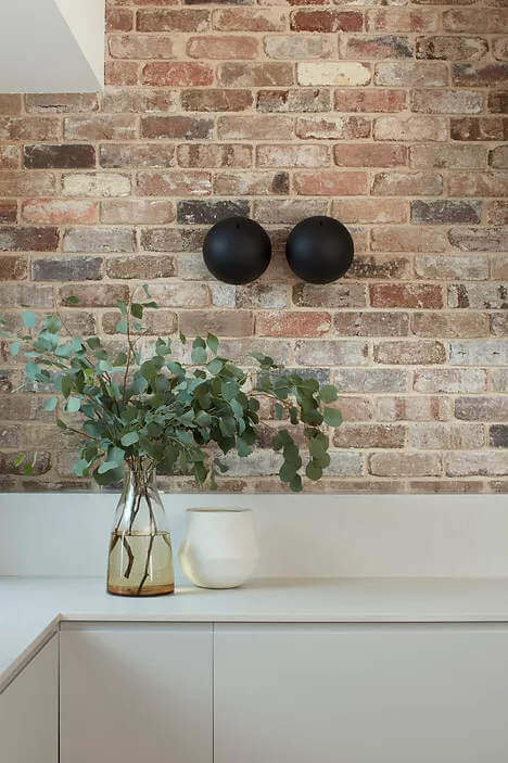
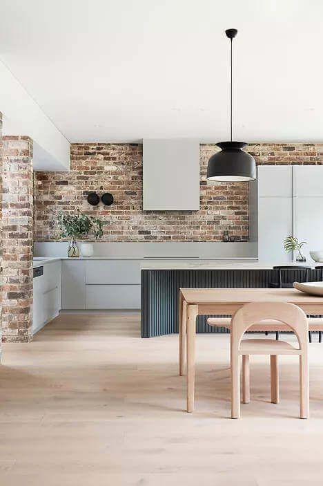
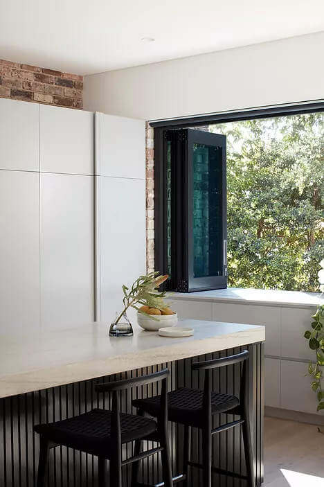
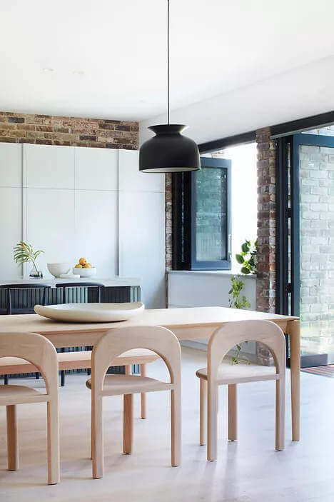
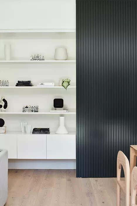
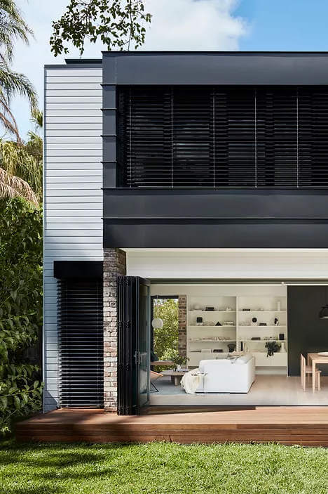
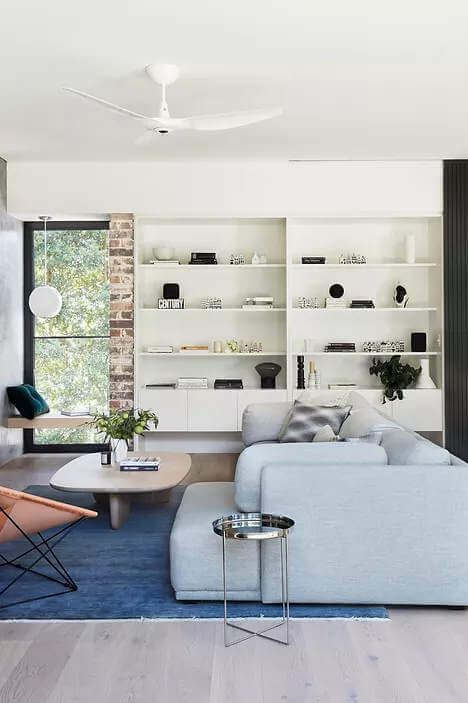
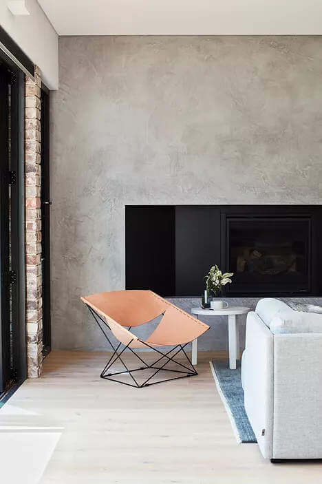
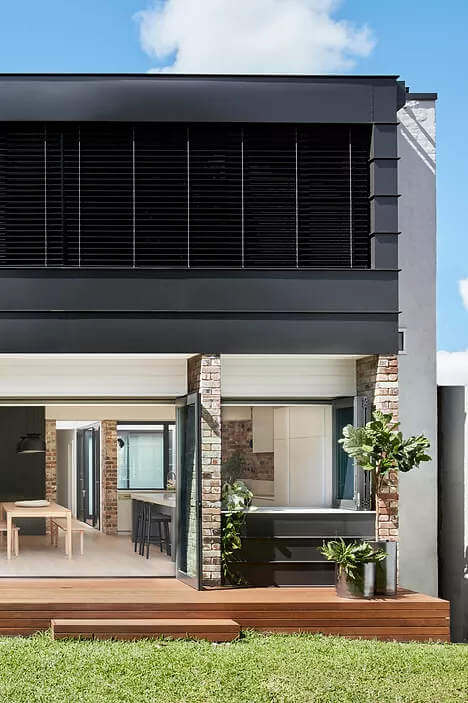
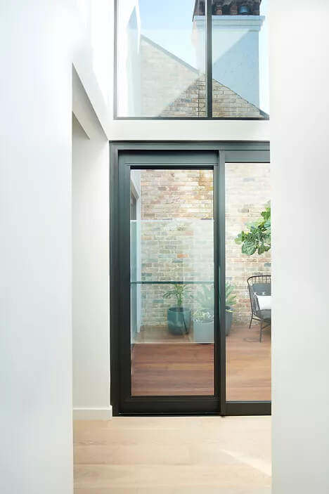
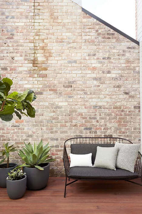
Photography by Prue Rucoe
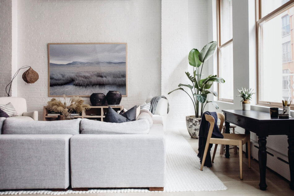
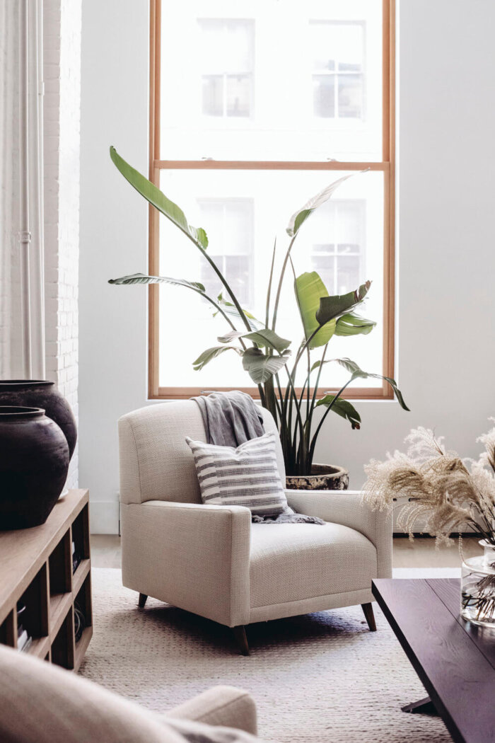
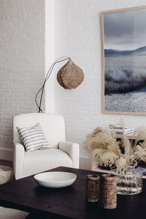
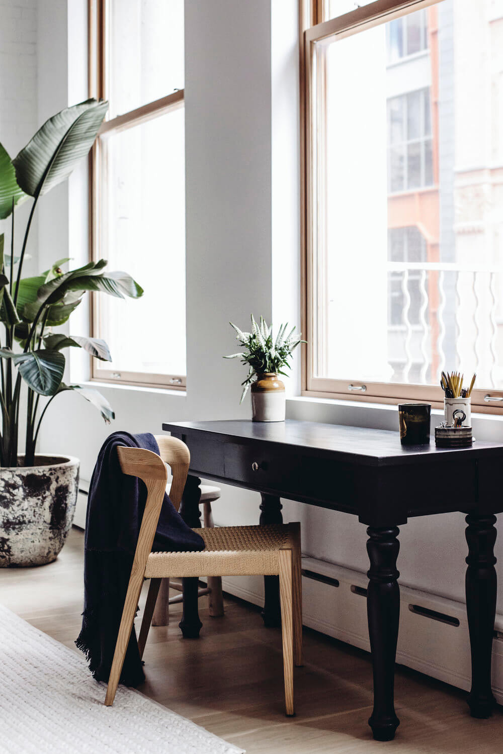
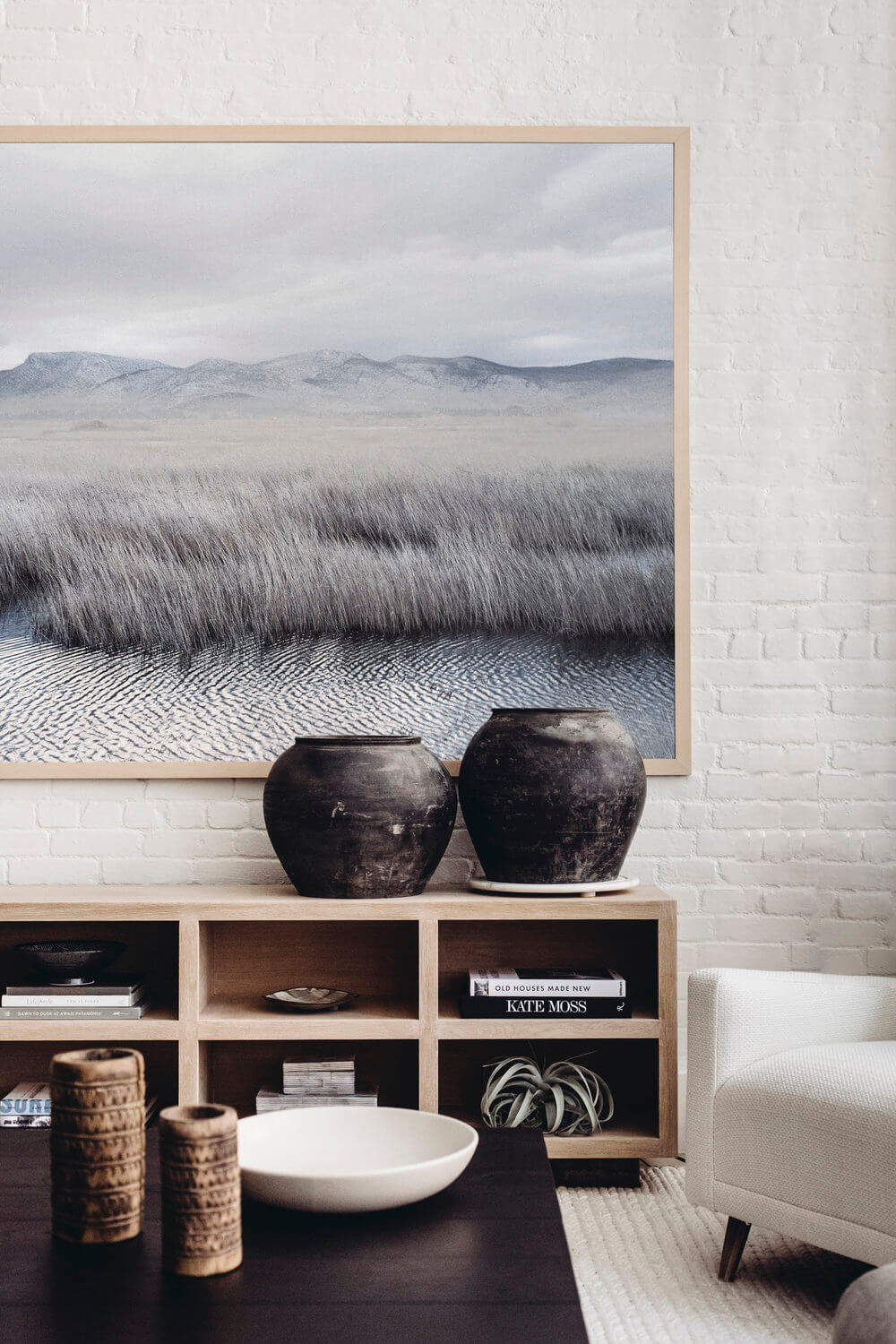
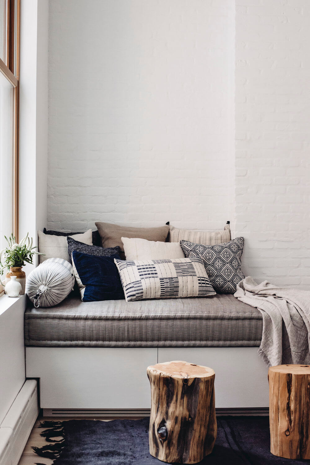
A light filled Soho Loft
Posted on Fri, 28 Aug 2020 by midcenturyjo
I started the week with a Hamptons beach shack getaway by Marie-Christine Design. I’m going to finish it with another of her designs. What’s as iconic as a Hamptons vacation home? why a Soho loft of course! Lots of light flooding in through tall windows, white painted exposed brick and that dining room. Swoon!