Displaying posts labeled "Shelving"
Traditional meets modern
Posted on Mon, 13 May 2024 by KiM

Shape, texture, and materiality converge within the walls of this warm and inviting home that places artistry and comfort on a pedestal.
Designed by Heidi Woodman Interiors, this home is so perfect in so many ways and has so much to offer that I think it would be a hit for the masses. The architecture has both modern and traditional elements, the colour palette is neutral and earthy with just the right amount of black accents, the furnishings all look like you could just sink into them and have a nap, there’s just a bit of pattern that is on the traditional side which is a pretty contrast to some of the modern art, textures that look incredibly cozy….


A graphic designer’s vintage haven in Kyiv
Posted on Thu, 2 May 2024 by midcenturyjo

Located in historical Kyiv’s centre, this apartment was designed by Yevheniia Dubrovska for her client a young female graphic designer. The owner wanted distinct spaces within the regular layout: a bedroom, a separate wardrobe and an active zone. The 4-meter-high ceilings allowed for tall doors and classic transoms. The vintage-themed interior includes a refurbished dining table and furniture sourced from across Europe, while newer pieces were crafted from the designer’s sketches. Colour accents, like pink tiles and a blue ceiling in the bathroom, add character, aiming for a cozy, historical ambience.


Photography by Yevhenii Avramenko.
Maximalism meets minimalism in Miami
Posted on Tue, 30 Apr 2024 by midcenturyjo

This Miami house with its Art Deco influences has been taken to the next level by Istanbul-based design practice Sanayi313. Enis Karavil created a neutral base using natural materials and a light palette then piled in a maximalist meets minimalist flair. With vibrant gallery walls, black-and-white kitchen and powder room, a mix of Art Deco bones with pieces from different design eras, the result is dynamic and fresh.


Photography by Tim Williams.
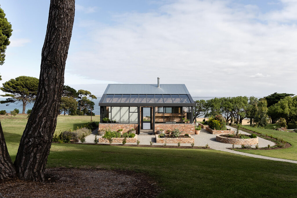
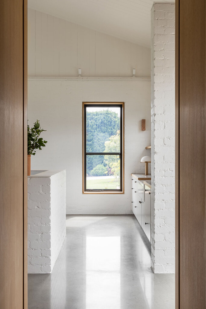
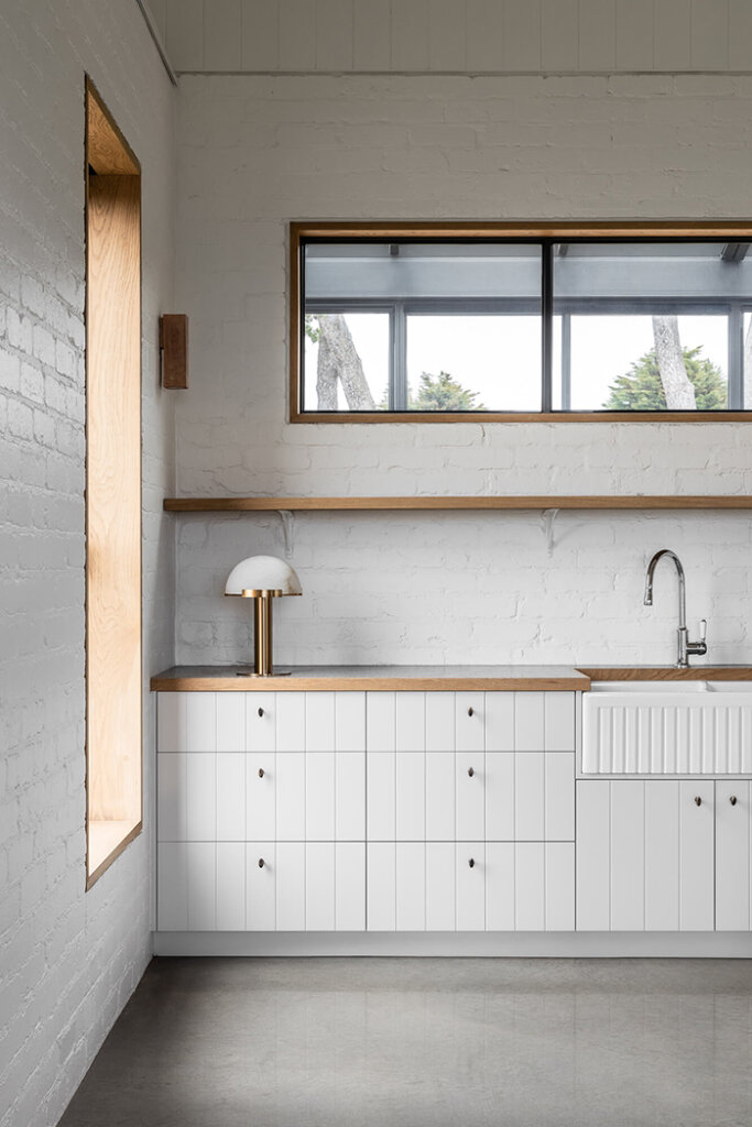
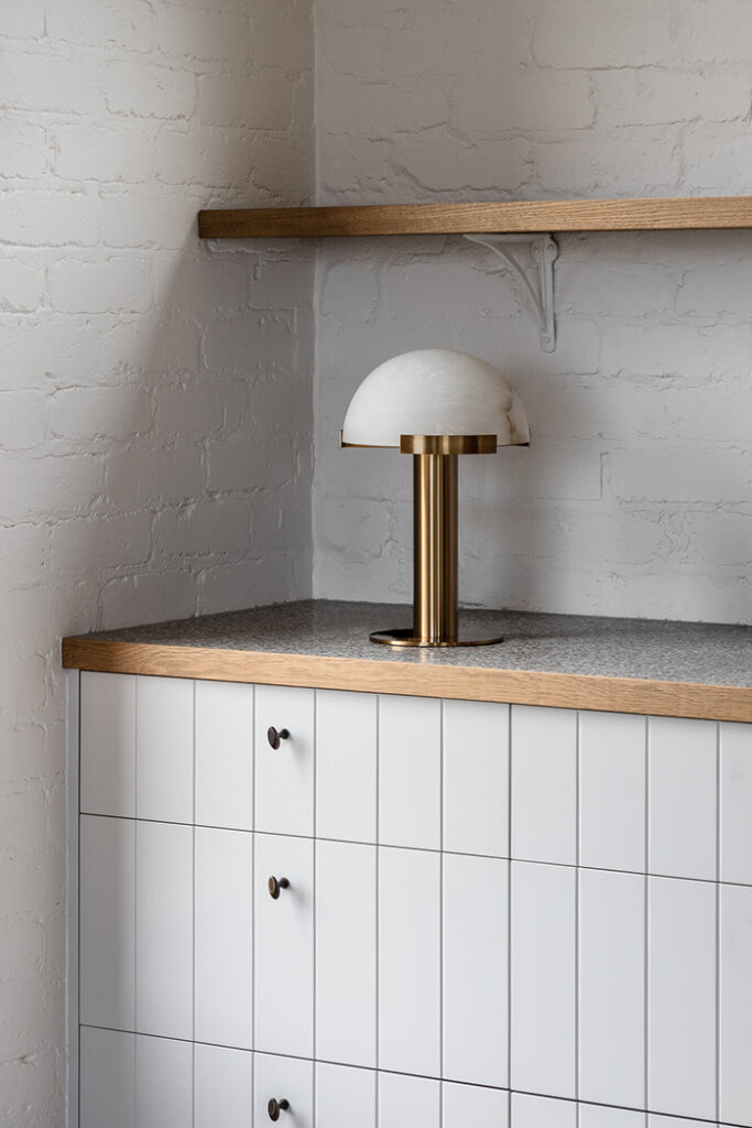
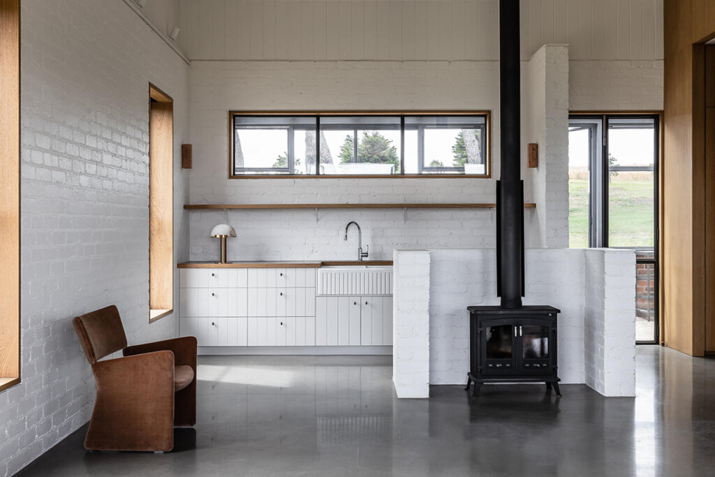
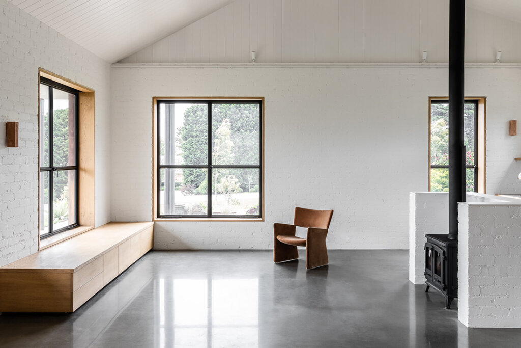
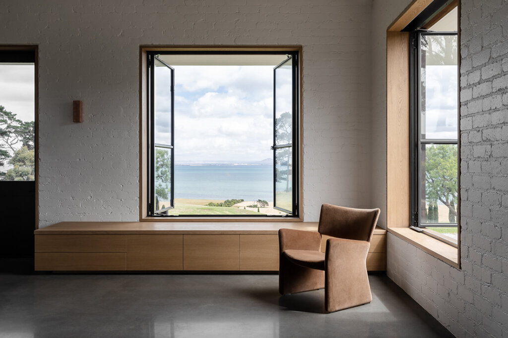
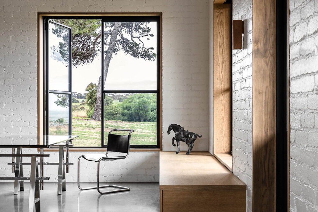
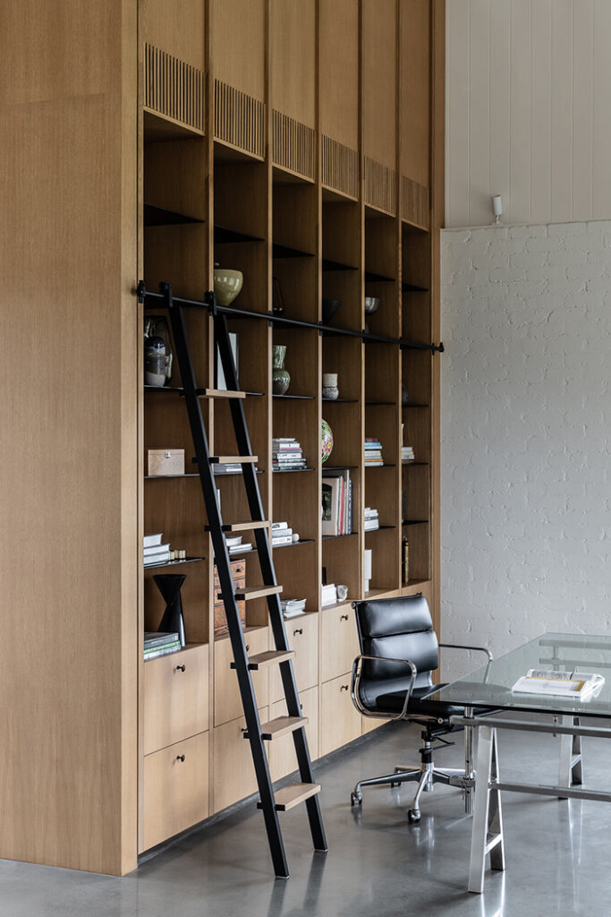
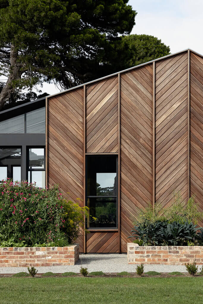
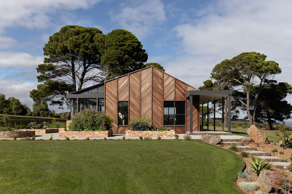
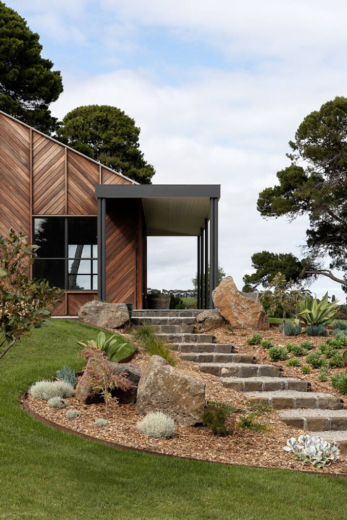
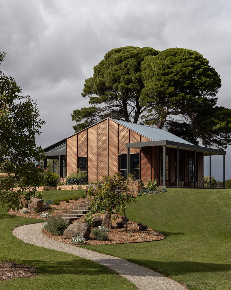
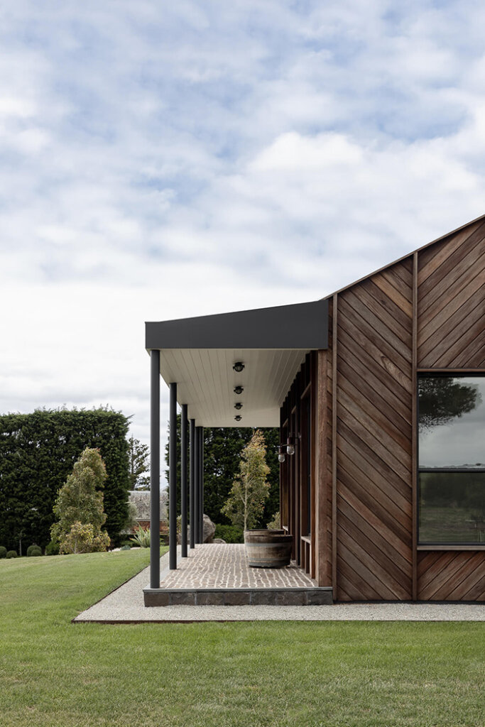
The Art Studio
Posted on Tue, 23 Apr 2024 by KiM
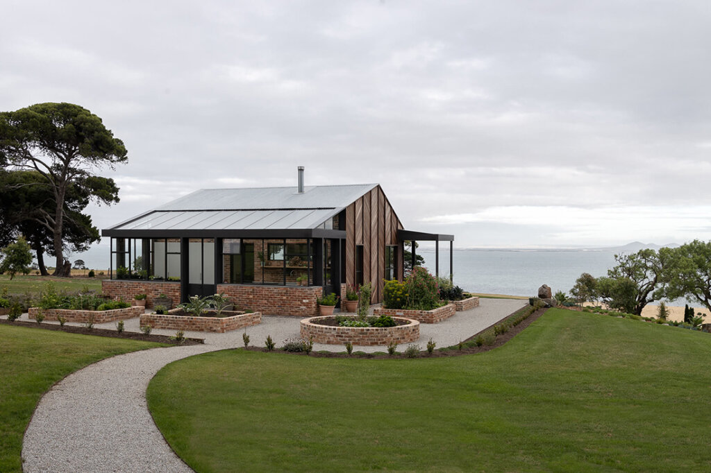
A quaint addition to the iconic Spray Farm Estate (Victoria’s Bellarine Peninsula), The Art Studio purposefully and eloquently invites artistic inspiration from the first step inside. Architecturally referencing details of the original homestead, our interior choices were sympathetic to the surrounding landscape, minimalist in design, abundant in high quality craftsmanship and technically executed for practicality.
I may not be an artist per se but WHOA would working at my current government day job virtually and working on this blog from a space like this would be a dream come true. And I thought my greenhouse was a decent outdoor space to work from…
Interiors: Watts Studio and Amiconi Architect; Architect & Construction: David Webb Building Solutions; Photography: Timothy Kaye; Art Direction: Marsha Golemac.
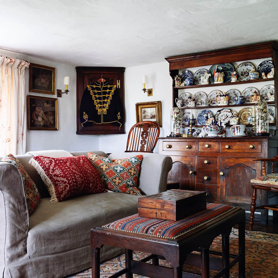
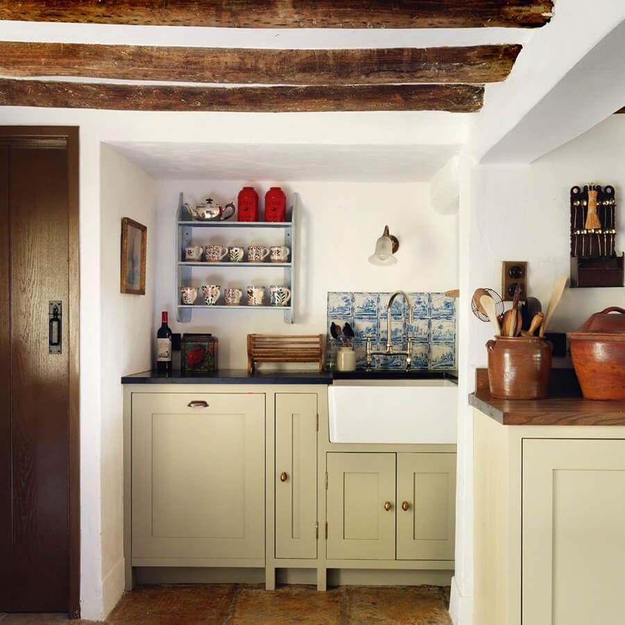
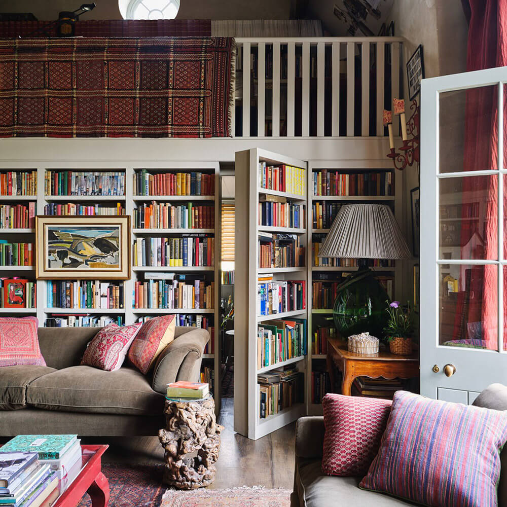
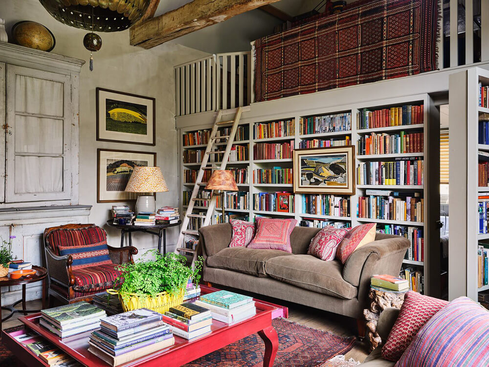
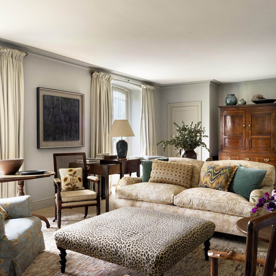
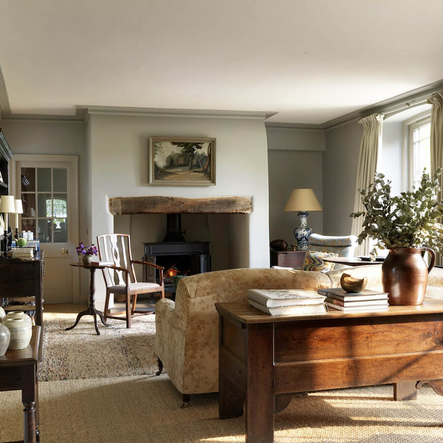
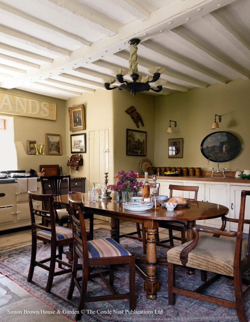
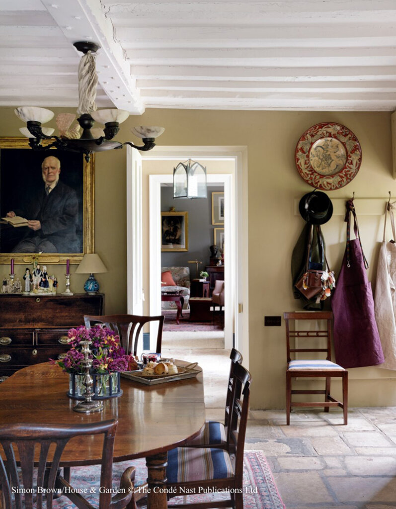
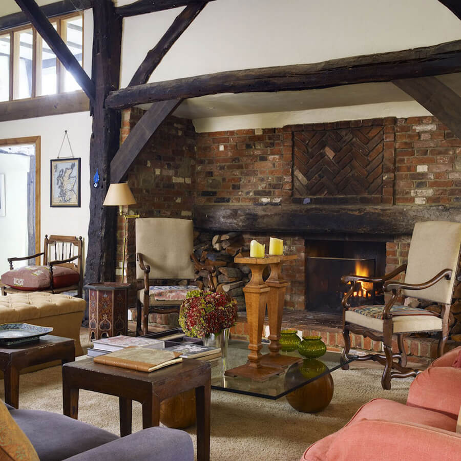
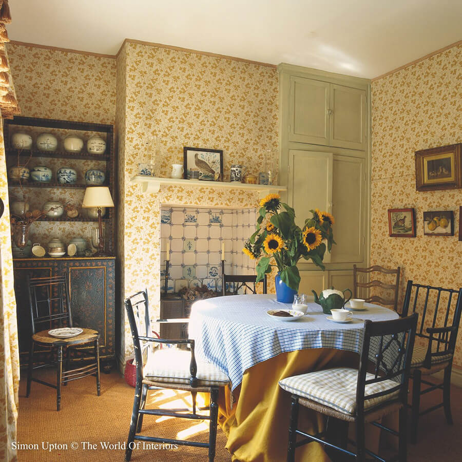
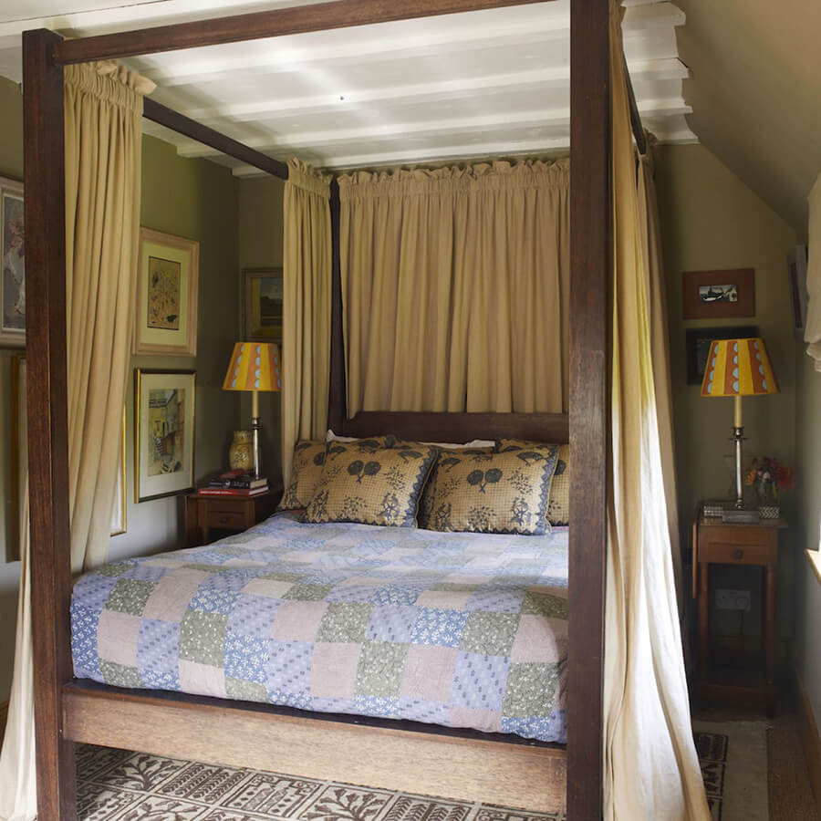
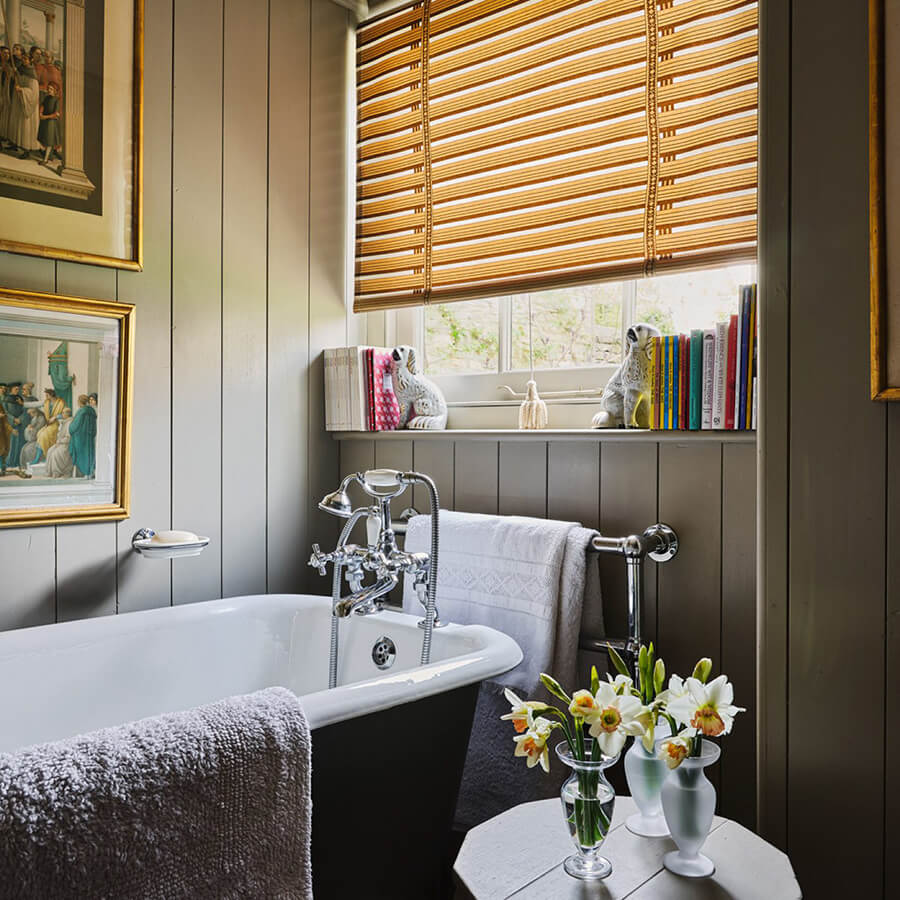
Country homes by Sibyl Colefax & John Fowler
Posted on Mon, 15 Apr 2024 by KiM
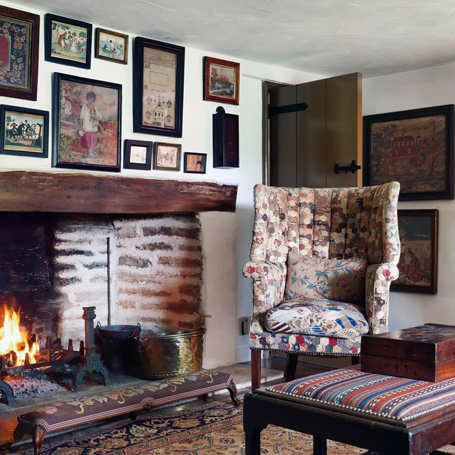
I am really just posting all of these photos as an excuse to feature the one above. That chair upholstered in quilt fabrics is just about the cutest and covetable thing I have ever seen. Photos from several country homes designed by the always inspiring Sibyl Colefax & John Fowler. (Some photos by Simon Upton)