Displaying posts labeled "Shelving"
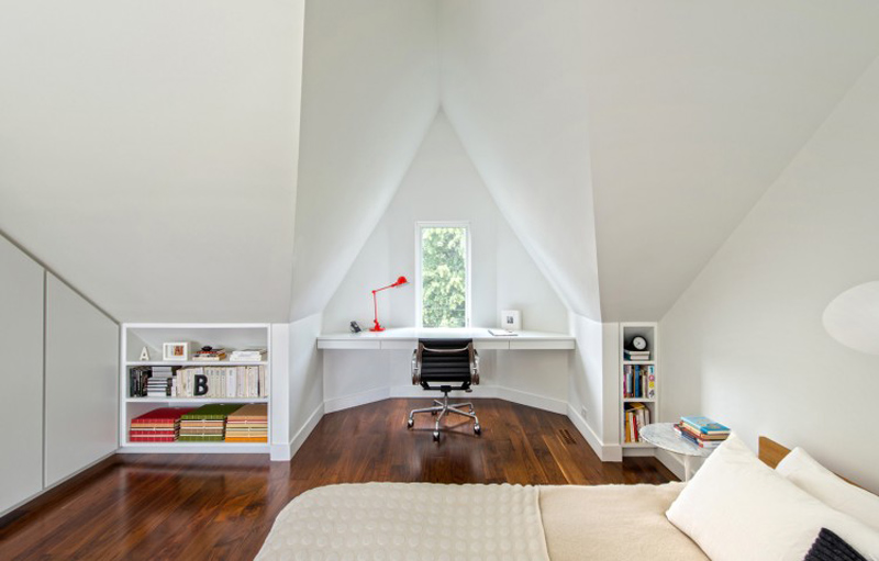
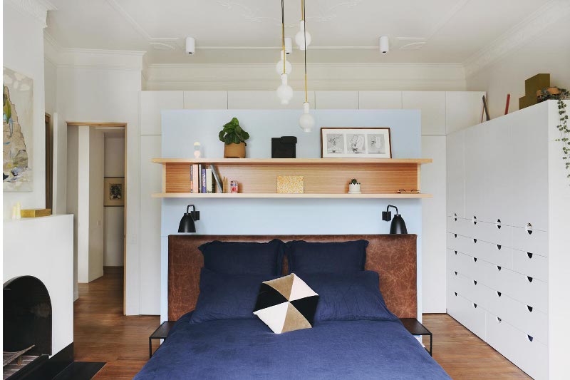
Books and bed
Posted on Mon, 6 Jul 2015 by midcenturyjo
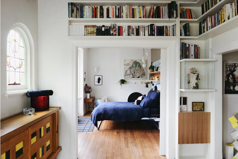
Salt and pepper. Nuts and bolts. Milk and cookies. Needle and thread. What goes better together than books and bed? Falconer Street by Nest Architects.
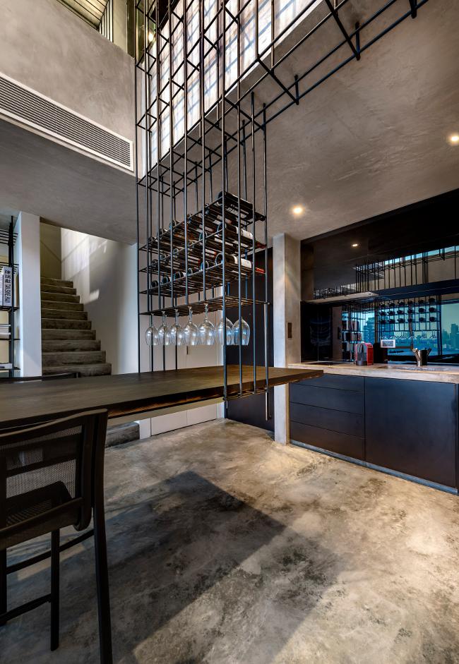
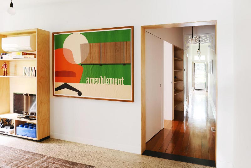
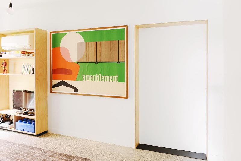
Reinforce
Posted on Tue, 16 Jun 2015 by midcenturyjo
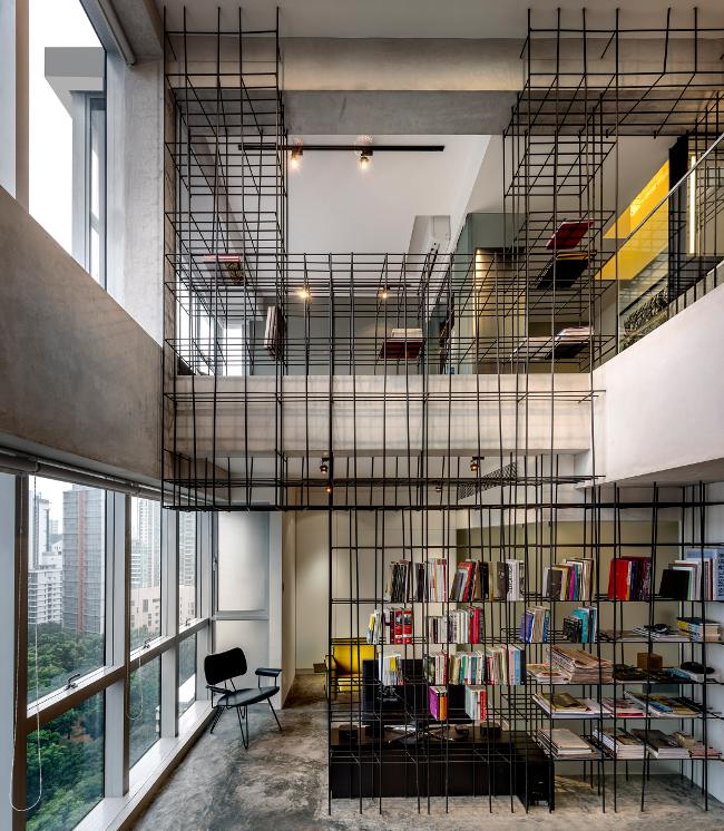
A bookshelf, a wardrobe, a table, a wine rack, and a sculpture. One piece of furniture frames and connects the space, reinforcing the meaning, the personality, the purpose. Monoform Living at the Strata by Singapore design firm Produce.
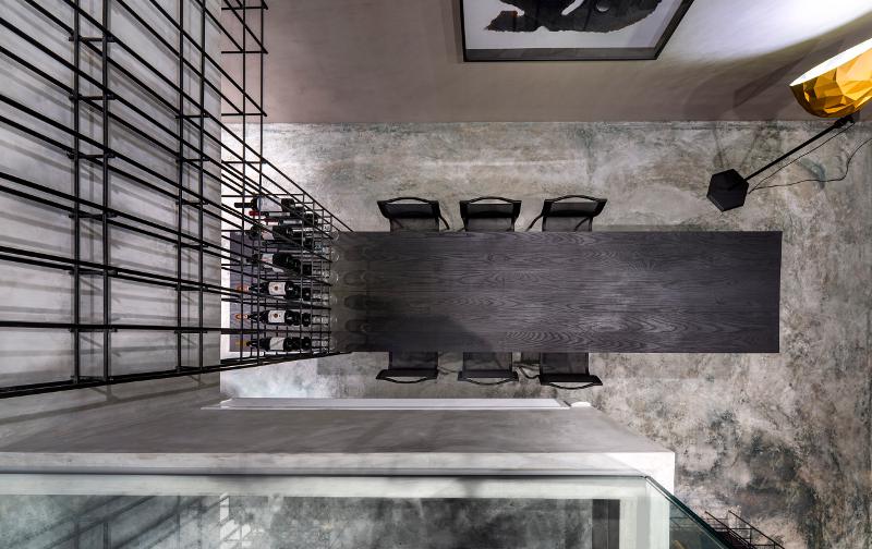
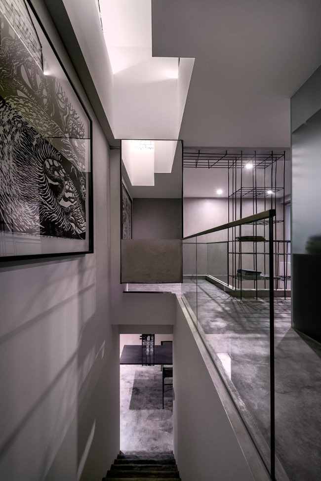
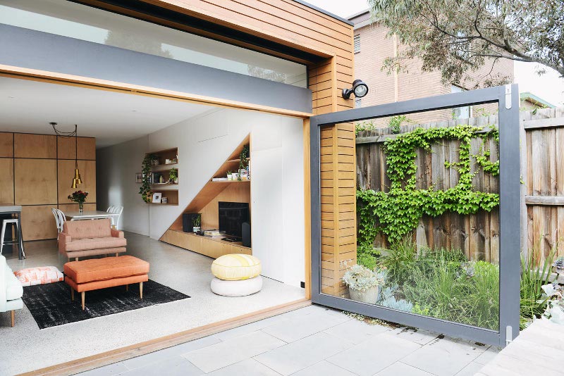
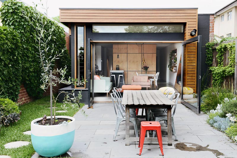
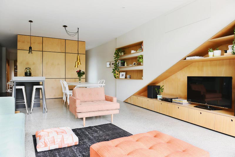
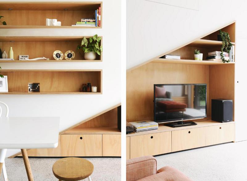
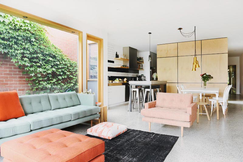
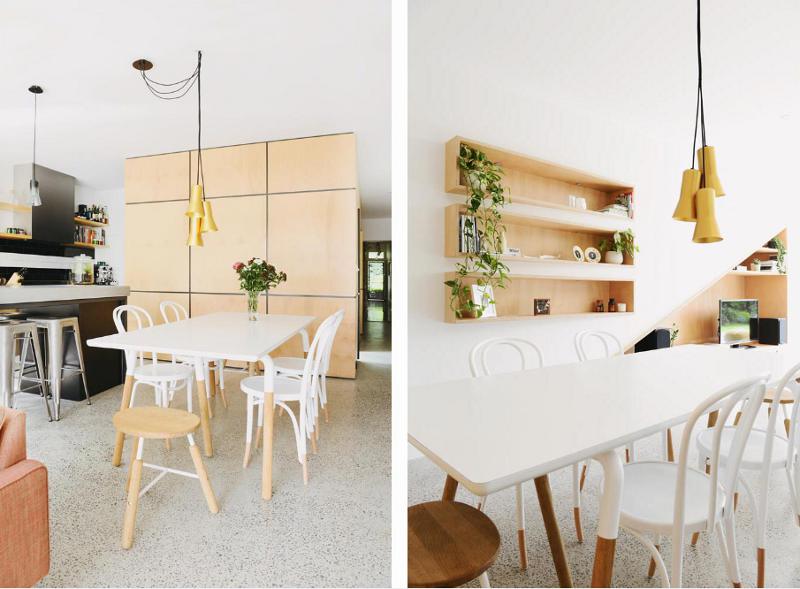
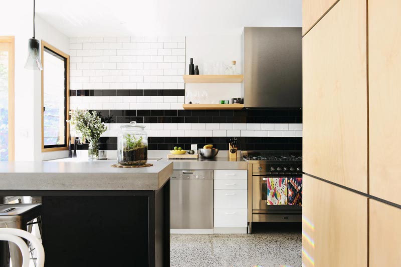
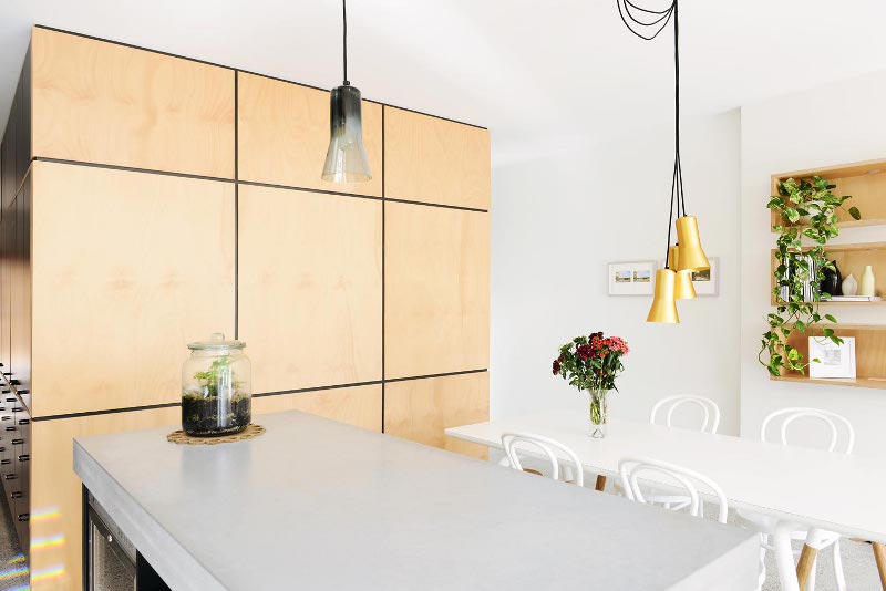
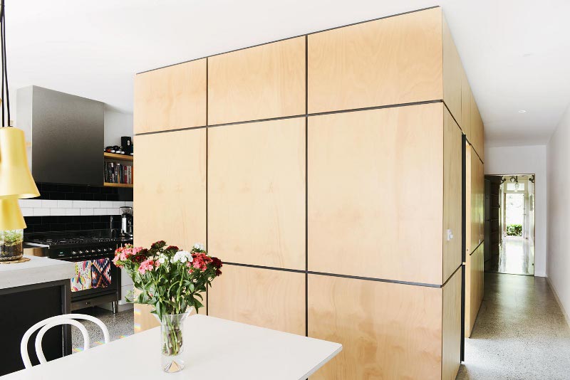
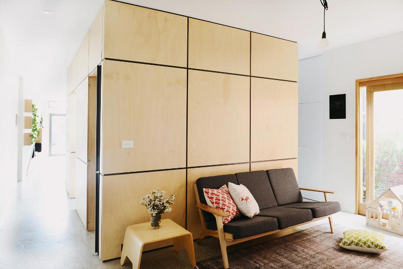
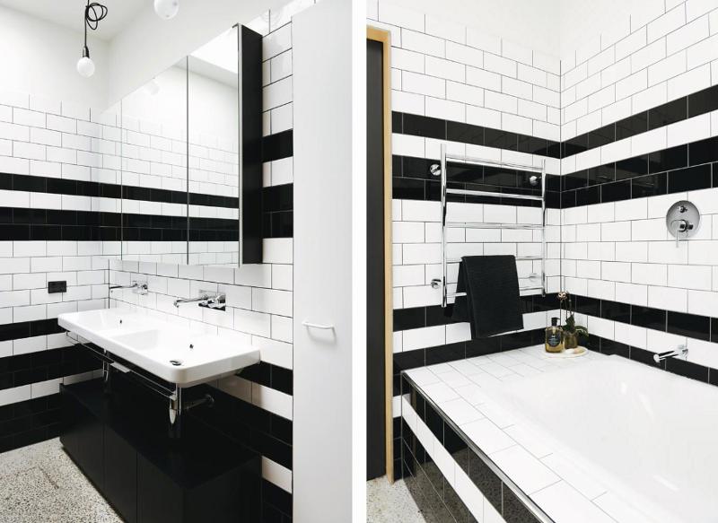
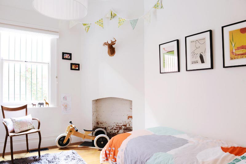
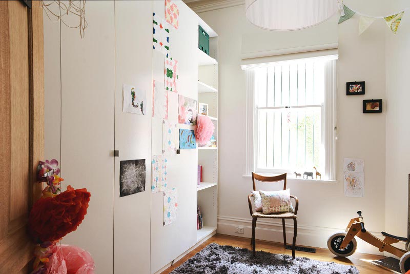
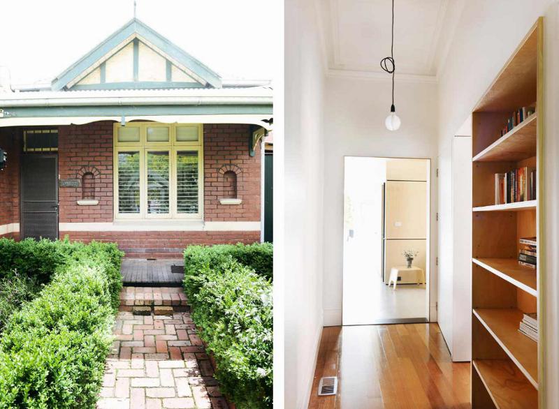
Nest
Posted on Mon, 25 May 2015 by midcenturyjo
The perfect family nest by Nest Architects. Let me clarify. Perfect is for the modern extension to this older home. Don’t really care if the family is perfect or not 😉
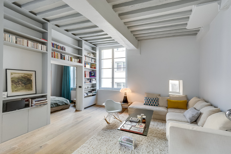
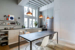
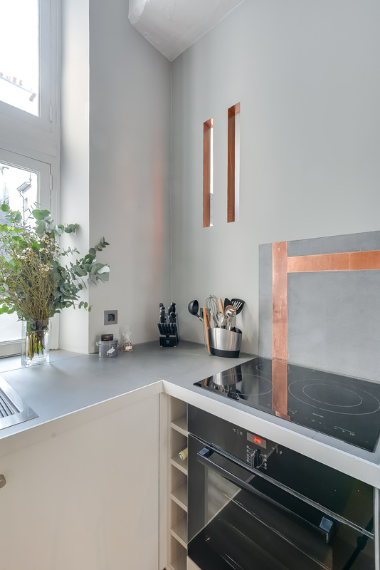
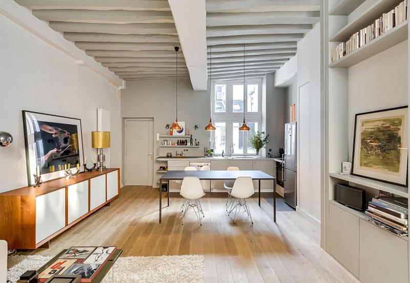
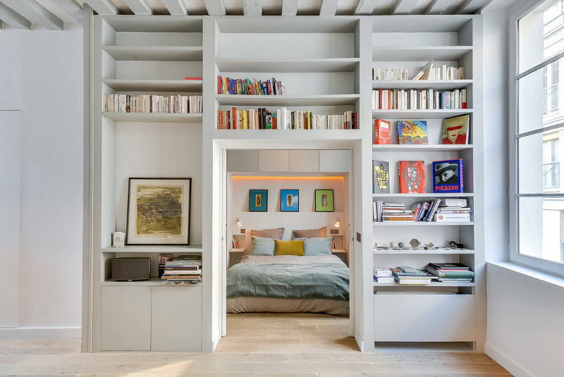
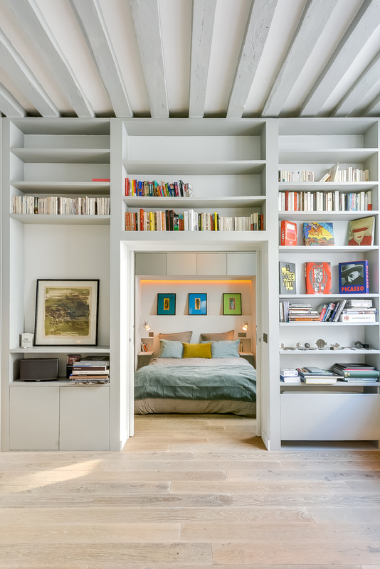
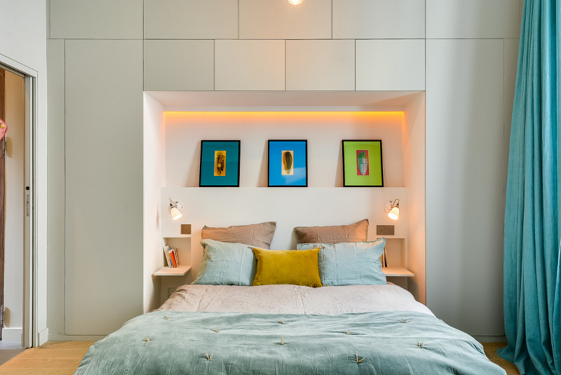
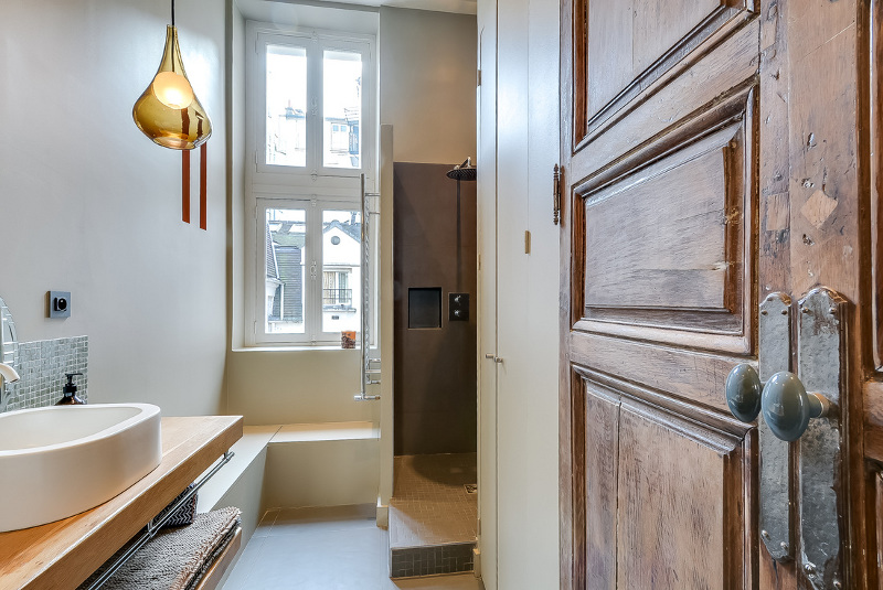
The bachelor pad
Posted on Fri, 15 May 2015 by midcenturyjo
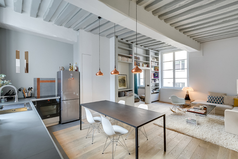
Bright, cheery, light and fun. Not your usual brooding, heavy on the masculine cliché bachelor pad. At 50 sq m open plan living and full height storage make the most of the space while still being cosy and inviting. Garçonnière Marais by Parisian interior designer Tatiana Nicol.
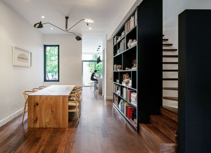
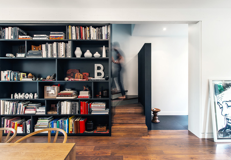
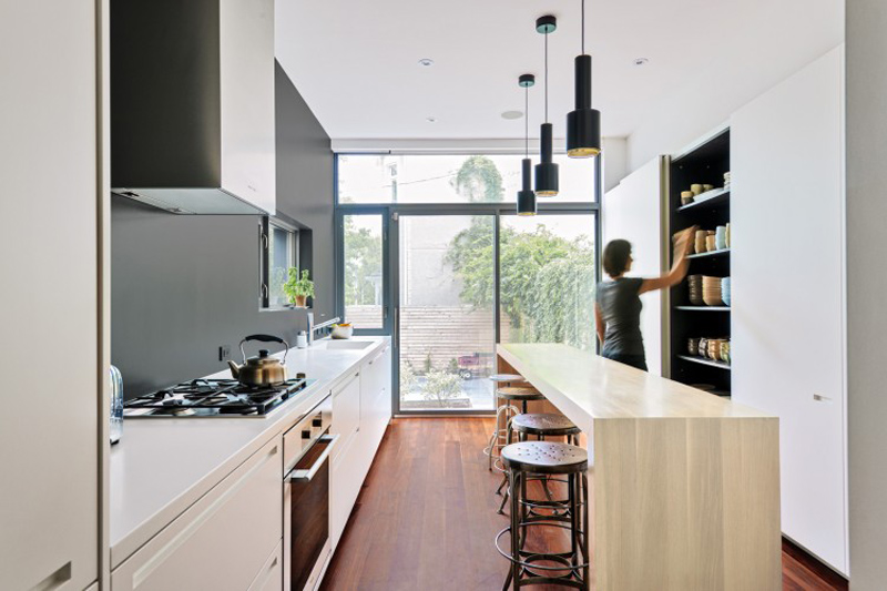
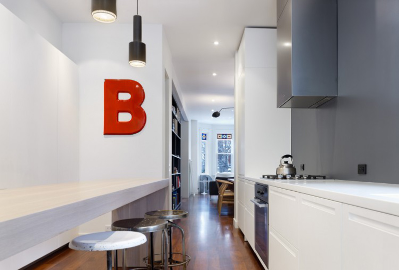
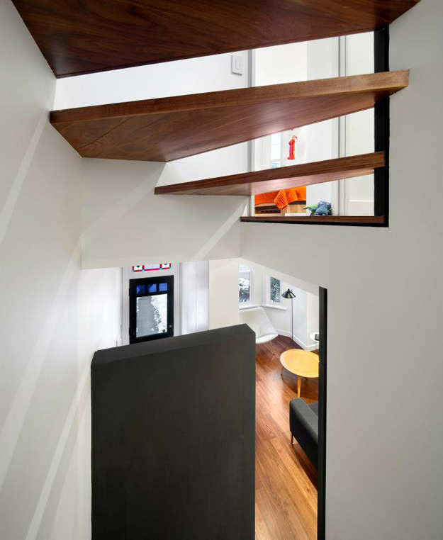
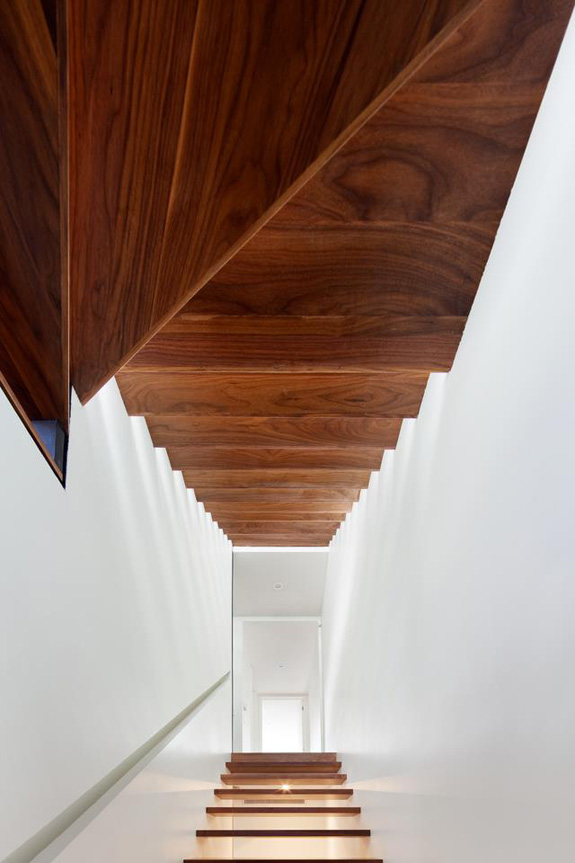
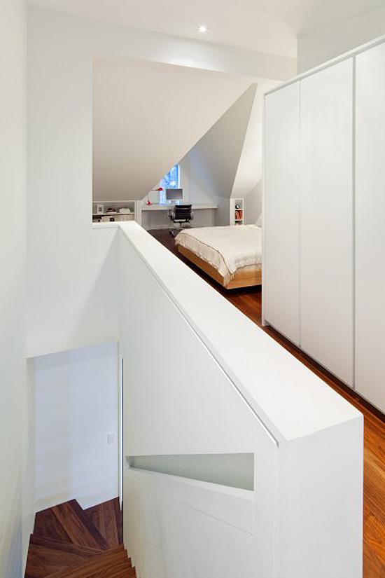
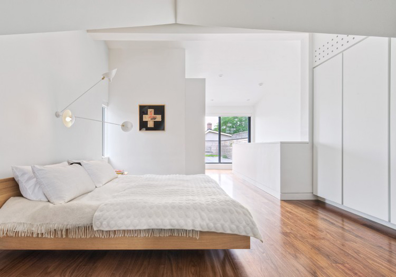
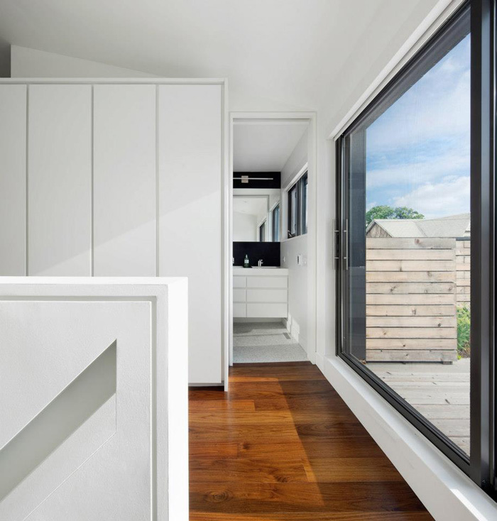
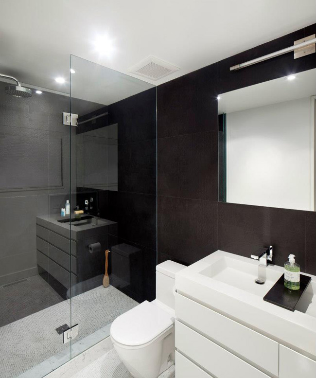
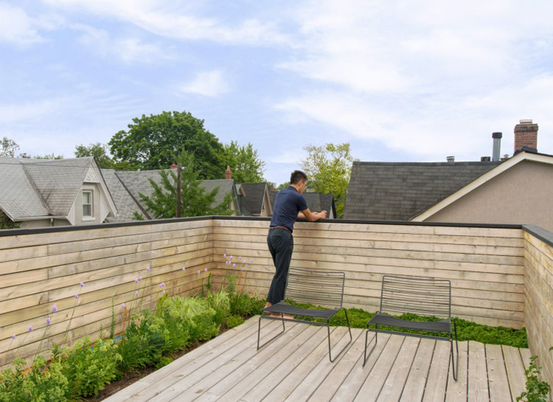
Contrast House
Posted on Fri, 10 Apr 2015 by KiM
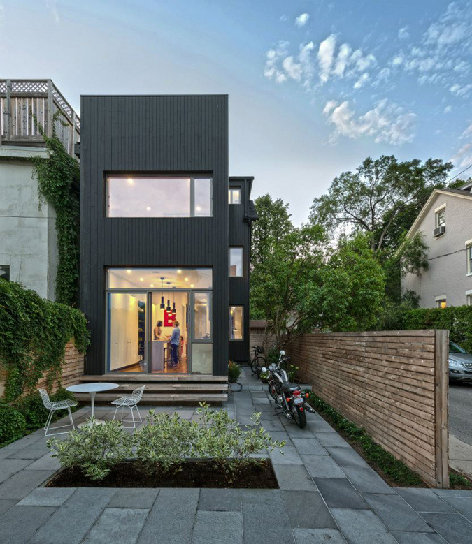
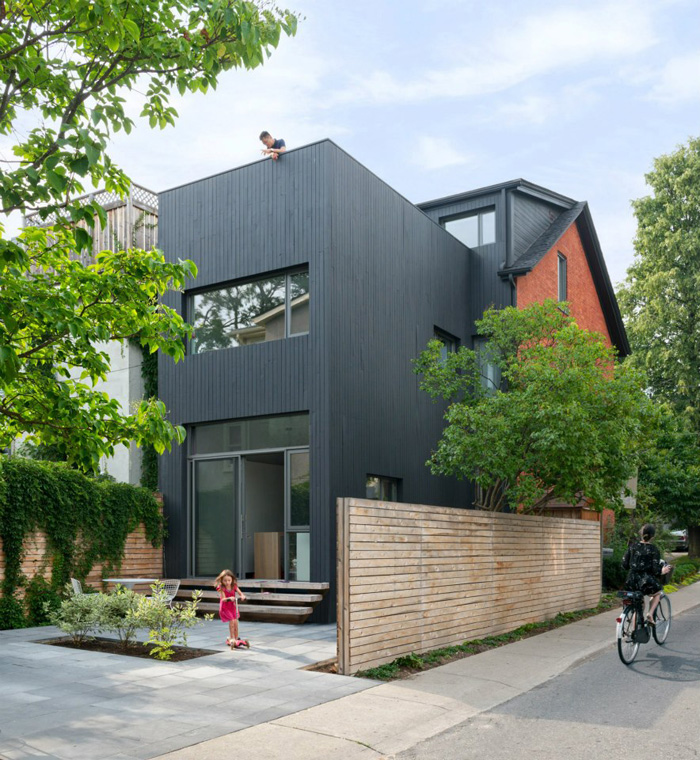
How to modernize an old home on a tiny lot and make it the best house on the street! The intent of the remaking of this narrow 125-year-old residence was two-fold: to increase natural light in the interior using contrast, and to reduce the house’s ecological impact.An increase of natural light is accomplished through both physical and perceptual means. Physically, the long, narrow house – only 11 feet wide on the rear façade – was reconfigured to allow direct sight lines to new window openings. Perceptually, contrast was used as a means to “brighten” internal spaces without direct access to natural light. Contrasting elements are placed in proximity to produce an intensified effect. At each level, the stair is punctuated by a black element to define space — be it floating bookcases housing the owner’s collectibles, or a chalk board wall for play — and to create contrast to visually intensify the natural light spilling down from above. Via Toronto’s Dubbeldam Architecture + Design