Displaying posts labeled "Stairs"
pushmi-pullyu house
Posted on Tue, 10 Nov 2015 by KiM
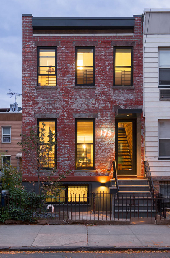
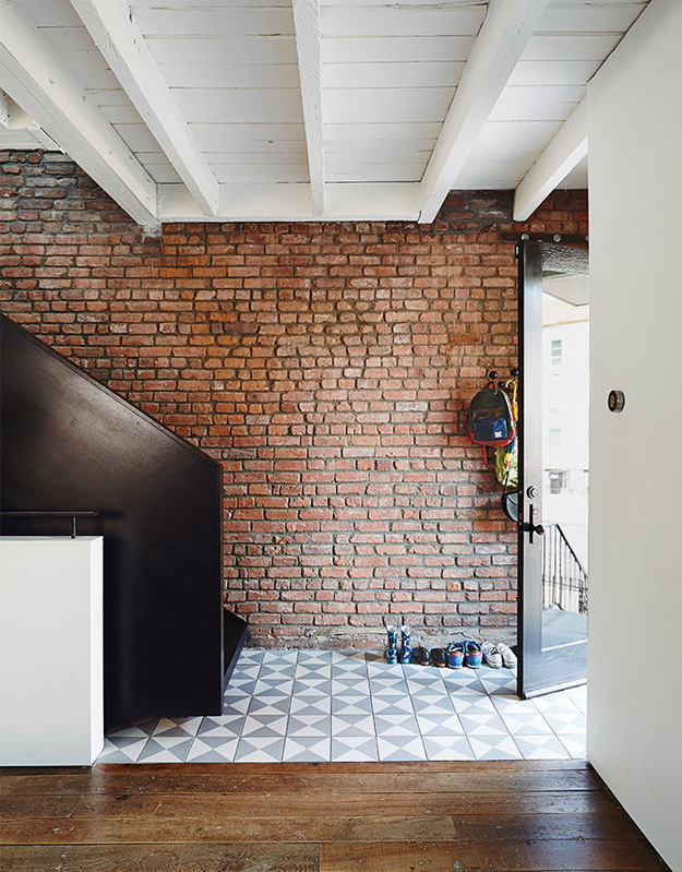
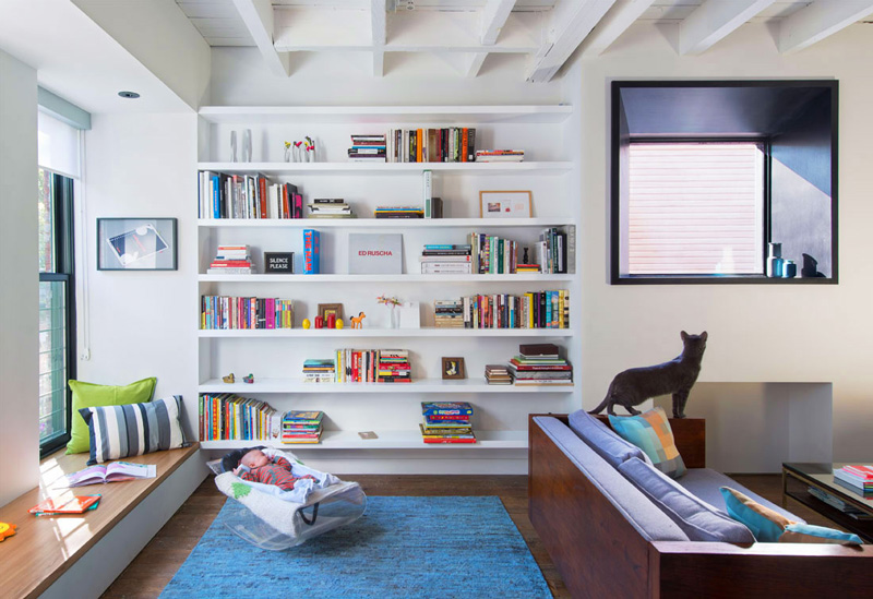
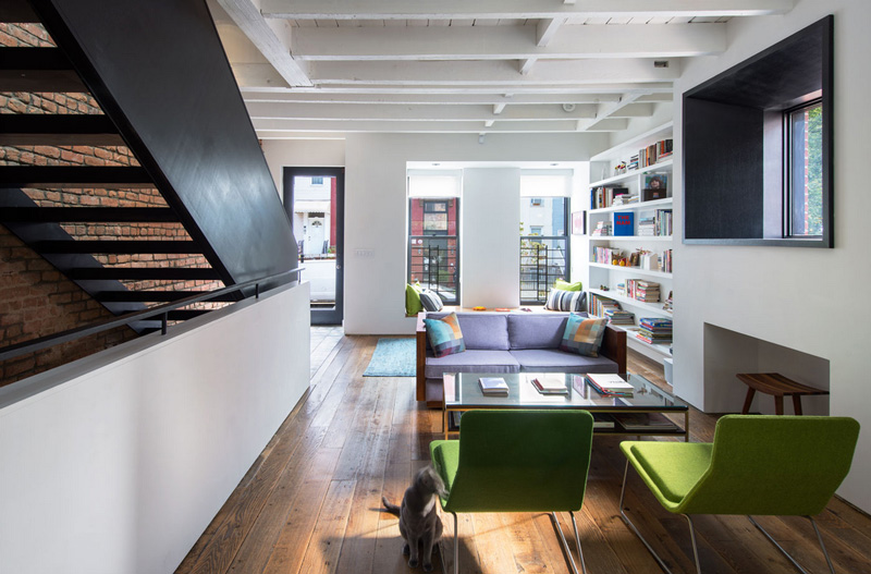
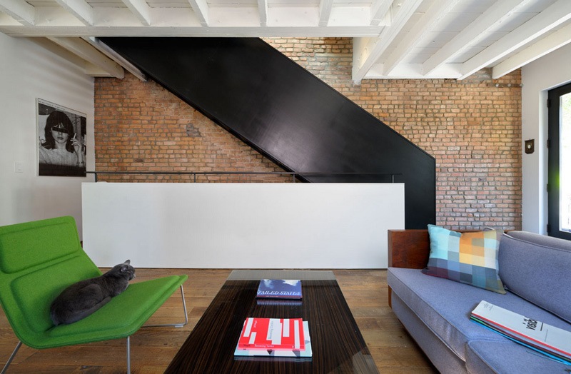
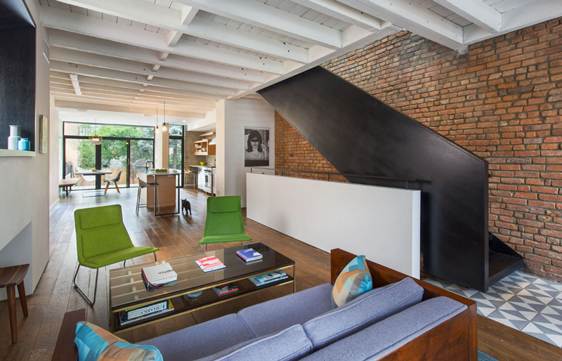
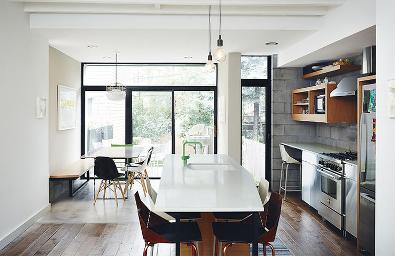
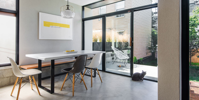
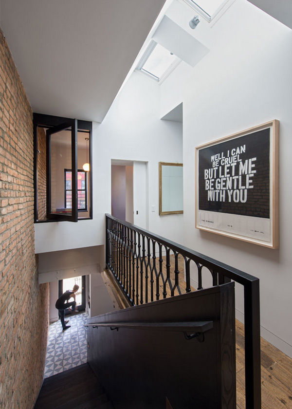
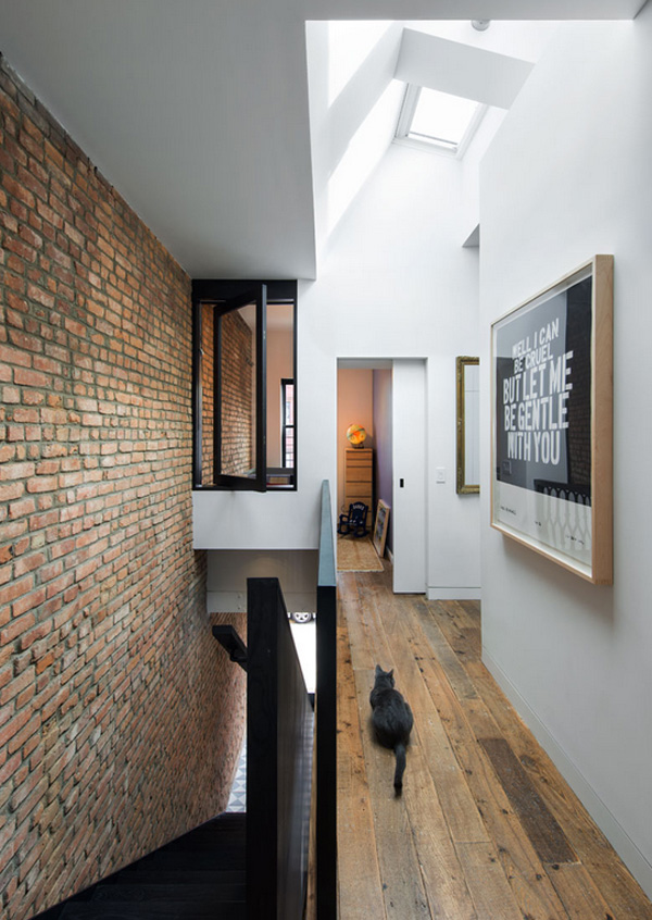
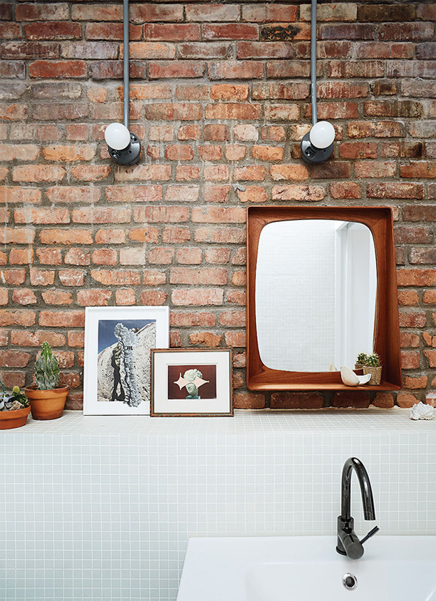
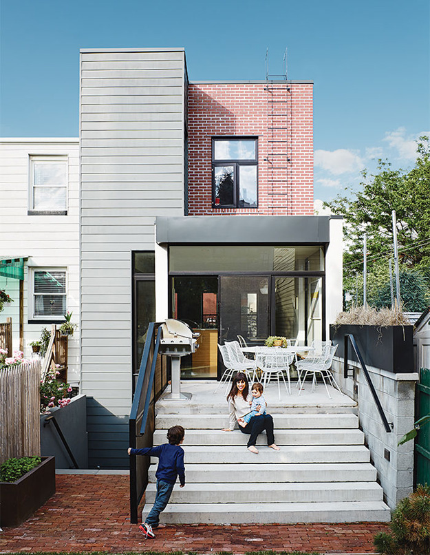
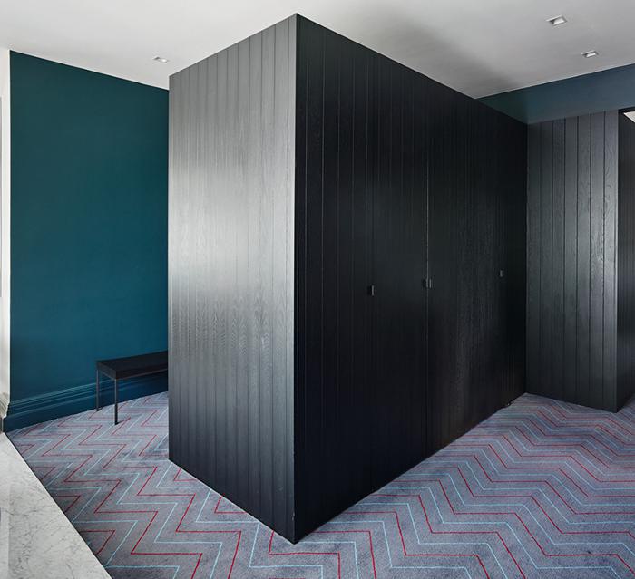
The “PUSHmi-PULLyu” house is a renovation of a worker’s house in Greenpoint for a creative couple and their growing family. The project was coined “PUSHmi-PULLyu” as a result of the forces at play in the work, drawing circulation, light and exterior materials into the house through its openings. The vision for the project was to marry the client’s two passions: modern simplicity + an unerring appreciation for the rustic qualities of the original house. This led to the invention of the term “m-ustic”, which became a new architectural language for the project. Modern elements were treated as black, abstract insertions while the rustic qualities inherent in the house were restored and enhanced. This home really speaks to me. It represents everything I always hoped my last house could have been…but wasn’t. This is taking something old and restoring the wonderful while replacing the horrible. By Brooklyn architecture firm noroof. (Photos: Chuck Close, Michael Graydon and Nikole Herriott)
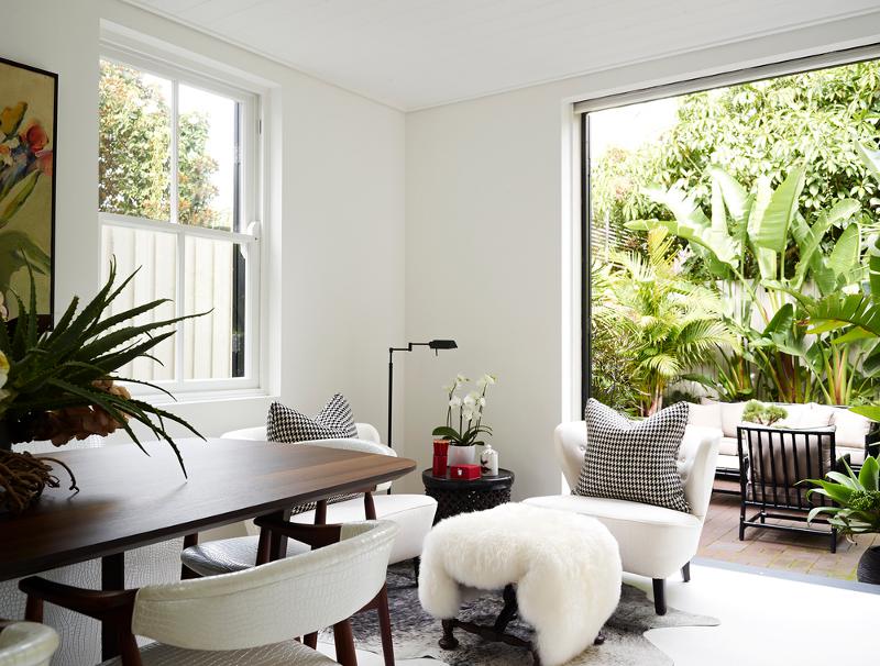
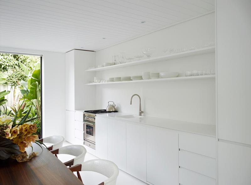
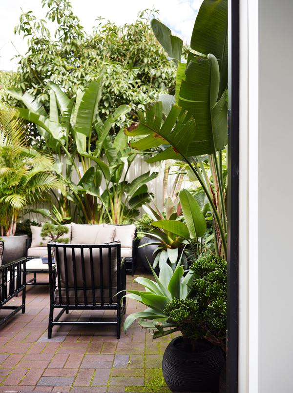
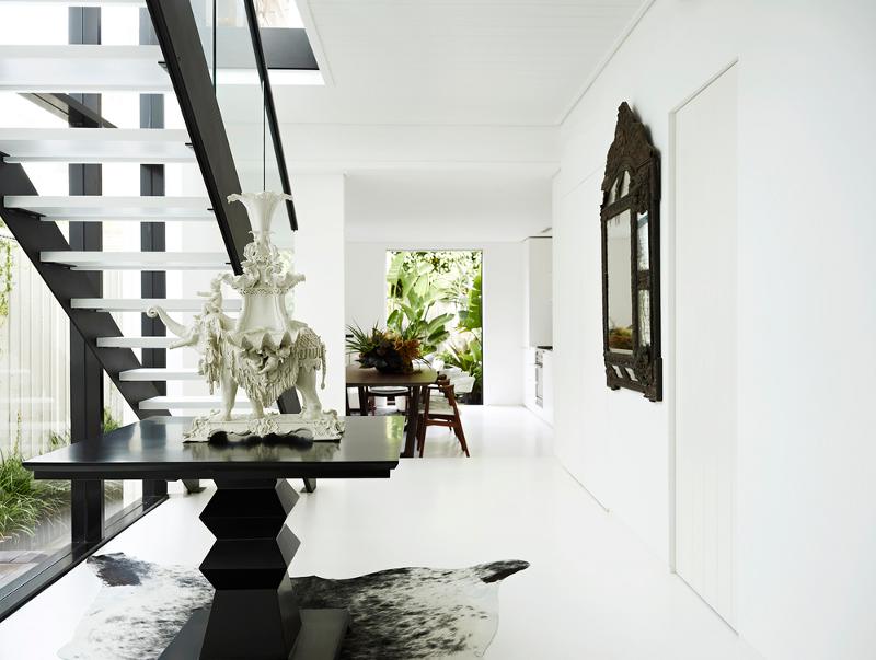
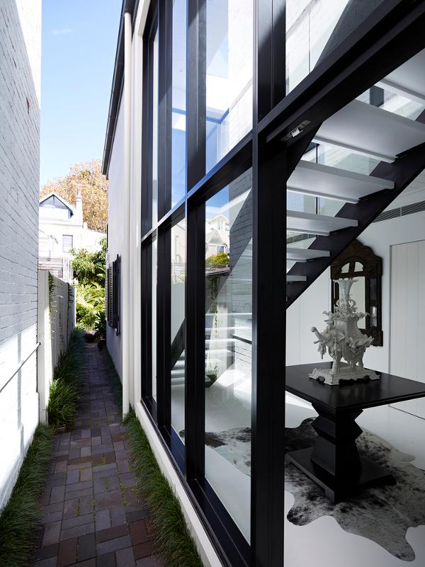
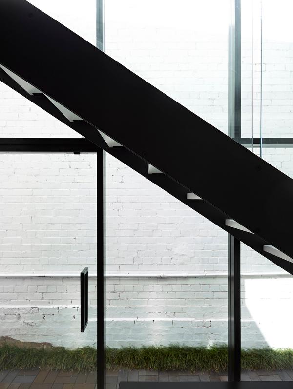
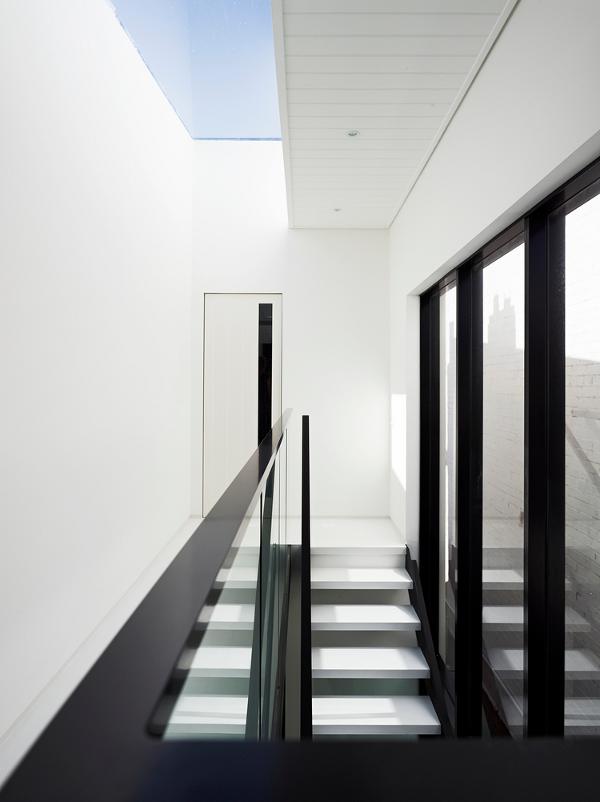
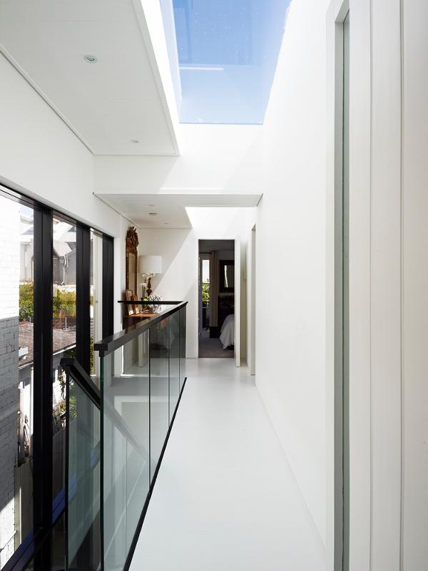
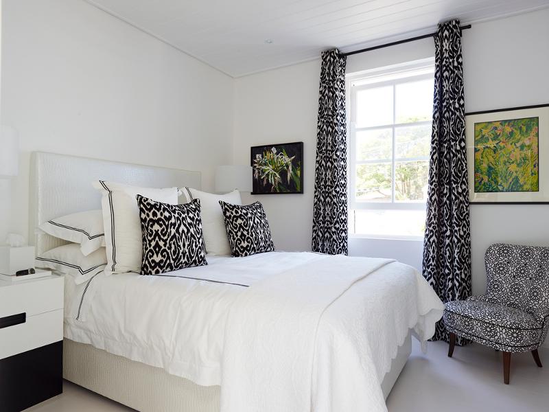
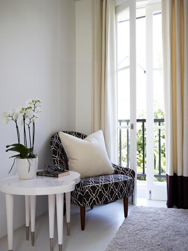
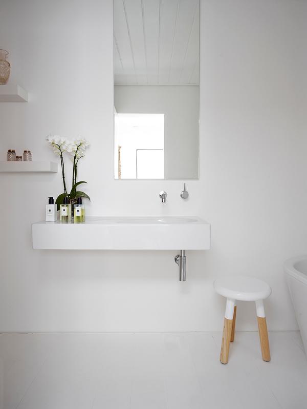
The terrace house
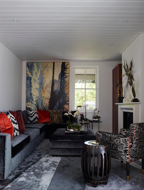
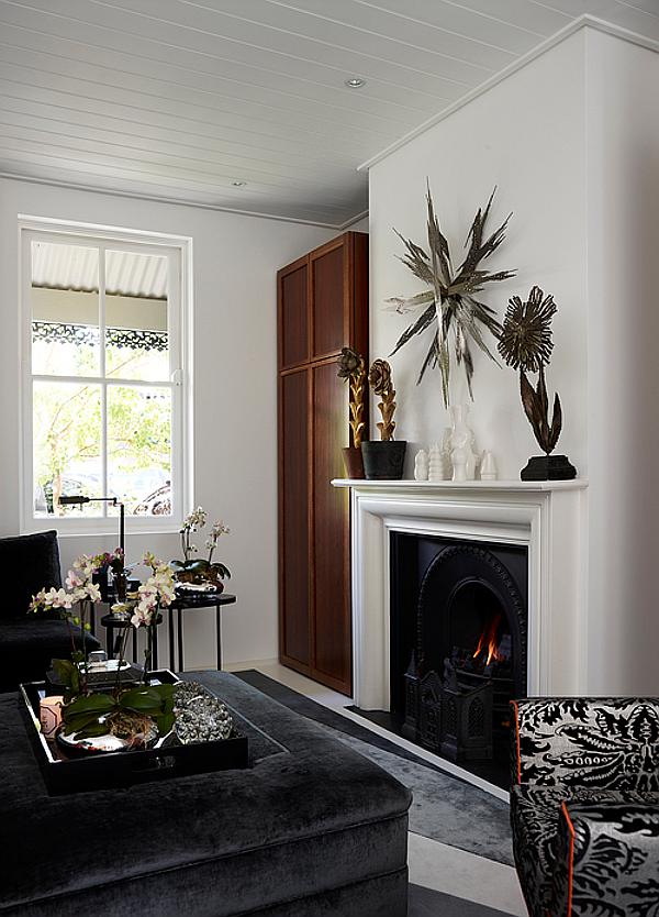
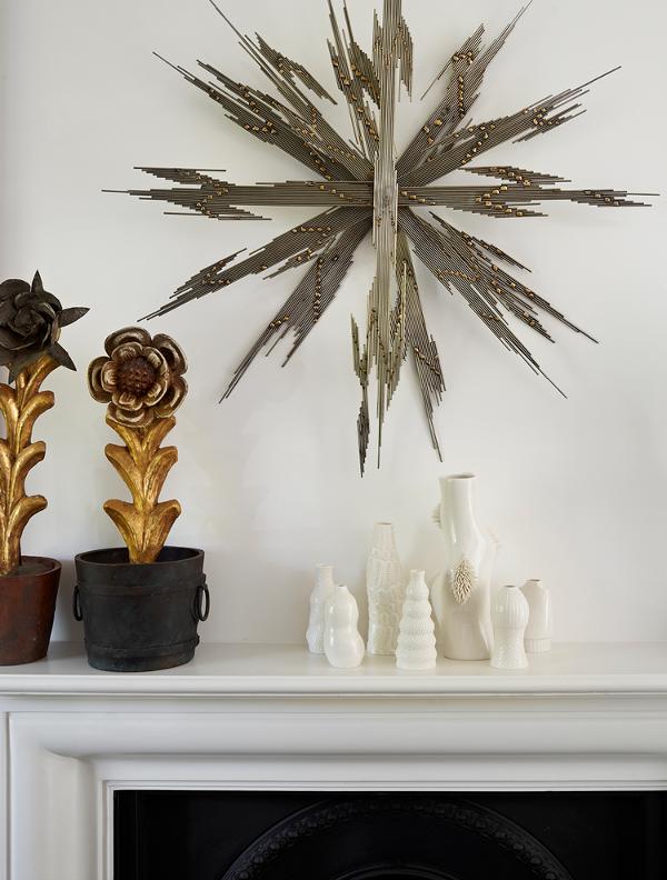
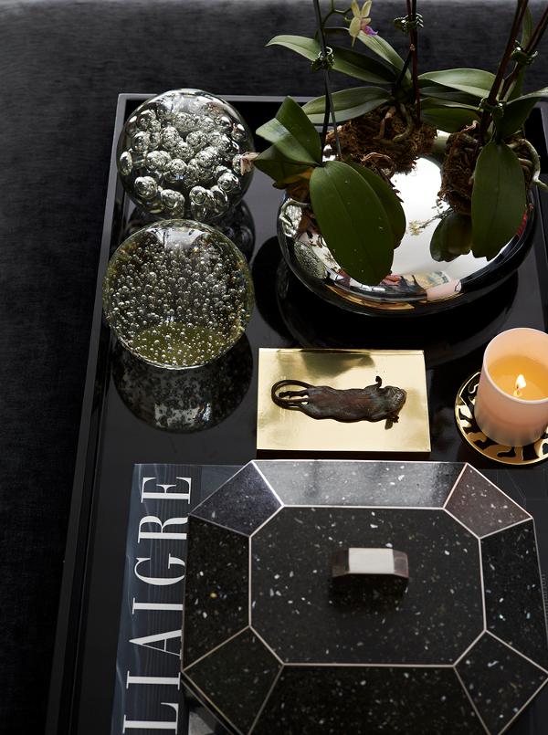
Posted on Tue, 10 Nov 2015 by midcenturyjo
Light filled and beautifully bright this terrace house in Woollahra, Sydney is only 3 meters wide. Poppy and Charlotte O’Neil of POCO Designs have used white extensively within the open plan design to stretch the house is the mind’s eye. A wall of glass floods both floors with sunlight and blurs the barrier between inside and out. A luxe living area is grounded with greys and warmed with gold and red accents. Contemporary and traditional, sophisticated and warm.
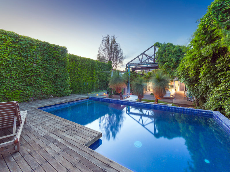
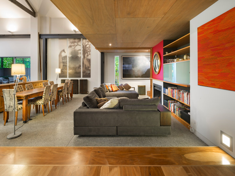
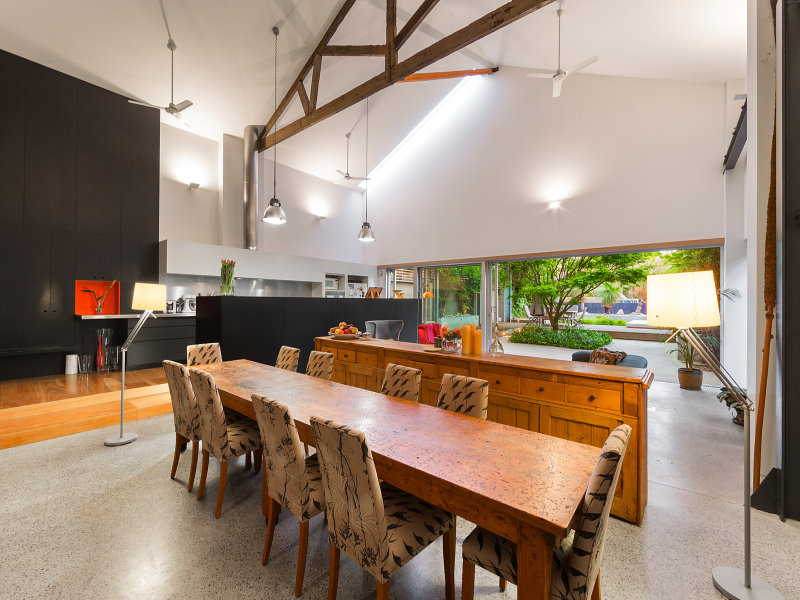
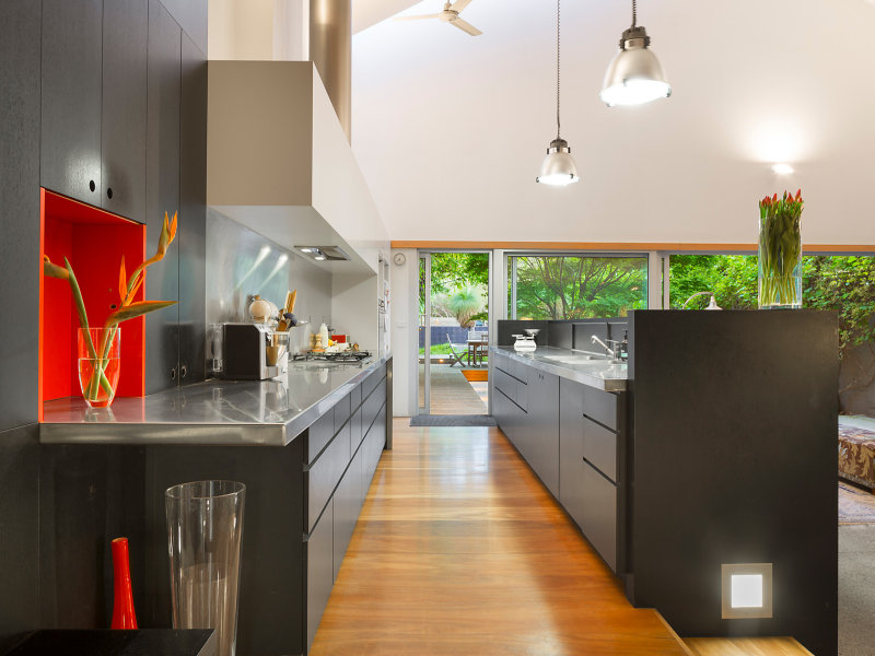
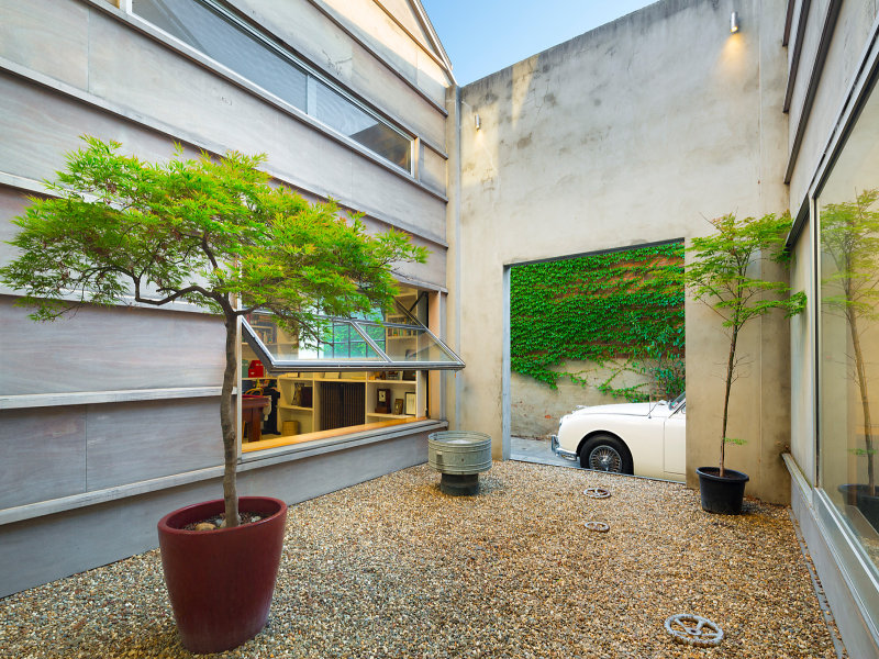
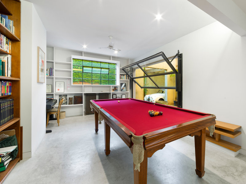
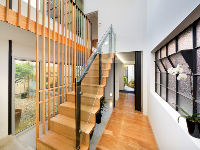
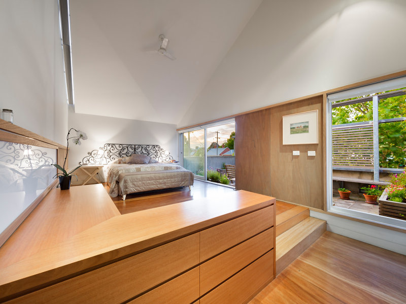
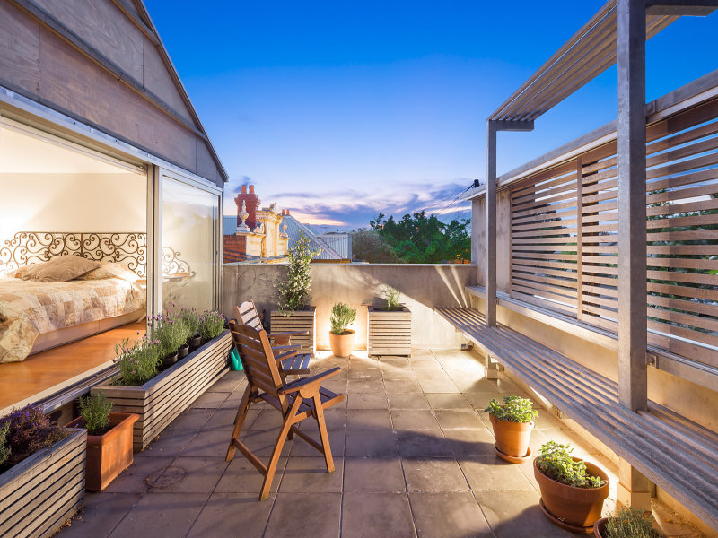
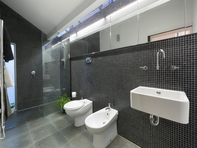
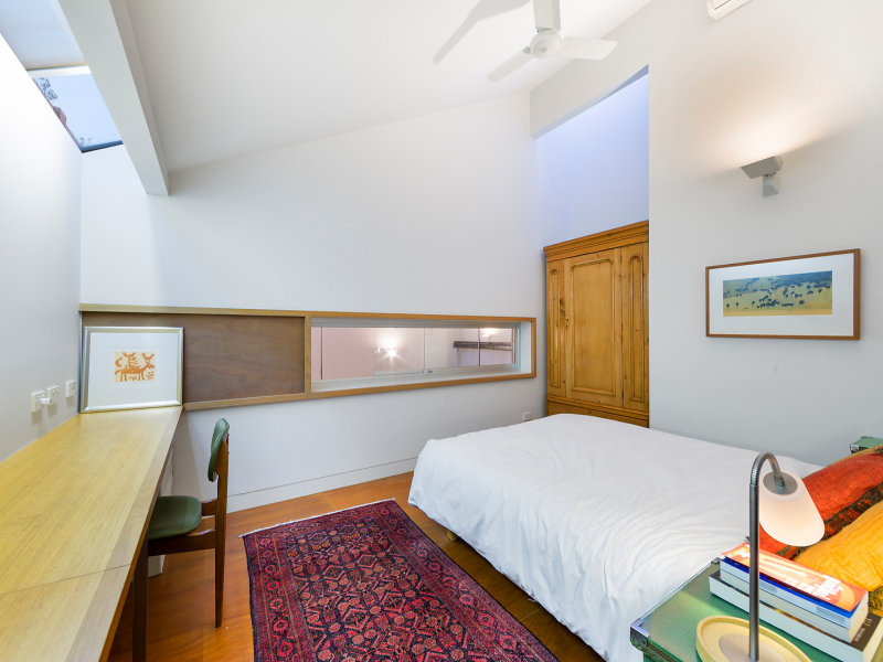
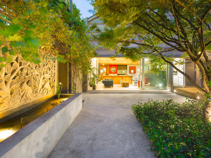
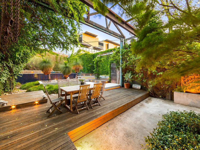
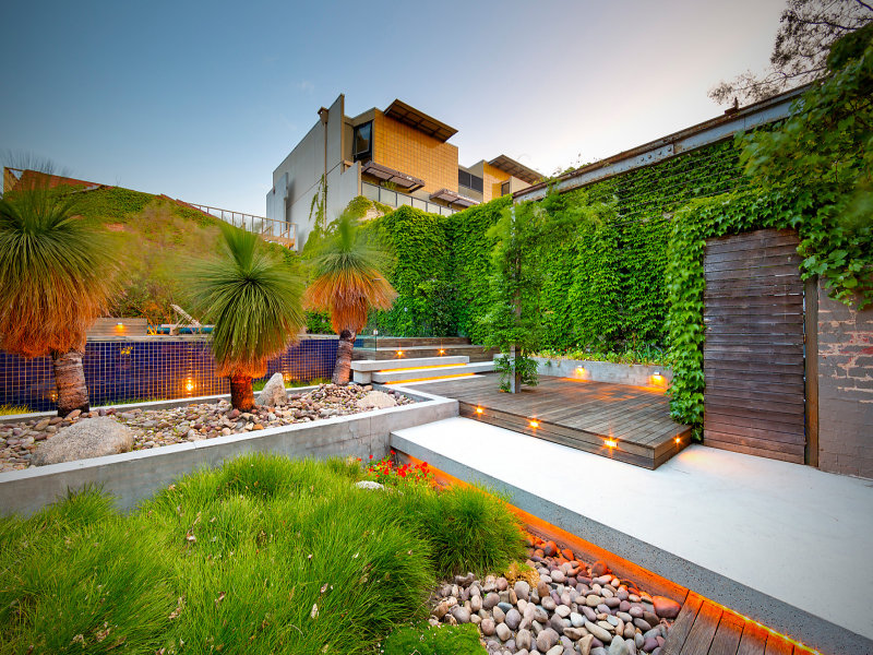
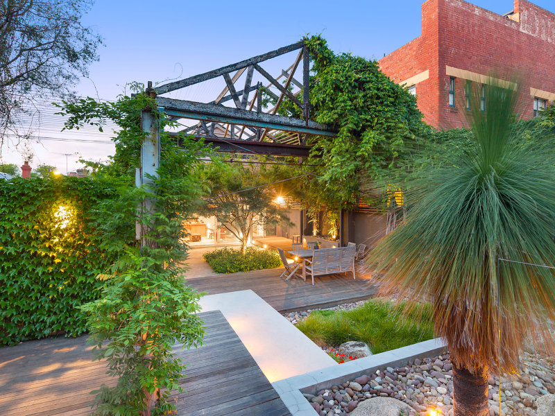
Stalking a warehouse
Posted on Wed, 4 Nov 2015 by midcenturyjo
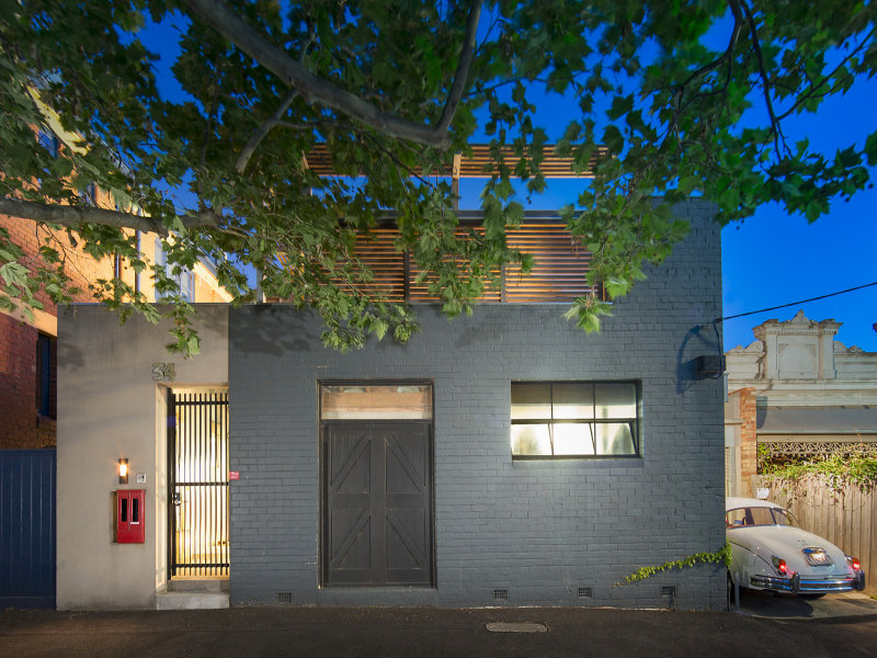
I think it’s the external space that I love the most in this Fitzroy North warehouse. Don’t get me wrong. I love (most) of the inside as well but it’s the walled garden effect, the exposed roof trusses, the creepers and pool that are tickling my fancy. I’d change one or two things inside this inner-city Melbourne home but that’s only due to a difference in taste. I’m sitting here staring at the computer screen figuring how to arrange my furniture and art in a home I’m stalking and even going to purchase. Tragic am I not? Link here while it lasts.
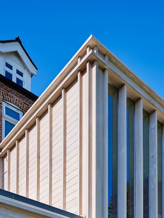
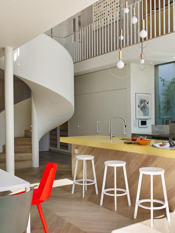
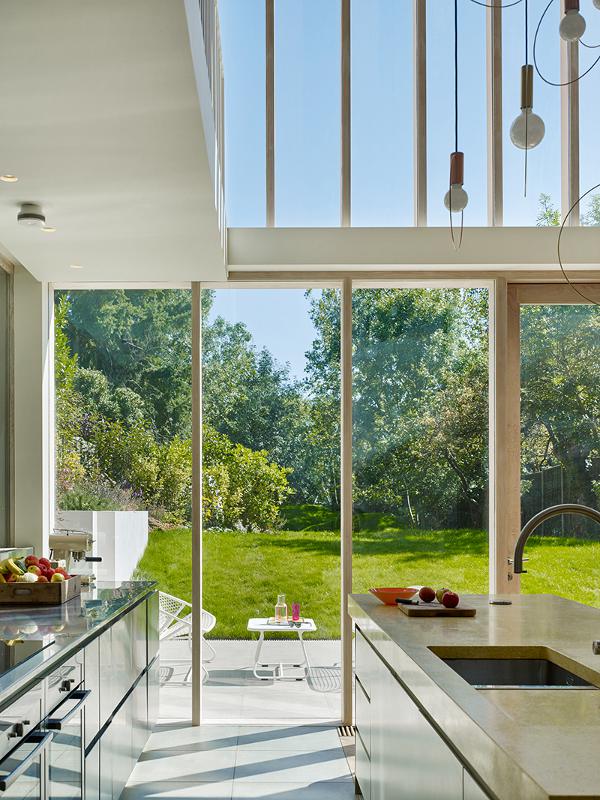
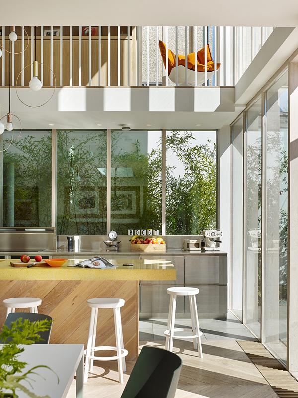
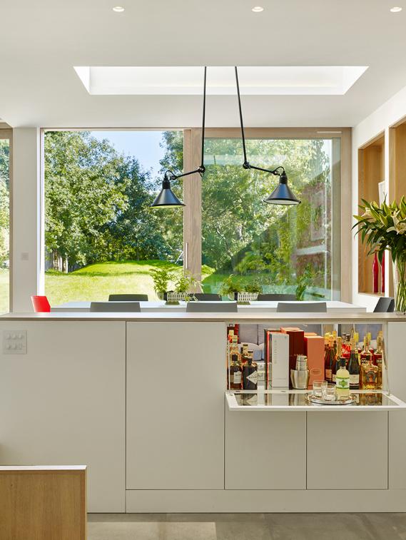
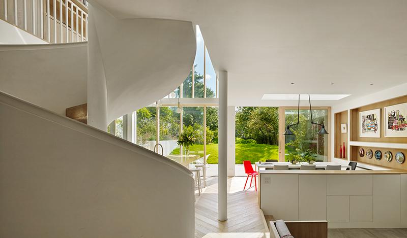
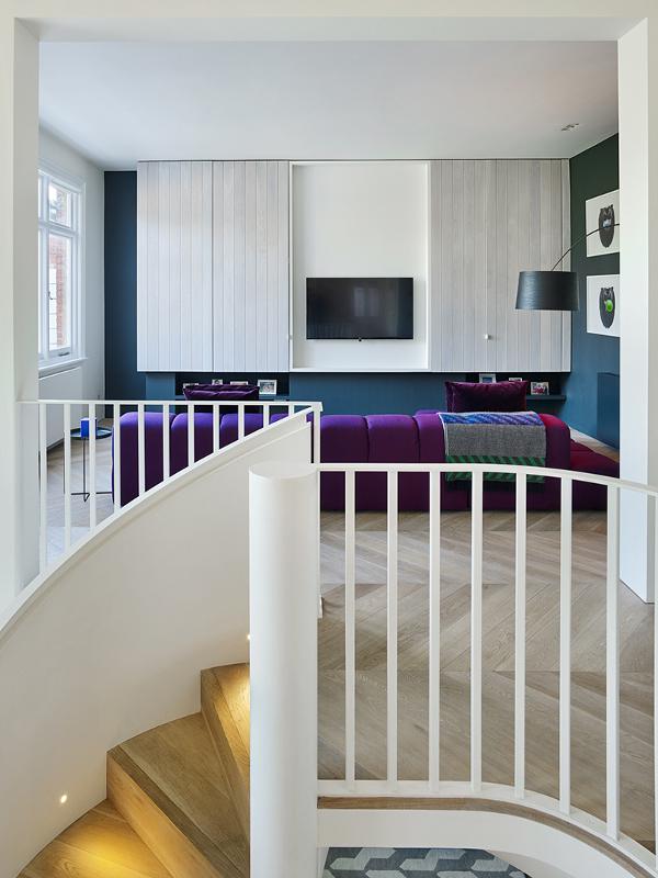
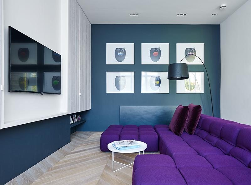
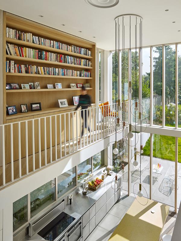
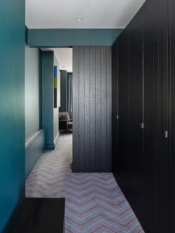
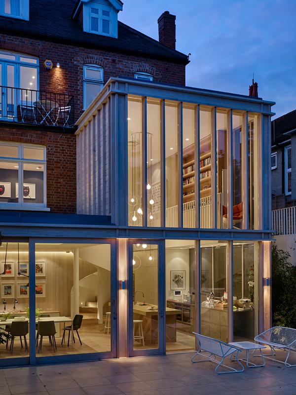
Andy Martin encore
Posted on Wed, 4 Nov 2015 by midcenturyjo
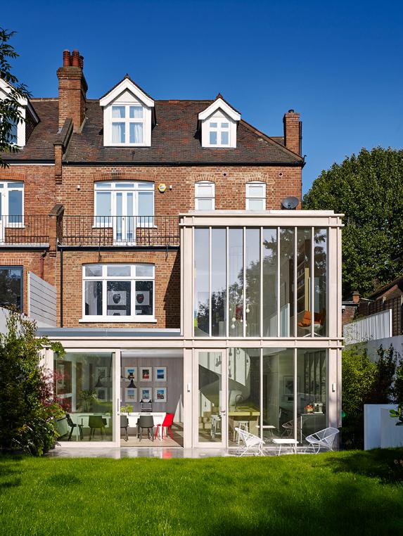
Please don’t ask me why it’s called the “Beach House” when it sits in west London. Perhaps it’s the bright, casual vibe. Lots of bleached timber, pops of colour, walls of glass to let in the light and capture the sea garden view. A family home that is casually stylish, at ease with its Edwardian era heritage and its modern extension. Evocative of being on holiday in the city. The reason doesn’t really matter. Beach House by Andy Martin Architects.

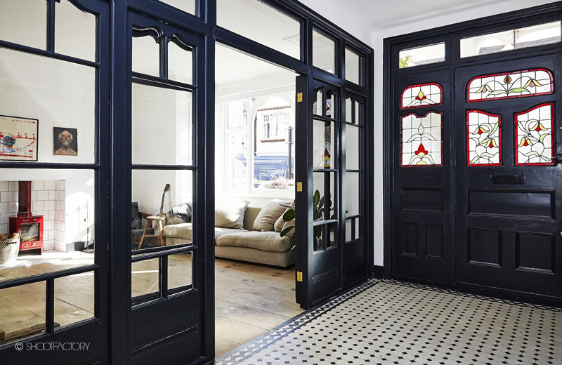
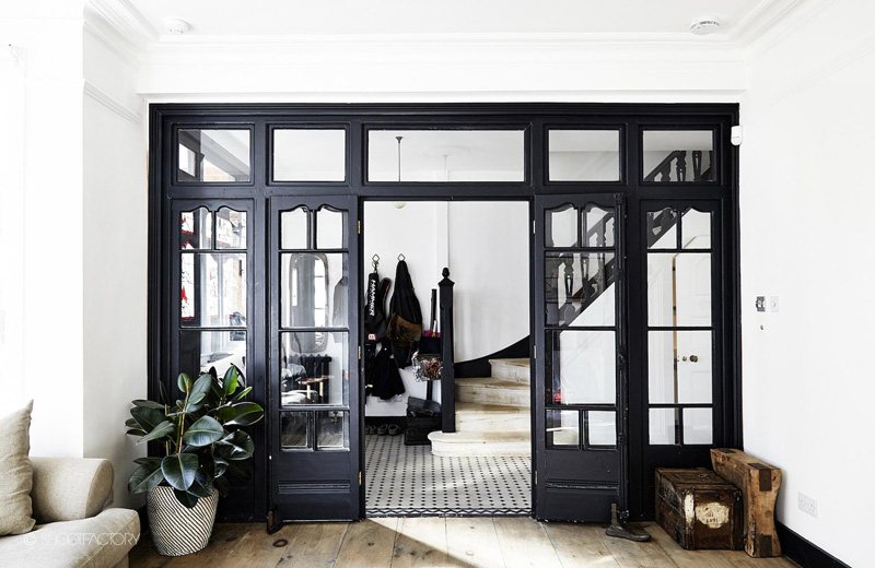
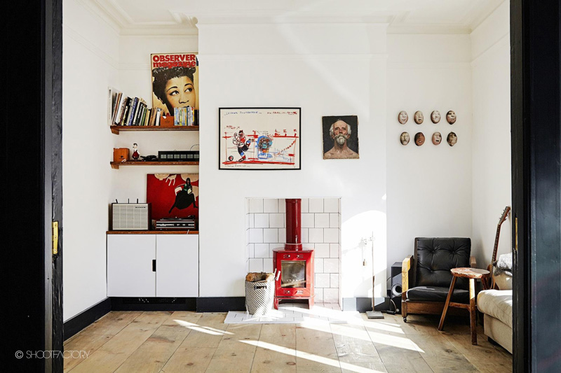
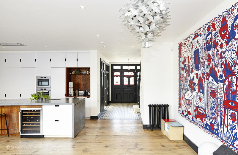
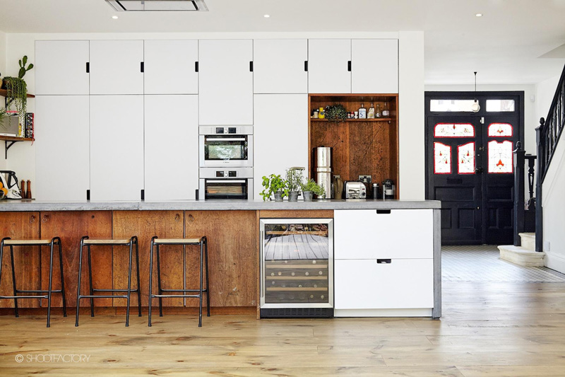
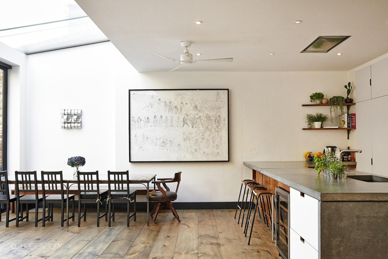
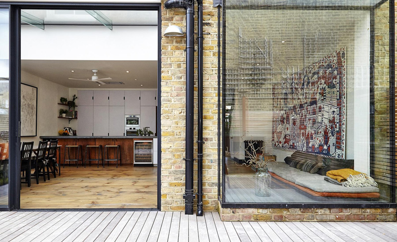
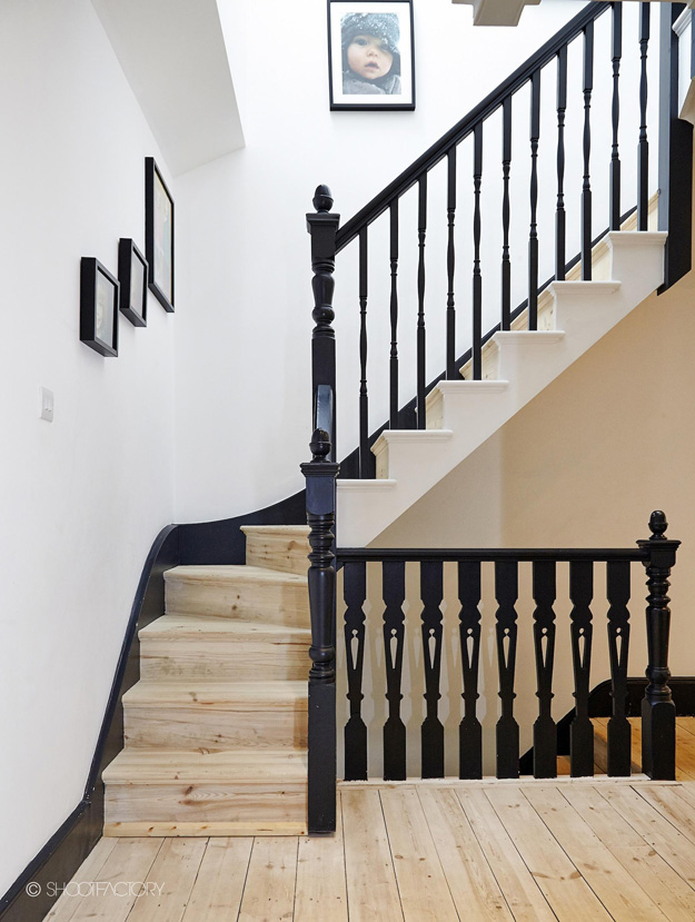
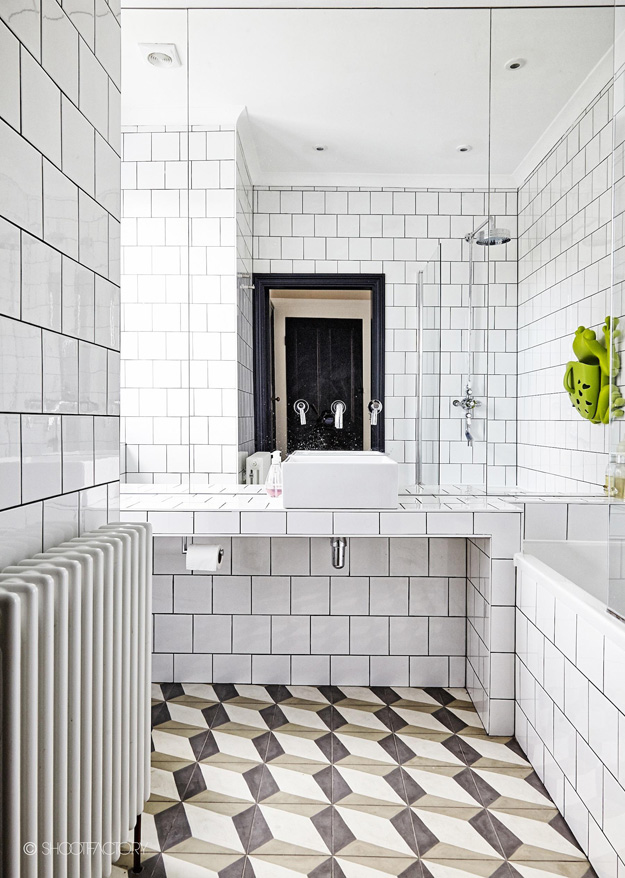
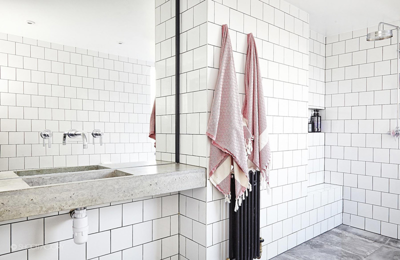
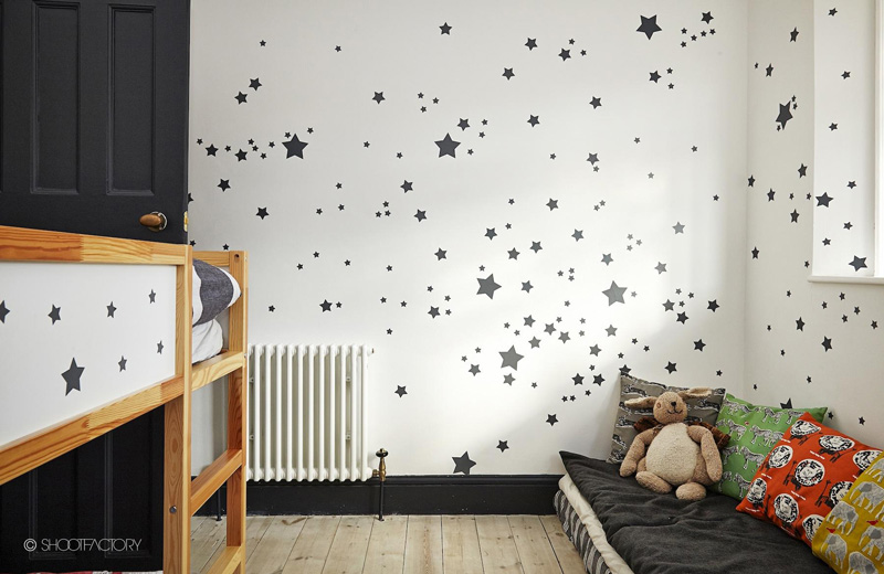
When it is not about the decor
Posted on Sun, 1 Nov 2015 by KiM
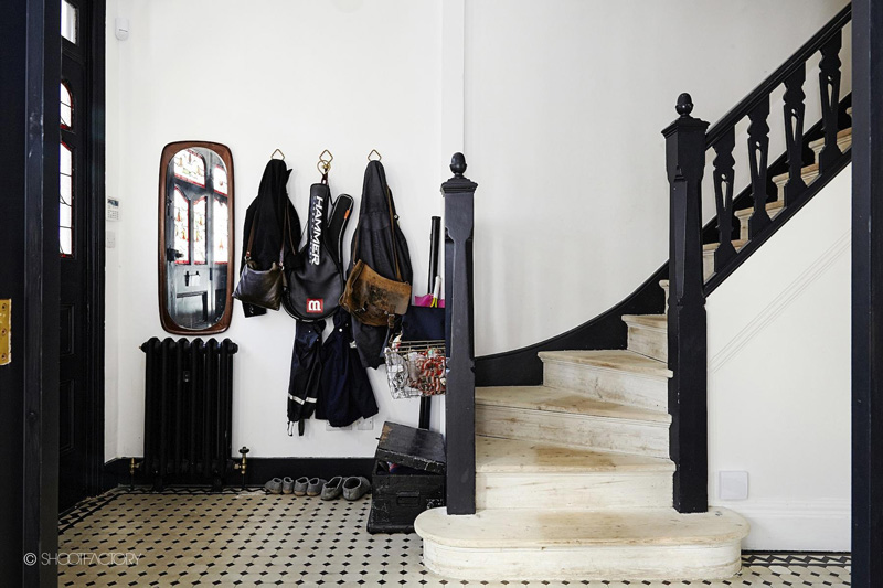
This is one of those rare occasions where I feature a home that is lacking in the decor department but the architecture and finishes more than make up for it. All of the black painted trim/stairs/doors, the tile foyer floor, the stained glass front entrance, THE PERFECT KITCHEN, the wide plank flooring, and the tiled bathrooms make this home a dream. Then add in all of your favourite artwork and vintage furnishings and BAM! New on the Shoot Factory roster.