Displaying posts labeled "Red"
Congrats Camilla
Posted on Tue, 4 Oct 2011 by midcenturyjo
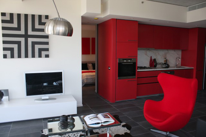
Just had to pop back to say congratulations to the lovely Camilla Molders on making the Top 50 Rooms 2011 as judged by Australian House & Garden. The smile that stretched across my face as I flicked through the magazine and thought “I know that room, I know that designer. We’ve drunk too much together.” Well deserved Camilla. (This photo is snagged from the magazine website and is by Derek Swalwell. Camilla if you have a larger file we’d love to have it so I can upload it nice and big.)
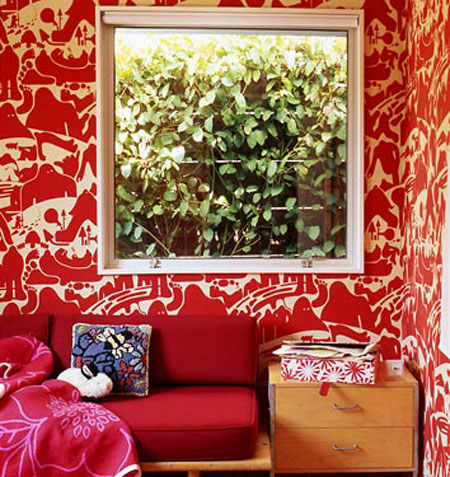
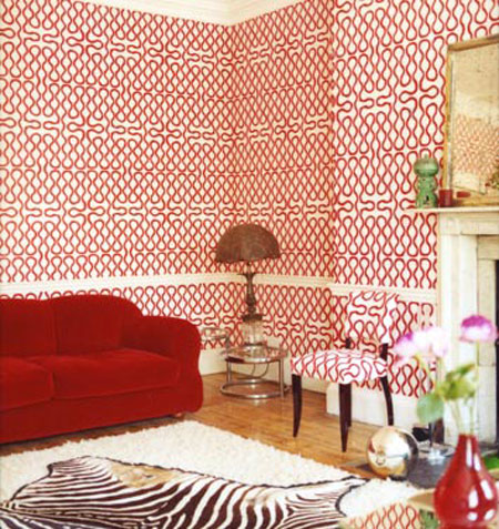
HAPPY CANADA DAY!
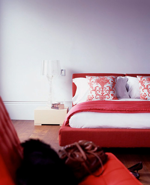
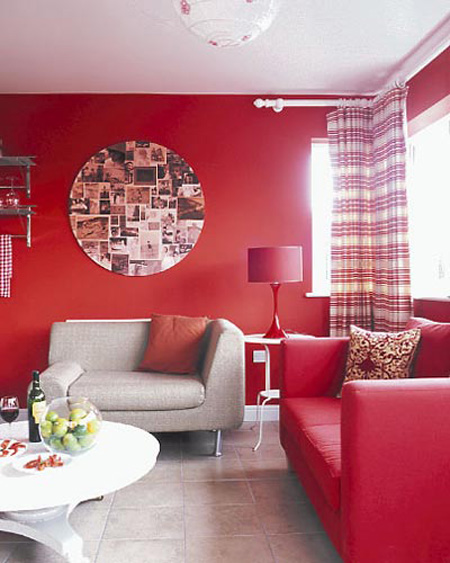
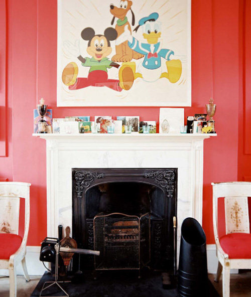
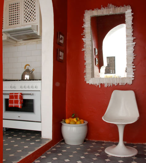
Posted on Fri, 1 Jul 2011 by KiM
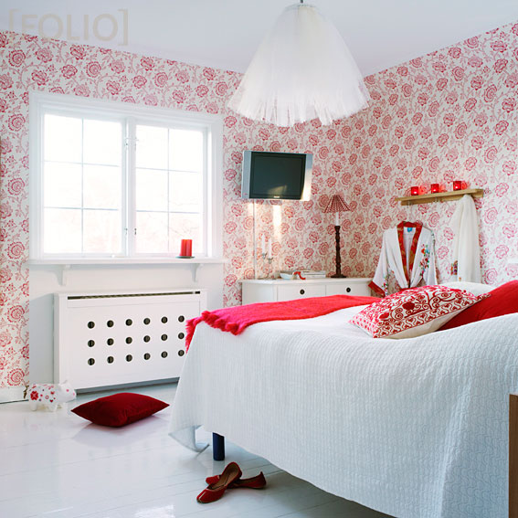
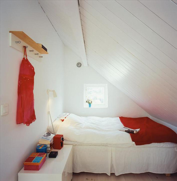
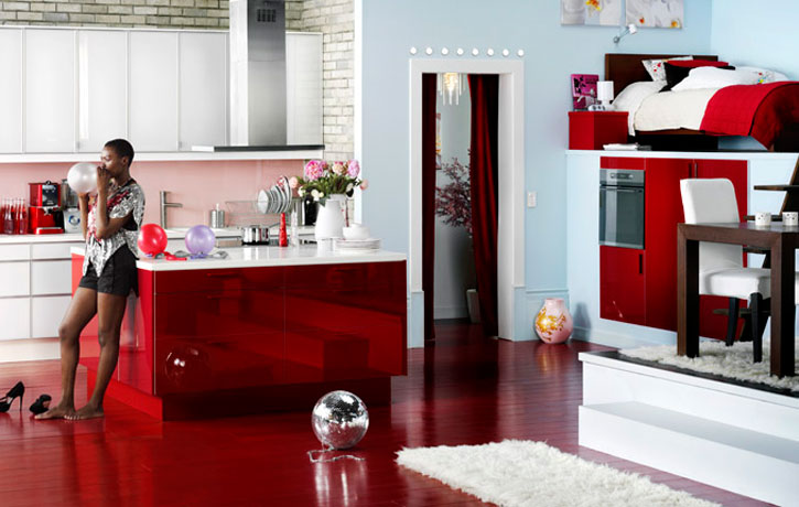
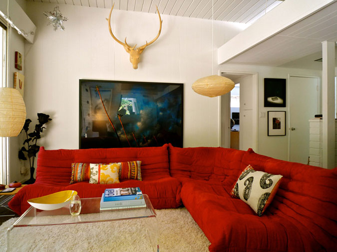
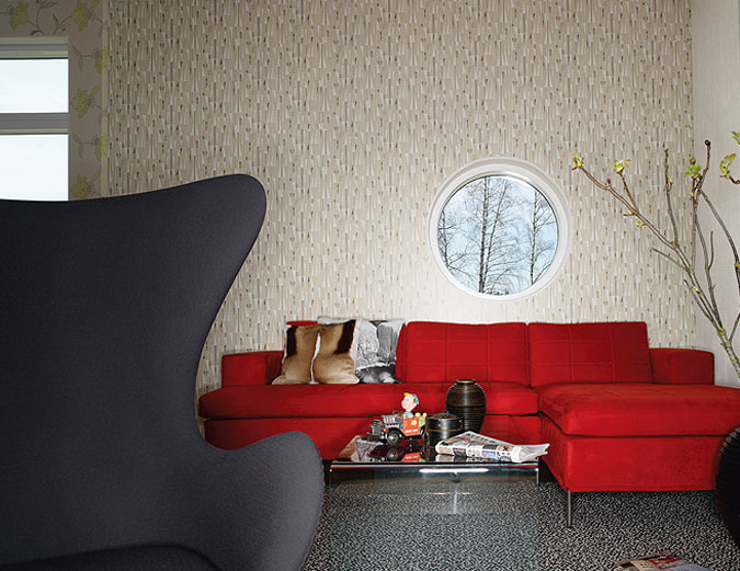
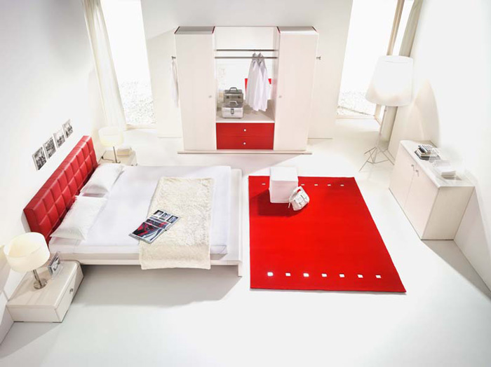
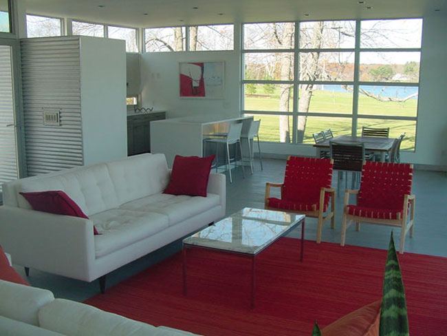
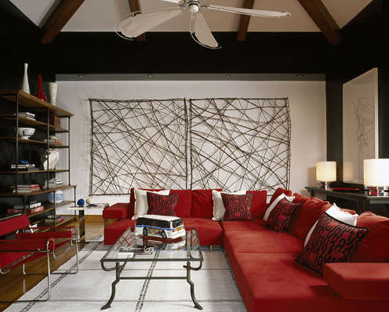
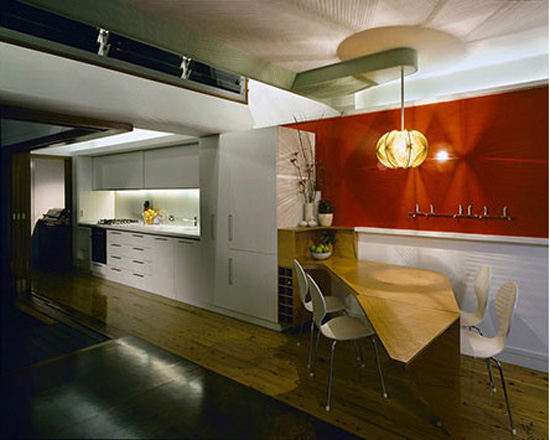
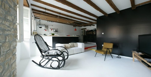
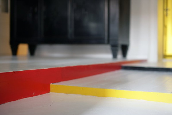
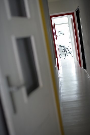
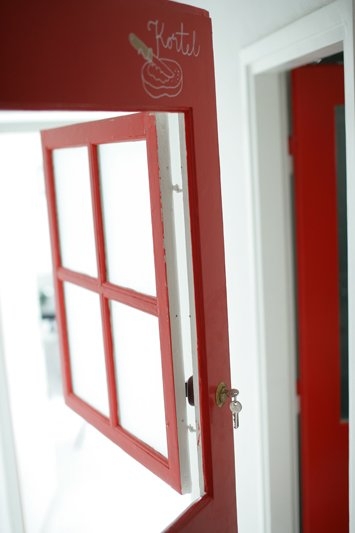
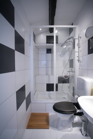
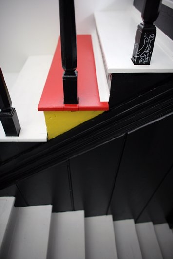
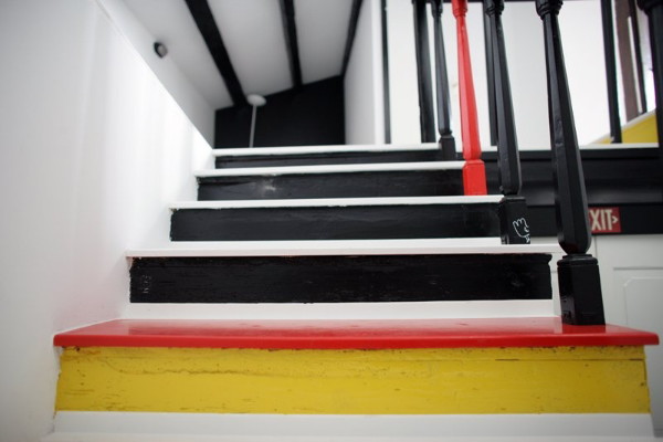
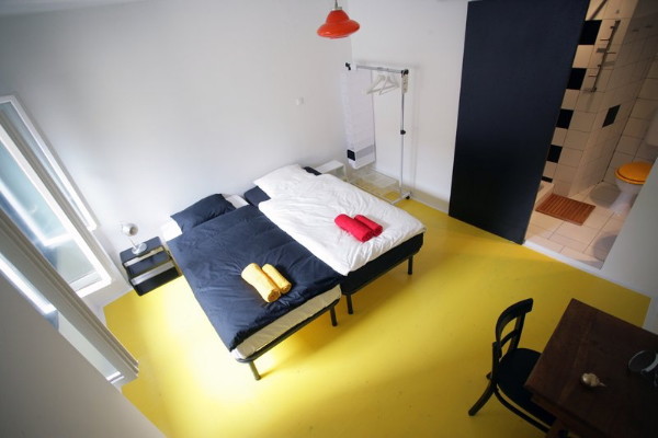
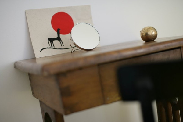
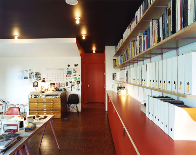
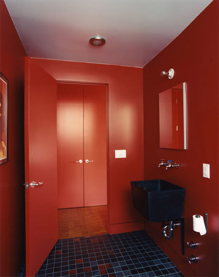
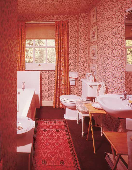
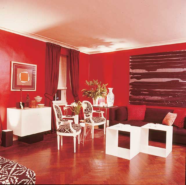
Happy Canada Day to all of our Canadian readers out there. I hope you enjoy the day off and partake in some typical patriotic nonsense like an overload of beer consumption, food and fireworks – all at someone’s cottage on a lake. The weather is supposed to be GORG here in Ottawa which will be perfect for the aforementioned activites – and coincidentally Wills and Kate’s visit. 🙂 In the spirit of Canada Day, I thought I’d feature some spaces decked out in red and white (like I did this day back in ’09)- and while red is probably my least favourite colour, it is a quick and easy way to inject some drama and energy into your decor.
Folio
Hus & Hem
Jake Fitzjones
Darren Chung
Lonny
Design*Sponge
Domino
Domino
Hus & Hem
Magnus Marding
Agent Bauer
Apartment Therapy
happy homes
houseworks ltd
Vanessa Hadaway
Apartment Therapy
INGRAO
Murray Fredericks
House of Gold
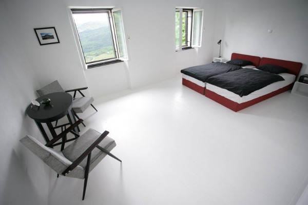
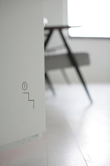
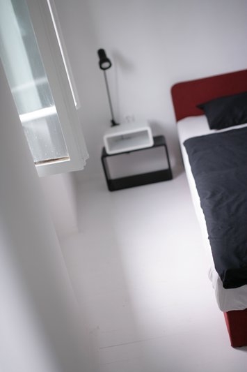
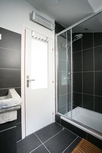
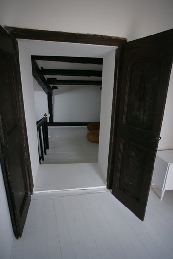
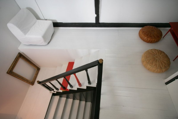
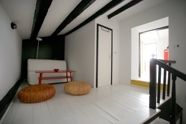
Posted on Mon, 14 Jun 2010 by midcenturyjo
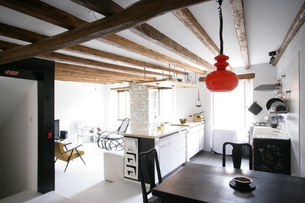
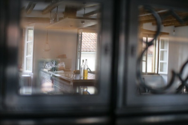
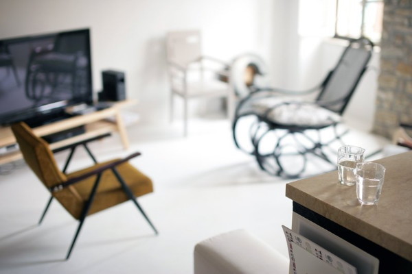
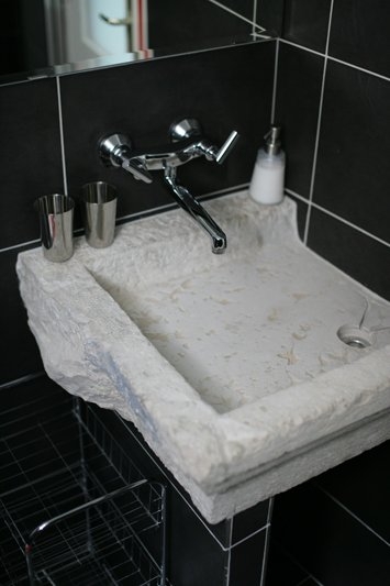
A few weeks ago Zdenka sent pictures of her adorable pups for Pets on Furniture. I loved what I saw of her Croatian home in the background. Of course I didn’t go lurking straight away. No I only decided to snoop further today. I’m glad I did! Zdenka’s home is amazing. Simple, stylish, fresh and… you can stay there. It’s the House of Gold and perches in a steep winding lane in the medieval village of Motovun. I’m thinking of getting together a house party. Want to come? (If only it wasn’t a dream… I’d love to visit Croatia.) If you want to see what Zdenka started with and her renovation journey visit her blog. It’s not for the faint hearted. OMG what a transformation!
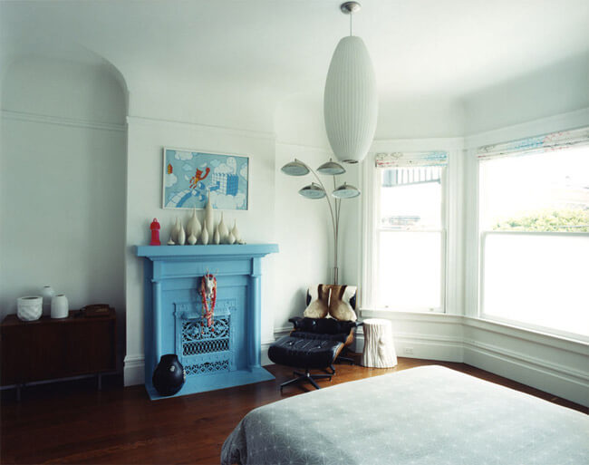
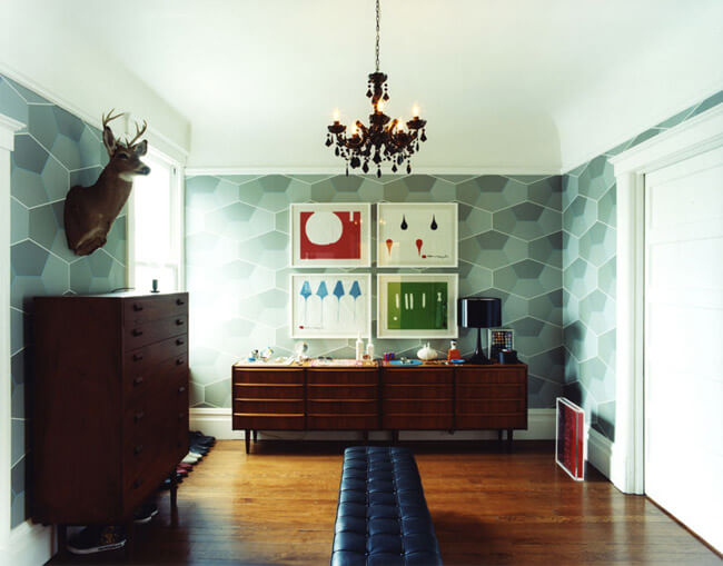
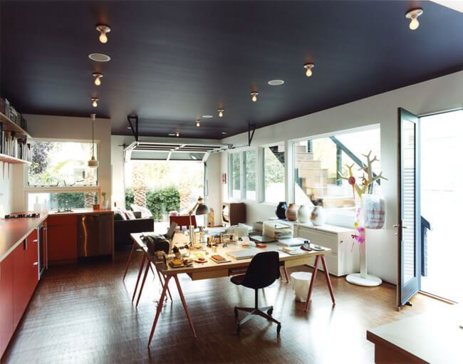
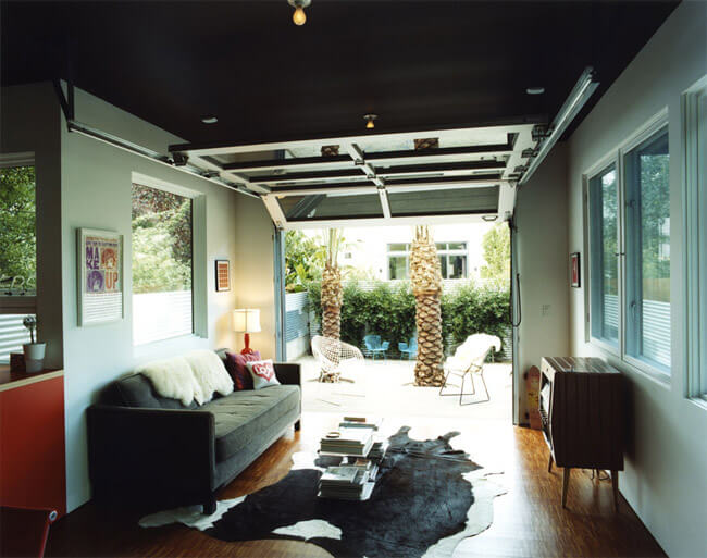
My dream home
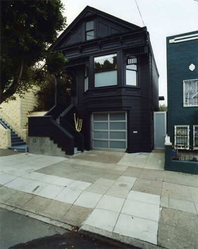
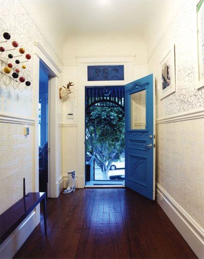
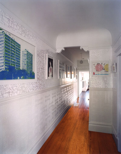
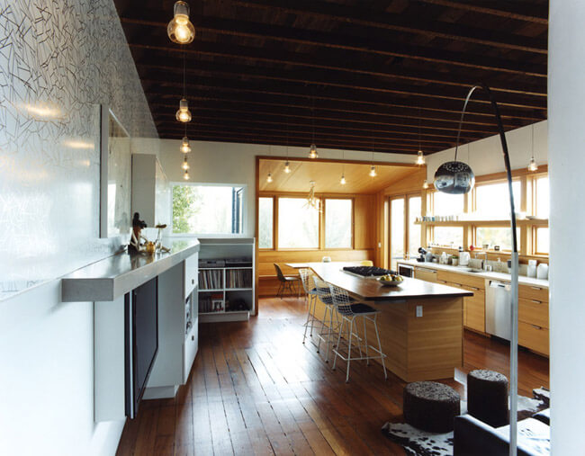
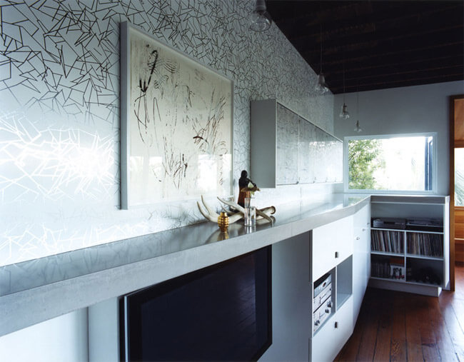
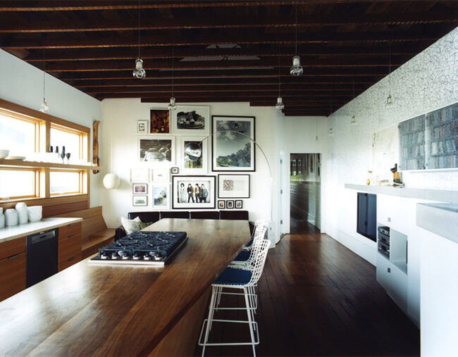
Posted on Fri, 24 Apr 2009 by KiM
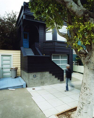
Patrick Flynn is a designer/project manager at envelopeA+D, an architecture and design firm based in Oakland, California and he emailed us thinking we’d be interested in a project the firm recently completed (it was featured in the NY Times yesterday). Interested??? I almost passed out when I saw the photos. This home is so unbelieveably cool and funky and creative and plucked right out of my dreams. I am completely smitten with it. The Victorian duplex is located in San Francisco, and is owned by Claire Bigbie (an interior designer who now designs for the firm) and her skateboarder boyfriend Jay Shapiro. It was renovated to house a creative studio for Claire on the main floor and the living quarters upstairs. I adore absolutely everything about this home, including the incredible blue-black exterior (used to downplay the Victorian embellishments). Thanks so much Patrick for sharing this with us! Every photo below is going in my inspiration folder, and I imagine in many of our readers’ folders too.
Killing two birds with one stone
Posted on Wed, 14 May 2008 by midcenturyjo
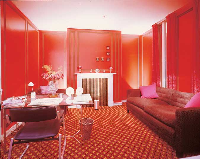
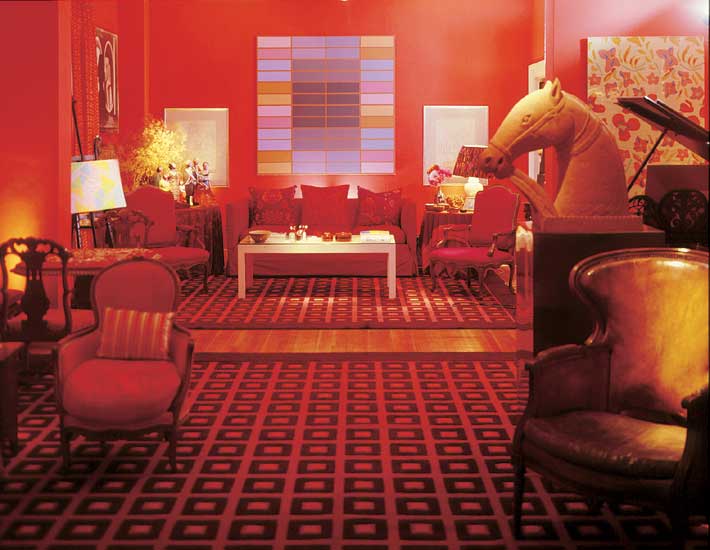
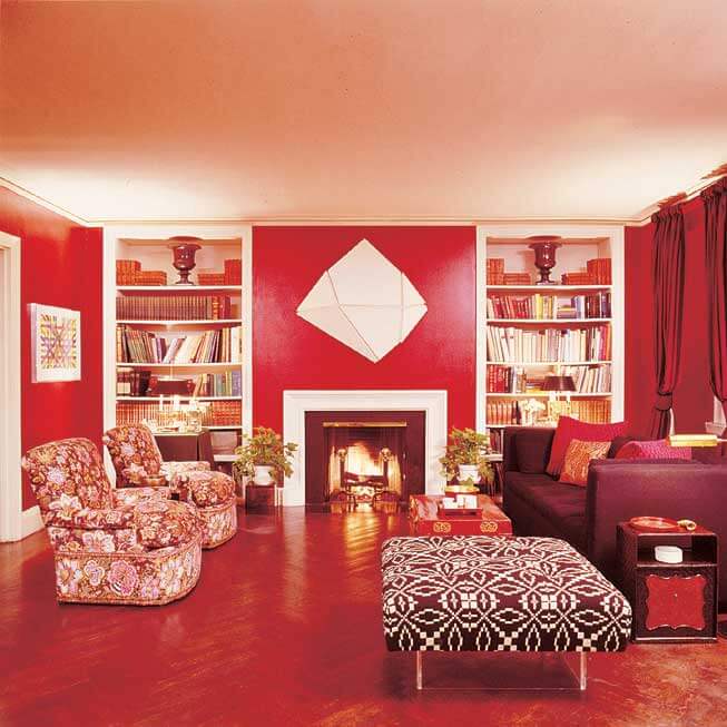
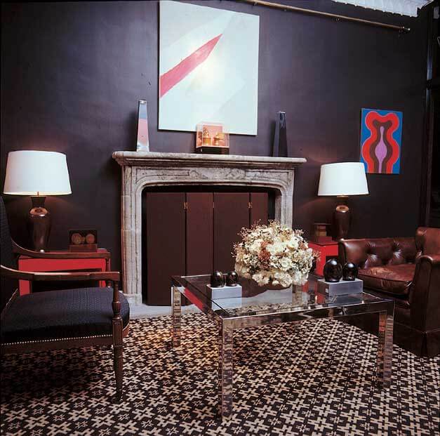
Sorry for the rather murderous analogy but it will all become clear soon I hope. I’m in a retro kind of mood today. It must be due to the lack of retro posts lately. I’ve also been inspired by Tessa’s design dilemma. When Kim bewailed the fact that no one paints a room burgundy my immediate thought was “they used to”. The light bulb went on in my head and one name was there – David Hicks. I’ve paid homage to Hicks before but I realised he was part of the solution. These are his lush rich rooms, not always burgundy but brave in their dark hues.
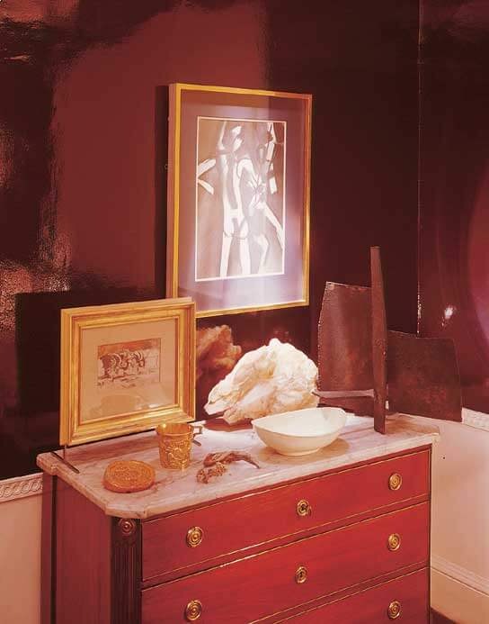
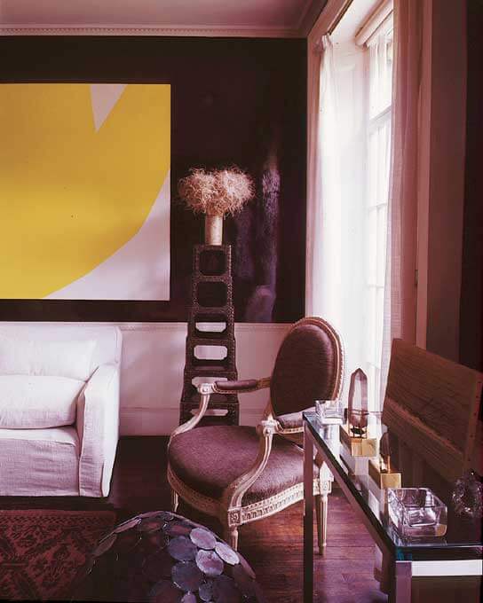

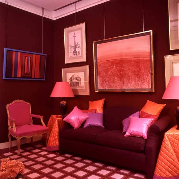
Imagine that Buddha vignette in a burgundy room! Or that yellow and white abstract canvas.
Tessa leans toward super bright hues (oranges, yellows, apple greens, etc.), Kim had some great ideas and with David Hicks’ help I’m going to suggest a few more. White, white, white. Tone it down with white. White furniture – think sleigh bed in white gloss, white sheers and fabric that uses white. Chocolate and white, navy and white, pink and white, black and white and even certain greens with white. Treat your burgundy walls as a deep dark neutral.
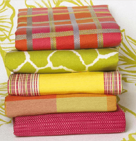
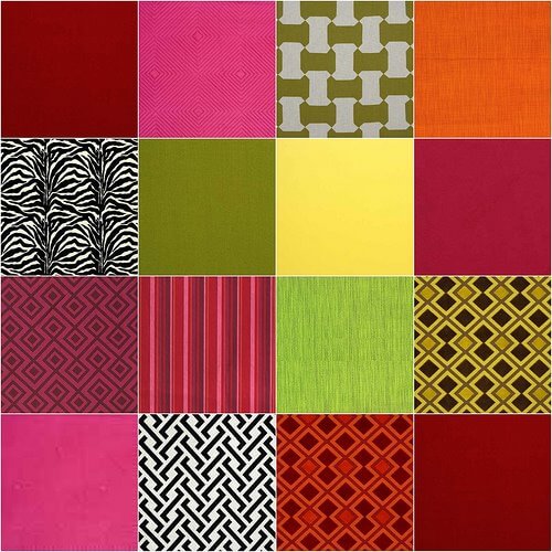
Bright colours? Why not! All these fabrics were pulled from Lee Jofa’s Groundworks Collection. Many are by David Hicks. Bright colours particularly orange and yellow and pink and green are all happy with burgundy. You don’t have to buy these fabrics but they give you an idea. Maybe florals are more your thing Tessa. I suggest a trip to the paint store. Gather together as many burgundy paint chips and every possible accent colour and play to your heart’s content. My second suggestion is dark wood with an ethnic twist, suzanis and kilims in rich reds, pinks, oranges and black. Layers and layers of pattern. Cocoon yourself in the mysterious dark. OK now I have retro rooms and Tessa’s burgundy dilemma out of my system. Two birds – not bad!