Displaying posts labeled "Windows"
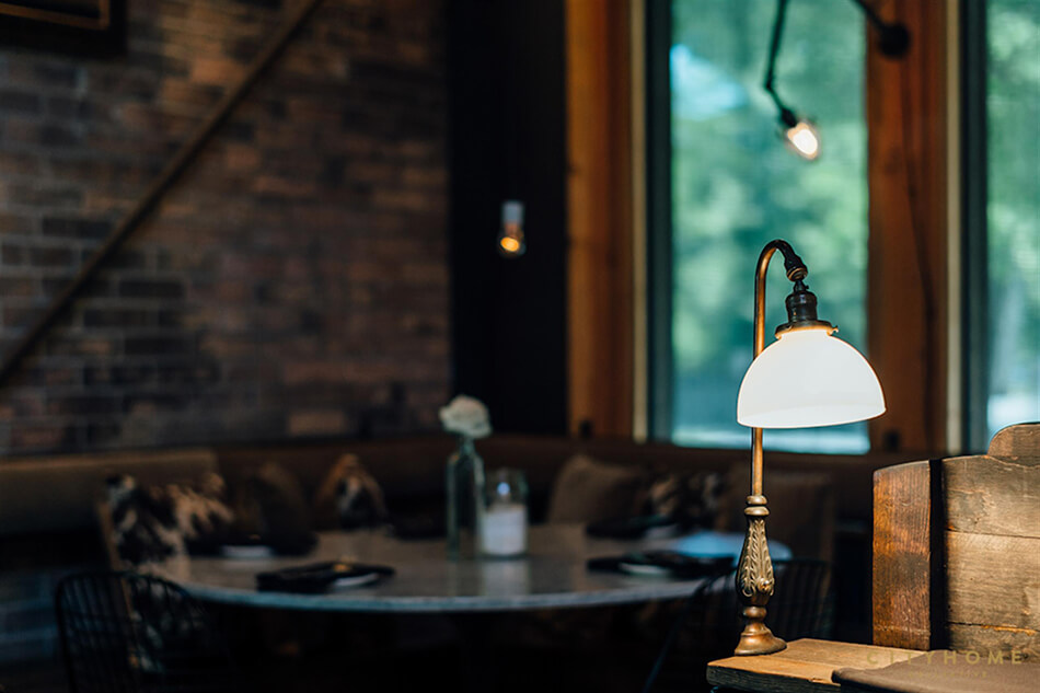
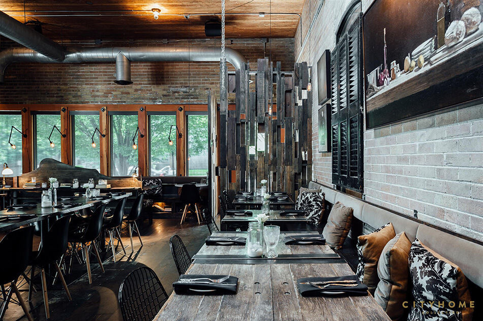
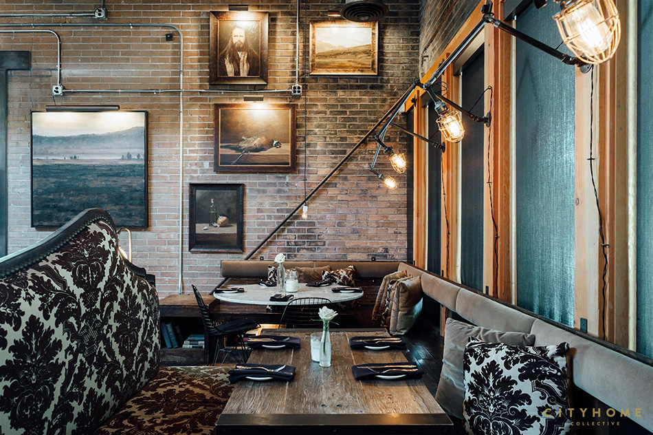
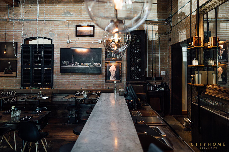
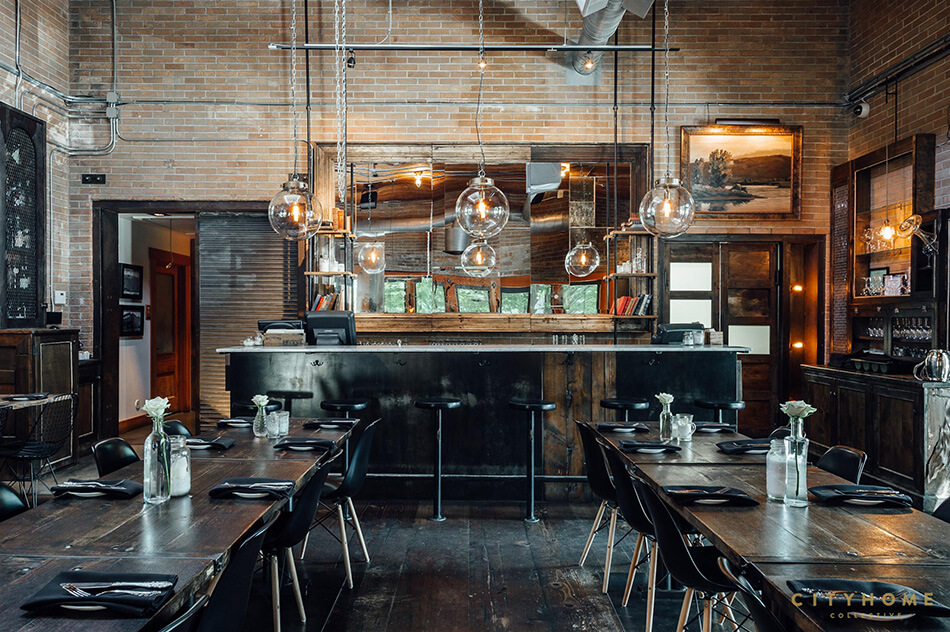
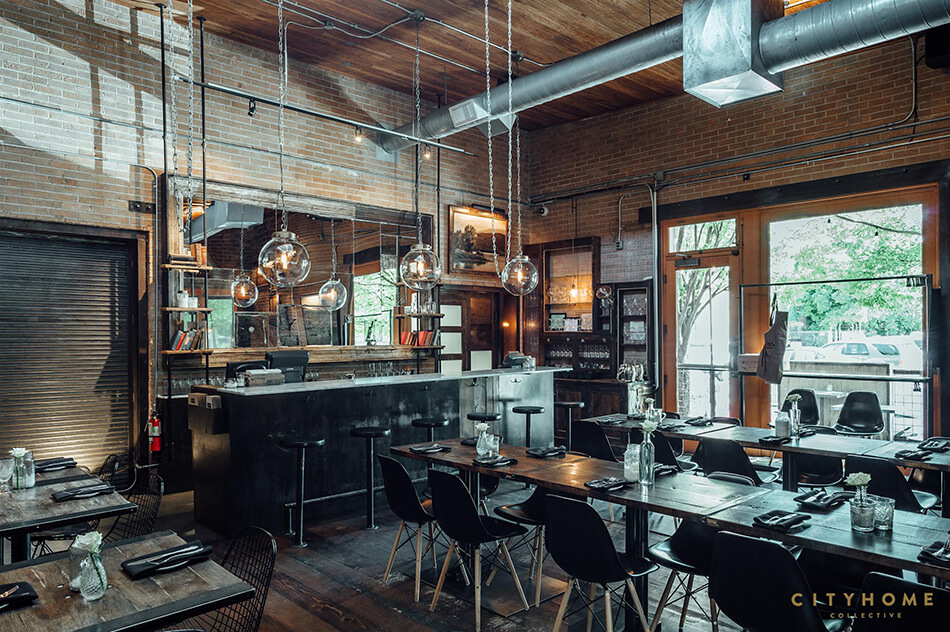
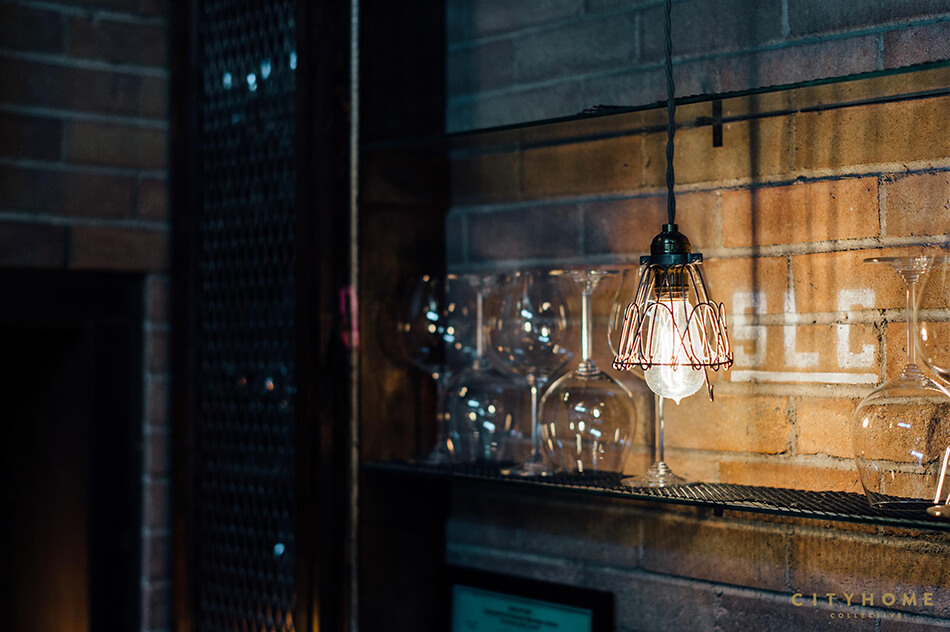
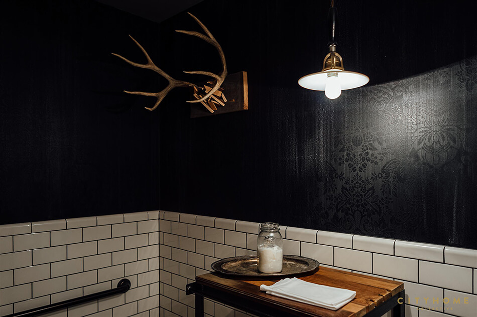
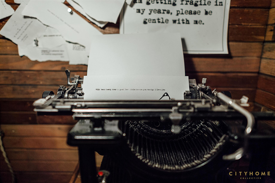
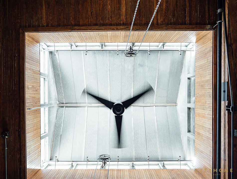
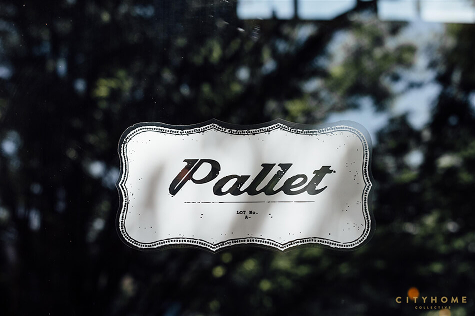
Sunday at a restaurant – Pallet
Posted on Sun, 5 Jul 2020 by KiM
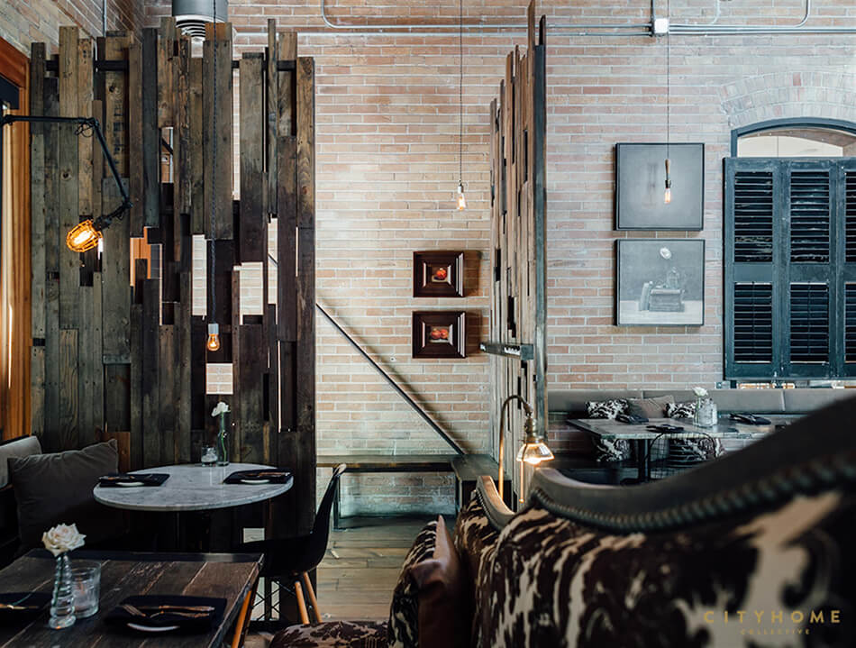
I sometimes feel the industrial interior trend has been completely overdone. But every once in a while a project catches my eye and I realize I still appreciate the moodiness and reusability of this style. Such as Pallet restaurant in Salt Lake City designed a few years ago by the consistently awesome cityhomeCOLLECTIVE. I’d LOVE to enjoy an evening here (post-pandemic of course).


A timeless black and white kitchen
Posted on Tue, 30 Jun 2020 by KiM
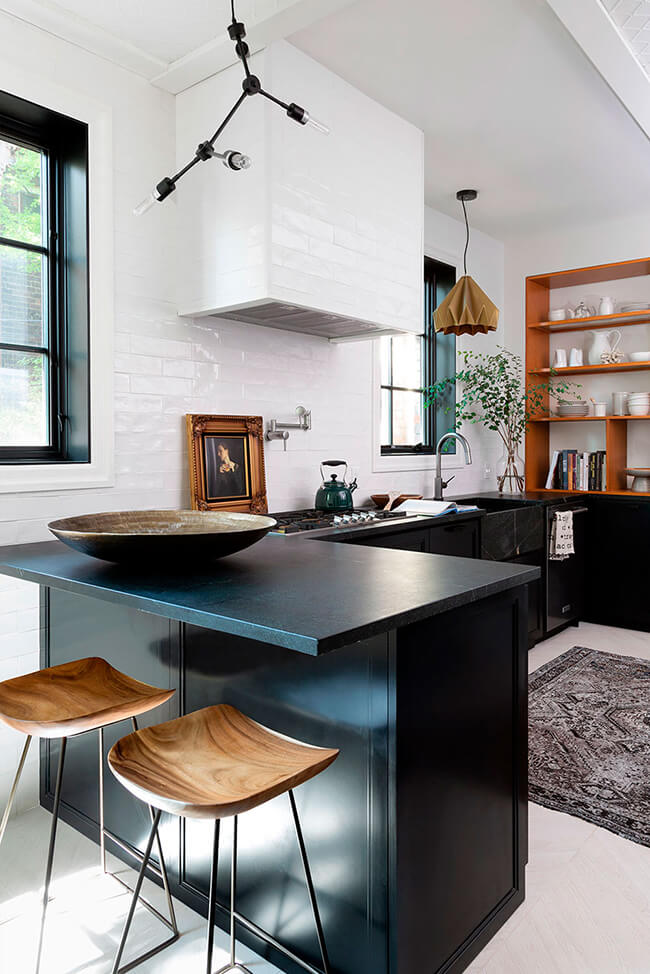
I am head over heels over this kitchen. Every inch if it. The drama of the contrast between black and white, with gold tones added in wood, art and the pendant, the soapstone countertops and integrated sink, the Indonesian rosewood armoire pantry (a Kijiji steal)….and perhaps my favourite touch is the fact that designer Inez Mazzotta (Kelly Hopter Interiors) left the window casings white and painted the rest of the window black. Graphic with a touch of subtlety.
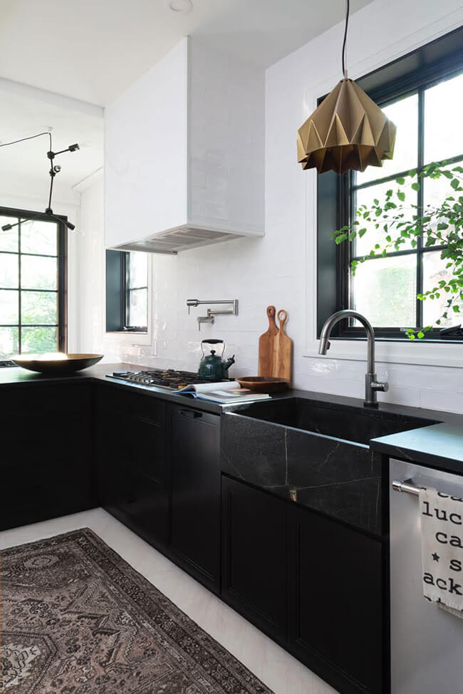
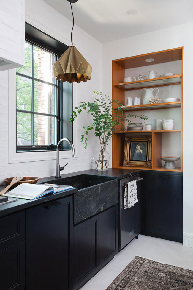
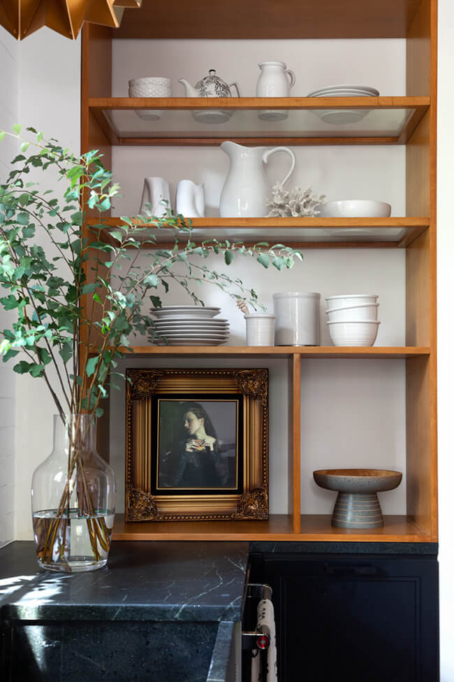
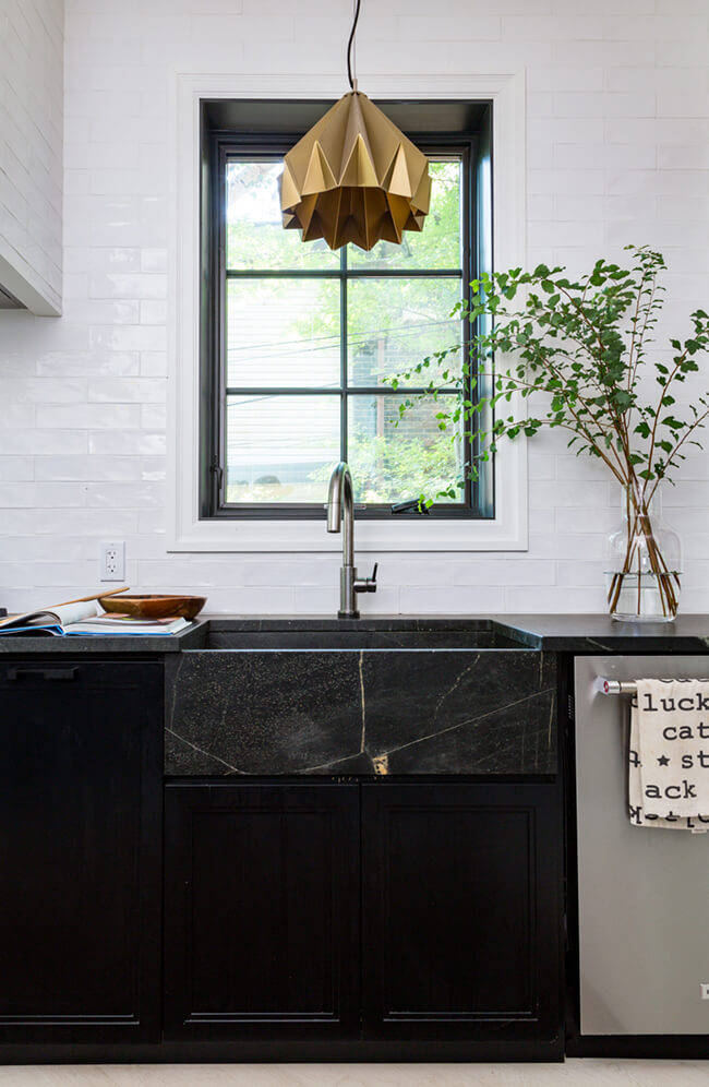
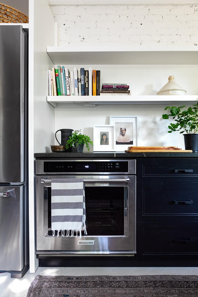
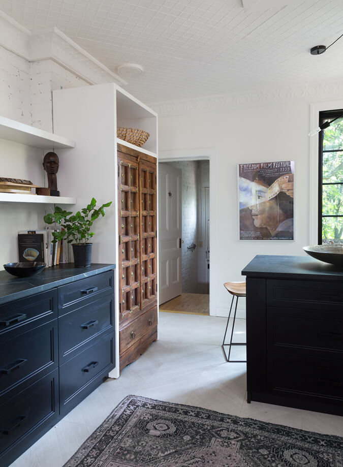
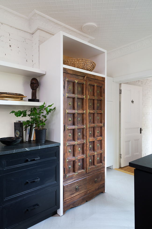
Photography: Robin Stubbert
Bright and neutral
Posted on Thu, 4 Jun 2020 by KiM
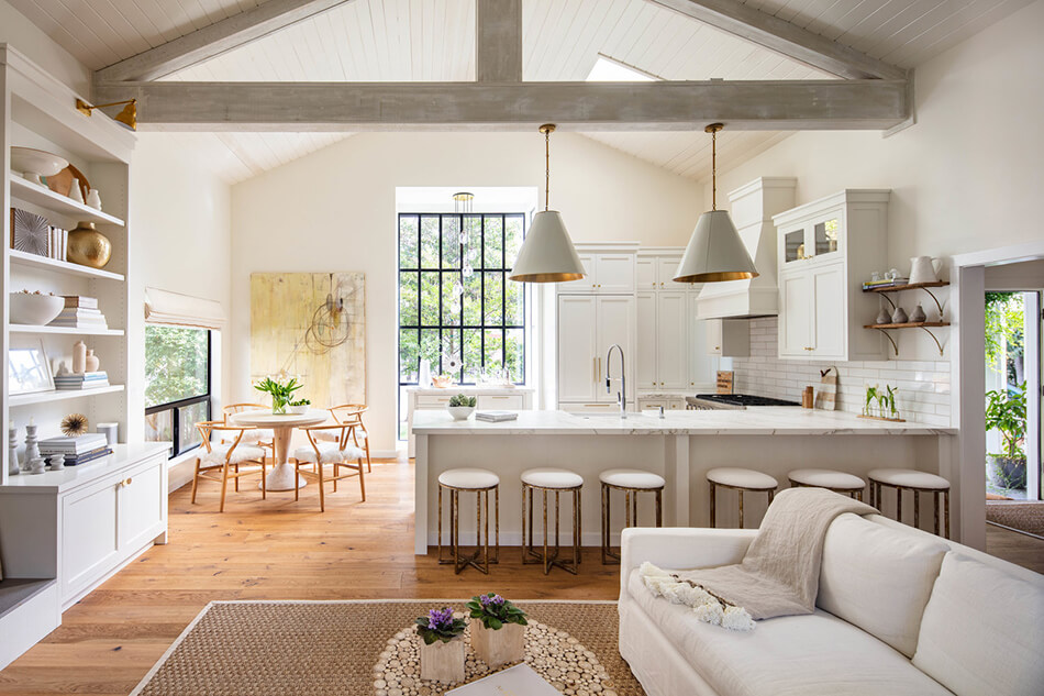
Beamed ceilings, large windows and nothing but neutrals. This home is so bright and airy and soothing. Designed by Heaton+Williams.
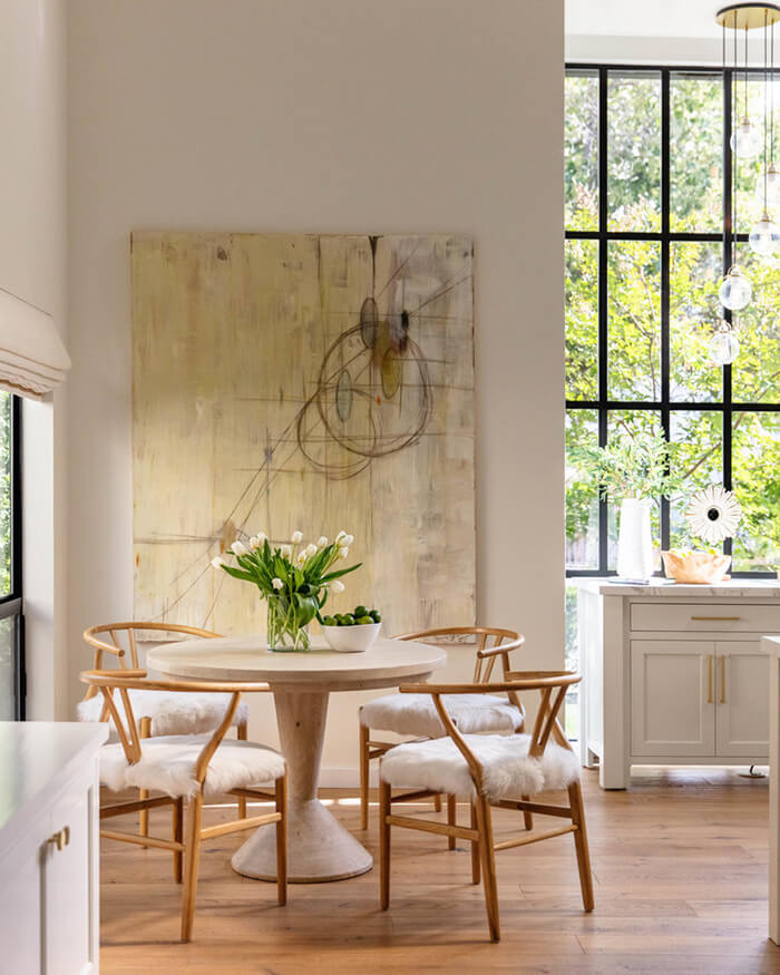
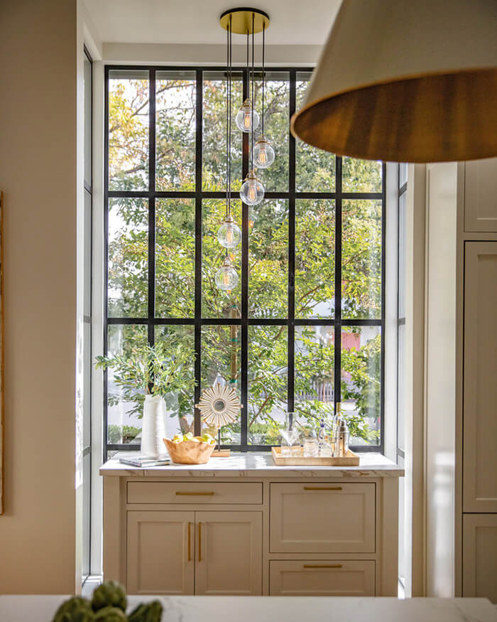
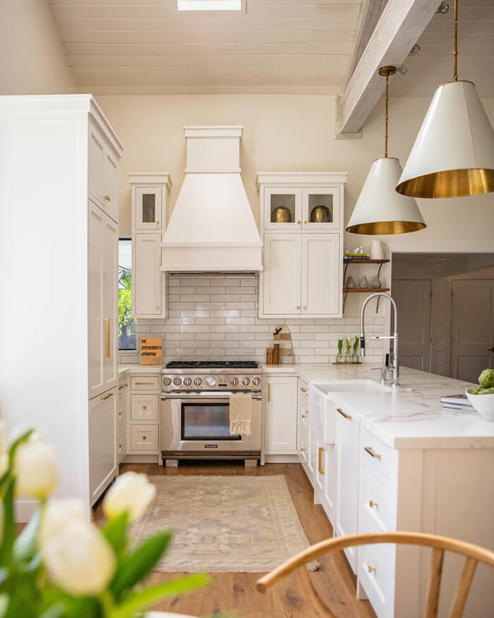
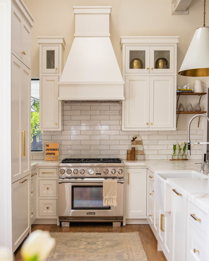
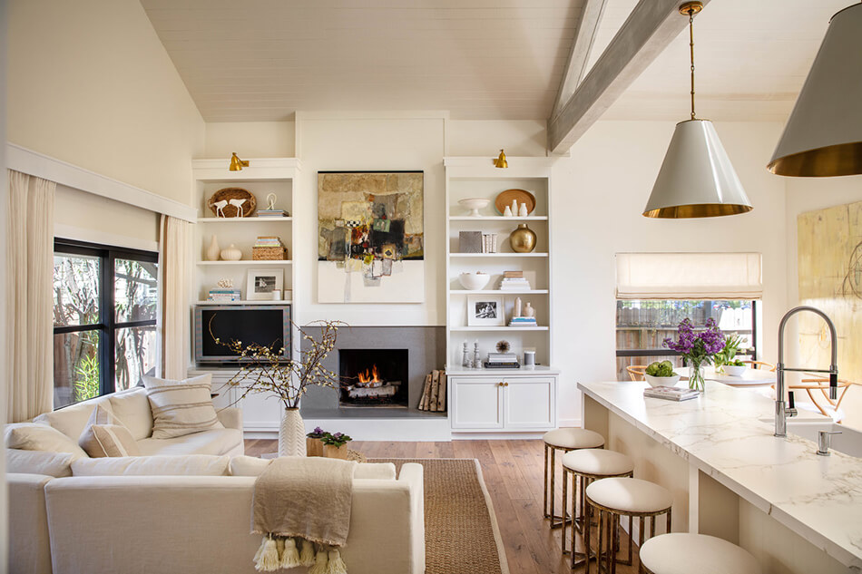
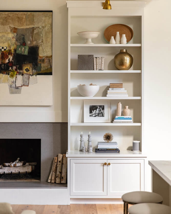
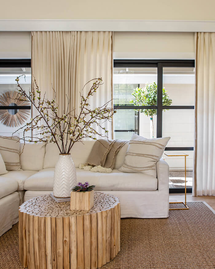
Photos: Thomas Kuoh
A fine balancing act
Posted on Tue, 26 May 2020 by midcenturyjo

It’s all about balance. A balance between crisp and modern and rustic and weathered. Rough versus smooth. A hint of scandi with a dose of Aussie. Light versus dark. Formally structured and sensuous and tactile. A fine balancing act indeed. Hunters Hill House by Handelsmann + Khaw.
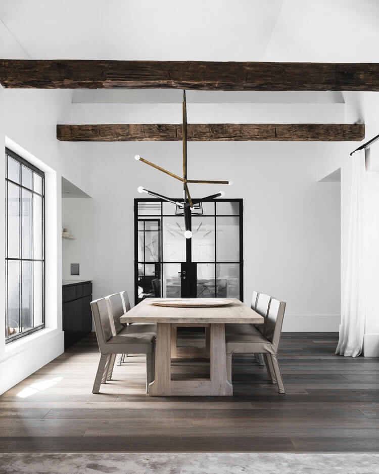
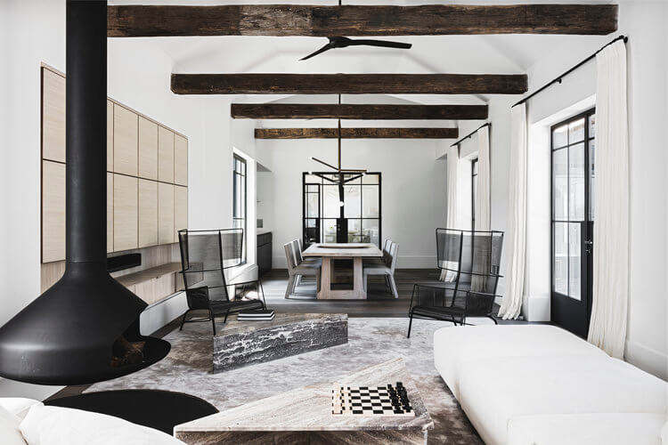
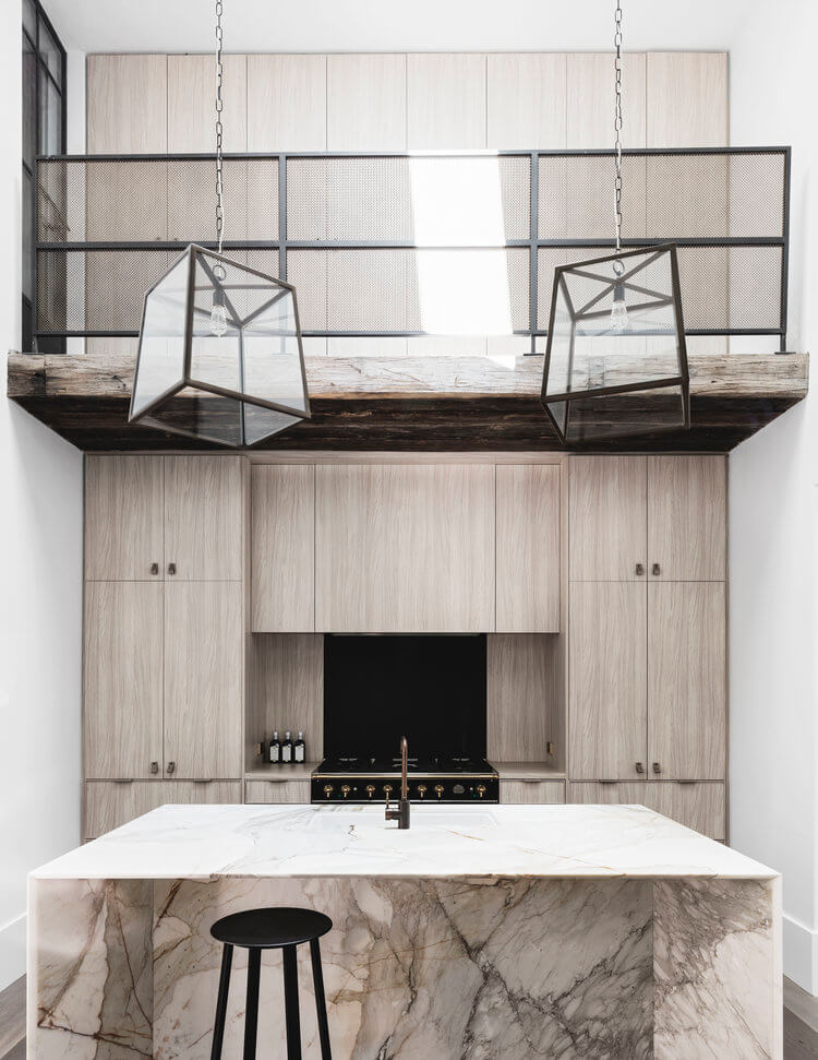

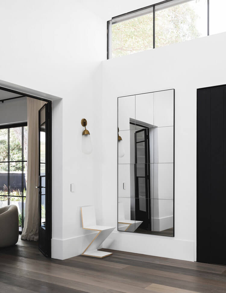

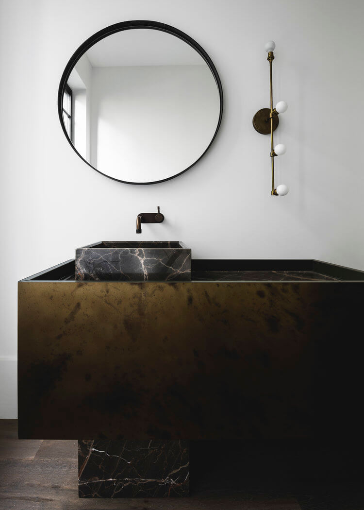
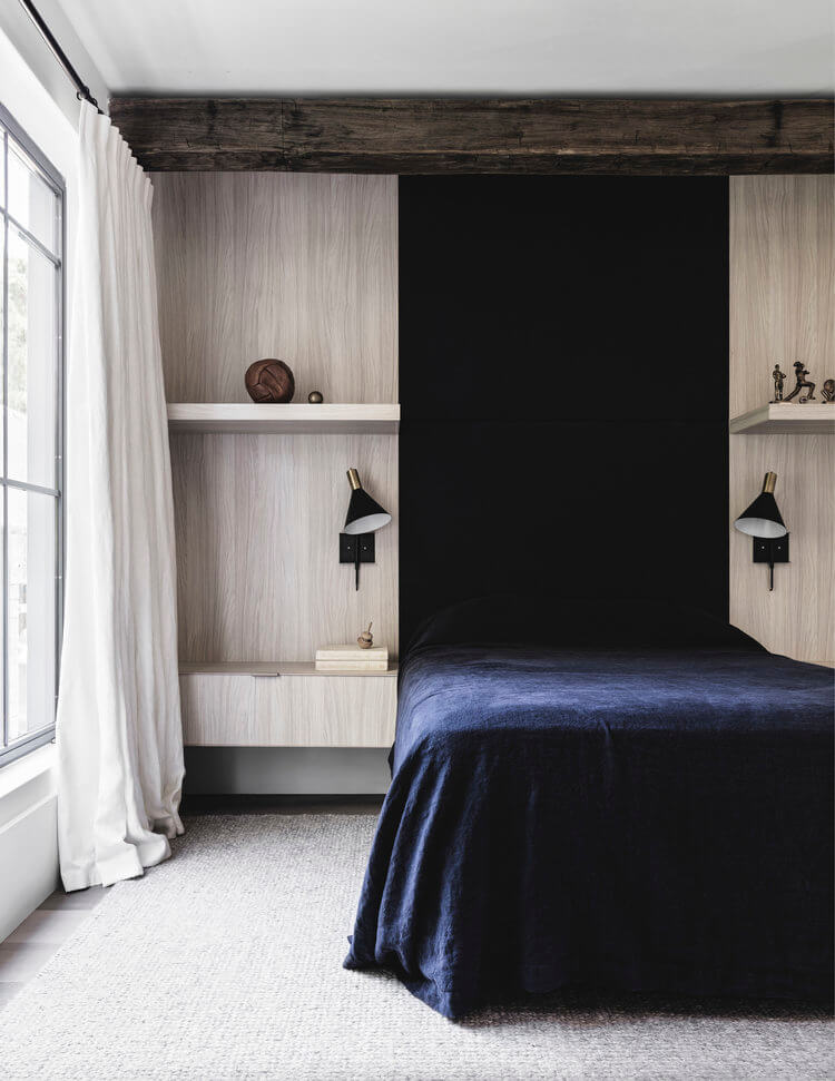
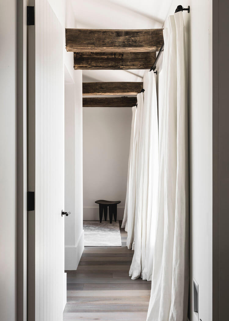
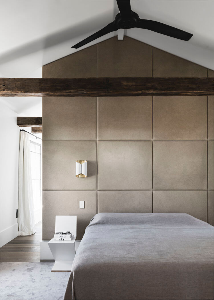
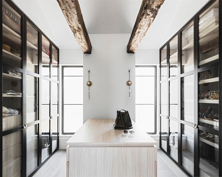
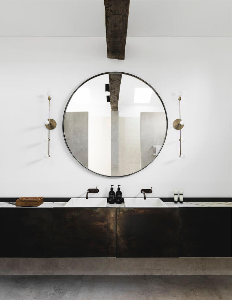

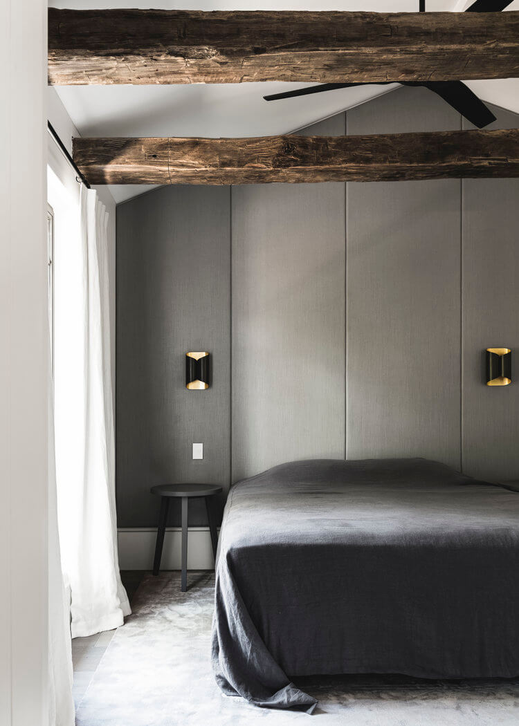
Photography by Felix Forest
Ballroom house
Posted on Fri, 17 Apr 2020 by KiM
Today I’m sharing another prime example of how incredible original details can look whilst modernizing through furnishings and art etc. Designer Claire Larritt-Evans turned this 1880s former dance school in Melbourne into a drop-dead gorgeous family home. Elegant yet chic and current, it may be a bit minimal but it is brought to another level with the beautiful stained glass windows, fireplace and tile floor. (Aside from, well, everything here I’m head over heels for the ball/chain detail in the kitchen and the bedding)
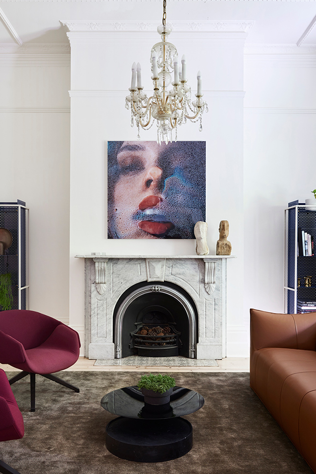
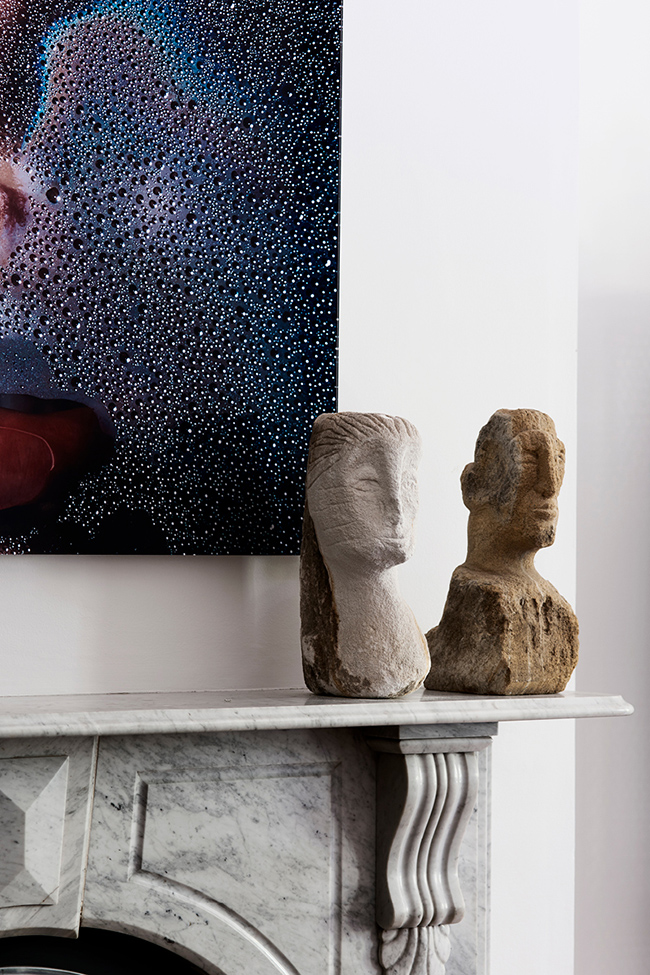
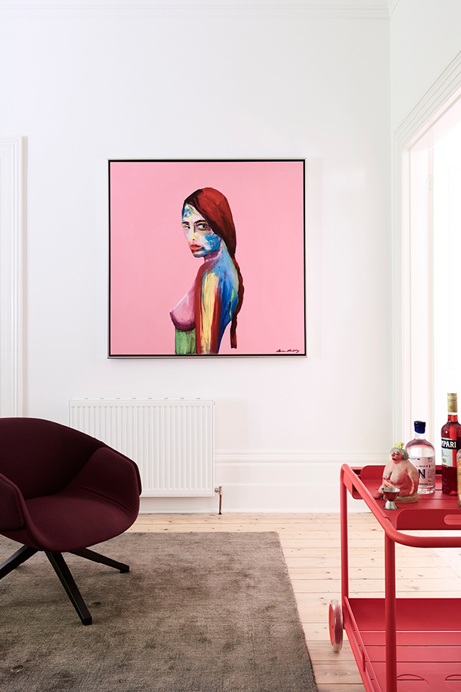
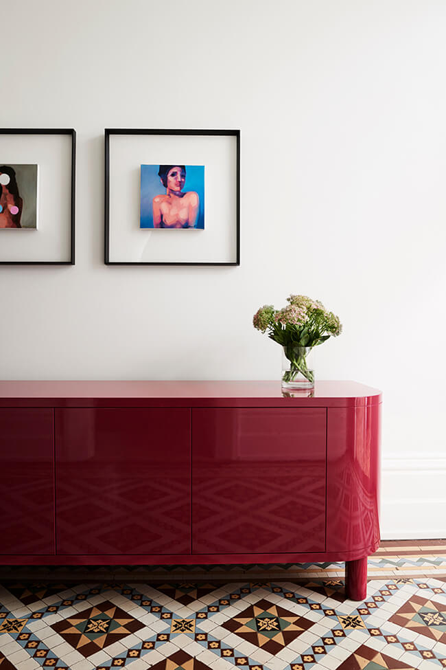
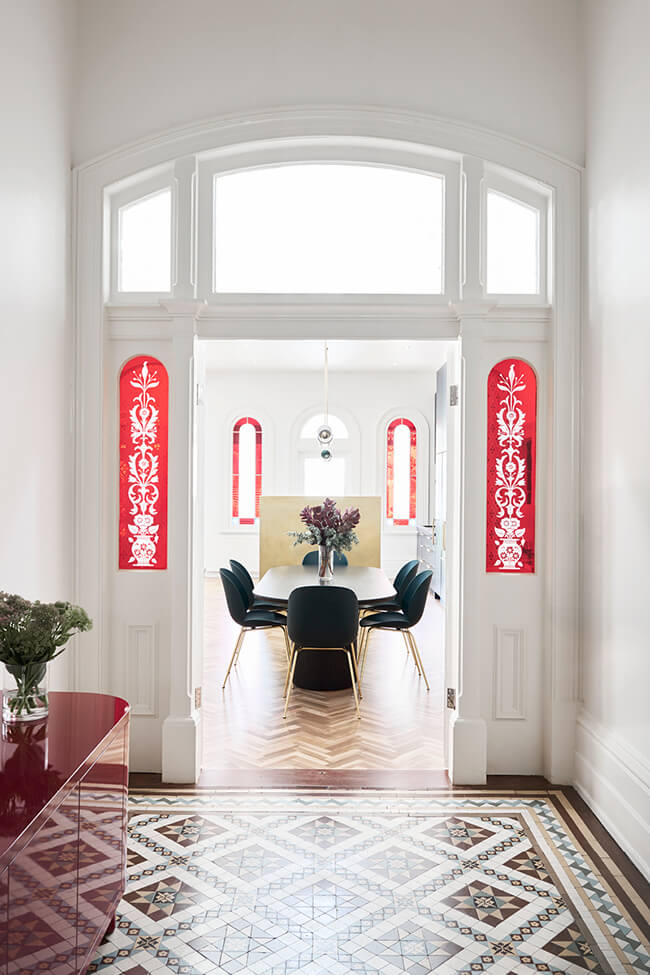
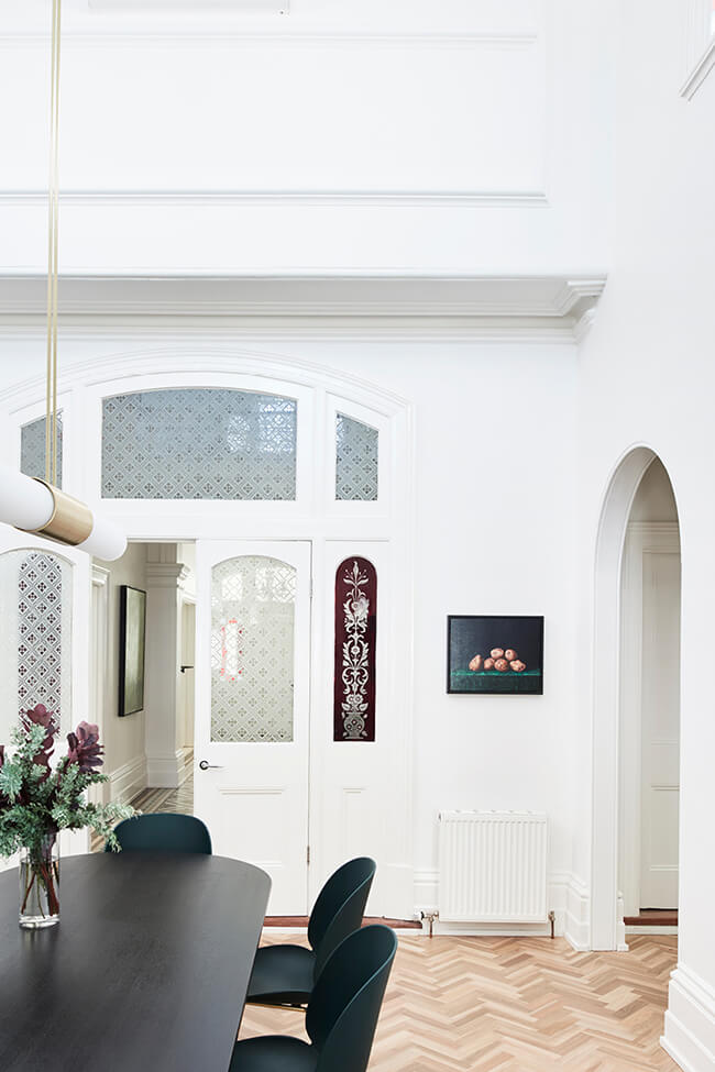
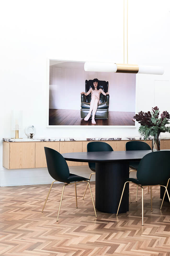
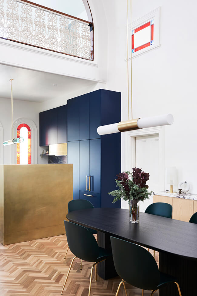
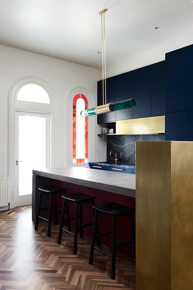
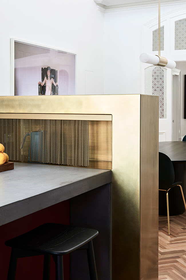
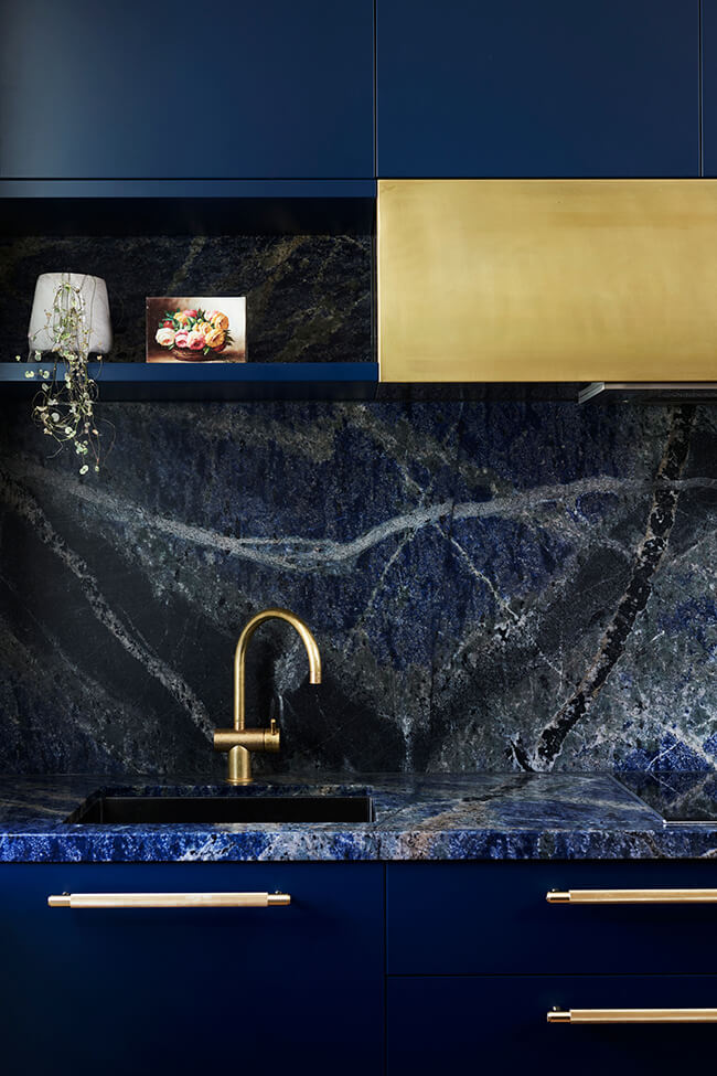
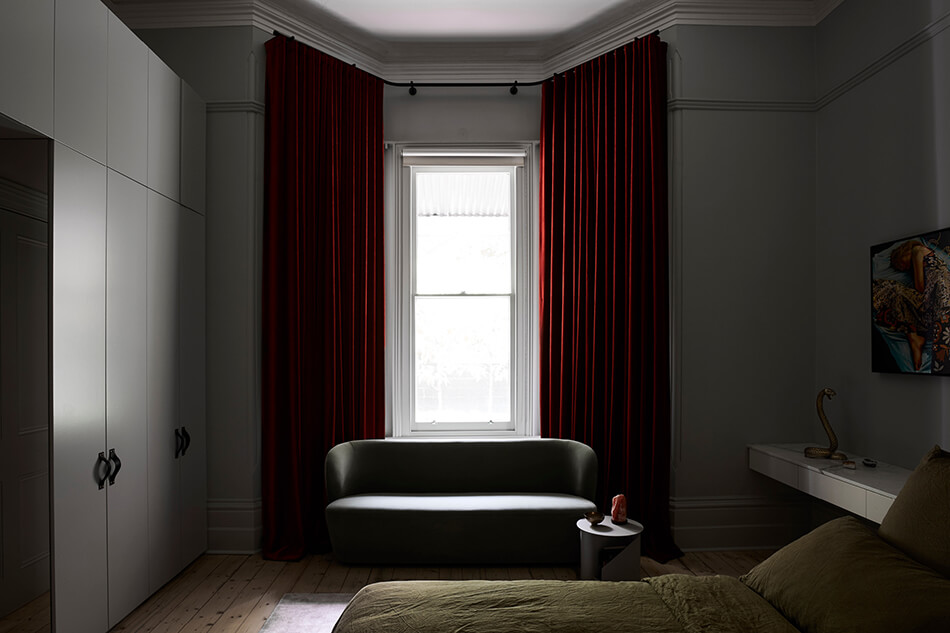
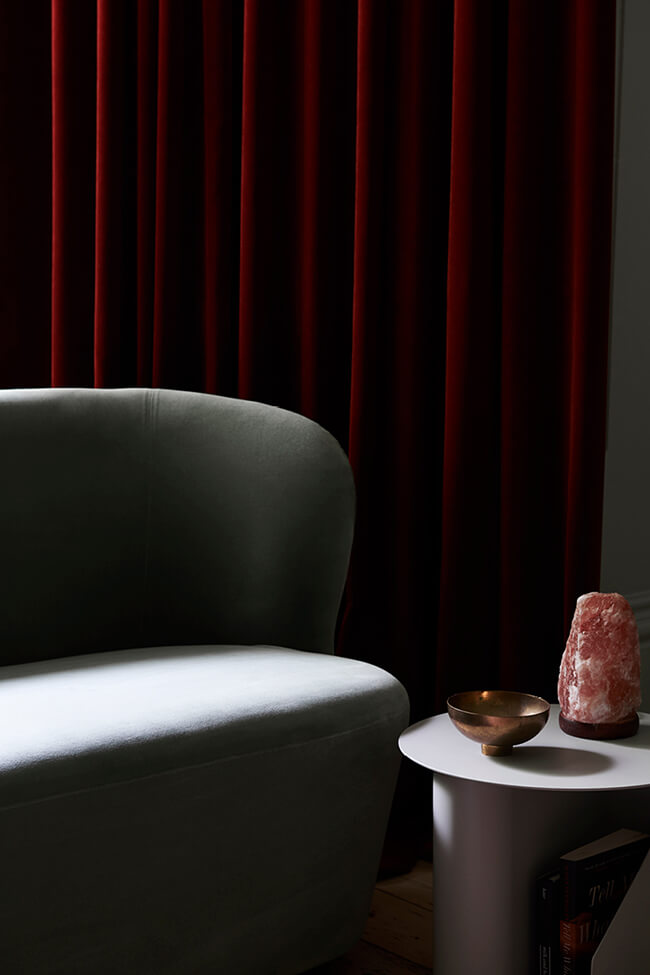
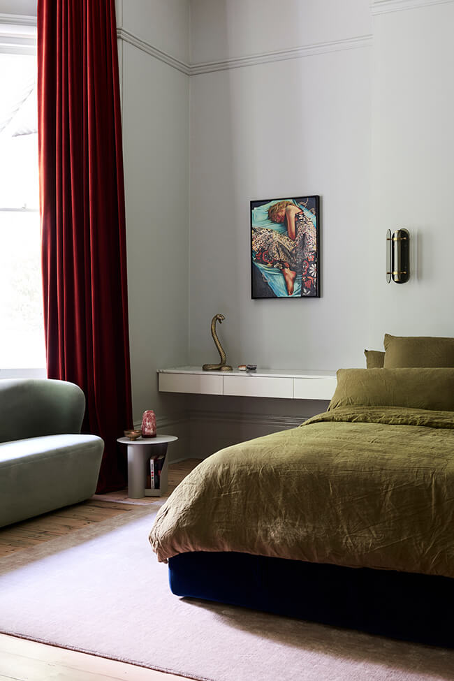
Photos: Eve Wilson

