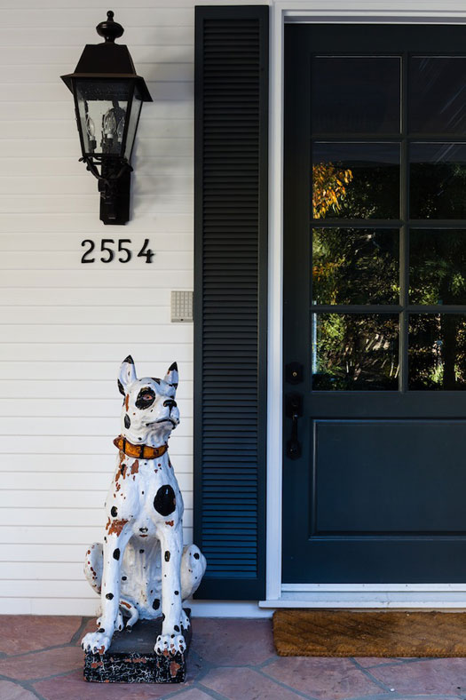
Displaying posts from March, 2014
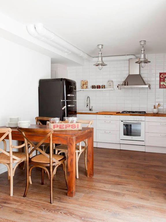
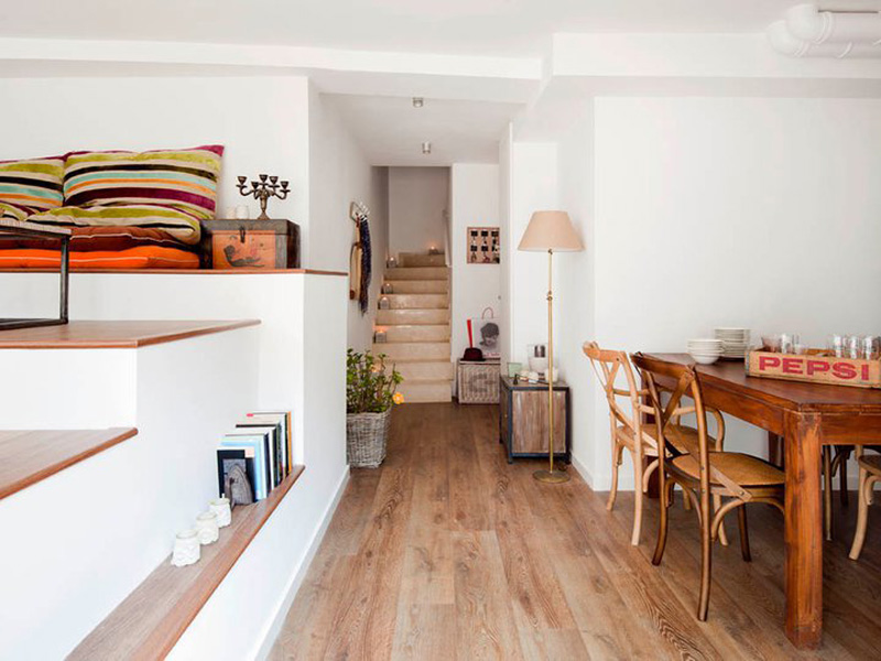
Stalking leftovers
Posted on Sat, 8 Mar 2014 by midcenturyjo

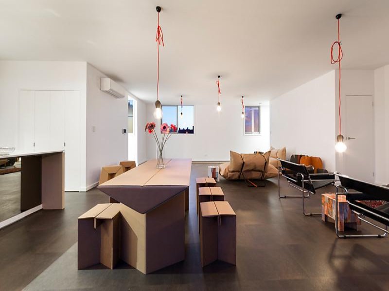
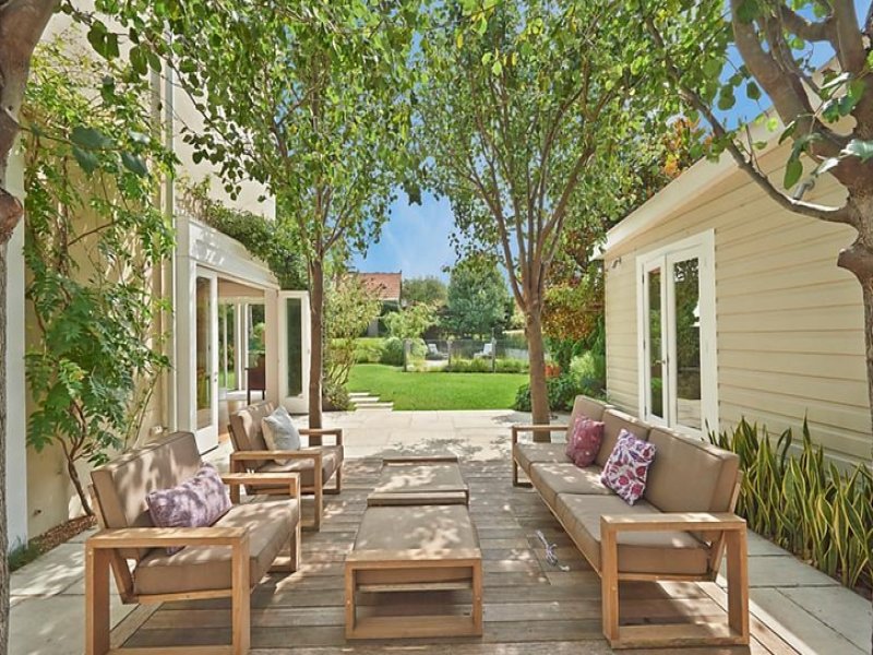
My name is Jo and I’m a property stalker… but I’m fussy. A real estate listing has to be just right to catch my eye. Bad photos, I need more photos please, house is amazing furniture is deplorable, can’t quite put my finger on it listings with something that has me nodding “yes”. This week’s leftovers include a darkly masculine art deco apartment, an artist Moroccan/Balinese/Indian/Spanish/slightly confused folly in the Byron Bay hinterland and a house we’ve stalked before.


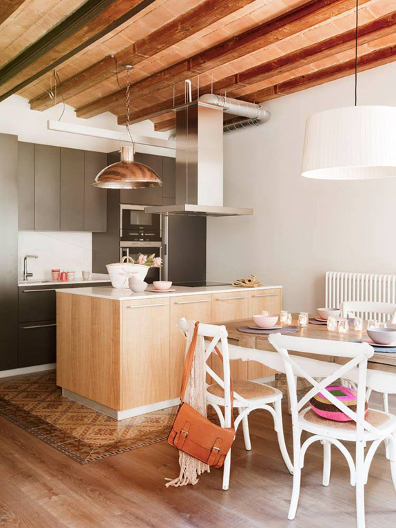
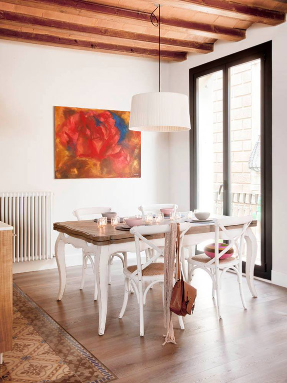
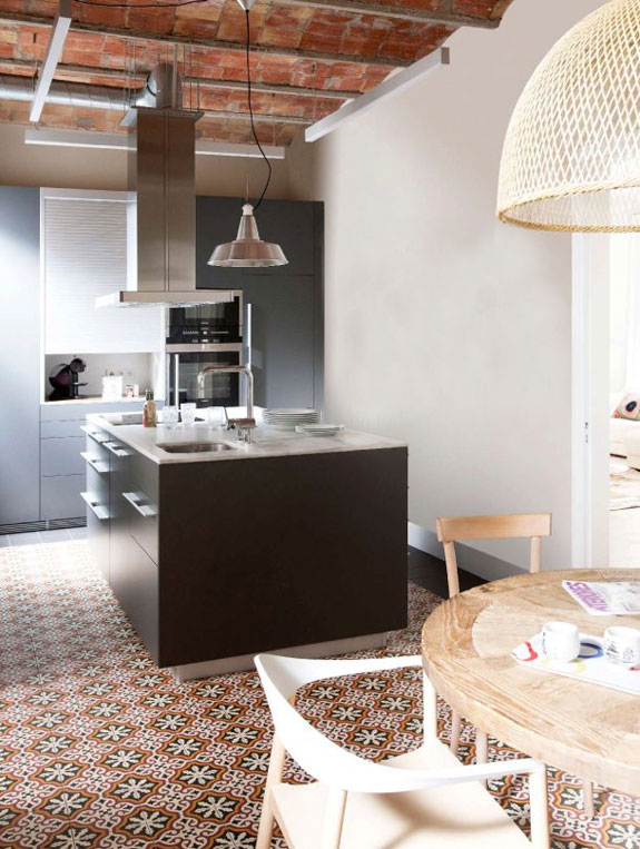
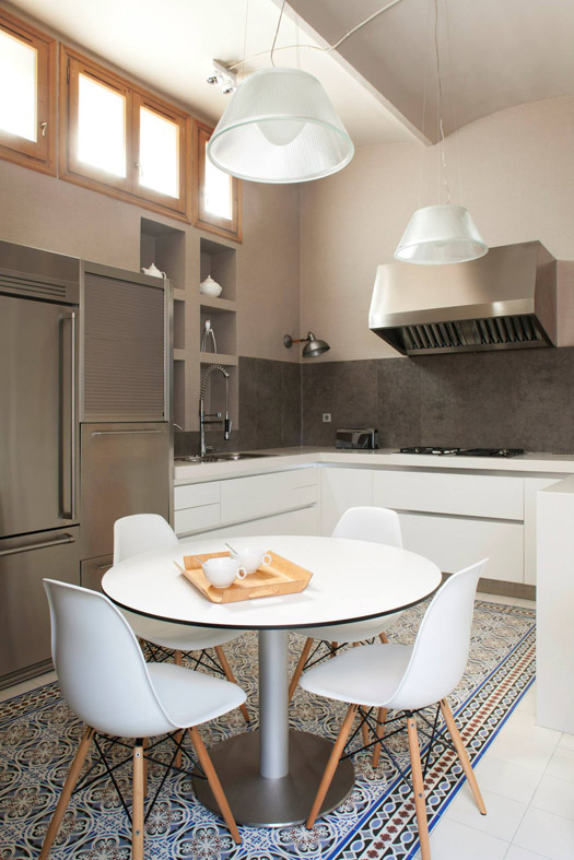
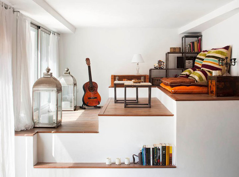
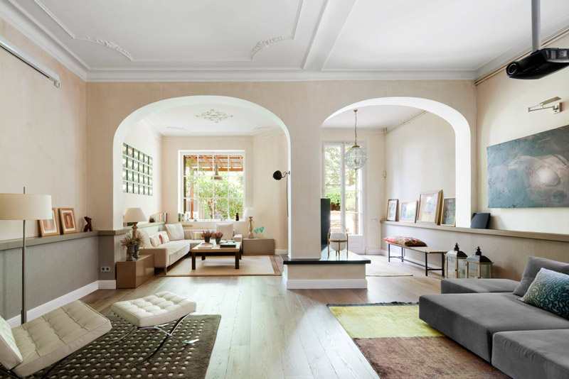
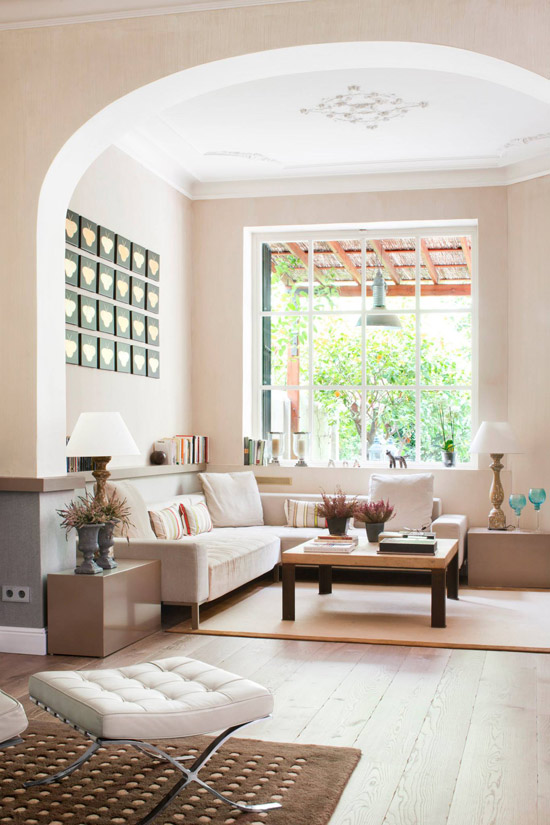
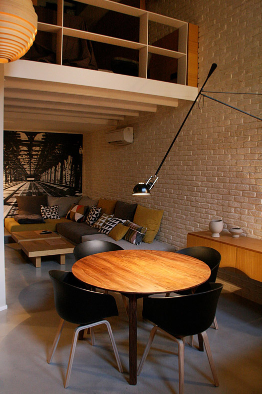
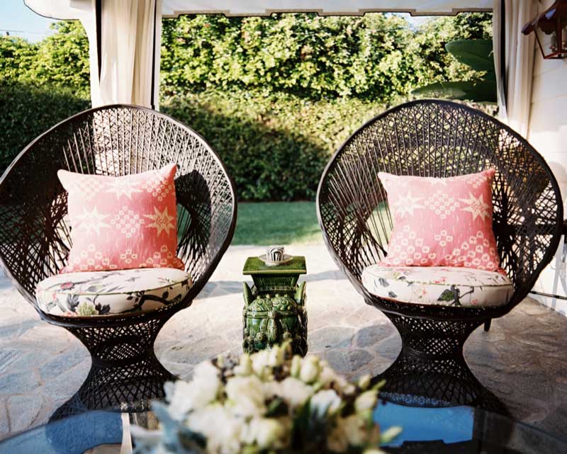
Meritxell Ribé
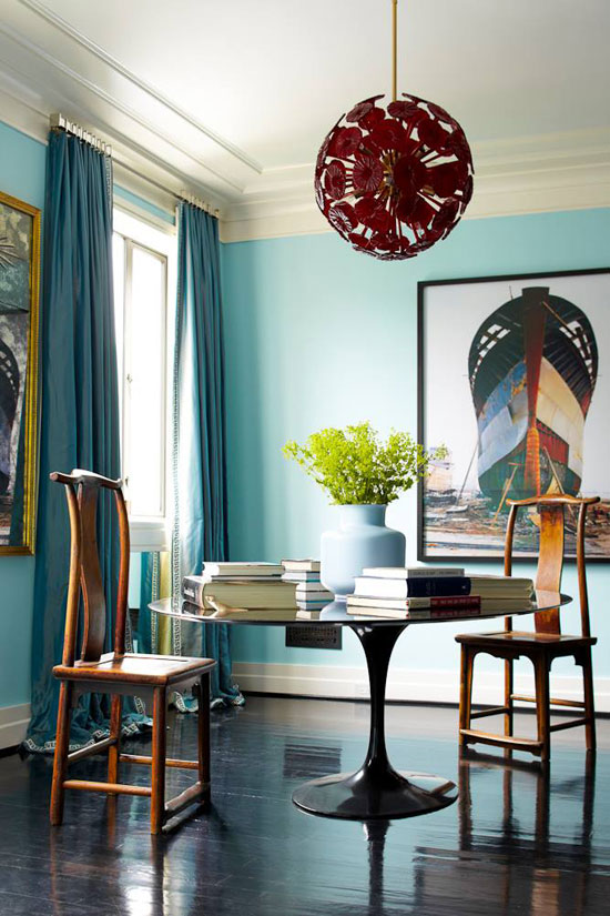
Posted on Fri, 7 Mar 2014 by KiM
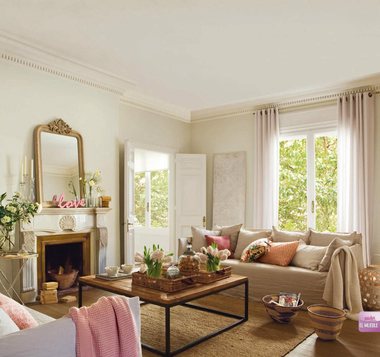
I am totally sick of winter. It is the worst one Ottawa has had in 20 years so they tell us. Despite my trip to Mexico, I have seriously had it. So today I thought I would transport us to Spain, where ceilings are higher, moldings are ornate, tiles are graphic, archways are abundant, and the decor is spectacular. Whether contemporary or more classic and relaxed, Barcelona architect and interior designer Meritxell Ribé is making it work and providing the eye candy on this too cold of a Friday.
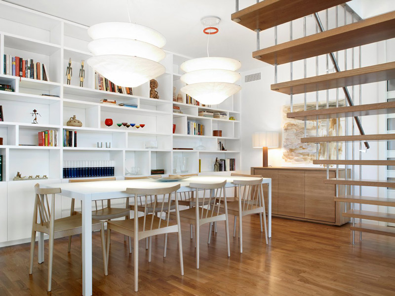
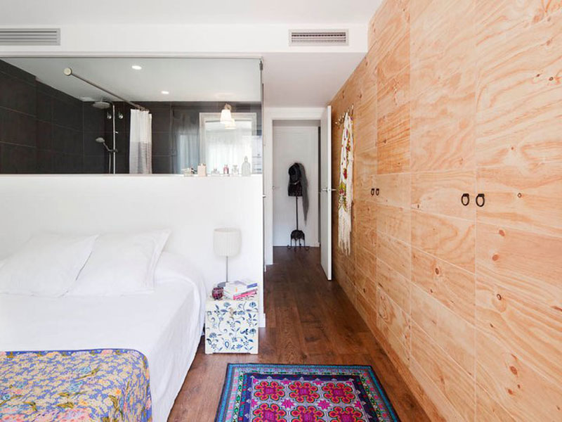
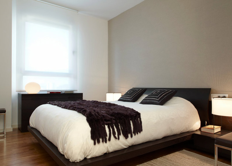
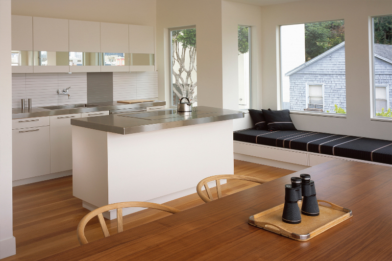
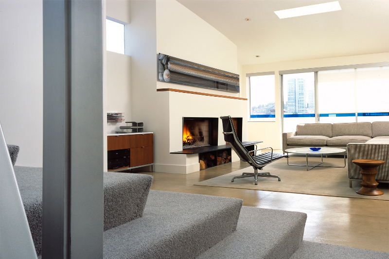
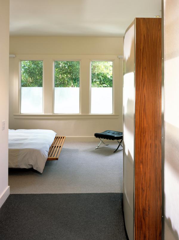
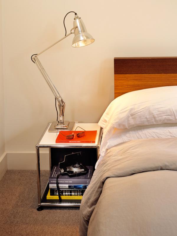
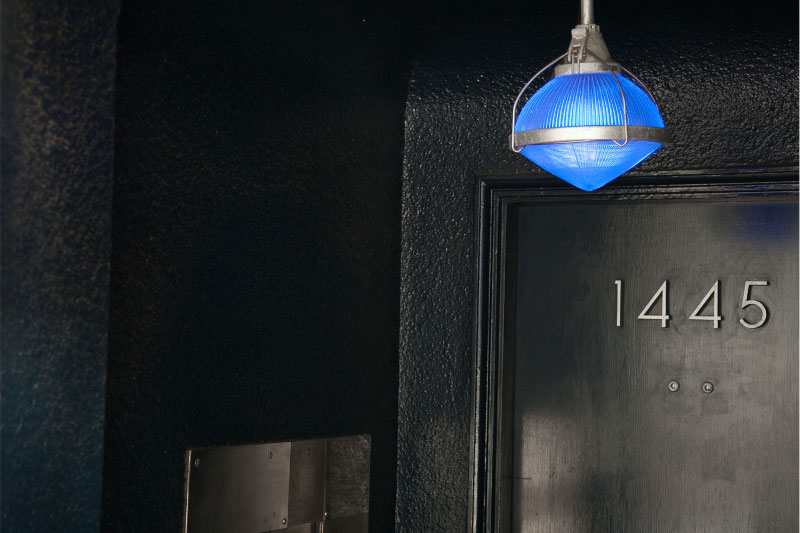
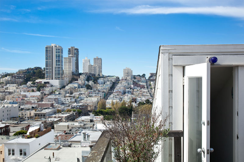
San Francisco
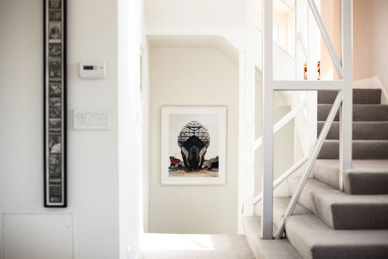
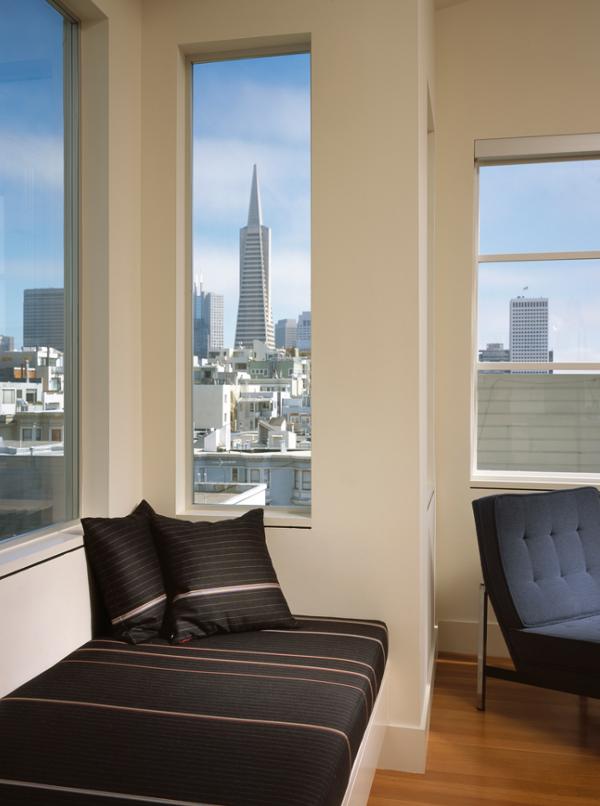
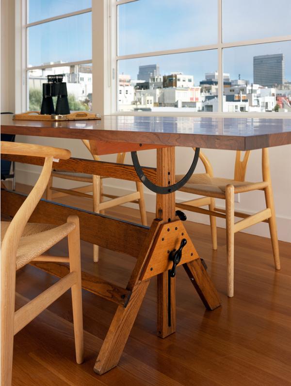
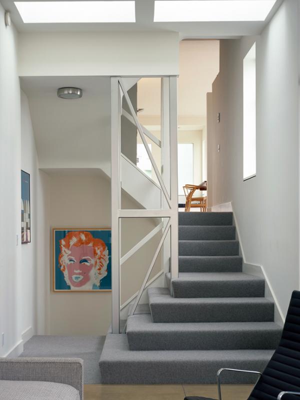
Posted on Fri, 7 Mar 2014 by midcenturyjo
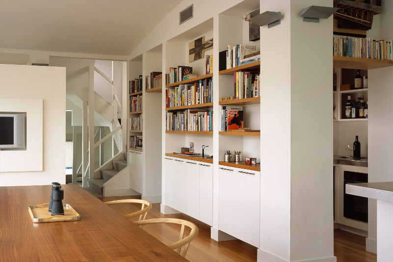
A modern retreat up on the hill. Telegraph Hill, San Francisco that is. Climb the stairs and not only does a stunning view await you but the clean, minimal lines of the two floor apartment by CCS Architecture. Can common sense be sexy? Can practical be super stylish? Sure can!


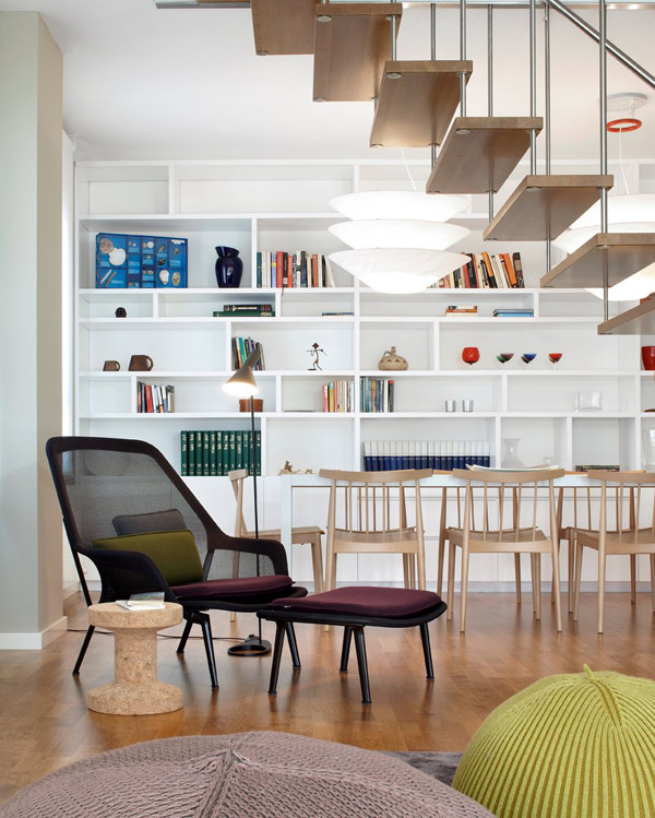
Hillary Thomas
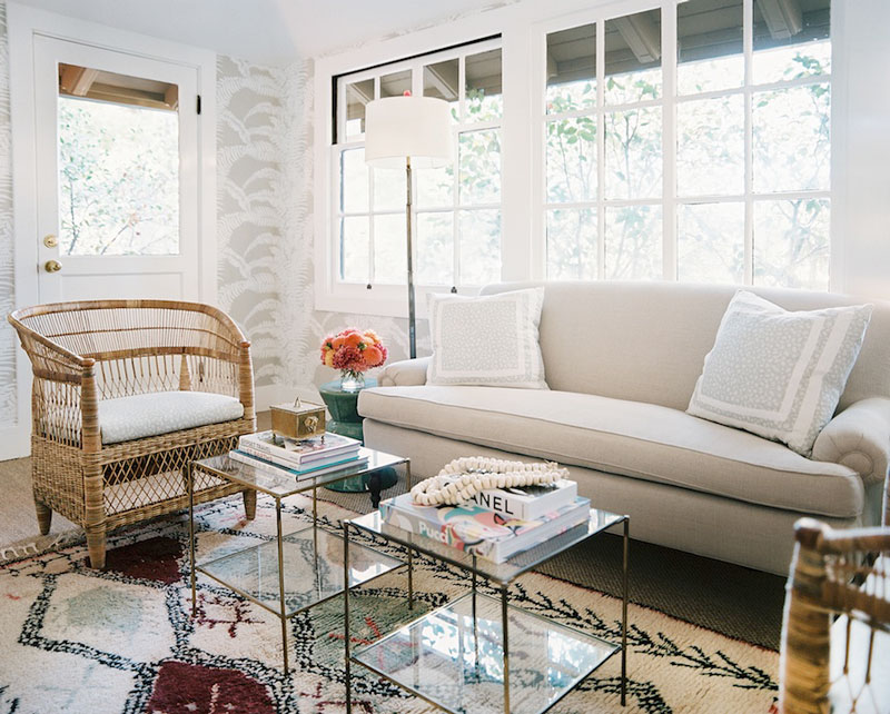
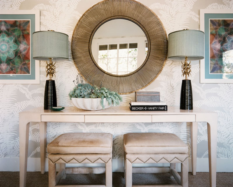
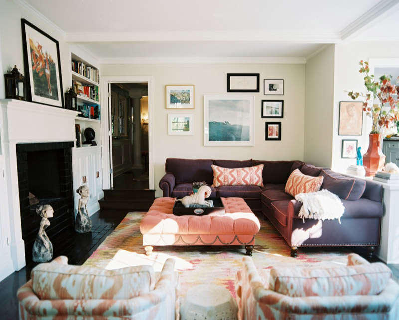
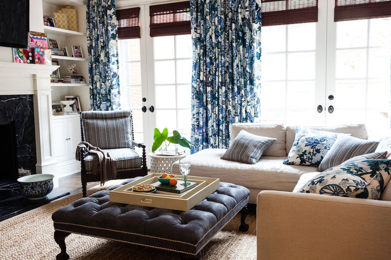
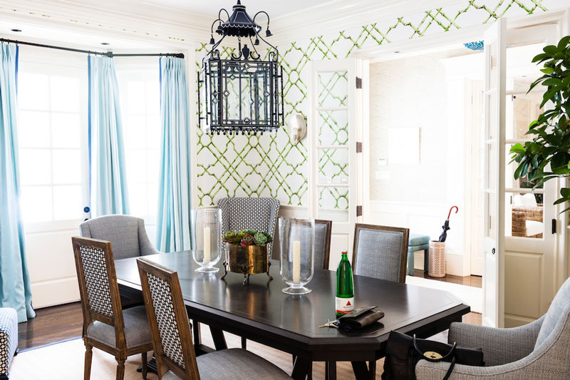
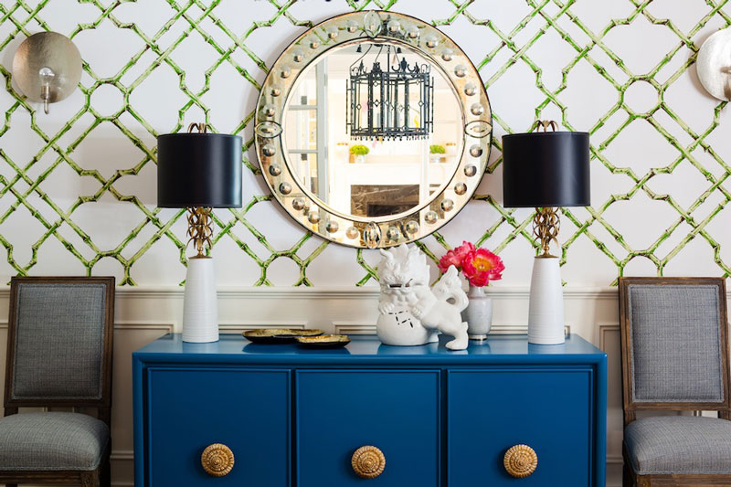
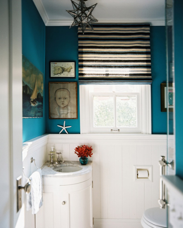
Posted on Thu, 6 Mar 2014 by KiM
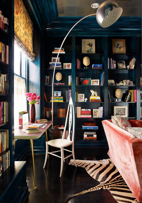
Looking for some spaces that are bold and fun, comfortable but classy? Los Angeles based interior designer Hillary Thomas has a knack for creating vintage chic interiors that are a bit Palm Beach and Hollywood Regency, with dramatic colours and patterns but keeps it grounded with neutrals and really cozy furnishings. I love the deep blue walls above combined with the black floors. GORG!

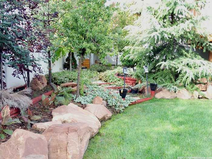
Reader’s dilemma – wonky exterior
Posted on Thu, 6 Mar 2014 by KiM
Ian lives in Salt Lake City, UT and found a home he wants to buy. The property is fantastic, but there’s a wonky front facade he’s not sure how to deal with.

This is an old photo from the tax assessor’s website. This is how it looks now:
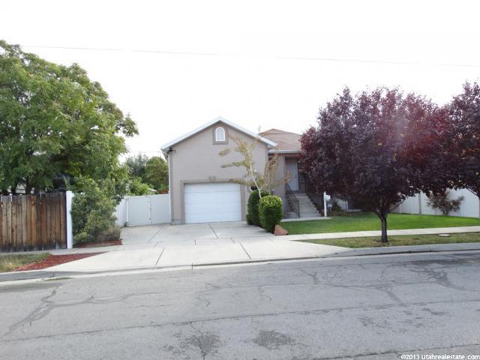
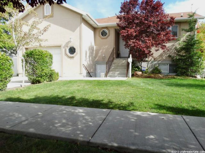
Here are 2 reasons why Ian hasn’t written this house off:

Here are Ian’s thoughts: This house is in a convenient location and is a large home on a large lot for a modest home with this proximity to the city. I’d love it to be able to work out, but I’d need a plan to fix its curb appeal. This “front of the house” looks like a “back of a house.” What do I do with all that space above the garage? What about those oggly-eyed octagonal windows? I’d need to increase the size of the window on the right, don’t you think. I’m thinking you and your readers may have some suggestions on shapes of windows, too. I’d, of course, like to keep the cost and changes to a minimum. You’ll notice there’s an entry to the basement there, on the front of the house, in addition to a number of other problems. One idea that I had was to double the width of the entry stairs, and replace the single door with either double doors or a single door with windows on either side (the latter option probably being more suited for a house this size). I’d also eventually want to diminish the amount of stucco with some stone and/or brick work. But some structural issues need to be addressed first.
Here is my 2 cents, and please feel free to leave your own suggestions, especially since none of the homes I’ve lived in ever allowed me to do any real landscaping or worry about the facade.
I would start by painting it all grey. Everything looks better grey. Then get rid of those octagonal windows. They’re making me crazy. YUCK! I’d cover up the garage one, then do some sort wood slat facade on the right side of the garage and up and over the top to the far left, to make it look like the garage is offset for a reason, and not just that the architect had really bad taste. (I can’t find a good photo of what I’m talking about but this one has the slats on the stairs). That way you kill 2 birds with one stone – you have something other than stucco going on so you don’t have the cost of doing brickwork somewhere (the house is too small and has too much going on in front to bother with that), and it will eliminate all of that empty space on the garage section. What a stupid idea to have the basement entrance right next to the front door! I’ve never seen that before (where it looks planned). I’d just get a nicer door that’s mostly glass. As for the window above the basement door, I’d remove it. It’s jammed up at the roof line. BAD! I would keep the single door but get one that’s more modern maybe with some glass and have glass one one side or both sides, and extend the front steps across the width of that whole space. And something fun could be done with the window to the far right – maybe build a “box” that juts out from the facade and have the window in that – a modern bay window. If too costly, then a funky shaped window – maybe really long and narrow. In the end, if the interior works for you, I’d get the house. The backyard is fantastic. The front really isn’t that bad – especially now that there are plants/trees helping to hide the wonky.

