Displaying posts labeled "Modern"
Feilden Fowles Architects
Posted on Fri, 1 Feb 2013 by midcenturyjo
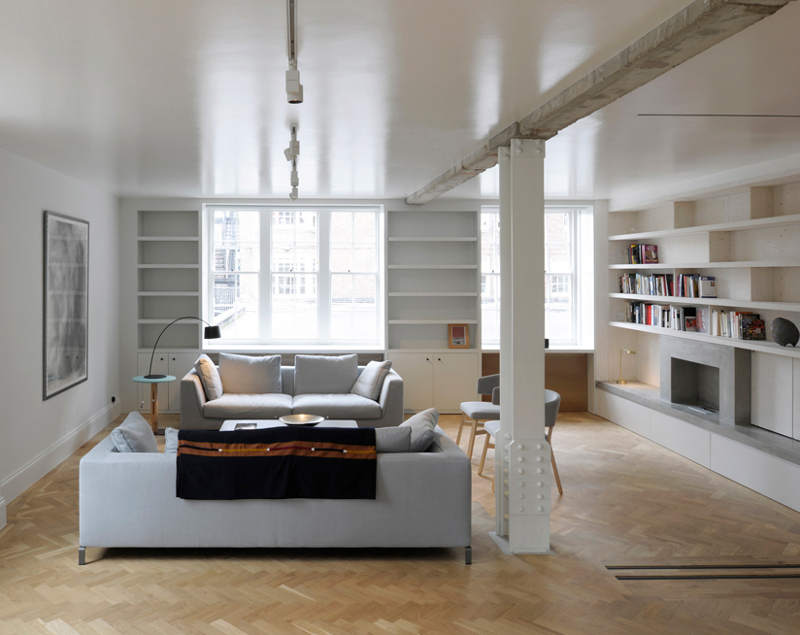
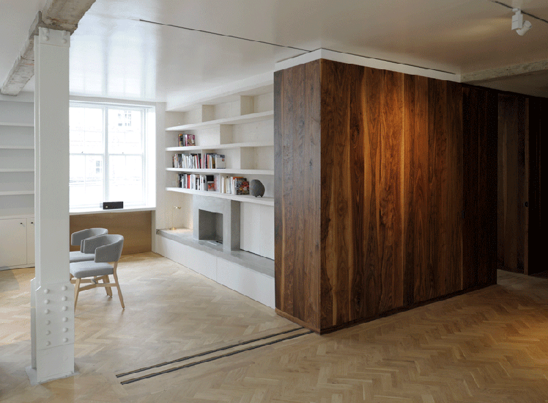
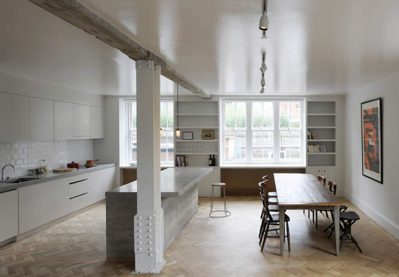
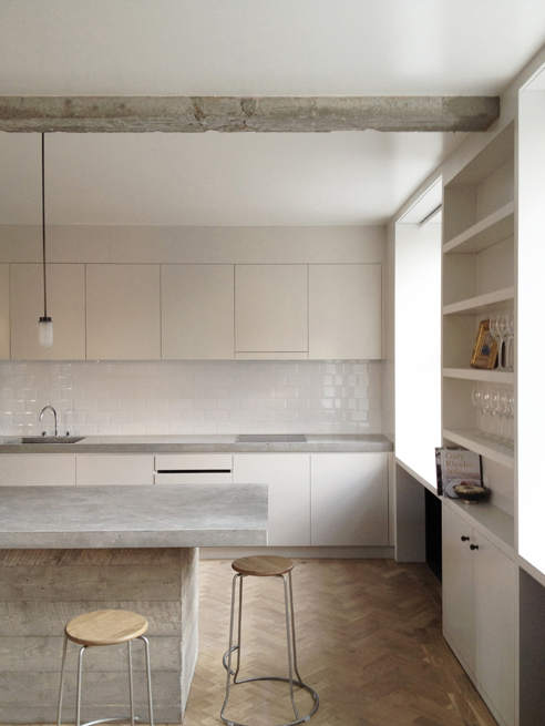
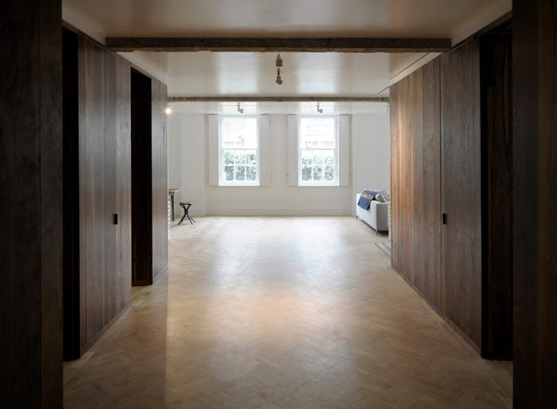
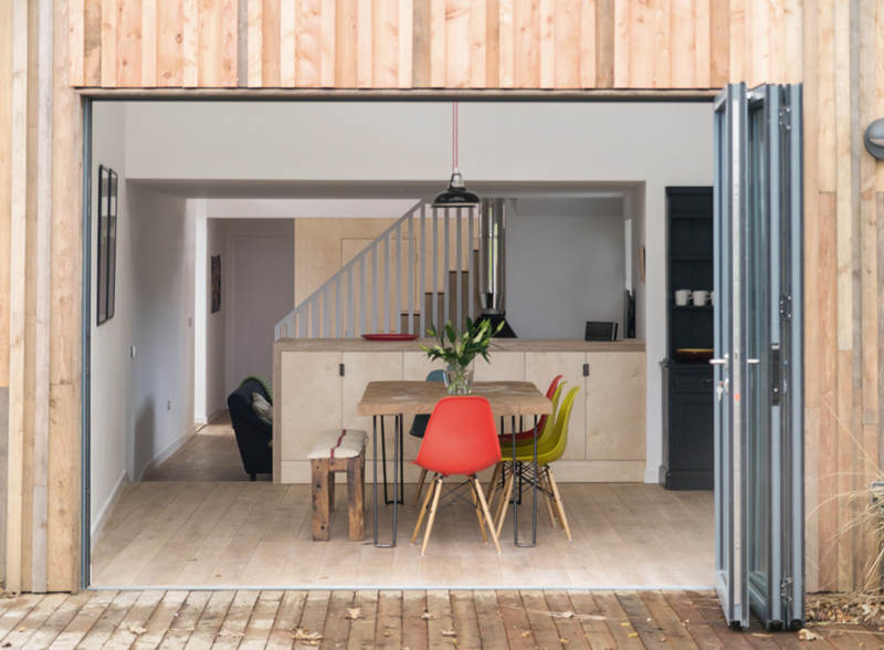
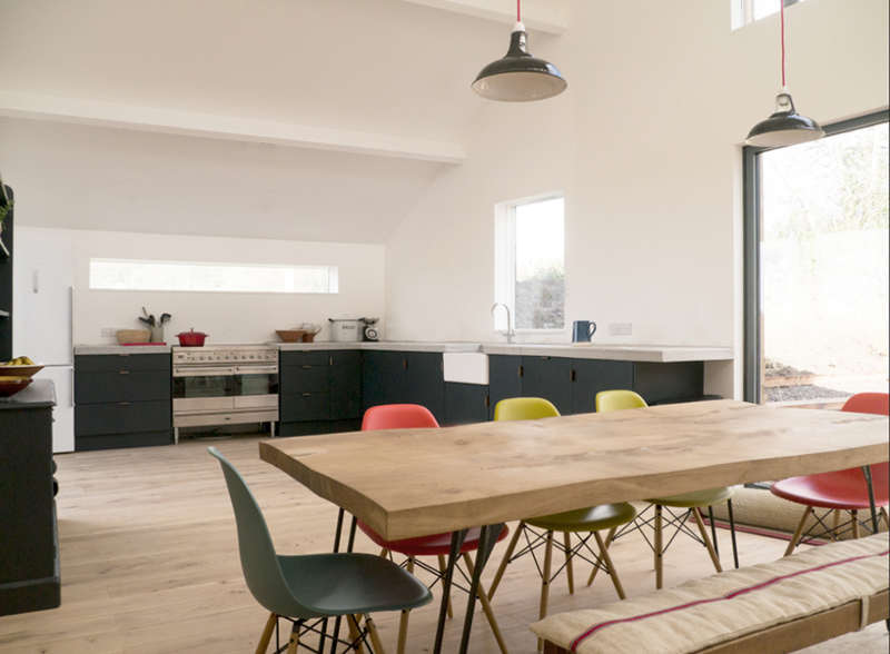
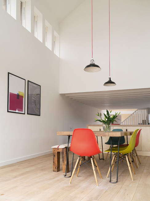
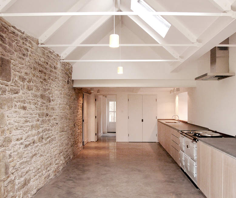
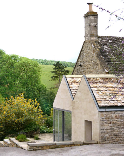
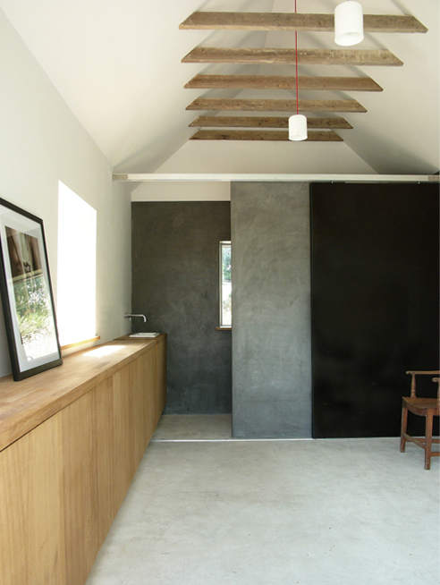
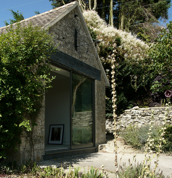
Pared back, elegant simplicity. Spaces stripped back to their inherent form. Beautiful, precise yet subtle. Feilden Fowles Architects deliver pure, conceptually strong buildings. The first , a renovation to a 1930’s apartment sees emphasis on symmetry where the dark walnut-lined central axis with sliding elements provides intimate pockets in an open plan design. stripped back to its inherent form. The second home, a Cotswold extension to a working farmhouse emphasises its simple, functional structure.
Joanna Laajisto
Posted on Wed, 30 Jan 2013 by midcenturyjo
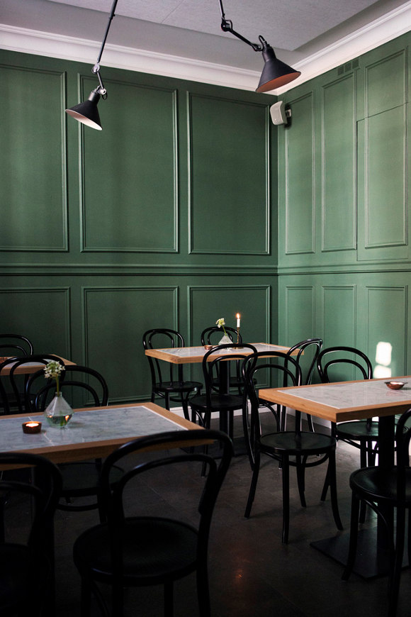
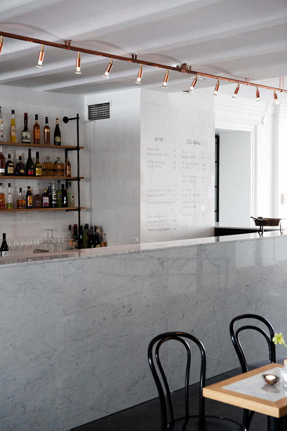
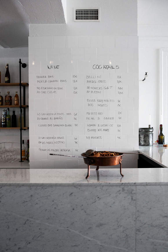
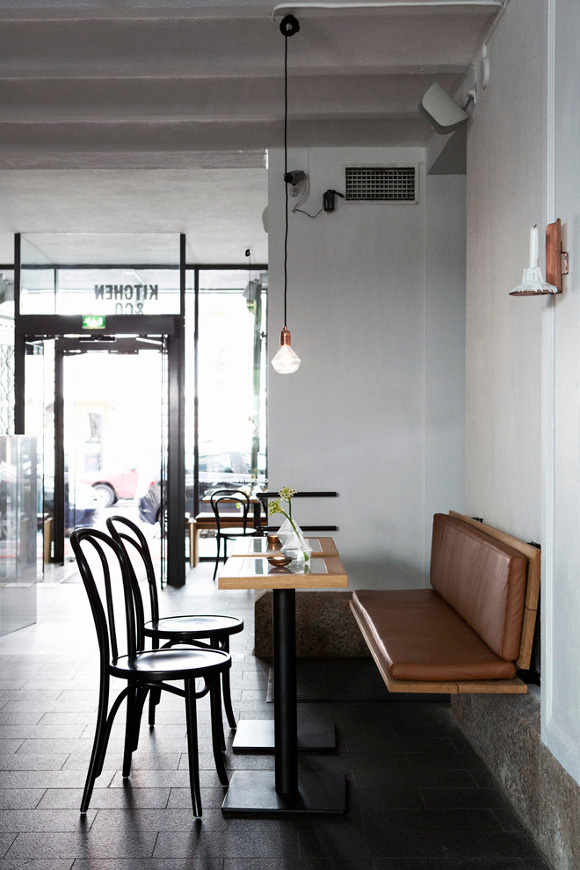
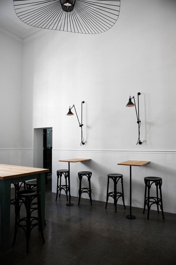
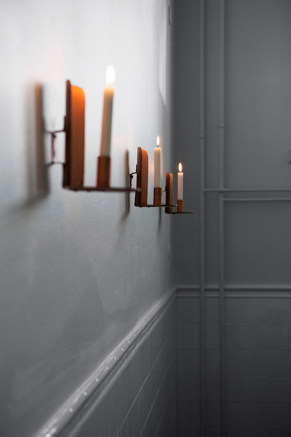
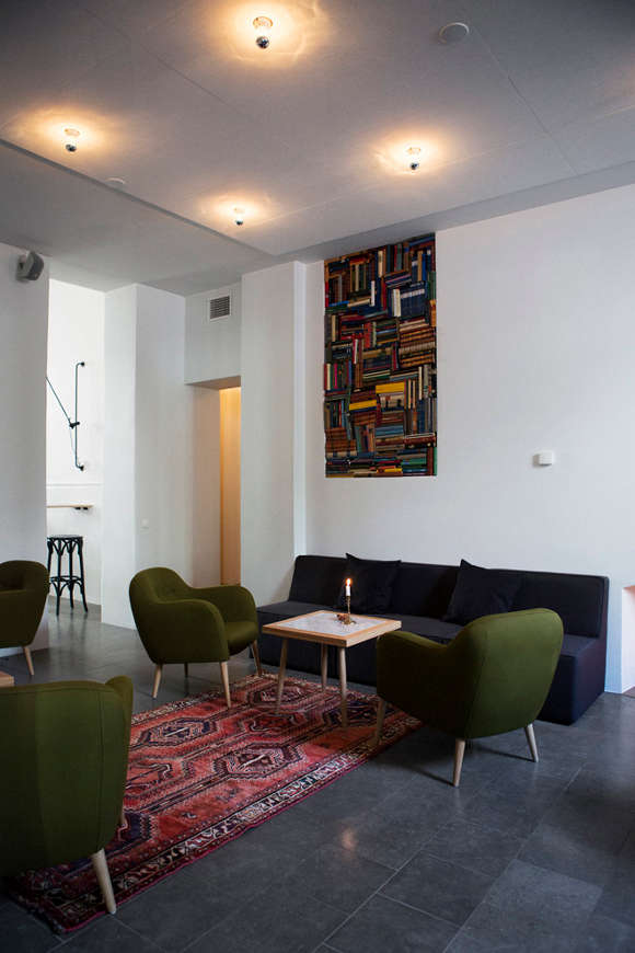
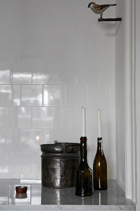
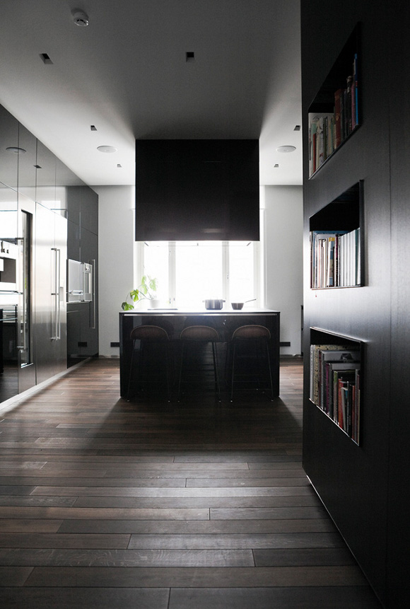
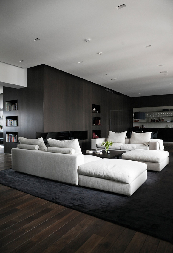
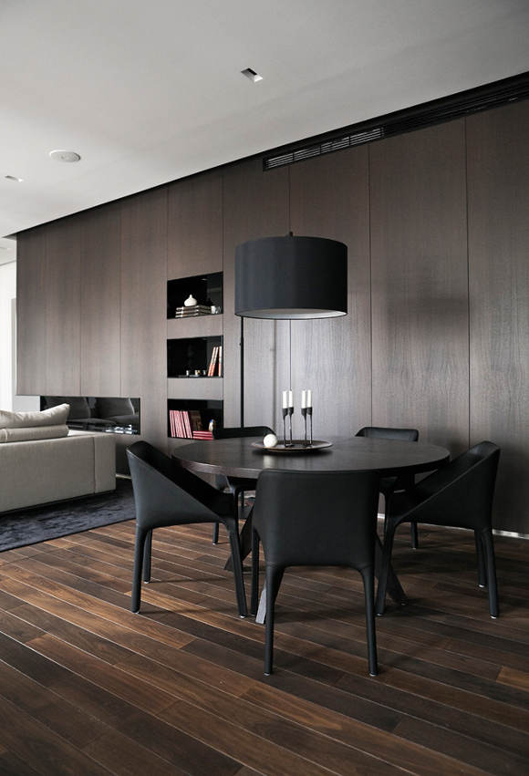
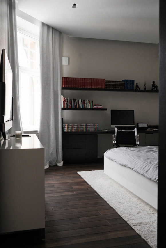
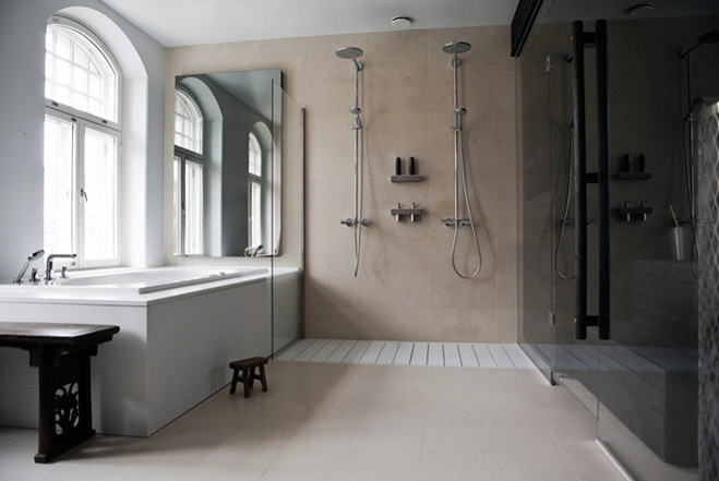
Helsinki based interior architect and designer Joanna Laajisto‘s philosophy is “not to clutter this world with unnecessary things but to find the hidden beauty of each space and to enhance it by creative solutions.” Two inspiring projects. The first Bar&Co, a modern take on a 1920’s bistro. Think marble, oak, leather, wrought iron and copper. Love the hand forged copper candle sconces. The second a dark and brooding minimalist home. A modern interior of rich woods and contemporary furniture.


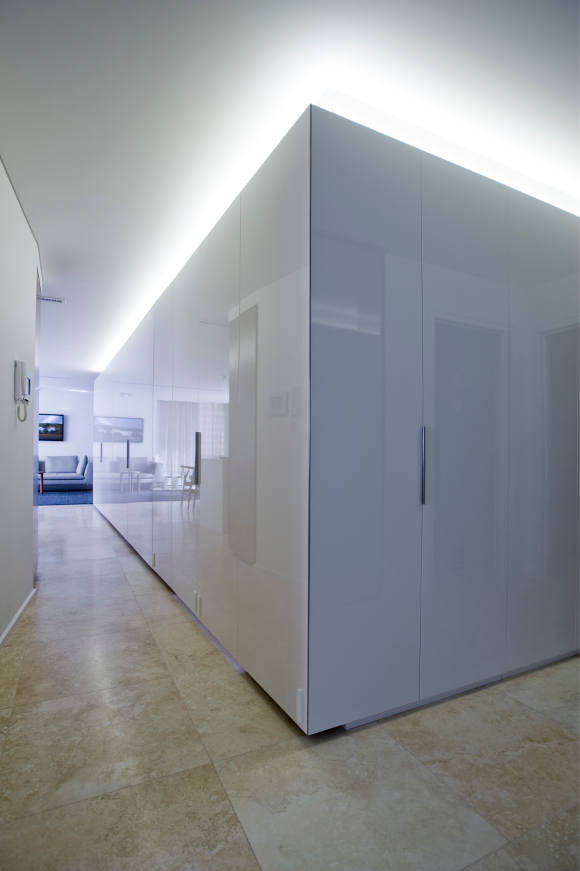
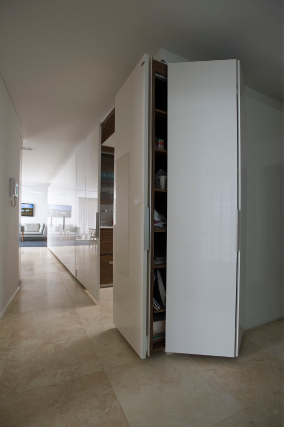
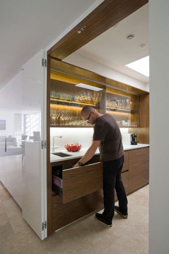
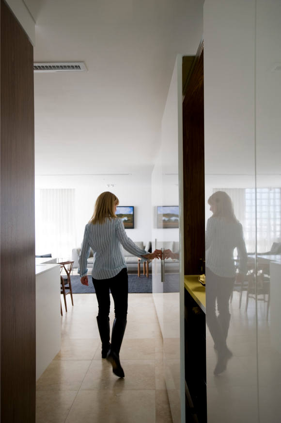
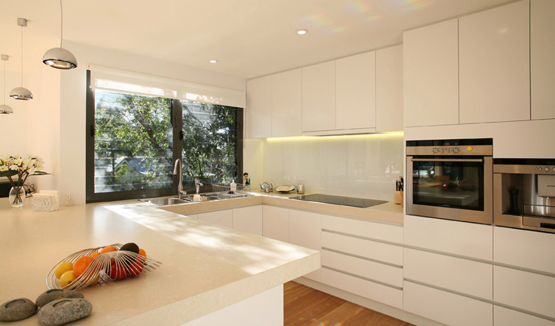
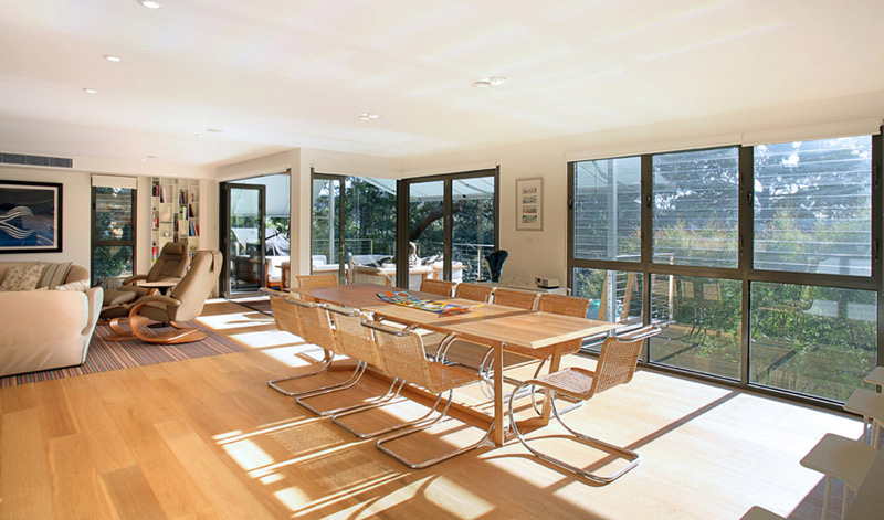
The hidden kitchen
Posted on Tue, 29 Jan 2013 by midcenturyjo
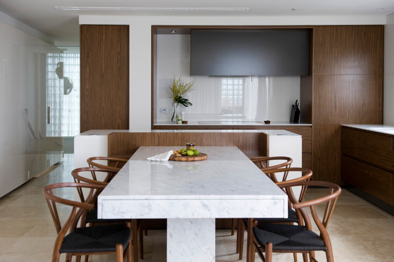
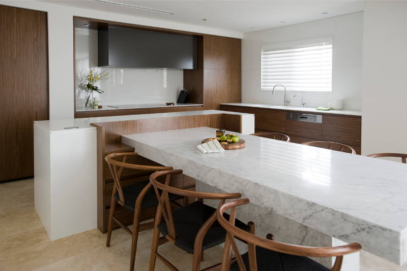
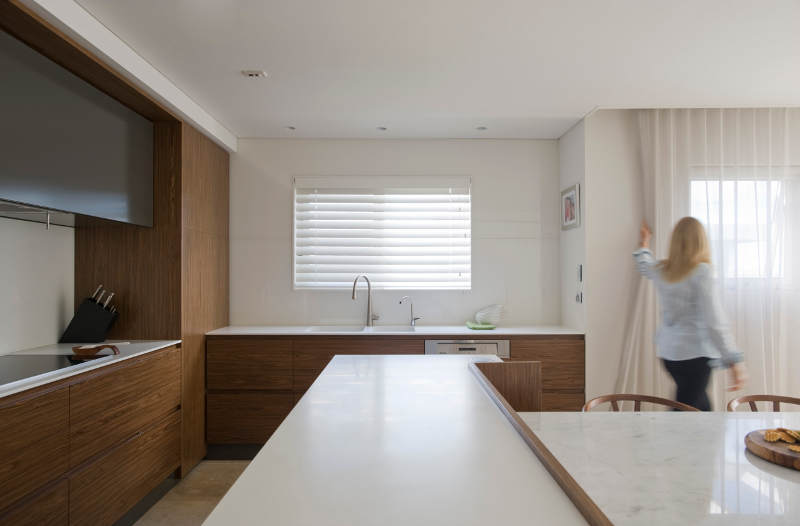
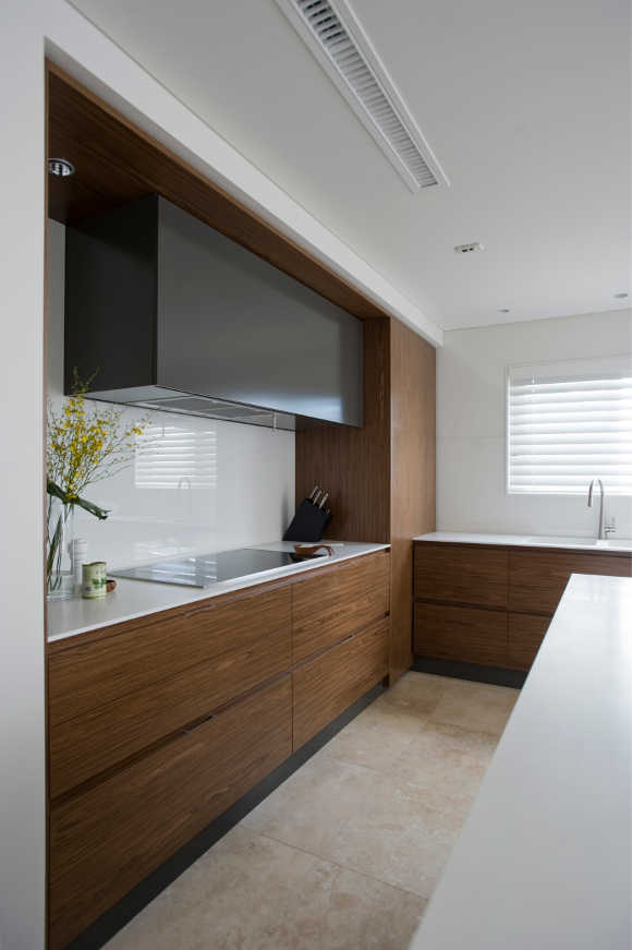
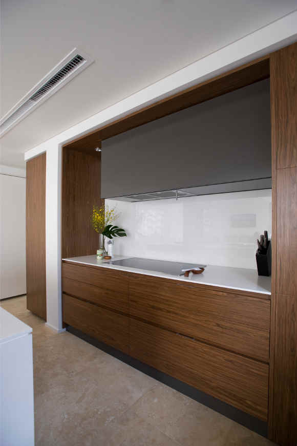
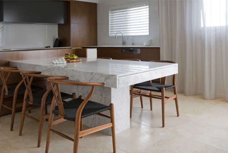
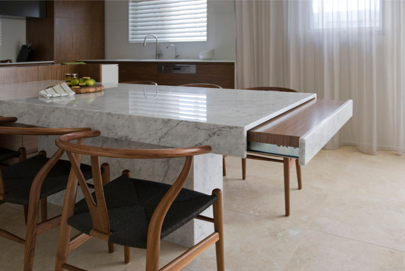
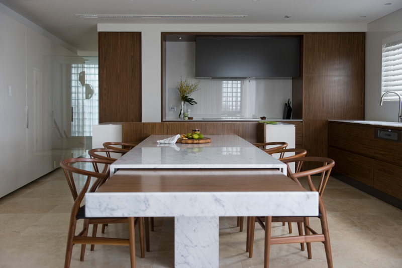
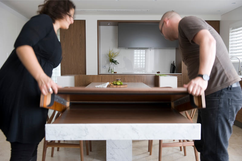
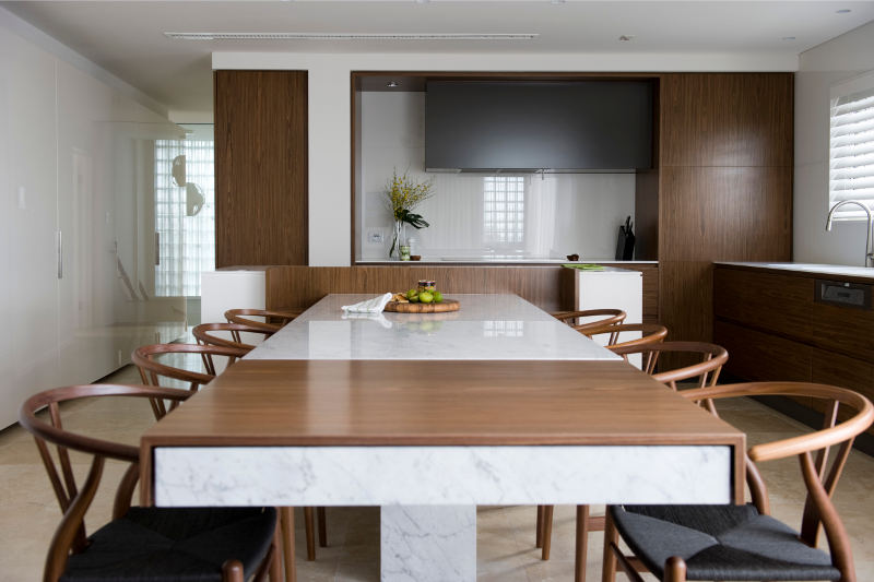
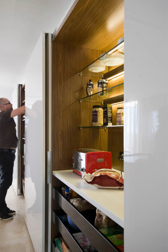
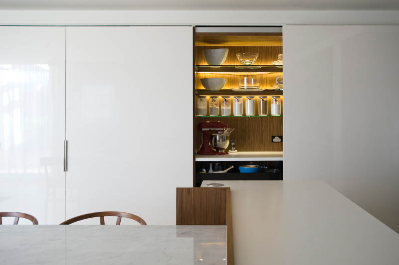
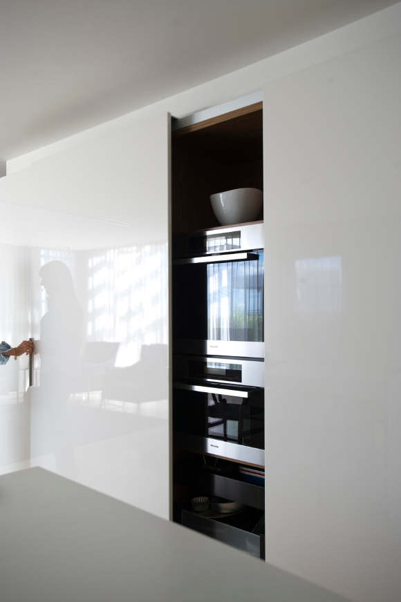
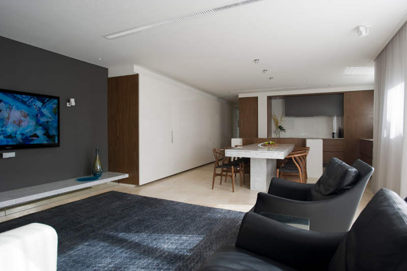
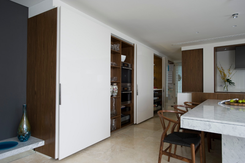
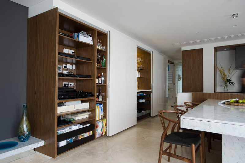
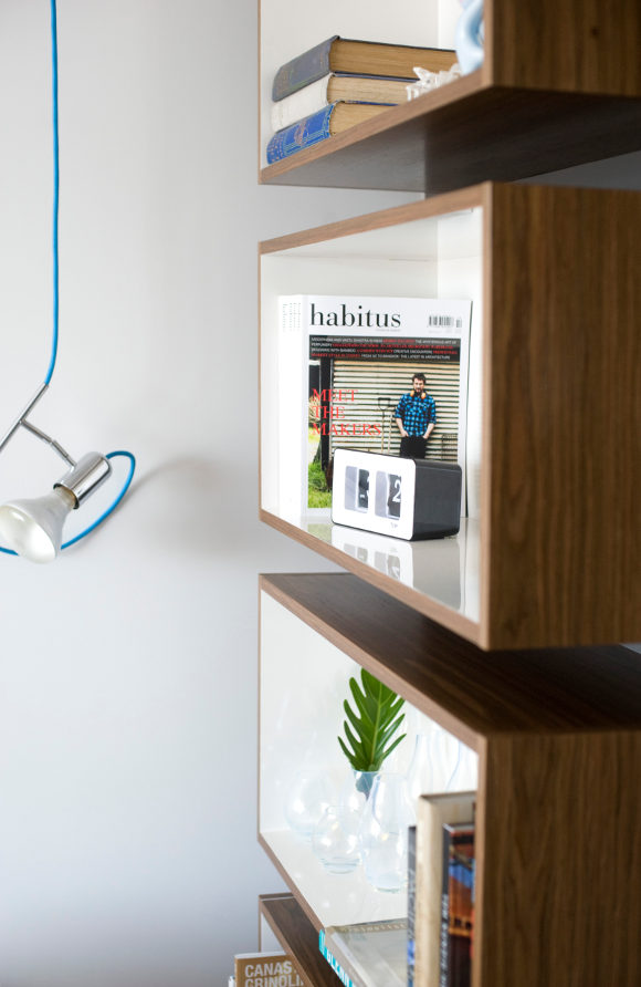
“The design brief was simple:- Fit enough appliances in that would service a small commercial kitchen; cater for a family of five that entertain a LOT, a ten seater table was a MUST! Make it stylish with no visible appliances…”
A clever kitchen design from Darren Genner and Minosa Design. A sixth floor apartment, a small space, and the need to find a home for 13 small appliances. Yes, 13. The solution? A bank of storage over 7 m with a “pop and slide” door system to conceal the wall ovens and steamer, cabinet for all those small appliances, a second appliance cabinet with tea/coffee making facilities and breakfast supplies and an ingenious scullery. And, of course, the dining table. Understated and yet bold. With the click of a remote and a flick of the wrist it extends from 8 seats to 12. Talk about a show stopper. You can find out more about the design process here.


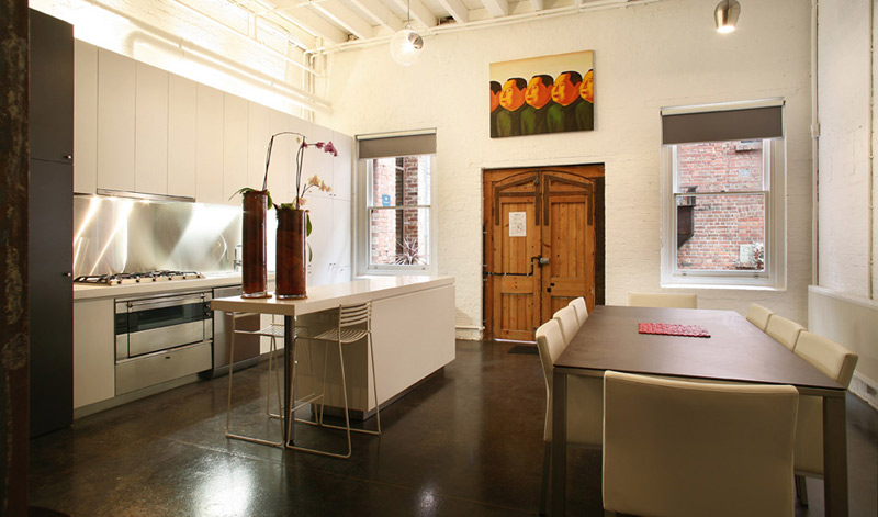
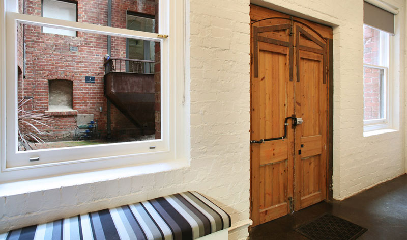
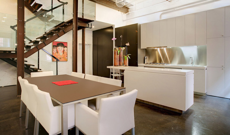
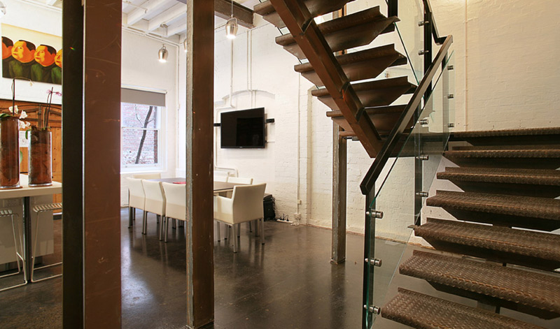
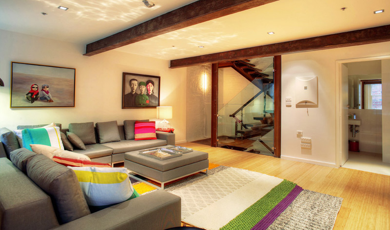
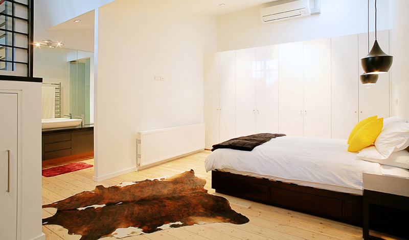
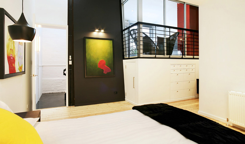
Herniman Interiors
Posted on Mon, 28 Jan 2013 by KiM
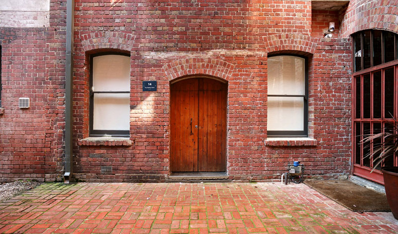
I would give anything to have the entrance to my home look like the photo above. Rustic, aged, charming, inviting. Then you walk in and are wowed by the modern conversion of the interior. YESSSSS. Via Australian firm Herniman Interiors. (A couple photos added on the end are of another one of their projects).
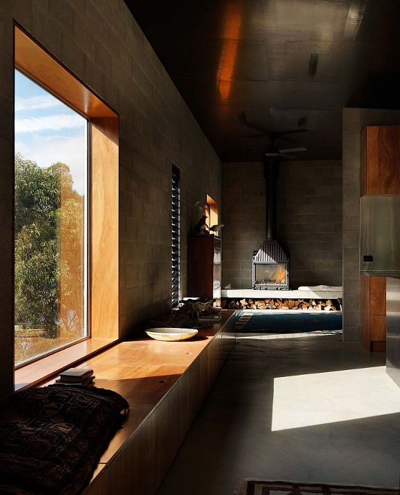
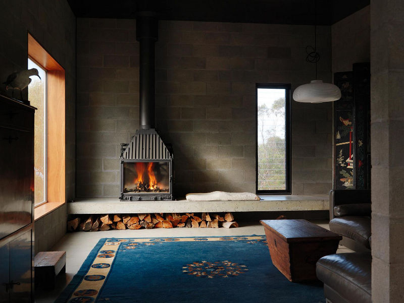
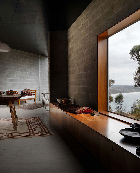
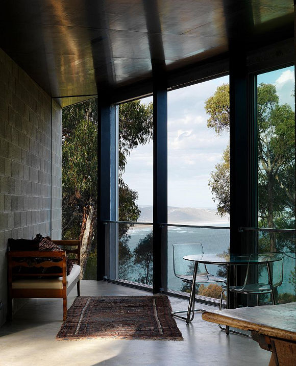
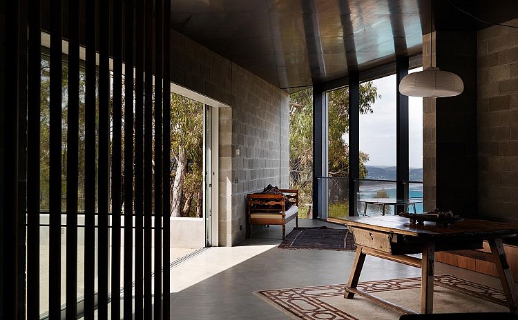
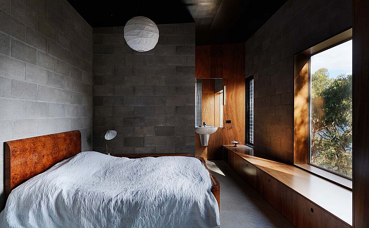
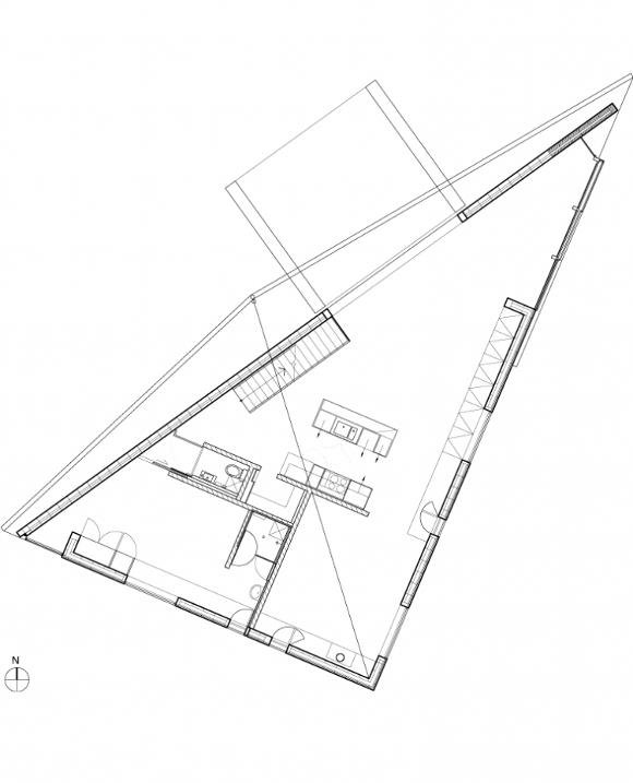
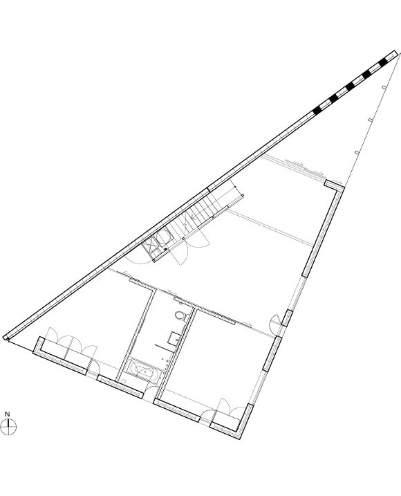
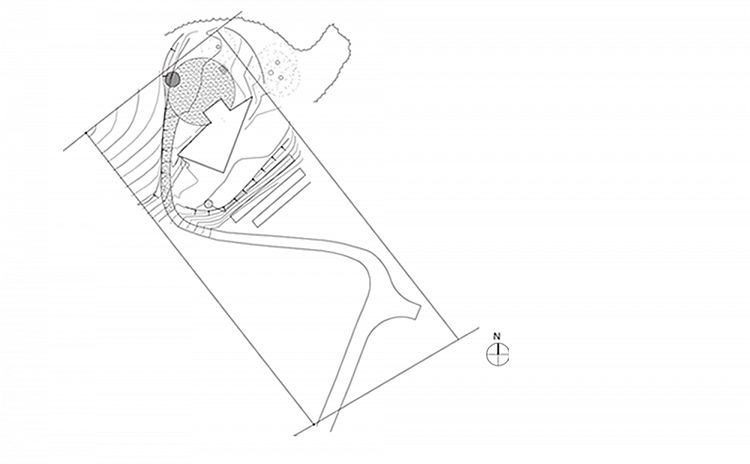
Kerstin Thompson Architects
Posted on Thu, 24 Jan 2013 by midcenturyjo
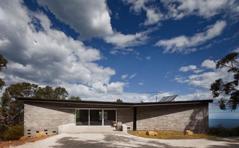
When architecture and its surrounding landscape combine magic happens. When a building addresses its site the experience of the space is heightened, enriched. A limited palette of materials, concrete flooring, blocks and timber accents are a counterfoil to that view, stunning glimpses through native trees to Bass Strait. The House at Big Hill by Melbourne based Kerstin Thompson Architects (KTA) draws the occupant through its dark, triangular space towards the vista while light and shadow cocoon and envelop the interiors.