Displaying posts labeled "Neutral"
The new classic by Cass + Nico
Posted on Thu, 19 Mar 2020 by midcenturyjo
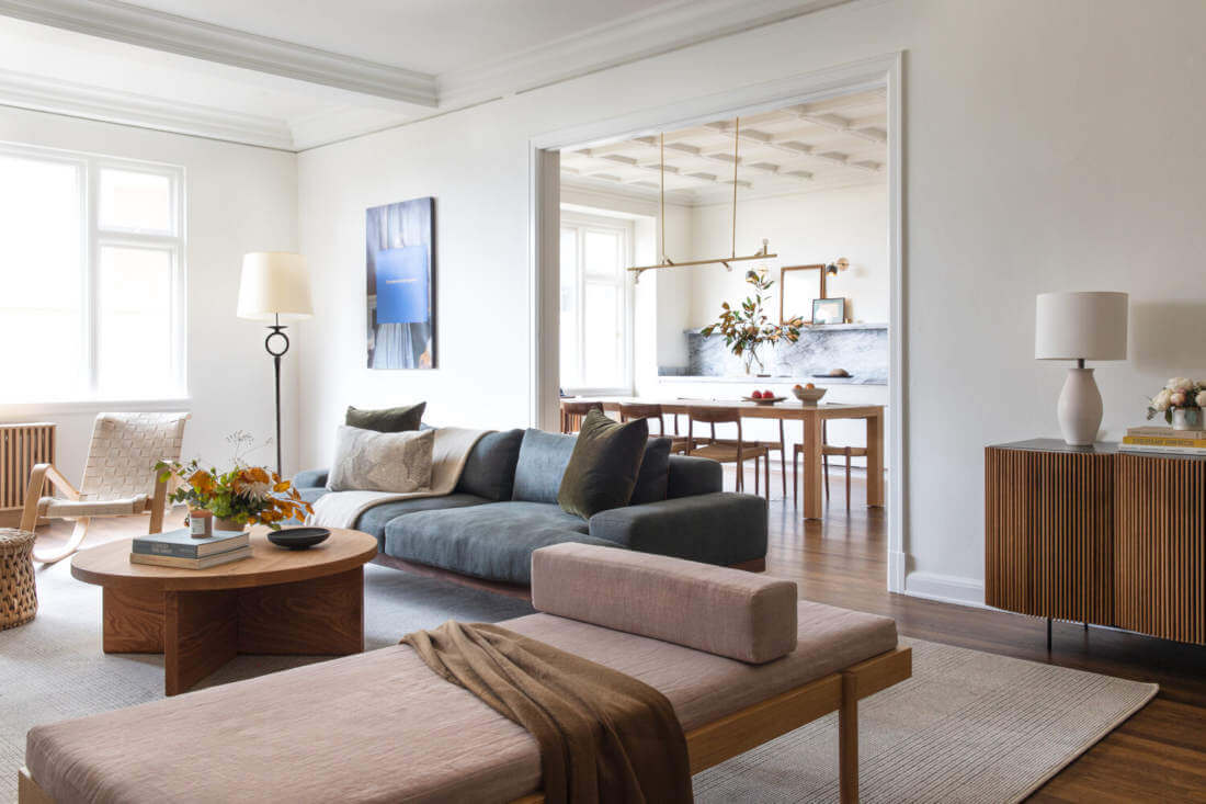
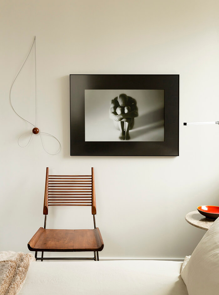
Timeless and refined yet with a casual, modern take on apartment living. The kitchen and living areas of this Nob Hill home by San Francisco based interior designers Cass + Nico features a rich mix of bespoke and the carefully curated with an emphasis on materials, texture and light. The new classic living.
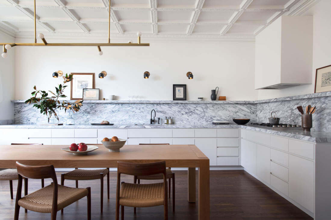
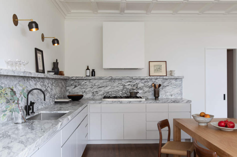
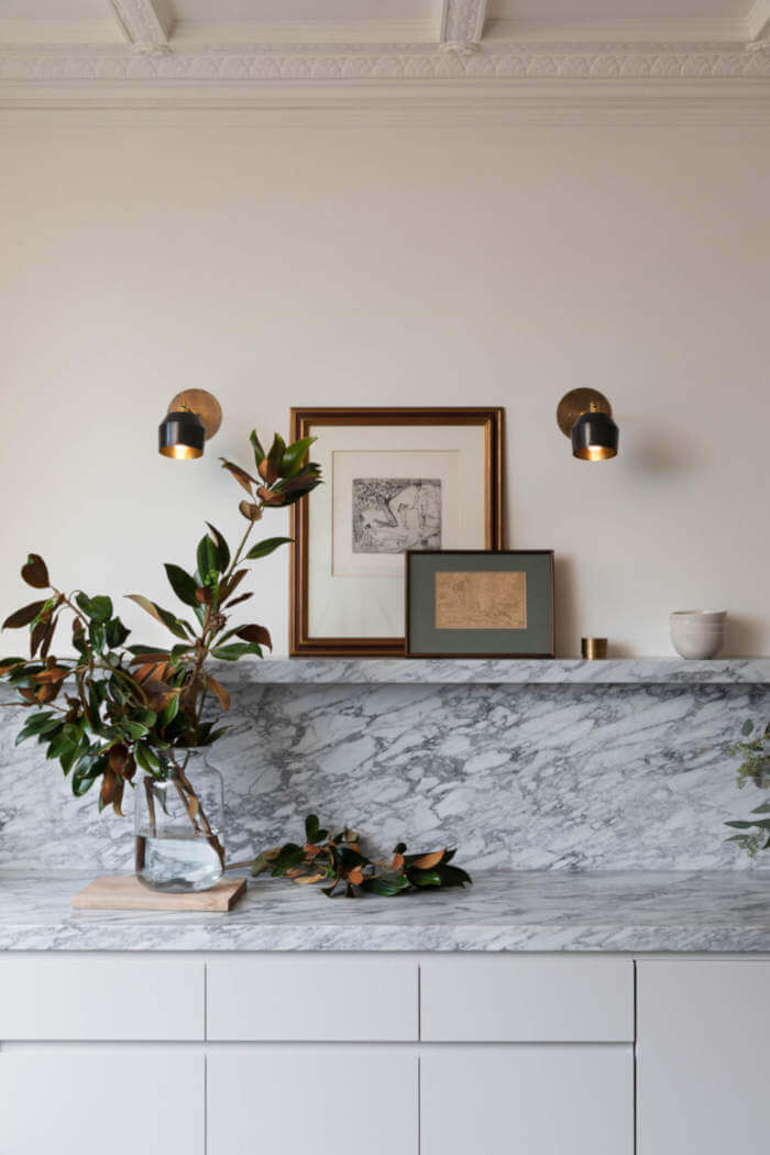
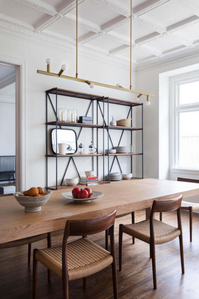
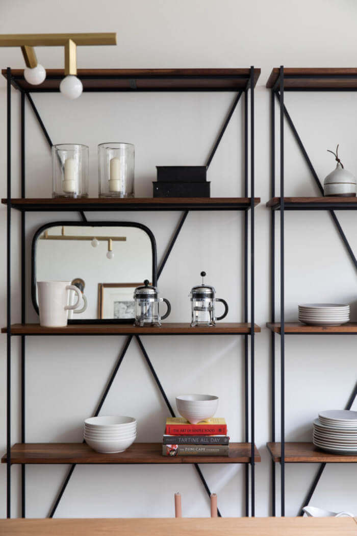

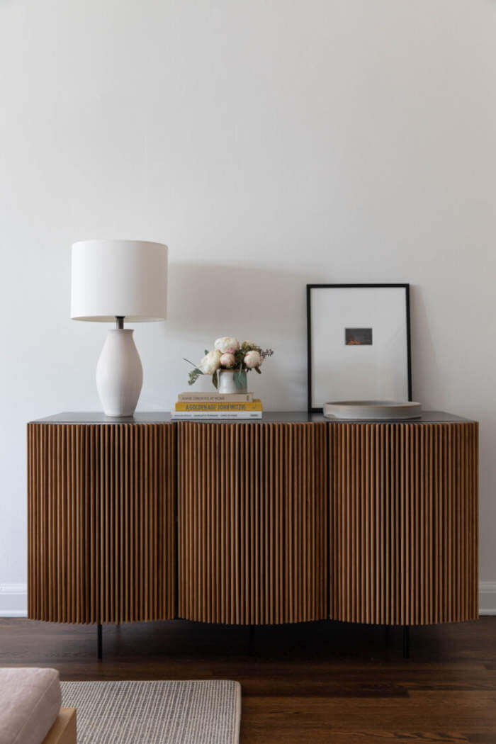

Photography by Bess Friday
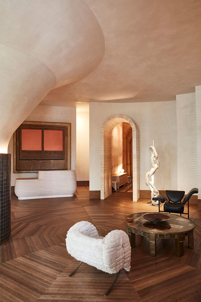
OM Townhouse
Posted on Wed, 18 Mar 2020 by KiM
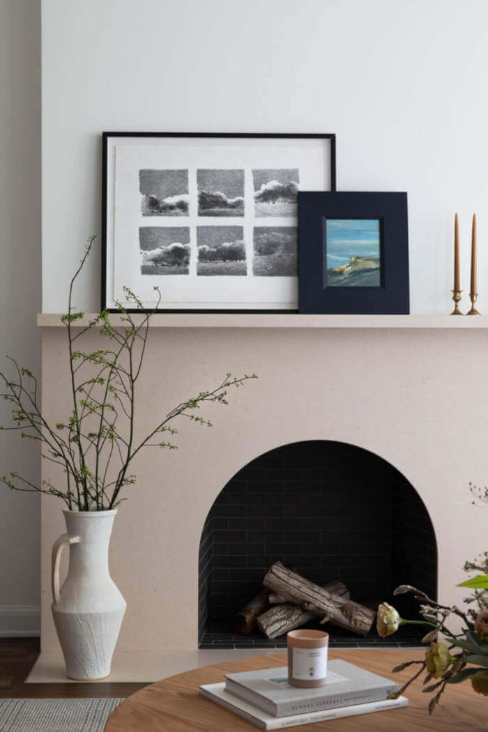
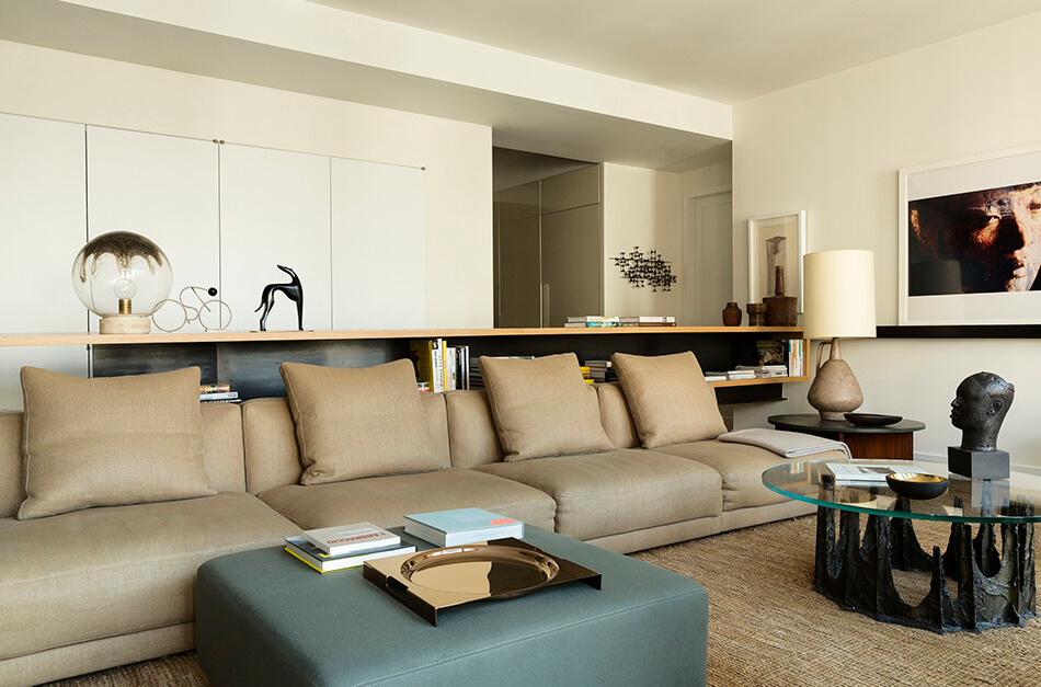
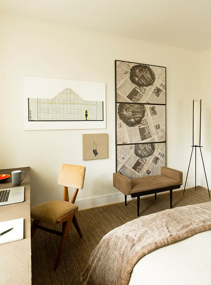
More neutral and modern from Arthur Casas in this 375 m2 New York townhouse. In an elegant prewar building standing five stories tall, just a few steps from central park, this ground floor apartment called for extensive renovations. The aim of the design was to illuminate the interiors and re-create environments, eliminating dividers and lending a visual unity to the apartment. We imagined the living room, with its 6 m ceilings, as the central space in the house. It connects the apartment’s three levels via a staircase that goes from the basement—transformed into a guest suite and laundry area—to the walkway on the upper level, which leads to the children’s bedroom. The garden is separated from the living room by large glass doors that slide into the walls, integrating interior and exterior spaces. Sober, neutral tones; simple gestures; integrated spaces; and furnishings that cover much of the best in 20th-century american design—with works by icons such as george nakashima, peter lane, and edward wormley, among others—are all key points in the design.
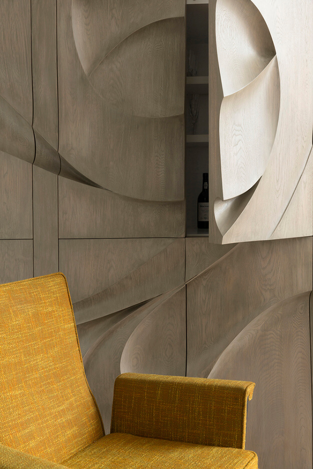
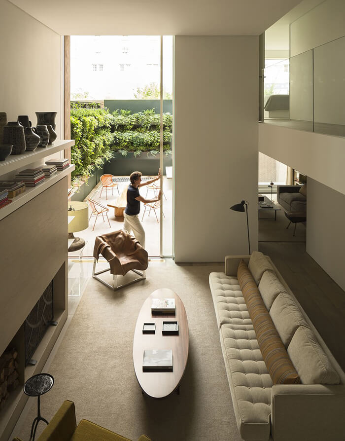
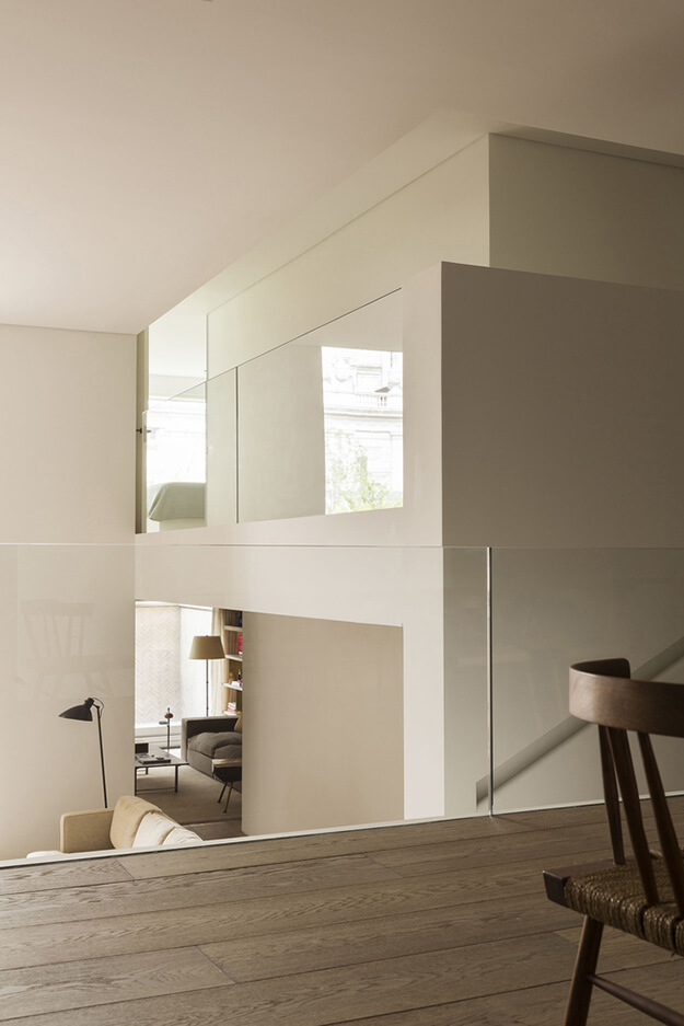
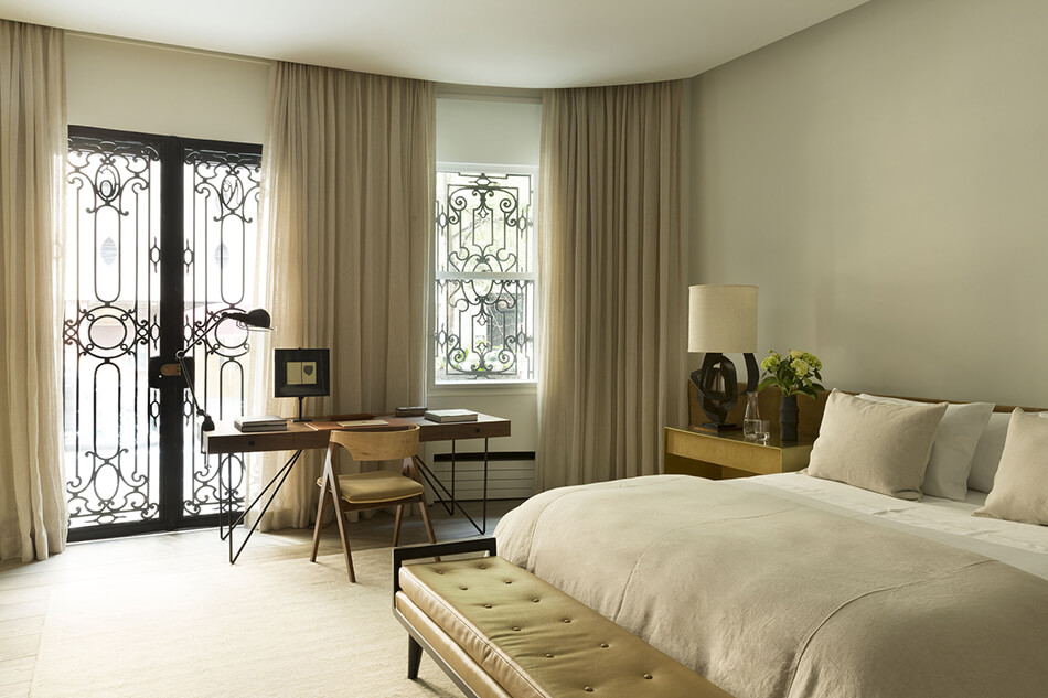
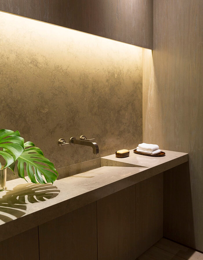
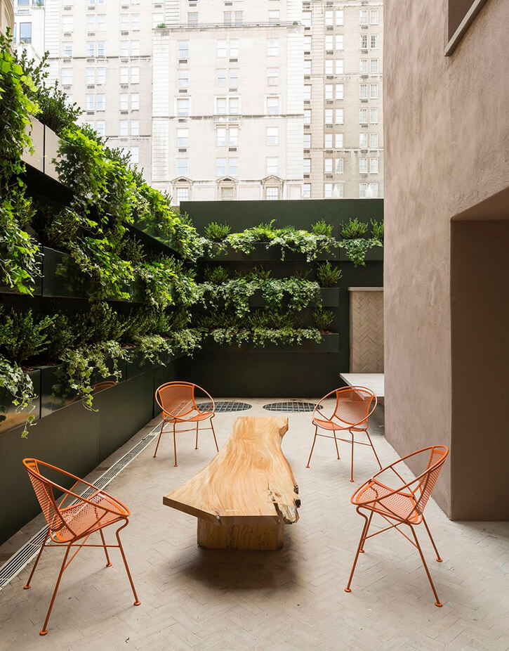
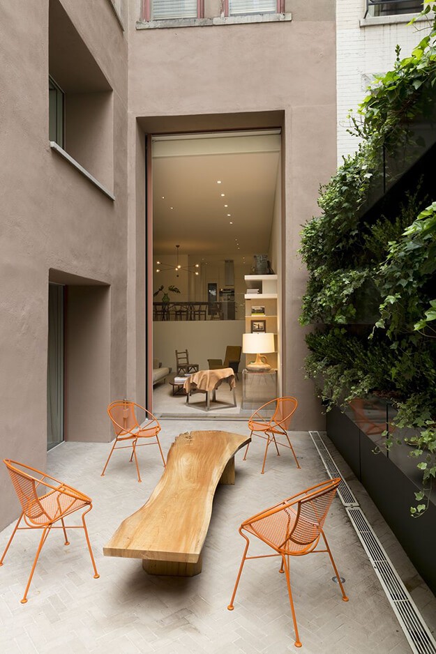
Photos: Ricardo Labougle
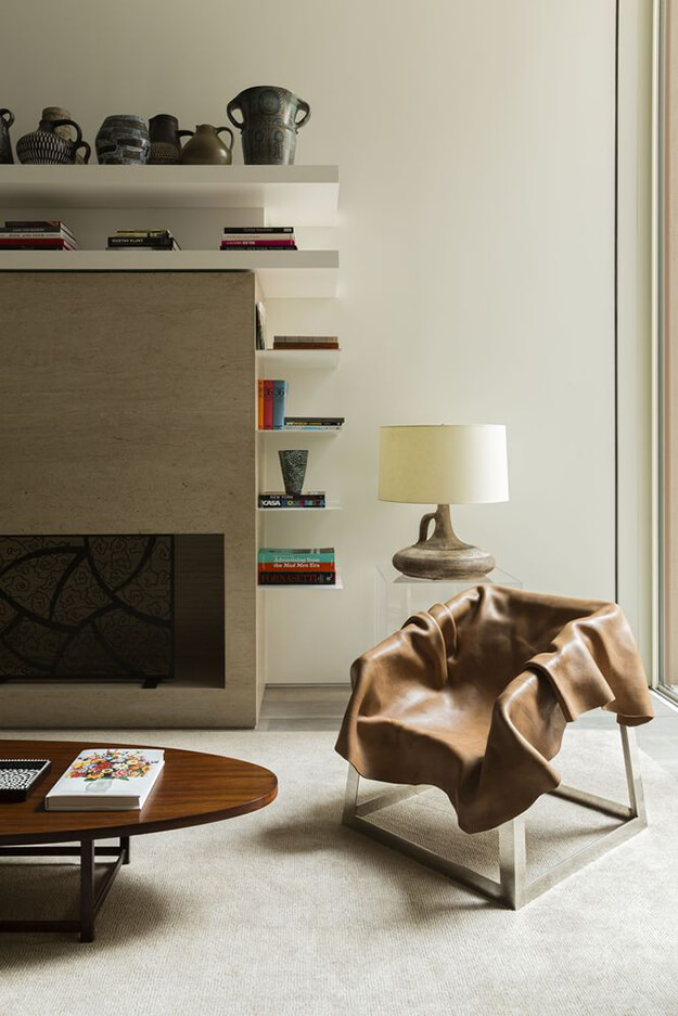
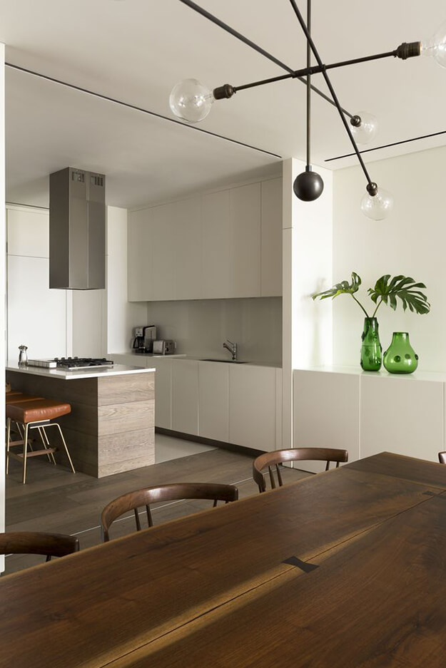
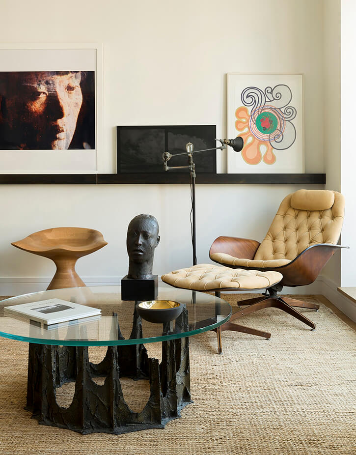
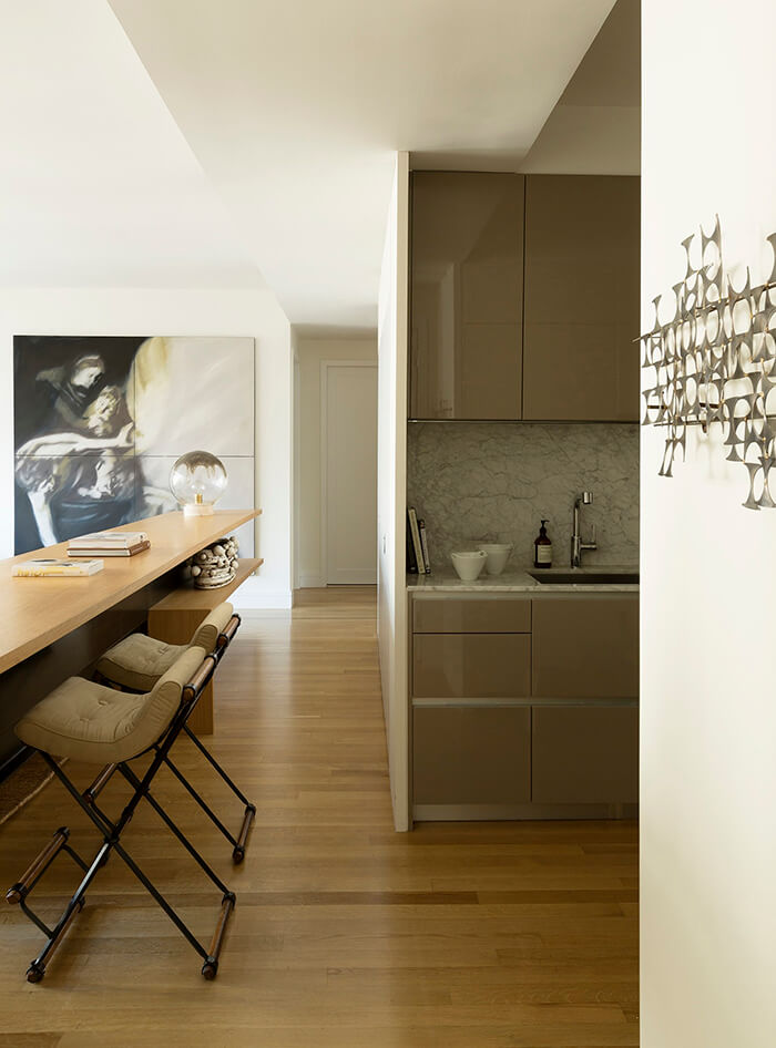
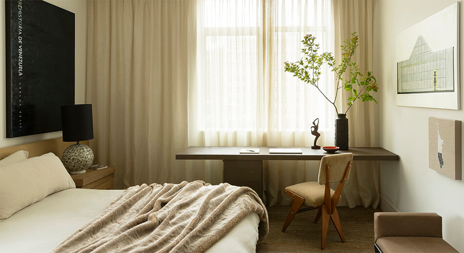
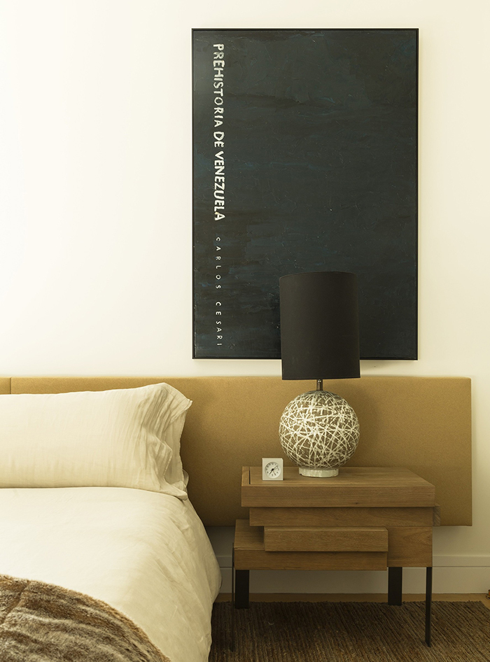
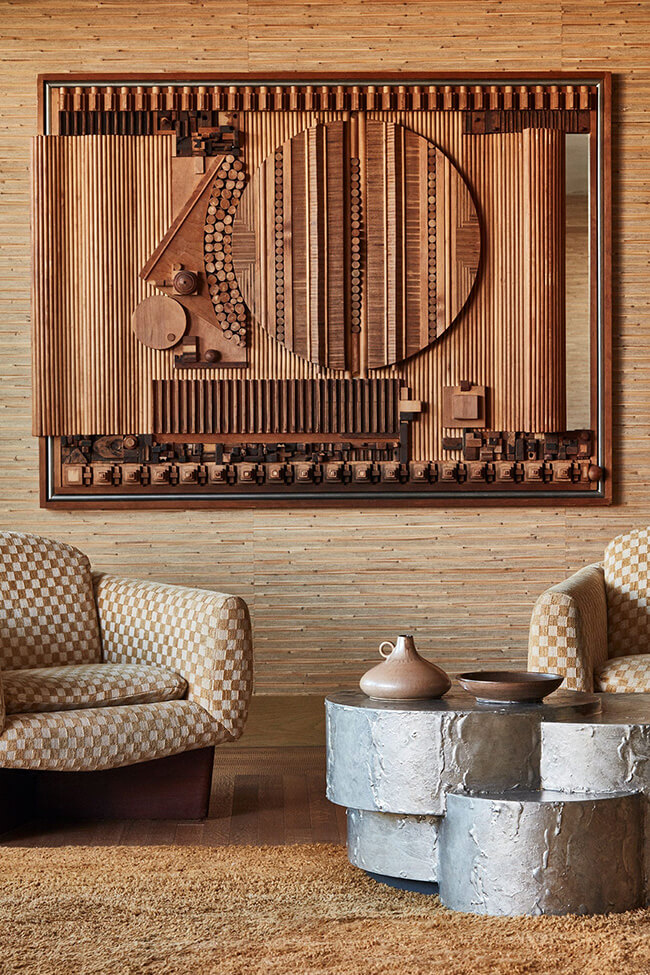
A neutral edge in a New York apartment
Posted on Wed, 18 Mar 2020 by KiM
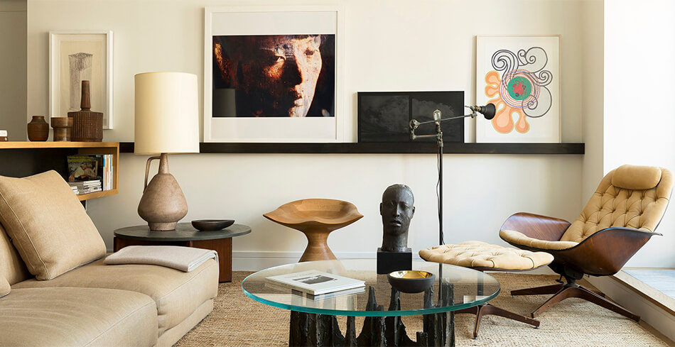
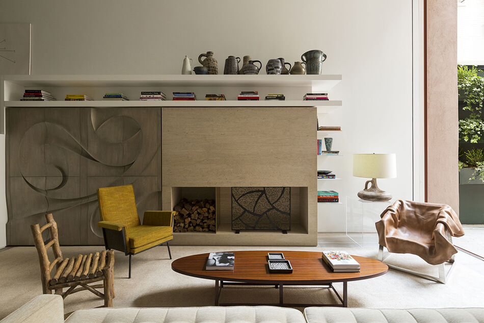
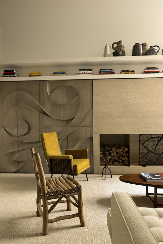
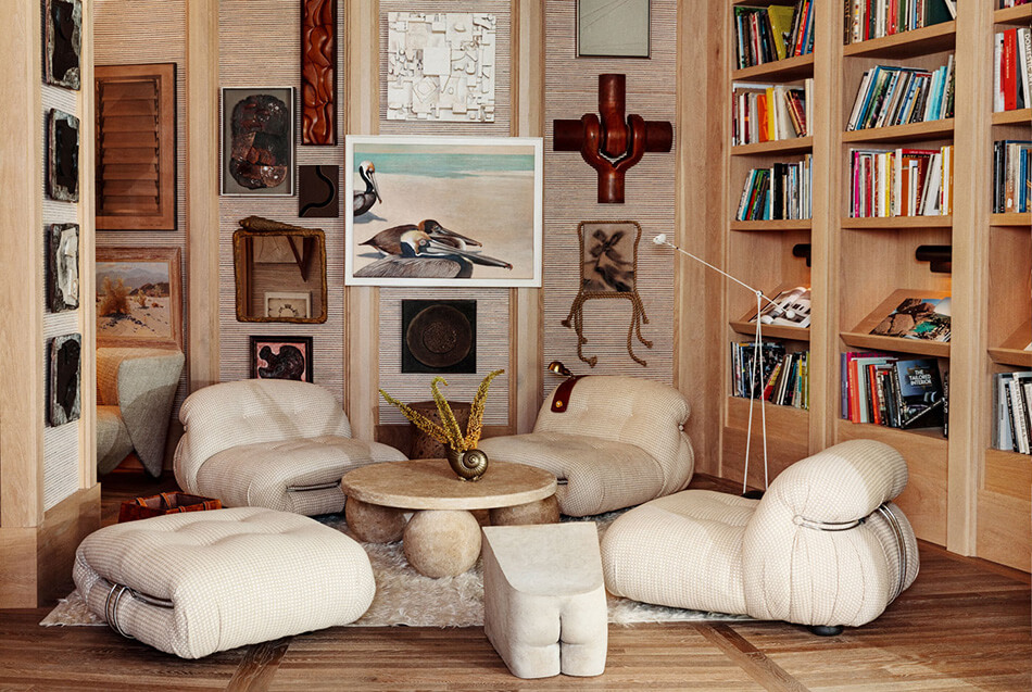
Sometimes all you need are neutrals. Beige/caramel tones mixed with black and modern artwork make this apartment in New York timeless and a bit edgy. Perfection. By Arthur Casas.

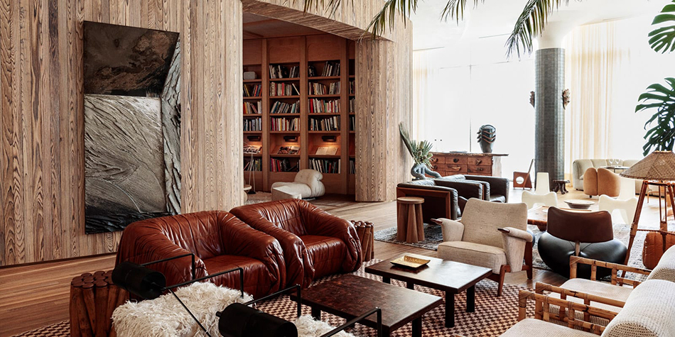
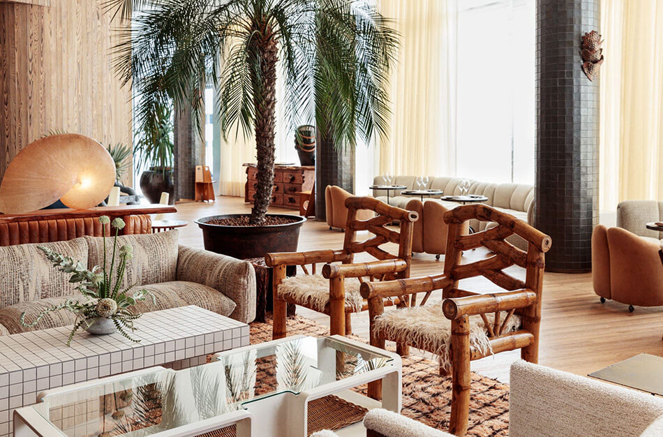
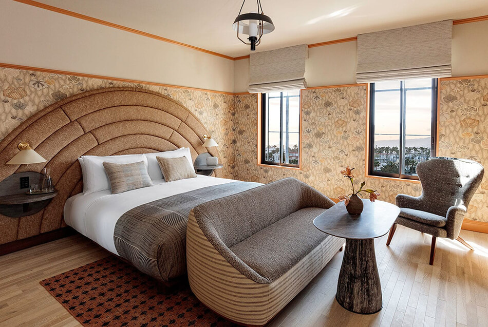
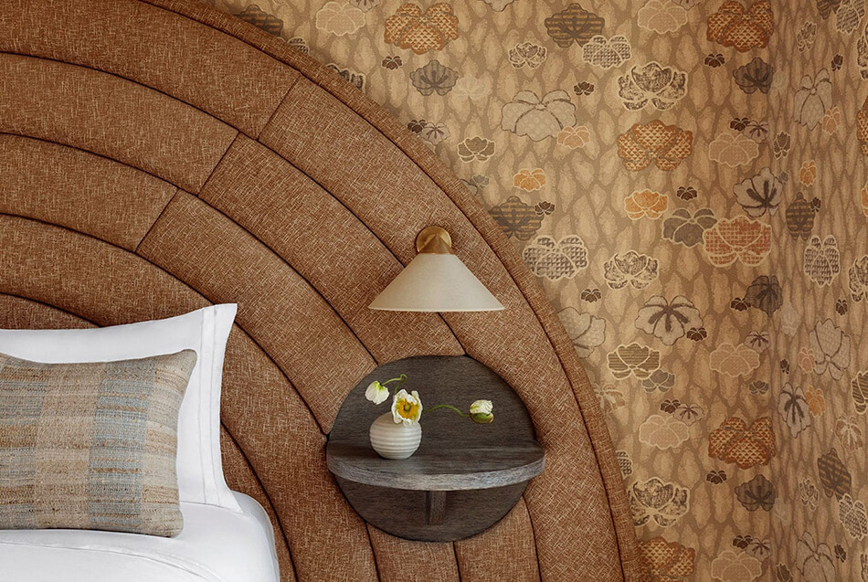
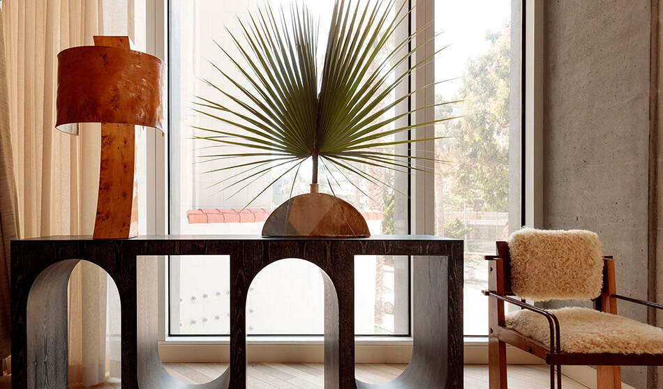
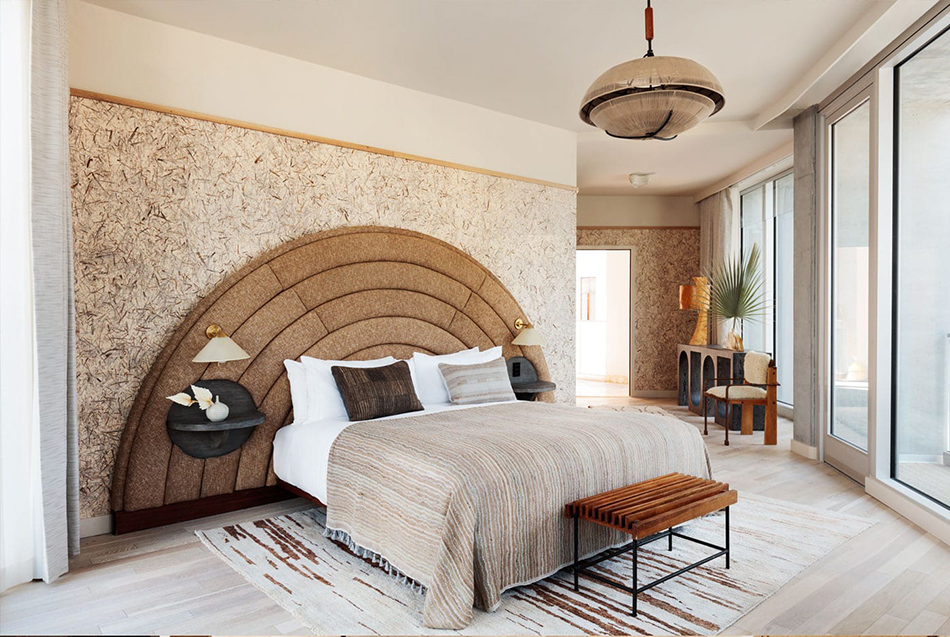
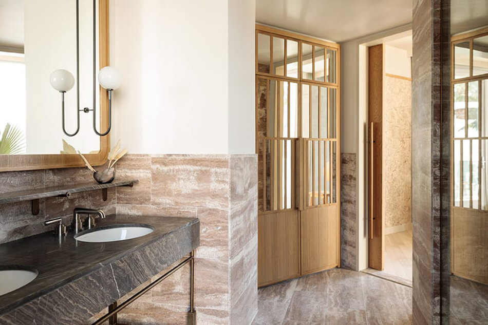
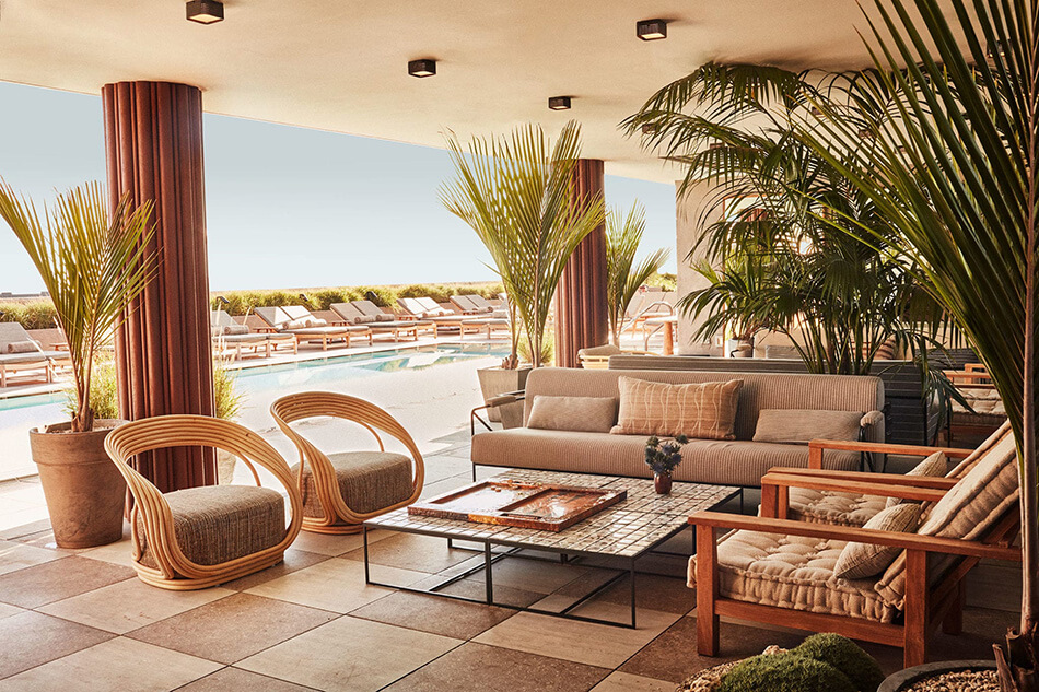
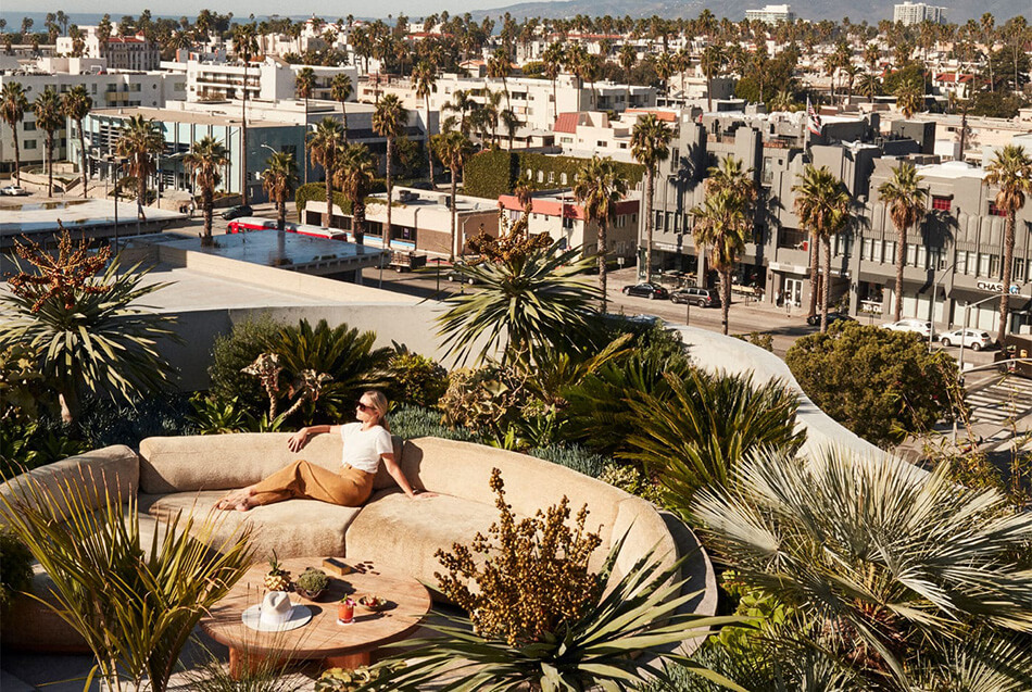
Santa Monica Proper Hotel
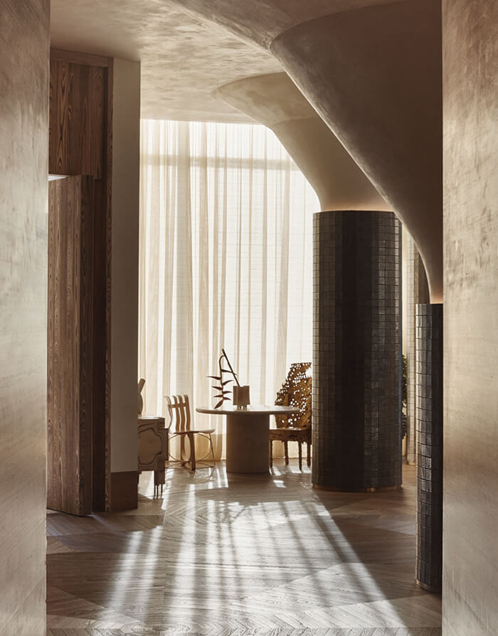
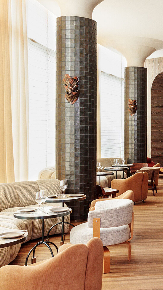
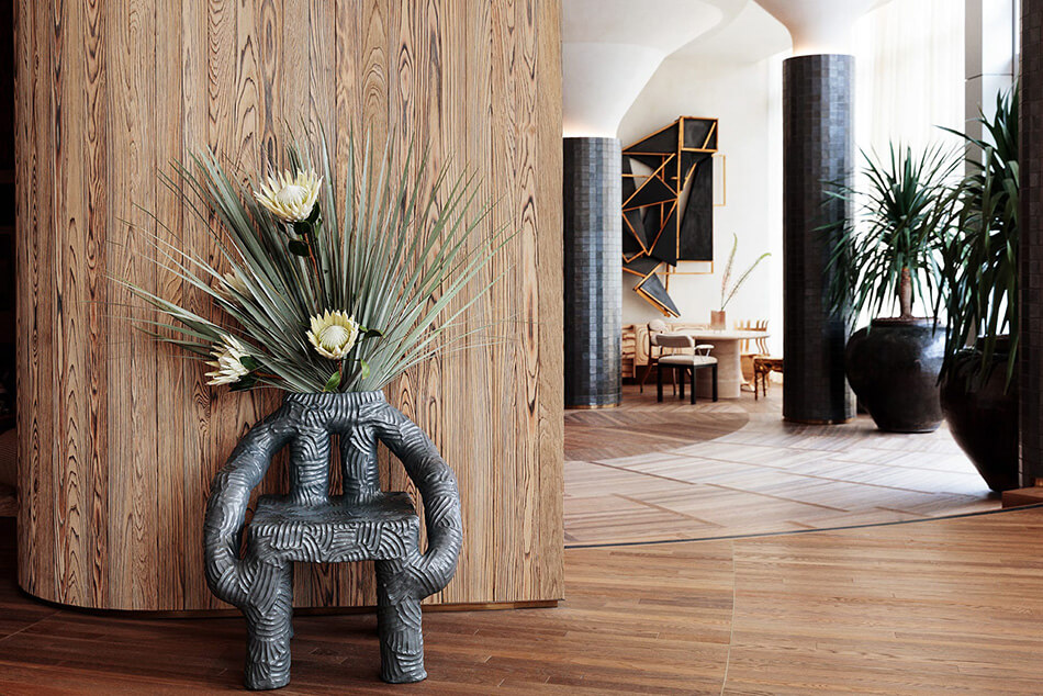
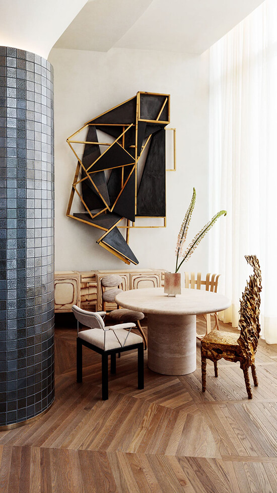
Posted on Sun, 15 Mar 2020 by KiM
Kelly Wearstler is a force to be reckoned with, and one of her latest projects, the Santa Monica Proper hotel, is really something else. I would looooooove to tour this in person. It is a bit subdued in colours then she normally chooses but of course, she nailed it. The landmark building is this beautiful Spanish colonial revival style, built in the late 1920s. The hotel was thoughtfully restored and refreshed, its original rich materiality and architectural moorish details served as inspiration for the overall design. The contemporary, modern building is more monolithic in nature and a great canvas for layering with textures – natural materials, stone wood, plaster. The hotel’s palette is nature-inspired and earthy, raw materials and organic textures, art and landscape bring a rich sensory feeling in to the hotel. Wearstler intentionally worked with local artists and artisans to bring a true localized experience within the spaces.
Courtyard house
Posted on Thu, 12 Mar 2020 by KiM

This Manhattan Beach house has everything you could want if modern is what you’re into. And I am into this! By ras-a studio. The home owners, both from Brazil, wanted an open floor plan with a strong connection to outdoor spaces that would remind them of home.Guests enter along a pathway that takes them through a courtyard before entering the home. Dictated by the geometry of the lot, the courtyard’s concrete masonry wall—which is just high enough to block outside views from the street while allowing in the southern sunlight—tucks under a cantilevered second floor, transitioning from courtyard to building wall. Rotating selected masonry units so they protrude from the face of wall to create succulent planters gives the wall texture and life. Two sets of sliding pocket doors seamlessly connect the courtyard to the open-concept ground level and then again to the patio and pool—which was carved out an existing backyard hillside. The bedrooms and private sectors are located on the second floor.
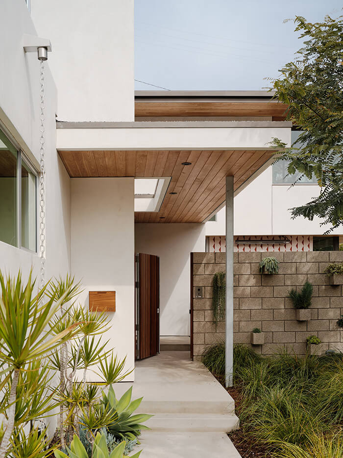
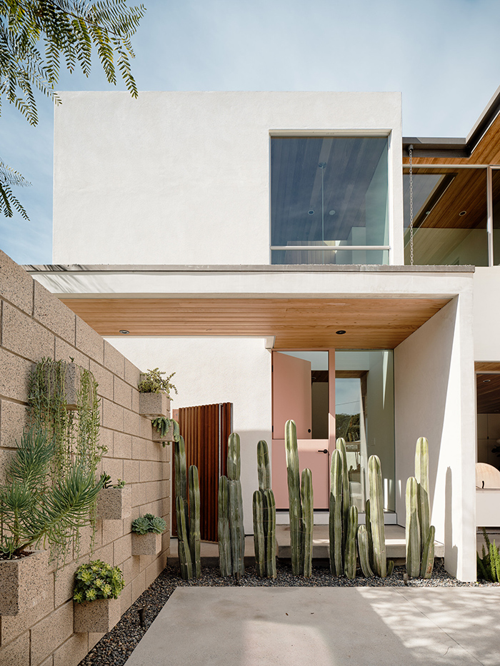
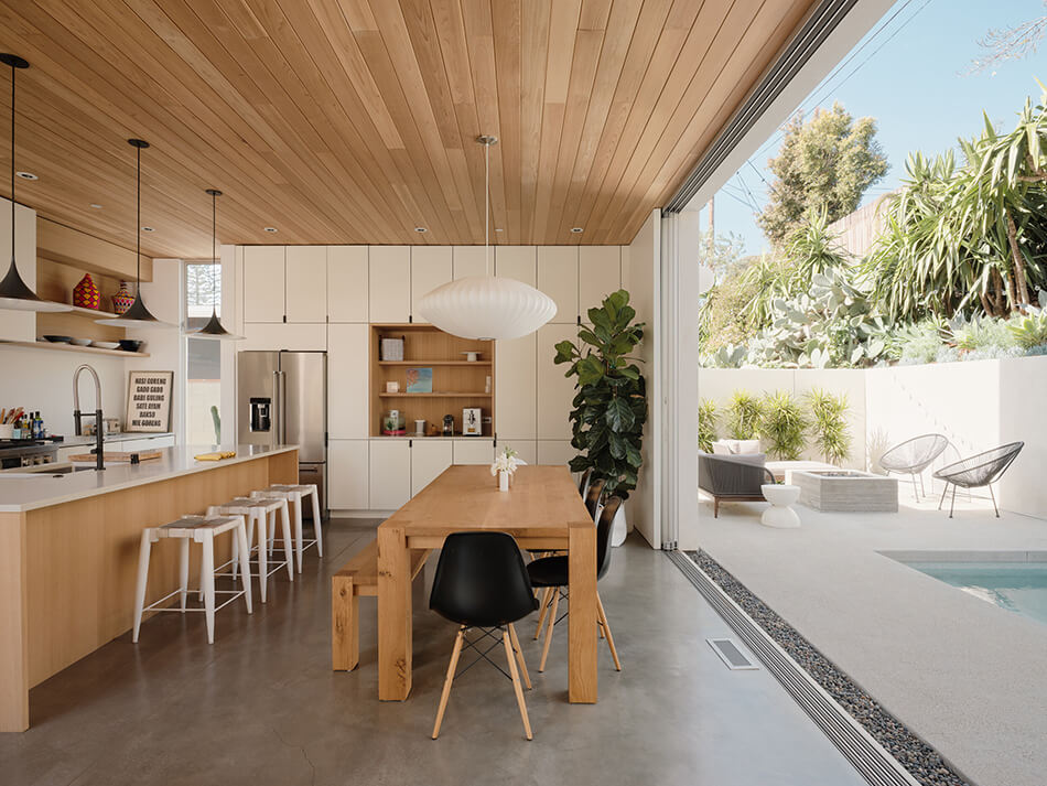

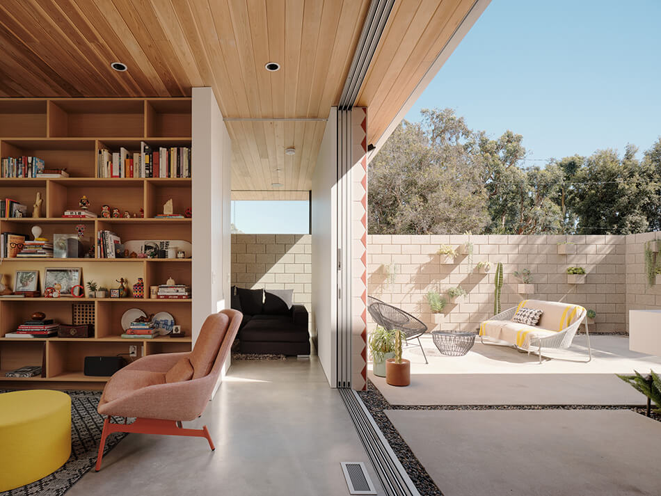
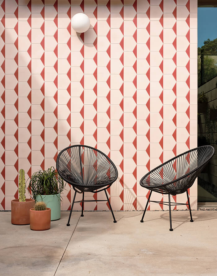
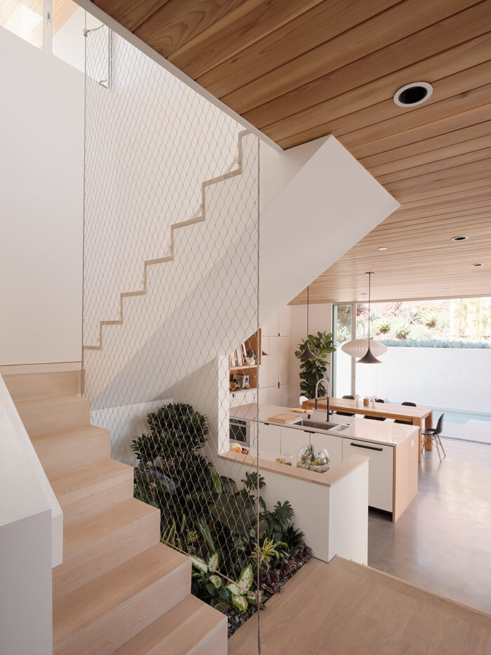
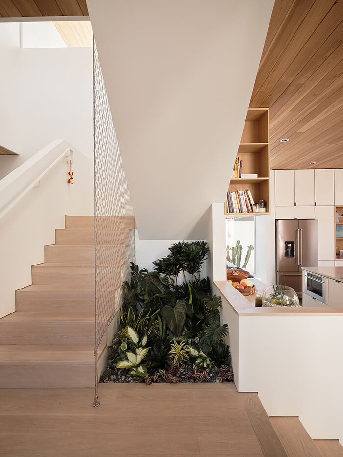

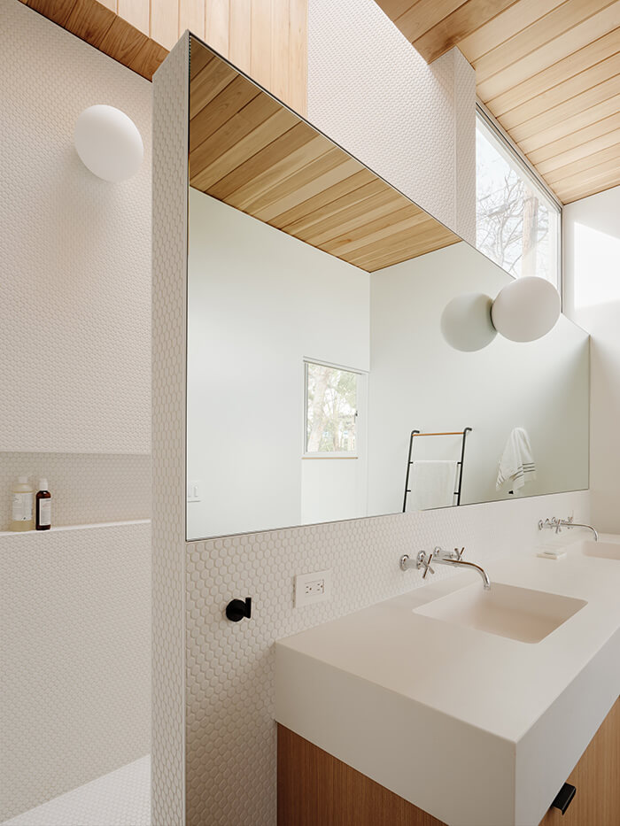
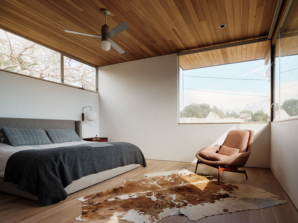
Photography: Joe Fletcher

