Displaying posts labeled "Reader’s Home"
Soviet era apartment makeover in Riga
Posted on Fri, 3 Jun 2011 by midcenturyjo
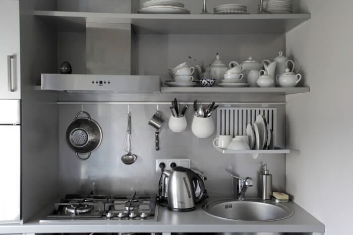
After yesterday’s amazing renovation I thought I’d share another. This time though it’s teeny tiny and on a shoe string budget. Alexey emailed to share this soviet era apartment re-do by interior decorator Natalja Radchenko in the Latvian capital of Riga.
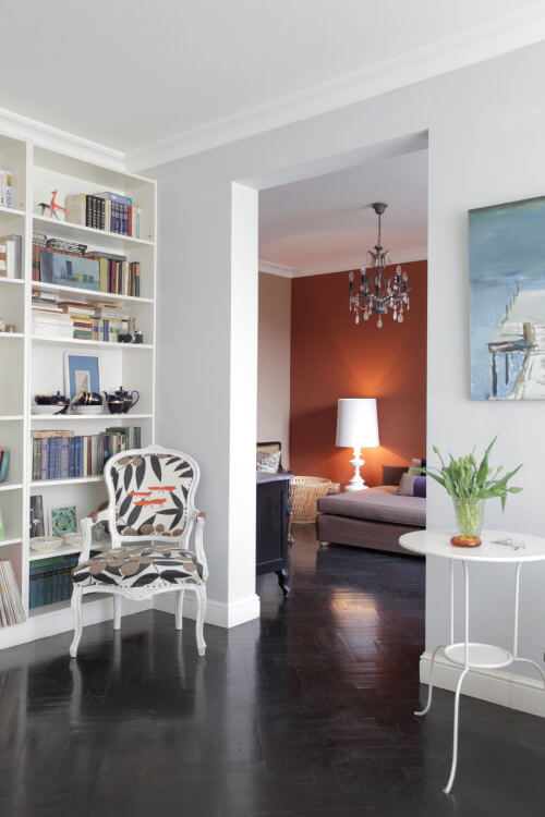
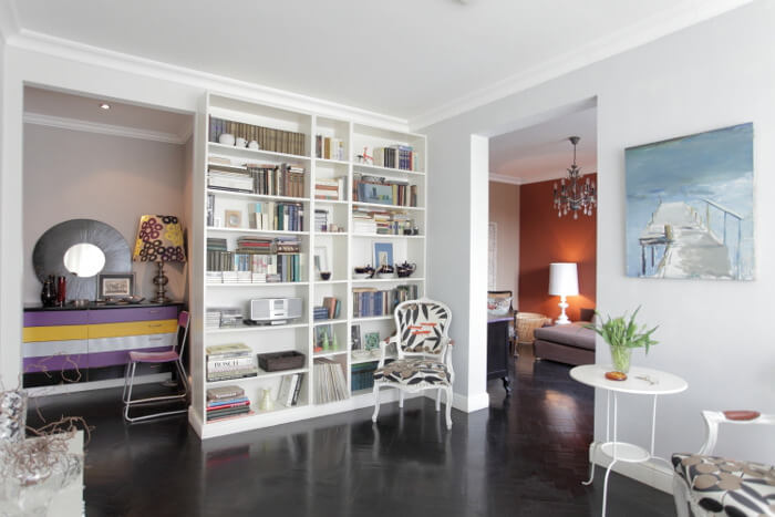
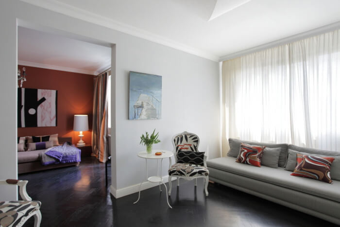
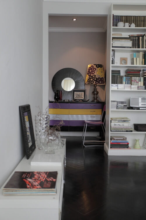
The apartment belongs to a middle aged Russian literature teacher who has inherited it from his parents and who had quite an utopian idea to transform a one bedroom 40 sq m living space located in a depressing soviet project building into something at least slightly resembling Riga old town last century apartments with high ceilings and wooden floors. Her main goals were to create (an illusion) of space and not to lose apartment’s functionality.
What she did:
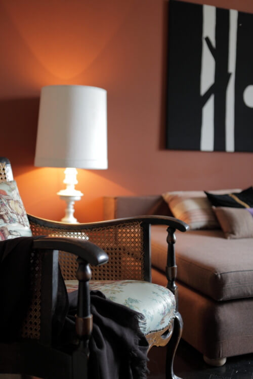
– Eliminated all the doors, leaving only one – to the bathroom;
– Created wide openings;
– Optically expanded space with wide cornices and plinths;
– Chose neutral tones for walls and black varnish for the floor.
The result:
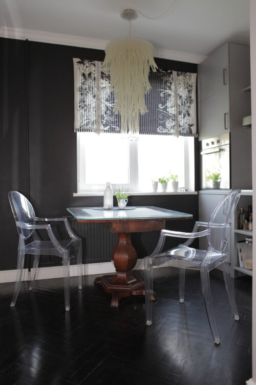
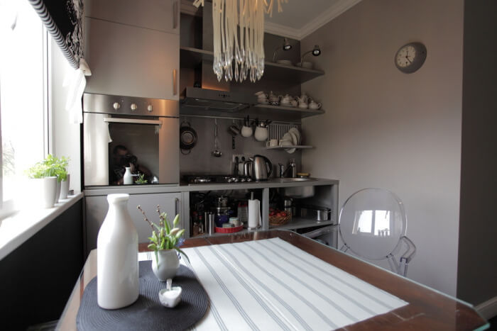
– Dining room/space with kitchen work space;
– Living room, semi-integrated into bedroom (owner’s requirement);
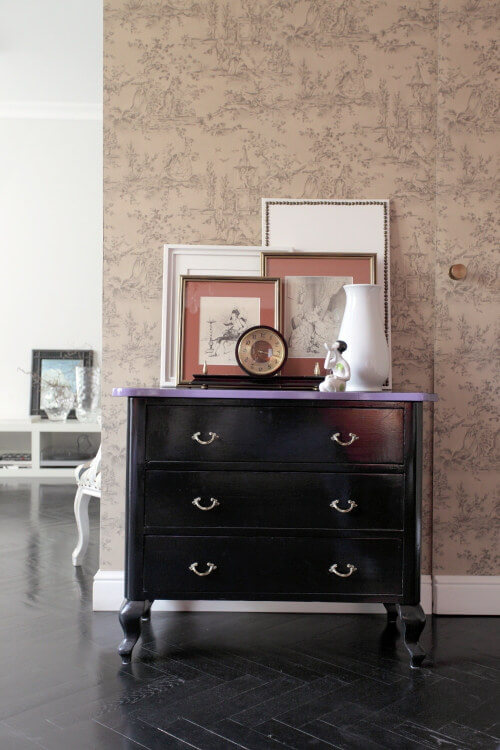
– Small dark corridor transformed into wide hall leading to dining/kitchen, where wall is turned into a kind of gallery of owner’s family relics;
– Tiny wardrobe between bedroom and entrance hall.
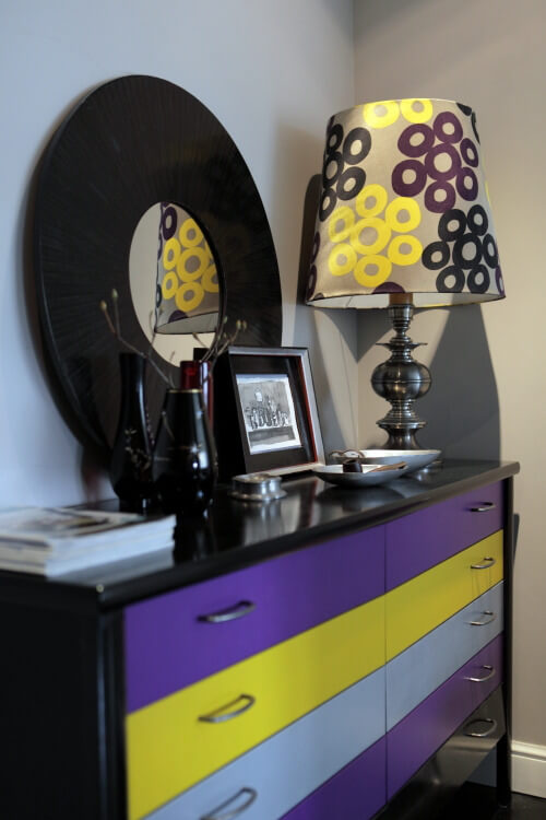
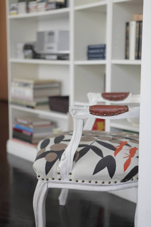
In addition to small size, another obstacle was that the owner had a very limited budget. Hence, not a single piece of furniture is just bought (except for kitchen appliances and bathroom); almost every item is redone and redesigned. For example, a sofa in a living room is bought in a second hand furniture store (and was originally disgustingly pink), bed – on the closing hotel auction, dinner table is inherited from owner’s parents, and almost all of the lamps are found on furniture dumps. Visual appearance of every item was changed via being repainted, overlayed with another fabric, accessorized. It was not a classical restoration, rather an ironical one – e.g. chair in the hall is overlayed with canvas bag fabric.
First time visitors claim that the effect of entering the apartment from a dark claustrophobic staircase is probably similar to entering Narnia chronicles wardrobe – the contrast is astonishing.


Reader’s home – before and after
Posted on Sat, 28 May 2011 by midcenturyjo
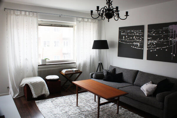
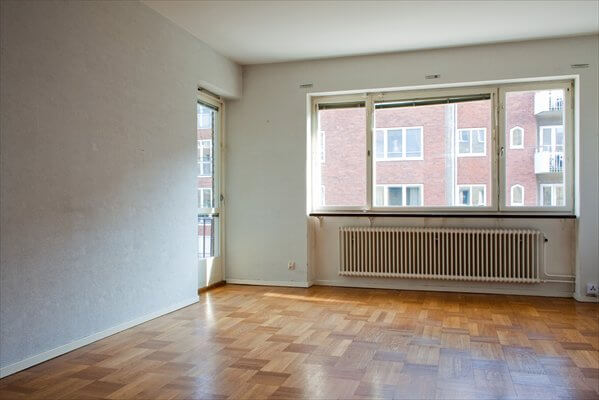
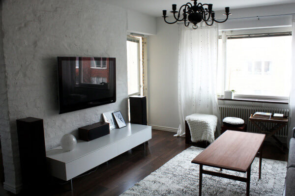
Iris from Inredningkaos emailed to share her apartment redo.
Here are some pictures from the kitchen, living room and dining room. We bought the apartment three years ago and completely redid everything from floor to ceiling. The first few months we lived in the apartment completely without a kitchen! All we had was an electric coolbox in the living room :)p Between the kitchen and dining room we removed a wall and instead we put a kitchen island with a stove to make a better space for cooking and entertaining, which we love to do! My favorite thing in this area is the white brick wall behind the television. My very handy boyfriend built in a pipe behind the bricks and underneath the floor where all the cords from the television and amplifiers go. I painted the art in my living room myself and I also painted the pattern on the rug! Hope you enjoy the pictures!
It’s a wonderful transformation Iris! From a plain box-like apartment to a stylishly casual and cosy home.


Design crew
Posted on Sat, 21 May 2011 by midcenturyjo

Got a problem? Need some help? Just standing there shaking your head? Don’t know what to do? You’re not alone. Send us a link to photos of your design quandary and let the Desire to Inspire design crew help you …. that’s you lot… the readers! This week it’s Cris who, after years of making do, has a flat with great bones and loads of potential. I know you’ll have lots of ideas for her.
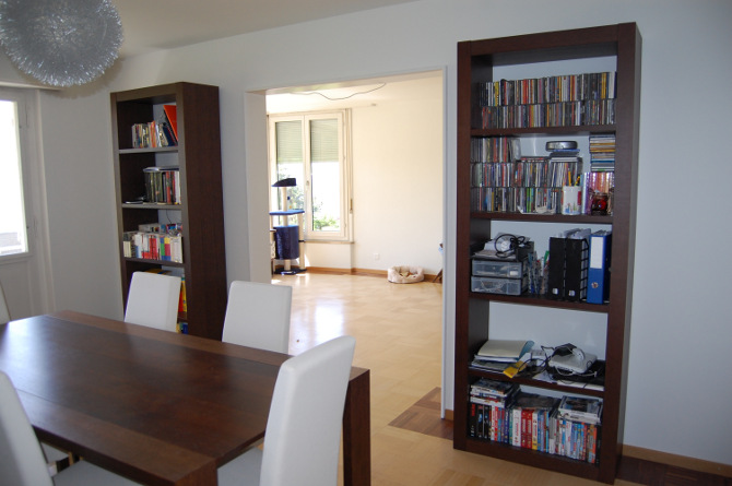
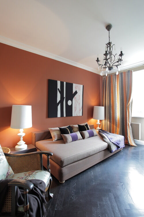
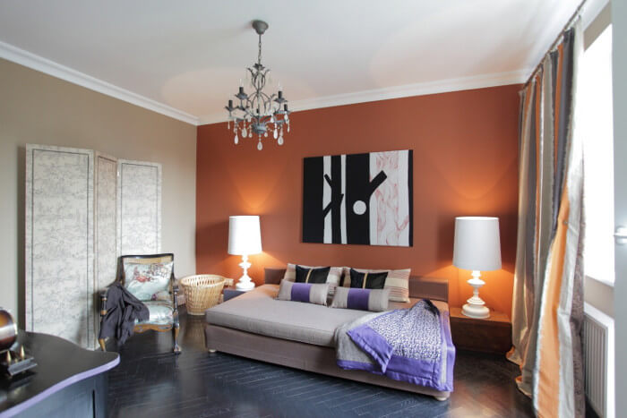
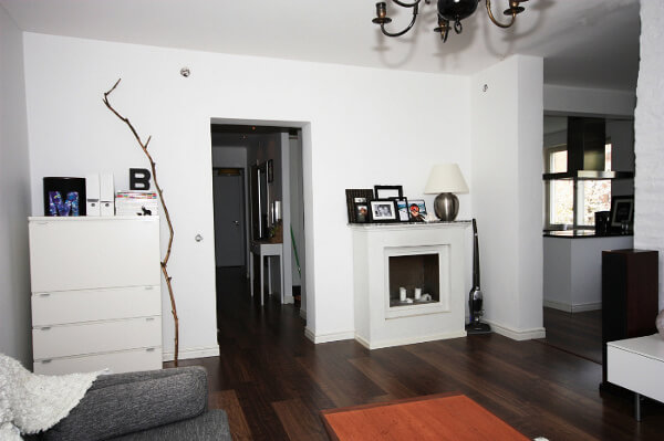
Let me tell you a few words about me. I am an assistant professor in organic chemistry and in 2007 I joined the faculty of the University of Zürich. So far I lived in couple of “just for sleeping” flats cause I was far toooo busy with the science. But three months ago I was able to find (and rent) a fantastic apartment. It´s just a dream, my dream come true. And this is also why I write you, cause ever since I cannot make up my mind on how to decorate the dining room as well as the connected living room. I desperately need the Crew´s help!!! For reasons too long to explain I had to buy some furniture to the previous tenant. Those are all the dark-brown wooden pieces you see in the first two pictures (table, 6 chairs, 2 high + 1 medium shelves), which I decided to put together in the (smaller) dinning room. The other pieces you see in the third and fourth pictures (big linen sofa + caravane cushions, old walnut chair and table, sewing machine, etc…) are my beloved pieces, those that I really feel MINE. They were either found in vintage stores, bought during my trips or rescued before my grandma decided to get rid of some of them. By the way, a 100 year old Chinese cabinet (4.5 x 1.3 x 5.6 ft in natural walnut tree wood) is on its way and I hope to fit the TV in there, exactly where it is now.

Here are some of my questions for the crew:
– should I keep the “independent” decoration in the two rooms although they are connected or should I mix the pieces? (if mixing is the option I am lost…I just don´t see those two “styles” coming along well together).
– In the living room, now it´s all going to be “walnut wood”…too homogeneous, isn´t it? How can I break it a bit? (wall paper or painting in other colour than white is not allowed here!).
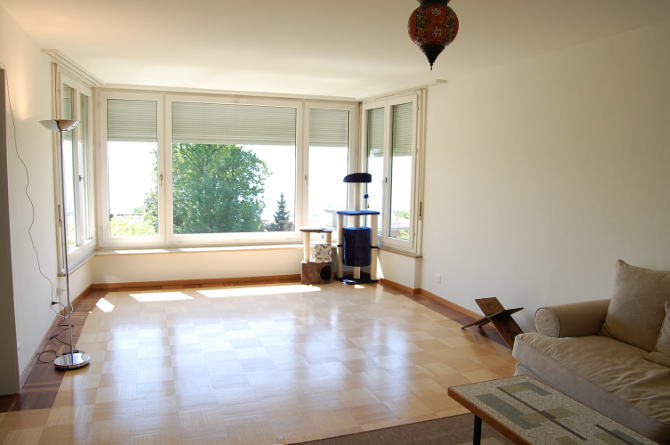
– Last but not least…what do I do with the big space I still have free in front of the huge window (I also send you a picture of the beautiful view we get from there)? Since the other half of the living room, the one closer to the chimney, is already quite busy (sofa, armchair, sewing machine, table, incoming TV-cabinet, carpet) I thought of buying just two big leather armchairs + a seventies big-arch lamp and decorate the walls with some small paintings or pictures to use it as a “reading area” but maybe I should just re-think everything from scratch…not sure!!
Any comments or suggestions beyond my questions will be also highly welcome. I really appreciate your readers taste 🙂
 The view from the big window
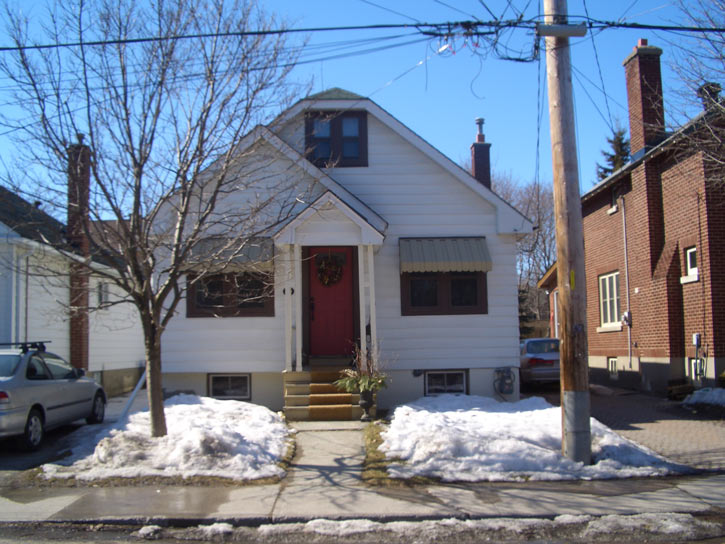
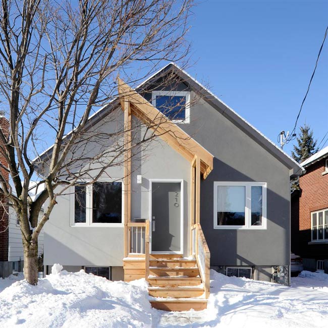
Reader’s home – a local reno
Posted on Tue, 17 May 2011 by KiM
I was SO EXCITED the other day when I received an email from Gillian, a local Ottawan who at one time had grand plans to turn a boring 1945 2 bedroom Ottawa bungalow into something modern and spectacular. Sounds kind of familiar. 🙂 Luckily for Gillian her plans were put into action and completed in November of last year – and the results are FABULOUS!! (and I’m totally going to hit her up for advice throughout my renos). Here’s the scoop from Gillian:
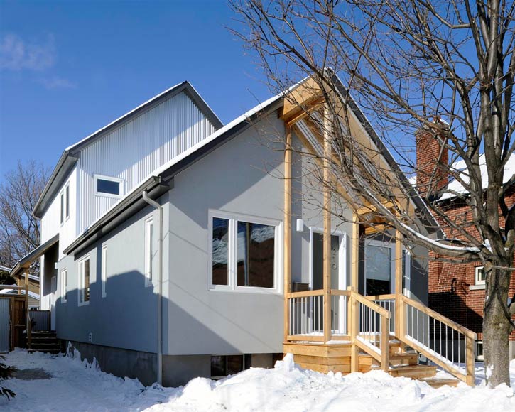
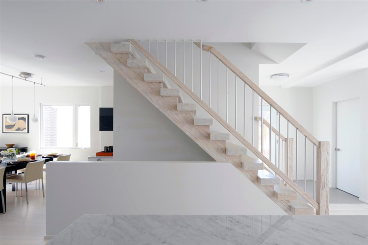
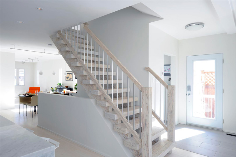
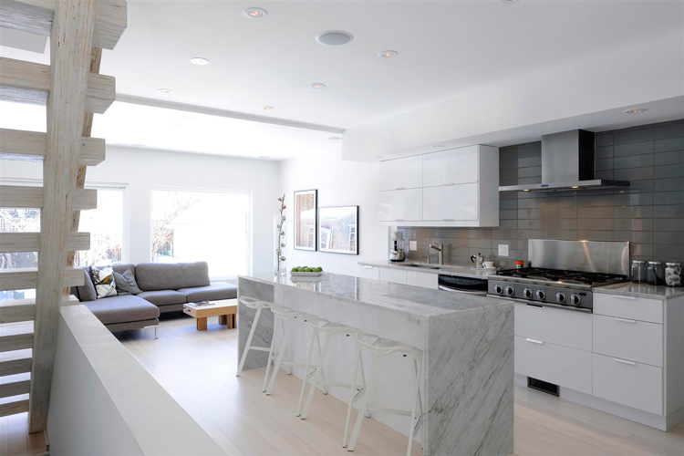
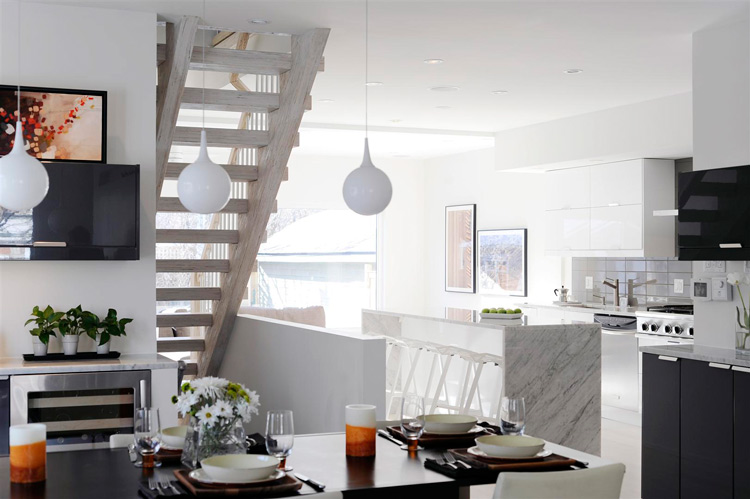
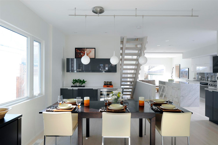
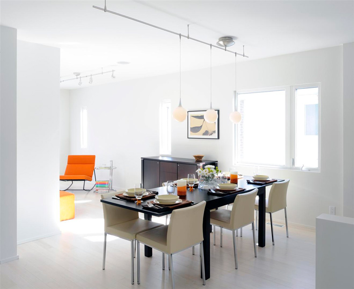
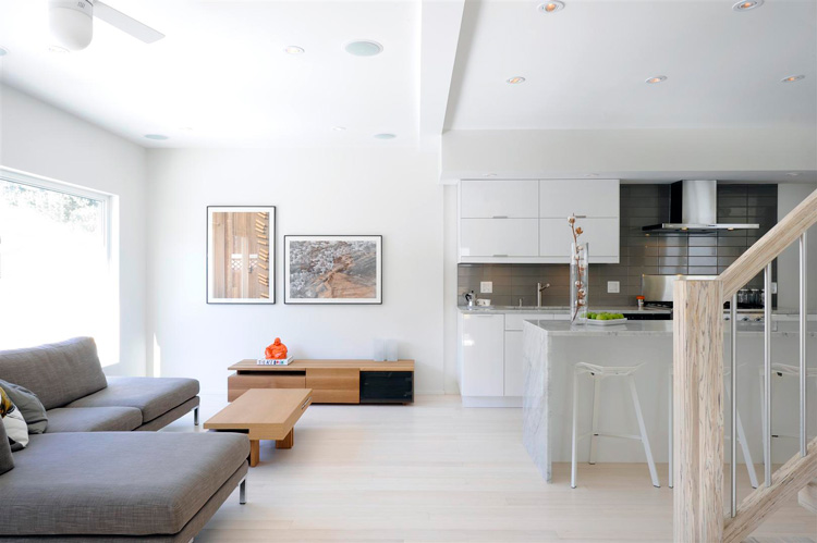
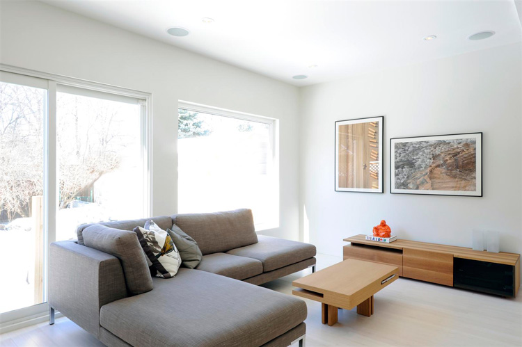
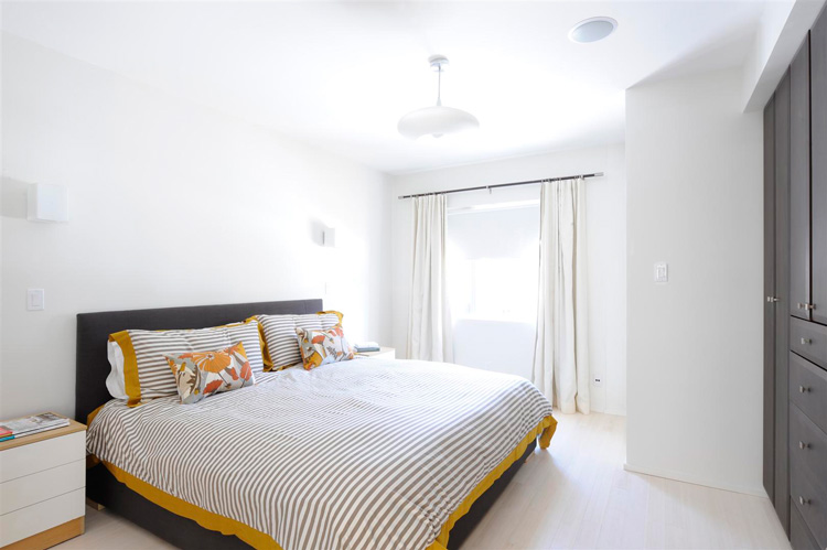
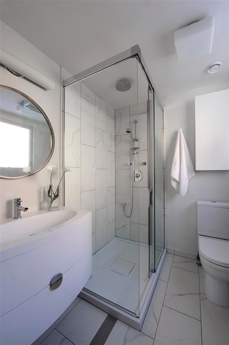
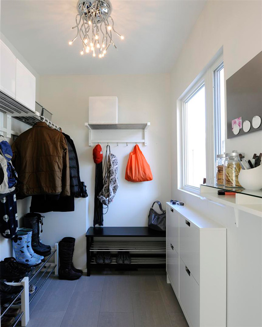
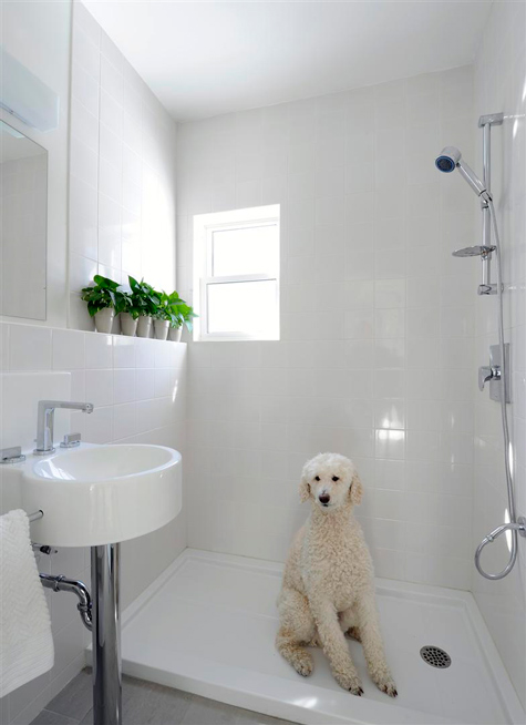
The objective was clear: build an edgy, modern, sustainable home. The wish list included: 3 bedrooms; an open concept, chef’s style eat-in kitchen for entertaining and doing heaps of cooking; an ‘urban great room’ across the back of the house to let the sun shine in and provide main floor family space; a custom, “wow” open staircase (none of that pre-fab stuff!); a mudroom; a dog bath; and an exterior that pushes the envelope. And so ensued the design process and renovation by Moneca Kaiser Design Build.
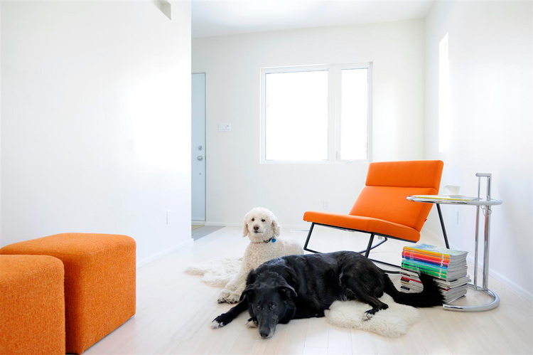
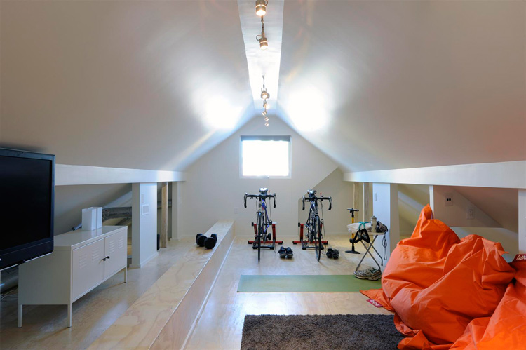
The idea was to be able to stay put, and not be forced to move in future, ‘cause that’s a whole lot of waste.To do this, for example, we put the master bedroom with ensuite on the main floor, which also features an accessible bathroom, at the side entry, that presently does double duty as a dog shower! The 2nd floor loft style family room on the ‘kids’ level’ can also easily be converted into a master bedroom (for now it’s our family room/gym).
Using sustainable products, like bamboo flooring and parallam beams for the staircase (and it is “wow”), as well as choosing greener options, such as spray foam insulation and a condensing hot water tank (among maaaany others), we aimed to take a practical approach to sustainability.
This forward thinking was carried right through to the decorating, where we opted to make the investment in well-designed pieces with nice clean lines that are totally timeless. With the exception of our One Stools by Magis, we chose an all-Canadian roster of designers, with the help of two amazing Ottawa-based home stores, Alteriors and Blueprint Home. Proudly, our furnishings are among the coolest designs by IZM Furniture, Gus Modern, LucyAu and William—all Canadian. The work of Louis Helbig, an abstract aerial photographer and fellow Ottawan, ups the edge factor, and its organic, context-free composition pulls the interior together in an uncanny way. (Sources mentioned above are listed at the end of this post!)
Below is a before photo of the exterior (bleh), a couple after photos (WOW!), and one peek at the interior (YES!). The rest of the photos are after the jump. (Photos via Gordon King)


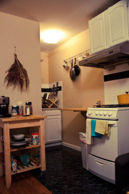
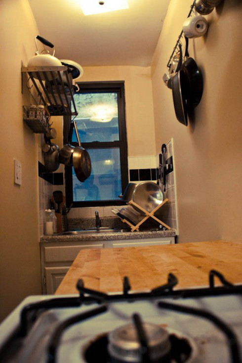
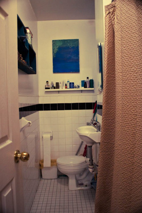
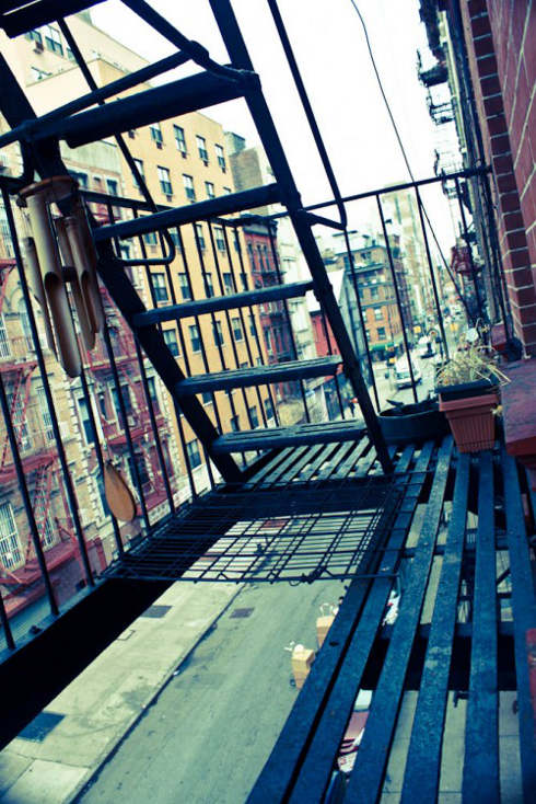
Teeny, tiny reader’s home
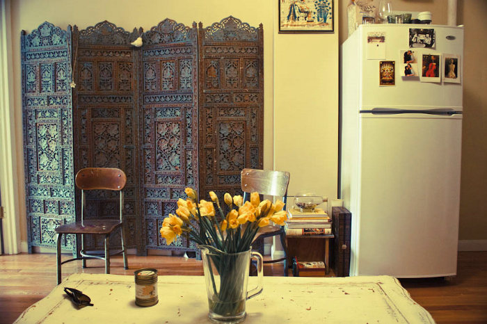
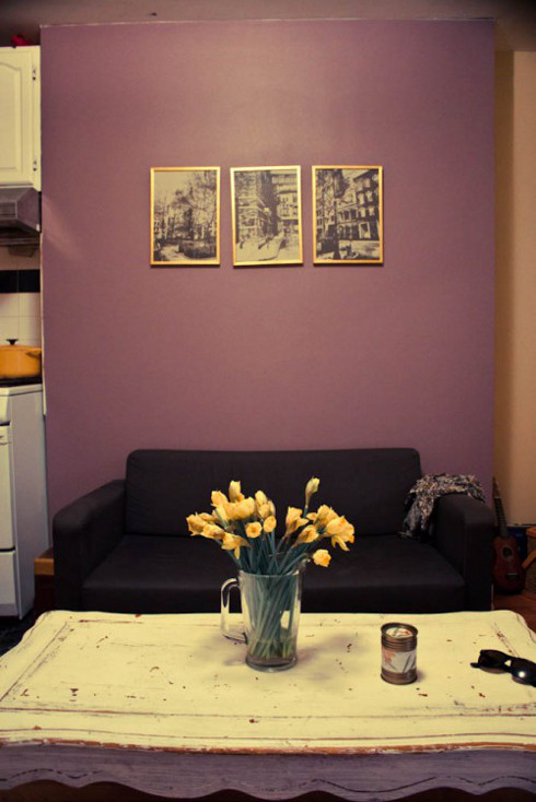
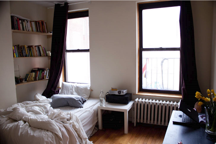
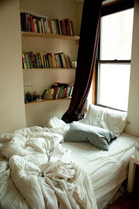
Posted on Sat, 9 Apr 2011 by midcenturyjo

Elizabeth lives in a 350 square-foot apartment in the lower east side of Manhattan. YES, it’s that small! However she and her boyfriend have managed to make it look cute, inviting and cozy! And best of all they are very happy in their small home. To find out more about why they live in such a tiny space you can head to her blog In Between Seams. Could you do it? Even with the pay off of living in Manhattan?